Final Image Selection
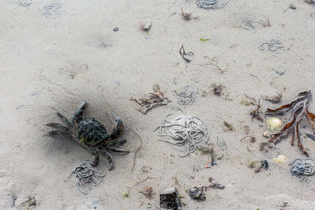
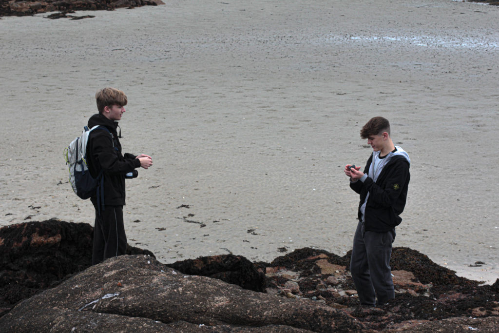
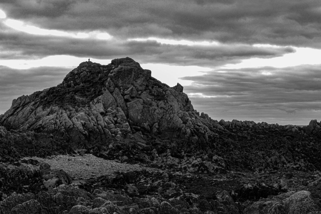
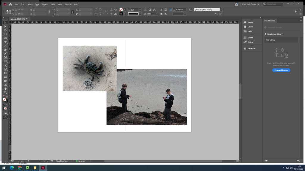
I used images from the La Hocq trip to create my photo-zine as I wanted to keep a similar/the same theme throughout. I edited my images in Lightroom and then decided which images I wanted to use.
Zine Creation
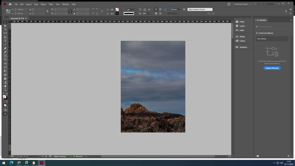
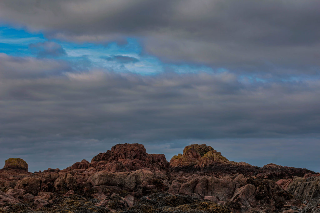
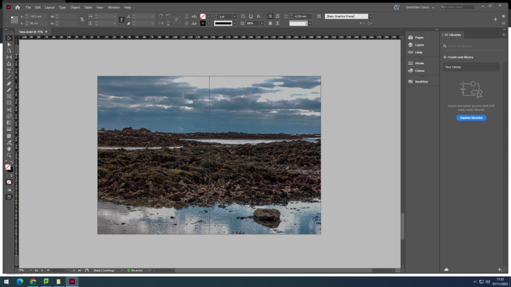
I wanted to make the back and front cover the same image, I did this as I believe it looks very effective

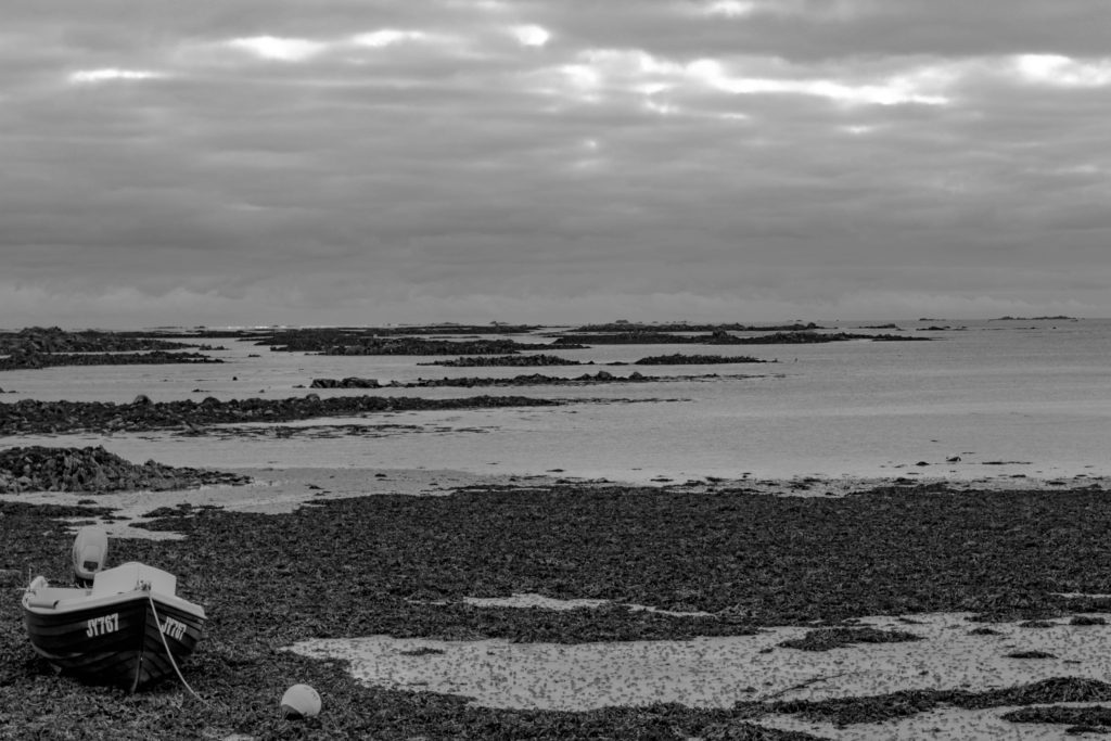
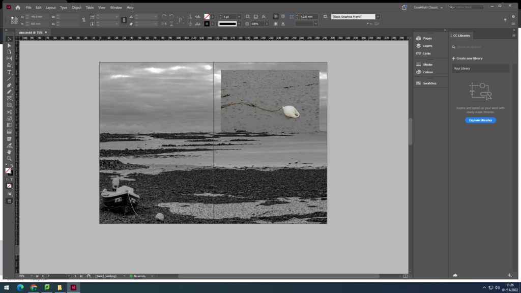
I also wanted a double page black and white spread, I used this image as I believe it is a very powerful image and works very well
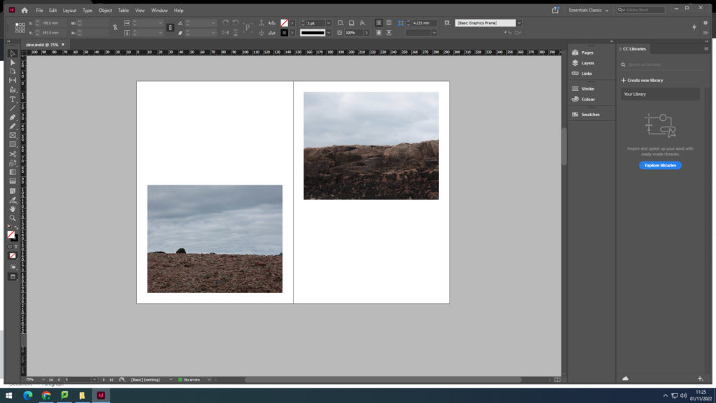
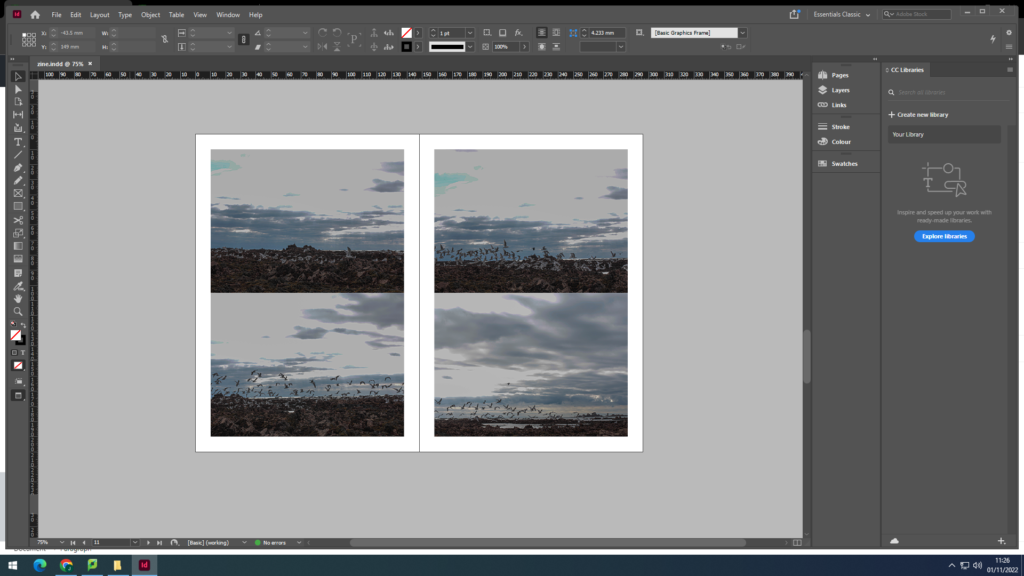
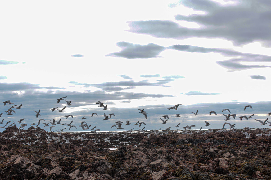
I really liked the idea of portraying the flight of seagulls aking off from the rocks, and I think it worked very effectively

Evaluation
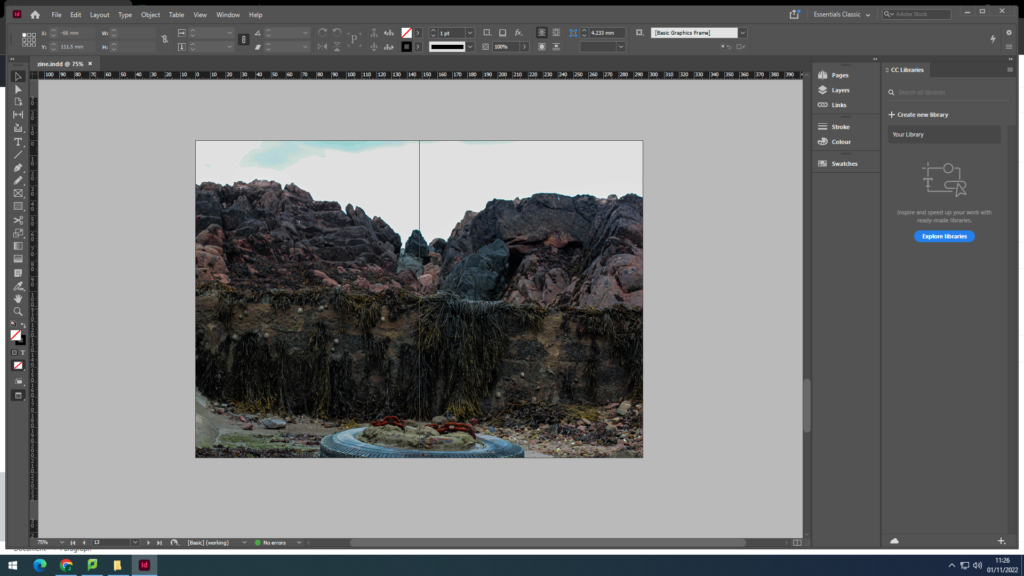
Overall, I believe that my zine came out very well, I kept to the same theme throughout and I think my zine tells a good story. To improve I would take multiple photoshoots instead of just one, this would give me more photos to edit and work with to come out with a better outcome. I named the title La hocq, I did this as this is the location for all the images included in the photo zine and I believe it is a very fitting name.

