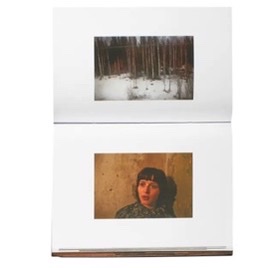
Photobook Specification and Moodboard

Write a book specification and describe in detail what your book will be about in terms of narrative, concept and design with reference to the same elements of bookmaking as above.

Narrative: What is your story?
Describe in:

3 words

Generational female identity.

https://www.shashasha.co/en/book/how-we-see-photobooks-by-women – an article I used to look at notable photobooks by women, in order to gain inspiration for my own.

A sentence

My project focuses on the personal and generational identity of women in my family, using archival and new material.

A paragraph

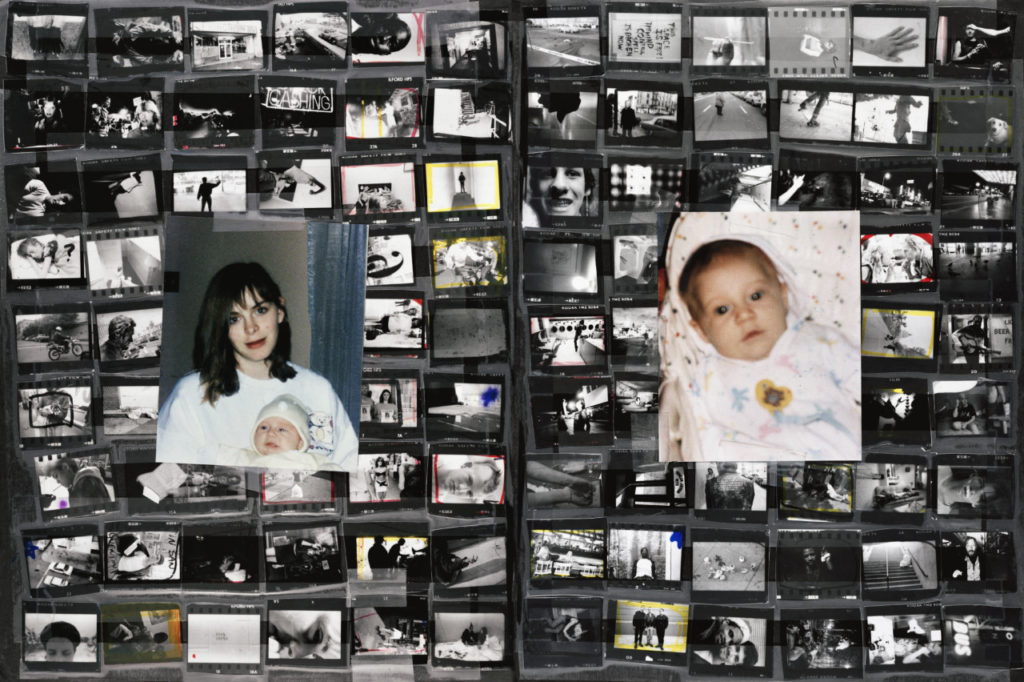
This project looks at different facets of identity, both in the past and present. More specifically, the project explores the personal identity of each of three subjects: my mother, grandmother and myself. Then, through the use of collage, it shows how each person’s identity links with each other. – The past also plays a role in my project, with the use of archival images a key part, used for comparison to the present day for my collages. The use of collages is inspired by my previous identity project, which formed the basis of this project. My personal study draws a lot from identity within a place as well, such as within the home: whether it be a past or present one.

Design: Consider the following:

How you want your book to look and feel

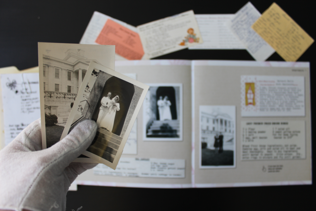
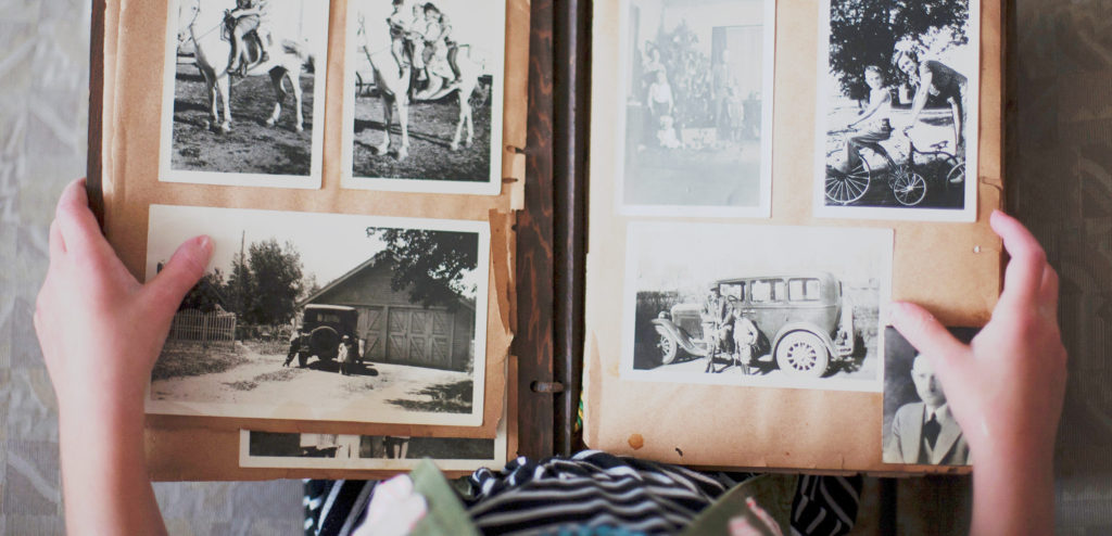
I want the book to have a soft, gentle feel. I think using vintage style, faded colours and fonts will suit the style of my work and editing style. I want to use classic colours and fonts to give my photobook a vintage/ timeless feel to it. – this is influenced heavily by my use of archival material, as well as my editing style, using high grain and faded tones. In this photo book, I have chosen to take inspiration from classic photo albums and books – I was heavily influenced by this after looking through my own family’s photo albums from the 70s, 80s and 90s which will help me to design my own.

Paper and ink

I plan on using white paper with black ink, creating a timeless feel. – I plan to use matte paper, to keep my style consistent. Furthermore, I think that using matte paper will help to keep the detail and unique features of my archival images throughout – using glossy paper may draw attention from small details of the images, such as creases, folds, and rips in the images. I am interested in keeping these imperfections intact to keep the authenticity of the images and to create a more tactile and immersive feel to my photobook. When adding my essay to the photo book, I have seen the idea of using different colour pages that fit with the theme. I like this idea as it would create a distinction between my pages with images and those with my essay and the images that accompany it.

Format, size and orientation

I’m going to choose the orientation based on my front and back cover choices – Probably either portrait or square. However, with still more images to make, I may change my mind – I tend to have more landscape-orientated images, which would also influence a choice of a landscape-orientated book. For these reasons, I’m still undecided. Having thought about this more, I have decided on a portrait format book. However, when creating my photobook

Binding and cover

I plan to use archival or collage images for my front and back cover, either slicing an image in half or two separate images. I want the front cover to be tactile, and heavy.
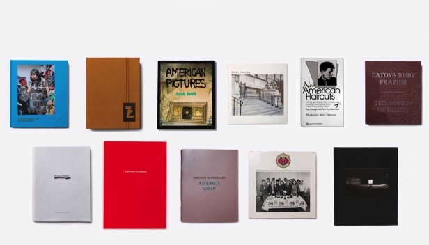
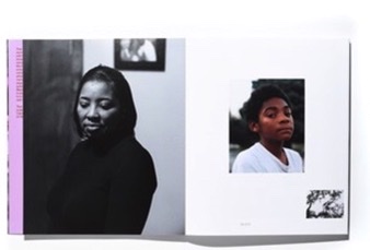
Some front covers of famous photobooks were used for inspiration – including “The notion of Family” by Latoya Ruby Frazier, one of my main inspirations for this project.

Title 

I’m still thinking of a title to do with my family or to do with the content. I think that I might need to focus on the content of the photobook first, and when I know what that looks like I will come back to the title. As for ideas, I was thinking of something linking back to my own family and its’ history, or to do with the content. For example “The Albums” or “80-18” – (The difference in ages between the 3 subjects in my book at the time of completion.)
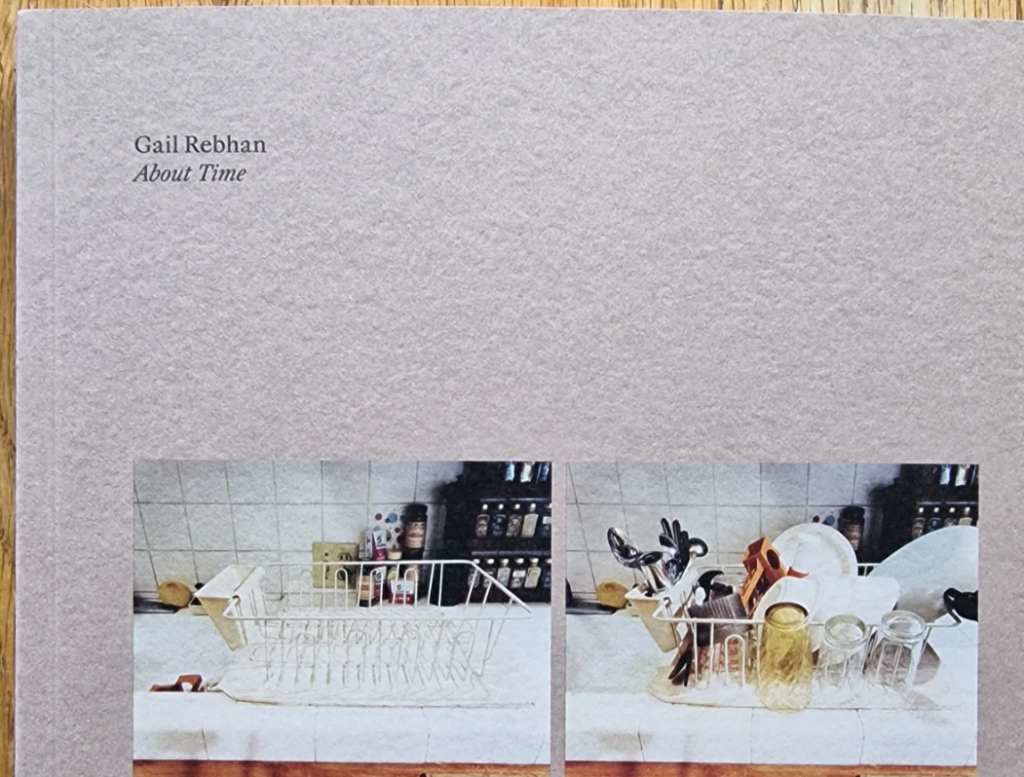
A simple title used by Gail Rebhan – I like the double meaning: the book is both about time and uses a colloquial phrase which adds humour. I also like the understated presentation of the cover of this photobook.

Structure and architecture

https://gatekeeperpress.com/types-of-binding-for-a-self-published-book/ – an article I used to find more information about book architecture.

I am considering different types of architecture for my photobook: a softcover, with a smooth image, wrapped front cover, or a hardcover, with a more vintage style cover, with either two images wrapped onto the outside or just a single image wrapped on to the front and back cover. I have decided against the use of a dust jacket for my book, as I want the image to be wrapped in the book.
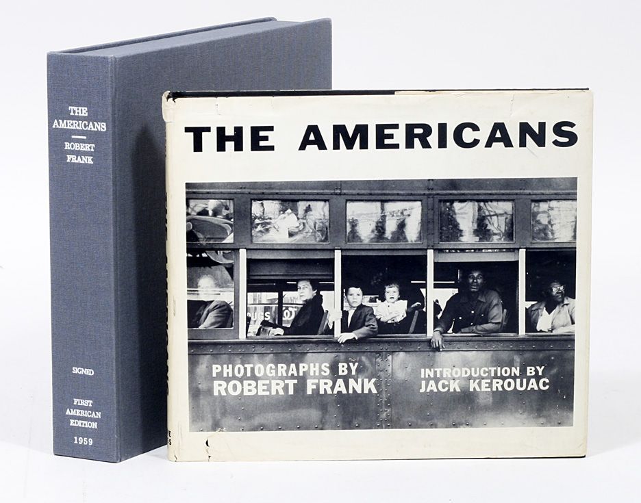
Design and layout

An article I used to help me figure out some inspirations and design choices for my photobook.

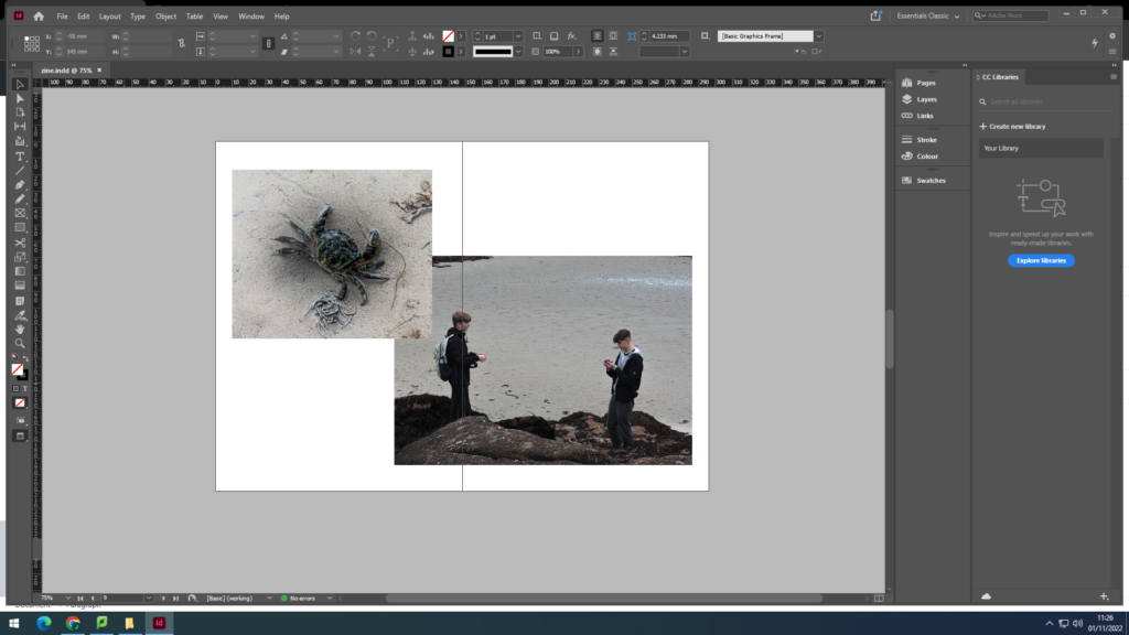
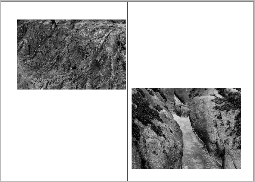
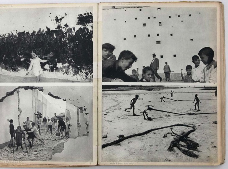
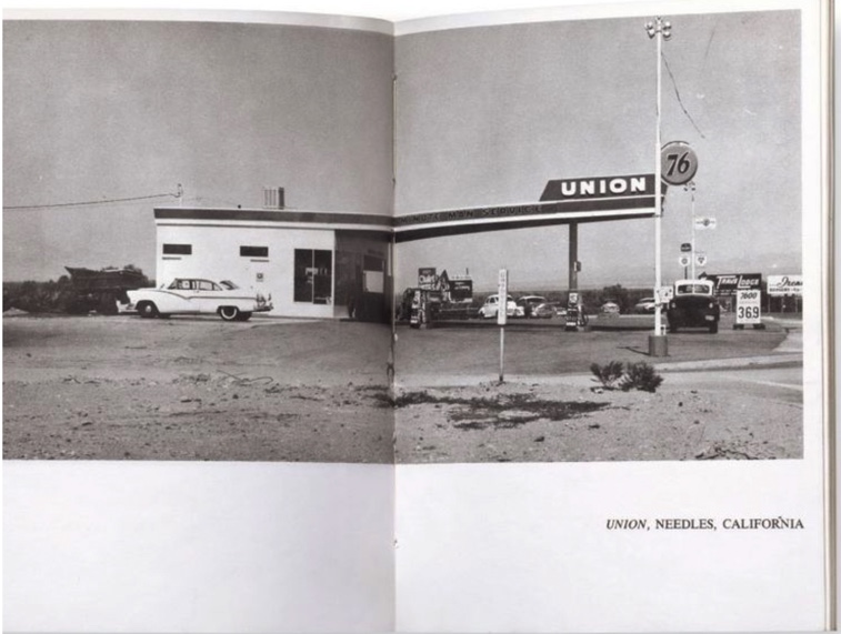
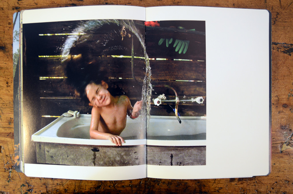
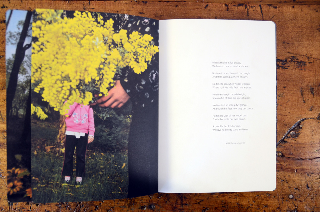
After completing my previous zines for the ‘My Rock’ project, I have gotten a better idea of what kind of design I would like in my project. I am going to use a mix of double-page spreads, specifically my strongest image on the middle page of my book. I want to utilise blank space in my photograph, creating unique compositions with different shapes and sizes of images. I have thought of lots of different layouts. For example: double page spreads, two image spreads, images on opposite ends of double page, single images on double and single pages, and arrangements of different sizes and orientations.
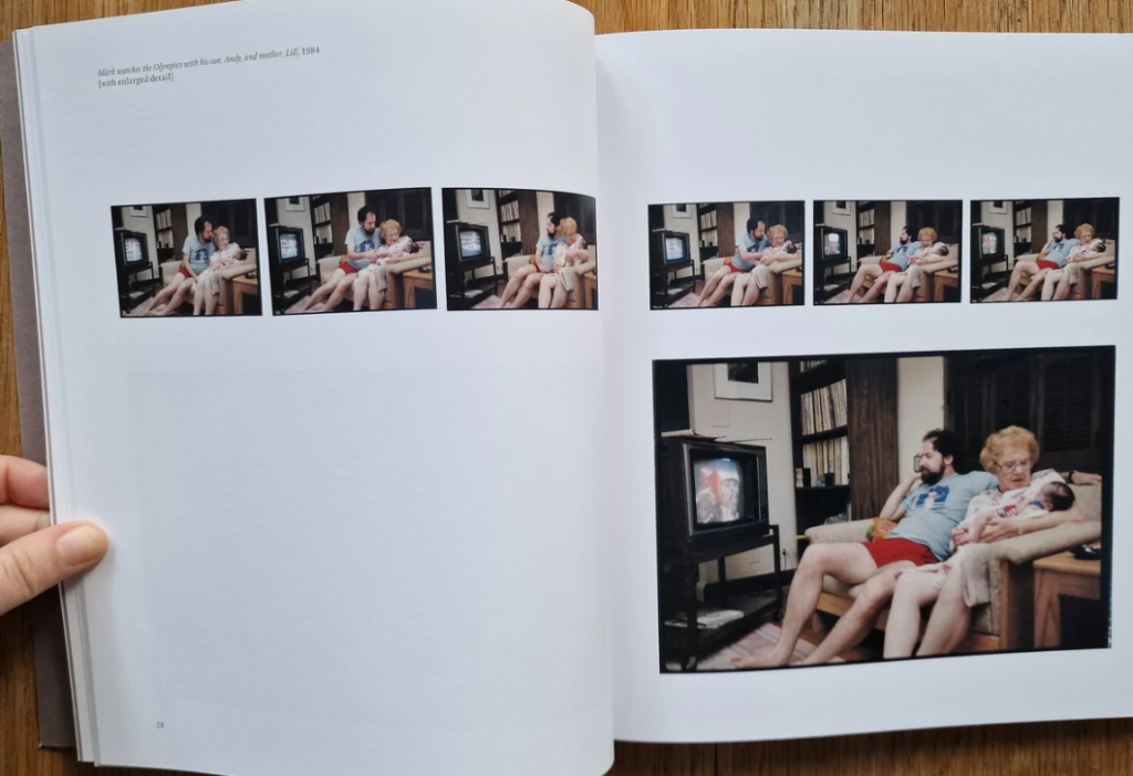
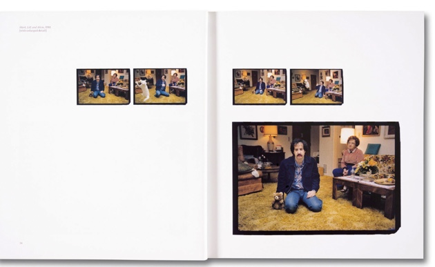
Gail Rebhan, 2023 “About time”

Jim Goldberg – USA. San Francisco and Hollywood, California. 1982-1986. Raised by Wolves. “101 Pictures”.

Editing and sequencing

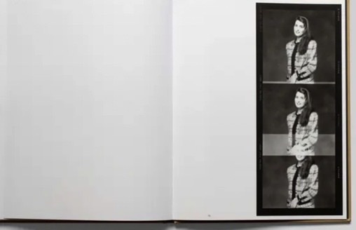
My editing for my self-portraits is in B and W, along with some of my other portraits – most of my portraits are in colour, along with almost all of my archival material. I plan to create collages, as well as juxtapositions of multiple images. I will sequence these evenly with normal portraits and single archival images.
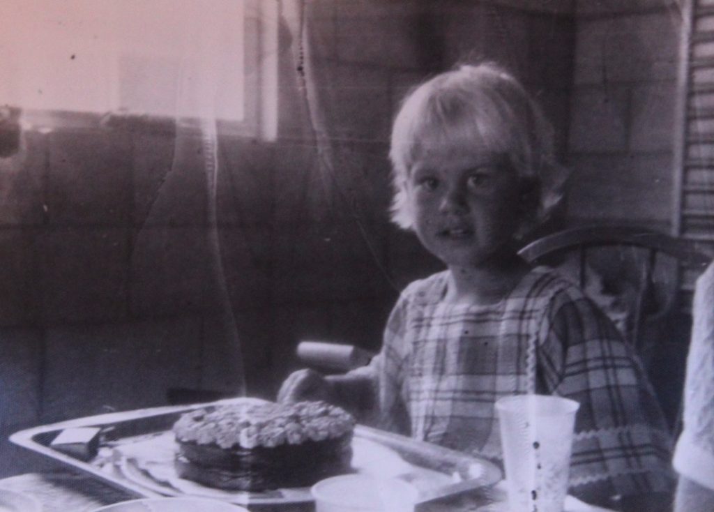
An example of one of my archival images to be included in the book – an image of my mother.

Images and text

I might use text on top of my images, narrating the photos or adding context. I first thought of this idea after looking at Jim Goldberg’s project: “Raised by Wolves”, in which he asked subjects to write on their own photos after being given them back. I think this idea links really well to my project as I wanted to find a way of including my subjects’ own ideas of the images and my project in my work. As well as asking my subjects (my mother and grandmother, and me) to write on their own images, I plan to write little captions or paragraphs in my own handwriting about the content of some pages and their meaning. This is also influenced by my interest in photocollage, and other artists using text in their images.
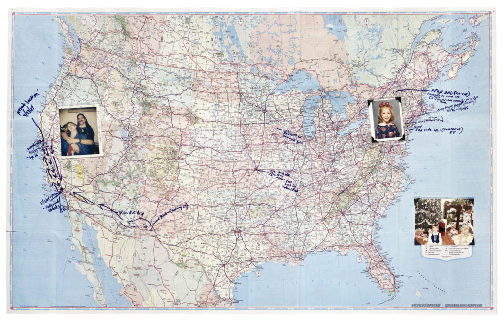
Jim Goldberg – USA. San Francisco and New York. 1989. “Echo’s Map.”

I also have an idea of including drawings or annotated images, in the same style as Jim Goldberg above – possibly a family tree, or a map of Jersey, UK and France to map out my family’s origins and homes. I think that this idea links well with my interest in photocollage, as it is another part of mixed media art.
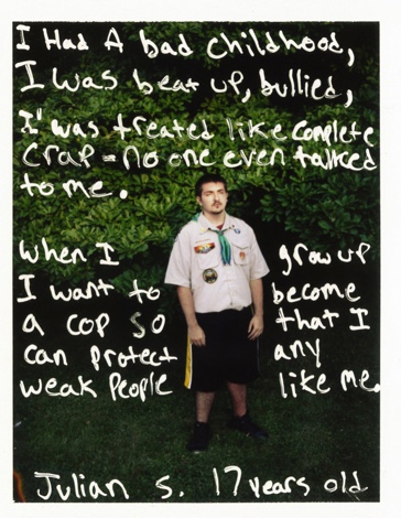
Jim Goldberg – the text of my images will not my of this nature – just a narration / comment on the images.

story and narrative

STORY: What is the story?

3 Words: Growth, decay, difference

A Sentence: The difference between the size of rocks and how it affects how they age.

A Paragraph: Stability increases as the rocks grow stronger despite the decaying/erosion that has occurred. Little rocks flock towards the big rock, preparing for battle against the terrors of nature once more. The cracks, scars and imperfections from previous struggles always remain but despite this, the boulders stand tall. Some rocks and pebbles, however, know their odds and so bury themselves, making them unknown to the horrors above.

NARRATIVE: How will the story be told?

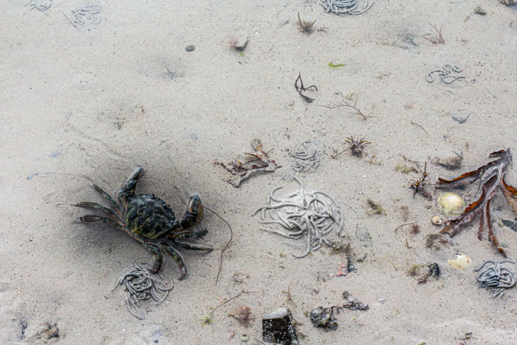
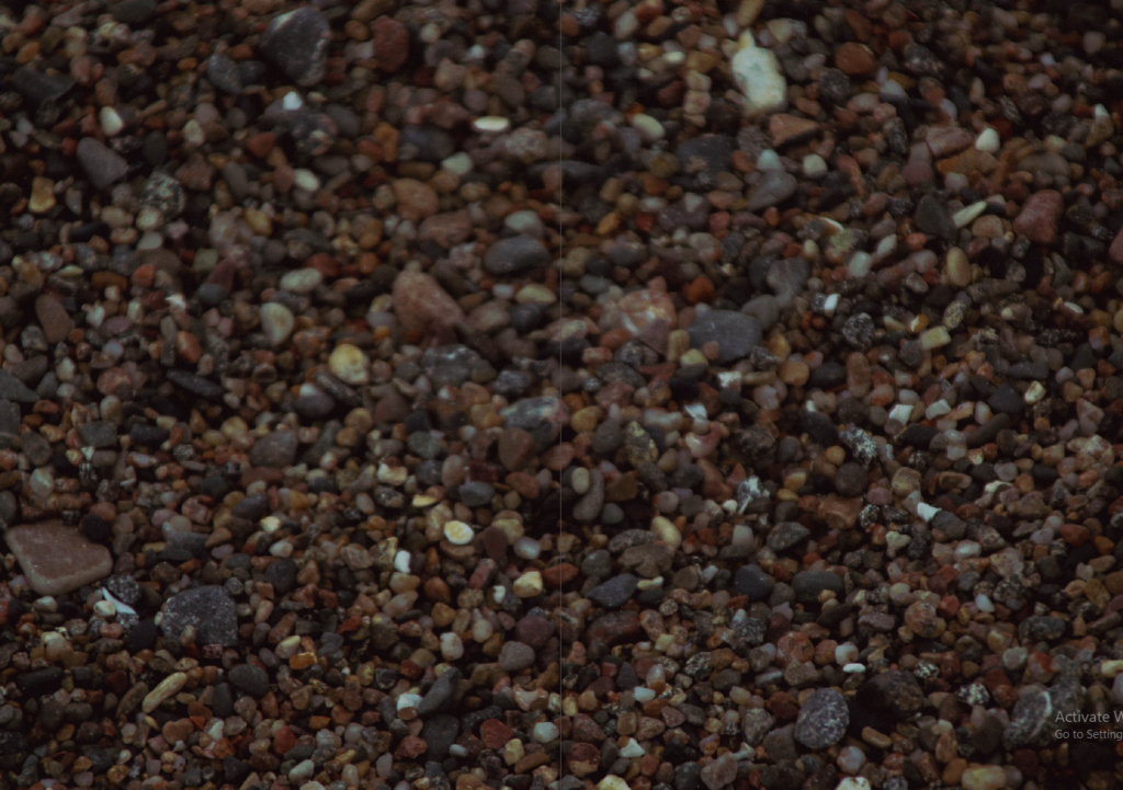
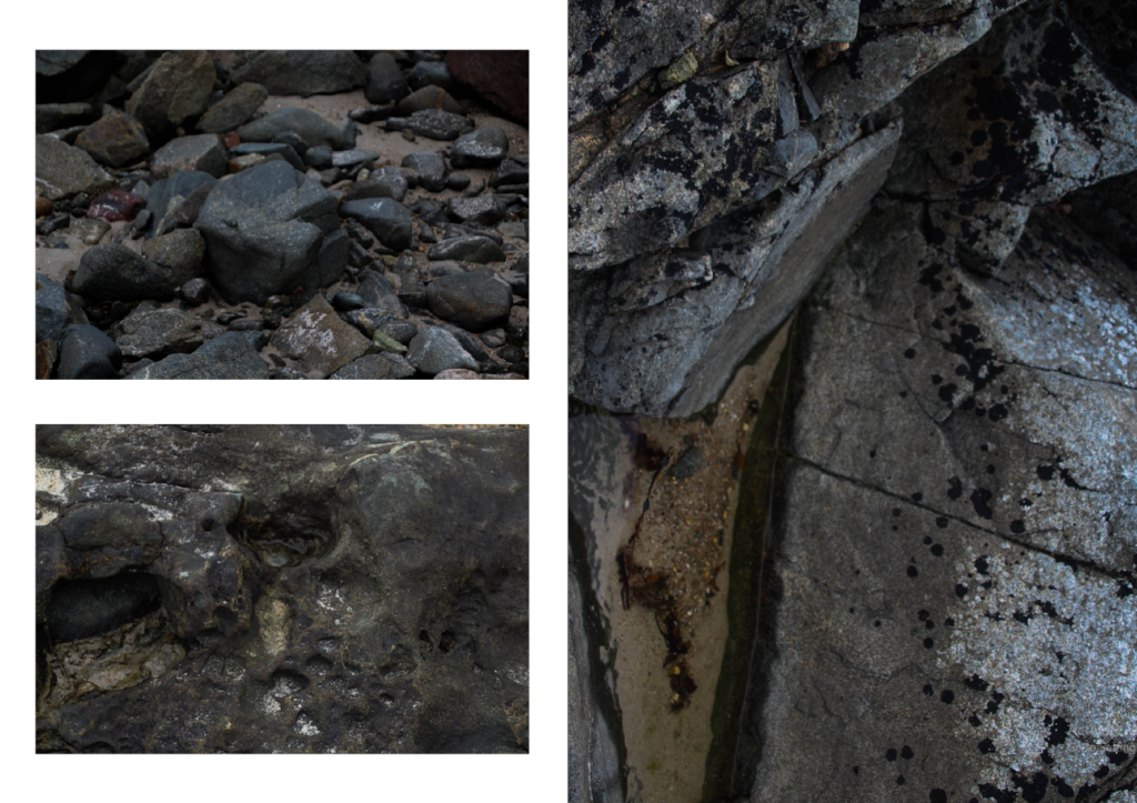
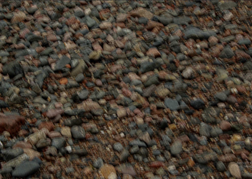
Images: I will be using images from green island throughout this project along with some still life images in order to get a mix of close-ups in both the rocks’ natural environment and in the studio.

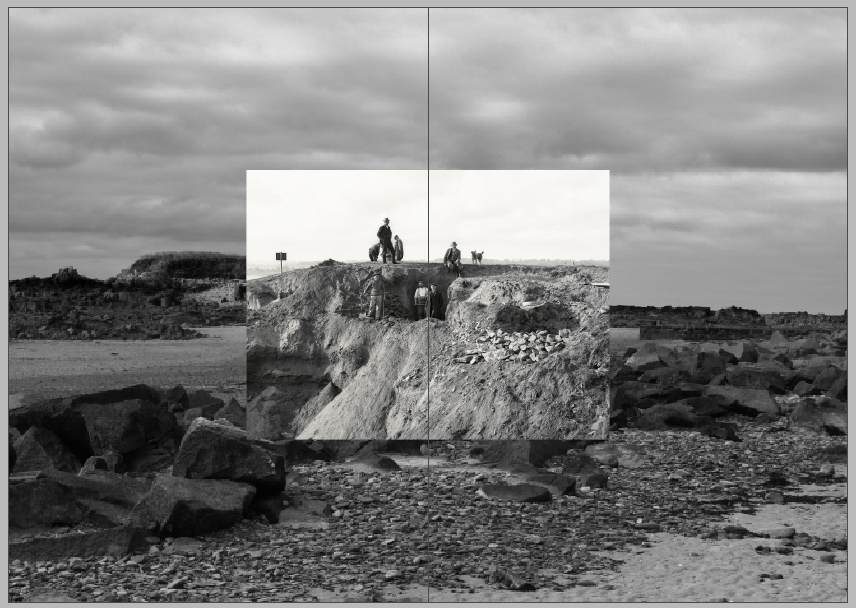
Archives: I will look over some images from the archive and compare them to my own images before deciding whether I want to incorporate any archival images into my zine.

Tests: I want to experiment with typography and possibly write/include a poem in my zine as I think it would help to bring my images together and possibly create more meaning.

PHOTO-ZINE

Final Image Selection

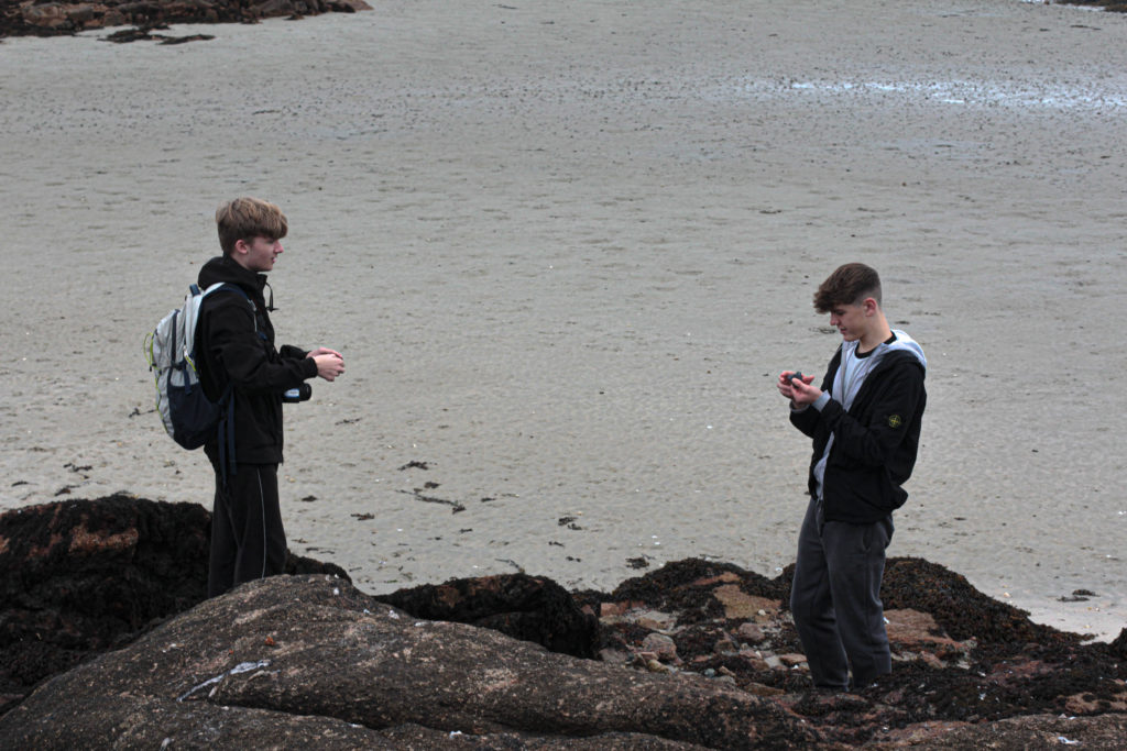
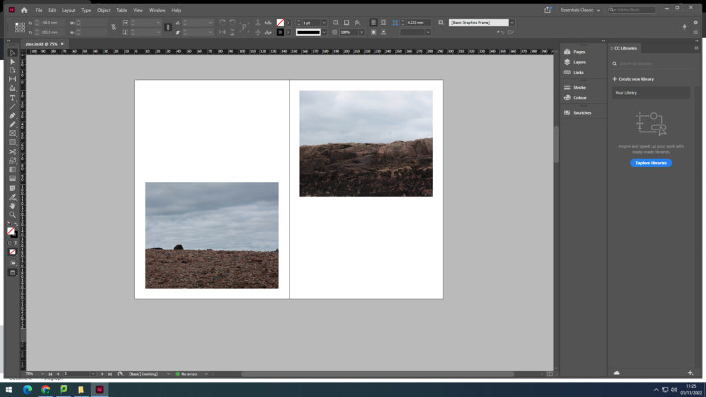
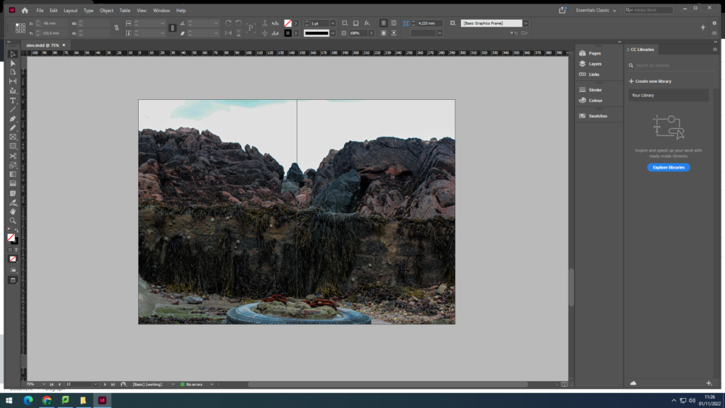
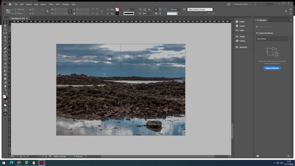
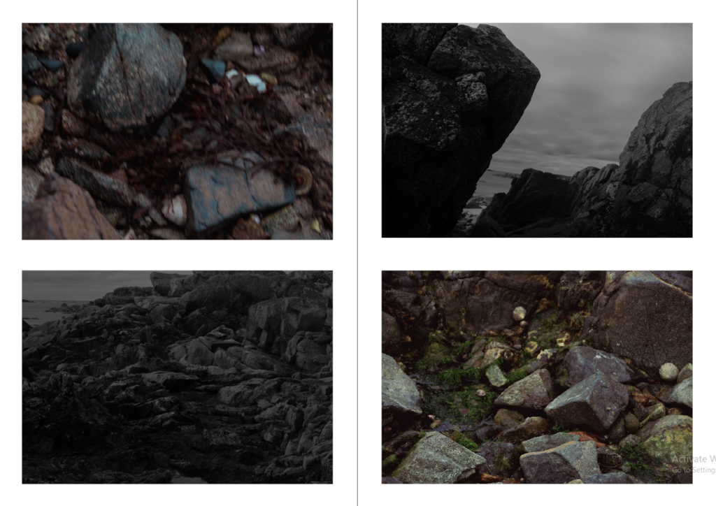
I used images from the La Hocq trip to create my photo-zine as I wanted to keep a similar/the same theme throughout. I edited my images in Lightroom and then decided which images I wanted to use.

Zine Creation

I wanted to make the back and front cover the same image, I did this as I believe it looks very effective

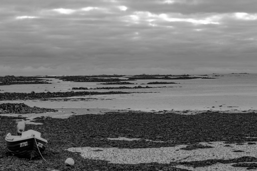
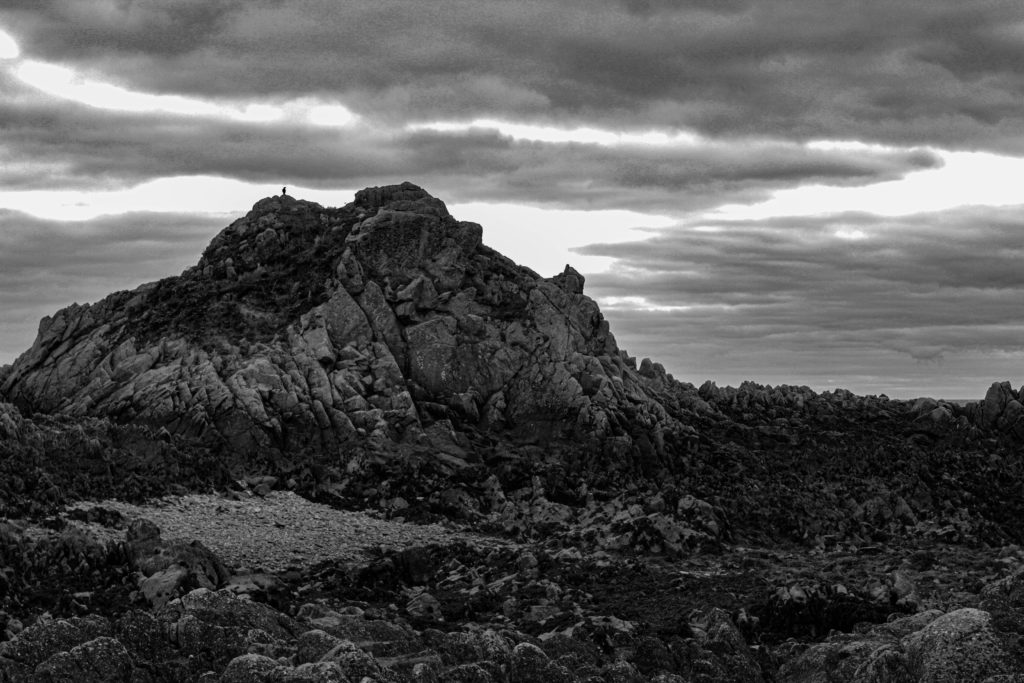
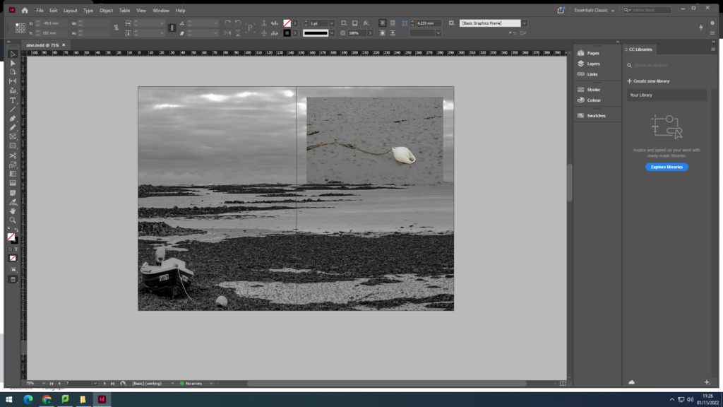
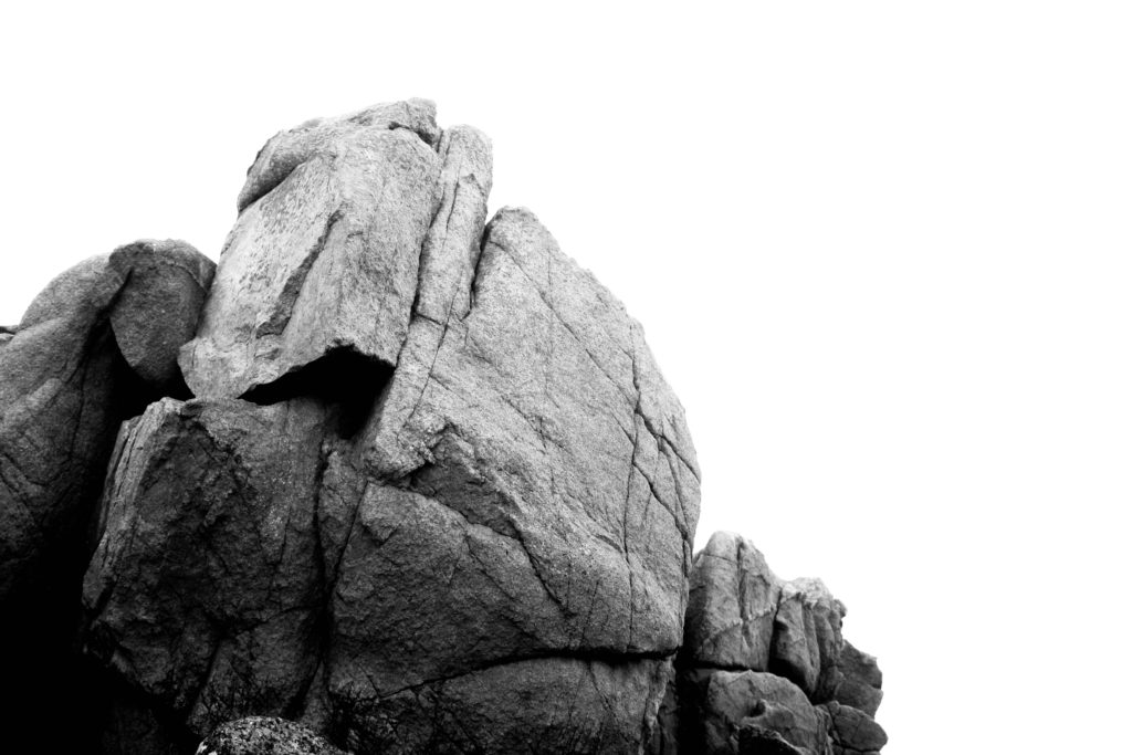
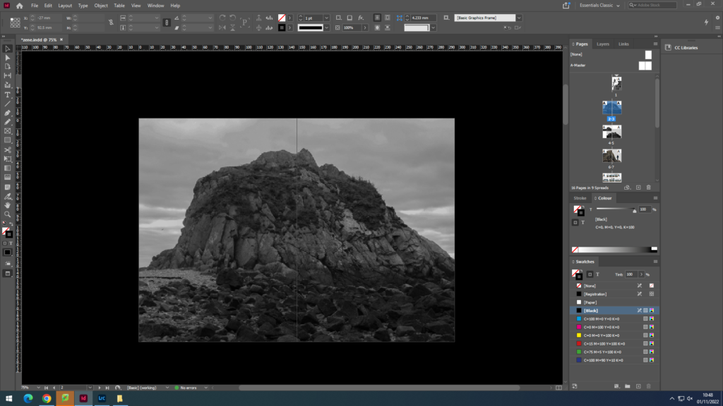
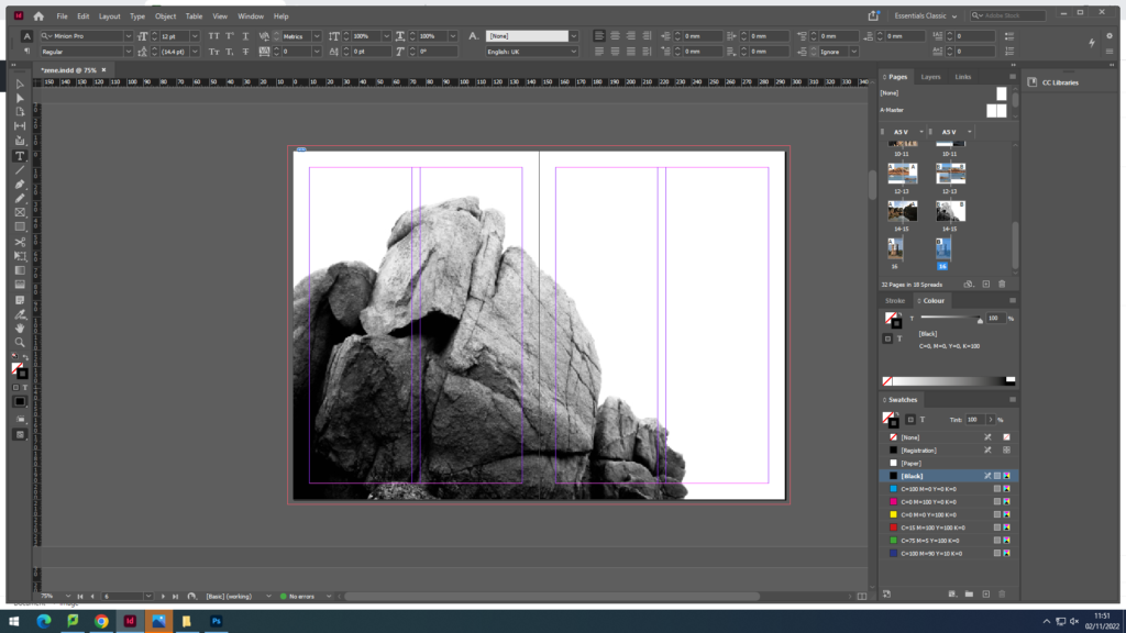
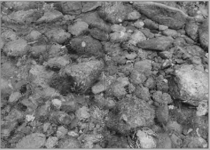
I also wanted a double page black and white spread, I used this image as I believe it is a very powerful image and works very well

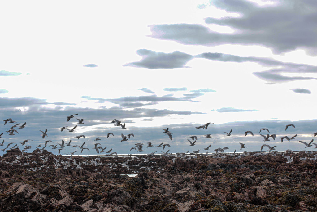
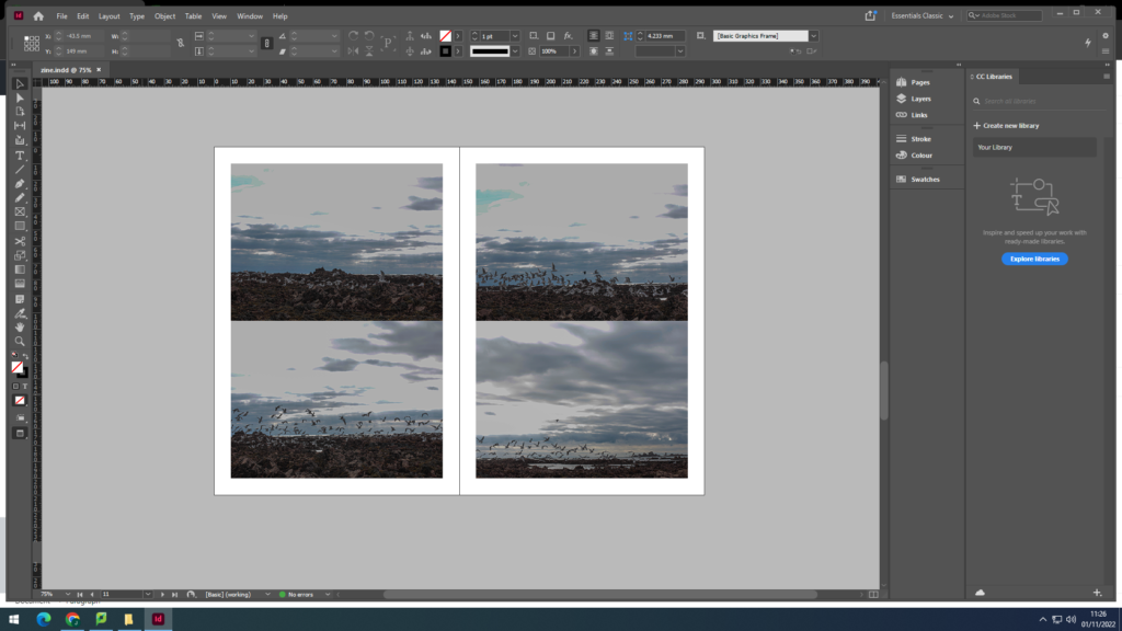
I really liked the idea of portraying the flight of seagulls aking off from the rocks, and I think it worked very effectively

Evaluation

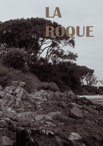
Overall, I believe that my zine came out very well, I kept to the same theme throughout and I think my zine tells a good story. To improve I would take multiple photoshoots instead of just one, this would give me more photos to edit and work with to come out with a better outcome. I named the title La hocq, I did this as this is the location for all the images included in the photo zine and I believe it is a very fitting name.

photo zine research

  1. How you want your design to look and feel
  2. Format, size and orientation
  3. Narrative and visual concept
  4. Design and layout
  5. Rhythm and sequencing
  6. Images and text
  7. Title and captions

What is a photo-zine?

A photo zine is a self-published, often handmade collection of photographs laid out in a magazine style. It can include written text and illustrations as well as photos. They are designed to display and share photo stories. A photo zine can be a single, one-off publication.

A zine is usually a non – commercial, non professional publication, kind of like a magazine but with a twist. The main difference between a magazine and a zine is that zines are not out there to make a profit but, rather, to add other, often unheard voices into the mix.

Examples of created photo-zines:

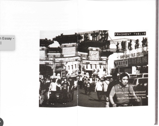
Café Royal Books is a small independent publisher of photography photobooks or zines, and sometimes drawing, solely run by Craig Atkinson and based in Southport, England. Café Royal Books produces small-run publications predominantly documenting social, historical and architectural change, often in Britain, using both new work and photographs from archives. It has been operating since 2005 and by mid 2014 had published about 200 books and zines and they are held in major public collections

Birmingham 1960s photo-zine:

Original photo-zine

Photo-zine moodboard:

UK Rave 1991
Soho 1990
Isle of Wight Festival 1969-1970
Graffiti 1971-1983
Birmingham 1960s

The pages in the photo-zine display the images side by side and create some sort of story. I am going to aim to create a photo-zine with a similar style as the Cafe Royal Books collection of zines that are described through black and white images displaying the history of Britain. I am most likely going to have alot of my images included in the photo-zine to be shown in black and white to try and follow the style of these older zines.

photo zine

To begin creating this photo-zine I needed to take a range of images from one location. I used images from my La Hocq photo shoot to try and keep a similar theme throughout the whole zine. After editing all my images I then needed to decide which images to use in my photo-zine. i wanted all my images to try and capture the beauty of le hocq

image selection

The images below are all the images contained throughout my 16 page photo-zine.

photo zine creation

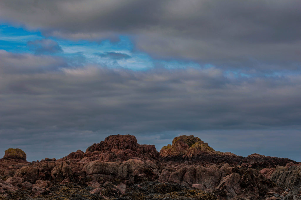
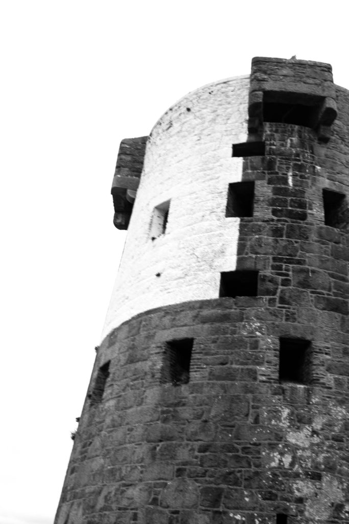
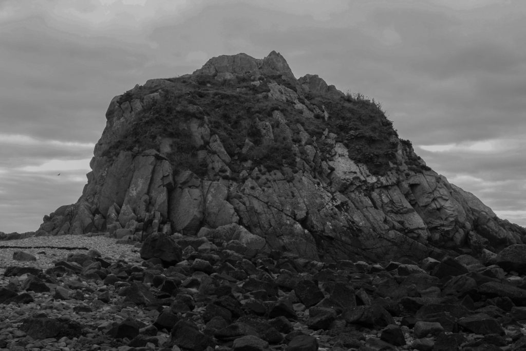
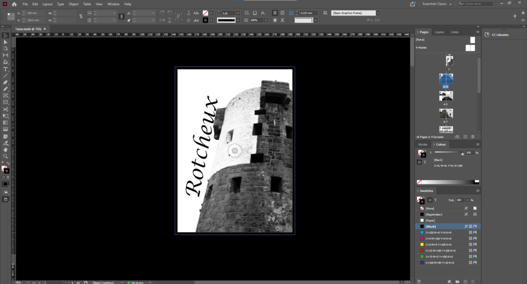
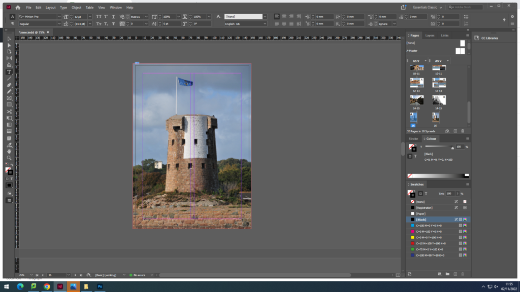
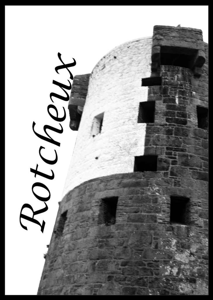
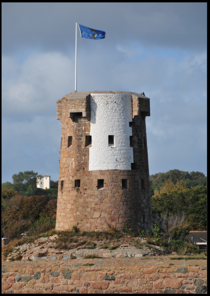
for my front page i wanted to represent le hocqs tower with a strong contrast to the sky

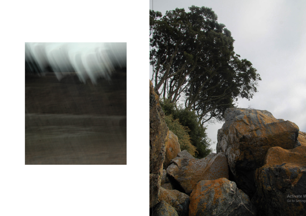
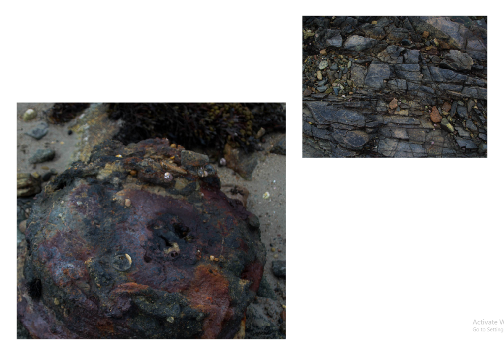
for pages 2-3 i wanted to use a strong image as a double page spread

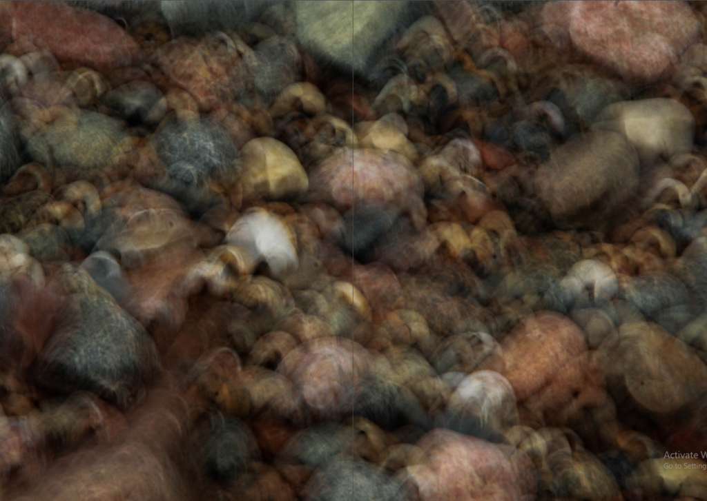
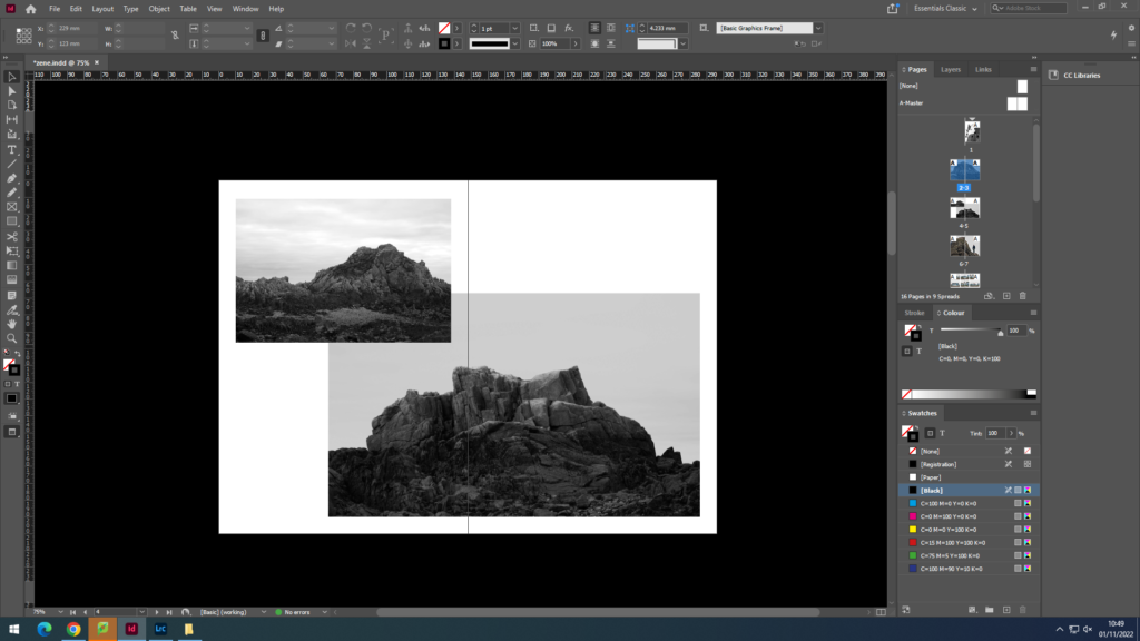
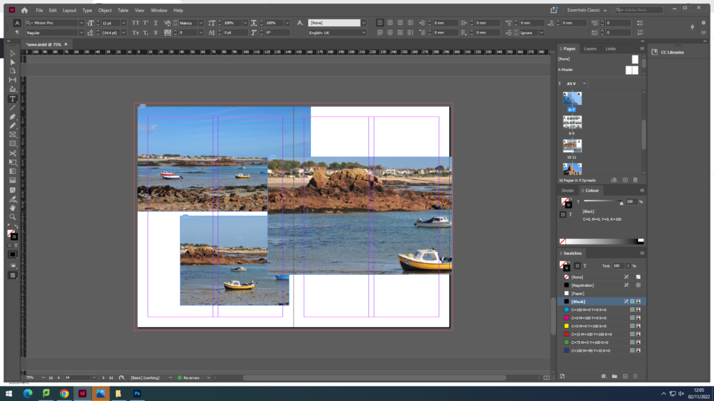
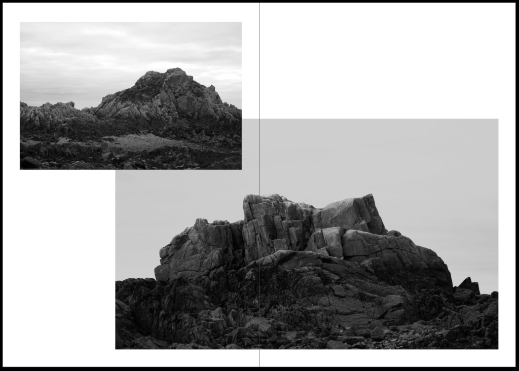
for pages 4-5 i then wanted to create an overlap of similar images the to the first double page spread

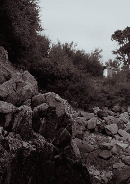
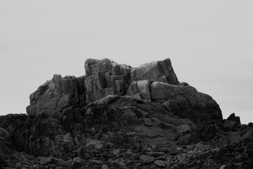
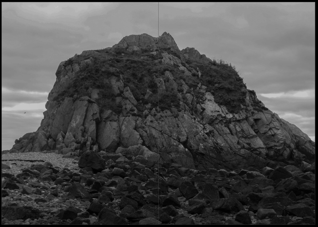
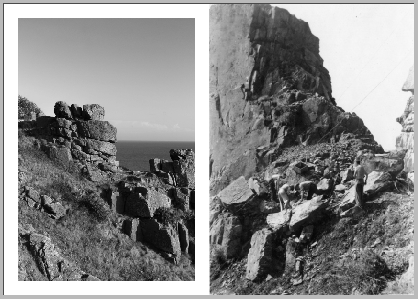
for pages 6-7 i wanted to keep to the black and white and used this image focusing on the rock with a strong contrast to the sky

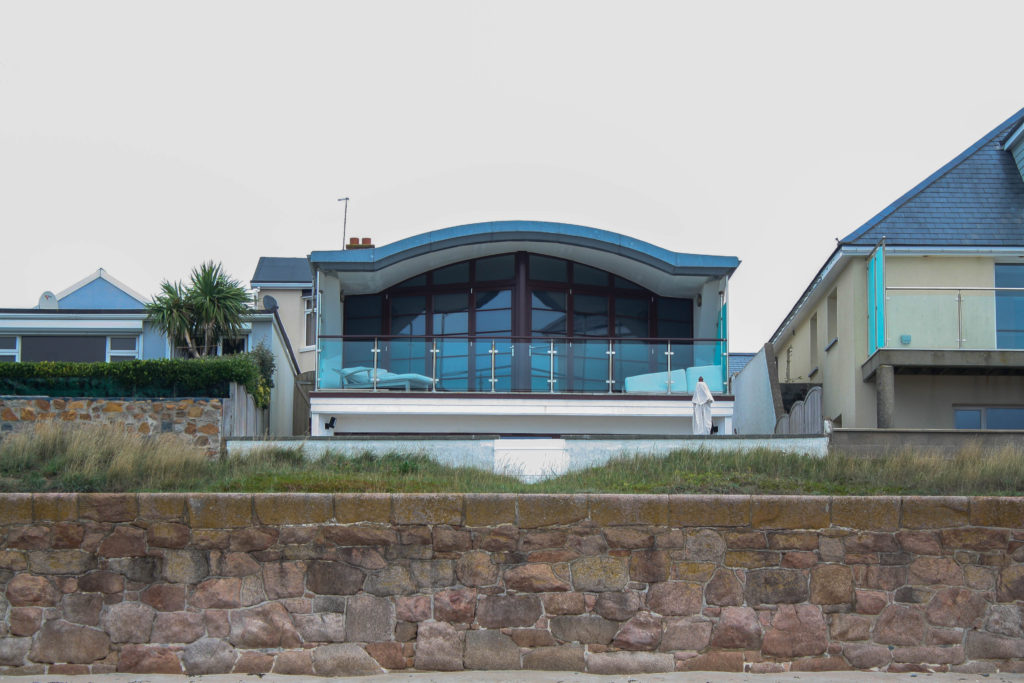
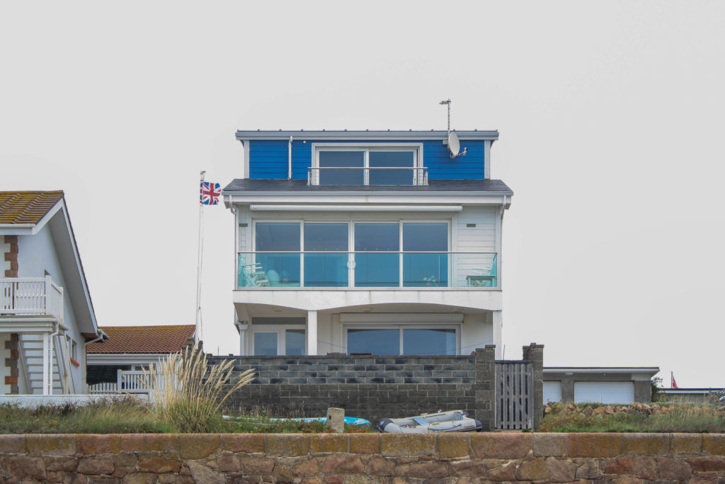
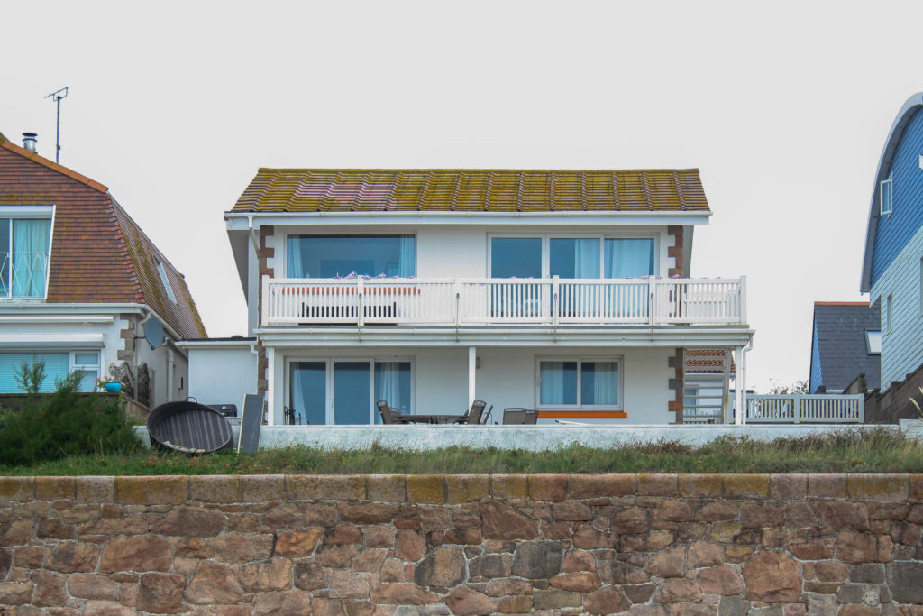
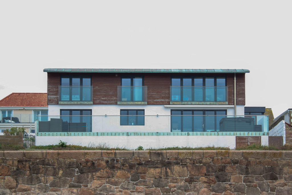
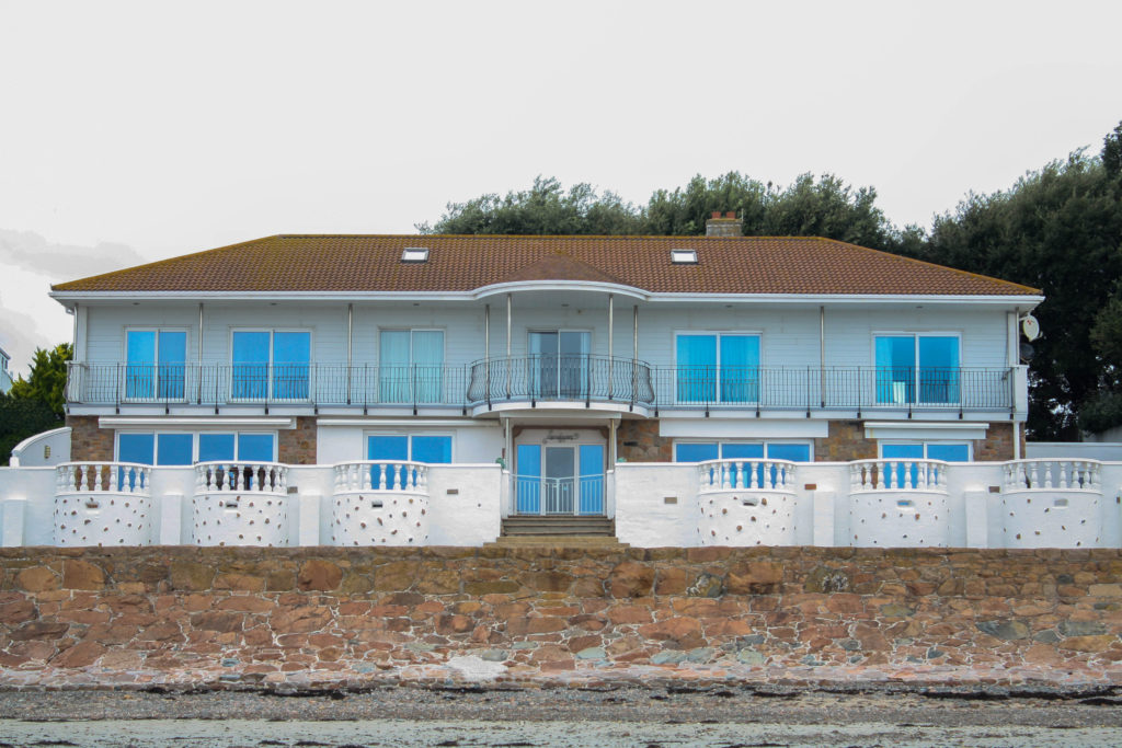
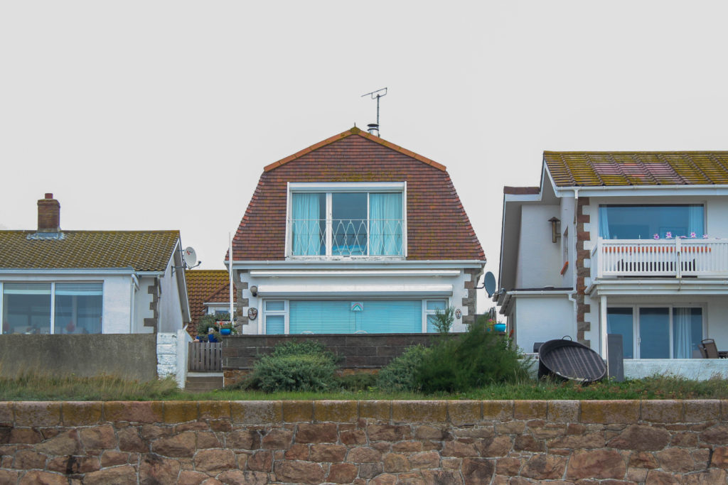
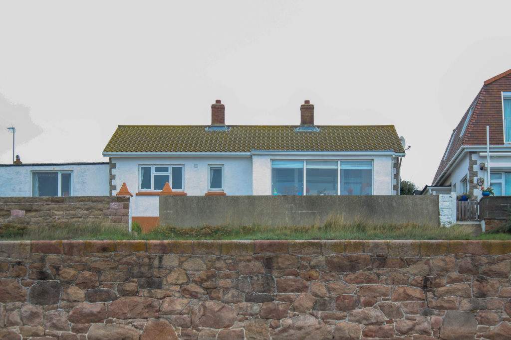
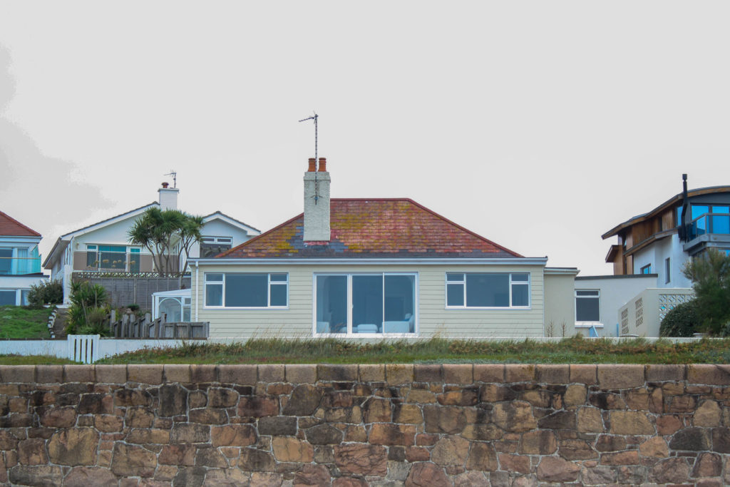
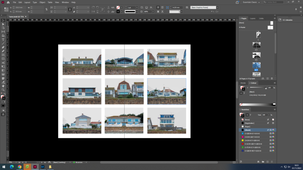
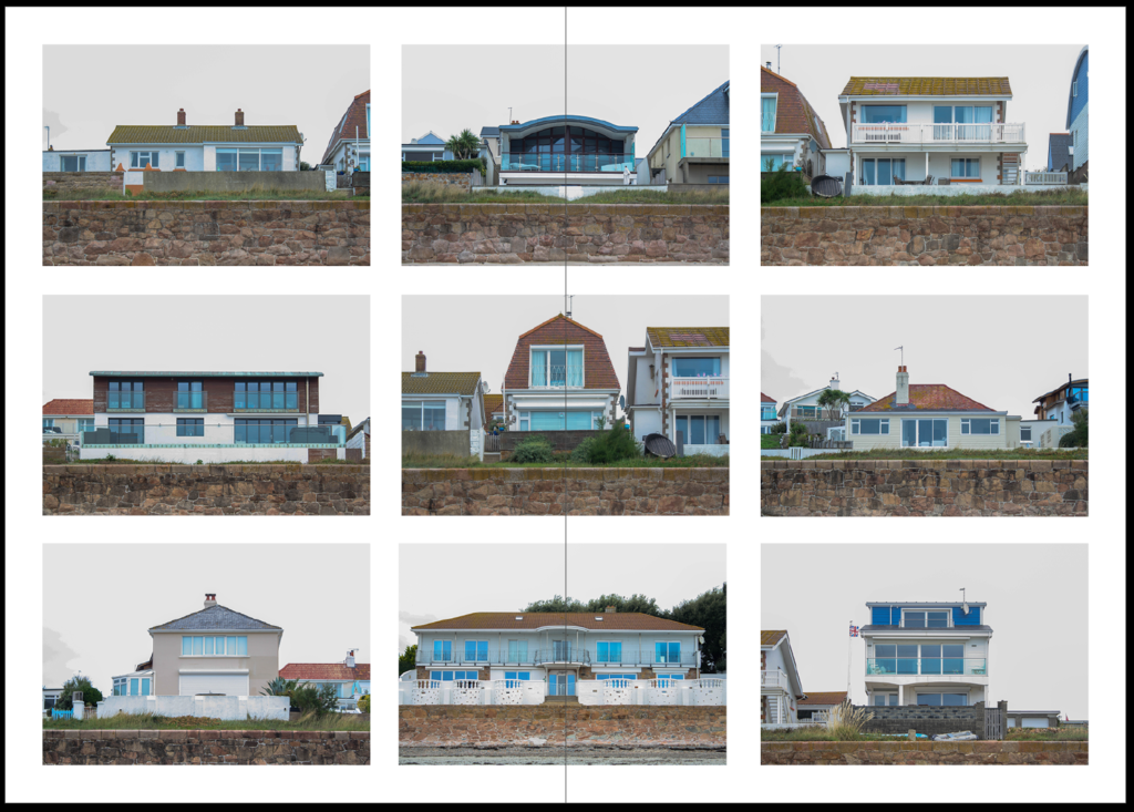
for pages 8-9 i wanted to represent the homes of the locals to le hocq in a 9 picture grid and switching the colour scheme

This image has an empty alt attribute; its file name is image-34-1024x576.png

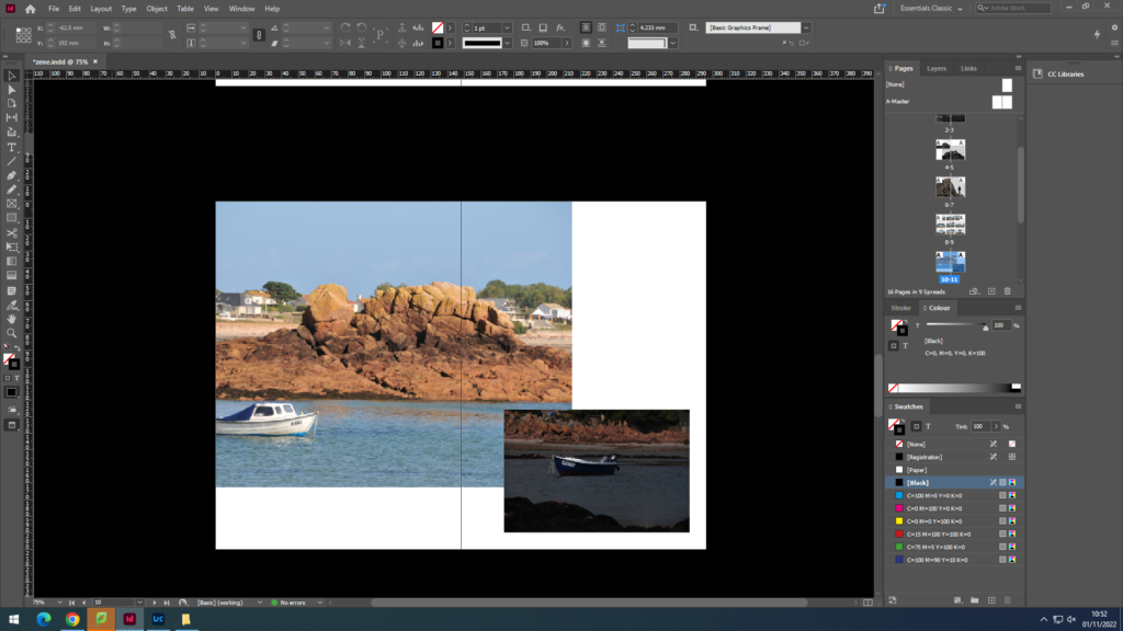
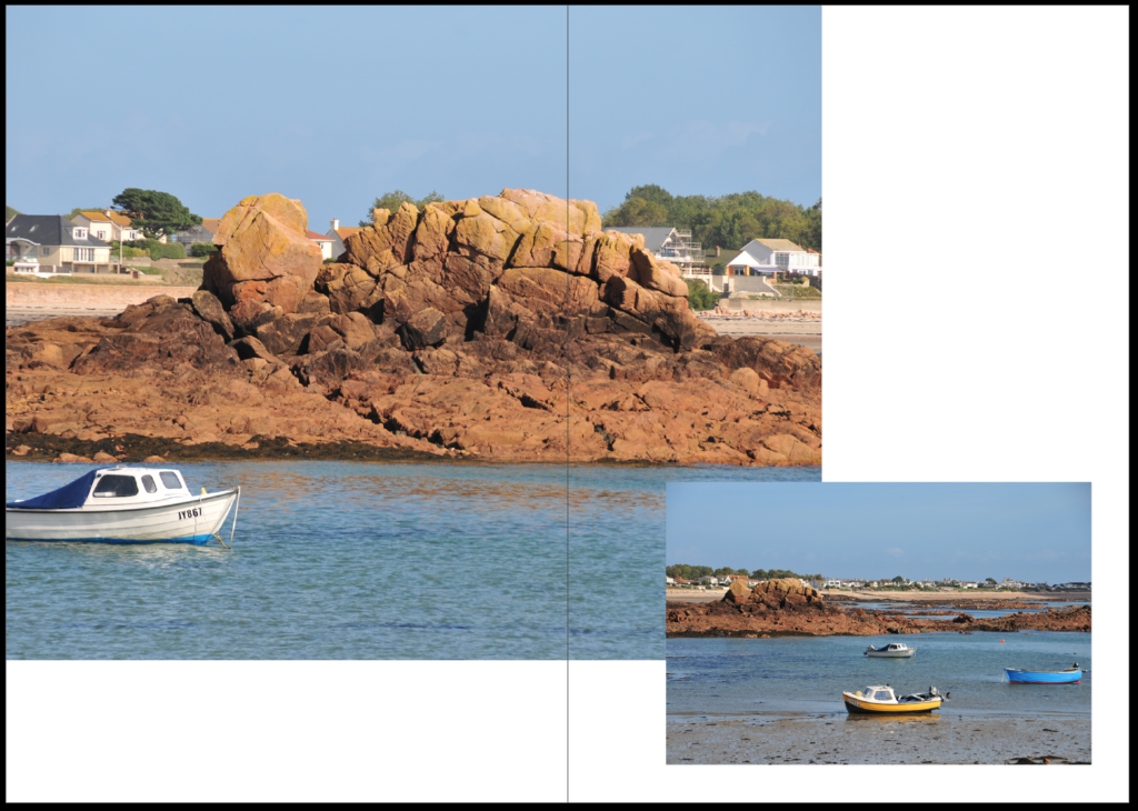
pages 10-11 i used 2 different coloured images contrasting each other showing the boats

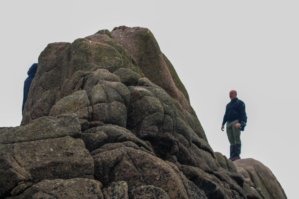
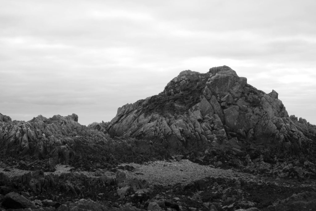
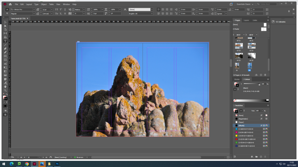
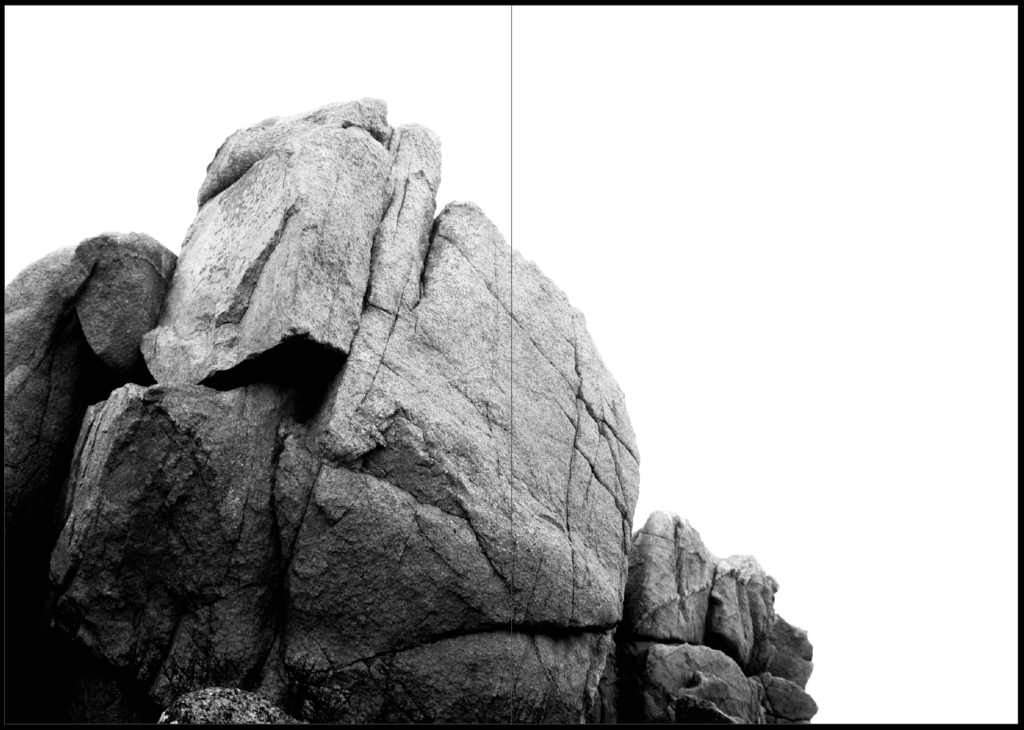
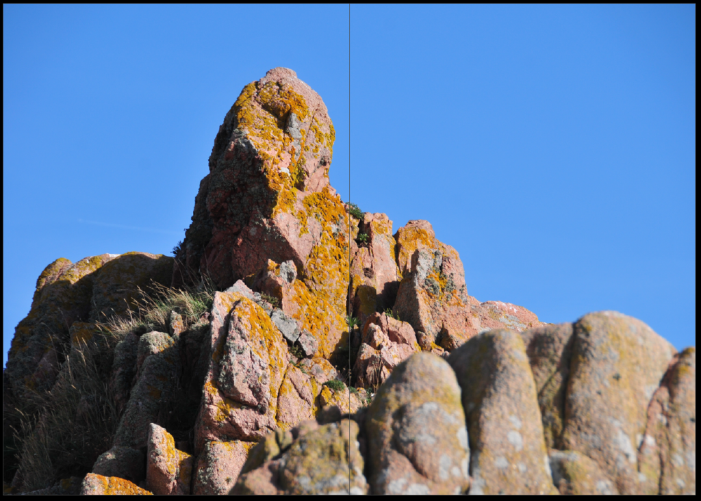
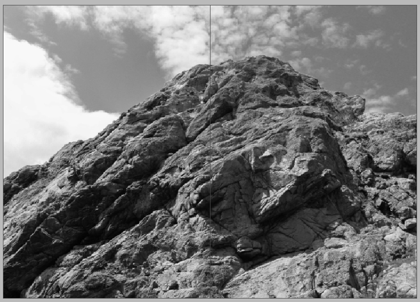
for pages 12-13 i used a double page spread focusing on the rock peak

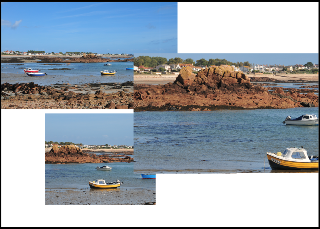
pages 14-15 i used 3 more images of boats in a juxtaposition layout showing the white spaces

for the back cover i used another image of le hocq tower linking back to the front page

FINAL PHOTO ZINE

EVALUATION

Overall, I am very happy with how my final zine turned out. I kept a similar theme throughout the pages of the zine with every picture inside being representing le hocq. The name of my zine, Rotcheux, which is Jèrriais for rocky which i tried implementing in the way that all the images included were taken. I really like the layout of the images with some pages having a white space to create more contrast. I used juxtaposition on some pages to change up the style and layout.

Final Zine

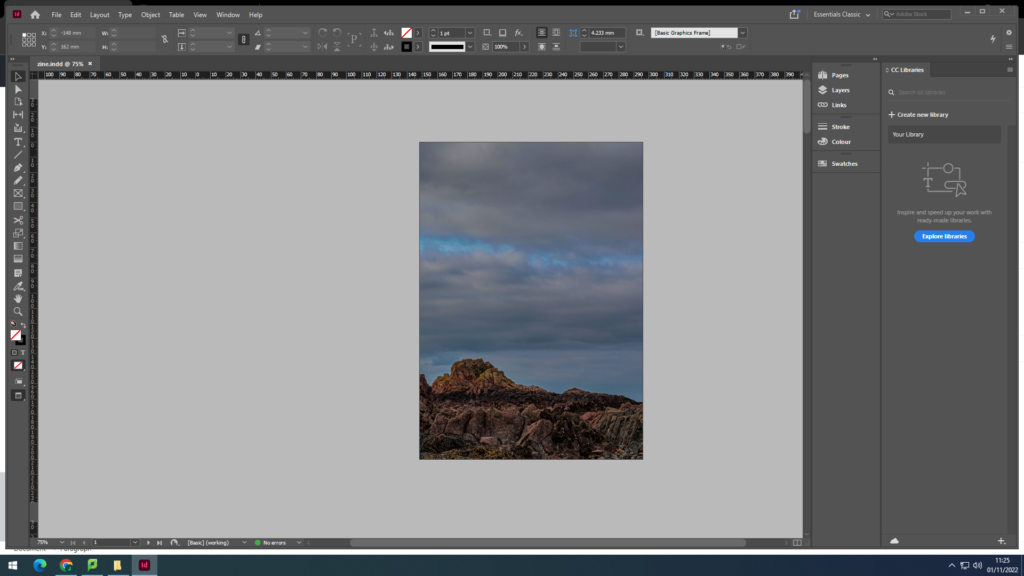
Overall, I think the process of making my zine was quite successful. I really enjoyed using InDesign and putting everything together as it was easy to use and had plenty of layout options. I had a good range of photographs, which made my selection process much easier and less stressful. I really like the layout of the photobook because I think I managed to create a simple and consistent theme through the zine that is not too confusing. I have learned a lot when making this zine and I hope to be able to use my skills further in my next projects.

However, I wish I would’ve been able to use more images from the photo archive and compared them to my ones, but I didn’t have many options. I do think that I incorporated the archive images that I used nicely.