
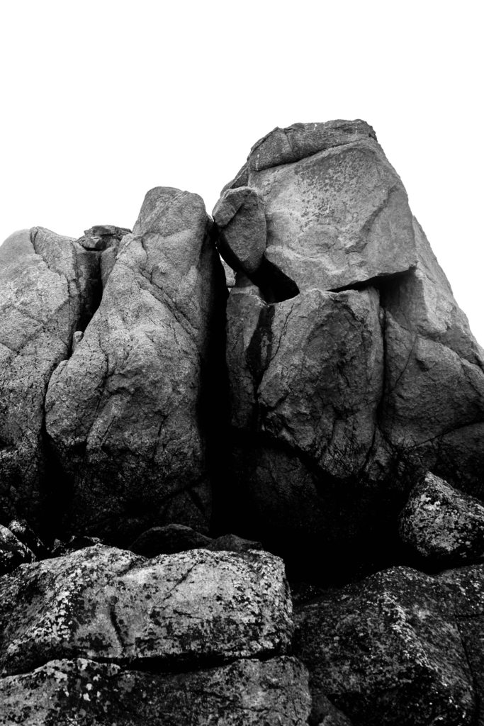
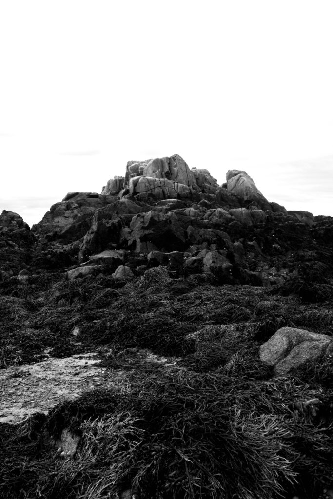
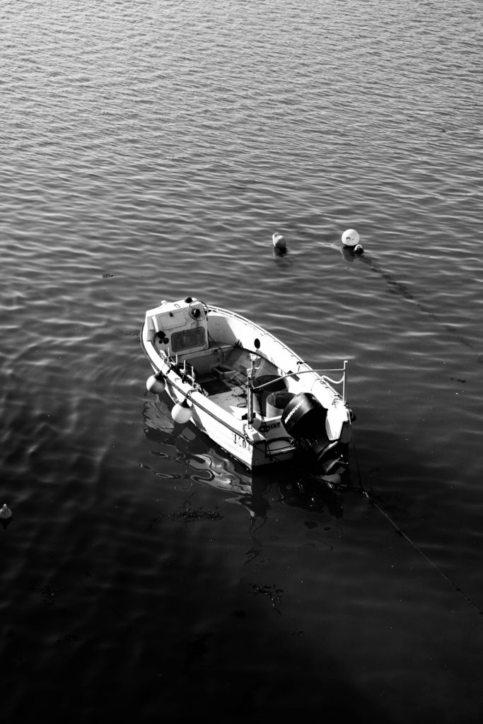
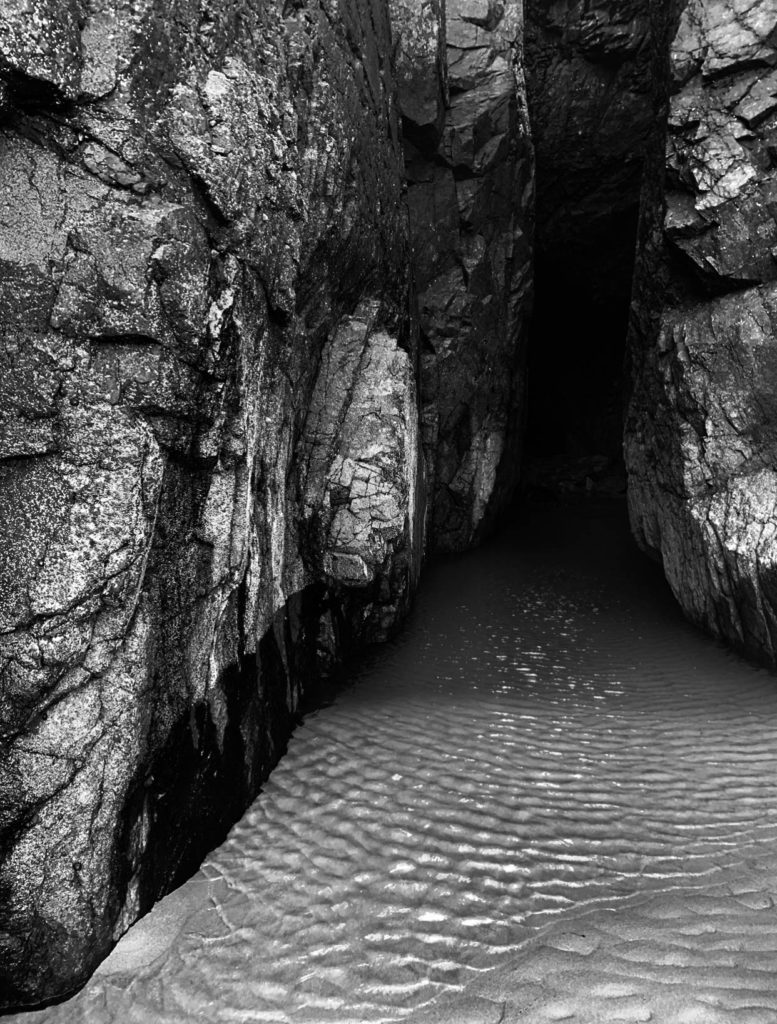
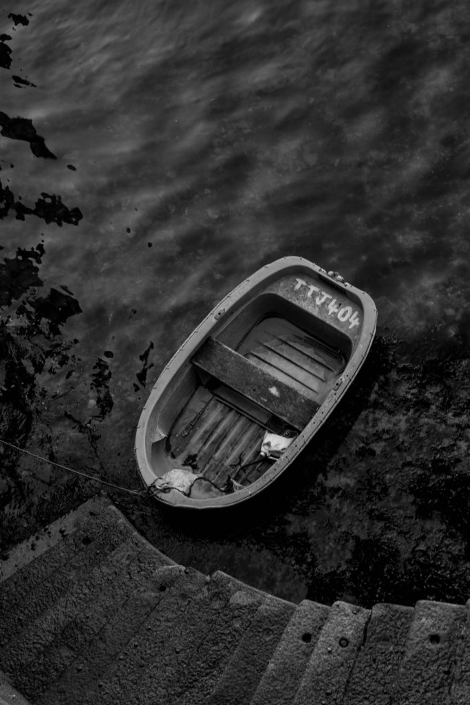
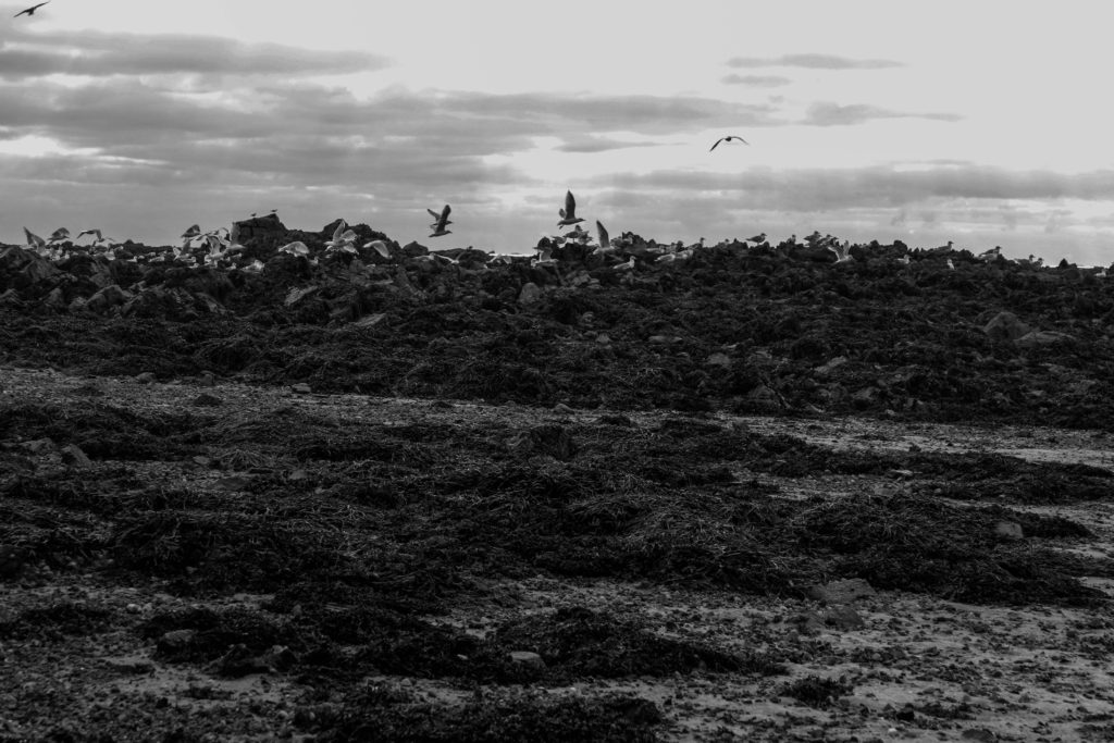
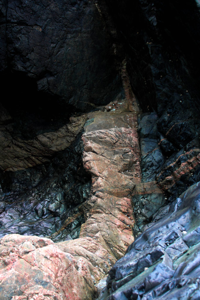
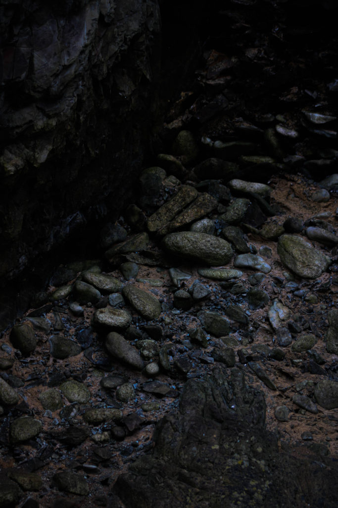
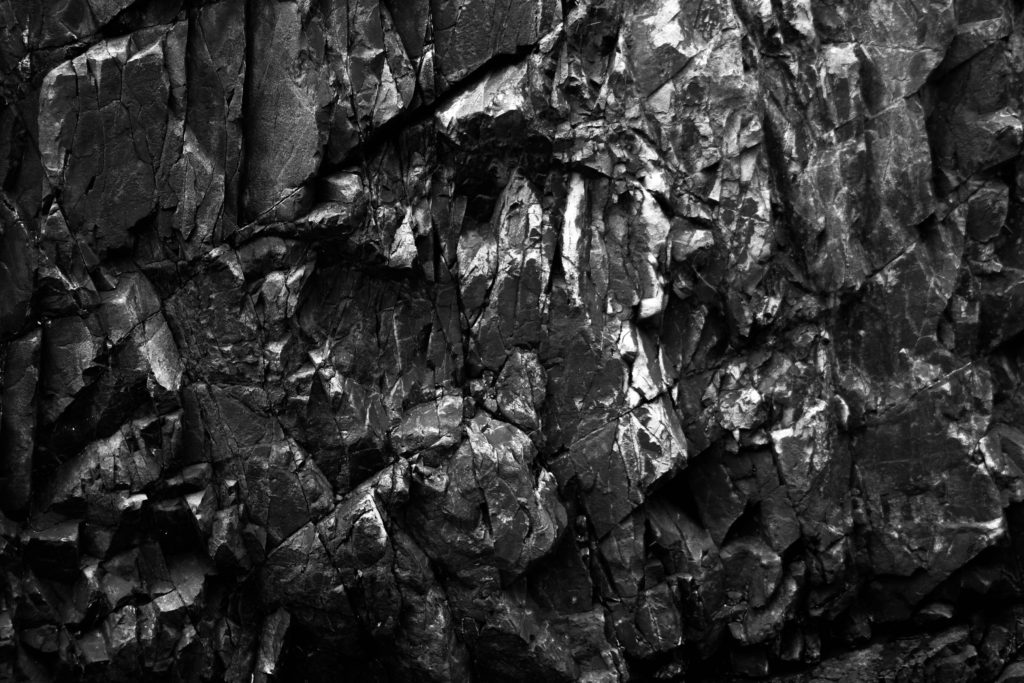
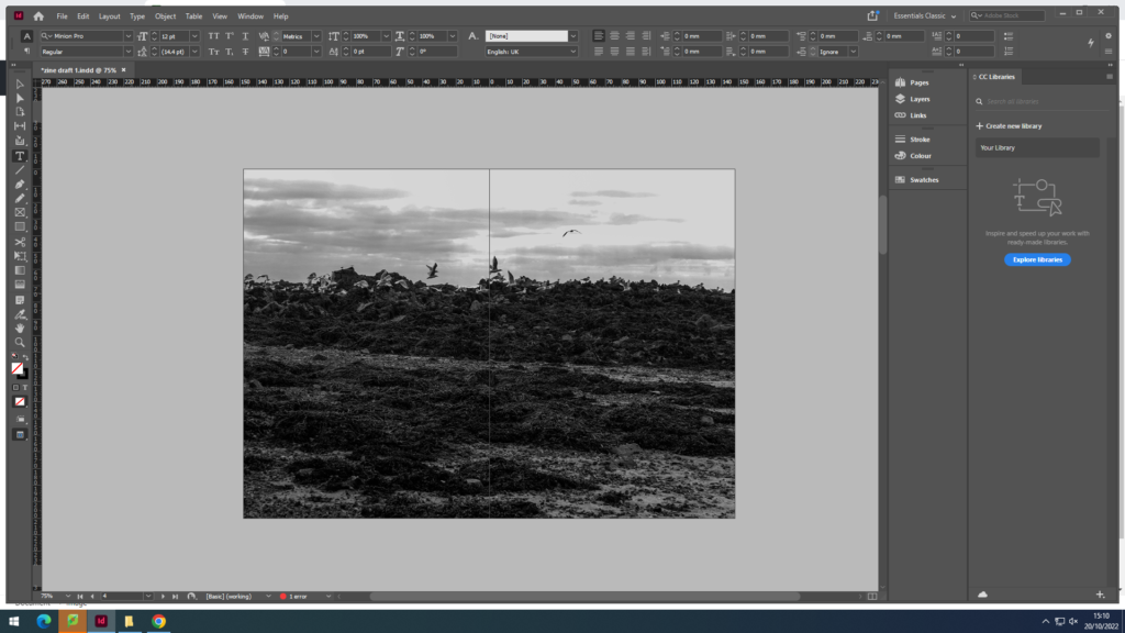
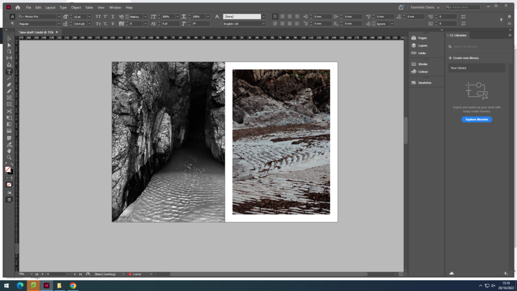
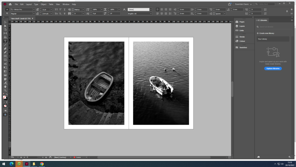
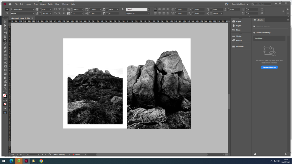
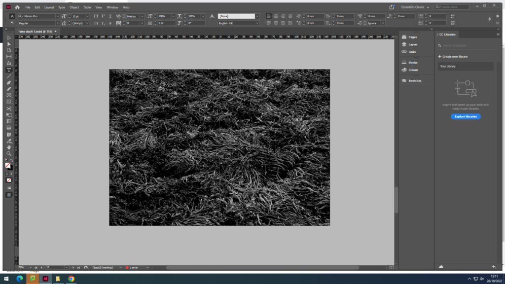
Final image selection
I chose these images as they all follow a similar theme of texture and patterns.


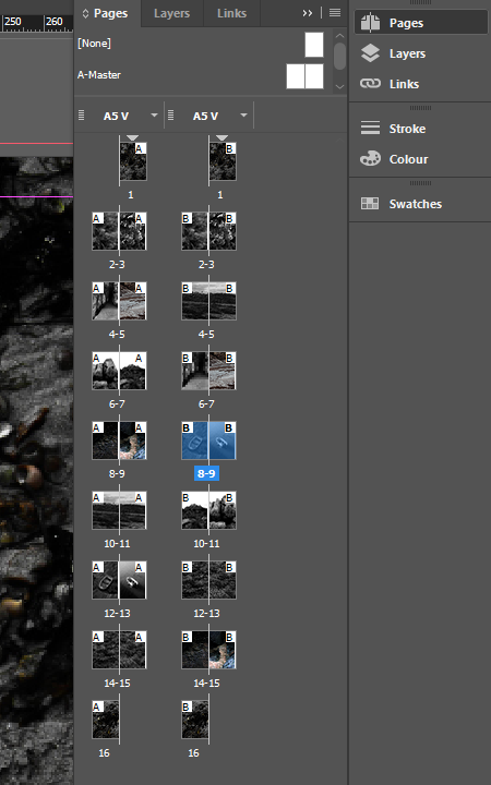
I have created 2 possible layouts for my zine in order to change, compare and get the best results.
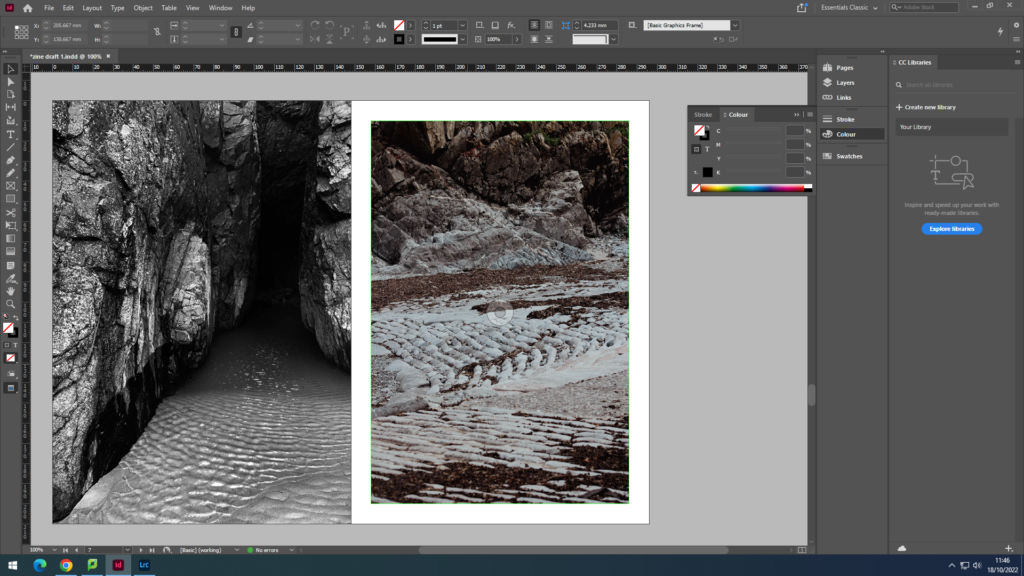
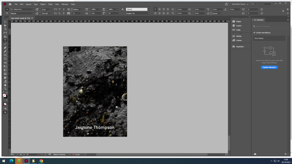
First zine draft
my first zine follows a pattern of having a white boarder around all the images, I like this style as it looks very clean. However, it lacks difference throughout the zine and makes it quite boring.

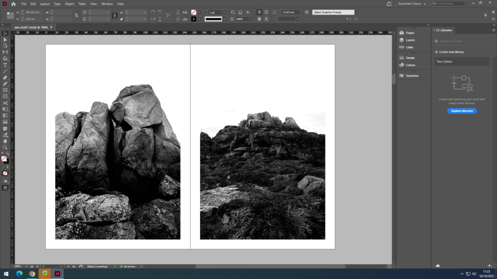
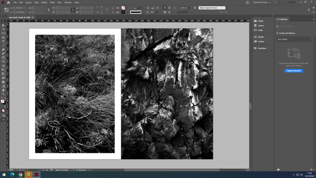
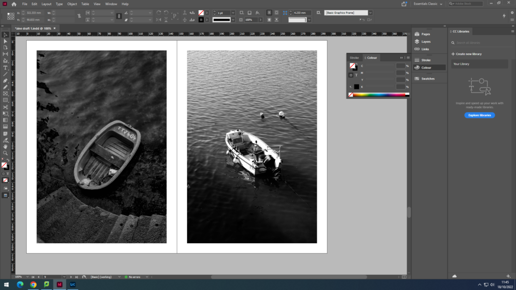
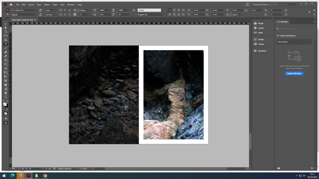
My second zine draft
for my second draft, i have decided on a pattern of having some with a border, and some without to create difference and fluidity throughout the zine.

Within my zine I will be including an image from Guiton to link to our study.
Final product
Evaluation
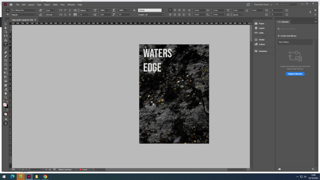
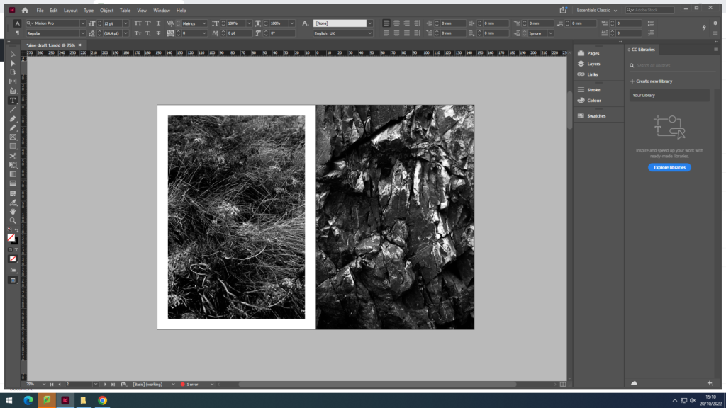
I named by zine ‘Waters Edge’ it tells the story of the different textures, patterns and general things you would see next to the sea. Within my zine, I follow the black and white style similar to Emile F Guiton to relate to our theme of ‘my rock’. I love my use of textures and patterns which highlight the imperfect natural formations of the earth, and juxtaposing those images with different images, some of which are from different beaches across the island. For example, pages 6 and 7, the ripples of water juxtaposes with the sand ripples of the slip. In my printed zine, some of the pages are slightly wonky and slightly shows the white boarder where it isn’t meant to be, to improve this next time, I would thoroughly check that all my pages are lined up straight before folding and stapling.