
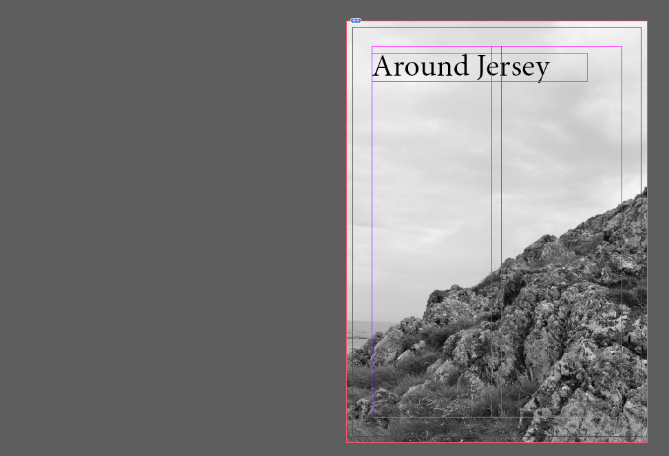
InDesign Settings for the Zine:
Create new document
width: 148mm
height: 210
pages: 16
orientation: portrait
columns:2
column gutter: 5mm
margins: top, bottom, inside, outside: 10mm
bleed: top, bottom, inside, outside: 3mm
Image Selection:
I started by making a new zine document in InDesign using the settings above. I then went into Lightroom and went through all of my photographs from the “My Rock” project. I wanted my zine to be about the rocks around the island of Jersey, which is why I chose 4 different locations (La Cotte, La Motte, L’Etacq and Gorey) and about 4 images for each location to present in my zine.
My Images:
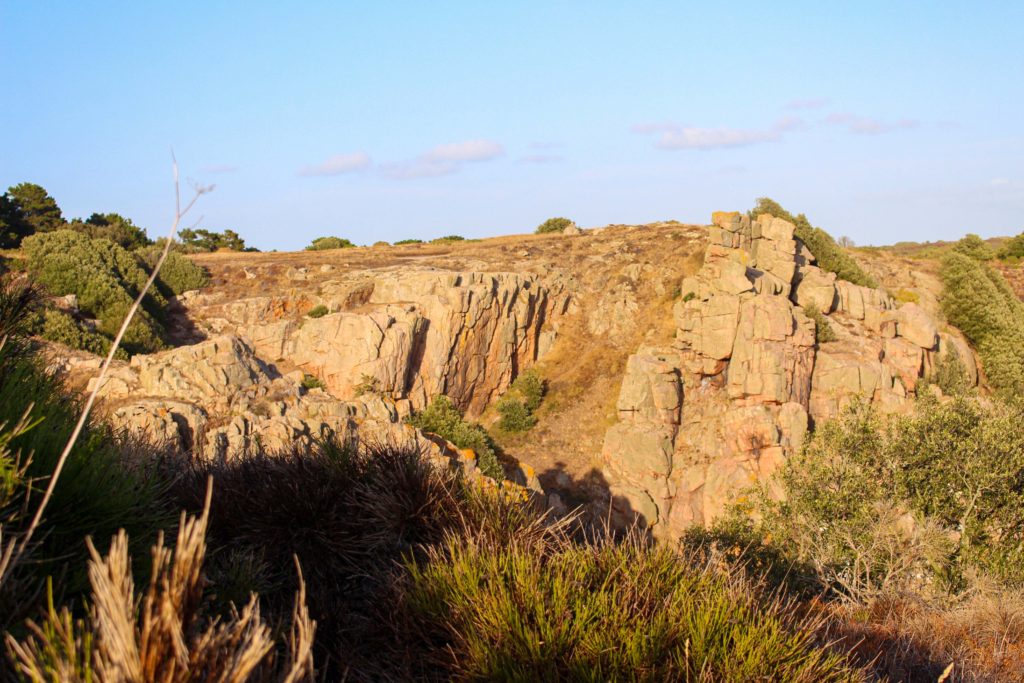
La Cotte 
L’Etacq 
L’Etacq 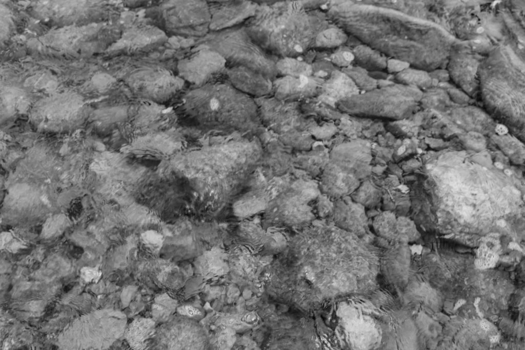
Gorey 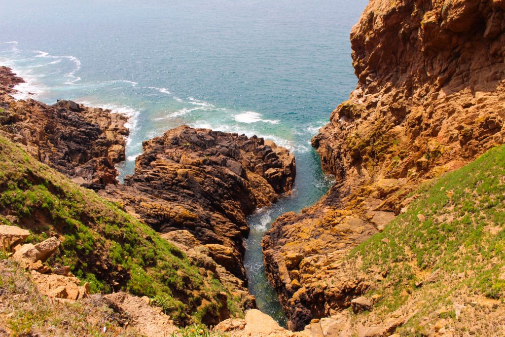
L’Etacq 
Gorey 
La Motte 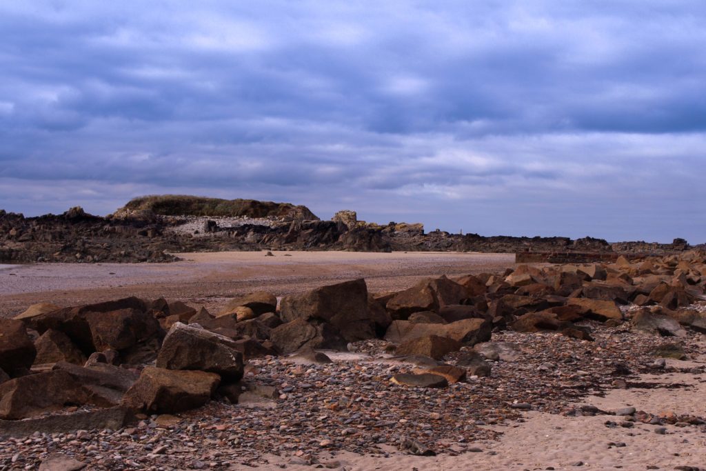
La Motte 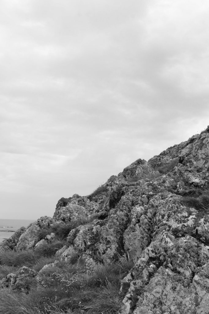
L’Etacq 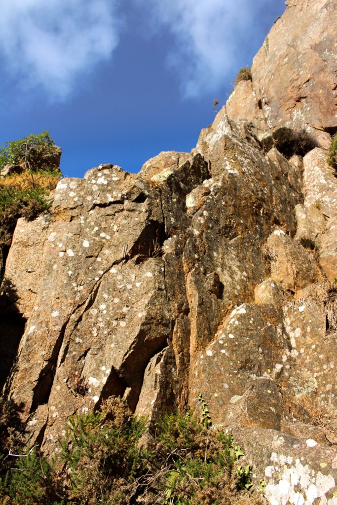
La Cotte 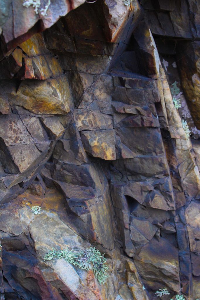
L’Etacq 
La Cotte 
Gorey 
La Motte
Societe Jersiaise Images:


Possible Zine Layouts:
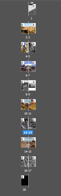
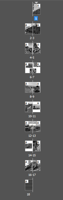
Layout 1:
1 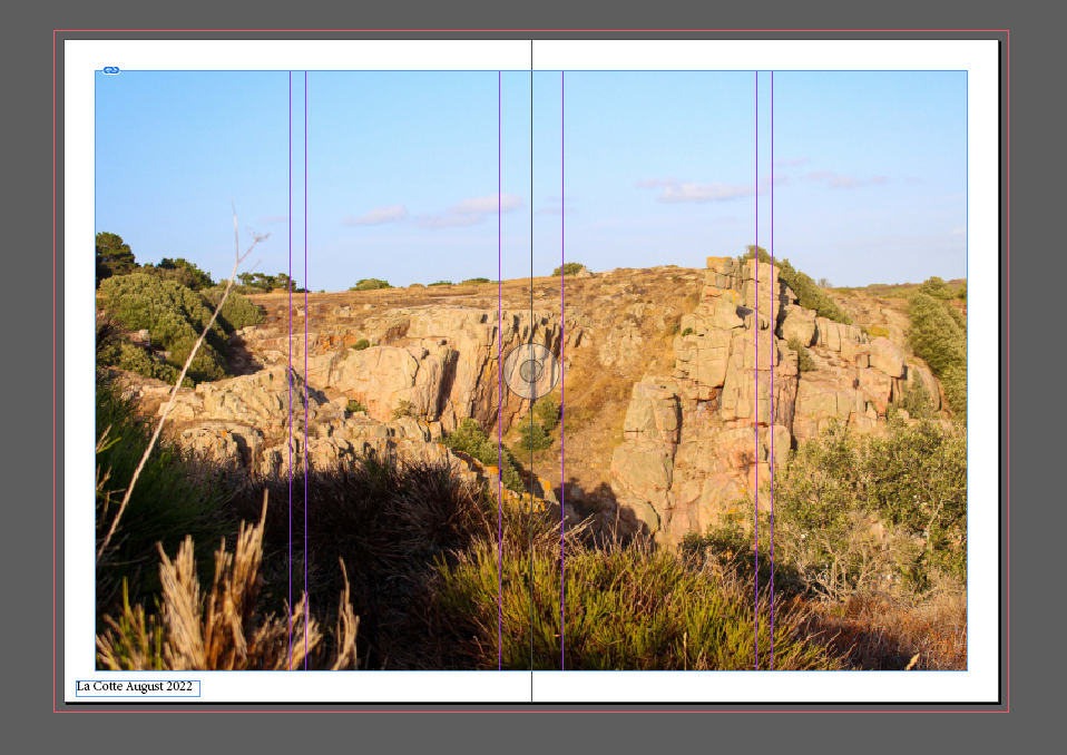
2,3 
4,5 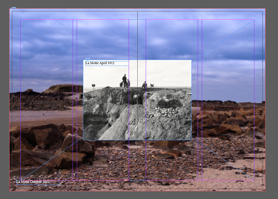
6,7 
8,9 
10,11 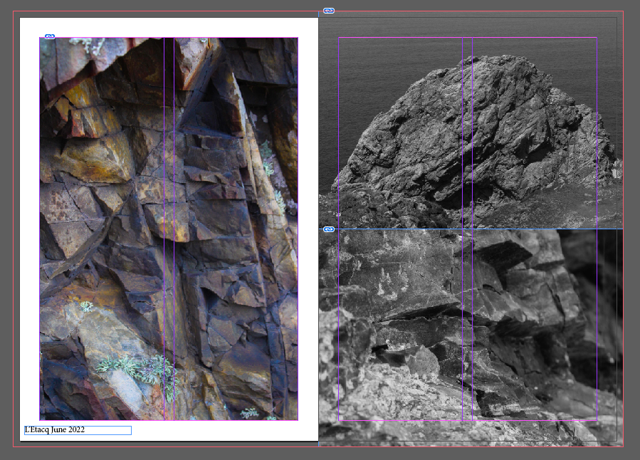
12,13 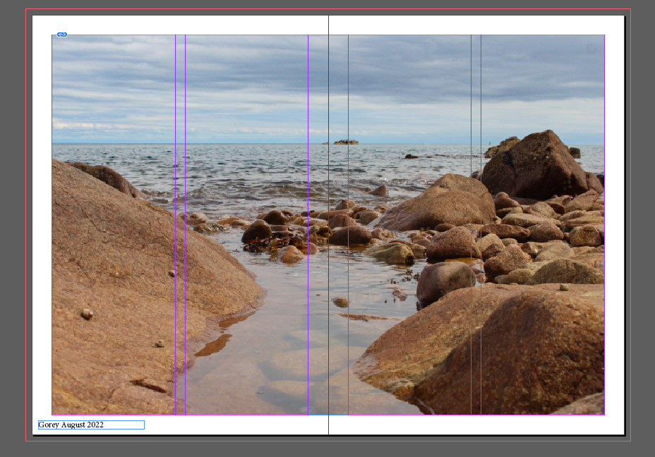
14,15 
16,17 
18
I like this layout because it uses all of my images and clearly shows all 4 locations, however, it also feels like there is too much going on. The pages of the zines are full of images which makes it a bit complicated and not as simple as I wanted at the beginning. Each page has a text in either the right or left corner which informs the viewer where the images were taken and why. I think this is a nice touch but it also clutters the page and the position of the text is inconsistent on each page which I don’t like. The title for this zine is “Around Jersey” which is an okay title because it truthfully says what the zine is about, but it’s also boring. I feel like the back cover should also be something more than just a black image because it makes the zine look unfinished. Even a little story/poem on what the zine is about would look nice at the back to make it more interesting.
Layout 2:
name is at the bottom of the page in the middle 
name is on the right bottom corner and title is on the left sideways (I like this one the most) 
name is kept on the right and title is on the top left side 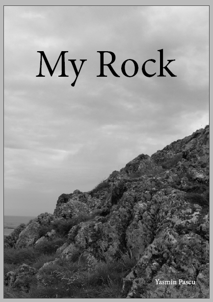
name is kept on the right and title is in the middle

1 
2,3 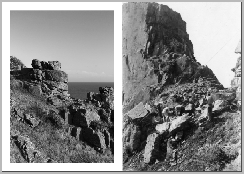
4,5 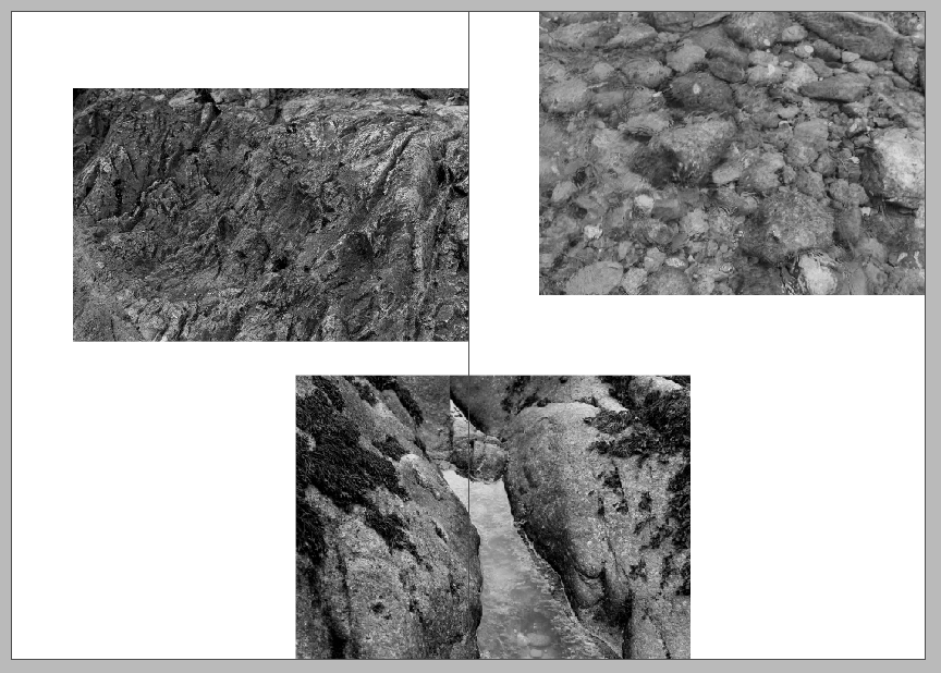
6,7 
8,9 
10,11 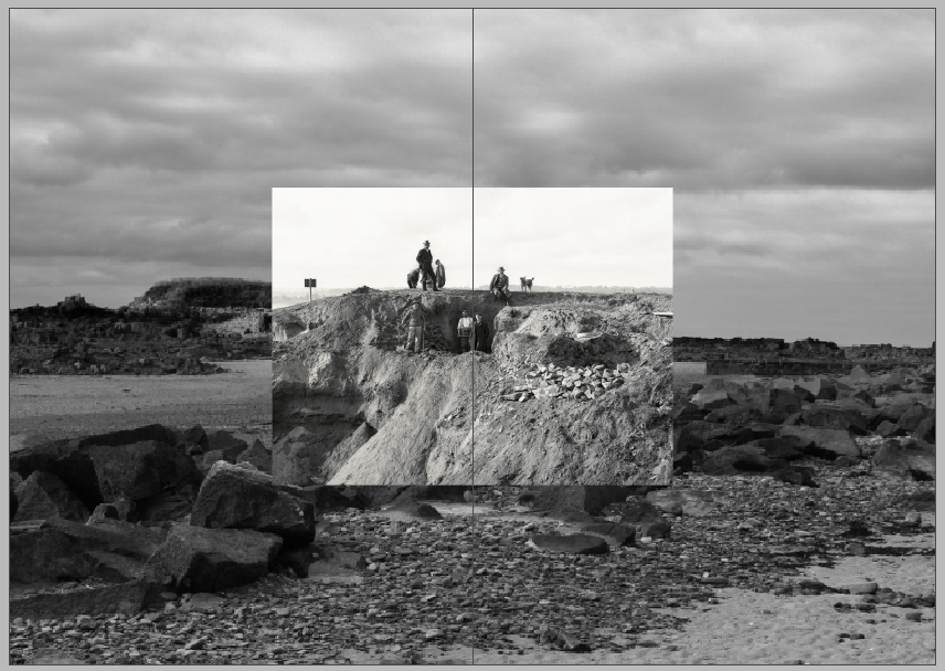
12,13 
14,15 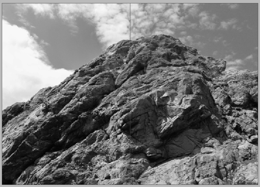
16,17 
18

old pages 6 & 7 
new pages 6 & 7 
new page (7 & 8)
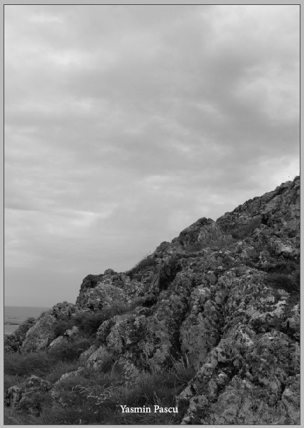
I like this layout more than the other one because it looks simpler and it’s not as cluttered. I think the black and white images makes the zine look more well put together and not as distracting. I managed to use more or less the same images I used in layout 1, which I’m happy about, as well as a few new ones because I wanted the theme to be the same and I didn’t want to change it last minute. I took away the text from each page that informed the viewer about each location because I thought it was bit too much, but I will definitely use it again in a different project because I really liked it. I kept the back cover black because I couldn’t think of anything and added the text “my rock” all over it in grey because that is my title. I changed the title to the name of my project because I thought it would be easier and more fitting.