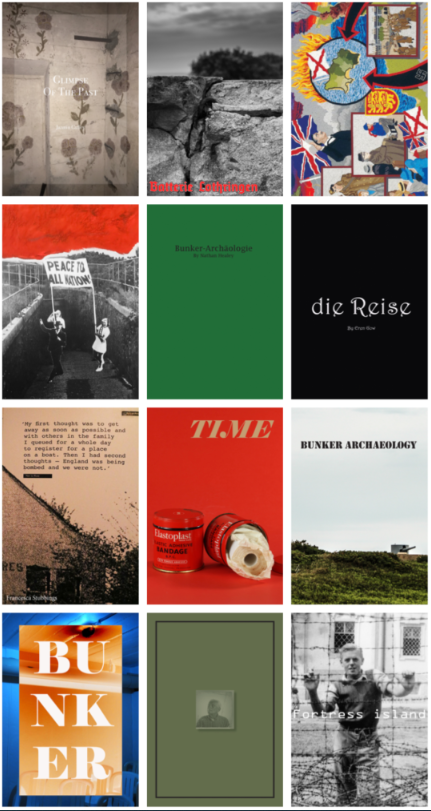
A photography zine, for example, is a tool that photographers can use to tell a visual story, to inform an audience about a specific topic or issue, to showcase and advertise a new idea or simply create a preview of an ongoing project. – Google

Photo zines are a method photographers use to convey information to their viewers in a simple and easy to understand way. They can me constructed with photographs and typography or just photographs. Personally i think that photo zines without writing make a more interesting zine as more is left to the imagination of the viewer.
There are many ways to create a photo zine however the most efficient way is using Adobe InDesign. The software makes it very simple to construct the zine while still having almost every feature a professional photographer would need.
There are many aspects required to make a zine a quality product that people want to look at. The front cover is the most important part as it must be designed to grab the viewers attention. this means it must have the best image displayed to cover the whole front page. There are multiple ways to lay out the images within the zine. Firstly where is a double page spread there the image will cover both pages going all the way to the corners. This is where the photographer would place their best images as it shows off the detail and colour the best. Second is a sing page spread, this is where the photographer would place one image covering just one page of the zine. this means that two images will be next to each other which means the designer must ensure that they go together well and do not contrast too much. Lastly is a framed image. this is when the photographer makes the images smaller than the page so that a boarder whichever colour the print paper will be will appear around the edge. This can show some of the best details in an image as the colours in the photo can be made to contrast the boarder.
