
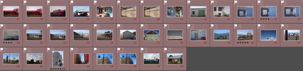
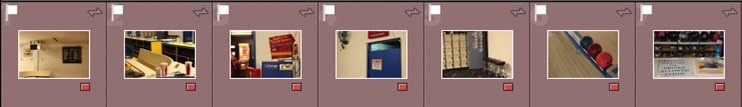
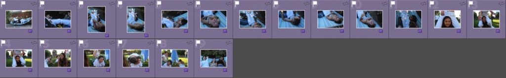
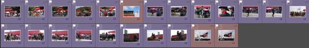
Selection process
After importing my images into lightroom, I separated all my images into subfolders of my Oregon trip for each photoshoot. It was important to organise my images like this as I had a lot of pictures – they were all very different photoshoots and having them separated made my selection process much easier.
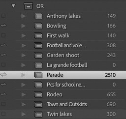
Best images selection
After sorting out my contact sheets and categories for each set of images, I began to filter my images for each photoshoot to pick my best images. In lightroom I used the P and X tools for my best images and images I did not want to keep. I then went through them again, making a new subfolder for my best images, with colour coding, and a star rating: 4 stars (good image, one of my best) and 5 stars (one of my best images, important to include in my final outcome). I used different colour coding to filter different kinds of best images: green for rural landscapes, red for urban landscapes, and purple for portraits.
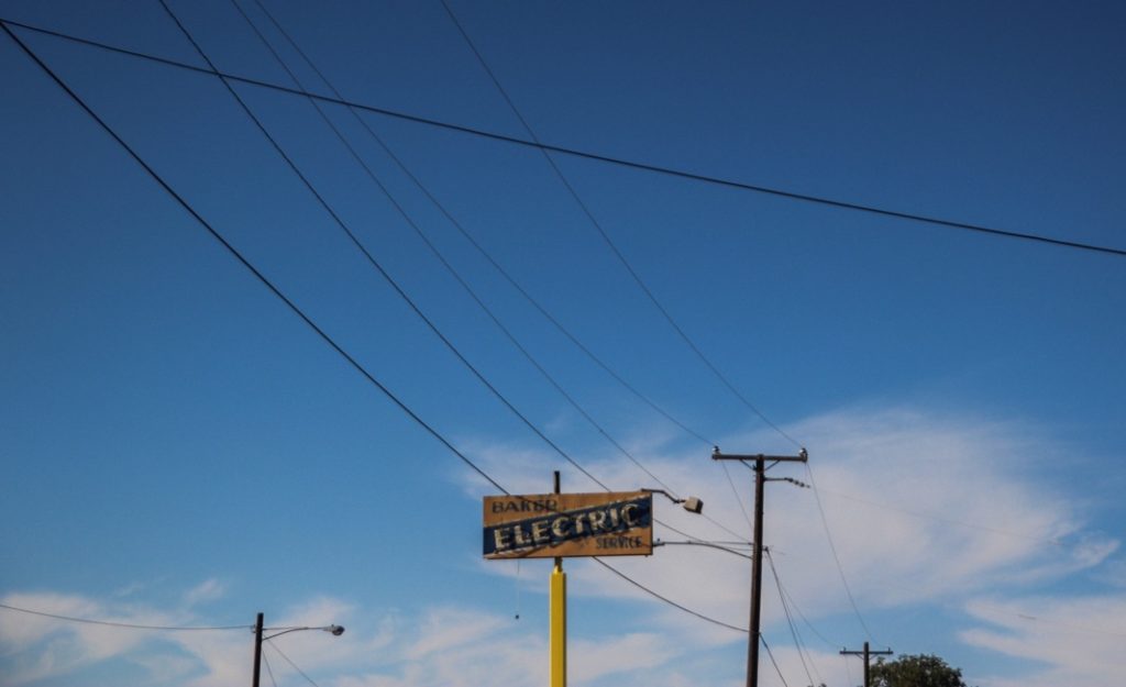
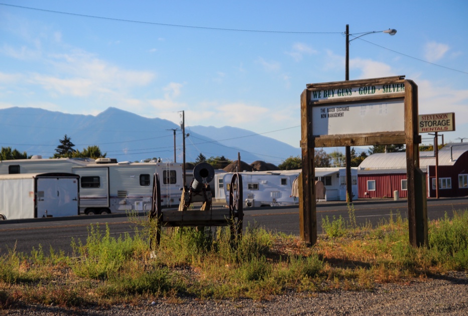
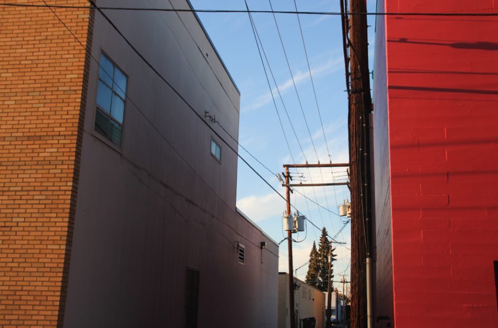
Urban Landscapes
Examples of my editing
Original 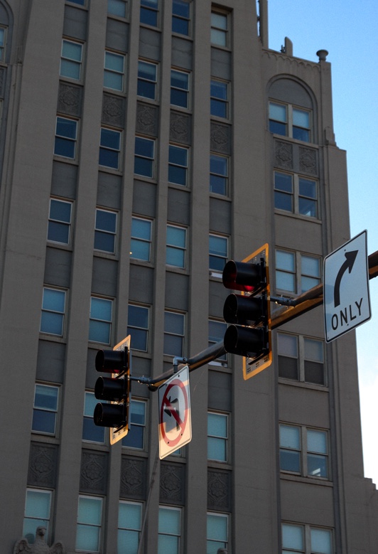
Edit
Colour Edit 
Turning monochrome
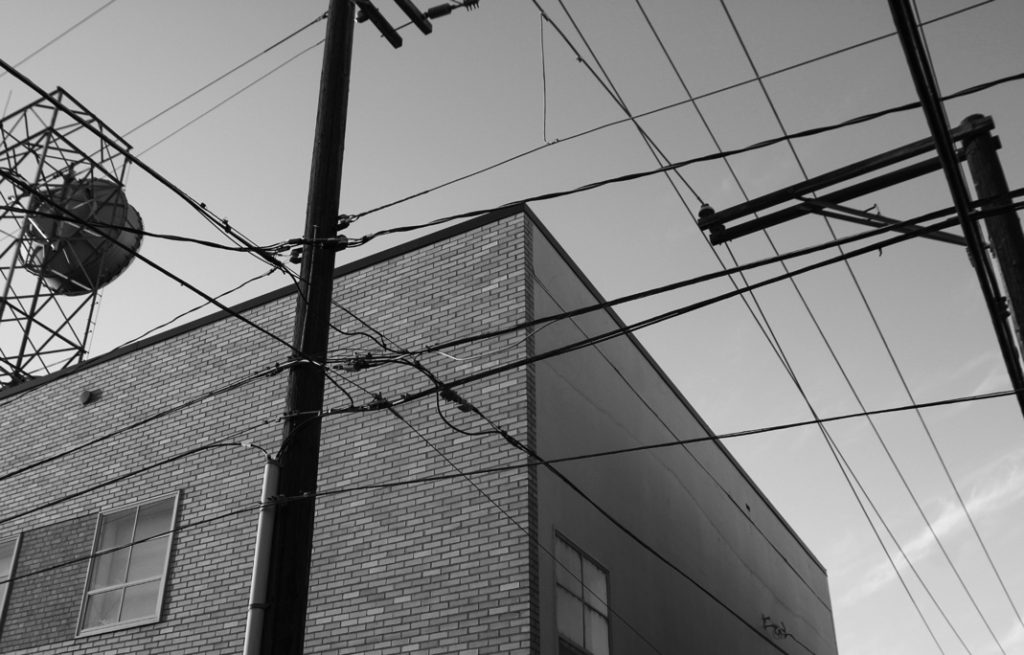

Edit 
Original
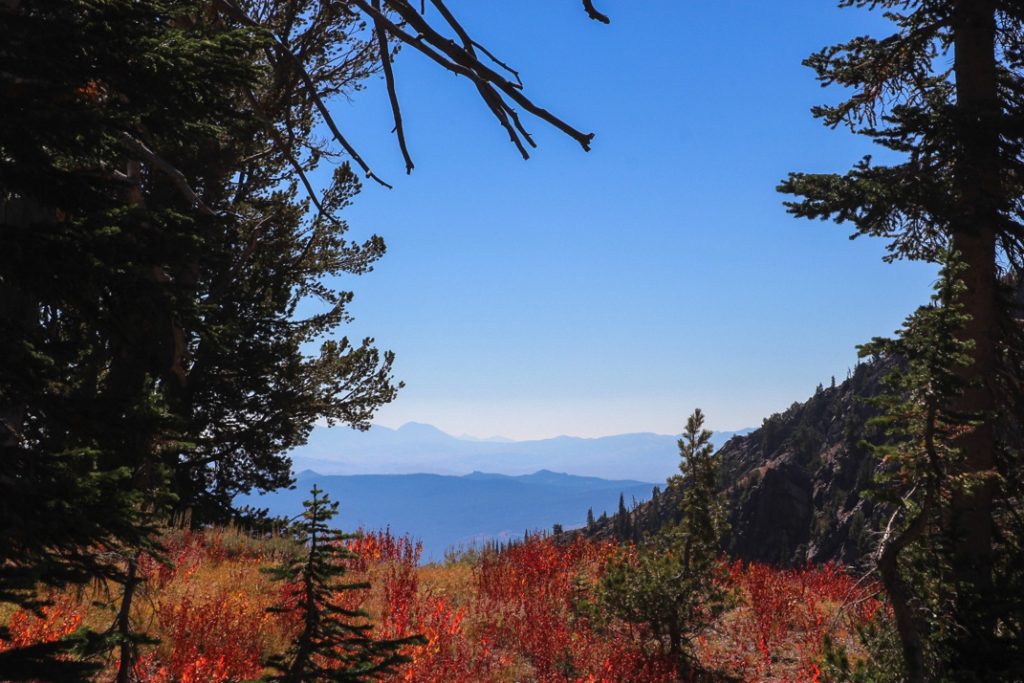
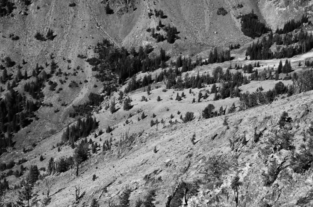
Rural Landscapes
Examples of my editing
Final edit
Edit 
Original

Colour edit 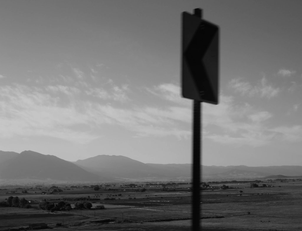
B and W edit, final edit
Portrait images
Examples of my editing

Original 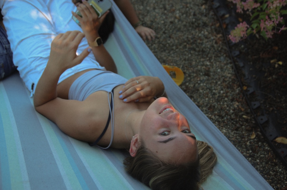
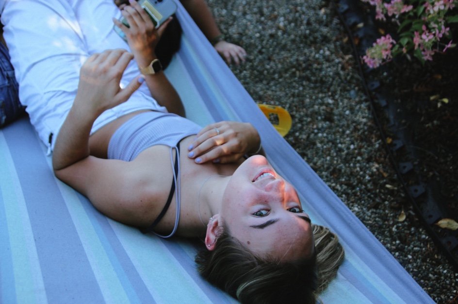

Edited image 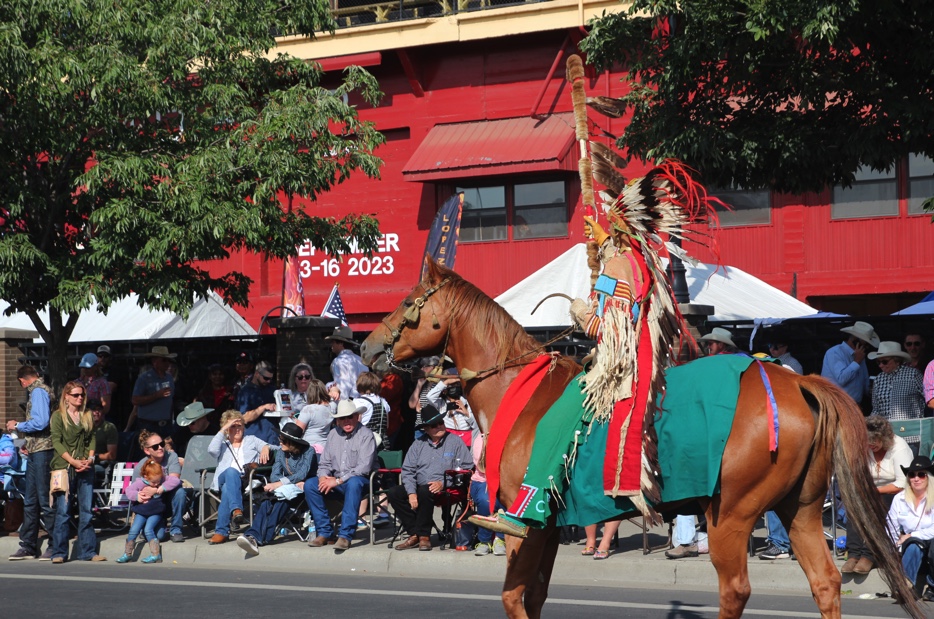
Original

Final edit
Evaluation
Overall I think my editing was quite successful. I tried to show a range of different edits, both B and W and colour. My editing was made more successful by the light in some of my shoots. Particularly, in my urban shoot, the light was great which made my editing easier – I shot during the start of golden hour, which helped to create a softer light with less glare and overexposure.
In my shoot from the parade I dealt with a bit of overexposure which I think I managed to correct quite well using lightroom. I also found cropping a very useful tool, as quite a lot of my images needed compisitionally changing. Using the cropping tool as well as the rule of thirds helped me to make a lot of my images much more compositionally balanced. In a lot of my images, I tried to create edits with vibrant and rich colours. I normally like to edit with lots of grain and a faded look, but for these images I wanted to try a different look, more vibrant and saturated. I think I acheived this quite well, but some of my images were too oversaturated at first – I edited some of my images, particularly the ones from the parade, twice or three times to make sure I was happy with the overall image.