
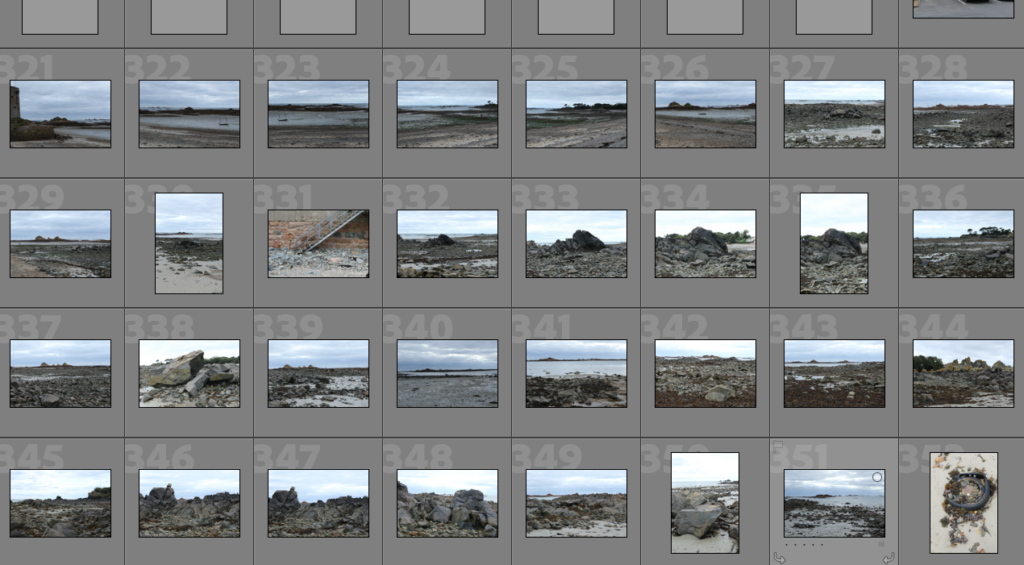
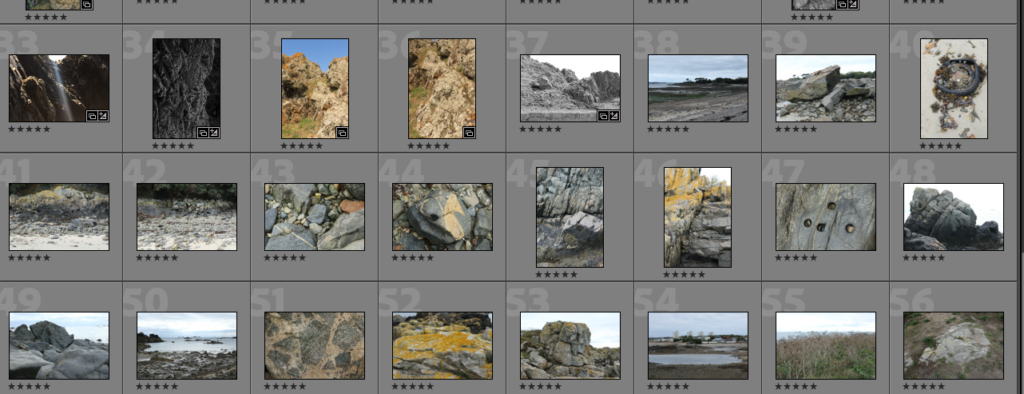
SELECTION

EDITING
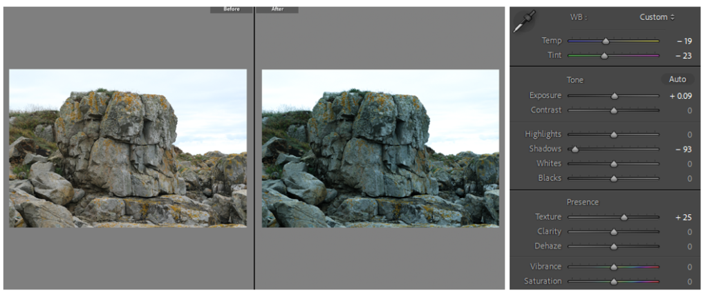
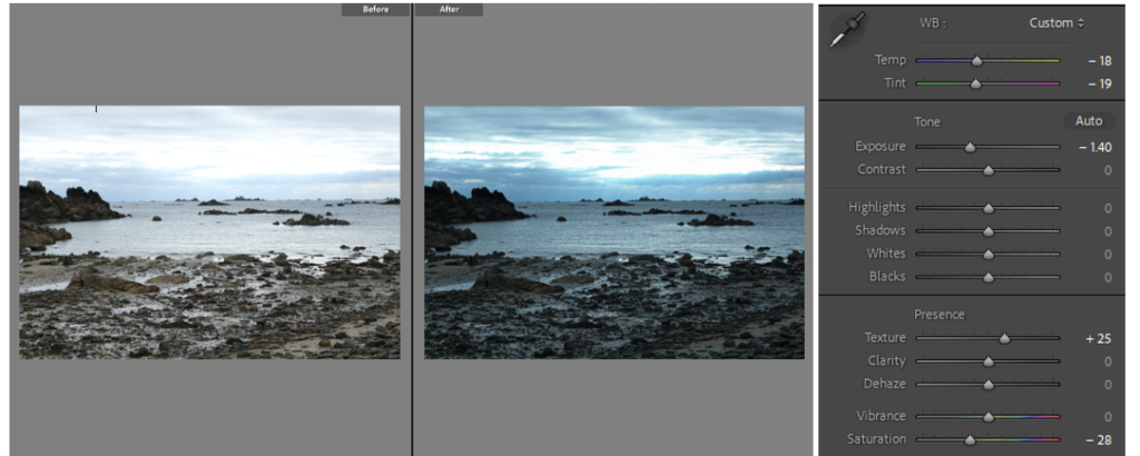
All of the photos are edited similarly to match the aesthetic of my zine, but these are my three favourite edited photos. Above, i lowered the shadows to draw focus and add detail to the cracks and edges in the rock face. The photo below i lowered the exposure and added a more blueish hue to the sky which overall gave a eye catching colour contrast between the rocks and the horizon.
Colour plays a big part in setting the mood in photography. I edited my photos with an underlying hue of blue and green to add emotion and help create a narrative. blue is often associated with a sense of calmness and safety, whereas green creates a sense of tranquility and vibrance. It’s nature’s color therefore i used it in my editing as the photos are of natures landscape and erosion of rocks over time. Paired together, green and blue are cool colors that form a refreshing combination.
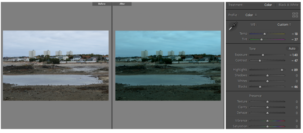
This photo is my favourite my 16 edited images – my attention goes straight to the pool in the middle, then to the tower blocks and manmade horizon in the background – a contrast from my top photo of the sea, the change in setting shows the difference between a natural landscape vs. an industrial landscape, and the impact mankind has had on nature. The tower blocks in the back helps build structure in the photo as they are in a set of 4 which catches the viewers eye, and the darker colours compliment the buildings by adding narrative.