
Images Used in My Zine
Below I have included some galleries of the images that I used in my zine, this is to show that all of my photographs do work together, and this helped me see which images which I liked the most and which were linked in the most with my zine and the context of its story versus its final outcome.
This was important as I can visualise what all of my images look like together before putting them into InDesign or printing out my photographs to experiment with. This helps me think about which images look aesthetic together, and others which contrast each other.
Title Experimentation
I have included some examples of me experimenting with my title, included the title words itself and then other aspects such as the font and arrangement of the typography on my front cover. I think it’s clear what style of fonts look best with the image in the background of my front cover. In this case I think that
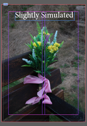
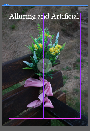
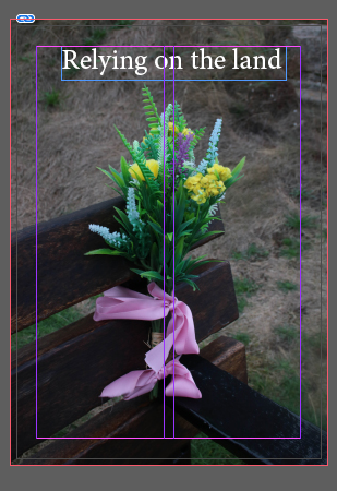
I think that these titles are okay but probably not good enough to put on the front cover of my zine, this is because I think the words are good, but the text doesn’t look aesthetically pleasing enough to be on the front of my zine, its only important because it’s the first thing you see when you look at my zine, creating a first impression of my work.
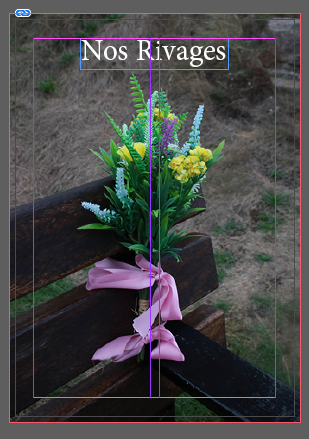


There I have selected the words that will be in my title, and I have demonstrated that I have experimented with the font and size of the title of my zine. this is important as certain letters look better with specific fonts. I think that the final font and size I selected looks good on the front of my zine as the white writing really stands out being in the centre of the darker image.
Process of Creating a Zine
Below I have created a first draft at my zine, this may be changed in the future when analysing my final zine, and when I do the final analysis of my work. This was a good opportunity to use many different of my best images from all of my photoshoots. To create the first outcome of my zine I used a software called InDesign, to use this we set up the zine template and then imported our photographs into the app. Using Ctrl+ D to place the images on top of the outlines for the images, I then altered the size of the photographs so that they would fit the way I wanted them to.
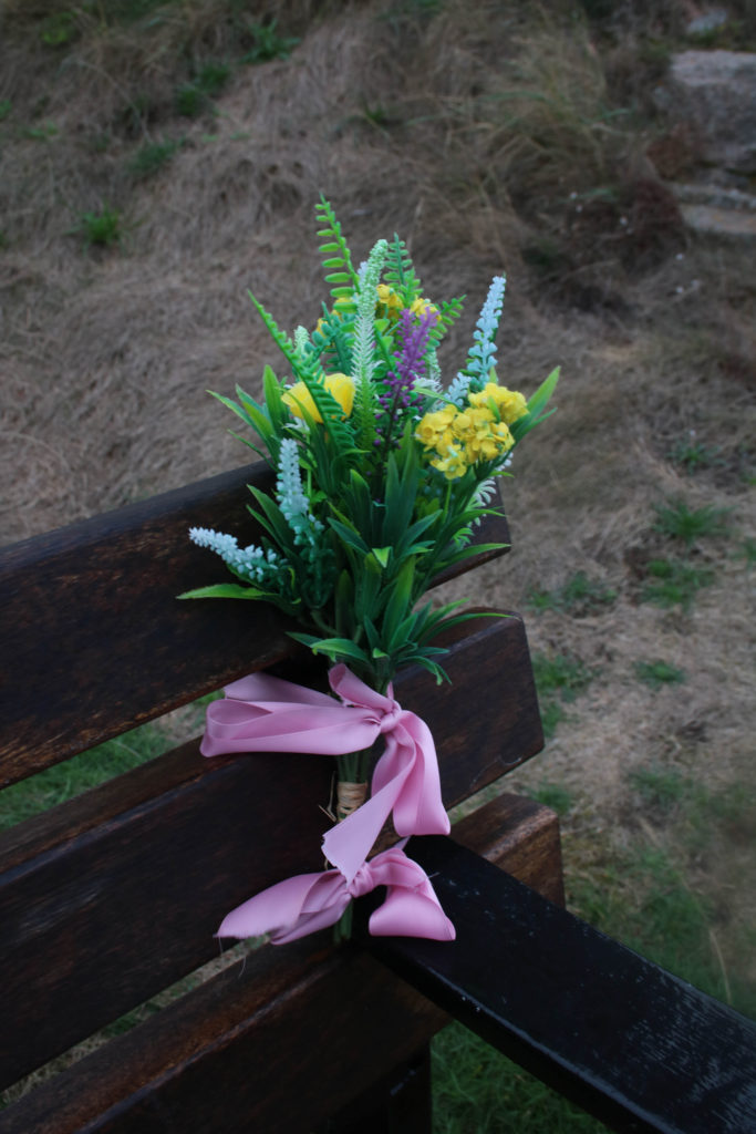
I have selected this as the front cover of my zine as I think it’s a good example of an eye-catching photograph, with the wide variety of colours present in this image means that contrast is created as the flowers and bow are filled with vibrancy and then the bench is dark brown, along with the plain grass background. This means that attention is drawn to the front cover of the zine, making people want to look through it.

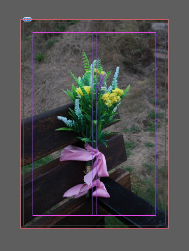
The left section below is an example of how this image would have a white boarder and the bleed would be kept to the set 3mm, whilst on the right side there is no bleed to the photograph. This means that the image fills the page to all of the corners of the page, creating different affects for each side of the pages. I have arranged my photographs this way as it draws the viewers attention into the middle of the page, with their being the same features within both of these images it means they compliment each other well.
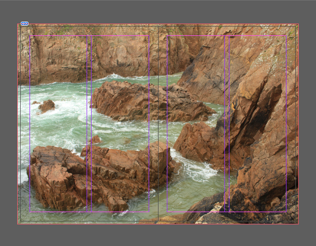
I have selected this as the 4th and 5th pages of my zine as I think they provide a break, as the double spread contrasts with the separate images previously. Furthermore, the warmer tones throughout this image means that it creates a balance of a variety of different tones throughout my zine as its good to creates a whole piece that links well together whilst still linking to the task. However, this image has been taken from my Plemont photoshoot so I’m not sure how well it links well being placed here in my zine.
This is my favourite pages out of my whole zine, this is because they the images link so well, they are from the same locational shoot at La Hocq, many components throughout these images are the same, such as the boys as the texture and temperature of the sane, making them look very aesthetic together. I have placed the landscape image first as it breaks up the composition from the double page spread before, and the second image filled up to the bleed of the page means that there is more attention drawn to the first image.

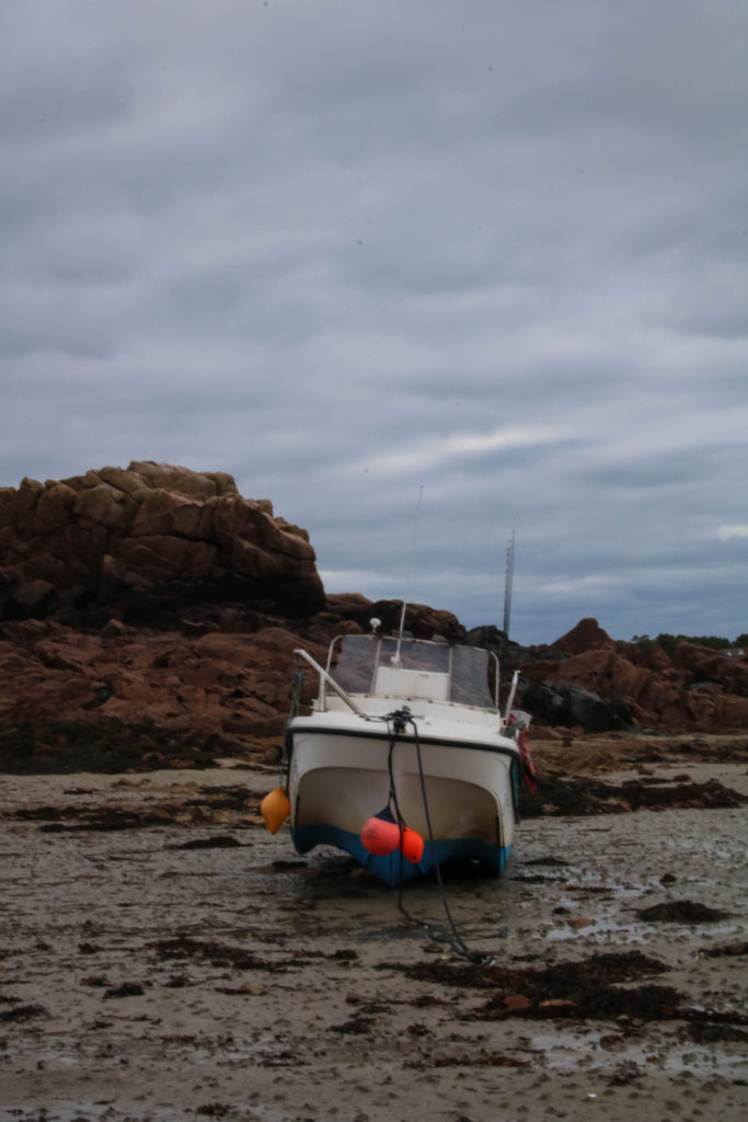
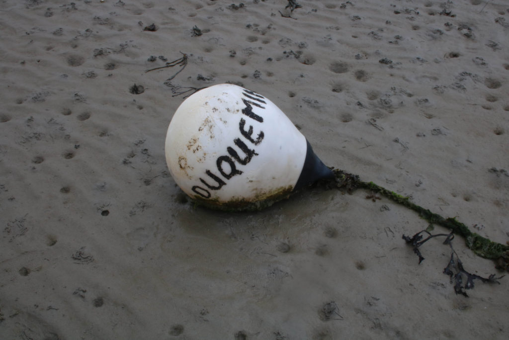
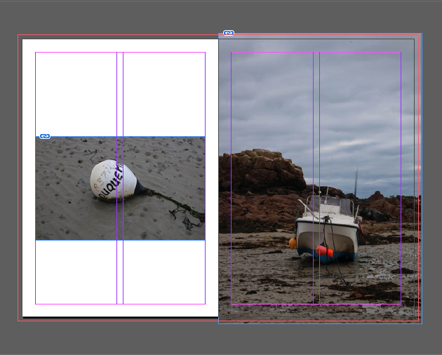
I have purposefully kept lots of white space on the left hand side of the page as my last pages were very cluttered, and the white space after that means that there is a balance between page 6 and page 5. I have placed the photograph of the boat afterwards as it links to the image before and creates the effect of my story by still using plainer images yet still trying to link them together.
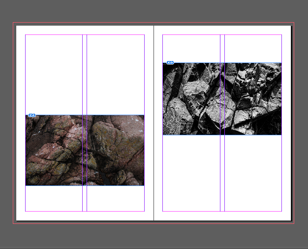
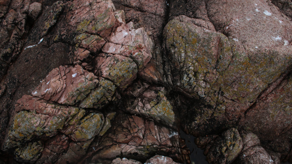
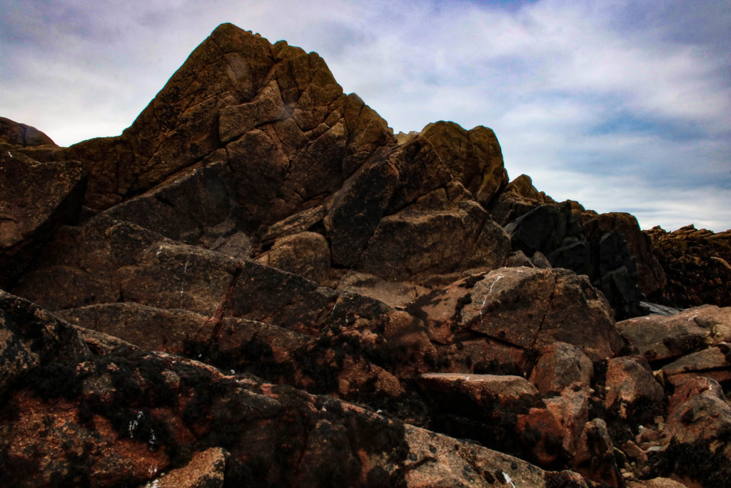
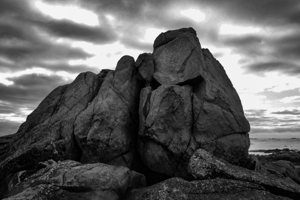
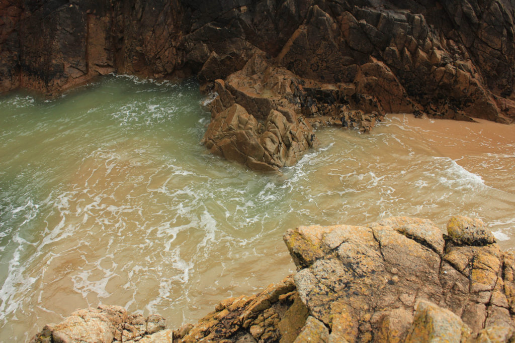
In my opinion, these two images compliment each other well, being rocks from different locational shoots means that there is a clear difference between them yet them still link well with the theme and story of my zine. They have been placed in this way as there is huge white space in order to provide a break from the very busy double page spread images before, this is in further attempt to create a flow throughout the zine. I like that one of the images is filled with colour and one is monochromatic because that means there is lots of texture in the two pages.
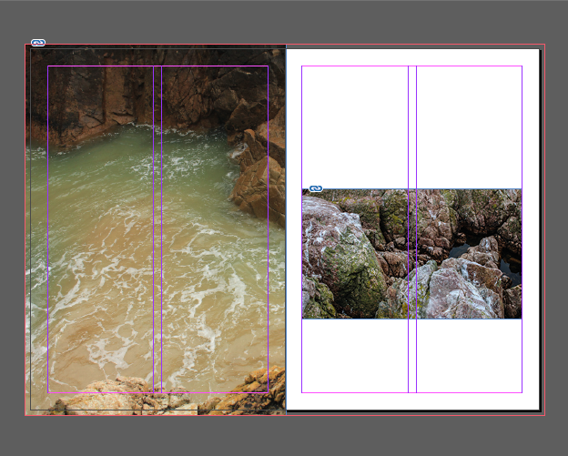
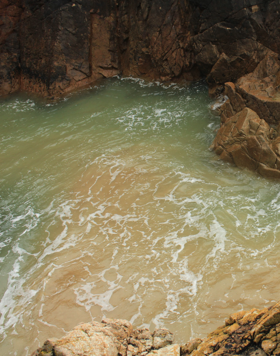
The composition of these images is the most apparent part of these two zine pages, as the negative space means that more attention is drawn to the right side of the page. I think that the colours throughout these two pages means that they make for an aesthetic layout. I have placed this kind of display here as it creates balance throughout my zine, as creating a zine that is too busy and filled with too many large images distracts from the quality of the individual photographs. My favourite aspect of these images is the flow of colour, as there is green tones flowing from the left to the right image.
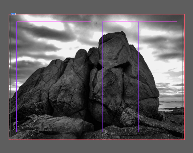
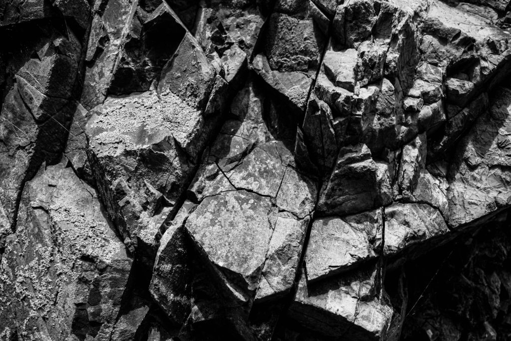
This is one of my favourite images that is placed throughout this zine, as the quality of the photograph meant that I thought it would look better as a double page spread rather than a smaller image. This is amongst 3 of my double page spreads throughout this zine draft and in my opinion, this is the most successful as it has a dramatic feel to it, meaning lots of attention is drawn to the image just through monochromatic editing, as it enhances the textures throughout the image.
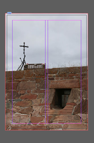
I have selected this as the back page of my zine as I think that it links nicely with the first page of my zine, as of course they are going to be connected when I print my zine, as the front and back page are from the same photoshoot, this means this is the end of the story and means that the narrative of the story is over, I also think that the front and back pages contrast each other very well.