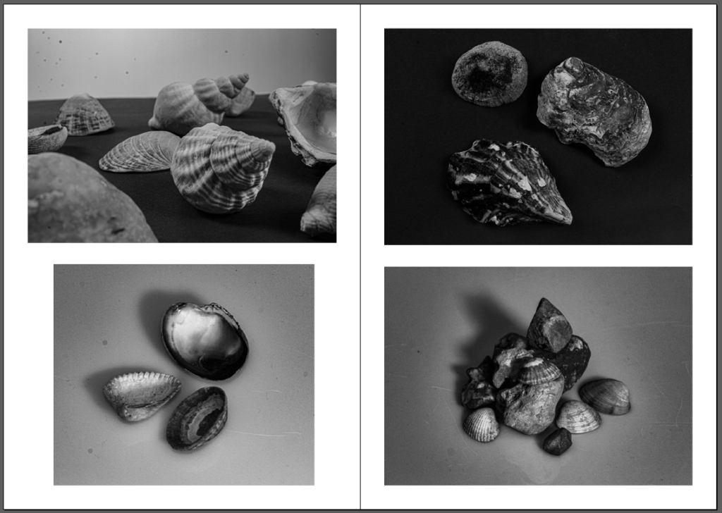
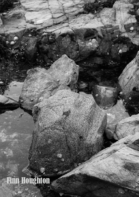
Ideas and Research for my zine

Research –

A zine is a small book which grew in popularity during the early 19th to 20th century through the amateur press but grew in popularity through the 1920’s and 1930’s due to the rise pf the popularity in the science fiction fandom. These zines consisted of adapted texts/images or self-published work, originally political but have since changed to appeal to anyone’s interests, which have been created by a single person or a small group of people which are the recirculated in to the public for others to see. They can consist of a variety of creative ideas such as poems, archival materials, drawings, interviews, poems, comics, etc. I think that zines are good ways to spread an image or tell a story because they aren’t long but they let your creativity flow throughout them on what you want to raise awareness of or tell to other people. Here is some more information on zines.

Zines collected from the 2019 National Young Writers' Festival Zine Fair |  Download High-Resolution Scientific Diagram
Different ideas of zines.

Mood board –

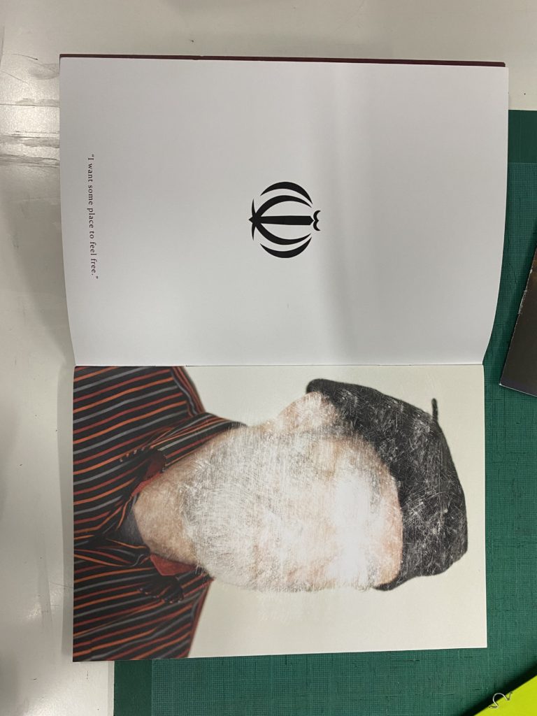
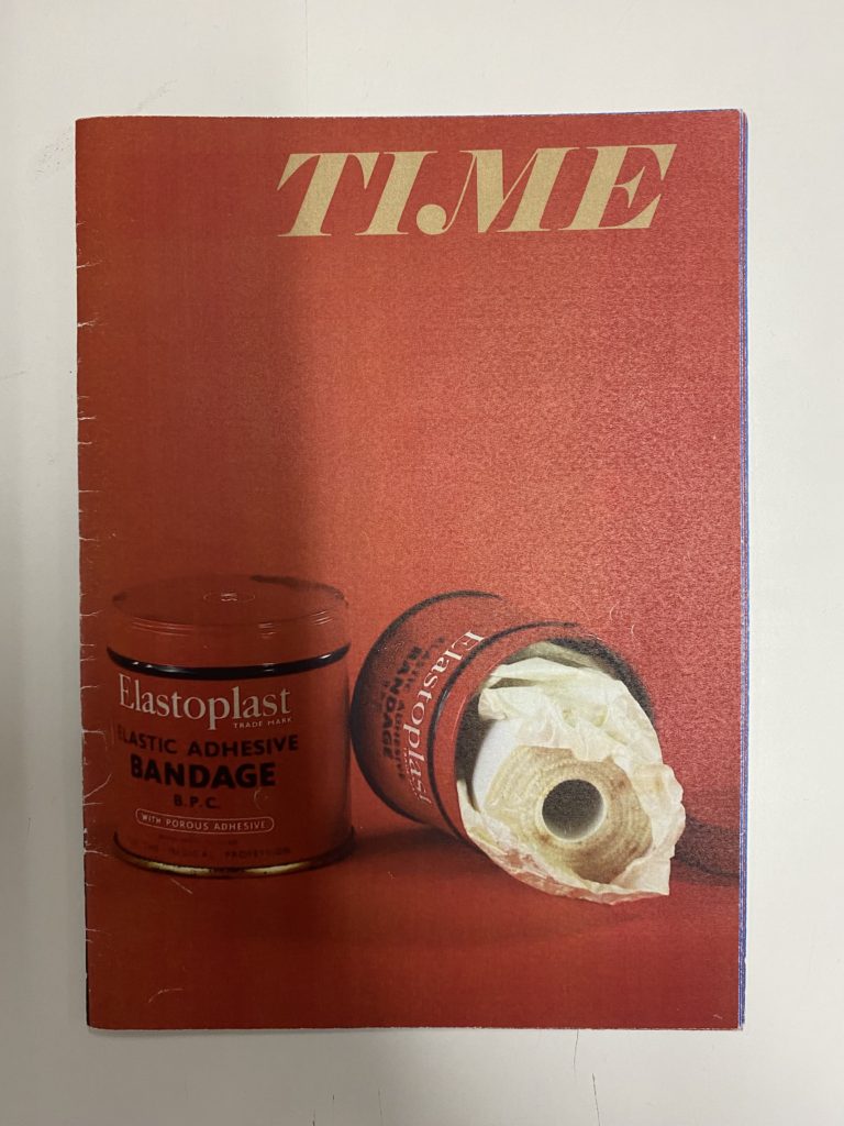
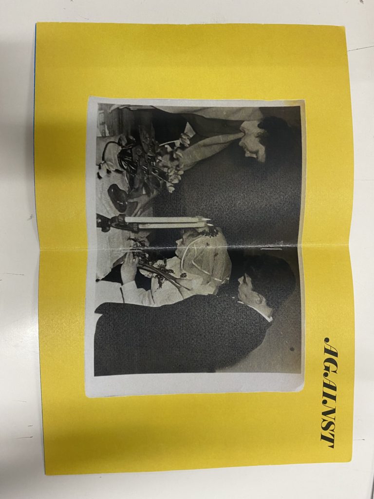
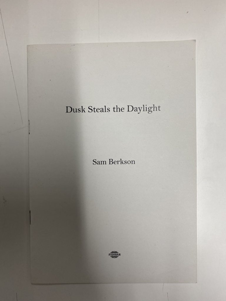
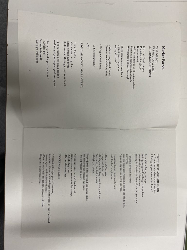
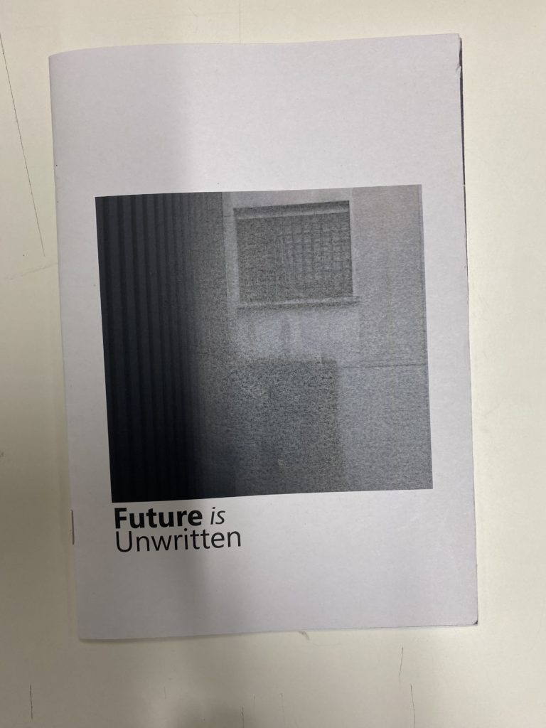
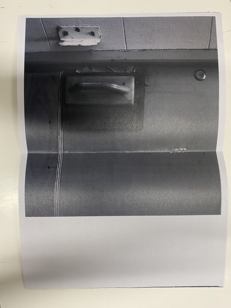
Below is a mood board which I constructed by taking photos of zines that appealed to me in class which I think that I could take inspiration from when considering how to craft and visualise my own zine. I think that this is very helpful for me and I will start by making a mock up zine of my initial idea then expanding on this and seeing if I likes my original idea/s.
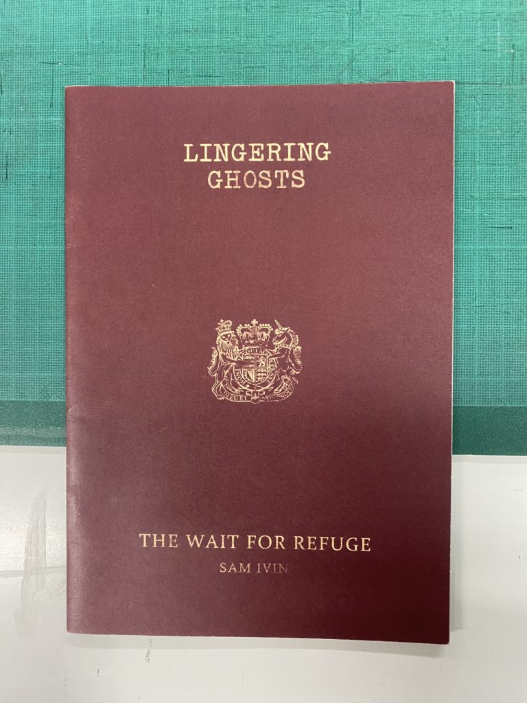
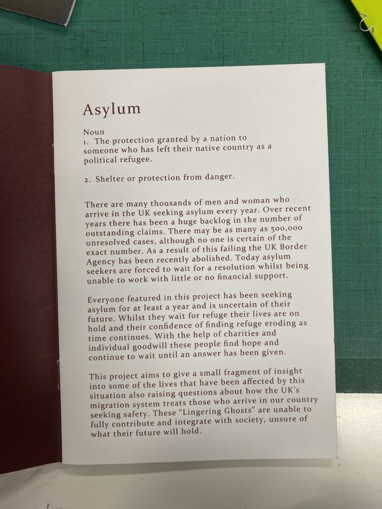
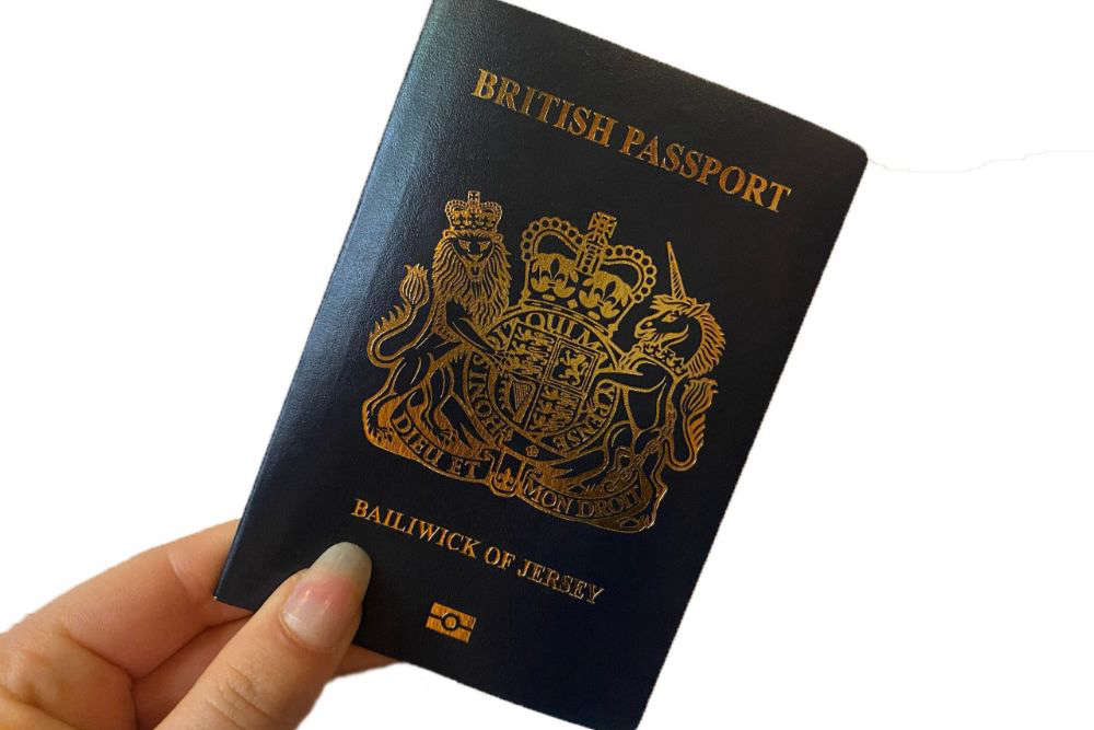
These are different examples which I have looked at to help me gain some ideas for my zine that I will create. I really liked the idea of doing a passport to show a journey that you take throughout the photos, giving an introduction on the first page with a picture on the right hand side with a symbol on the opposite side. I also liked the bright coloured zines with brighter fonts, as it is simplistic yet effective because they contrast well against the black and white photos. There was also a zine which consisted of poems and I think that this could be quite effective when telling a story but I am unsure of how well it would work with an idea of a passport, which was my original idea. The last one, similar to the passport, takes you on a journey of what the future could consist of and then the 2nd and 3rd page included a photo which spans across 2 pages, stopping midway which I like because it isn’t overwhelming by taking up the whole page and it is just enough which I think could be nice.

My ideas –

  • Passport structured zine.
  • Coloured visual journey with black and white pictures.
  • Using archival materials throughout, showing the change in scenery over the years.
  • Using poems to add another level of personality, nature based/beach based.
  • Black and white photos, similar to you make up the colours in which you think will be in the different places as if you are using a paintbrush in your mind.

Story and Narrative –

For my zine I wanted to create a story that you follow throughout, below are some ideas of words/sentences which I have used to give me some creative inspiration of how I want to layout and develop the design of my zine. I will apply some of these words/sentences throughout my zine as I think it will be a good way to narrate and guide people through it.

STORY: What is your story?

Describe in:

  • 3 words: Path, gloomy, textures.
  • A sentence: A path that guides you through different textures while being overlooked by the gloominess of the day.
  • A paragraph: The day is bleak and gloomy but their is a path, a path you follow. You don’t know what to expect but you have to believe it will be worthwhile. There are rules that are unspoken. Your imagination is your guide and it can flow as creatively as you want but you have to remember this experience is for yourself, no one else. The rocks hold different textures, and the objects tell numerous stories, it’s up to you to decide what that story may be. As no one can make that decision for you.

NARRATIVE: How will you tell your story?

Examples:

  • Images > new photographic responses, photo-shoots of objects…
  • Archives > images from SJ photo-archive, found imagery…
  • Texts > experiment with typography, key words, poems…

History of still life

Still life is a genre of art that depicts common and usually inanimate objects, both natural and man-made, within a work of art, the style beginning with a Netherlandish painting of the 16th and 17th centuries.

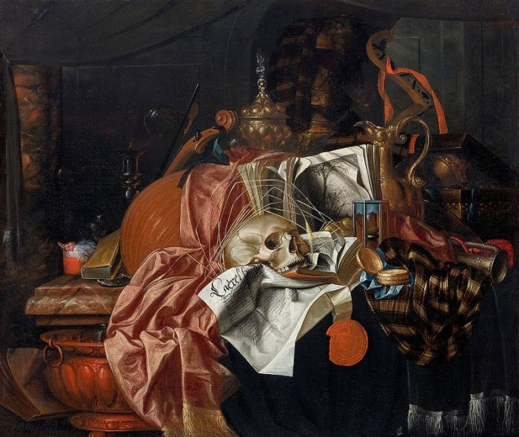
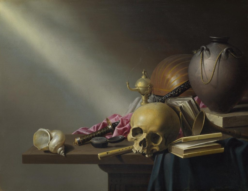
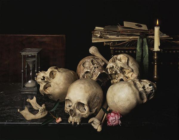
Still life artists choose and arrange objects such as fruit, wine, utensils, skulls, flowers etc to their liking before painting their unique composition, having full creative freedom over the colour palette, ambience and size of the painting. The objects within each painting often allude to something bigger, creating a deeper meaning within each piece, usually related to religion and life, [i.e: skulls represent mortality, candles represent the passing of time etc] making each piece compelling to look at. This is referred to as ‘Vanitas’ and is used to remind the viewer of their own mortality through the different symbolic objects within each painting, showing how pointless and meaningless each object is without the value placed upon it.

Vanitas with musical instruments, fine vessels, books, an extinguished candle, a skull and ears of wheat [1657-1675] by Franciscus Gijsbrechts
Still life: An allegory of the vanities of human life by Harmen Steenwyck [1640’s]
Vanitas Still-Life
Vanitas still life by Hendrik Adriessen [1650]

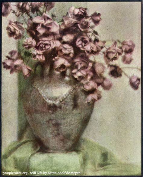
Still life became popular with photographers in the early 20th century, causing a lot art photographers to emerge [such as Baron de Meyer who took soft-focus images to be taken, allowing his photos to look like drawings] which allowed 2 different styles of still life photography to develop over the years: ‘found still life’ and ‘created still life’. Found still life photography would include taking images of places/objects as they are whilst created still life photography involves organising everything in frame until the desired composition is found and photographed.

A famous still life photographer whose work links with the Vanitas style is Guido Mocafico, an Italian photographer with a unique and intriguing style. His work tends to use a lot of snakes but he has taken an array of images that are composed in the Vanitas style, especially in his series ‘Nature Morte’. It is clear in his work that Mocafico carefully plans his compositions, ensuring each object is carefully placed and balanced to his liking which also allows the softer lighting to accentuate parts of his compositions, causing the shadows to overpower most of the image without underexposing it. Mocafico also has an interesting use of colours as he his images look as though they’ve been tea-bagged due to the different beige-tan shades he uses, however, he tends to add a pop of colour by adding 1 or two vibrant objects which definitely enhances the image as a whole.

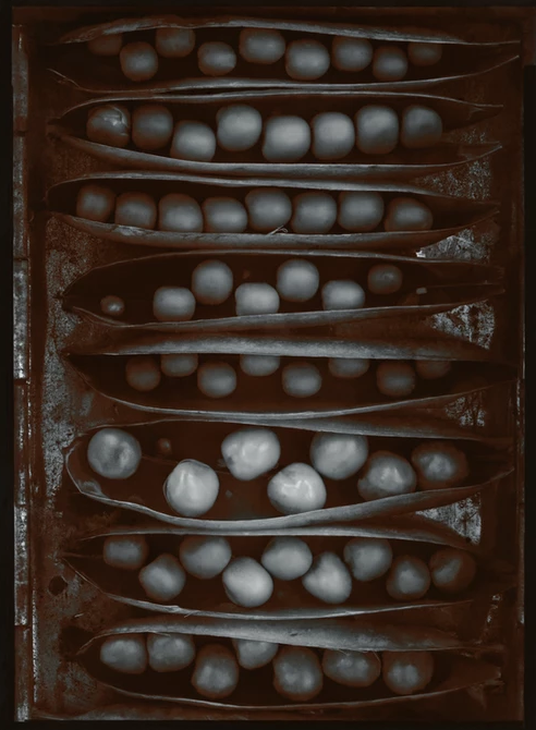
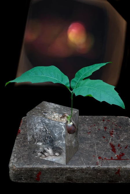
One of the most famous still life photographers is American photographer Olivia Parker [born in 1941]. Her work looks very similar to paintings due to the techniques she uses to photograph each object. Her use of shallow focus allows her close-ups to really stand out against the backgrounds. In her more recent photoshoots, the colours are rich in saturation due to her use of light, making the objects within each image look artificial and unreal.

Pods of Chance [1977]
Uncertain Intention [2011]

Green Island Photoshoot

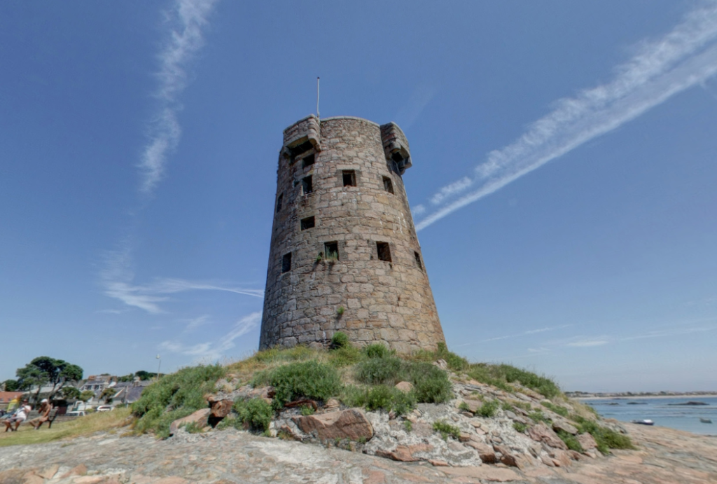
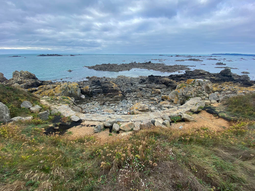
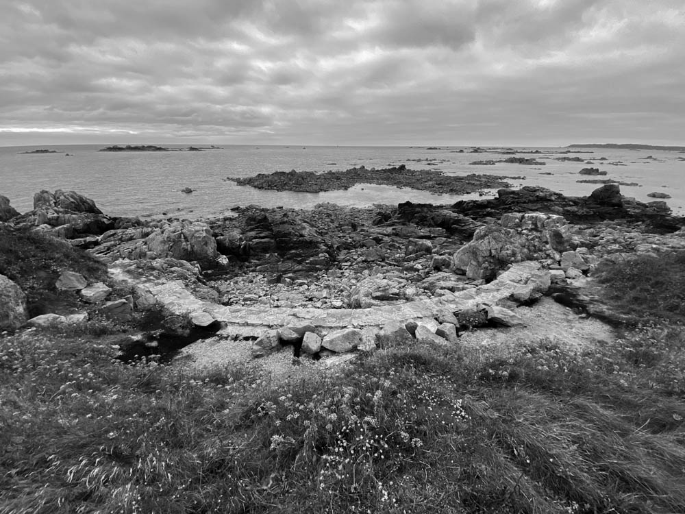
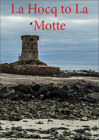
To further develop our project: My Rock, we visited Le Hocq and walked down the beach towards Green Island, where we took photos of both the smaller objects and the wider landscape that surrounds those areas.

A picture of Le Hocq tower

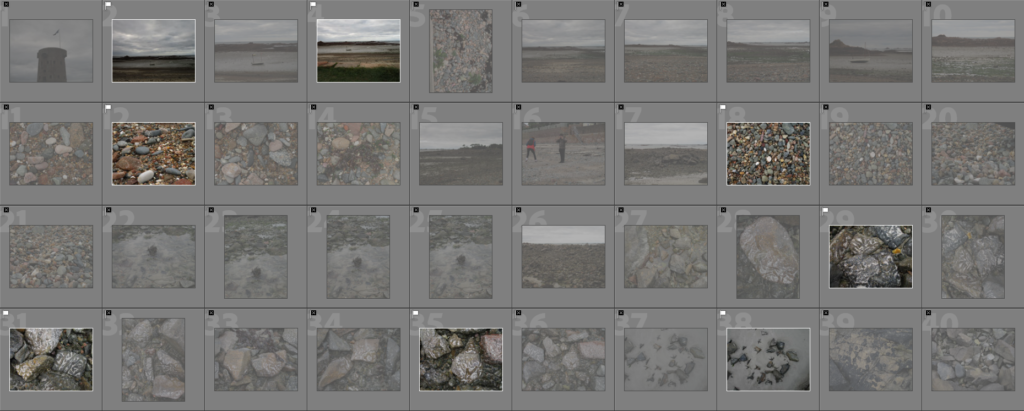
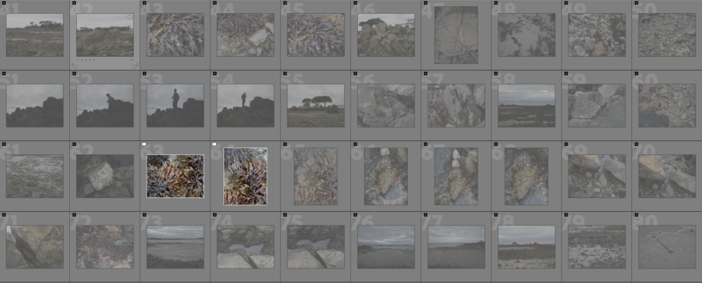
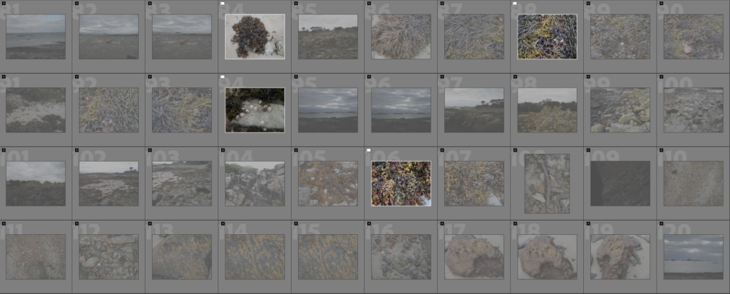
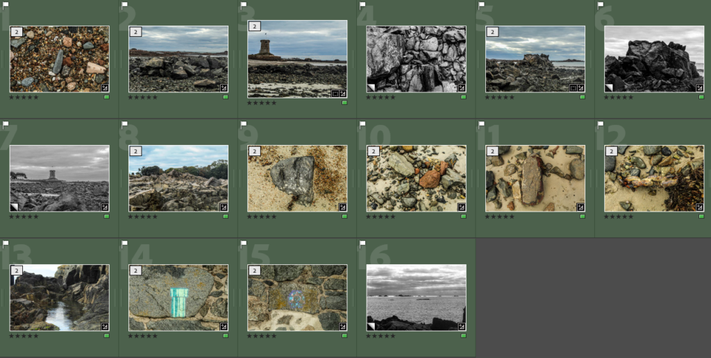
Contact Sheets

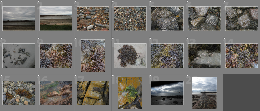
Below are the images I took on my phone as my camera ran out of storage


Editing Process

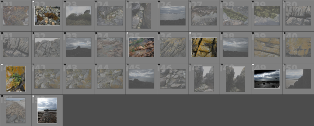
To start my editing process, I uploaded my images into Lightroom and went through the images using the ‘Pick’ and ‘Reject’ function to narrow my selection down.

Next I went through my selected images again and used the star rating function to select what I considered to be the best images out of my original selection.

These are the images from my phone.


Final Images

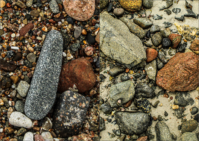
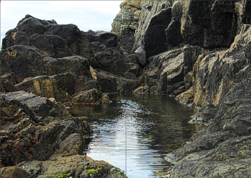
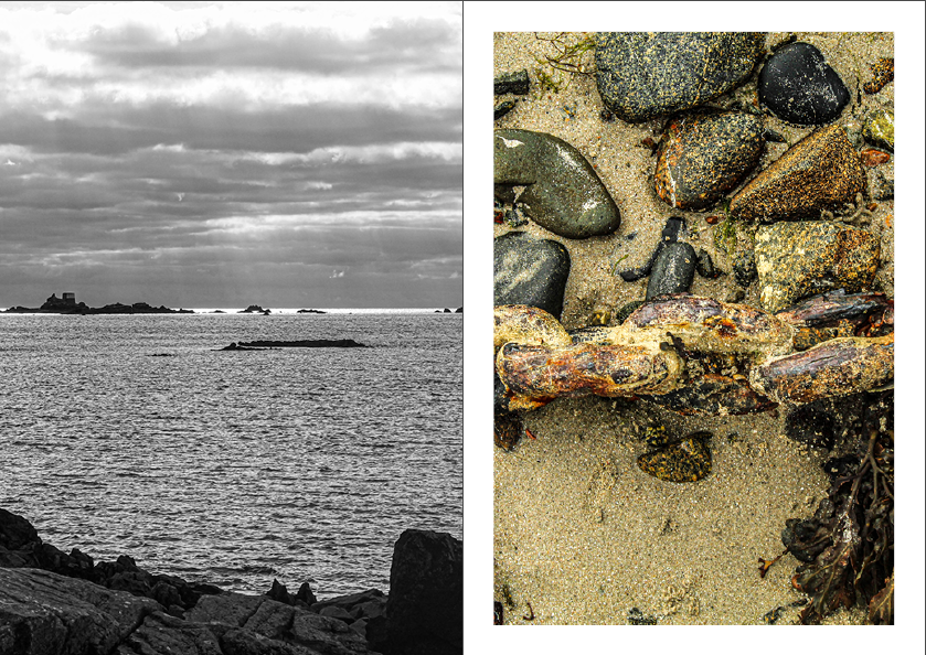
These are the images I considered to be the strongest from this shoot after finishing the selection process.

For this photoshoot in particular, I wanted to put a focus on making the images more lively and vibrant, to do this I simply upped the ‘vibrancy’ and ‘contrast’ to varying amounts on each photograph to make it stand out.


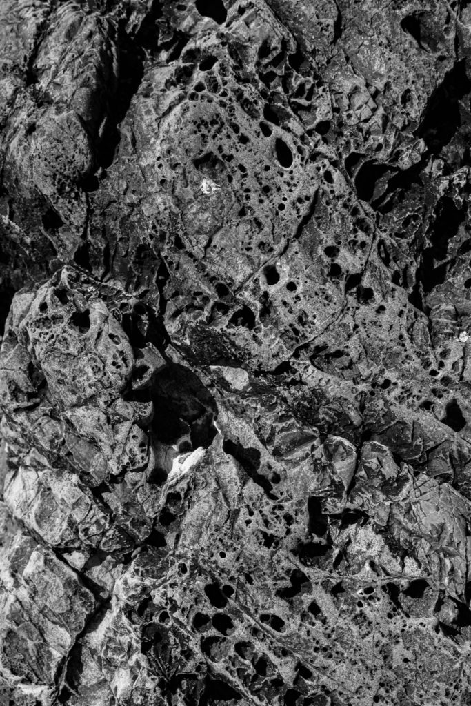
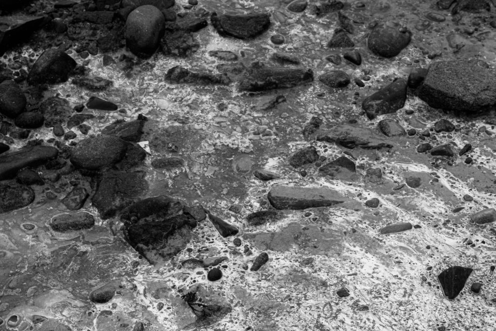
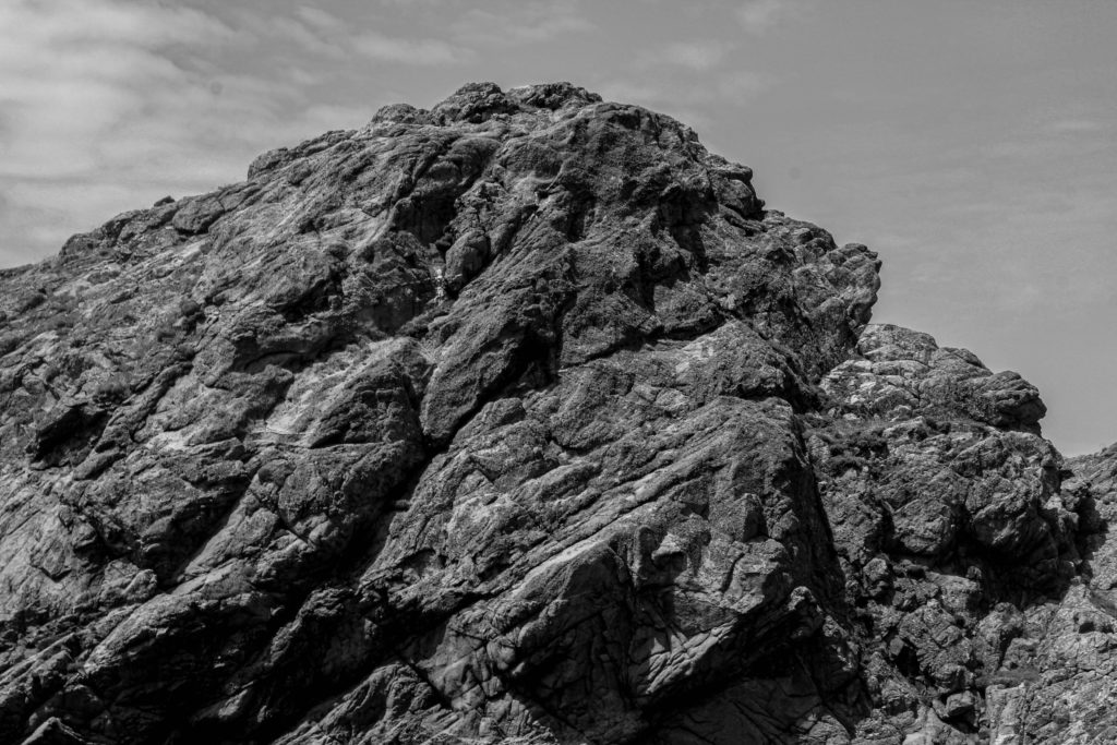
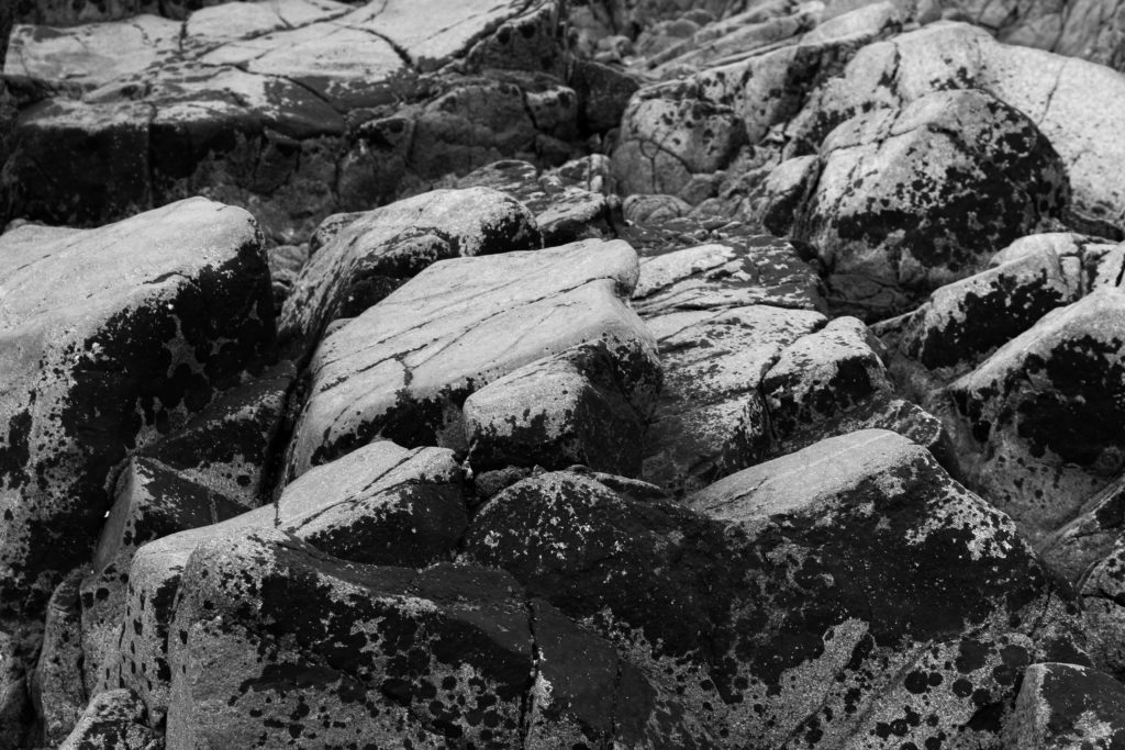
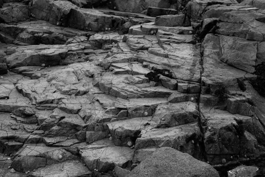
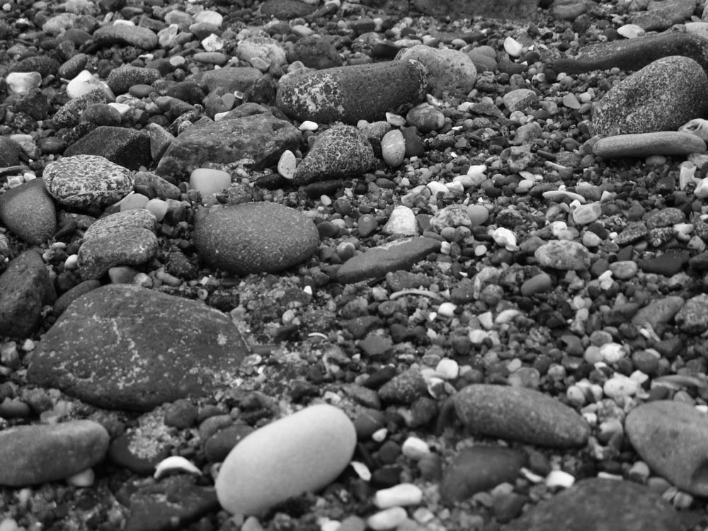
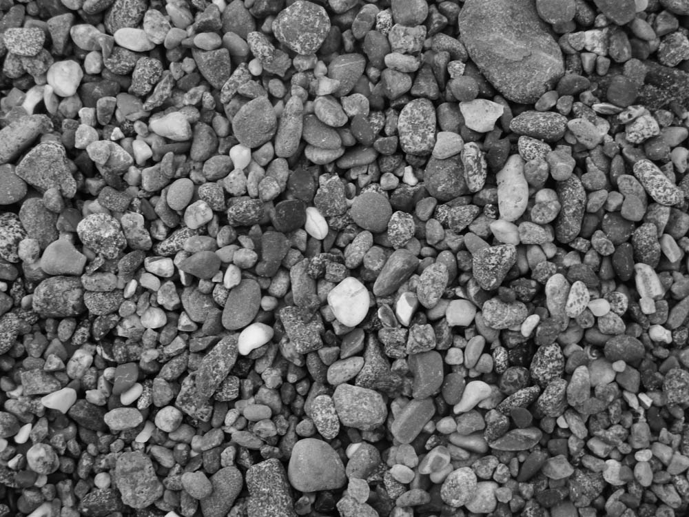
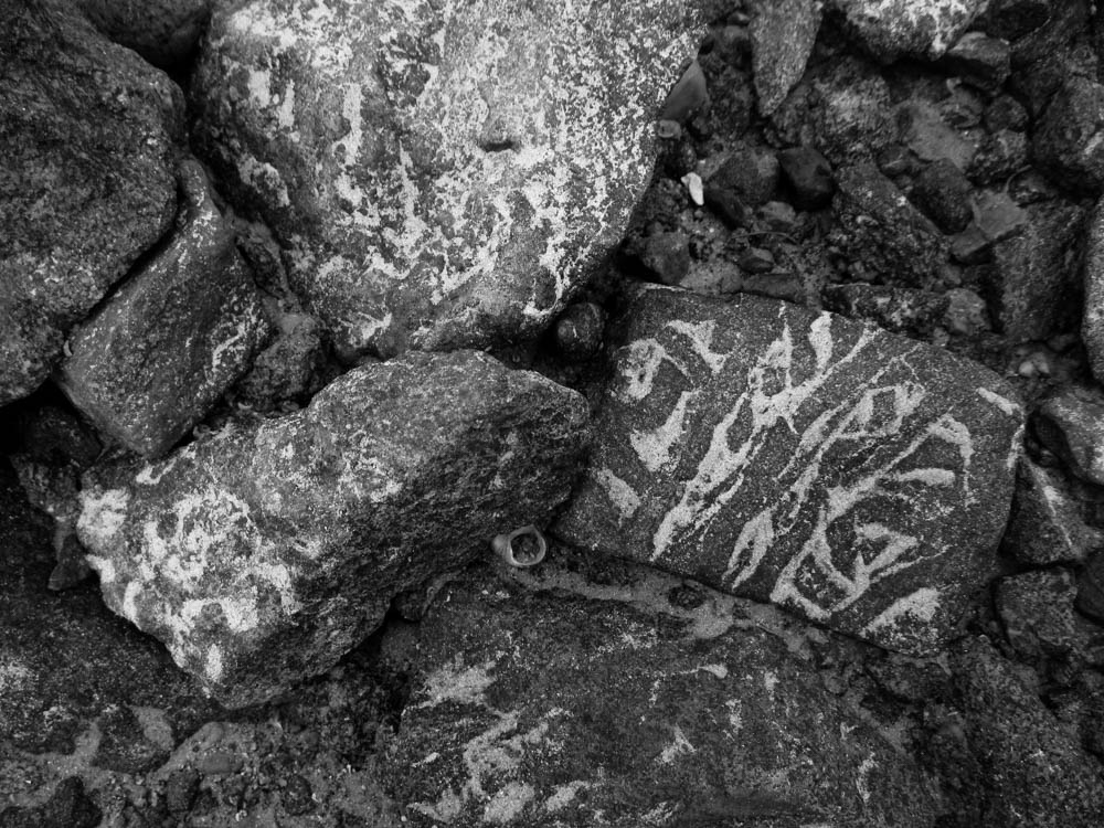
Here I made black and white versions of each image. While that does go against the colourful aesthetic I was going for for this photoshoot, I still think the lines, shapes and tones on these images make for interesting compositions when black and white.


Evaluation

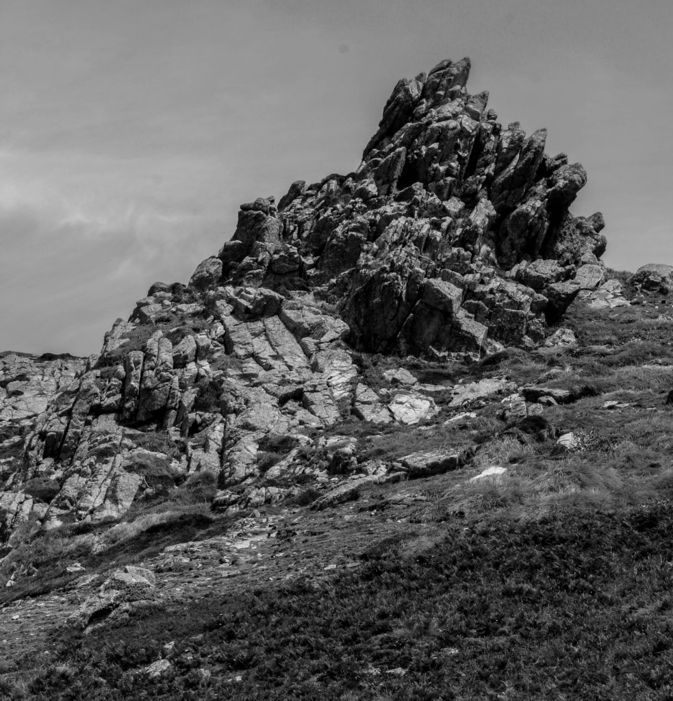
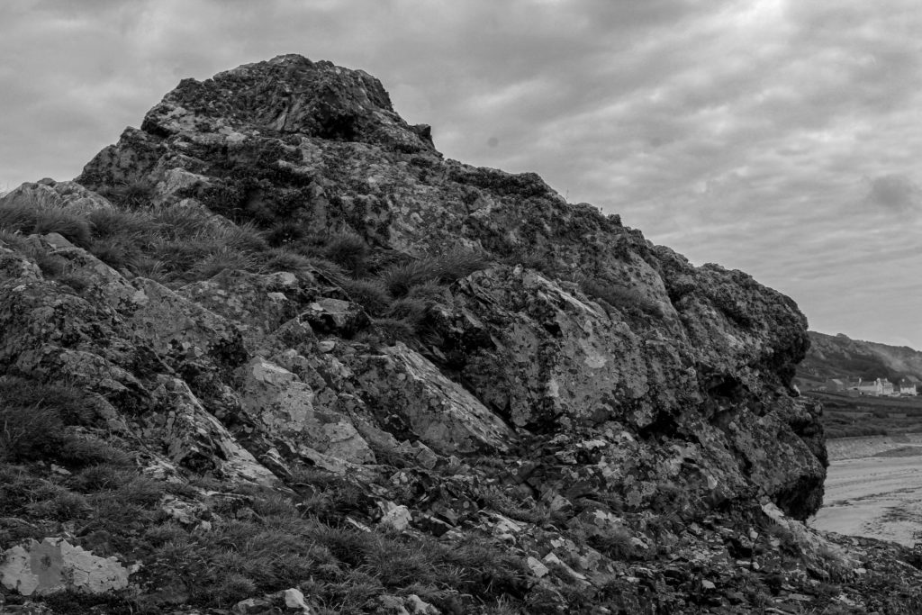
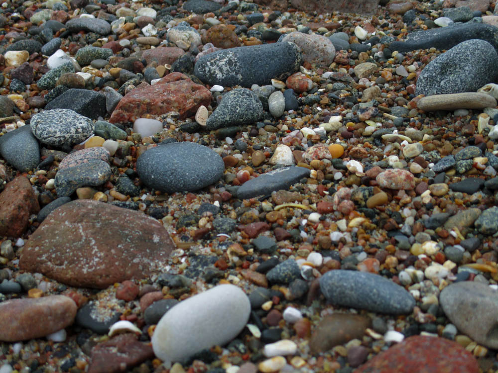
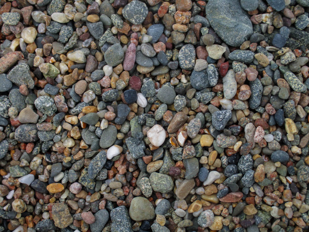
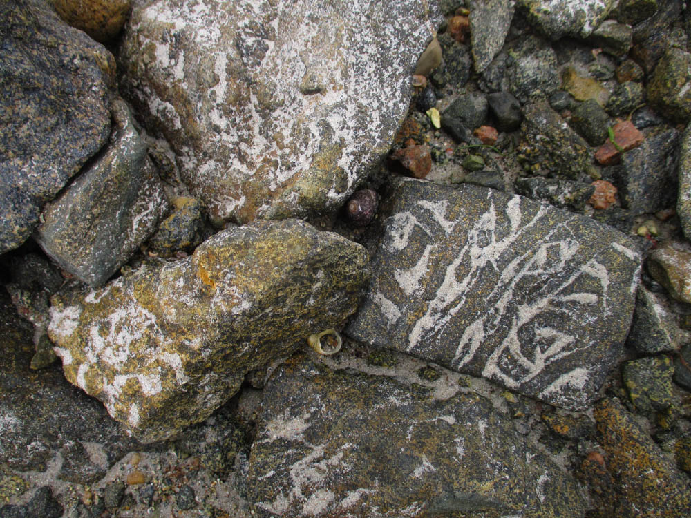
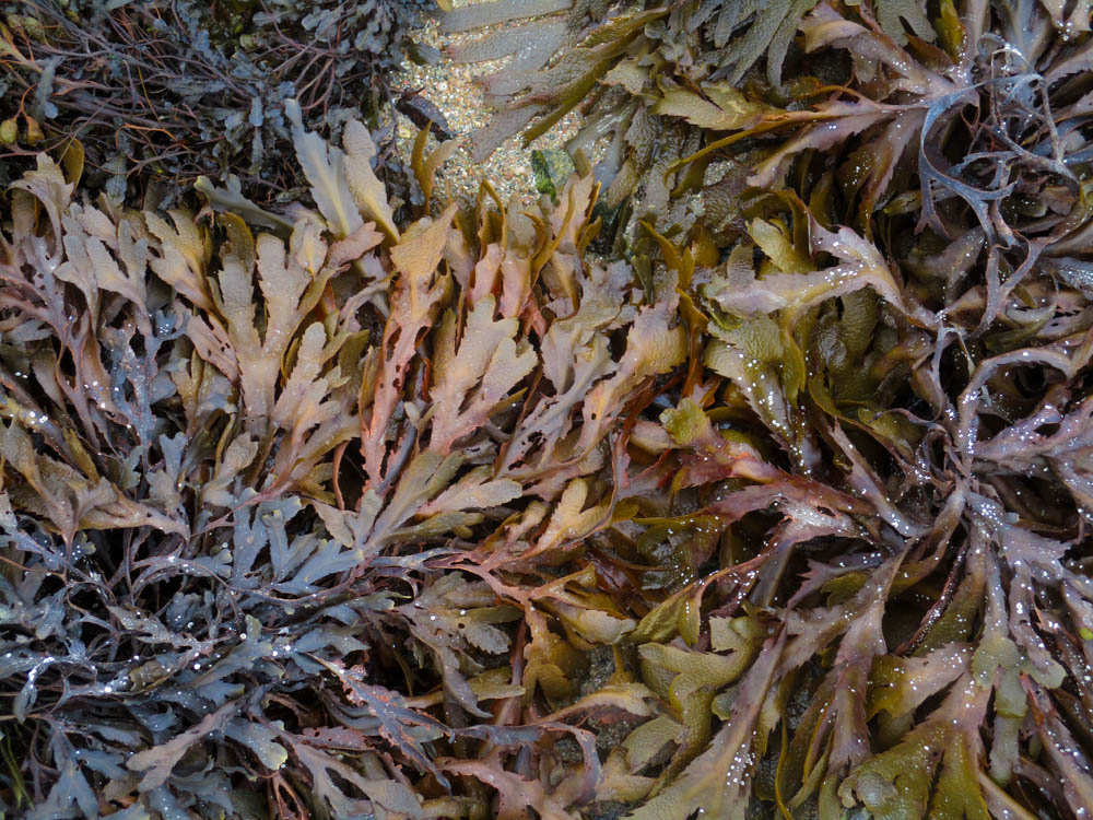
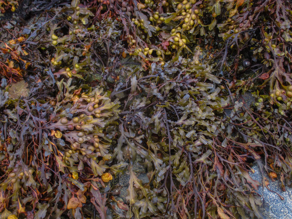
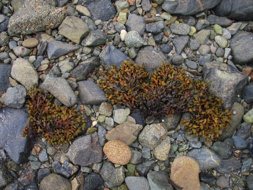
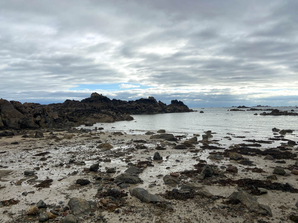
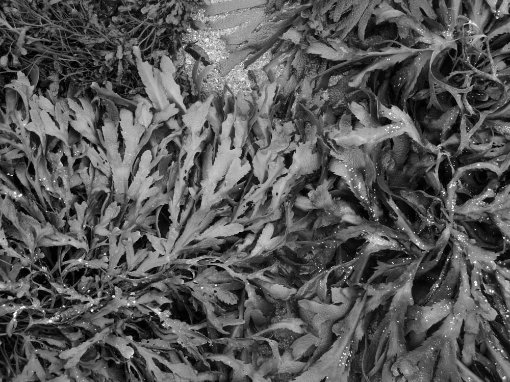
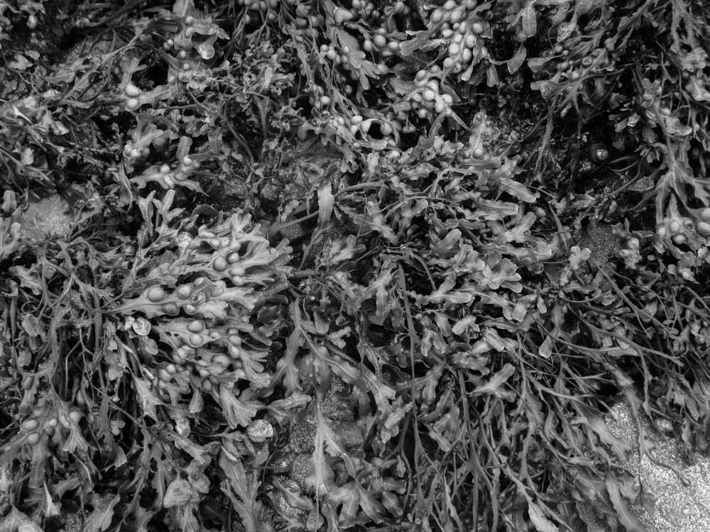
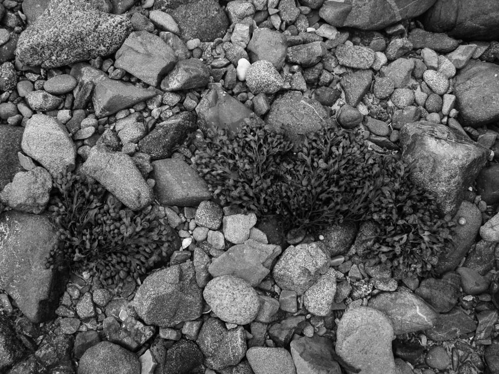
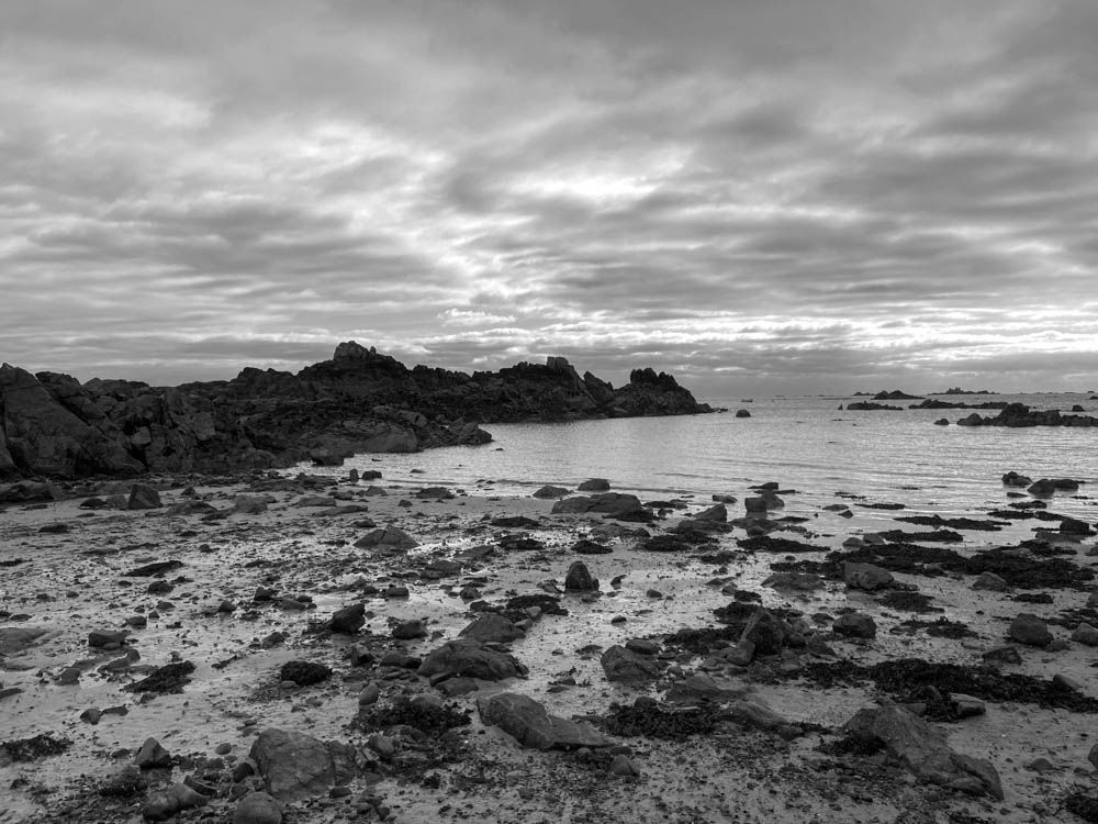
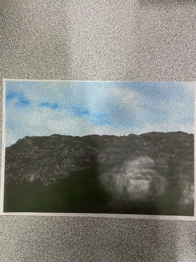
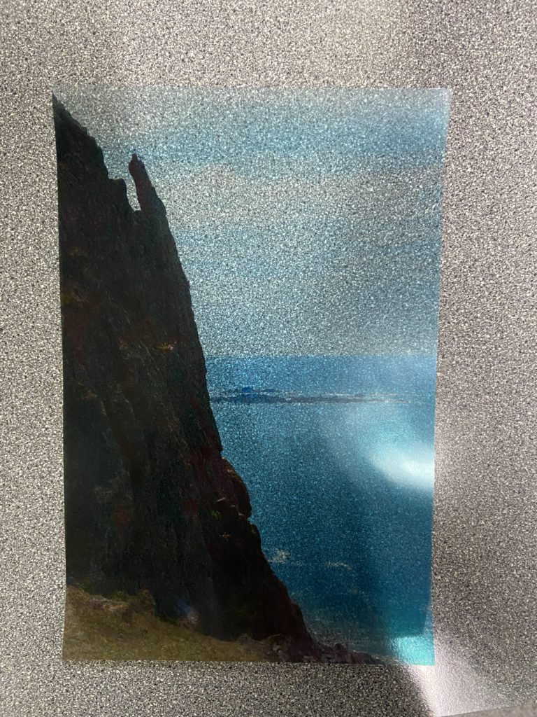
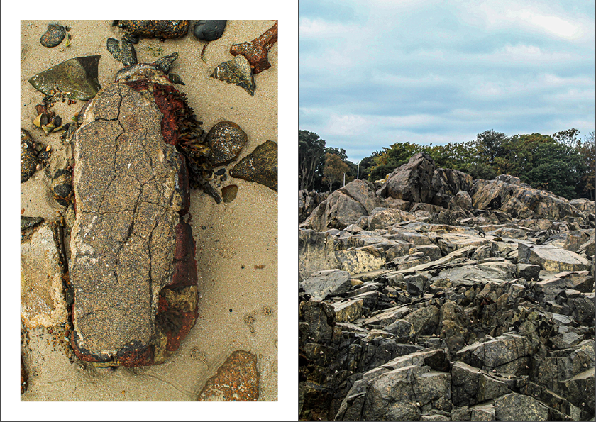
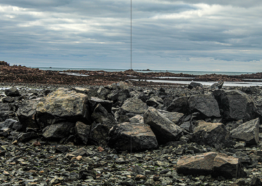
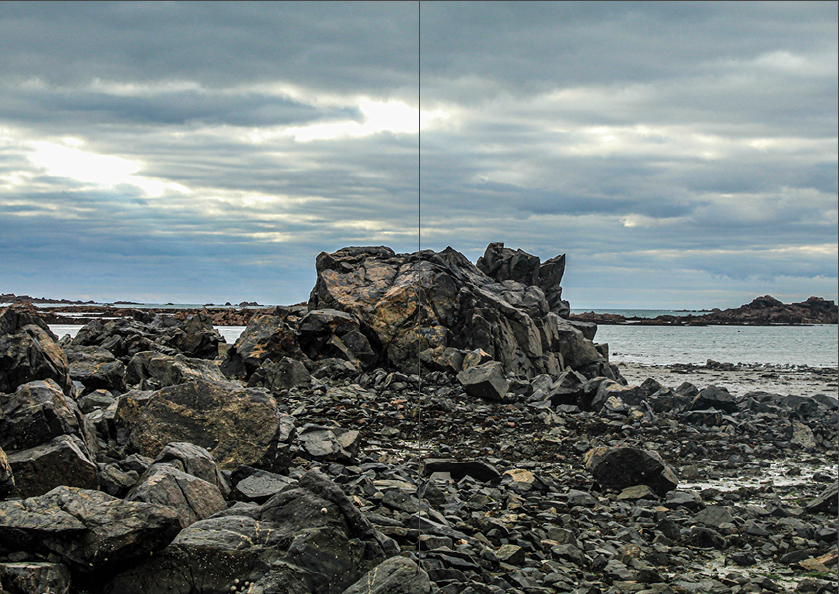
I found this photoshoot to be very enjoyable to do (taking the photos and visiting the Société Jersiaise) and edit, and I am happy with the images I came out with. I was able to get close-up images, as well as more traditional landscapes, which gave me a wide selection to pick from for the final images. My Final Images mainly consist of close-ups with interesting lines and shapes, the subject matter consists primarily of rocks and seaweed, which will hopefully give my zine a consistent theme. The Final Images I got from the landscape images all depict some form of rock with a dramatic sky, which offers a nice contrast to the other close-up images.

What didn’t go so well was that my camera ran out of memory (because I forgot to clear it beforehand) and so I had to use my phone’s camera. While the images from that were still good, it caused some delay with the creation of this blog post. I will make sure that I am properly prepared for the next photoshoot.

Société Jersiaise Photographic Archive

The Société Jersiaise is one of the two Jersey archives that contains a vast amount of photographs detailing Jersey’s history and culture.

Société Jersiaise - Search the Photographic Archive | Details

The Archive was founded in 1873 by a small group of islanders, it found a permanent location on 1893 in 9 Pier Road, where it continued to gain more members and collections. The first Bulletin Annuel was published in 1875 which acts as the Société’s main record of activities. The Société’s goals involve multiple sections that specialise in multiple fields involving bibliographic, cartographic, photographic and research collections to help preserve Jersey’s culture or heritage.

The Archive’s Website


For this part of the project, our focus was specifically placed on the Société Jersiaise and Emile Guiton’s excavation of a particular site: La Motte (Green Island) and La Rocque, both of which we went to photograph.

Green Island

A picture of the Green Island excavation taken by Emile Guiton

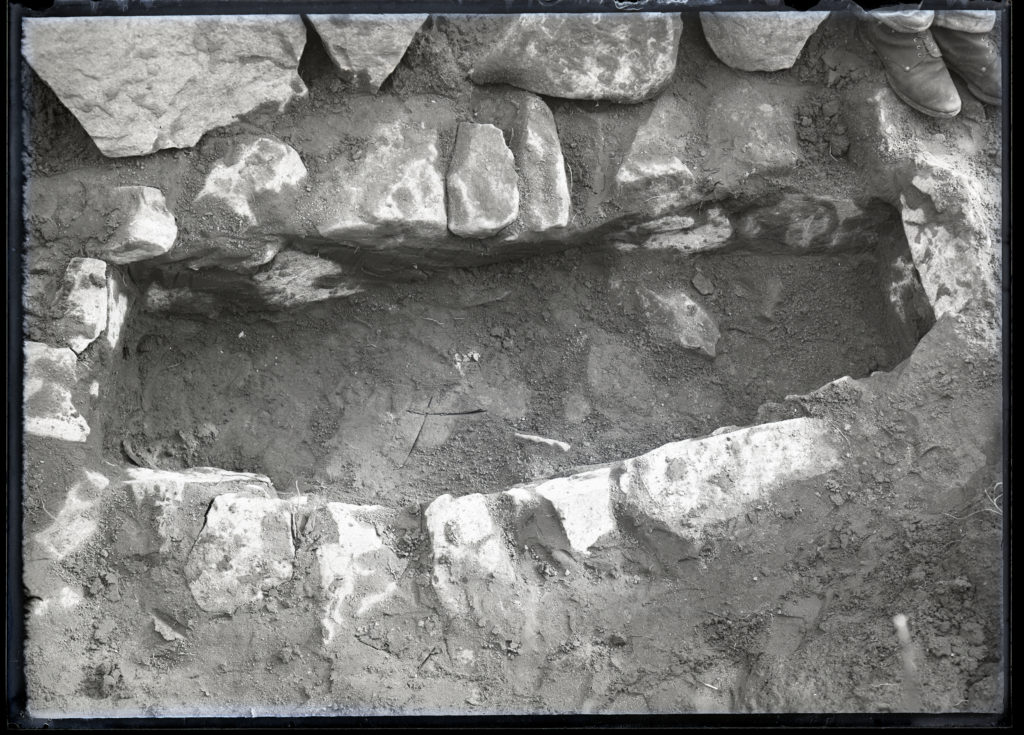
During the excavation, the Société found the remains of what is believed to be a Neanderthal necropolis containing multiple skeletons. Due to the necropolis being covered with sand, the remains were preserved in good conditions, considering they would have been thousands of years old. Some of the remains, in particular skulls and fragments of skulls, were collected and brought back to the archive where they were photographed in a studio by Guiton for documentation purposes.

One of the skulls photographed by Emile Guiton
A tomb found at Green Island

Emile F Guiton

Emile-guiton.jpg

Guiton was born in Jersey in 1879 and became one of the most prolific photographers not only in Jersey, but for the Société Jersiaise, as well as the wider world, as he was one of the first photographers to take a coloured photograph. Due to his interest for history, he became a member of the Société Jersiaise where he worked on the executive committee as honorary secretary, as well as being the editor the the Annual Bulletin, the Société’s main publication for their findings. As shown above, Guiton took part in photographing the findings of the Société, wishing to document the history of the island through his photographs. During the second world war, Guiton was one of the few photographers on the island granted a permit to take photographs during the occupation, which he used to document Jersey as historic artefacts.

The first coloured photograph of a St. Helier street. Taken in 1911 using the Autochrome Lumière process.

Image Analysis

Emile Guiton - Jerripedia
An image of a Jersey field on a farm by Emile Guiton

What I find interesting about this image is the way that the field and the people, crops and the background in the distance only make up about 1/3rd of the whole image, giving it an almost painterly, calming and grand look. Due to the image’s early origins, the colours are probably not 100% accurate, however I think this adds to the aesthetic of the image, as it seems to give the colour palette more variety (for example the shadows appear to have a dark purple-ish tone). This also gives the image a more painting-like look. In terms of the abundance of shadows, there is not that much shadow, as the image appears to be taken at noon in an open field. I also like the way the background trails off into the rocks found frequently on the outskirts of Jersey’s coast. Because of this, there is a clear difference between foreground, midground and background, with the haystacks and farmers anchoring the foreground. I think the farmers being place in the lower-centre of the image is effective as it makes them seem much smaller than the rest of the scene, giving the image an almost sublime aesthetic, while the soft colours and shapes seem to contradict that, making the image seem calmer.

Sculpture Making – MY Sculpture

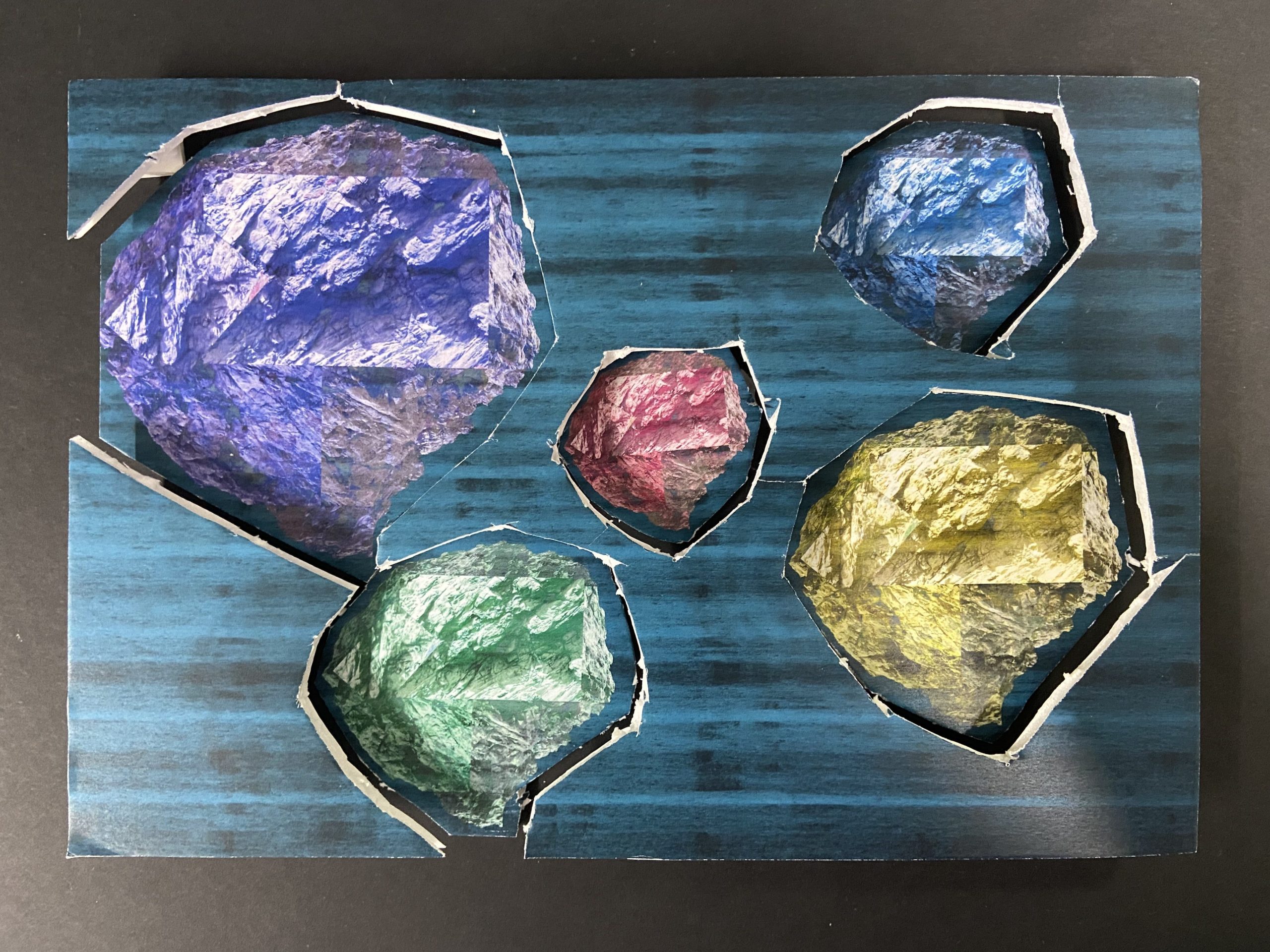
In response to our Site of Special Interest photoshoot, we made sculptures using the images taken from that photoshoot, in order to explore the natural formations of the landscapes in those sites. In particular, we looked to mimic the jagged formations of the rocks found in those sites.

Early Set of Experiments

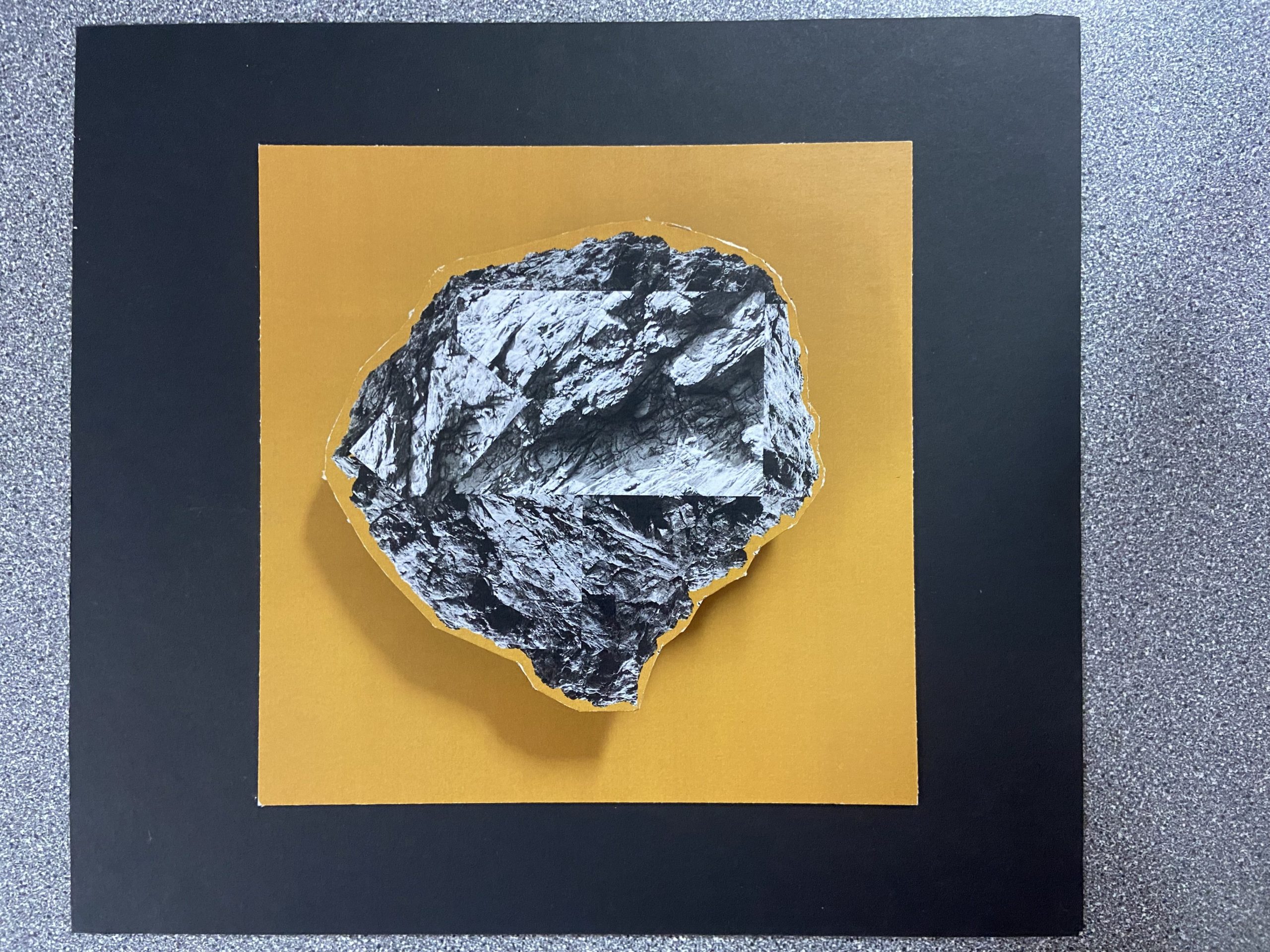
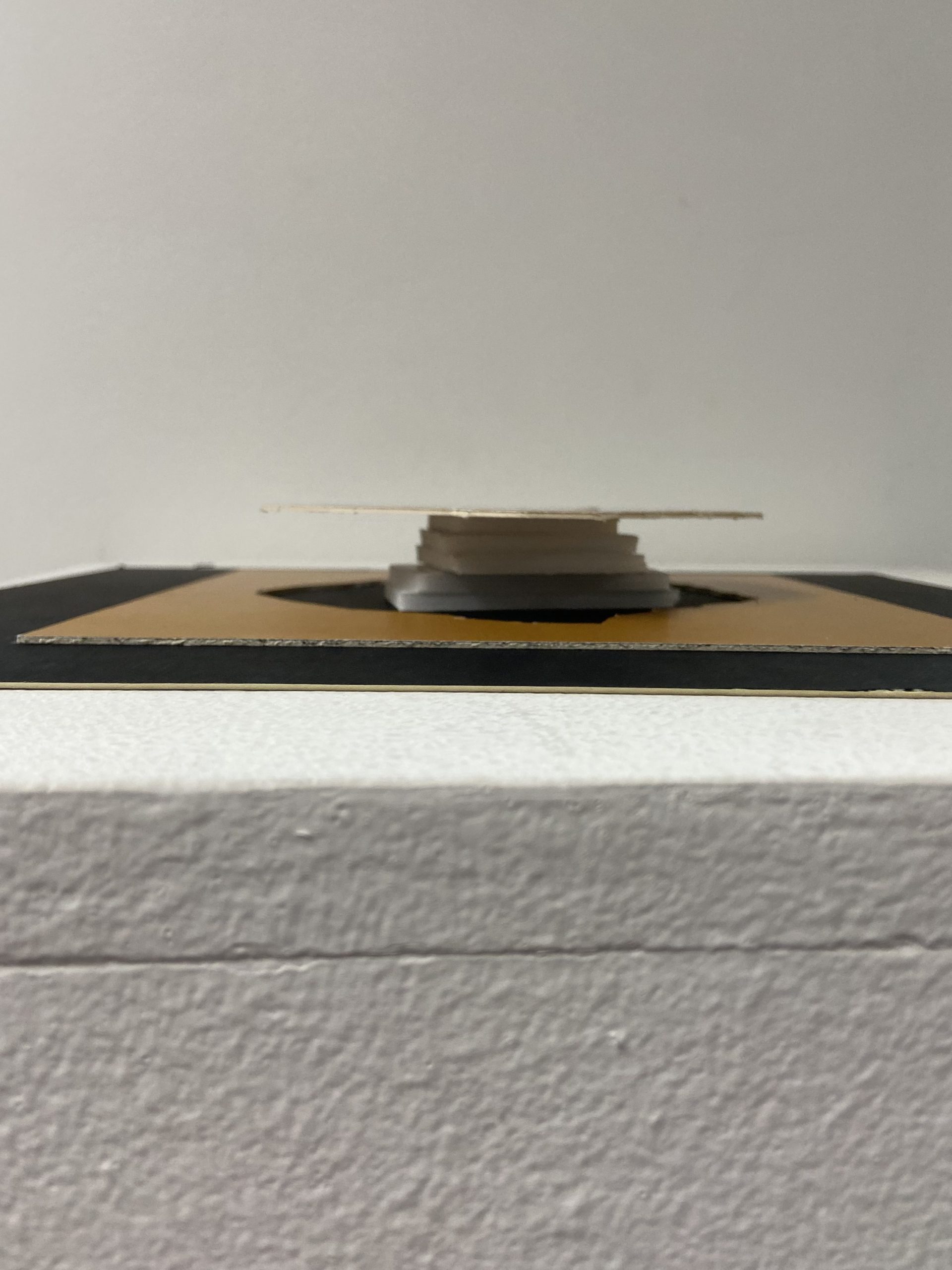
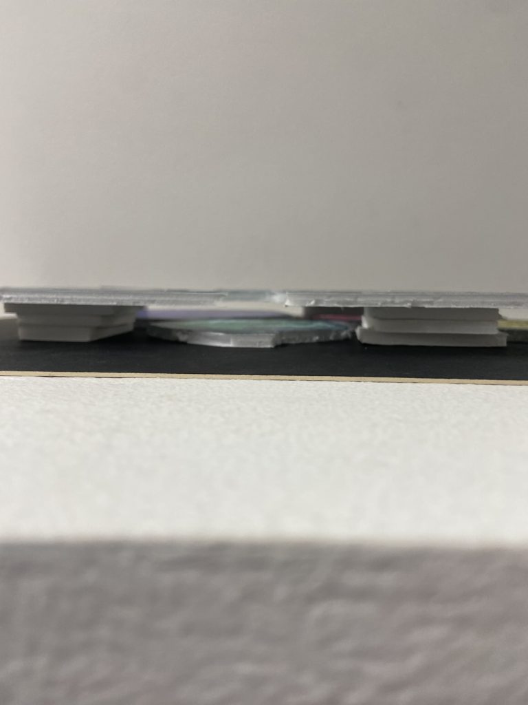
These are some of my early experiments, in these, I took the main object of the image out by putting the image on foam board and cutting it out using a Stanley knife, once I separated the rock from the background, I raised the rock up using smaller pieces of foam board and stacking them up. On my second one, I cut out the rocks like the first, but raised the background instead to create a different effect.

Experiment #1

This was my first idea, since I already had the original image made, I wondered how the rock would look elevated above the background. By stacking it on top of multiple pieces of foam board I was able to create this effect. As this was an experiment I was not too worried about the method of stacking the foam boards, however if I was to do this as a final sculpture I would likely use another, more secure method.

Top View
Side View

Experiment #2

This was the second experiment. This experiment was far more rough than the last, but the premise was pretty much the same, to separate the background and subject by elevating one, in this case I elevated the background (by using stacked pieces of foam board like the last experiment). My cutting in particular here was not the most successful, which made me look into more photographers, such as Koh Myung Keun, for another idea.

Top View
Side View

These sculptures were early ideas that I could use to get a better idea of how I could approach this task. While I am a fan of the first experiment piece in particular, I don’t think I will be taking this idea into the next stage.


Next Set of Experiments

After researching Koh Myung Keun and his body of work, I found this image/sculpture that I found to be interesting due to it’s simple form, yet complex use of semi-transparent planes to display the images in an almost surreal way.

Koh Myung-Keun “A Blending Space” (Tokyo Gallery + BTAP) |Tokyo Art Beat
Koh Myung Keun’s Image

Finding the Materials

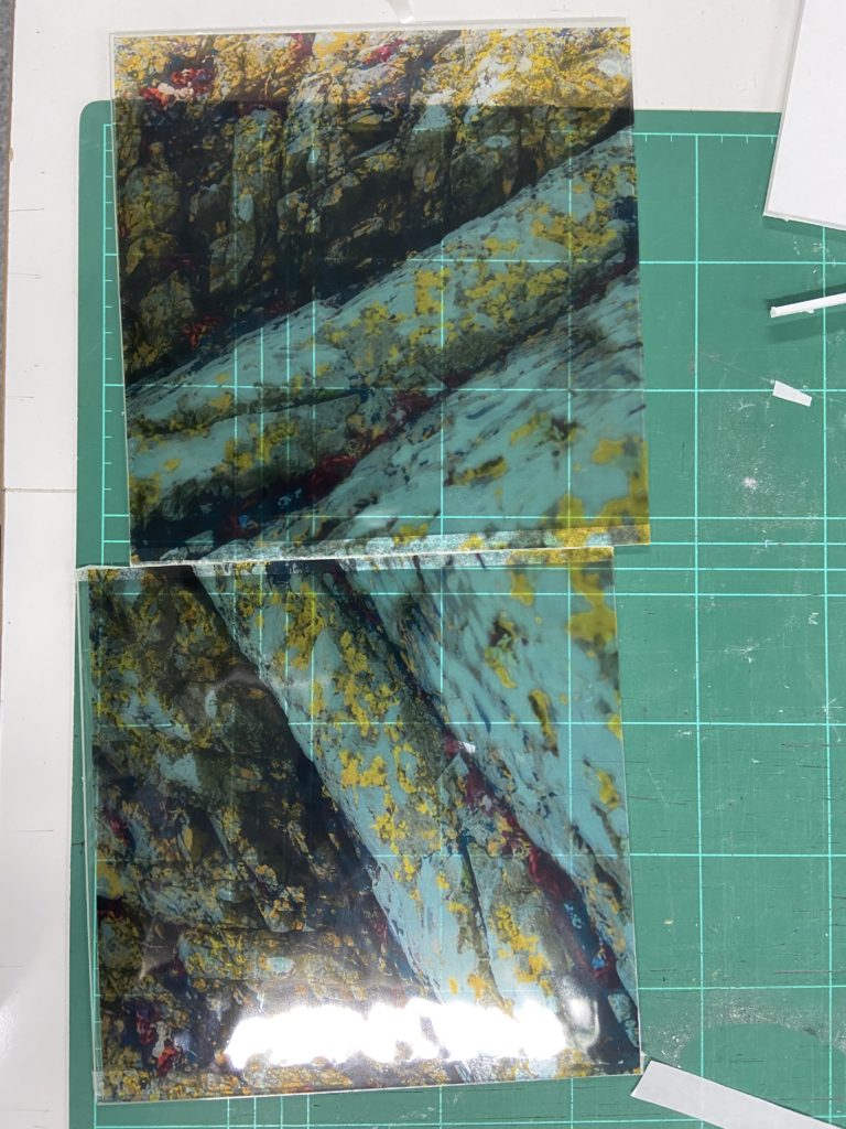
To try to recreate the semi-transparent look of Koh Myung Keun’s images, I tried two different materials: sketching paper and acetate. The sketching paper turned out to be slightly too cloudy, which would have made it hard to see through, removing the illusion that Koh Myung Keun’s sculptures have. In addition, it seemed to darken the colour and remove some detail, which was not ideal.

Next I used acetate, which turned out to be more effective than sketching paper, as it was fully see-through, and retained the detail and colour of the original images. In order to give the images more of a vibrant look on the acetate, I edited the images on Lightroom slightly to be more colourful.

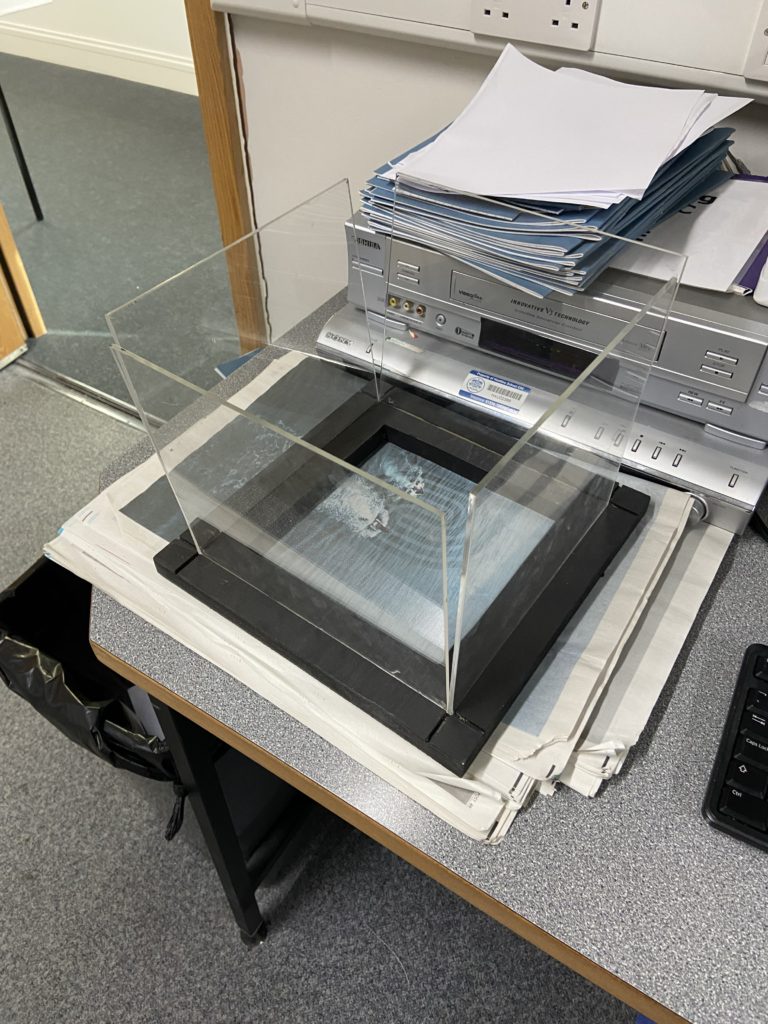
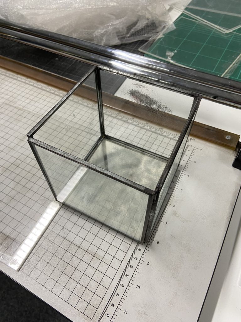
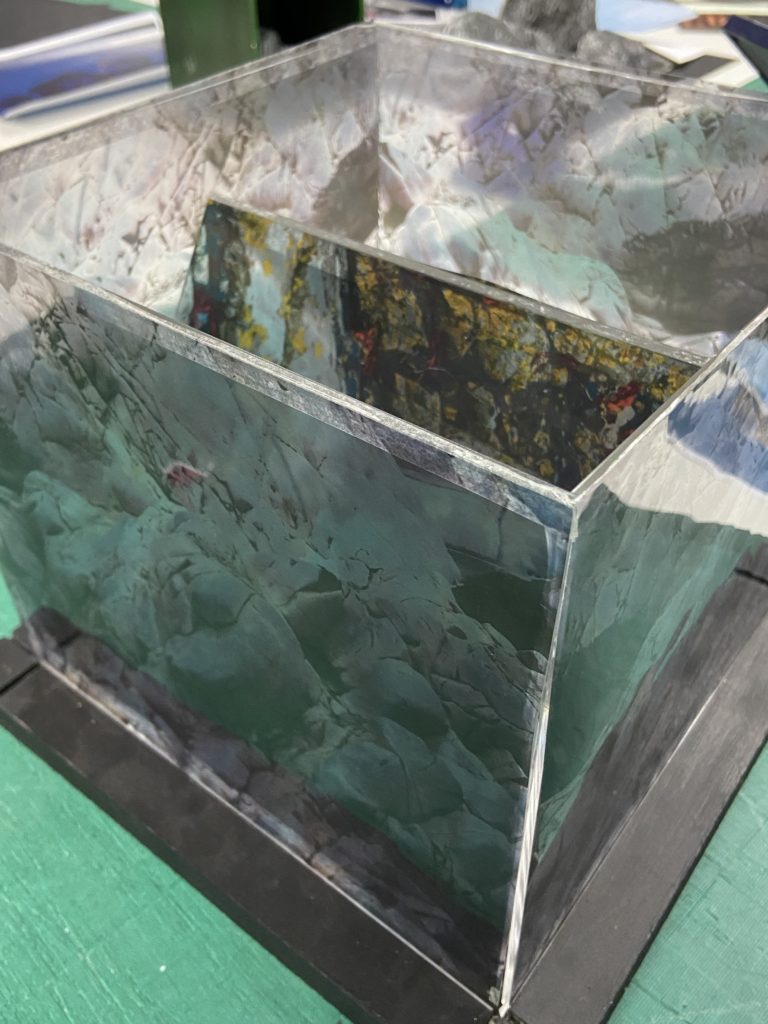
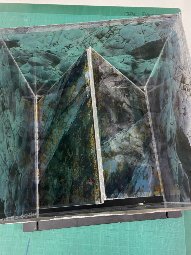
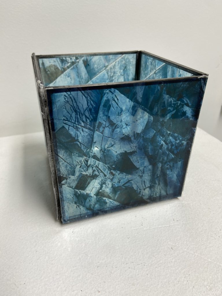
My next problem I had to solve was how I was going to sculpt the images in a similar way to Koh Myung Keun (in a school setting). To do this I found two boxes (one large and one small) made of planes of plastic that I can mount the acetate on and see through to the images on the other planes. I also found individual planes that I could put the acetate on and perhaps add to the sculpture in some way.

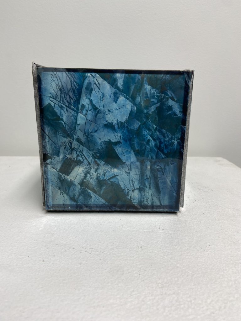
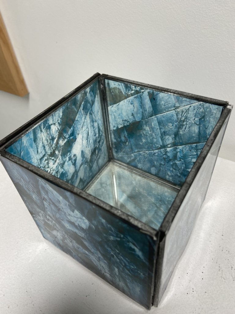
Here is what the smaller box looks like after I had placed the acetate prints onto the sides of it. To join the acetate to the box I used double-sided tape as there was no permanent spray mount on-hand.

I did the same with the two individual planes, as well as the larger box

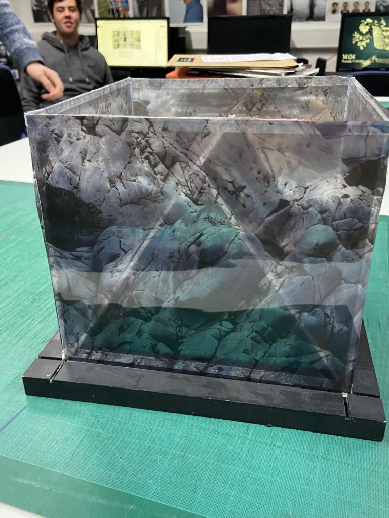
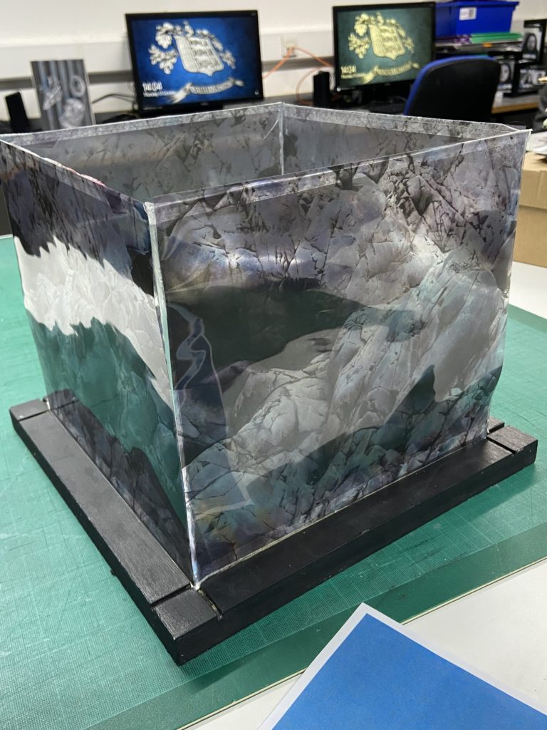
Later on in the project, I thought it would be a good idea to see how the boxes would look if I put the smaller one inside the bigger one and placed the two planes leaning against the smaller one inside.


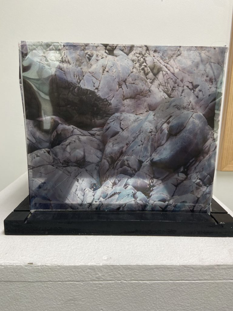
Final Sculpture(s)

Evaluation

Overall I am happy with my sculptures as they resemble the style of Koh Myung Keun’s work fairly closely. I think being able to use acetate for the first time in years was a good way to not only remind myself on how to use it, but to also add some diversity to my final outcomes. I think using brighter colours for the sculptures was a good idea because it made my images aesthetic slightly different to Koh Myung Keun’s, giving mine a bit of originality. The colours also help make the sculpture stand out more, as the acetate would have likely removed some details if the images weren’t edited to adhere to it. I think my decision of using acetate over sketching paper was a good choice, as it made the sculpture much more alike Koh Myung Keun’s, however the cloudier properties of sketching paper might be able to be used in later projects.

If I was to do this project again, I would probably use a permanent spray mount to attach the acetate to the planes without leaving any marks (I don’t think the double-sided tape isn’t that noticeable but it would be a definite improvement). I also think it would be interesting to experiment with different shapes of the sculptures, this would have been difficult in a school setting but it would open more possibilities.

East Coast Zine

3 words – LaHocq to Greenisland

A sentence – The journey from La Hocq to green Island along the coast

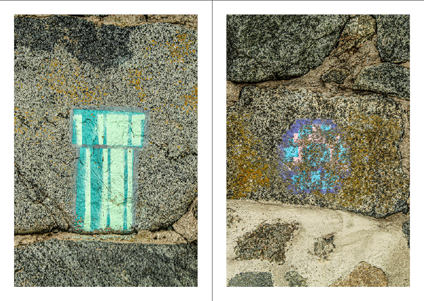
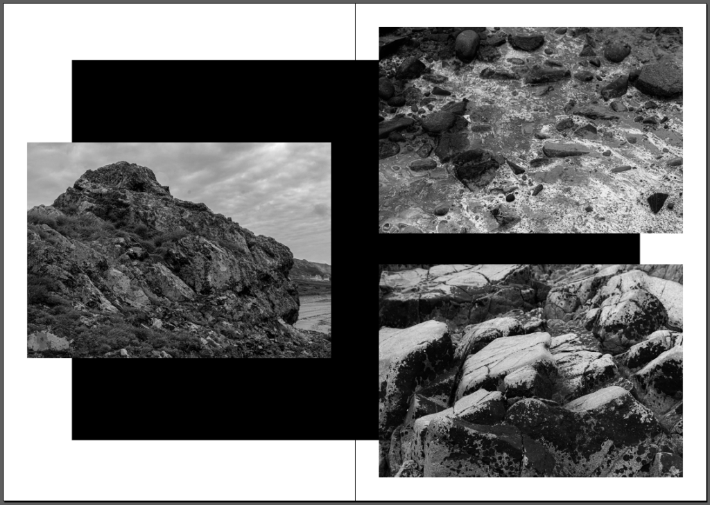
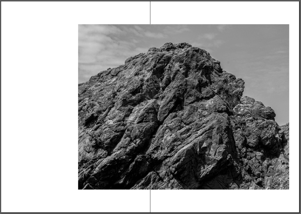
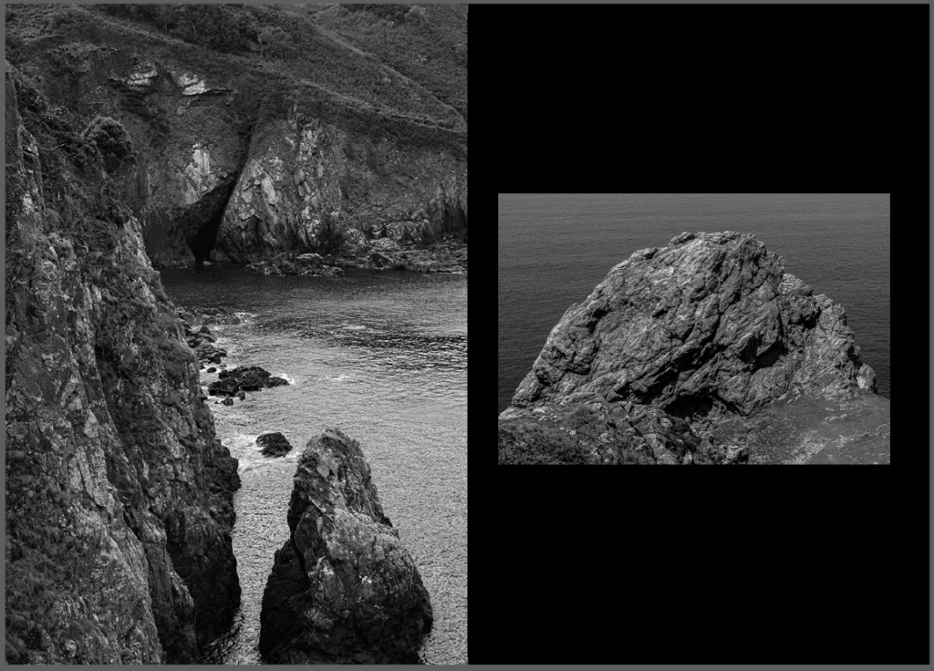
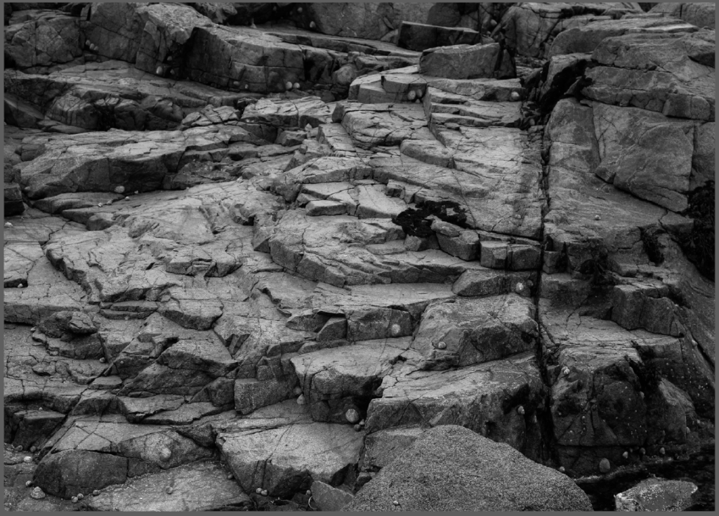
A paragraph – My zine is going to show the journey along the beach and around the headland from La Hocq to Green Island. I am going to achieve this by having the images in my zine in the order they were taken on our Field Trip to La Motte.

Creating My Zine

My Zine

Evaluation

Overall i am very happy with my zine. I thought that it had a good diversity between style and size of images. For example the spread between Black and White in addition to colour images. As well as the different layouts such as double page spreads and bordered images. Some thing i think i could have improved on is adding some writing to the images to give them more meaning.

Final zine – Evaluation and Critique

Final decision explanation

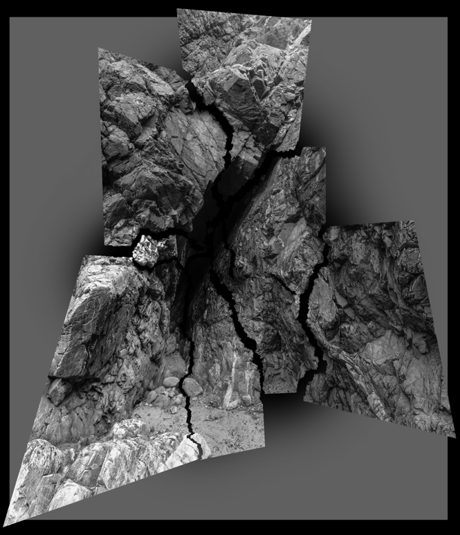
I decided to chose the first draft of my zine for my final product as I preferred that overall layout and the composition. The first draft contained a few more experimental page layouts such as the one with a black rectangle in the centre of the pages with the photos on top. I wanted to really experiment more with this zine compared to my first ever zine that I made on the topic ‘Anthropocene’.

Analysis

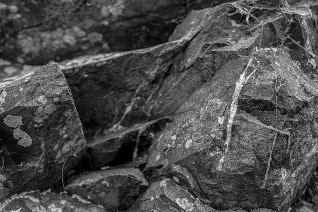
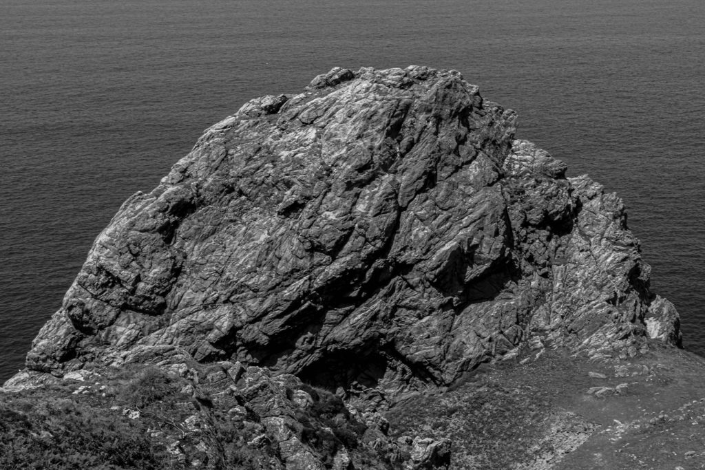
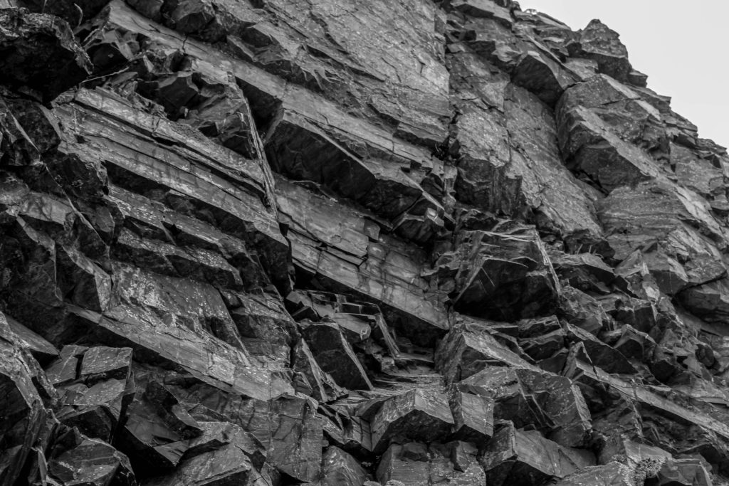
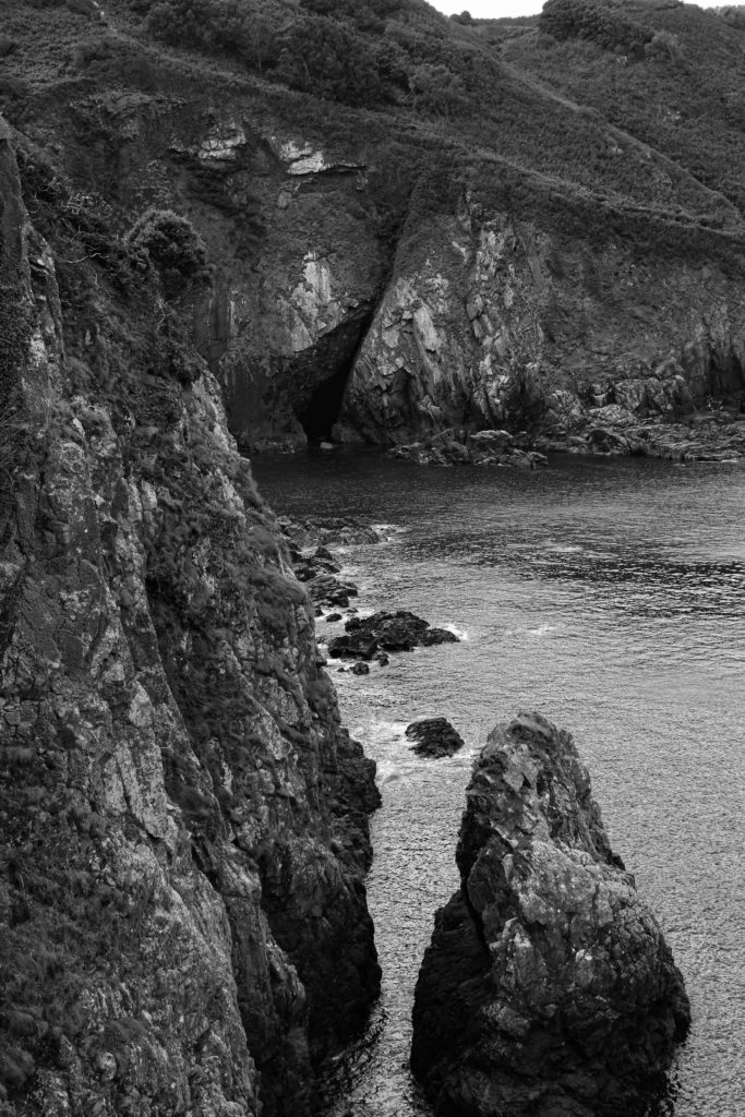
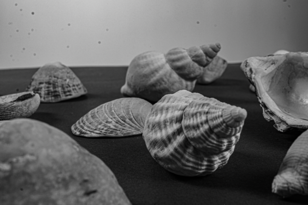
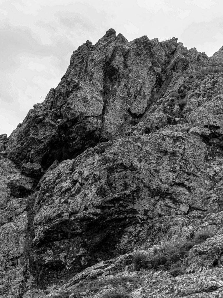
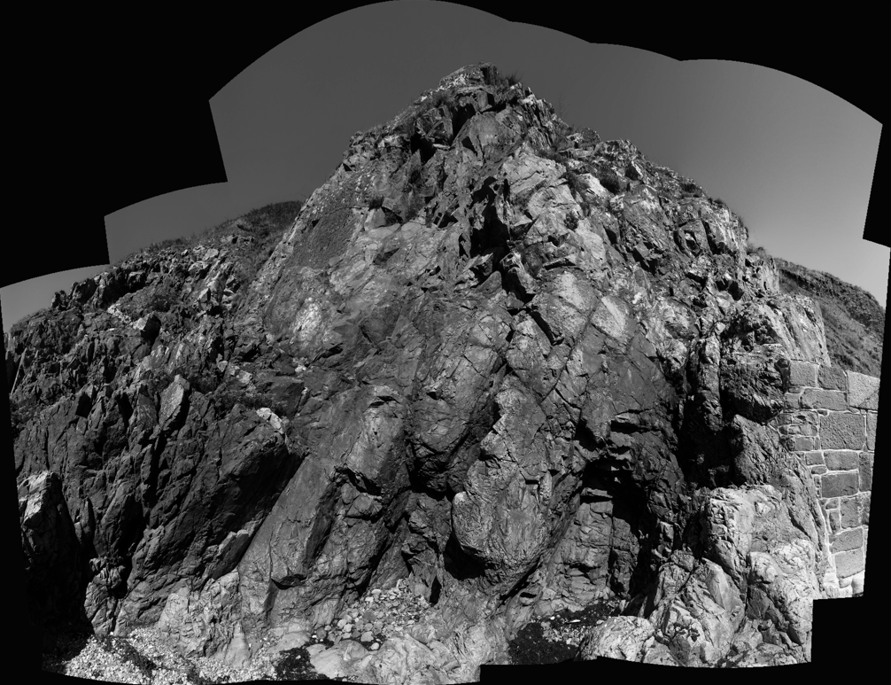
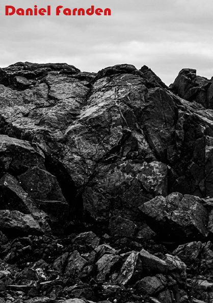
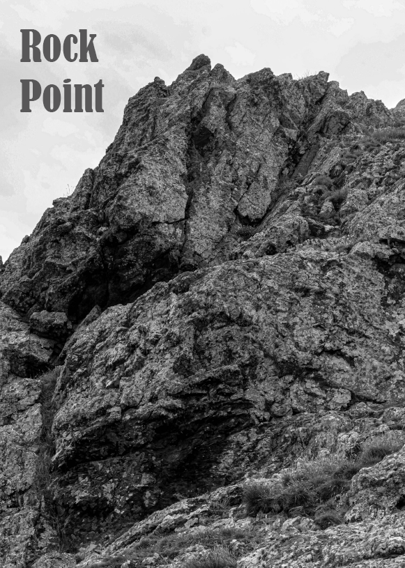
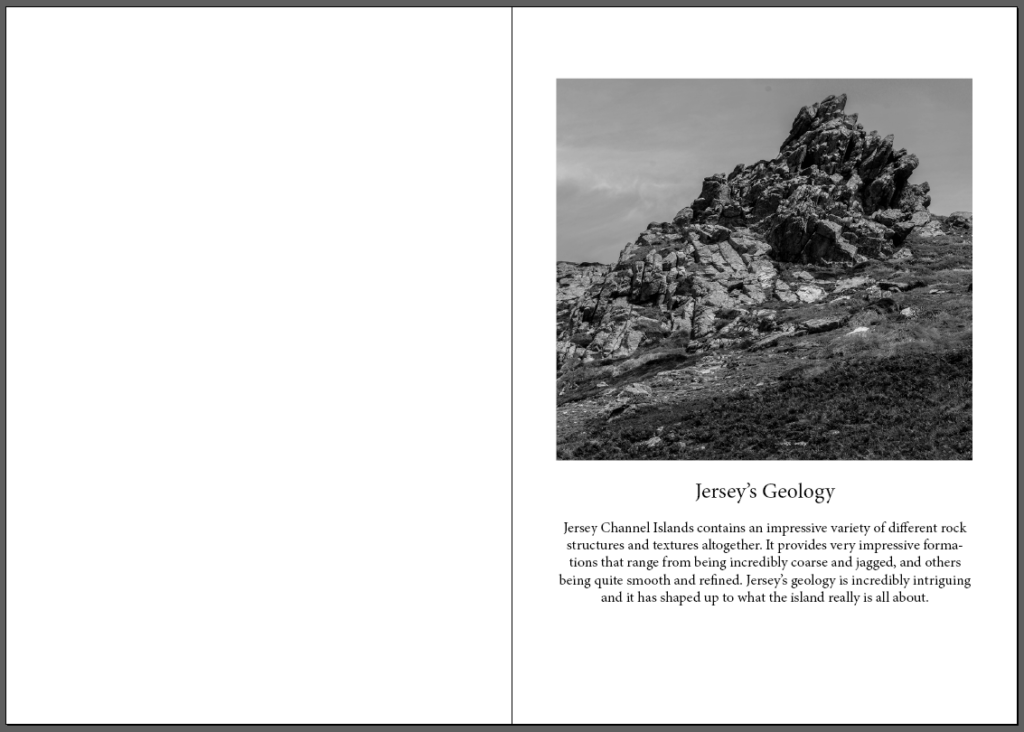
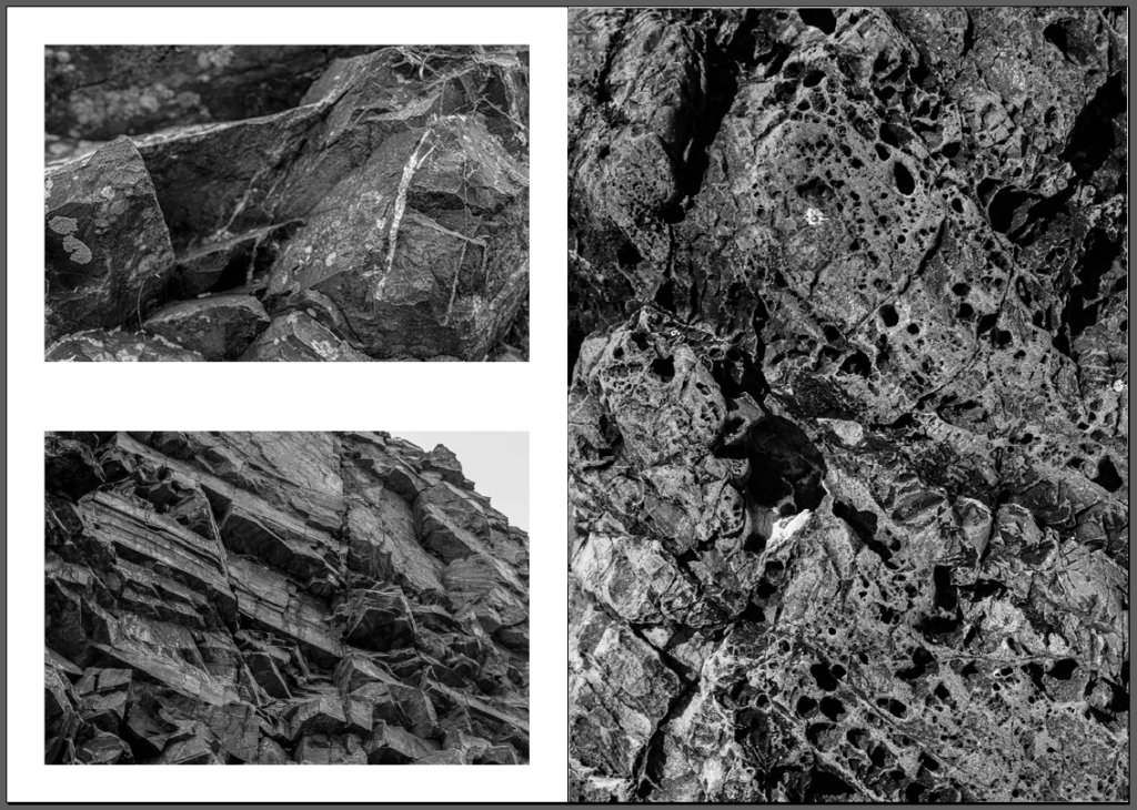
What went well: With my zine, I was overall very happy with the result as I believe I was able to capture the true essence of what Jersey’s geology is all about. I wanted my zine to be very dramatic, so that is why I chose the approach of making every image black and white so that I could enhance the structures and formations that are made among the rocks. I wanted to state the importance of its structures and make it easier for people to notice areas that are hard to see at first glance.

Critique

What to consider next time: Overall, I really like how my zine turned out, but next time I make a zine, I would like to have experimented a bit more with the layouts of the pages. I have included some experiments, including the black background and expanding the images over both pages, but I would have maybe included a wider range of photoshopped layouts so that the zine would appear a bit more intriguing. Other than that, I am very happy with how my zine ended up turning out.