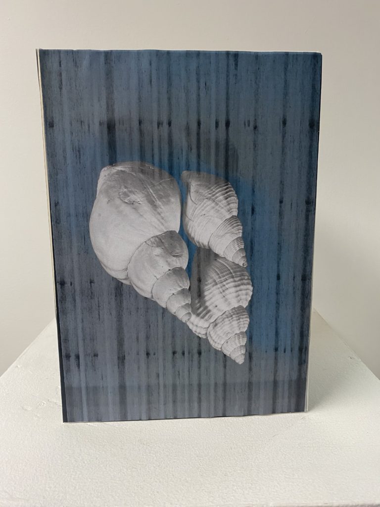
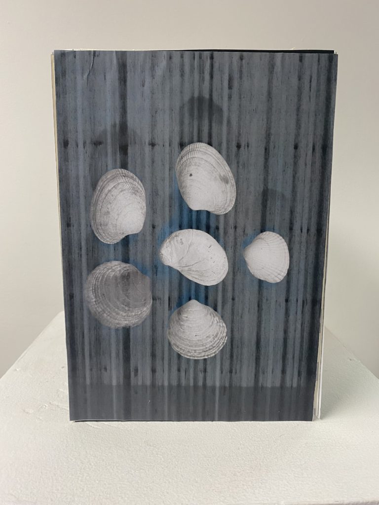
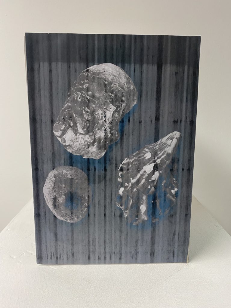
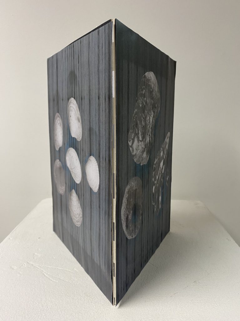
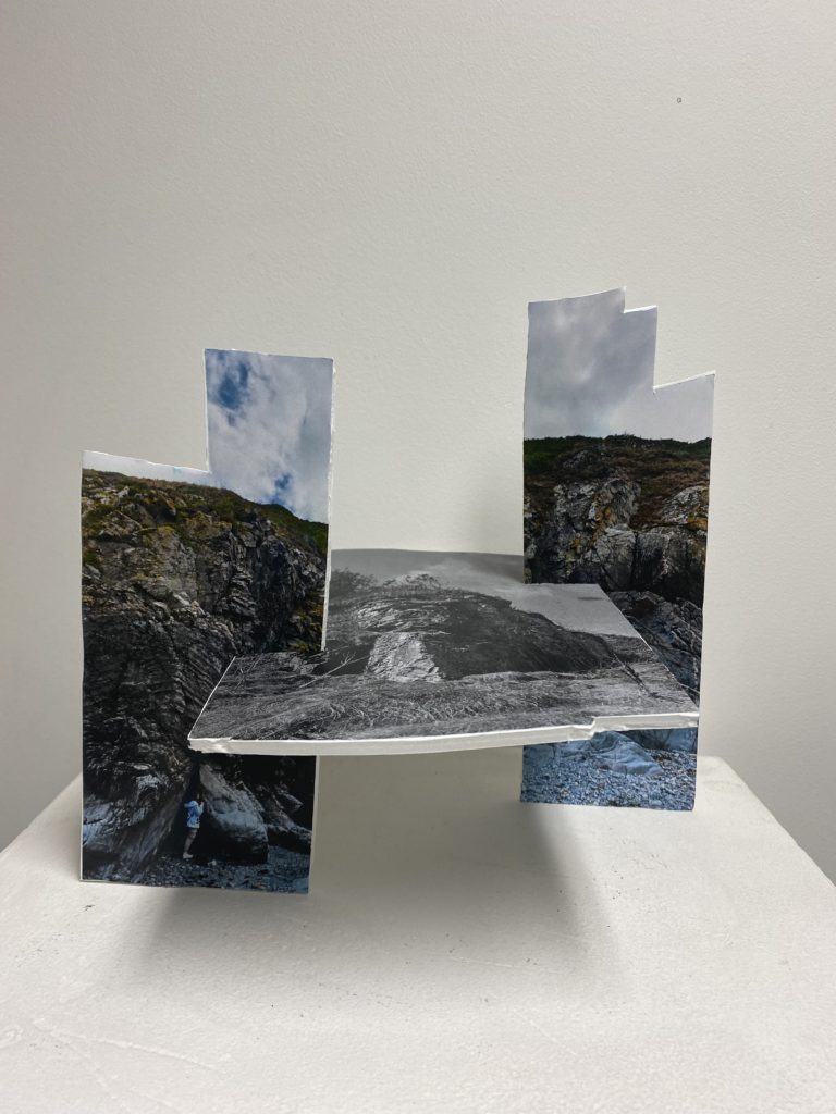
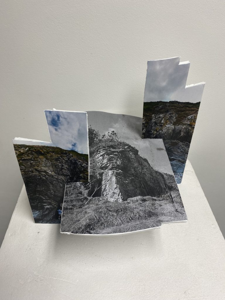
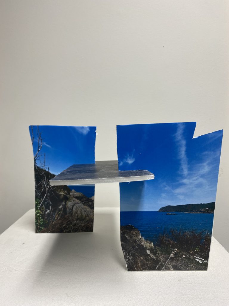
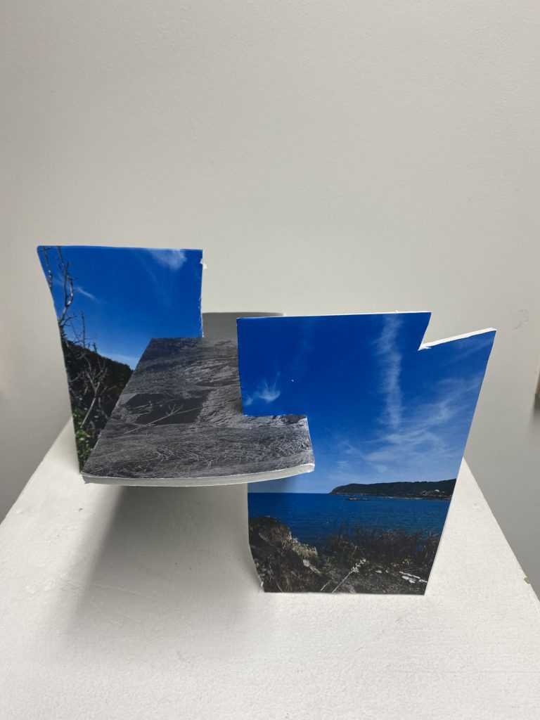
In class I experimented with different ways to manipulate my photos which I have taken and edited, I ended up creating 4 different outcomes. I enjoyed doing this because it allowed me to be creative with different ways to create a sculpture which I could use for a final outcome.
Outcome #1 –
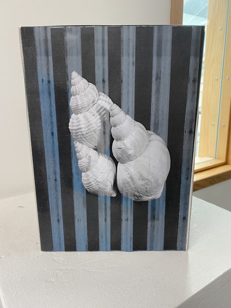
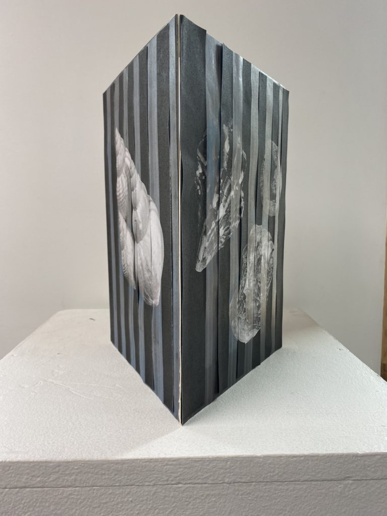
For this sculpture, I printed out my photos in black and white because I wanted their to be a distinct contrast between the background and the shells so that they would stand out well. Due to the printer not working well. the prints came off streaky but I liked the effect which this added to my sculpture. To create the stand for my photos to rest on I began by cutting out mountboard through putting the photo onto it then cutting around it then repeated it 2 more times. Next I combined the 3 photos mounted on the mounted by taping them together inside of the structure, I used 3-4 pieces of tape at each crease to make sure that it was secure. I was quite happy with the way that this turned out because it is simple yet effective as the photos work well in a set together and the structure of this sculpture highlights that. If I were to do this again, I would make sure that the photos are cut and mounted accurately as I didn’t cut it correctly in places so that they link together better at the sides and don’t create a gap which has happened. Another aspect of this sculpture that I would improve on is adding a top to the structure because I think that it would make it look more complete.
Outcome #2 –
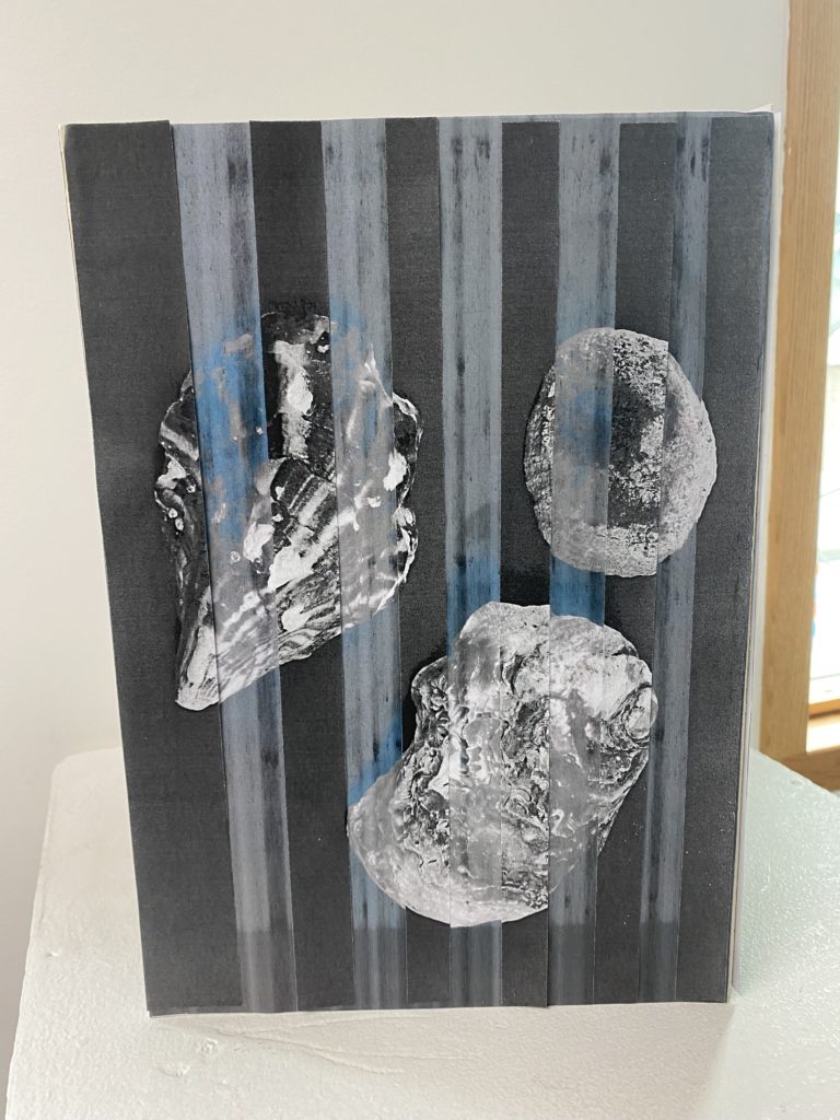
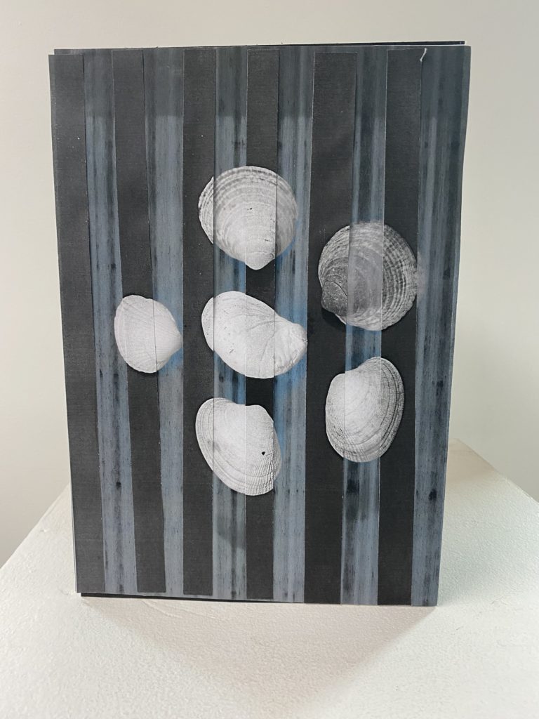
For this outcome that I enjoyed creating, I expanded with my experimentation from my first sculpture as I wanted to add more. I achieved this through slicing up the same images which printed out differently and layering them in the correct places and missing a gap each time, repeating on each of the three sides. I liked the effect which this created, which resembles a double exposure, which you can create on photoshop. I liked the idea of this structure and how it turned out but if I were to improve it I would make sure that the pieces are stuck down correctly in most places, as many can be seen to be coming up at the top and sides. I would also make sure that they are put down in their accurate and designated places as there are a few pieces which are slightly off of where they should be. To further expand on improving this sculpture as I think it could be more successful, I would make sure that all of the pieces are sliced in accurate sizes as I think that this would help the issue of matching them to their correct places which I talked about beforehand.
Outcome #3 –
For this outcome that I think was my most successful throughout this experiment, I think that it turned out unusual and unique in the way that I have manipulated and transformed it. This was through using foamboard which I cut out to make the different shapes, which were originally joiners that I had printed out, I taped each photo down and cut around it then used spray to secure them down so that they won’t fall off in the future. I also made sure that the bottom of each joiner structure was secure so that when I combined them they would be able to rest flush to the surface that they are on and won’t wobble around. To decide where I wanted to slice the image I began by making a slit down the middle of the coloured photo because it was originally quite a big structure which I didn’t like as there was too much surface area. This then separates the photo and I thought that I could but the joiner which is in black and white in the middle which creates a bridge structure where it is resting in the middle. To add a little bit more depth into this sculpture, I decided that I should position each of the coloured joiner posts at different points which changes the perspective of how you were looking at them, as well as if you are looking down on to them as the black and white photo faces upwards.
Outcome #4 –
For my final outcome, where I used a similar technique as before to create a set of sculptures/photo which work well together. I began by mounting each image and then I sliced the coloured joiner in half and once again then repeated the positioning of where to put the coloured posts which changes the perspective of the sculpture completely from every angle that it is viewed from. I was not happy with this outcome to an extent as I think that I could have been more careful to how I was cutting out each joiner because it can be seen as wonky in a few different places due to me not being accurate which I don’t like as I think that it makes the sculpture look quite messy and not put together well.

