I have made a zine once before in my previous photography project ‘Anthropocene’. I was able to produce a 16 page zine which contained all my best images from the previous project and overall I was very satisfied with the final results.
I would however like to think more about the theme of the whole zine to be the same, as in my previous zine the images were all different colours and the theme was slightly all over the place. This time I will take on board the criticism I am setting myself with to hopefully make this zine a lot more to my liking. The previous zine was a first attempt, so I hope that this second attempt is something that I’m slightly more satisfied with.
Images selected for my zine
Here I have a couple images that I would like to use for my zine, and I wanted to see how well they would compliment each other by being paired together.
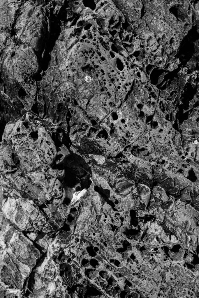
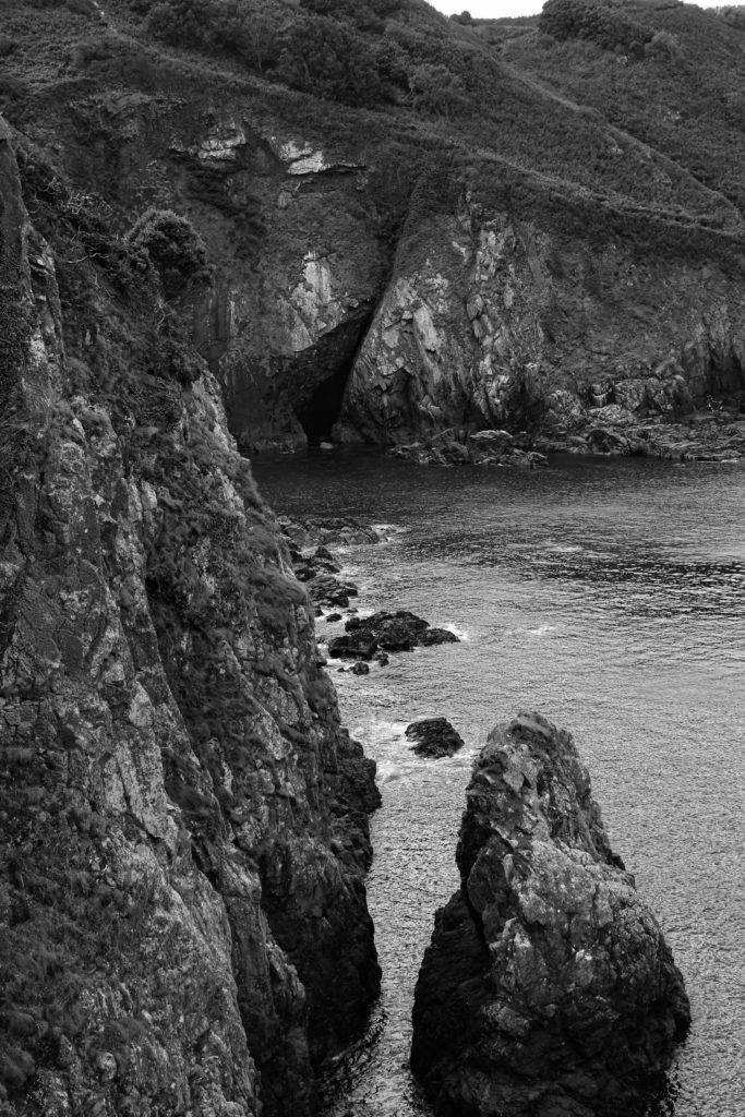
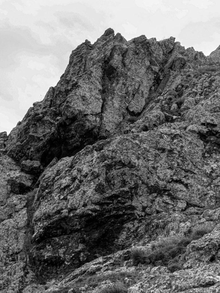
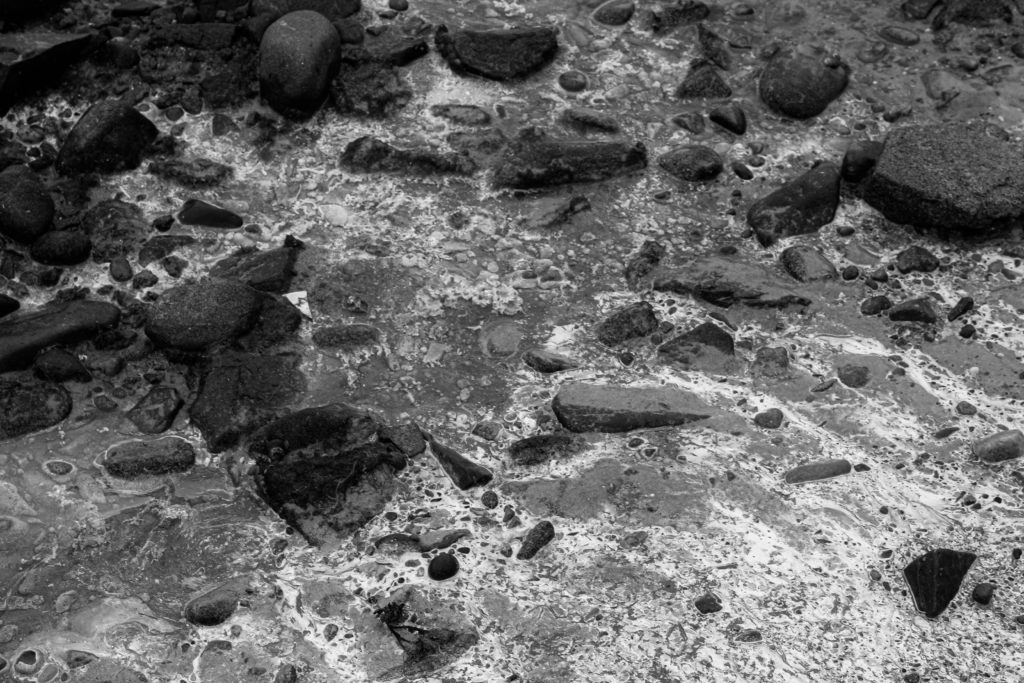
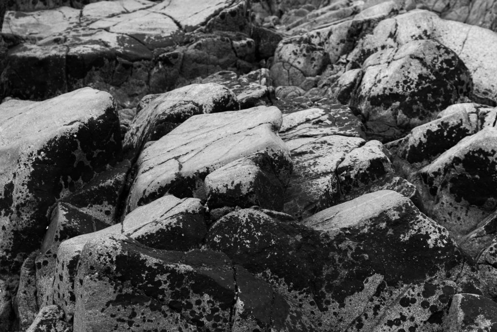
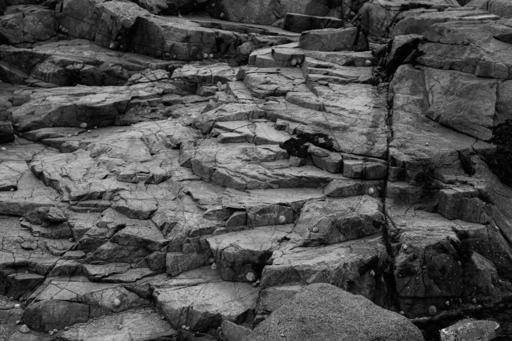
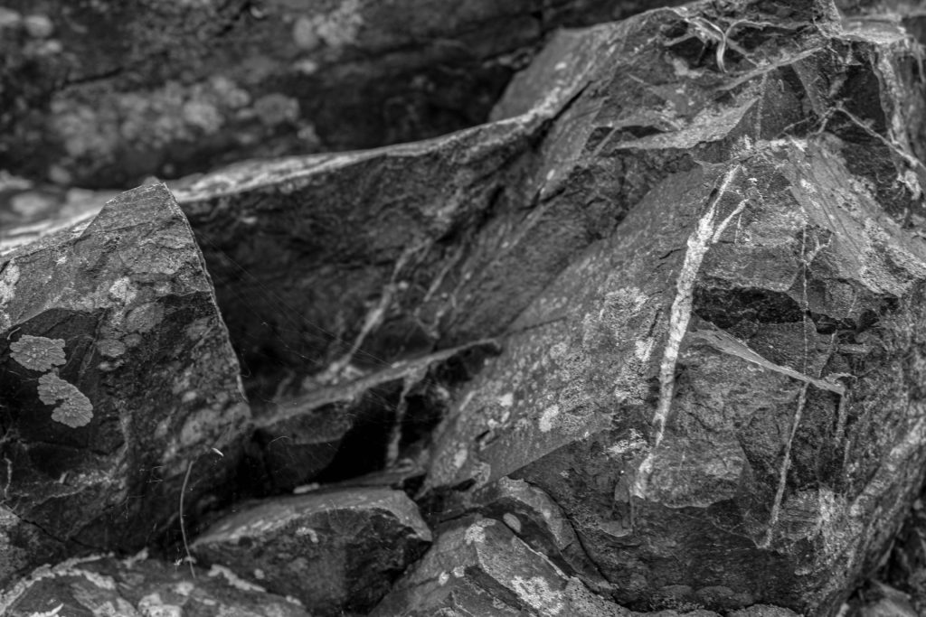
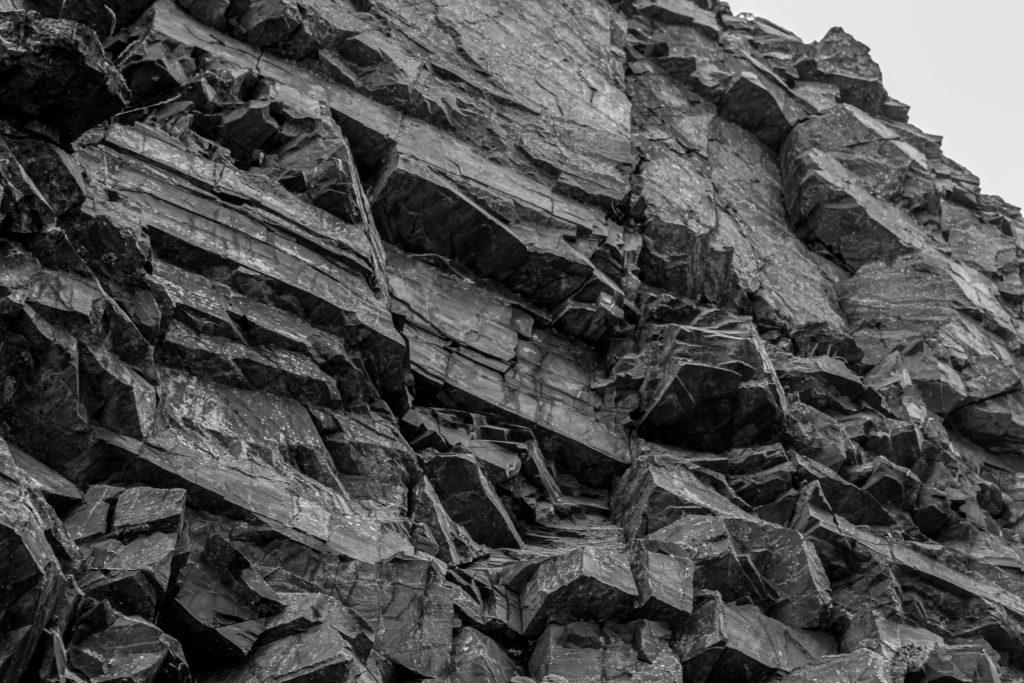
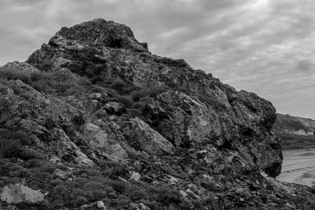
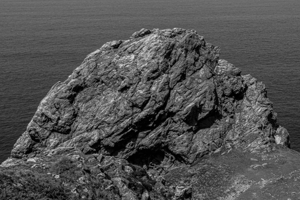
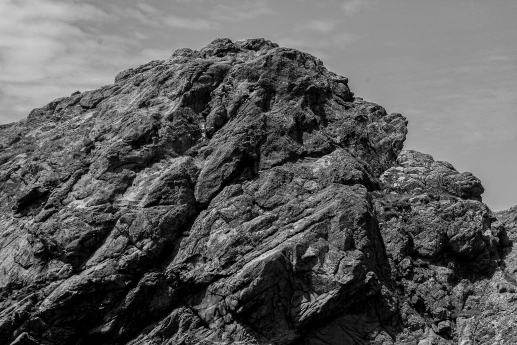
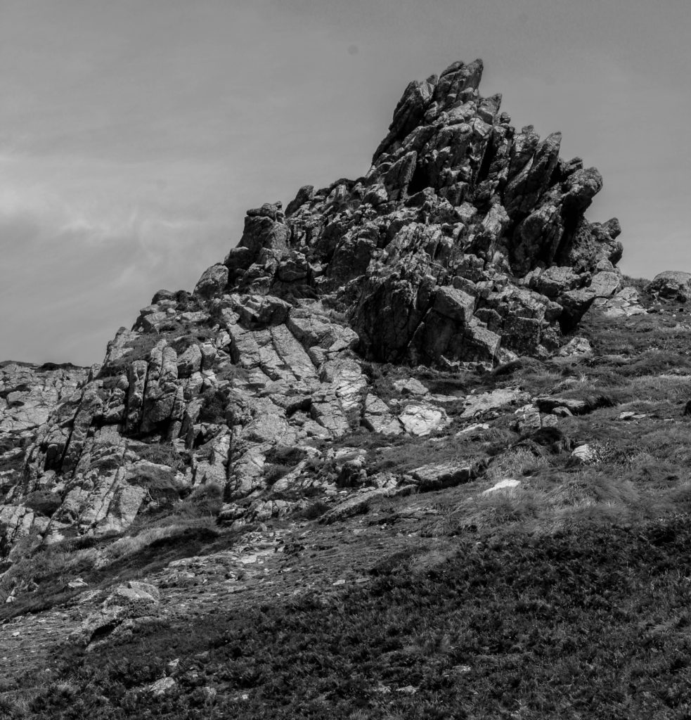
These are the wide range of images that I am going to use for my zine. I wanted to incorporate variety of close-up and textured images, with the full-scale sculptures. I wanted to achieve a contrast with my photographs so that I can display what others may not notice at first, such as the rocks rough structures close up. Displaying Jersey’s Geology from different viewpoints is definitely a good way of showcasing it’s many formations.
Process of making the zine
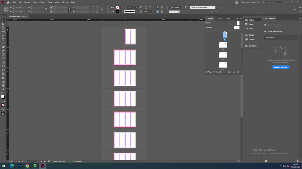
First I began with the layout of my zine by choose to have 16 pages for my zine. I decided to cut the number down after I added my images as I didn’t want to have a load of blank pages or even add more images on to fill in the gaps.
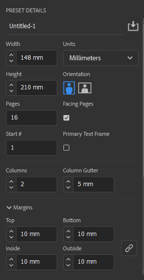
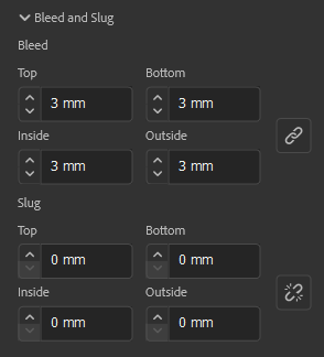
These were the settings we had to follow for the zines. They were to be presented with a portrait orientation and had to have the width and height be at a size that showcased the zine in a rectangular shape, similar to an A4 piece of paper. as to get a good range of photographs presented in the piece.
First zine draft
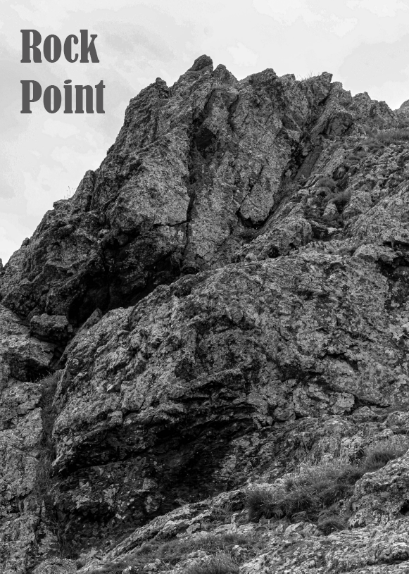
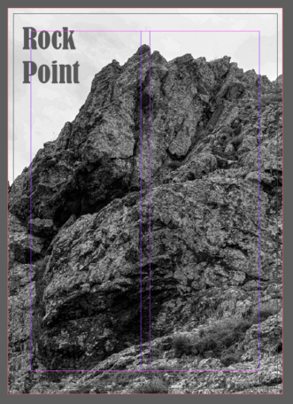
With my front cover, I chose this image as I really wanted to make the beginning of the zine quite impactful and intriguing bt choosing such a dramatic photograph. I also went ahead with choosing the title ‘Rock point’, as to represent what was going to be showcased within the zine. I experimented with a few titles such as ‘Rock bottom’ or ‘Jagged geology’, but I thought ‘Rock Point’ was a lot more suitable than the others.
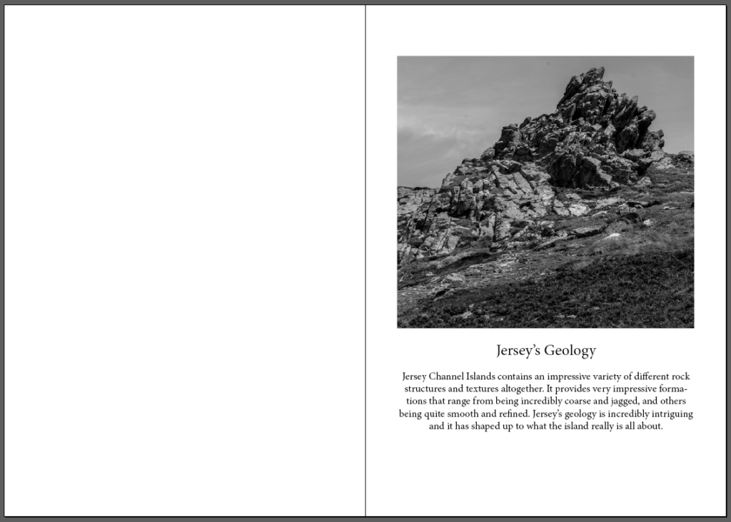
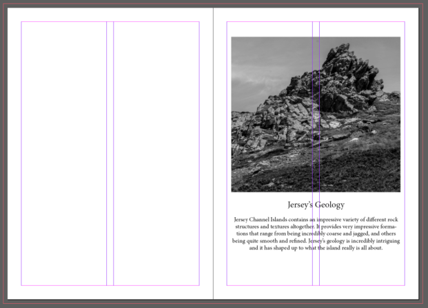
For my first and second page, I wanted to start off by including a small description about Jersey’s Geology and what this zine is all about. I wanted the description to also be included in with an image I took as to highlight the basis of what is to come within the zine.
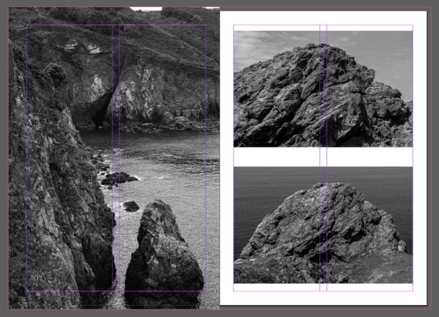
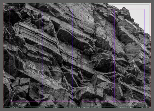
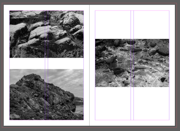
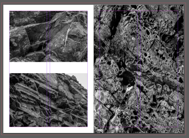
With these pages below, I wanted to start off by showcasing the textures of Jersey’s geology and a close-up representation of what people may not notice at first glance. Jersey has quite jagged formations and I wanted to highlight what it is that makes the islands rocks so intriguing. For page 4, I wanted the images to be placed within the zine with a white border around them so that they can both shine separately and not be too confusing or difficult to look at. There are so many different textures occurring with these images so I didn’t want to make them all confuse one another. On the right side, I wanted to expand the image to completely cover the page, allowing for no white borders to appear and for the image to expand to the bleed, which is kept at 3mm for each page. I wanted to really highlight how intriguing Jersey’s rock patterns are and I thought this was a really good example for how to showcase this.
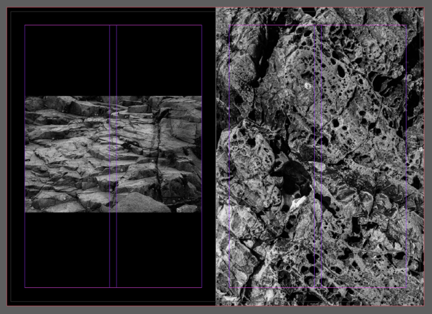
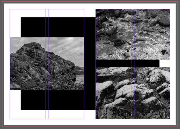
With pages 6 and 7, I wanted to edit the background of the images so that there was a black rectangle which spread across both pages. I didn’t want to include just a plain white background for these next pages, as I believed that it would clash with what pages 4 and 5 have been presented as. I wanted to experiment a bit more with the aesthetic of the page before placing the images on top. I thought these images all complimented each other as they’re all showcasing different areas of the islands formations. The images on page 7 highlight close-ups of the rocks, whilst page 6 presents a full-scale, and much more intimidating, representation of the islands geology.
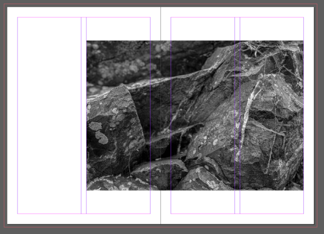
Page 8 and 9 include an image of one of the full-scale rock photographs which spreads along both of them. I wanted this to be a break from the other pages so far, as every page includes more than one image set together. This image on the other-hand, presents only one image but it is spread out among both pages. I liked how this page looked as I believe that it will be quite effective to turn to, especially after the repetition of multiple images on the pages so far.
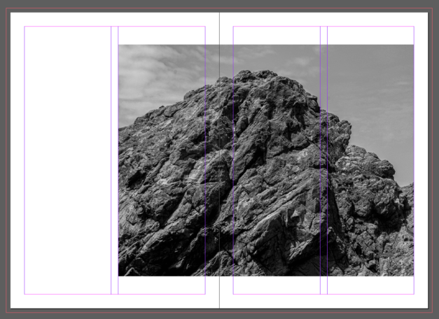
I thought that these pages really complimented each other as they both showcase full-scale photographs of the islands formations and present just how intimidating their size really is. I wanted to include a black background as well for the image on page 11, as to break away from the white background that is chosen to begin with. I wanted to allow for these to make a more dramatic impact with the darker and harsher colouring.
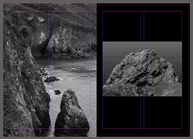
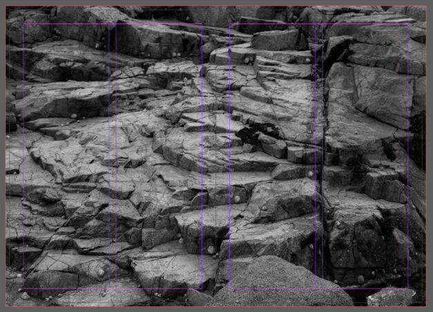
I wanted to then take the approach of completely covering both pages with a large-scale photograph. I chose this image for it so that I could really make the rocks textures stand out. I wanted to make it big and bold as to make a larger impact on what the island has to offer. I expanded the image right up to the bleed so that the image would cover the pages nicely, not allowing for any of the white borders to peek through.
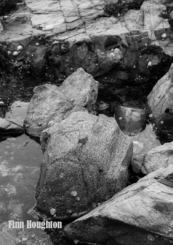
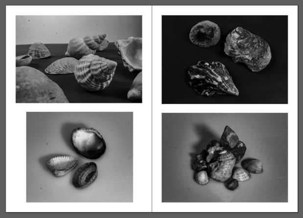
After all of my images being mainly about Jersey’s landscape, I wanted to also incorporate some still life images of rocks and other items that I have collected from the areas I have explored. I wanted to really capture the many varieties of rocks and shells that would be lying among the Jersey coastlines. I particularly liked these images for my zine as they still fit within the theme, but they also present a dramatic intent of the many items that would be harder to notice at first glance due to the size of them all. The harder to notice rocks lay among the much larger scale rocks, so I wanted to allow for these still life images to really shine so that the importance is highlighted massively.
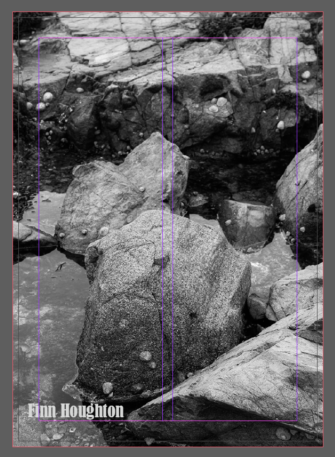
Finally, for my back cover of my zine, I wanted to once again let the image expand up to the bleed so that it would cover the entire page. I chose this image as I believe it is quite a strong image for displaying the many arrangements of rocks present. I believe that it compliments the front cover very well as they both have presented an almost intimidating interpretation of what Jersey’s geology is all about.
Second zine draft
After creating my first draft of my zine, I wanted to experiment a bit more with the layout so I decided to carry out a second zine draft. I wanted to compare the two zines so that I could make a well thought out decision of which one I would like to be printed.
For this draft of my zine, I kept everything fairly similar to that of my first draft, but just ended up rearranging some images to see if they complimented each other more than the previous arrangement. I wanted to experiment before making my final decision for printing out my zine.
