How do archives function as repositories of knowledge?

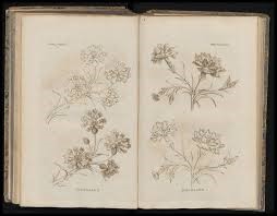
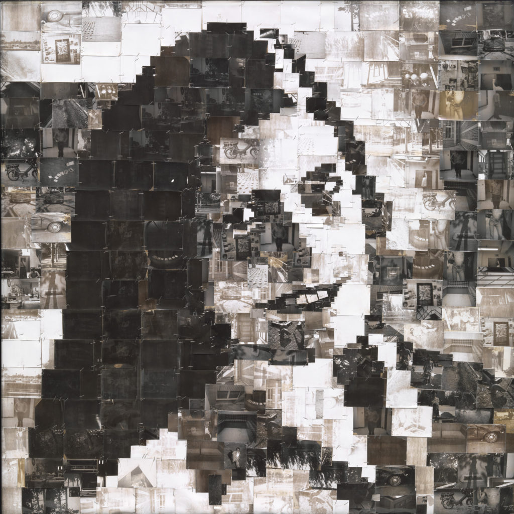
The official Cambridge definition of an archive is “A collection of historical records relating to a place, organization or family,” an archive can be as simple of a collection of photographs on a mobile phone however traditionally an archive contains historical records in all forms of media: such as photographs, documents, scientific findings, and items of the past: These records are then categorised into separate classifications whether that be type of media, era/year, or a certain subject. For example, Jersey Archive has a section for the collection of seaweed specimens collected in Jersey during the years 1859 and 1860 by Mrs J. W. H. Harris- records like this can help scientific research and show Jersey’s development environmentally as well as technologically, showing local access to technologies such as cameras to create the images themselves.
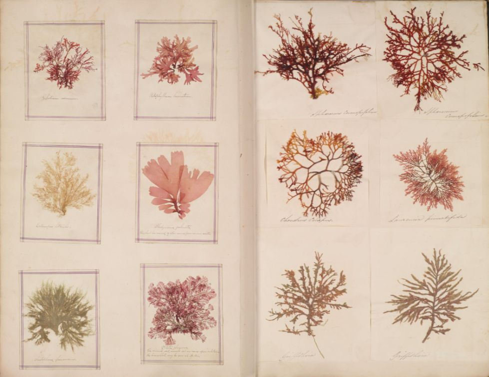
Mrs J. W. H. Harris Seaweed Albums

Archives give a vast insight into the history of an area: The Societe Jersiase Photographic Archive is an example of this, it aims to produce and facilitate research on the Island’s history, culture, language, and environment; and to share that knowledge with the widest possible audience for the benefit of the island community. This is done through a volunteers opportunities, an online archive, community outreach and collaboration with local and international heritage partners. The Société specialises in various fields of study, from archaeology to zoology with the help of volunteers, modern information and research is inputted to enhance and continue producing the raw data and research which make long-term studies possible- The Société started in 1873 and holds extensive bibliographic, cartographic, photographic and research collections ranging from modern times to the 1800s, these act as a long-term memory for island history, these collections provide a vital resource informing contemporary study and value for the community through a greater understanding of Jersey’s shared heritage, identity and environment. 
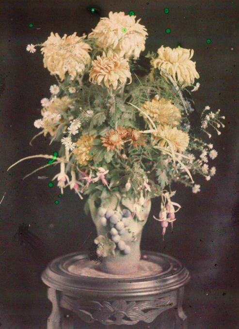
The First Colour Photograph Taken in Jersey – By G. Guiton and E. Guiton, available on the archive to view

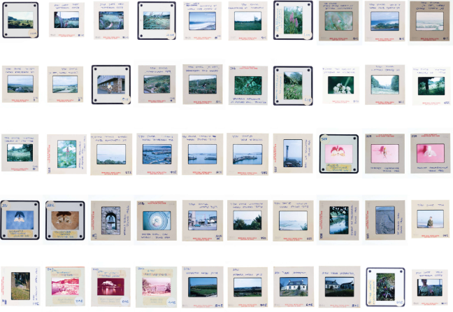
An interesting piece of work in the Societe Jersiase Photographic Archive is the Roger and Margaret Long Collection; this collection (which is available online to view) represents a tiny fraction of the 28,000 colour transparencies in the original collection. The images were produced between the late 1960s and early 2000s and cover the subjects of entomology, ornithology and botany, though items of social history interest appear between species, giving a personal touch to a scientific collection. The slides are hand numbered with handwritten indexes, identifying specimens, subjects and dates.  
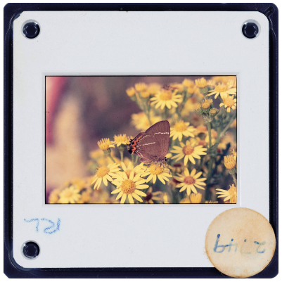
Although amateur, The Roger and Margaret Long Collection has beautiful skill in the composition of the images as well as colour balances- see in the image below the main point of concentration is the butterfly while the yellow flowers surrounding it are unfocused showing that the focus of the image is to preserve the memory of the butterfly possibly for scientific view. This image taken in Le Coin, St Ouen in 1976 would have been developed specifically to be viewed on a projection screen using a slide projector as it is a positive image with a transparent base, once again this could have been done for scientific view or just to show memories of a beautiful butterfly. 
Images from the past can serve as reminders of history; they show culture, beauty, advances in technology, and insights into how society has grown. For my photography work I plan to use images from the Societe Jersaise as inspiration- including The Robert and Margaret Long Collection and the botanical collection of seaweed specimens by Mrs J. W. H. Harris as these images serve as a basis for an insight into what an archive is- showing personal memories and passions through compilation where the devotion is seen throughout the careful processes the creators went through to compile a selection of subjects. Jersey Archive has been widely used by students, teachers, scientists, politicians, and members of the public to learn more about Jersey’s vast and rich history- this loyalty will continue as history is always being created, meaning generations of the future will be able to look back at the current age to learn and prosper. 

narrative and sequencing

Stories

A story is any account of a series of related events or experiences, whether nonfictional or fictional. Narratives can be presented through a sequence of written or spoken words, through still or moving images, or through any combination of these. They also can be describe a series of events we either create or remember or imagine which we tell ourselves because we want or need to hear them. Perhaps we create stories because we want or need to know something, or learn something, or answer a question.

24 Children's Stories That Still Give Us the Creeps - Atlas Obscura

Can be described in:

  • 3 words
  • A sentence
  • A paragraph
Story (an acrostic poem) – Never Short On Words

Narrative

Definition: Narrative is essentially the way a story is told. For example, you can tell different narratives of the same story. It is a very subjective process and there is no right or wrong. Whether or not your photographic story is any good is another matter. Additionally, is constructed when you begin to create relationships between images (and/or text) and present more than two images together.

How will you tell your story?

Images > new photographic responses, photo-shoots of objects…
Archives > images from SJ photo-archive, found imagery…
Texts > experiment with typography, key words, poems…

Common types of narrative:

  • Descriptive- is meant to convey an intense description of a particular place, object, or concept
  • Viewpoint- what the storyteller gets to “see” in one or more characters of a story
  • Historical- the practice of writing history in a story-based form
  • Linear- we see the events of the story unfolding in the order in which they occurred

History of Magazines

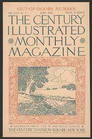
The first magazine was published in Germany during the 17th century. The success of this publication led to the introduction of magazines across Europe. During the 17th and 18th centuries, publishers founded several different types of periodicals aimed at diverse audiences, including the elite and women.

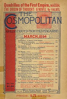
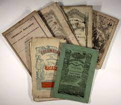
The first American magazines are said to have been published in 1741 by Andrew Bradford and Benjamin Franklin, rivaling printers in Philadelphia. Both folded within the span of six months but, by the end of the 18th century, there were over 100 magazines in the U.S. Other magazines such as Cosmopolitan was originally published in 1886 in the U.S. as a family magazine titled The Cosmopolitan. It later evolved into a literary magazine until eventually becoming a women’s magazine in 1965.

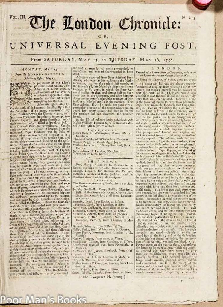
Much as in newspaper publication, Great Britain closely followed continental Europe’s lead in producing magazines. During the early 18th century, three major influential magazines published regularly in Great Britain: Robinson Crusoe author Daniel Defoe’s the Review, Sir Richard Steele’s the Tatler, and Joseph Addison and Steele’s the Spectator.

Group of Seven Young Boys' Early 20th Century Adventure Magazines. | Lot  #90209 | Heritage Auctions

All this changed during the 1830s when publishers began taking advantage of a general decline in the cost of printing and mailing publications and started producing less-expensive magazines with a wider audience in mind. Magazine style also transformed. While early magazines focused on improvement and reason, later versions focused on amusement. No longer were magazines focused on the elite class. Publishers took advantage of their freshly expanded audience and began offering family magazines, children’s magazines, and women’s magazines. Women’s publications again proved to be a highly lucrative market.

Zines

The aim is to produce a 16 page photo-zine in InDesign based around the images you have produced from exploring a bay or geological sites of special interest, that you selected to photograph as part of your Summer Project: MY ROCK. I am looking forward to creating this zine as it means that I will get an opportunity to use all of my best images throughout my whole project and display them in the most fun and creative way.

Before creating my zine, I will attempt to construct a short storyline to base my work off of. This is so that I have some idea of the theme of my zine before I start creating, this helps to get visual ideas and make my zine more aesthetic. I think it’s important to understand how the concept of a storyline works before creating my zine, so this research is very important for my understanding as it helps me understand that without a story my zine will not have as much contextual information put into it, and also hinder the quality of my work.

I also like the fact that Zine design is so subjective and when creating our zines everyone will have vert different outcomes as the styles which influence how we take images has been inspired by a variety of different photographer since starting our course at the start of year 12. Furthermore, I think that zines can show just not stories or narratives, they can illustrate a moment that has occurred in the past and they are a good way of creativity showing how history can be told through images rather than textbooks.

Hamish Fulton

Hamish Fulton (born 1946) is an English walking artist. Since 1972 he has only made works based on the experience of walks. He translates his walks into a variety of media, including photography, illustrations, and wall texts. His work is contained in major museums collections, such as the Tate Britain and MoMA. Since 1994 he has begun practicing group walks. Fulton argues that ‘walking is an artform in its own right’ and argues for wider acknowledgement of walking art.

Hamish Fulton: A Decision to Choose Only Walking

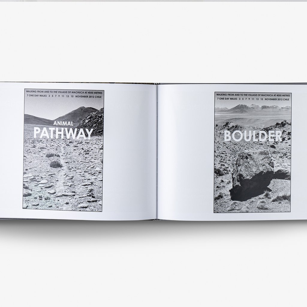
Fulton follows a leave no trace ethic, and does not collect materials on his walks for display in galleries. Instead, his work combines text-based descriptions with a photograph, illustration, or, more recently, vinyl wall texts, to communicate his walks to viewers in a gallery. Fulton has stated that walking is an experience not an art medium, and that what he builds is an experience, not a sculpture.

“Leave only footsteps, take only photographs”

More recently, Fulton has referred to his walks as ‘invisible objects’ and has discussed his group walks as artworks that are created and observed by the participants. Fulton has emphasised the political aspects of his work, particularly in concern to the situation in Tibet and the degradation of the environment.

Atacama, Hamish Fulton - Buy in Galeria Nara Roesler

Exhibitions Include:

  • Hamish Fulton – A Decision to Choose Only Walking (2016) Galerie Tschudi – Zuoz, Zuoz, Switzerland
  • Hamish Fulton: Wells of Dee (2015) Galleri Riis, Stockholm, Sweden
  • Walking Transformation (2014) Villa Merkel, Esslingen Am Neckar, Germany

Fulton is interested in exercising total artistic freedom, which he infuses with environmentalism and reverence for nature, not to mention a general dismay for what he sees as a growing disconnect between humans and the natural world. The first time Fulton picked up a camera was quite accidental, being a trained sculptor, but Fulton had the idea of developing an artistic activity based on the act of walking; whereby the walks themselves become the artworks, as the camera documents the land. 

Image Anaylsis

Hamish Fulton en el CGAC | Exit Express

I have selected this image to analyse as I have looked through some pages of this zine and its parts of some of my favourite of Fulton’s work, this is because it captures so many different natural elements in one piece if work. Firstly, I like that this image has a really good focal point which catches the viewer’s attention straight away and makes you want to look through the rest of the zines and attracts you and makes you interested in Fulton’s work. Furthermore, the monochromatic tones within this image means that the clouds become very bright and a better focal point for the middle and top portion of the image, these white tones match up well with some subtle aspects of the foreground.

East Coast Photoshoot

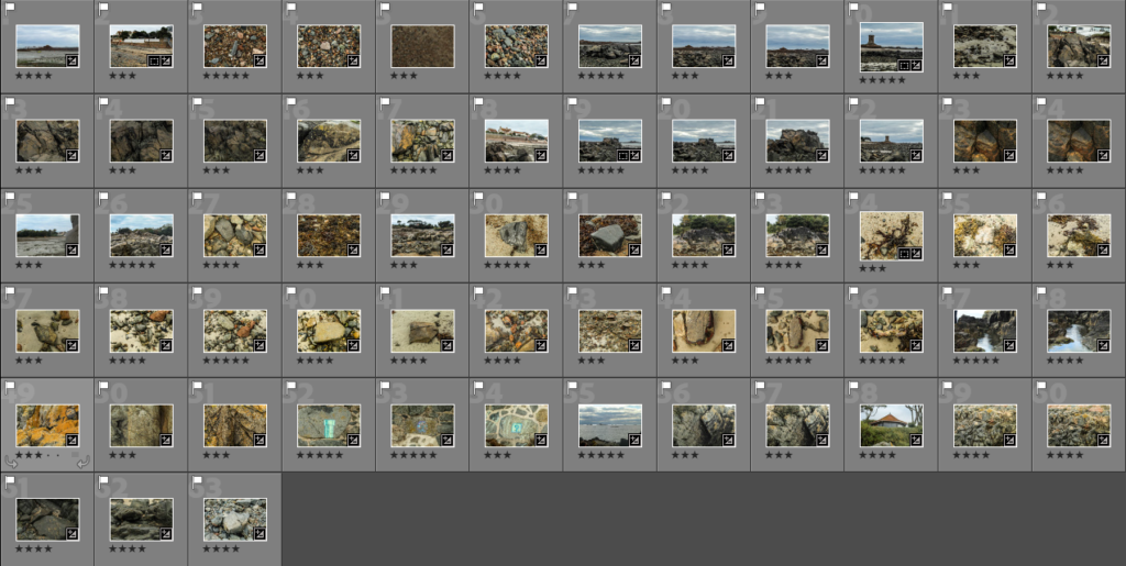
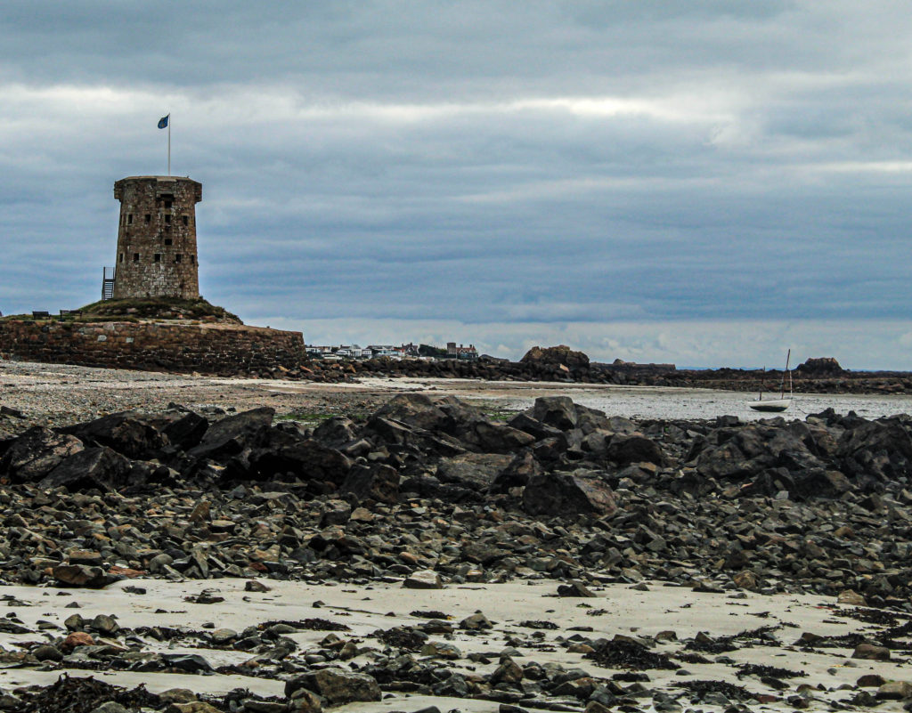
On my photoshoot at Green island I got around 200 images. After looking trough and comparing my images i separated the photos i thought were the best.

After getting the 63 images i thought had potential to be good images i developed them to the highest quality i could using Adobe Lightroom Classic. After the images were developed i then sorted them again in order to pick the ones with the most potential.

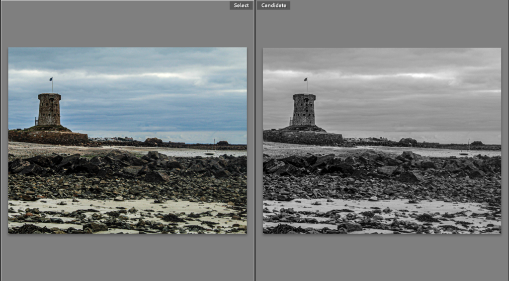
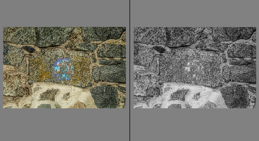
After Collecting my final images i experimented with the images in black and white. This gives a different perspective of the same photos.

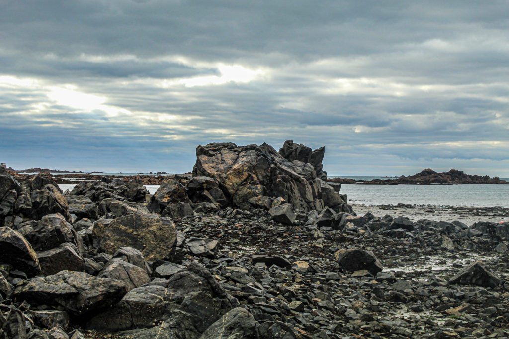
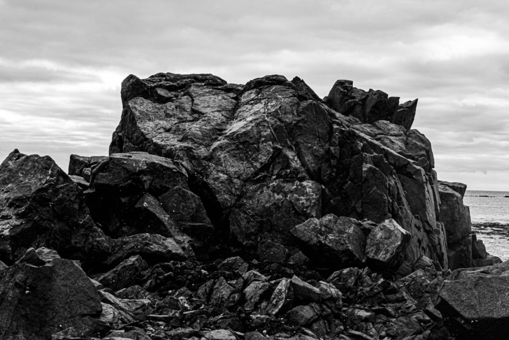
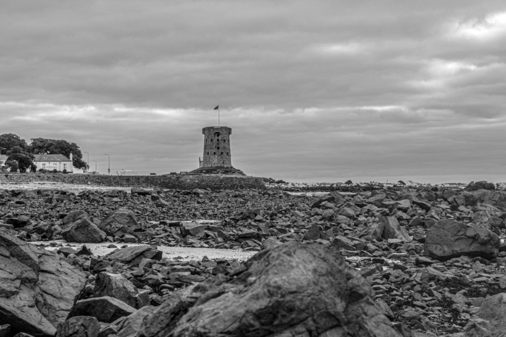
I find that this image in black and white fails to show the true gloom of the weather the day the photo was taken however the contrast is higher in the rocks in the foreground

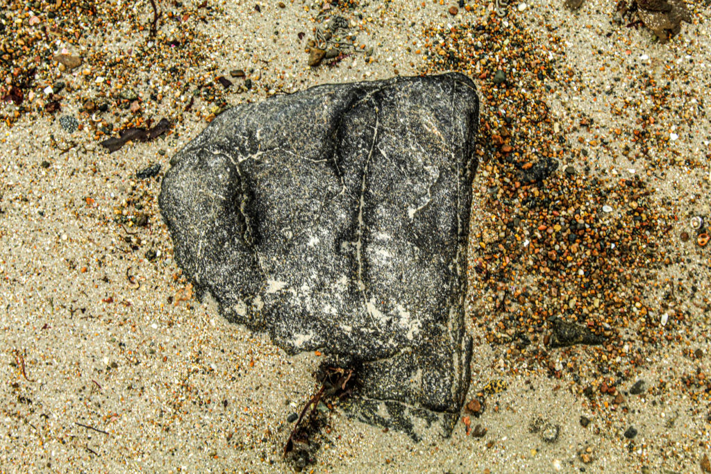
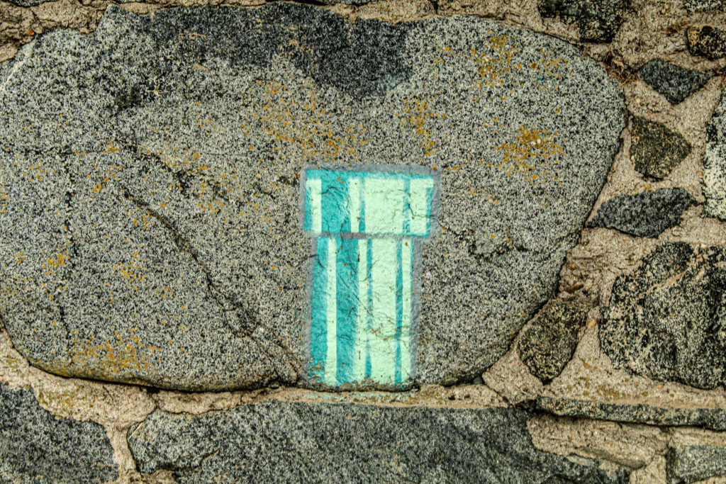
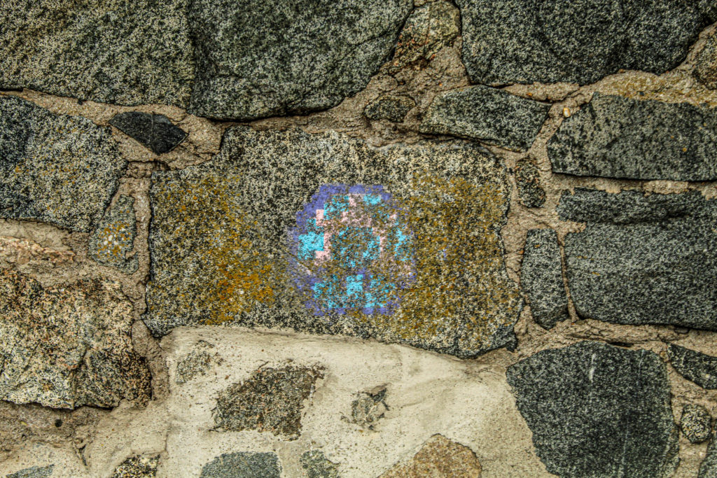
This image does not work in Black and White. The pattern in the centre rock can not be seen well enough and as this is the focal point of the photograph it does not work very well. To try and correct this issue i tried to increase the contrast in develop mode of Lightroom classic however this did not work. I find that the colour image is better due to the colours of the graffiti. As it is not natural and looks a bit out of place i think that the image has a heavy contrast about it which i really like.

Final Images

After comparing very image with its Black and White counterpart i decided which image I thought looked best. The green images are the ones that I am going to use in my zine and the red ones are the ones i will discard.

Final Images

Societe Jeriaise

Société Jersey was established in 1873. The charity which produces and felicitates research of the islands history, is also home to the Jersey photography archives. Since 1993 the jersey archives have acquired over 300,000 archives including: diaries, financial and legal documents, photographs, and moving image and sound recordings.

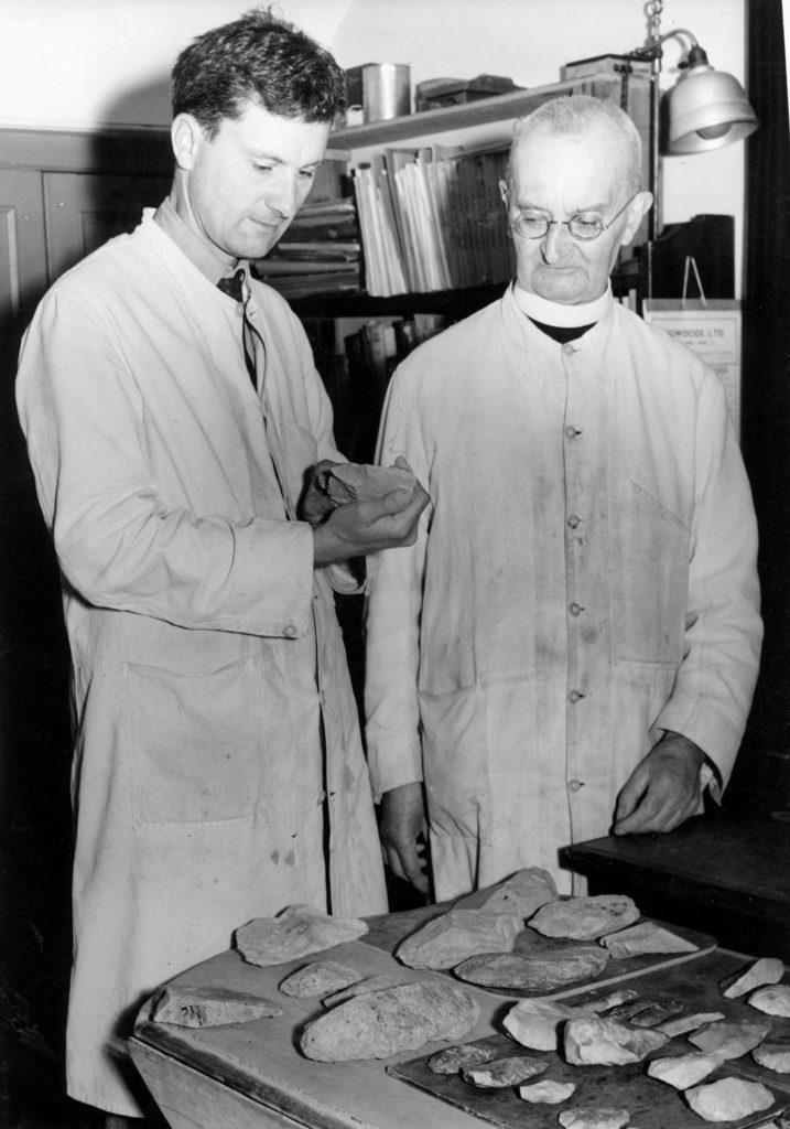
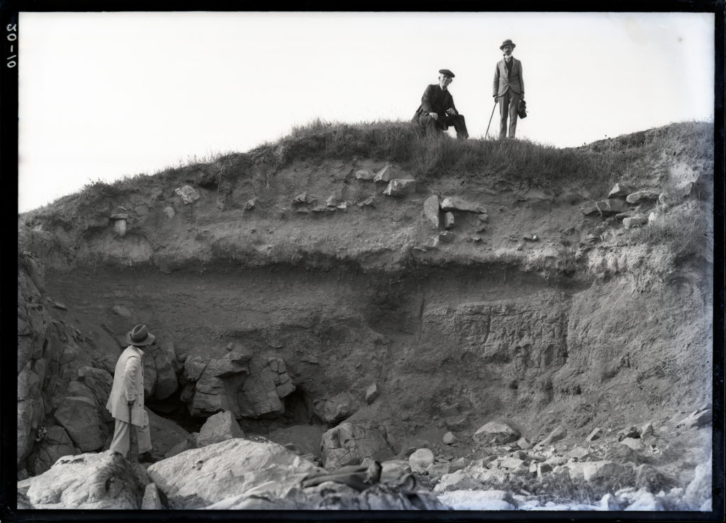
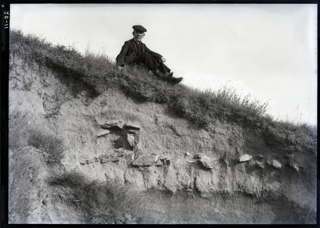
We spoken to Patrick Cahill, an archivist, he discussed with us the need for archives as well as the things they hold. He introduced us to the photography work of Emile F Guiton and the historical excavations he photographed, in particular, La Motte and Le Cotte.

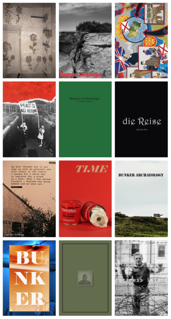
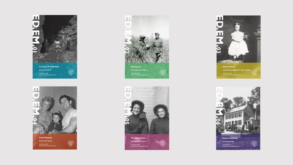
During our talk with Cahill, we were shown some of the zines which had been produced by Société Jersiaise with the help of Mr Toft, these gave us greater understanding of zines and also allowed us to see different styles and eras of photography held at the archives.

Emile F Guiton

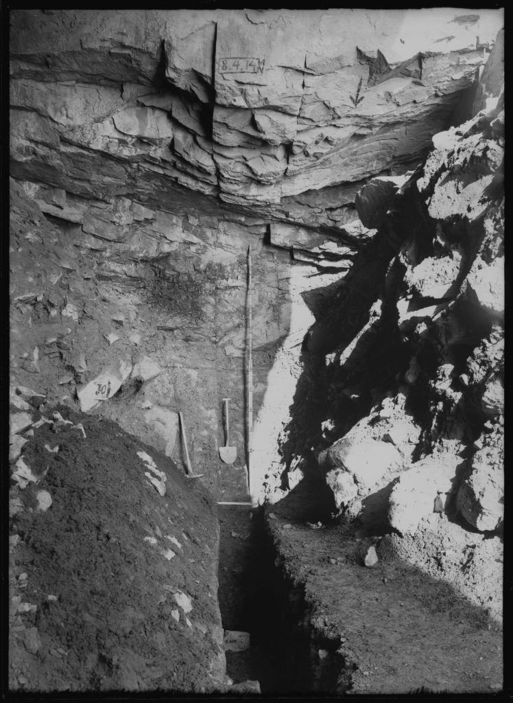
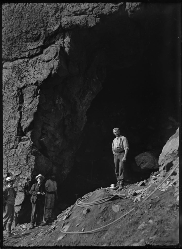
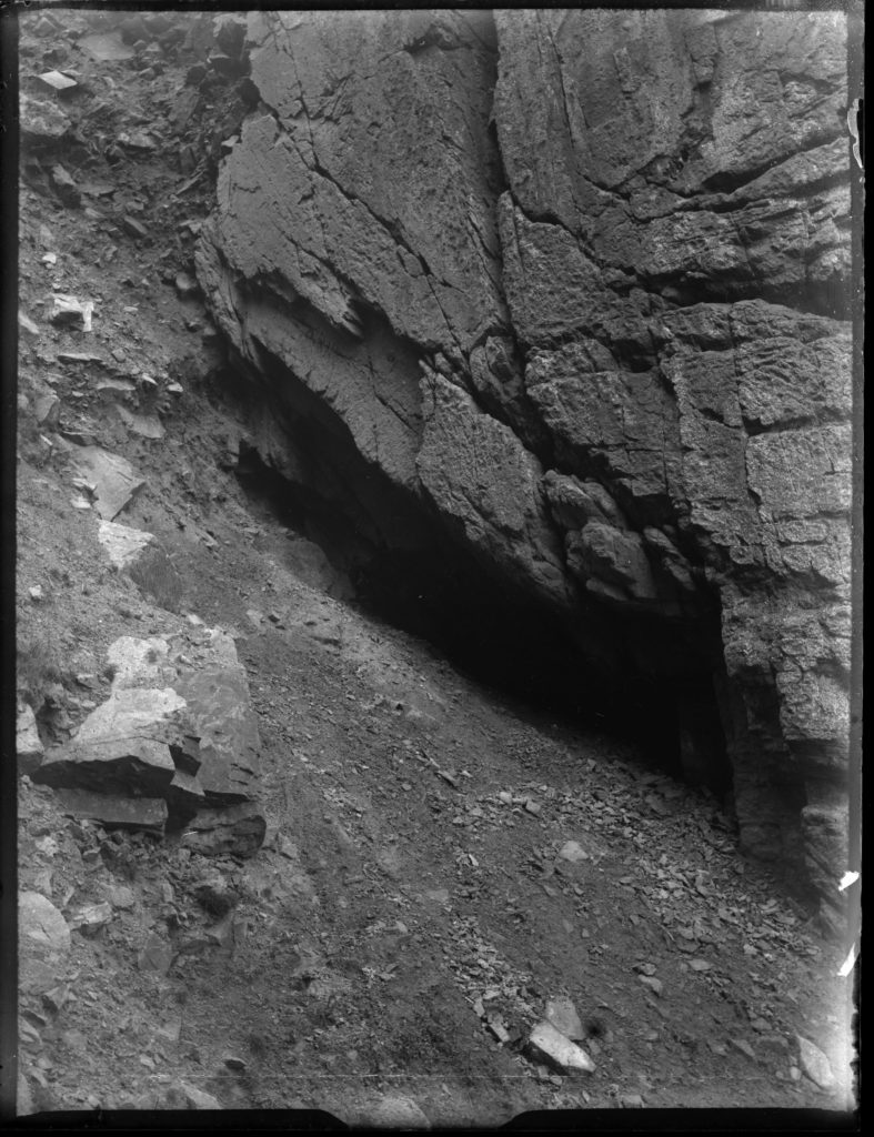
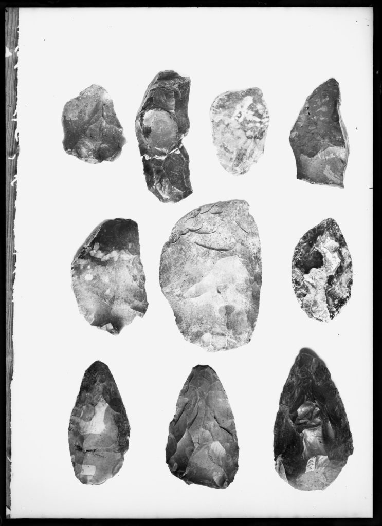
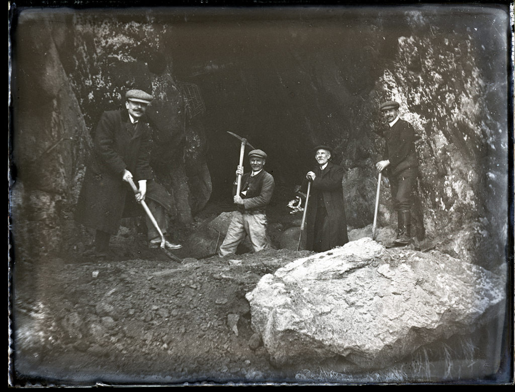
Honorary Curator of the Museum and Editor of the Annual Bulletin, he is considered to be the founder of the Photographic Archive at the Société Jersiaise. Emile was also an excellent photographer making use of a rapidly expanding medium in the early 20th century to record important historical sites, events and objects. He was the principal photographer at La Cotte de Saint-Brélade, one of the most important Palaeolithic sites in Northern Western Europe on numerous archaeological excavations producing images dating from 1910 to 1950s. Photo-Archivist, Patrick Cahill comments; ‘For over a century the Société Jersiaise has been involved with the archaeological excavations at La Cotte de Saint-Brélade.

La Cotte

Situated on a granite headland on Jersey’s south west coast, the collapsed cave and granite ravines of La Cotte de St Brelade provided a home for Neanderthal hunters-gatherers for over 200,000 years.

Since ancient stone tools were first found at the site in 1881, stunning discoveries have been made by successive generations of archaeologists. La Cotte provided early fossil evidence for Neanderthal people, exciting records of their use of fire, and heaps of bone which showed how they could work together to hunt Ice Age megafauna such as mammoth and woolly rhinoceros. It is now time for a new era of investigation and a new generation of archaeologists are about to embark on an exciting and ambitious programme of scientific research and discovery.

La Motte Excavation

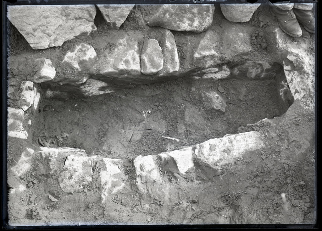
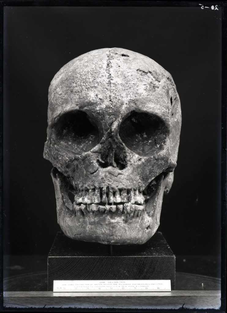
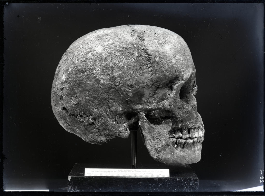
Excavations by archaeologists in 1910 – 1911, based on the large amounts of flint and pottery found around La Motte, revealed the tiny islet to be rich in archaeology. They discovered 18 cist graves, some of which contained human remains thought to be in excess of 4000 years old. Some of these have been removed to the grounds of La Hougue Bie.

Erosion from heavy rain in 1910 revealed small and roughly constructed cist graves. When excavation began, these were found to be the open ends of a “sepulchral chamber”, consisting of two graves covered by capstones. When these stones were removed, the researchers found “no relics of art or industry” as the acidity of the clay had dissolved any remains.

As exploration continued, more cist graves began to be discovered about 5 feet north of the last, though again, no lasting remains had been found. By the end of the excavation, 15 cist graves had been discovered and recorded by the Société Jersiaise excavators. Grave number 14 contained the most intact skeleton, and three graves bore intact skulls. Grave number 6 contained two skulls, and graves 2, 5, 9 and 15 contained the remains of children.

The view of the researchers, reflected in the 1912 edition of the Société Jersiaise Bulletin, was that the graves were likely Neolithic in origin. However, this view was criticised when revaluated in the 2002 Bulletin by Archaeologist Mark Patton, who identified the graves as Medieval cist graves dating between the 4th and 11th centuries AD.

3D PHOTO SCULPTURE

What is a 3d photo sculpture?

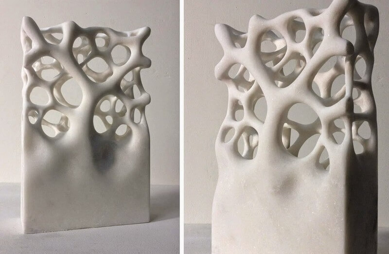
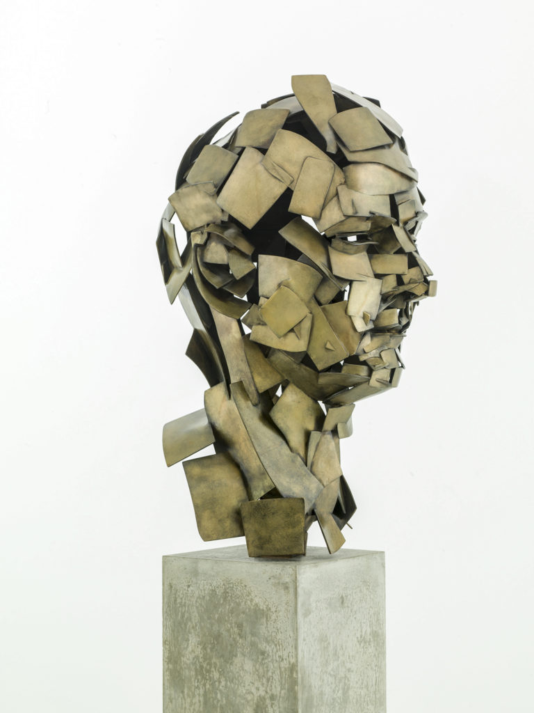
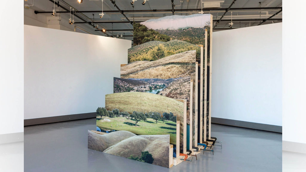
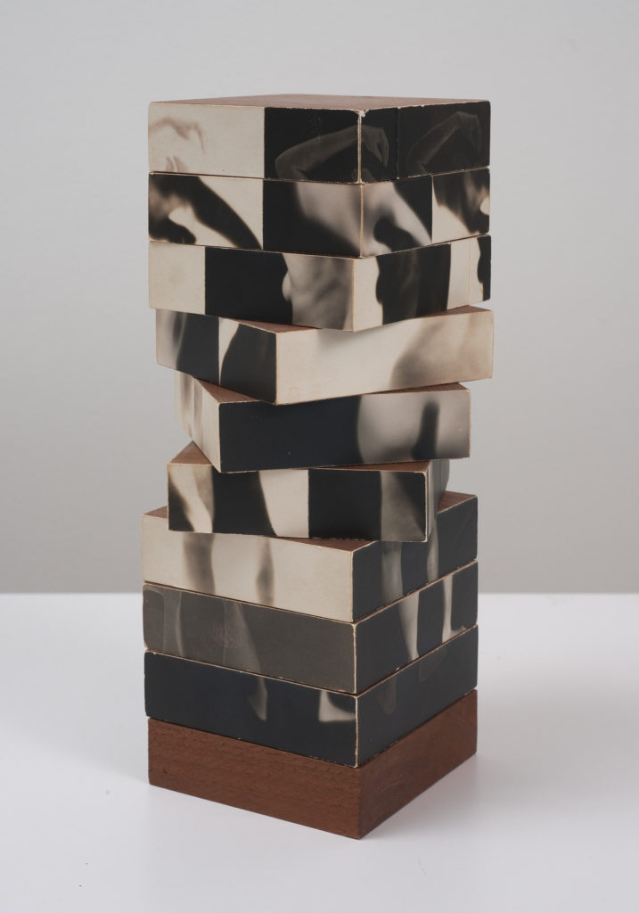
Three-dimensional art sculptures are works of art that present the dimensions of height, width, and depth. They occupy physical space and can be perceived from all sides and angles. Traditional types of three-dimensional media, like sculptures and reliefs, are some of the oldest examples of 3D artwork.

Moodboard

Artist reference: Robert Heinecken

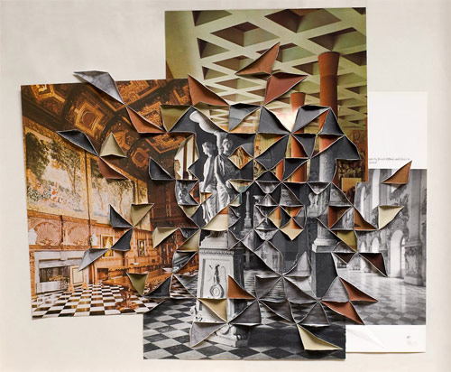
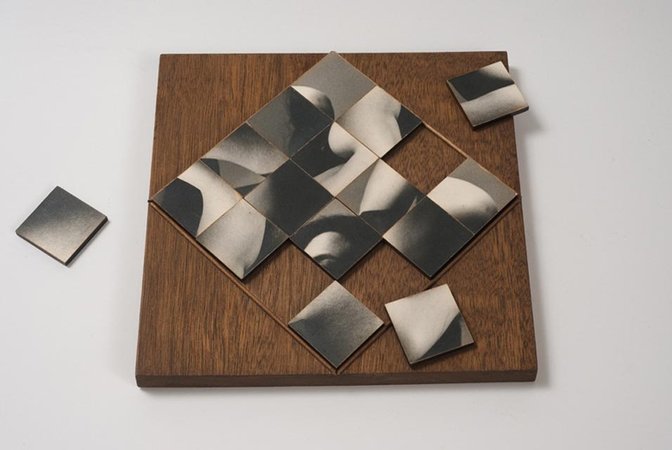
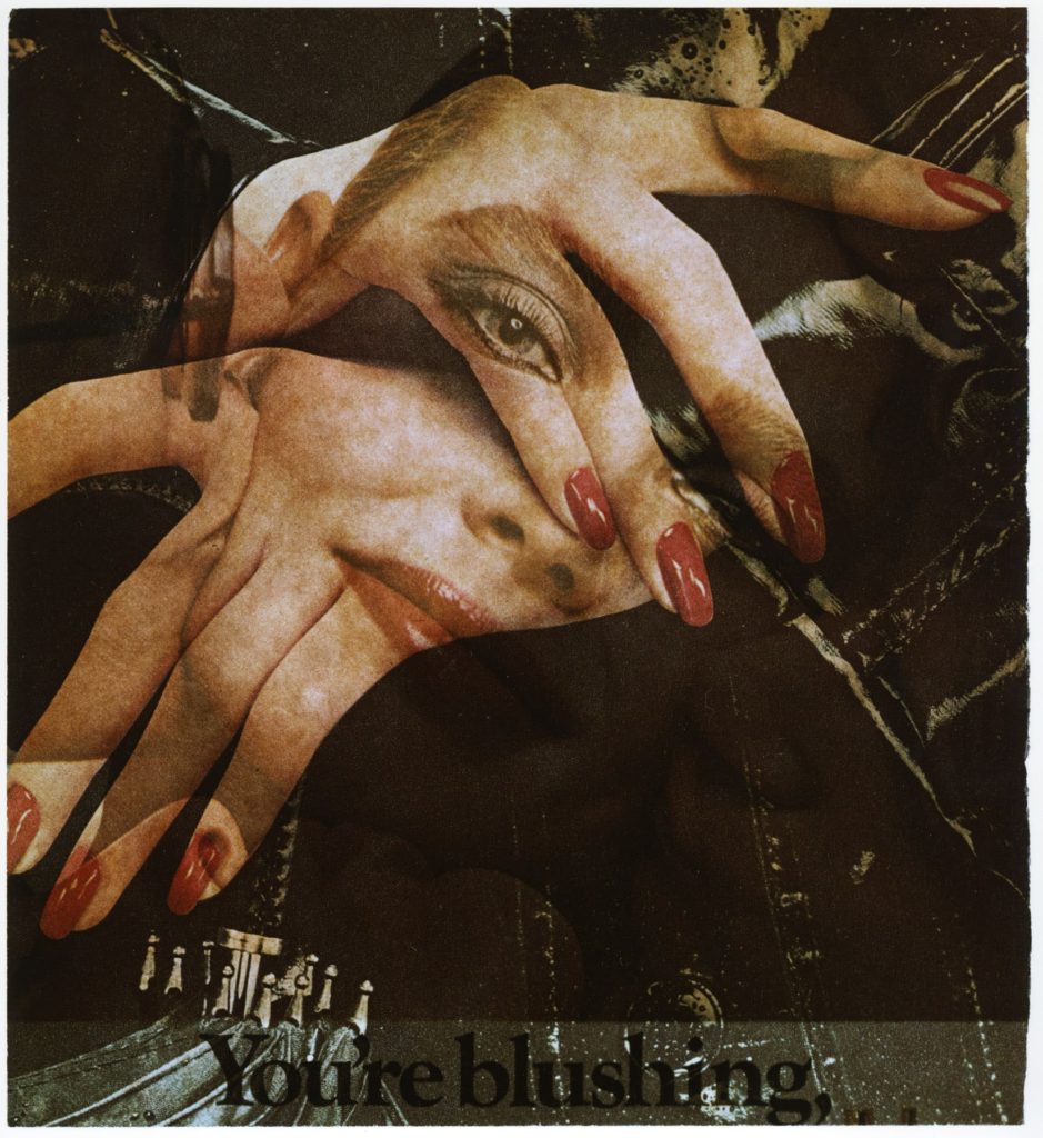
Robert Heinecken was an American artist who referred to himself as a “paraphotographer” because he so often made photographic images without a camera. Heinecken was known for appropriating and re-processing images from magazines, product packaging or television. In the late 1960s, he also began cutting up popular magazines such as Time and Vogue and inserting sexual or pornographic images into them. He would place his collage-publications back on newsstands in Los Angeles to be sold to unsuspecting buyers. In the 1980s, he created several series on American news television that involved photographing images on the television or exposing the light of a television set directly to paper to create what he called “videograms.”

Examples of his work:

My 3d Photo Sculpture

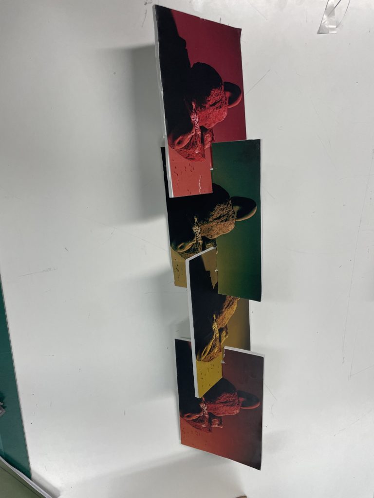
To begin, I created a sculpture out of 4 pieces of foam board including the same photo of a rock in multiple different colours. I used knifes and glue to cut out and bring it all together. After seeing the final outcome I wasn’t very happy with it and thought it looked a bit washed so I decided to start a new sculpture.

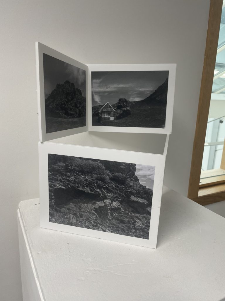
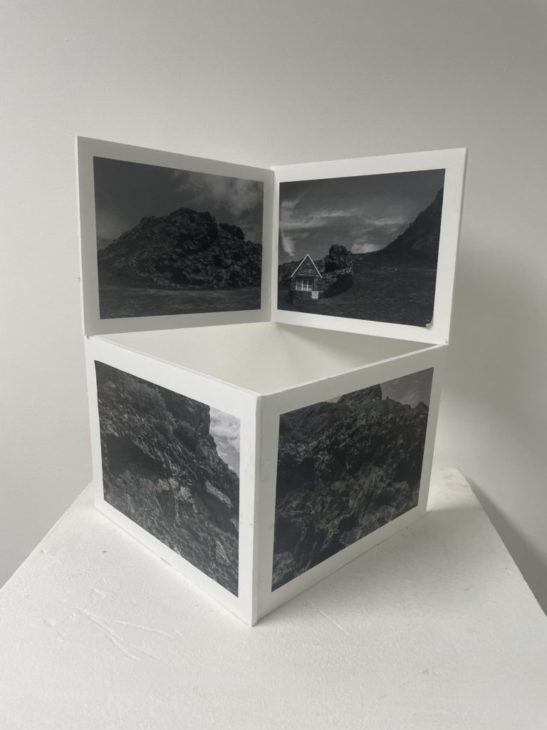
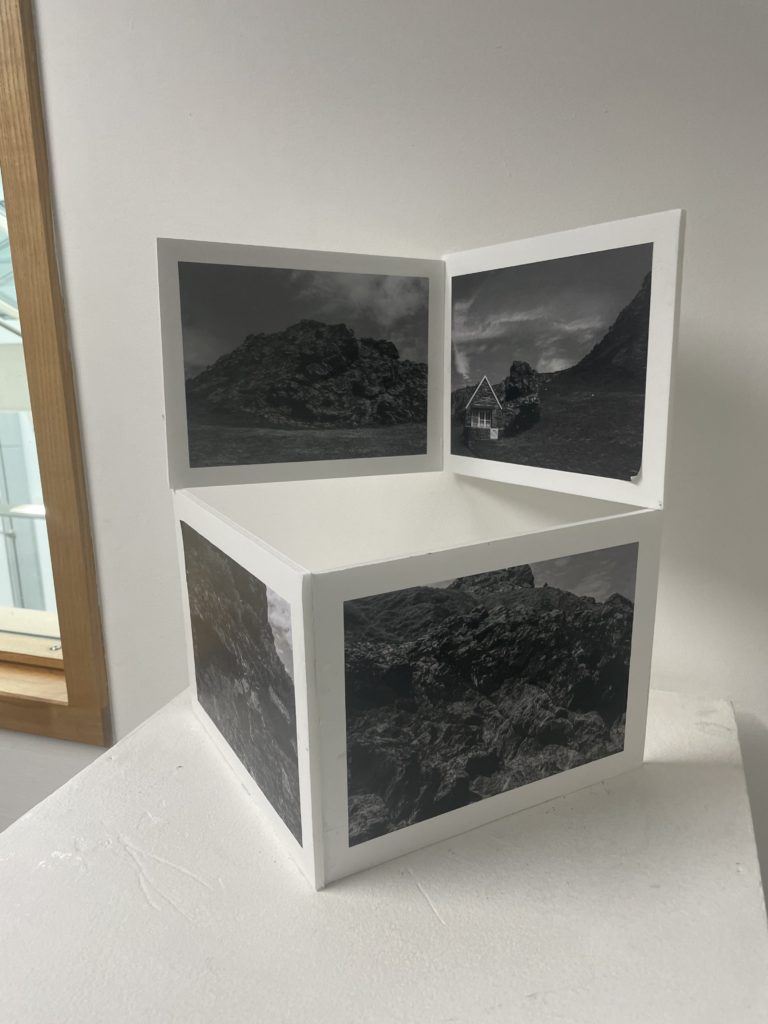
I created my sculpture using foam board, images of rocks, glue and tape. I cut out 4 rectangles of foam board with all the same measurements and positioned them in a symmetrical way. I then stuck down my images of rocks on my 4 cut-outs of foam board. After the glue dried I experimented with how to put it all together. After multiple attempts at getting the best outcome I ended up with 2 right angled images on top of 2 other right angle images.

Overall, I am happy with the way my second sculpture turned out. I like the way the grey images of rocks contrast against the white foam board and the white stand and walls. When creating another sculpture I am going to follow the same technique of using black and white images on the white foam board. Also, I like the way the four images used on each square represents different parts of St Ouens and shows the different kind of rock formations .

Still life

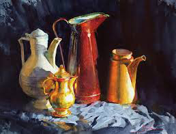
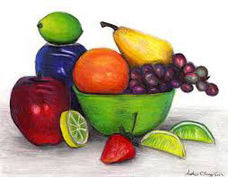
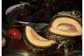
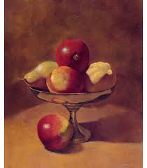
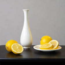
Still life photography is a style of photography where an array of objects that either compliment or contrast each other are arranged in a way that makes the objects which are often quite simple seem very interesting. Still life images originated in the 17th century when still life images were painted. These paintings were often of common household products of upper class people including fruits and glass object such as bowls and vases that would only be found in upper class houses.

Examples of still life images

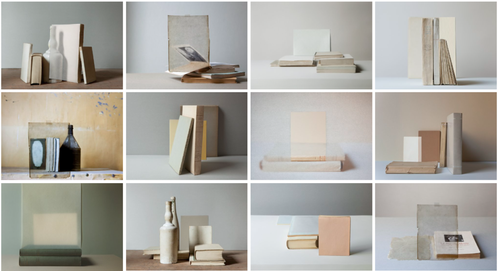
Mary Ellen Bartley

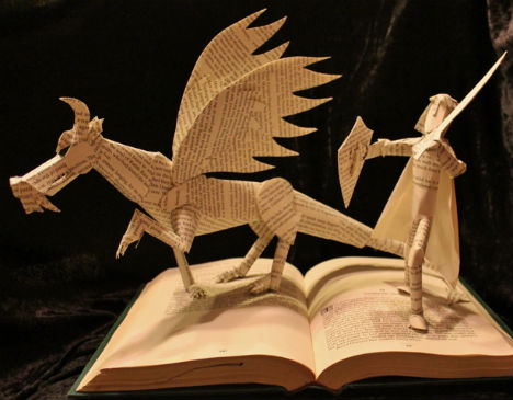
Mary Ellen Bartley is a still life photographer who focuses on photographing printed matter such as books and pages. Her unique style is very interesting as she takes objects that are so simple and makes them into very unique structures and photographs. Bartley works in collaboration with many major libraries and archives in New York City where she works to develop projects on specific aspects of their collections. for example The Queens Museum working with Andrew Beccone’s Reanimation Library..

Mary Ellen Bartley, Photographer - Moms Don't Have Time to Read Books™️ |  Acast

About Mary Ellen Bartley

Born in New York, NY, in 1959, Bartley received her BFA from Purchase College, SUNY, and she lives and works in Sag Harbor, NY. Her work has been exhibited in numerous institutions including The Queens Museum, NY; The Walker Art Center, Minneapolis; Houston Center for Photography; The Drawing Room, East Hampton, NY; Parrish Art Museum, Southampton, NY; The Watermill Center, NY; and National Museum of Archeology and Ethnology, Guatemala City. Bartley has taken part in numerous residencies, including at The Queens Museum, NY; Visual Studies Workshop, Rochester, NY; and Watermill Center, NY. Bartley’s work is in numerous collections, including the Guild Hall Museum, East Hampton, NY; McEvoy Family Collection, McEvoy Foundation, San Francisco, CA; Parrish Art Museum, Watermill, NY; Walker Art Center, Minneapolis, MN; The Watermill Collection, Watermill, NY. – https://www.yanceyrichardson.com/artists/mary-ellen-bartley#2

https://www.yanceyrichardson.com/artists/mary-ellen-bartley#2

Sculpture experiments

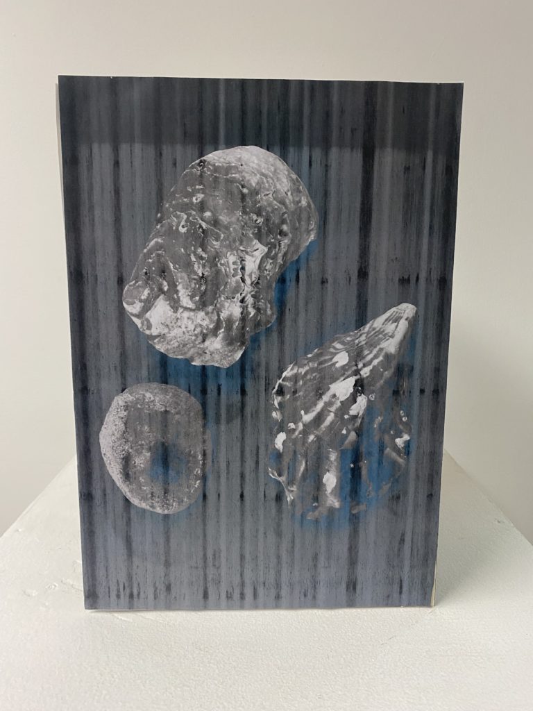
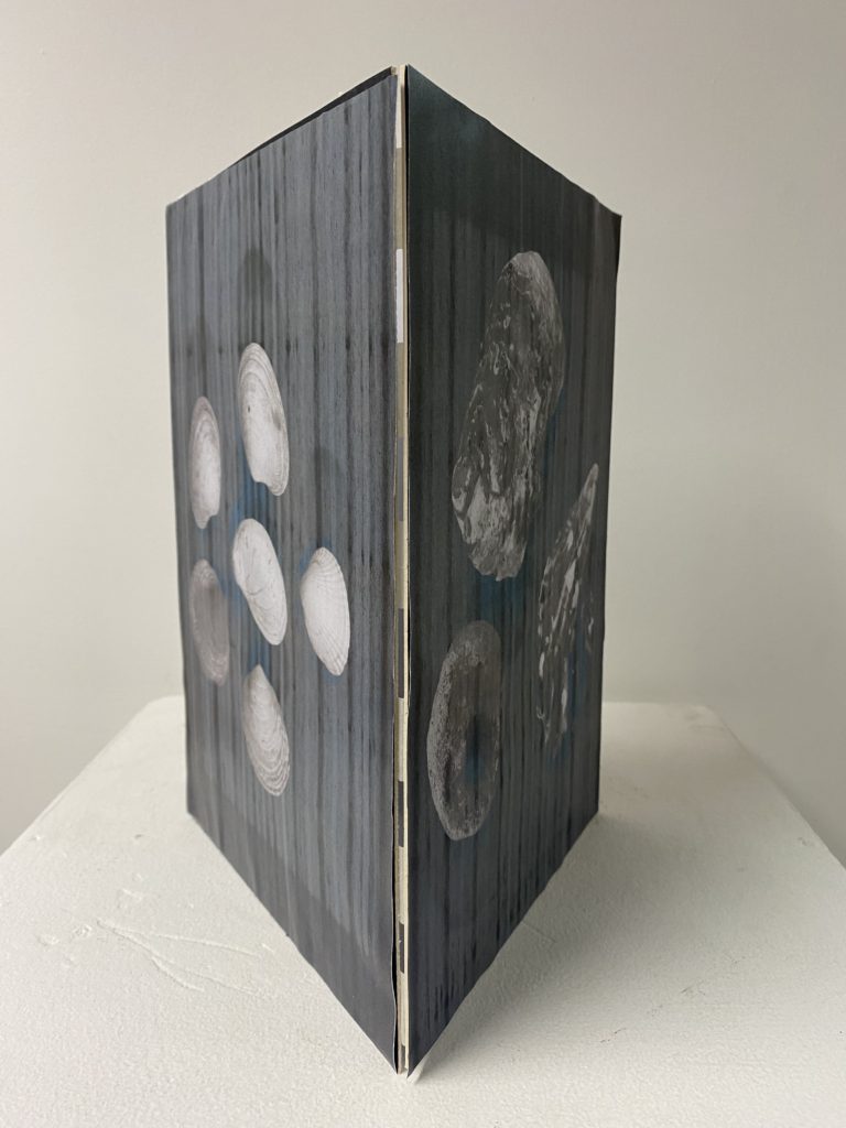
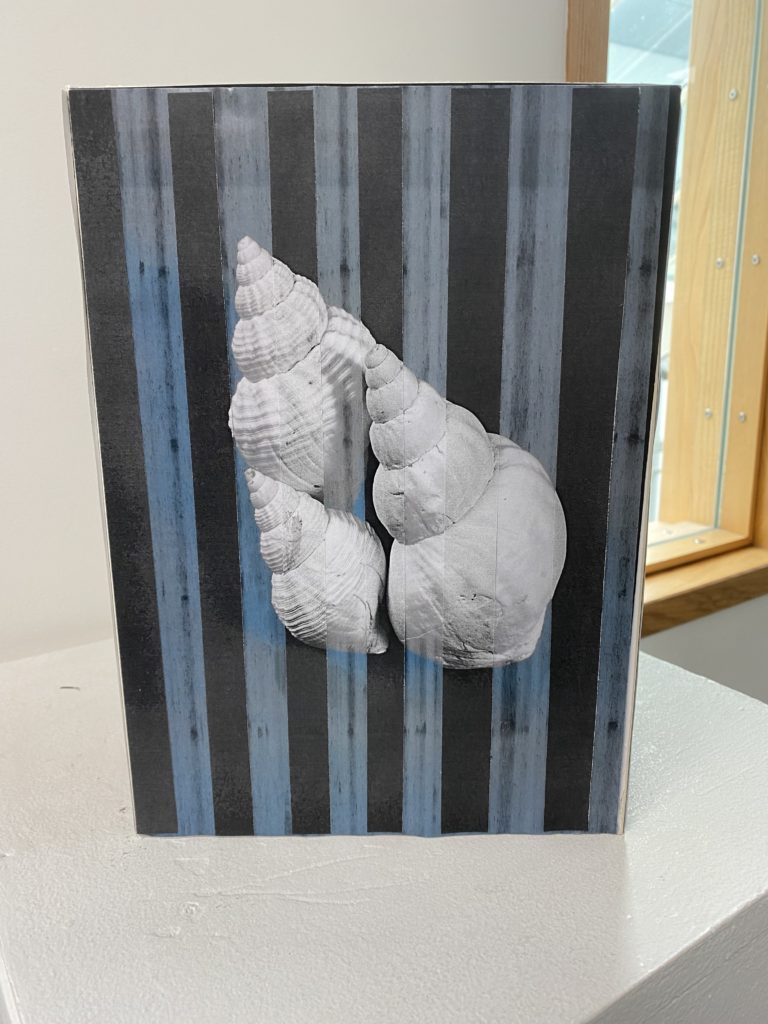
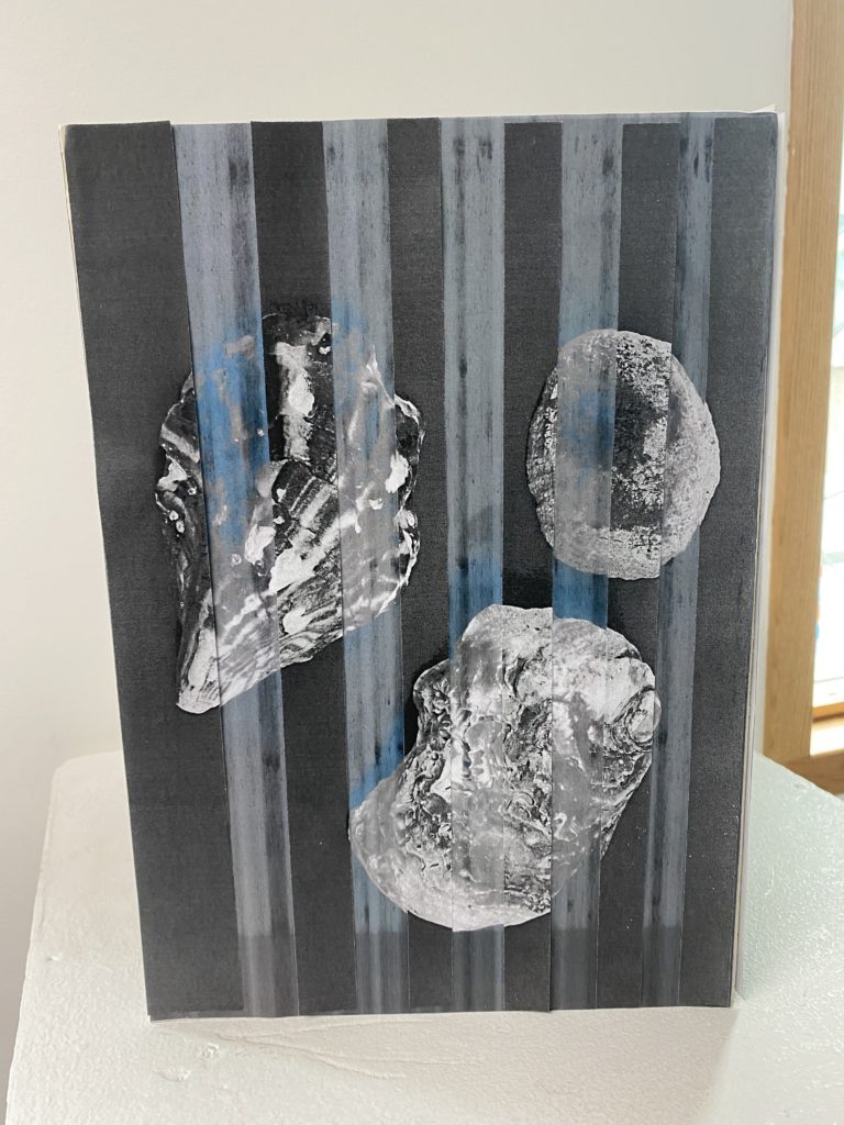
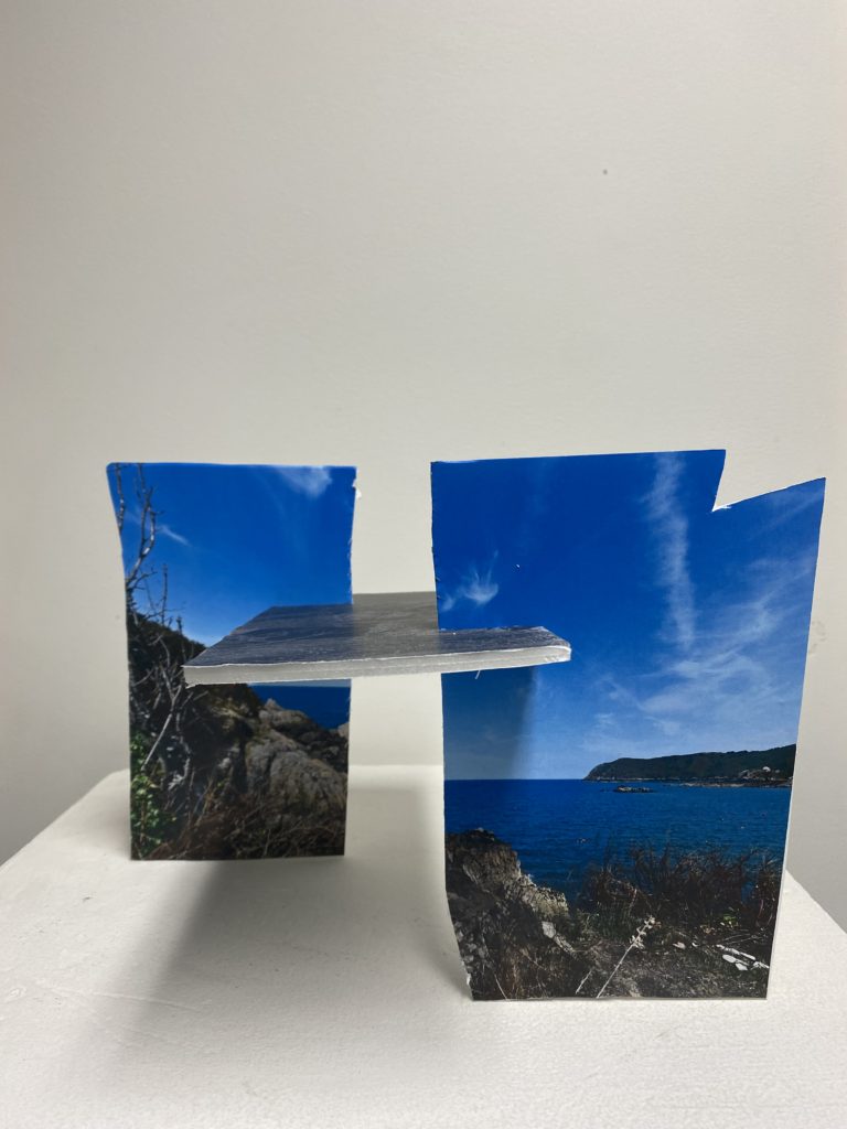
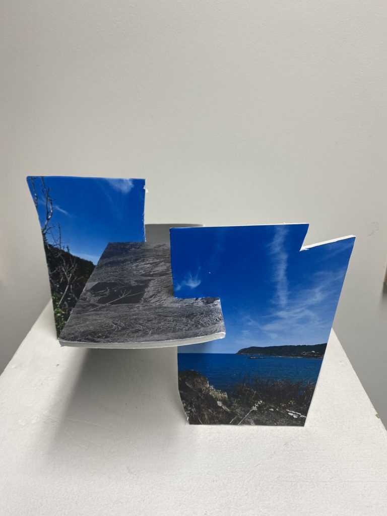
In class I experimented with different ways to manipulate my photos which I have taken and edited, I ended up creating 4 different outcomes. I enjoyed doing this because it allowed me to be creative with different ways to create a sculpture which I could use for a final outcome.

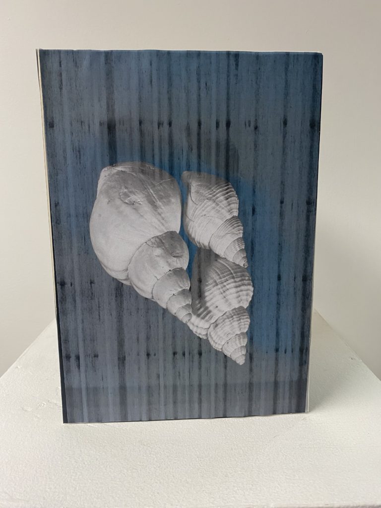
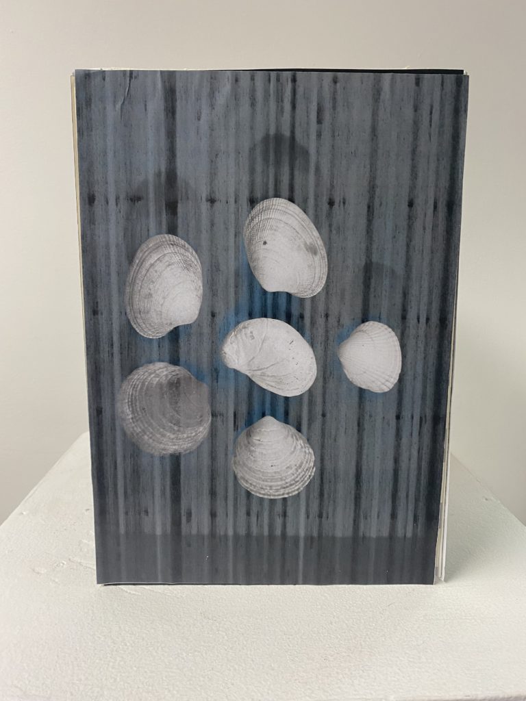
Outcome #1 –

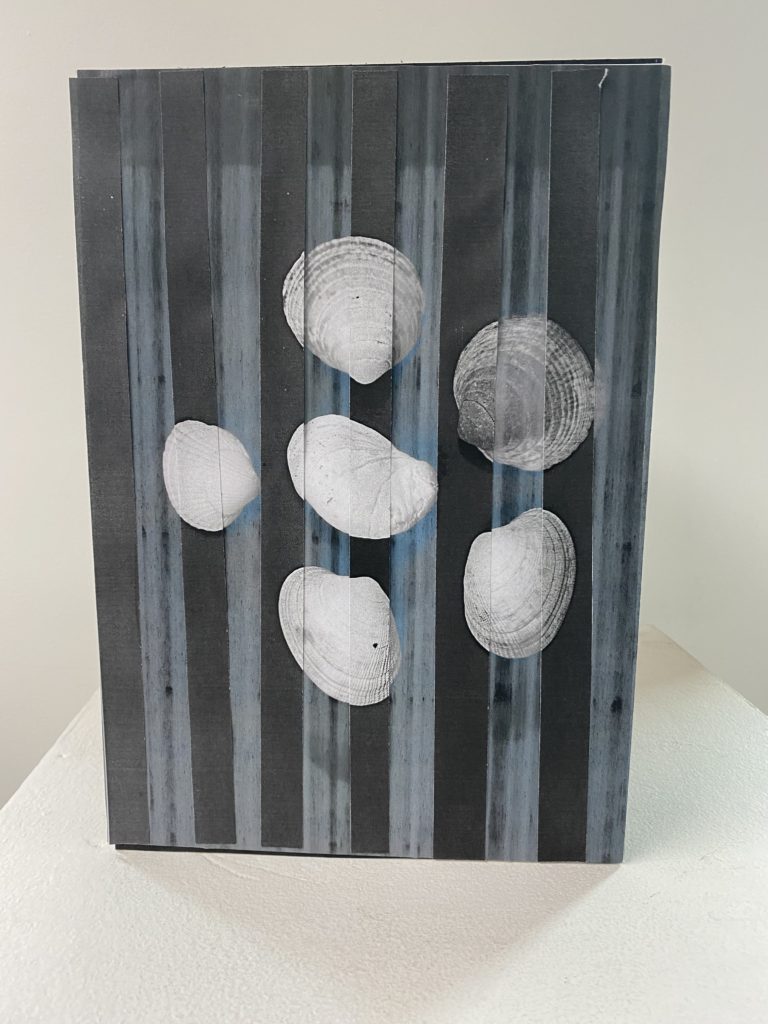
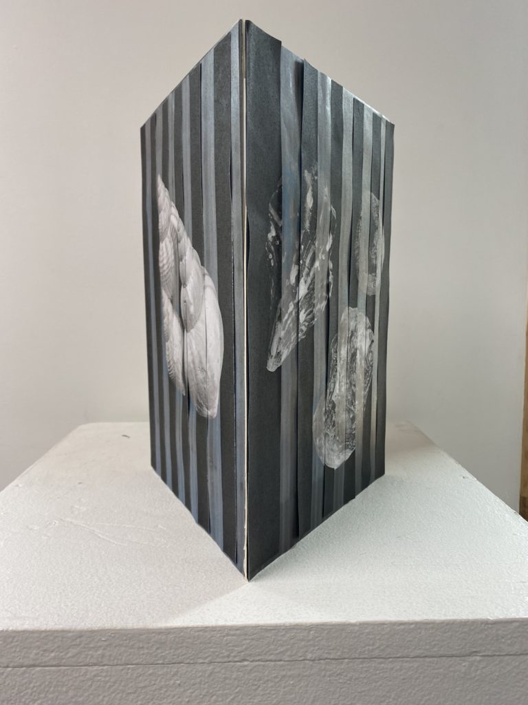
For this sculpture, I printed out my photos in black and white because I wanted their to be a distinct contrast between the background and the shells so that they would stand out well. Due to the printer not working well. the prints came off streaky but I liked the effect which this added to my sculpture. To create the stand for my photos to rest on I began by cutting out mountboard through putting the photo onto it then cutting around it then repeated it 2 more times. Next I combined the 3 photos mounted on the mounted by taping them together inside of the structure, I used 3-4 pieces of tape at each crease to make sure that it was secure. I was quite happy with the way that this turned out because it is simple yet effective as the photos work well in a set together and the structure of this sculpture highlights that. If I were to do this again, I would make sure that the photos are cut and mounted accurately as I didn’t cut it correctly in places so that they link together better at the sides and don’t create a gap which has happened. Another aspect of this sculpture that I would improve on is adding a top to the structure because I think that it would make it look more complete.

Outcome #2 –

For this outcome that I enjoyed creating, I expanded with my experimentation from my first sculpture as I wanted to add more. I achieved this through slicing up the same images which printed out differently and layering them in the correct places and missing a gap each time, repeating on each of the three sides. I liked the effect which this created, which resembles a double exposure, which you can create on photoshop. I liked the idea of this structure and how it turned out but if I were to improve it I would make sure that the pieces are stuck down correctly in most places, as many can be seen to be coming up at the top and sides. I would also make sure that they are put down in their accurate and designated places as there are a few pieces which are slightly off of where they should be. To further expand on improving this sculpture as I think it could be more successful, I would make sure that all of the pieces are sliced in accurate sizes as I think that this would help the issue of matching them to their correct places which I talked about beforehand.

Outcome #3 –

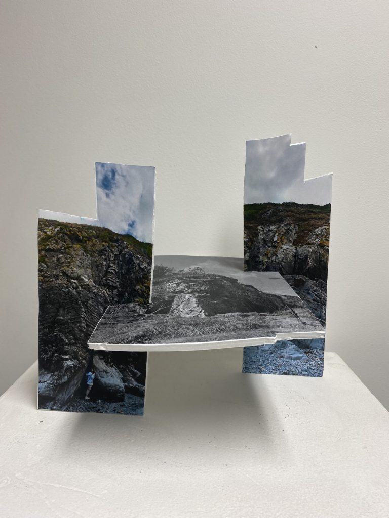
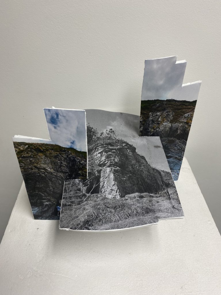
For this outcome that I think was my most successful throughout this experiment, I think that it turned out unusual and unique in the way that I have manipulated and transformed it. This was through using foamboard which I cut out to make the different shapes, which were originally joiners that I had printed out, I taped each photo down and cut around it then used spray to secure them down so that they won’t fall off in the future. I also made sure that the bottom of each joiner structure was secure so that when I combined them they would be able to rest flush to the surface that they are on and won’t wobble around. To decide where I wanted to slice the image I began by making a slit down the middle of the coloured photo because it was originally quite a big structure which I didn’t like as there was too much surface area. This then separates the photo and I thought that I could but the joiner which is in black and white in the middle which creates a bridge structure where it is resting in the middle. To add a little bit more depth into this sculpture, I decided that I should position each of the coloured joiner posts at different points which changes the perspective of how you were looking at them, as well as if you are looking down on to them as the black and white photo faces upwards.

Outcome #4 –

For my final outcome, where I used a similar technique as before to create a set of sculptures/photo which work well together. I began by mounting each image and then I sliced the coloured joiner in half and once again then repeated the positioning of where to put the coloured posts which changes the perspective of the sculpture completely from every angle that it is viewed from. I was not happy with this outcome to an extent as I think that I could have been more careful to how I was cutting out each joiner because it can be seen as wonky in a few different places due to me not being accurate which I don’t like as I think that it makes the sculpture look quite messy and not put together well.

Making a Zine in Indesign – My rock

I have made a zine once before in my previous photography project ‘Anthropocene’. I was able to produce a 16 page zine which contained all my best images from the previous project and overall I was very satisfied with the final results.

I would however like to think more about the theme of the whole zine to be the same, as in my previous zine the images were all different colours and the theme was slightly all over the place. This time I will take on board the criticism I am setting myself with to hopefully make this zine a lot more to my liking. The previous zine was a first attempt, so I hope that this second attempt is something that I’m slightly more satisfied with.

Images selected for my zine

Here I have a couple images that I would like to use for my zine, and I wanted to see how well they would compliment each other by being paired together.

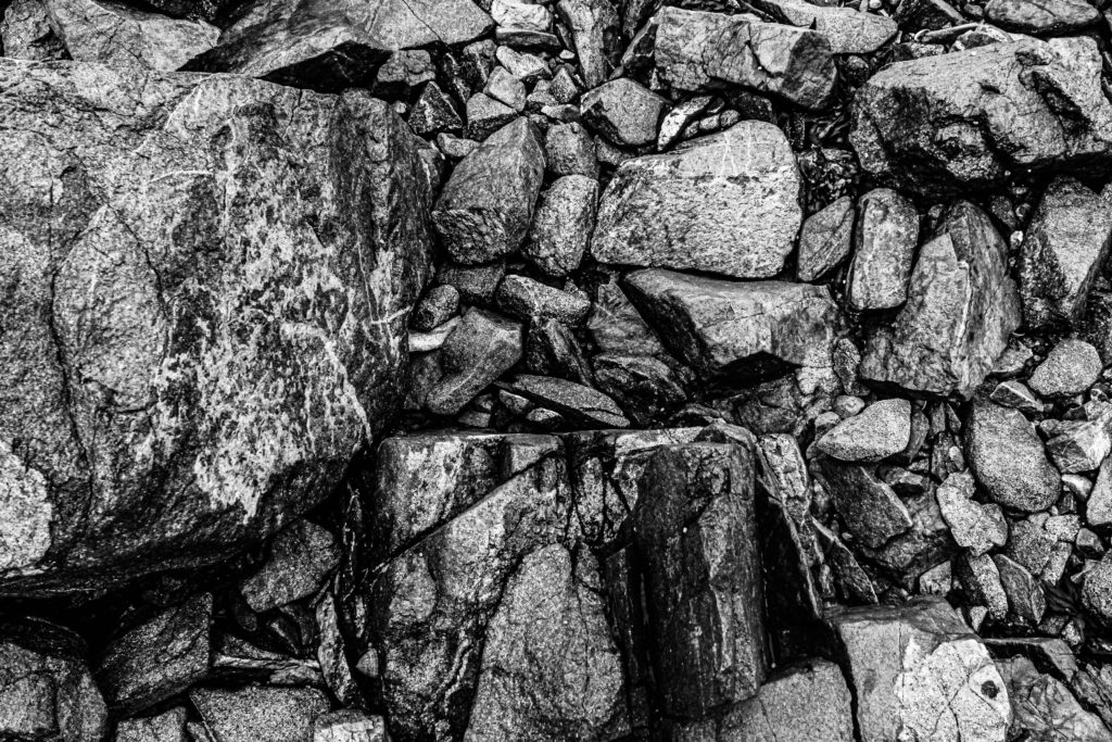
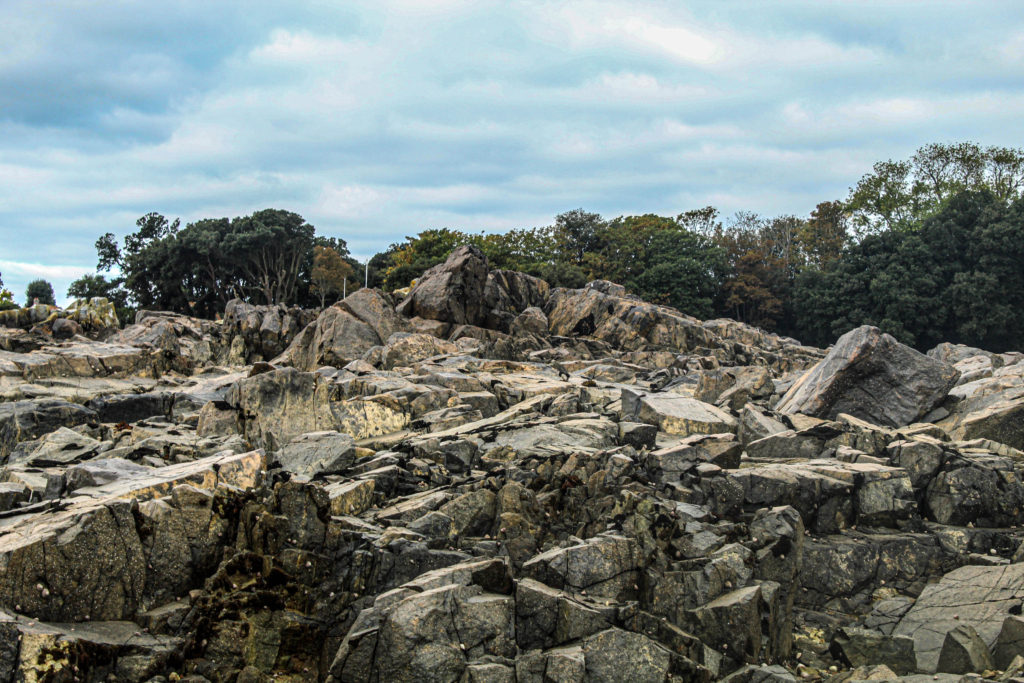
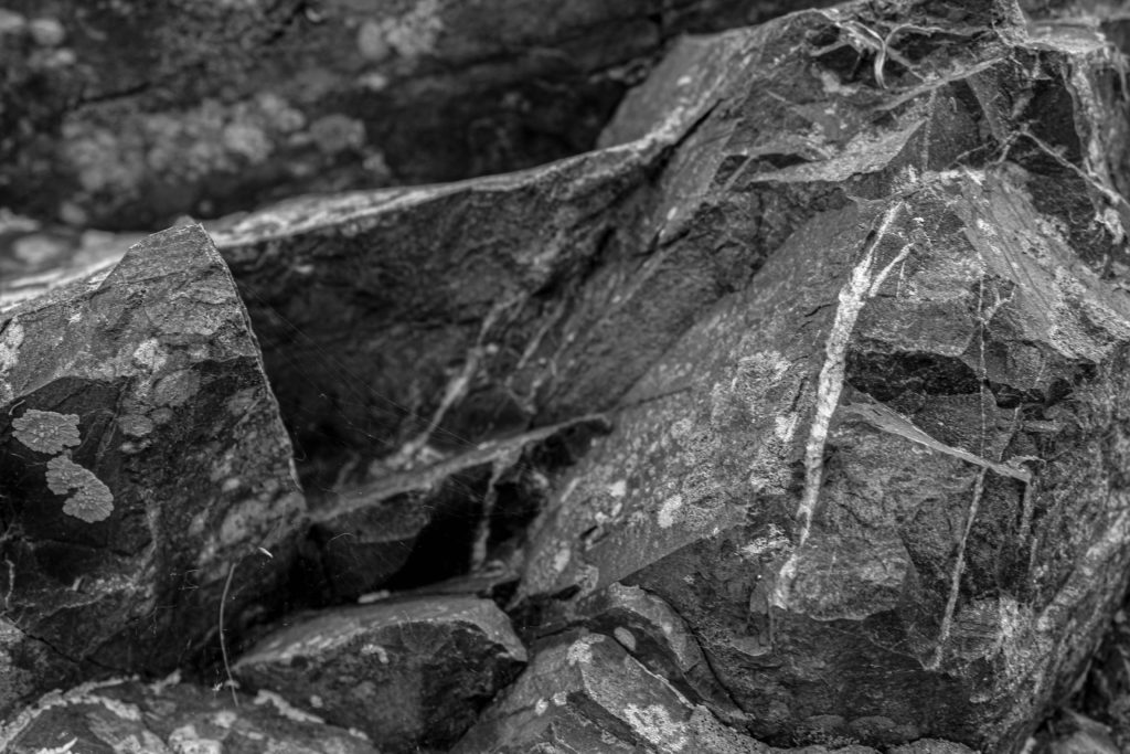
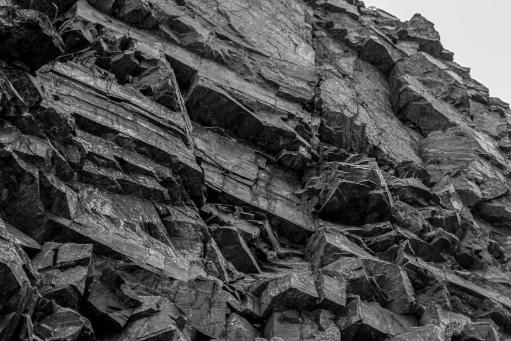
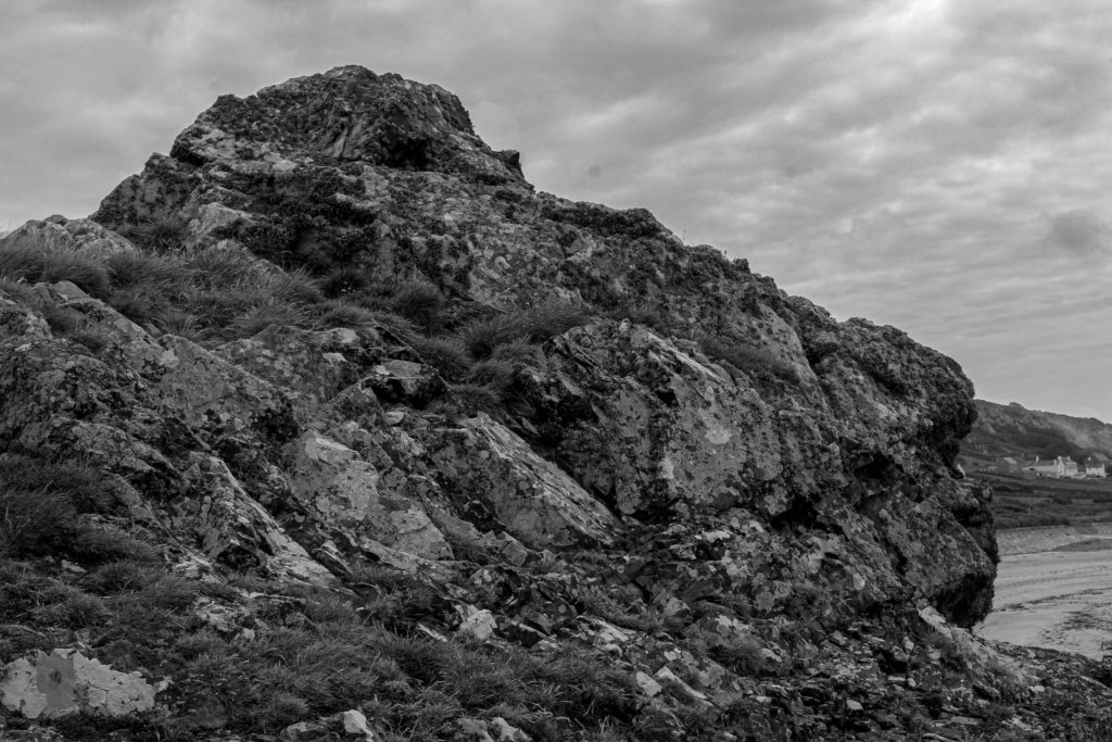
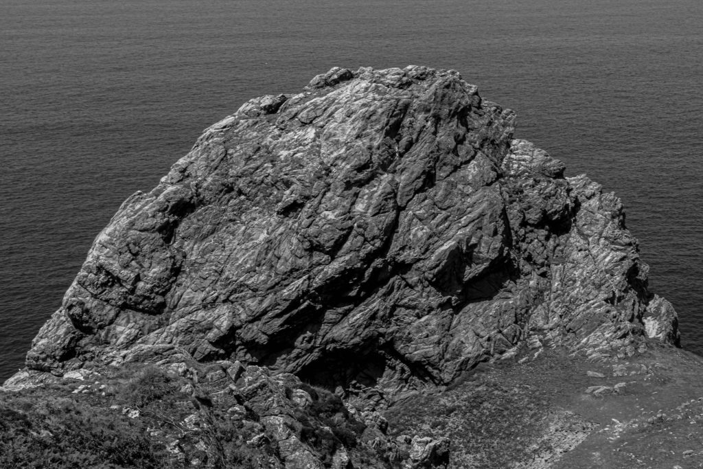
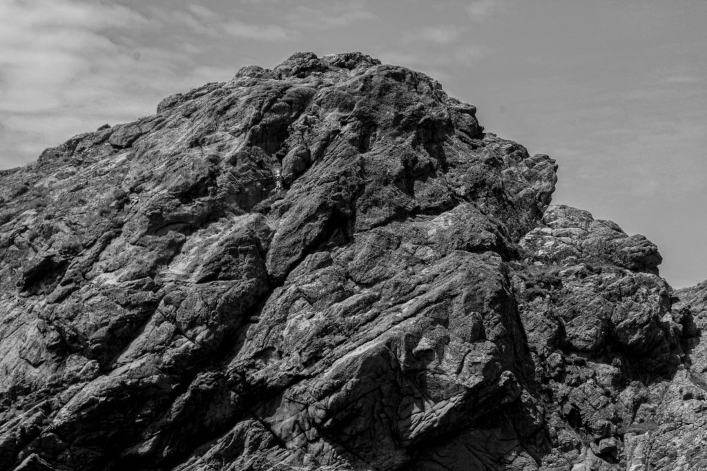
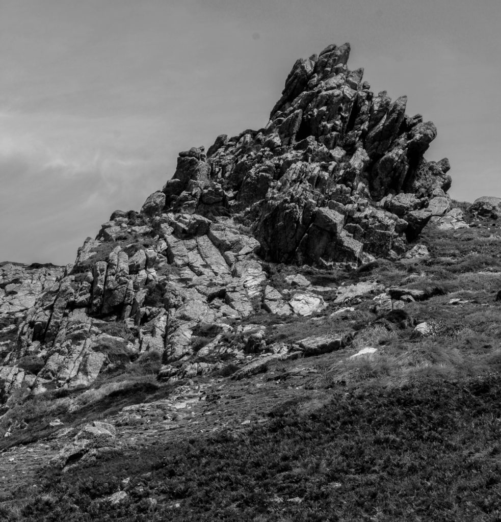
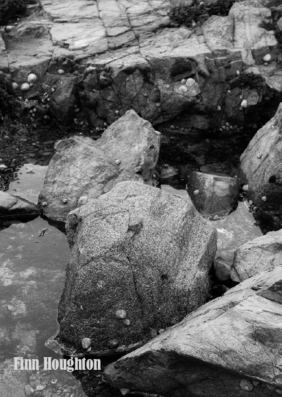
These are the wide range of images that I am going to use for my zine. I wanted to incorporate variety of close-up and textured images, with the full-scale sculptures. I wanted to achieve a contrast with my photographs so that I can display what others may not notice at first, such as the rocks rough structures close up. Displaying Jersey’s Geology from different viewpoints is definitely a good way of showcasing it’s many formations.

Process of making the zine

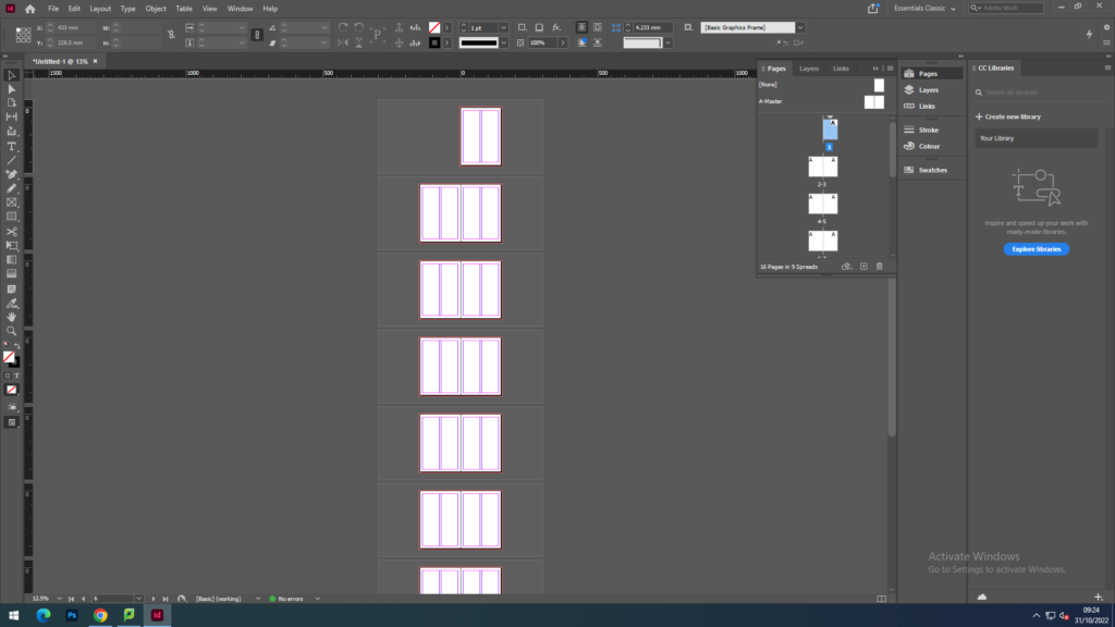
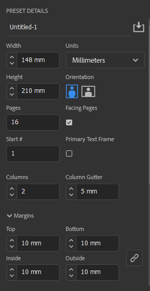
First I began with the layout of my zine by choose to have 16 pages for my zine. I decided to cut the number down after I added my images as I didn’t want to have a load of blank pages or even add more images on to fill in the gaps.

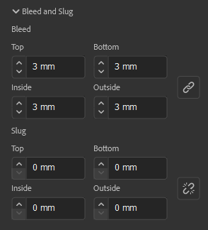
These were the settings we had to follow for the zines. They were to be presented with a portrait orientation and had to have the width and height be at a size that showcased the zine in a rectangular shape, similar to an A4 piece of paper. as to get a good range of photographs presented in the piece.
First zine draft

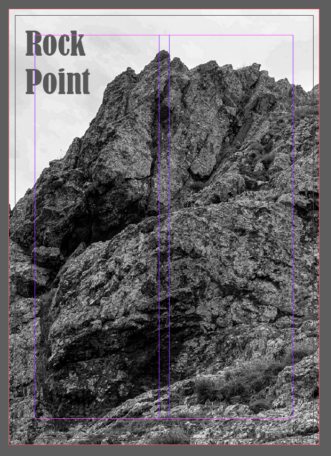
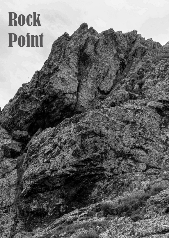
With my front cover, I chose this image as I really wanted to make the beginning of the zine quite impactful and intriguing bt choosing such a dramatic photograph. I also went ahead with choosing the title ‘Rock point’, as to represent what was going to be showcased within the zine. I experimented with a few titles such as ‘Rock bottom’ or ‘Jagged geology’, but I thought ‘Rock Point’ was a lot more suitable than the others.

Front cover – Page 1

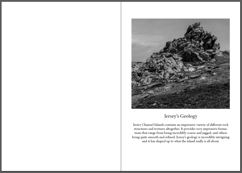
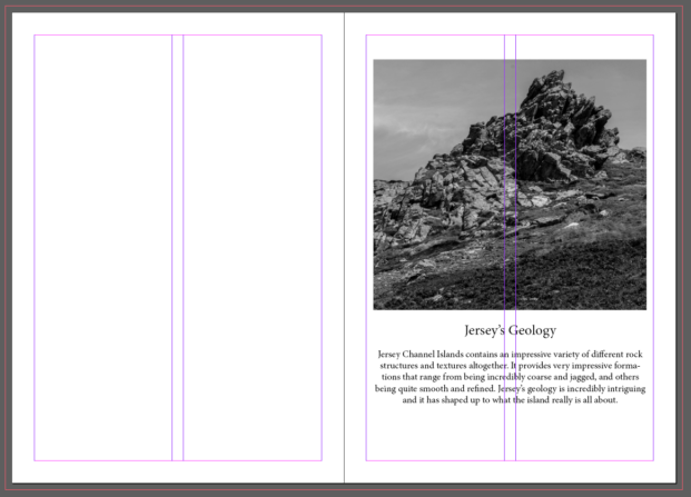
For my first and second page, I wanted to start off by including a small description about Jersey’s Geology and what this zine is all about. I wanted the description to also be included in with an image I took as to highlight the basis of what is to come within the zine.

Page 2 & 3

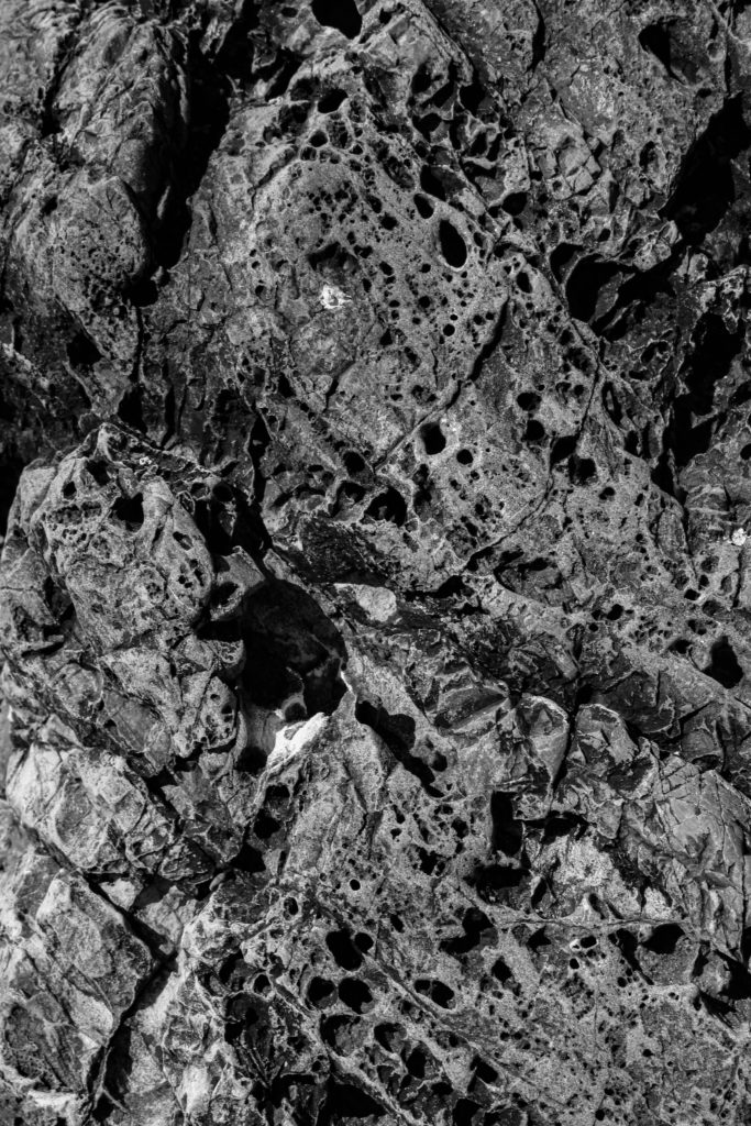
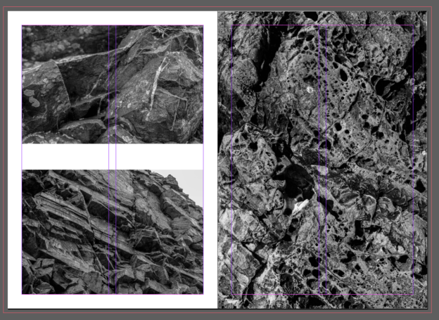
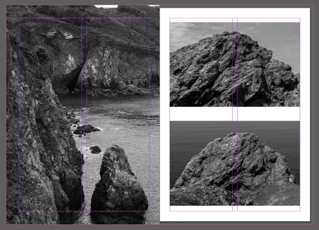
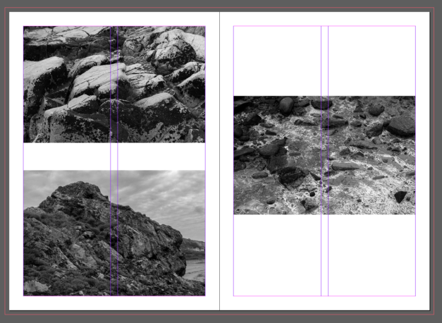
With these pages below, I wanted to start off by showcasing the textures of Jersey’s geology and a close-up representation of what people may not notice at first glance. Jersey has quite jagged formations and I wanted to highlight what it is that makes the islands rocks so intriguing. For page 4, I wanted the images to be placed within the zine with a white border around them so that they can both shine separately and not be too confusing or difficult to look at. There are so many different textures occurring with these images so I didn’t want to make them all confuse one another. On the right side, I wanted to expand the image to completely cover the page, allowing for no white borders to appear and for the image to expand to the bleed, which is kept at 3mm for each page. I wanted to really highlight how intriguing Jersey’s rock patterns are and I thought this was a really good example for how to showcase this.
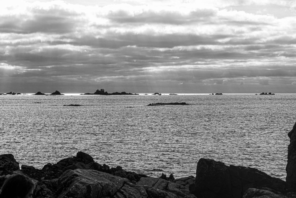
Page 4 & 5

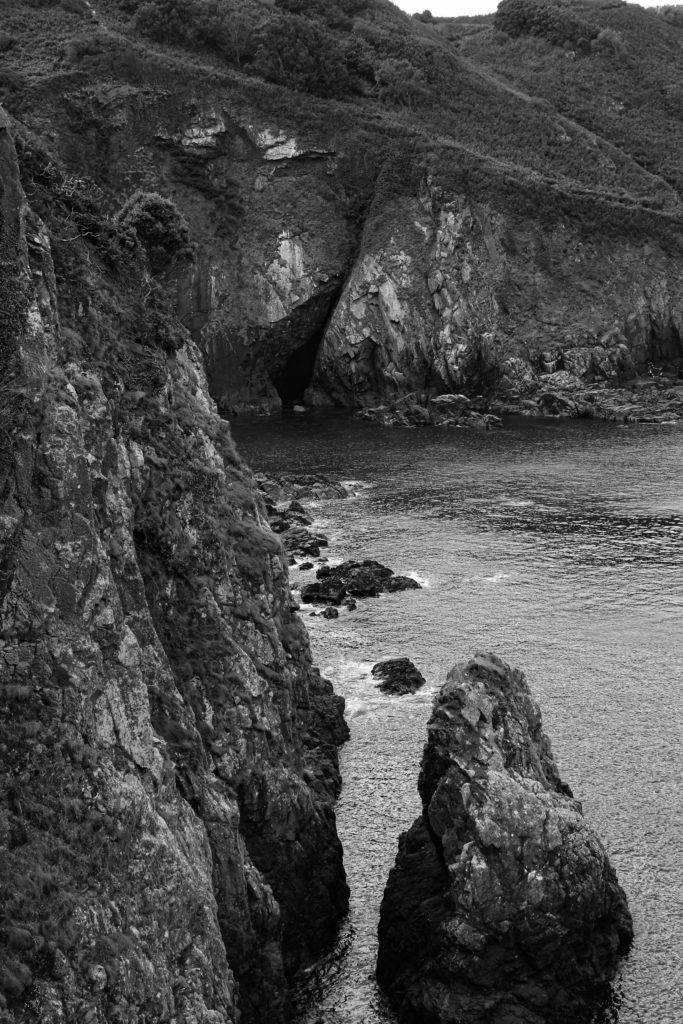
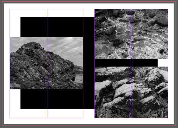
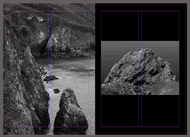
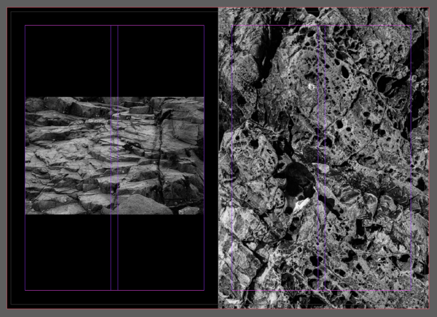
With pages 6 and 7, I wanted to edit the background of the images so that there was a black rectangle which spread across both pages. I didn’t want to include just a plain white background for these next pages, as I believed that it would clash with what pages 4 and 5 have been presented as. I wanted to experiment a bit more with the aesthetic of the page before placing the images on top. I thought these images all complimented each other as they’re all showcasing different areas of the islands formations. The images on page 7 highlight close-ups of the rocks, whilst page 6 presents a full-scale, and much more intimidating, representation of the islands geology.

Page 6 & 7

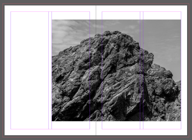
Page 8 and 9 include an image of one of the full-scale rock photographs which spreads along both of them. I wanted this to be a break from the other pages so far, as every page includes more than one image set together. This image on the other-hand, presents only one image but it is spread out among both pages. I liked how this page looked as I believe that it will be quite effective to turn to, especially after the repetition of multiple images on the pages so far.
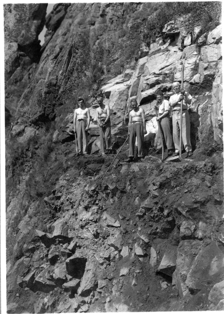
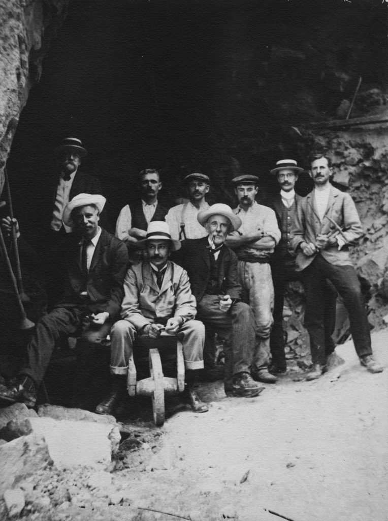
Page 8 & 9

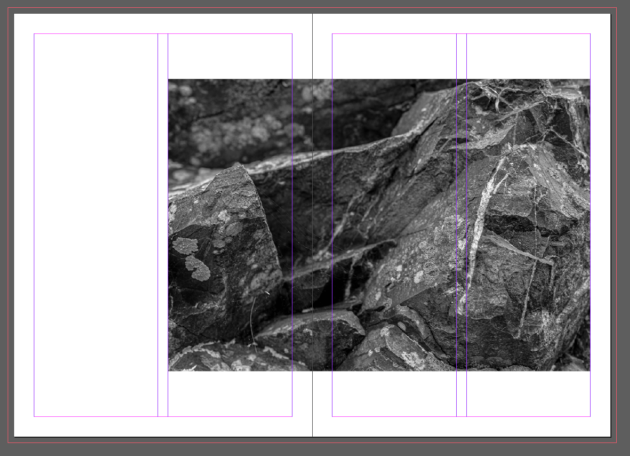
I thought that these pages really complimented each other as they both showcase full-scale photographs of the islands formations and present just how intimidating their size really is. I wanted to include a black background as well for the image on page 11, as to break away from the white background that is chosen to begin with. I wanted to allow for these to make a more dramatic impact with the darker and harsher colouring.

Page 10 & 11

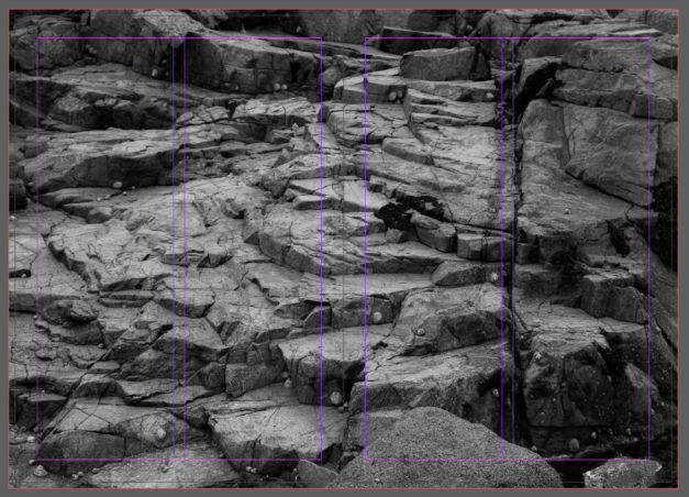
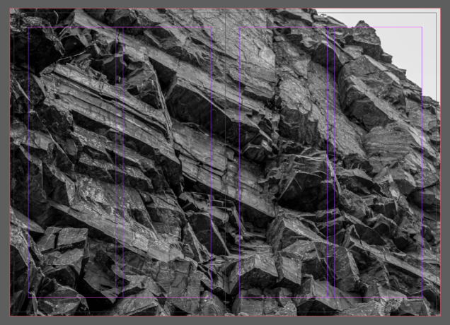
I wanted to then take the approach of completely covering both pages with a large-scale photograph. I chose this image for it so that I could really make the rocks textures stand out. I wanted to make it big and bold as to make a larger impact on what the island has to offer. I expanded the image right up to the bleed so that the image would cover the pages nicely, not allowing for any of the white borders to peek through.

Page 12 & 13

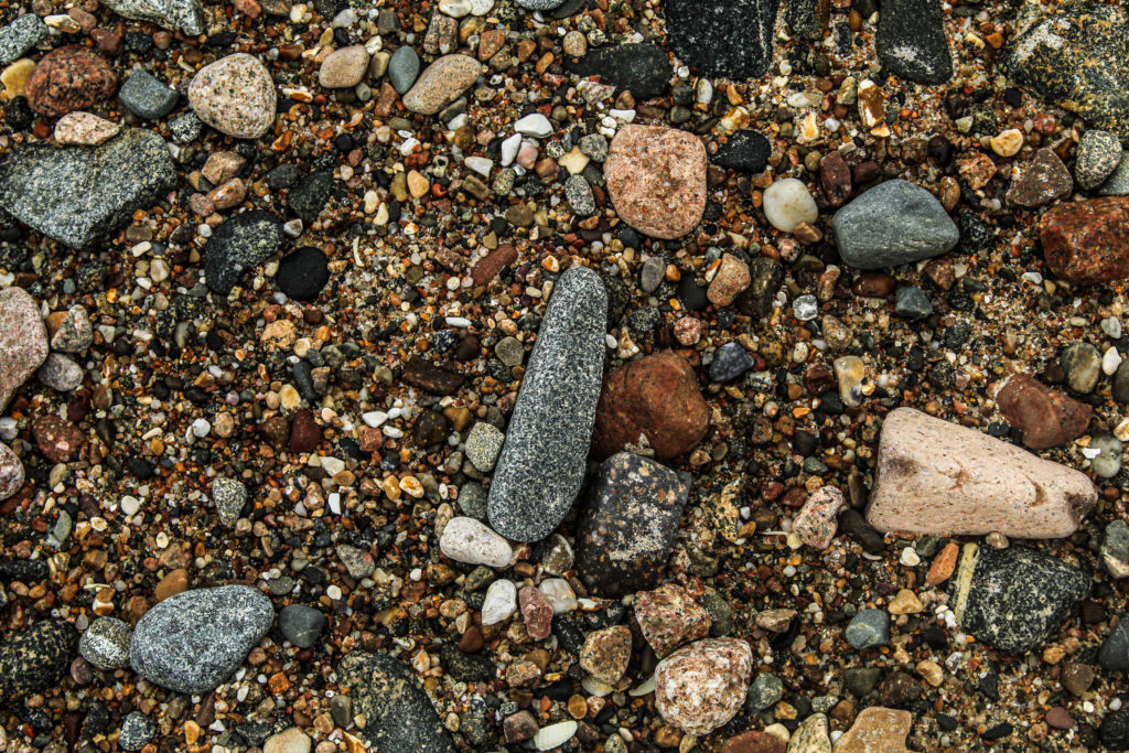
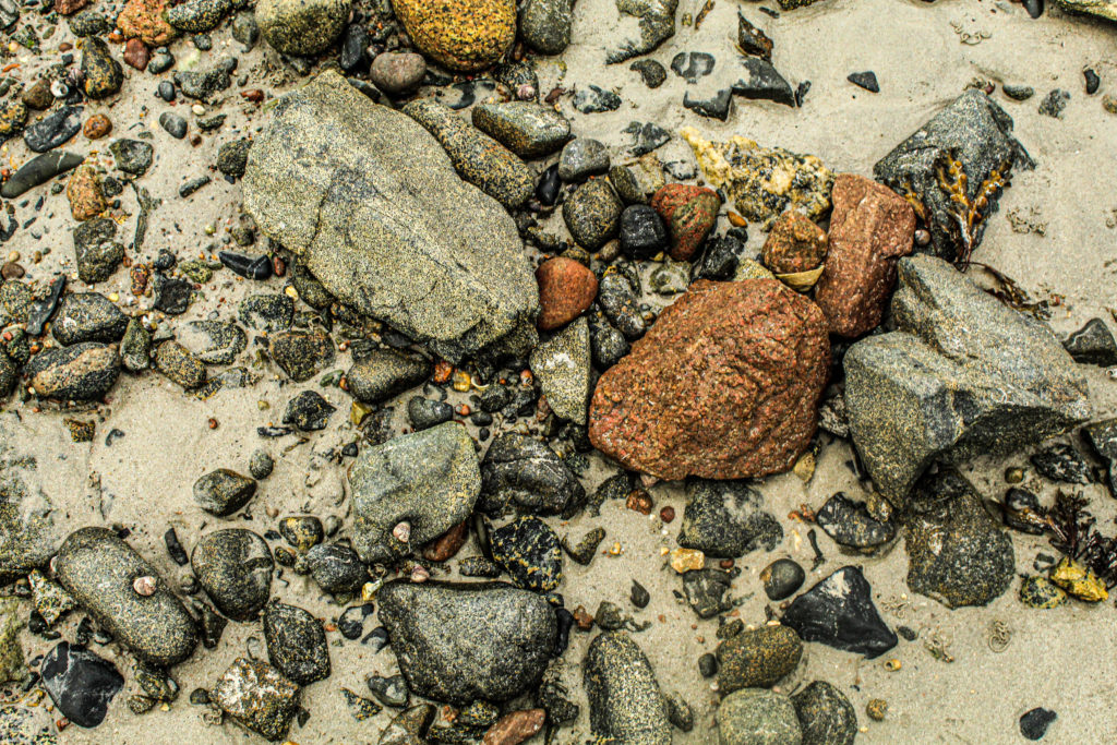
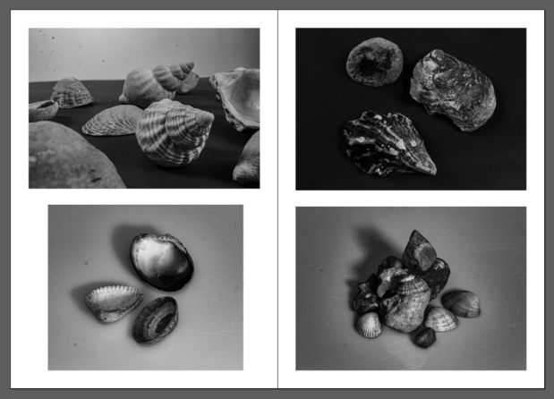
After all of my images being mainly about Jersey’s landscape, I wanted to also incorporate some still life images of rocks and other items that I have collected from the areas I have explored. I wanted to really capture the many varieties of rocks and shells that would be lying among the Jersey coastlines. I particularly liked these images for my zine as they still fit within the theme, but they also present a dramatic intent of the many items that would be harder to notice at first glance due to the size of them all. The harder to notice rocks lay among the much larger scale rocks, so I wanted to allow for these still life images to really shine so that the importance is highlighted massively.

Page 14 & 15

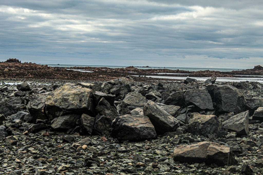
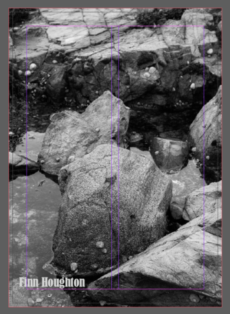
Finally, for my back cover of my zine, I wanted to once again let the image expand up to the bleed so that it would cover the entire page. I chose this image as I believe it is quite a strong image for displaying the many arrangements of rocks present. I believe that it compliments the front cover very well as they both have presented an almost intimidating interpretation of what Jersey’s geology is all about.

Back cover – Page 16

Second zine draft

After creating my first draft of my zine, I wanted to experiment a bit more with the layout so I decided to carry out a second zine draft. I wanted to compare the two zines so that I could make a well thought out decision of which one I would like to be printed.

For this draft of my zine, I kept everything fairly similar to that of my first draft, but just ended up rearranging some images to see if they complimented each other more than the previous arrangement. I wanted to experiment before making my final decision for printing out my zine.

Physical Zine Experiment

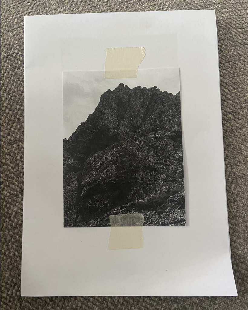
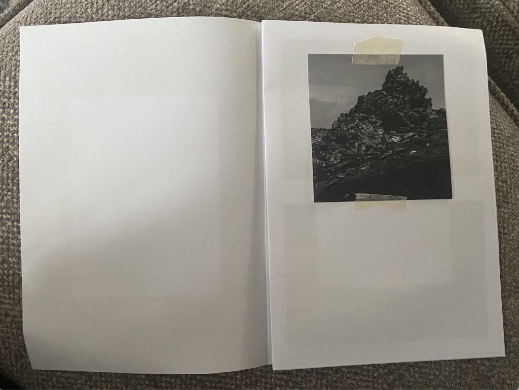
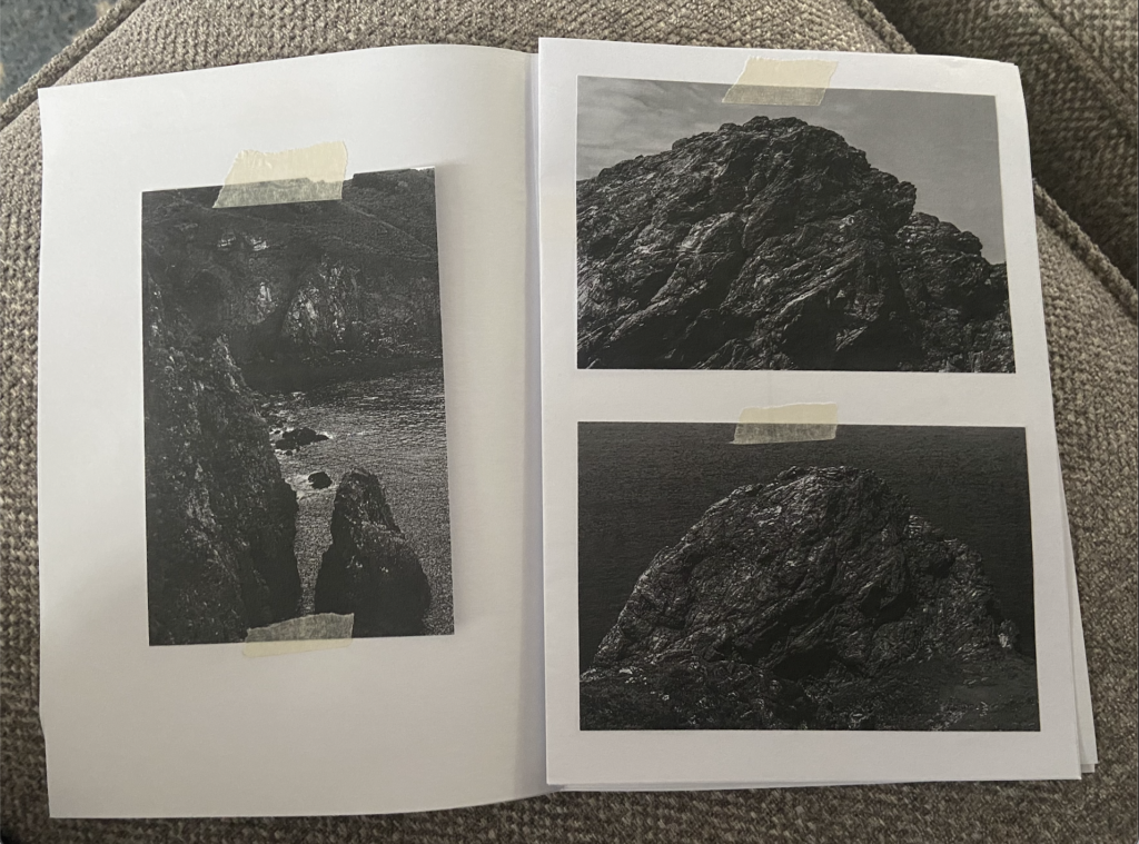
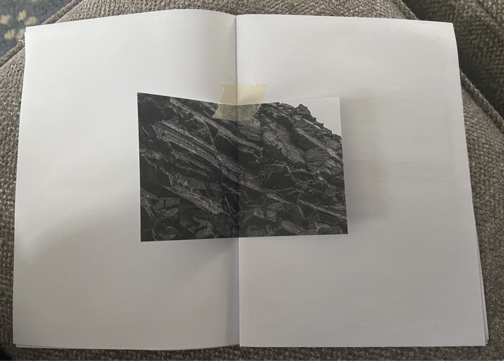
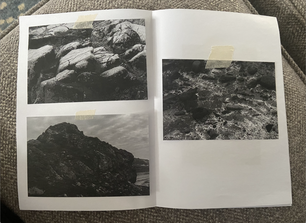
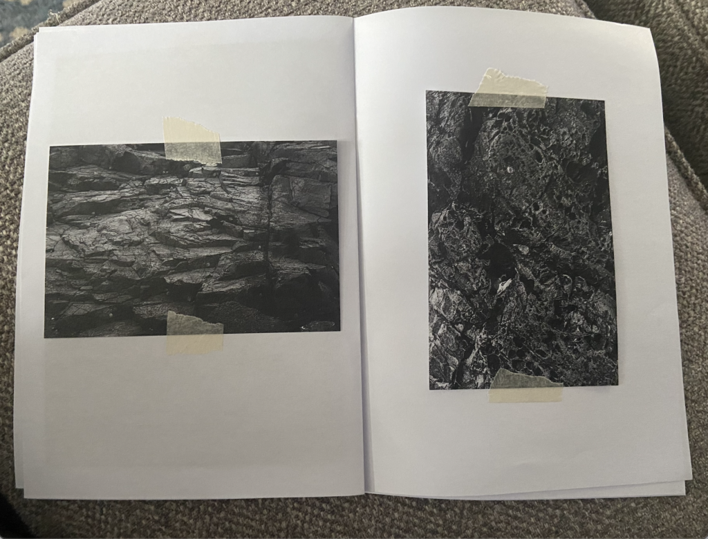
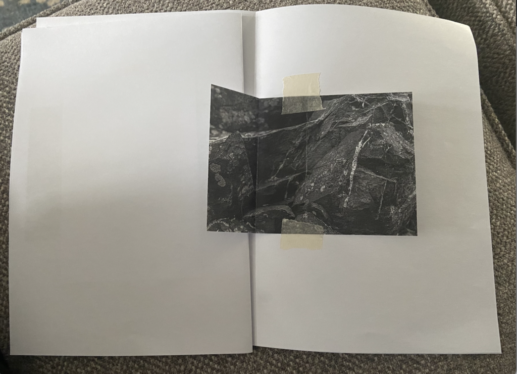
Before I began creating my zine on InDesign, I took the approach of making a physical layout by printing off the photographs I would like to include, and then taping them to a 16 page booklet made with folded pieces of paper. I wanted to get an idea of the layout first with printed off images, just so I could make it easier for me to edit my version on InDesign.
I ended up leaving a few pages blank near the end of the zine as I wasn’t sure which other images I’d consider including.

Front cover
Page 1 & 2
Page 3 & 4