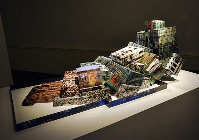
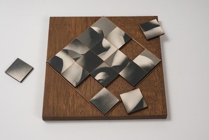
Moodboard
Artist Reference: Koh Myung Keun
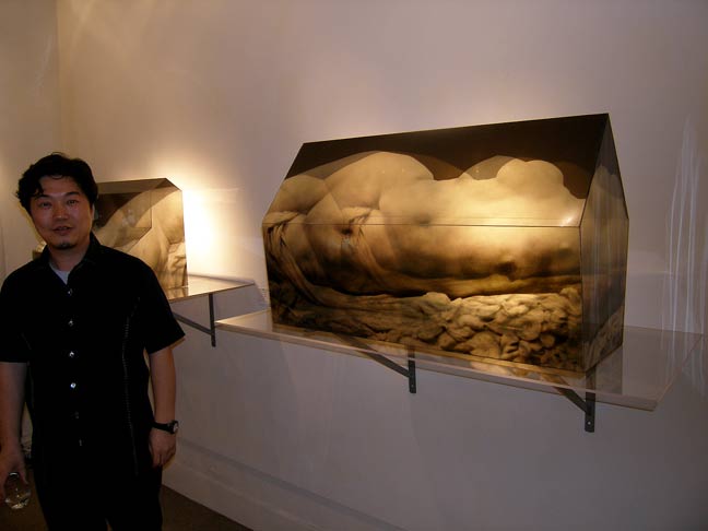
Koh Myung Keun is a Korean, Seoul-based modern and contemporary artist and photographer born in 1964, whos work begins with the inquiry of “defining truth”. He has held multiple solo and group exhibitions featuring his work, ranging from a focus on the ” ideal human figure” as to “create fiction”, to a focus on the Asian cities visited by him, creating unique looking landscapes of those areas.
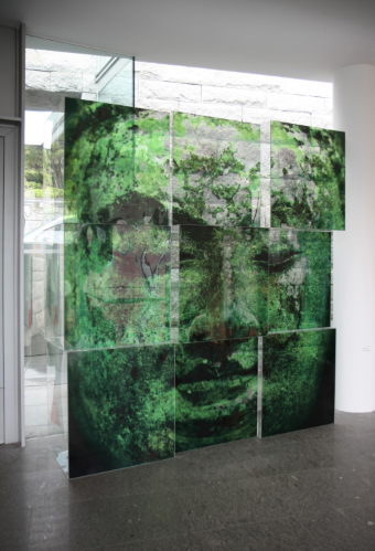
He uses sculptures made from semi-transparent layers of digital prints, made from film laminated with plastic, to give his sculptures a memorable effect when viewing them. The name of his ‘Blending Space’ exhibition perfectly describes his works, especially the landscape-focused ones, as he seems to blend the images together with his technique of placing the images together
A video of Koh Myung Keun describing his works.
Similarities and Differences between his Works
Koh Myung Keun’s work usually involves his signature use of semi-transparent material, which gives his photographs a physical structure, but at the same time (especially when using more than one photograph), makes the images themselves lose regular structure and become something more abstract. Koh Myung Keun also tends to change up the shape of the sculptures between each one, giving the sculptures a sense of originality, however, if one of the works is within a series, then it may be likely that he will use a similar, or the same, shape.
One clear difference between his works is that in some sculptures he puts and emphasis on the human body/form (such as Body House 9) and tries to make an abstract image using little colour and soft lines, while others, he uses more industrial landscape scenes such as a building face or interior, which tend to use more colour and harsher shapes/lines (such as Building 62). Some of his works include more natural and cultural subject matter (such as Buddha 1). I think it is interesting that he named a series of his body-focussed works ‘Body House’, as ‘body’ and ‘house’ seem to contrast with each other thematically, however the ‘house’ part of the name comes from the structure itself, while the ‘body’ takes from the photograph itself.

Image/Sculpture Analysis

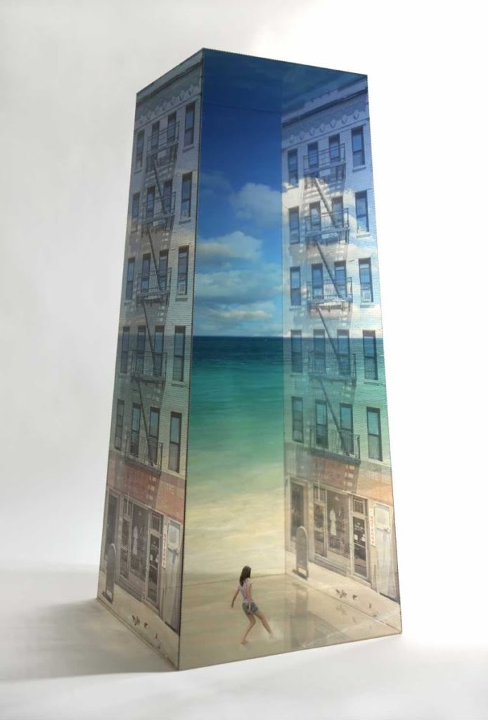
This sculpture appears to be made up of four sides, each with the same photograph. Due to this and the semi-transparent nature of the images, a 3D effect is created, this is especially apparent with the washing line, as it seems to fully form a square with an appropriate depth. The shape of the sides gives the sculpture a sense of verticality, which allows the photograph to inherit this sense of verticality, as it allows for a taller frame. This shows much more of the building than what would have been seen if Koh Myung Keun had used a square, since the second floor and leaves that seem to adorn it would be cut out. The photographs themselves seem to be taken from the second floor, giving the lower half of the image a downwards viewpoint. Due to the images being printed onto semi-transparent material, the image’s colour has slightly faded, I think this fits with the image itself, as it gives it a softer look that pairs well with the homely subject matter of the image. The palette is fairly limited, with the image being made up mainly of greys, reds and greens, all of these colours have a fairly warm tone.


