
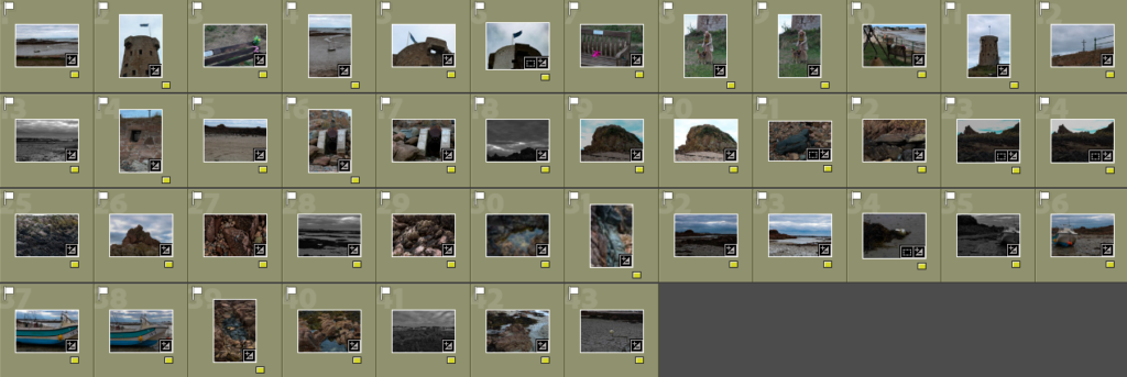
Contact Sheets
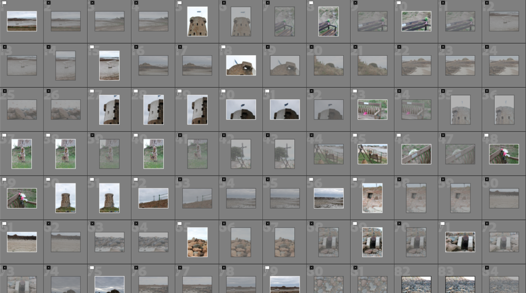
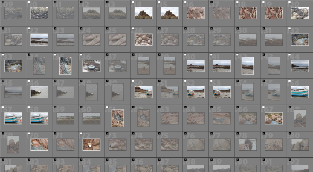
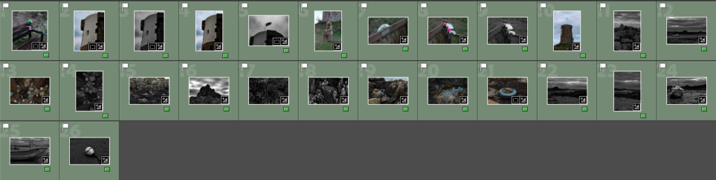
Here are some of my contact sheets from my photoshoot at La Hoque. Contact sheets are an easy way to see all the photographs and make a prediction if there needs to be another photoshoot or not. I used lightroom and imported my images from the camera.
1st Selection (Flags)
To help me narrow down my selection of images I first used the ‘p’ and ‘x’ tools to flag my images. The ‘p’ tool is used to put a white flag above the photo which means I have selected to use this image. By using the ‘x’ tool it put a black flag means I have deselected the image and it won’t come up in the editing selection.
Editing
1st 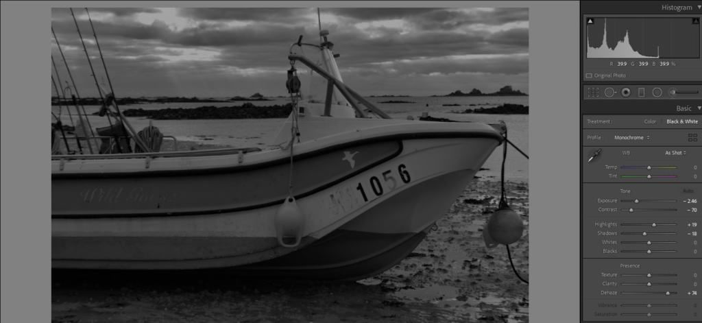
2nd 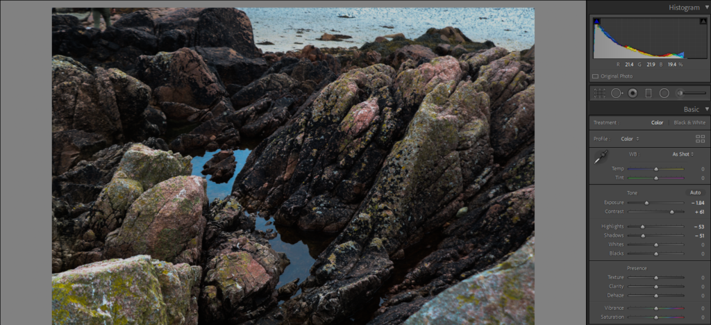
3rd
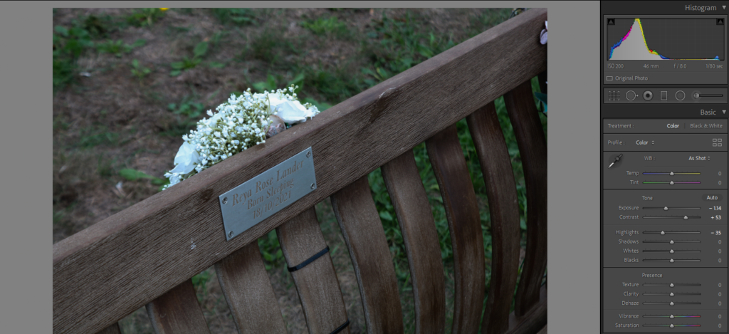
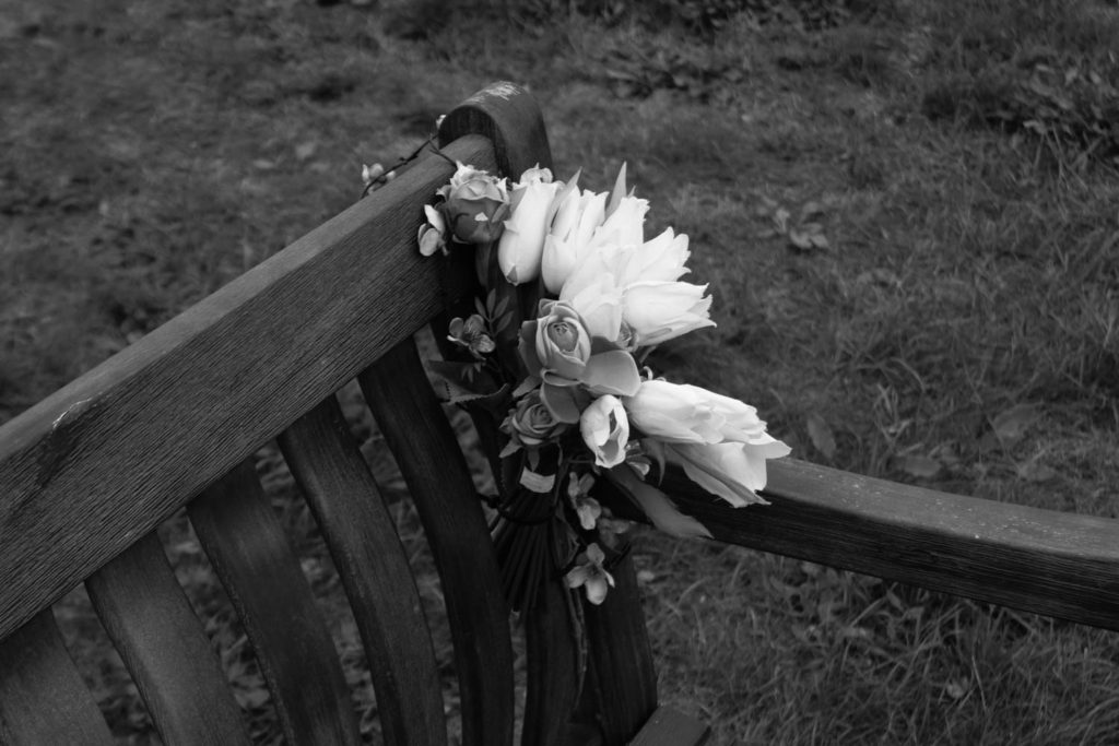
Above are three of my edited photos which I imported into lightroom to help me edit them. For my 1st and 3rd image, I kept them in colour, and I decreased the exposure and increase the contrast setting which have given the images a darker tone, but they still hold the saturated colours from the grass in the 1st image and in the rocks in the 3rd image. For the first image, I didn’t feel like I could include it in my final selection as it was a memorial bench which is personal to other people.
For my second image, I converted to black and white as I thought it would create a greater effect, especially with the sky rather than keeping it as a coloured image. To give the sky a more dramatic effect I increased the dehaze toll and decreased the exposure. I also slightly increased the contrast to make the darker tones stand out more against the white and grey tones.
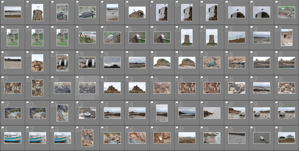
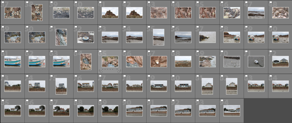
2nd Selection (Colour Coding)

To help me with my selection and finding the best for my final images I narrowed it down a second time by using different colours to differentiate photos into ‘best images’ (green), ‘average images’ (yellow) and lastly my final images which I have highlighted in blue.
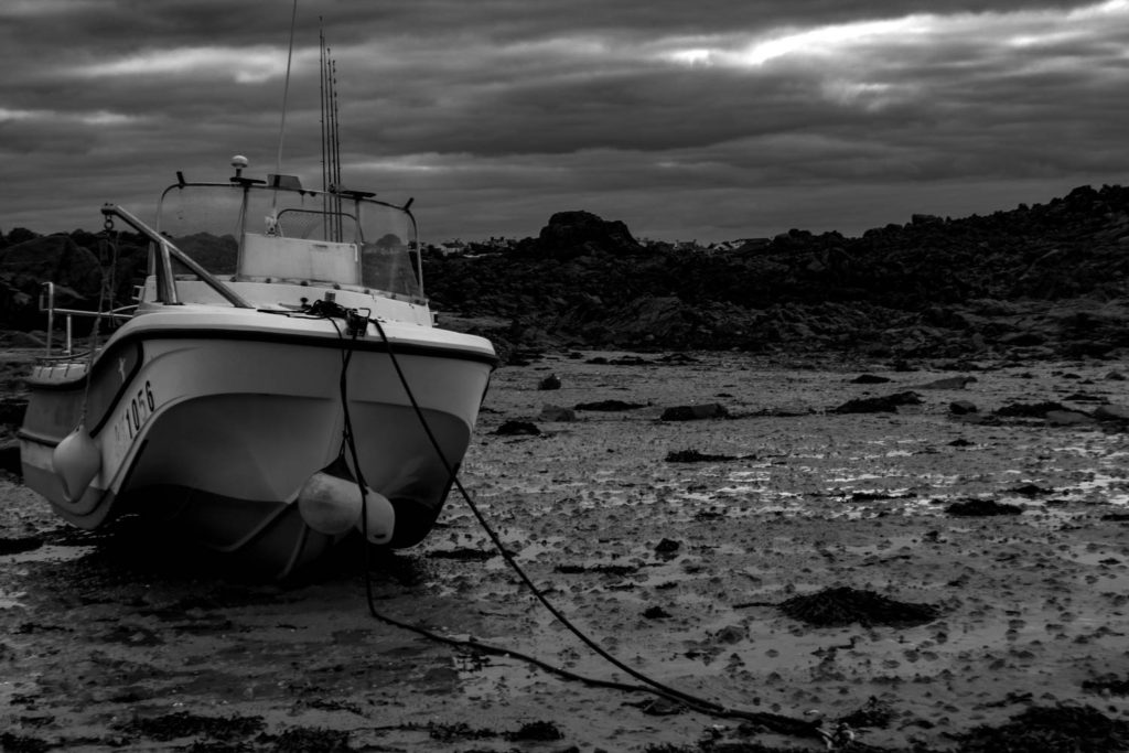
Final Images
1st 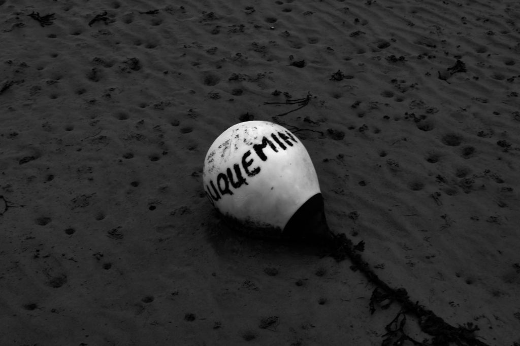
2nd
Above I have two of my final images which I have converted into black and white. In my opinion, I think my first photo is the best out of the select that I have chosen to be part of my final images, this is because of the dramatic editing that compliments both the sky and the background with the darker rocks that contrast with the lighter grey shades of the sand and the boat in the forefront of the image. I enjoy the composition of my first image as the boat is not directly in the middle of the photograph it allows the different textures of the rocks, sand and seaweed to be seen which adds more life to the final image.
For my second image, I have edited it in a similar way to the first as I wanted the buoy to have a bright white that is very eye-catching and jumps out against the darker shade of sand. One of the things I like most about this photo is the different texture in the sand that sits in the background of the image, you can see the ripples and other seashells that add personality to the photograph. Lastly, another feature I think really stands out is the writing and sand/dirt that is on the buoy, the way I have edited the photo helped to create a darker text that compliments the white of the plastic buoy.
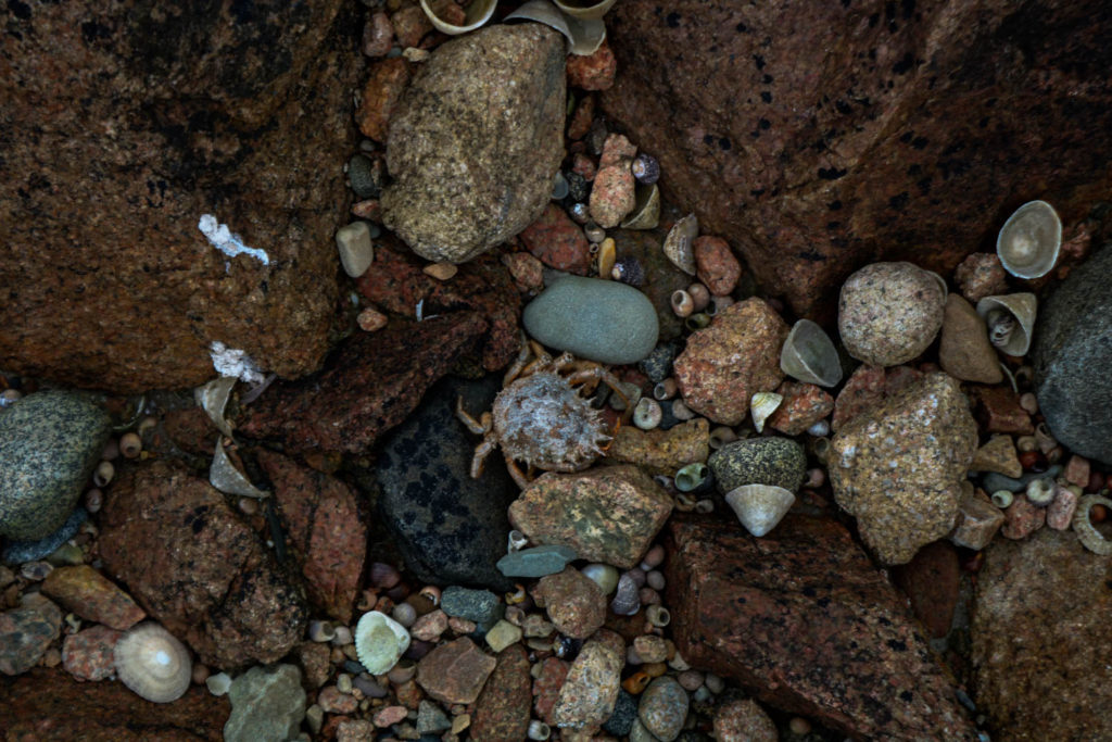
3rd 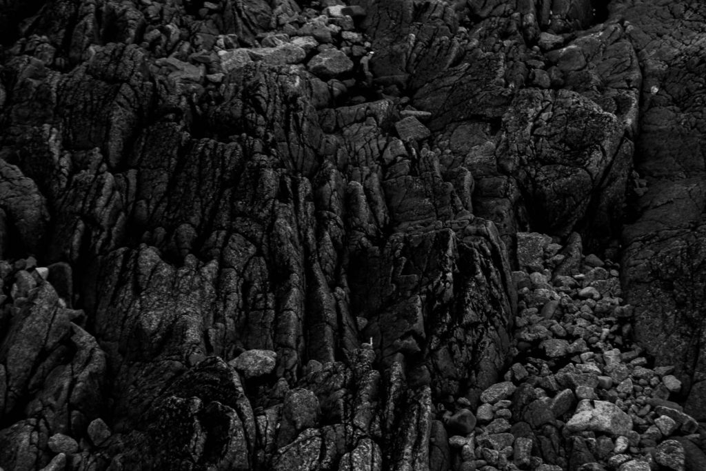
4th 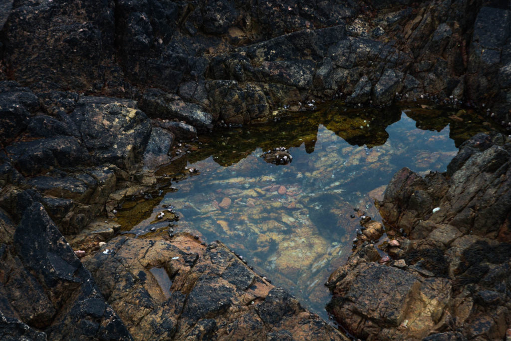
5th
Here I have the next three images in my collection of final images, I have picked my 3rd image as I feel that it gives a good representation of the different life and objects that are on Jersey beaches. In my opinion, I think that the 3rd is quite unique as it has a lot of different features to it including the colours, shapes and tones. As the photo has so many objects in it there are lots of different elements to look at which will attract people’s attention, there is a slight contrast between the warm and cooler tones as some of the rocks and shells are more of a blu/purple colour where the majority is a red/beige colour.
For my 4th image, I have converted it into black and white as I wanted to make the shadows in the groves of the rocks more drastic. Also, by making the image black and white it took away the distraction of colour making it easier for any viewer to focus on the different textures of the rocks in both the foreground and background. As I was quite close to the bigger rocks it made the ripples in them more prominent. Finally in my 5th photo, I have taken a photo of one of the rock pools down at La Hoque, in his image I really like the reflection of the sky and the other rocks surrounding it, I think it makes the photo more interesting and better to view. Another feature of the image that i think adds characters is the different shapes and tones, there are many different reds and yellows which appear in this photograph which I think compliments the black that lies on the rocks.
6th 
7th
Above I have included my 6th and 7th final images, these are both in black and white as I thought that type of editing suited the images better. In my 6th image I photographed a bunch of flowers that was attached to one of the benches down at La Hoque, I like how the bright white flowers standout against the darker background and the different shades of from the other flowers around them. Another thing I enjoy about this image is the different textures that complement each other throughout the photo. For example, the benches rougher wooden texture contrasts with the flower petals but they also somehow bring the image together.
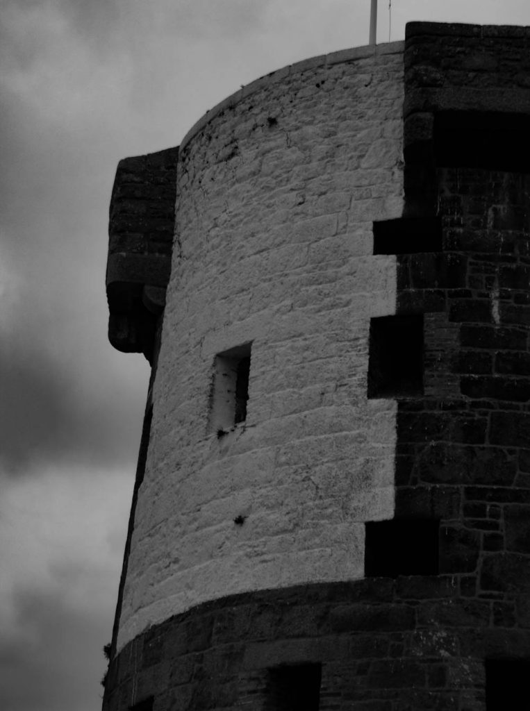
Moving on to my 7th image, I have photographed the top of La Hoque tower white the flag. I decided to convert this into black and white as I wanted to have a dramatic grey sky sitting above the tower which I think I have successfully gotten. I enjoy how the outer areas of the clouds are darker grey which slowly go into a lighter grey in the middle. Another feature which I like about this image is the block of white that has be painted on the tower, it adds more personality to the image as it’s another key feature which attracts people’s attention.
8th 
9th (Josie and Belle)
Above are the last two final images of my La Hoque collection. The 8th image is similar to the 7th but is takes portrait instead of landscape allowing for mor of the tower to be seen. One thing I like about this image is the composition, I think it creates a better image as the full tower has not been photographed but rather just half of it. I enjoy how the main focus is the blocked out white but there is also the natural-coloured brick that frames it in the final image. The contrast between the harsher, bolder colours of the tower and the more faded and blurred shades which comes out in background also help bring the whole photo together as it helps the tower become more eye-catching.