SOCIETE JERSIAISE PHOTOGRAPHIC ARCHIVE

History

the Societe Jeriaise’s mission is to produce and facilitate research on the Island’s history, culture, language and environment; and to share that knowledge with the broadest possible audience for the benefit of our island community. The Société holds extensive bibliographic, cartographic, photographic and research collections which act as their long-term memory. These collections provide a vital resource informing contemporary study and value for the community through a greater understanding of our shared heritage, identity and environment.

The Société Jersiaise was founded in January 1873 by a small number of Islanders who were interested in the study of the history, the language and the antiquities of Jersey. Once the Société Jersiaise was up and running memberships grew quickly and the aims of the new society soon included a variety of publications of historical documents, the founding of a museum and the study of the Island’s natural history. The Société’s first Bulletin Annuel was issued in 1875 and remains the main record of their activities.

The Societe’s Museum found a permanent home in 1893 when they moved to 9 Pier Road, a large early nineteenth-century merchant’s house.  The Museum and its extensive Museum collections are now looked after by Jersey Heritage but they continue to add to its collections annually.  In 1977 they built a large extension to our Museum on the site of No 7 Pier Road to house the library and meeting rooms. Their Headquarters contains their offices and purpose-built archive storage.

The Museum and other collections have been largely built up through gifts and bequests which has ensured its preservation of many important items with relevance to Jersey including; books, manuscripts and maps, photographs, prints and paintings, archaeological finds and historical items.
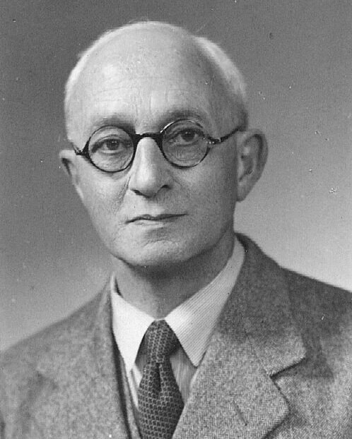
Emile F Guiton

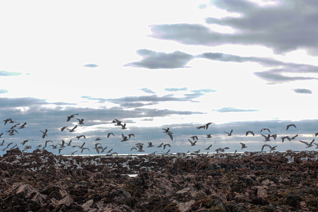
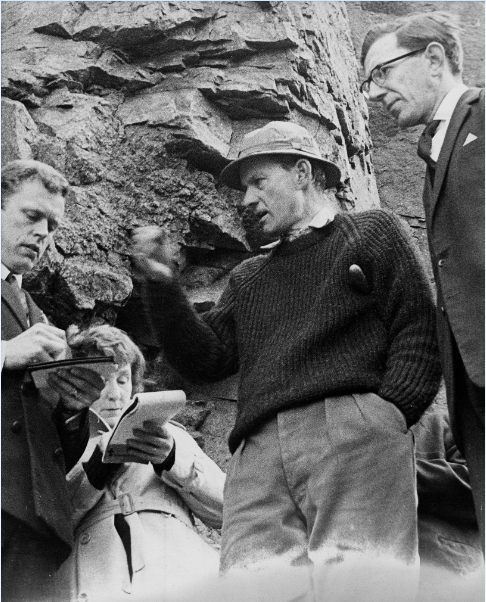
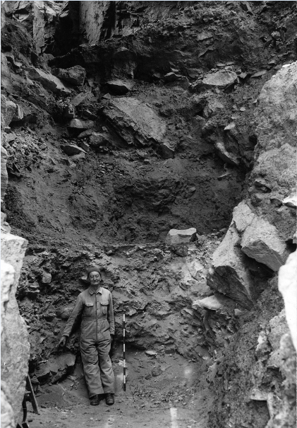
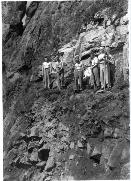
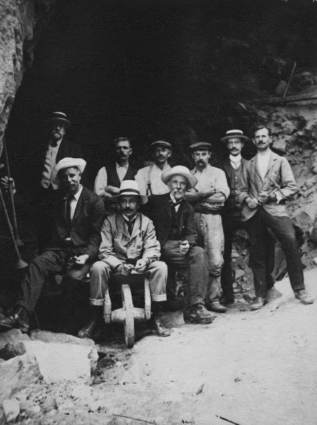
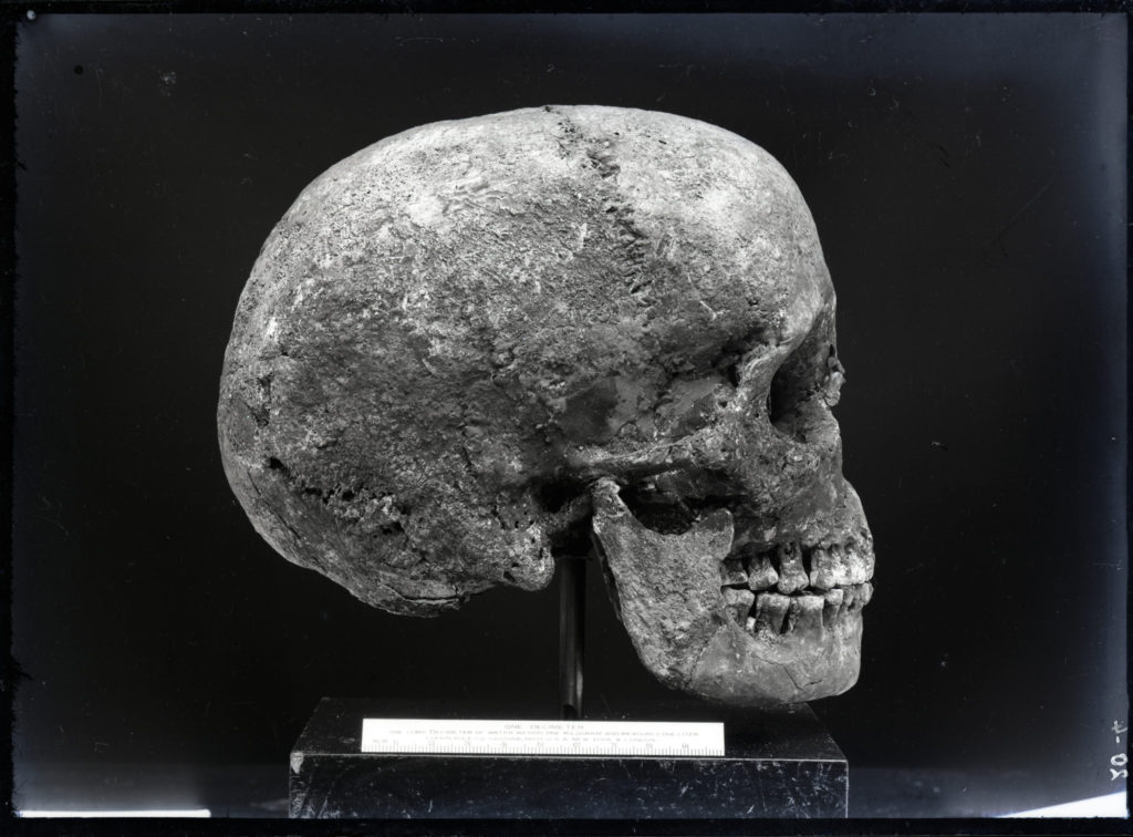
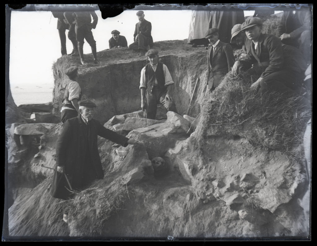
Honorary Curator of the Museum and Editor of the Annual Bulletin, Emile F Guiton is considered to be the founder of the Photographic Archive at the Société Jersiaise. He was also an excellent photographer making use of a rapidly expanding medium in the early 20th century to record important historical sites, events and objects.

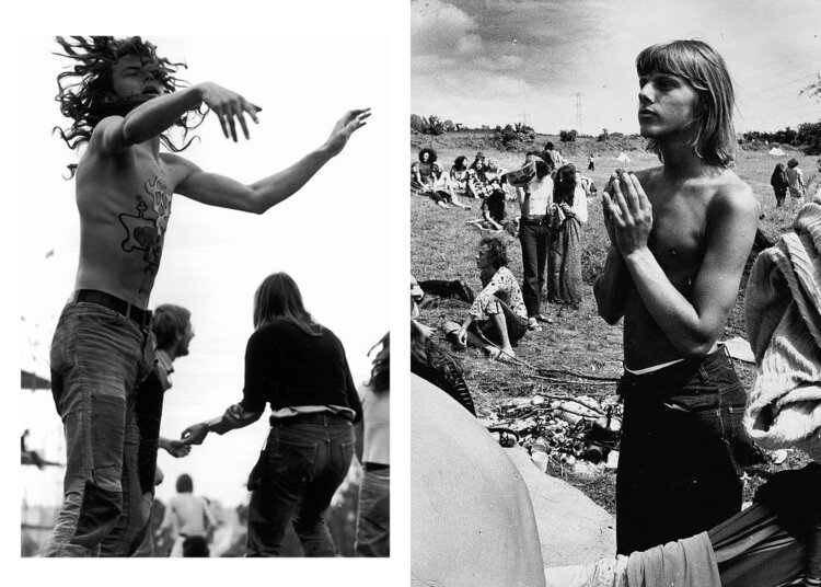
In honour of Emile and his legacy, the Societe Jersiaise decided to launch Éditions Emile, with each issue of ED.EM. They take a fresh look at a specific collection within the archive, pairing it with either another collection or contemporary work, in order to re-contextualise the images, keeping the collections active and relevant for new audiences.

Emile F Guiton

The surname Guiton is said to be on the derivation of Jersey names to come from the old French word for ‘page-boy’. But, other sources suggest that while of ancient French origin, that this surname may be an occupational name for a professional guide which was a very important role when maps were either non-existent or not to be trusted.

The Guiton family had become involved in newspapers just a few weeks after the Jersey Evening Post had launched. The JEP had been founded by HP Butterworth who used Walter Guiton as his printer. Seeing this as a big opportunity, Guiton bought the title and it remained in his family until 2003.

Edwin Dale

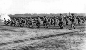
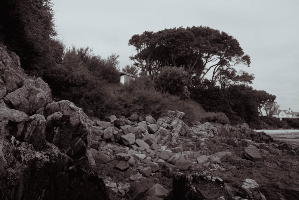
Edwin Dale was born in January of the 1880s and has left an extensive collection of photographs of the island views which were taken between 1910 and 1920 some may have been taken earlier. There is a selection in the Photographic Archive of La Societe Jersiaise and some images are also held by private collectors.

‎
Edwin Dale

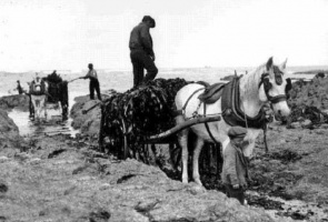
Dale made a living by running his father’s boot, shoe and leather shop which was found at 63 New Street but he still had a passion for photography, some of his favourite places to photograph were harbour scenes and steamships, churches, houses, country lanes and coastal views, sport and the railways. He also adventured into portraiture and photographs of islanders at work. Dale also had a motorcycle which he used to travel around the island to take his photographs. In the 1910s some of Dales’s images were published as a series of postcards and many were numbered among the most iconic images of the island.

la hoque

Contact Sheets

Here are some of my contact sheets from my photoshoot at La Hoque. Contact sheets are an easy way to see all the photographs and make a prediction if there needs to be another photoshoot or not. I used lightroom and imported my images from the camera.

1st Selection (Flags)

To help me narrow down my selection of images I first used the ‘p’ and ‘x’ tools to flag my images. The ‘p’ tool is used to put a white flag above the photo which means I have selected to use this image. By using the ‘x’ tool it put a black flag means I have deselected the image and it won’t come up in the editing selection.

Editing

Above are three of my edited photos which I imported into lightroom to help me edit them. For my 1st and 3rd image, I kept them in colour, and I decreased the exposure and increase the contrast setting which have given the images a darker tone, but they still hold the saturated colours from the grass in the 1st image and in the rocks in the 3rd image. For the first image, I didn’t feel like I could include it in my final selection as it was a memorial bench which is personal to other people.
For my second image, I converted to black and white as I thought it would create a greater effect, especially with the sky rather than keeping it as a coloured image. To give the sky a more dramatic effect I increased the dehaze toll and decreased the exposure. I also slightly increased the contrast to make the darker tones stand out more against the white and grey tones.

2nd Selection (Colour Coding)

To help me with my selection and finding the best for my final images I narrowed it down a second time by using different colours to differentiate photos into ‘best images’ (green), ‘average images’ (yellow) and lastly my final images which I have highlighted in blue.

Final Images

Above I have two of my final images which I have converted into black and white. In my opinion, I think my first photo is the best out of the select that I have chosen to be part of my final images, this is because of the dramatic editing that compliments both the sky and the background with the darker rocks that contrast with the lighter grey shades of the sand and the boat in the forefront of the image. I enjoy the composition of my first image as the boat is not directly in the middle of the photograph it allows the different textures of the rocks, sand and seaweed to be seen which adds more life to the final image.

For my second image, I have edited it in a similar way to the first as I wanted the buoy to have a bright white that is very eye-catching and jumps out against the darker shade of sand. One of the things I like most about this photo is the different texture in the sand that sits in the background of the image, you can see the ripples and other seashells that add personality to the photograph. Lastly, another feature I think really stands out is the writing and sand/dirt that is on the buoy, the way I have edited the photo helped to create a darker text that compliments the white of the plastic buoy.

Here I have the next three images in my collection of final images, I have picked my 3rd image as I feel that it gives a good representation of the different life and objects that are on Jersey beaches. In my opinion, I think that the 3rd is quite unique as it has a lot of different features to it including the colours, shapes and tones. As the photo has so many objects in it there are lots of different elements to look at which will attract people’s attention, there is a slight contrast between the warm and cooler tones as some of the rocks and shells are more of a blu/purple colour where the majority is a red/beige colour.

For my 4th image, I have converted it into black and white as I wanted to make the shadows in the groves of the rocks more drastic. Also, by making the image black and white it took away the distraction of colour making it easier for any viewer to focus on the different textures of the rocks in both the foreground and background. As I was quite close to the bigger rocks it made the ripples in them more prominent. Finally in my 5th photo, I have taken a photo of one of the rock pools down at La Hoque, in his image I really like the reflection of the sky and the other rocks surrounding it, I think it makes the photo more interesting and better to view. Another feature of the image that i think adds characters is the different shapes and tones, there are many different reds and yellows which appear in this photograph which I think compliments the black that lies on the rocks.

Above I have included my 6th and 7th final images, these are both in black and white as I thought that type of editing suited the images better. In my 6th image I photographed a bunch of flowers that was attached to one of the benches down at La Hoque, I like how the bright white flowers standout against the darker background and the different shades of from the other flowers around them. Another thing I enjoy about this image is the different textures that complement each other throughout the photo. For example, the benches rougher wooden texture contrasts with the flower petals but they also somehow bring the image together.

Moving on to my 7th image, I have photographed the top of La Hoque tower white the flag. I decided to convert this into black and white as I wanted to have a dramatic grey sky sitting above the tower which I think I have successfully gotten. I enjoy how the outer areas of the clouds are darker grey which slowly go into a lighter grey in the middle. Another feature which I like about this image is the block of white that has be painted on the tower, it adds more personality to the image as it’s another key feature which attracts people’s attention.

Above are the last two final images of my La Hoque collection. The 8th image is similar to the 7th but is takes portrait instead of landscape allowing for mor of the tower to be seen. One thing I like about this image is the composition, I think it creates a better image as the full tower has not been photographed but rather just half of it. I enjoy how the main focus is the blocked out white but there is also the natural-coloured brick that frames it in the final image. The contrast between the harsher, bolder colours of the tower and the more faded and blurred shades which comes out in background also help bring the whole photo together as it helps the tower become more eye-catching.

Photo zines research

What is a photo zine

A zine is most commonly a small-circulation of self-published work. It could be about many different topics: photography, illustration, design, etc…Usually zines are the product of a small group or individual people, and the primary intent is exposure rather than profit. Zines are usually created to look like magazines. A photo zine, for example, is a tool that photographers can use to tell a visual story, to inform an audience about a specific topic or issue, to showcase and advertise a new idea or simply create a preview of an ongoing project. Zines were originally called fanzines, alluding to the fans who made them. Later on, Fanzine was just shortened to zine.

History of photo zines

Zines were first created in the science fiction fandoms of the 1930s, long before the advent of the Internet, zines allowed fans to create networks, share ideas and analyses, and collaborate on writing and artwork. The punk music scene of the 1980s expanded upon the self-published format by creating a wide of array of constantly evolving zines dedicated to the musical genre that were both fanzines and political tracts. Punk zines were more than just magazines, they represented the aesthetic and ideals of an entire subculture.

Examples of photo zines

When creating a photo zine there are certain aspects that you must think about: How you want your design to look and feel, Format, size and orientation, Narrative and visual concept, Design and layout, Rhythm and sequencing, Images and text and Title and captions. These are the aspects that I will focus on while creating my photo zine, I have also taken a lot of inspiration from the examples shown above to create my zine.

photo-zine research

  • How you want your design to look and feel
  • Format, size and orientation
  • Narrative and visual concept
  • Design and layout
  • Rhythm and sequencing
  • Images and text
  • Title and captions

What is a photo-zine?

A photo zine is a self-published, often handmade collection of photographs laid out in a magazine style. It can include written text and illustrations as well as photos. They are designed to display and share photo stories. A photo zine can be a single, one-off publication.

A zine is usually a non – commercial, non professional publication, kind of like a magazine but with a twist. The main difference between a magazine and a zine is that zines are not out there to make a profit but, rather, to add other, often unheard voices into the mix.

Examples of created photo-zines:

Café Royal Books is a small independent publisher of photography photobooks or zines, and sometimes drawing, solely run by Craig Atkinson and based in Southport, England. Café Royal Books produces small-run publications predominantly documenting social, historical and architectural change, often in Britain, using both new work and photographs from archives. It has been operating since 2005 and by mid 2014 had published about 200 books and zines and they are held in major public collections

Birmingham 1960s photo-zine:

Photo-zine moodboard:

The pages in the photo-zine display the images side by side and create some sort of story. I am going to aim to create a photo-zine with a similar style as the Cafe Royal Books collection of zines that are described through black and white images displaying the history of Britain. I am most likely going to have all my images included in the photo-zine to be shown in black and white to try and follow the style of these older zines.

LE HOCQ PHOTO SHOOT

Overall from the Le Hocq photo shoot I took a total of 266 photos which I am very happy with. Using the flagging system on Lightroom I took my 266 photos down to 96 of my best quality and favourite photos that I took from the trip to Le Hocq.

Best unedited images

These images were my favourite images that I believed did not need any editing as they were already good images.

Best image edits

These images are my favourite images which I edited in Lightroom, these also contain black and white images, I changed multiple presences including texture, as well as exposure and contrast to make these images better looking.

3d photosculpture artist reference

Jody Powells work really interests me in the use of layers to create an image

OpenLab Art - Conjuring Tricks: a studio visit with Noémie Goudal
Noemie Goudal

Noémie Goudal is a French visual artist who currently resides in London. She works with photography, film and installation.

Goudal often works directly within the landscape, sometimes inserting photographic backdrops into a scene before re-photographing it. In addition to her photography, she makes video work that is thematically linked to her photos.

Goudal is represented by Galerie Les Filles du Calvaire and Edel Assanti.

Noemie Goudal's Journey Into The Familiar Unknown | Yatzer
Imaginary observatories by Noémie Goudal — CercleInterview with Noémi Goudal | Project PressureNoemie Goudal | Satellite I (2014) | Available for Sale | Artsy

My Rock Exhibition

EXHIBITION

The Link Gallery is a local exhibition space which displays the work of local artists across Jersey, it is located in the Jersey Museum and Art Gallery.

Our “My Rock” work was displayed in The Link Gallery.