
Plan
I will be taking photographs at Green Island I would like to take these images round midday to ensure that I can have the best changes of having the correct lighting for this shoot, and making sure its not raining to make sure my only equipment, the camera, doesn’t get damaged.
Contact Sheets
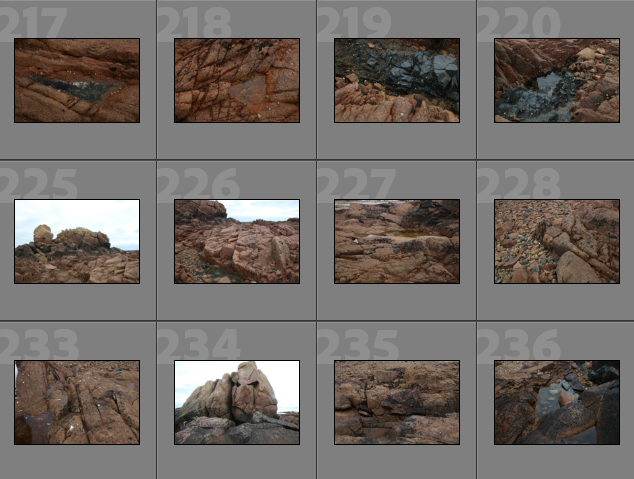
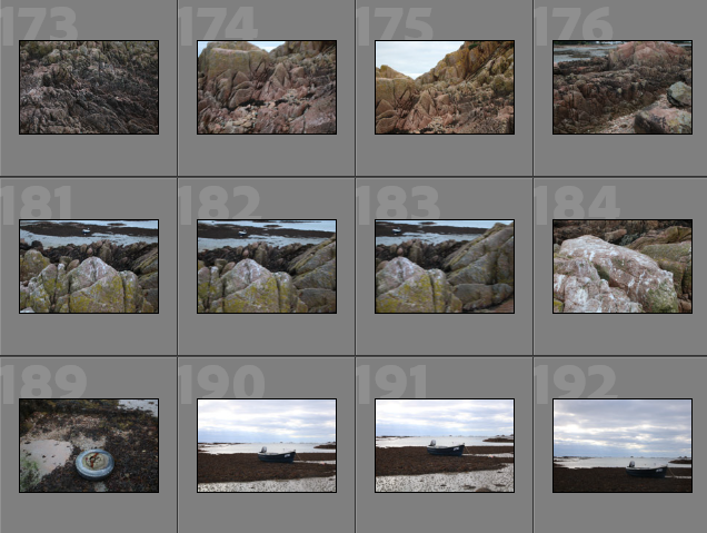
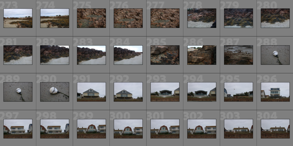
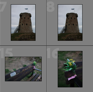
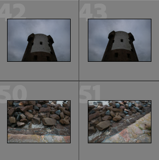
Below I have included some contact sheets displaying the wide variety of images from my Plemont and Stinky Bay shoot, this is important as it gives an indication of how many images I have from each shoot, and helps with the organisation before image sub selection.

Colour Ratings/ Image Sub-selection
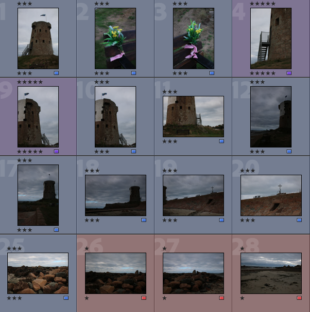
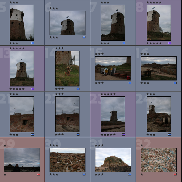
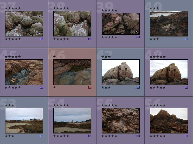
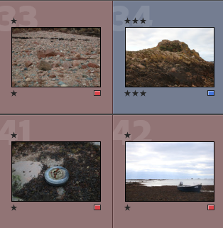
Below I have placed some screenshots of my colour coding my photographs, I have included an explanation of the system and how I have come to the image sub selection process, I really like this system as it ensures that I have a clear plan in my mind of which images I am going to edit. It also helps me predict my final images just from looking through them in Lightroom.
- Purple- Best images
- Blue- Average images
- Pink- Not so good images

Best Images
There I have taken some of the images from my ‘purple’ selection above and placed them in a gallery so that they can be more easily viewed, this also helps me consider whether or not they could be displayed as 9 images or just individually. Furthermore, this is before the editing process so lots of these photographs could be made to be of a higher quality afterwards.

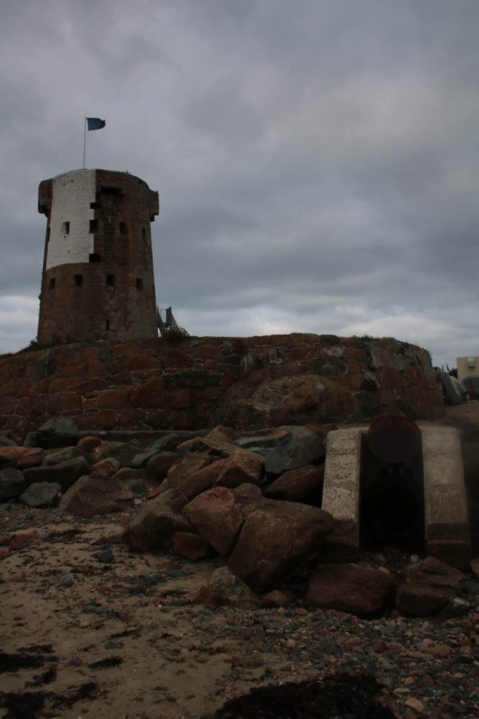
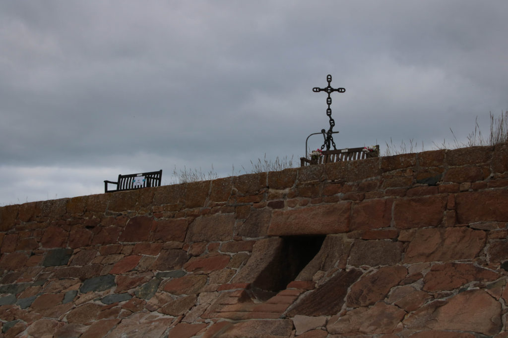
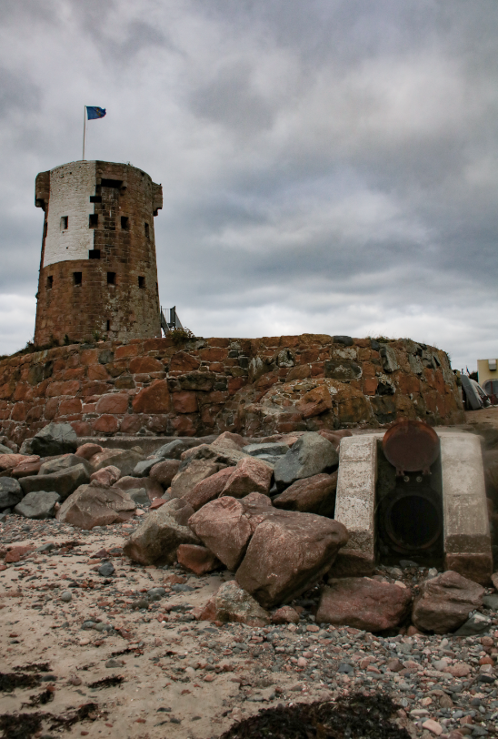
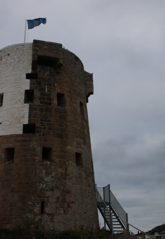
I have organised my best images into mini galleries, this one focusing on the small castle at La Rocq and its area around, I think this is a good way to display images as it helps visualise images in collections and helps when it comes to thinking about the layout of how they would displayed.

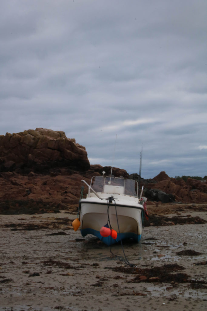
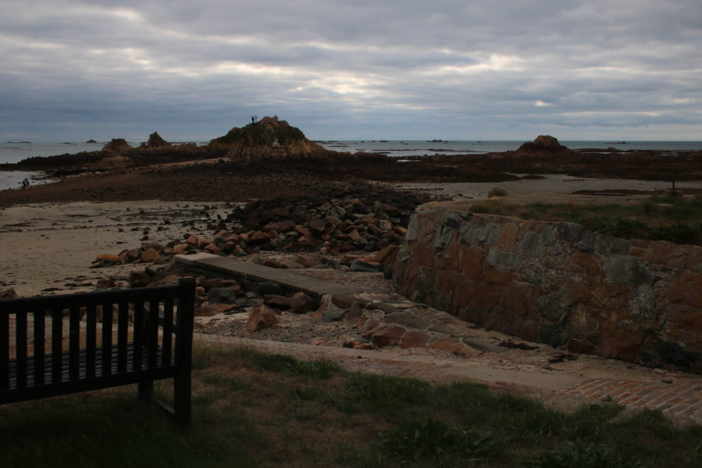
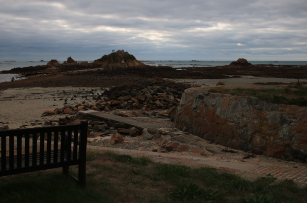
These next two mini galleries are much more focused on the beach and the rocky areas around, I like that these images all have very similar tones and brightness’s, meaning that they compliment each other well.
Editing
Below I have included before and afters of all of the images that I have decided to edit, I think that for the most part these images came out very well, I think I didn’t end up with a wide range of good images to edit, however I think the ones that I have are of good clarity and some exposures have been edited so that the images are more legible. Furthermore, I think that changing the undertones of the images to make them appear cooler/ warmer gives them a greater effect.
Above I have included an one example of how I have edited my photographs, and below I have included images before and after thee editing so that their differences are more prominent, I think this is a good way to display editing and it helps to make decisions about whether images look better before or after editing.


Final Images
For my final images I have decided that these are my best options, I have included evaluations for each of my images, with explanations for each stating the strengths and weakness of each.
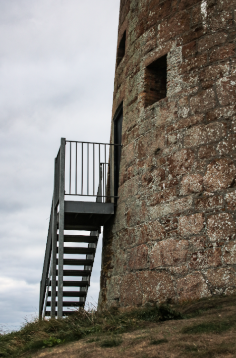

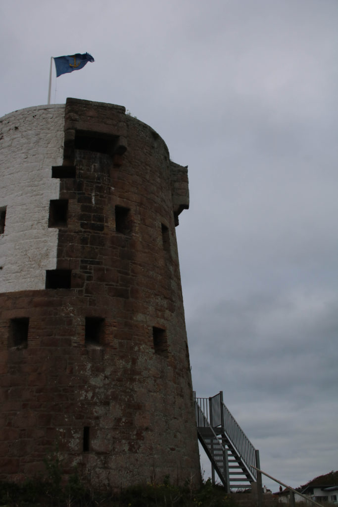
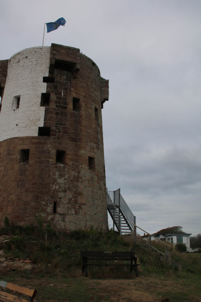
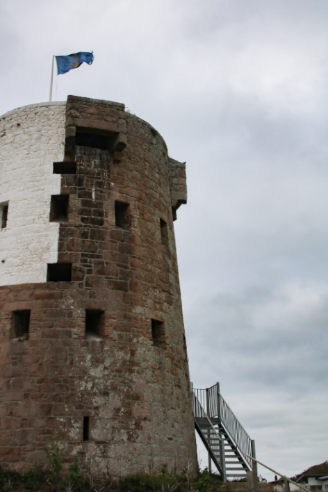
I have selected these two as my first final images as I think that they compliment each other well, when editing these images I tried to make it so they had a similar exposure. This is one of my favourite aspects of these images is that they are both slightly over- exposed, I think this adding a lot of brightness of the sky creates a focal point out of the bricks in the castle, along with helping the photographs to have a cooler toned images. Furthermore, I think that there is a lot of contrast between them, starting with the perspective of them, I put them together as the difference in the angles means that they compliment each other well. Additionally, the materials within the pieces are different, with the new metal stairs leading up to the entrance of the castle contrast with the very old fashioned bricks that compose the castle.
In contrast, there are some downfalls to these photographs, as the fact that they are somewhat over-exposed may hinder the quality of my images, or how well liked they are. Furthermore, I think that the first image is more of a higher quality, especially in contrast with the second, and they may even look better displayed by themselves. The fact that the second image is a lot more warmed toned means that the contrast between the two photographs may mean that the contrast may not be aesthetic.

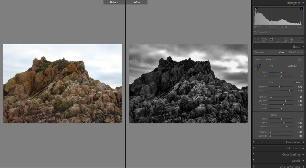
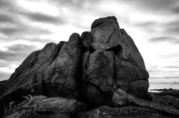
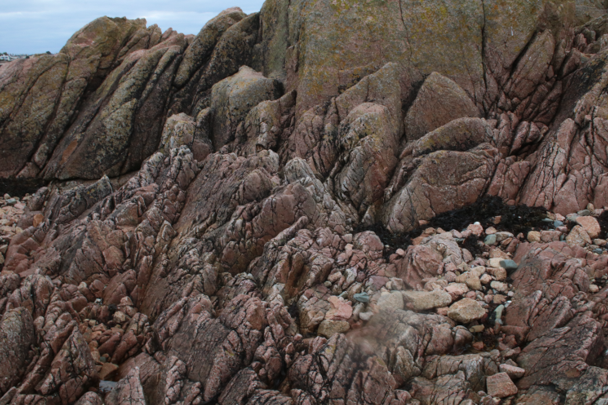
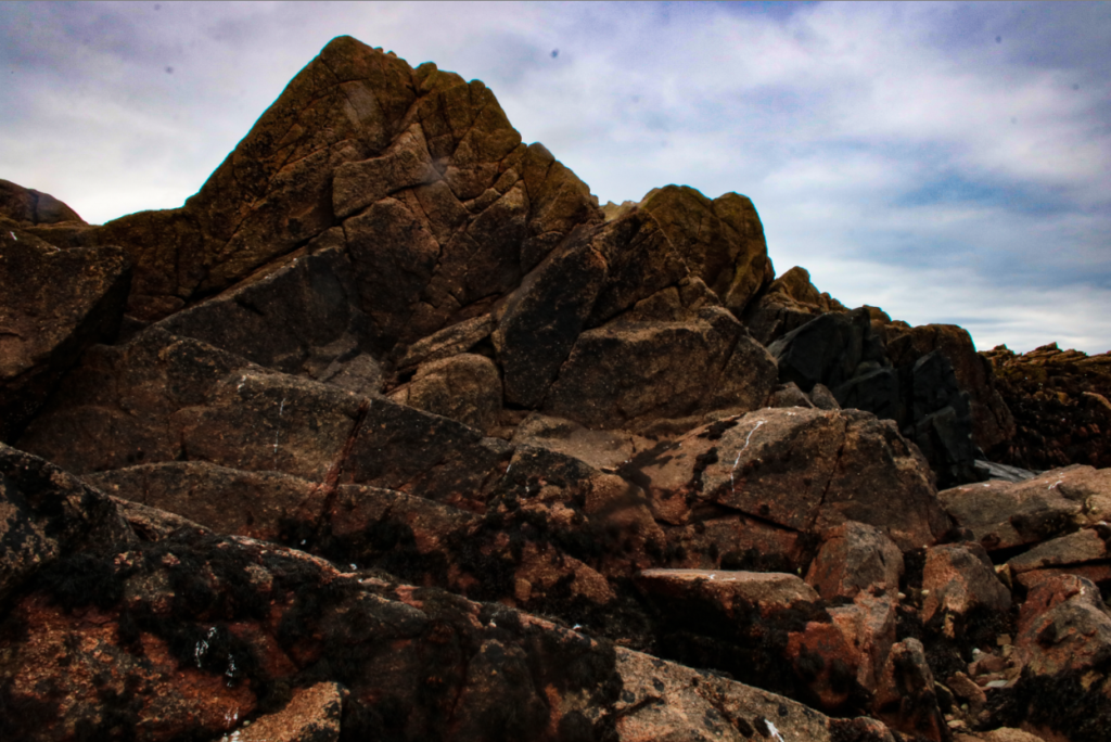
This is my third final piece, this was my favourite to edit as the drastic change made to this photograph made it more interesting. My favourite aspect of this image is the clouds surrounding the rocks in the background as I think this gives the images an eerie affect and the fact that this piece is has been edited in black and white (monochromatic) means that it also adds to the affect. Additionally, I think that there is lot of contrast between the foreground and the background, with the foreground being filled with lots of darker tones, with details such as the lines and textures in the rock. Then the background being filled with highlights which make the central piece, the rock, stand out more. Alternatively, this final piece could be seen as a little boring as there is only one aspect to this image, meaning that its not as catching as my other pieces.

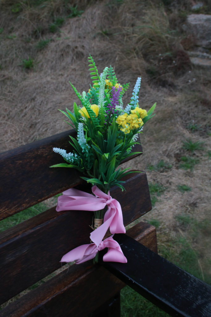
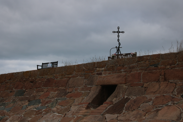
These final pieces have been placed together as I think that they would compliment each other well together as they tell a mini story within only two photographs. With the first being a lot more zoomed in, focusing on one thing that happened outside of this castle, the lady with the dog is just one example of something that has occurred here, maybe making us think about what else may had happened here, such as war and conflict. The second image is placed here in order to put the first one into perspective as its a different point of view from the first. I think that the second photograph is of very high quality because of the clarity of it, with the bricks and grass being filled with texture and depth because of the clarity of the original image. However, in my opinion, these piece could be improved by adding more images to the sequence, as this would make the mini story more detailed and vivid.
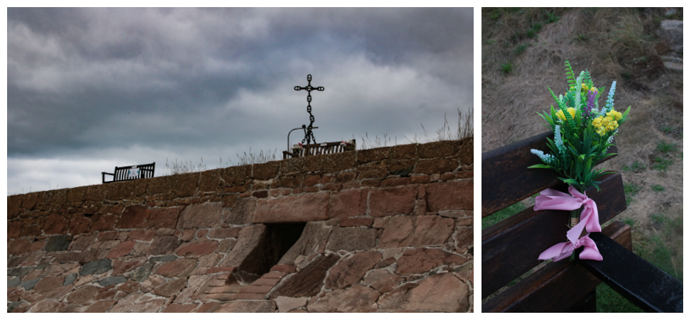
I have presented these photographs in this way as I don’t want to cut off some of the first photograph (which is what happens when a gallery on the blog is made). Furthermore, I think that the perspective of the first image is important to note as the image is perfectly half rocks and half sky. To edit these photographs I changed the ‘dehaze’ and ‘saturation’ settings, this was in an attempt to keep the cold and eerie affect throughout many of these photographs. Furthermore, the second photograph is filled with lots of more colour and softer textures, which are present throughout the flowers and grass. The best contrast between these images is the man-made vs natural theme, as the first is filled with all human made features and the second being filled with natural aspects such as the wood, flowers and grass.
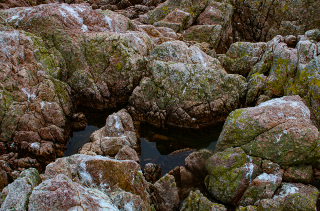
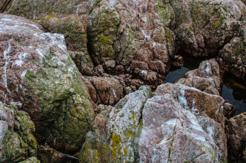
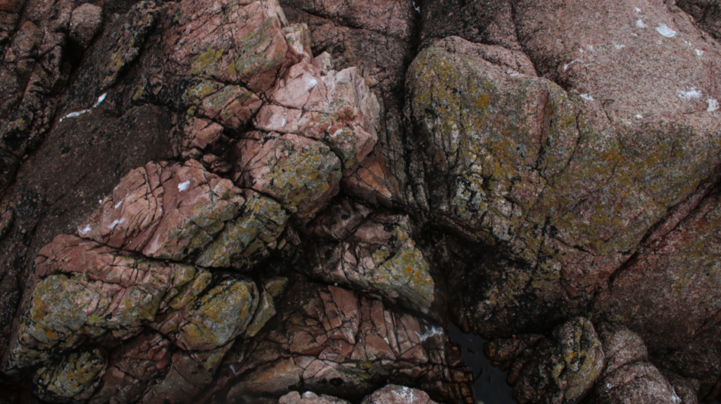
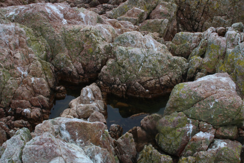
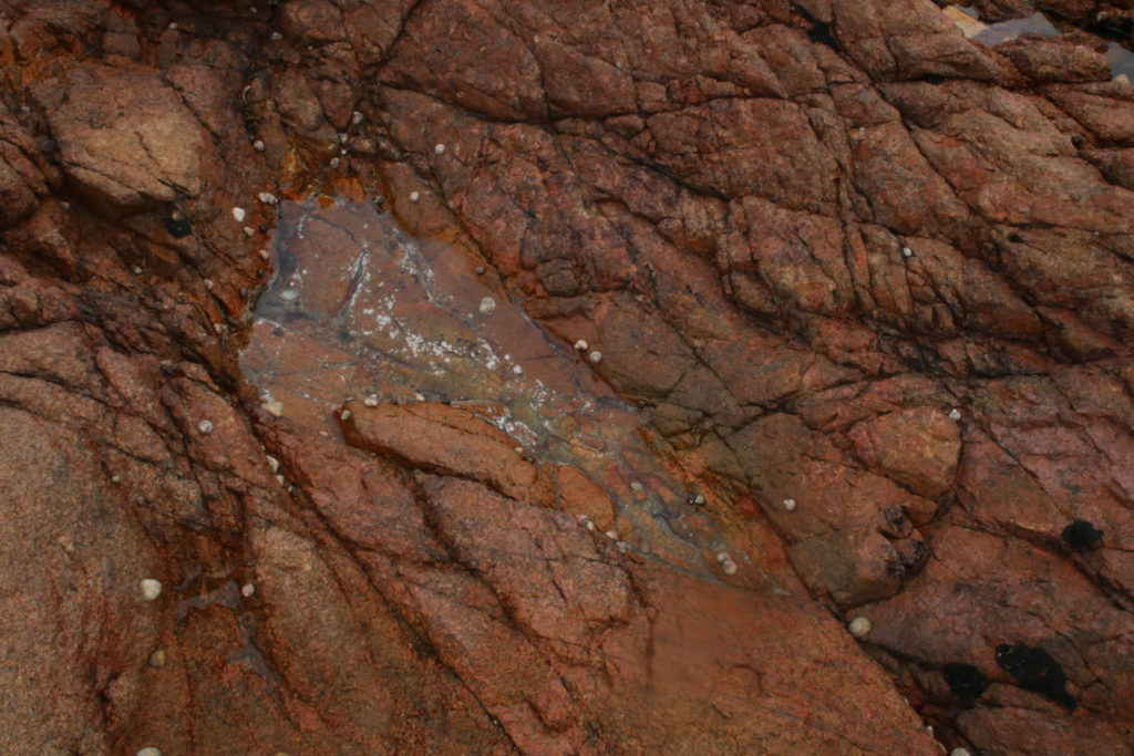
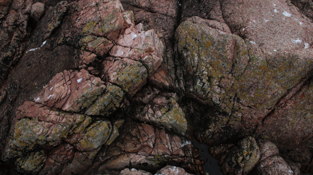
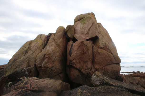
I have placed these three photographs together to produce this final piece as I think this makes these images stronger as they are together. This is because the top two photographs are very similar, and the third/ bottom image being a different perspective of the same face of rocks (as the image was taken from the side). Additionally, I think that these photographs are very aesthetic as the contrasting natural colours throughout the pinks and greens on the rocks help to create depth, along with the browns in the left side of the bottom photograph. All of these images contain the ‘rule of thirds’ which means that horizontally they can be split in three, with different angles and features in each section.