Process- Image Selection
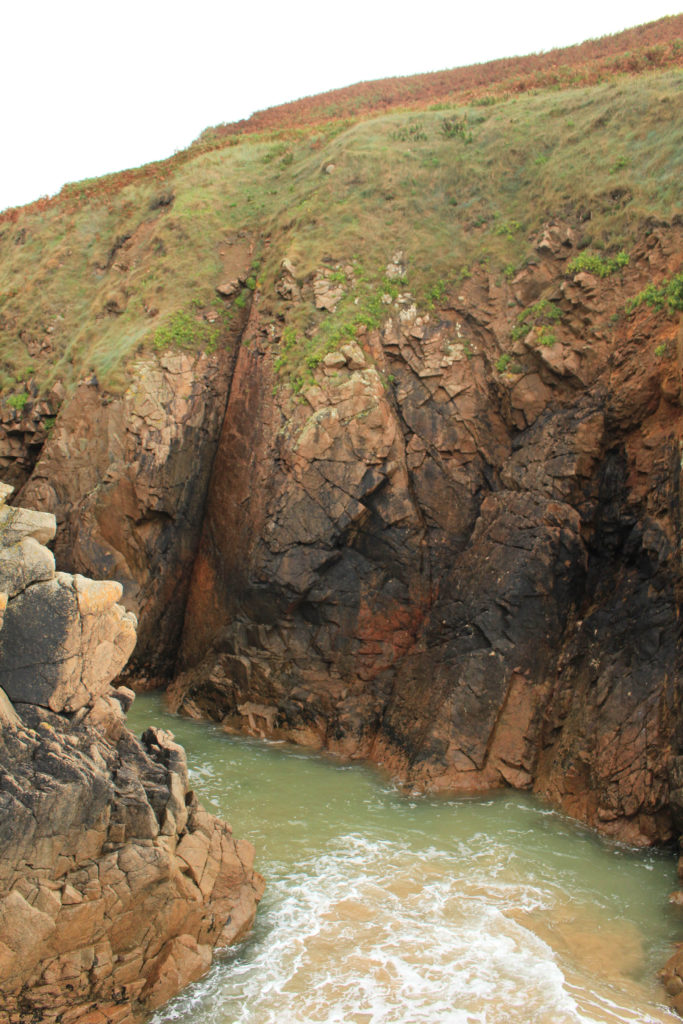
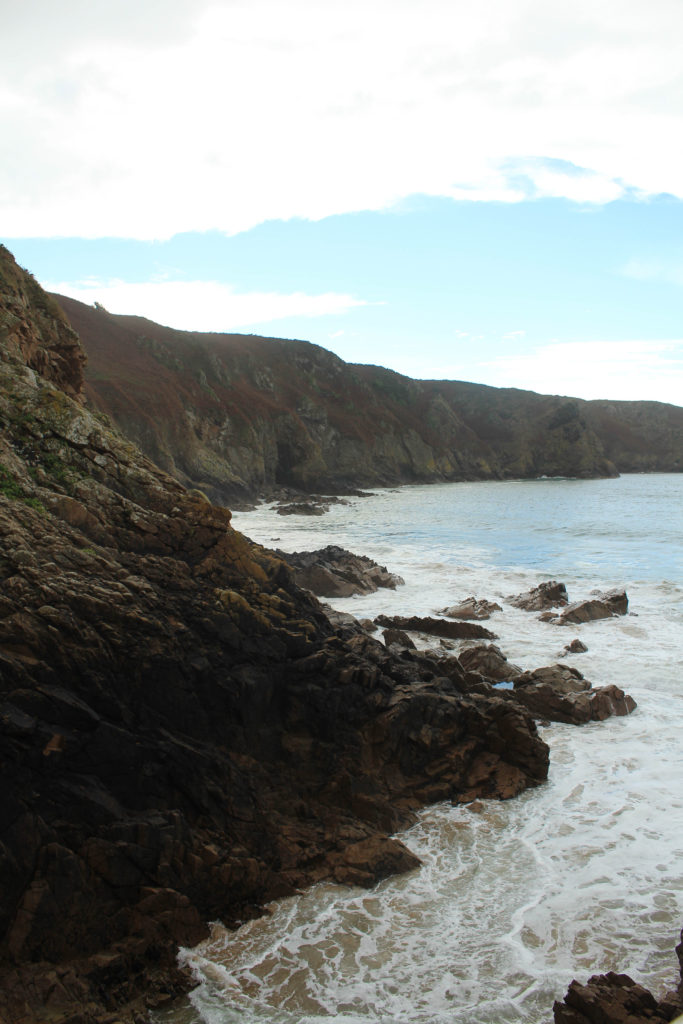
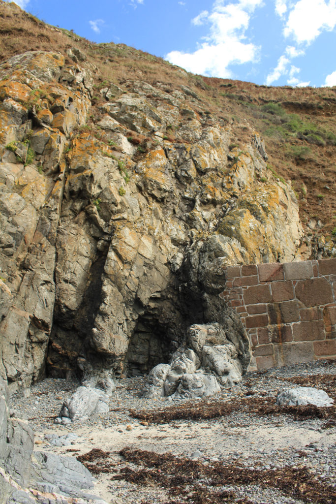
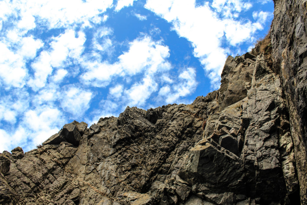
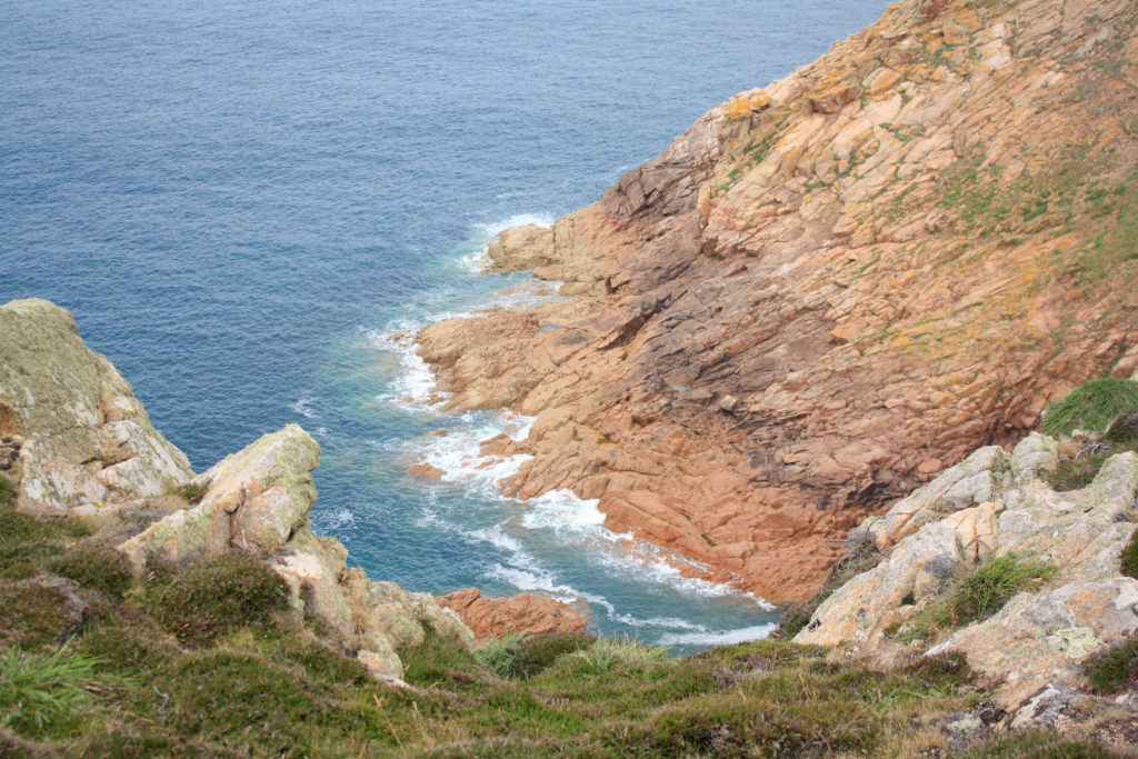
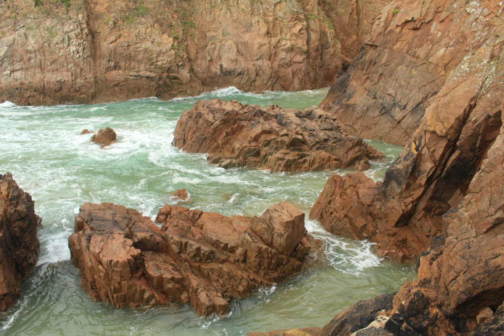
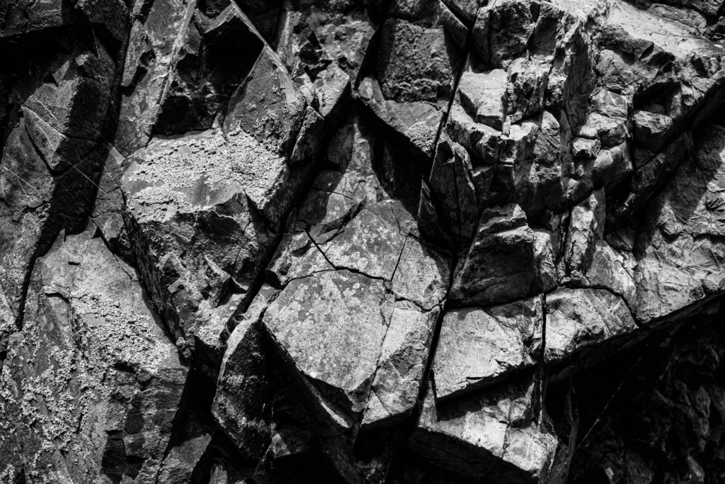
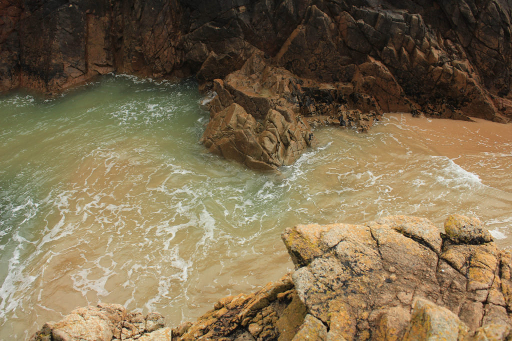
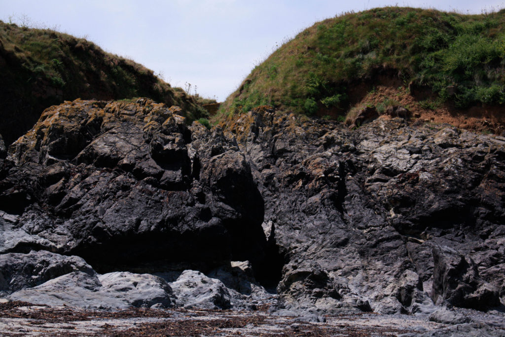
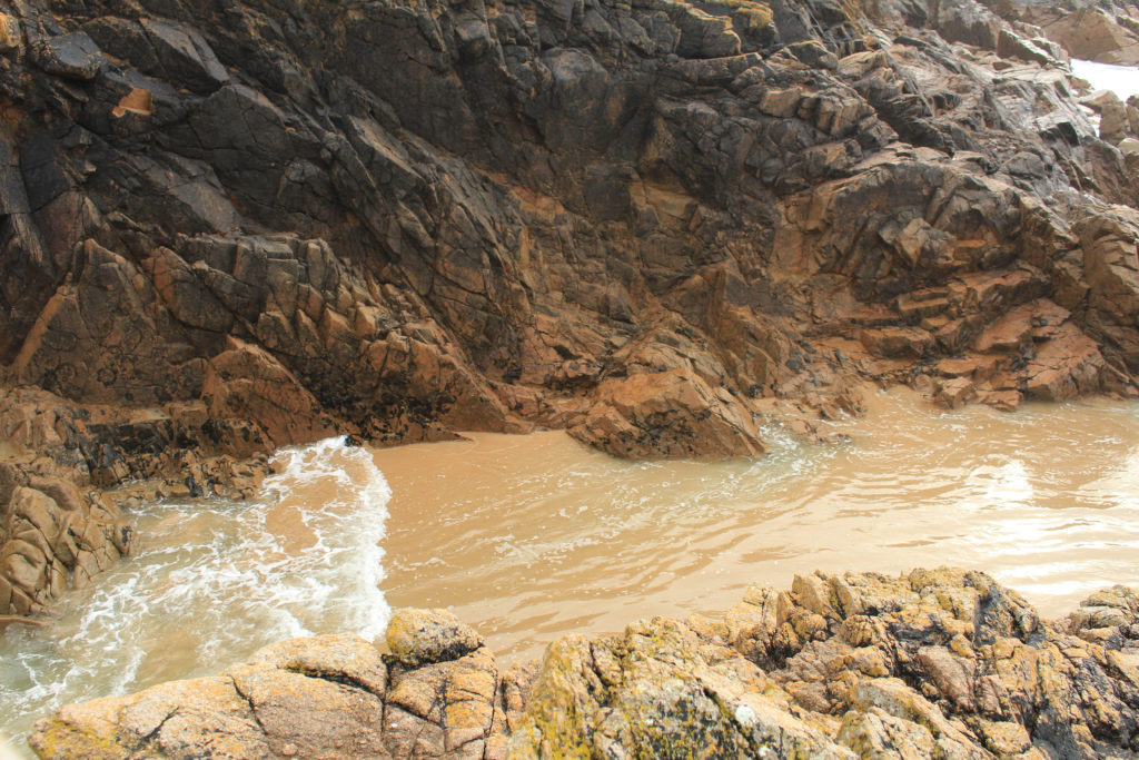
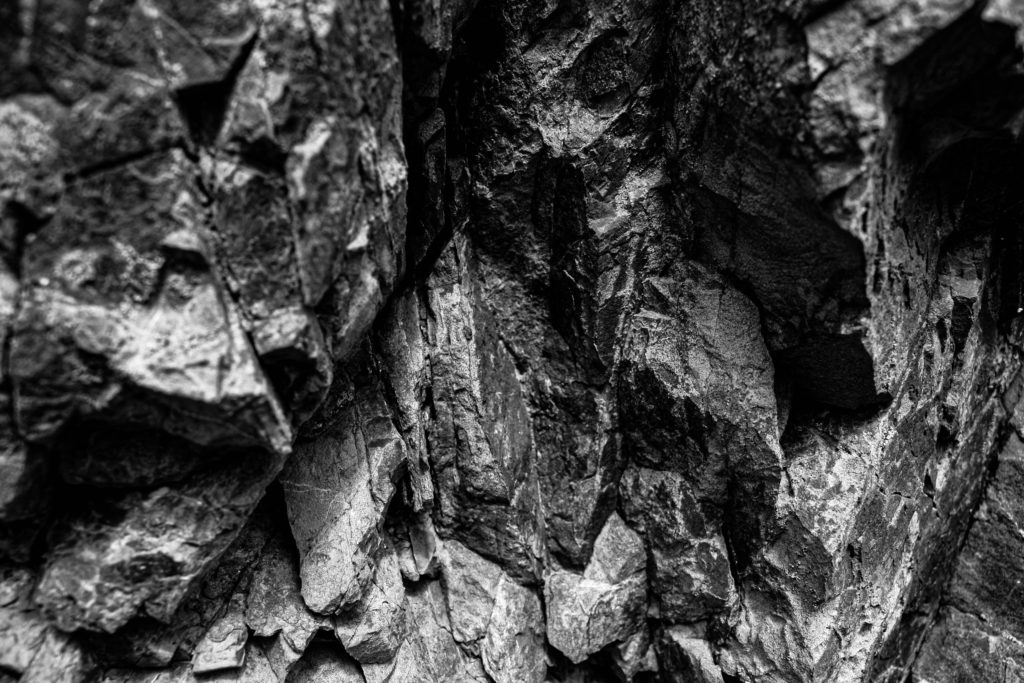
To create my 3D sculptures, I took some of my best images from my Stinky Bay and Plemont photoshoots, then printed them out and attempted to make some successful experiments. Below I have included the images I would like to use in my sculptures, which include my most successful photographs from the shoots.
Materials
- Photographs
- Card
- Tape
- Scissors
- Knives
- Glue
Experiments
After choosing and printing out my photographs, I now had to think about the layout of my sculptures and how I would assemble my work. Below I have included some images of the experiments I created and a visual process of how each of them were made, with explanations and analysis’.
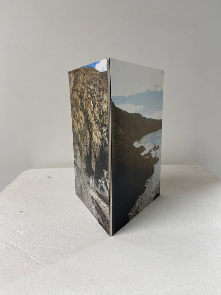
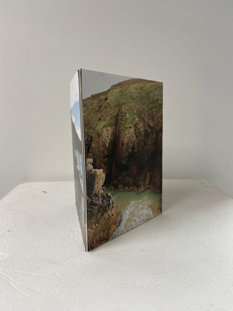
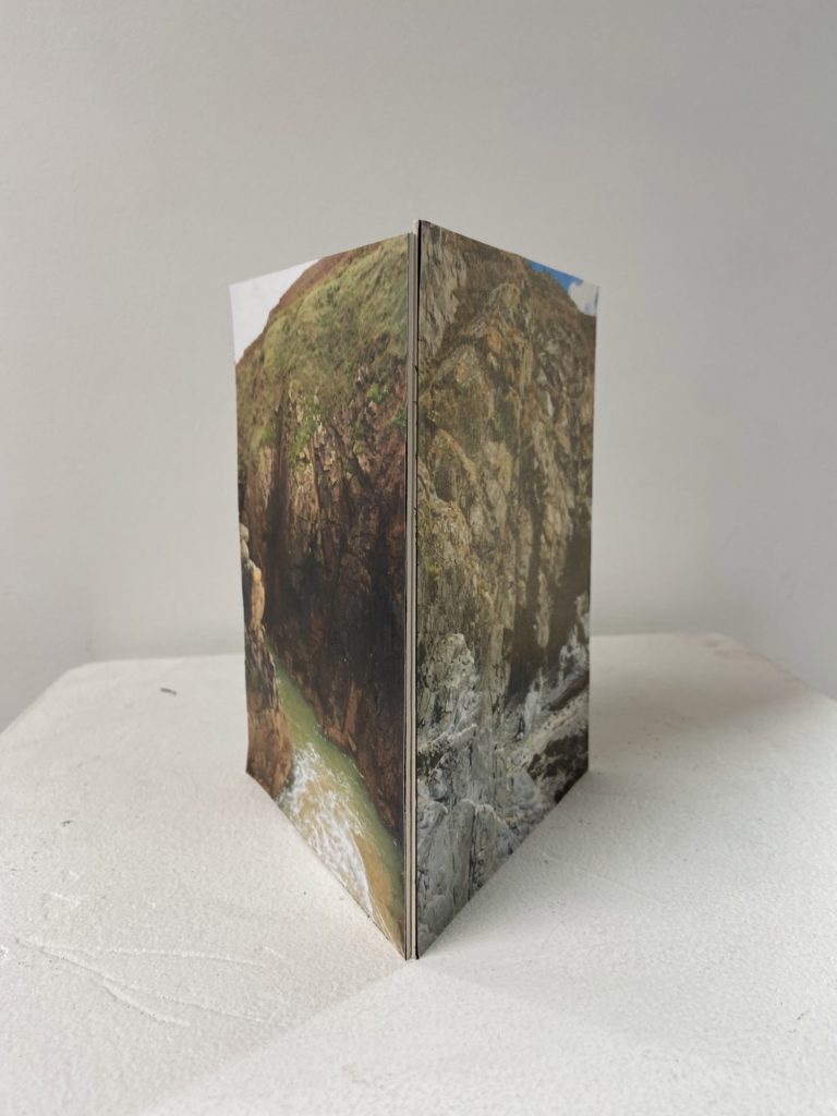
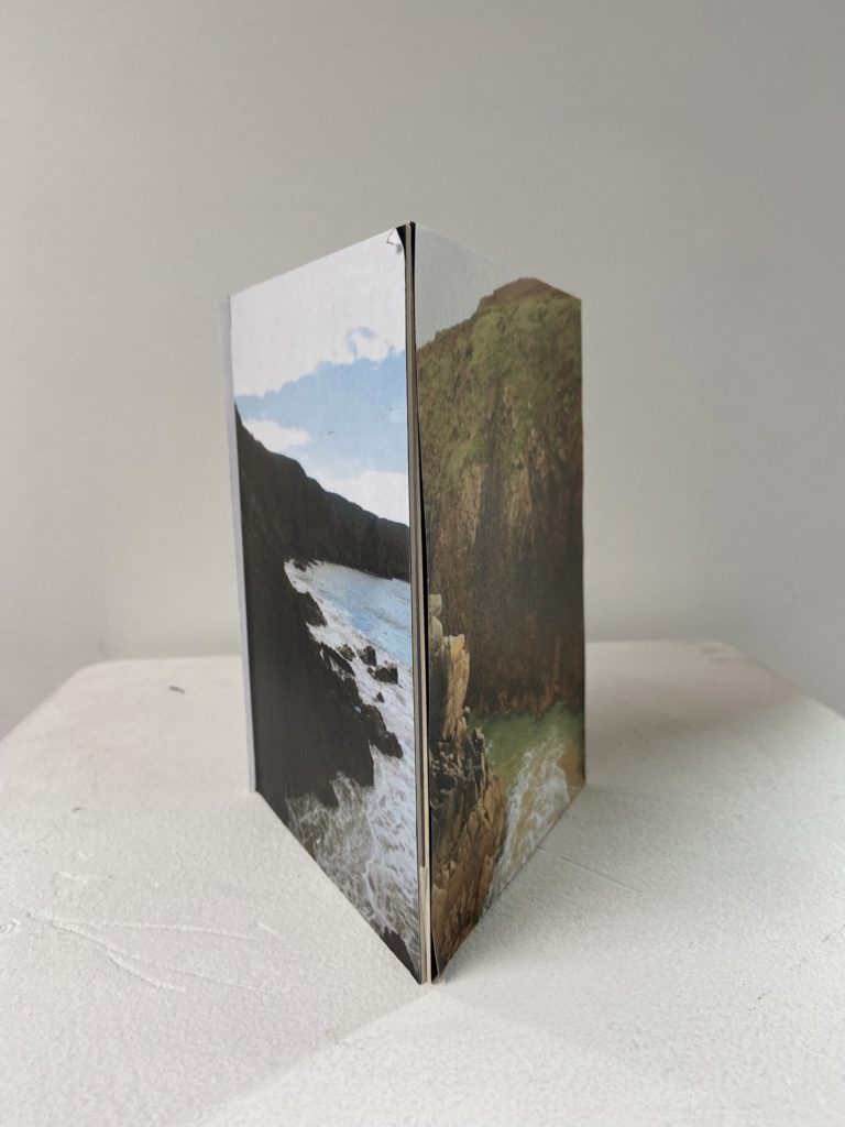
This make this sculpture I just printed out three colour photographs and glued them onto card, afterwards I used tape on the inside of the corners of the card to make this 3D triangle shape. I really like the shape of this sculpture as I think that its one of the easiest and best ways to display successful images. I like how this project lets us experiment and see which structures are the most aesthetic and useful when it comes to making photographs more exciting, and this will also give me inspiration when it comes to exams.
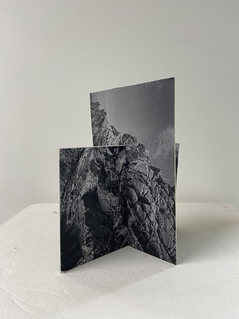
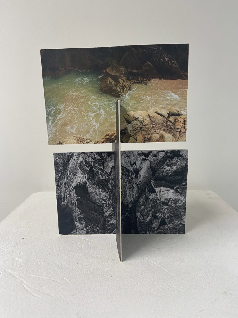
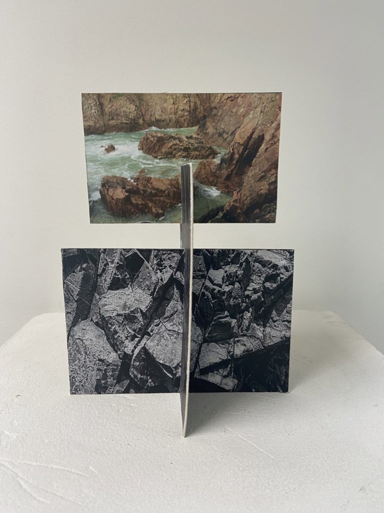
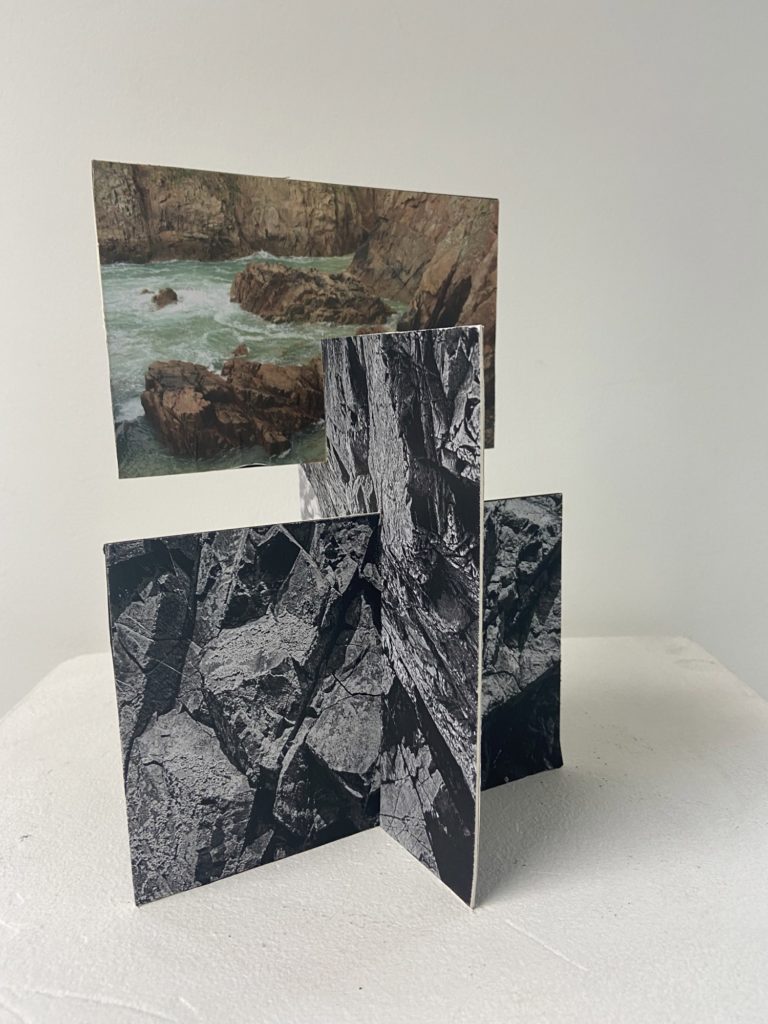
To create my this sculpture I had the simple idea to merge two photographs together by sticking 4 images onto two pieces of card (so each piece of card is double sided). I decided to make this first piece black and white as the contrast creates texture within the rocks and this means that this piece came out successful in my opinion, as this was actually my first sculpture I think that this was a good attempt as making these photographs 3D.
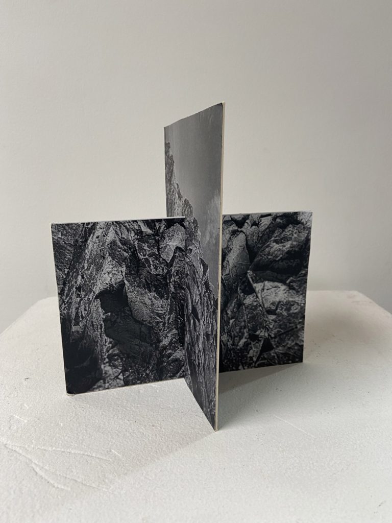
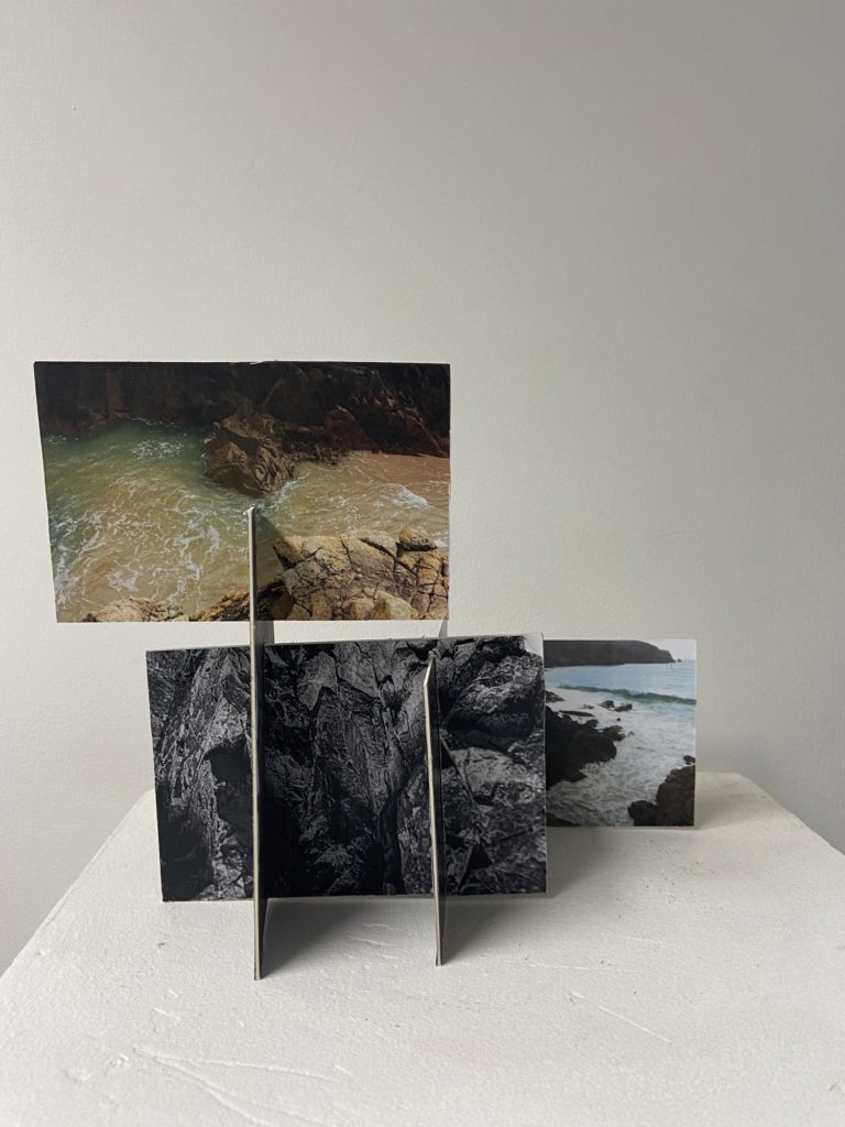
I had taken the sculpture from above and adapted it by adding a lot more double sided pieces of card. To make this I added more slits to my images which meant that I could keep adding to the sculpture. I think this turned out successful as I decided that it would be best to add colour images to the piece. The fact that the colour is put at the top of the sculpture means that there is an aesthetic focal point and I think this adds depth to the structure.
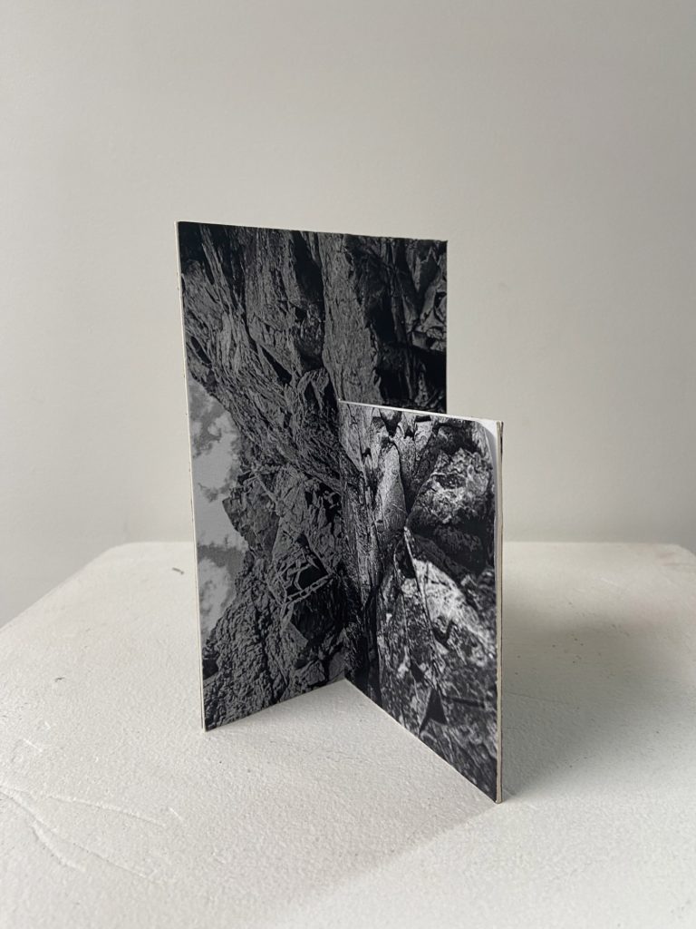
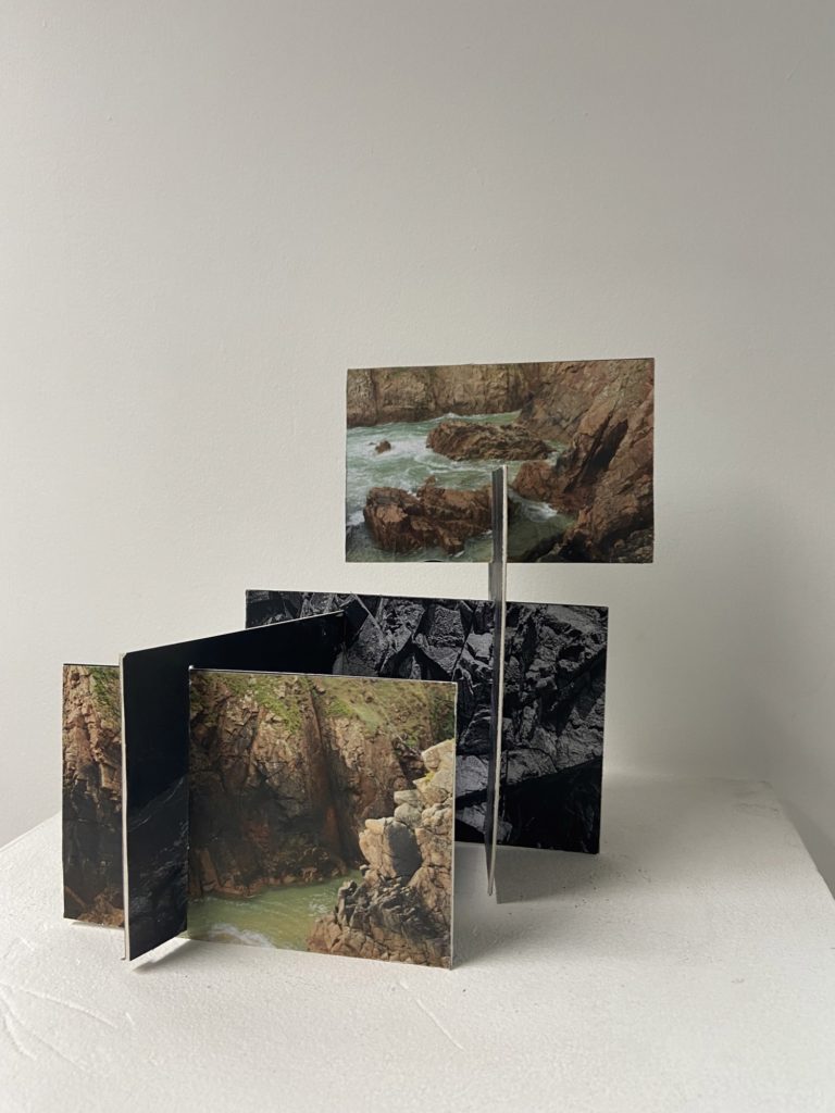
This sculpture was created from a sculpture which was already adapted, I really liked making this piece as it was fun to experiment with many different photographs. I think the fact that there is a wide variety of image with different textures, colours and tones makes this my more interesting piece. However, this was my most difficult sculpture to create as it was like a puzzle with the many different slits in the pieces of card which had to be put together.
Best Work
Below I have included my best sculptures and explanations as to why I think so, I think its important to evaluate and criticise my work as it gives me an idea of what is successful and this helps with ideas in the future.
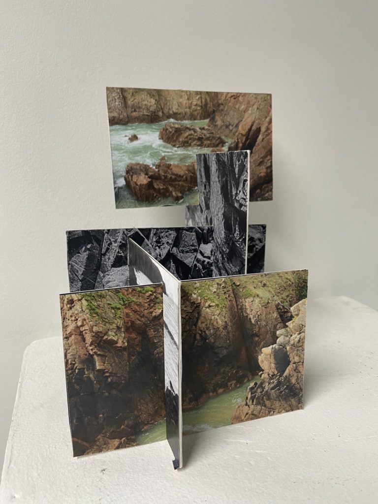
In my opinion this is my best sculpture (and the image that makes it looks the more aesthetic) this is because of the different levels within this piece and how they were created. I decided that the colour images would be at the front and the back of the piece and the black and white double sided images would be kept in the middle, this was in a attempt to keep the focal points of the piece within the colour images. I think the actual structure of the sculpture is interesting as everything was placed in a thought out way so that all aspects of it would intertwine well and link the whole project together, as the piece is composed from images from both my Stinky Bay and Plemont photoshoots.
Additionally, the different shapes and angles of all the photographs means that a sense of depth is added to the images, this means that the piece is more eye-catching. However, I think that this sculpture is very adaptable, it could have been made better if I had kept adding many more images to it, this would have made it a bigger structure and more interesting. Furthermore, if I were to do this again from future projects I would give the images more contrast, saturation and clarity, as all of these features were lacking and I think this hindered the successfulness of this piece.
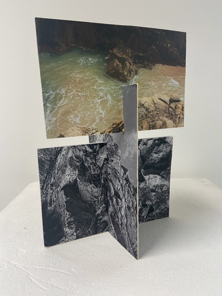
One of my favourite parts of this piece is the simplicity of it, with it only being composed of 6 images in total, I think that this draws attention to the photographs and shows how interesting Jersey’s Sites of Special Interest are. I like how much this sculpture illustrates my best images from this project. Whilst making it I decided that the top image should be colour and places further at the front, this was in an attempt to create a sense of perceptive and the fact that the black and white images were taken before the colour one. Showing a change in time and space (from Plemont to Stinky Bay) between both my photographs and my sculpture at the same time.
Furthermore, I like how the portrait image in the middle matches up in some areas with the bottom one, kind of like creating yet another photograph from merging two existing ones together. However, some of the edges of the card in this piece aren’t cut straight and are fraying, this could be a downfall of the sculpture as it isn’t as neat as my one above. I still think that the boldness of this structure is its most aesthetic piece and that’s how I liked making it so much.

A very good blog post form start to finish. Well done and keep going!