Still Life

Renaissance Still Life

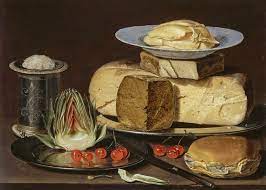
Into the early renaissance period, still life painting accompanied religious artworks as stylistic elements with symbolic meanings. these were usually painted in backgrounds of religious paintings and were seen in Northern Renaissance and early Netherlandish paintings. Many still life paintings were kept with religious meanings which were shown in the work of artists like the Flemish painter, Jan van Eyck.

Other artists like Leonardo da Vinci and the German painter Albrecht Durer painted still lifes without the religious symbolism. Still life paintings were done of a variety of natural objects, some being flowers, household items or even food. At this stage during the Renaissance, still life paintings were also done to explore the natural world by observing it and painting it.

Dutch `Still Life

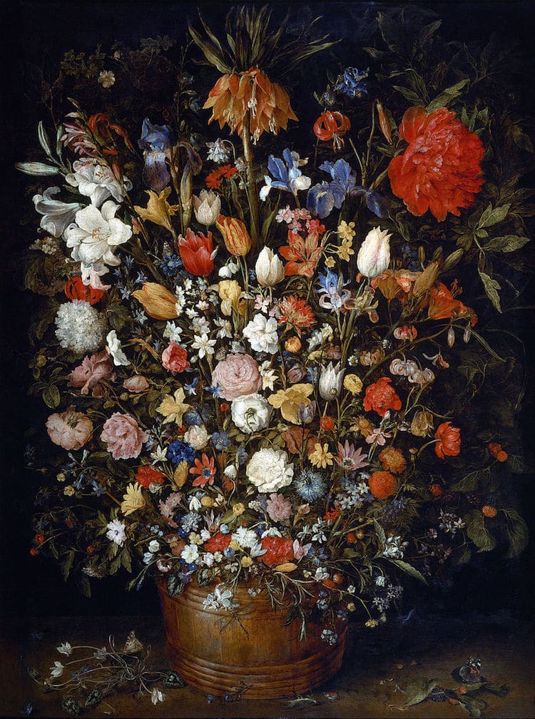
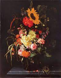
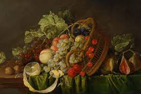
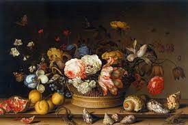
Still Life painting started as a genre in the Netherlands which was termed as one of the Low Countries, which also included Belgica and Flanders. The Dutch Golden Age was a result of Dutch independence from Spain, which led to the Dutch Republic being born. Still Life was especially popular as a painting style during this time, especially paintings of flowers.

The protestant revolution minimised the production of religious artworks, which led to other genres of paintings becoming more popular. Still life paintings were favoured because they could depict everyday scenes of people and their lives which inherited a symbolic meaning from various objects. These paintings also branched off into what was called “Dutch Realism”. This focused on the ordinary depictions of people, specifically the middle class, mainly traders and merchants. Artists painted subject matter for merchants who were more focused on depicting what they have earned during their lives.

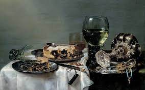
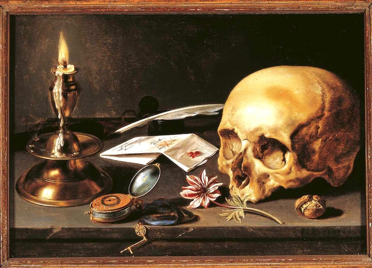
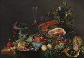
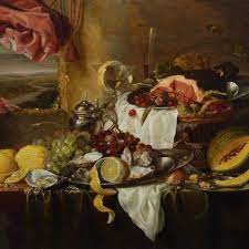
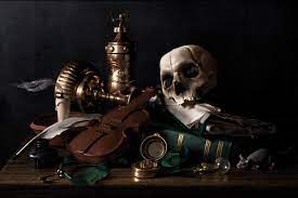
Paintings during this period were mostly small and done for private home display as opposed to paintings done on a larger scale for churches or altarpieces. But as this was dominantly a protestant culture, there was not a need to flaunt artworks in the same way. Furthermore, the common types of still life paintings included the Vanitas (Latin for ‘vanity’ or ’emptiness’) genre, ‘breakfast pieces’, ‘ornate’ or ‘ostentatious’ displays of still life pieces as well as florals.

Modern Still Life

Modern Still Life came about during art movements like Impressionism and Post-Impressionism. Notably, during Post-Impressionism, Vincent van Gogh brought Still Life painting to life with his flower and vase paintings.

A French artist from Post-Impressionism, Paul Cezanne, painted Still Lifes with fruit, bread, bottle and baskets. The difference between these paintings and the more realistic Dutch Still Life paintings was that these modern artists used more expressive brushstrokes, colours and different perspectives. Skulls would also sometimes be included in the Dutch Vanitas. Still Lifes that included skulls would mainly have various fruits with pieces cut or bitten out of it, placed in front or in the skull’s mouth.

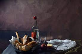
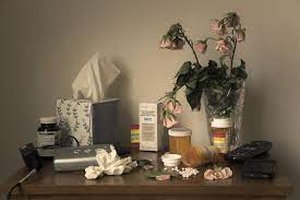
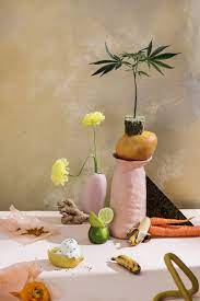
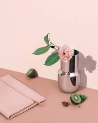
Contemporary Still Life art has developed over the years and many artists now use photography, computers and videos as means of portraying everyday objects and food. The evolution of technology has allowed a hyper-realistic portrayal of subject matter, from painting to being computer generated.

Don McCullin

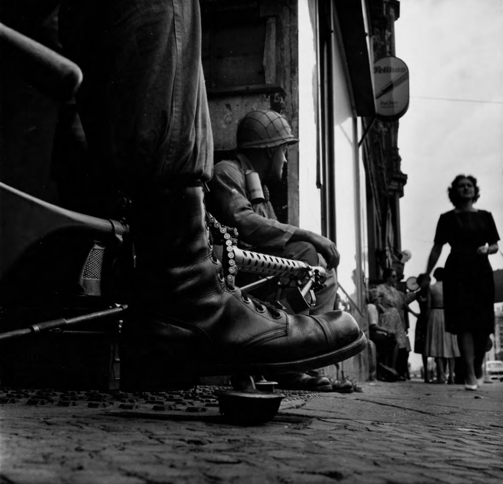
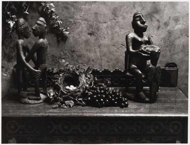
Don McCullin is one of the greatest living photographers who has employed a variety of different photography genres in his work. He has documented the poverty of London’s East End, and the horrors of the wars in Africa, Asia and the Middle East. He has also proved to be an artist capable of beautifully arranged still lifes, soulful portraits and landscapes.
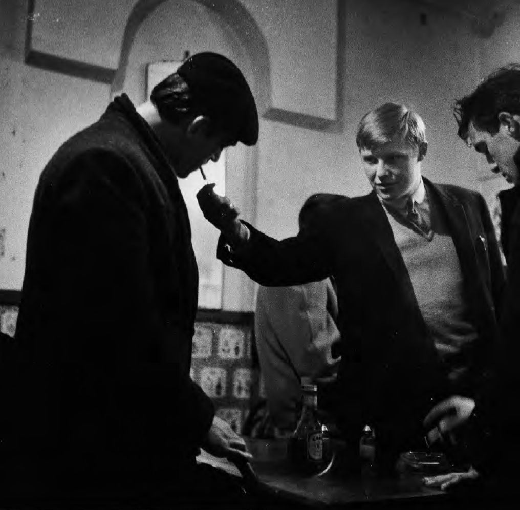
“Photography for me is not looking, it’s feeling. If you can’t feel what you’re looking at, then you’re never going to get others to feel anything when they look at your pictures.”

McCullin grew up in North London, and after his impoverished childhood, he was called up for the National Service with the RAF. After being posted to Egypt, Kenya and Cyprus he returned to London with a twin reflex Rolleicord camera and began photographing friends from a local gang named The Guv’nors. McCullin showed this collection to the picture editor at the Observer in 1959 which kick-started his career in photography.
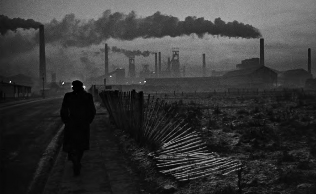
West Hartlepool,1963
A man walking towards his work at the Steel Foundry

Photography has given me a life… The very least I could do was try and articulate these stories with as much compassion and clarity as they deserve, with as loud a voice as I could muster. Anything less would be mercenary.”

For the next two decades war became a mainstay of McCullin’s career, initially for the Observer and then The Sunday Times in 1966. Moving on from war, Don McCullin’s work focused on the suffering of the poor and underprivileged and he has produced moving essays on the homeless of London’s East End and the working class of Britain’s industrial cities.
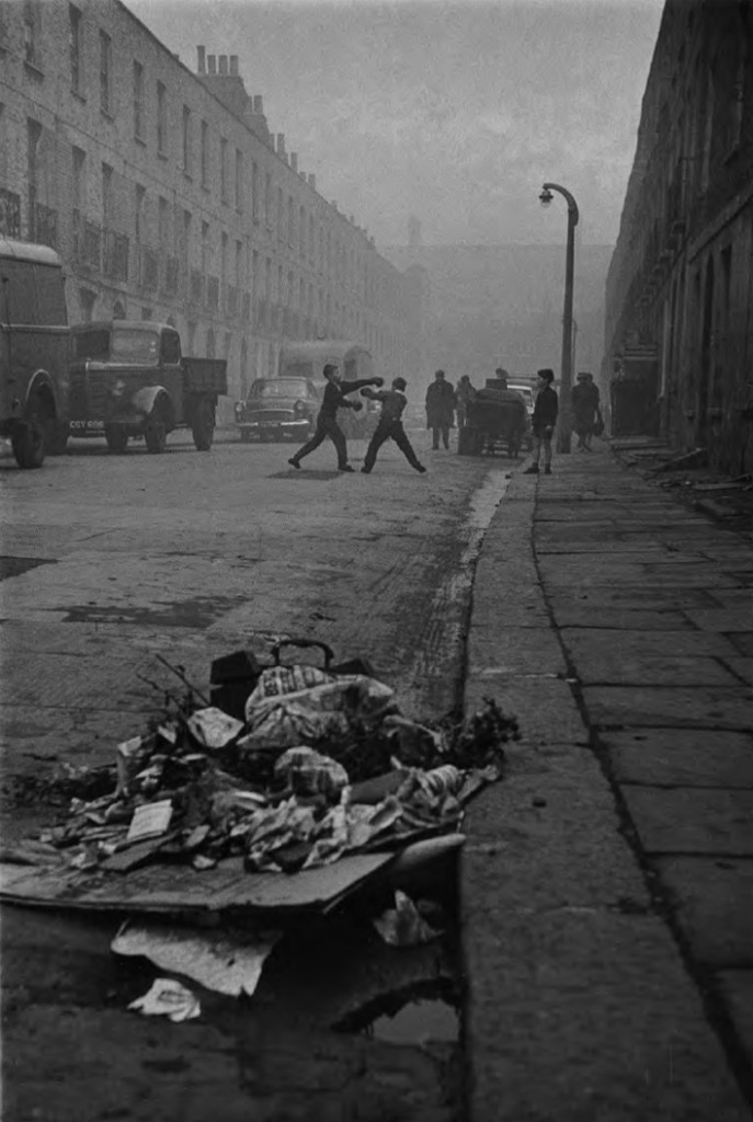
Caledonian Road, Islington, London, 1960s
Boys boxing

“I had long been uncomfortable with my label of war photographer, which suggested an almost exclusive interest in the suffering of other people. I knew I was capable of another voice.”

When McCullin returned home from travelling, he spent three decades chronicling the English countryside – in particular the landscapes of Somerset – and creating meticulously constructed still lifes all to great acclaim.

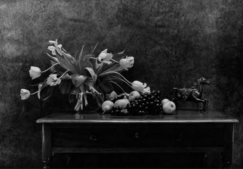
Don McCullin Still Life

le hocq photo shoot

Contact Sheets

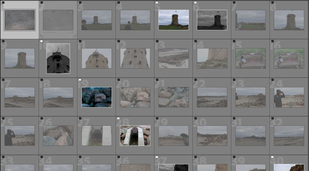
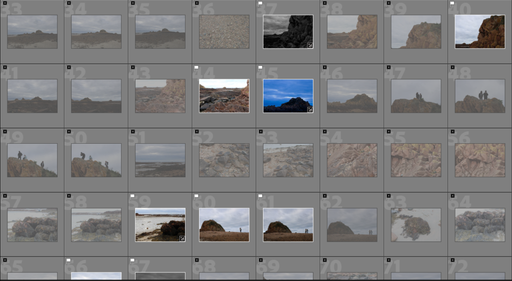
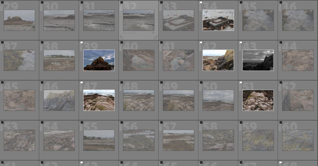
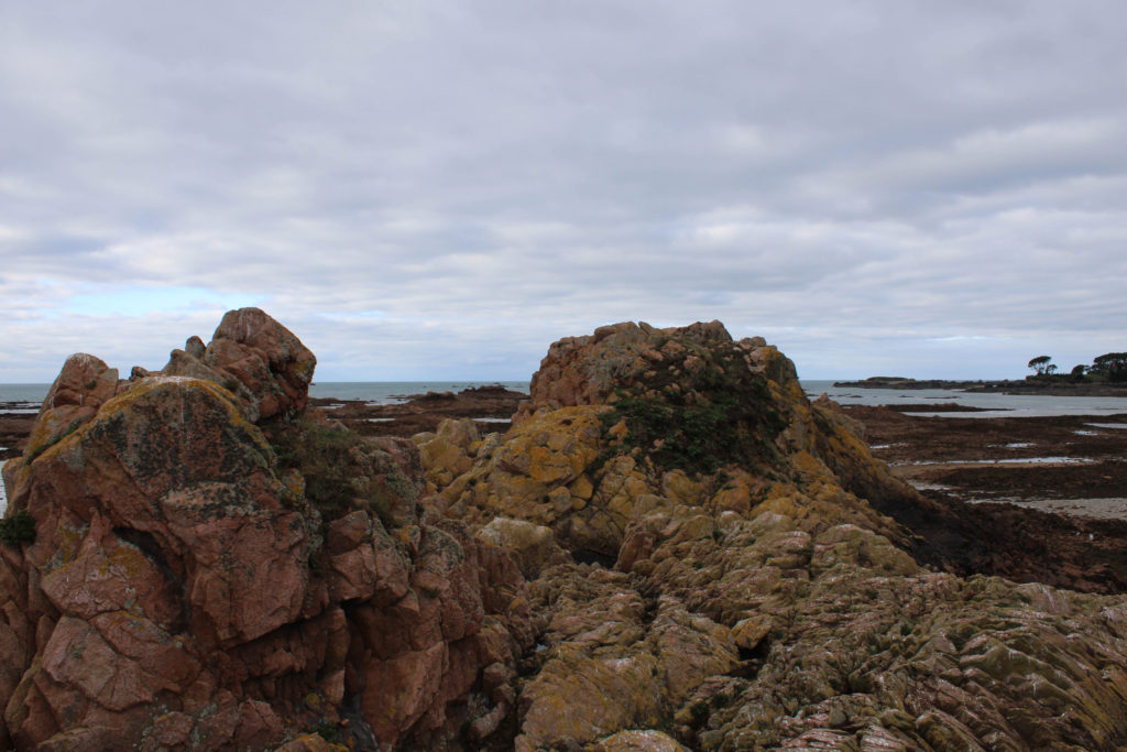
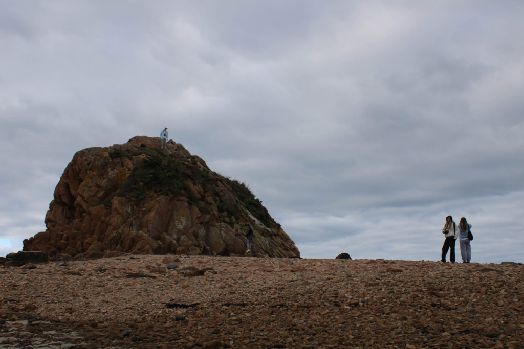
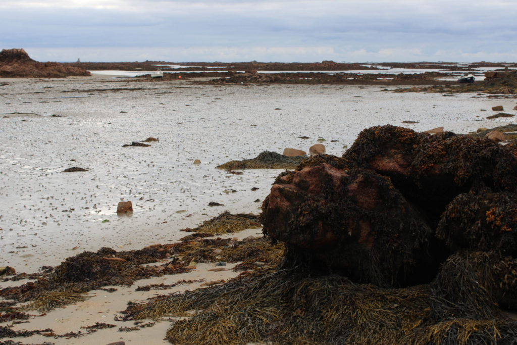
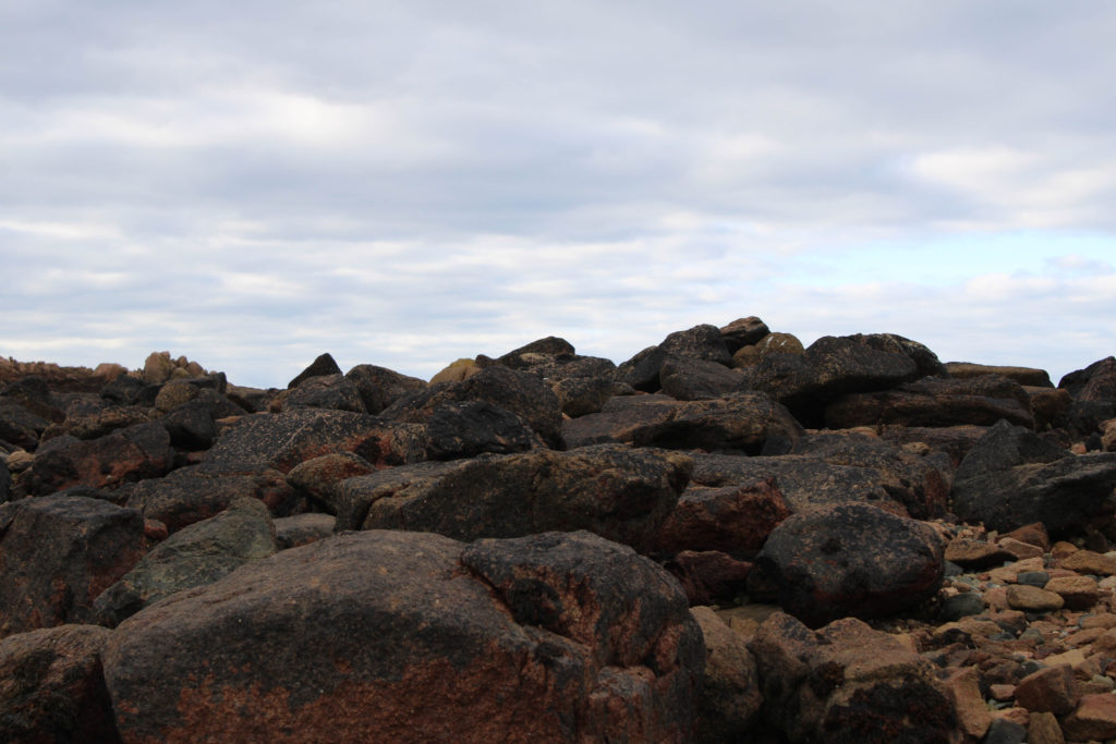
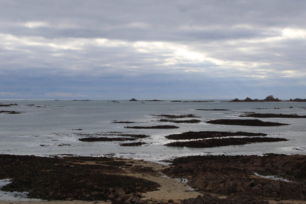
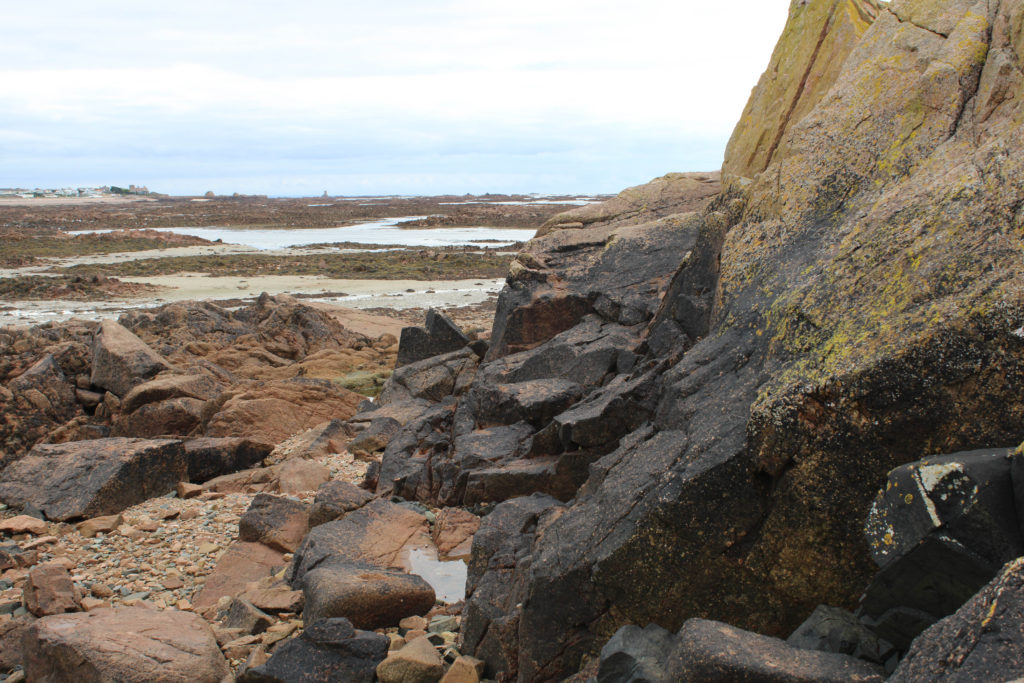
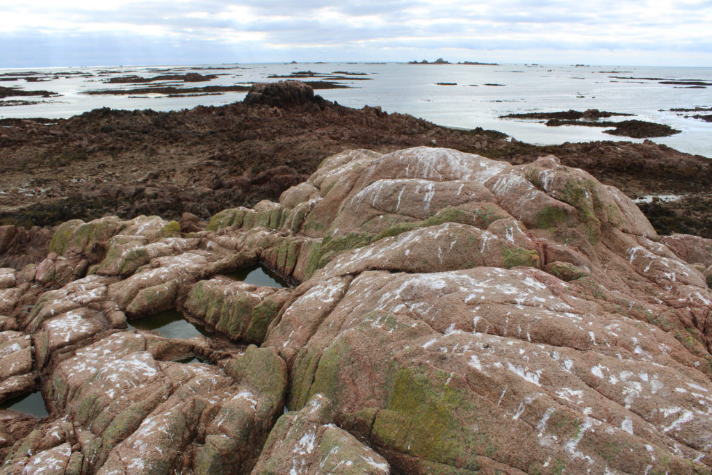
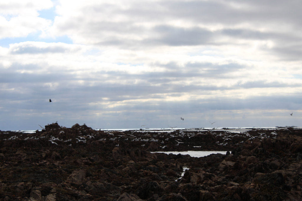
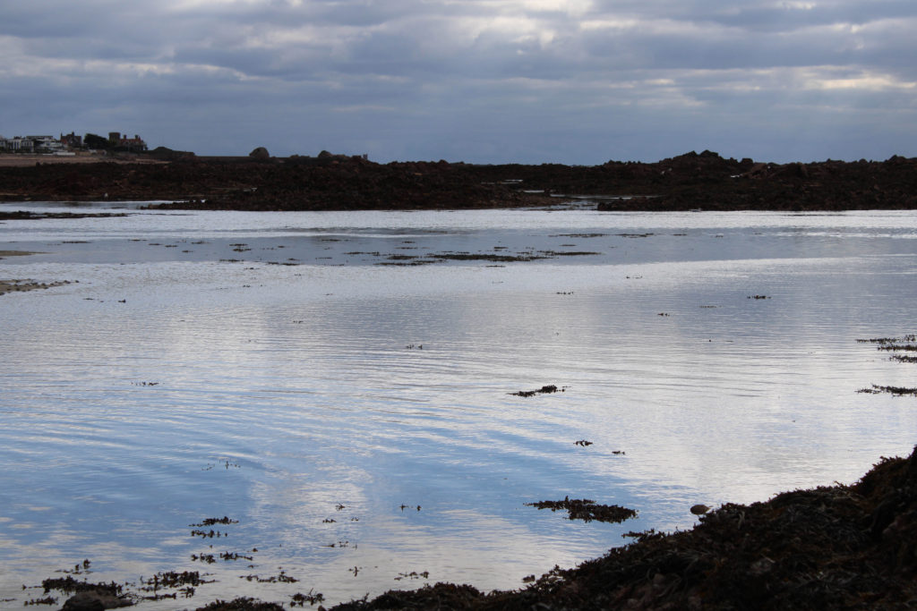
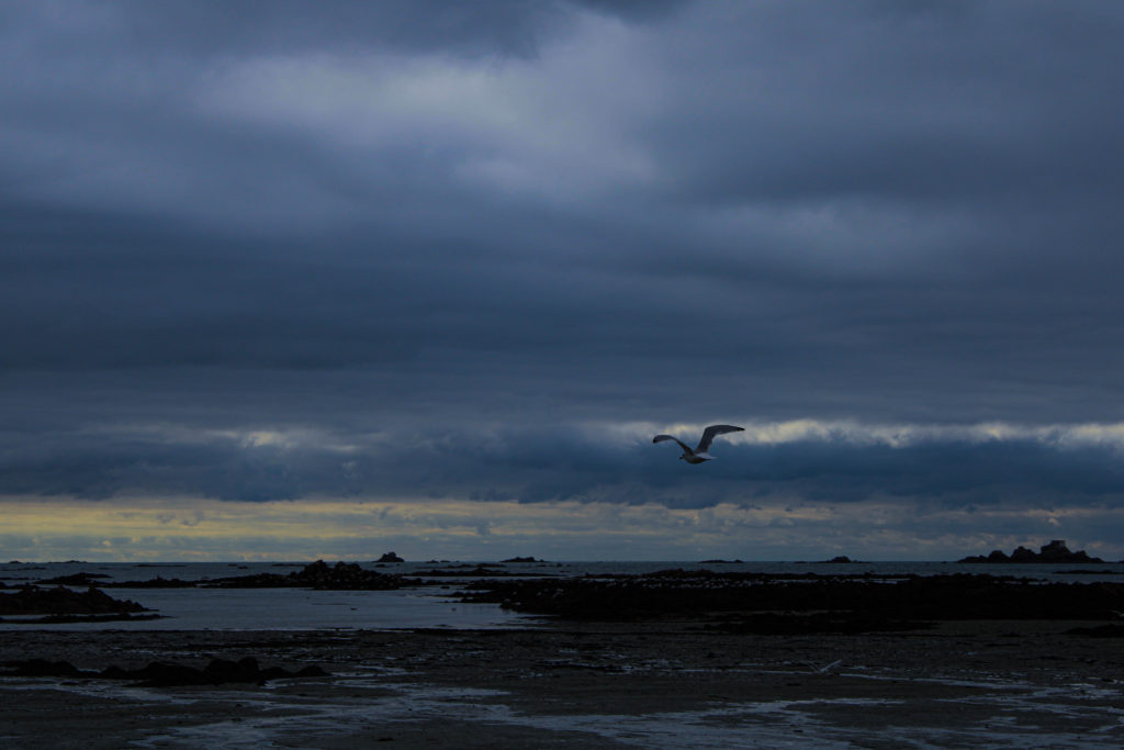
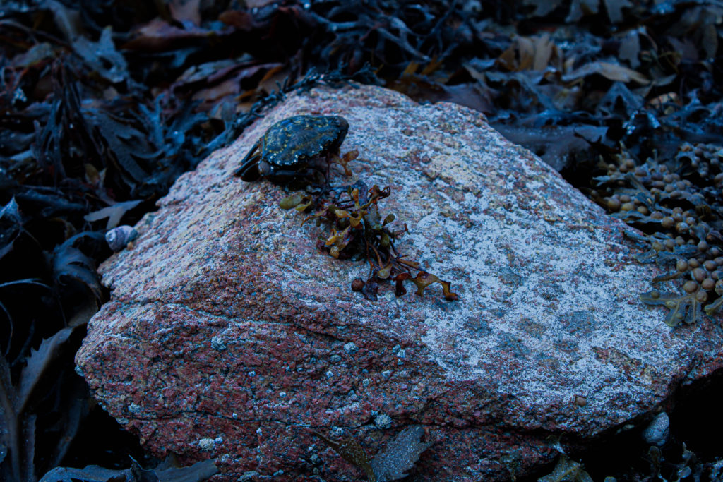
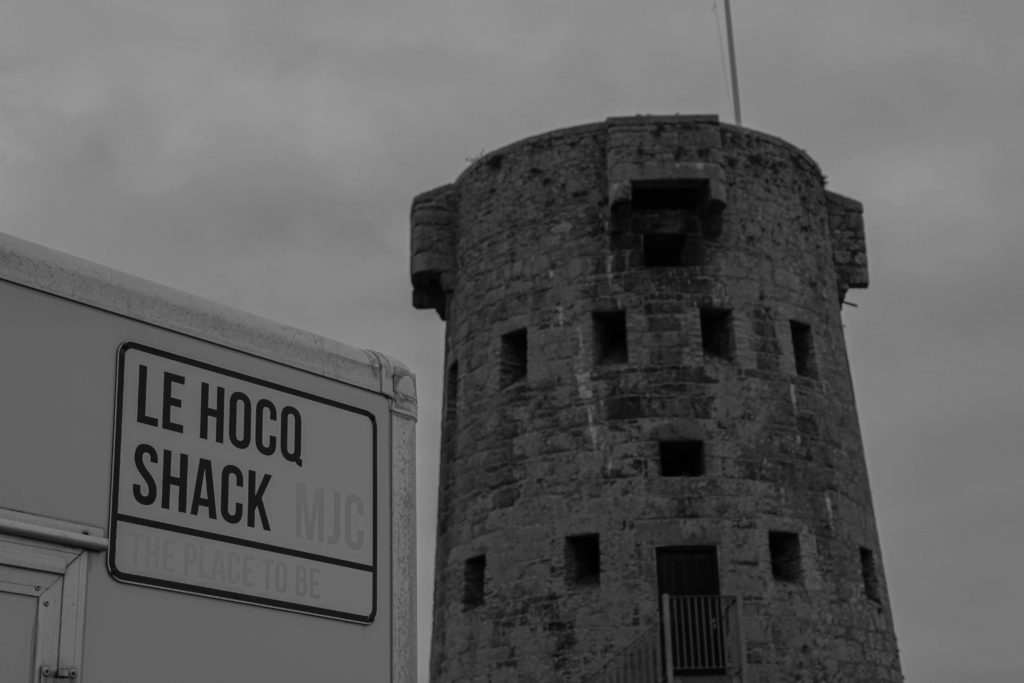
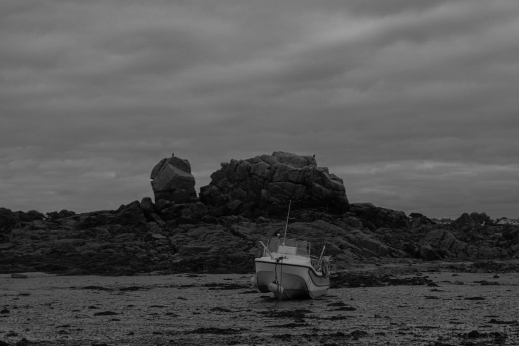
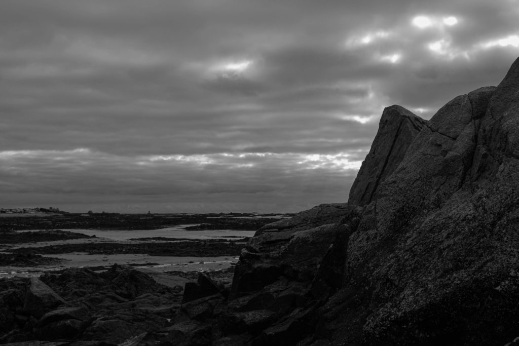
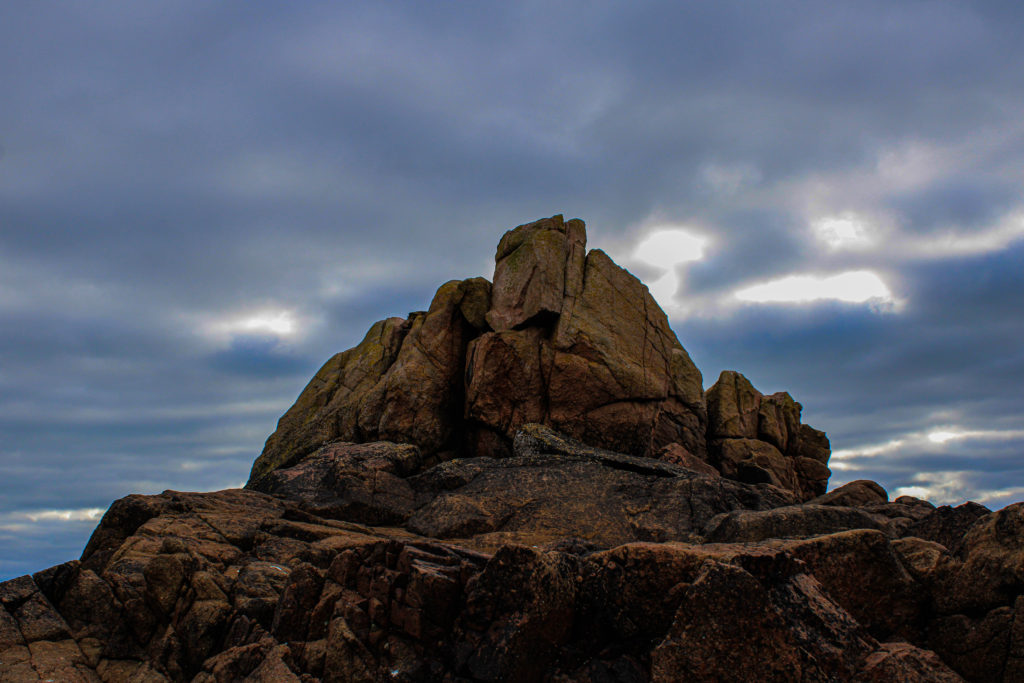
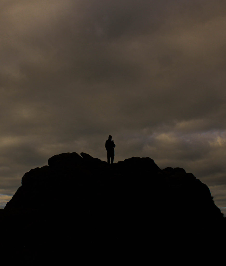
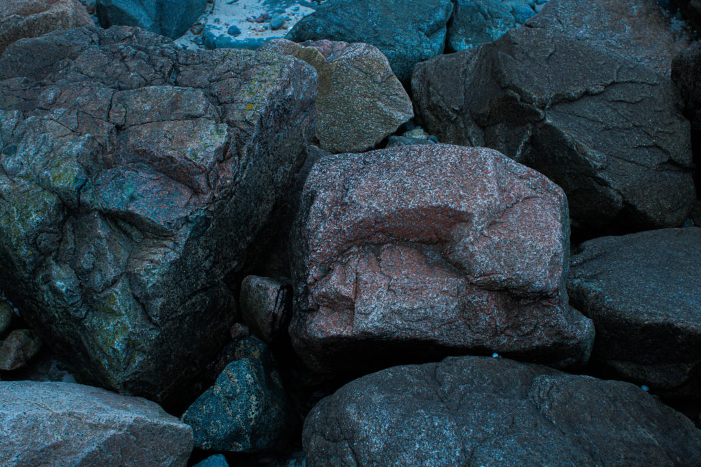
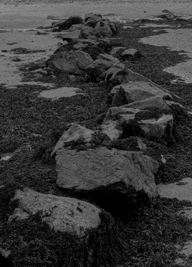
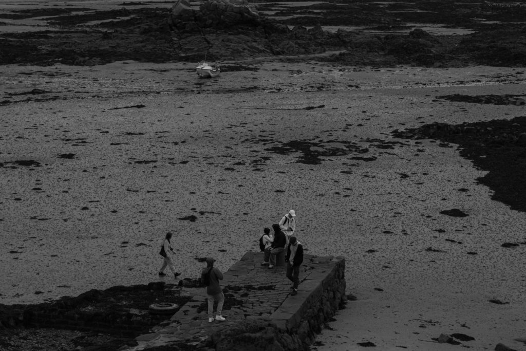
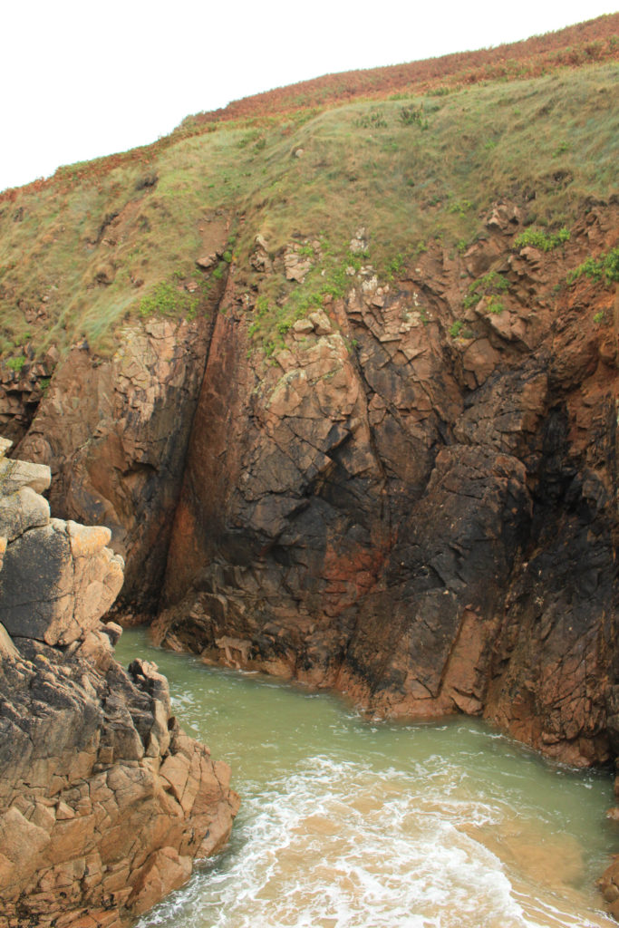
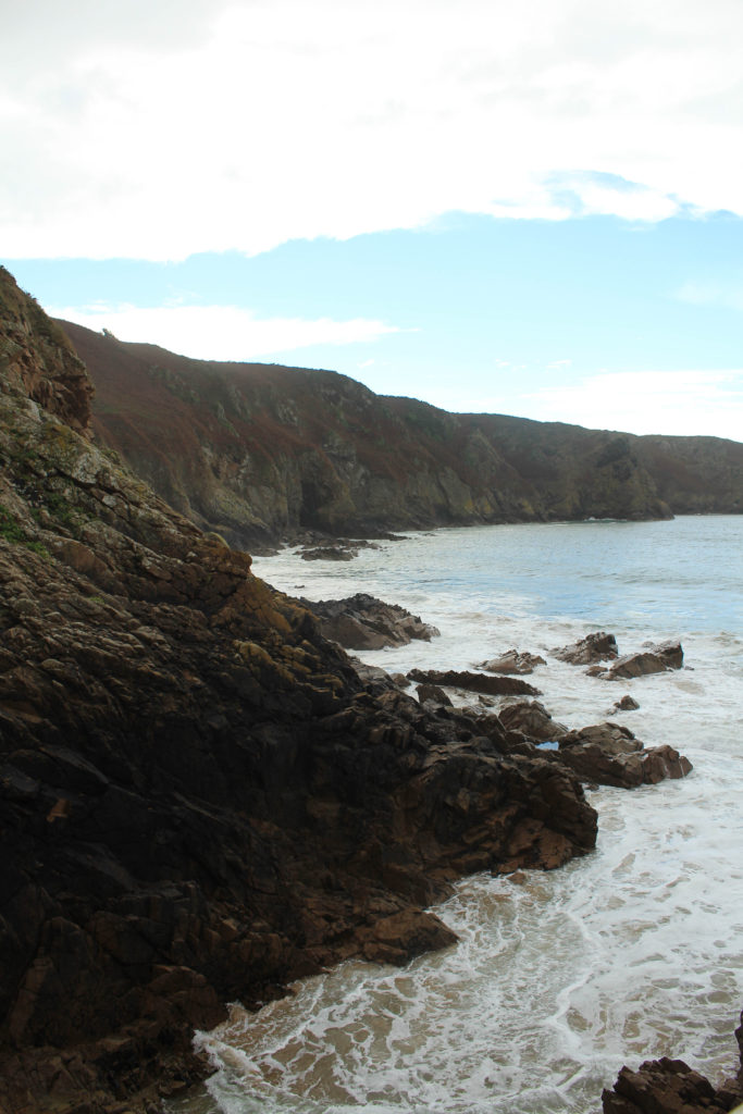
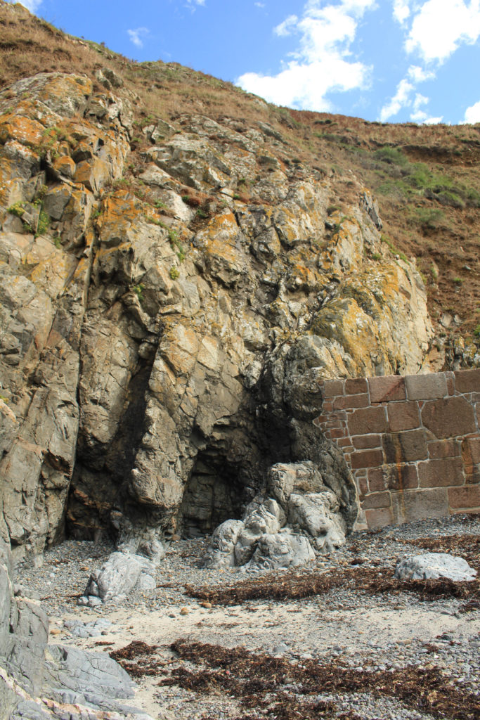
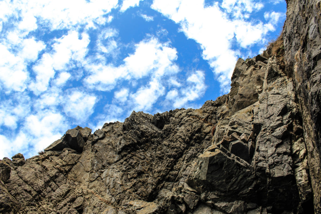
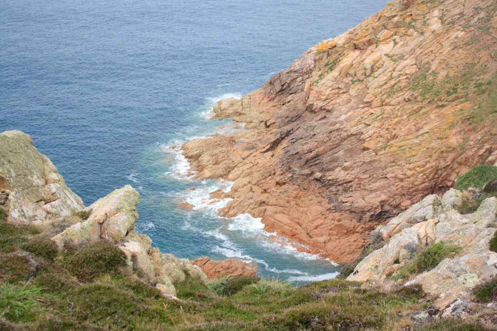
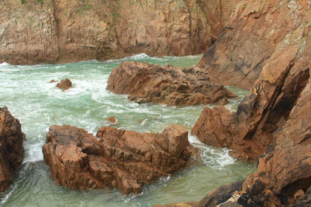
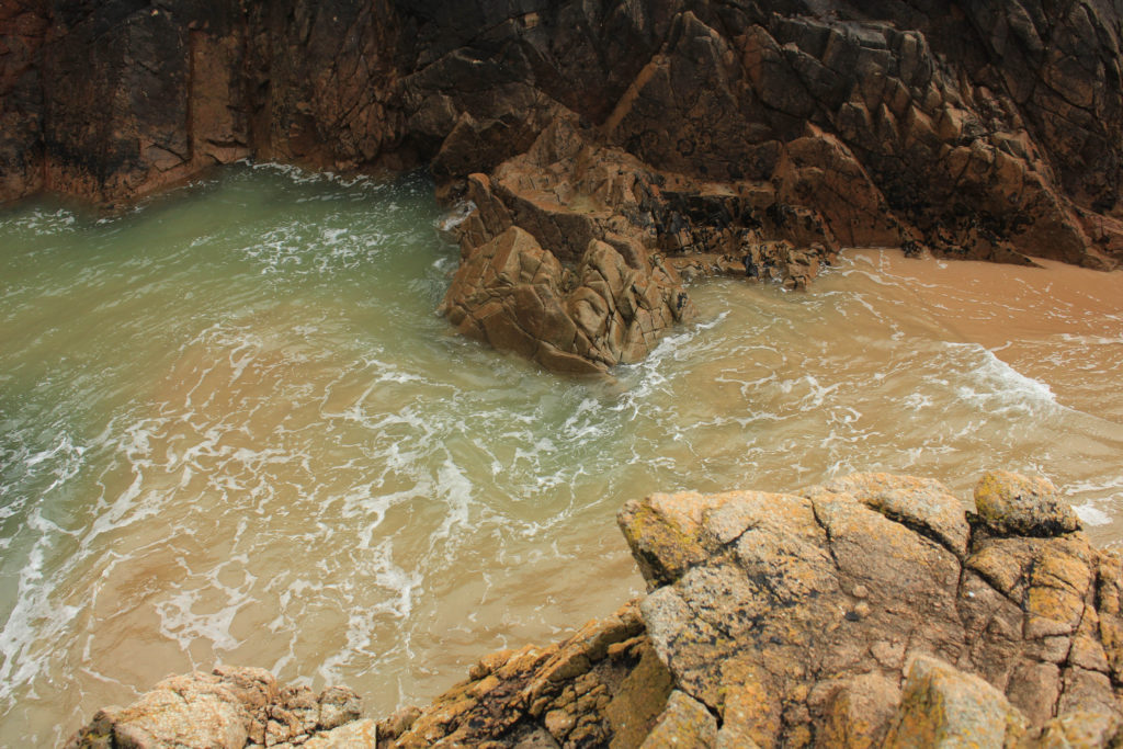
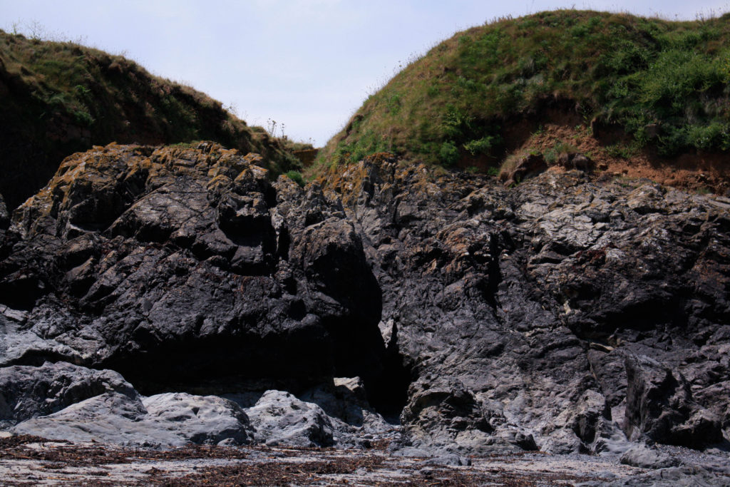
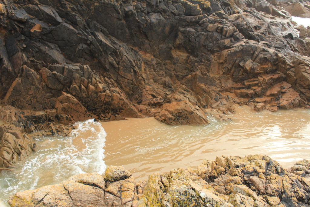
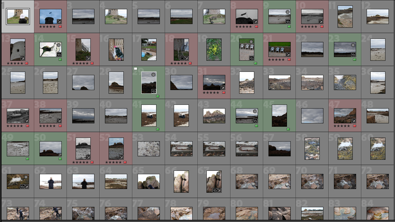
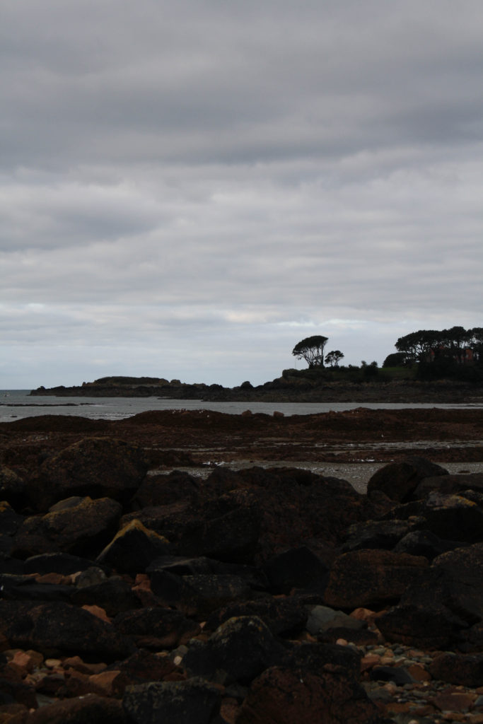
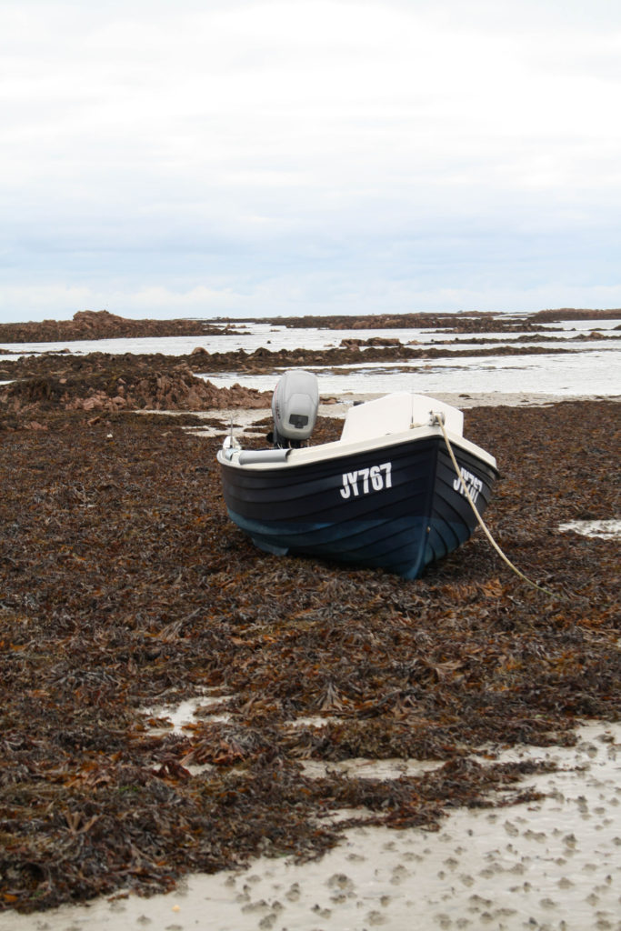
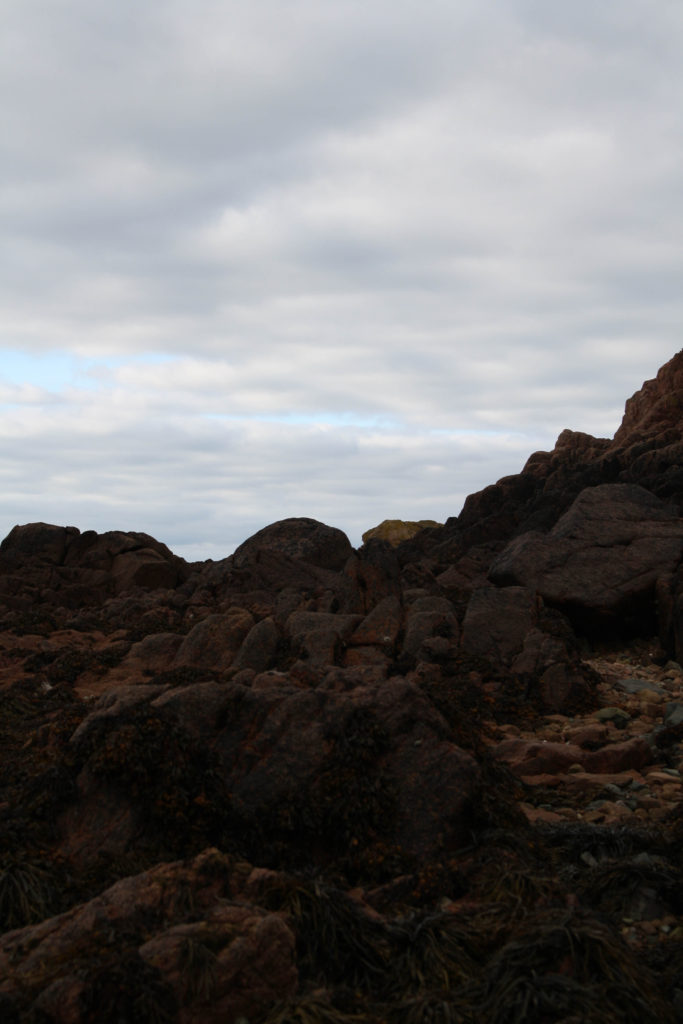
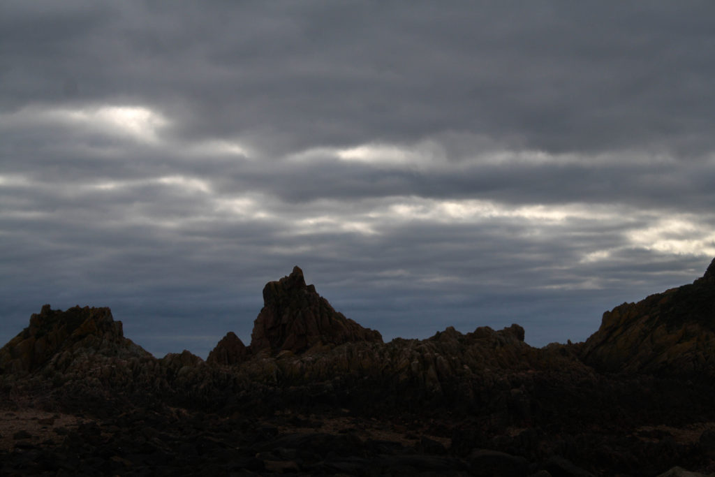
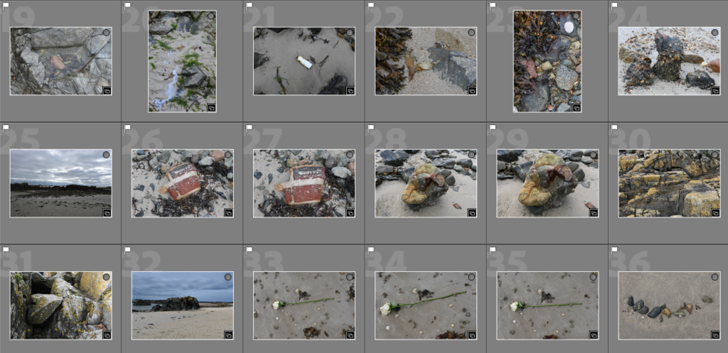
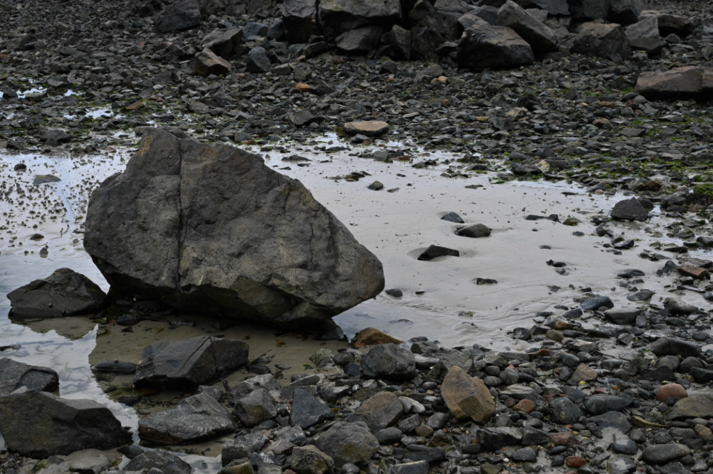
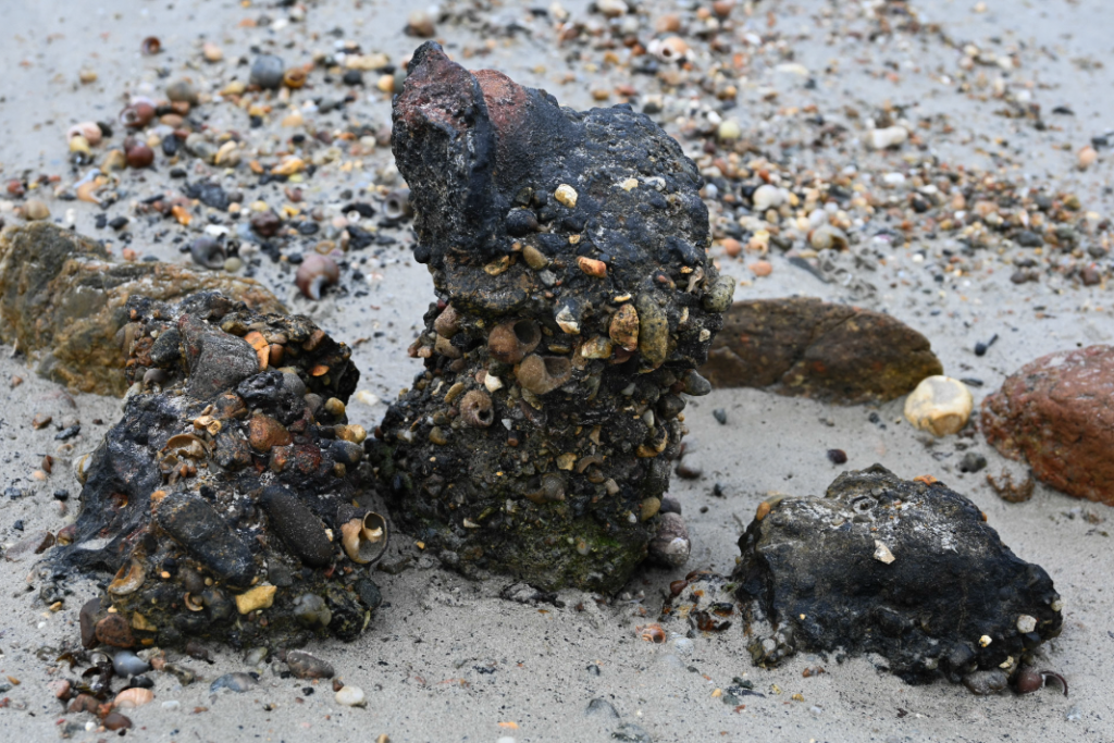
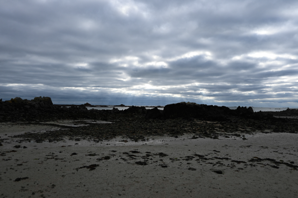
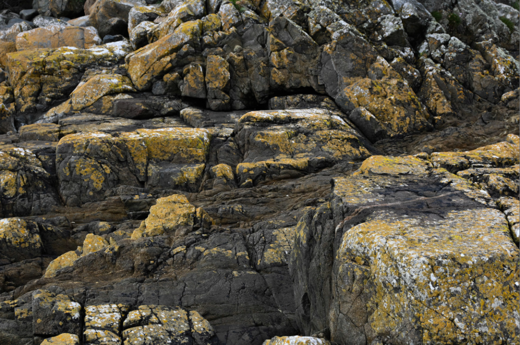
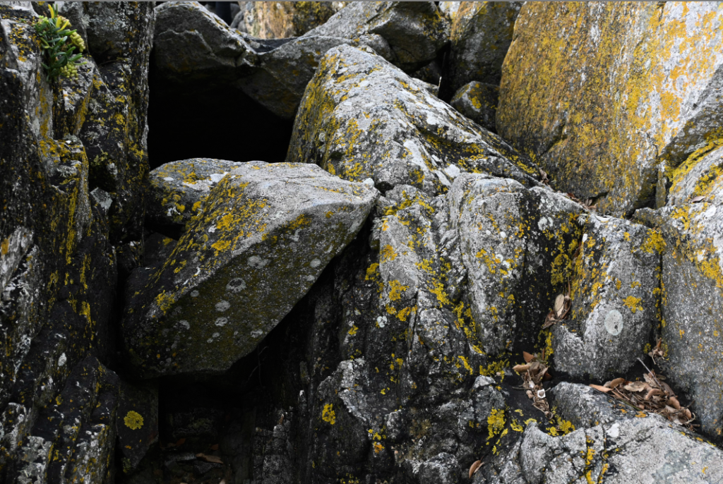
On Tuesday 4th October we went to Le Hocq beach and travelled down to photograph things such as, rocks, landscape and ocean. I took around 300 images of different rock formations and the beach. I then exported all my images over to Lightroom and used the P and X tool to decide which images can be further edited.

P and X tool

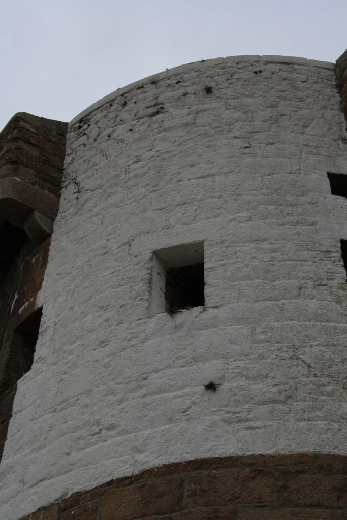
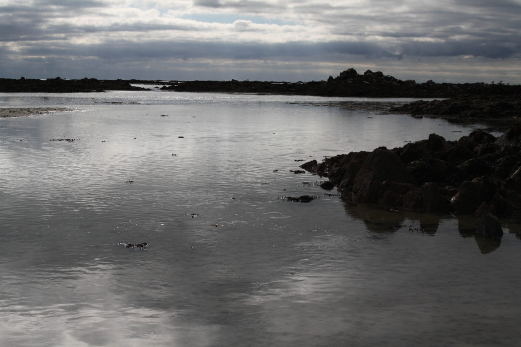
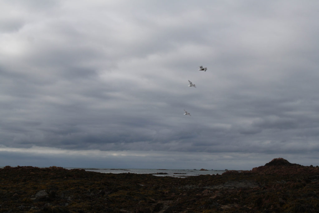
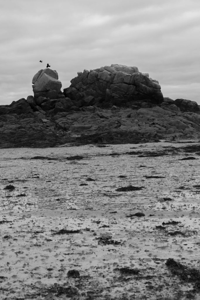
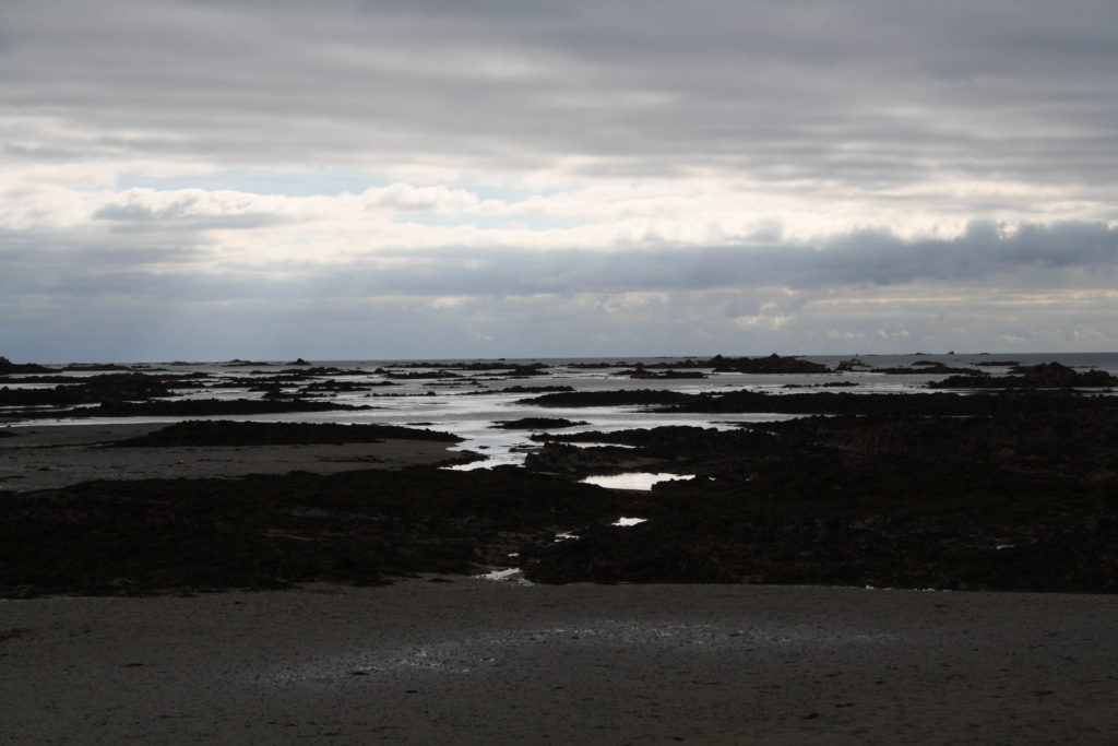
After going through all my images and choosing which were the best I came down to around 30 images which I then decided to edit. Below shown are some of my best unedited images from the Le Hocq shoot:

Best unedited images:

I edited my images using Adobe Lightroom and changed many different features on my best images. I edited features such as the tint of the photo to create a warm or cold coloured image. Also, I used the transform tool to make my images straighten up because of the horizon being slightly slanted. I edited around 20 images using these different tools and was happy with how they turned out.

Lightroom Edits:

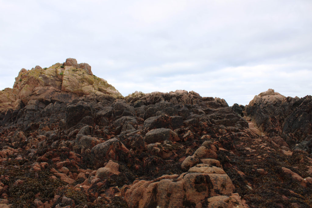
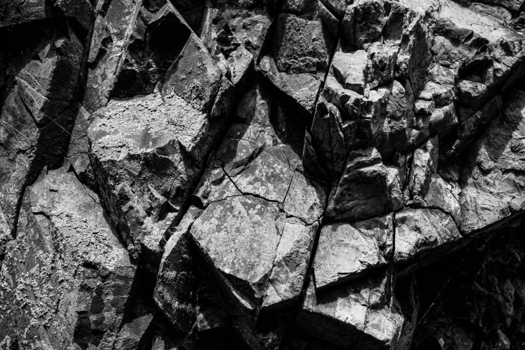
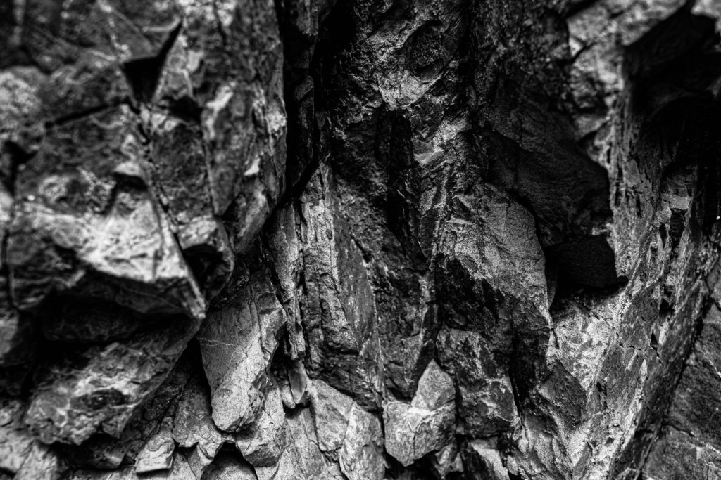
Overall, I am very happy with the way my images turned out after editing. I like the monochrome photos because the contrast between the brown rocks and sand makes the rocks stand out compared to the rest of the image. Also, I really like the close up images taken of rocks because it shows a very good amount of detail and texture.

still life sculpture

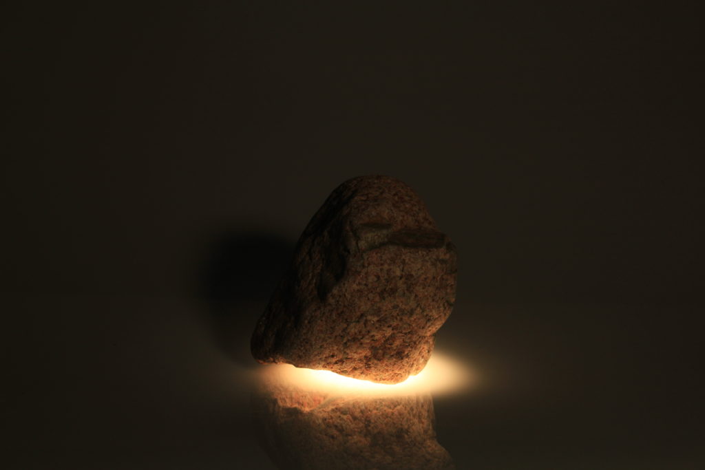
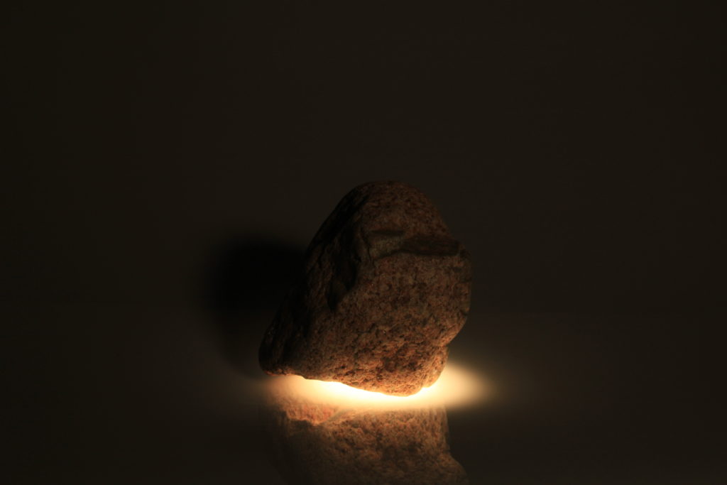
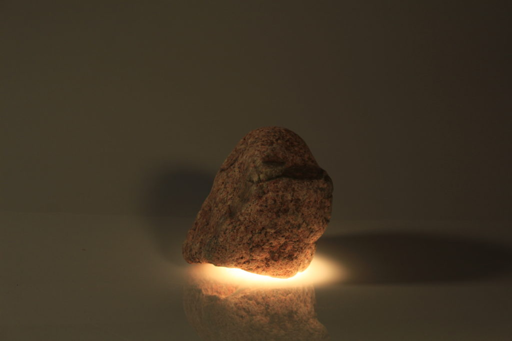
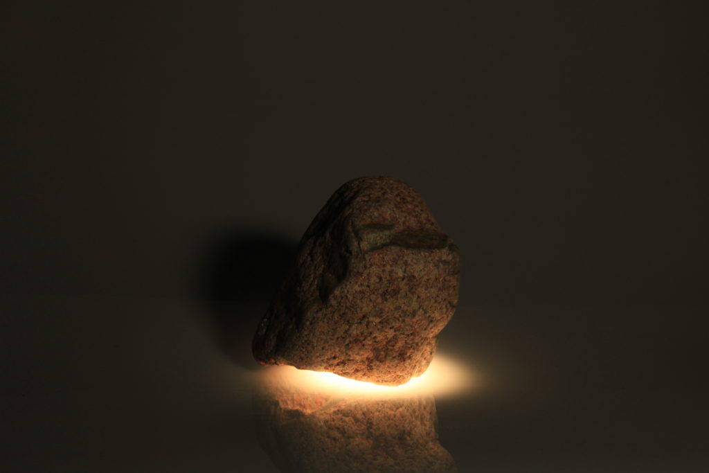
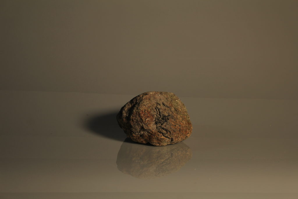
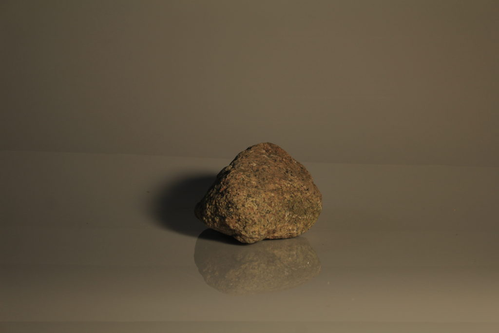
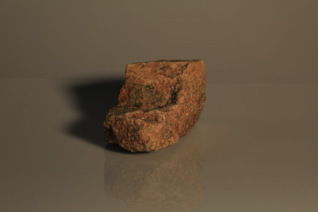
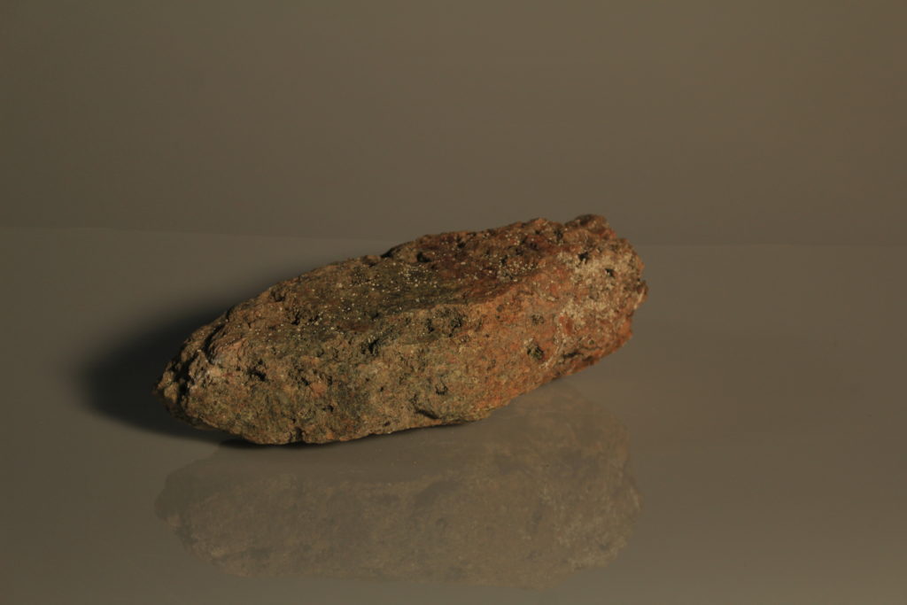
I started my sculpture by taking photos of rocks in the studio. I adjusted the lighting before taking the pictures so they would look better.

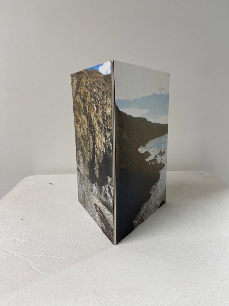
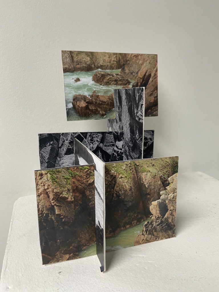
Then I printed 4 of the photos off on laminated paper. I folded them to create a 3d effect then pinned them down to a mount board. This was the final product

Image preview

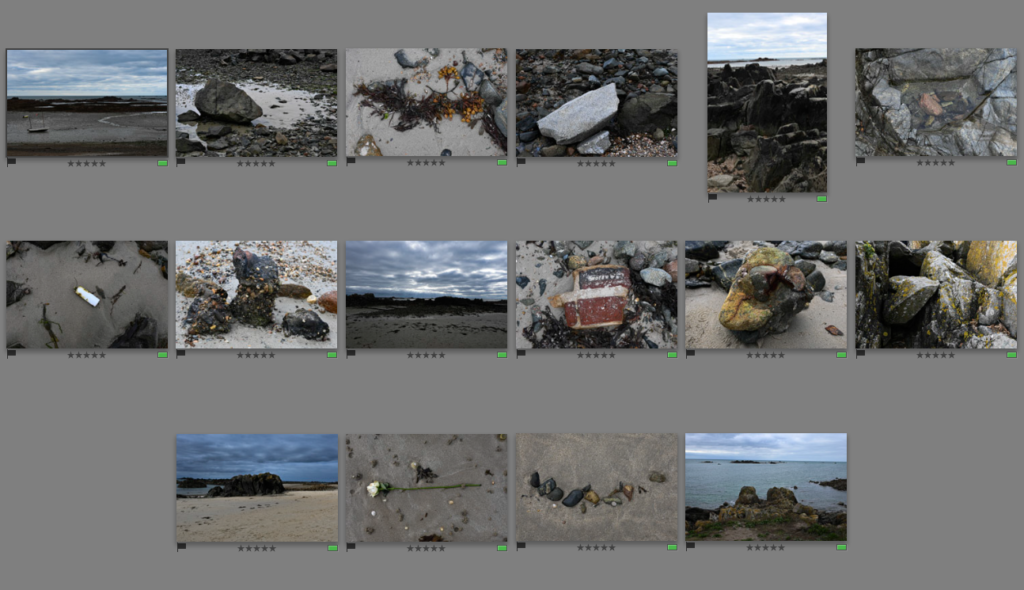
Further editing of 16 best shots

The 16 photos that I have selected to edit further in Lightroom will be the photos which I will use later on to create my zine. Throughout these experiments, I will creatively manipulate my photos in to black and white, change the contrasts/lighting, etc. Then I will print the photos out and use them to make a paper mock-up in class so I have an idea on how I want to lay my zine out as I think that it will be more helpful to help me understand what I want to do and the experience I want to create for the people who will view my book.

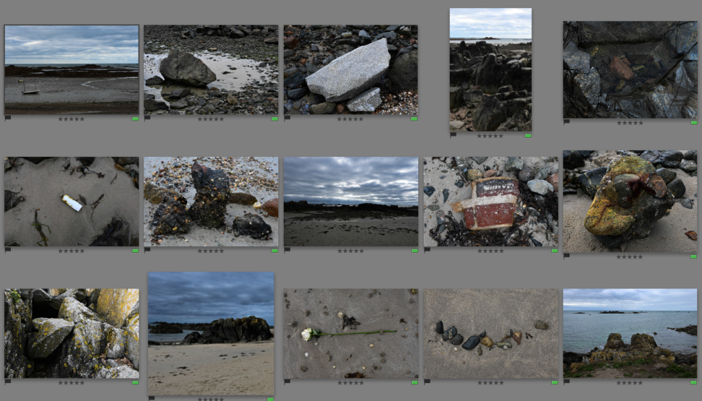
Experimenting with editing –

For these photos, I began by doing simple edits which can be seen above which I then synced to all of the others. This acted as a baseline to work with which I thought was better as they would all have the same settings that I can expand with further along the line.

Then I went further into editing for these photos, I started cropping which can be seen in #3, #5, #10 and #12 because I felt as if there was too much negative space and I wanted to create a more focussed point of the photo. I also went through other photos which were slightly wonky and needed to be straightened in the horizon lines because I think that it makes the photos look neater and work better together. I also decided to get rid of one photo which I thought didn’t really work well with the rest of my photos because of the way it was taken and the different textures within it.

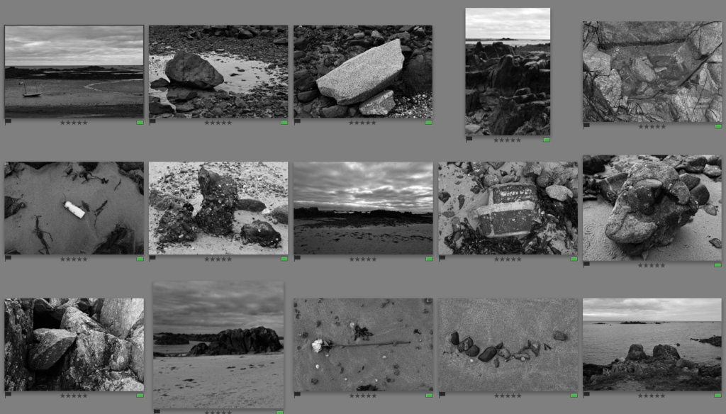
I then decided that I wanted to turn these photos into black and white in Adobe Lightroom. I really liked the way that they turned out in black and white as it adds more control into the photo because they have all synced in how they appear which I like as it provides a uniformed look instead. I think that I will use the photos in black and white for my final prints that I will use to create my zine.
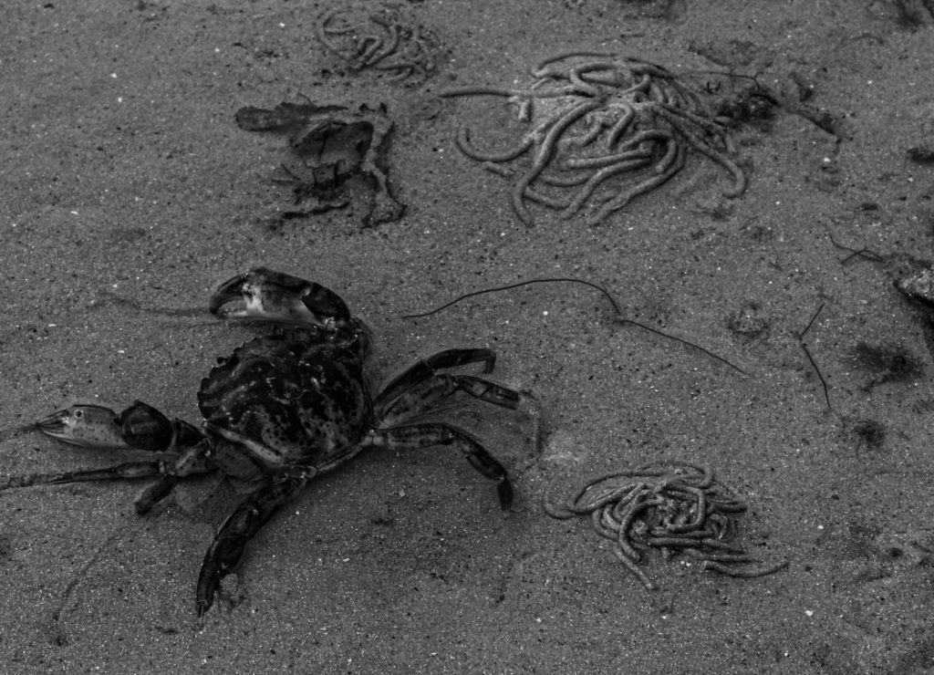
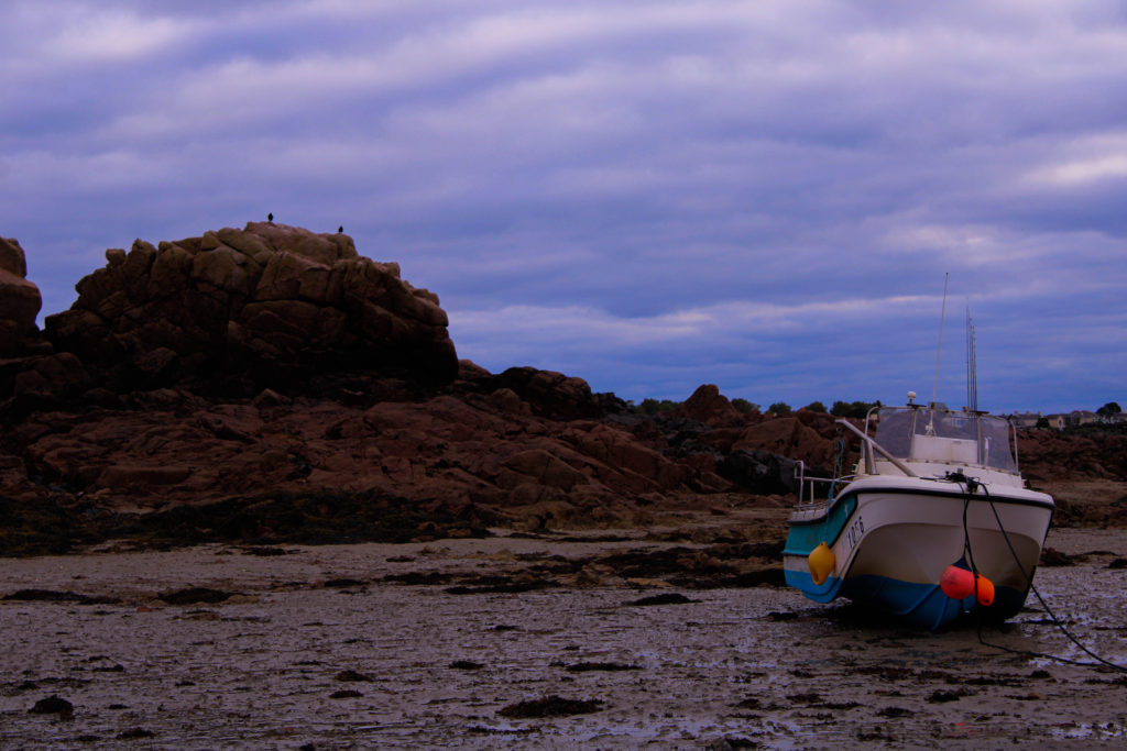
photo structures

Process- Image Selection

To create my 3D sculptures, I took some of my best images from my Stinky Bay and Plemont photoshoots, then printed them out and attempted to make some successful experiments. Below I have included the images I would like to use in my sculptures, which include my most successful photographs from the shoots.

Materials

  • Photographs
  • Card
  • Tape
  • Scissors
  • Knives
  • Glue

Experiments

After choosing and printing out my photographs, I now had to think about the layout of my sculptures and how I would assemble my work. Below I have included some images of the experiments I created and a visual process of how each of them were made, with explanations and analysis’.

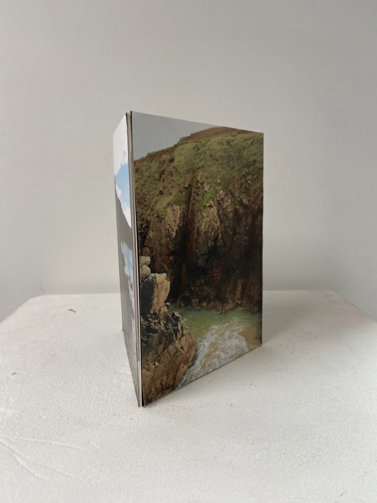
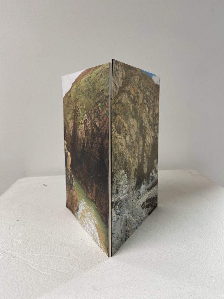
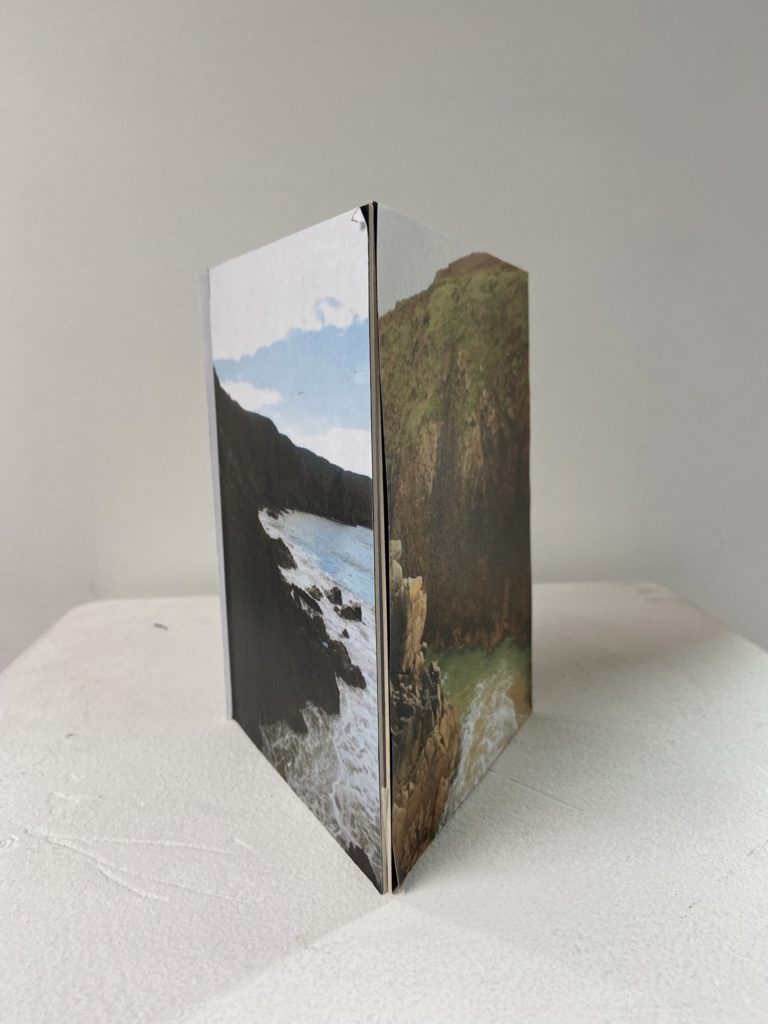
This make this sculpture I just printed out three colour photographs and glued them onto card, afterwards I used tape on the inside of the corners of the card to make this 3D triangle shape. I really like the shape of this sculpture as I think that its one of the easiest and best ways to display successful images. I like how this project lets us experiment and see which structures are the most aesthetic and useful when it comes to making photographs more exciting, and this will also give me inspiration when it comes to exams.

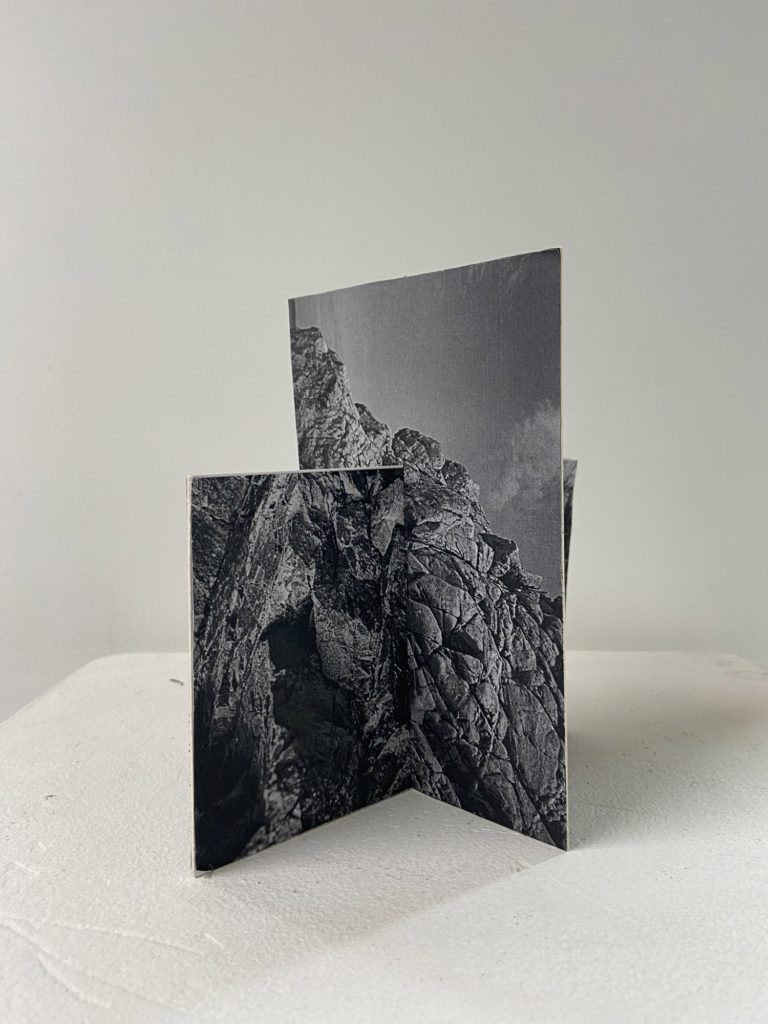
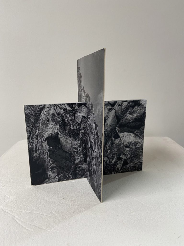
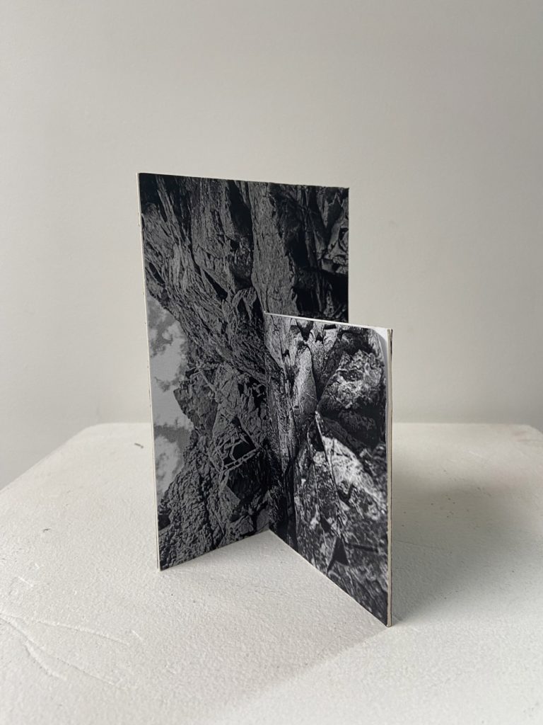
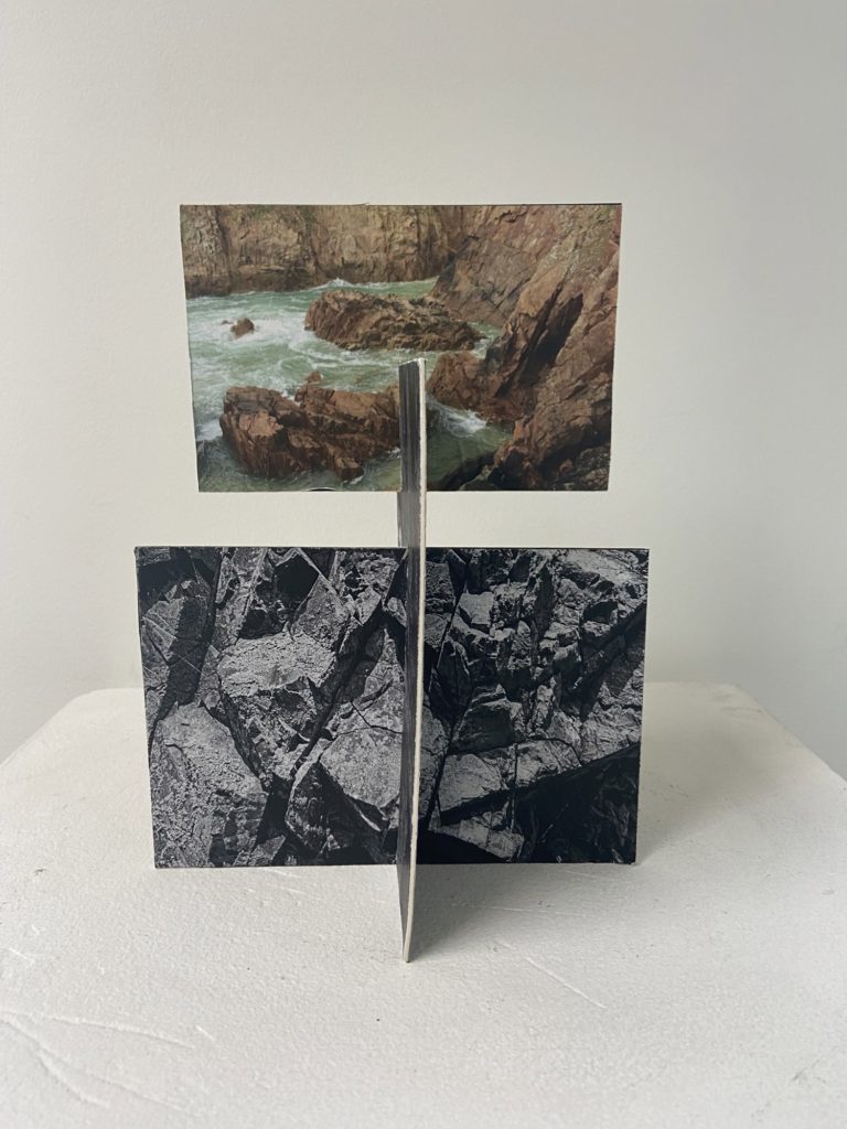
To create my this sculpture I had the simple idea to merge two photographs together by sticking 4 images onto two pieces of card (so each piece of card is double sided). I decided to make this first piece black and white as the contrast creates texture within the rocks and this means that this piece came out successful in my opinion, as this was actually my first sculpture I think that this was a good attempt as making these photographs 3D.

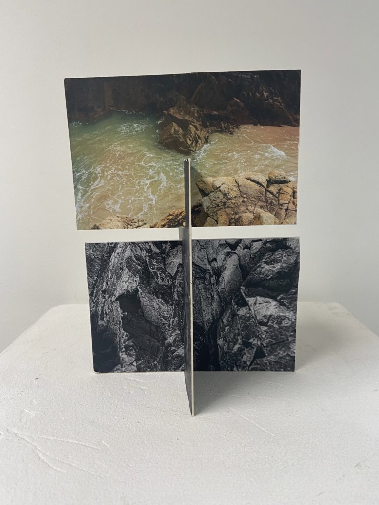
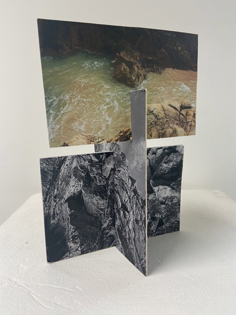
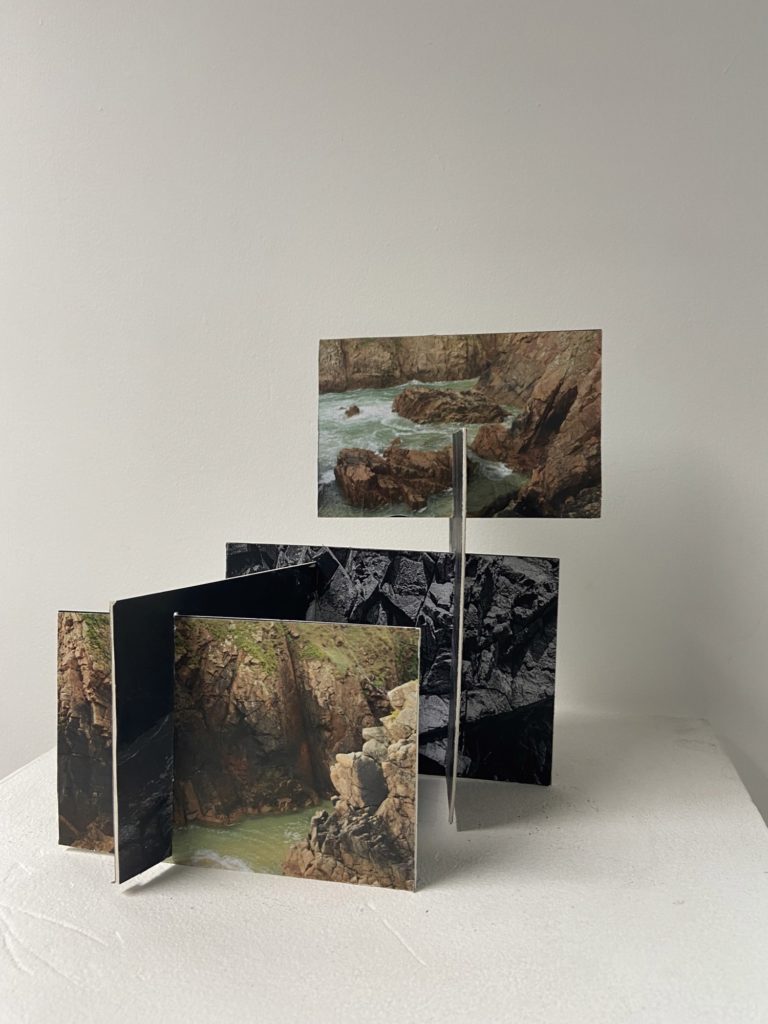
I had taken the sculpture from above and adapted it by adding a lot more double sided pieces of card. To make this I added more slits to my images which meant that I could keep adding to the sculpture. I think this turned out successful as I decided that it would be best to add colour images to the piece. The fact that the colour is put at the top of the sculpture means that there is an aesthetic focal point and I think this adds depth to the structure.

This sculpture was created from a sculpture which was already adapted, I really liked making this piece as it was fun to experiment with many different photographs. I think the fact that there is a wide variety of image with different textures, colours and tones makes this my more interesting piece. However, this was my most difficult sculpture to create as it was like a puzzle with the many different slits in the pieces of card which had to be put together.

Best Work

Below I have included my best sculptures and explanations as to why I think so, I think its important to evaluate and criticise my work as it gives me an idea of what is successful and this helps with ideas in the future.

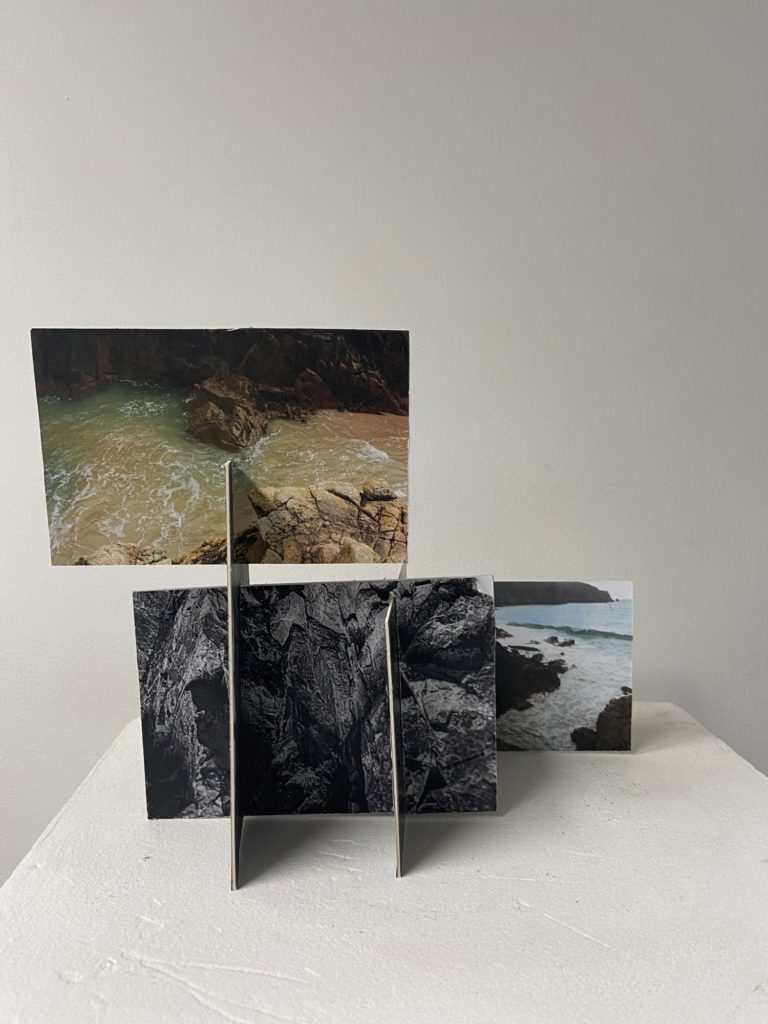
In my opinion this is my best sculpture (and the image that makes it looks the more aesthetic) this is because of the different levels within this piece and how they were created. I decided that the colour images would be at the front and the back of the piece and the black and white double sided images would be kept in the middle, this was in a attempt to keep the focal points of the piece within the colour images. I think the actual structure of the sculpture is interesting as everything was placed in a thought out way so that all aspects of it would intertwine well and link the whole project together, as the piece is composed from images from both my Stinky Bay and Plemont photoshoots.

Additionally, the different shapes and angles of all the photographs means that a sense of depth is added to the images, this means that the piece is more eye-catching. However, I think that this sculpture is very adaptable, it could have been made better if I had kept adding many more images to it, this would have made it a bigger structure and more interesting. Furthermore, if I were to do this again from future projects I would give the images more contrast, saturation and clarity, as all of these features were lacking and I think this hindered the successfulness of this piece.

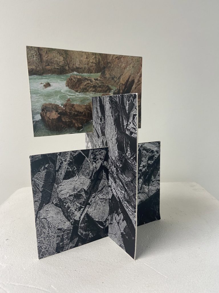
One of my favourite parts of this piece is the simplicity of it, with it only being composed of 6 images in total, I think that this draws attention to the photographs and shows how interesting Jersey’s Sites of Special Interest are. I like how much this sculpture illustrates my best images from this project. Whilst making it I decided that the top image should be colour and places further at the front, this was in an attempt to create a sense of perceptive and the fact that the black and white images were taken before the colour one. Showing a change in time and space (from Plemont to Stinky Bay) between both my photographs and my sculpture at the same time.

Furthermore, I like how the portrait image in the middle matches up in some areas with the bottom one, kind of like creating yet another photograph from merging two existing ones together. However, some of the edges of the card in this piece aren’t cut straight and are fraying, this could be a downfall of the sculpture as it isn’t as neat as my one above. I still think that the boldness of this structure is its most aesthetic piece and that’s how I liked making it so much.

Le hocq

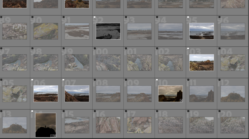
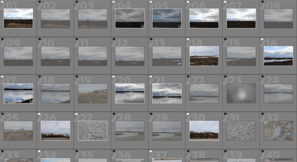
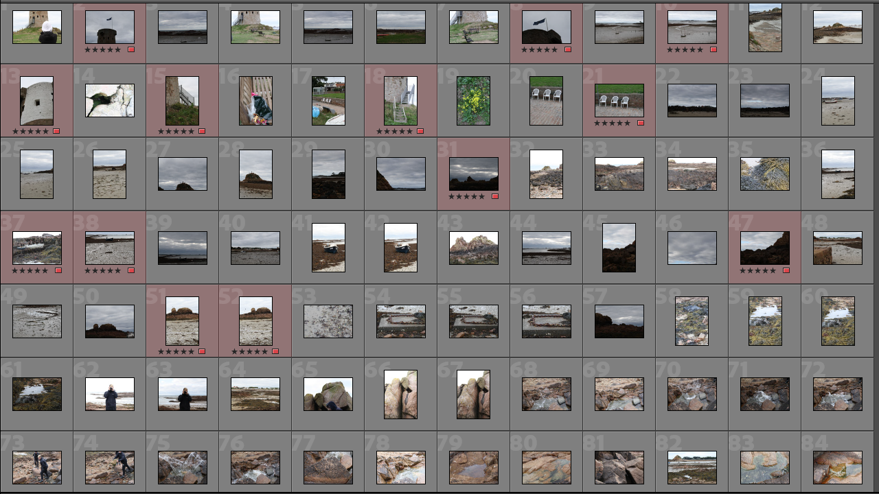
I have a total of 215 images and have labelled my preferred images in red so it is easier for me to pick out my favourites and edit them to my preferred way.

Best Images from Lightroom

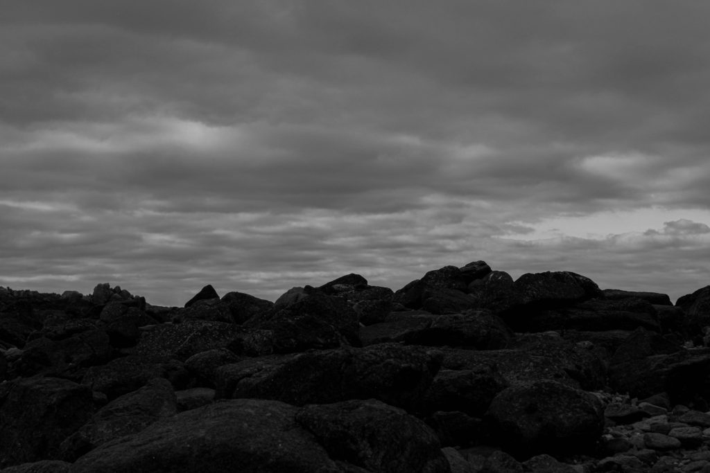
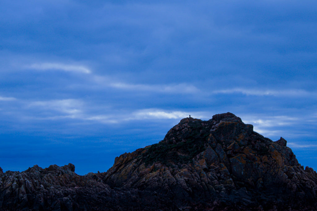
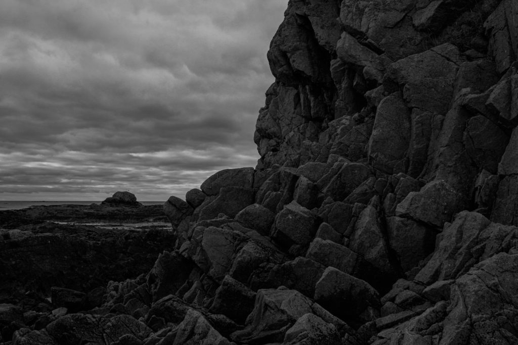
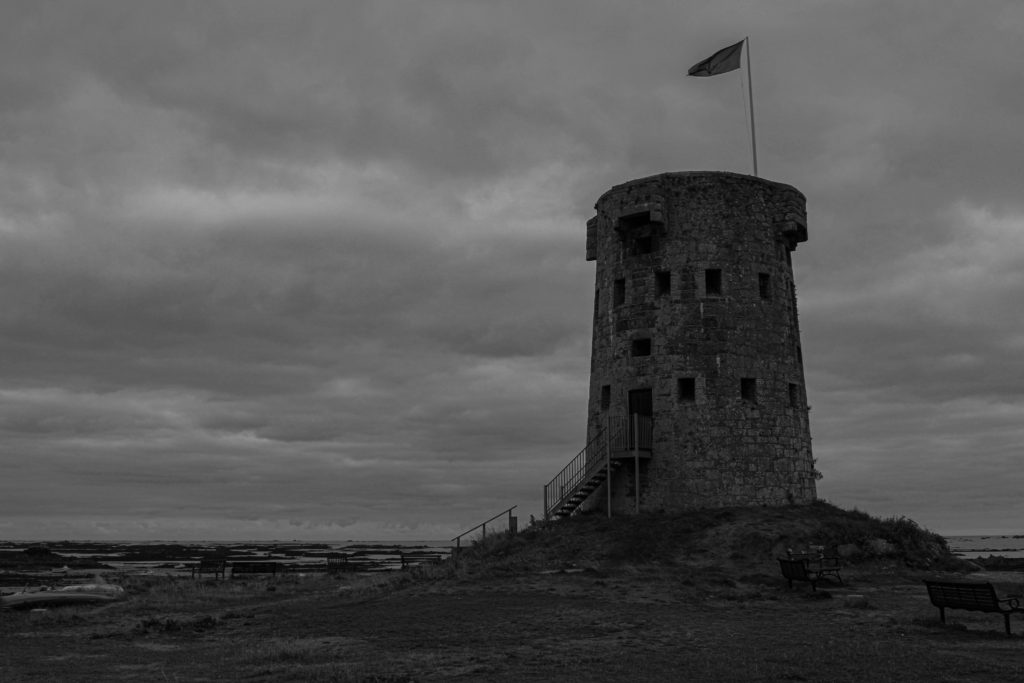
I saved these images from lightroom onto my m drive so I could access them and upload them into a gallery style for the blog. I like these images because they represent and symbolize a darker side to le hocq, the images are murky and show off the beach as mysterious as if it has a secret.

The images marked in green label my best unedited images, I have labelled them in green so I can move these selected images into my folder to upload onto the blog once again in gallery style.

I left these images untouched as i feel they had a greater impact left unedited, the contrast of the images I felt were perfect for the outcome of the photo, the most i did was crop the image to remove un wanted people or things in the background that got in the way and ruined my photograph.

My Best Unedited Images

Green Island photoshoot – Contact sheets

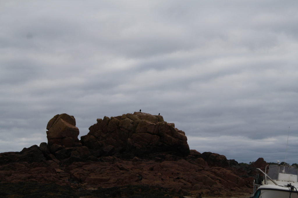
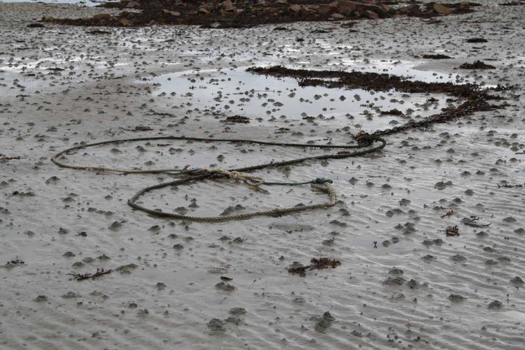
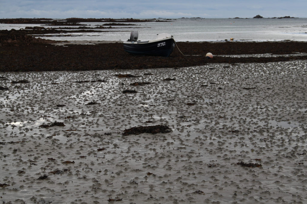
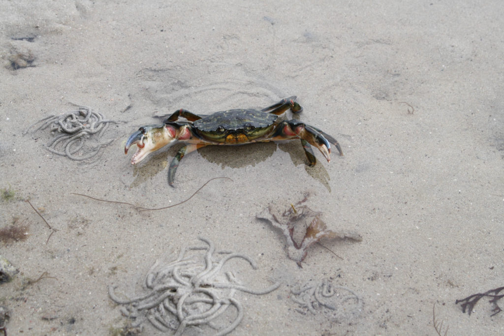
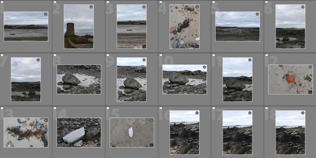
For this photoshoot, we visited Green Island where we walked along the seafront taking various pictures of items we found along the way and other views which we could see. The weather for this trip worked well with the pictures in my opinion because it was overcast, which can be seen in many photos, this makes it easier when taking photos as the glare from the sun isn’t able to overexpose the images although the blue sky did do this in a few of the photos. I really liked visiting Green island because it got me to look across the seabed at different rocks/objects/etc to see what can be found on our journey and I found a few different things which I think that I could use in the future for my zine to tell a story of what we saw.

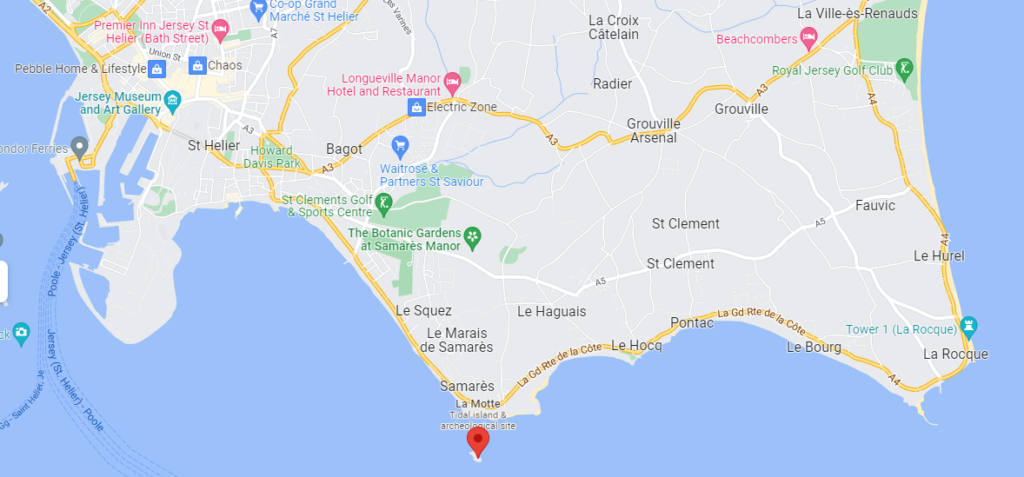
The place marker shows where Green island is in Jersey.
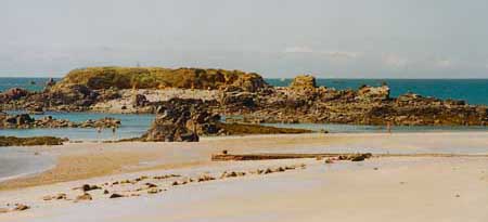
Green Island - Jerripedia
A photo of what Green island looks like.

Most successful –

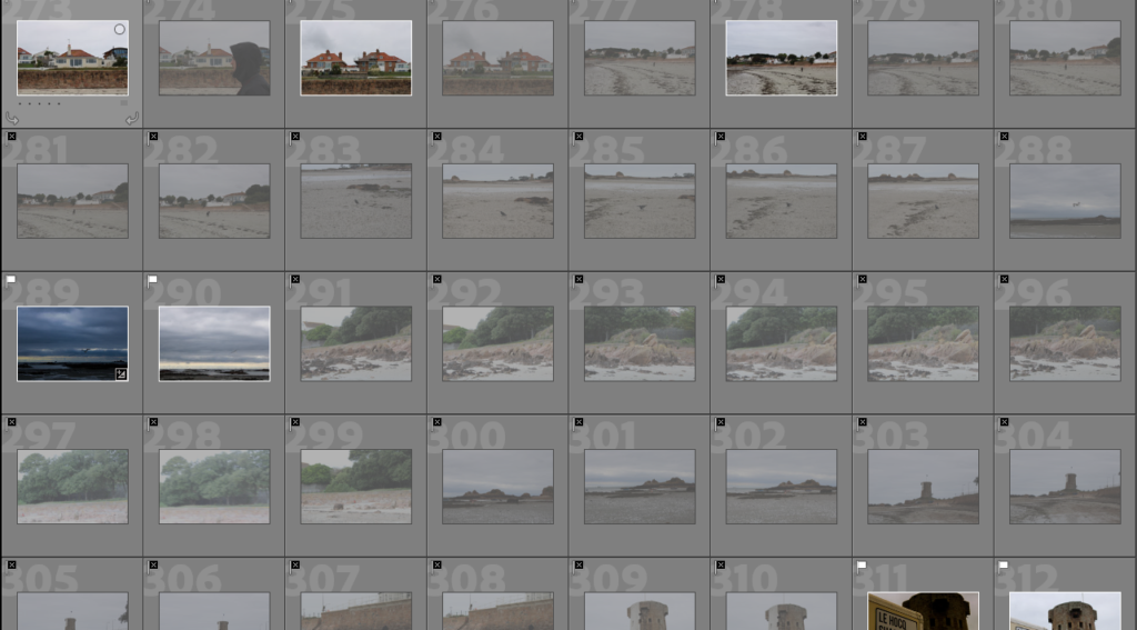
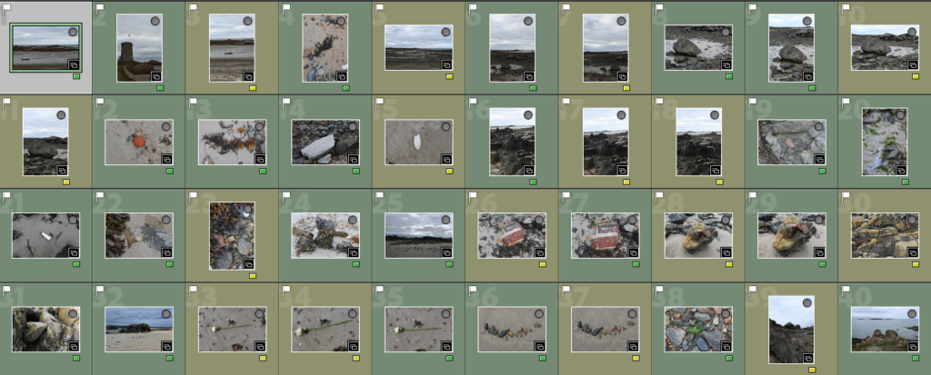
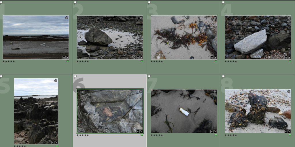
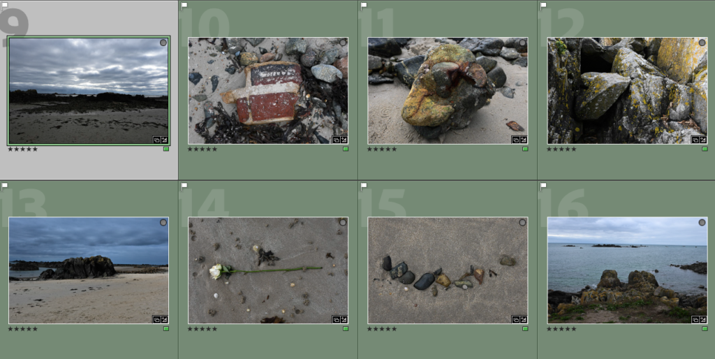
To begin my selection process from my photoshoot at Green Island, I began by going through and selecting my best photos on Adobe Lightroom by flagging the ones which I thought were successfully due to not being blurry/not in focus or overexposed from the sunlight. I was able to gather around 40 photos which I decided to start with as a basis for doing my colour selection below and I think that a few of these photos already have started to work well together with the way they are able to flow and tell a story within them. I really liked the ones where I am looking down at an object on the sand because it shows me following a path and what I could see, which is different to what others could have seen, therefore I think that those photos will be ones which I use commonly throughout the creation of my zine.
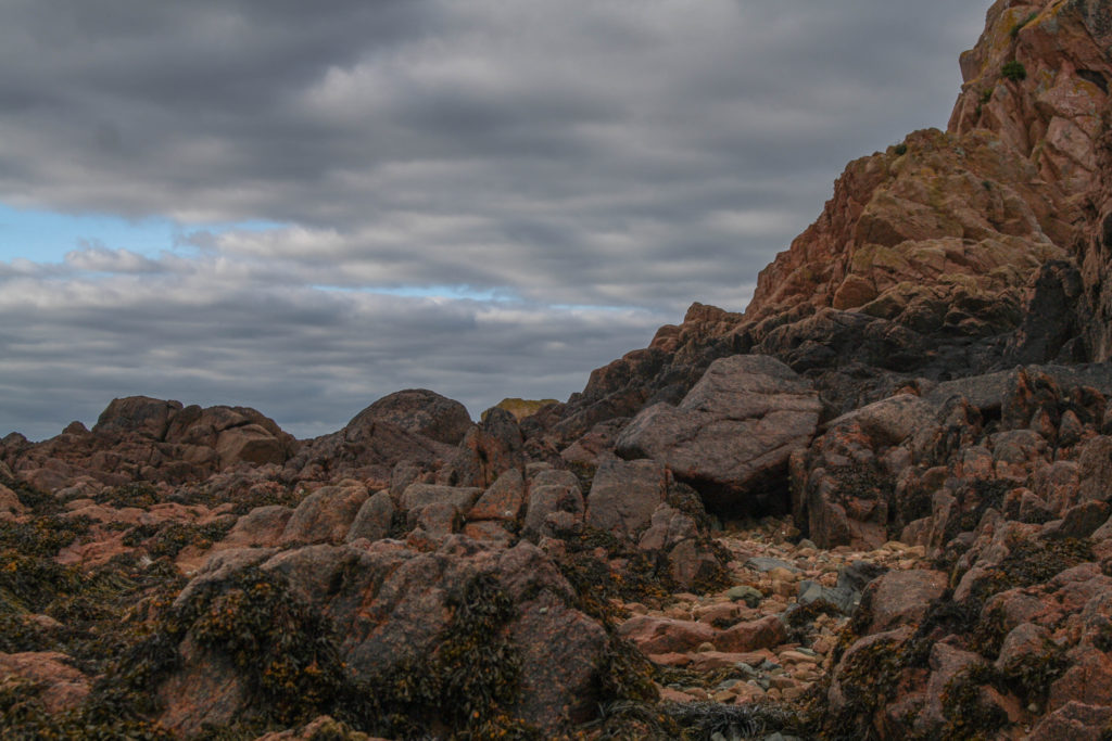
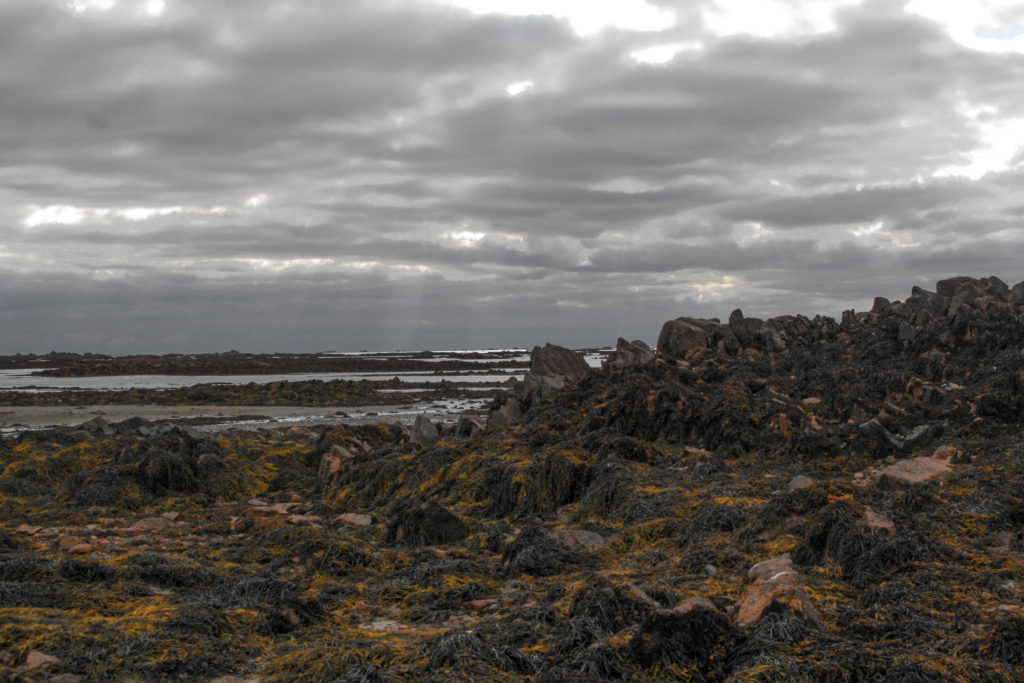
Colour sorting –

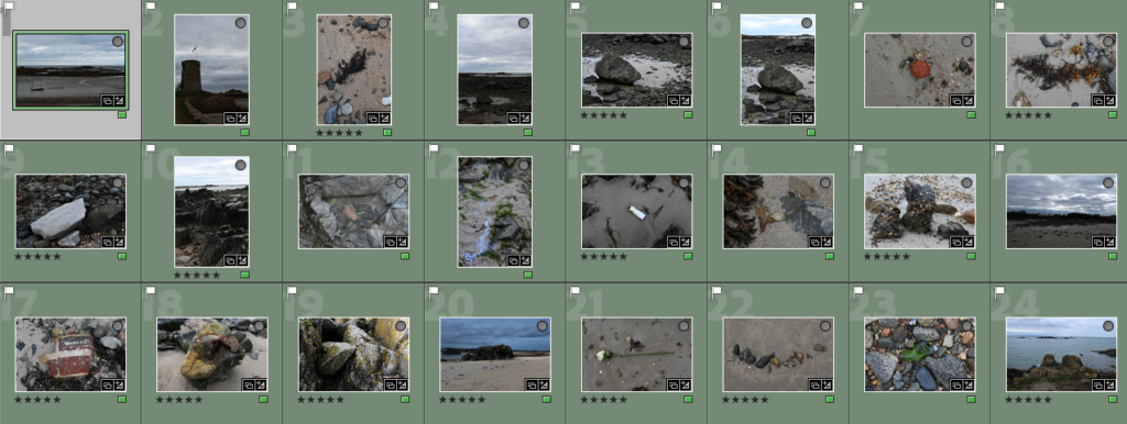
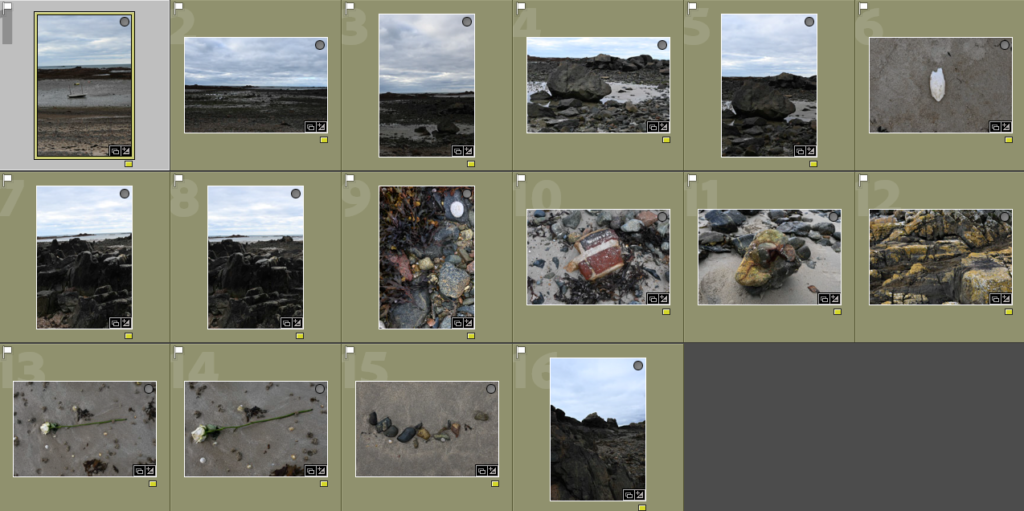
For my colour sorting, I highlighted the photos in green which I thought would work together in a zine and had the most potential and could be further edited to create my zine. Then I would apply basic editing, shown below, which would help me to further analyse the photos which I want to incorporate into my work. For the photos which I was unsure of I used the yellow filter, I went through these numerous times analysing how effective and well positioned the camera angle/focus is and if it has something distinct in it creatively which would create a story. Most of the photos were repeats of ones I had liked or generic views which I didn’t want to include a lot through out my zine because I felt as if it would be quite boring whereas zooming in on specific objects could be more interesting. Then I used the rating system in Adobe Lightroom, this was where I went through the photos which I had previously highlighted in green and I rated the photos which I was certain and confident to further edit so that they could be used in my zine. This technique made it easier for my to quickly select the images I want or don’t want to see as I could choose which colour I highlighted in and then be able to also select the rating to see how many photos I had already decided to use for my zine creation, it also helped me to see the flow of the pictures together which I found helpful.

Basic editing and examples –

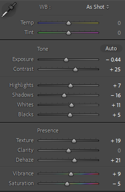
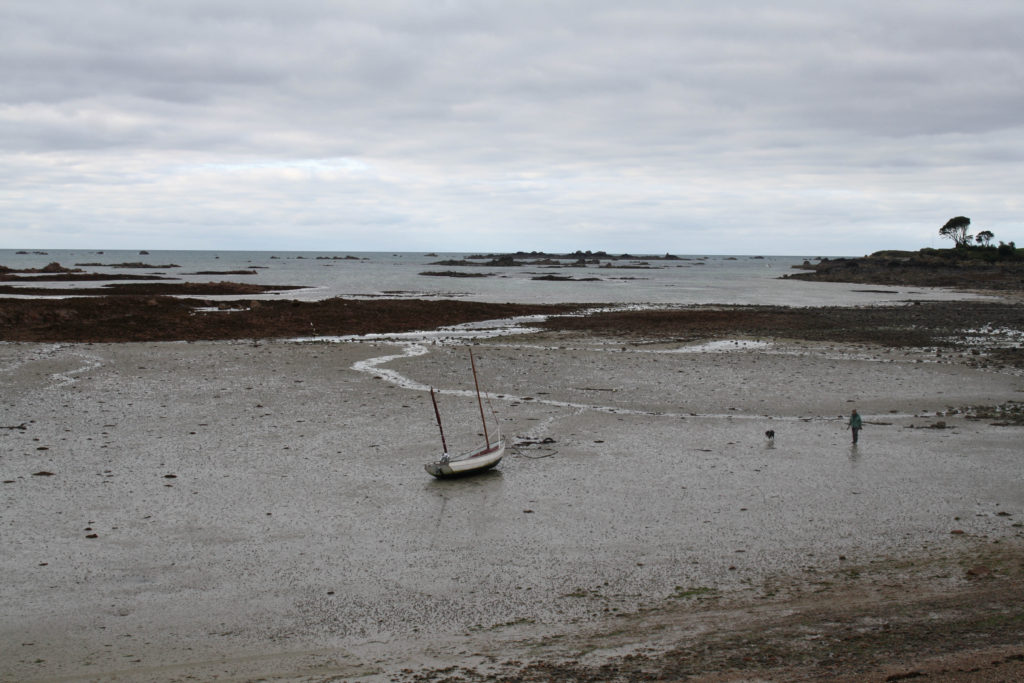
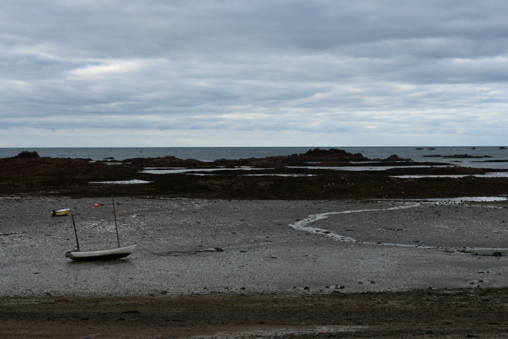
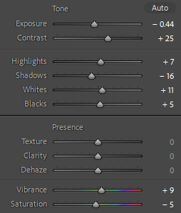
For the basic editing, I began by selecting the photos which I had chosen in green and choosing one to begin with to start my editing process. I chose the first image of a scenic view with a small boat included in it. For this photo, I wanted to make it quite overcast and yet still have some colour in it. I achieved this through bringing the exposure down slightly and brining the contrast up so the details of the rocks and the blue of the sky which is peering through the clouds could be seen as the same time. I also brought down the shadows to give the photo a gloomier look which made it slightly overcast, which I wanted. As I wanted to keep the finer details of the rocks to be seen I made sure that the white tones in the photos, which are used to highlight these finer details, was brought up to enhance and work with the highlights and creates a contrast against the black meaning that they work opposite one another. To make sure the colour of the blue sky was apparent in the back of the photos and the sea’s darker green/blue colour was also emphasised I adjusted the vibrancy and brought down the saturation, to make sure the colour wasn’t too overpowering, this then enhanced these through the blue/green tones on the photo, which can be seen to be happening on the scale.

16 best photos –

Why I chose these photos for my 16 best photos which I will experiment with further in Adobe Lightroom to create a story through my zine. This is because I think that they create a good way to show the path that I followed throughout our visit to Green Island showing the different objects and debris that I found along the way and it makes you wonder how it got there, therefore with further editing I think that it will turn our quite well when creating my zine.