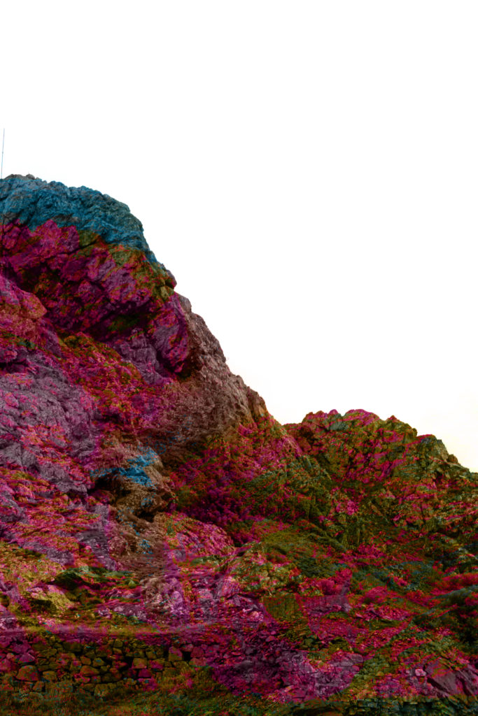
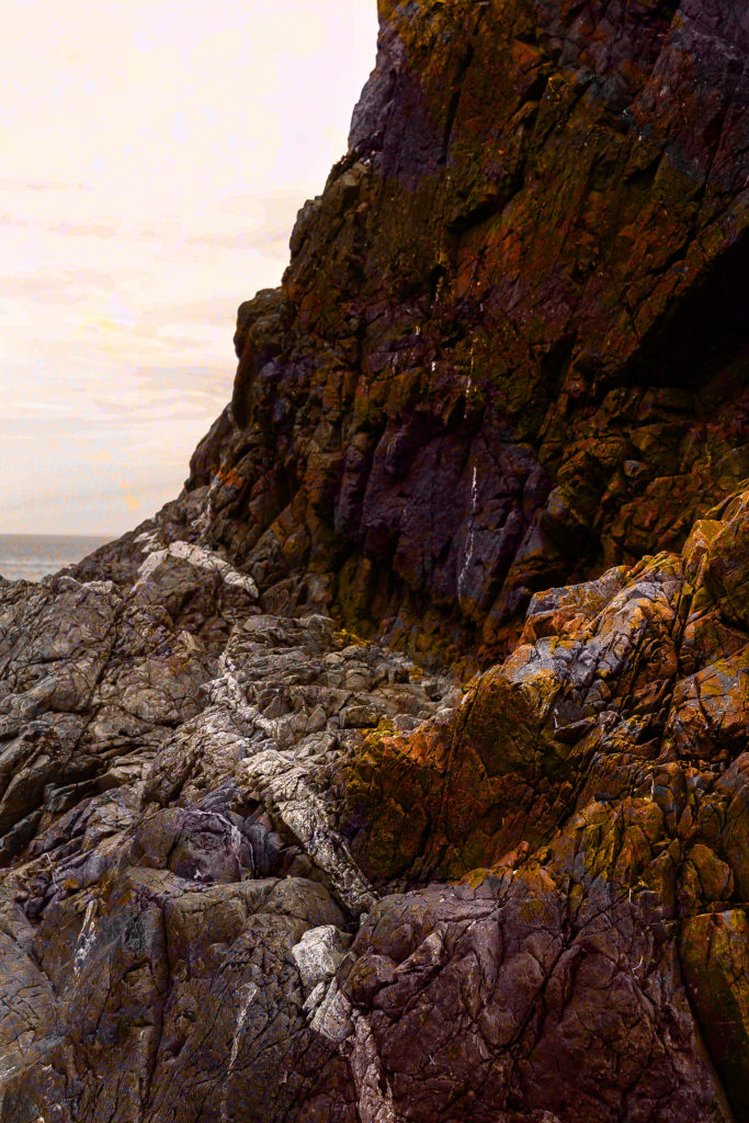
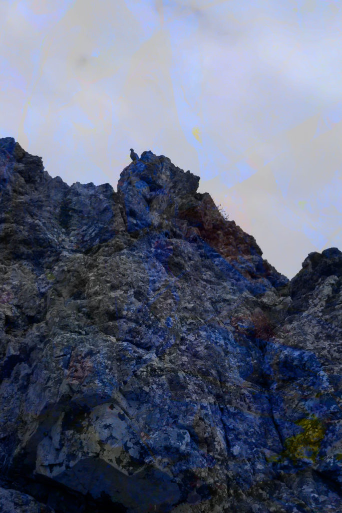
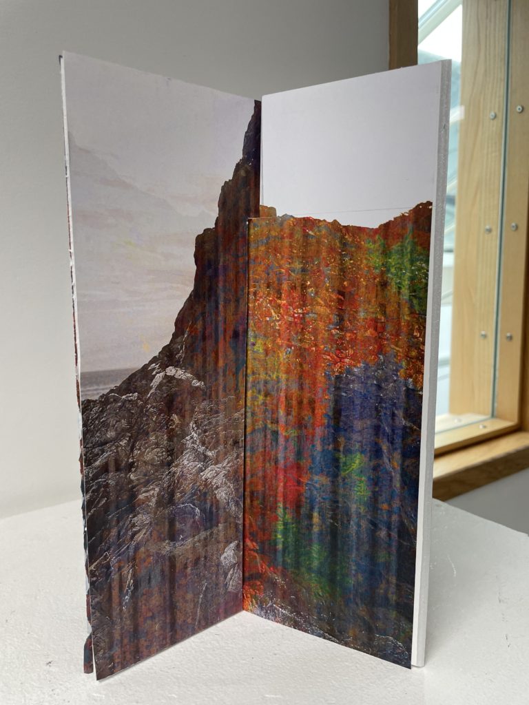
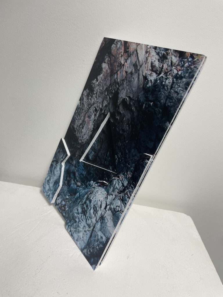
I decided to try a few different concepts for my Photo-sculptures, mostly trying to experiment with the ideas of shapes and layers.
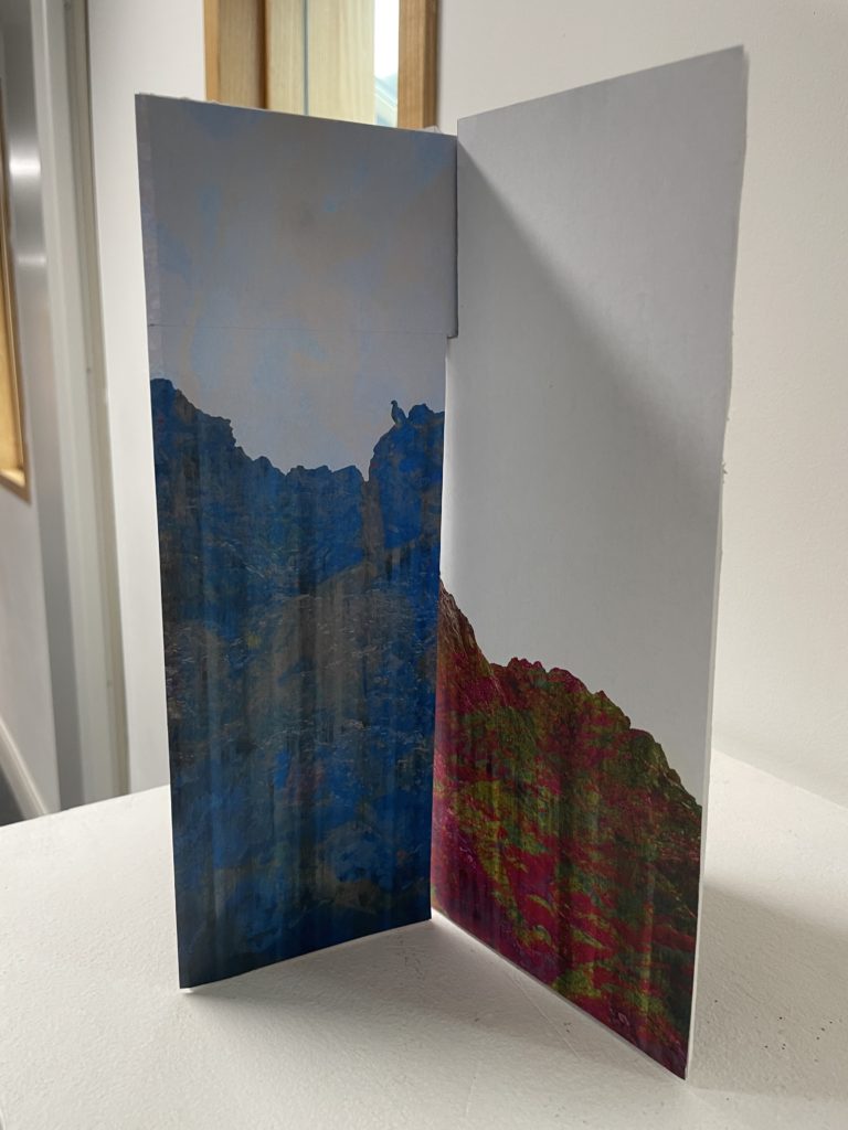
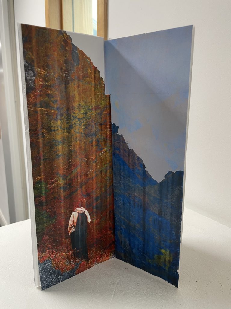
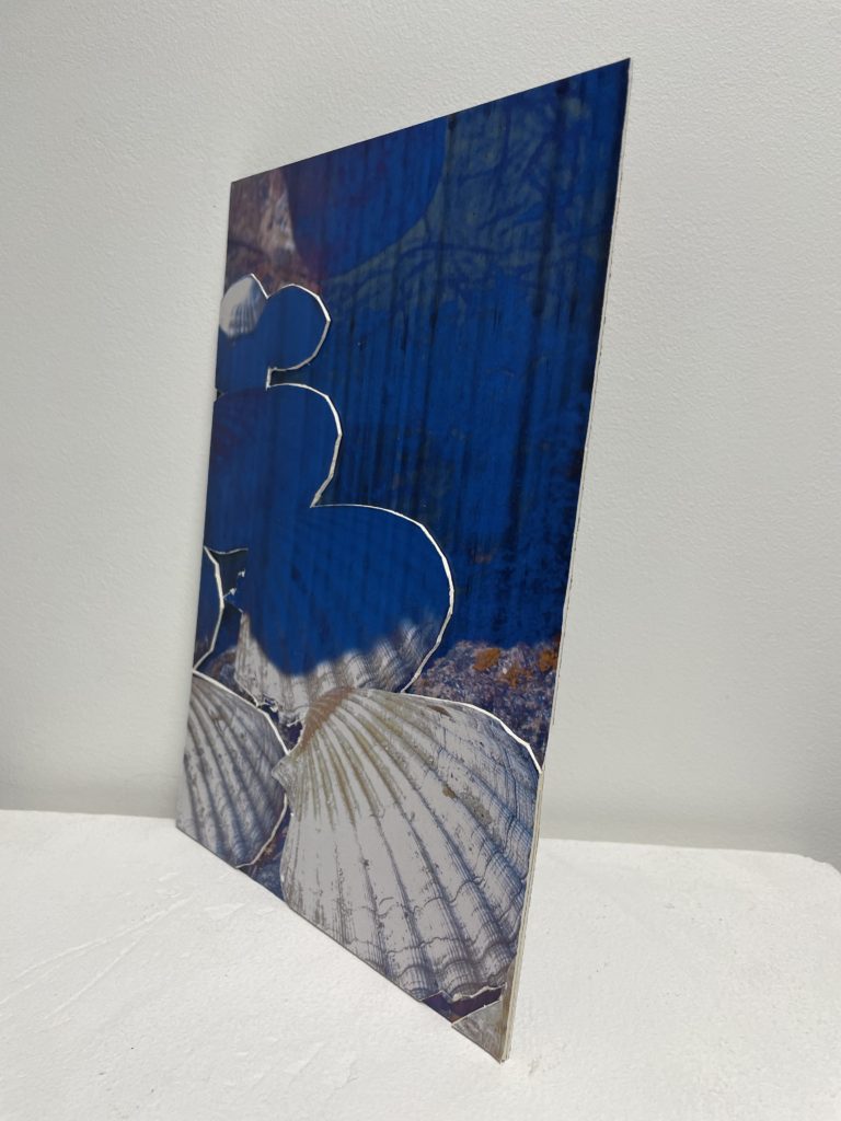
I decided to use these images for my first sculpture because they are unique and memorable due to the colours overlaid onto them.
I made it so that an image was glued onto each side of a piece of foam board and cut out slits so that they could lock together. Unfortunately there was a problem with a printer so they came out streaky so I decided to just use this piece as an experiment. The pieces I cut out where also too big so it was not held together very securely.
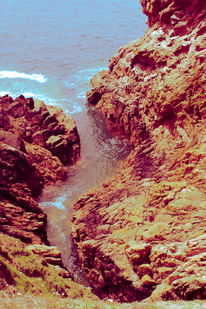
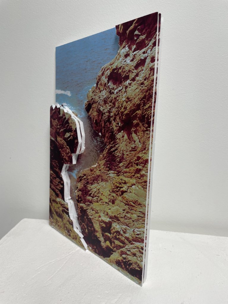
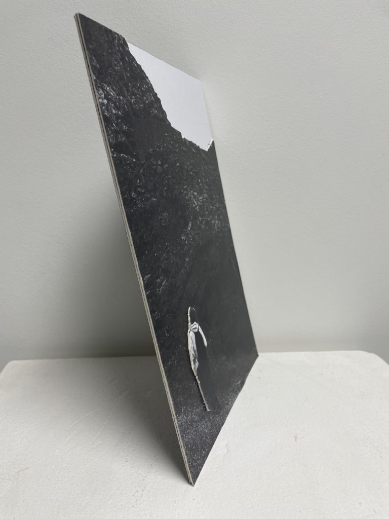
For my next piece I decided to experiment with layering pieces of the image over itself to create a sense of depth. I chose this image because I though it would be easy to split into these layers.
These images show how I cut out layers for my sculpture, the edges are messier than I would have liked and the colours are still slightly off because of the printer. I liked this style more than my last one so decided to do some more pieces with the same technique.

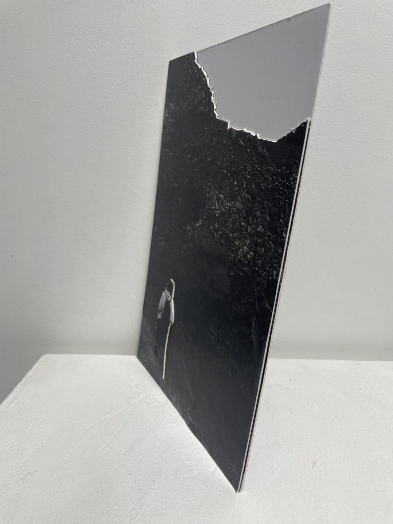
Using the image above I decided to make another layered photosculpture, this time only focusing on cutting out a single element and using the card used for window mounts instead of foam board. The edges are still a bit messy and I continued to have issues with the printer but I still wanted to explore this idea further.
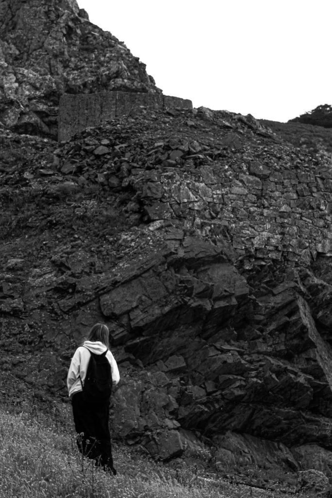
I then chose to use this image because it had pretty simple layers that could be cut, the figure in the foreground, the rocks, and the sky.
This one turned out a lot better than some of the earlier ones, with simple layers and cleaner cuts, using the 3D element to stand out from its 2D counterpart. These cleaner style is possibly due to my decision to use card which I have found is easier to cut through.
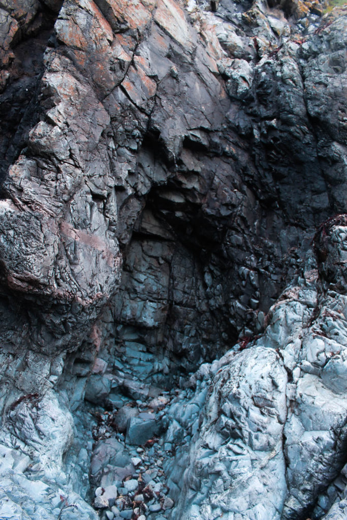
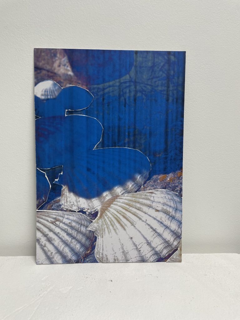
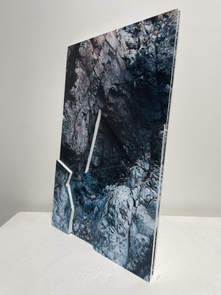
This was my last photo sculpture so I decided to be a bit more experimental, starting off by cutting out the usual layers but since the original image was quite detailed I was struggling to cut it out through the foam board. Instead of continuing with the style used earlier I decided to cut out a triangle in one of the layers to make it more visually interesting, as it creates a strange sense of depth.
If I were to do this project again I would try to plan out my ideas a bit more and work on making my pieces neater.


