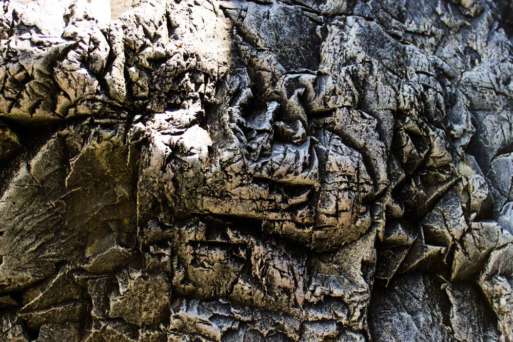
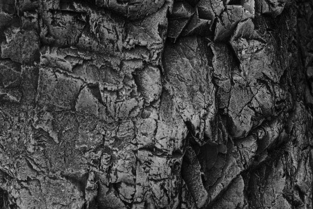
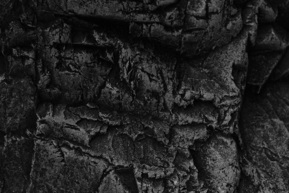
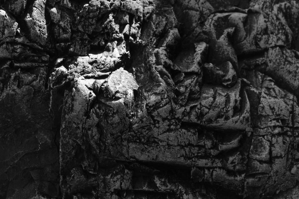
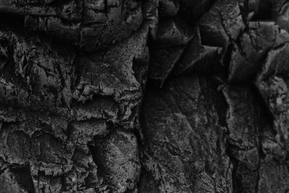
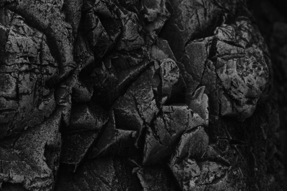
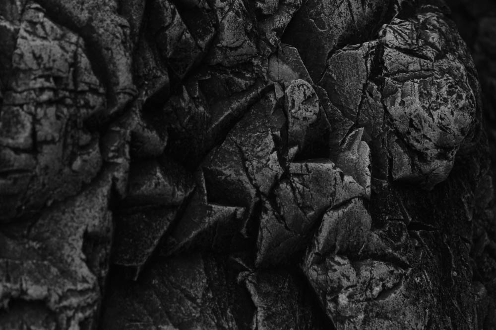
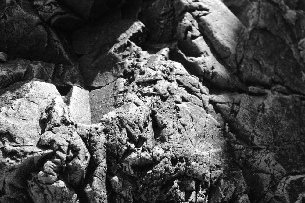
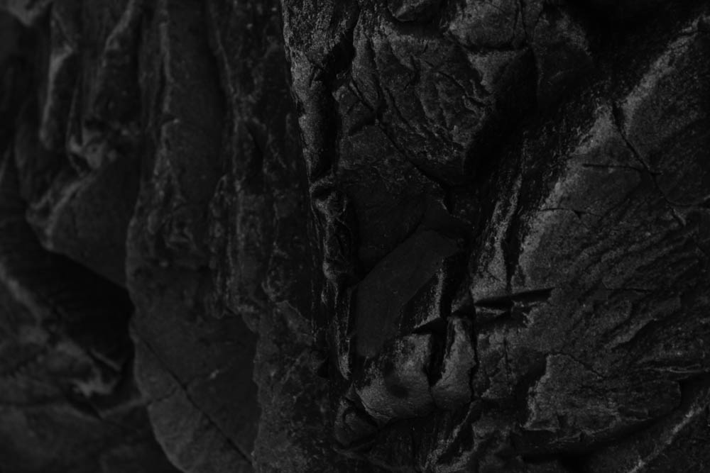
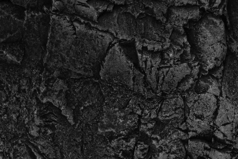
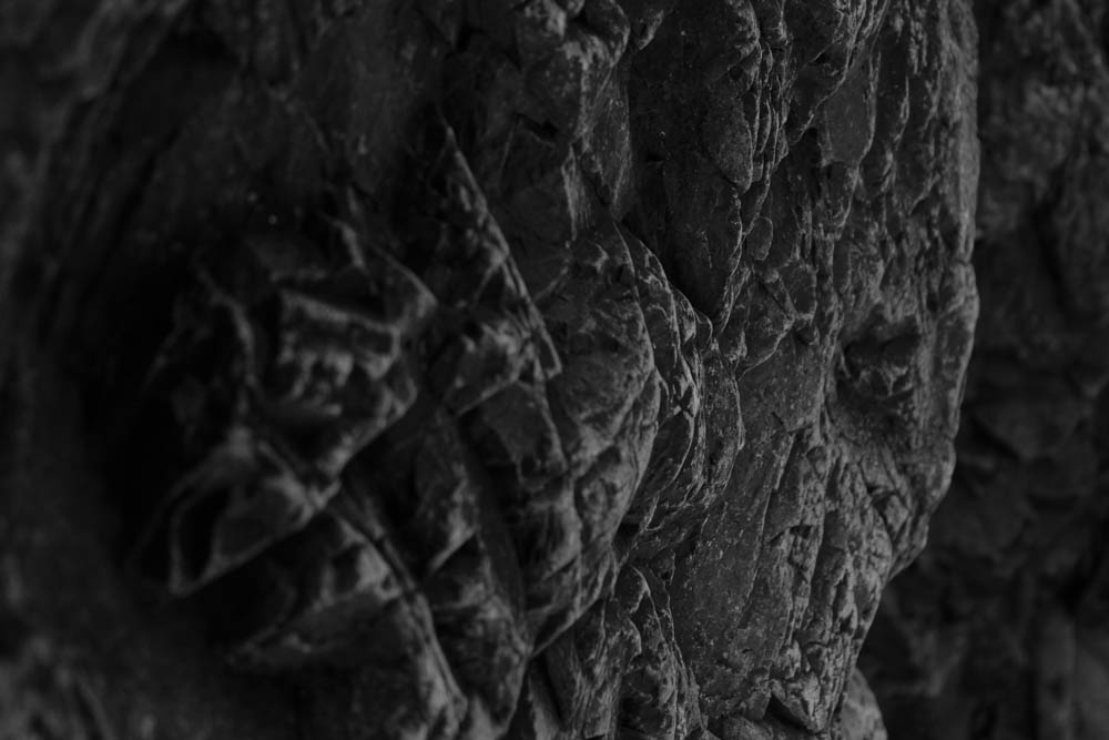
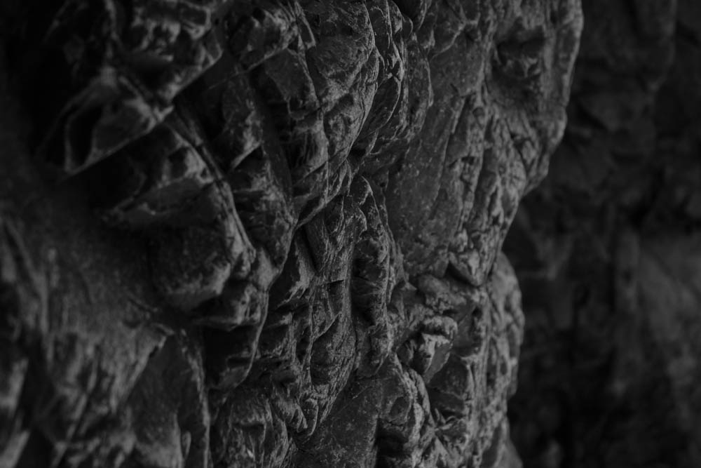
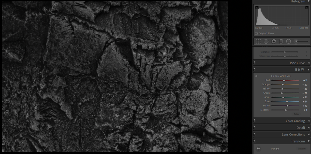
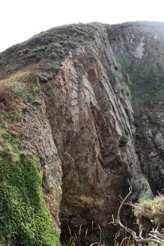
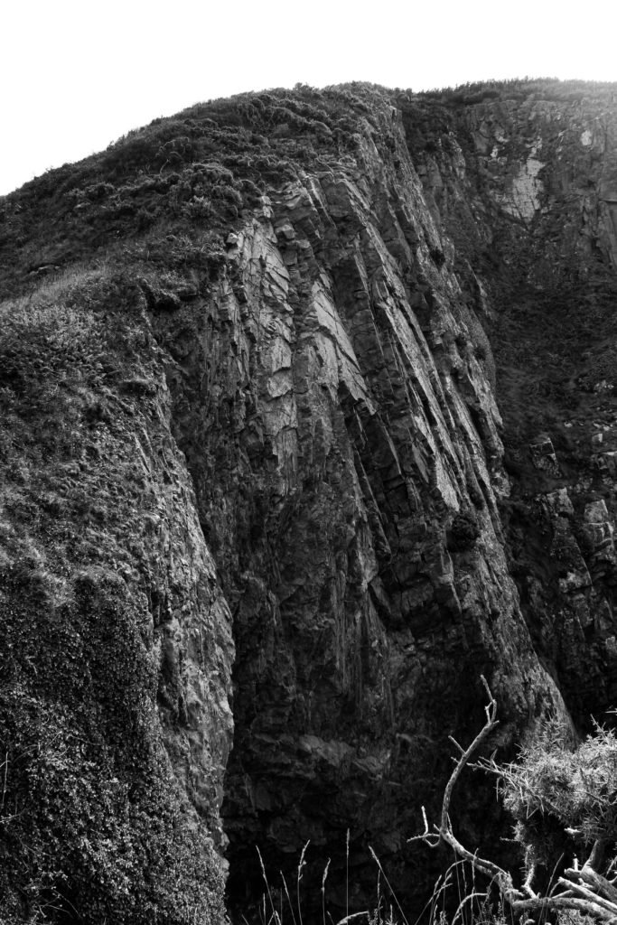
I played around with the black and white setting as it adjusts colours rather than the whole image.
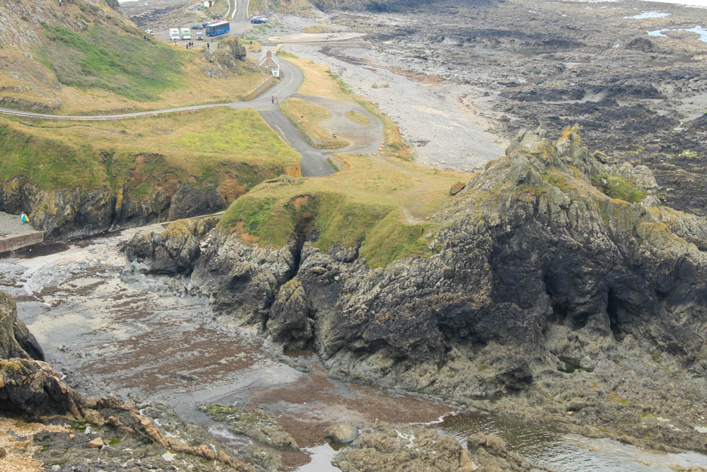
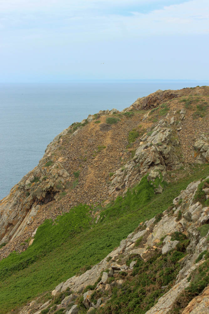
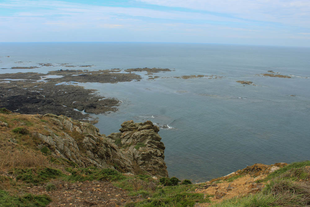
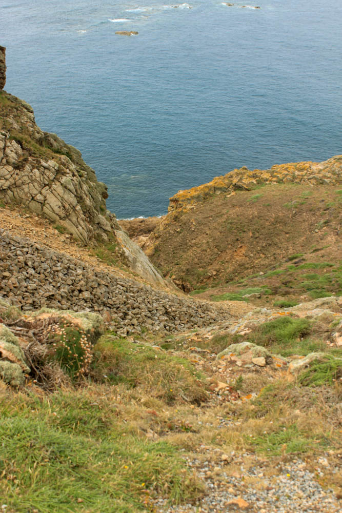
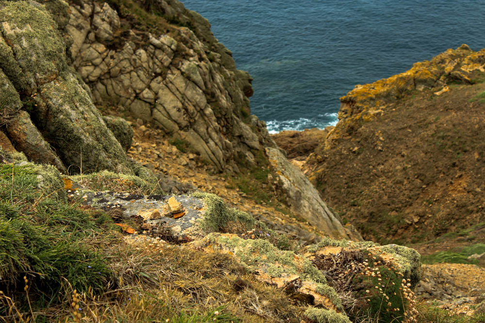
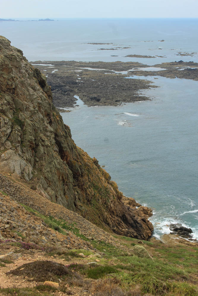
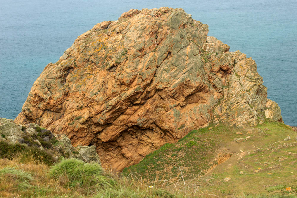
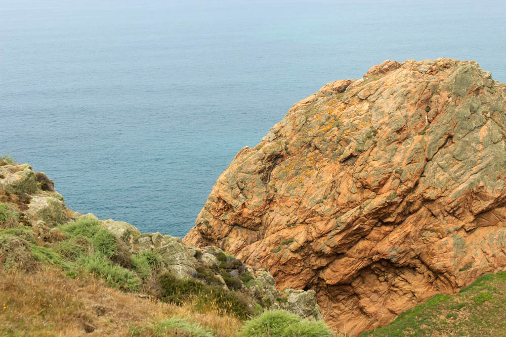
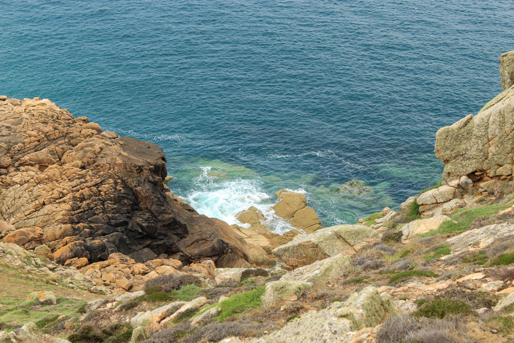
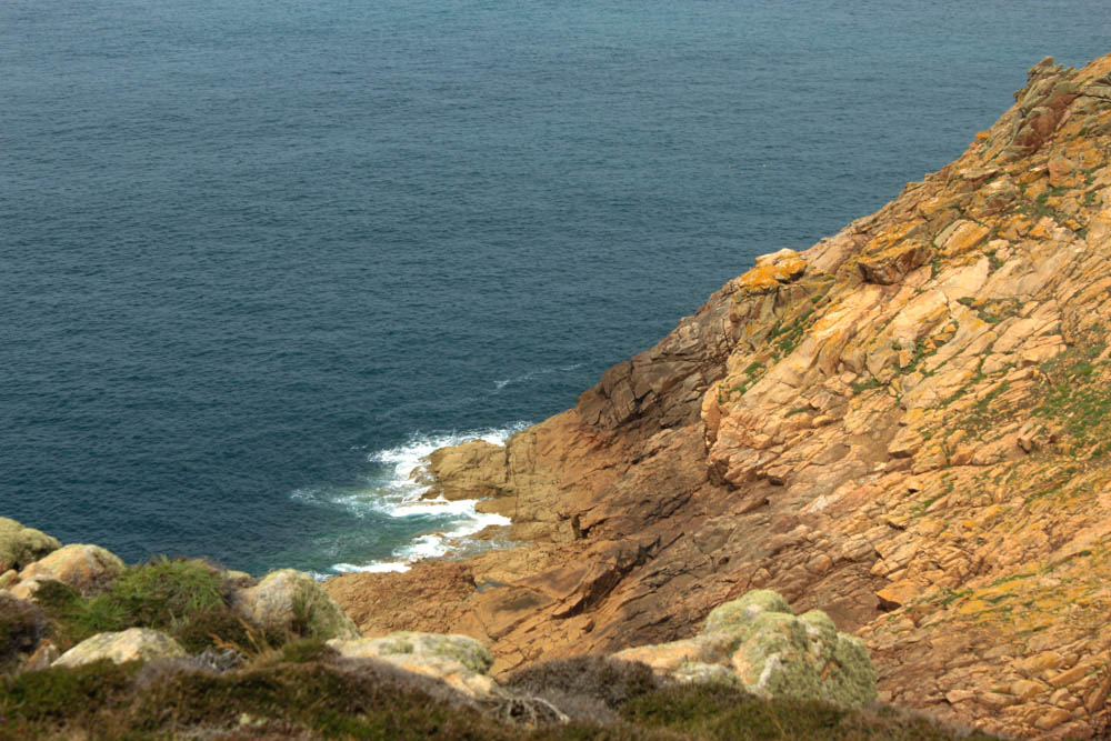
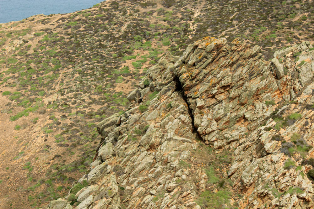
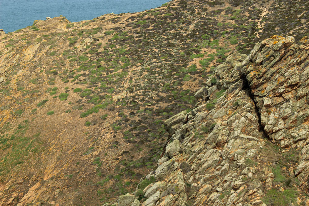
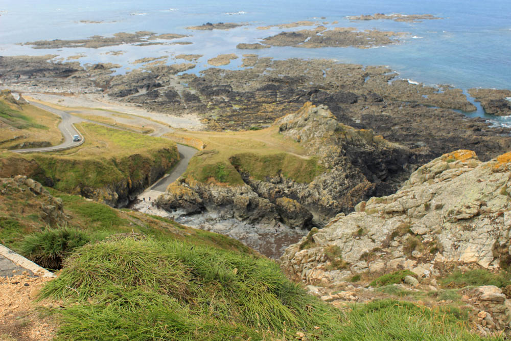
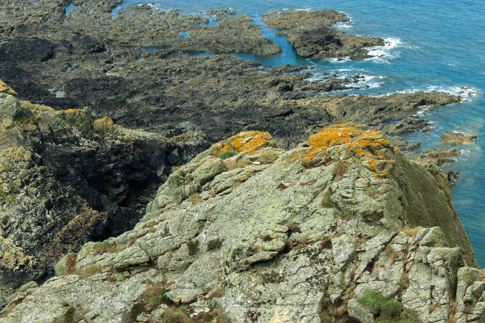
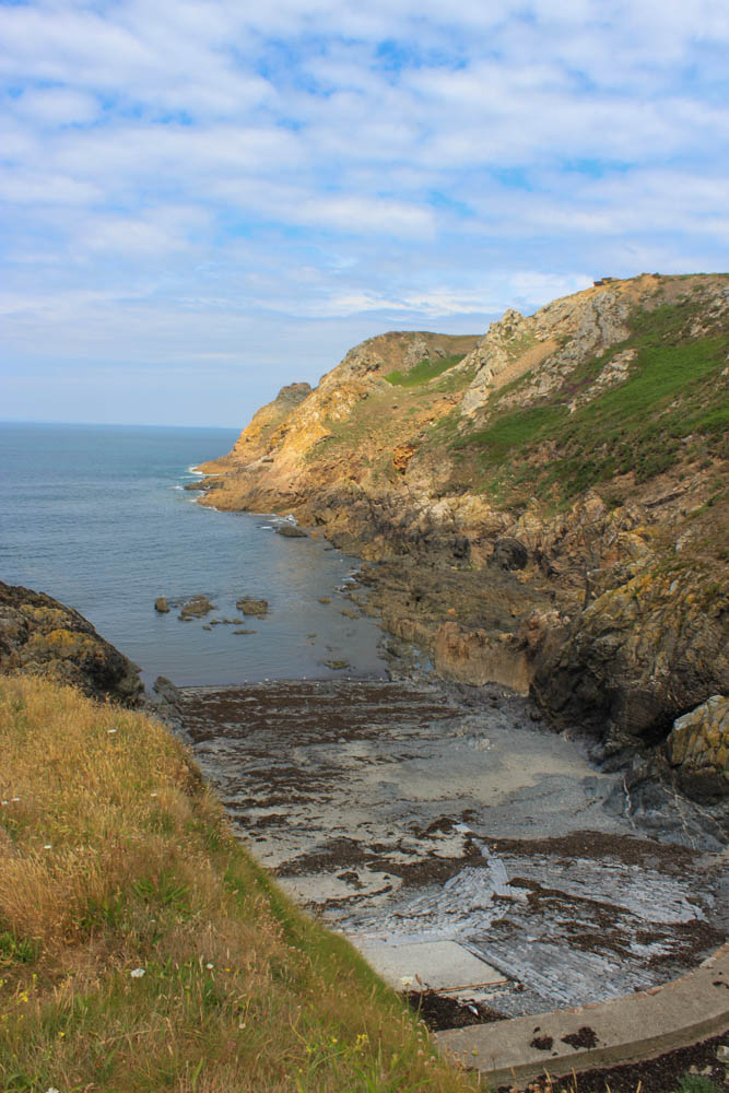
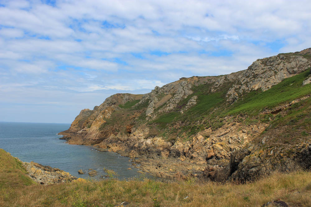
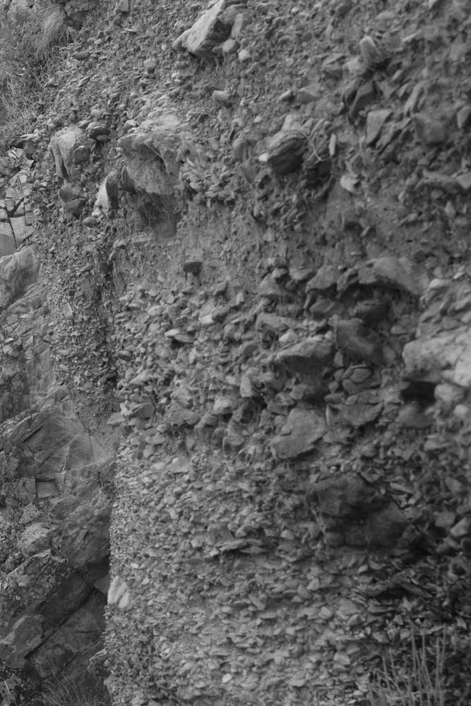
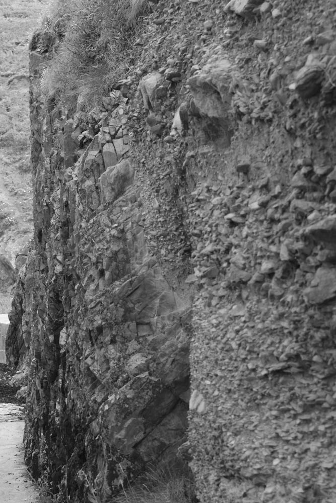
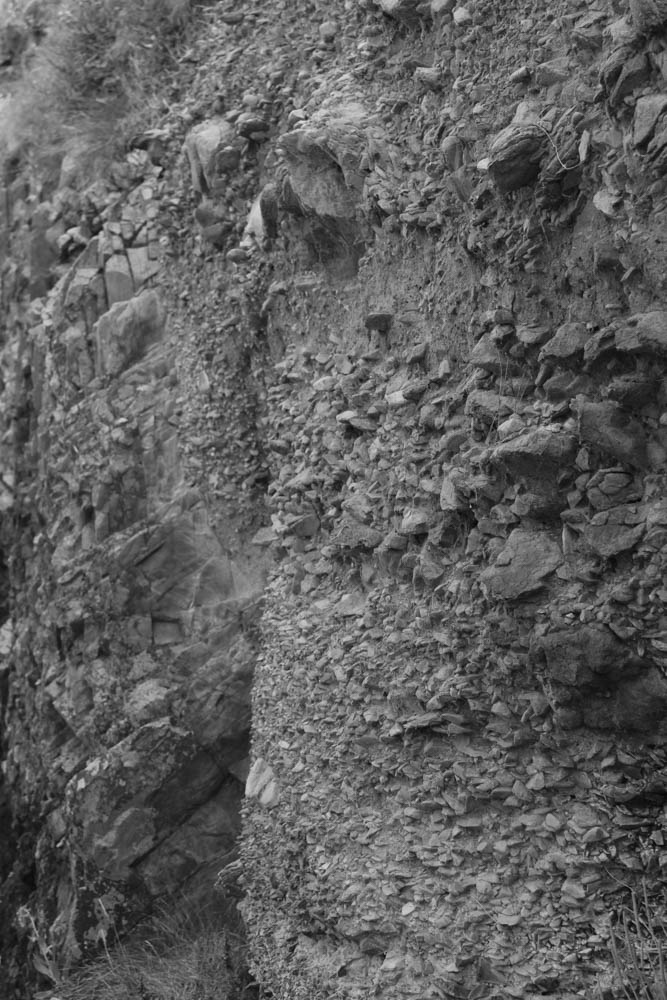
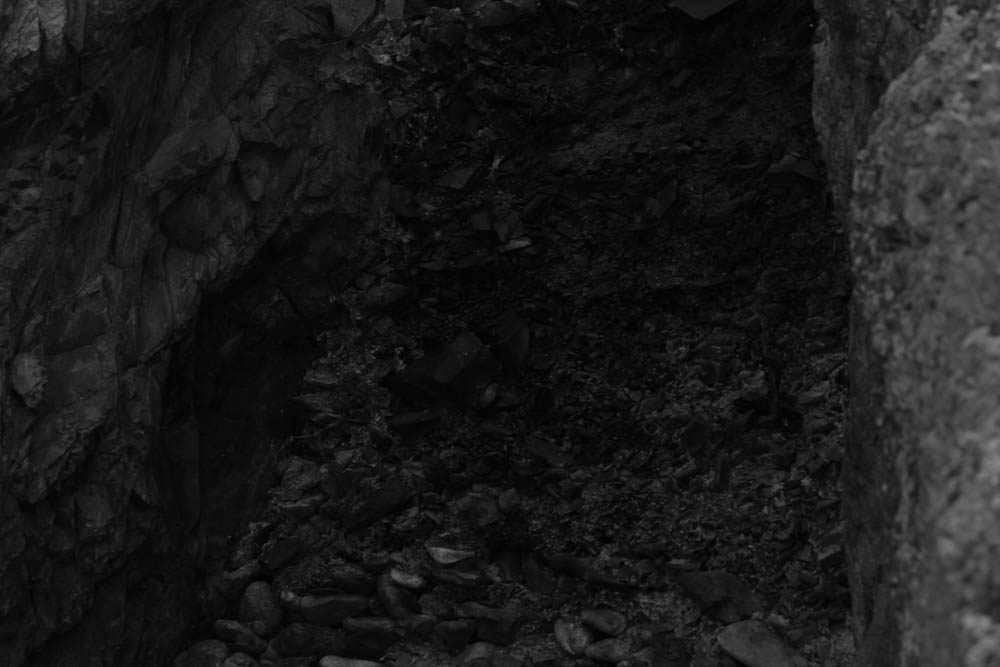
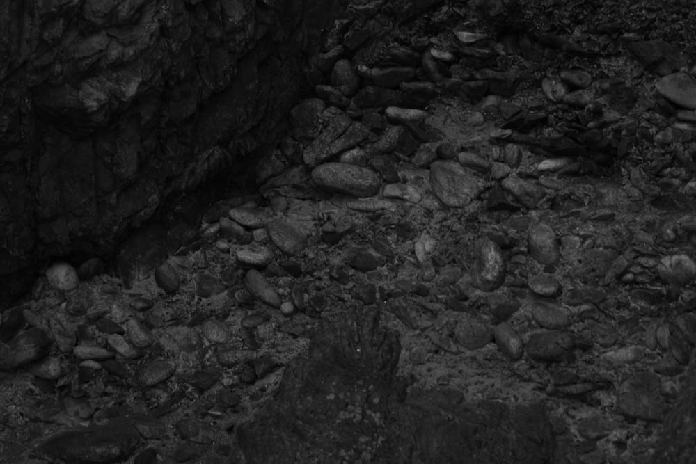
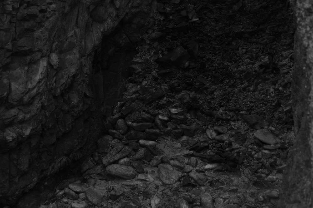
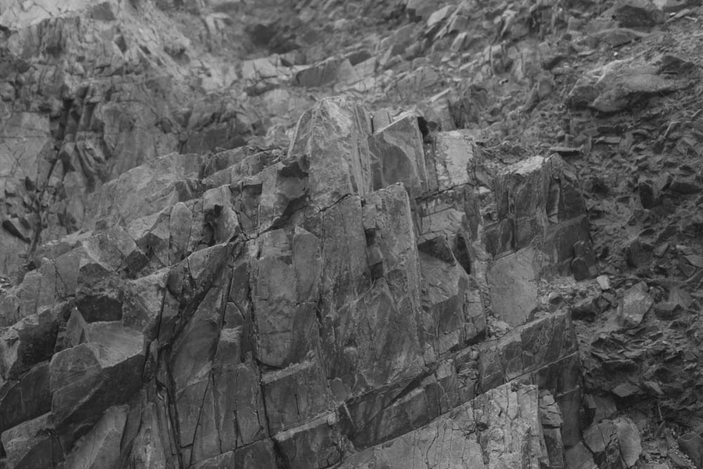
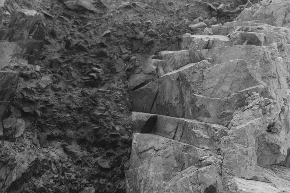
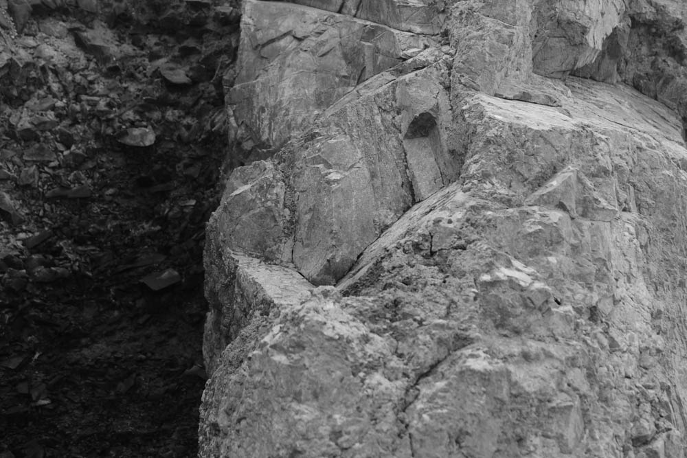
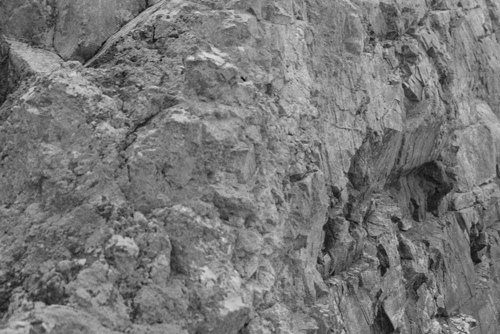
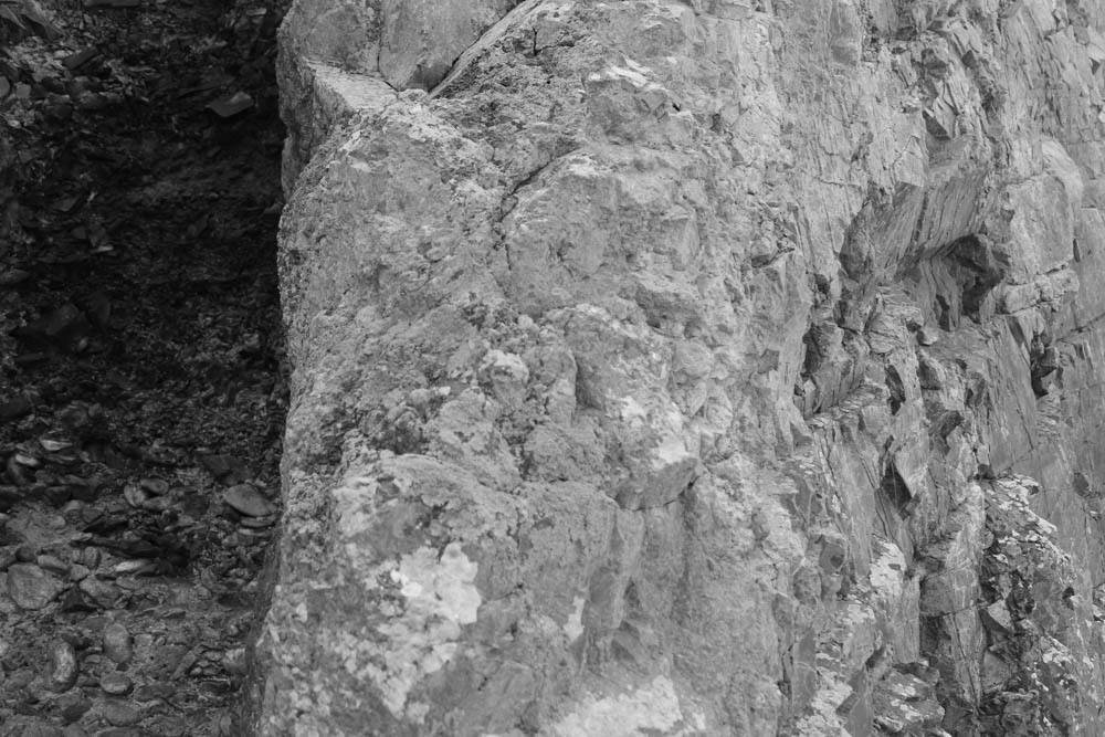
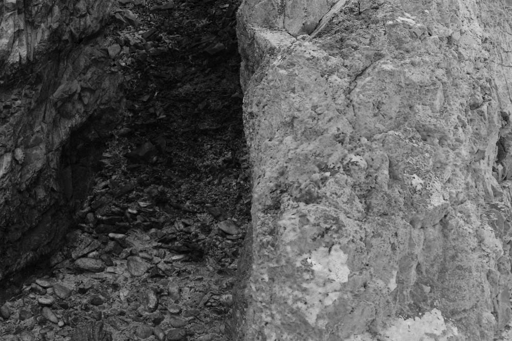
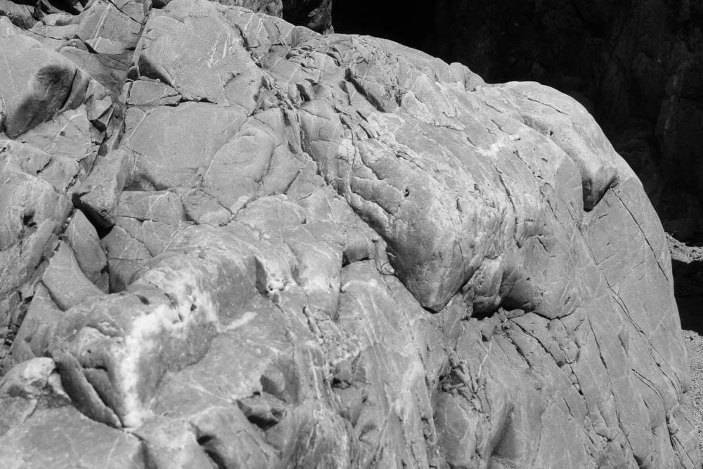
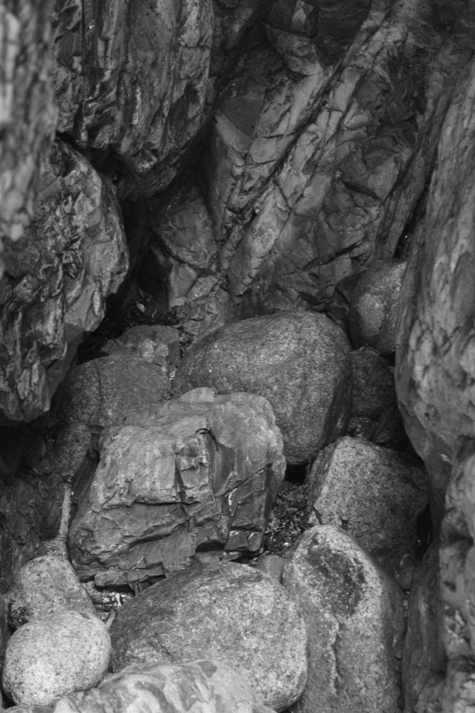
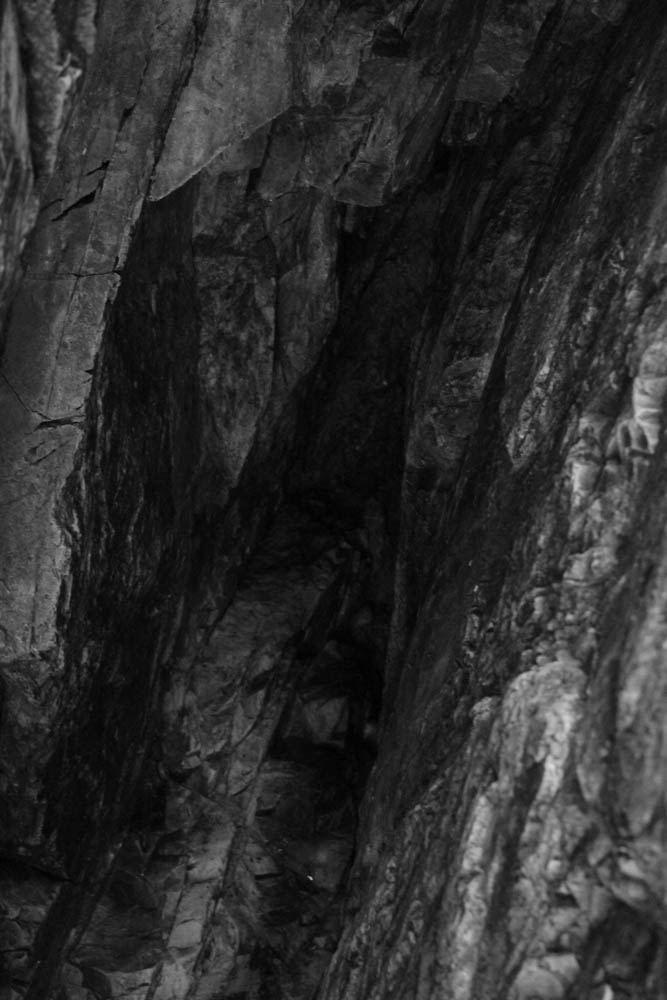
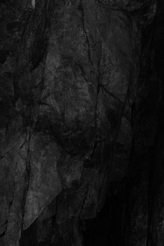
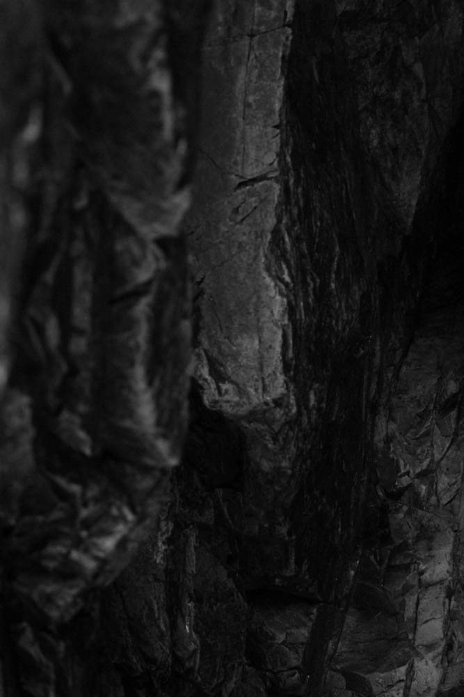
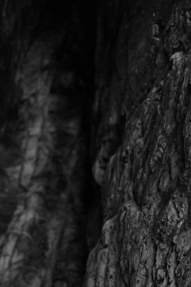
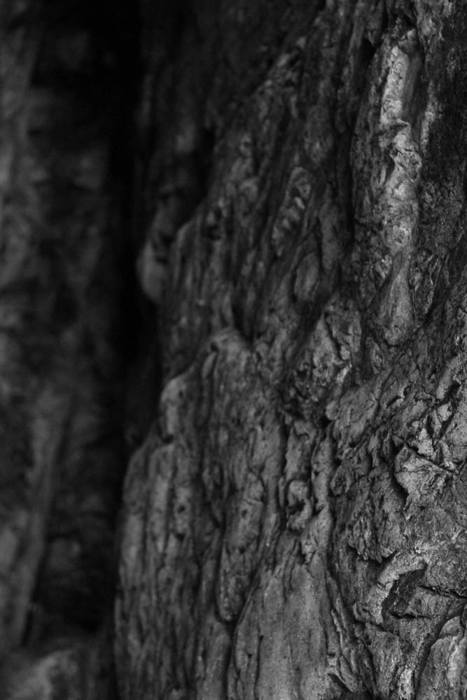
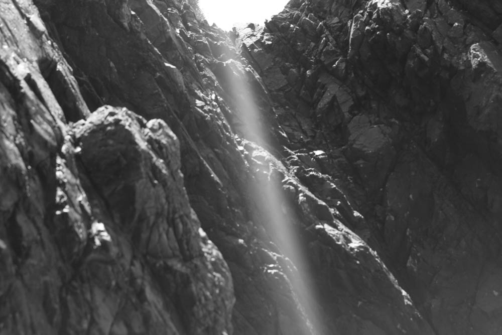
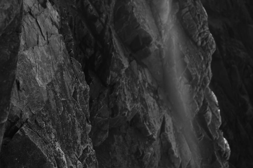
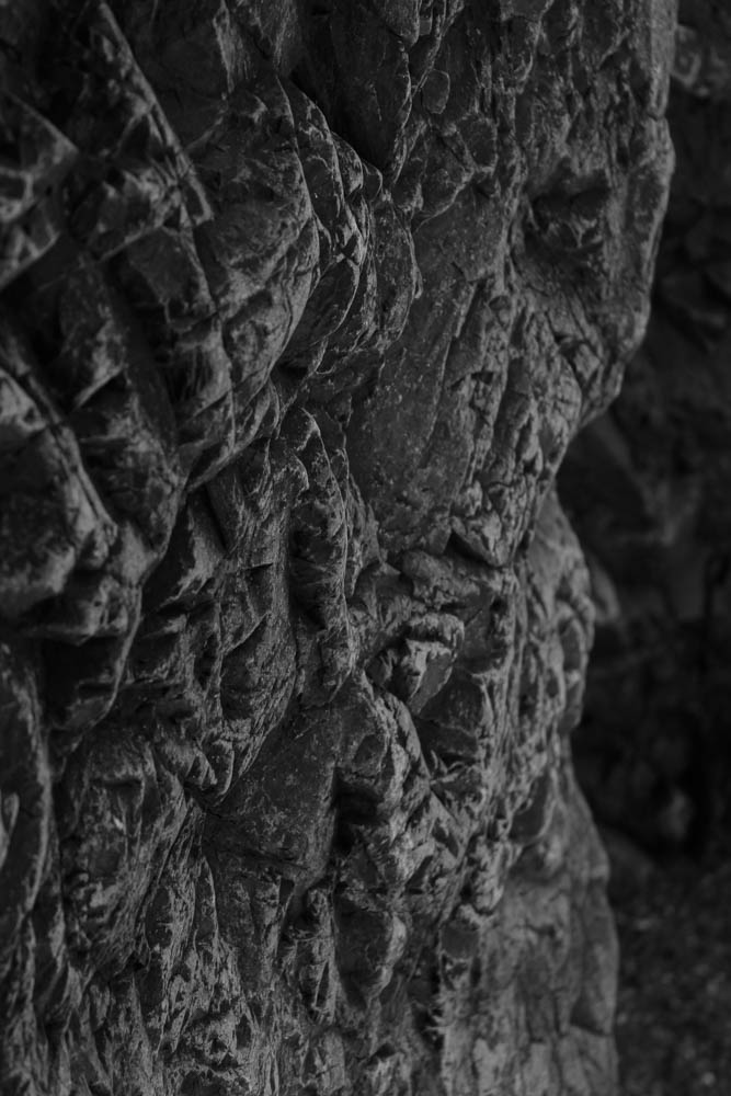
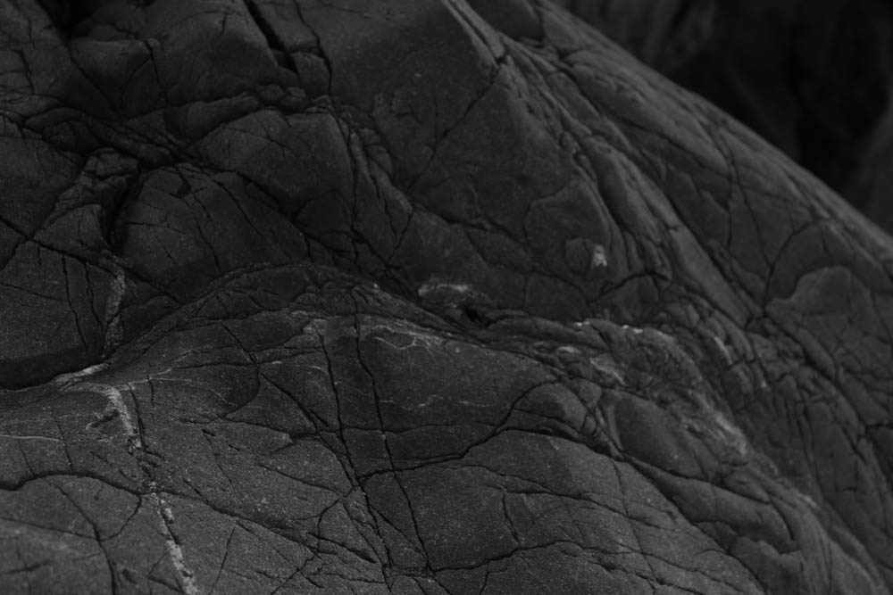


I played around with the black and white setting as it adjusts colours rather than the whole image.


What is a Geopark?
A Geopark is a designated area of land containing one or more sites of geological importance. This is an area in which we are trying to conserve the geological heritage and promote awareness, which is common through tourism.
A Unesco Global Geopark is are geographical area sites and landscapes of international geological significance which are managed with a holistic concept of protection, education and sustainable development.
These features are representative of a region’s geological history and the events and processes that formed it. It must also include important natural, historic, cultural tangible and intangible heritage sites.
Geoparks in Jersey
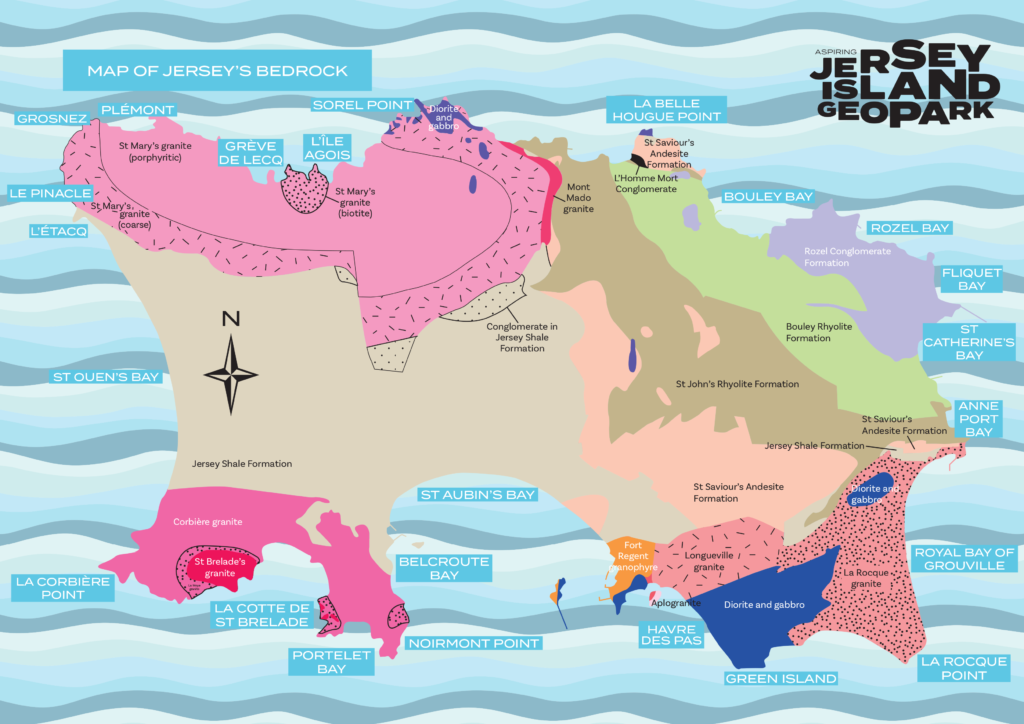
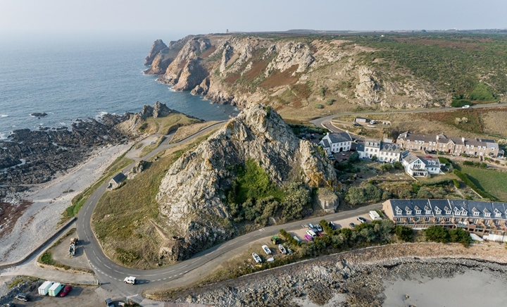

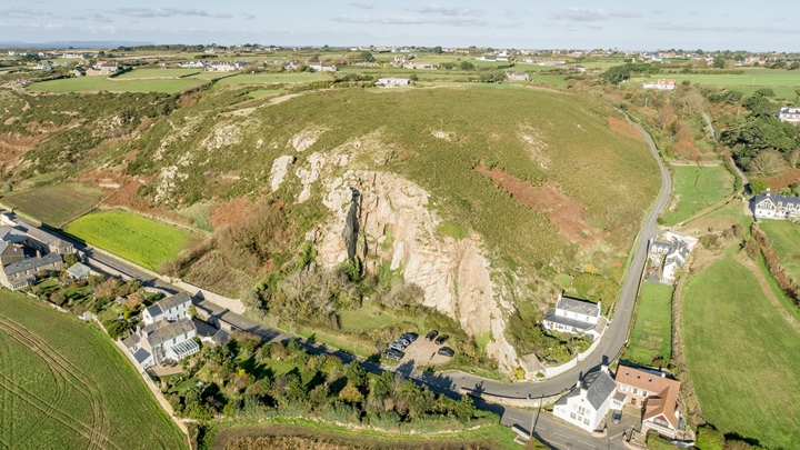
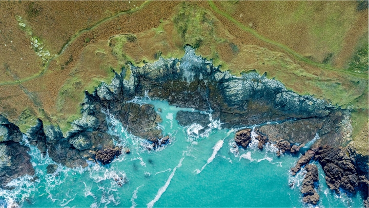


https://societe-jersiaise.org/uploads/documents/inline/pdf/jersey-geopark-2.pdf
David Hockney (born 9 July 1937) is an English painter, draftsman, printmaker, stage designer, and photographer. As an important contributor to the pop art movement of the 1960s, he is considered one of the most influential British artists of the 20th century. In the early 1980s, Hockney started to produce photocollages, which he called “joiners,” starting off with polaroid prints and later of 35mm, processed color prints. Using a large number of Polaroid prints or photolab-prints of a single subject Hockney arranged a patchwork to make a composite image. One of his first photomontages was of his mother. the images are taken from different perspectives and with slightly different lighting resulting in an effect similar to Cubism.

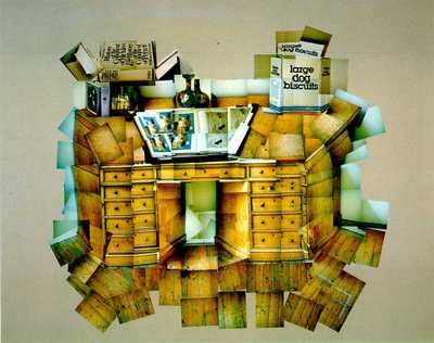

David Hockney’s creation of the “joiners” occurred accidentally. He noticed in the late sixties that photographers were using cameras with wide-angle lenses to take pictures. He did not like such photographs because they always came out somewhat distorted. Working on a painting of a living room and terrace in Los Angeles, he took Polaroid shots of the living room and glued them together as a preparatory work, not intending for them to be a composition on their own. He realised this picture created a kind of story, as if the viewer was moving through the room. He began to work more and more with photography after this discovery and even stopped painting for a period of time. Hockney had always been interested in Cubism and the idea of multiple perspectives and viewpoints so this was another way for him to explore this way of looking.
Space is an illusion, as the photograph itself is only a representation of the ‘real’ thing. Secondly, the collage can expand space by assembling many individual images together into a wider view.
Viewpoints The construction of a collage includes many images, each with their of point of view. Therefore, by definition a ‘joiner’ is a collage with multiple viewpoints.
One of David Hockneys pieces of work consists 30 polaroid pictures which are put together similarly to a collage. His methods take into account for a bigger illusion of space in comparison to a single image and time is extended beyond a fraction of a second due to this many viewpoints are accounted for in each image.
Time is captured in a much broader scale.
By manipulating time from a fraction of a second in one image when taking multiple images in portraiture he was able to express emotions throughout time.
Hockneys work leads us to the discussion of photographs which are of course real but that they are also an illusion.
“Photographs don’t have life”












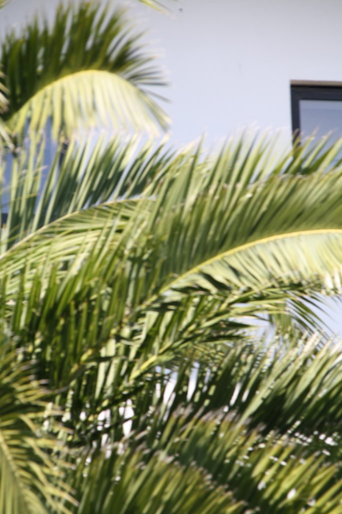
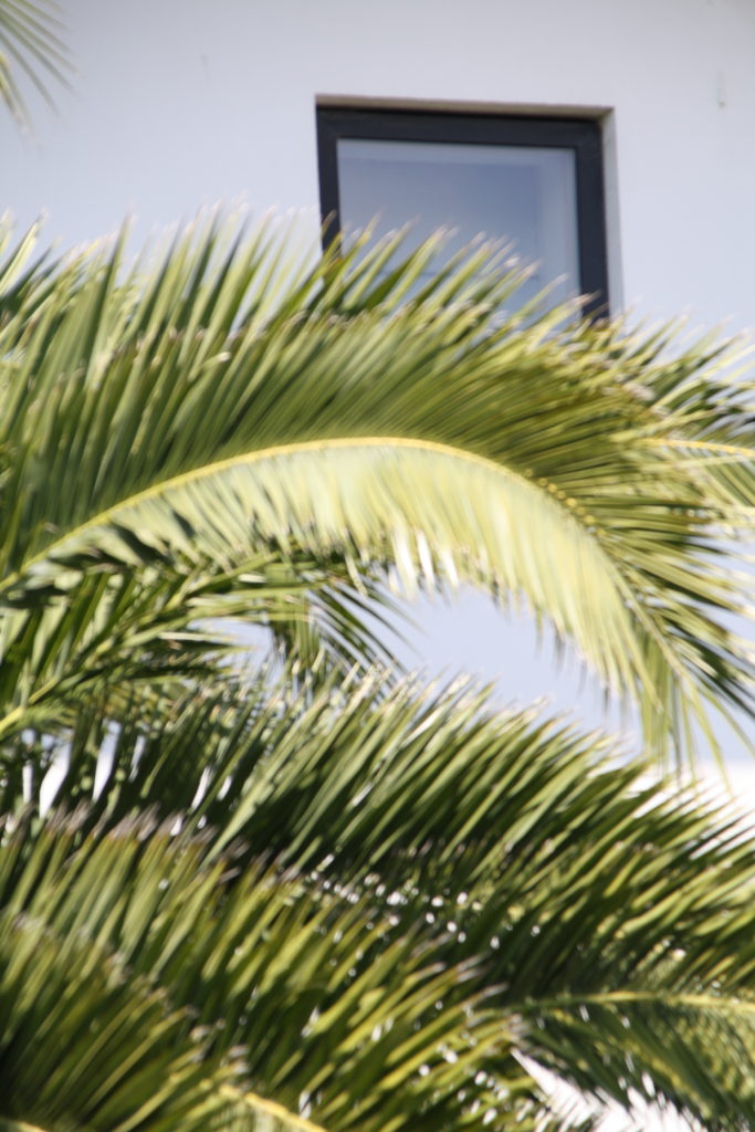

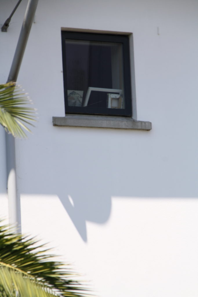


Over the summer, I decided to revisit the location of L’Etacq as I was hoping to get a wider selection of images to edit for my final images. I had quite a good range already from the first photoshoot at L’Etacq, but I thought it might be a good idea to just revisit the area as it’s always good to have more options.
—- L’Etacq —-
Contact Sheets:
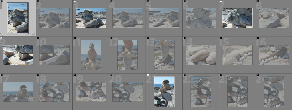
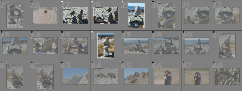



Colour coded and star rated:
Green:

Yellow:


Red:


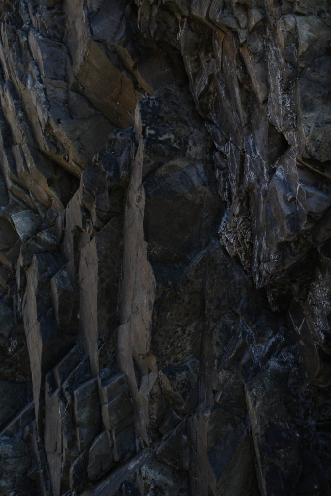
Best Images:
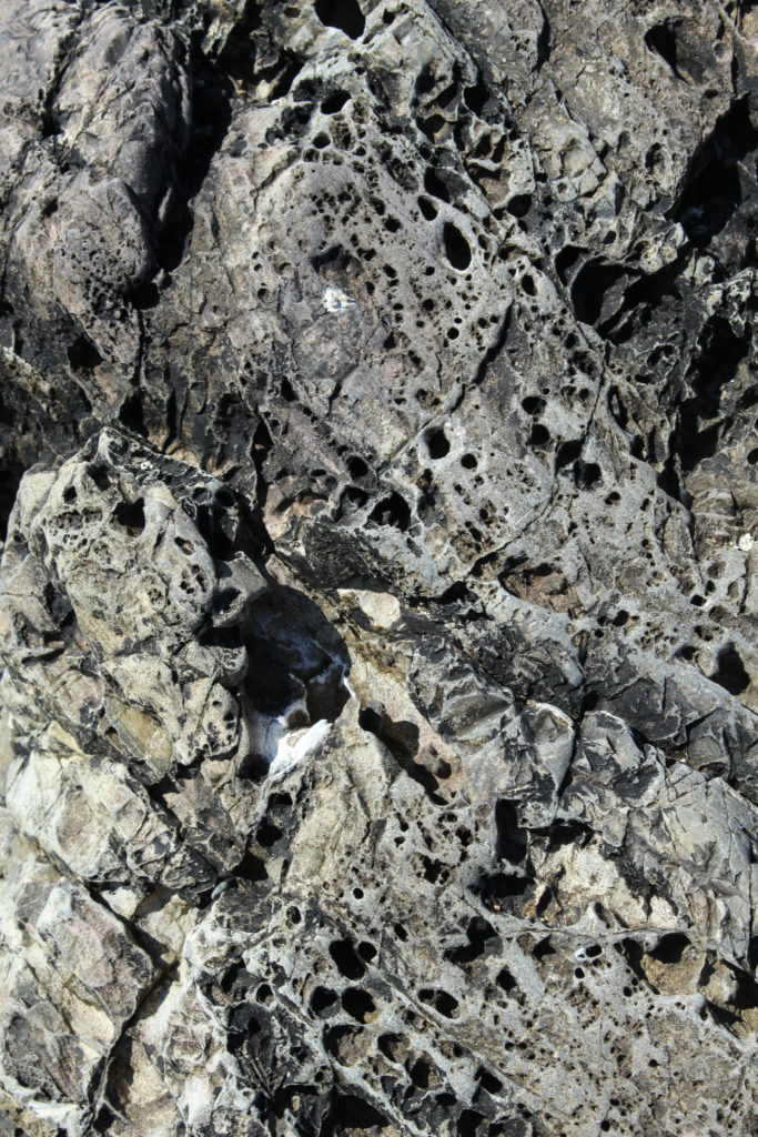
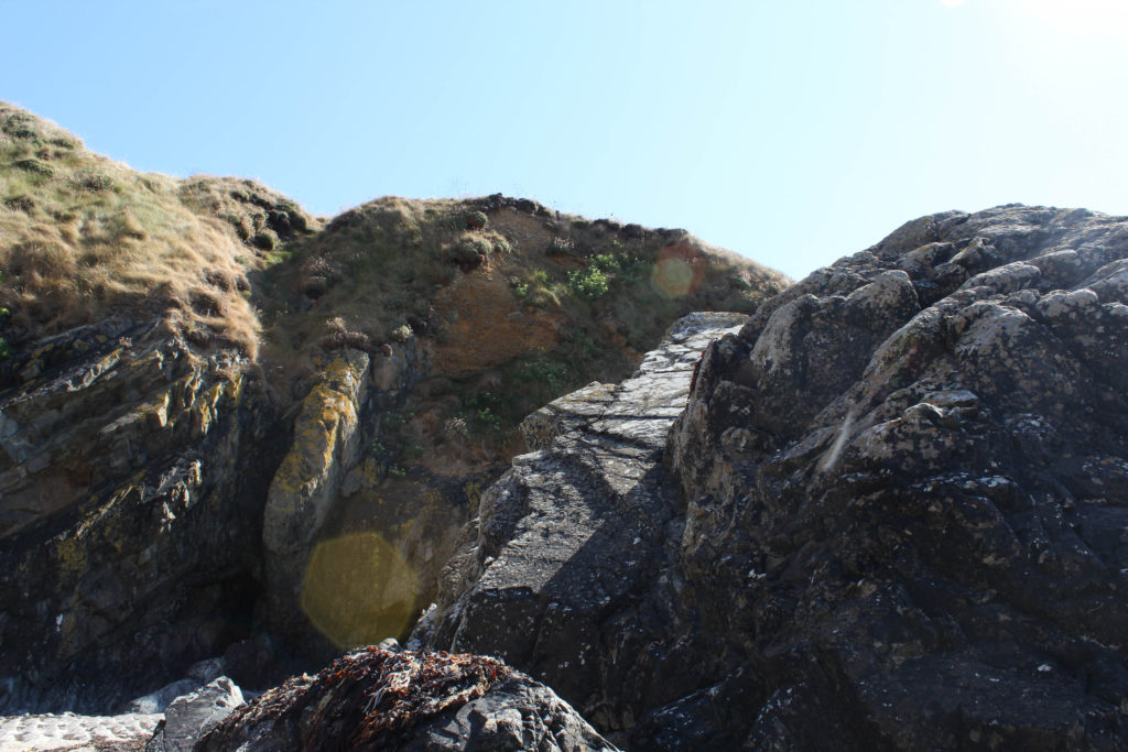

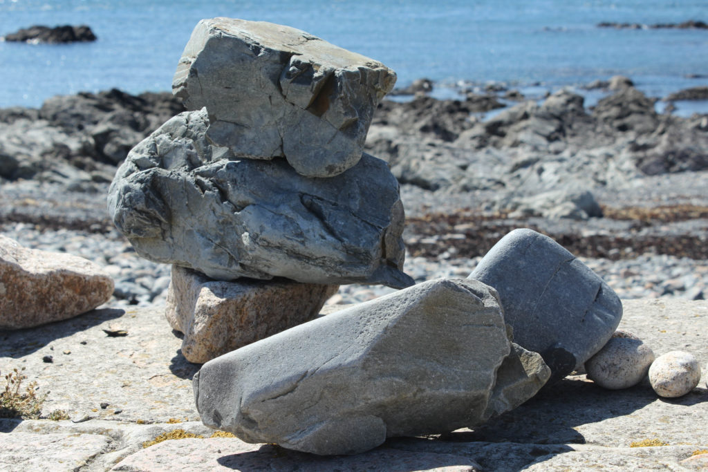

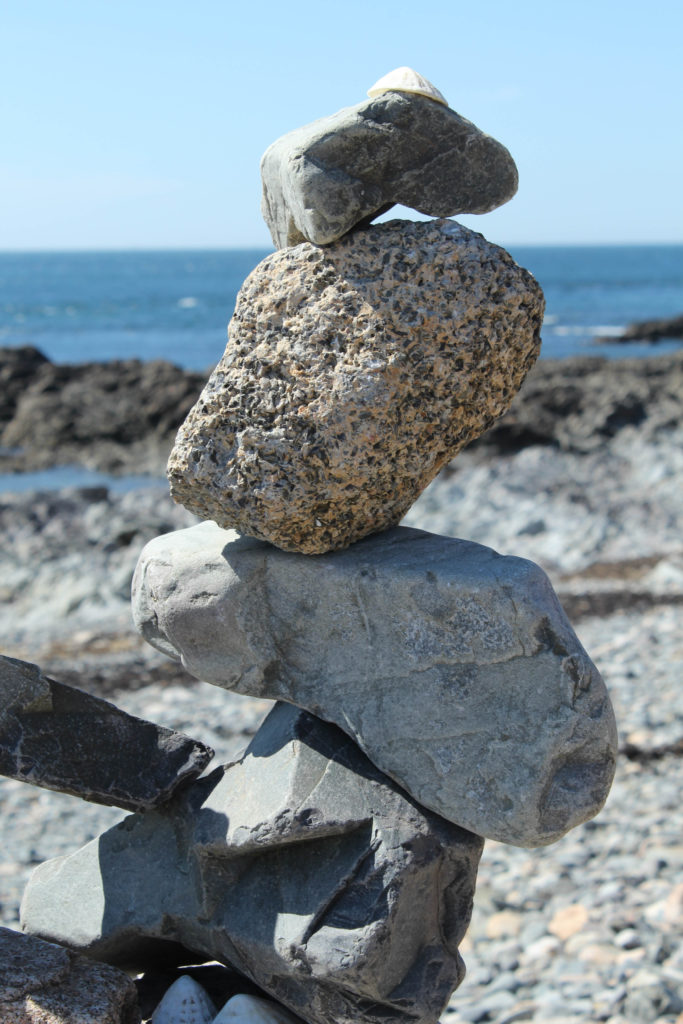
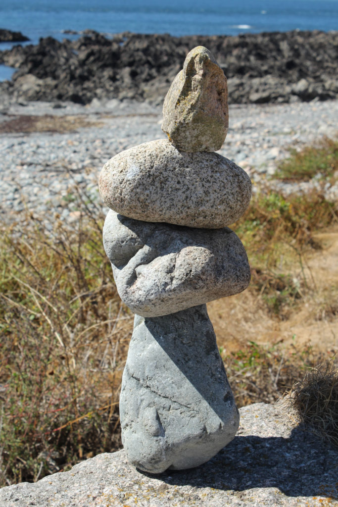

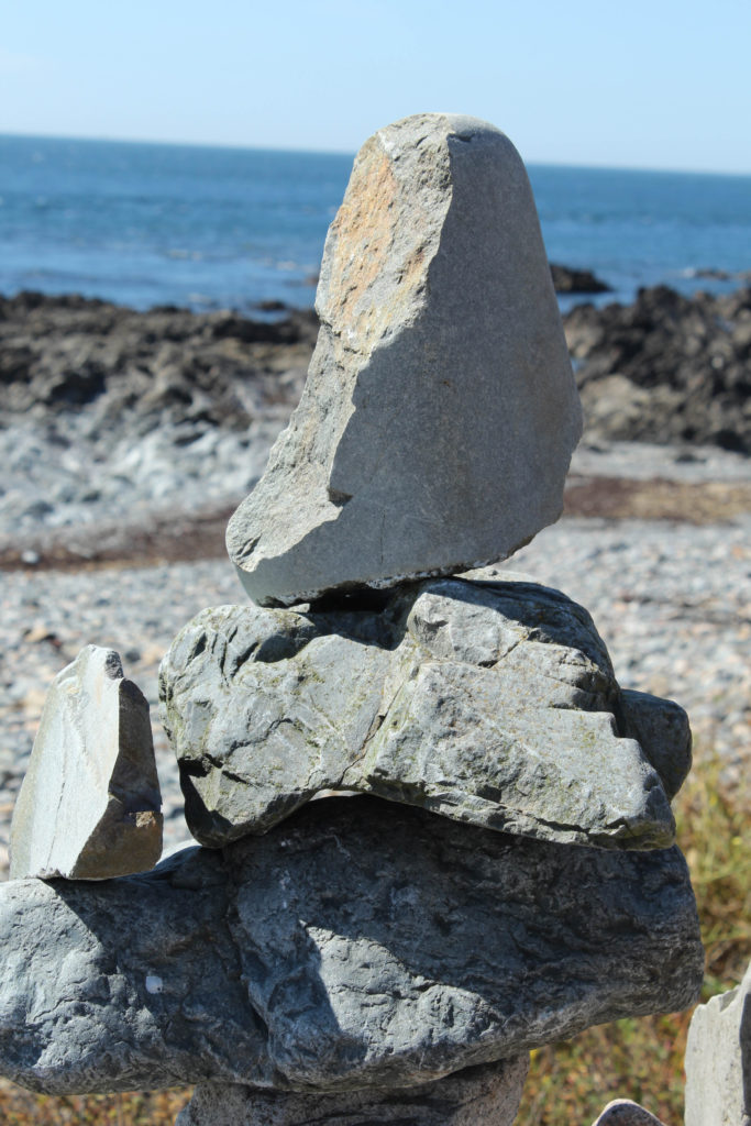
—- Devil’s Hole —-
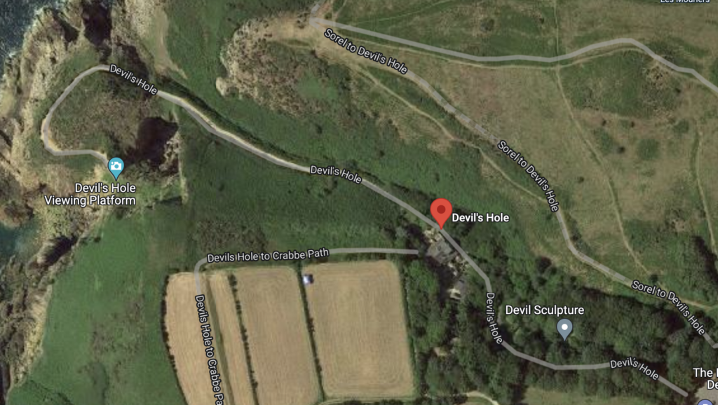
I decided to visit Devil’s Hole for another photoshoot during the summer as I believed that the rock formations along the walkway, down towards the sea are especially impressive. I started at the car park, just before where the Devil sculpture is, and proceeded down that pathway towards the ‘Devil’s Hole Viewing Platform’. Around this area was a perfect example of Jersey’s magnificent rock formations and the overall amazing representation of the geological aspects of the island.
I ended up getting a good range of photos during the photoshoot and especially liked the images I took around the viewing platform as I was able to capture more full-scale and close-up images of the rocks.


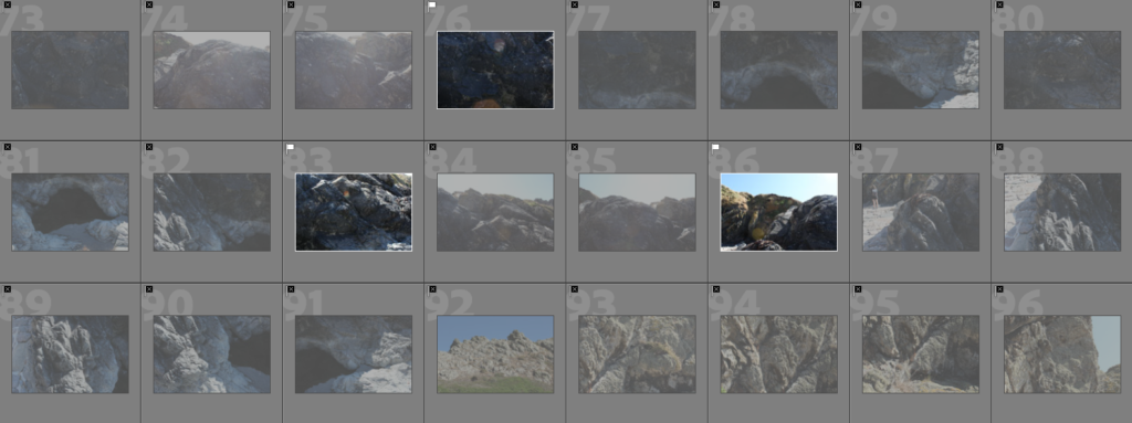
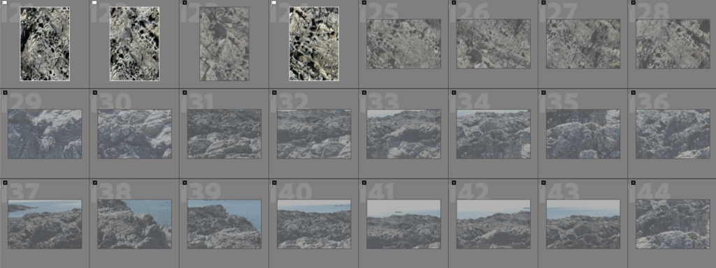
Contact Sheets:
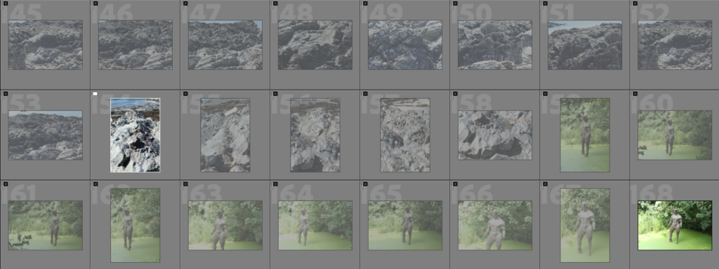
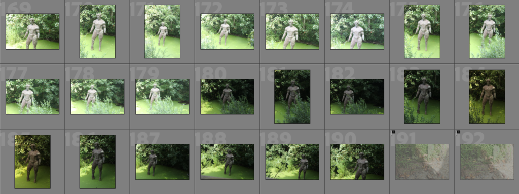
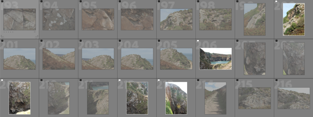
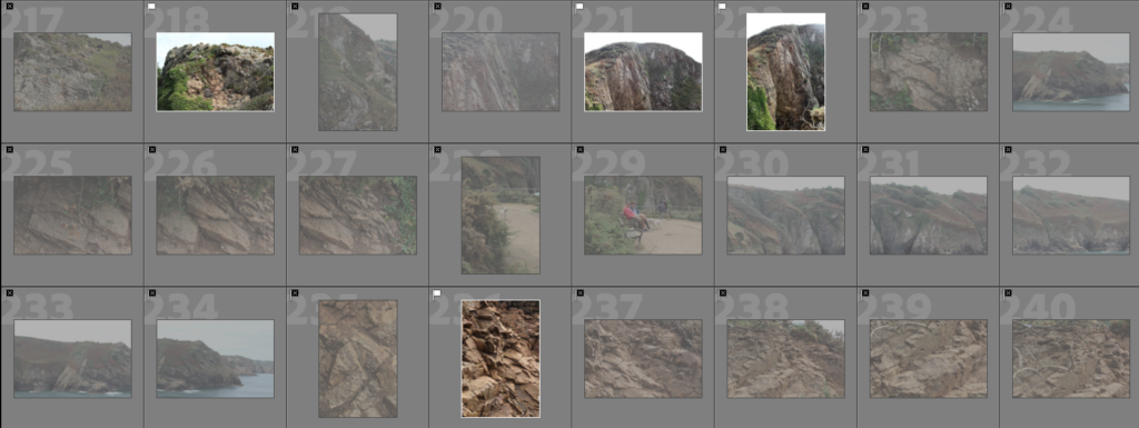
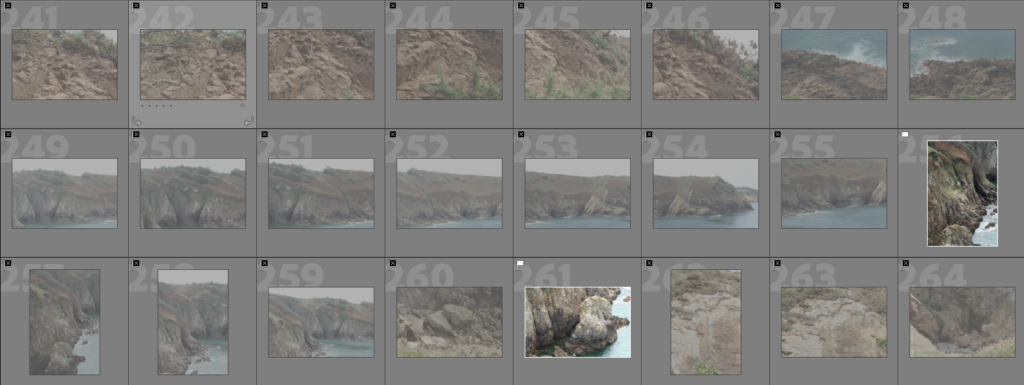
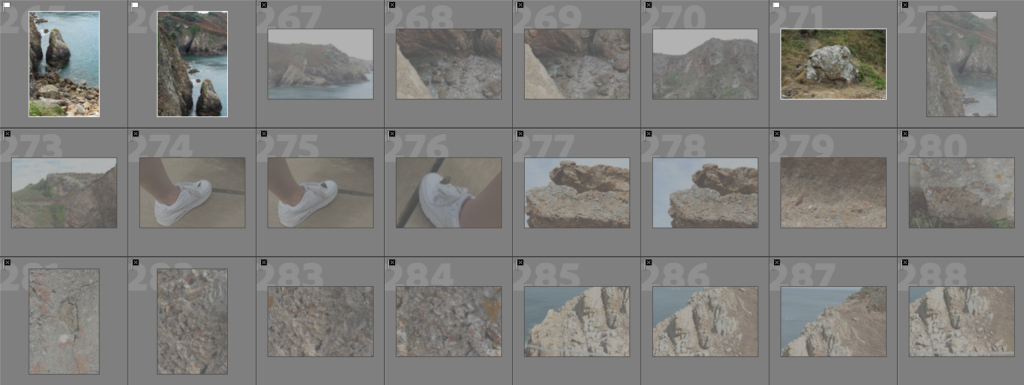


Colour coded and star rated:
Green:

Yellow:

Red:

Best images:

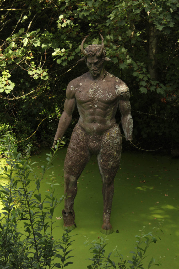



Final edited outcomes from both photoshoots



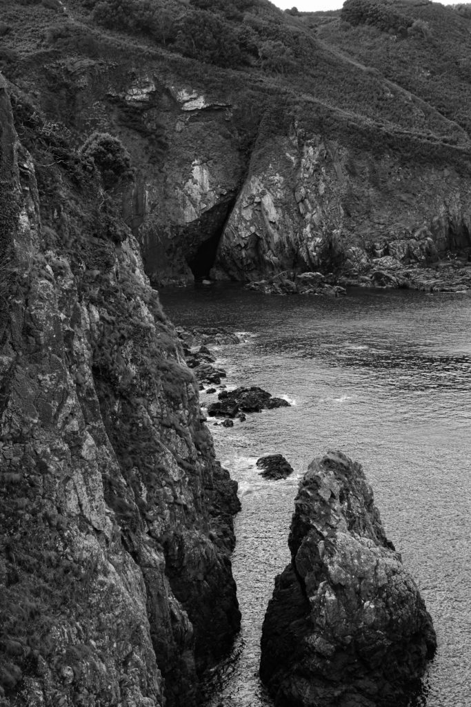
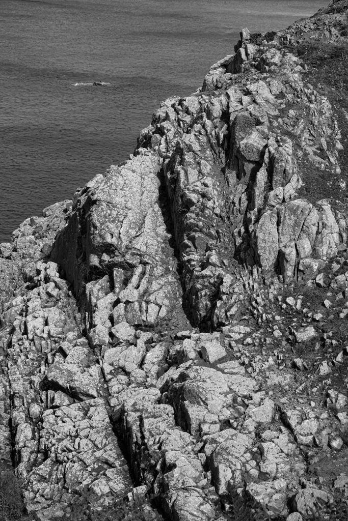


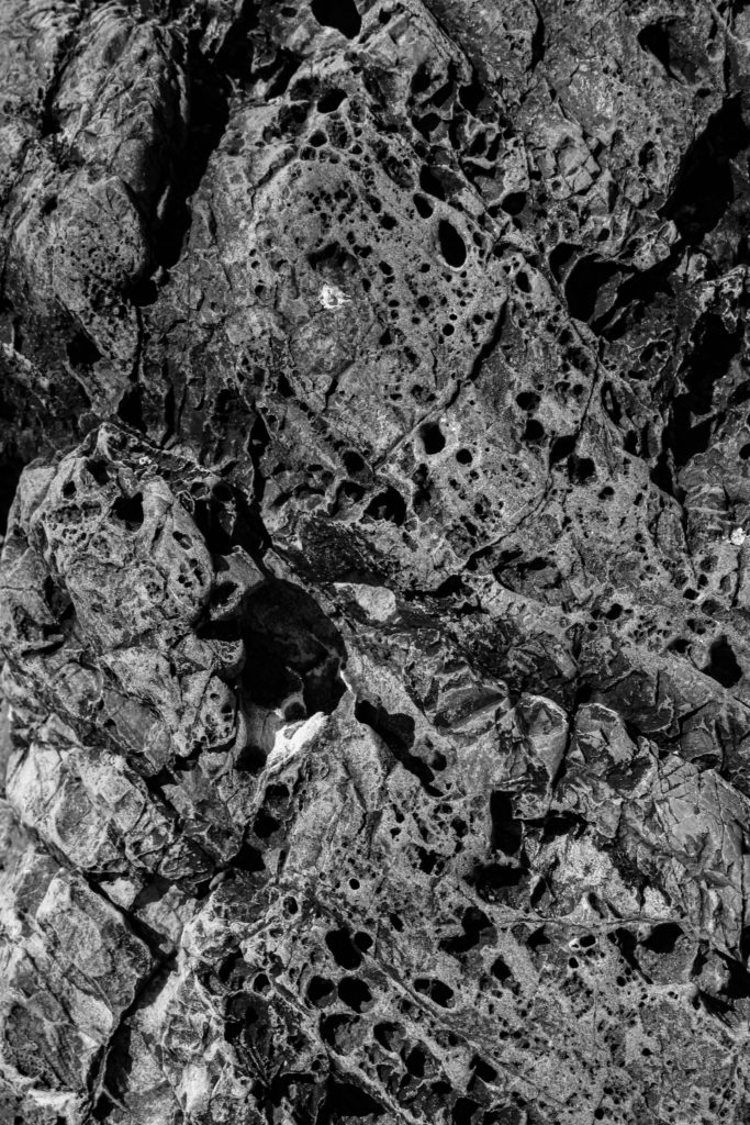
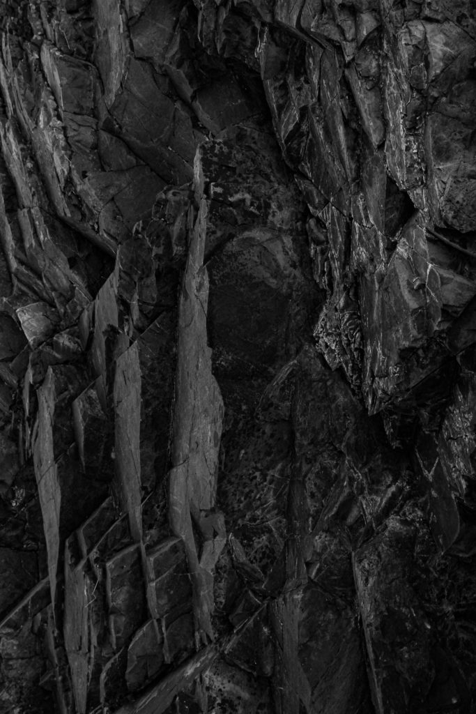

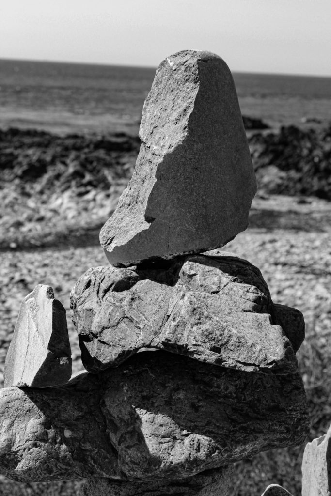

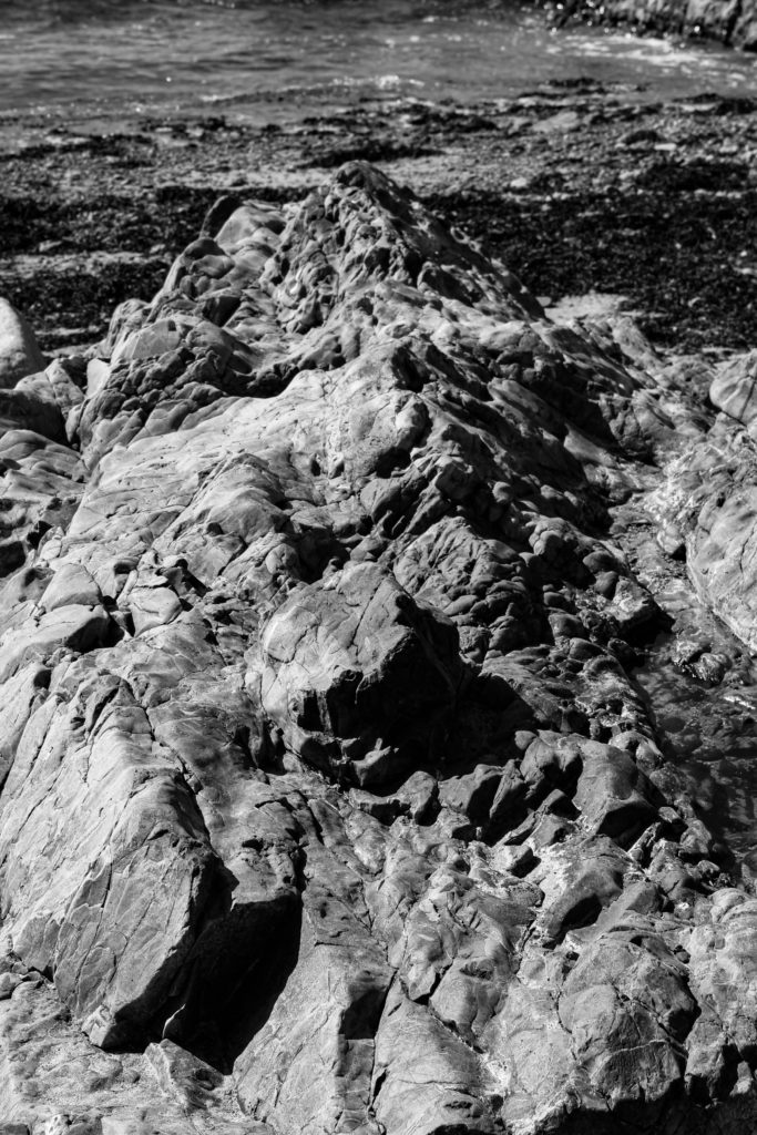
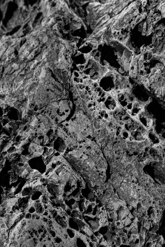
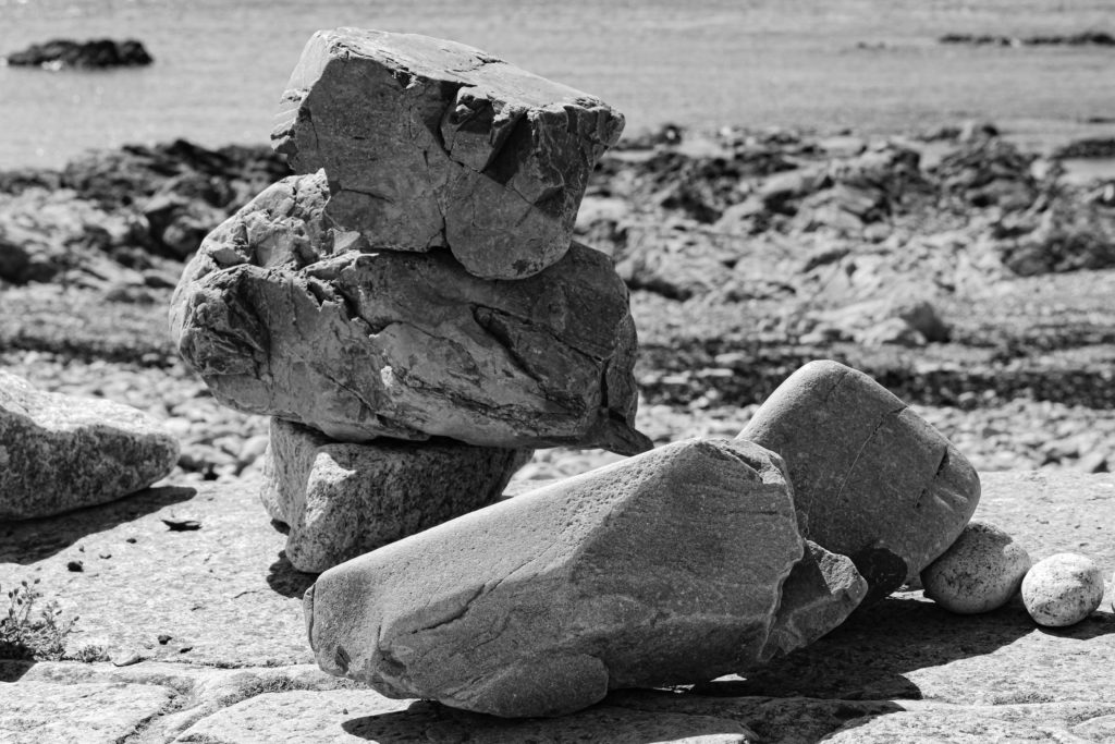

As a response to David Hockney’s work, I ended up making a physical joiner as well as the digital ones made within photoshop. In order to make these joiners, I ended up printing off sections of my digital joiner into small pieces and began to assemble them together on a piece of card. I started off by assembling them on a white card so that I could see my images composed together easier and get an understanding of what formation I believe would work best.
—- Experiments —-
I wanted to play around with the formation of the sections within the joiner, so I positioned them in slightly different ways and continued to take photos throughout each stage. I checked to see which organisation of images I preferred, to see if it looked better with less or more images or even just the way the overall joiner is shaped.


—- Process of making the joiner —-
Whilst making my joiner, I thought about experimenting with the idea of making it slightly 3D and not just a flat 2D joiner. I decided to choose three images that lay on the surface of the joiner and stuck them on top of pieces of foam board. I then cut them out and stuck them in their original positions on top of the 2D joiner.
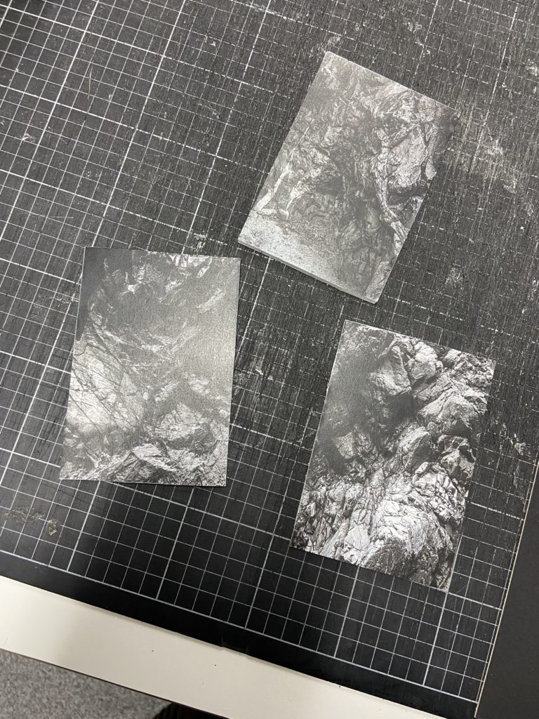
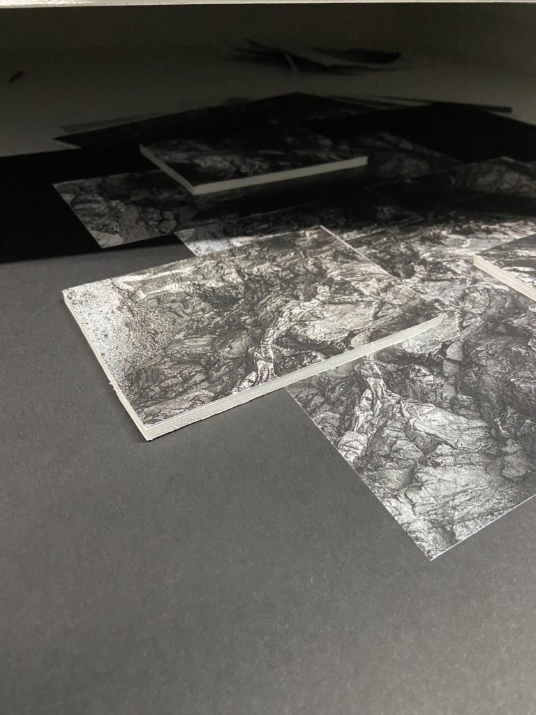

Final outcome of my joiner
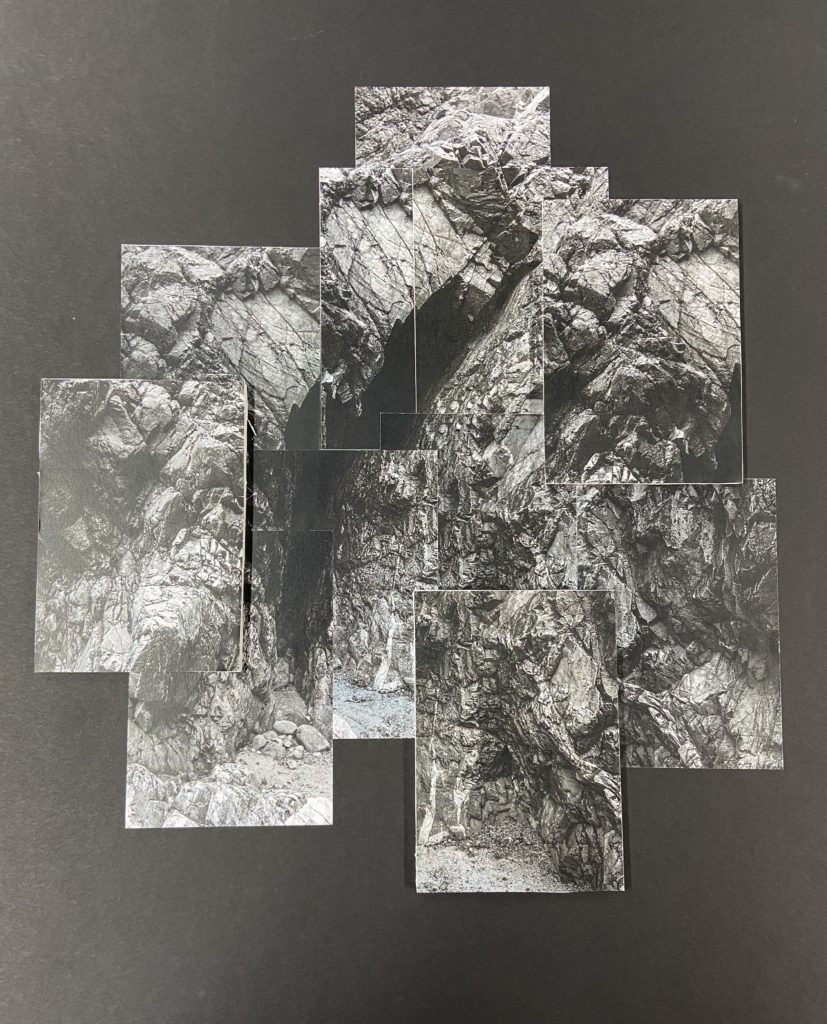
When making my joiner, I did enjoy forming the overall structure of how I wanted the final outcome to look. With making digital joiners, the images are usually just automated instantly and set up in an already organised formation with many interesting shapes. This method allowed for me to have more control over what I was wanting to achieve rather than have a computer organise everything for me.
Overall, I am very happy with the results of my joiner but next time if I were to make another one, I would like to consider using less images as sometimes I printed off images that were way too similar and just unnecessary to put into the final joiner. The extra images made the process slightly more confusing and I did actually end up discarding a few extra prints as I thought they served no purpose in the final product.
After editing my images in lightroom, I wanted to try out the concept of making a joiner out of my collection of images. I wanted to follow a similar concept to that of what David Hockney does.
Contact sheets:

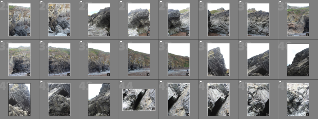


After selecting all of the images I wanted to use to compose my joiners, I chose one image from a joiner group and edited it to my liking. Once that was done I synced up the edited settings so that every image was edited exactly the same.
I then colour coded certain images into separate groups as to keep the joiners all together and to not get any mixed up.


Process of making the joiners:
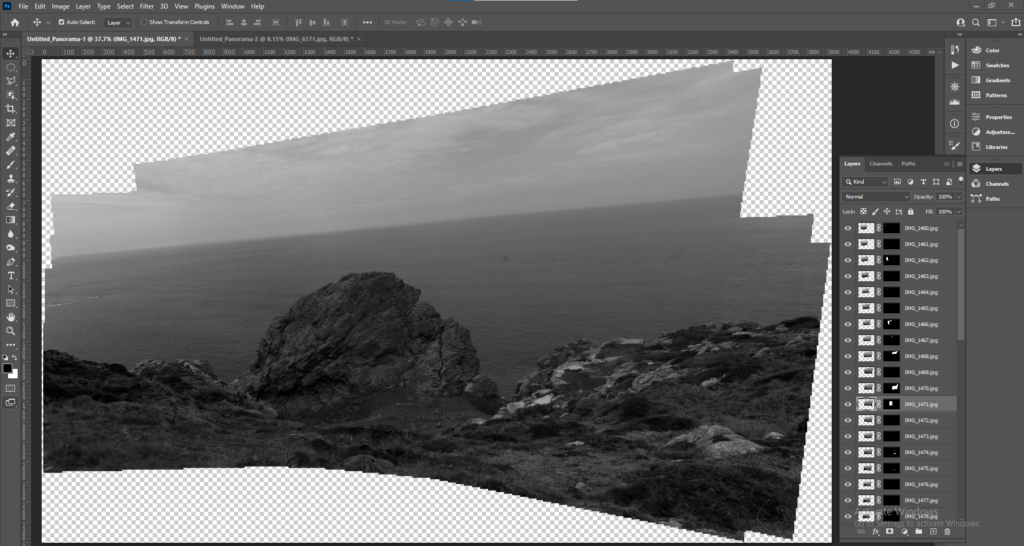
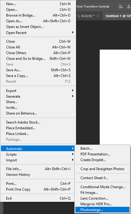
In order to make the joiners, I needed to open up on one of the images included in the joiner and then select ‘Automate’ and ‘Photomerge’.
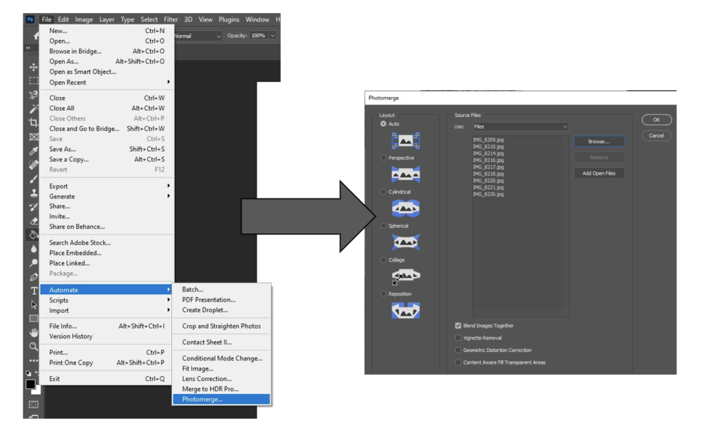
After selecting those I would need to click ‘browse’ and select all the images I would like to combine as a joiner. After selecting ‘Ok’, it would merge all of my images into a joiner.
—- Failed joiners —-


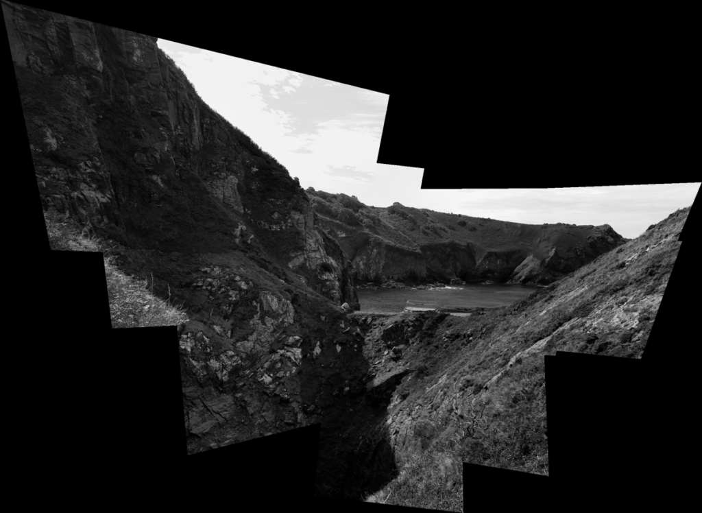
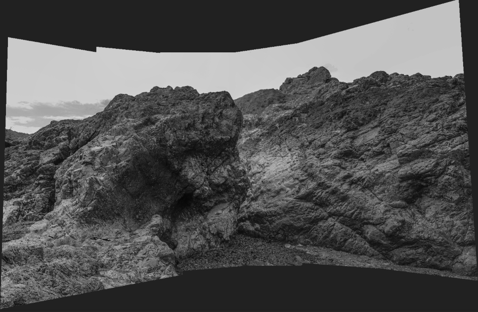
—- Successful joiners —-






3D Joiners experiments
After making my 2D joiners, I decided to take the oppurtunity to experiment with the finalised joiner a bit more and to make them into 3D joiners. There were many different types of 3D formats I could choose between so I took the time to go through a few of them to see if any were to my liking.
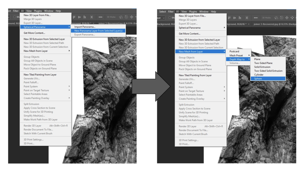
Results of the 3D joiner experiments —–







Welcome back after summer break!
Before we begin our next creative phase we need to make sure you have chosen your best photo-collage/ joiner and saved in this folder below for our upcoming exhibition at the Link Gallery, Jersey Museum.
Deadline Fri 16 Sept.
M:\Radio\Departments\Photography\Students\Image Transfer\PRINTING – JOINER\A3
Week 1-4: 6-28 Sept
Practice: Still-life, 3D Photo-sculpture and Installation
Theory: History of Still-life as a genre in art
DEADLINE: Wed 28 Sept
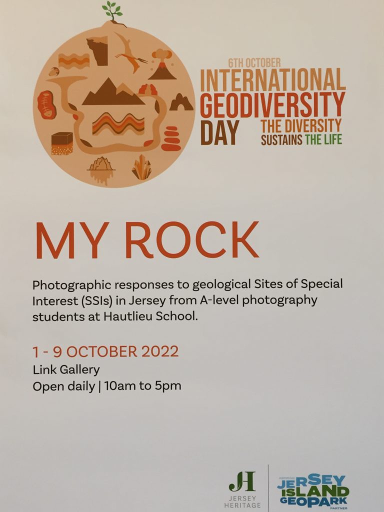
EXHIBITION: MY ROCK
Link Gallery 1- 9 Oct, Jersey Museum
Still life has captured the imagination of photographers from the early 19th century to the present day. It is a tradition full of lavish, exotic and sometimes dark arrangements, rich with symbolic depth and meaning.
However, before we begin making images of our objects collected over the summer period we need to learn about how still-life emerged as an independent genre, in particularly during the early 1600s Dutch and Northern European paintings. Many of the objects depicted in these early works are symbolic of religion and morality reflecting on the increasing urbanization of Dutch and Flemish society, which brought with it an emphasis on the home and personal possessions, commerce and trade. Paintings depicting burnt candles, human skulls, dying flowers, fruits and vegetables, broken chalices, jewelry, crowns, watches, mirrors, bottles, glasses, vases etc are symbolic of the transience and brevity of human life, power, beauty and wealth, as well as of the insignificance of all material things and achievements.
Throughout its long history, still life has taken many forms, from the decorative frescoes of antiquity to the high art of the Renaissance. Traditionally, a still life is a collection of inanimate objects arranged as the subject of a composition. Nowadays, a still life can be anything from your latest Instagram latte art to a vase of tulips styled like a Dutch Golden Age painting. Read here for more details about the different categories within still-life paintings such as Fruits, Flowers, Breakfast pieces, Trompe L’Oeil and Vanitas.
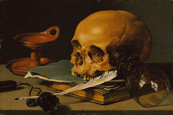

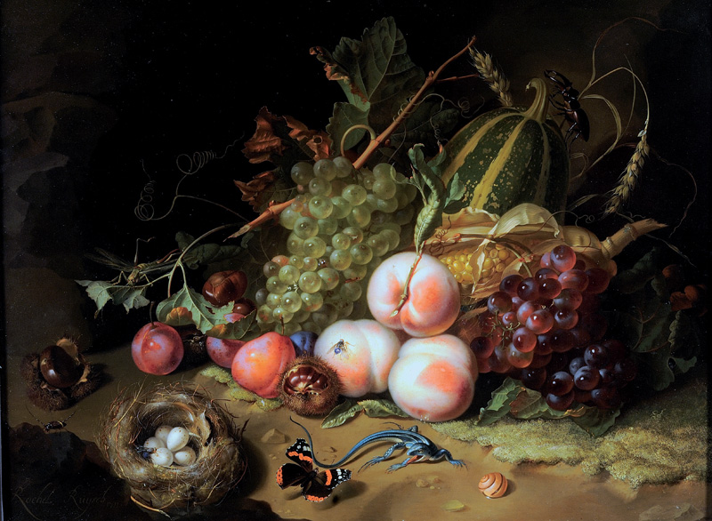
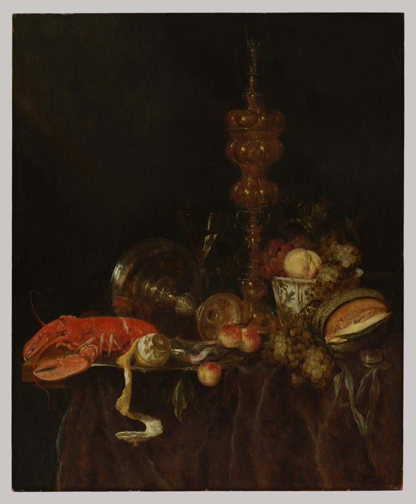
Week 1: 6-11 Sept
RESEARCH > ANALYSIS
Study this exhibition: ART OF ARRANGEMENT: PHOTOGRAPHY AND THE STILL LIFE TRADITION
READ the following two short essay linked with the exhibition above for more understanding of still life in art and photography—with its roots in the vanitas tradition.
Brian Liddy: ‘ART OF ARRANGEMENT’: ON THE SHORTNESS OF LIFE
Roy Exley: ‘ART OF ARRANGEMENT’: STILL LIFE IN THE STILL-LIFE
1. HISTORICAL CONTEXT: Produce a blog post and describe origin and definition of still life as a genre in history of pictorial practice. Read texts above and below to gain an overview of how still-life emerged.
https://mymodernmet.com/what-is-still-life-painting-definition/
2. ANALYSIS: Select a key painting and comment on the religious, political and allegorical symbolism of food and objects in terms of wealth, status and power, or the lack of.
Lets take a closer look at the painting, Cookmaid with Still Life of Vegetables and Fruit by British painter Sir Nathaniel Bacon.
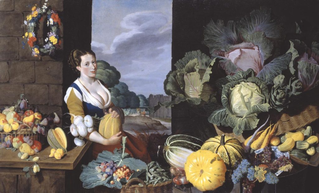
Listen to curator Tim Batchelor discussing the painting
For further insights into the symbolic meaning of food and objects in still-life paintings, read this text Secret Symbols in Still-Life
Week 2: 11-19 Sept
RECORD > RESPOND
STILL-LIFE: photograph objects you collected over the summer from bays and geological sites of special interest (SSI) and photograph them in the studio using different lighting techniques, backdrops and compositions.


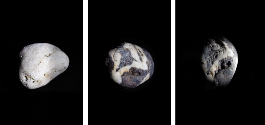
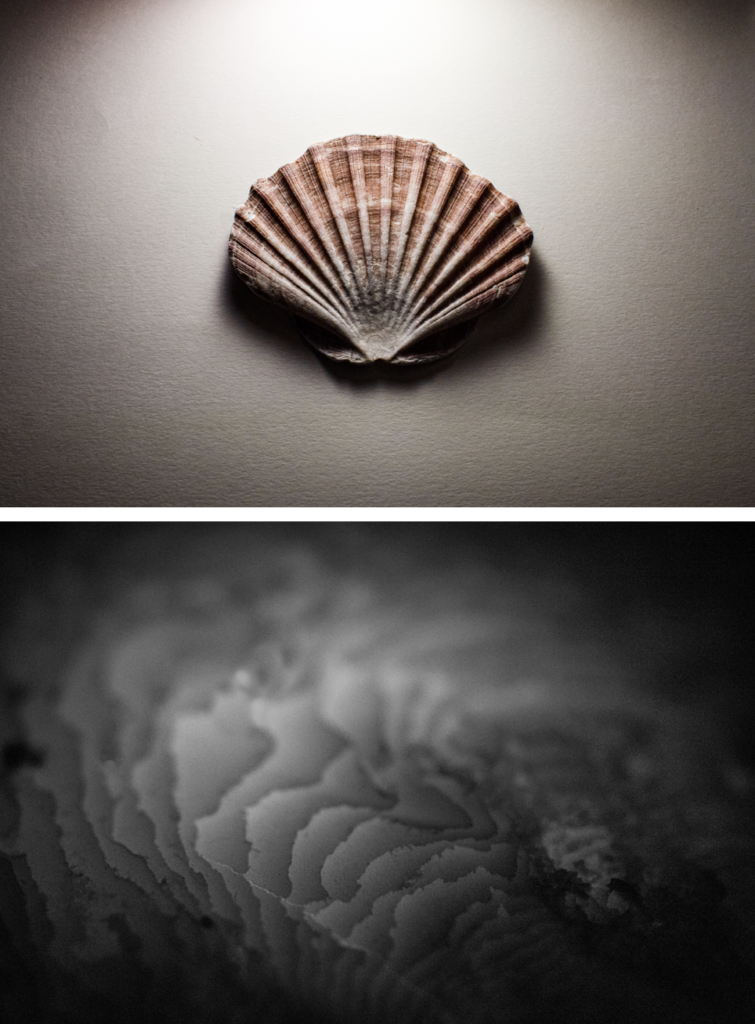
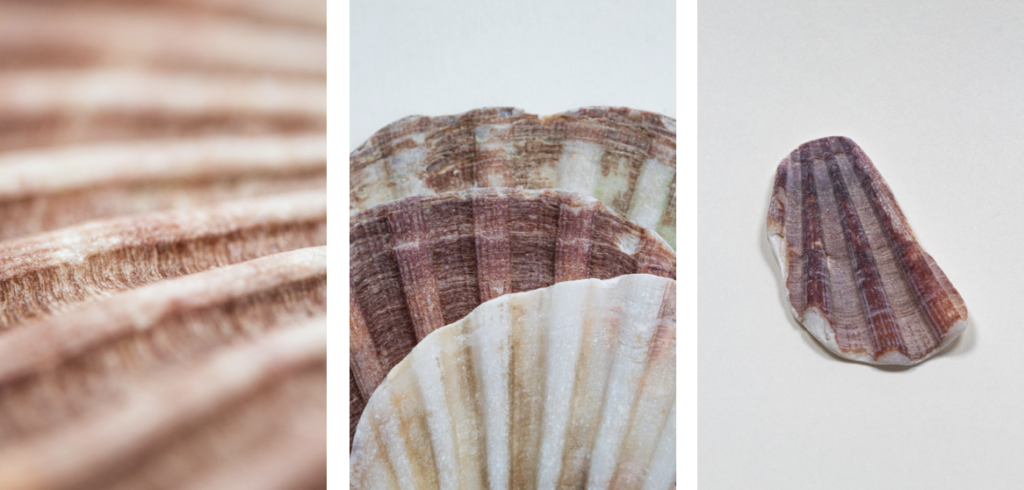

You my wish to remind yourself and refer back to your previous study on objects and still-life that you explored as part of your HERITAGE project last year.
Object Based / Still Life Photography Tasks | 2023 Photography Blog (hautlieucreative.co.uk)
What you must do…
Collect a group of objects that you think combine well. Consider shape and size, colour, texture etc.
For ideas, look carefully at how Mary Ellen Bartley groups, lights and photographs her objects. Aim to create a set of images by altering the layout, lighting, focus, composition etc.


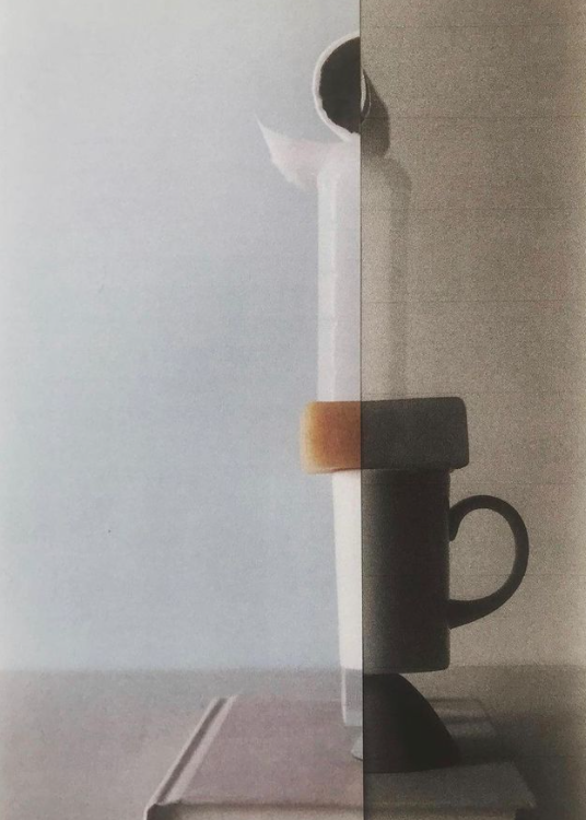

Also photograph individual objects as specimen applying a typology approach, ie. deadpan and uniformly framed and lit in a way that is the same in all images.


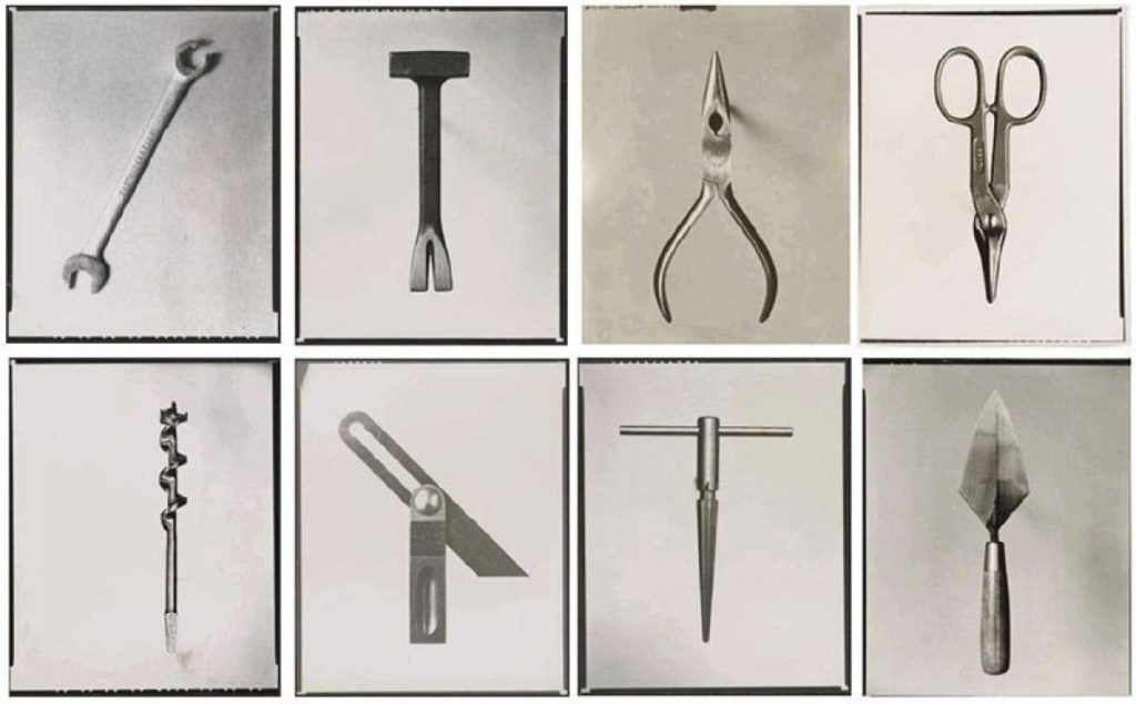
BLOG: Follow these instructions and complete the following blog posts:
EDITING – NEW PHOTOSHOOTS: Upload and process images from any new photo-shoots your have made in relation to PHOTO-ASSIGNMENT from Summer Project using Lightroom.
Week 3-4: 19 Sept – 2 Oct
EXPERIMENTING > DEVELOPING
PHOTO-SCULPTURE: Print a selection of your images and mount them onto foamboard/ mountboard cut-outs and begin to work analogue with knives/ scissors and glue constructing a 3D photo-sculpture.

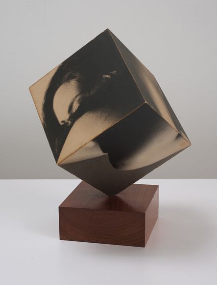
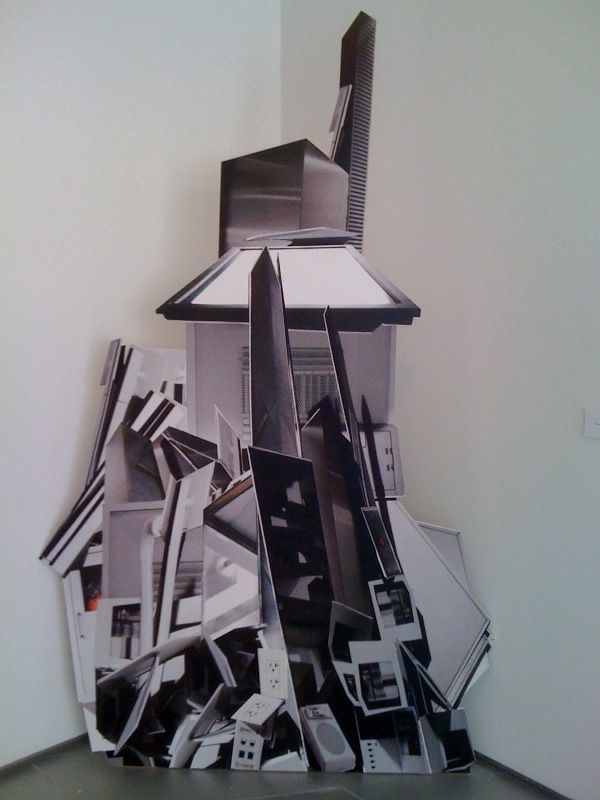
Ideas for constructing a photographic sculpture


ARTISTS REFERENCES. As inspiration for your photo-sculpture select at least two artists references as a case study. Explore, discuss, describe and explain key examples of their work relevant to your project and intentions. Follow these steps:
1. Produce a mood board with a selection of images and write an overview of their work, its visual style, meaning and methods. Describe why you have selected to study their work and how it relates to your project.
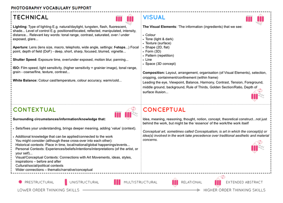
2. Select at least one key image and analyse in depth using methodology of TECHNICAL>VISUAL>CONTEXTUAL>CONCEPTUAL
3. Incorporate quotes and comments from artist themselves or others (art/ media /film critics, art/ media/ film historians, curators, writers, journalists etc) using a variety of sources such as Youtube, online articles, reviews, text, books etc. Make sure you reference sources and embed links in your blog post.
4. Compare and contrast your chosen artists in terms of similarities and contrasts in their approaches, techniques and outcomes of their work.
3D DESIGN PROCESS: Make sure you produce a blog post that show stages of your experimentation using camera/ phone to document your 3D photo-sculpture as it develops. Make sure you annotate the various processes and techniques that you are using and also describe creative decisions and choices that you make.
FURTHER EXPERIMENTATION: You can produce more than one photo-sculpture and create an installation of several pieces. Be creative and not afraid to make mistakes, Try out the following:
INSTALLATION
3D Photosculpture > 2D image
Upon completion of your 3D sculpture photograph your sculpture as an object experimenting with creative lighting techniques in the studio playing between light and shadows, creating a false sense of scale and size. Produce a blog post with a set of your most successful edited images and annotate.
WHOLE CLASS INSTALLATION
As a whole class we will create an installation of all 3D photosculptures. Follow same process as above and add your most successful edited images to the blog post above and annotate.
FINAL PRINTS
Select a set of your best 3 images and save into shared folder below. Mount prints and create a blog post with final presentation and include evaluation below.
M:\Radio\Departments\Photography\Students\Image Transfer\YR13 MY ROCK
EVALUATING: Upon completion of your final outcomes and experimentation, make sure you evaluate and reflect on your creative development. Include images from our exhibition: MY ROCK at Jersey Museum (1-9 Oct) and comment on the following:


INSPIRATIONS: Artist References
Photographic installations which are site specific and 3-dimensional is very in vogue right now. Here are a selection of artists exploring the material nature of a photographic image (print, negative etc) and the idea that photographs can be sculptural.
Felicity Hammond
Felicity Hammond is an emerging artist who works across photography and installation. Fascinated by political contradictions within the urban landscape her work explores construction sites and obsolete built environments.
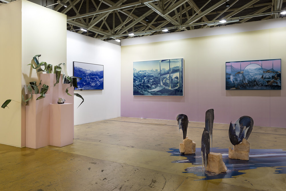
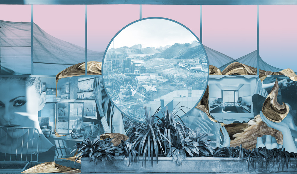
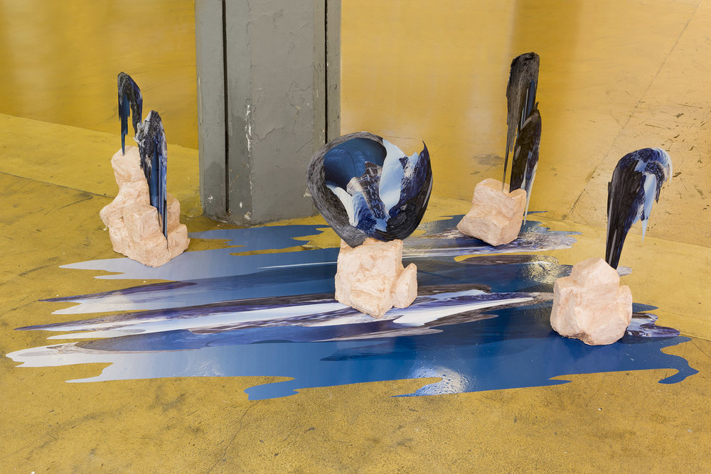
In specific works Hammond photographs digitally manipulated images from property developers’ billboards and brochures and prints them directly onto acrylic sheets which are then manipulated into unique sculptural objects. Here a few selected works you can use as case studies
Case Study: World Capital (2019)
Ink jet prints on vinyl and dibond, wood, rubber, water, concrete, steel, acrylic


Conversations about the homogenisation of the built environment have taken many forms. From Walter Benjamin’s writings about the effect of capitalism on nineteenth century Paris, to Ian Nairn’s scathing review of the growing ubiquity of town planning, the crisis surrounding urban identity has been and will continue to be widely contested.
In World Capital the conversation turns towards the way that digital technologies have influenced the global image of the city. Offering a commentary on the role that the computer generated architectural proposition plays in the increasing uniformity of the urban realm, the work outlines the ways in which the proliferation of the virtual world has contributed to urban indifference.
Combining images used to market contemporary housing alongside relics of the industrial past, the work collides local history with the global image that supersedes it. Re-imagining the Great Thames flood of 1928 which destroyed much of the site of the exhibition (now known as London City Island) World Capital recalls the area’s industrial and troublesome past, propelling its history into the near future.
Case Study: Remains in Development (2020)
Various materials
In her work, British artist Felicity Hammond confronts the social, political, and economic contradictions of the postmodern city, whose buildings and façades shape our collective identity and open up a future by obliterating the past. Hammond’s large- scale collages combine found images from glossy real estate brochures with her own photographs. They are reminiscent of apocalyptic historic images, but they never reveal the locations of the places they show or how they relate. Instead, the collages reflect the increasing homogenization of big cities, resulting from a process of urban development steered by power struggles between international real estate companies, profit-driven investors, and gentrification critics.



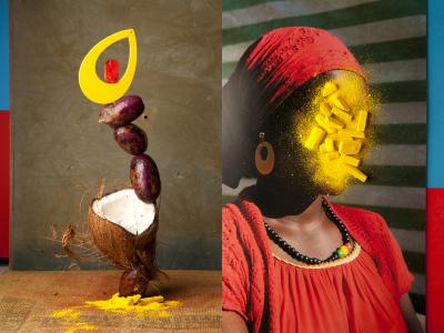
Lorenzo Venturi: Dalston Anatomy
Lorenzo Vitturi’s vibrant still lifes capture the threatened spirit of Dalston’s Ridley Road Market. Vitturi – who lives locally – feels compelled to capture its distinctive nature before it is gentrified beyond recognition. Vitturi arranges found objects and photographs them against backdrops of discarded market materials, in dynamic compositions. These are combined with street scenes and portraits of local characters to create a unique portrait of a soon to be extinct way of lif
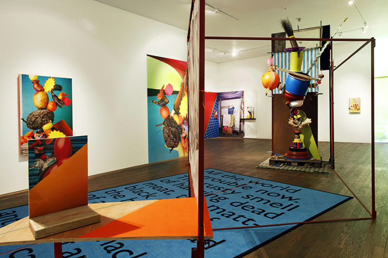
His installation at the Gallery draws on the temporary structures of the market using raw materials, sculptural forms and photographs to explore ideas about creation, consumption and preservation.


INSTALLATION: Create a miniature installation on the white table in the classroom/ studio with your various photo-collages and 3D photo-sculptures and re-photograph it in-situ producing a new set of 2D images. Use proper studio lighting techniques, such as spotlights, chiaroscuro, flashlights and coloured gel for dramatic effect. Mount camera on a tripod frame different compositions that play on our sense of scale & shapes, form & texture and reality & fantasy. Consider making a backdrop out of paper or paint a backdrop that will add an effect.
INSPIRATIONS: Artist References
Look for inspirations from artists, such as James Casebere and Thomas Demand (see below) and compare/ contrast their work to your own images that you produce from photographing your sculptures.
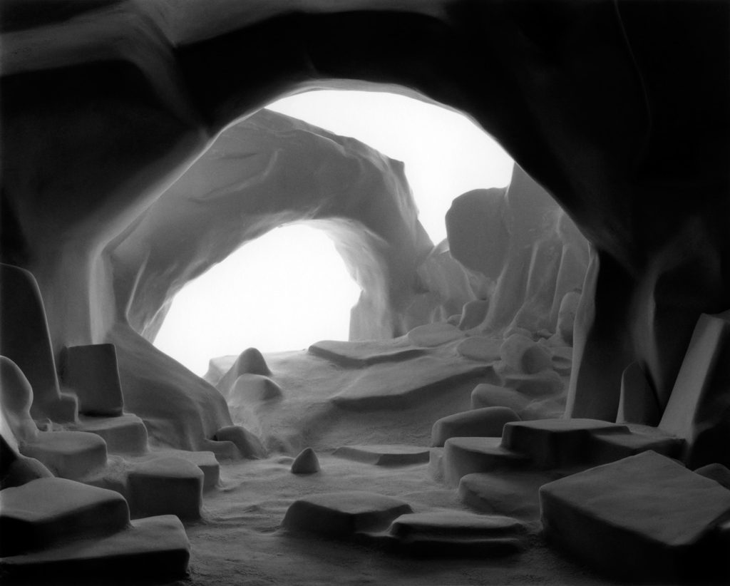
James Casebere
James Casebere pioneering work has established him at the forefront of artists working with constructed photography. For the last thirty years, Casebere has devised increasingly complex models that are subsequently photographed in his studio. Based on architectural, art historical and cinematic sources, his table-sized constructions are made of simple materials, pared down to essential forms. Casebere’s abandoned spaces are hauntingly evocative and oftentimes suggestive of prior events, encouraging the viewer to reconstitute a narrative or symbolic reading of his work.

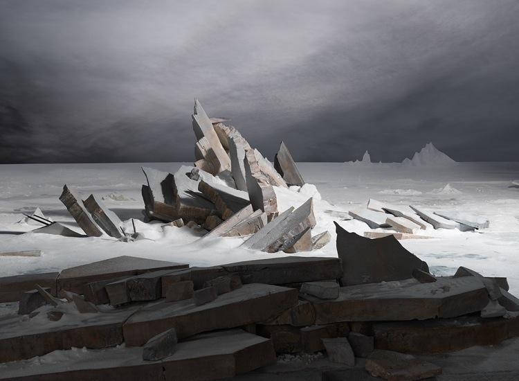
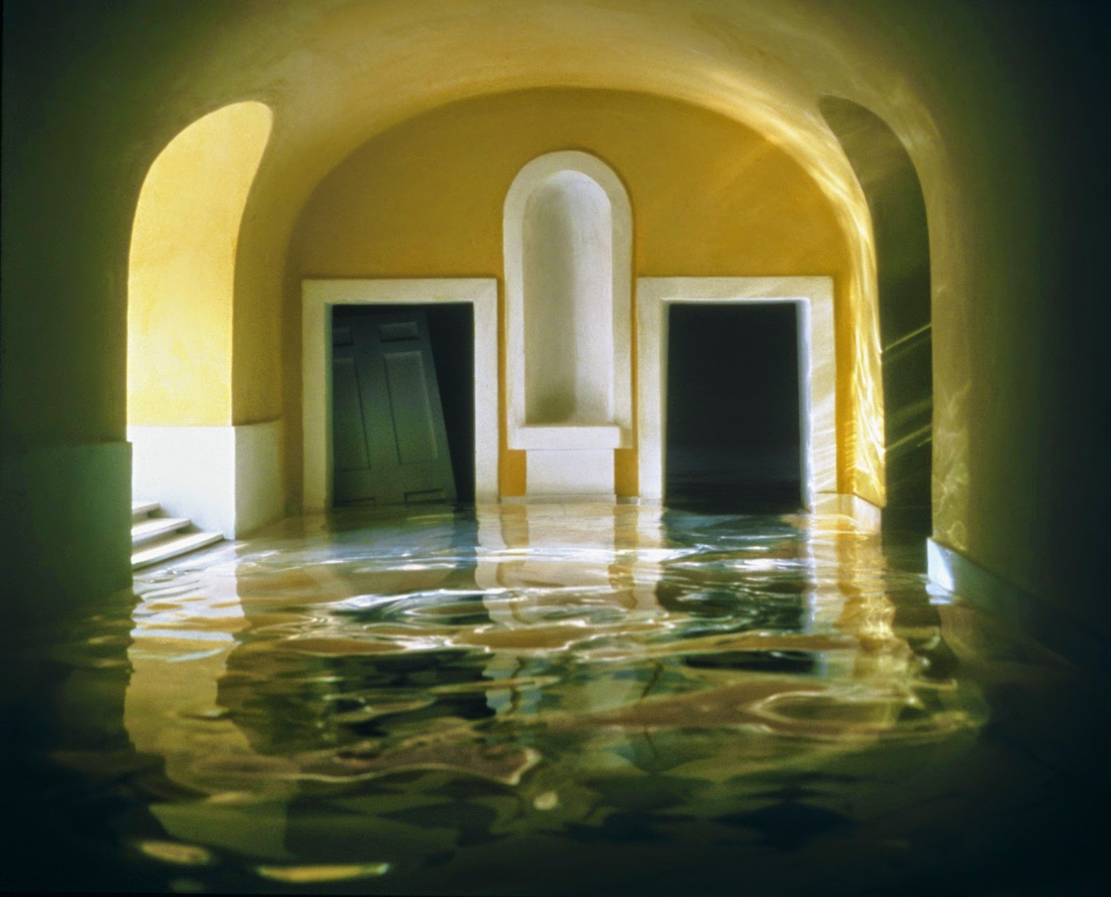

While earlier bodies of work focused on American mythologies such as the genre of the western and suburban home, in the early 1990s, Casebere turned his attention to institutional buildings. In more recent years, his subject matter focused on various institutional spaces and the relationship between social control, social structure and the mythologies that surround particular institutions, as well as the broader implications of dominant systems such as commerce, labor, religion and law.

Thomas Demand
Demand studied with the sculptor Fritz Schwegler, who encouraged him to explore the expressive possibilities of architectural models at the Kunstakademie Düsseldorf, where Bernd and Hilla Becher had recently taught photographers such as Andreas Gursky, Thomas Struth, and Candida Höfer. Like those artists, Demand makes mural-scale photographs, but instead of finding his subject matter in landscapes, buildings, and crowds, he uses paper and cardboard to reconstruct scenes he finds in images taken from various media sources. Once he has photographed his re-created environments—always devoid of figures but often displaying evidence of recent human activity—Demand destroys his models, further complicating the relationship between reproduction and original that his photography investigates.
Thomas Demand builds models of the scenes of political and societal events and photographs them. This has made him one of the photographers most in demand today. Now his depictions of German history can be seen in Berlin.


Read interview here on BBC with Thomas Demand about his work and process of making Sadam Hussein’s kitchen. Discusses death of photojournalism (see also Jeff Wall)
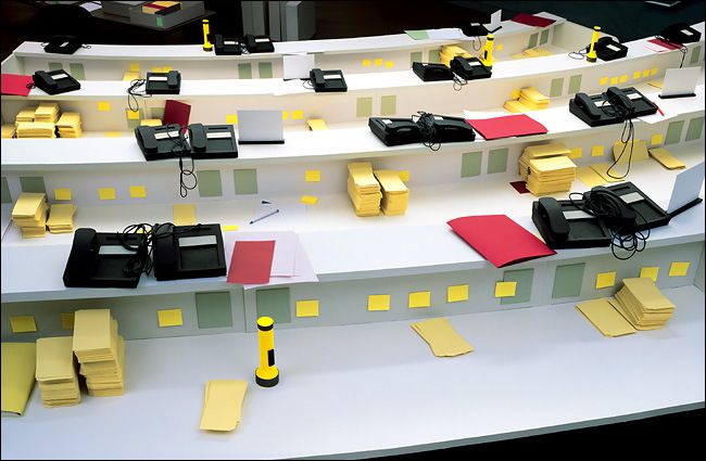
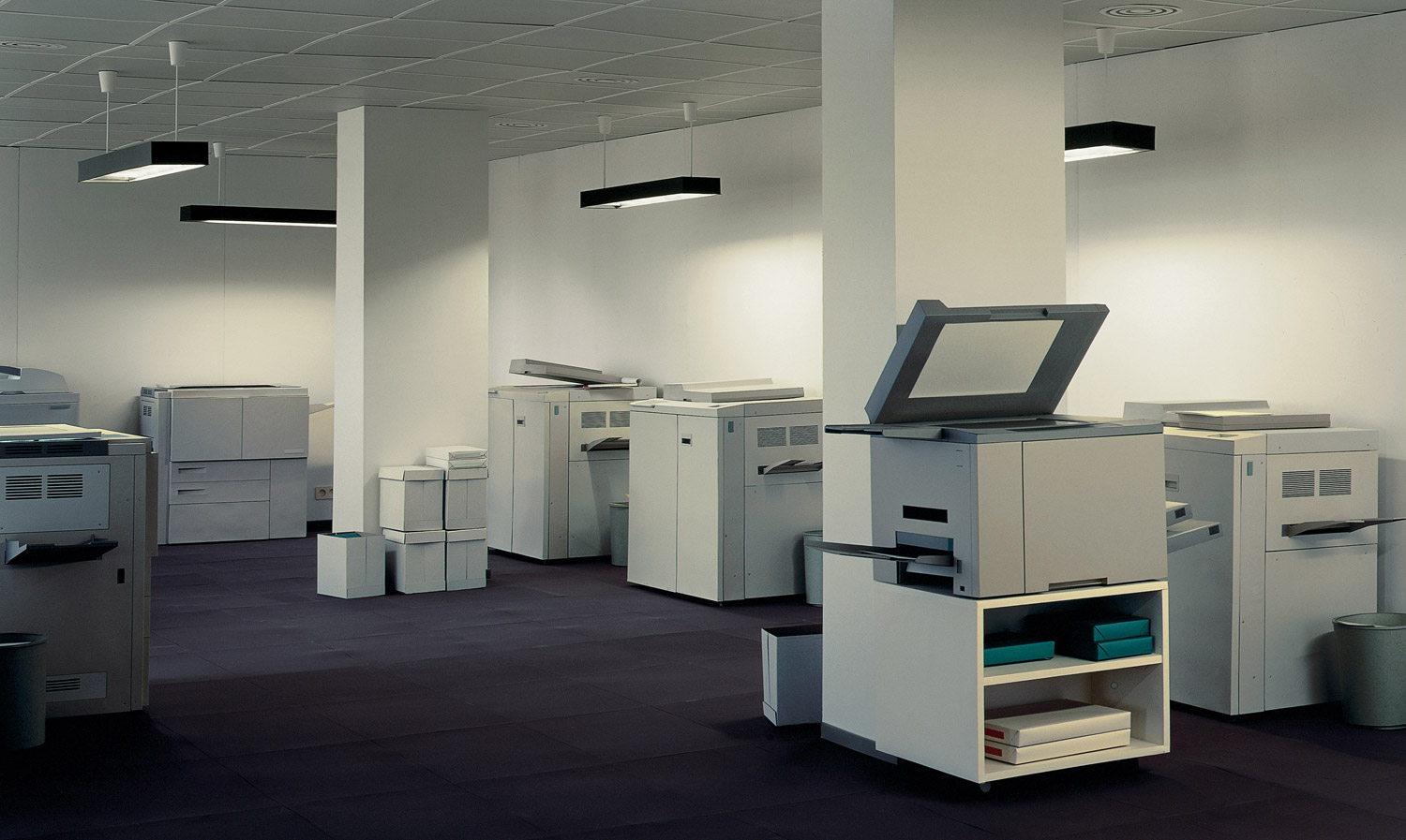

See my books on the table for resources and images about how Demand creates his sculptures.
Pacific Sun, a joint acquisition by LACMA and the Israel Museum, Jerusalem. Consisting of 2,400 frames that capture the artist’s meticulous recreation of YouTube footage of a cruise ship struggling in the midst of a violent storm, the work reveals Demand’s interest in opposing reality with the artificial. Demand’s earlier works dating from the early 1990s were also discussed, illuminating his cross-disciplinary practice spanning sculpture, architecture, photography, and film.
Theory: reality vs artificial
Jeff Wall constructed photography
Week 5: 3 – 9 Oct
Practice: Zine-lab
Theory: Archive
DEADLINE: FRI 21 OCT
TUE 4 OCT: FIELD STUDIES & RESEARCH
La Hocque & Societe Jersiaise Photo-archive
Activities:
08:45: Leave Hautlieu by boach to take us to La Hogue
9:15: Shoot at La Hogue/ Robin Bay/ Green Island/ La Motte
11:30: Coach to Societe Jersiaise, 7 Pier Road
12:00-12:30: Intro to archive and its collections: Look at Guiton’s set of images from La Motte archaeological dig and images from La Cotte.
12:30-13:20: Lunch
13:20-14:00: Research activity – students exploring online catalogue – link to Guiton’s images above and other collections
14:00-14:10: Break
14:10-15:00: Sequencing/ storytelling task: using Guiton’s set from La Motte and also La Cote De St Brelade
15:00 Coach return to Hautlieu School


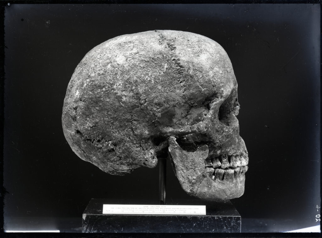
Emile F Guiton – La Motte excavation
BLOG POSTS
ARCHIVES: The Société Jersiaise Photographic Archive contains over 100,000 items dating from the mid-1840s to the present day and is the principal Jersey collection of nineteenth and early twentieth century photograph. Archives can be a rich source for finding starting points on your creative journey. This will strengthen your research and lead towards discoveries about the past that will inform the way you interpret the present and anticipate the future.
SJ Photo-Archive – historical context
Emile F Guiton
Henry Mullins
William Collie
Ernest Baudoux
Clarence P Ouless
Francis Foot
Charles Hugo
Edwin Dale

HOMEWORK TASK
Essay: What are archives?
DEADLINE: WED 12 OCT
To show knowledge and understanding of your experience day at the SJ Photo-Archive you need to write an essay. Follow link and instructions here:
NARRATIVE & SEQUENCING
In our final year of A-level photography we will study how different narrative structures can be used to tell stories from looking at the origin of photo essays in photojournalism to contemporary photography as well as cinema and literature.
This term we will begin to focus our attention on narrative in photography and explore visual storytelling as apart of our Personal Study, that includes developing a new body of work based around the theme of ‘islandness’, presented either as a photobook and/or a film, and writing an essay.
The aim is to produce a 16 page photo-zine in InDesign based around the images you have produced from exploring a bay or geological sites of special interest, that you selected to photograph as part of your Summer Project: MY ROCK.

NARRATIVE is essentially the way a story is told. For example you can tell different narratives of the same story. It is a very subjective process and there is no right or wrong. Whether or not your photographic story is any good is another matter.
Narrative is constructed when you begin to create relationships between images (and/or text) and present more than two images together. Your selection of images (editing) and the order of how these images appear on the pages (sequencing) contributes significantly to the construction of the narrative. So too, does the structure and design of the photo-zine. However, it is essential that you identity what your story is first before considering how you wish to tell it.
In order for you to understand better how narrative works in photography let’s consider the differences between narrative and story when making a photo-zine. For a more in-depth understanding of NARRATIVE and PHOTOGRAPHY go to blog post below.
Once you have considered the points made between the differences in narrative and story and done some research around Jersey’s geography, bays and geological site of special interest that you explored with your camera, ie. west coast or east coast, write the following:
Research sites and resources: www.jerseygeologytrail.net
STORY: What is your story?
Describe in:
NARRATIVE: How will you tell your story?
EDITING: photo-shoots from school trip.
Produce a blog post with evidence of your photoshoot and editing and selection process.
Here are instructions on how to use, if necessary: LIGHTROOM-CHECKLISTDOWNLOAD
SEQUENCING: Print your final set of 12-16 images as small work prints using print Microsoft wizard (4 images per page, 9x13cm) Cut images using guillotine and layout on table and begin to sequence them to construct a narrative. Consider the following:
You can find Guiton images and images from other SJ collections here on our shared school folder:
M:\Radio\Departments\Photography\Students\ISLANDNESS\SJ Photo-Archive


Week 6: 10 – 14 Oct
DESIGN & LAYOUT
Complete the following blog posts
RESEARCH > ANALYSIS: Research zines and newspaper design made by artists and photographer that will provide visual stimulus for your page design. Produce a mood board and consider the following in your analysis:
InDesign
Create new document
width: 148mm
height: 210
pages: 16
orientation: portrait
columns:2
column gutter: 5mm
margins: top, bottom, inside, outside: 10mm
bleed: top, bottom, inside, outside: 3mm

Something to read: Something Tactile: Why Photographers Should Create Zines
Café Royal Books is a small independent publisher of photography photobooks or zines, and sometimes drawing, solely run by Craig Atkinson and based in Southport, England. Café Royal Books produces small-run publications predominantly documenting social, historical and architectural change, often in Britain, using both new work and photographs from archives. It has been operating since 2005 and by mid 2014 had published about 200 books and zines and they are held in major public collections
https://www.caferoyalbooks.com/

Editions Bessard is a paris-based independent publishing house created by pierre bessard in 2011. Focusing on working with artists, writers and curators to realise intellectually challenging projects in book form.


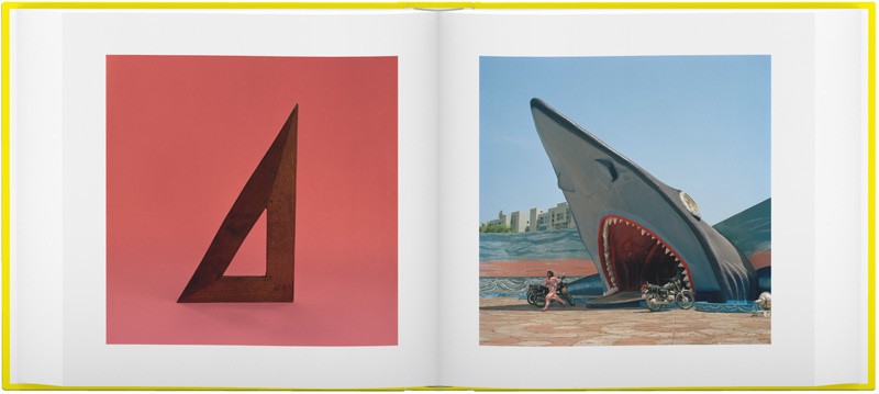
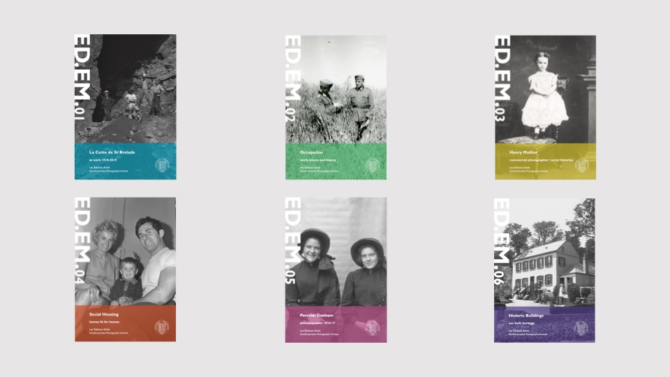
The new imprint Éditions Emile is named in honour of Emile F. Guiton, the founding father of the The Société Jersiaise Photographic Archive. The first set of publications is a series of small photo-zines comprising of 48 pages with an average of 30-40 images and a short text providing further context. With plans to publish three editions annually, each issue of ED.EM. will take a fresh look at a specific collection within the archive, by pairing it with either another collection or contemporary work, in order to re-contextualise the images, keeping the collections active and relevant for new audiences both in the island and beyond.
Darren Harvey Regan
Entwining image and object, the work of Darren Harvey-Regan (b. 1974 Exeter) often sees a hybridisation of the conventions of photography and sculpture. As quietly humorous as they are frustrating his works challenge the viewer to distinguish where representation ends and the object begins. “The presentation of photographs in interaction with objects serves to highlight the inherent tensions within representation; between the photograph as an object and the image of the world it contains. In this way, I consider the photograph as being something not only to think about, but to think with.”
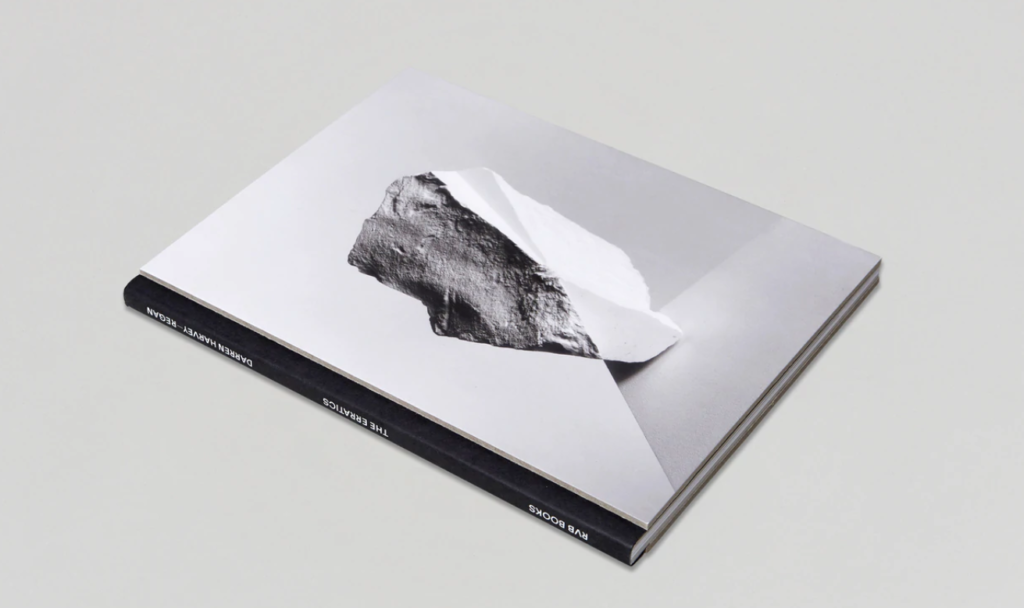
Photobook: The Erratics
DEVELOPING > DESIGNING: Show variation of designs
See examples of previous students blog charting his zine design process, here.
https://hautlieucreative.co.uk/photo20al/wp-admin/post.php?post=31481&action=edit
Week 7: 17 – 21 Oct
PRINT & PRESENT
Complete the following blog posts
PRESENTATION > EVALUATION: Print, fold and bind final photo-zine and hand in for assessment.
Write an overall final evaluation (250-300 words) that explain in some detail how successfully you explored the first part of the IDENTITY & COMMUNITY project. Consider the following:
—- Before and after edits of images —-
Image 1:
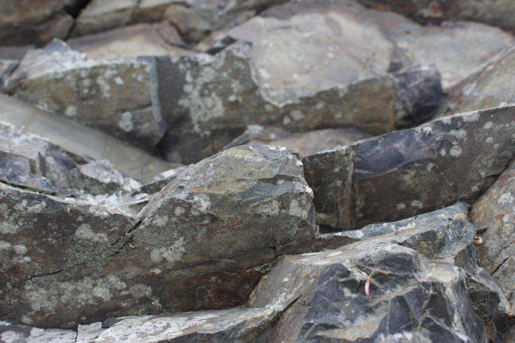
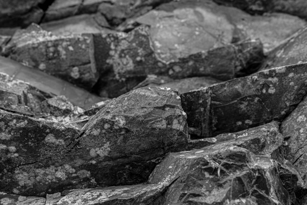
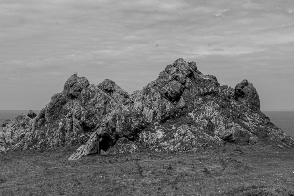
For this image here I ended up converting the image to black and white. Although it doesn’t look like a huge amount has changed due to the original image containing a range of low tone greys and rather dark shades of colour in itself, I have converted the entire colour scheme to be a solid black and white colour based image and have adjusted the contrast, texture and exposure to my liking. I have also considered to change the whites, blacks and highlights of the image until I am satisfied with the final result.
Image 2:


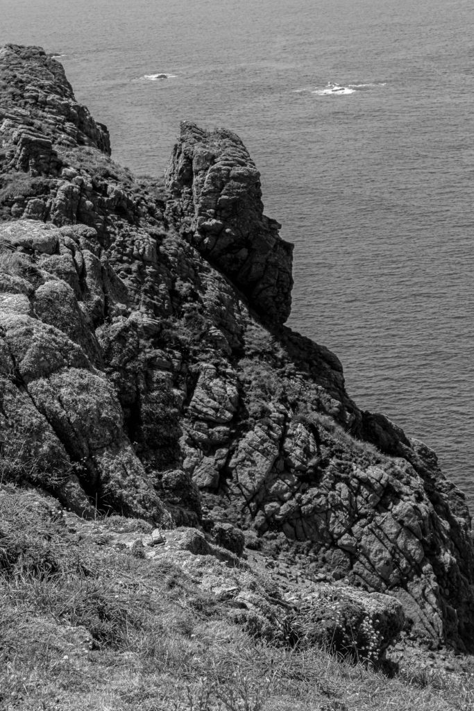
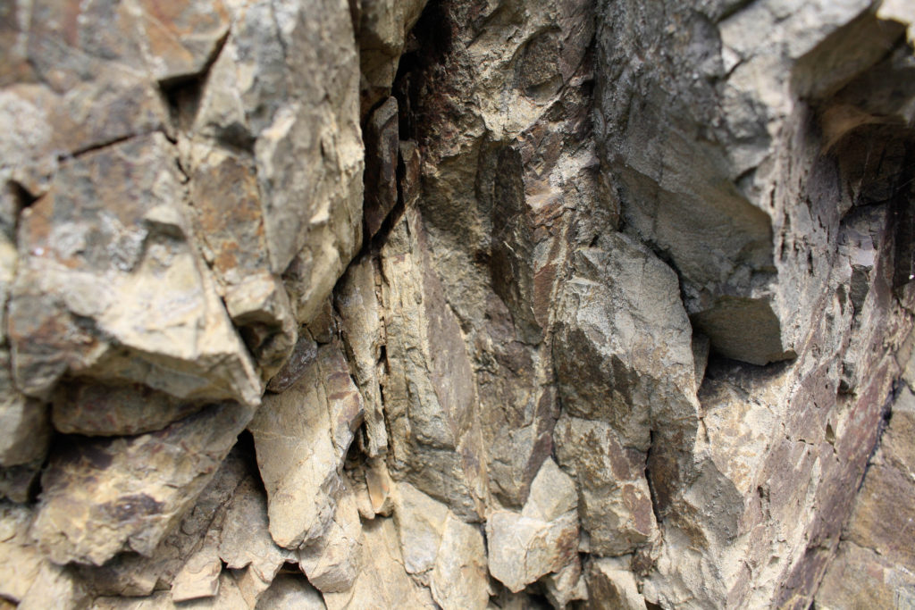
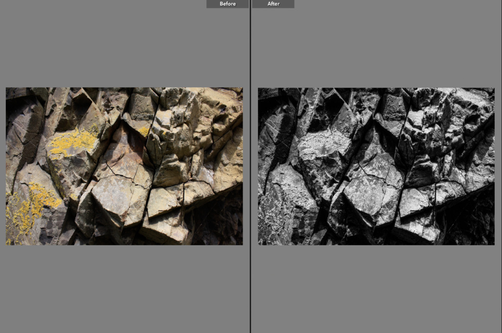
Once again I have decided to follow a very similar scheme to that of ‘Image 1’ by converting the entire photograph to a solid black and white one. There is a slightly more obvious change within these two images as one is seen to be containing a range of feint colours such as yellows, reds and browns. I adjusted the contrast and texture of the image quite a bit as to really make the rock textures appear more obvious and sharp.
Image 3:
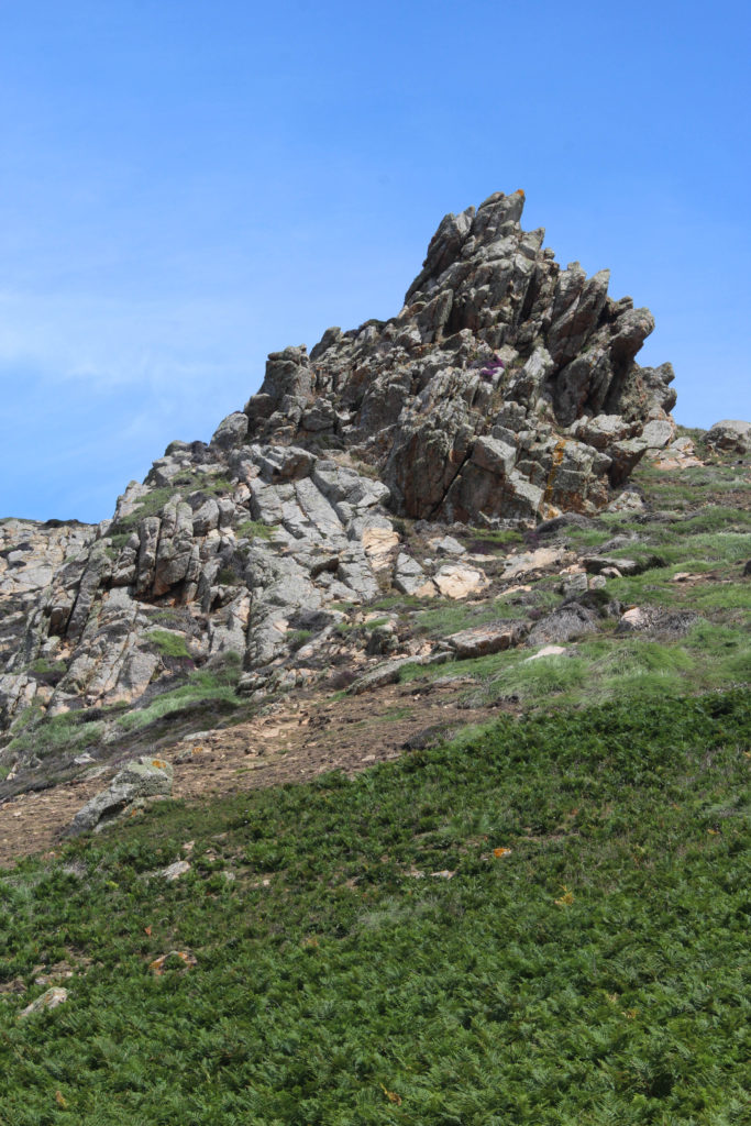

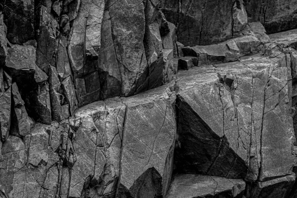
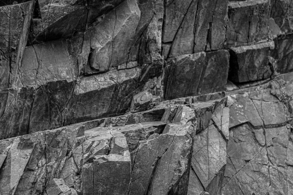
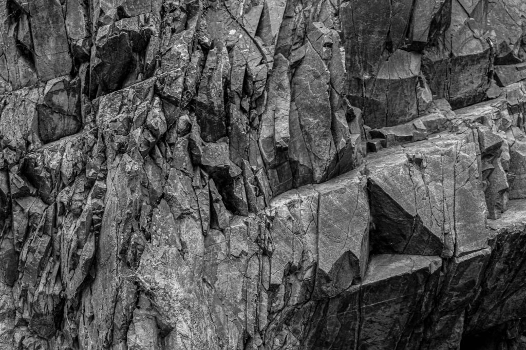
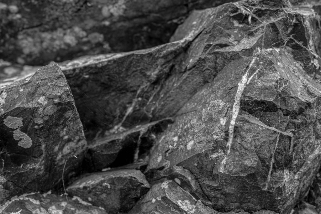
For this image here, I ended up converting it once again into black and white, as to follow the same theme as the previous ones, and completely shut out the rich colours in the original image. Although the colours of the rocks highlight the original sense of the geology we have in Jersey, I preferred taking the approach of having a much harsher and dramatic version of the rock formations that are present on the island. I also considered cropping the image as I believed there was too much of the landscape visible and didn’t have the rock as being the centred focal point.
—- Best edits —-
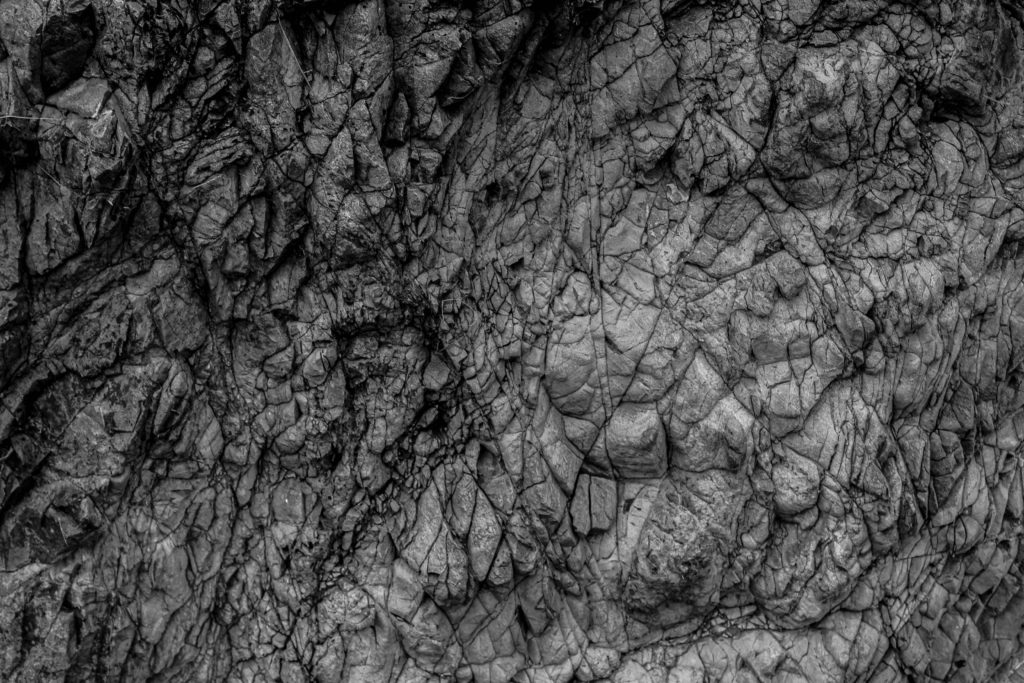
Close- up Geometric Rock Formations:



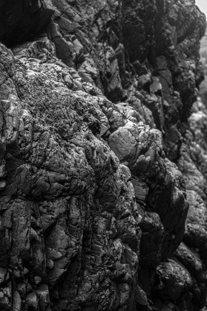
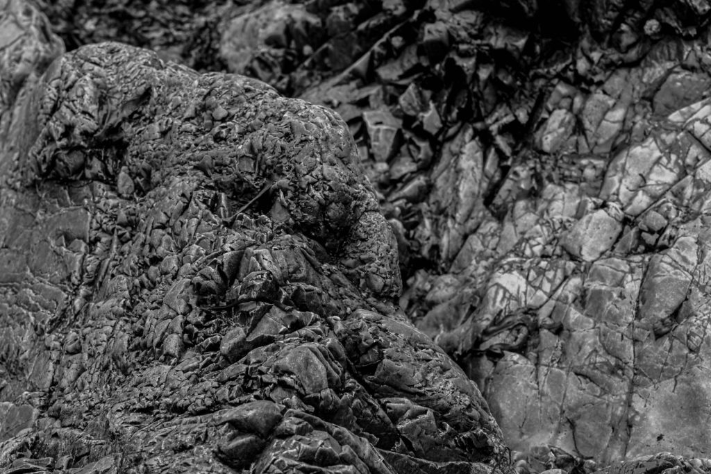


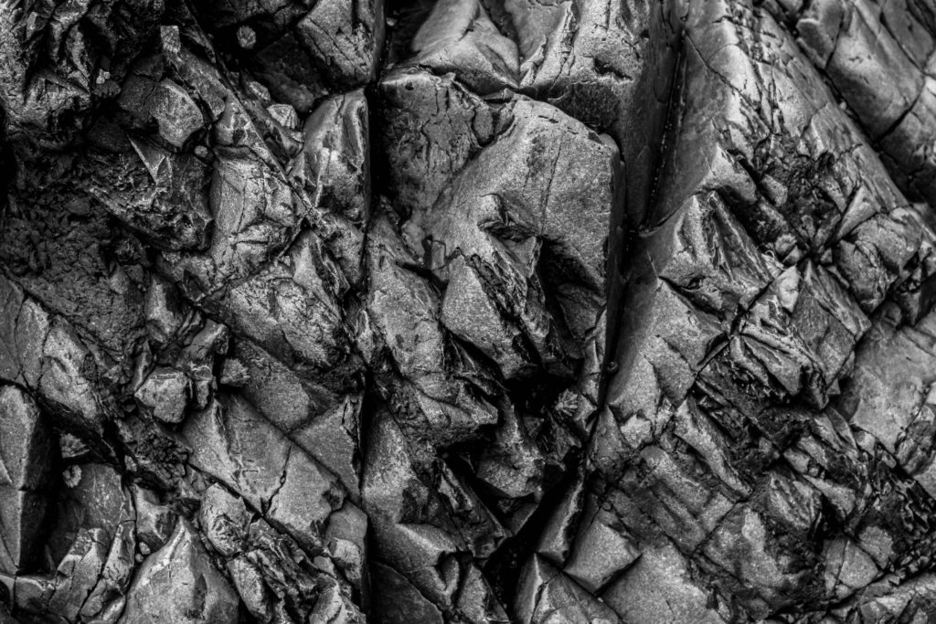
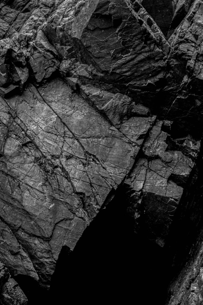

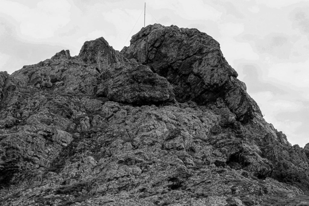
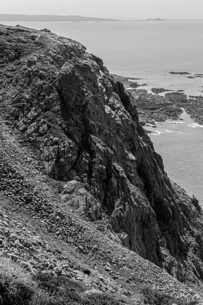
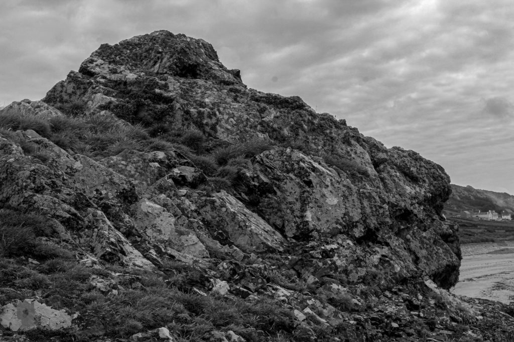
Full-scale Rock Photographs:

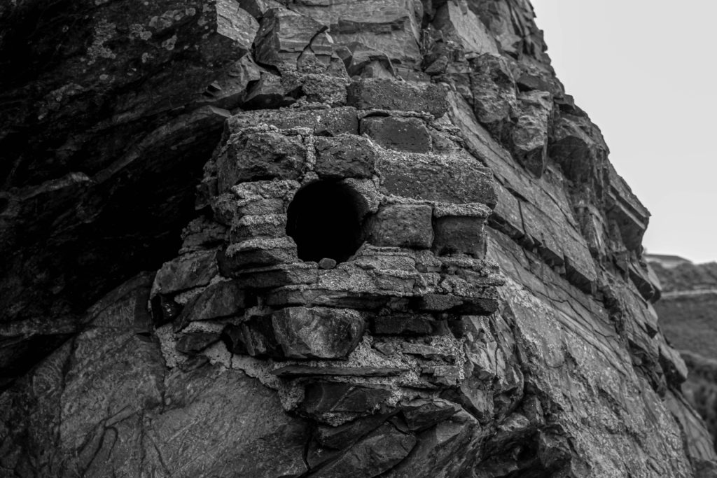

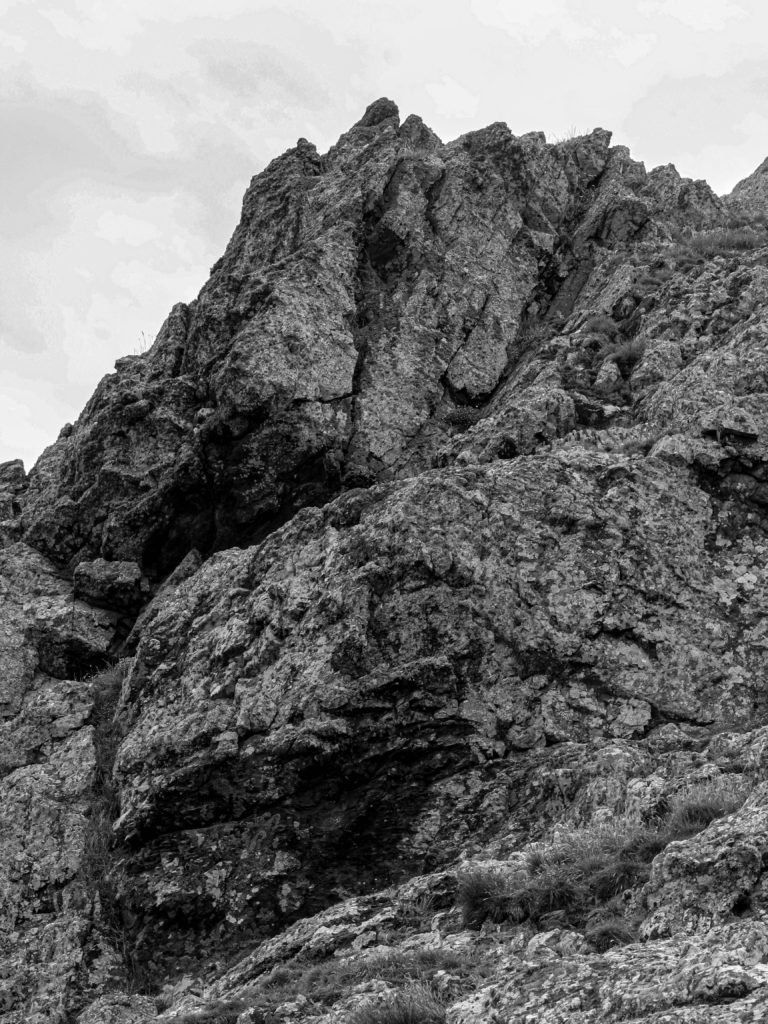
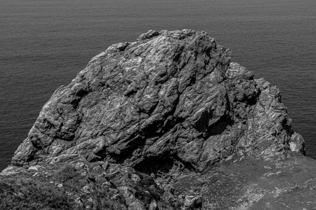


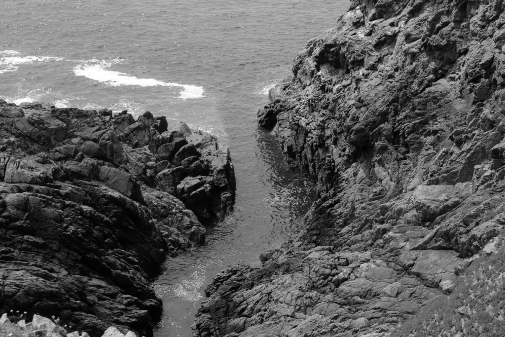
Photoshoot Plan
I will be taking photographs at L’Etacq/ Stinky Bay, I would like to take these images round midday to ensure that I can have the best changes of having the correct lighting for this shoot, and making sure its not raining to make sure my only equipment, the camera, doesn’t get damaged.
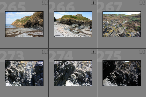
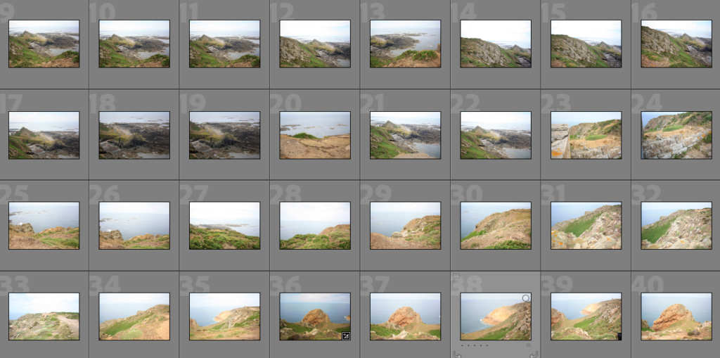
Contact sheets
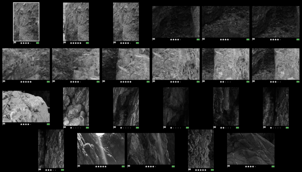
Below I have included some contact sheets displaying the wide variety of images from my L’Etacq shoot, this is important as it gives an indication of how many images I have from each shoot, and helps with the organisation before image sub selection.


Colour Coding System
Below I have placed some screenshots of my colour coding my photographs, I have included an explanation of the system and how I have come to the image sub selection process, I really like this system as it ensures that I have a clear plan in my mind of which images I am going to edit. It also helps me predict my final images just from looking through them in Lightroom.

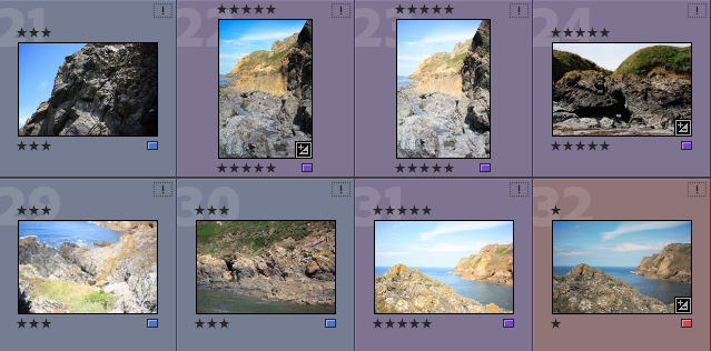

Best Images after Sub Selection
There I have taken some of the images from my ‘purple’ selection above and placed them in a gallery so that they can be more easily viewed, this also helps me consider whether or not they could be displayed as 9 images or just individually. Furthermore, this is before the editing process so lots of these photographs could be made to be of a higher quality afterwards.


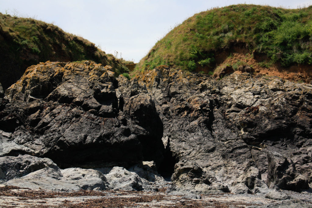

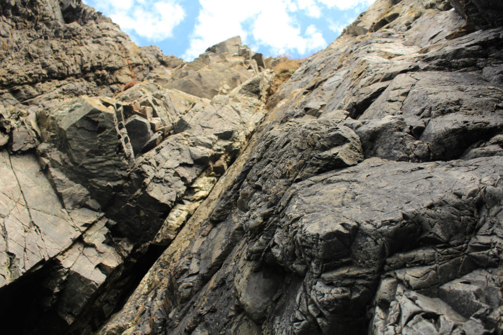
Editing
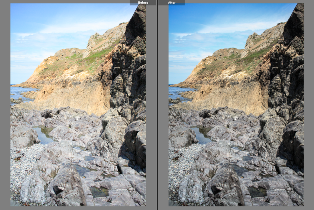
Below I have included before and afters of all of the images that I have decided to edit, I think that for the most part these images came out very well, I think I didn’t end up with a wide range of good images to edit, however I think the ones that I have are of good clarity and some exposures have been edited so that the images are more legible. Furthermore, I think that changing the undertones of the images to make them appear cooler/ warmer gives them a greater effect.


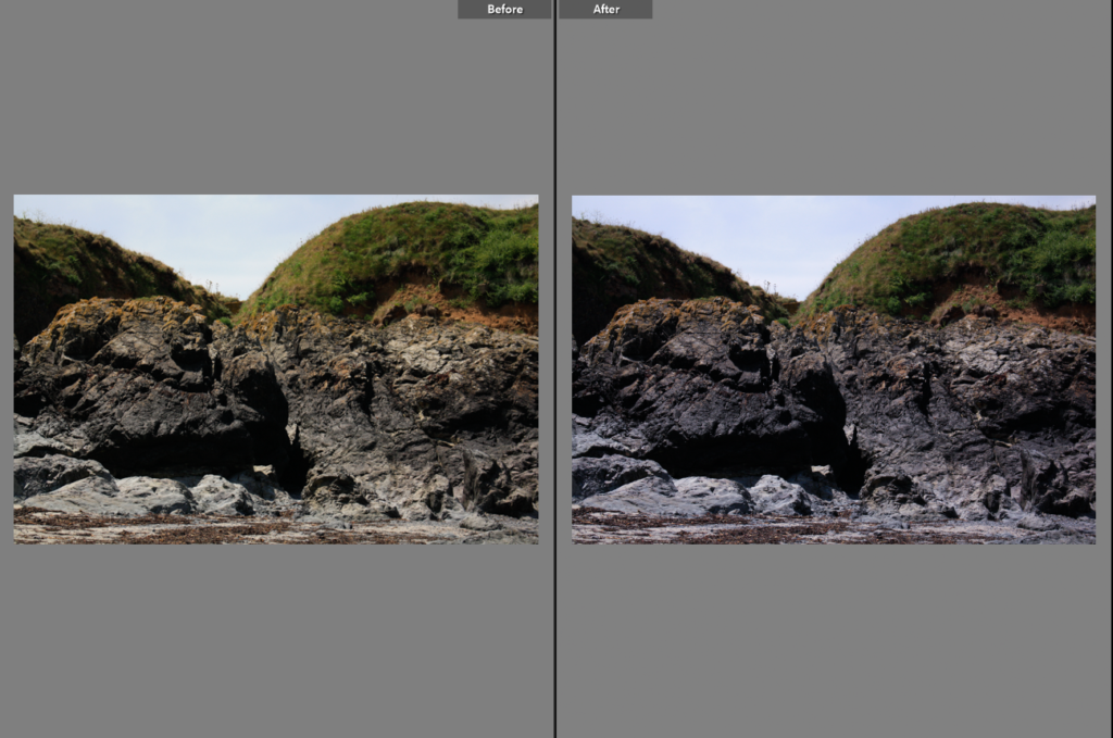
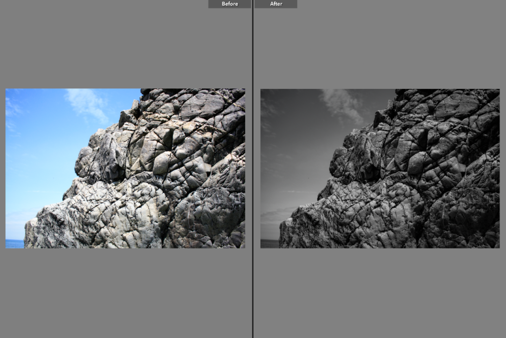
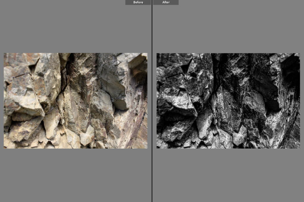
Final Images/ Analysis and Critique
For my final images I have decided that these are my best options, I have included evaluations for each of my images, with explanations for each stating the strengths and weakness of each.
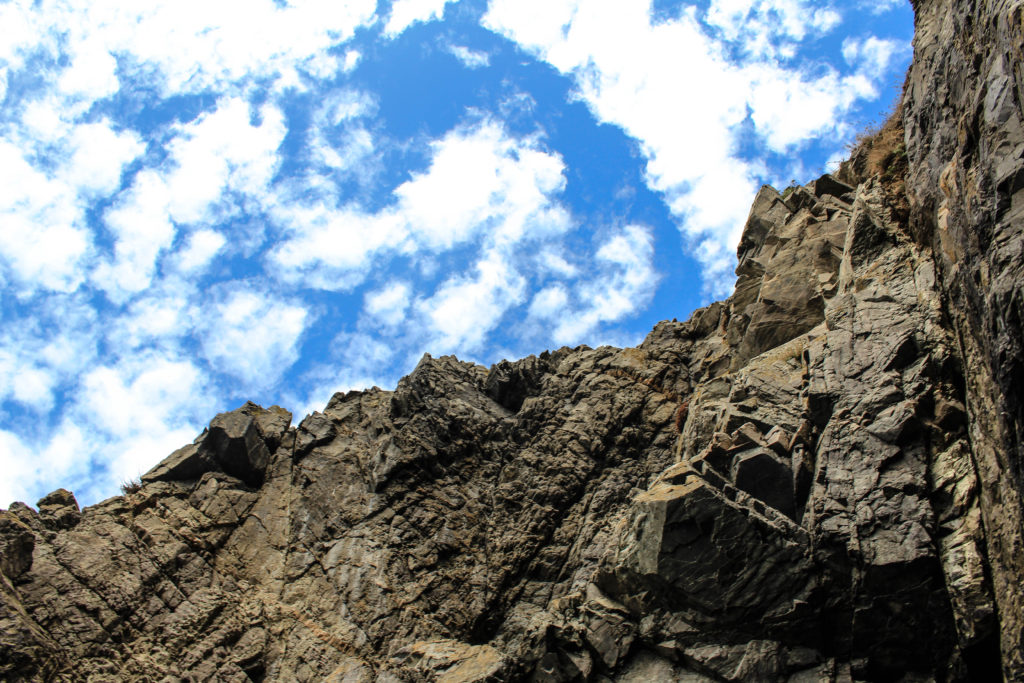
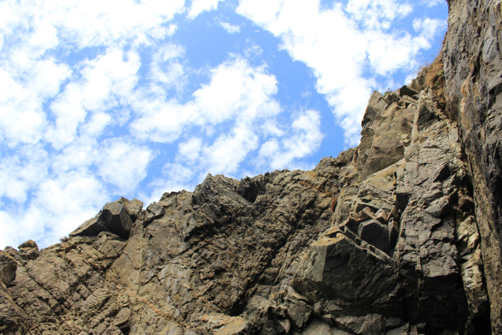
I have selected this as one of my final images from this L’Etacq shoot as I think that there is many interesting components to this image. Firstly, I think that there is lots of contrast between the rocks and the sky, as I have increased the saturation in order to enhance this. This effect is created by the interesting perspective of the photograph, as I took the image from the beach, looking up to the rocks and the sky. I like that this means that half of this image if rock and half is sky, and also the fact that each rock is visible in the image as the clarity is very high. Furthermore, throughout the photograph there is lots of texture created by the clear view of the rocks, this creates more depth of field within the piece.
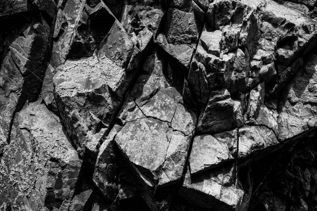
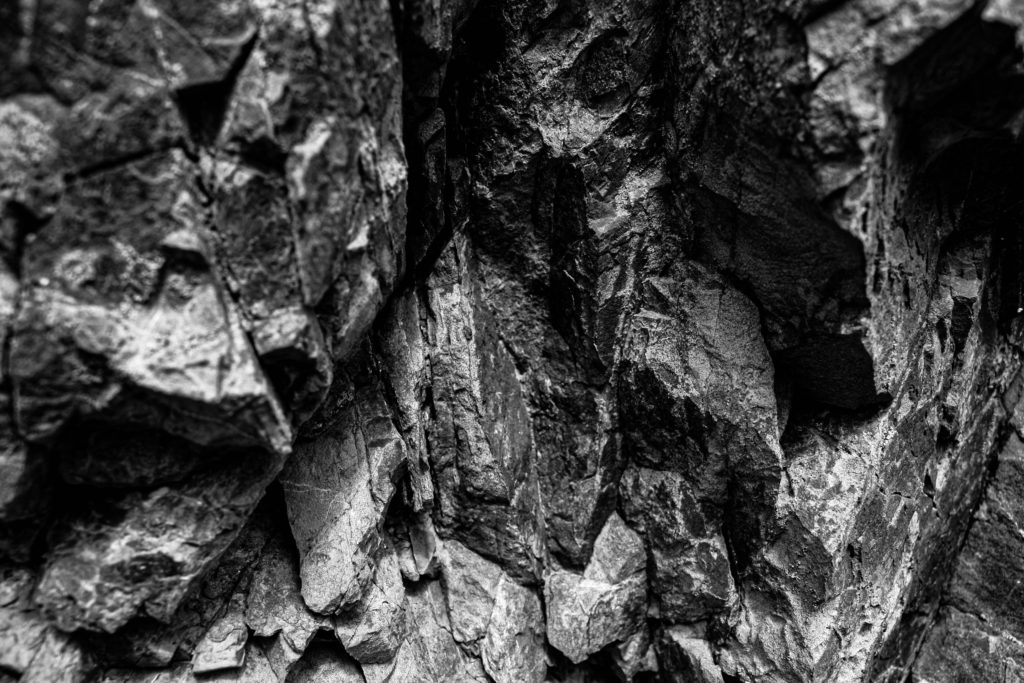
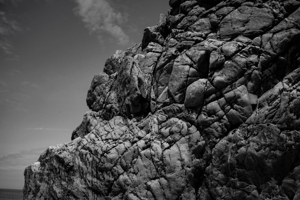
I have put all three of these final pieces together, arranged in this order as I think that if they were printed out onto materials such as foamboard they would look best this way. The most prominent feature of all of these images is the high contrast and increased clarity. They have all been edited to black and white so that this is more obvious, and I think that these are my most successful three images as they all link well, with the bottom one being slightly different yet still being linked through the ‘My Rock’ project. Furthermore, its important the note that the perceptive all of these images makes them more unique and I think this adds to the successfulness of these pieces. Alternatively, they could be viewed as more boring or generic as they are monochromatic, however, I think this reminds us of how old these rocks are.
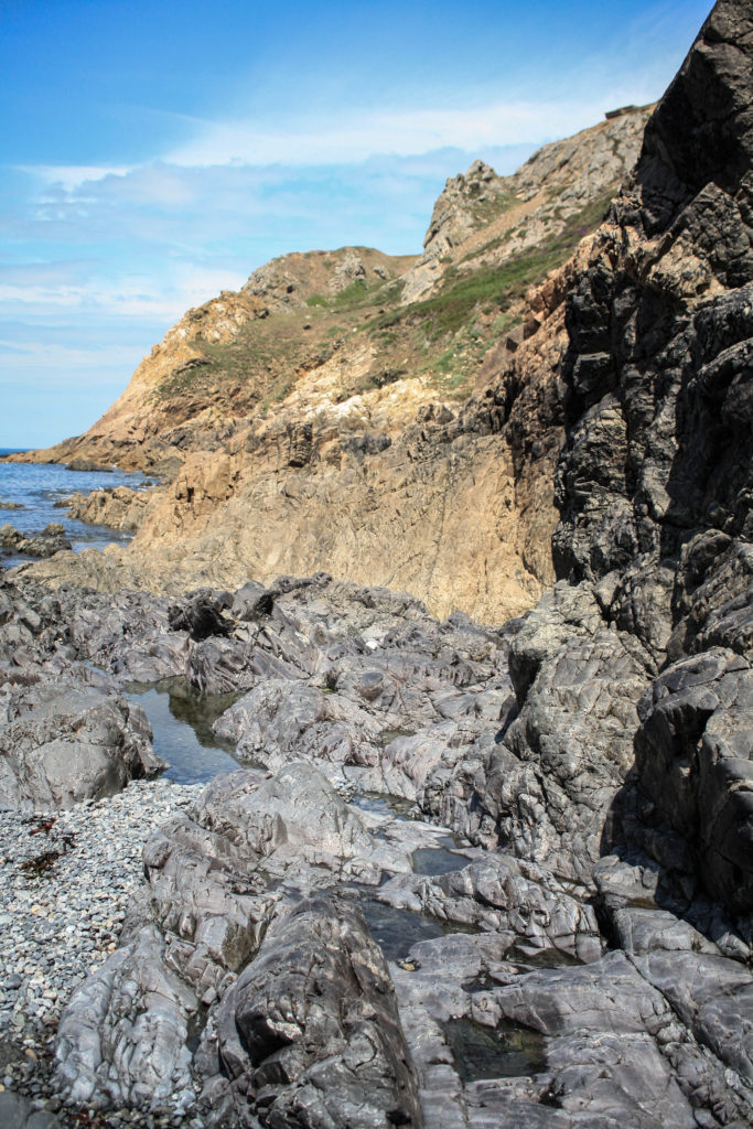
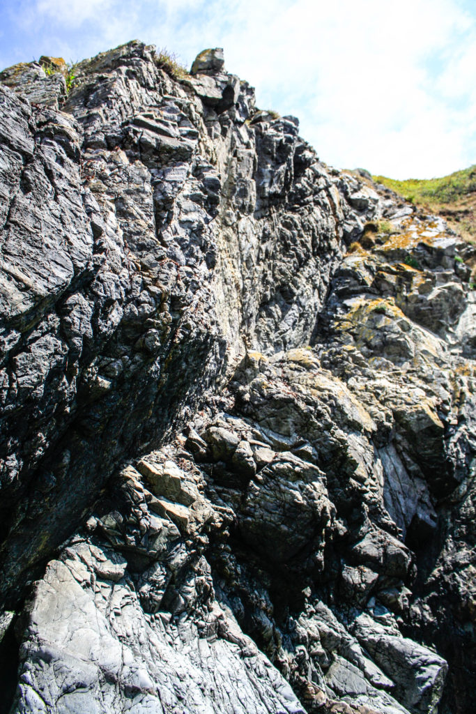
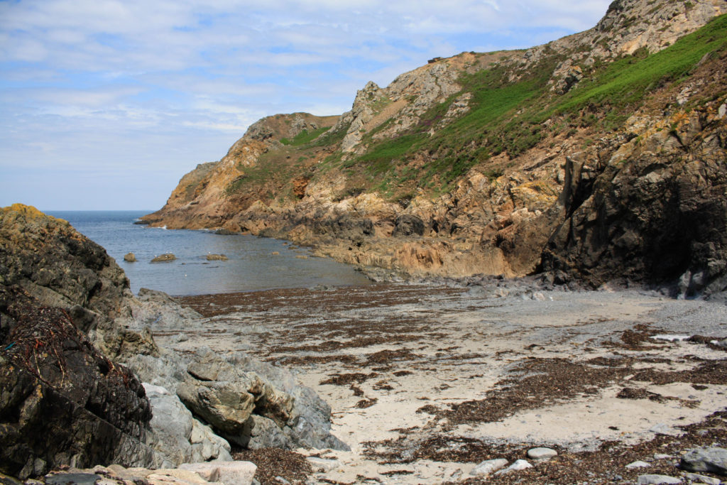
I have selected these as my last final two images as I think they have many similarities and differences. They were both taken at the same Jersey Sit of Special Interest, however features of these photographs such as the tones are very varied, as the one of the left is filled with warm yellow and green tones with nicely contrast with the greys in the foreground of this image. Alternatively, the one on the right is filled with cooler toned greys throughout the whole image with spots of colours such as the green in the background. However, I think that the clarity of these images could hinder there successfulness, as most of the increased clarity’s had to be increased through editing and weren’t part of the original images.
Process
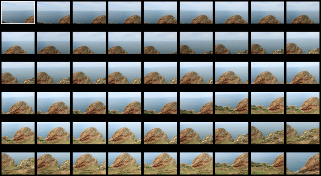
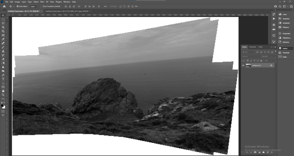
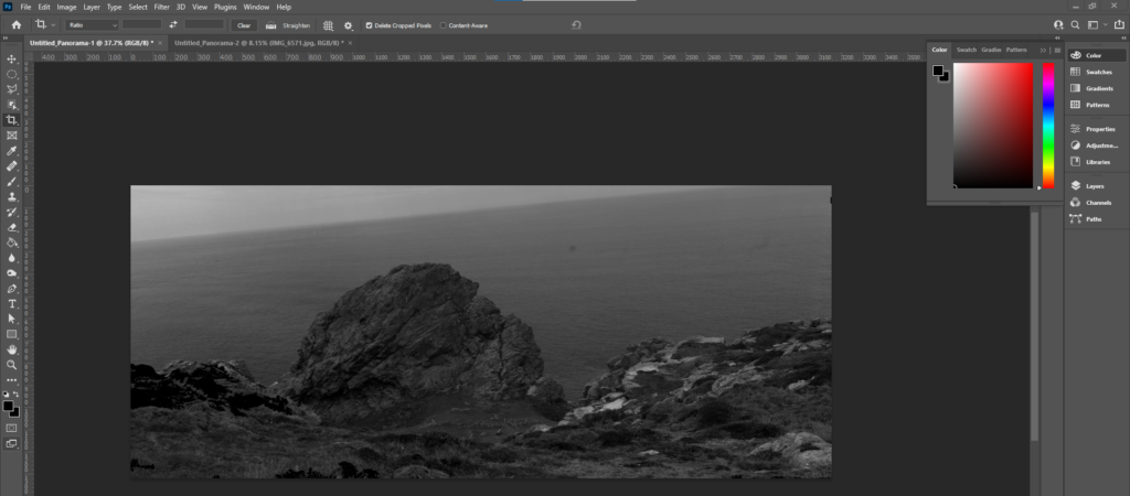
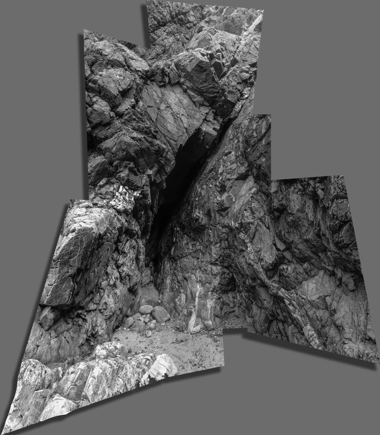
Below I have included some images to help explain the process of how to produce a joiners, inspired by David Hockney’s work. Using Photoshop and the images selected from Lightroom, we used the Photomerge tool to digitally create the joiners. The main advantage of this process is that it’s quick and creates effective joiners as long as long as you use legible photographs.

Outcomes
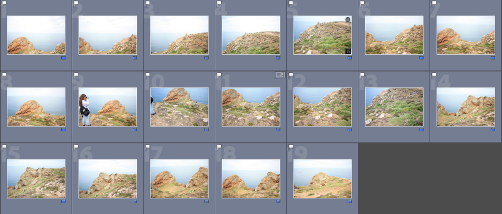
To make the joiner we had to create a quick collection in Lightroom, creating the folder make it easier to export the images into Photoshop to create the joiners. Below I have added some contact sheets so that the process is more visual.

Evaluation: This outcome was created from good original images, the main disadvantage of this piece of its composition. As the angle of the image could be viewed as boring along with the fact that someone is in the joiner, meaning it distracts from the focus of the Sight of Special Interest. Despite this piece not being fully natural, the La Pinacle being in the background means that there is some variety within the piece. The photographs matching up perfectly means that the details in features such as the horizon and rocks aren’t lost.

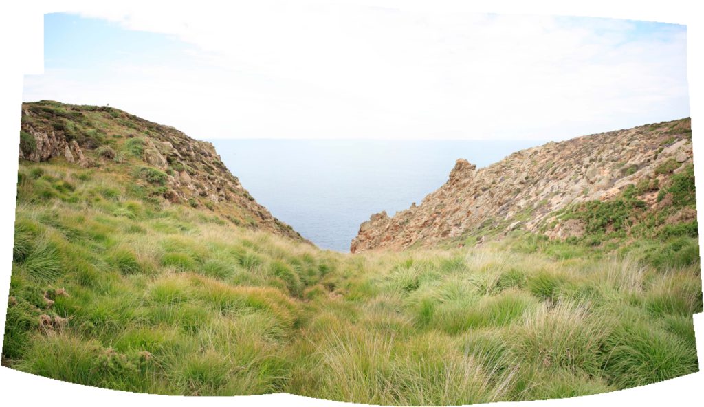
Critique: This joiner looks very much like my other one, which could be seen as a negative as there isn’t much variation in my work. Furthermore, I think these piece is a little over exposed and the fact that the angle captures more of the ground then the sky and rocks means that all you can see is grass. Despite this, the images used to create this are very legible meaning that the final piece turns out clear and aesthetic.
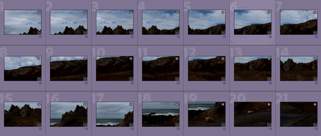
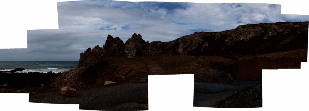
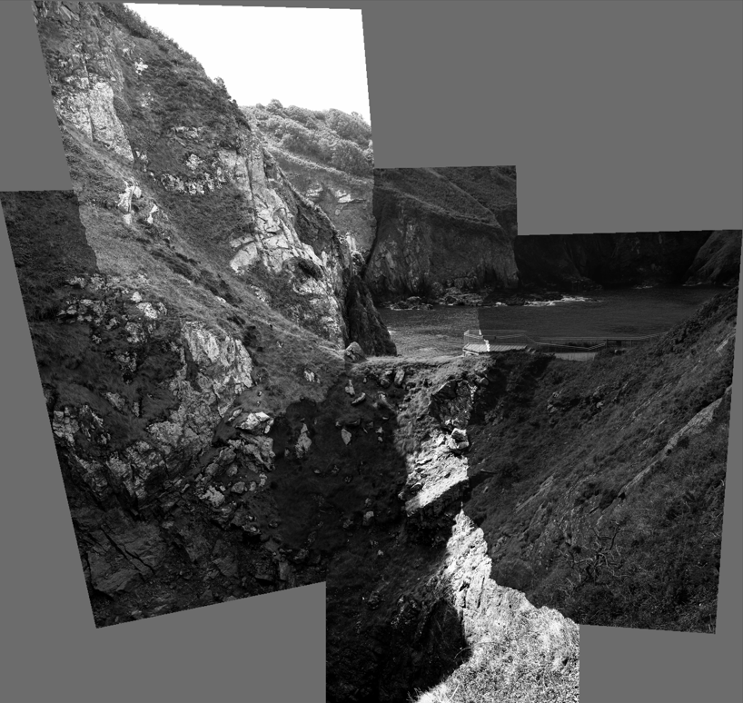
I think that this joiner is one of my best, as the warmer tones in the joiner adds to it’s effect. However, I think that the fact that there is a missing part in the bottom middle of the image creates a bad focal point for it. Despite this, I feel like with lots of editing this could become a lot more successful joiner as I like the location of Stinky Bay a lot, as I think that this is one of Jersey’s most aesthetic geoparks.
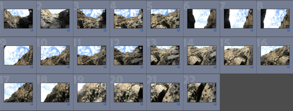
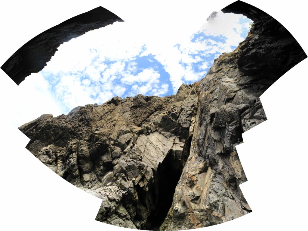
I thought that this would be my best joiner, however it didn’t turn out as successful as I anticipated, I think that the perceptive of this joiner is quite creative, however the final space of the image came out a bit strange and I think that changing the shape through editing wouldn’t fully fix the problems of this joiner.
Experimentation
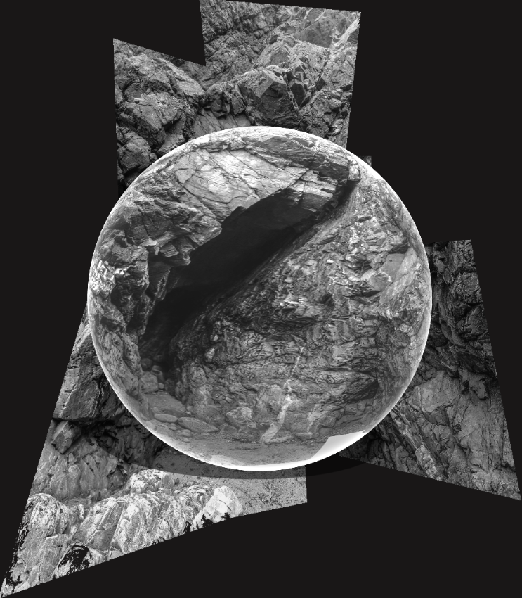
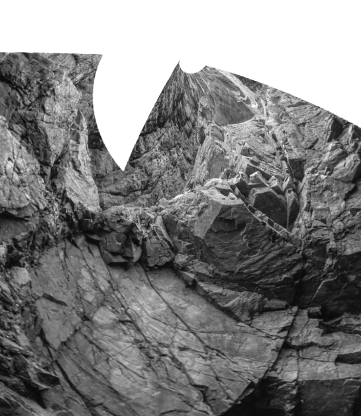
Below I have taken my joiners and changed them into 3D shapes, I have altered some of their textures to add more depth and variety to my experiments. In my opinion, these make the joiners more fun but don’t really match with David Hockney’s work.
Original Joiner
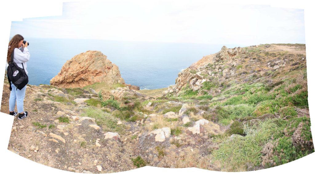
Edited
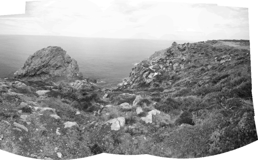
I think that this joiner is a lot more successful in black and white, this is because more contrast is created between the actual joiner and the white background. I think that more contrast within the joiner there is, the more successful in the first place.
Original Joiner

Edited

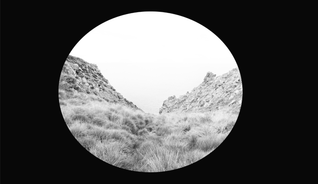
The edit on the right is my favourite of all of my joiners, again there is lots of contrast as I have washed out the joiner by purposefully having a very white sky, this along with the circular shape means that there is lots of focus on the picture itself rather than the background.
Original Joiner
