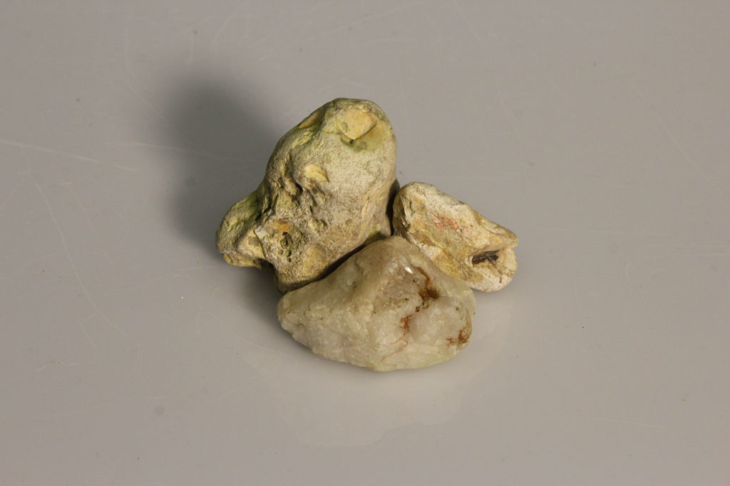
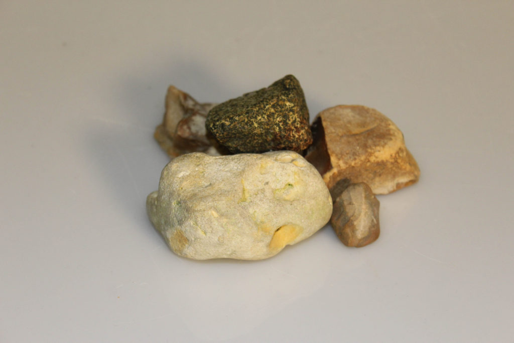
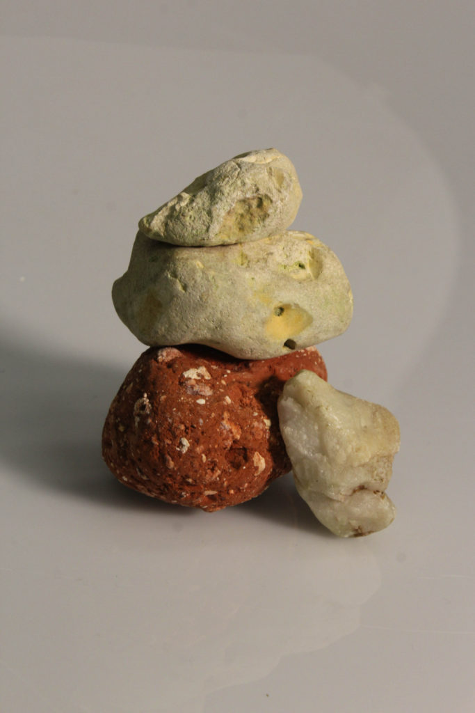
Still life photography is a genre of photography used for the depiction of inanimate subject matter, typically a small group of objects. Similar to still life painting, it is the application of photography to the still life artistic style.
Historical context:
Still life derives from the Dutch word stilleven, coined in the 17th century when paintings of objects enjoyed immense popularity throughout Europe. The impetus for this term came as artists created compositions of greater complexity, bringing together a wider variety of objects to communicate allegorical meanings.
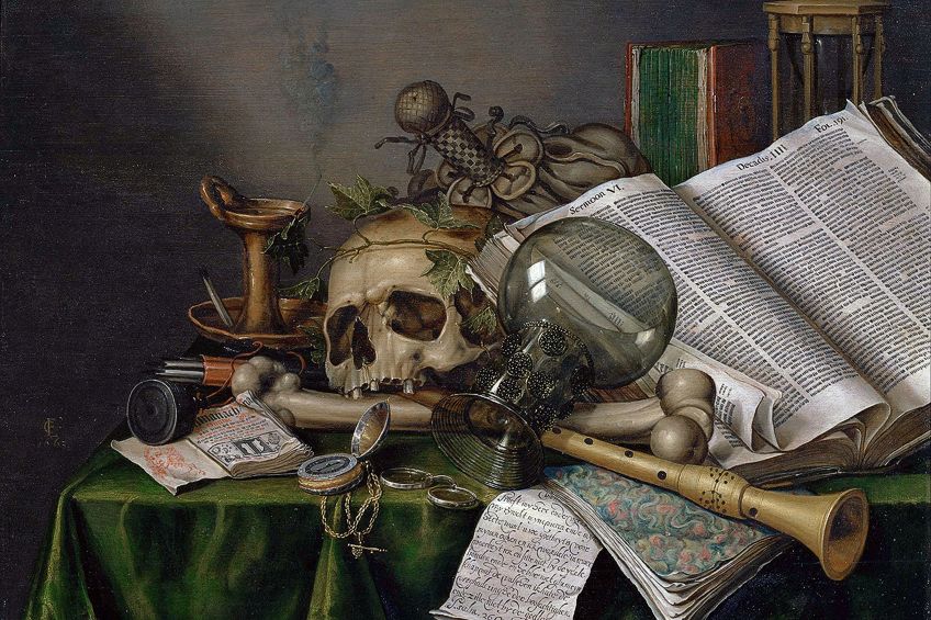
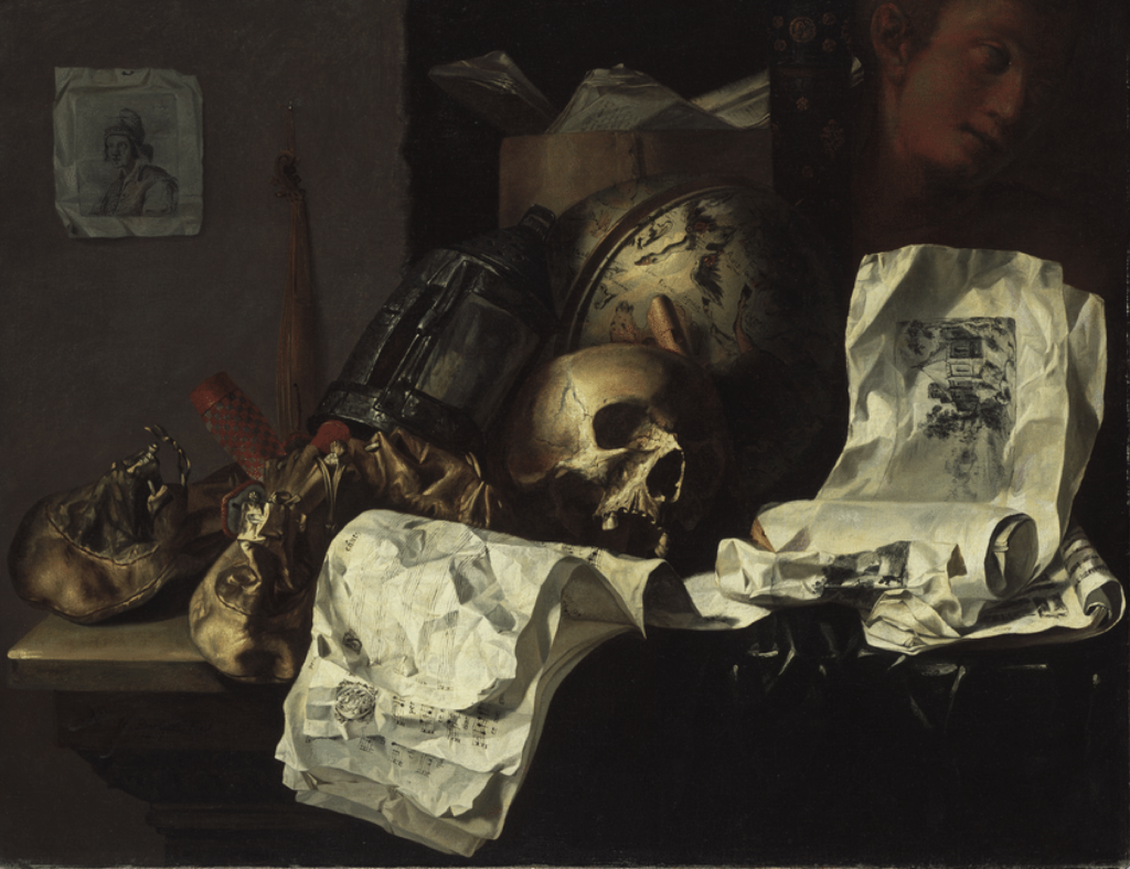
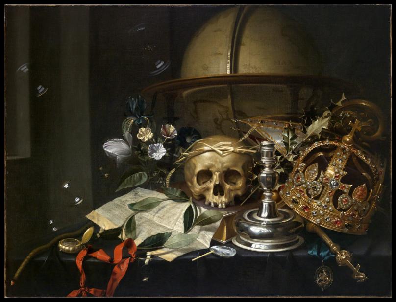
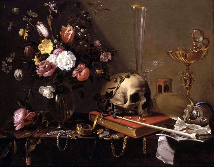
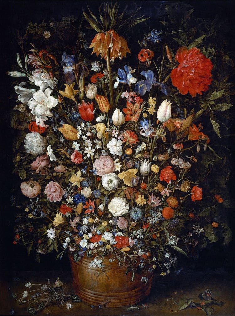
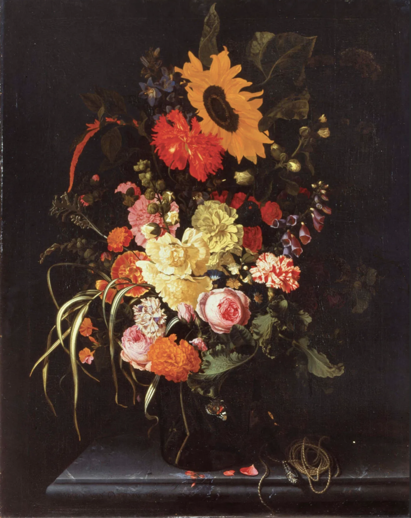
Still life painting reached a height of popularity in the Netherlands during the 17th century, when the market for small intimate paintings for domestic settings exploded. These images reflected the importance of religion to their owners and used a rich symbolic language to subtly convey complex moral and spiritual ideas. Flowers, fruit, and common household items were used to gently remind the viewer that life is short, death is certain, and any overindulgence in sensual earthly pleasures will be paid for in the afterlife. A still life conveys vanitas themes because we know that flowers fade, and candles burn out. They symbolise the shortness of life and are meant to remind the viewer that existence is meaningless without the hope of salvation.
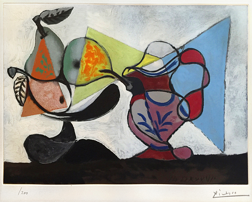
Still-life painting:
Franciscus Gijsbrechts (1657-1675) 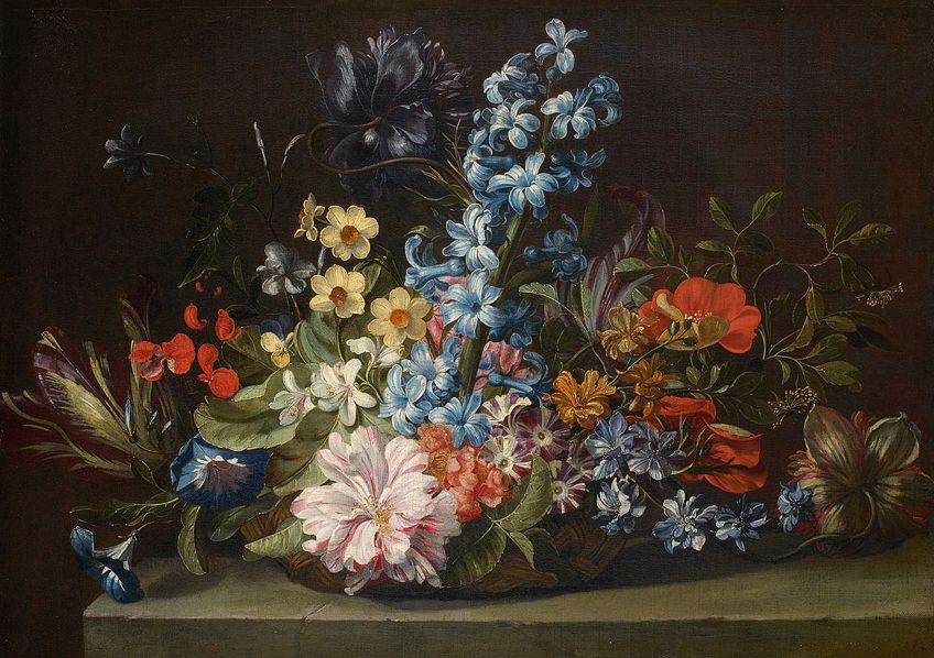
Jan van den Hecke (1640-1684)

Jacob van Hulsdonck (1615) 
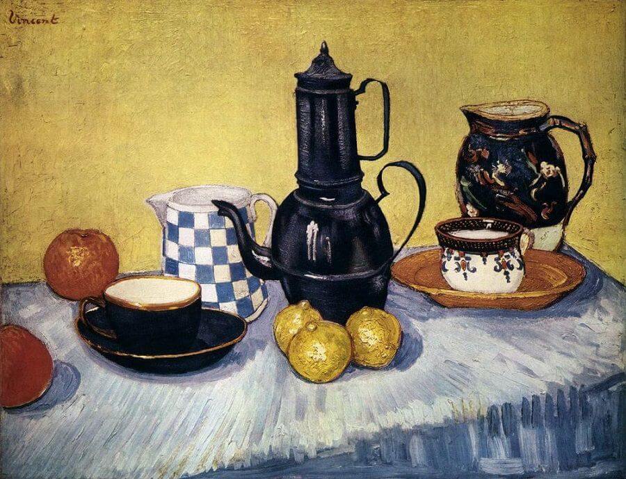
Paul Cézanne (1893)
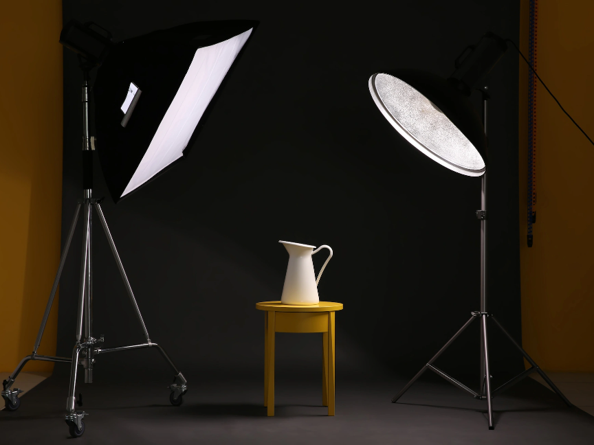
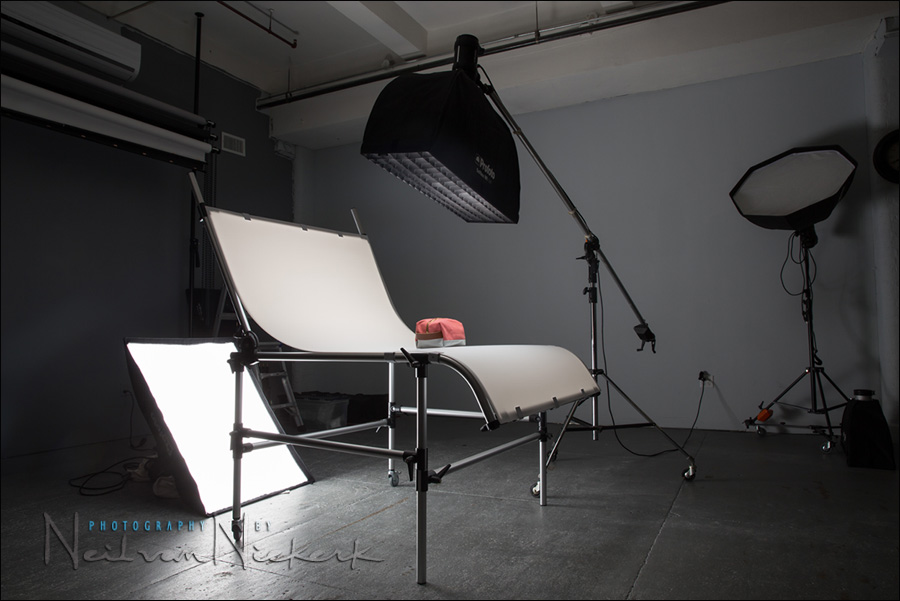
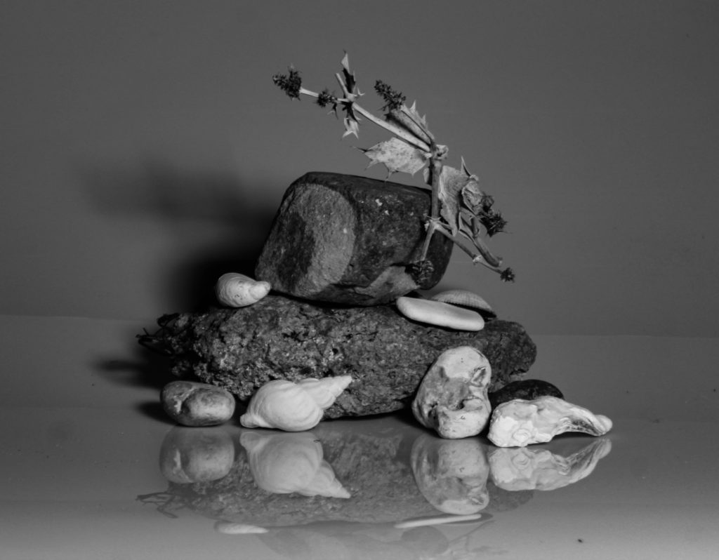
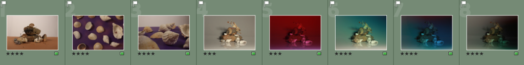
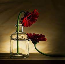
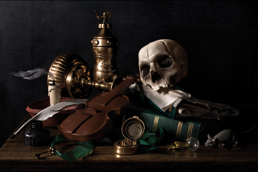
Still-life photography:
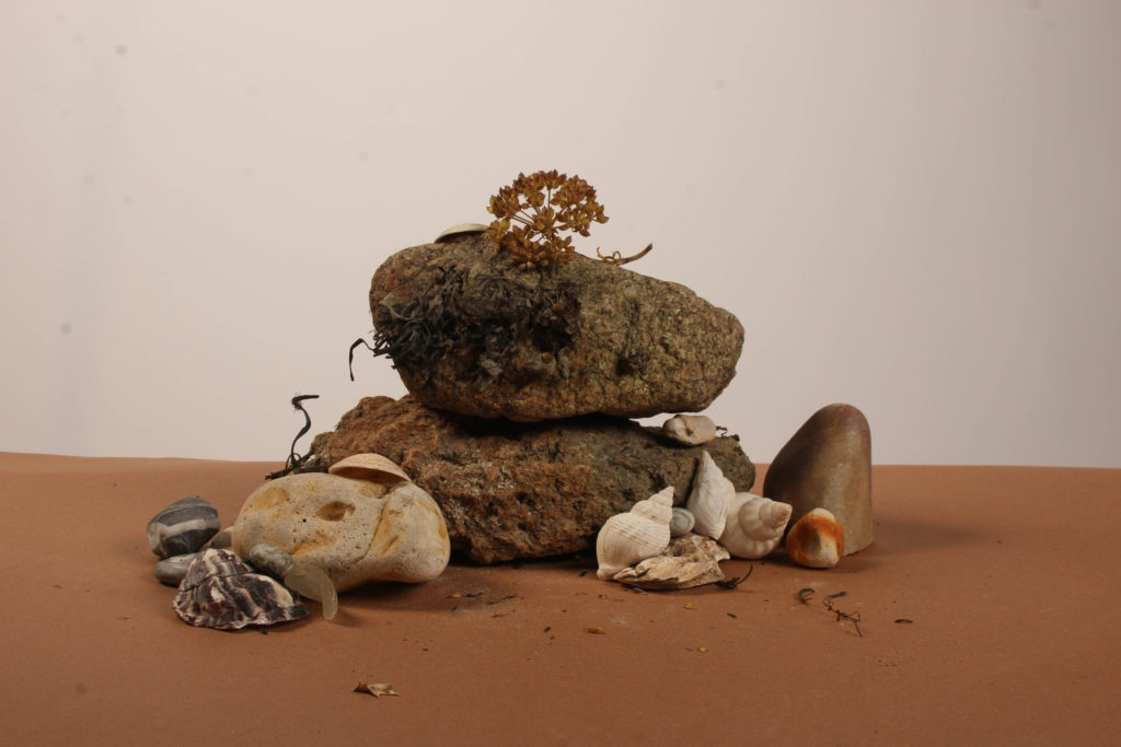
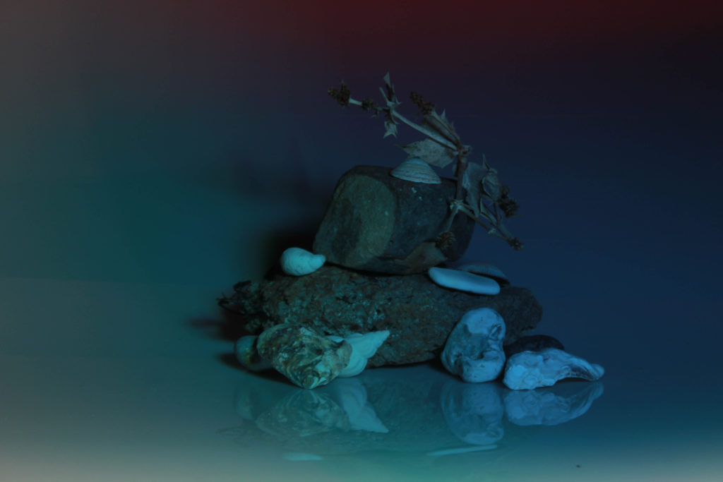
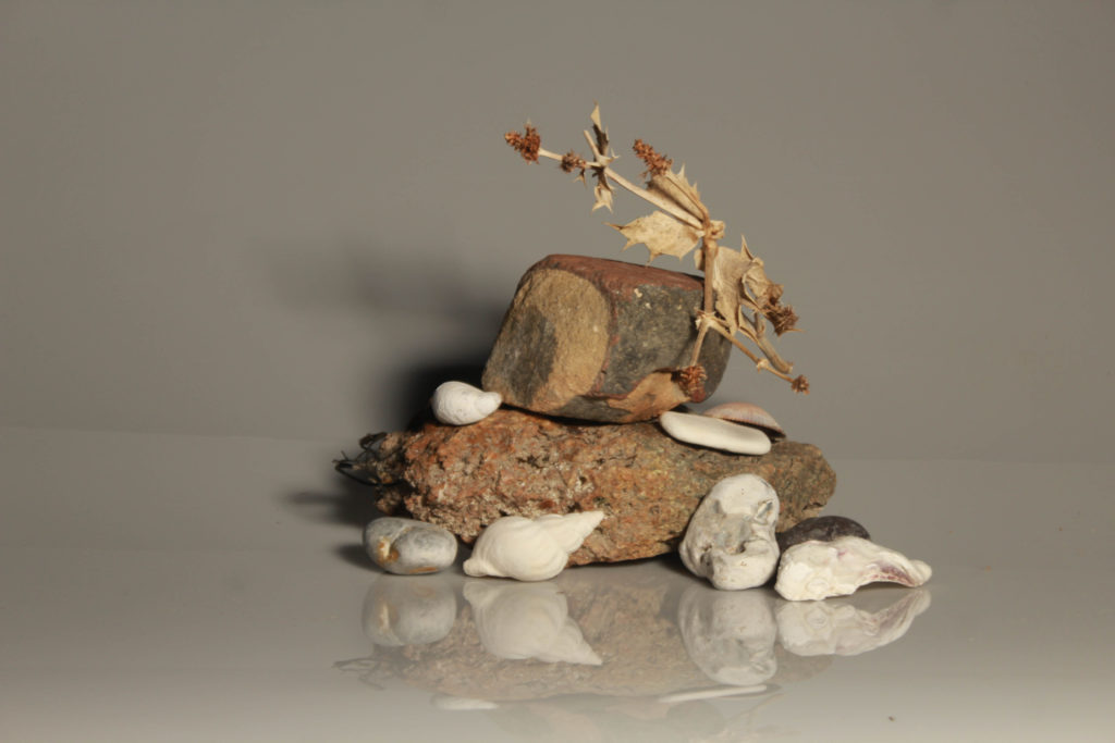
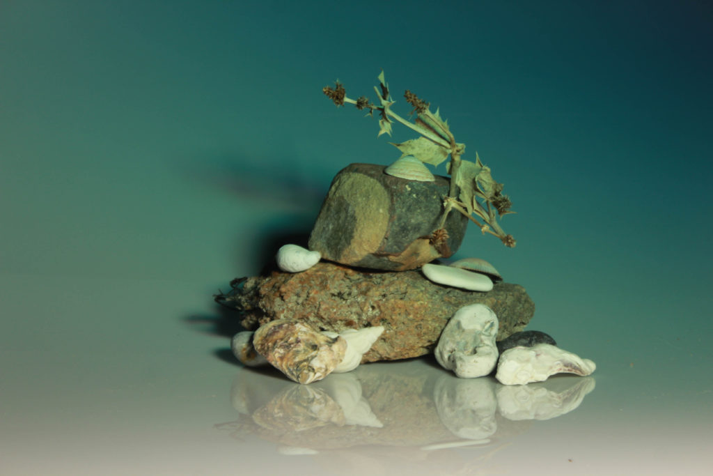
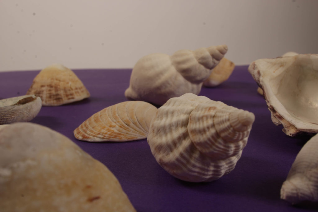
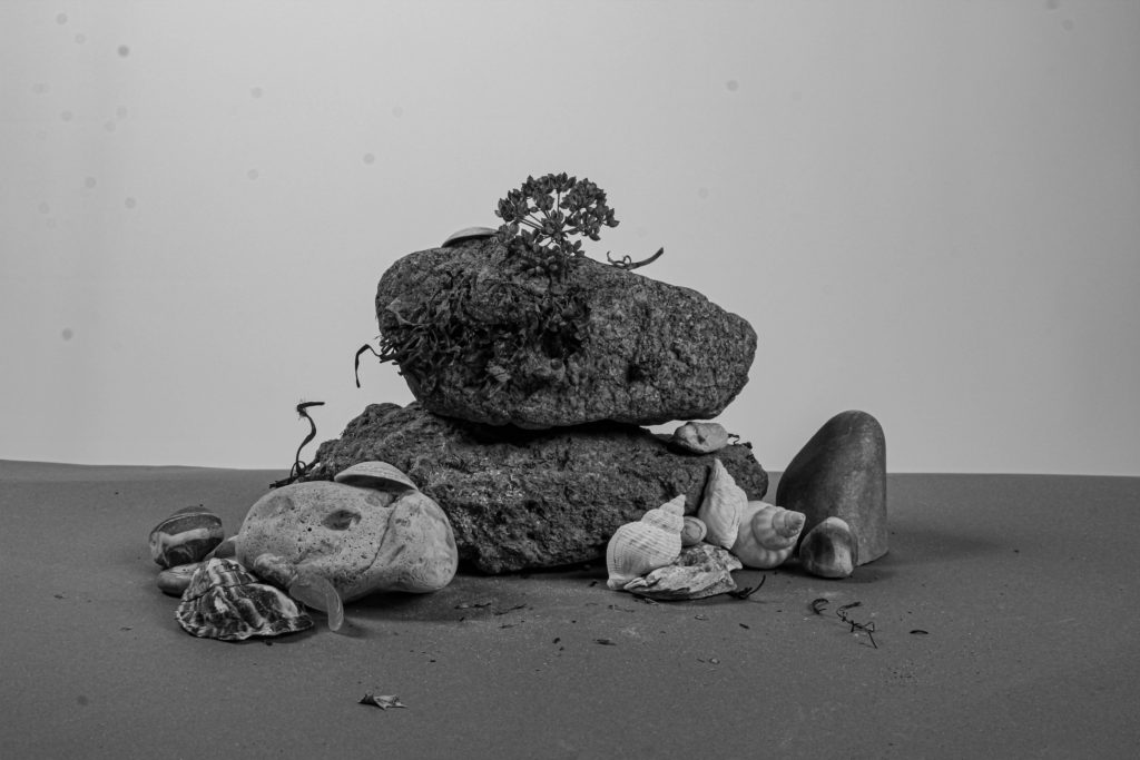
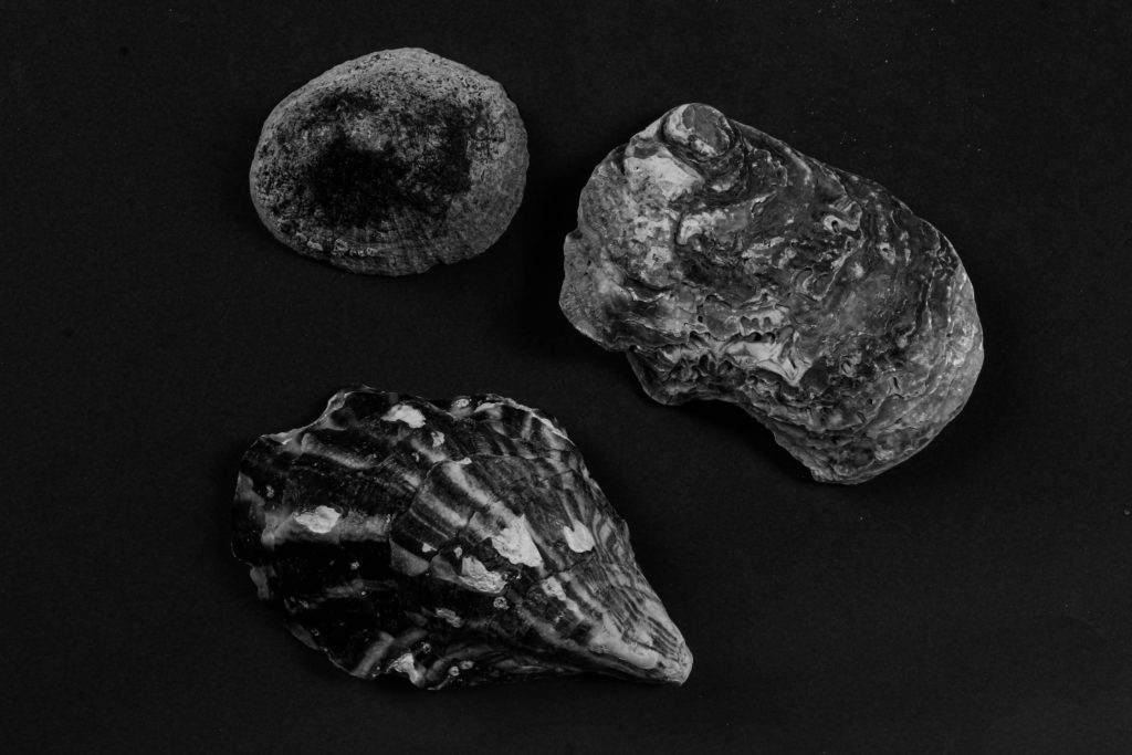
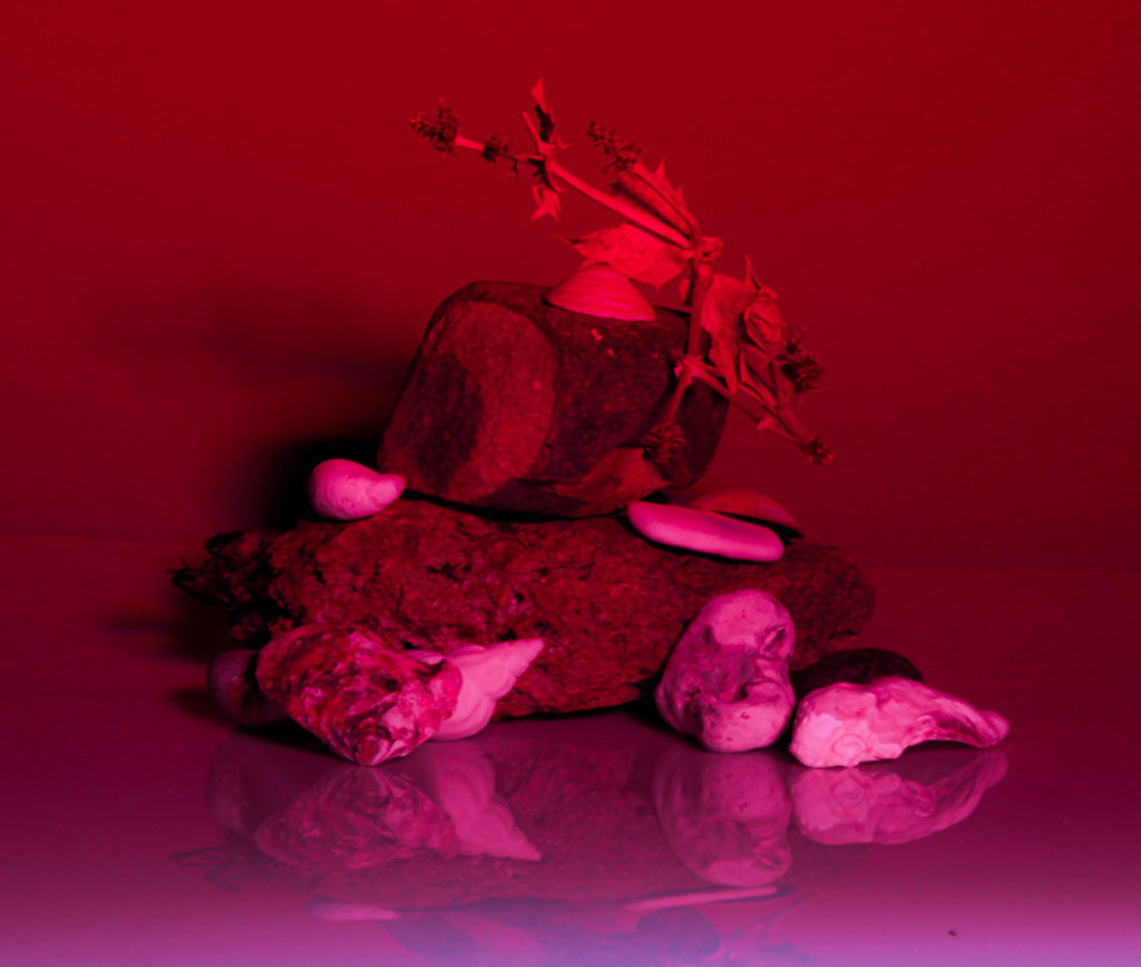
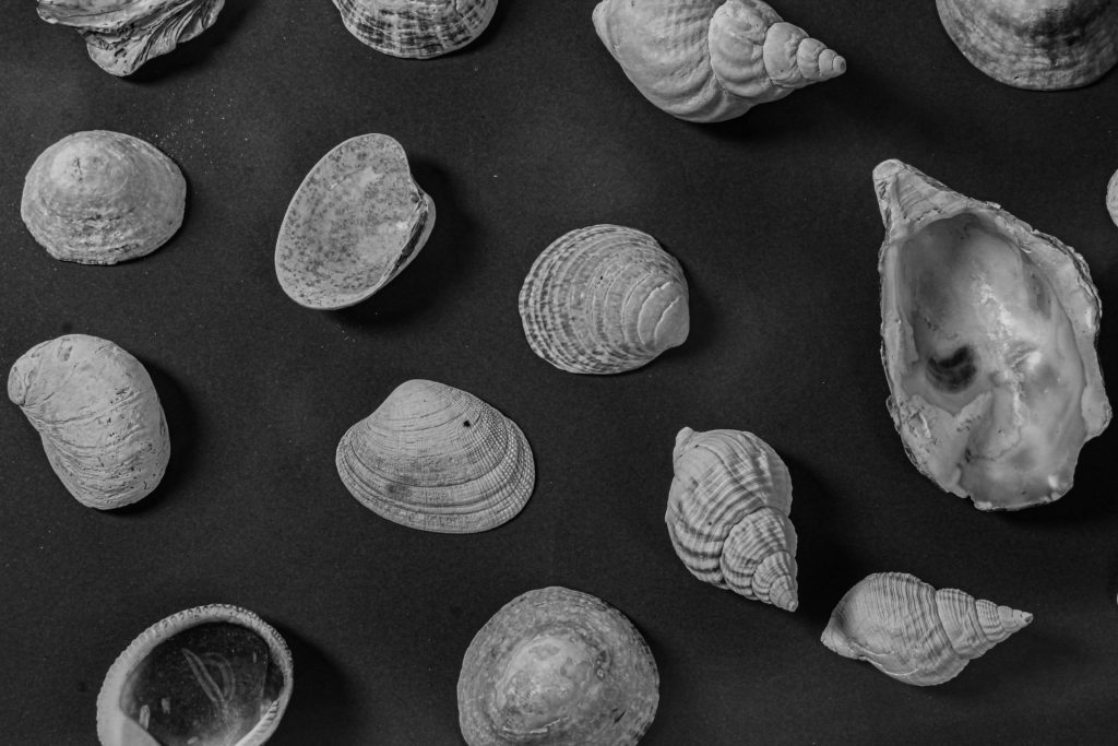
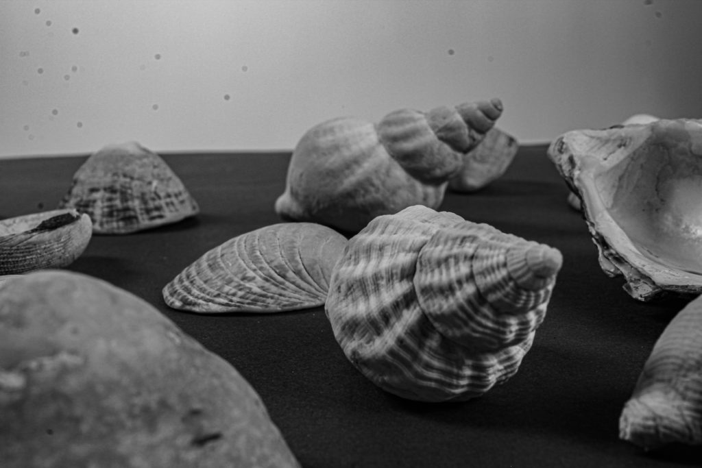
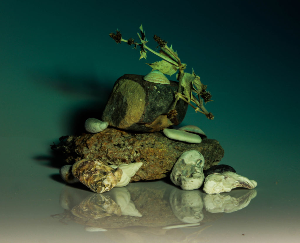
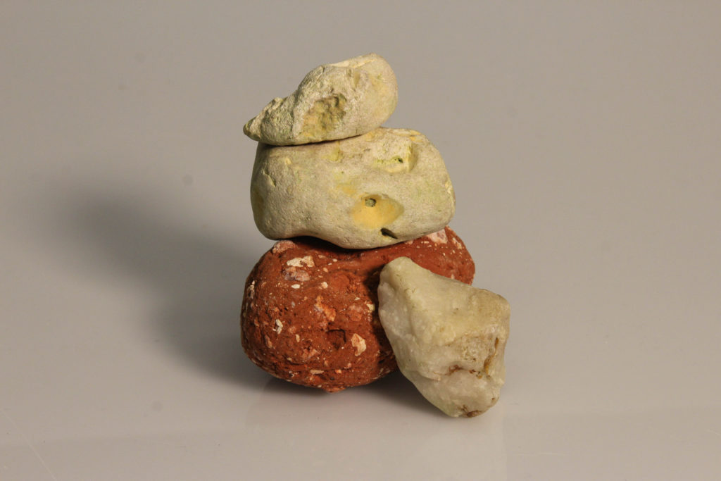
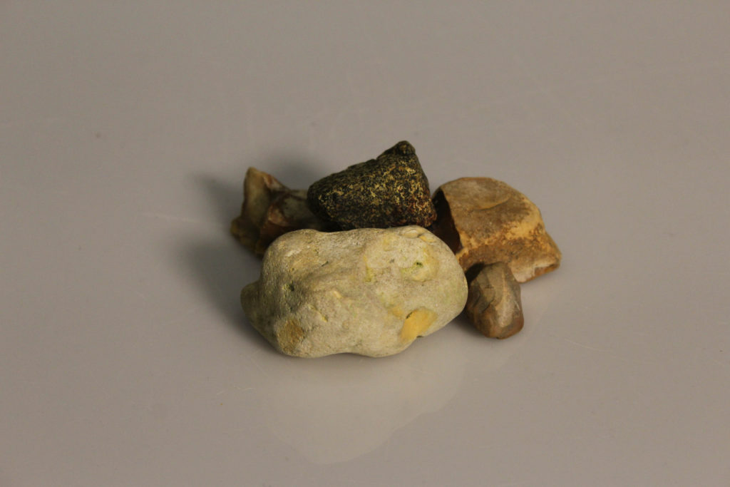
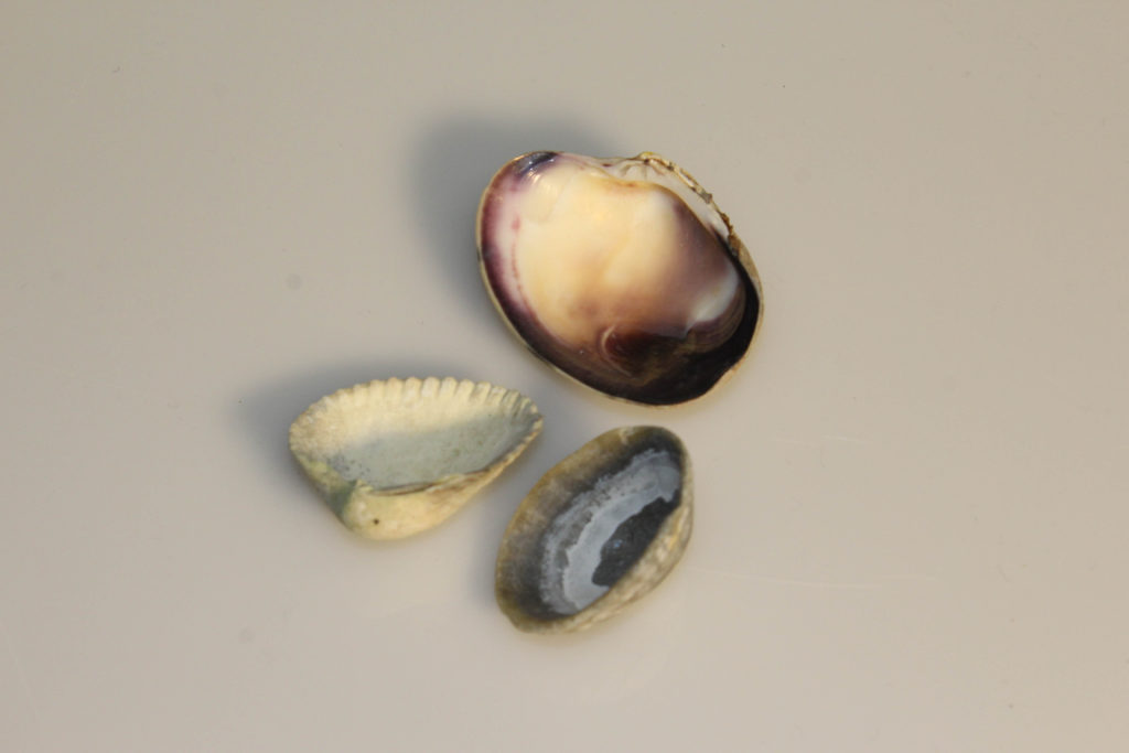
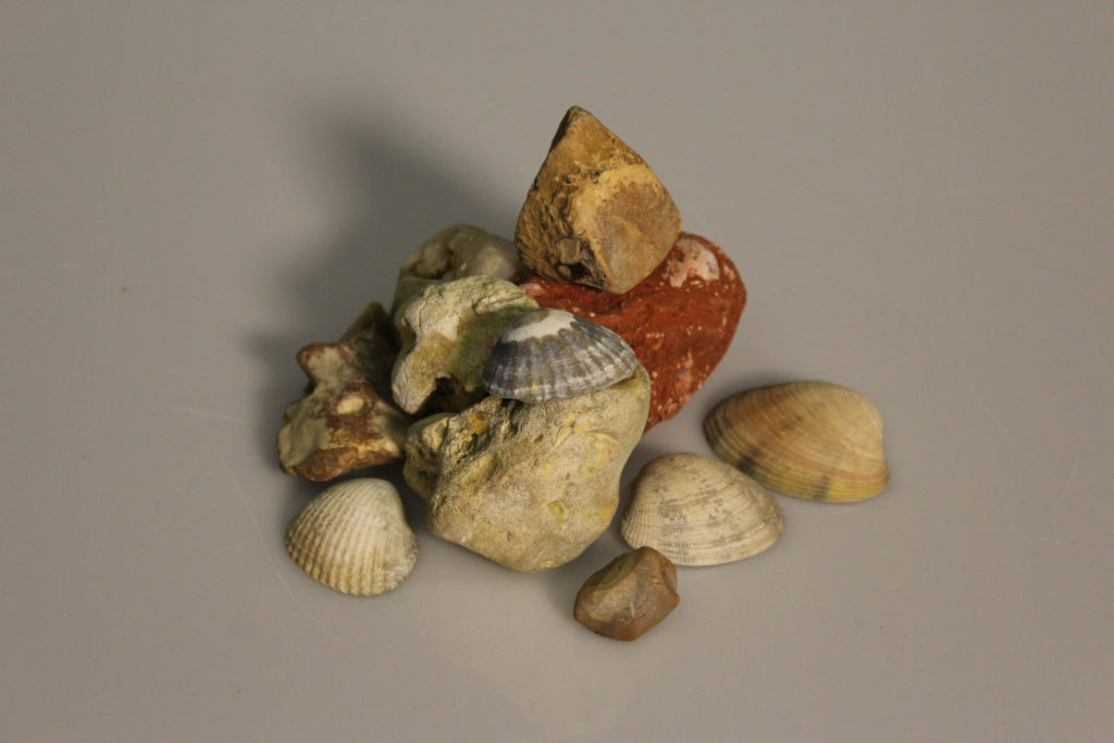
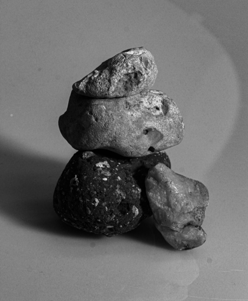
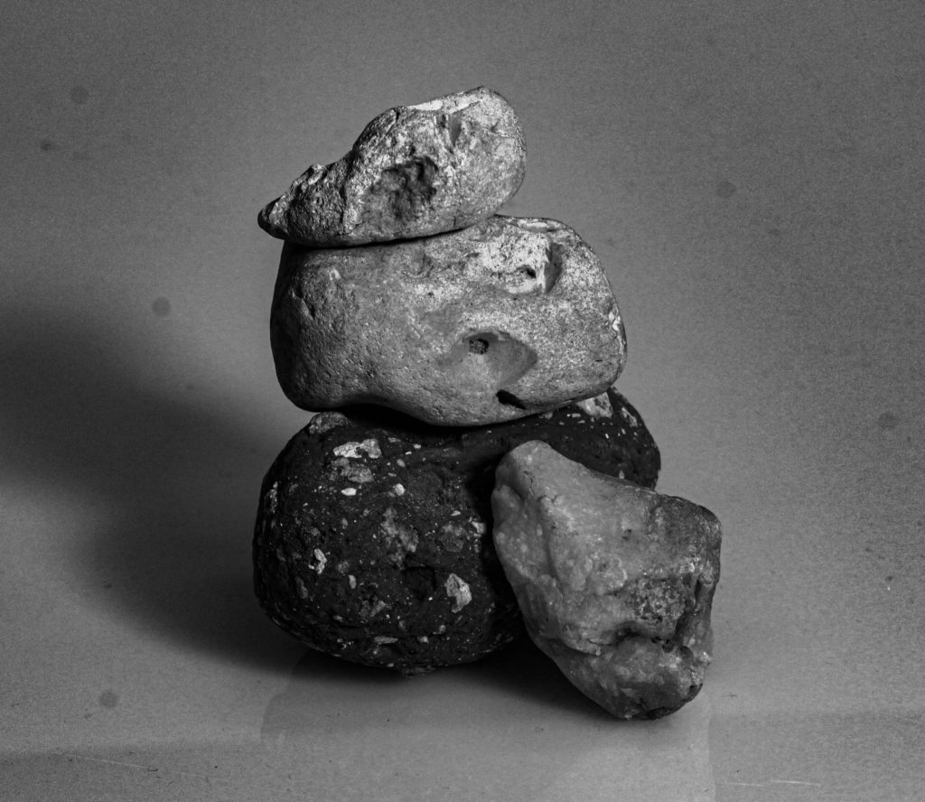
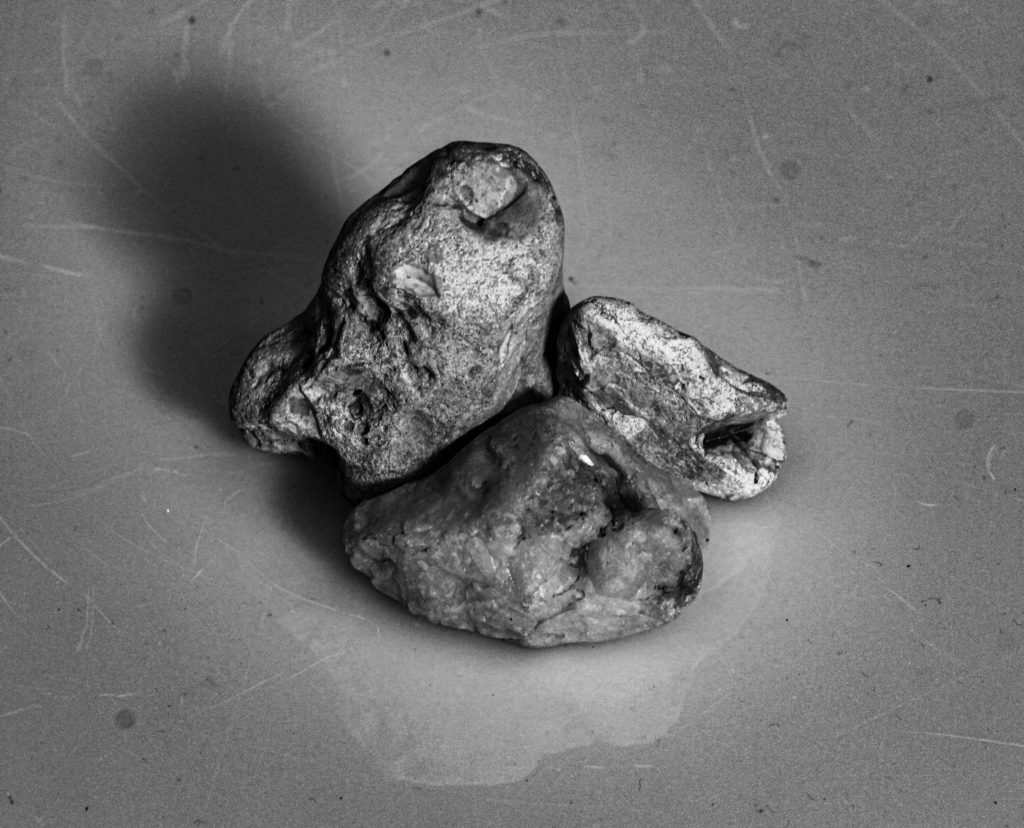
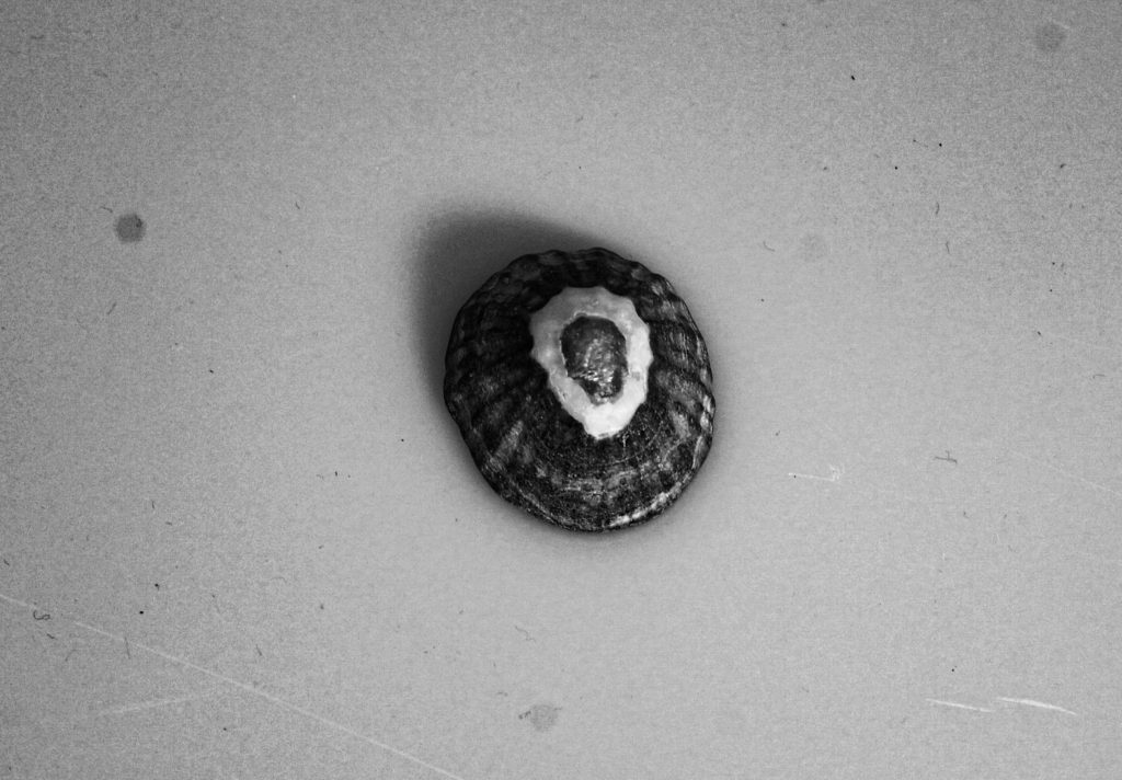
Still life photography is a form of professional photography that depicts inanimate objects or subject matters. Still life is a unique genre of photography. One thing that makes it so special is that often the subjects aren’t very interesting.
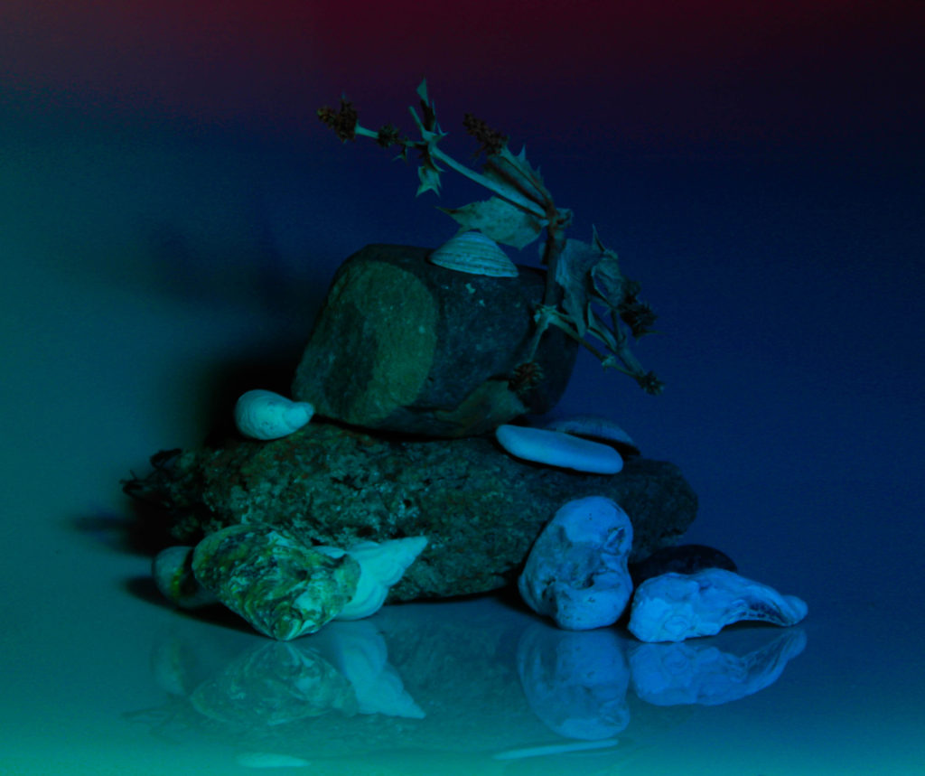
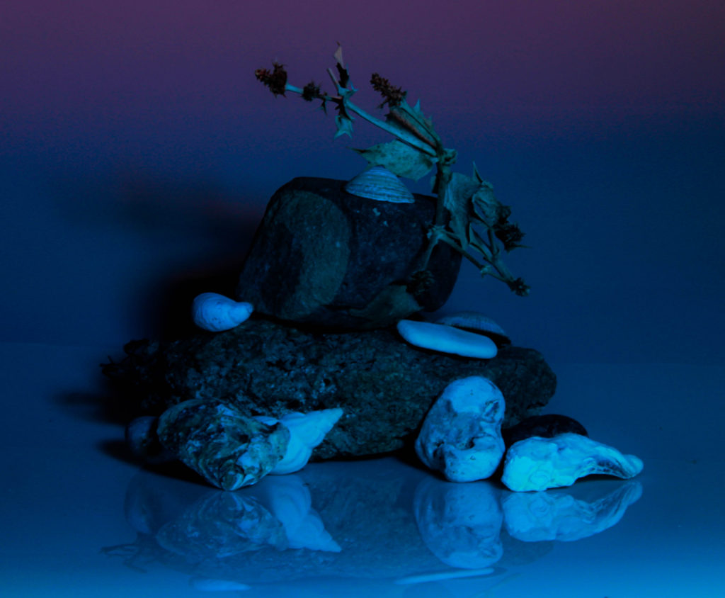
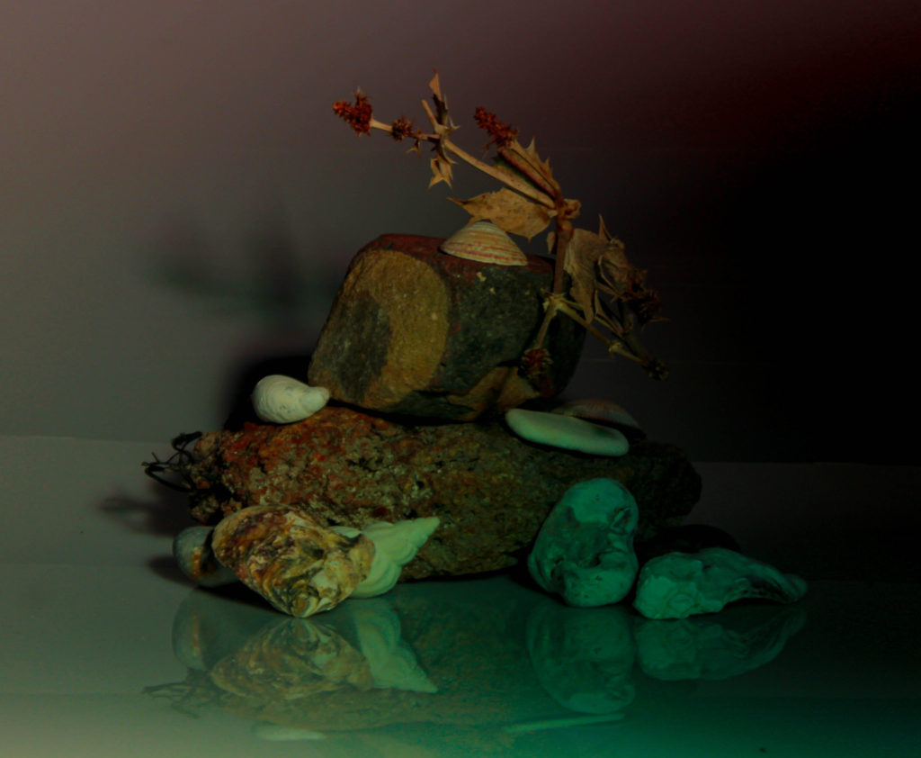
There are two different types of still-life photography which are found still-life and created still-life. Found still-life is photography that contains a combination of found subject, symbolic objects, and natural lighting. The visual message is concerned with the transitory nature of life, and the inevitability of death. However, created still-life is when a photographer creates an image with almost full control over lighting, mood, and composition. Because photographers directly influence the image creation process, still life photos reflect the creativity and style of the photographers themselves.


Key Painting Analysis:
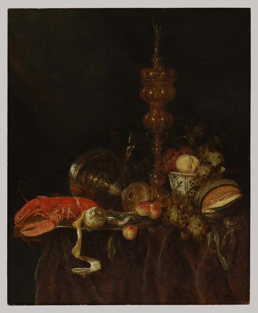
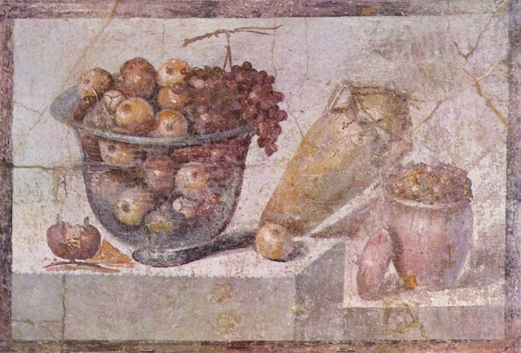
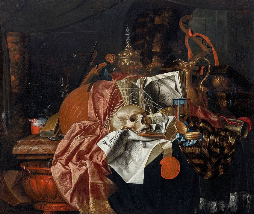
In this still-life painting created from 1620/21–1690 by Abraham van Beyeren it clearly displays multiple food items which symbolise the idea of ‘wealth’. The artist included a rich, red lobster which symbolises wealth and temptation with a fancy glass that shows the artist indulged in a life of luxury. The table shown is neatly lade boasting the luscious foods on display with a prosperous white and blue bowl. The glass could be used to reflect the richness off of the lobster to arrange the ideas of wealth throughout the collection of lavish items. The ideas of good luck and abundance have been presented through the grapes which are slightly hanging off the table meaning to always hold on due to the good luck. The painting has a great contrast between the black background and the dimmed items presented on the table. The use of the dark browns make the image have a dark tone and create a gloomy feeling towards the viewer.