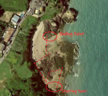
summer work- plemont/ stinky bay

Photoshoot Plan

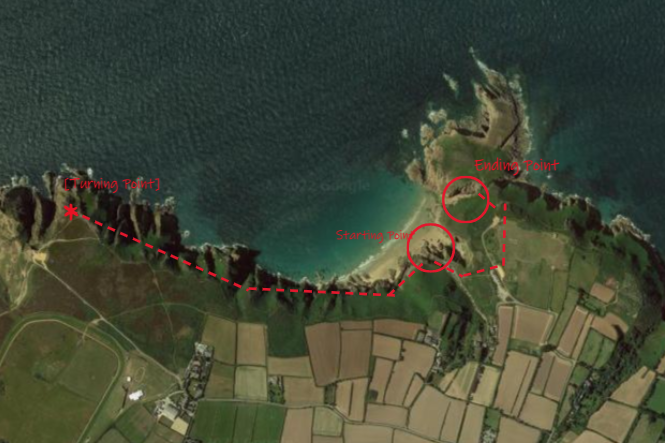
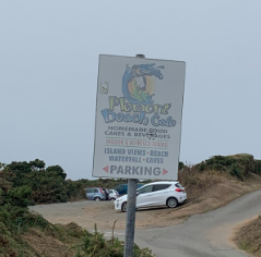
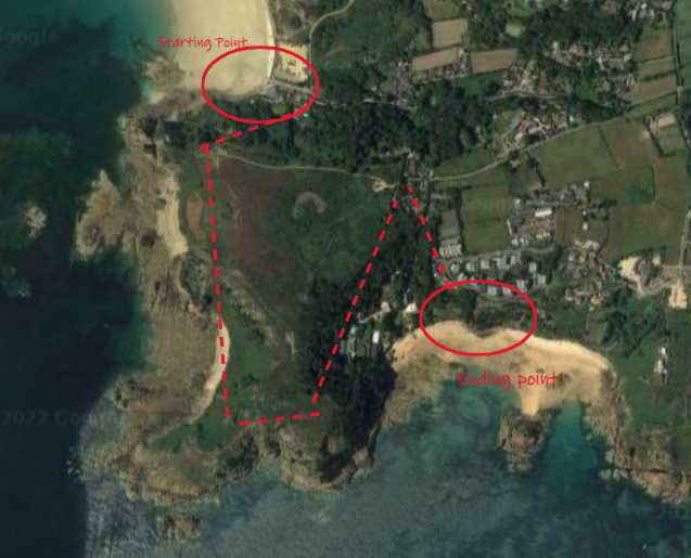
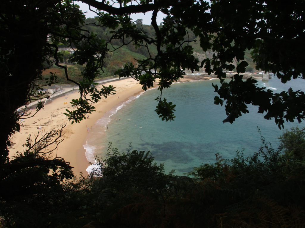
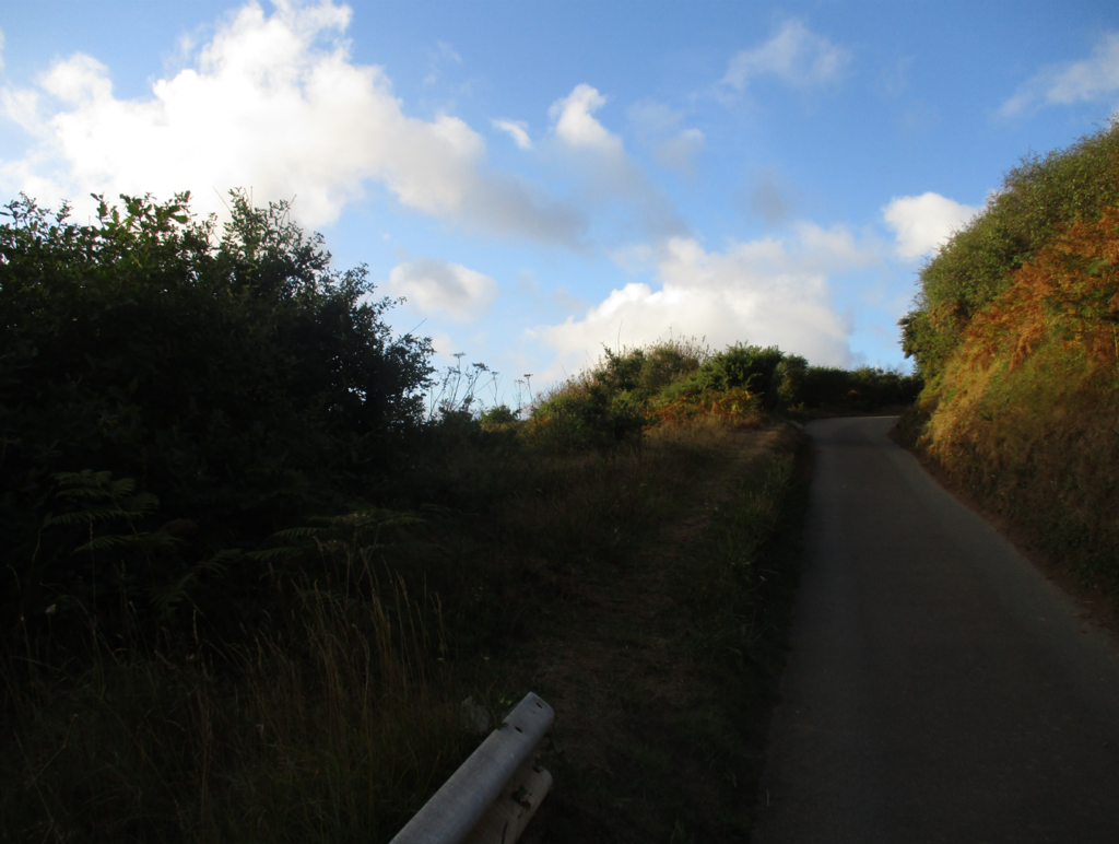
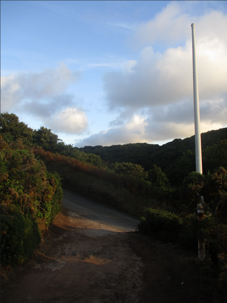
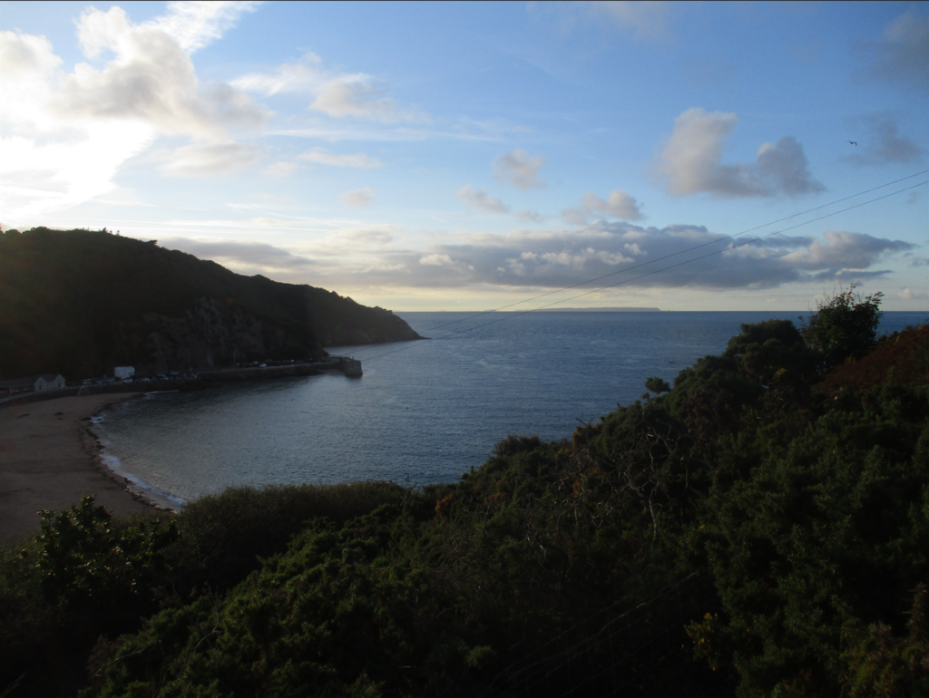
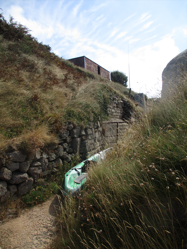
I will be taking photographs at Plemont and Stinky Bay, I would like to take these images round midday to ensure that I can have the best changes of having the correct lighting for this shoot, and making sure its not raining to make sure my only equipment, the camera, doesn’t get damaged.
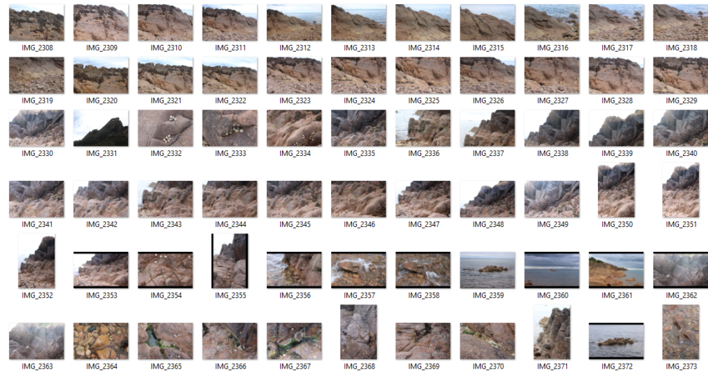
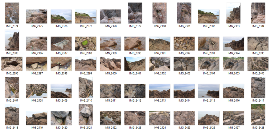
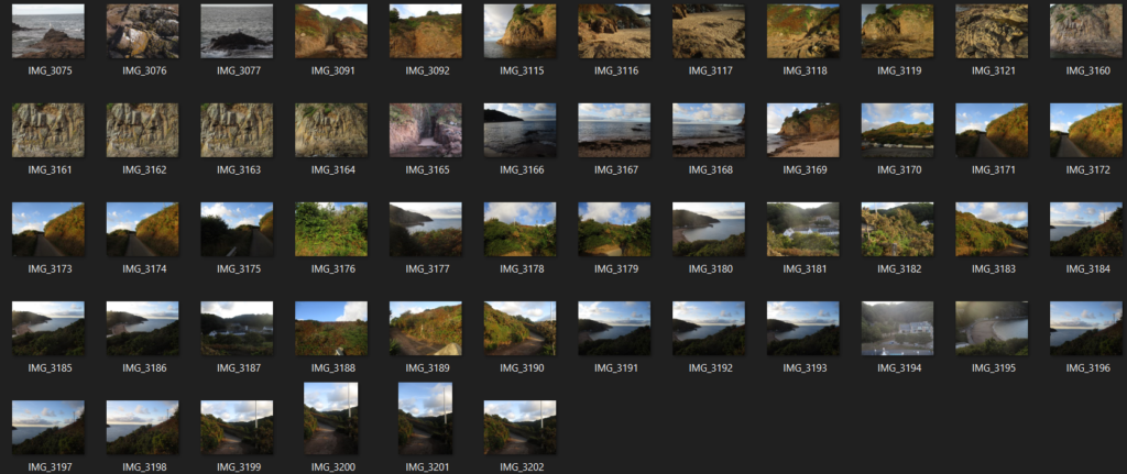
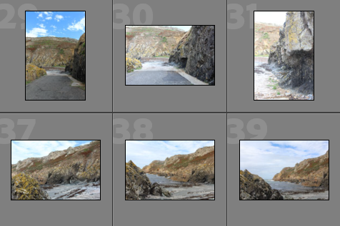
Contact Sheets

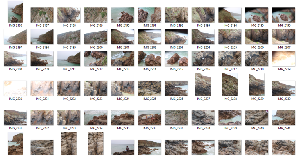
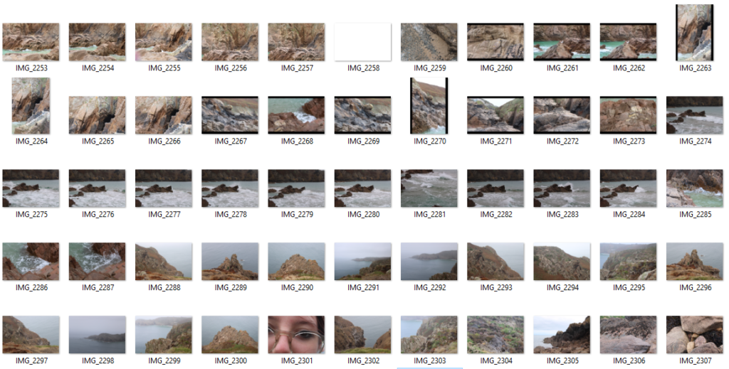
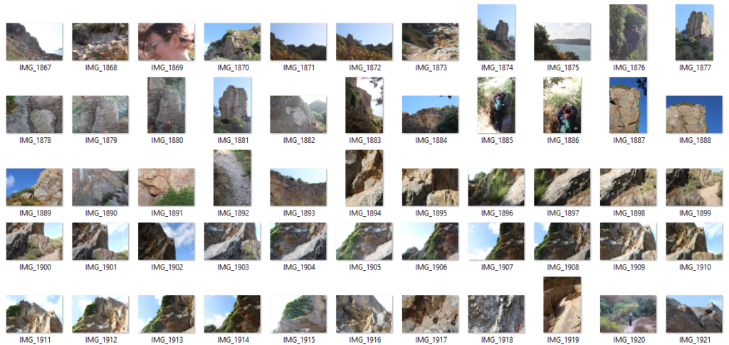
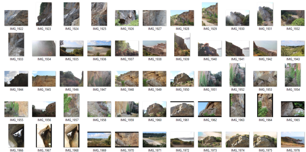
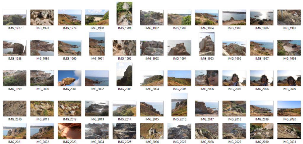
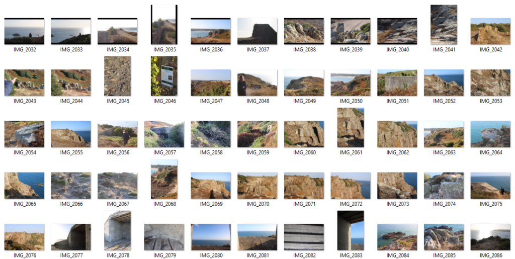
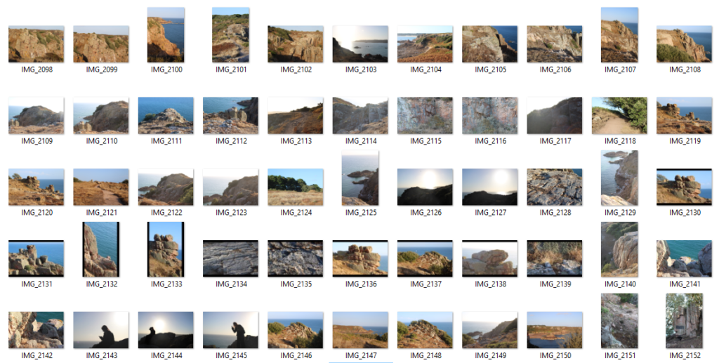
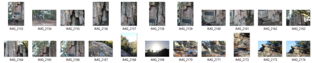
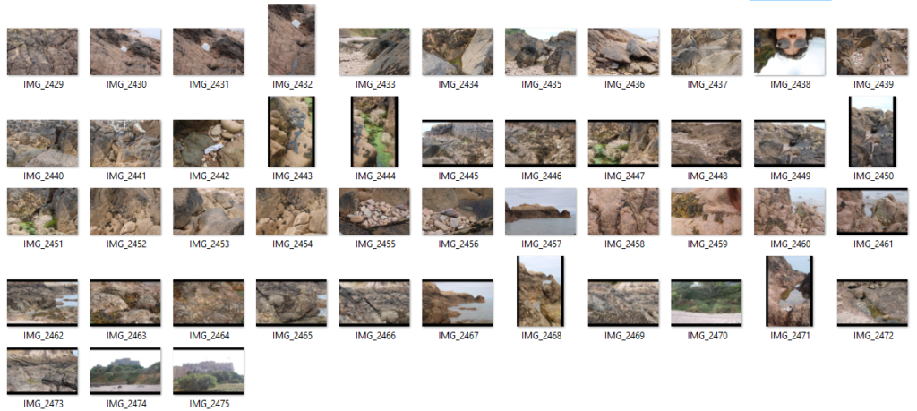
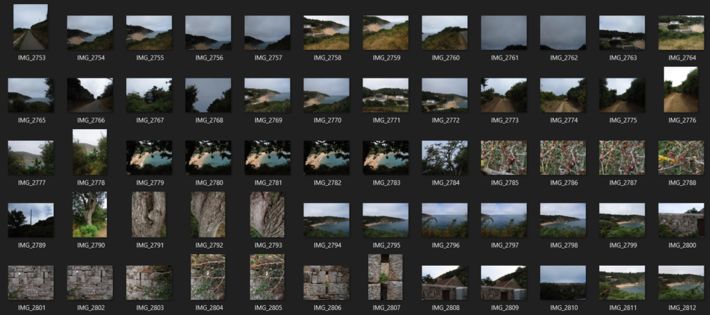
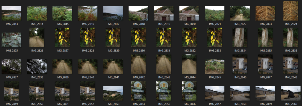
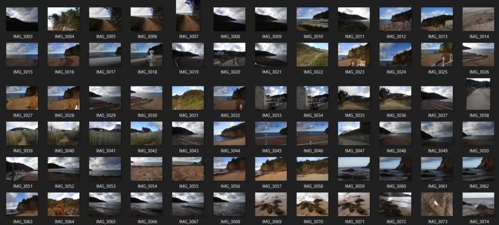
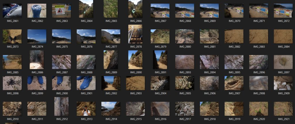
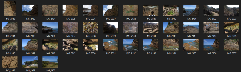
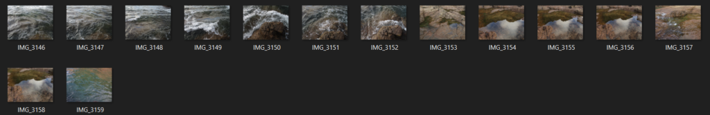
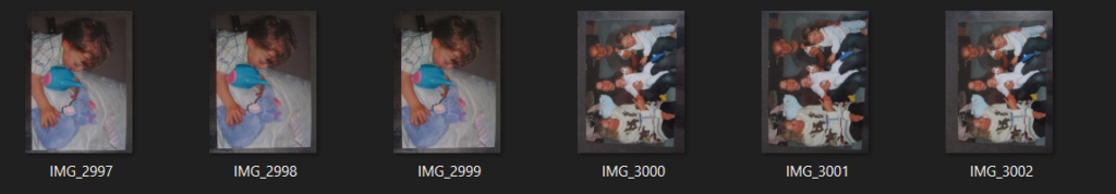
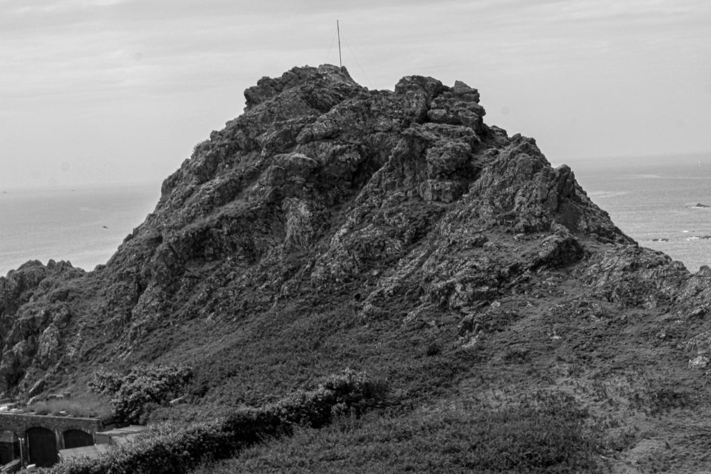
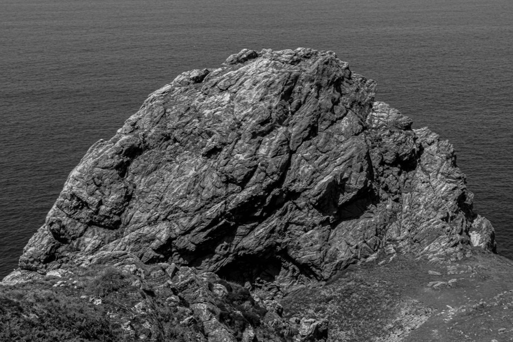
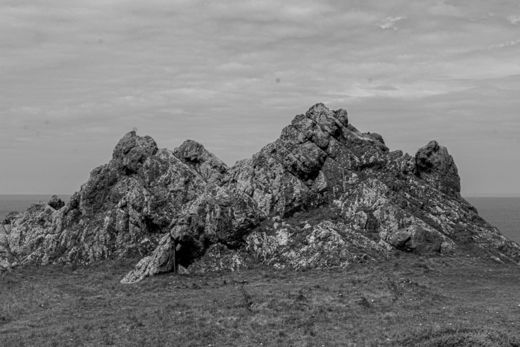
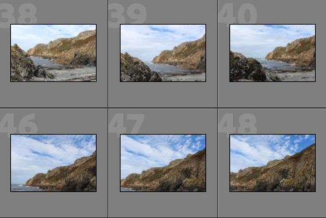
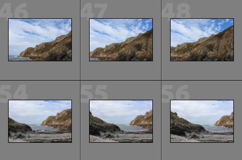
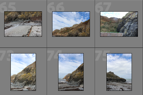
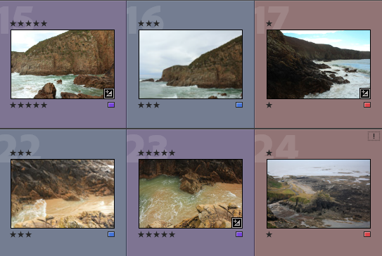
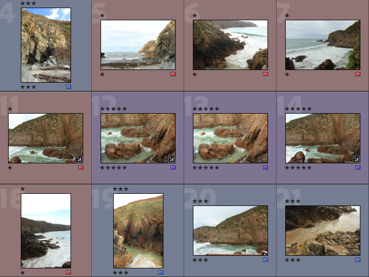
Below I have included some contact sheets displaying the wide variety of images from my Plemont and Stinky Bay shoot, this is important as it gives an indication of how many images I have from each shoot, and helps with the organisation before image sub selection.

Colour Coding System

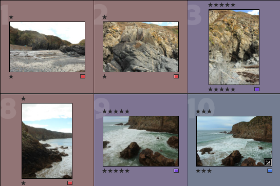
Below I have placed some screenshots of my colour coding my photographs, I have included an explanation of the system and how I have come to the image sub selection process, I really like this system as it ensures that I have a clear plan in my mind of which images I am going to edit. It also helps me predict my final images just from looking through them in Lightroom.

  • Purple- Best images
  • Blue- Average images
  • Pink- Not so good images

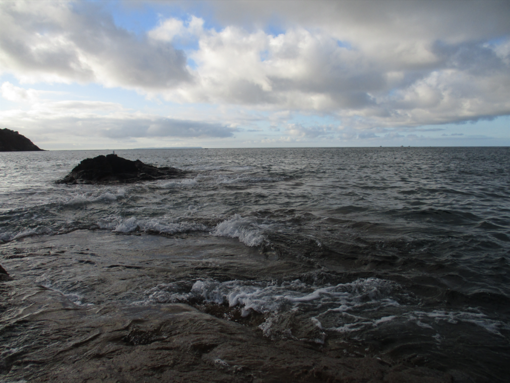
Best Images after Sub Selection

There I have taken some of the images from my ‘purple’ selection above and placed them in a gallery so that they can be more easily viewed, this also helps me consider whether or not they could be displayed as 9 images or just individually. Furthermore, this is before the editing process so lots of these photographs could be made to be of a higher quality afterwards.

Editing

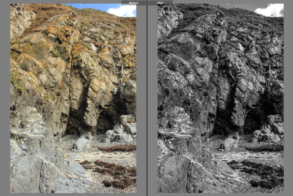
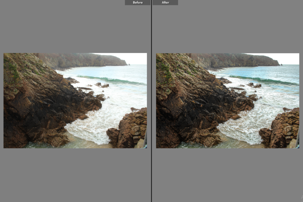
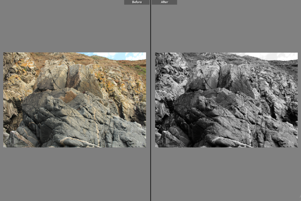
Below I have included before and afters of all of the images that I have decided to edit, I think that for the most part these images came out very well, I think I didn’t end up with a wide range of good images to edit, however I think the ones that I have are of good clarity and some exposures have been edited so that the images are more legible. Furthermore, I think that changing the undertones of the images to make them appear cooler/ warmer gives them a greater effect.

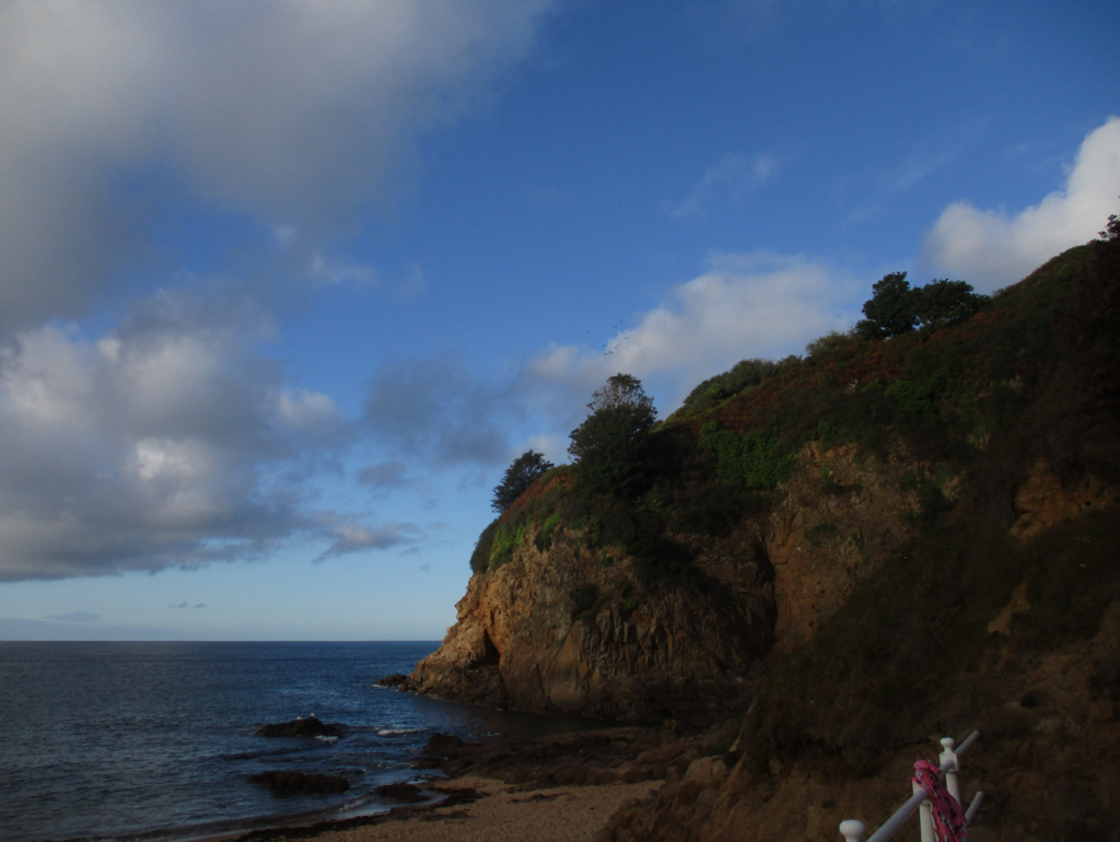
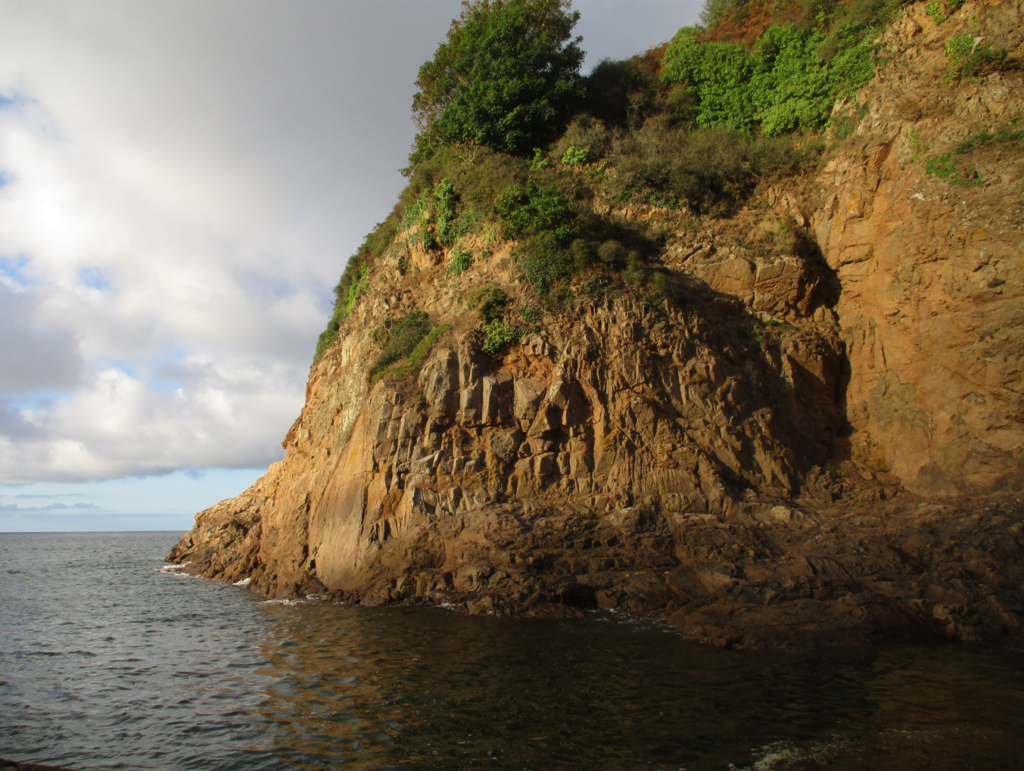
Final Images/ Analysis and Critique

For my final images I have decided that these are my best options, I have included evaluations for each of my images, with explanations for each stating the strengths and weakness of each.

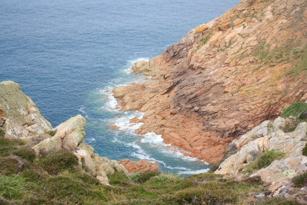
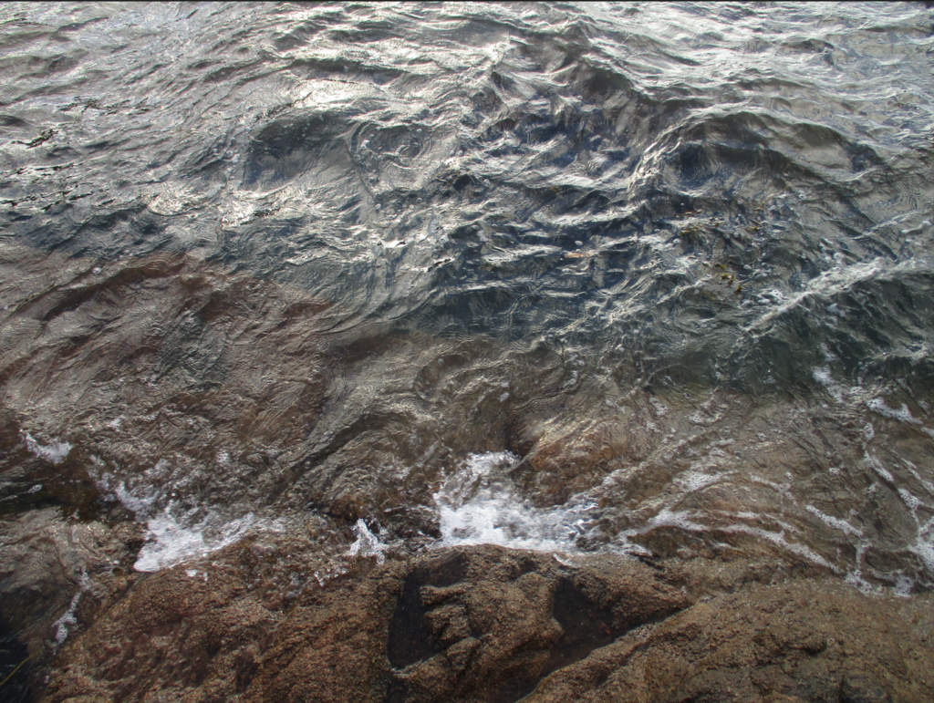
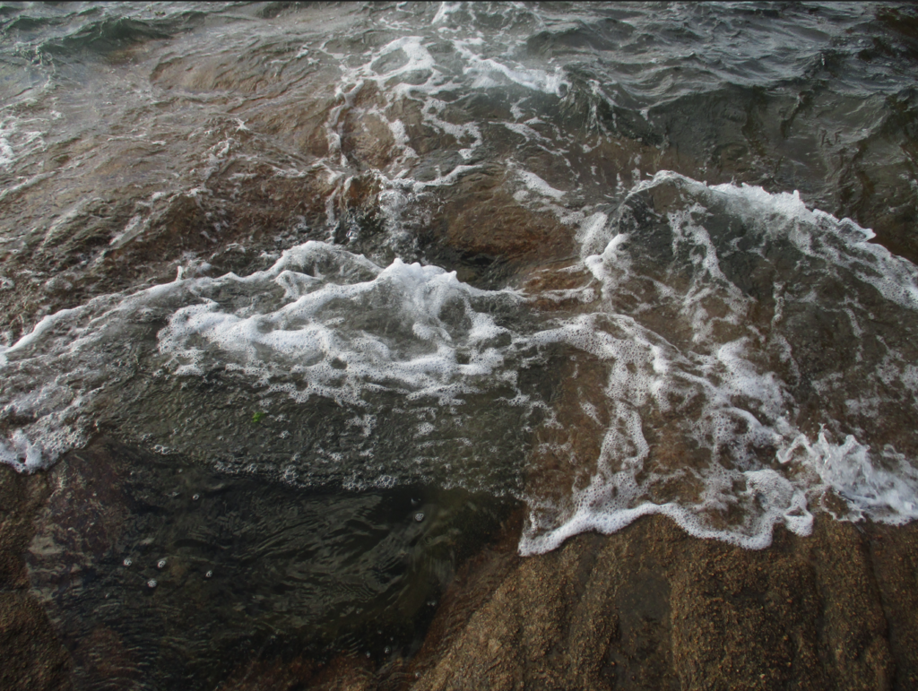
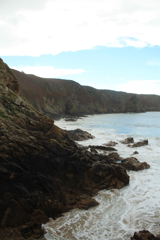
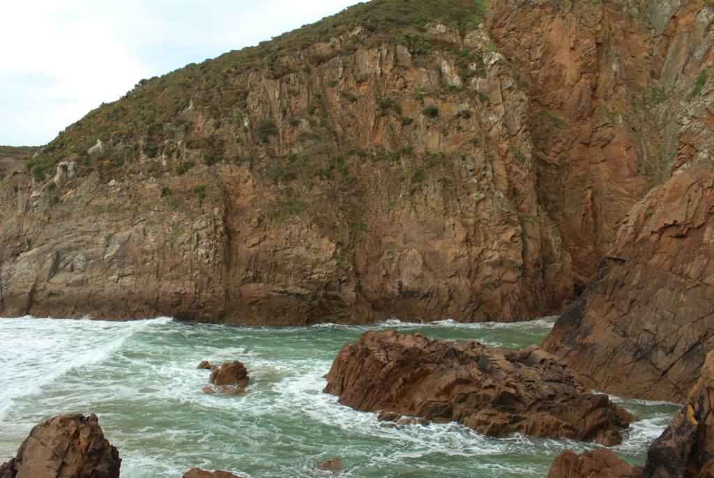
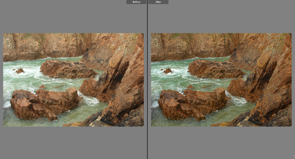
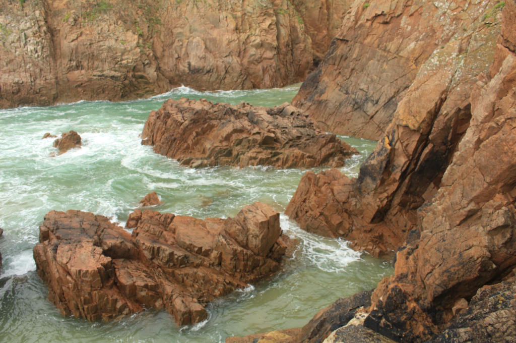
I have selected this as my first final image as I think that the composition of this photograph is it’s strongest point. Additionally there is lots of contrast within this piece, firstly with the warm tones of red and orange amongst the rocks in contrast with the blues in the sea. Also, there is a difference in texture between the smooth sea and the rough rocks, this means that the photograph is more eye-catching and there is more depth within the image. In my opinion this is my strongest out of all of my final images and this is mostly because of the clarity of the original image, meaning not much drastic editing was needed in order to make it successful.

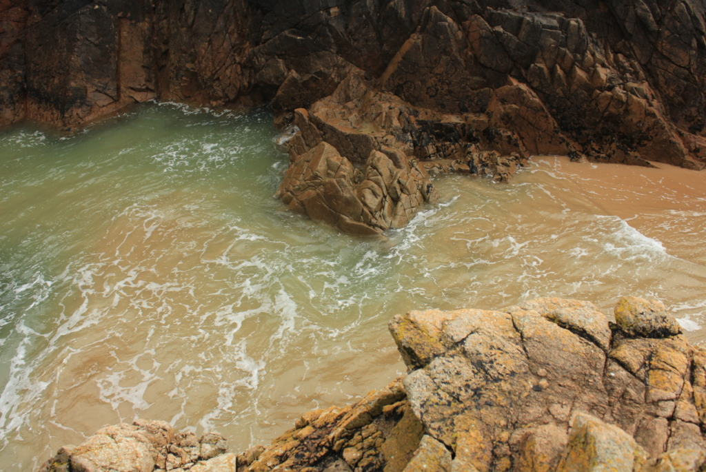
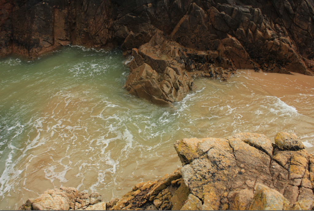
I have selected this as my first final image as I think that the colours of this image are very aesthetic , this is captured by the original composition of the photograph as the yellow rocks in the foreground and the green and blues tones in the background, captured in the sea compliment each other well. Additionally, I like that the perceptive of this image is quite unique, this along with other features such as the rule of thirds, created by the outlines of the rocks all make this final piece successful. Alternatively, the weakness within this image is that the piece isn’t filled with interesting components, so they could be seen as boring or uncreative.

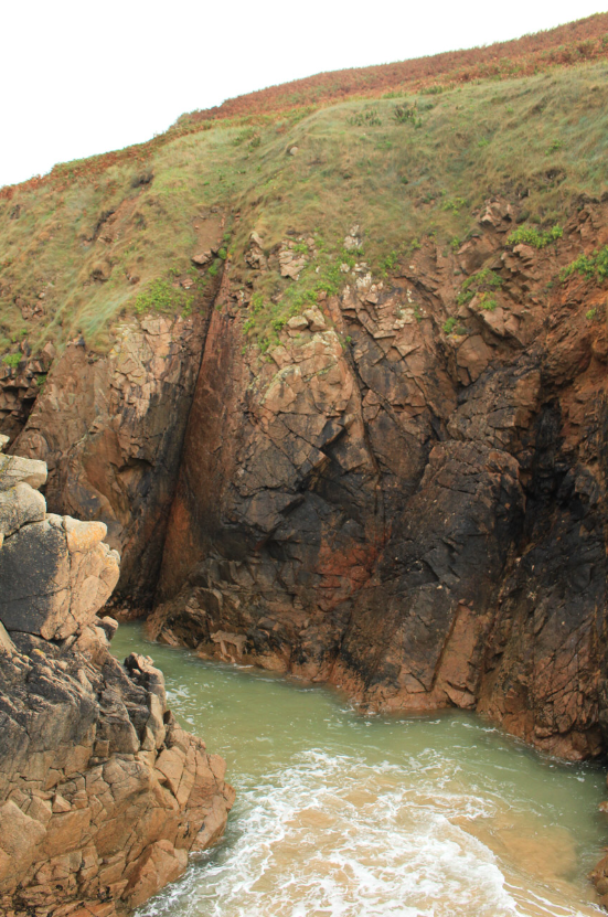
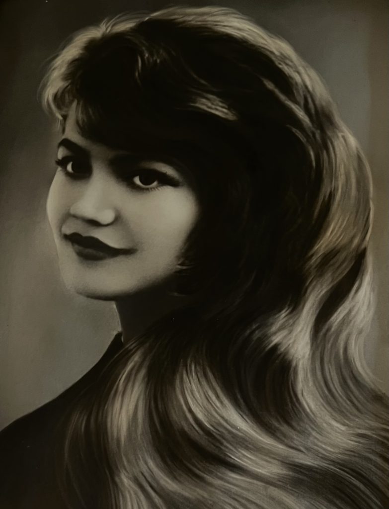
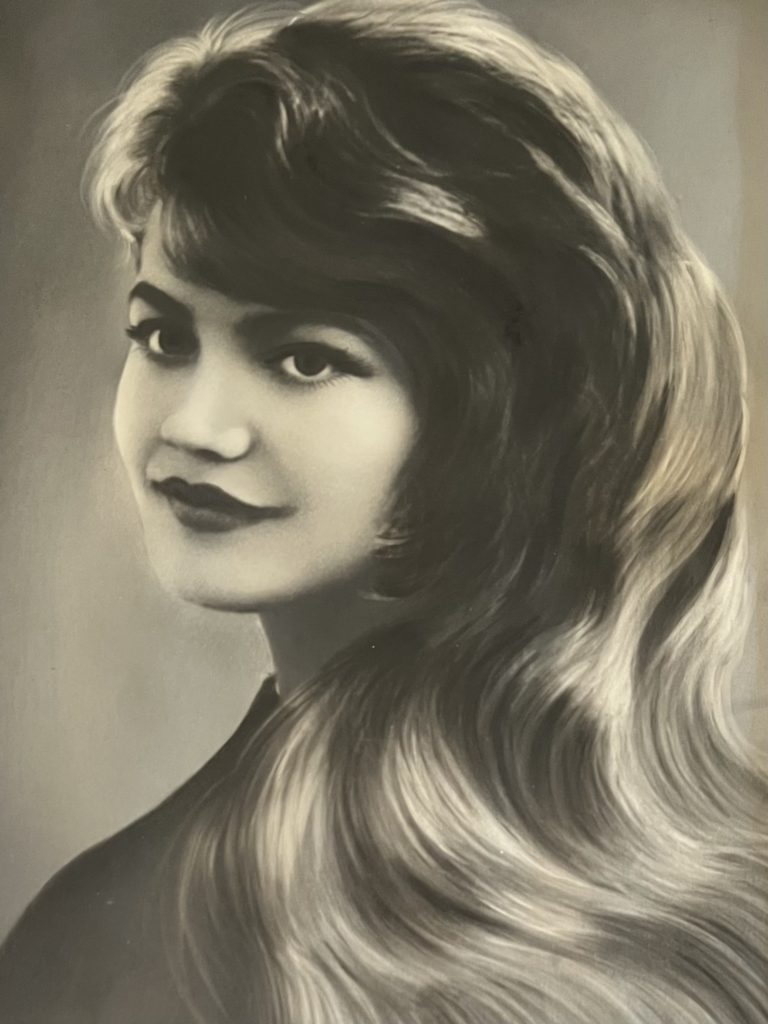
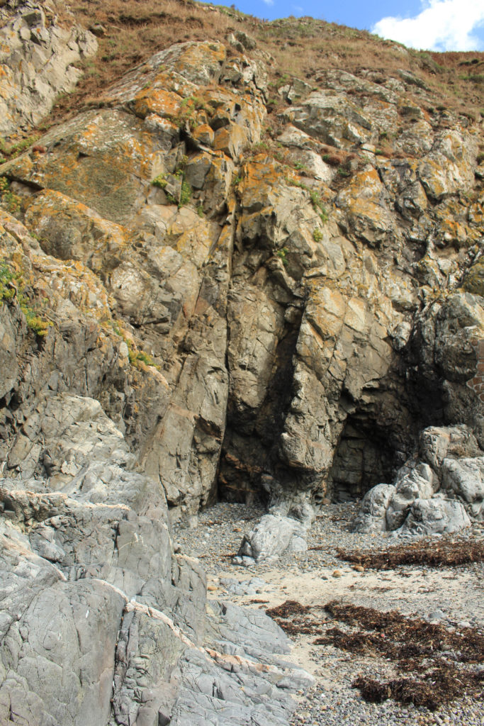
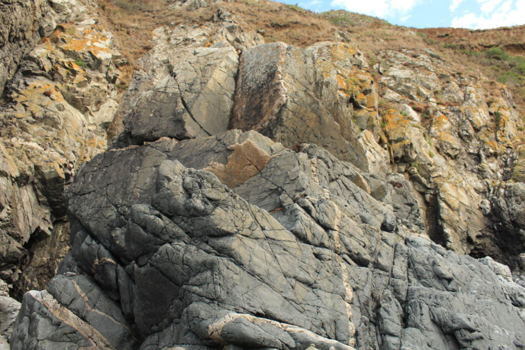
I think that if I were to display my final images I would place these two portrait images together, as I think that they go well together, as the similarities and differences of the two means that they compliment each other well. The image on the left is filled with many different colours and the one on the right is filled with more blue and greys, the first being filled with warmer tones helps contrast with the cooler tones in the second and this means that these images are stronger together as one cohesive piece. Furthermore, this helps with my project as the photographs being more interesting makes the project more interesting as bring vibrancy to the rocks. However, I think that the first image is a lot stronger so maybe this could be displayed by itself.

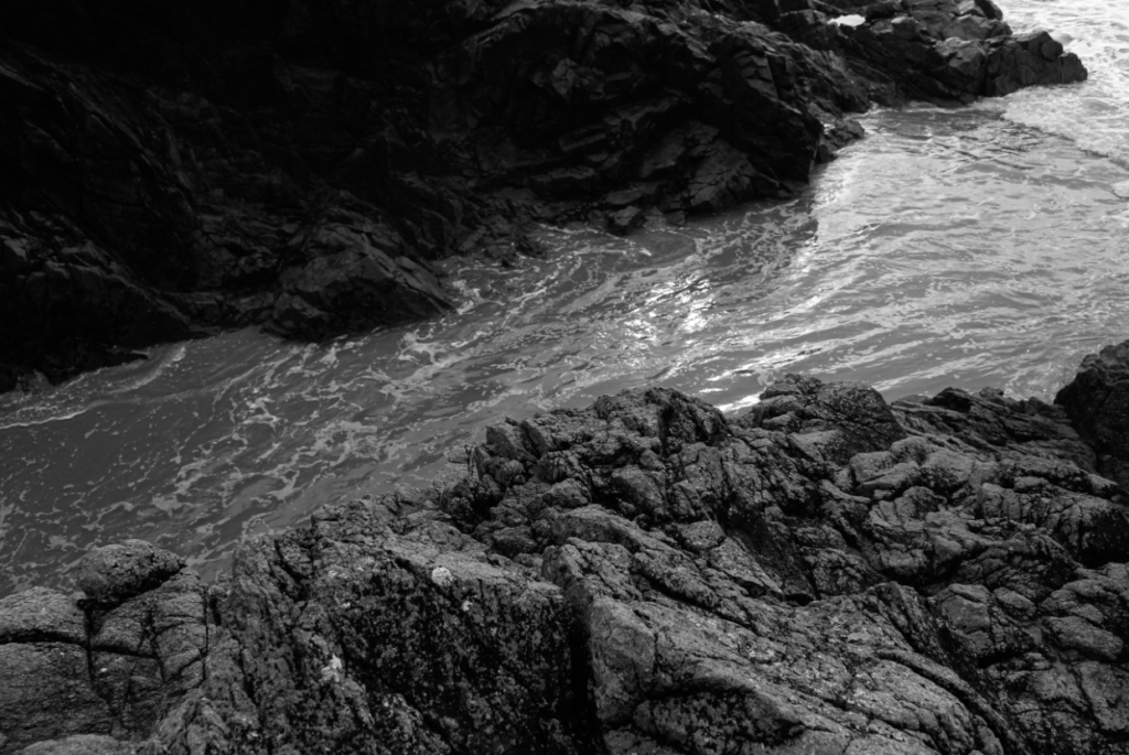
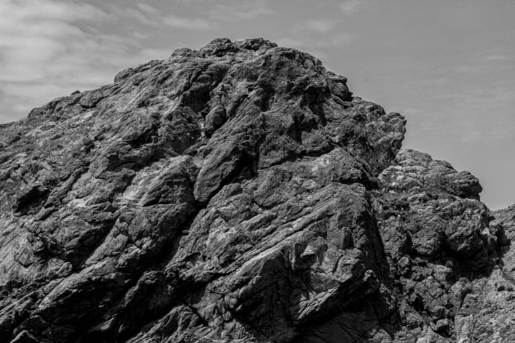
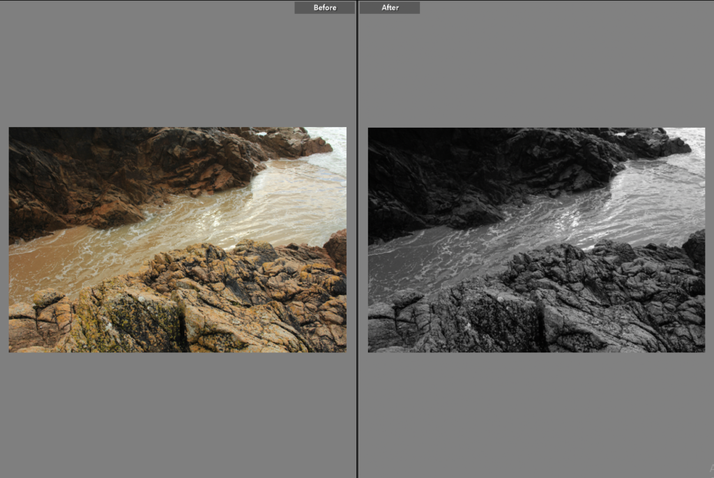
This final image is very different from my others as the fact that it’s black and white means there I could make the contrast and the clarity of this photograph very high and it could still be successful. This made the image more aesthetic as it added a lot of texture; both throughout the rocks and amongst the water moving on the sand. I like this image as I feel like it capture a moment in time which will never happen, making it more unique. Furthermore, the tones in this photograph means that the foreground is filled with light and the background contrasts as the rocks and dark and the texture isn’t as prominent.

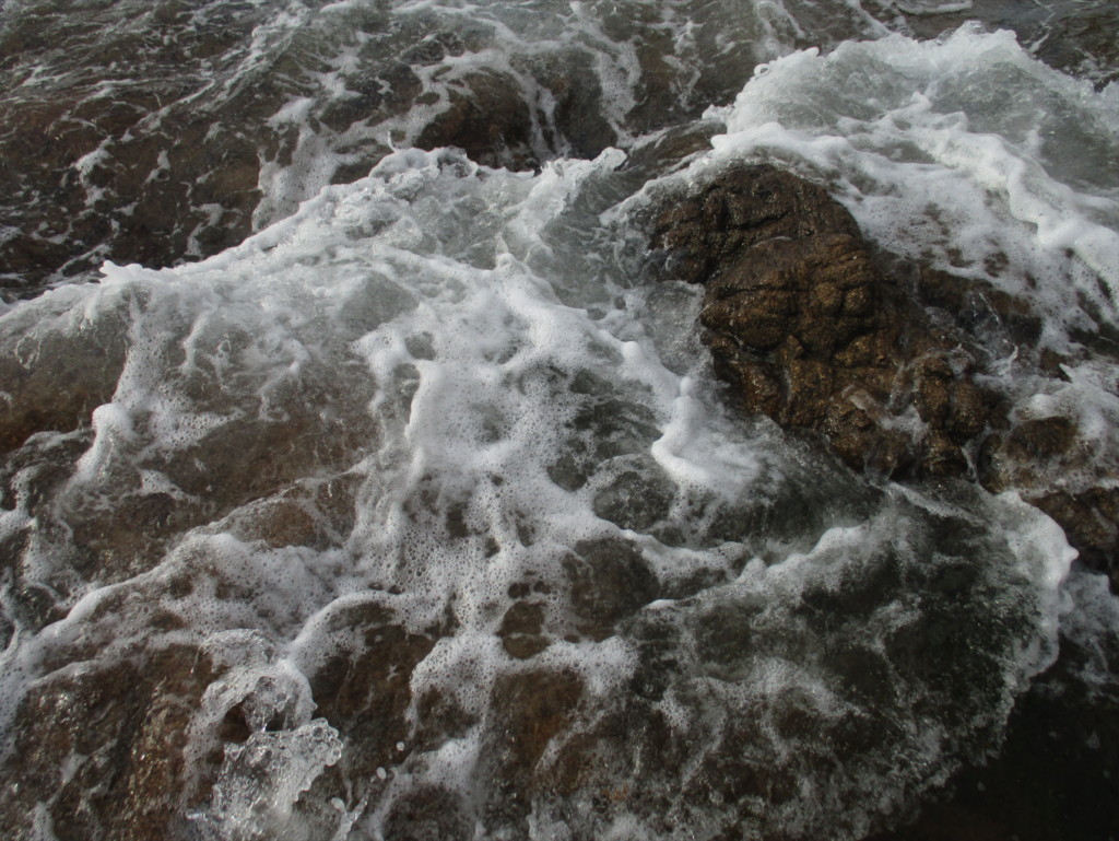
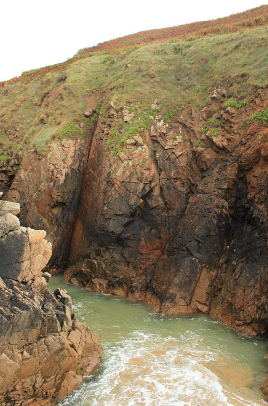
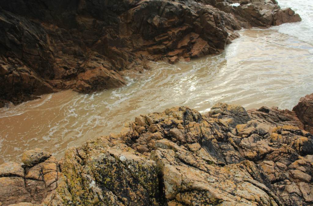
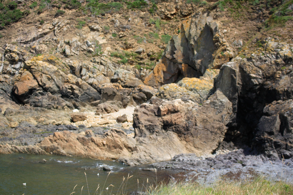
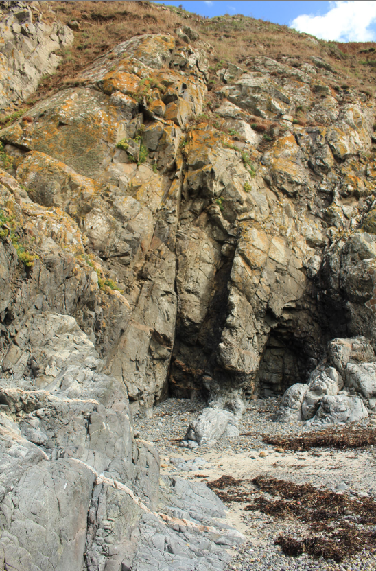
I have selected this as my last final piece as my favourite aspect of it is the composition, this means that the most prominent features are the rocks, as the orange and brown tones in them mean that a sense of perspective is formed as they appear like they are brought forward throughout the image, with the contrasting water in the background. However, I think that this piece wouldn’t have been at all successful within any editing as the clarity of the original photograph wasn’t as good as I expected.

artist reference for my 3D sculpture

—- Jody Powell —-

Jody Hudson-Powell is a graphic designer who joined Pentagram as a partner in October 2015. After completing his BA, he went on to complete an MSc Virtual Environment at the UCL Bartlett School of Architecture. He began his career at Nokia, focusing on motion and generative visual identity development.

In 2005, he founded Hudson-Powell with his brother Luke Powell. As Hudson-Powell, their work encompassed brand identities, motion graphics, interactive design, creative technology, immersive experiences and art pieces. Alongside this, Hudson-Powell served as a Design Director at Wolff Olins from 2010.

I have chosen to use Jody Powell as my source of inspiration for my 3D sculpture as I really admire the effectiveness that it brings without being overly complicated. I wanted to aim to make a rather interesting sculpture, especially one that acted out as an optical illusion, so that I could present my photography in a completely different sense to how I usually do.

Image Analysis

I have chosen this image to analyse from Jody Powell’s works as I really admire the way it’s been structured and the fact it’s a digital sculpture rather than a physically made one. He is a graphic designer so he specialises in the arts of digital model making rather than physical fine art making. What I can see from this sculpture is that there are three of almost the exact same image placed in front of one another, then a completely different image at the back to counteract as the background to the whole structure.

What I like about the sculpture: What I particularly enjoy about seeing this sculpture is just how simple yet effective it is. The sculpture is mainly just four cut out images, one in front of the other, but the way it’s conceptualised just gives off a really clever illusion of looking like an entirely singular image. The simplicity overall is just what makes the piece really intriguing for me. I also really like how the image at the very back is completely different to the other three in front of it. I feel as if it ends up breaking the repetition just a little bit so that it’s not completely lost with the same patterns and textures. The image at the back acts as a nice backdrop for the images in front to flow in front of, making them pop out more.

Still-Life Photography

Still life photography encompasses everything that is an inanimate object in front of a camera. The artist must compose subject objects to resemble a painting, as that is what it is designed to replicate. Manmade objects like pots, vases, consumer products, handicrafts etc. or natural objects like plants, fruits, vegetables, food, rocks, shells etc. can be taken as subjects. Typically, still life photos are not close up to the subject nor far away, but at a very head-on angle. The art in still life photography is often in the choice of objects that are being arranged and the lighting rather than the skill of the photographer.

This style of photography really took off in the 20th century, allowing many photographers to show their skills.

Plemont Photoshoot: Contact Sheets

For my 2nd photoshoot, I decided to go to Plemont in the early afternoon on a foggy, drizzly day, contrasting my first photoshoot which was done on a sunny day later in the afternoon. This, however, made taking my images more difficult as I had to ensure my camera didn’t get wet, which could cause the camera to break or blur the photos from rain falling on the lens.

Map of where I went
A sign from Plemont

Contact Sheets:

When taking my photos, I tried to make sure they were all well-lit as the amount of fog and lack of sun made it more challenging to balance all the tones within each image, making them prone to being overexposed/underexposed. Along with that, in some of my images, I accidentally got my jacket [that I wrapped around the camera to ensure its safety] in frame, cutting out some of the corners of my images.

Portelet Photoshoot: Contact sheets

For my first photoshoot, I started at Le Quaisne and walked up to La Cotte before making my way through Portelet, ending my photoshoot at Potelet beach. I started my shoot in the afternoon in order to try avoid any harsh natural lighting that the sun could create in the morning/midday and to attempt to take some photos when it got darker. I decided to do a photoshoot there as I knew it had a lot of rocky areas that I could get close to, allowing me to take a mixture of distant and close-up images instead of relying solely on zooming in to get detailed photos.

Map of where I went
Sign at Portelet

Contact Sheets:

When taking my photos, I tried to thoroughly take multiple images of each rock from various angles, heights and distances to capture as many details and perspectives as possible. I had to keep checking my photos and camera settings throughout the photoshoot as the sun would occasionally overexpose my images/create light leaks due to me moving around and taking images facing both towards and away from the sun.

Still Life

Still Life is described as “a painting or drawing of an arrangement of objects, typically including fruit and flowers and objects contrasting with these in texture, such as bowls and glassware“, most popular during the 16-17th centuries in Europe, particularly with Dutch painters, working with oil paints. At the time, many people saw art as a hierarchy, with still life seen as the very bottom, giving it the alternative name Vanitas- meaning vanity/futility in Latin. Despite it’s low place in the eyes of many art critics, vanitas paintings still held a plethora of symbolism and meaning after taking a closer look, many of which tie to themes of life and death.

Still Life became a popular subject for early photographers due to the fact that nothing will move while the camera takes the picture, much easier to work with compared to attempting to photograph a person or animal, adding another layer of control for the photographer to manage.

Still Life with Peacock Pie by Pieter Claesz

Here is an example of a Still Life painting from the 17th century, full of various pieces of symbolism. It was made by Pieter Claesz, a Dutch artist, and shows a half eaten feast, the most notable feature being the massive uneaten peacock pie, ornately decorated with the bird’s own feathers, and holding a pink rose in its beak, and underneath it lies an array of spices. Each of these elements show off the host’s wealth, as all of these things would have to be imported from Asia, an incredibly expensive endeavour at the time, made possible through the rampant colonisation and slavery happening due to many European countries. There has been a human presence, due to the crumpled napkin and the mess towards the end of the table, though there is an eerie stillness as it is hard to tell why the host would have left, since there is still plenty of food left on the table, and it is unclear how long it will be left there to waste away.

Gorey Photoshoot: Contact sheets

I decided to do a 3rd photoshoot in Gorey, by the ocean, as I already had many photos that were taken at a distance from previous shoots and I knew I would be able to get close-ups of rocks down at Gorey. Along with that, I knew Gorey had a lot of small, loose rocks that I would easily be able to carry and take to photograph in the photography studio at a later date for some still life photos.

Map of where I went
A sign I found at Gorey

Contact Sheets:

Whilst taking photos, I tried to get as many details as I could of each rock, making sure they were all in focus and well framed so I could get the best outcomes possible. I did struggle with taking some of the images as I had to carefully climb over quite a few rocks to get some of the shots I wanted which was rather difficult as I needed to keep my footing stable whilst also having to make sure my camera wasn’t going to break against the rocks.

Summer Project – My Rock/My Family

My Rock

The Bay I have chosen to photograph throughout the summer is Greve de Lecq, as it is not only close to my home, but it is also a place in which I have spent a lot of time in. This area also has a historical interest, with the Greve de Lecq Barracks (built in the early 17th century), as well as Le Câtel Fort (built in the 18th century) being located here.

Greve de Lecq Beach | Jersey Beaches | JerseyTravel.com
An image of Greve de Lecq bay.

Photoshoot 1

Plan

What?I will take pictures around the bay – Larger, traditional landscape images of the whole bay or close up shots of objects or details in the landscape. I will also attempt to take pictures of Le Câtel Fort, however the fort is walled over so I may struggle.
Where?I will try and take pictures of Greve de Lecq from a higher viewpoint, which will allow me to get a view of the whole bay at once. I think this approach will be a good starting point.
When?I will aim for this photoshoot to take place during a foggy/cast over day, perhaps during midday to make the sky clear, and making the lighting flat.
Why?This will allow me to make the images more effective in black and white.
How?There is a pathway above the bay that will allow me to take images from a high viewpoint.

Contact Sheet


Photoshoot 1 Review and Evaluation

Some of the best images from this shoot:

Photoshoot Evaluation

I think this photoshoot went well as I stayed close to my original plan; I managed to capture the overcast, grey feel I was going for from the plan which helps make the greens/greys/blues in the images stand out more. The images of the bay itself were taken from a higher-up vantage point, like I had wanted in the plan. I also got the chance to take up-close pictures, giving them a more abstract look and zooming in on the lesser seen parts of the bay.

However, like I had thought, I was not able to get many good pictures of Le Câtel Fort (mainly just the walls around it – however I do like some of the images with the walls as it gives the images a colder/less natural look). To make the photoshoot better I could have maybe gone to different viewpoints to see how the bay looks at various heights and angles, in the next photoshoot I might change the focused viewpoint to be different to this one.


Photoshoot 2

Plan

What?I will take pictures of the bay with a greater focus on the style of a traditional landscape image (with a wider field of view).
Where?I will take pictures from a grounded view point, which will allow me to take head-on and upwards angled pictures of the bay.
When?I will aim to take the pictures at sunrise/sunset (preferably on a sunny/clear day) to give the shadows and colours of the image more depth.
Why?My previous photoshoot had an emphasis on having a high-up viewpoint that looked over the whole bay from above, as well as some close up/abstract images of the surroundings, I hope this photoshoot will be different enough to photograph more aspects of the bay.
How?I will likely stand on the beach or just before it to get images looking out to sea or towards land.

Contact Sheet


Photoshoot 2 Review and Evaluation

Some of the best images from this shoot:

Photoshoot Evaluation

I think this photoshoot was successful as I was able to follow my plan fairly closely, I was also able to take pictures of the bay from several locations with the setting sun’s light illuminating each image to give it a warm tone. The sky itself was cloudy enough to where it fills the sky and creates more depth in each image, often contrasting the warmer colours on the landscape with its own colder tones, creating a nice juxtaposition in some images.

If I was to do this photoshoot again, I would like to take pictures when the sun has set even lower, so the sky itself is filled with more orange/pink/purple colours, which could help give the images more colour. Likewise, I could also do the photoshoot at dawn instead of dusk, as this would illuminate the left side of the bay, as opposed to the right side at dusk, this would allow me to explore more areas of the bay with the warm, strong lighting of a rising sun.


Photoshoot 3

Plan

What?For this photoshoot, I will primarily focus on taking close-ups of the rock, sand, seaweed and other natural patterns I find on the bay.
Where?I will be standing on the bay or the rocks themselves, most likely using a worm’s eye view, or from a more level viewpoint by crouching down (I may also be able to find some patterns by looking straight down from a birds eye view).
When?Later in the day so natural light is a bit more intense, which will make the shadows more contrasting with the lighter parts of the image. I will also make sure it is sunny so light is abundant.
Why?Hopefully this will differ from the other photoshoots by consisting of more close up shots. This will help show different aspects of the bay by focusing not on the bay as a whole, but the smaller parts inside of it.
How?I will look for interesting patterns in the sand/rocks/cliff faces/plants found around the bay to create interesting, abstract images.

Contact Sheet


Photoshoot 3 Review and Evaluation

Some of the best images from this shoot:

This one doesn’t fit into the close-up concept but I liked it enough to put it here

Photoshoot Evaluation

I think this photoshoot complements the other two photoshoots nicely with its focus on close-up, or, physically closer, subject matter. I think the images themselves came out nicely, with a nice focus on the patterns found on the natural landscape of Greve de Lecq. The weather was good for the photoshoot and was similar to, or the same as, the weather described in the plan, which allowed me to get some interesting images that make use of shadow (such as the 4th image down from the selected images above).

However, while I did manage to get plenty of close-up images, I feel like I could have focused more on capturing the patterns, lines, shapes and other formal elements of the landscape, as some images do seem to be taken from a few steps back. If I was to do this photoshoot again I would possibly try going later in the day (on a sunny/clear day) for even more distinct shadows, and I would put more of a focus on close-up images of the landscape, as well as possibly, a larger variety of the landscapes themselves.


Photoshoot 4

Plan

What?For this photoshoot I plan on taking images of the rocks, waves and ripples in and around the sea.
Where?On the right side of the bay (looking towards sea), there is a rock formation that juts out into the sea, this will allow me to take closer pictures of the water from various angles.
When?Later in the day, around late afternoon-early evening, on a day with clear skies, will give me good lighting to light up the waves and ripples in the water, while the clear sky will give the water more colour.
Why?I think this will offer another photoshoot that will contrast with the more traditional landscape photoshoots I have taken throughout the project. It will also allow me to zoom in on a part of the bay I am particularly fond of and otherwise haven’t fully captured.
How?I will try to stand near/on the edge of the rock to capture the waves breaking on the rocks, as well as the calmer ripples.

Contact Sheet


Photoshoot 4 Review and Evaluation

Some of the best images from this shoot:

Photoshoot Evaluation

I like the way the images from this photoshoot came out, to me, the images gave a refreshing contrast to the other images. I had followed the plan successfully and came out with images that capture the movement of the sea, as well as the rock formations that surround it. I think the day I chose to do the photoshoot was an appropriate one, as the reflections offer a subtle touch of colour to the sea that would not be seen on an overcast day, in addition, the sunlight gives the highlights on the sea more vibrancy, which contrasts with the darker parts of it.

Looking back, I think it would have been more interesting/successful if I took images from more vantage points, such as around the cliffs, instead of just the rocks on the bay itself. I could have also waited for the tide to be out, which would have revealed a lot of hidden rocks and other formations that would have been interesting to photograph.


My Family

To start my research, I found objects (or a box of objects) that holds significance for me. I created a small, homemade studio using an infinity curve made with paper and photographed the more interesting objects, as well as the box itself to see if that would make for an interesting composition.

Here are some of the images from that shoot that I thought were somewhat interesting.

Looking at the images closer, I could see that some of the images were fairly dark, or under-exposed (this can be seen in the first two of the images shown), if I was to do this photoshoot again, I would try to make sure the lighting was strong enough to make the images clear, but not too bright.

I think it would be interesting to retake these images in the school studio, with access to different background and lighting options, which could give the images more variety.


Next I looked through some old photobooks that contained chiefly images of my siblings and I when we were younger, however most of, if not all of them, are difficult to recreate due to family issues that span throughout the summer.

Making a 3D photography sculpture

—– 3D Sculpture moodboard —–

Robert Heinecken, Figure Cube, 1965
Lethe Wilson
Lauren Pascarella, Photographic Sculpture
Jody Powell’s work

For my 3D sculpture, I am aiming for more of an optical illusion approach such as that of Jody Powell’s. I like the overall look of the sculpture and how everything is layered up one behind another. It makes it look almost like the photo is flowing together as one and not being separate photographs.

—- Making of my 3D sculpture —-

Image selection

For my 3D sculpture, I needed to start off by choosing my best images out of all the ones I ended up taking. I decided to choose photos from my L’Etacq photoshoot as I believed that I was able to photograph very appropriate images for the type of sculpture I was aiming to pursue making. I needed full-scale images of larger rocks and I believed that these images were perfect examples of what I needed to use.

For my attempt at a photography sculpture, I decided to take inspiration from the works of Jody Powell. I wanted to use a variety of my images taken of large rock formations and position one in front of the other to add a sense of depth to the overall sculpture.

The first step I took with my sculpture is I printed out all of my chosen photographs, printing out some larger than others. I chose the much wider rocks as being the main background images for my sculpture, so I chose to print those out full scale on A4 paper. I then chose to print out the smaller ones together on one side of A4 paper and cut all the images out. Once they were all cut out, I stuck each individual image onto a styrofoam board and cut around the image so that it would be mounted on the board.

My photographs stuck down onto styrofoam and cut out

Next with my sculpture, I found myself two pieces of styrofoam board and stuck them together for more support of the sculpture. I then measured the length of each cut out and drew it along the board before cutting out the slits for them to be inserted into.

The sculptures stand
Inserting the cut outs into the slits
View of all the cut outs inserted

Afterwards, I inserted each cut out photograph into the slits and adjusted them all so that you could see each of them over top of one of another. I wanted each of them to have enough space so that each could be seen above one another, allowing for the illusion to take form.

Photoshoot of sculpture

Here I have some photographs of my photo sculpture and I attempted to take it at different angles as to have a variety of outcomes. I really wanted to make it obvious that the sculpture was composed of many different images but to allow for them to also flow into one image, creating the optical illusion that I wanted to achieve much like Jody Powell’s.

Analysis and critique

Final outcome

Overall, I am very pleased with how my final sculpture turned out and I feel as if I was able to execute it well to the standard I set myself up with at the very beginning of my sculpting. The process was pretty straight forward and I was easily able to execute my piece to effectively showcase the illusion I was hoping for. I did come across a few areas where the background image was at a certain shape which I was slightly unhappy with, but I was able to fix this problem by just trimming the cut out to a more jagged shape as to still help it maintain the rock formation it had to begin with.

Something I would do differently next time, is I would have possibly changed the size of all the images slightly more just so everything was a bit more central. I would have also maybe picked a different image for the very back as the image I chose is incredibly jagged and isn’t as rounded as I hoped. I wanted the image in front of it to be central enough so that you could see the entirety of the other one behind it as well, but due to the formation of the rock, it gets slightly lost behind the one in front of it. Other than these critiques, I am very satisfied with how my final outcome turned out.