My plan
As well as executing planned photoshoots, I plan to bring my camera with me on walks through town, to school and anywhere else I go. This will help me to capture (mainly) unstaged, everyday life in my images.
Photoshoot plans
| Lighting | Genre | Idea | Camera Setting | |
| Photoshoot 1 – Rodeo and parade | Natural | Landscape and Portrait | Documentary, sport photography | Landscape, portrait, sport |
| Photoshoots 3 and 4 – football games | Natural, floodlight | Landscape and portrait | Sport, Documentary | Sport, portrait |
| Photoshoot 5 – Baker town and outskirts | Natural | Landscape | Documentary | Landscape |
| Photoshoot 6 and 7- hikes | Natural | Landscape | Landscape | Landscape, portrait |
| Photoshoot 8 – garden | Natural | Portrait | Portrait | Portrait |
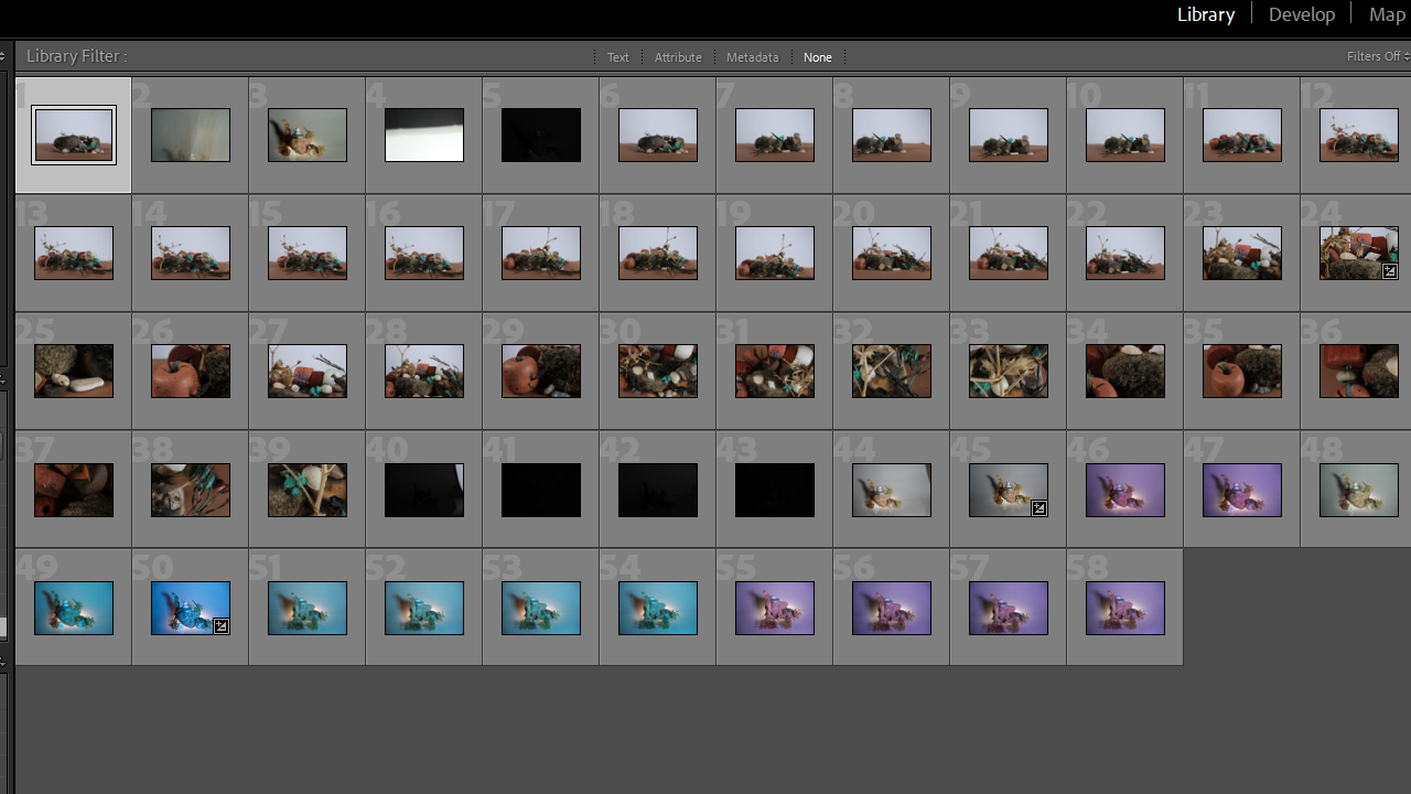
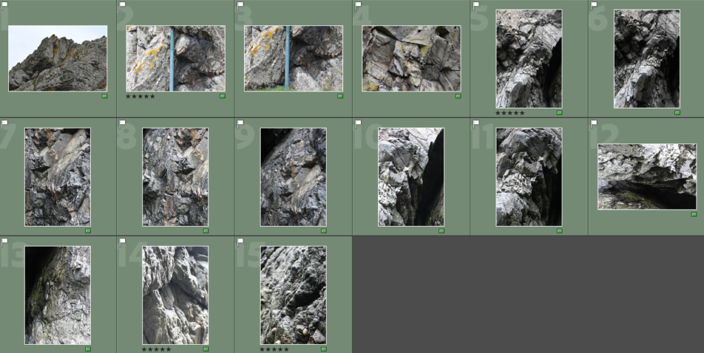
Photoshoot 1
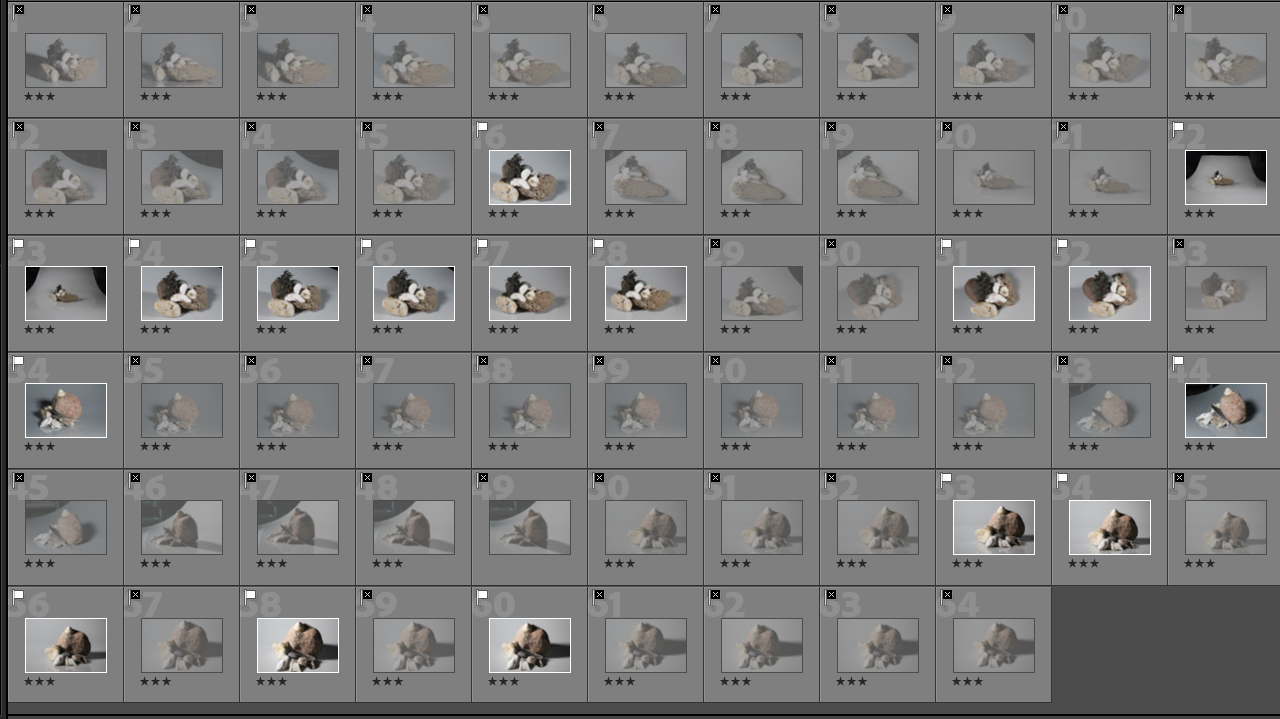
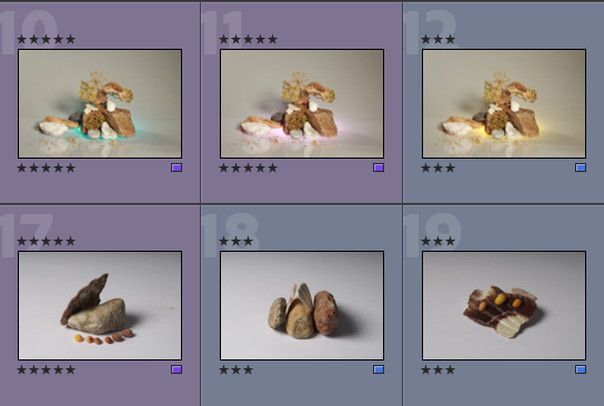
Below are two of my contact sheets from the rodeo I went to while in the US.

In this photoshoot, I struggled a bit with different settings – I started off in landscape, which I initially thought would be better. I then realised, as I began to shoot, that the movement of the horses in the images was too blurred in this mode, even though the rest of the image was well in focus. I then decided to switch to sport mode for images that contained lots of movement – this enabled me to take lots of pictures quickly with minimal blurriness, and I think this helped me to capture high-movement images in the best way as I was able to select images from a large set and ensure my best images were of the highest quality I had.
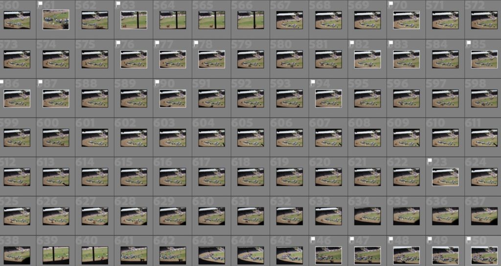
Also in this photoshoot, I struggled to capture a lot of the action as my lens did not have a high enough zoom. I did not anticipate this, and in the future, I would have either tried to sit closer to the action or bring/use a lens with a higher zoom for situations like this. In my images, the composition is often too busy or not focused enough on one part of the image. Because of this issue, in my editing, I will have to utilise cropping quite a bit in order to make sure I still have balanced, exciting compositions.
Evaluation
In this shoot, I realised that it would have been ideal to have a zoom lens. I think I produced some good images but I think that the action and focal point in each image are lost due to the lack of zoom in each image.
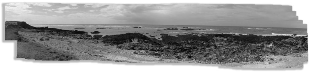
Photoshoot 2 – Rodeo Parade
Below is a selection of my images from my photoshoot at the Rodeo Parade. I had a lot of images for this photoshoot so have only included certain contact sheets.

In this photoshoot, I was again shooting moving subjects, but not as fast as my first photoshoot. This enabled me to use portrait and landscape modes more effectively, depending on the subject. If my subject was a single person, or group of people and nothing else, I used portrait mode which helped me to capture detail in the faces of my subjects. When capturing multiple subjects as well as background and surroundings, I used landscape mode.
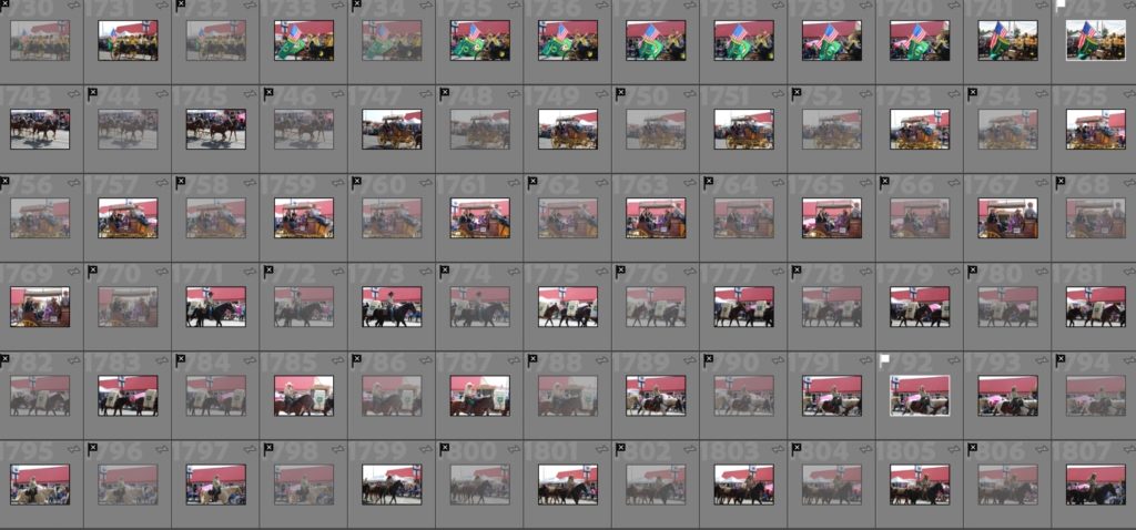
Due to the weather conditions on my day of shooting I experienced some quite annoying overexposure in my shoot. I tried to combat this by changing my ISO and shutter speed and shooting from different angles and positions. I will also need to fix this further in my editing I think.
Evaluation
Overall I think this photoshoot was one of the most successful from my trip, as I produced some images I really like that I think show a different part of American culture that I had not experienced before. Even with my problems with overexposure, I think this photoshoot was overall very successful and produced some good images for me.
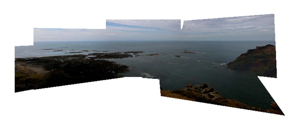
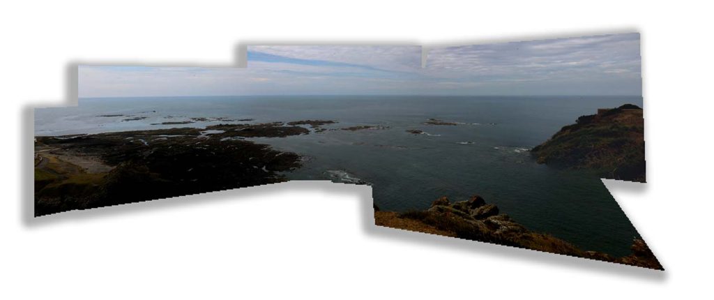
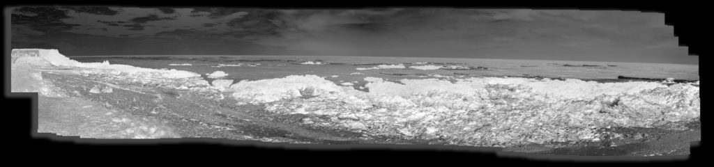
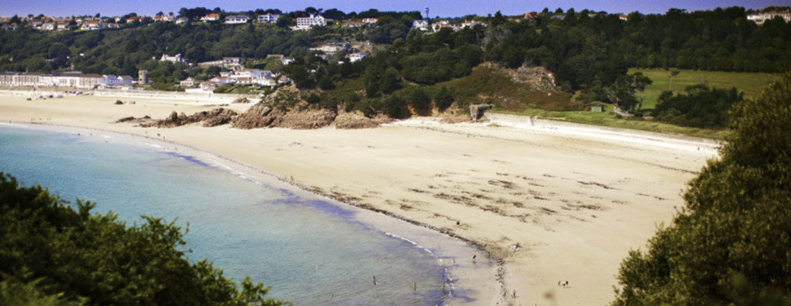
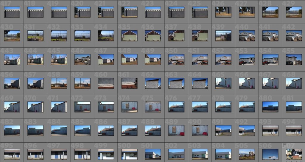
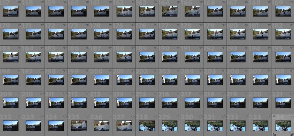
Photoshoot 5 – Town and Surrounding Areas
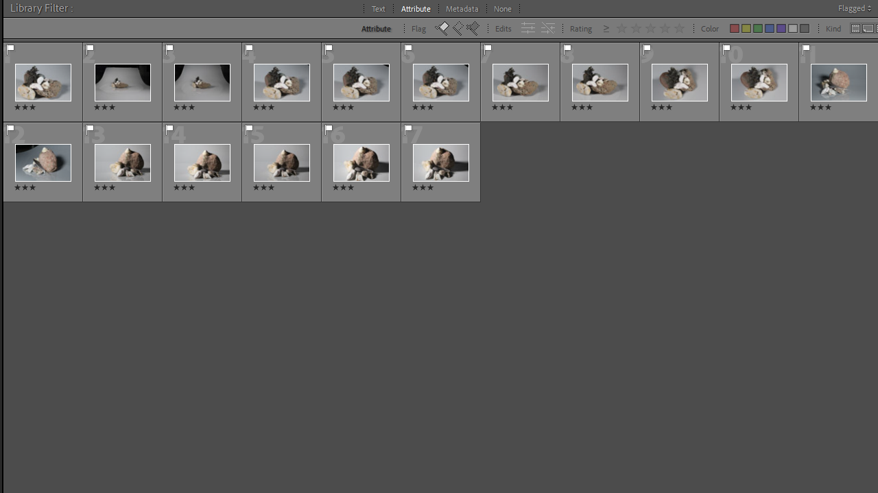
Below are my contact sheets from my photoshoot of the town I stayed in, Baker City, and its’ surrounding area, Baker County.
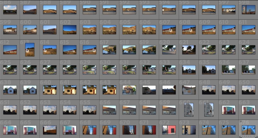
When planning this photoshoot, I decided to shoot during the golden hour, early evening. This was because of the exposure issues I had in my previous shoots – I did not want to ruin my pictures and make the mistake of shooting at the wrong time of day. I think this really influenced the quality of my images for the better. I think the quality of the light made the shadows and shapes of buildings stand out more, and I’m glad I shot in the golden hour.
Evaluation
Overall I think this photoshoot was one of the more successful of my trip. I think my decision to shoot in the golden hour was a really good idea as it made the lighting much better than in some of my previous shoots from my trip away. Where I stayed on my trip the light tends to be very bright and glare-y during the height of the day, with no clouds, so shooting later on really helped this I think.
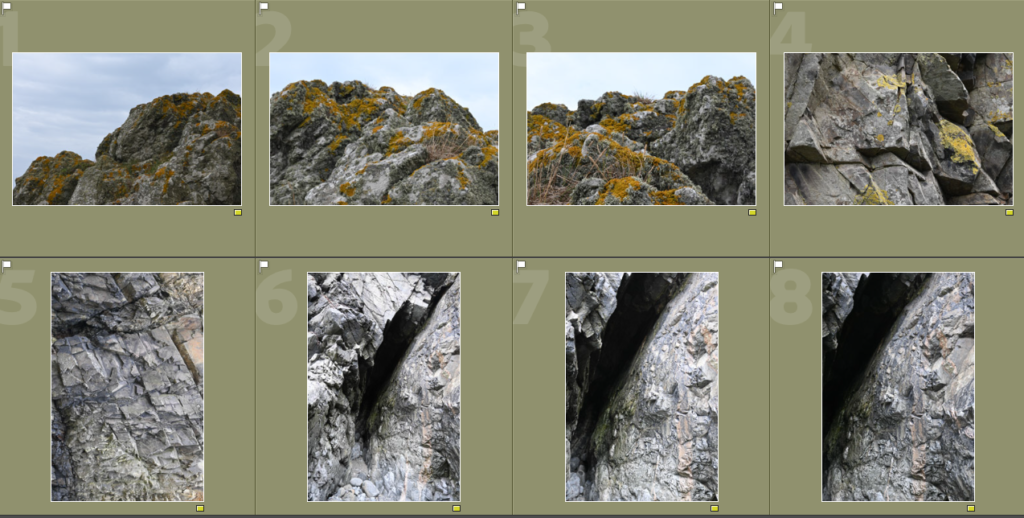
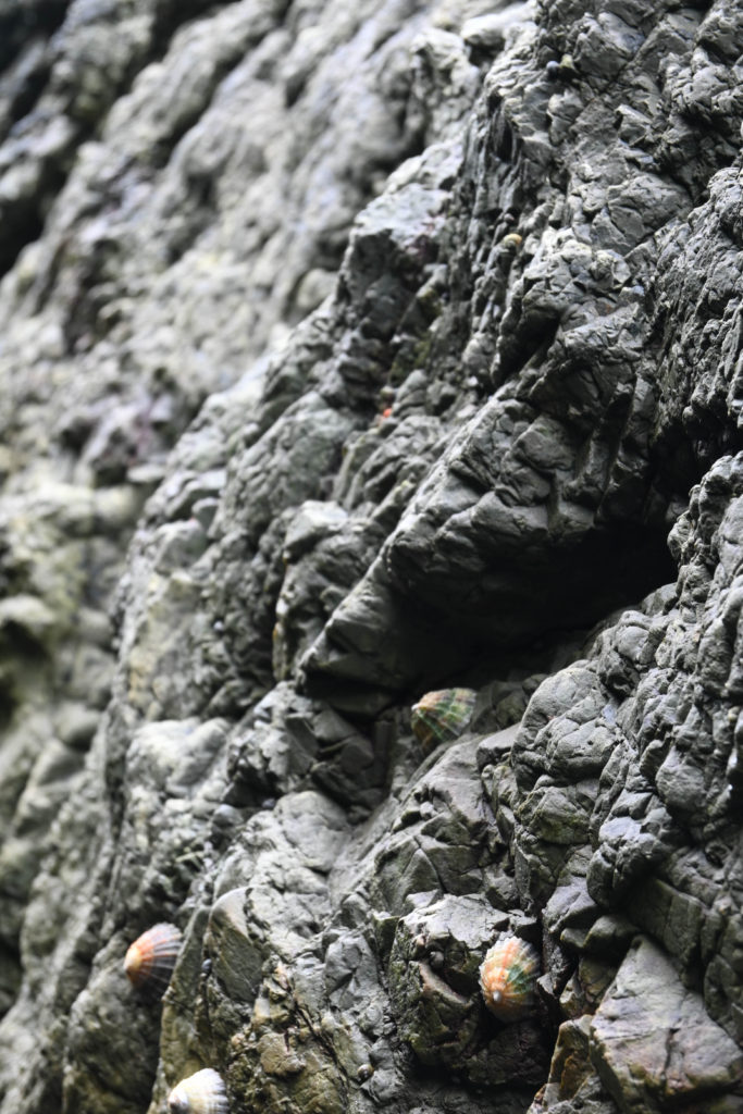
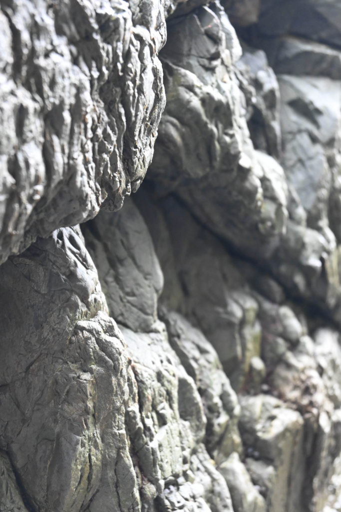
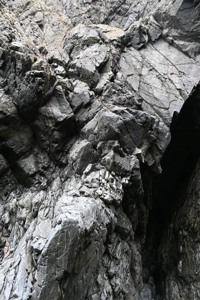
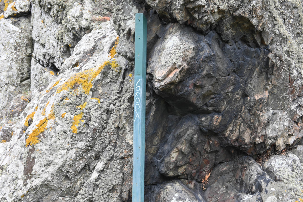
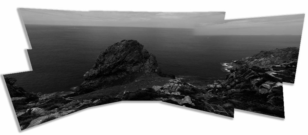
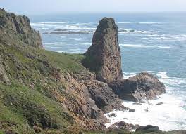
Photoshoots 6 and 7 – Hikes
Below are two of my contact sheets from both hikes I went on.
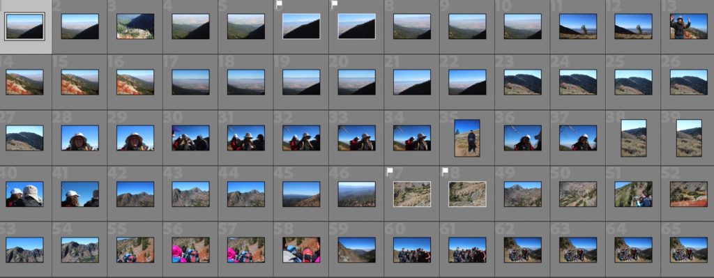
These shoots were not my best from my trip away – I don’t think they link necessarily link as well as I would like to my chosen artist studies, but I think the variation in my images is also good. Again, in this shoot, I wished I had a zoom lens to capture more detail in the mountains.
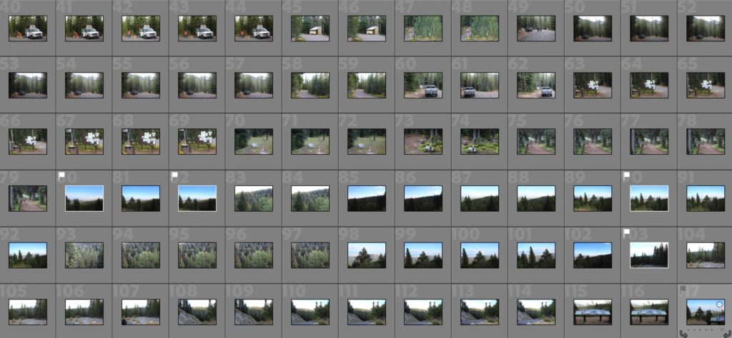
Evaluation
Overall, I think this shoot could have been improved by shooting at a different time of day to improve the lighting, as well as a zoom lens to help my pictures improve in terms of detail and composition.
Photoshoot 8 – Garden shoot
Below are my contact sheets from my photoshoot taken in the garden – this was my main portrait shoot.
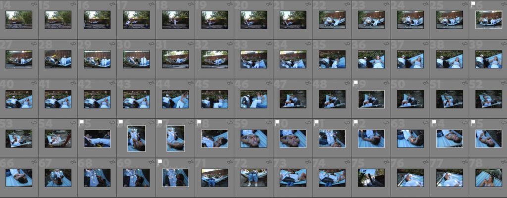
This photoshoot was one of my favourites, and overall it was quite successful. It was unplanned, so I think this created better pictures, as they looked a bit less awkward and I much prefer this to my pictures looking super staged.
Evaluation
Overall, I really like this photoshoot. I think I shot at the right time of day, which helped me to achieve nice light in my images. I would have loved to have had my portrait lens when shooting, but as I was travelling I didn’t. Even without my portrait lens, the portrait mode on my camera worked well with the light when I was shooting so overall I’m happy.