Felicity Hammond 
Noemie Goudal 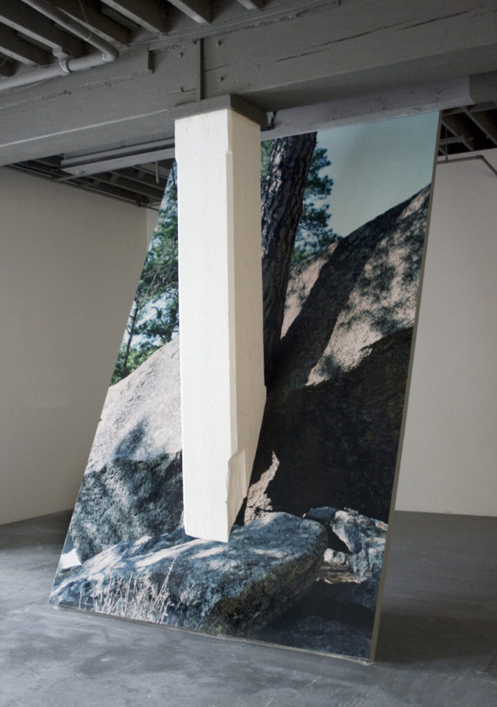
Letha Wilson 
Letha Wilson 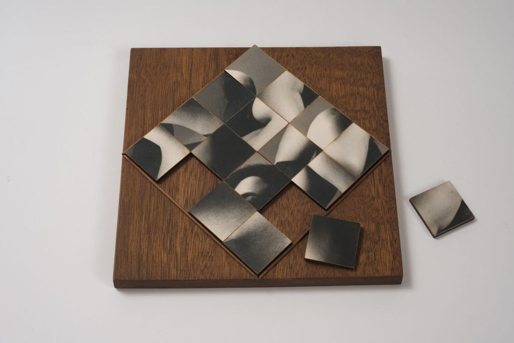
Robert Heinecken
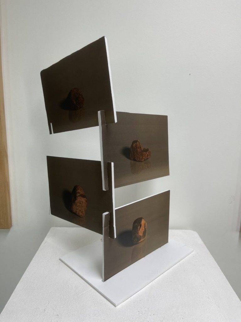
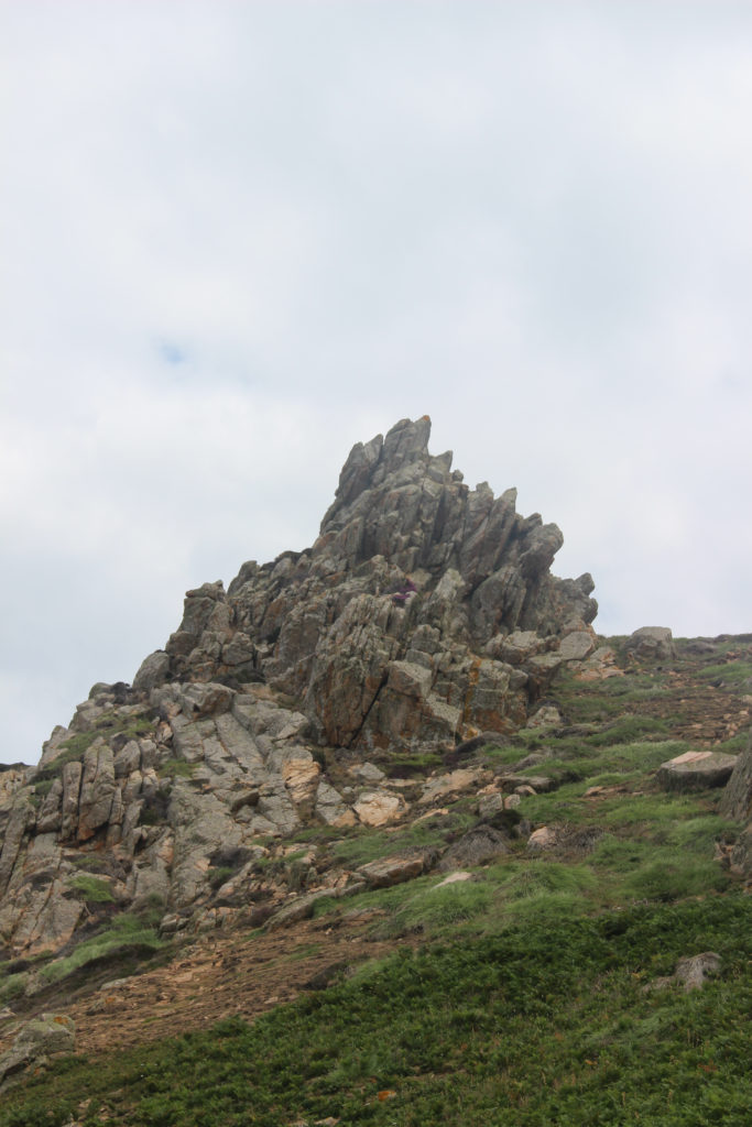
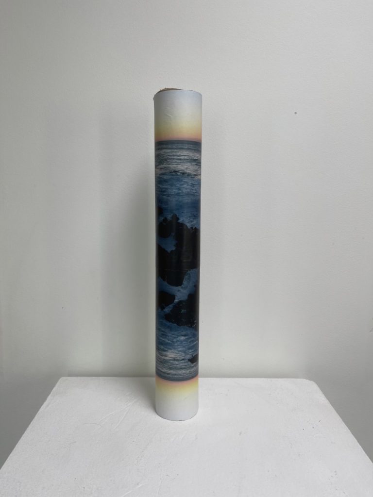
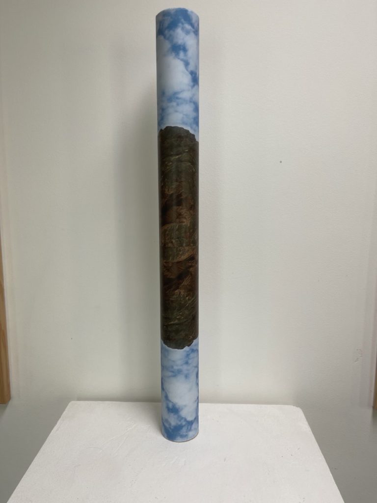
I have selected an array of images to use as inspiration for my own photo-sculpture. I like the idea of distorting my original images and focusing on shapes and layers in my sculpture.
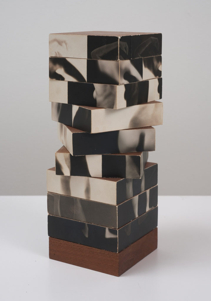
“There is a vast difference between taking a picture and making a photograph,” declared Heinecken, who rejected the idea of photography as a mere recording device. In this work, a series of segmented photographs of a nude female figure are affixed to the sides of nine rotating blocks. Borrowing practices normally used in sculpture or modernist abstraction, Heinecken expanded what we expect of photographs, here insisting on their interactivity, dimensionality, and ability to puzzle.
https://artmuseum.princeton.edu/collections/objects/18932
I chose to look at Fractured Figure Sections because it is a unique and memorable photosculpture. Heinecken’s work tends to feature Multiexposures and inverted colours and this piece is no different, it does however have the added 3D element of there being multiple faces, as well as the fact that these faces can be moved to create the desired image of the viewer. This could tie into ideas of the portrayal of women and beauty standards as the faces of the sections are all based off of one original image of a naked woman. This idea of customisation by the viewer could tie into the male gaze and women being expected to change themselves in order to be seen as appealing by other people.
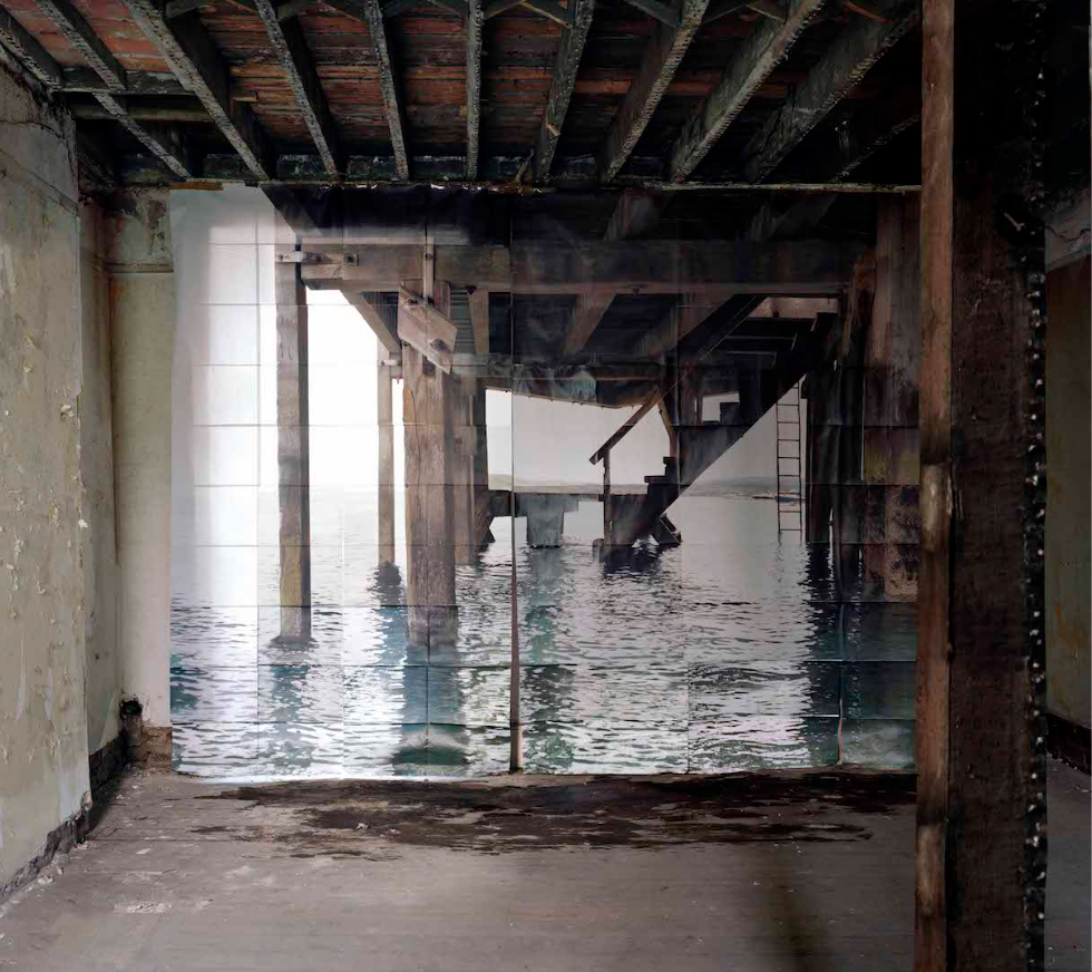
Goudal’s work often features images of one environment placed inside a different contrasting one. Jetée features a collection of images of a pier placed inside some kind of run down, industrial looking room. Both places are old and manmade and Goudal made sure to line up the perspectives of the interlope between images to make their combination more seamless, while also leaving the noticeable cracks between the images of the jetée. The water on the floor below the pier image make it look as if water has spilled through, creating another strange connection between the two images. Goudal’s pieces are often about contrast, often between manmade structures and the natural world, which is seen in this piece as well, the warms dark greys of the indoor environment contrast the lighter cooler colours of the outside world.

