
For my first photoshoot, we went down to L’Etacq and La Pinacle which is in the top left of Jersey. When we went down the weather was suitable for taking photos as the sky was different in parts, changing from a light blue with clouds to a light grey. This provided me with a good background for my photos as it wouldn’t contrast and overexpose any of my pictures, and making them clear.
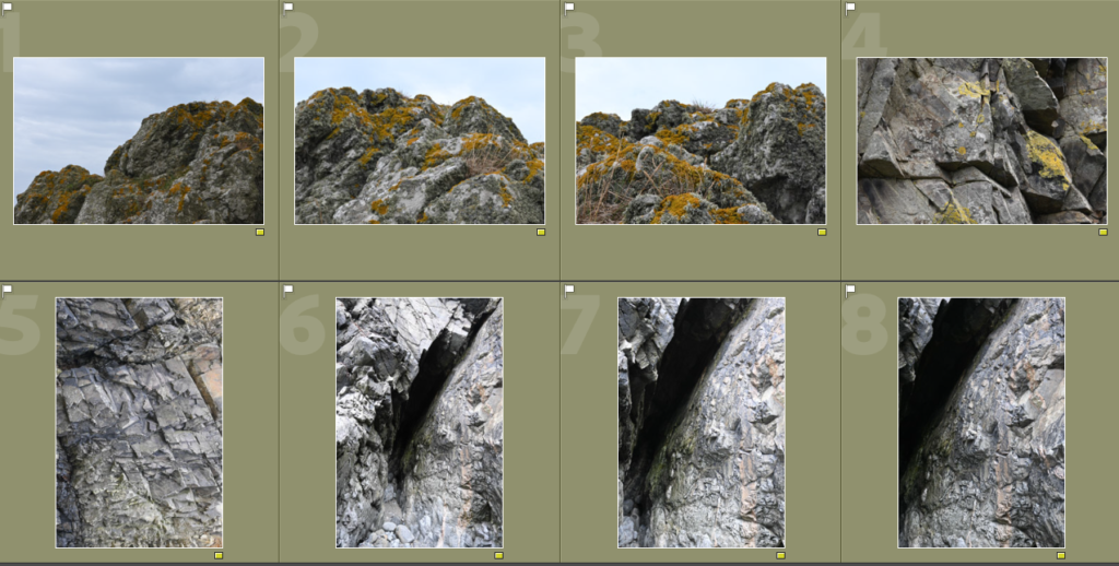
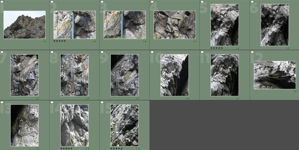
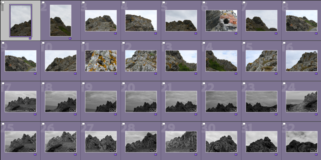
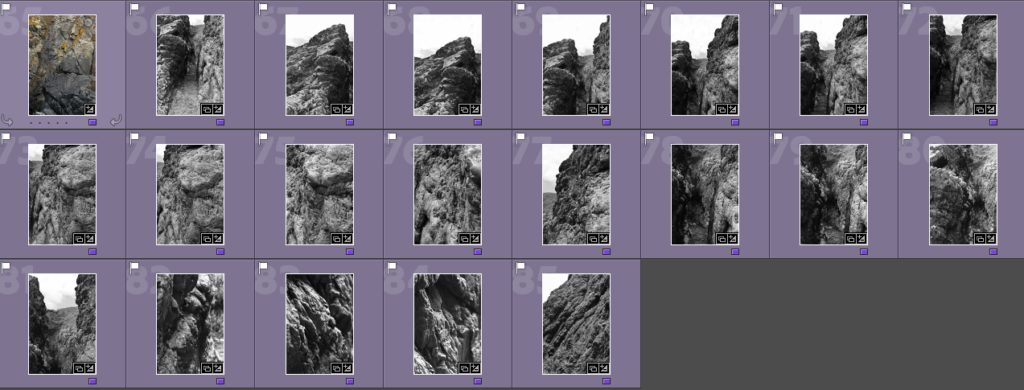
On Adobe Lightroom, I went through my photos and selected the photos which I think turned out well and organised them by colours. As seen above, I put the photos that I thought were potential best shots into the yellow colour so that I could go back for further analysis when deciding on my final 4 best shots. Then I coloured the photos which I thought were the strongest in green, and on further analysis the 4 best shots which I decided on can be seen to be marked with 5 stars.
4 best shots from the photoshoot –
Here are my 4 best photos from my first photoshoot of L’Etacq and La Pinacle.
1 and 2)
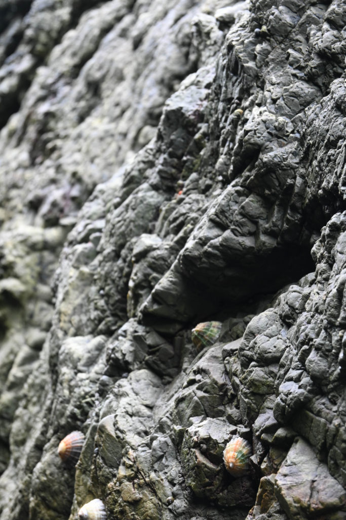
Why I chose these 2 photos is due to the way the camera has focussed on the rocks in them, because it can be seen to be blurred in the background and in the foreground. In the photos, the camera has focused on the smaller and finer details of the bumps and formations of the rocks and how the shells which are spread across the rock cling to it, which I really like. I also like the slight highlight that is created by the dim sunlight on the rocks, this makes the formations and patterns to become clear which represents their beauty and uniqueness and how 2 rocks are never the same. To further develop these 2 photos I would change this into black and white because I think that it may create quite a sinister look with the way the filter would fall on top of the way the rocks edges and faces have been formed.
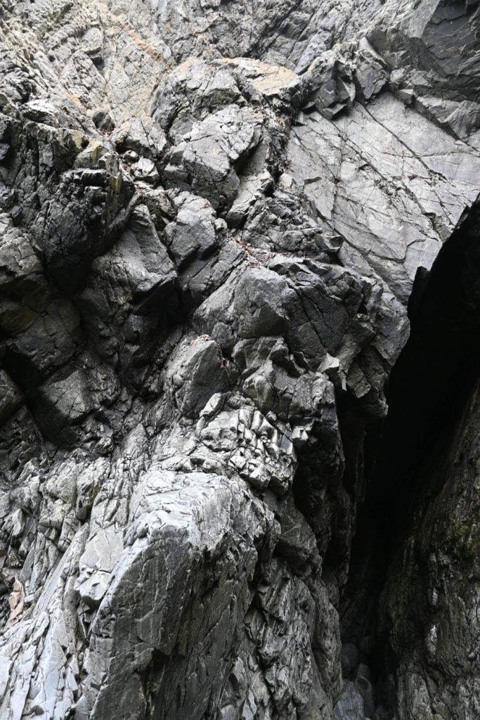
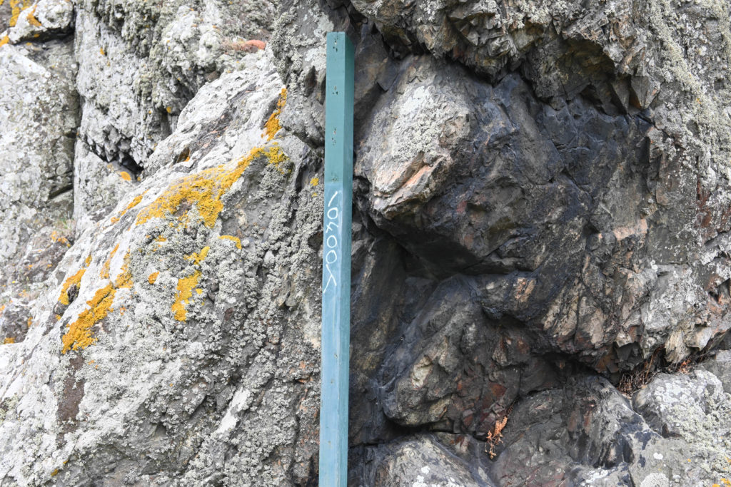
3 and 4)
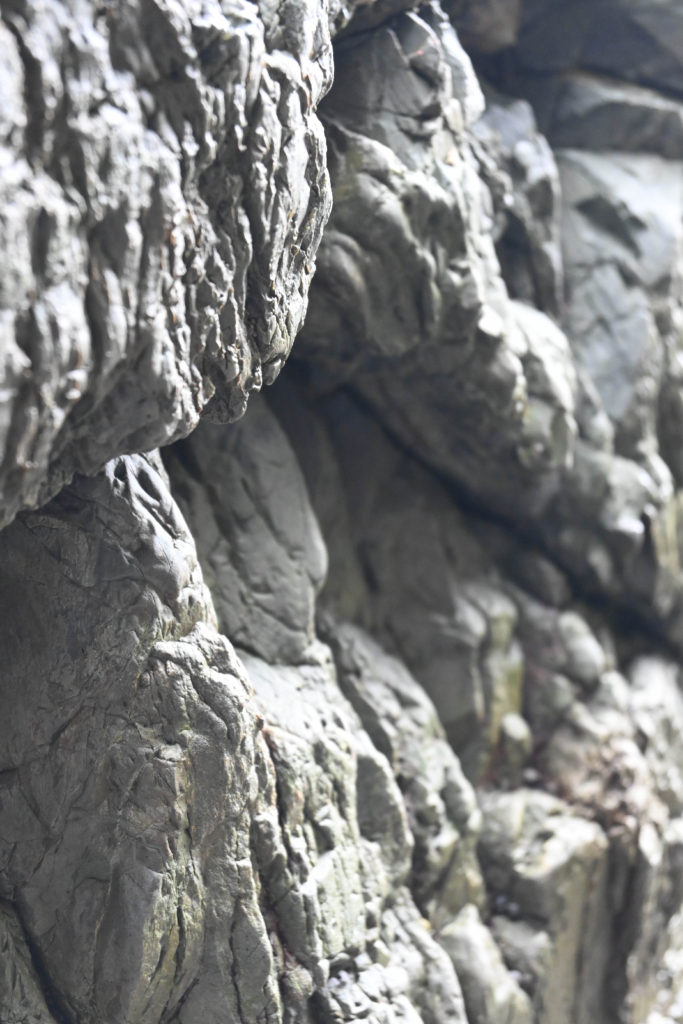
Why I chose these 2 photos as part of my 4 successful best shots is due to the way in the 3rd photo has the darker area which has been created due to the shadows of the rocks and this creates a strong contrast against the highlighted rockface from the sunlight. This is then able to show the finer and smaller details of the rockface, as if you are staring at it with a magnifying glass due to the way the highlights and contrasts work together which create the illusion of if you are zooming in to the photo.
For the 4th photo, I like how the contrast of the straight line of the pole works against the jagged, rough textures of the rockface behind it. These 2 features work well alongside one another to create a separation as if you are looking at 2 photos that have been merged together. I really like this effect because one side of the rockface is lighter than the other side which could be used to represent the two different types of weather and how this can make other features of Jerseys island feel.
Joiners –
From our photoshoot, I was really happy with how these turned out because I made sure to take photos which I could use to create and experiment with different joiners further on in Adobe Photoshop.