Contact Sheets
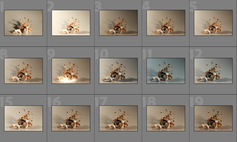
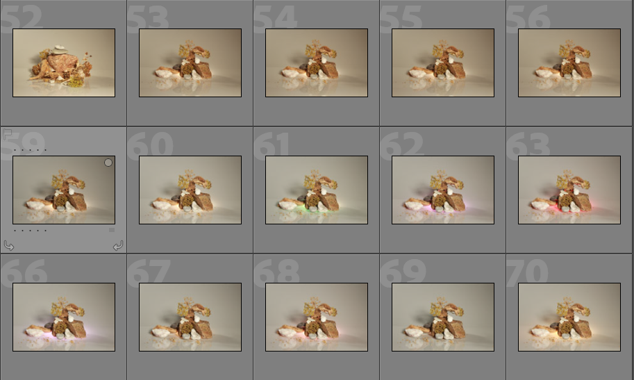
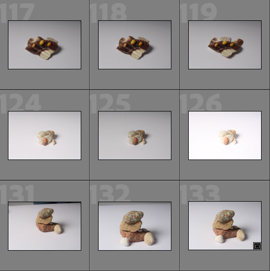
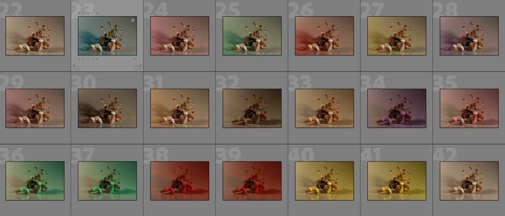
Below I have included some contact sheets displaying the wide variety of images from my Still Life shoot, this is important as it gives an indication of how many images I have from each shoot, and helps with the organisation before image sub selection.
Continuous and Flash Lighting
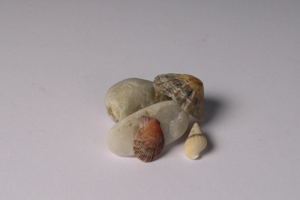
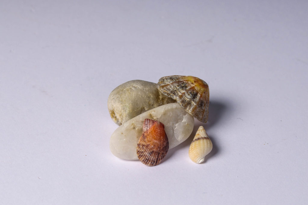
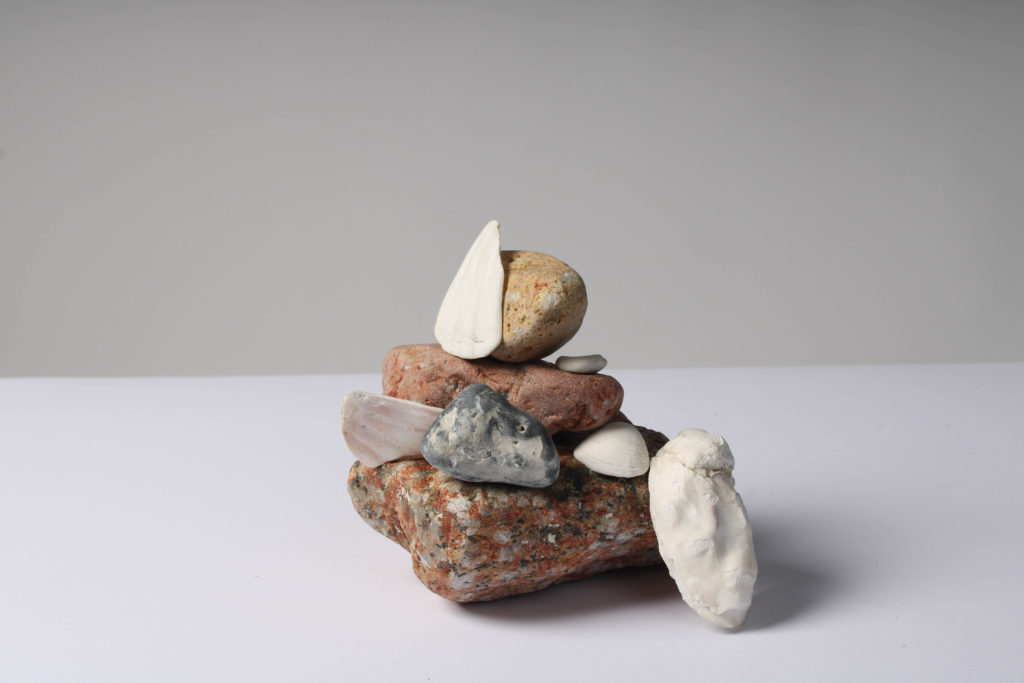
Below I have included some examples of my continuous lighting images and some of the flash lighting ones, this is in an attempt to demonstrate the difference between the two different types of lighting and how this comes to affect the final images. In my opinion, the flash lighting images look like they are of a better quality, however, this may just be because of the camera settings at the time. With the flash lighting its easier to see the details of all of the rocks and shells and take up close images.
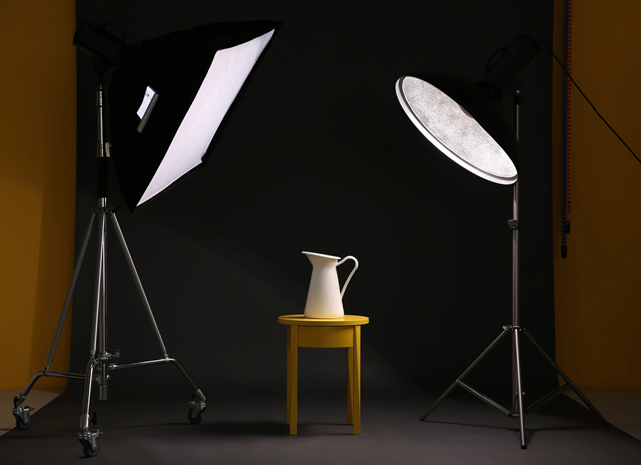
Continuous lighting: you can see how the light falls on your subject as soon as you switch it on. You don’t have to wait until you’ve taken a photo to get an idea of what kind of image you’re going to end up with. However, A disadvantage of continuous light you have to adjust the white balance on your camera another one is the lights tend to become warm.

My Example
Flash Lighting: The biggest benefit to flash lighting over LED lighting is that flash provides much more power and in a shorter burst that is less disrupting to a model. Additionally, some darkness and shadows are illuminated when using this type of lighting.

My Example
Image Sub-Selection
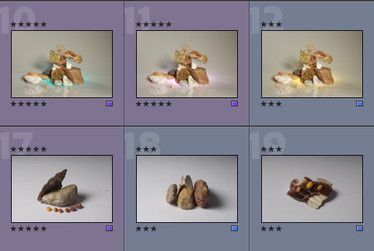
I have included evidence of image selection below, with me choosing to use a star and colour rating system to understand the quality of my photographs before editing them. I think that this is a good and effective way of choosing my images as it helps me pick out my best images from the not so good ones.
Editing
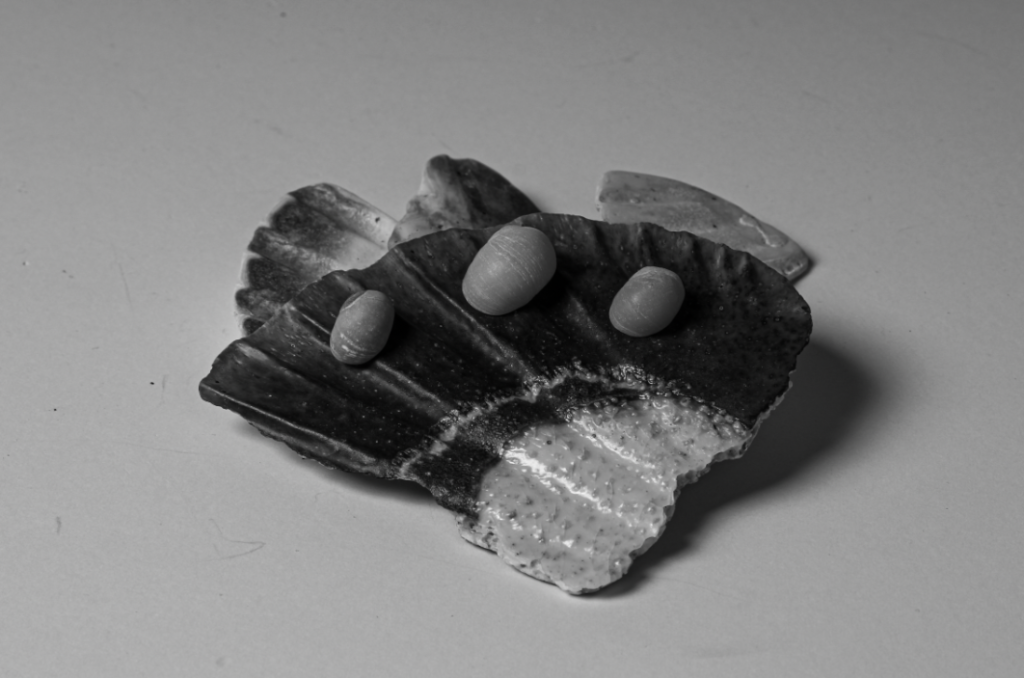
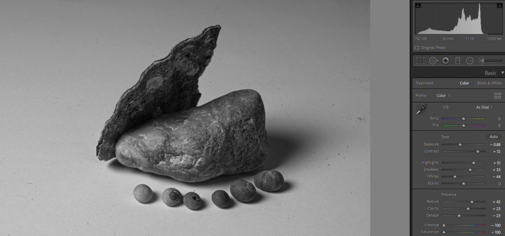
Below I have included a visual explanation of the editing process, for the first screenshot I have included the settings I have changed, for example to make this image monochromatic I had to get rid of all of the saturation and change the exposure and contrast in order to make the detail in the rocks and shells more visible. Additionally, I have added small galleries of all of my photographs before and after the editing process, this is an attempt to show the editing process.
Final Images/ Analysis and Critique
For my final images I have decided that these are my best options, I have included evaluations for each of my images, with explanations for each stating the strengths and weakness of each.
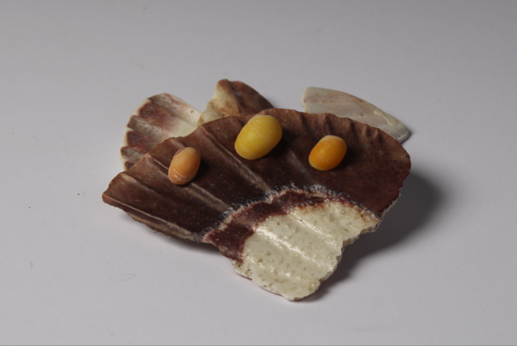
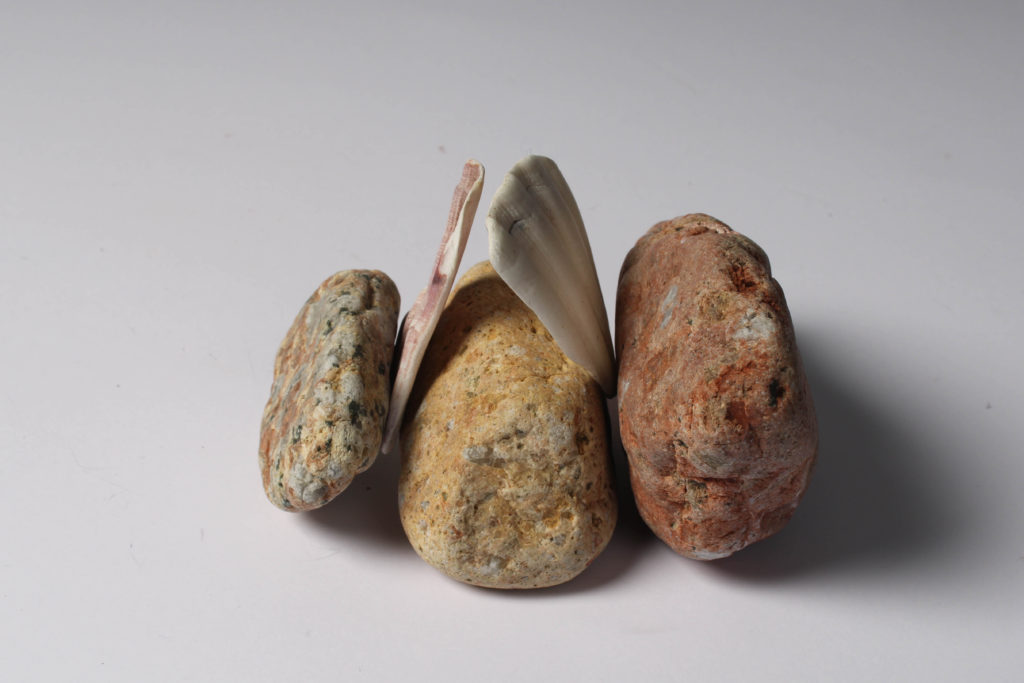
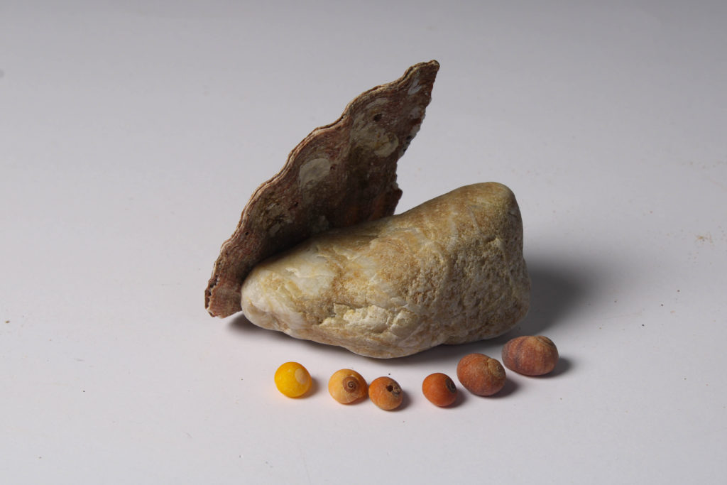
I have selected these as my first final images as I think they compliment each other well, the first image is filled with the same components as the second, being a reflection of the Jersey’s Sites of Special Interest and the history of the island. The objects in the second picture have been placed in an attempt to create a gradient with the shells in the foreground, with the small shells being places from brown tones, to red and then following a orange gradient down to yellow at the end of the chain of shells. In my opinion, the colours and tones of the rocks mean they match well together.
There are some weaknesses present in these images, the whole idea the flash lighting in the studio is to either get rid of or create different levels of shadows in the areas you would like. However, in these images I never wanted the shadows at all, I was aiming for a white background for these two pieces. Additionally. I think when taking the original image the F setting should have been changed more to try and increase the clarity of the original image.
I have included this type of editing throughout one of final images to show that some still life images look better when the white balance and temperature has been edited to make them look more eye-catching, as usually still life work consists of more mundane images and editing process, as many piece can only be altered by making changing them to monochromatic, I think that this is my most interesting final images as the blue toned background means that I now have more variety within my work. Furthermore, the vibrancy of the white shells is increased with cooler toned editing and this juxtaposes with the brown and darker tones throughout the brown objects. I think this image would be better if the clarity of the original photograph was better, and if this along with the exposure didn’t have to be edited.

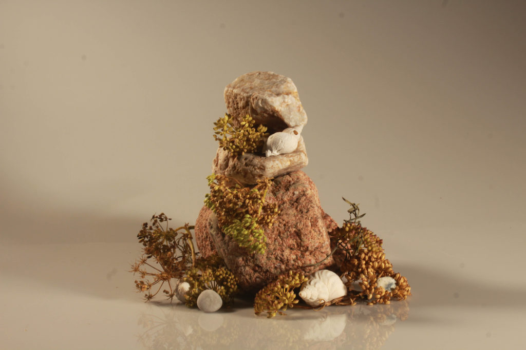
I think this is my strongest final image as it many different visual components to it, this makes it more successful as the whole image is more eye-catching. The composition of the image means that there is many layers filled with different colours, the white shells have been placed so that they break up the colours in the composition so its not too busy. Furthermore, the textures in the image mean that the plain white matches with the arrangement of the rocks. To achieve this image we had to keep changing the angle of the camera on the tripod and this meant that some came out more blurry, however I think this image turned out to be high quality. The weaknesses of this piece include the fact that it could be viwed as a composition which is too simple, making this still life piece slightly boring, however I think that it links really well to the theme of ‘islandness’.
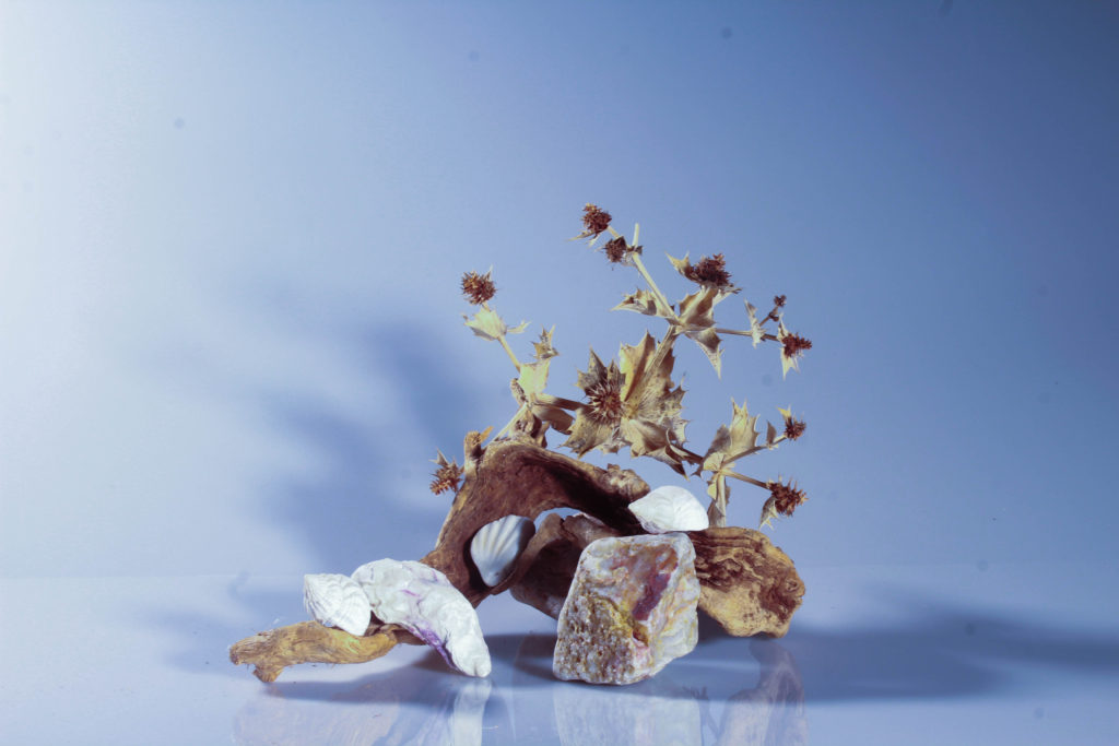
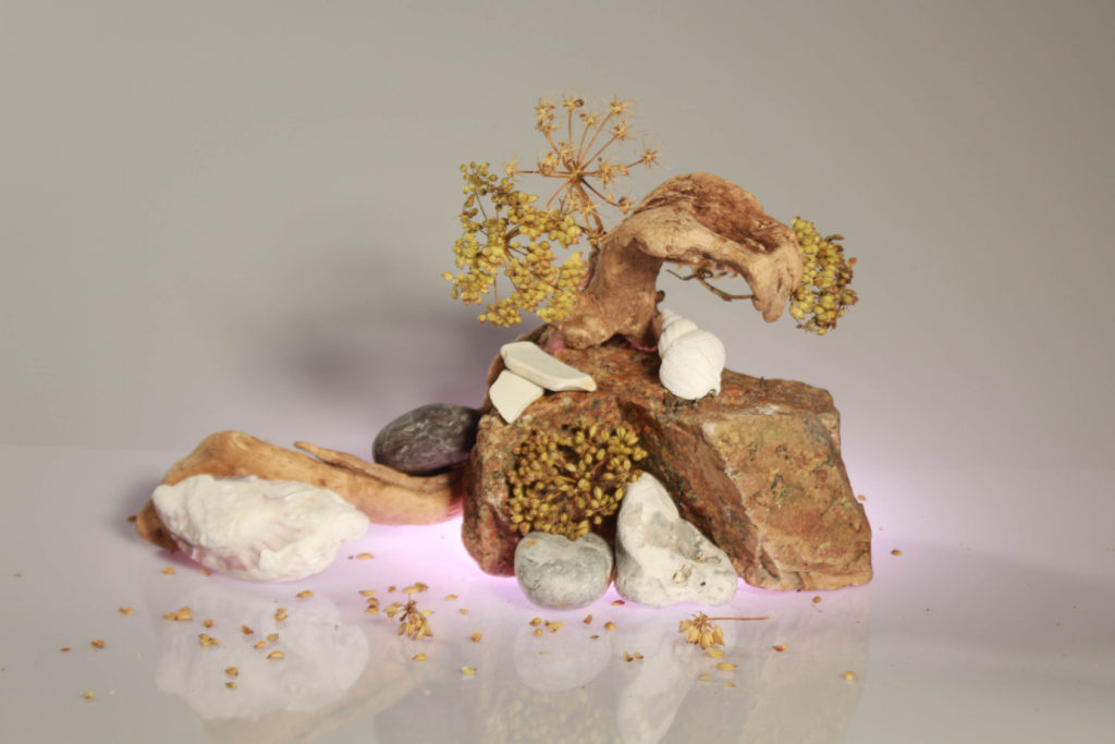
These two images are my most successful examples of continuous lighting, as the composition of this pieces is the best in my opinion. I have placed them together in order to show the difference between cooler toned under-light (the first image with the turquoise) and warmer toned under-light (the second image with the pink). The right piece is a brighter then the left but I think both images are successful because the differently lightings means that the composition looks altered. This means that your attention is draw to different aspects because of the colours. For example, attention is draw to the top of the image in the first image and more to the bottom centre of the second image. In my opinion, both of the colours compliment the tones within the woods, rocks and plants within the composition.
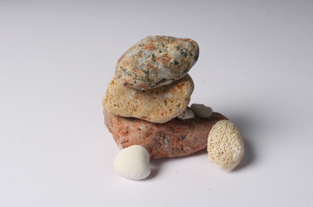
This has been selected as my last final image as I think that this piece has it has an aesthetic simplicity to it, with there being a subtle colour gradient going from the top to the bottom of the rocks. I like that the smaller white shells provides balance to the composition, as it breaks up the colours throughout the piece. However, in my opinion the composition would have looked a lot better if it was all central and not placed to the left side. Additionally, this piece would have looked a lot better if the background wasn’t grey and the foreground wasn’t as bright white. A balance between the shadows would have made this a lot more successful as it would show more photographic technique.

