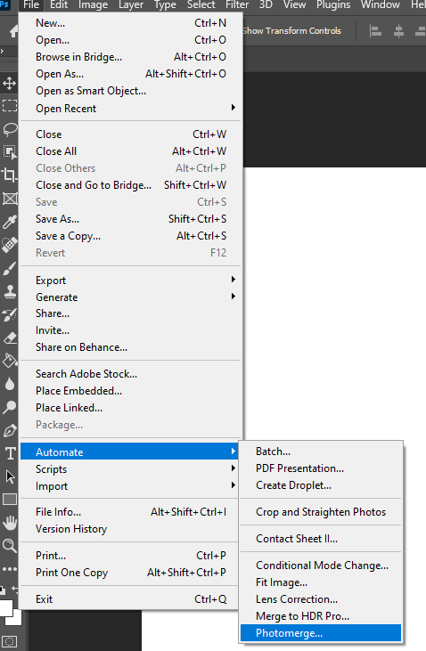
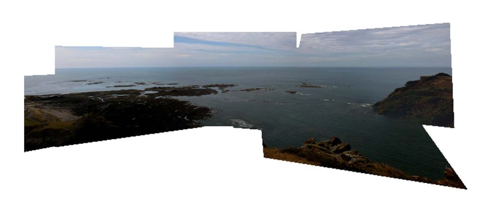
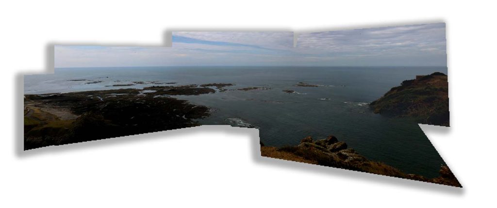
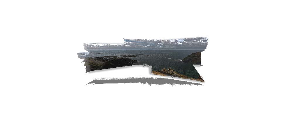
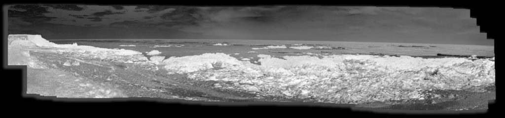
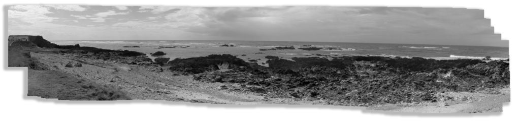
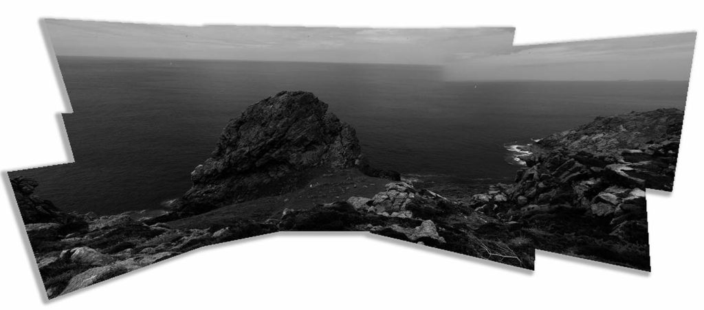
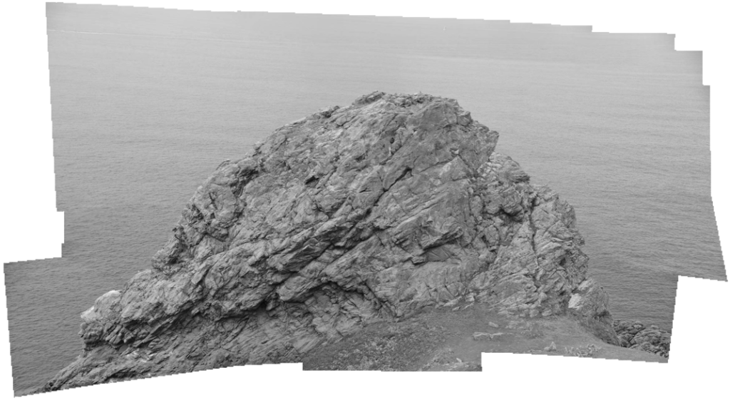
I have taken inspiration from David Hockney and have made my joiners of Sticky bay and Le Pinacle. Below I have included some photos to help explain how to make these joiners. First I would export them from Lightroom and into photoshop, there I found the photo merge button which is used to create the joiners automatically.
Editing
Before exporting my images from lightroom I had to edit them all so that they completely matched in colour, for this I had to first start with one photo and edit it how I wanted my joiner to come out, I then selected all the photographs that would be in my joiner and used the ‘sync settings’ to edit all images the same. Doing this it saved me time as I didn’t have to edit all photos separately.
After exporting my images to photoshop I proceeded to make my joiners, for this I started by clicking ‘file’, going down to ‘automate’ and using the photo merge tool to automatically put all my selected photos together.
First Edit 1
First Edit 2
Experimentation
Drop Shadow 1
Drop Shadow 2
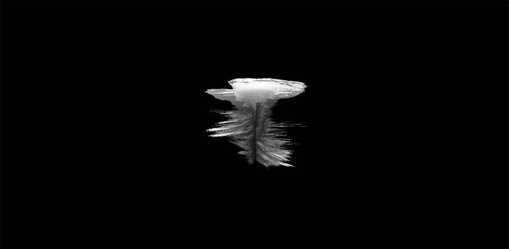
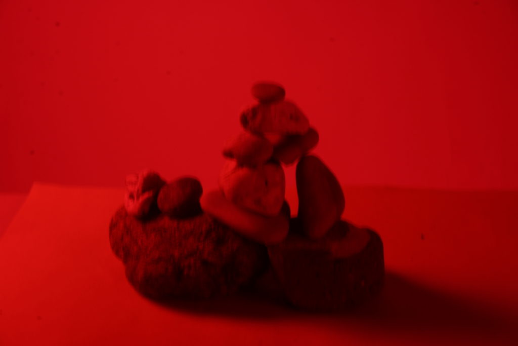
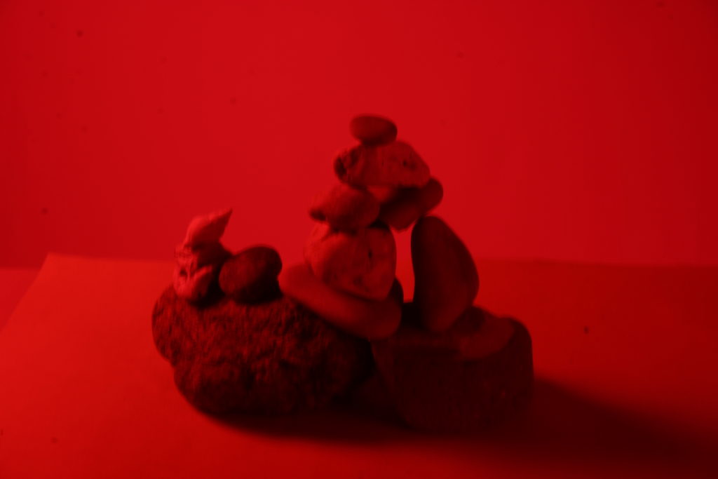
After I created my joiners I decided to experiment with different features on Lightroom such as adding a drop shadow to try and give the final image depth and make it seem like it has been embedded into the background. I was also experimenting by using the 3D tool and creating different edits of the same joiner and I was able to morph them into different shapes and objects.
3D Sphere
This is my edit of a 3D sphere of one of my joiners, I have also changed the background colour, which makes the 3D object in the centre look like it’s floating in midair.
I have included screenshots of how I have used different tools on photoshop to edit the joiners.
3D Plane
Here is another example of my experimentation with using the 3D tool and have edited the final joiner into a 3D plane.
Inverted
Above I have chosen to invert the colours in one of my joiners to try and create a different atmosphere and meaning for the final image.
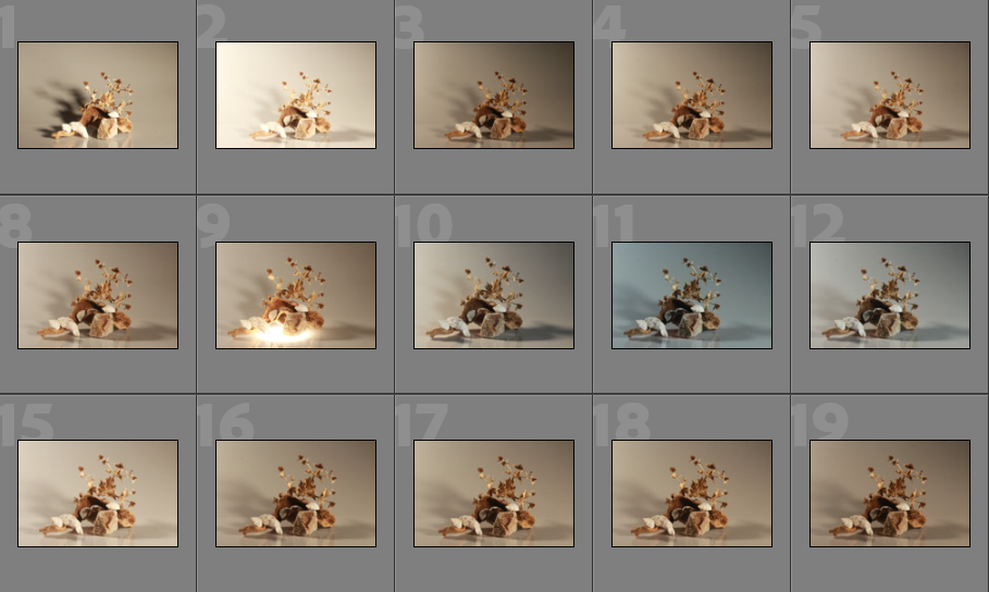
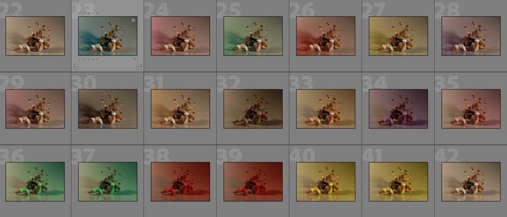
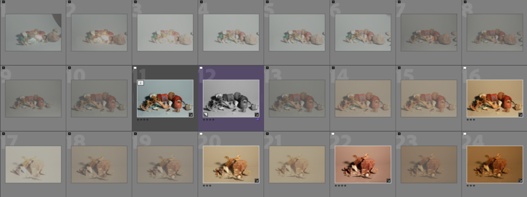
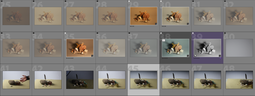
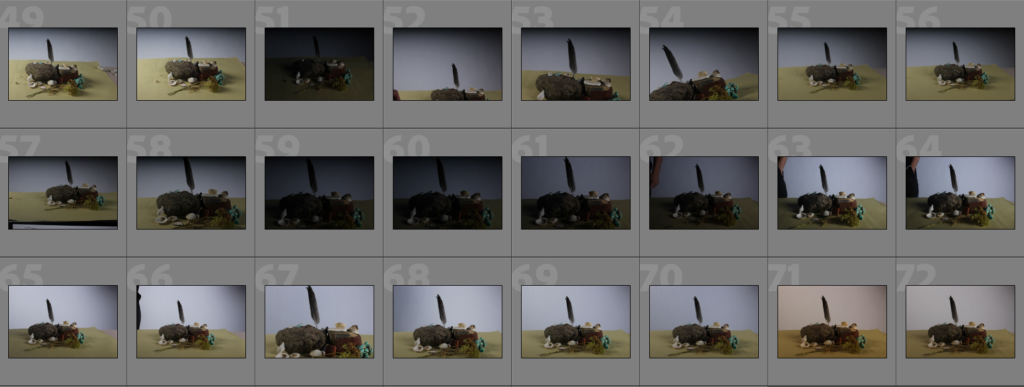
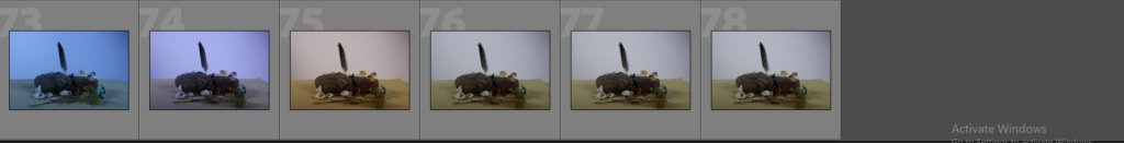
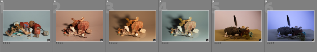
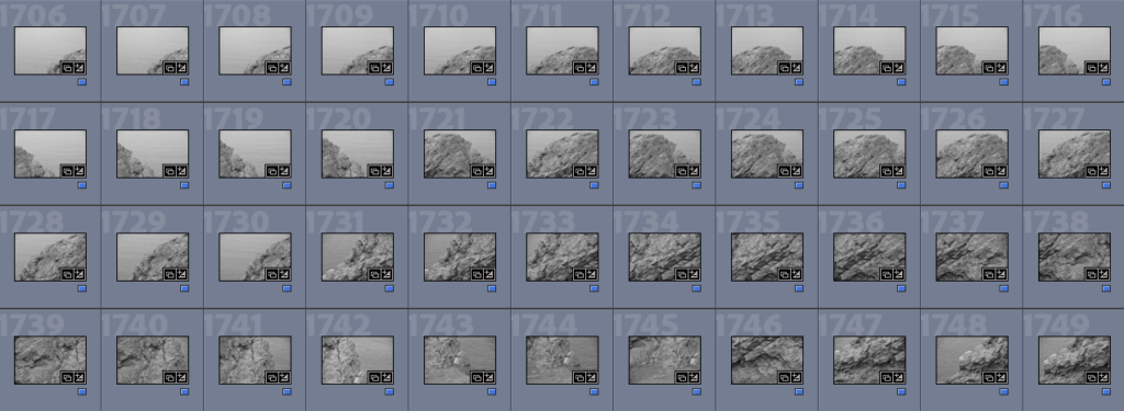
Below I have included some contact sheets displaying the wide variety of images from my Still Life shoot, this is important as it gives an indication of how many images I have from each shoot, and helps with the organisation before image sub selection.
Continuous and Flash Lighting
Below I have included some examples of my continuous lighting images and some of the flash lighting ones, this is in an attempt to demonstrate the difference between the two different types of lighting and how this comes to affect the final images. In my opinion, the flash lighting images look like they are of a better quality, however, this may just be because of the camera settings at the time. With the flash lighting its easier to see the details of all of the rocks and shells and take up close images.
Continuous lighting: you can see how the light falls on your subject as soon as you switch it on. You don’t have to wait until you’ve taken a photo to get an idea of what kind of image you’re going to end up with. However, A disadvantage of continuous light you have to adjust the white balance on your camera another one is the lights tend to become warm.
My Example
Flash Lighting: The biggest benefit to flash lighting over LED lighting is that flash provides much more power and in a shorter burst that is less disrupting to a model. Additionally, some darkness and shadows are illuminated when using this type of lighting.
My Example
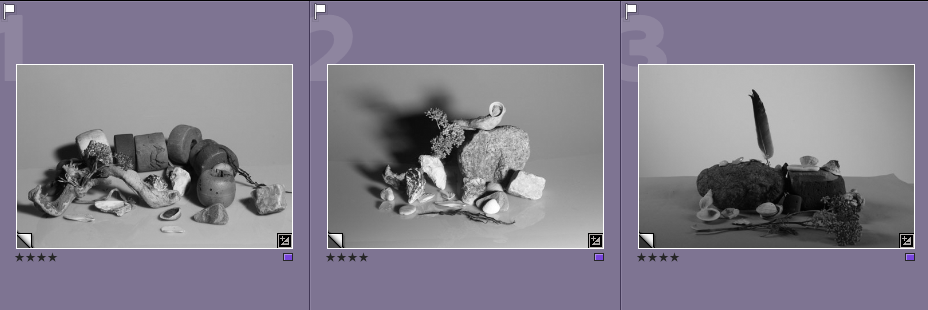
Image Sub-Selection
I have included evidence of image selection below, with me choosing to use a star and colour rating system to understand the quality of my photographs before editing them. I think that this is a good and effective way of choosing my images as it helps me pick out my best images from the not so good ones.
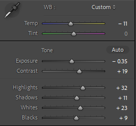
Editing
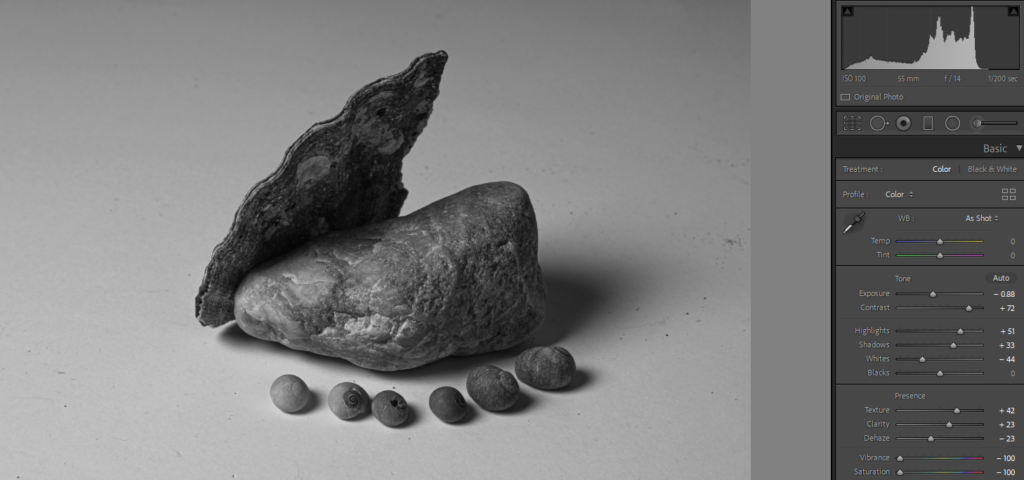
Below I have included a visual explanation of the editing process, for the first screenshot I have included the settings I have changed, for example to make this image monochromatic I had to get rid of all of the saturation and change the exposure and contrast in order to make the detail in the rocks and shells more visible. Additionally, I have added small galleries of all of my photographs before and after the editing process, this is an attempt to show the editing process.
Final Images/ Analysis and Critique
For my final images I have decided that these are my best options, I have included evaluations for each of my images, with explanations for each stating the strengths and weakness of each.
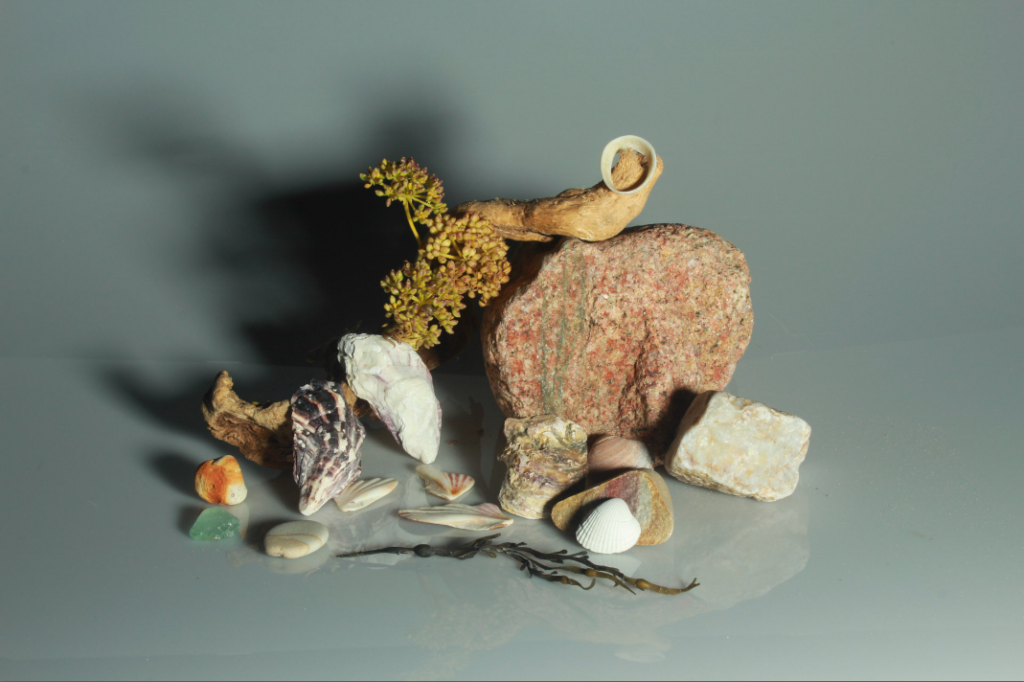
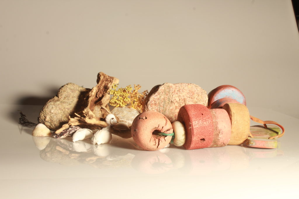
Flash Lighting
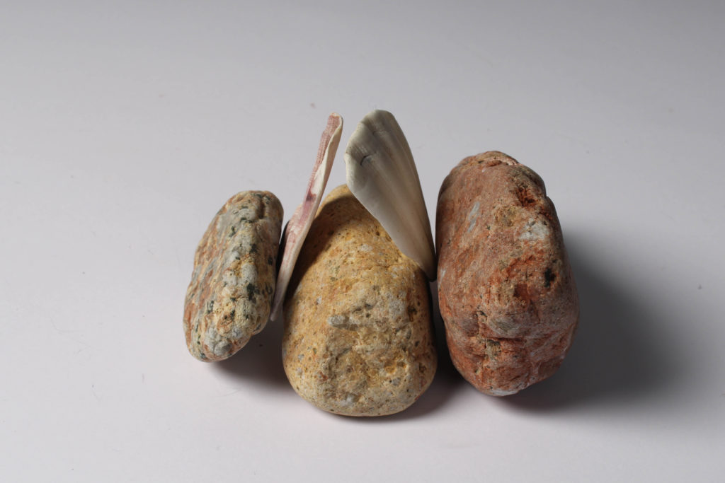
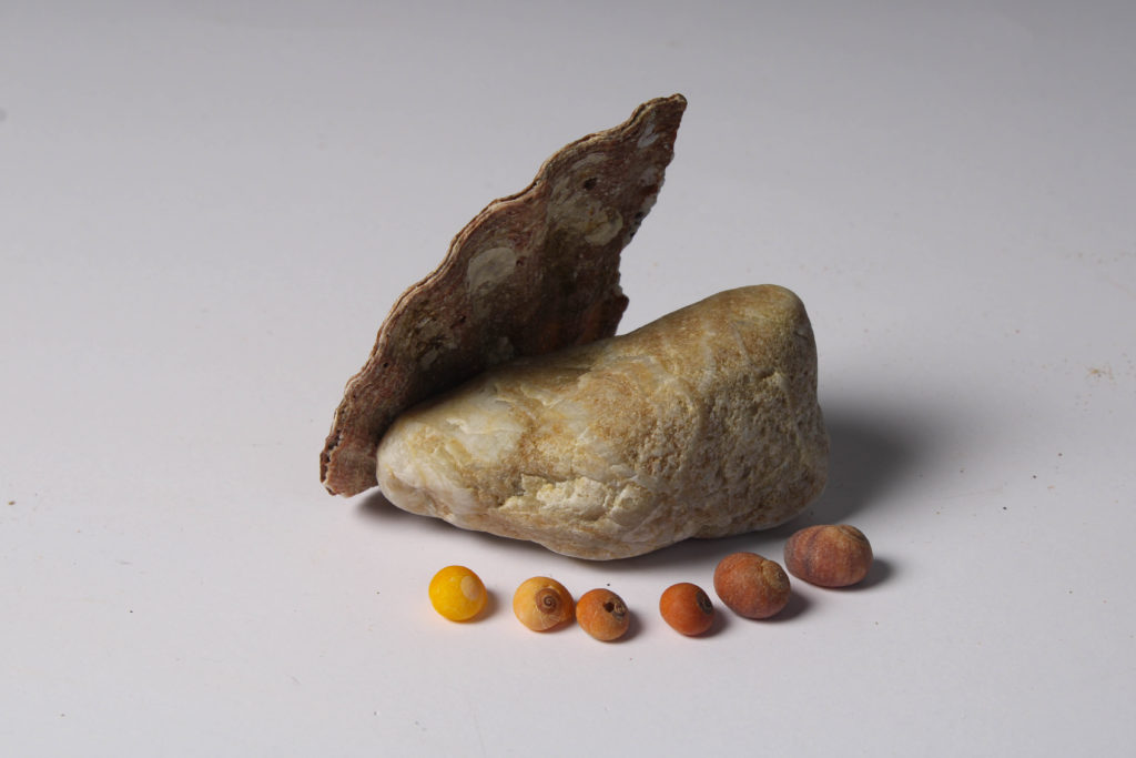
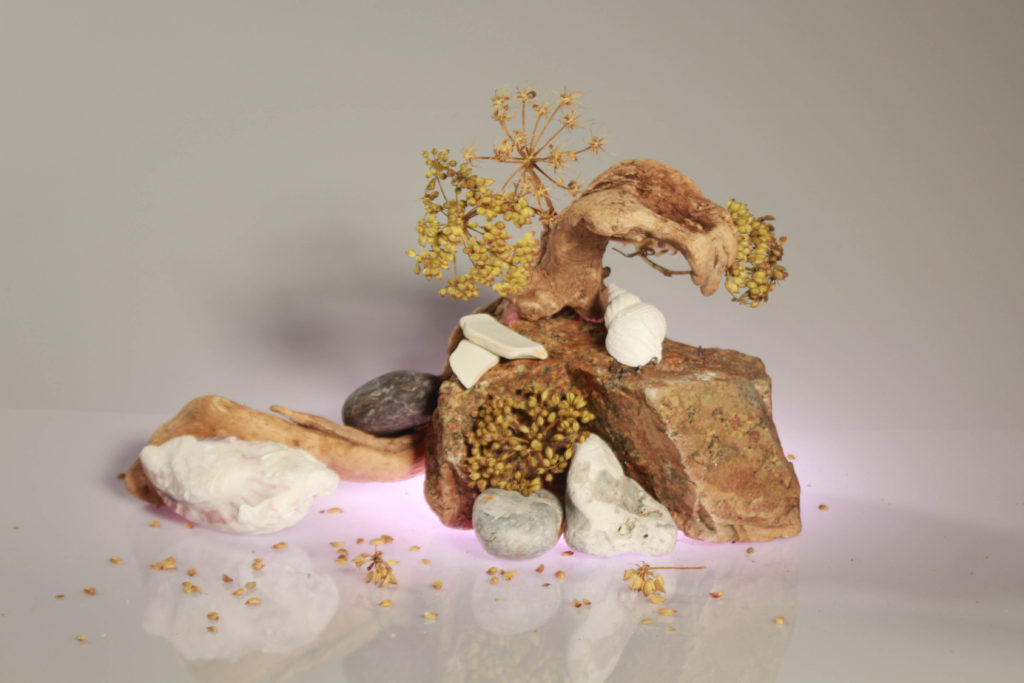
I have selected these as my first final images as I think they compliment each other well, the first image is filled with the same components as the second, being a reflection of the Jersey’s Sites of Special Interest and the history of the island. The objects in the second picture have been placed in an attempt to create a gradient with the shells in the foreground, with the small shells being places from brown tones, to red and then following a orange gradient down to yellow at the end of the chain of shells. In my opinion, the colours and tones of the rocks mean they match well together.
There are some weaknesses present in these images, the whole idea the flash lighting in the studio is to either get rid of or create different levels of shadows in the areas you would like. However, in these images I never wanted the shadows at all, I was aiming for a white background for these two pieces. Additionally. I think when taking the original image the F setting should have been changed more to try and increase the clarity of the original image.
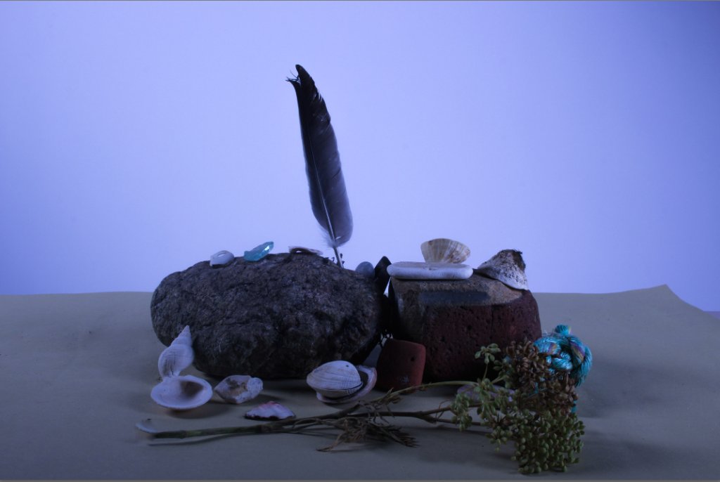
I have included this type of editing throughout one of final images to show that some still life images look better when the white balance and temperature has been edited to make them look more eye-catching, as usually still life work consists of more mundane images and editing process, as many piece can only be altered by making changing them to monochromatic, I think that this is my most interesting final images as the blue toned background means that I now have more variety within my work. Furthermore, the vibrancy of the white shells is increased with cooler toned editing and this juxtaposes with the brown and darker tones throughout the brown objects. I think this image would be better if the clarity of the original photograph was better, and if this along with the exposure didn’t have to be edited.
Flash Lighting
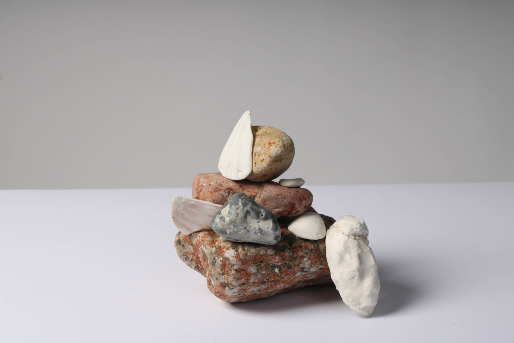
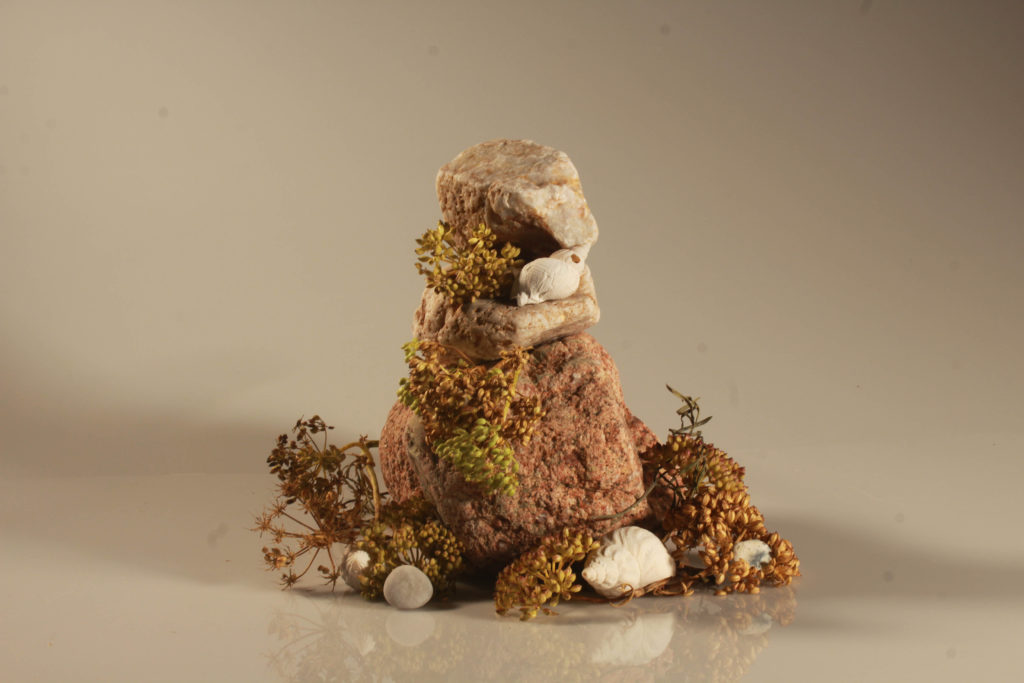
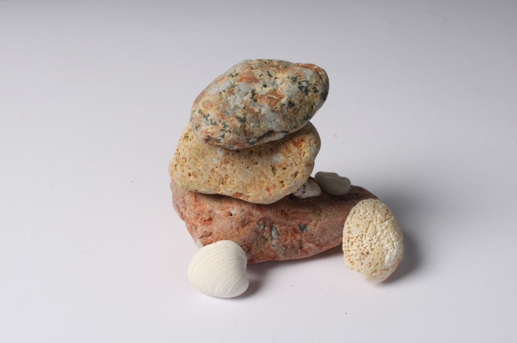
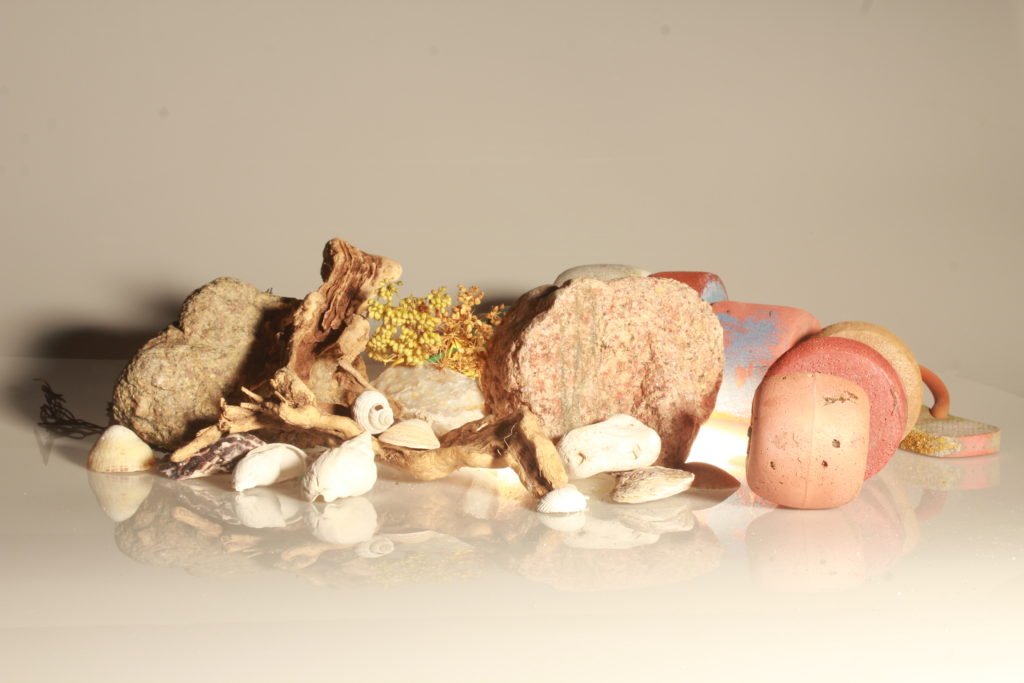
I think this is my strongest final image as it many different visual components to it, this makes it more successful as the whole image is more eye-catching. The composition of the image means that there is many layers filled with different colours, the white shells have been placed so that they break up the colours in the composition so its not too busy. Furthermore, the textures in the image mean that the plain white matches with the arrangement of the rocks. To achieve this image we had to keep changing the angle of the camera on the tripod and this meant that some came out more blurry, however I think this image turned out to be high quality. The weaknesses of this piece include the fact that it could be viwed as a composition which is too simple, making this still life piece slightly boring, however I think that it links really well to the theme of ‘islandness’.
Continuous Lighting
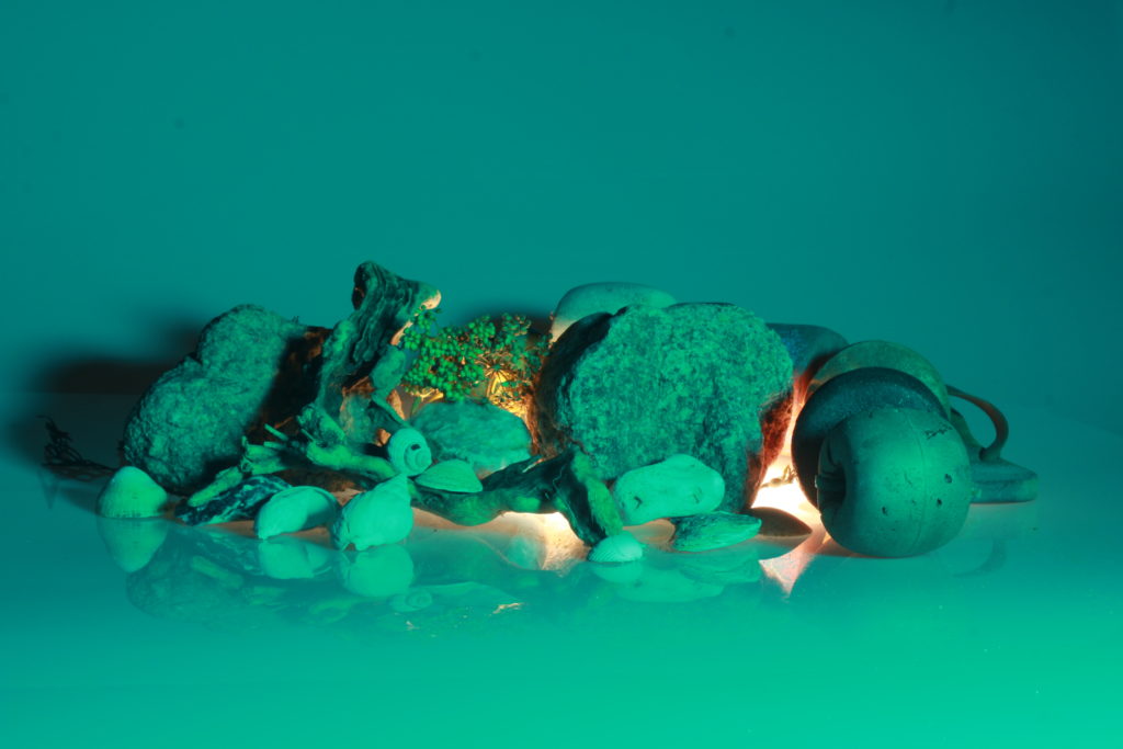
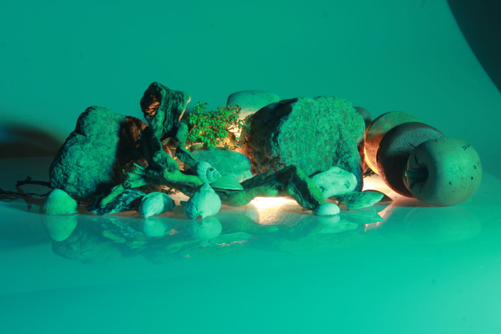
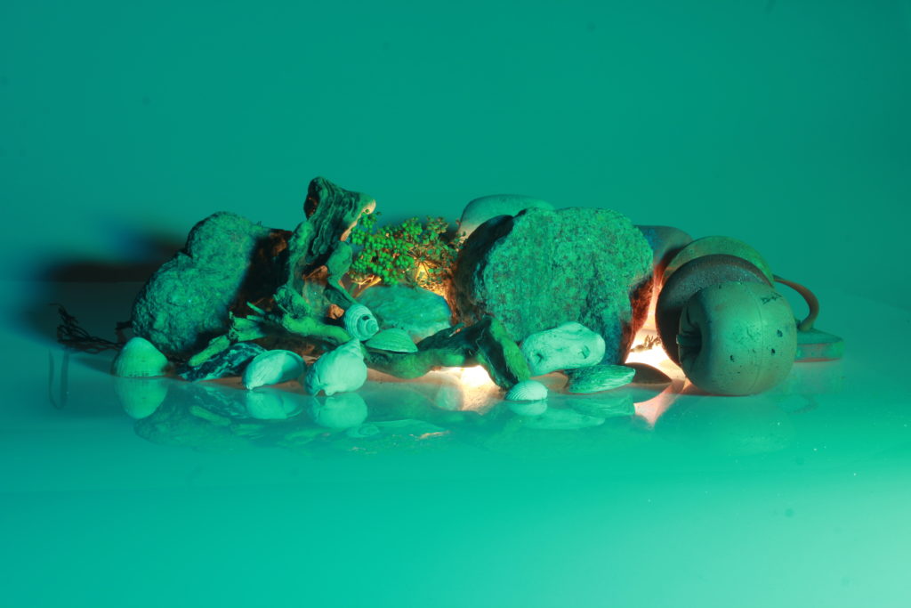
These two images are my most successful examples of continuous lighting, as the composition of this pieces is the best in my opinion. I have placed them together in order to show the difference between cooler toned under-light (the first image with the turquoise) and warmer toned under-light (the second image with the pink). The right piece is a brighter then the left but I think both images are successful because the differently lightings means that the composition looks altered. This means that your attention is draw to different aspects because of the colours. For example, attention is draw to the top of the image in the first image and more to the bottom centre of the second image. In my opinion, both of the colours compliment the tones within the woods, rocks and plants within the composition.
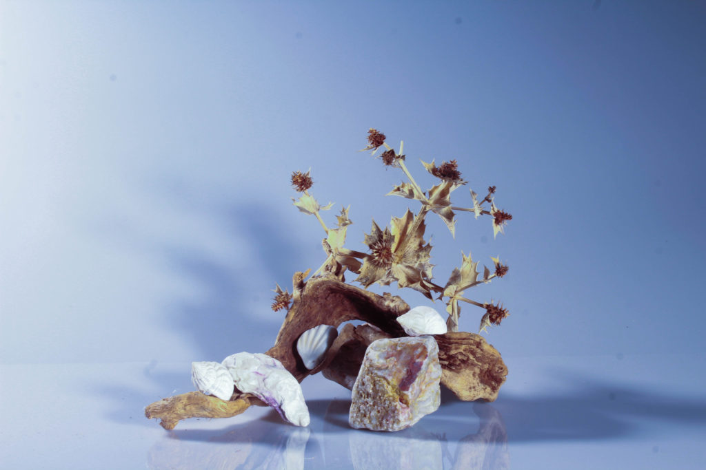
This has been selected as my last final image as I think that this piece has it has an aesthetic simplicity to it, with there being a subtle colour gradient going from the top to the bottom of the rocks. I like that the smaller white shells provides balance to the composition, as it breaks up the colours throughout the piece. However, in my opinion the composition would have looked a lot better if it was all central and not placed to the left side. Additionally, this piece would have looked a lot better if the background wasn’t grey and the foreground wasn’t as bright white. A balance between the shadows would have made this a lot more successful as it would show more photographic technique.
“David Hockney was born 9 July 1937. He is an English painter, draftsman, printmaker, stage designer, and photographer. As an important contributor to the pop art movement of the 1960s, he is considered one of the most influential British artists of the 20th century.”
Joiners
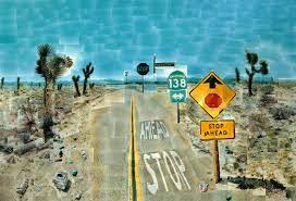
In the early 1980s Hockney began to experiment with photo collages which were famously known as “Joiners”. Hockney called photo collaging painting with photographs.
Examples of David hockney joiners
Photo Analysis
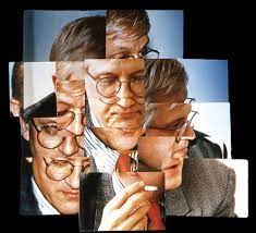
This is one of Hockney’s most famous images. it shows an elderly couple solving a crossword puzzle however Hockney has managed to achieve something in this image that is very rare, and that is the image of time. usually images only portray a simple one frame scene but in this image due to hockey’s unique joiner style he has shown multiple stages of the image that he being captured. this can be seen in the facial expressions of the models as well as the hand placement. Due to the images clearly being made up of many image many viewpoints are shown. This image seems to have natural lighting which shows that Hockney wanted this image is seem as natural as possible. However the clothing is the models seems rather formal which implies that they could be passing time before they head out.
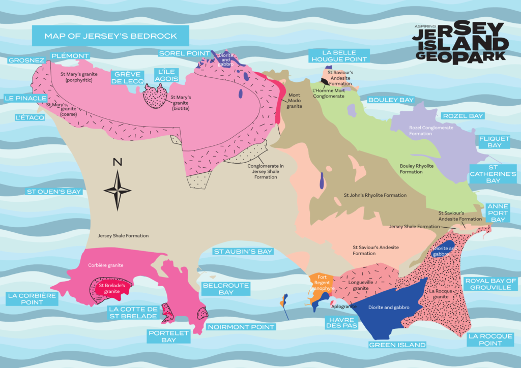
“Geoparks are places where landscapes with outstanding geological heritage are used to support sustainable development; this is achieved through conservation, education, interpretation and nature-based tourism.” – dictionary.com
Hong kong geopark
Geoparks are a way that a country can preserve and protect a historical heritage site.
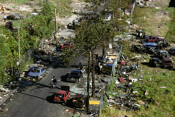
We visited jersey museum where we spoke with geologist Dr Ralph Nicols about jerseys bedrock and sites of special interest in out geological features. He explained to us about how jersey is working to become an island geopark.
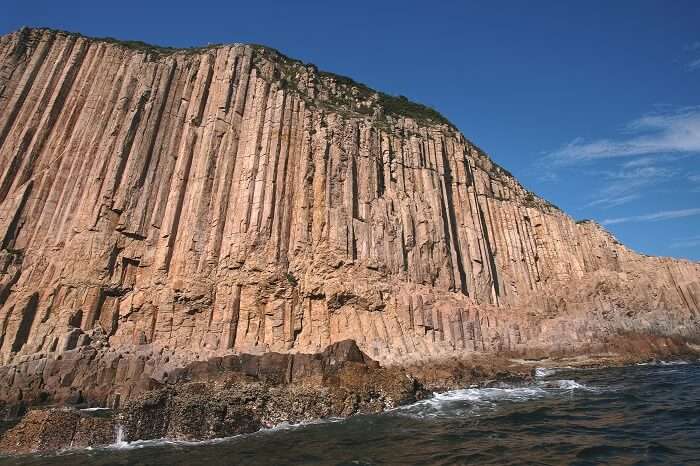
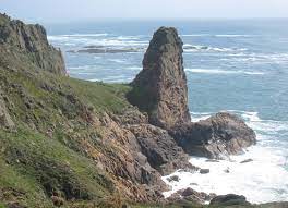
Natural Sites of Special Interest (SSIs) are places that are considered to be of public importance because of their special zoological, ecological, botanical or geological interest, or a combination of these and other special qualities. – dictionary.com
These sites are very important to the people of jersey as they are places that represent jerseys heritage.
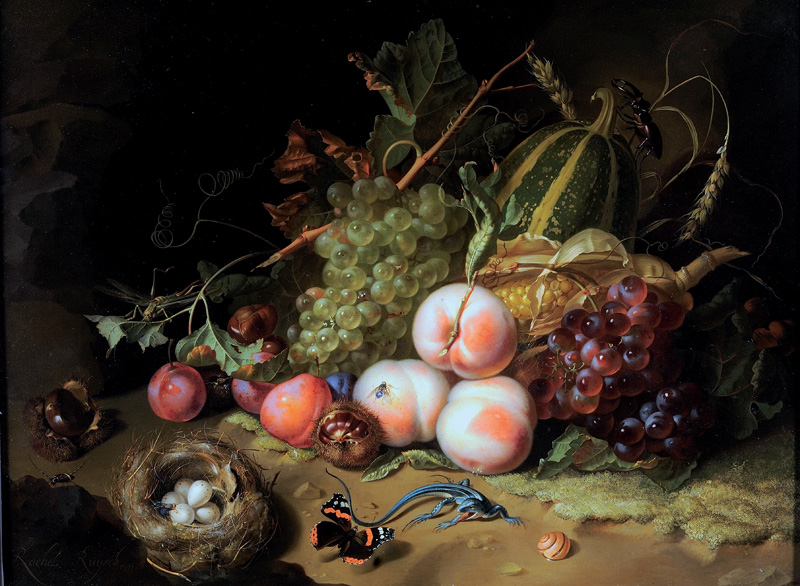
Still life is historically a genre of painting where the subject of the painting includes either dead animals and/or inanimate objects such as fruit, candlesticks, fish and cut flowers. Typically still life displays material pleasures and often a warning pointing towards hedonism. Still life can also be a display of memento mori– designed towards remind the viewer of their own morality.
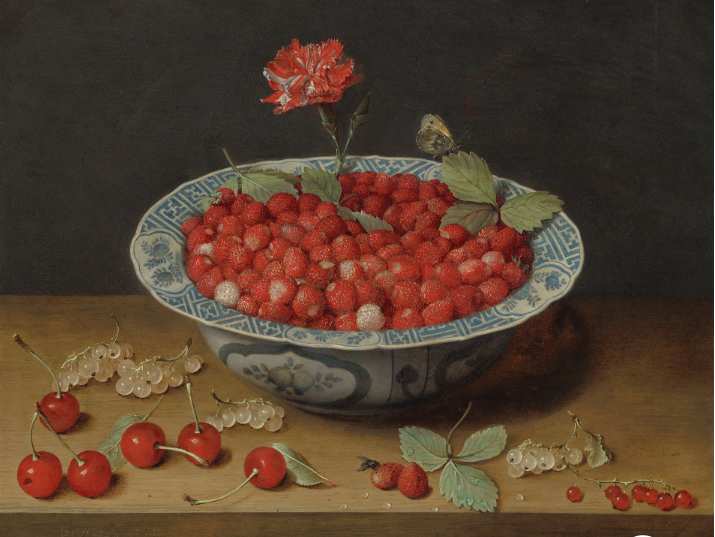
Wild Strawberries and a Carnation in a Wan-Li Bowl Jacob van Hulsdonckc. 1620
HISTORY OF STILL LIFE
Still life became a dignified art genre with Netherlandish painting of the 16th and 17th centuries. The English term still life derives is translated from the Dutch word stilleven- in French, the term for Still Life is nature morte, which means “dead nature”. Early still life paintings, particularly before 1700, often contained religious and allegorical symbolism relating to the objects depicted- for example some of the earliest still life paintings were created by the Egyptians in the 15th century BCE which decorated the interior of burial tombs
Still life found in the Tomb of Menna, click the link for a virtual tour of the tomb
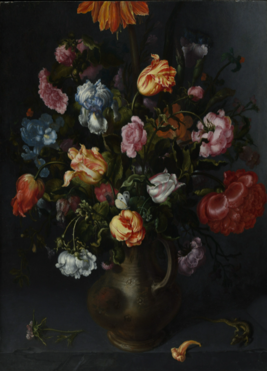
Throughout history still life travelled across the globe, but finding its primary home in the Netherlands during the Dutch Renaissance (17th century) where it became a prevalent art form with many paintings displaying rich colours, hedonistic implications, religious symbols and symbols of death as a reminder of human mortality. Click on the image below for a guide on symbolism in still life.
Still life was then translated to photography, with its origins residing in the early 20th century. Art photographers emerged such as Baron Adolph de Meyer who took direct inspiration from the Dutch painters of the 17th century.
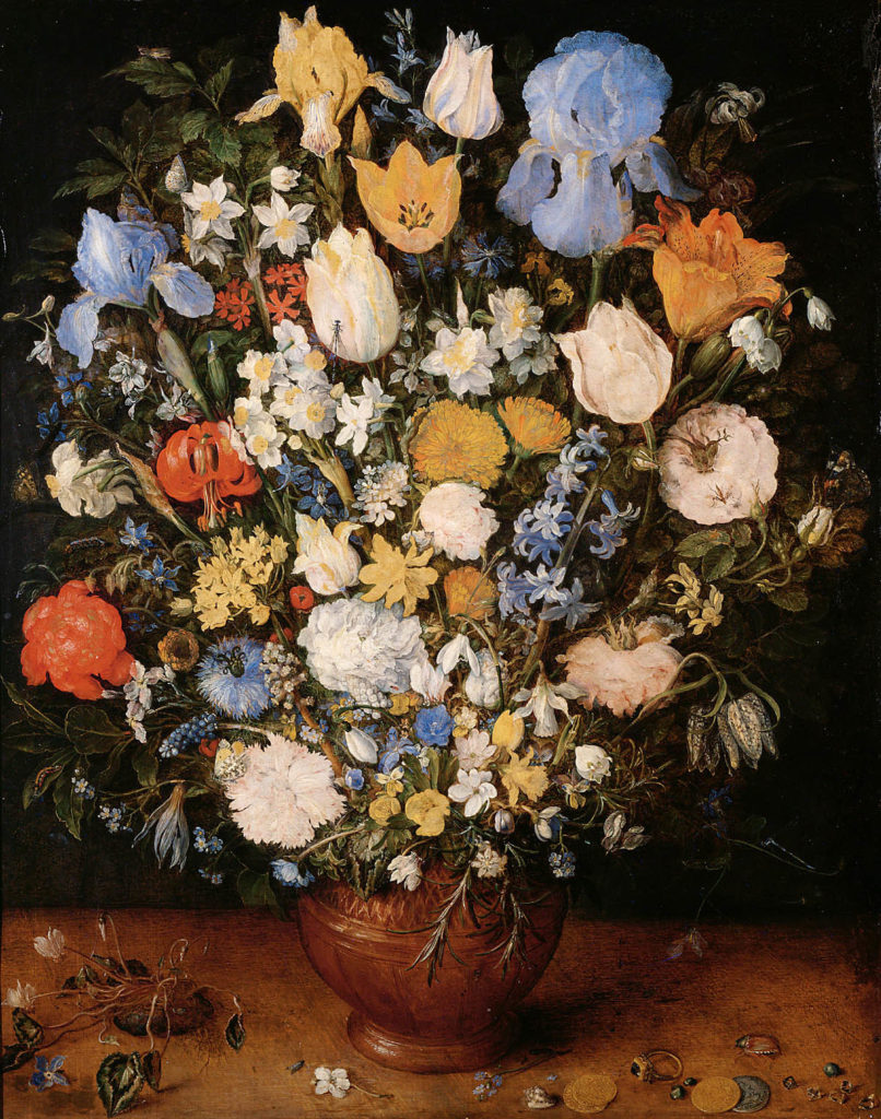
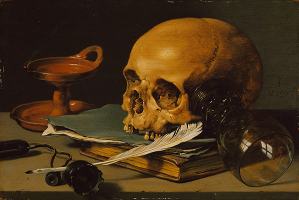
This vanitas still life painted by Pieter Claesz in 1625 displays a candlestick holding the stub of a candle, a watch, a letter, a pen and an inkpot, a flower, a skull and a walnut arranged on a table. All of these objects are part of the established language of classic vanitas paintings, engulfed with symbolism of mortality and time passing. The flower at the edge of the table is an anemone, It appears newly picked as the petals and the leaves are still fresh, however anemones have a reputation for withering quickly- the Roman poet Ovid called the anemone a ‘windflower’ because it clings to life for such a short time. In this still life, with its message of time slipping by, the flower certainly refers to the fugitive nature of life; this is further enhanced by the candle which seems as if it is about to blow out and quite obviously, the skull which is where attention is mostly drawn to as the light in the painting is coming from the left side (the candle- and possibly another light source so the painting could still be worked on) and concentrates on the skull which is outlined by shadows, defining its shape. This painting is quite interesting as the composition is quite spread out meaning the shadows are every visible which is especially unusual compared to the contrast of the quite light objects- the flower, skull and paper which are primarily white based.
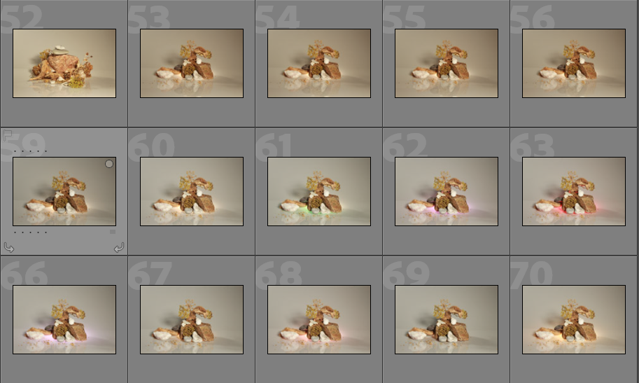
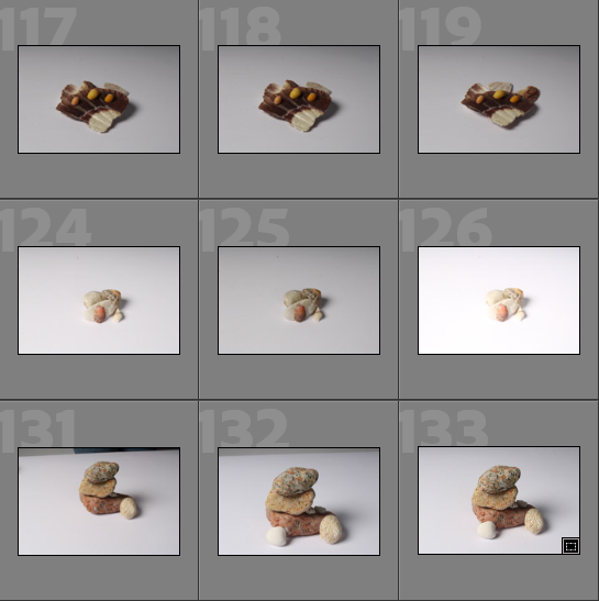
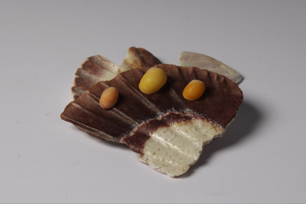
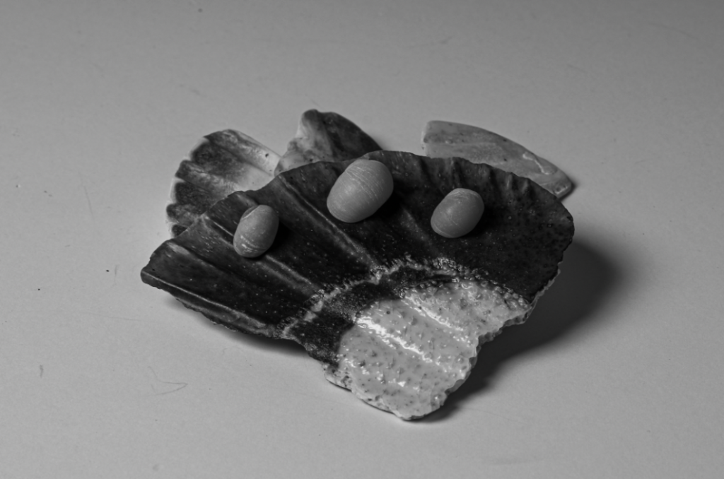
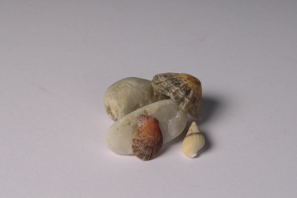
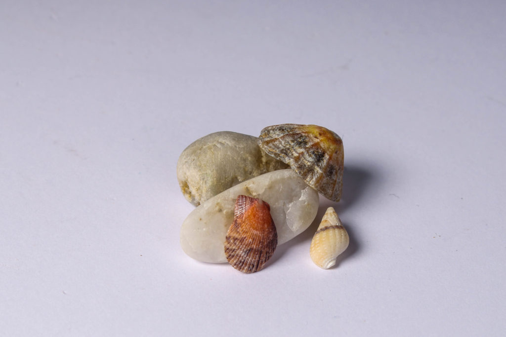
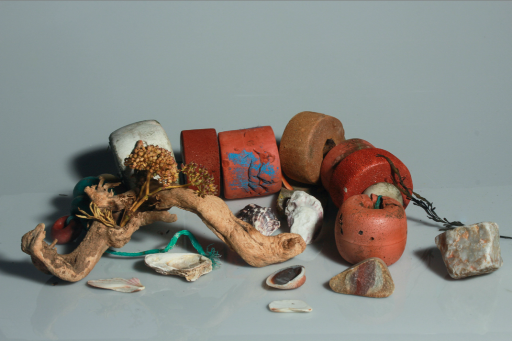
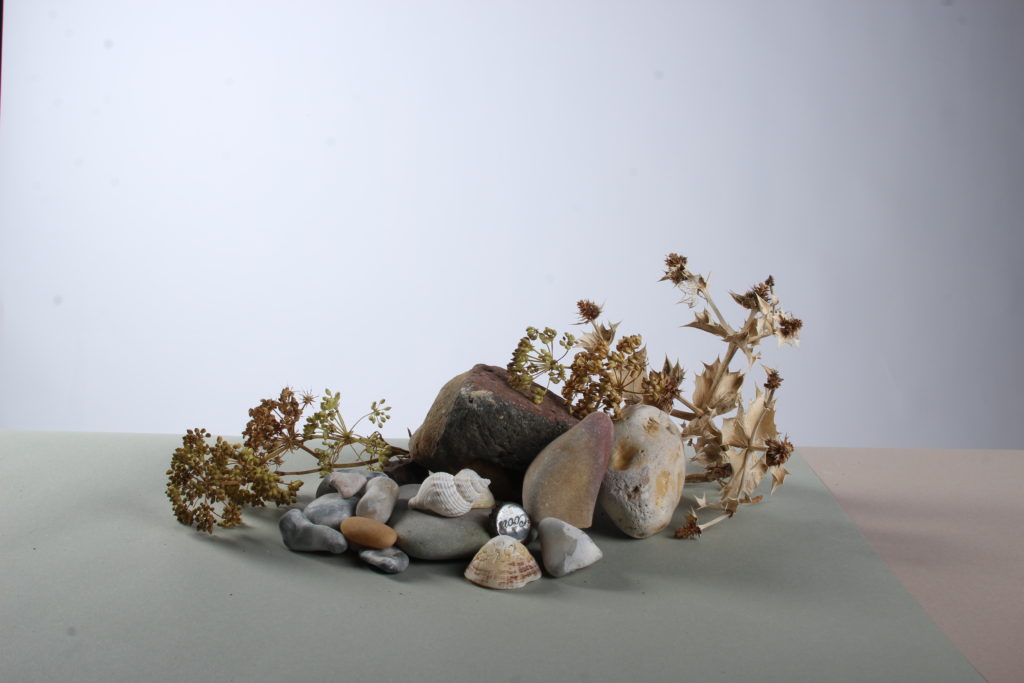
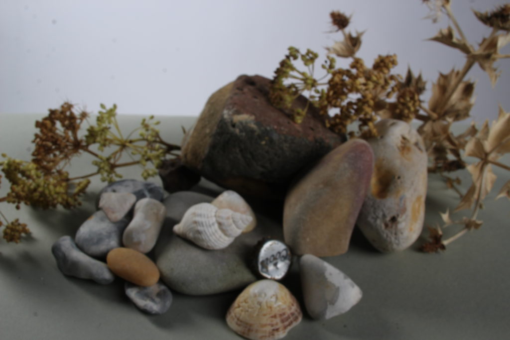
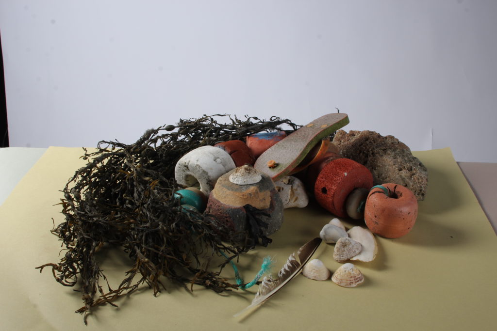
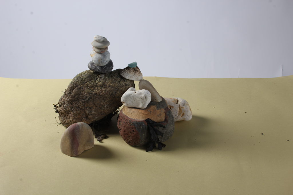
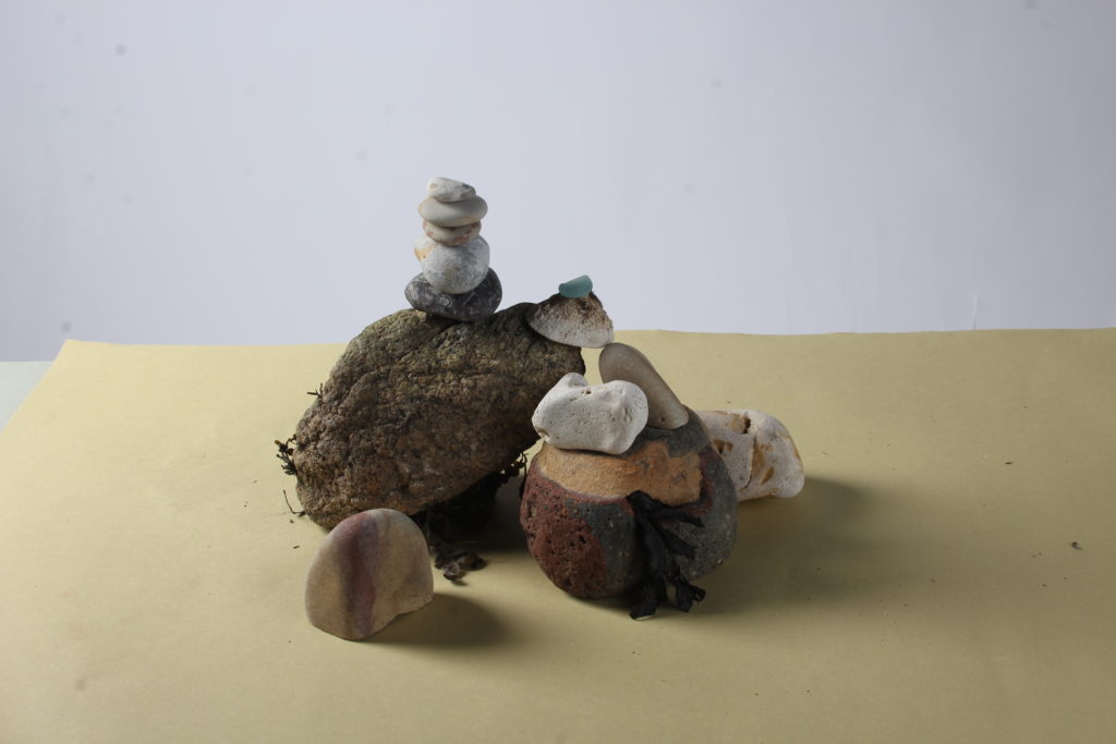
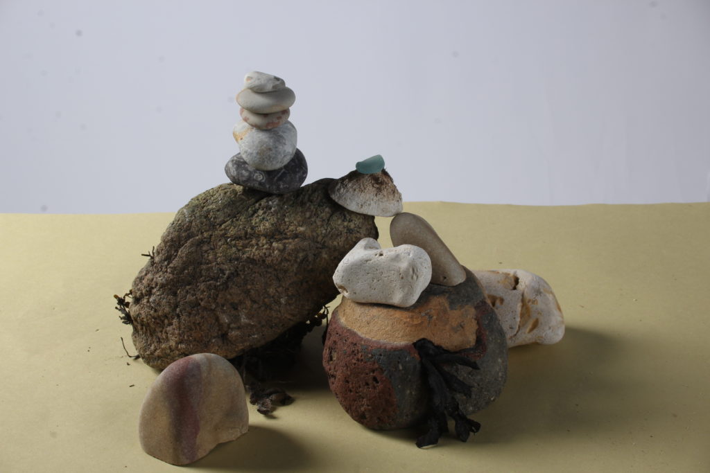
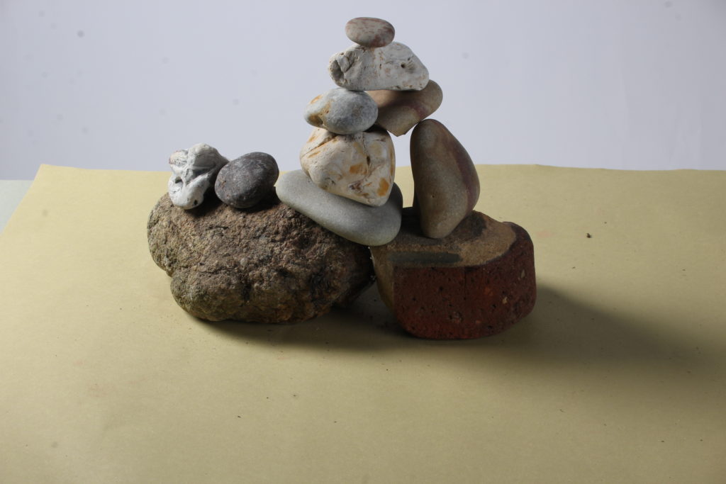
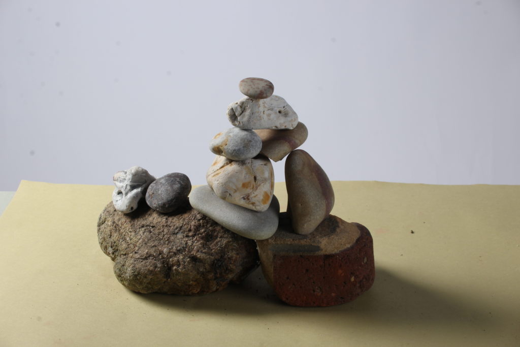
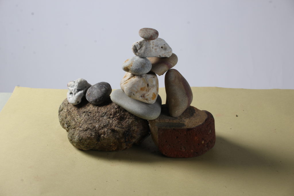
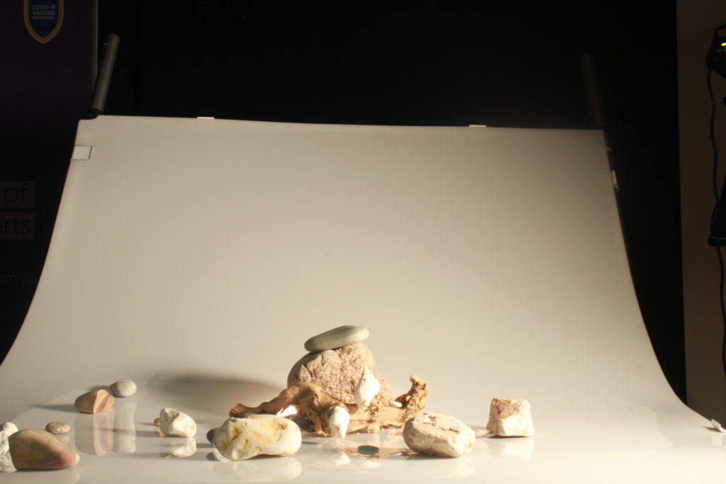
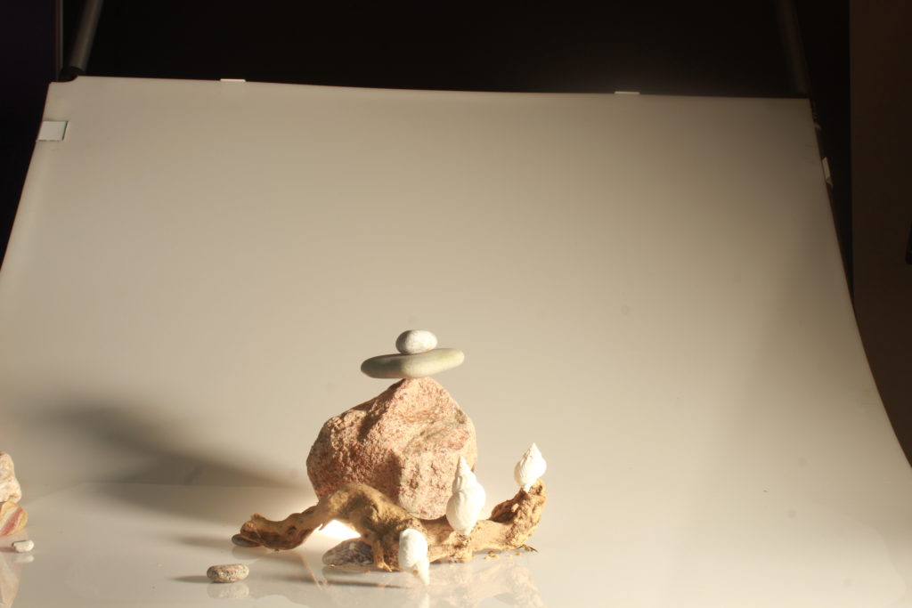
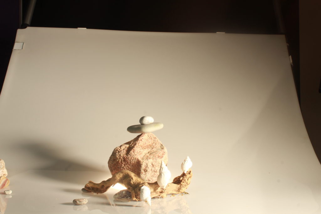
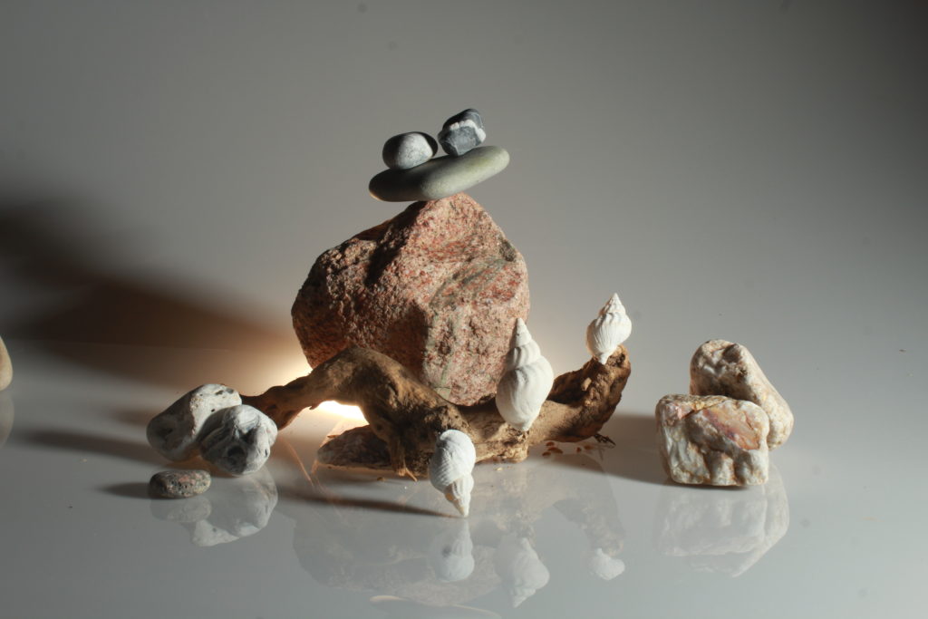
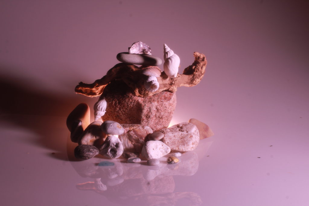
To respond to the genre of Still Life, I went into the school studio to take my own still life pictures using objects taken from SSIs around Jersey. I used two stations: one with a semi-reflective infinity curve and one with a paper background and base, to create two different colours.
Contact Sheets
Editing Process
As Still Life images tend to require less editing than landscape or portrait images (as they tend to be more controlled), less editing than usual was required for this shoot.
To start the editing process I removed the spots on the images using the spot remover tool on lightroom as there were a few smaller bits of pieces left on the station we used to take pictures.
Next, I chose the best images using the ‘Pick’ and ‘Reject’ (Or ‘Flagging’) function on Lightroom.
As well as the Star Rating Function.
Next, I edited the images themselves by manually changing the exposure, contrast and temperatures of the images to make them stand out a bit more, but not too much as to remove them from their original aesthetic.
Edited Images:
These are the final edited images from this shoot, the changes I made to them are minimal as still life photographs do not need to be changed as much.
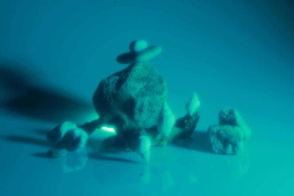
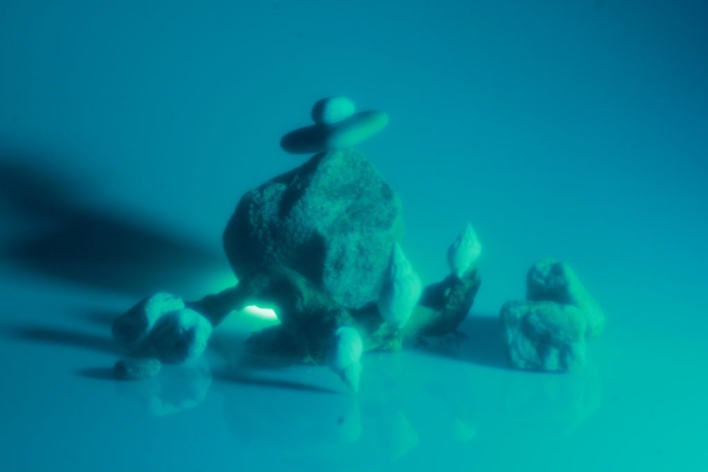
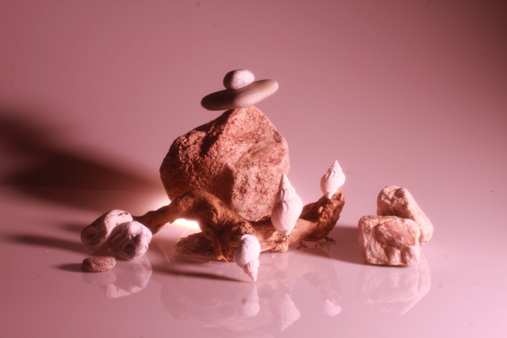
I also made some black and white versions for some of the images, which is gives each image a completely different tone.
Alexander Apostol was born in Barquisimeto in 1969. Encompassing photography and video, Apostol seeks to expose fractures in the modernist project, both in the artist’s native Venezuela and across South America. Since early in his career, he has concentrated on the iconography of the urban landscape. Apostol digitally altered the images to conceal windows and doors.
I chose Apostol as an artist because I like how he edits his images to cover the windows which to me portrays the idea of isolation and what our world may look like in future and or it could foreshadow how man- made buildings etc shouldn’t be there.
Using Apostol’s work I could alter a landscape of the Sand dunes and manipulate them so that the Sand dunes are in the foreground and a large sky rise building and or office building is in the background
Edward Steichen
Image Analysis
interaction between architecture and people so compare size
Gray scale of concrete fields
Towering skyscrapers
Bold Geometric structures
after sunset
Inspiration
Camilo Jose Vergara
Vergara photographs and documents the poorest and most segregated communities in Urbanized America. He says “I feel that a people’s past, including their accomplishments, aspirations and failures, are reflected less in the faces of those who live in these neighbourhoods than in the material, built environment in which they move and modify over time. Photography for me is a tool for continuously asking questions, for understanding the spirit of a place, and, as I have discovered over time, for loving and appreciating cities”. Throughout his work he revisits places as a way of becoming historically conscious.
Still-life is a form of photography in which it depicts inanimate objects or subject matters.
History of Still-life Photography
Still-life photography was recognised in the 19th century and rapidly became popular in Europe. Artists created compositions which from first glance looked simple however has complex meaning. Paintings depicted burnt candles, human skulls, dying flowers, fruits and vegetables, broken chalices, jewellery, crowns, watches, mirrors, bottles, glasses, vases all in which are symbolic to death, power, beauty and health.
Inventors changed with the times when the daguerreotype was created by Louis Daguerre in 1839. Shortly after in the mid 1800s Charles Aubry formed a company to manufacture plaster casts and make photographs of plants and flowers. By the 20th century, Baron Adolf de Meyer used soft-focus lenses and painterly darkroom techniques to make photographs that resembled drawings and prints.
There is an underlying theme through arrangement of objects with implies a meaning.
Death is a common theme demonstrated through still-life
By adding layers to a painting or in photography also can communicate a socio-political point in which the painter or photographer is trying to raise. By adding layers the image or painting is mimicked adding more context which can result in being unethical but this method is used as a powerful way of communicating to the audience.
Still life photography is a genre of photography used for the depiction of inanimate subject matter, typically a small group of objects.
History
The origins of still life photography date back to the early 20th century. This is when the first still life photographers emerged and started getting attention.
Analysis
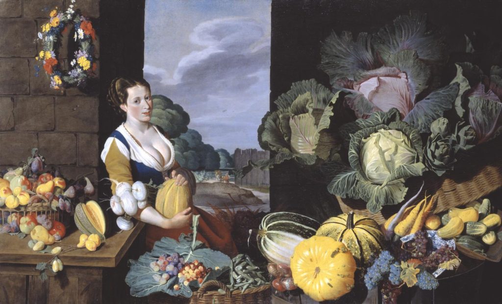
Sir Nathaniel Bacon did not paint professionally, although he was a skilled amateur artist. Very few works attributed to him survive, so the appearance of this work on the art market presented the Collection with a rare opportunity for acquisition. Furthermore, the subject matter, a cookmaid surrounded with lavish produce, more usually associated with Dutch and Flemish art, is highly unusual in England for the period and associated only with Bacon. Every item depicted is known to have been growing in England: Bacon himself grew melons on his Suffolk estate.
‘Cookmaid’ and market scenes, popular in the seventeenth century, evolved in the Low Countries from a genre practised by Pieter Aertsen (c.1533-c.1573) and his pupil Joachim Beuckalaer, which combined contemporary kitchen scenes with a New Testament episode beyond. Bacon could have seen such works on a visit he made to the Low Countries in 1613. An inventory of 1659 connected to the will of the artist’s wife lists ‘Ten Great peeces in Wainscote of fish and fowle &c done by S:r Nath: Bacon’ (quoted in Gervase Jackson-Stops, ed., The Treasure Houses of Britain, exhibition catalogue, National Gallery of Art, Washington, DC 1985, p.140). Two other ‘Cookmaid’ pictures are known to exist: Cookmaid with Still Life of Game and Cookmaid with Still Life of Birds, both in the possession of the artist’s descendants. The Tate’s work is possibly part of this group. Such groups were often intended to depict the four seasons or the twelve months of the year. In the case of this piece, however, although every item represented in the painting was grown in England at the time, not all would have been in season simultaneously. Bacon, according to a letter dated 19 June [1626], was growing melons at his estate in East Anglia, and he was known to have a keen interest in horticulture. The subject would most likely have had erotic connotations. The abundance of ripe melons surrounding the cookmaid echo her voluptuous cleavage.
I started with an arrangement of unedited photos, all the same size and tone. I then edited an individual image to the specifications I wanted, then copied these edits to the rest of the images. This allowed them to remain the same, yet in black and white.
I then used the PhotoMerge algorithm within Photoshop to combine the photos together and create a singular large image. This is done by File/Automate/Photomerge. After dropping the files within the algorithm and waiting for the process to complete, this final product was produced.