Green Island Photoshoot

—- Plan for the Photoshoot —-
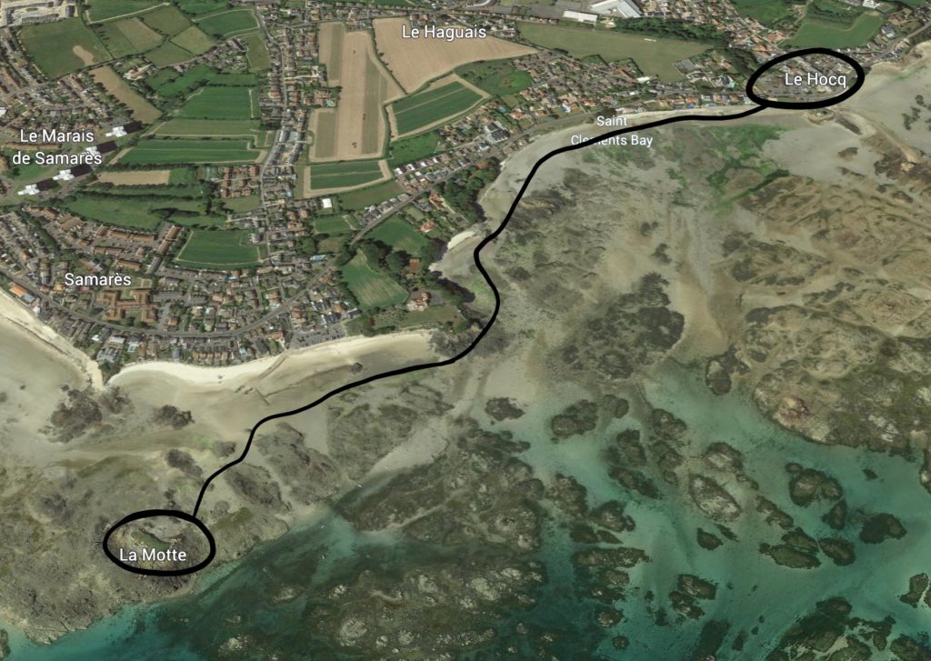
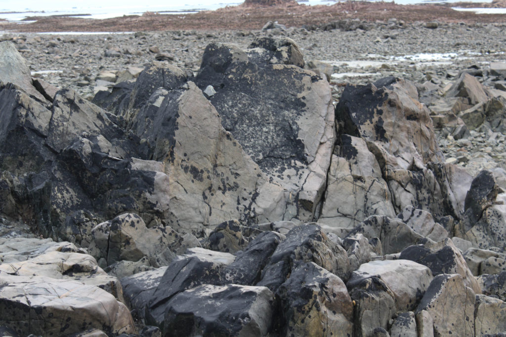
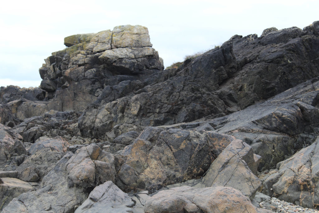
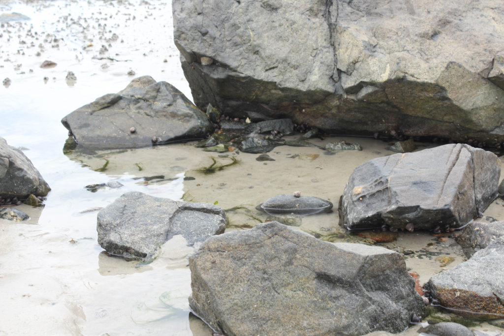
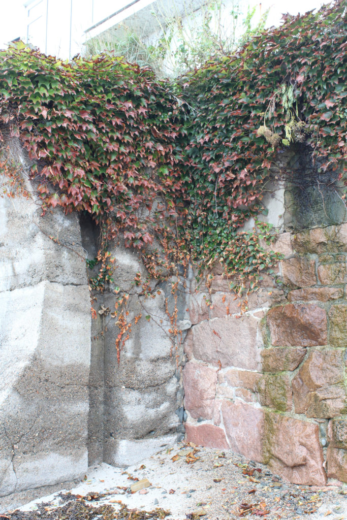
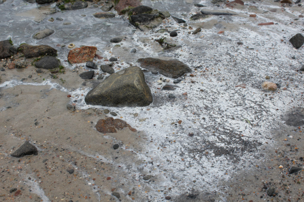
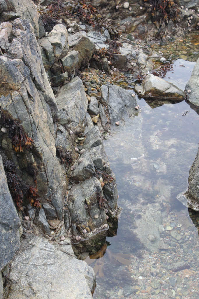
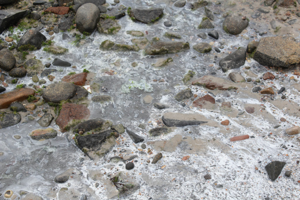
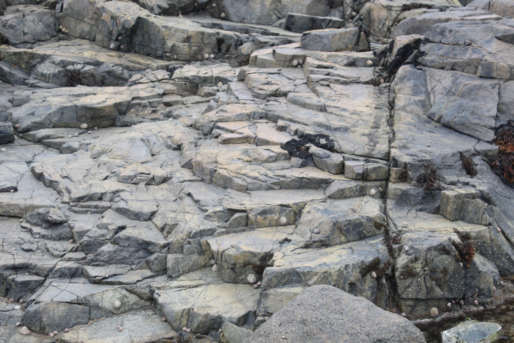
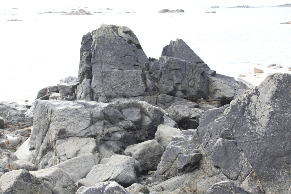
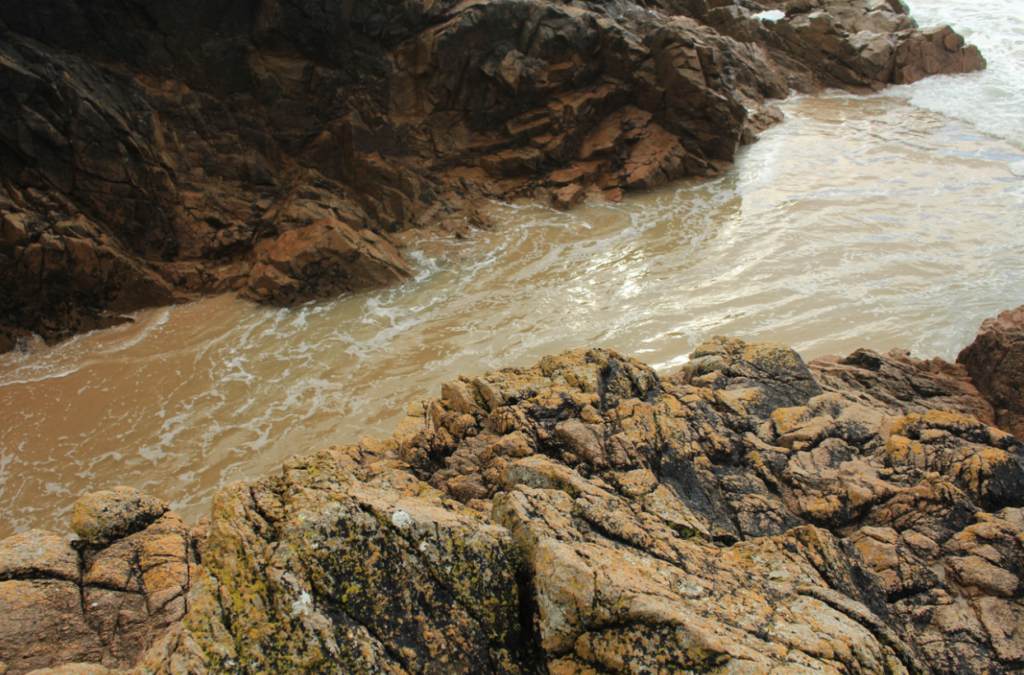
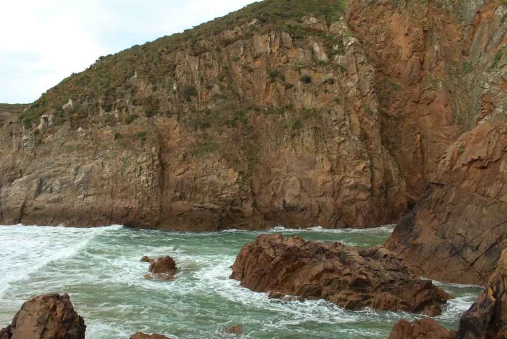
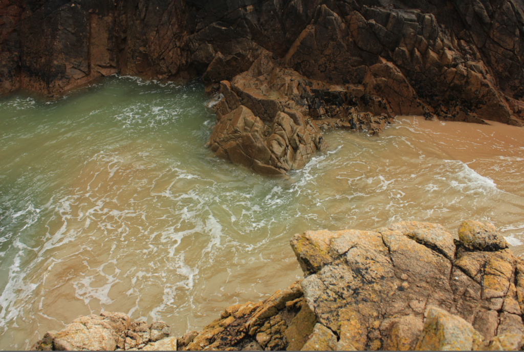
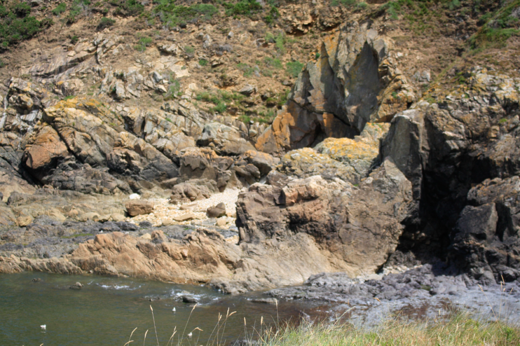
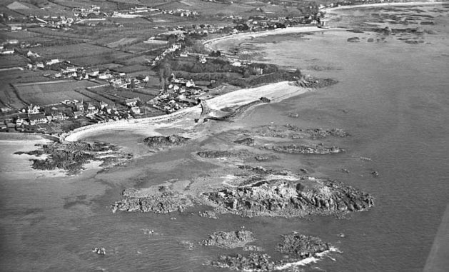
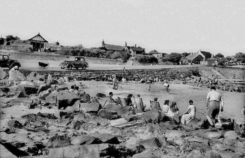
We ended up going on a photography field trip down to Green Island to capture the many different types of rock formations that would be present along the coastline.

We split up into two groups and I was placed among the group that would venture along to Green Island. We started at the car park where La Hocq is and began to walk along the beach towards where Green Island was. During the walk, we were advised to capture images of the many different types of rocks that were spread out among the beach and also running just along the sides of it. There were many photo opportunities for us as the beach was completely covered in many different types of geological interests.
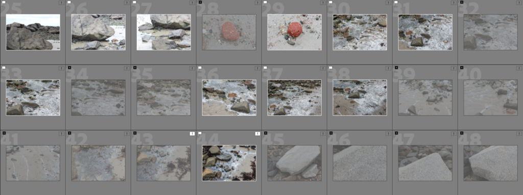
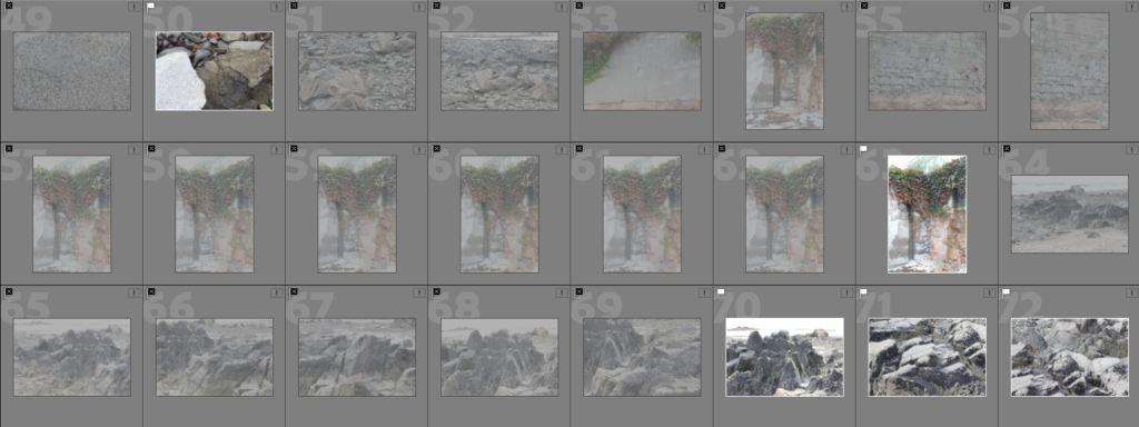
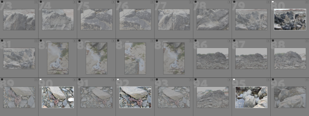
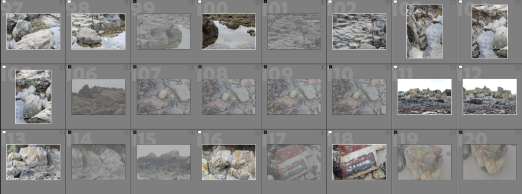
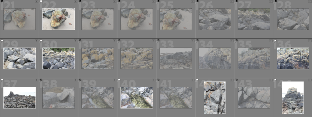
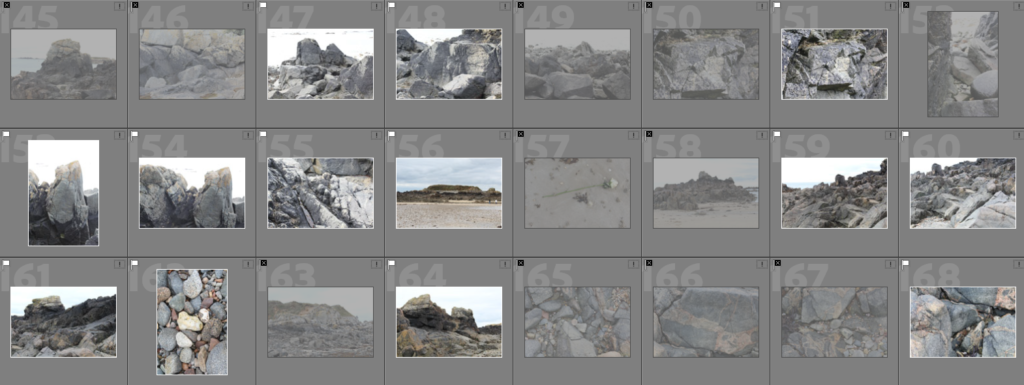
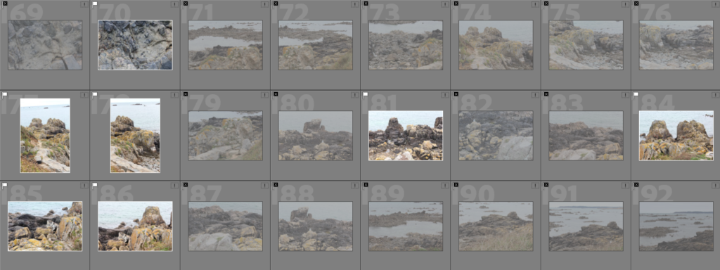
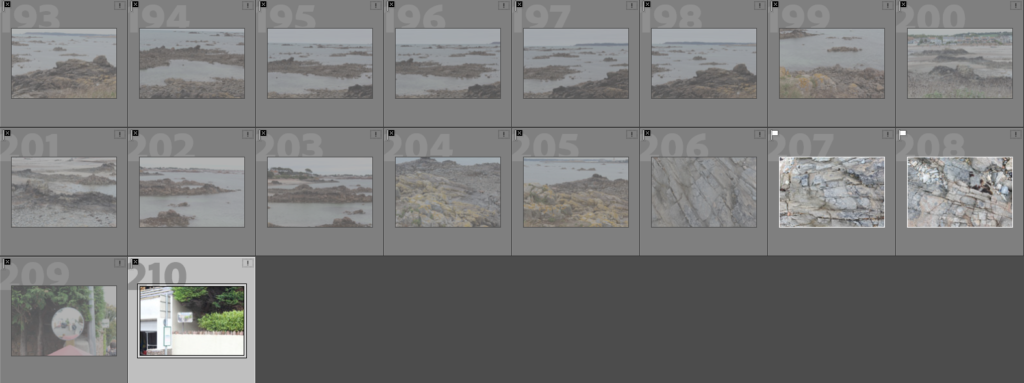
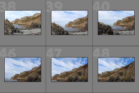
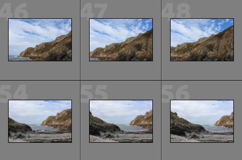
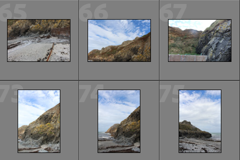
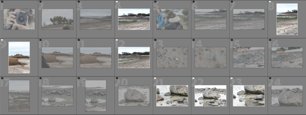
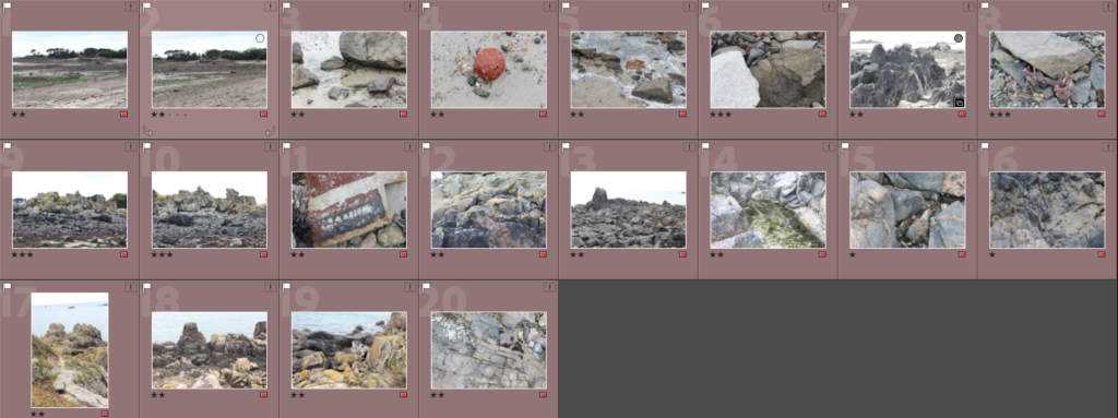
Contact sheets

—- Flagged and rejected —-
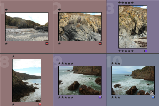
—- Colour coded and star rated —-

Green – Images I’m going to use:

Yellow – Images I might be using:
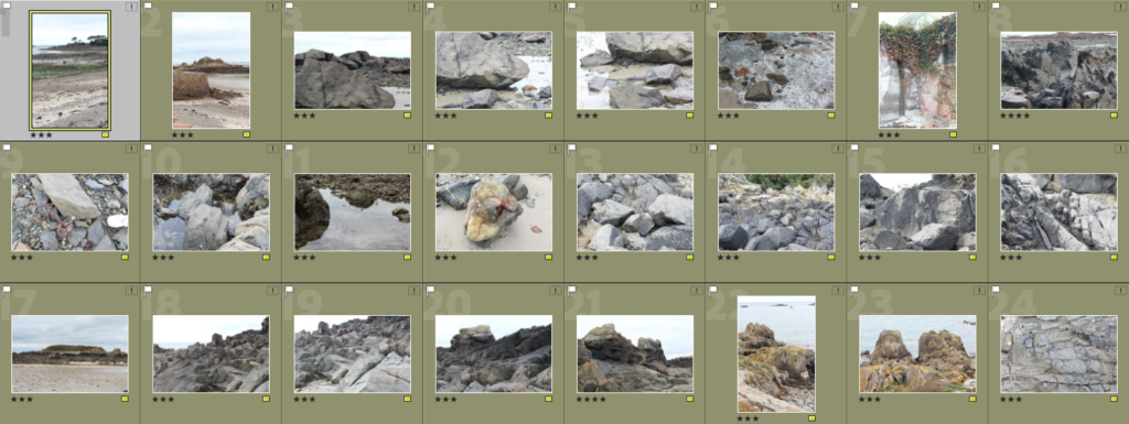
Red – Images I won’t be using:
—- Final outcomes from the shoot —-

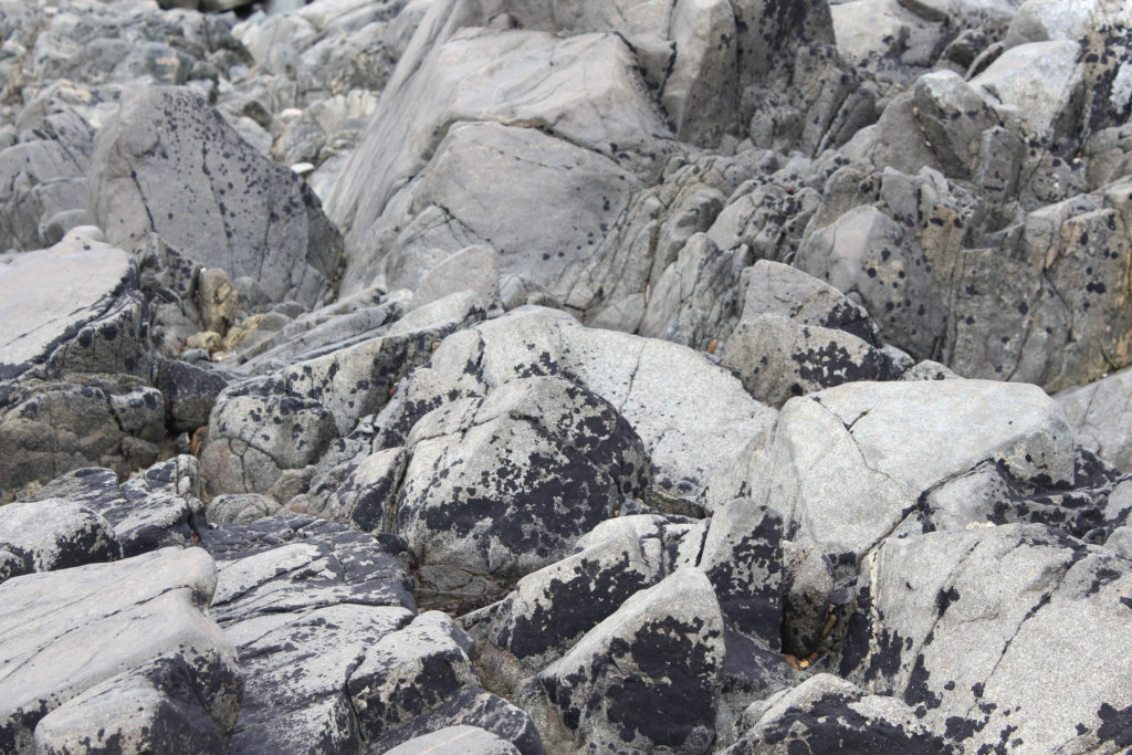
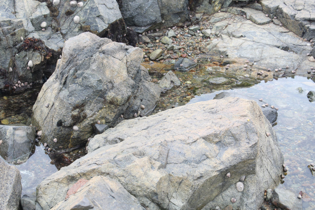
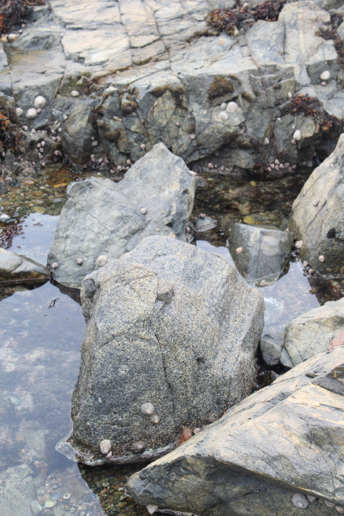
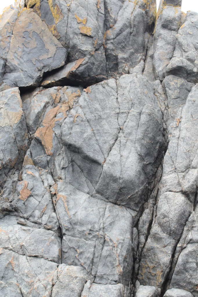
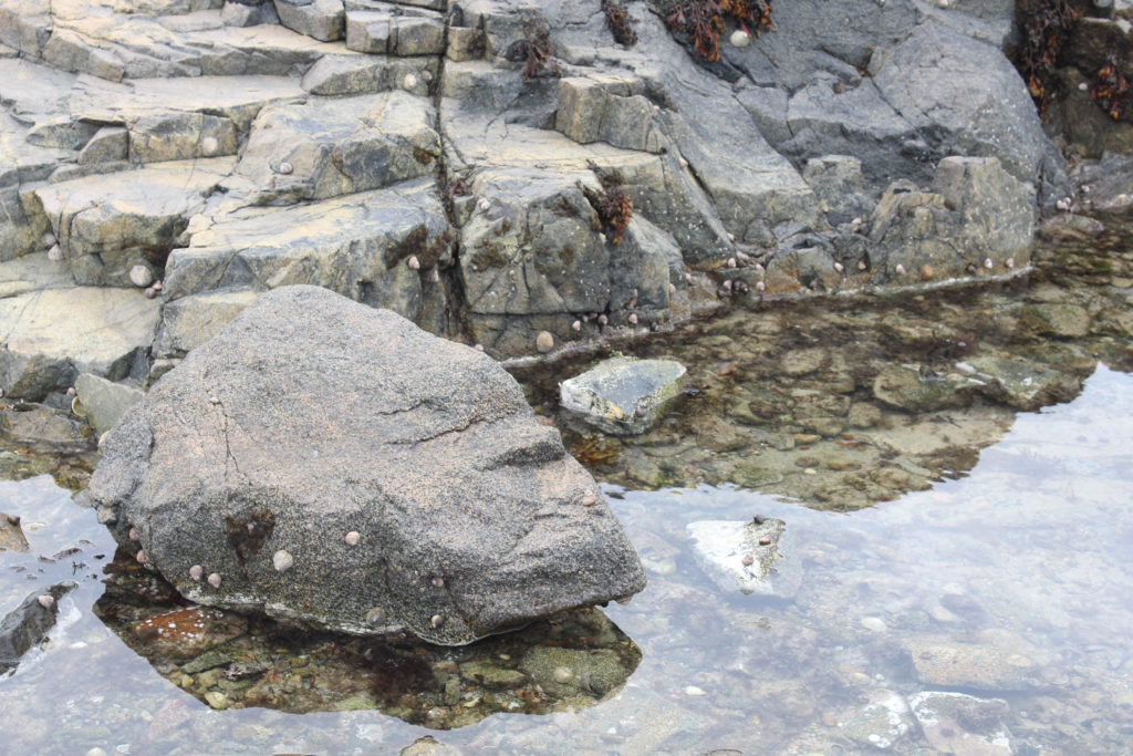
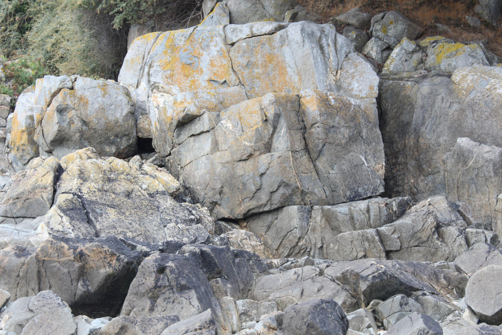
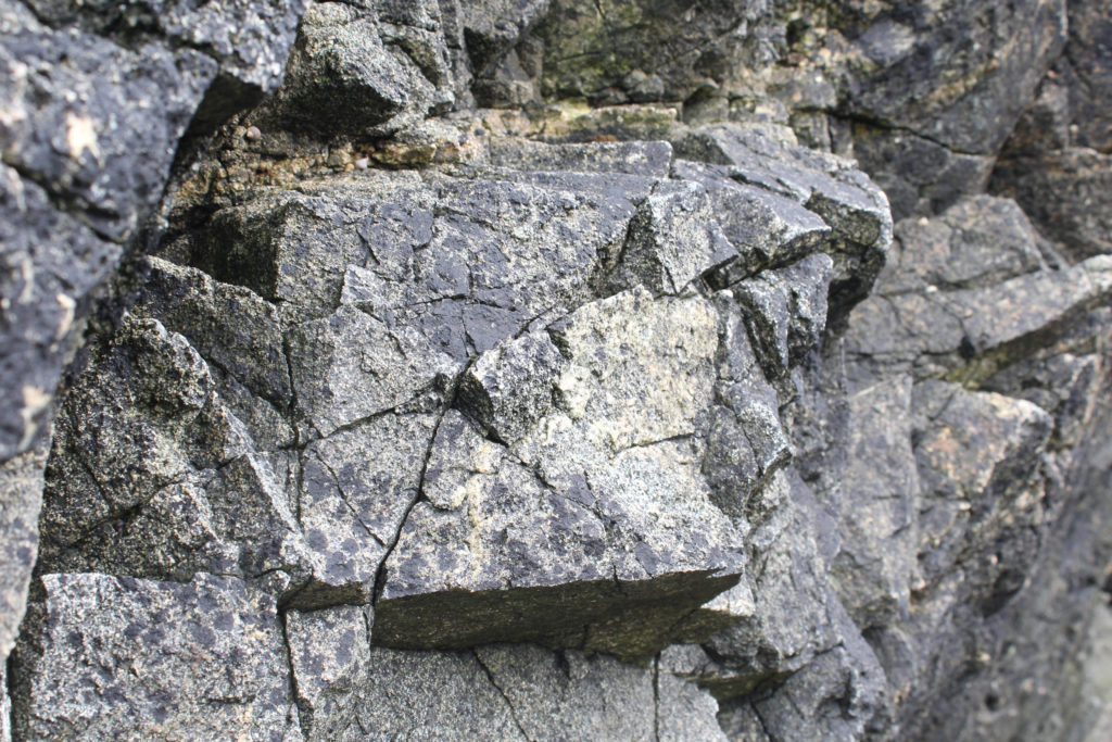
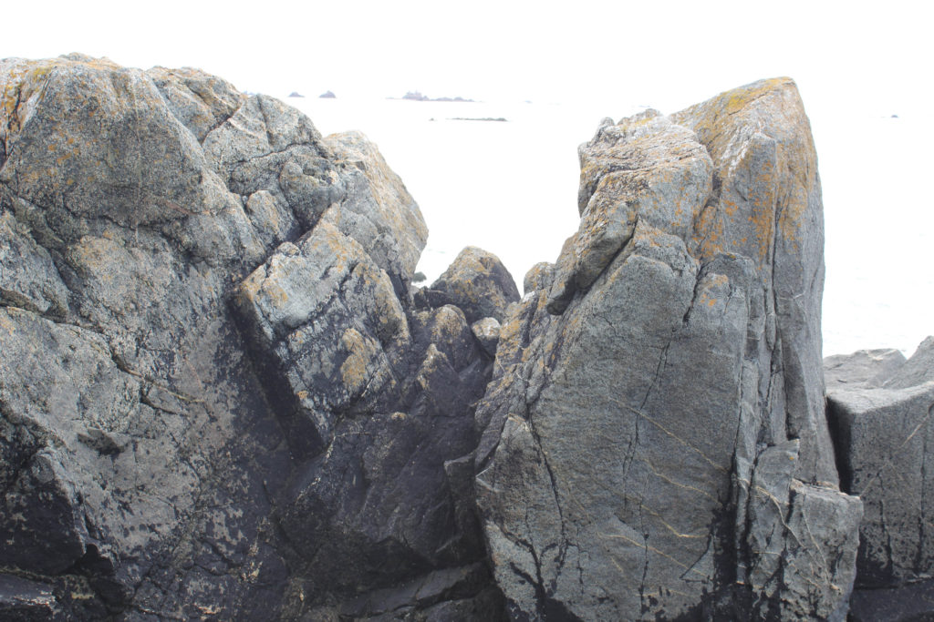
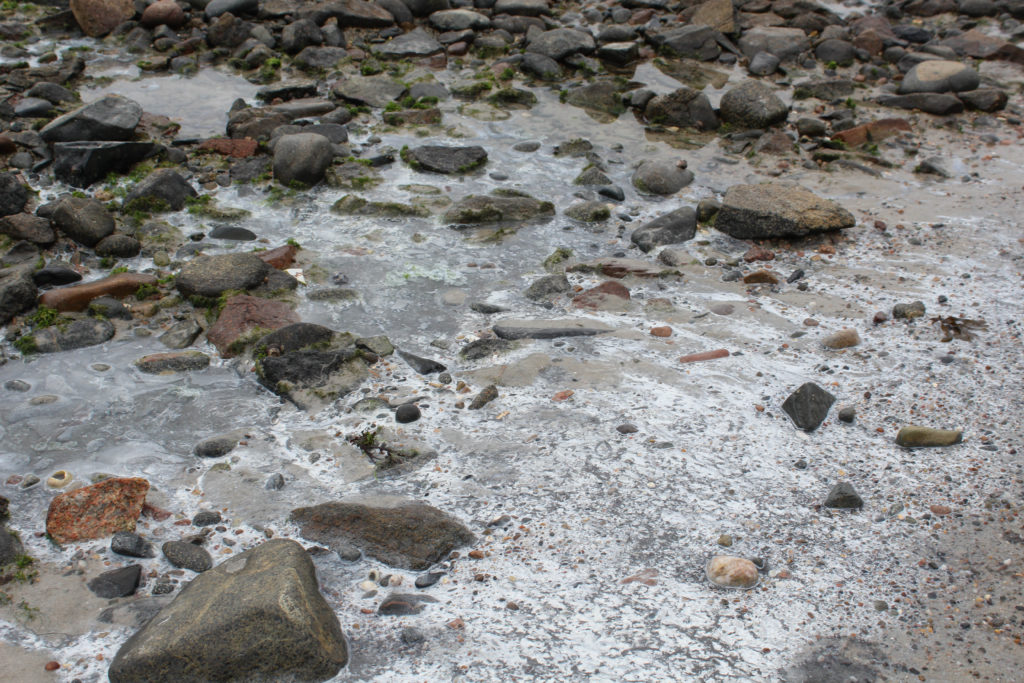
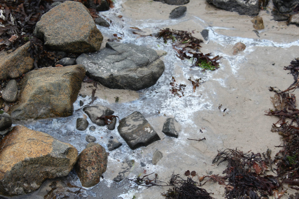
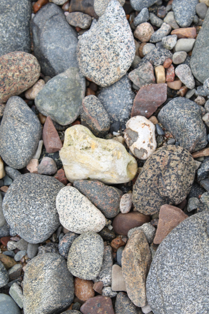
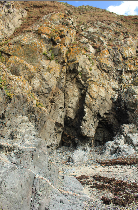
I ended up taking a vast amount of good images that I would like to continue editing until they are to my liking. The rock formations along Green Island were incredibly interesting to look at as every single piece was completely different from one another. Every rock was different and unique with its own textures and structures.
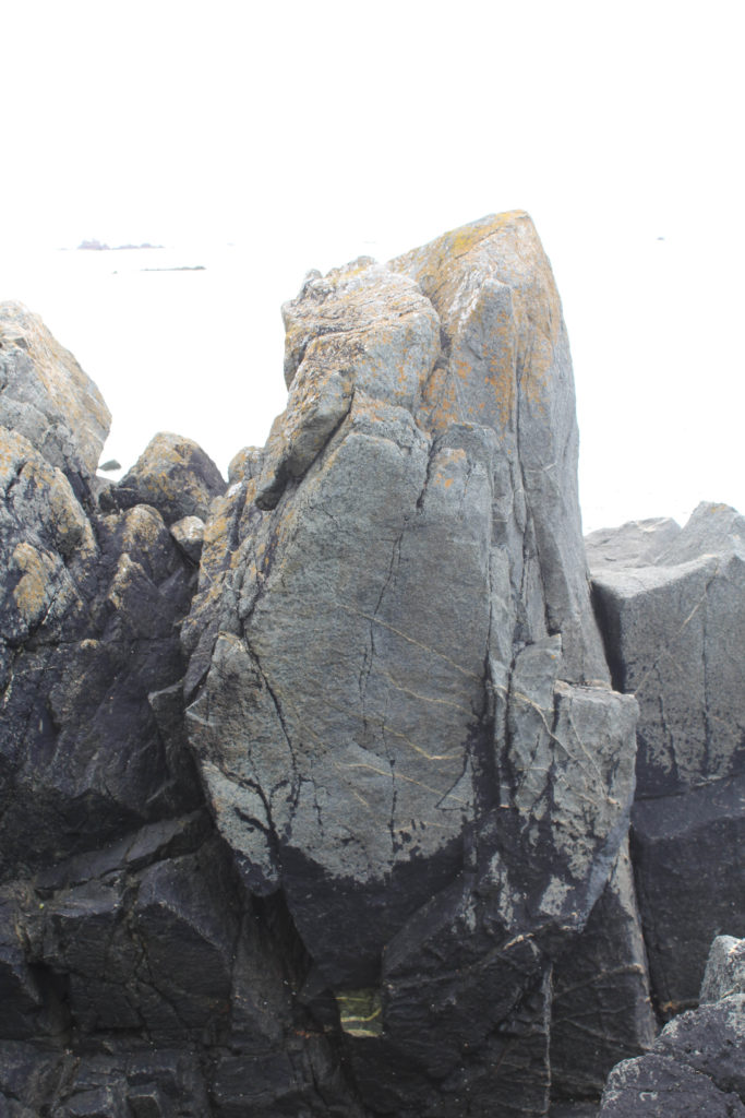
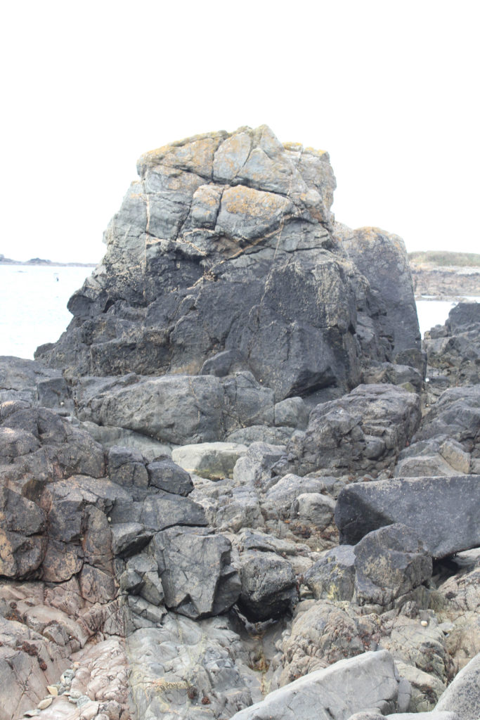
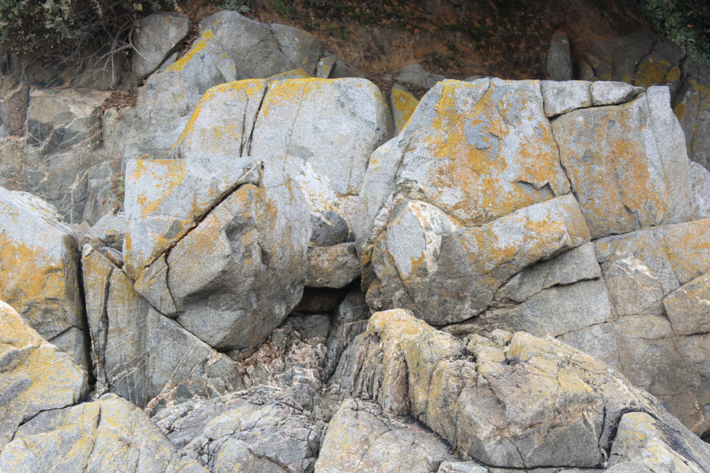
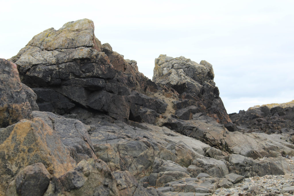
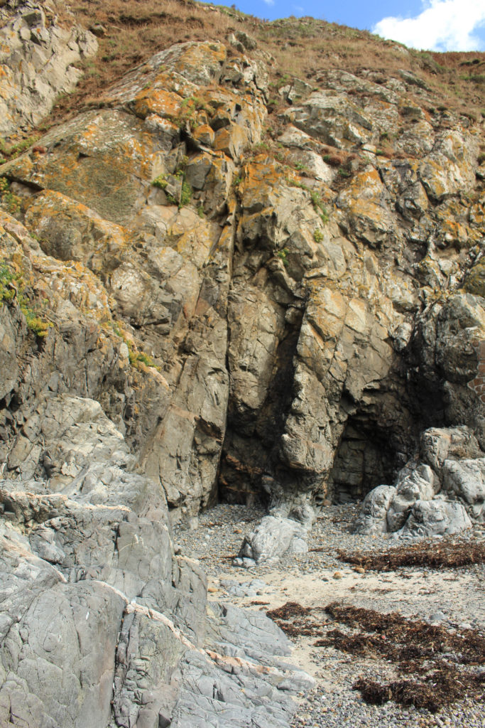
These singular rock images I believe were strong together as they both display one rock, taken at a portrait viewpoint, and make that the sole focal point of the piece. The large rock stands out from the many small and extra ones around it which makes it seem like a more intimidating structure compared to what lies around it.
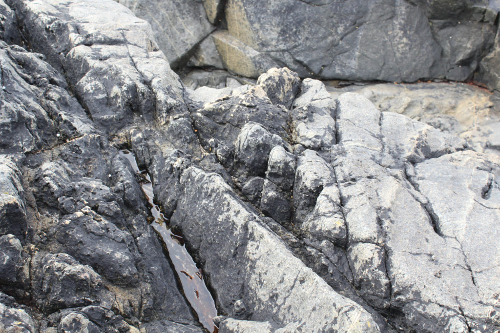
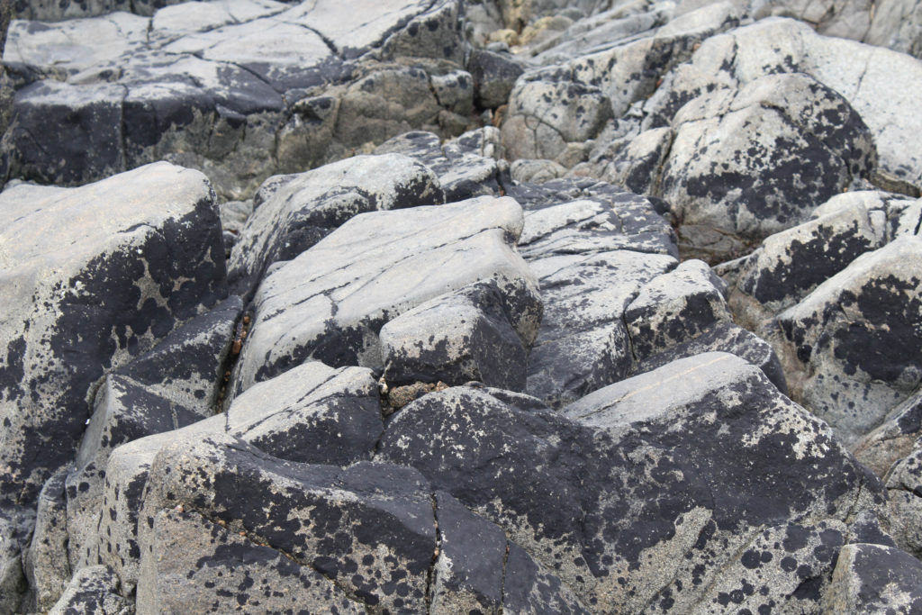
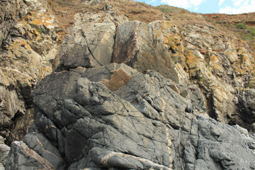
I enjoy how these images look together as they all share a similar colour scheme and pattern on them. They are of the same rock but taken at different angles and perspectives just to make it seem like they’re completely separate rocks.
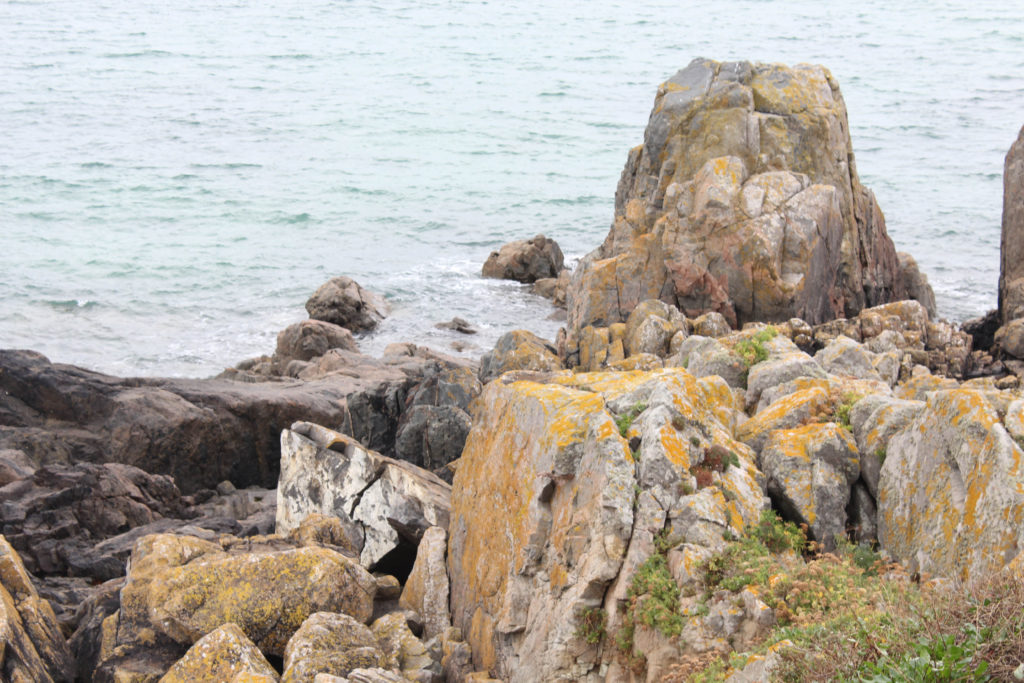
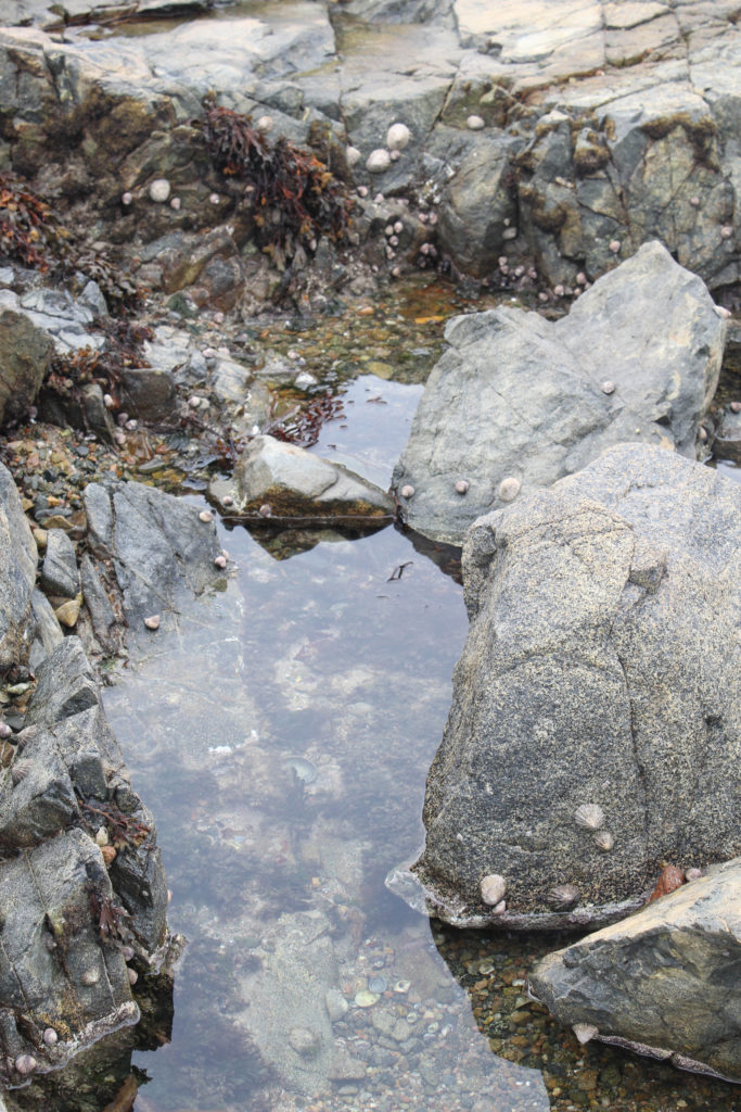
I quite liked how these two photos together as they create quite a nice colour contrast. The image on the left, containing mustard yellows and green pigments, has a few more bright colours than the image on the right does, that image containing a lot of grey and brown tints of colour.

Series of other final outcome

These photographs I believed were also quite strong so I decided to put this as well among my successful outcomes during the photoshoot.

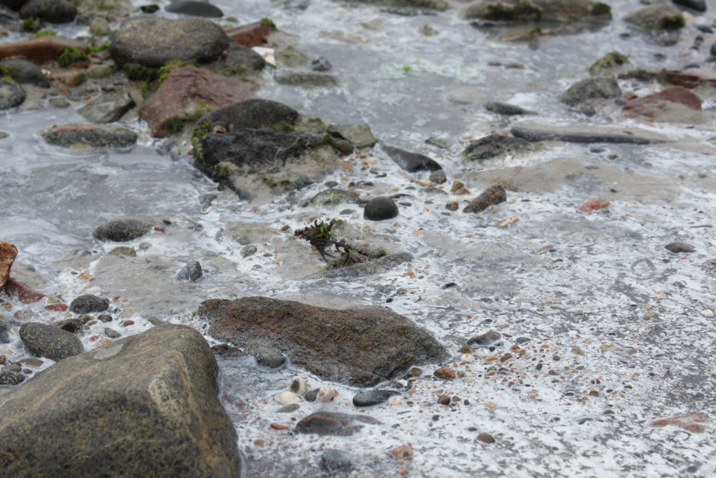
Image analysis and Critique
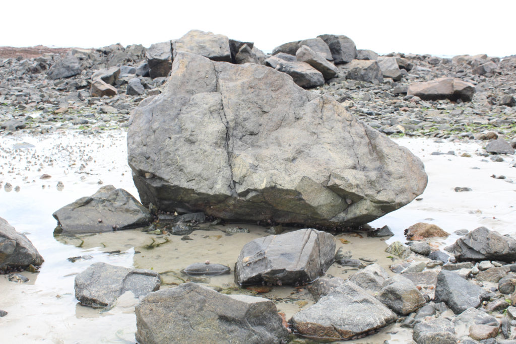
What I liked about the photograph: I was particularly happy with this photograph that I took as it gave off the importance of Jersey’s geology by focusing on a singular version of the many rocks the island has to offer. Photographing the rock on its own, gives off a better sense of uniqueness because this is the main focal point and is central to the photograph.

What I would do different next time: Next time I would possibly take a few more close ups of the rock just to display its textures a bit more, maybe even getting closer to the rock and photographing it fully central would have been a good idea as well. The rock is central, but there seems to be other rocks in front of it which may diminish the true importance of the larger rock.

summer work- plemont/ stinky bay

Photoshoot Plan

I will be taking photographs at Plemont and Stinky Bay, I would like to take these images round midday to ensure that I can have the best changes of having the correct lighting for this shoot, and making sure its not raining to make sure my only equipment, the camera, doesn’t get damaged.

Contact Sheets

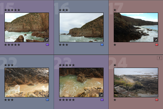
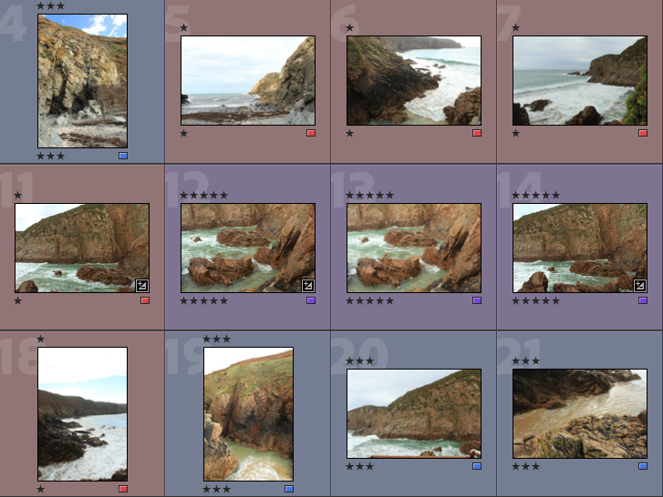
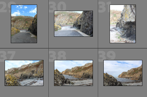
Below I have included some contact sheets displaying the wide variety of images from my Plemont and Stinky Bay shoot, this is important as it gives an indication of how many images I have from each shoot, and helps with the organisation before image sub selection.

Colour Coding System

Below I have placed some screenshots of my colour coding my photographs, I have included an explanation of the system and how I have come to the image sub selection process, I really like this system as it ensures that I have a clear plan in my mind of which images I am going to edit. It also helps me predict my final images just from looking through them in Lightroom.

  • Purple- Best images
  • Blue- Average images
  • Pink- Not so good images

Best Images after Sub Selection

There I have taken some of the images from my ‘purple’ selection above and placed them in a gallery so that they can be more easily viewed, this also helps me consider whether or not they could be displayed as 9 images or just individually. Furthermore, this is before the editing process so lots of these photographs could be made to be of a higher quality afterwards.

Editing

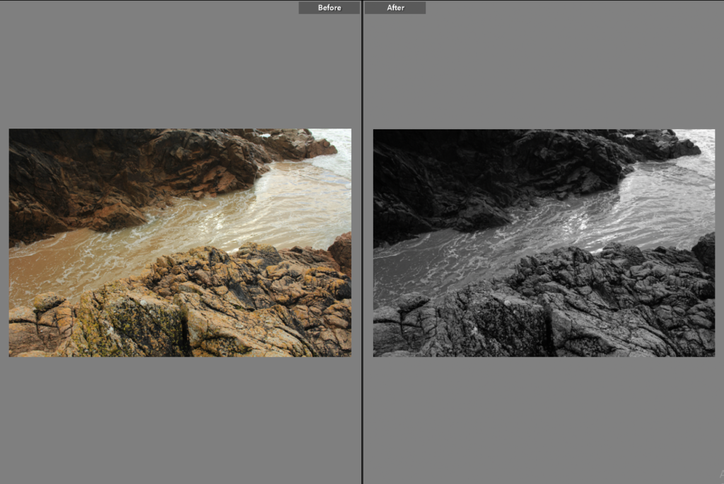
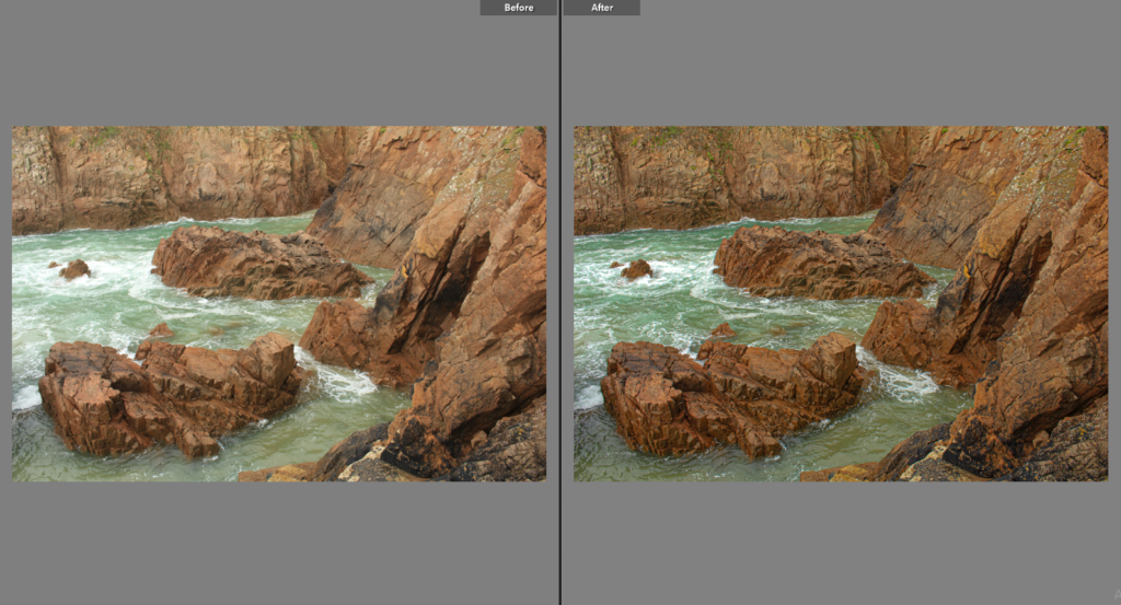
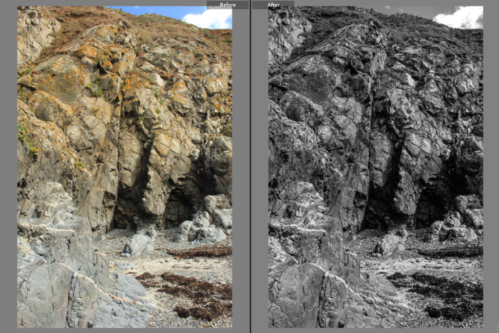
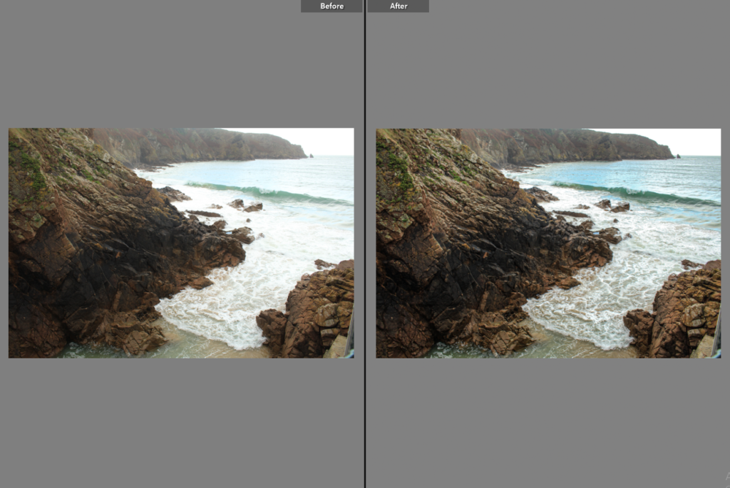
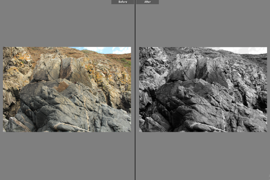
Below I have included before and afters of all of the images that I have decided to edit, I think that for the most part these images came out very well, I think I didn’t end up with a wide range of good images to edit, however I think the ones that I have are of good clarity and some exposures have been edited so that the images are more legible. Furthermore, I think that changing the undertones of the images to make them appear cooler/ warmer gives them a greater effect.

Final Images/ Analysis and Critique

For my final images I have decided that these are my best options, I have included evaluations for each of my images, with explanations for each stating the strengths and weakness of each.

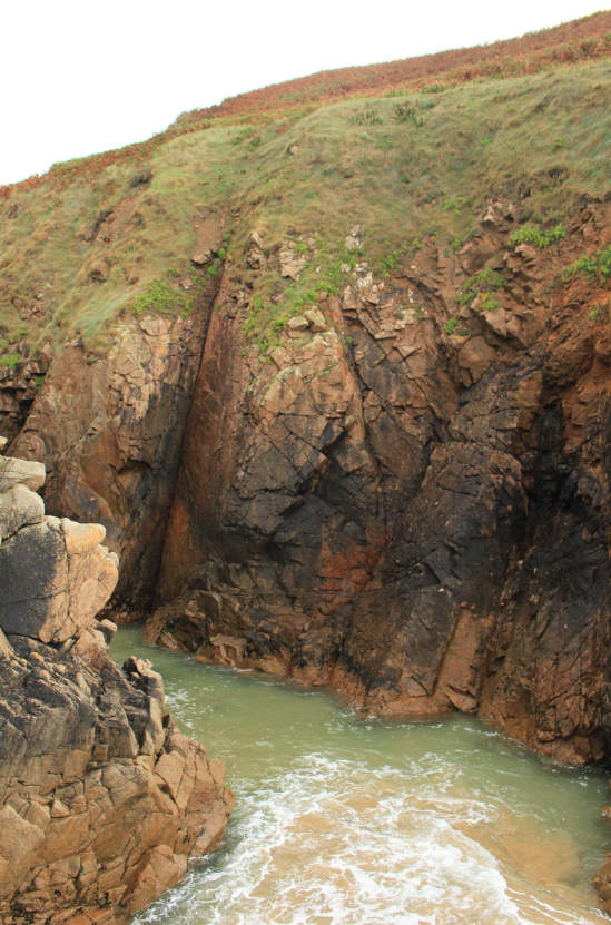
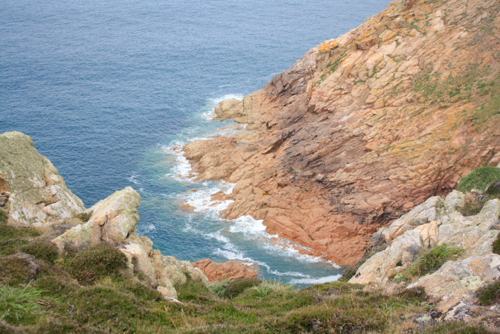
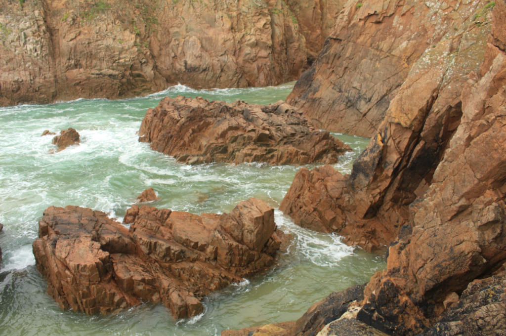
I have selected this as my first final image as I think that the composition of this photograph is it’s strongest point. Additionally there is lots of contrast within this piece, firstly with the warm tones of red and orange amongst the rocks in contrast with the blues in the sea. Also, there is a difference in texture between the smooth sea and the rough rocks, this means that the photograph is more eye-catching and there is more depth within the image. In my opinion this is my strongest out of all of my final images and this is mostly because of the clarity of the original image, meaning not much drastic editing was needed in order to make it successful.

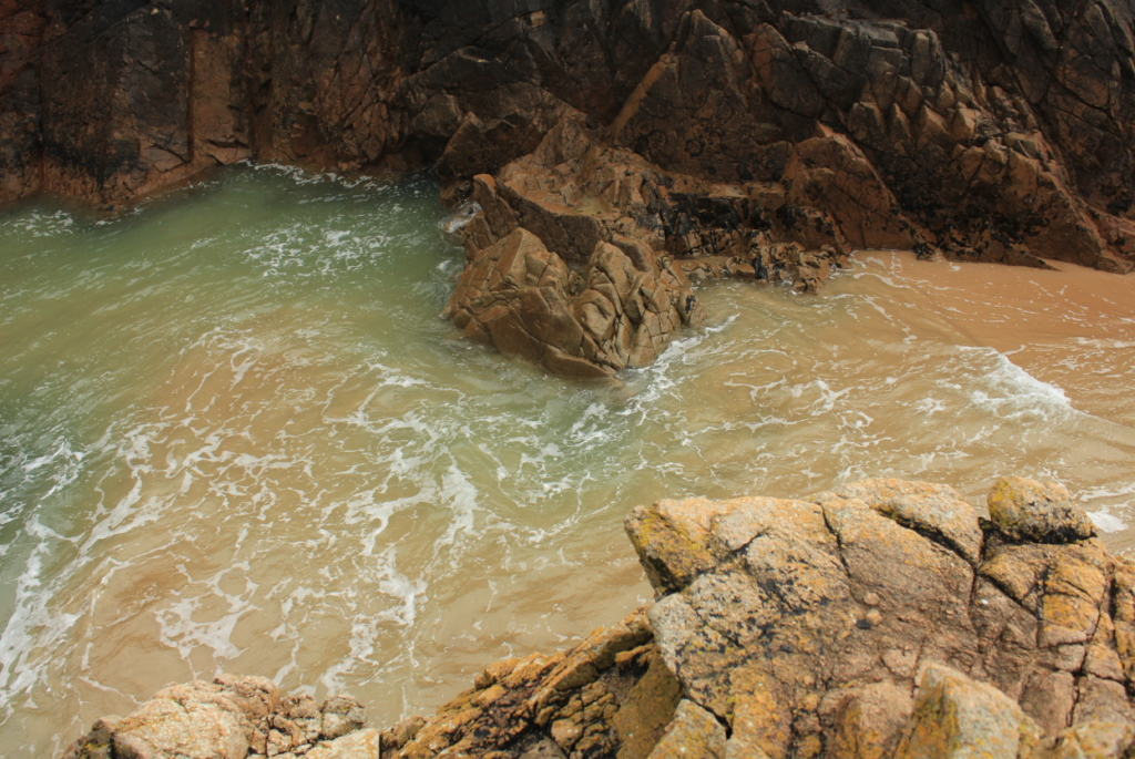
I have selected this as my first final image as I think that the colours of this image are very aesthetic , this is captured by the original composition of the photograph as the yellow rocks in the foreground and the green and blues tones in the background, captured in the sea compliment each other well. Additionally, I like that the perceptive of this image is quite unique, this along with other features such as the rule of thirds, created by the outlines of the rocks all make this final piece successful. Alternatively, the weakness within this image is that the piece isn’t filled with interesting components, so they could be seen as boring or uncreative.

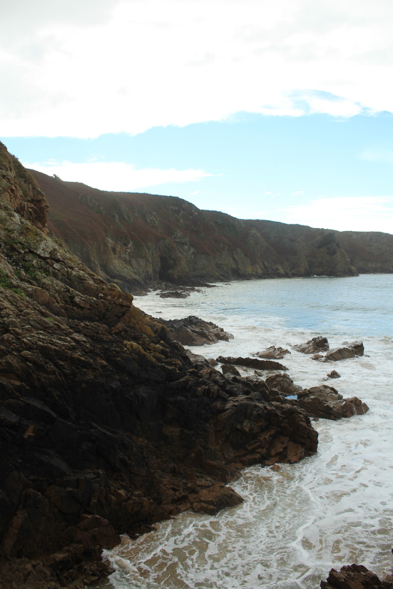
I think that if I were to display my final images I would place these two portrait images together, as I think that they go well together, as the similarities and differences of the two means that they compliment each other well. The image on the left is filled with many different colours and the one on the right is filled with more blue and greys, the first being filled with warmer tones helps contrast with the cooler tones in the second and this means that these images are stronger together as one cohesive piece. Furthermore, this helps with my project as the photographs being more interesting makes the project more interesting as bring vibrancy to the rocks. However, I think that the first image is a lot stronger so maybe this could be displayed by itself.

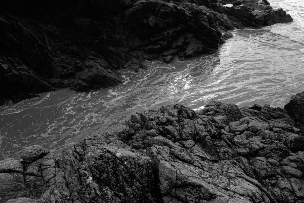
This final image is very different from my others as the fact that it’s black and white means there I could make the contrast and the clarity of this photograph very high and it could still be successful. This made the image more aesthetic as it added a lot of texture; both throughout the rocks and amongst the water moving on the sand. I like this image as I feel like it capture a moment in time which will never happen, making it more unique. Furthermore, the tones in this photograph means that the foreground is filled with light and the background contrasts as the rocks and dark and the texture isn’t as prominent.

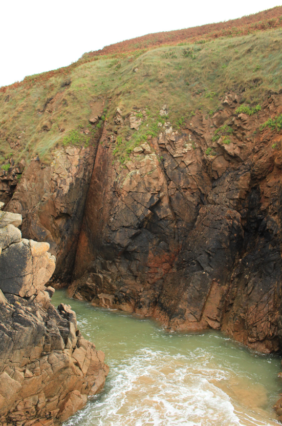
I have selected this as my last final piece as my favourite aspect of it is the composition, this means that the most prominent features are the rocks, as the orange and brown tones in them mean that a sense of perspective is formed as they appear like they are brought forward throughout the image, with the contrasting water in the background. However, I think that this piece wouldn’t have been at all successful within any editing as the clarity of the original photograph wasn’t as good as I expected.