—- Jody Powell —-

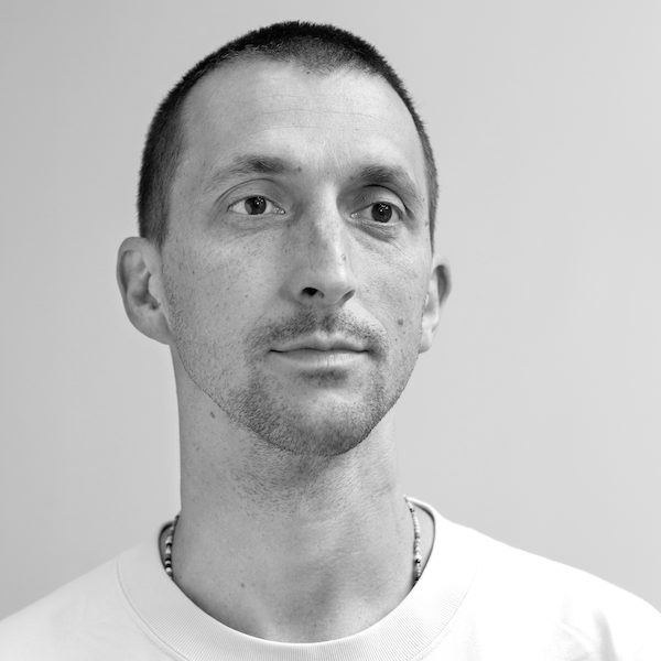
Jody Hudson-Powell is a graphic designer who joined Pentagram as a partner in October 2015. After completing his BA, he went on to complete an MSc Virtual Environment at the UCL Bartlett School of Architecture. He began his career at Nokia, focusing on motion and generative visual identity development.
In 2005, he founded Hudson-Powell with his brother Luke Powell. As Hudson-Powell, their work encompassed brand identities, motion graphics, interactive design, creative technology, immersive experiences and art pieces. Alongside this, Hudson-Powell served as a Design Director at Wolff Olins from 2010.
I have chosen to use Jody Powell as my source of inspiration for my 3D sculpture as I really admire the effectiveness that it brings without being overly complicated. I wanted to aim to make a rather interesting sculpture, especially one that acted out as an optical illusion, so that I could present my photography in a completely different sense to how I usually do.
Image Analysis

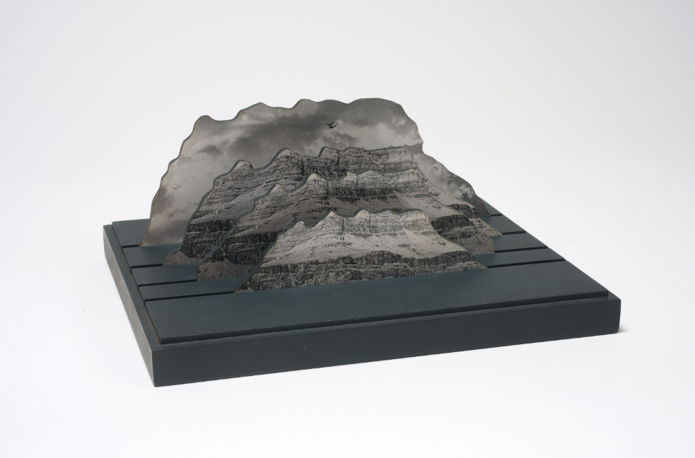
I have chosen this image to analyse from Jody Powell’s works as I really admire the way it’s been structured and the fact it’s a digital sculpture rather than a physically made one. He is a graphic designer so he specialises in the arts of digital model making rather than physical fine art making. What I can see from this sculpture is that there are three of almost the exact same image placed in front of one another, then a completely different image at the back to counteract as the background to the whole structure.
What I like about the sculpture: What I particularly enjoy about seeing this sculpture is just how simple yet effective it is. The sculpture is mainly just four cut out images, one in front of the other, but the way it’s conceptualised just gives off a really clever illusion of looking like an entirely singular image. The simplicity overall is just what makes the piece really intriguing for me. I also really like how the image at the very back is completely different to the other three in front of it. I feel as if it ends up breaking the repetition just a little bit so that it’s not completely lost with the same patterns and textures. The image at the back acts as a nice backdrop for the images in front to flow in front of, making them pop out more.
