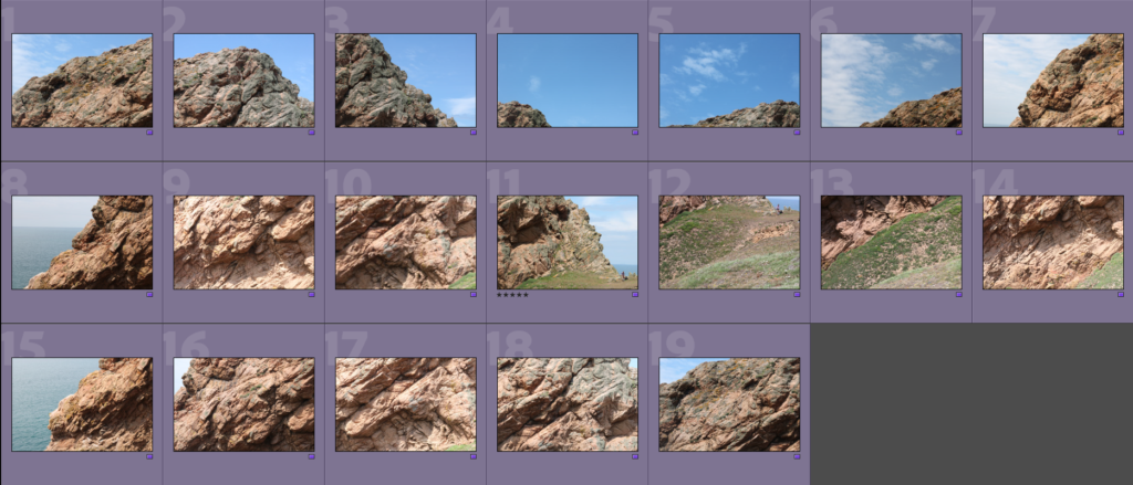
To start making the Joiner, I had to find and mark the images I would use for the joiner to make them easier to find and use.
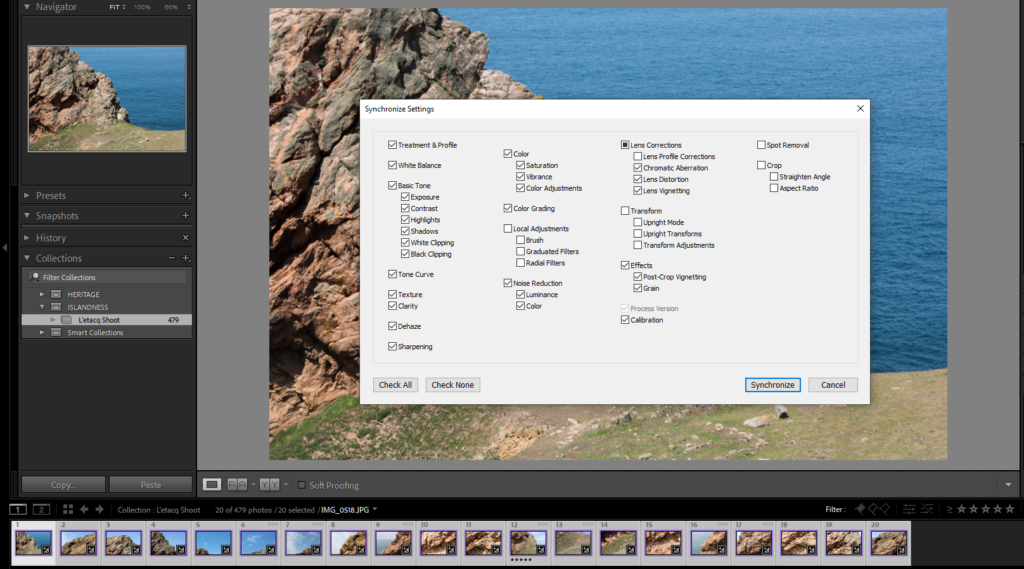
Next I edited an image to how I wanted it to look, then I used the synchronise function on Lightroom to make sure each image looks the same exposure/contrast-wise.
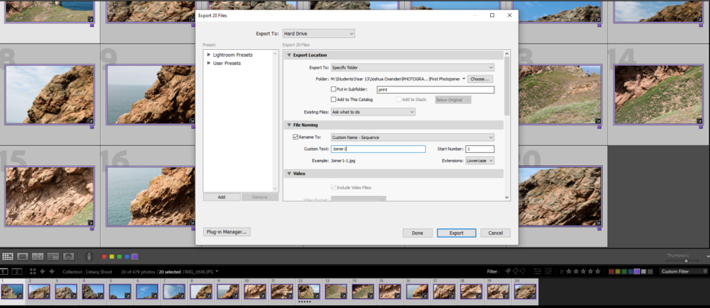
Then I exported them from Lightroom into small/medium sized files so they can be used in photoshop, in order to create the joiner
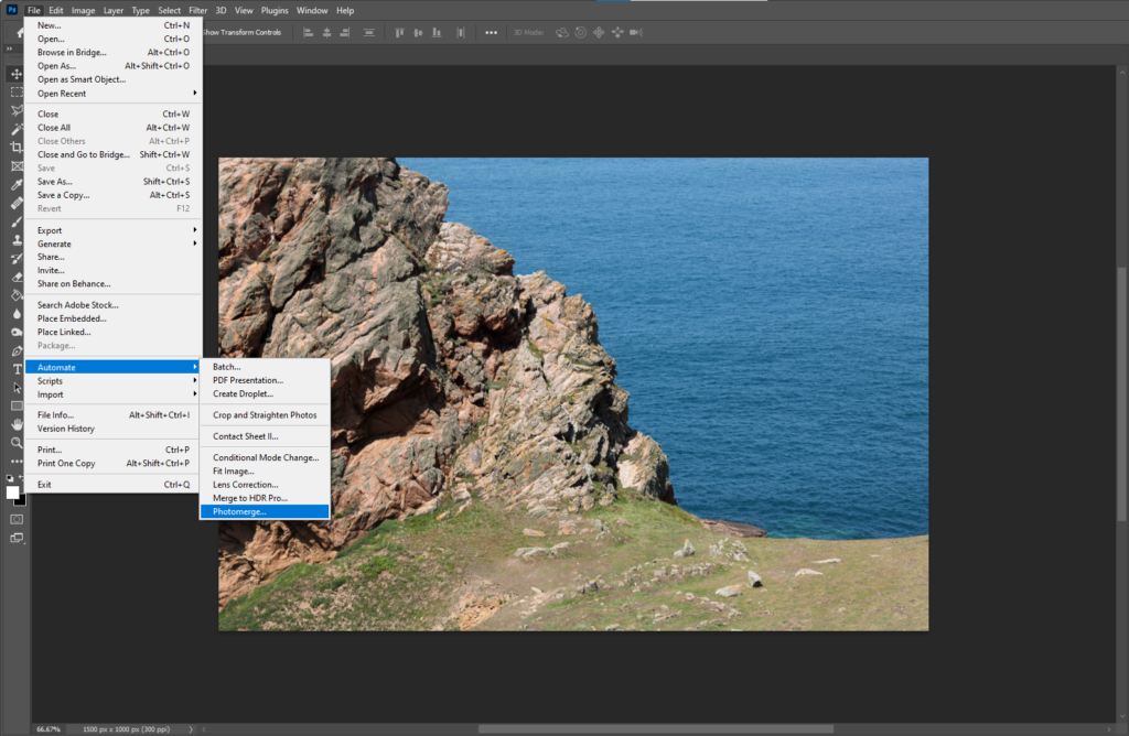
In photoshop, I used the Photomerge tool to generate the photo joiner automatically.
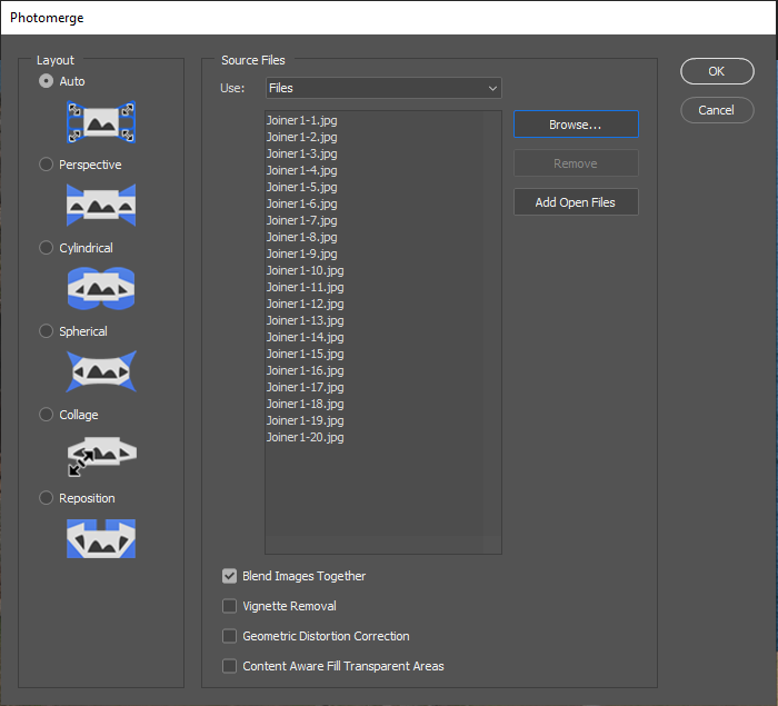
I selected the images I wanted to use and ticked the ‘Blend Images Together’ option
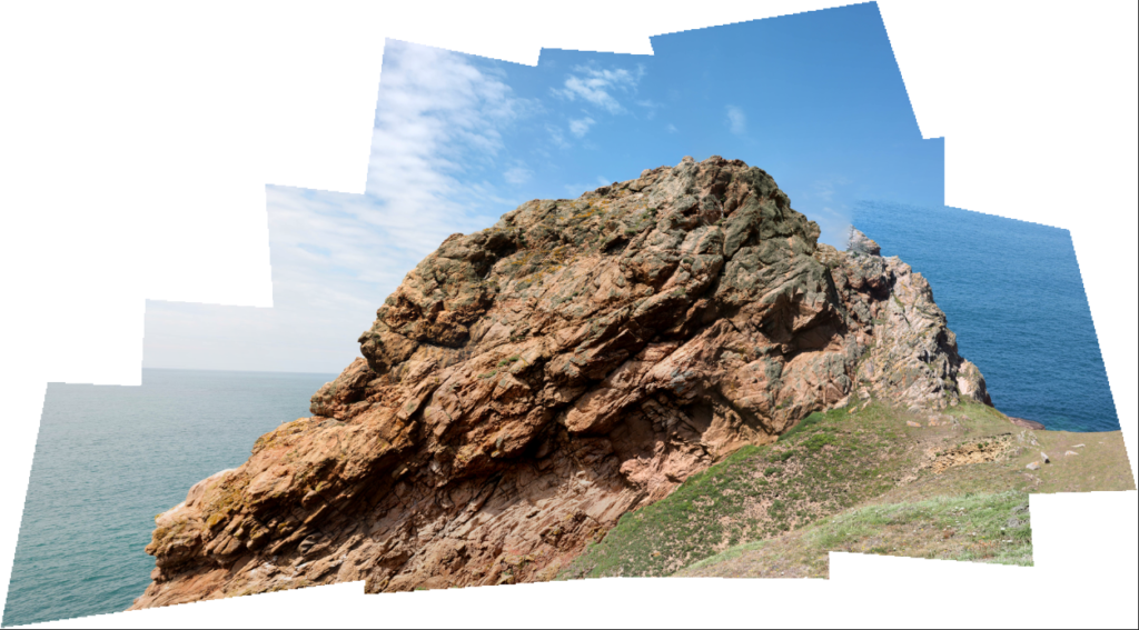
After that, this is what was generated. I like the way the joiner is somewhat imperfect on the top-right, it gives the image a more jagged look.
Experimentation
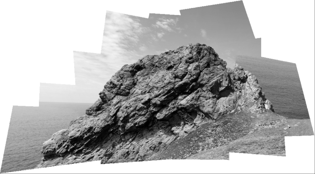
Here I made a Black and White version to see how it would look.
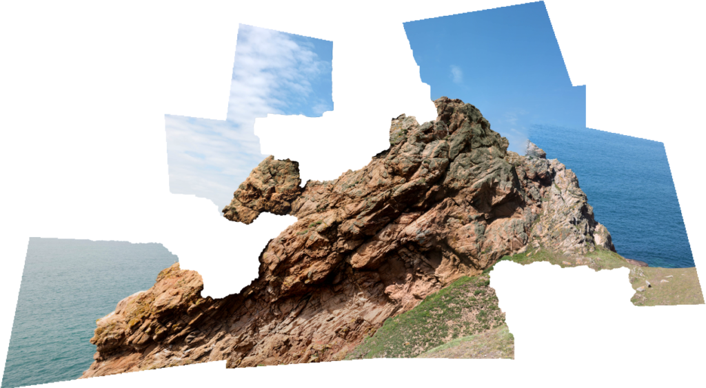
Here I experimented on the image by hiding some layers, removing chunks from the original joiner. I think this looks interesting as the makes the edge of the joiner (which is usually just straight lines) appear more irregular.
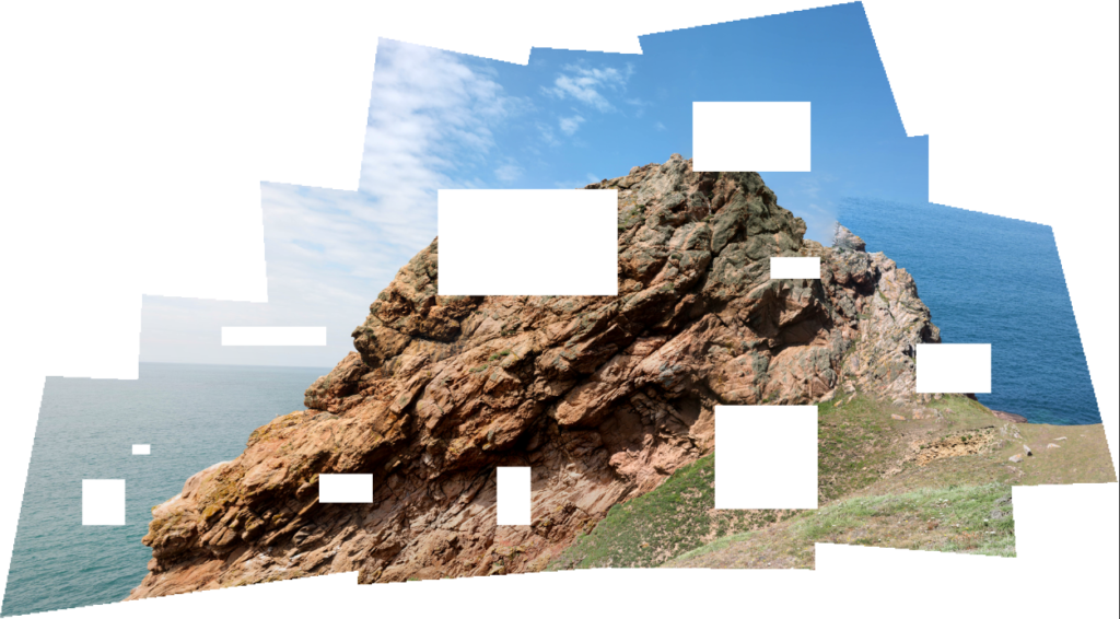
Here is another experimentation where, instead of hiding individual layers, I used the selection tool to delete squares/rectangles from the image to see what effect that would create.
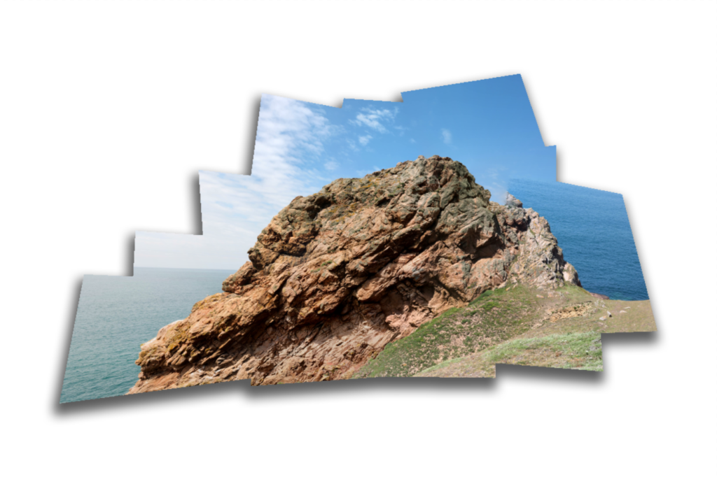
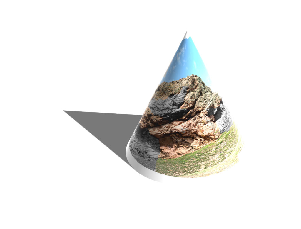
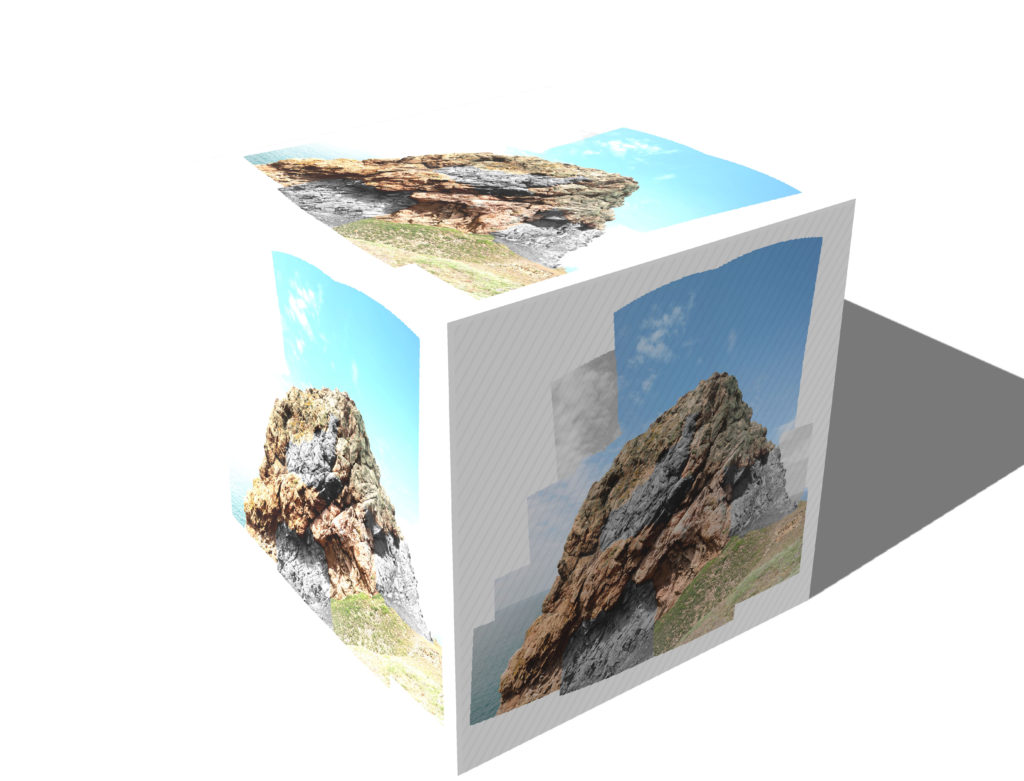
Here I flattened the photo joiner and applied a drop shadow to it to give it a more 3D look, as if it was a physical joiner.
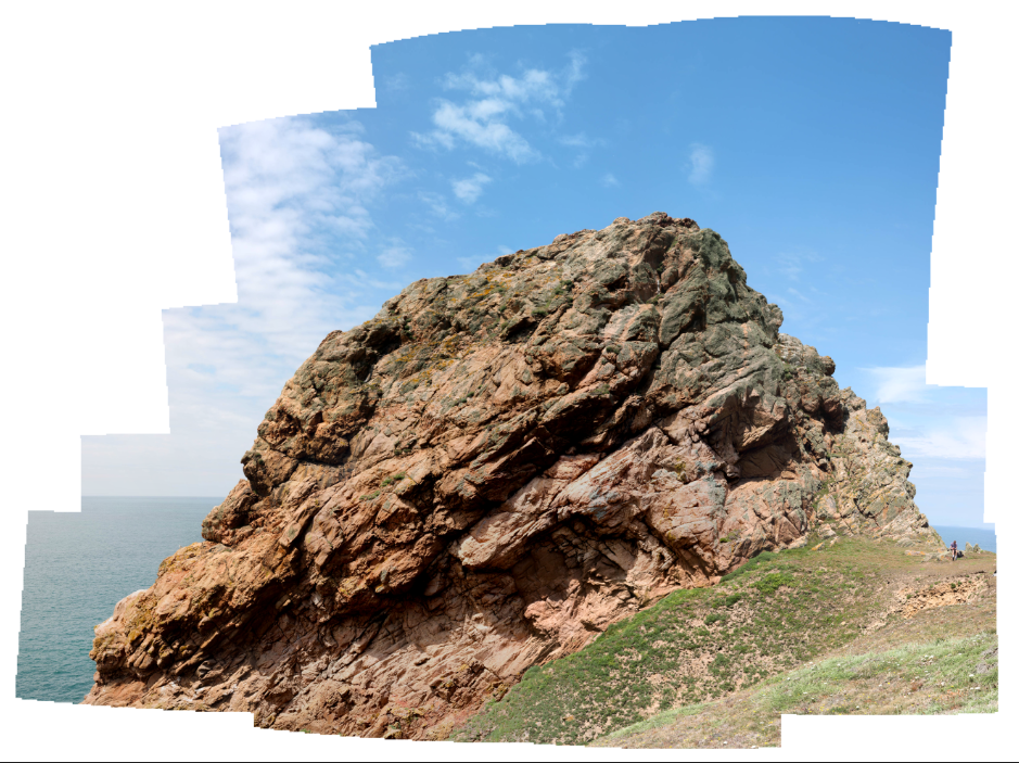
Here I have made another photo joiner using the ‘cylindrical’ setting on the photomerge tool.
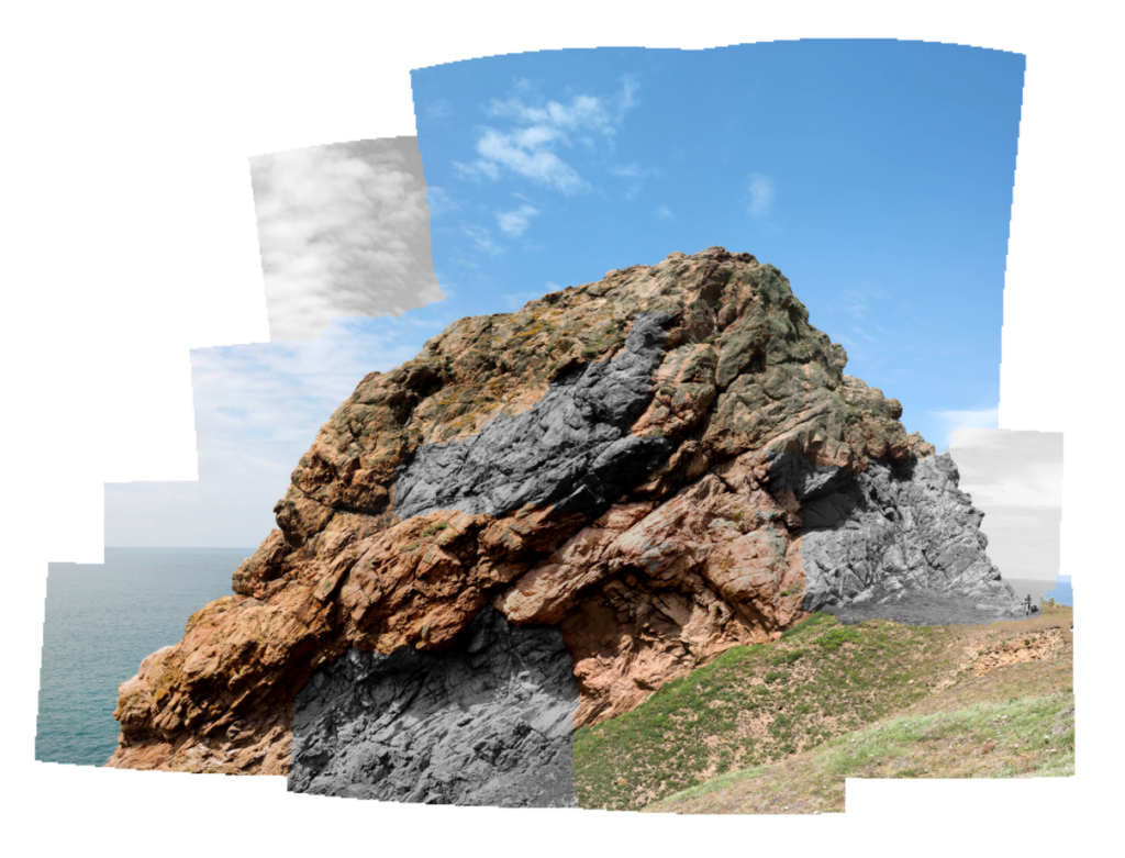
Here I was inspired by artist Daniel W. Farnden to make some parts of the image black and white. I like the way the colour and the black and white segments go well together.
Second Outcome
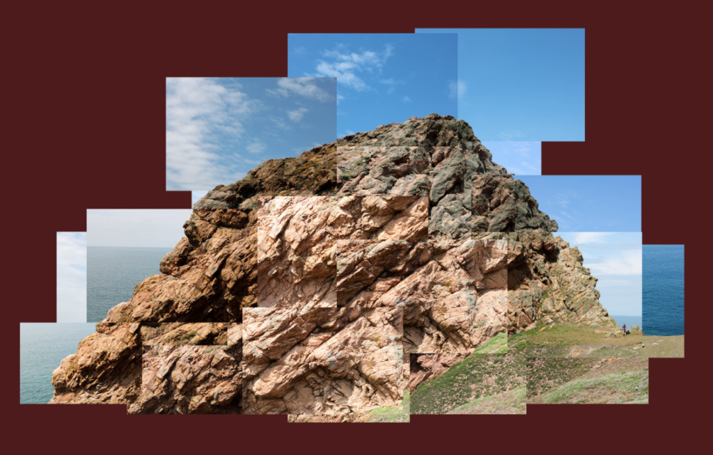
This is another photo joiner I have made, instead of using the automate photo merge tool on photoshop, I manually placed the images together. I like the effect this makes as it makes some images brighter than others, in addition, I purposefully made some of the images blend incorrectly together to give the rock a more jagged look.
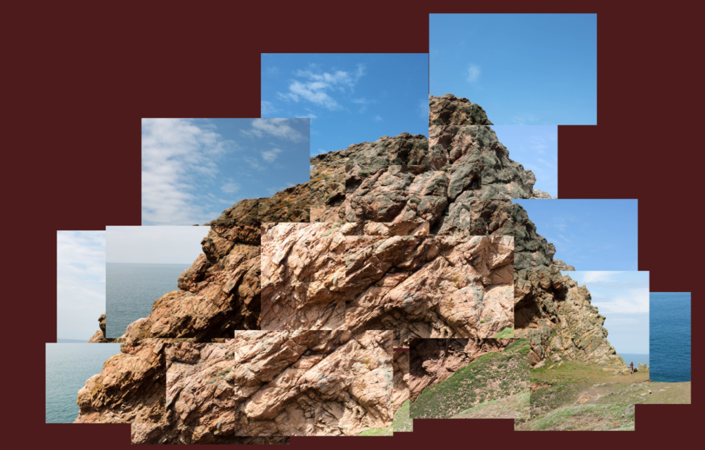
I have made a second version of this photo joiner where I have been even rougher with the placement of the images, giving the rock a distorted look.
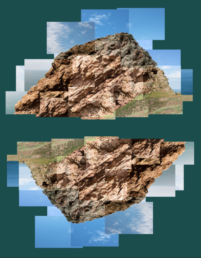
In this version I wanted to see how the image would look if I flipped it and put them together. I like the effect this creates as it makes it easier to see the image in different ways/angles, which sometimes can change where the image draws our attention.
Third Outcome
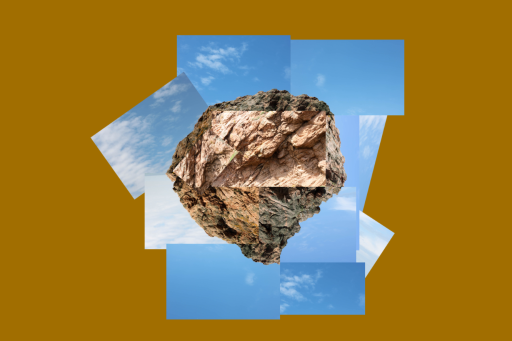
For this joiner, I wanted to attempt to create an abstract shape using the images taken of the edge of the rock, allowing me to put them in a circular arrangement, creating a circle surrounded by sky. I chose a dark, mustardy colour as it pairs well with the blue of the sky, but doesn’t interfere with the image due to it’s dullness.
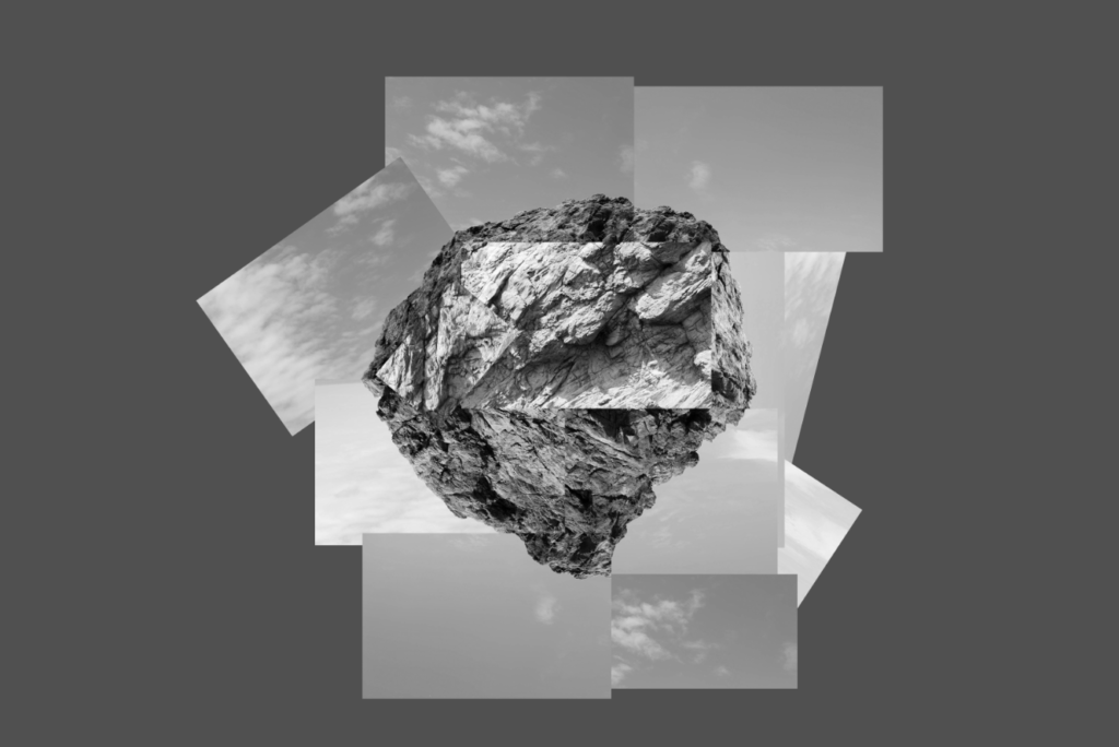
I made a black and white version of this image to see how it would look, I like this version as the sky separates the rock with the dark background, as well as how it creates a greater contrast between the bright and dark parts.
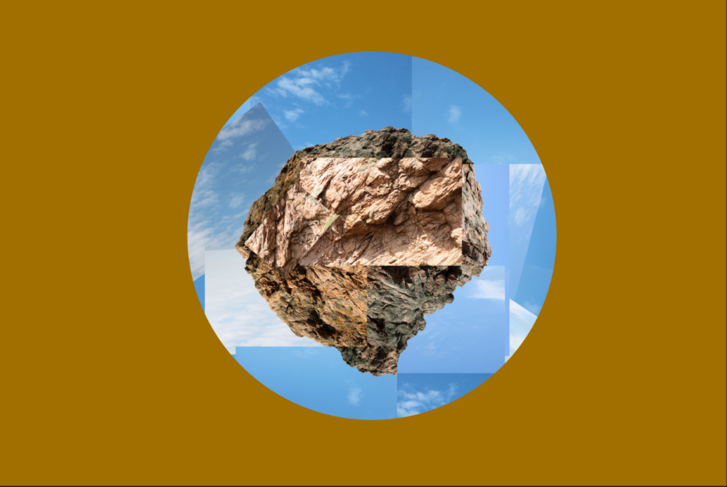
In this version, I cut out the edges of the joiner and made it circular to match the rough shape of the rock formation in the centre.
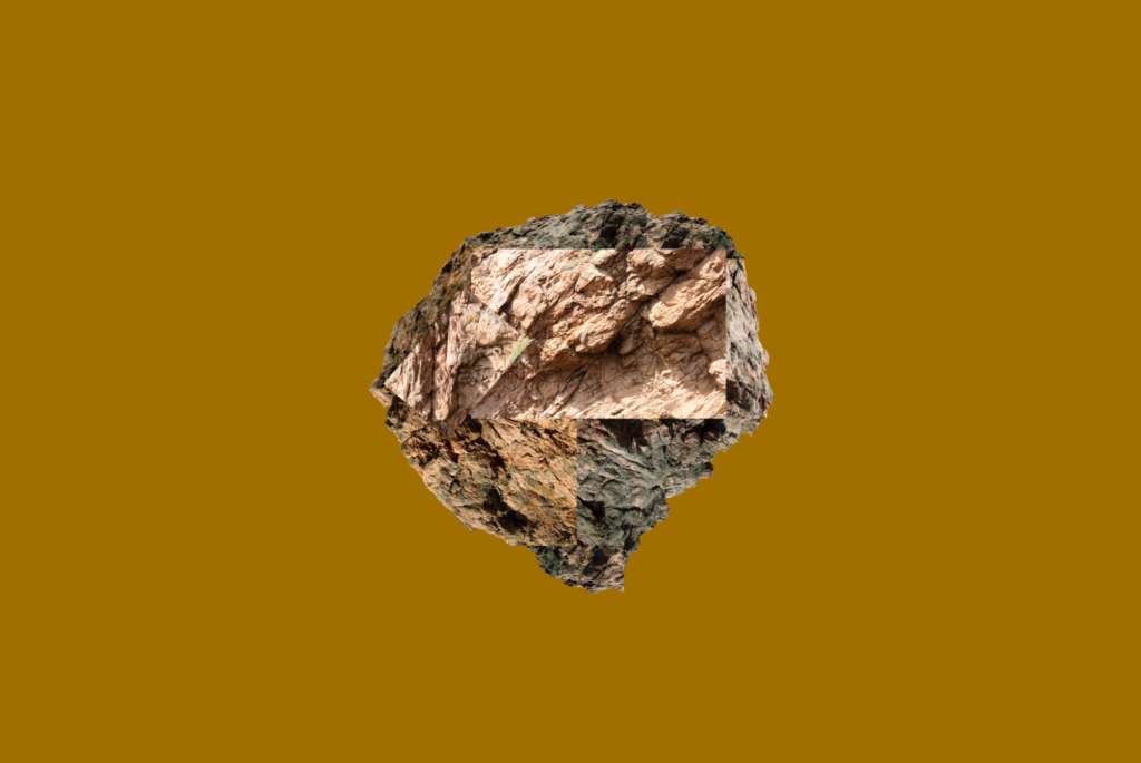
Here I have completely removed the sky to see how the rock would look by itself, I like the way this looks as an abstract image.
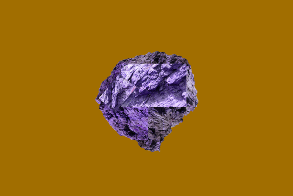
Here I experimented by changing the hue of the rock to a different colour (in this case purple) to see how it would look, I like the way this looks as it further abstracts the rock.
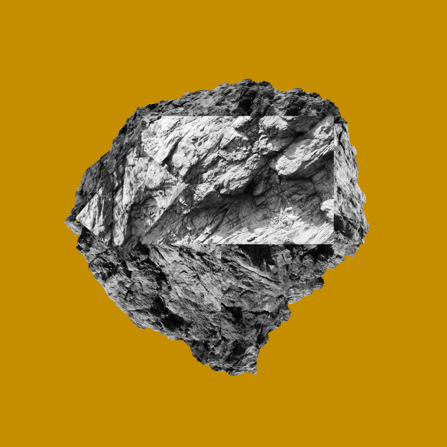
Here is a black and white version, I made the background slightly brighter to give the image a more vibrant look. I like the look of this image as it keeps the cold and angular properties from the stone while staying vibrant.
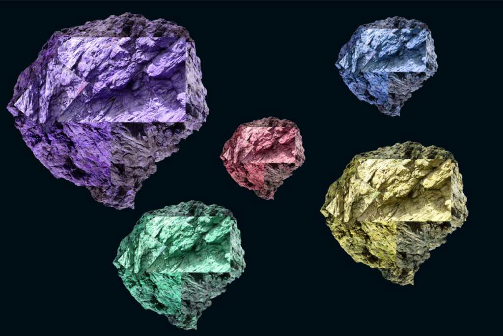
Here I copied each rock and changed the hue and size of each rock and made the background a very dark blue to match with the colours better, and perhaps give the image a space-like look. I like the effect this creates, as it looks like a collection of special rocks or something similar. While this has deviated slightly from the photo joiner technique, I think that this experimentation goes well with the rocks in the images.
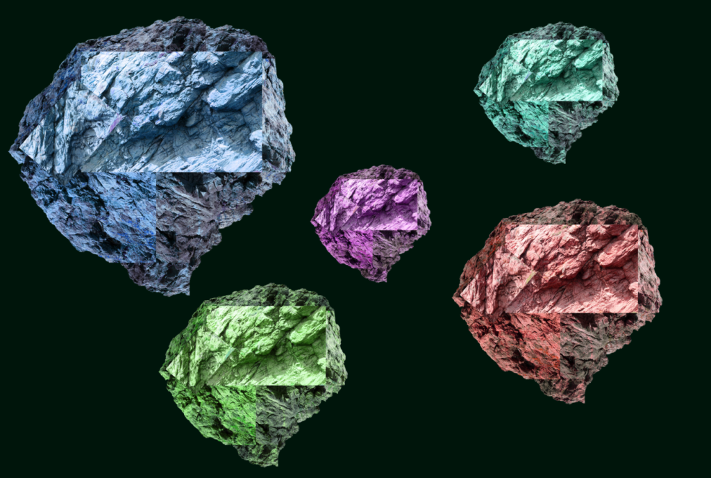
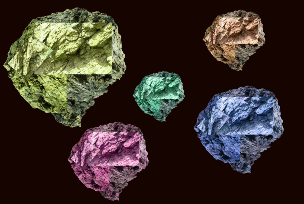
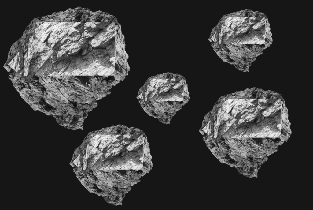
Here are a few more examples of different colour combinations I thought went well with this image (including a black and white version).
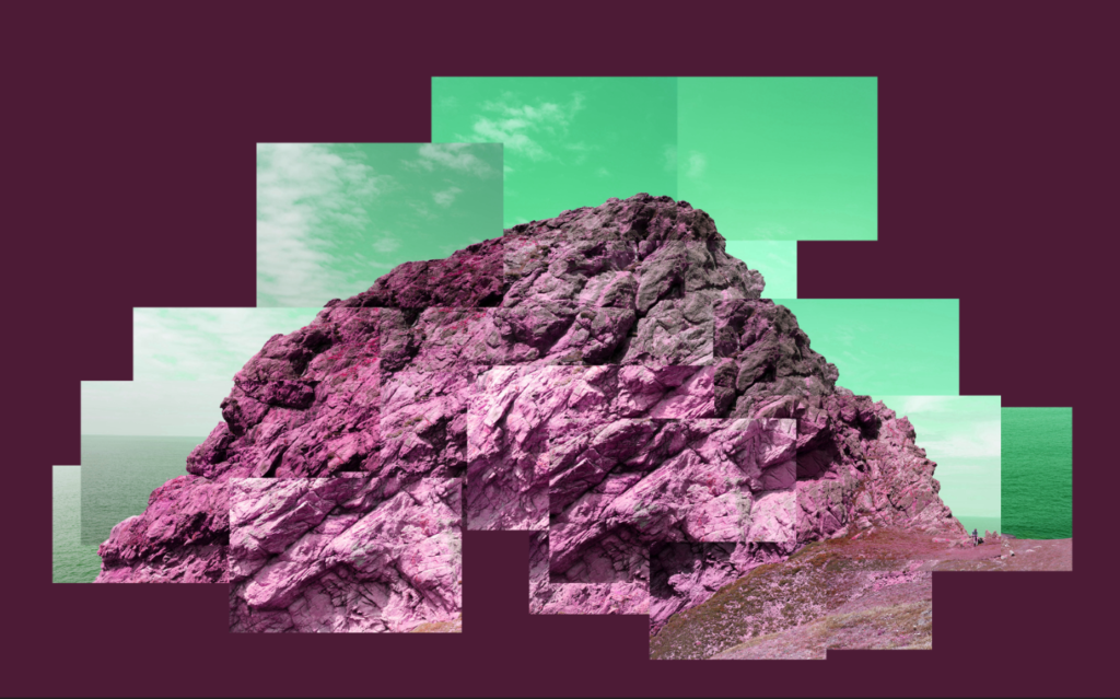
After this set of experiments, I wondered how the image would look if I changed the hue of the whole image. I think this effect is interesting as it gives the image an abstract look.
Fourth Outcome
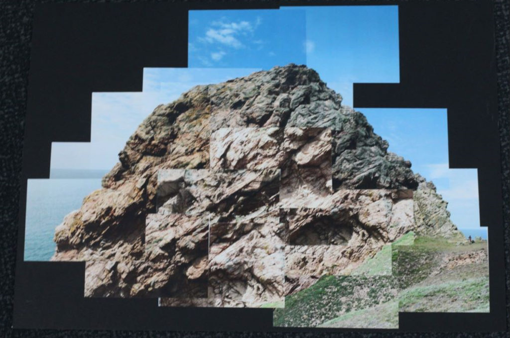
This outcome is a physical joiner I made by printing out the images in a 9 x 13 cm size, cutting them out and placing them on the black side of the window mount to create the joiner in a more traditional way. This was my first attempt at creating a joiner physically and I think it turned out quite well.
Final Images
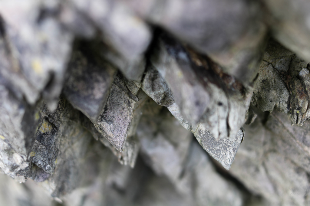
Single Image
Joiner
Evaluation (For the Joiners)
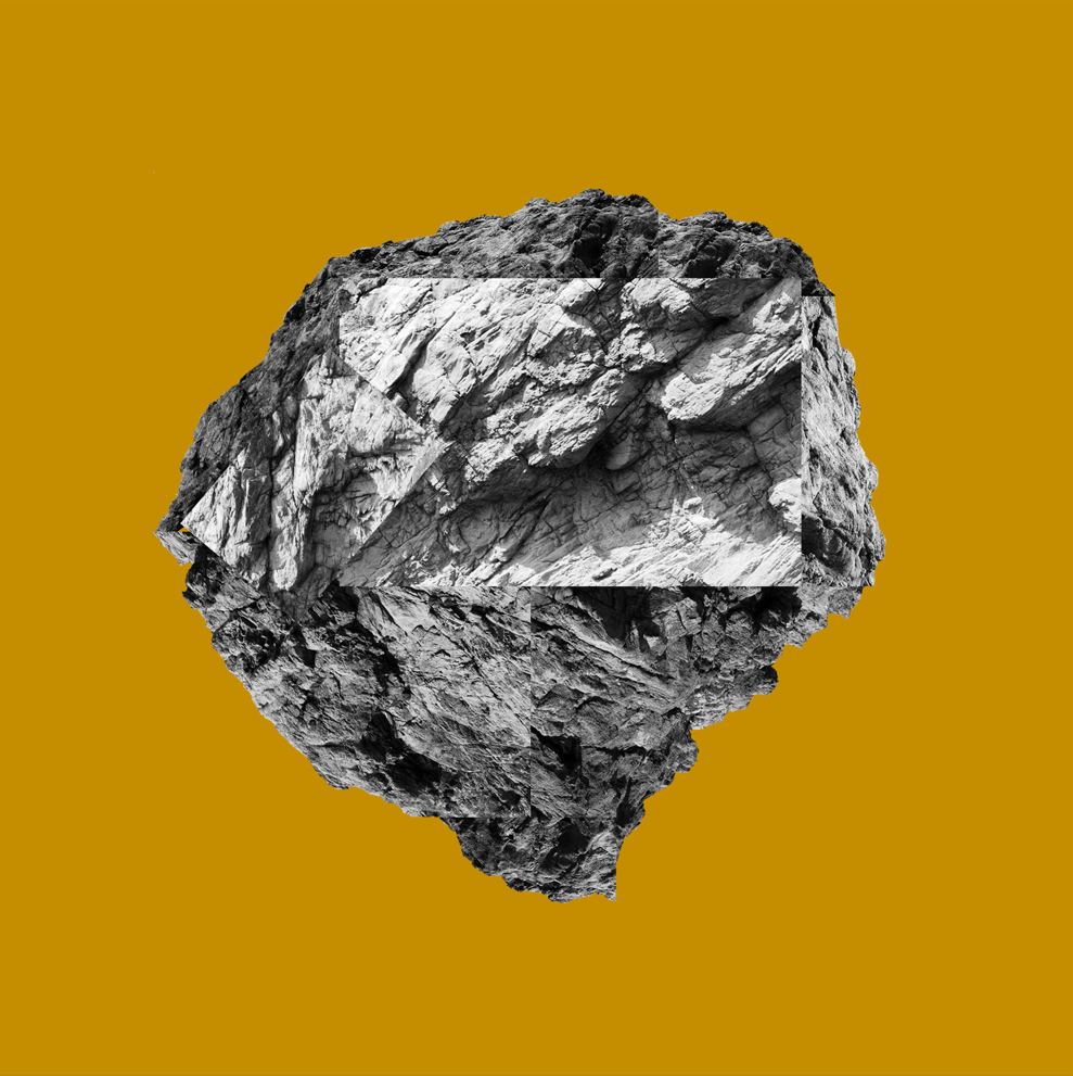
I like the way my joiners came out – both the digital and physical ones. In particular, I thought the experimentation part of this project was the most fun and expressive, and it allowed me to explore the joiner technique further. During my experimentation, I focused on using colour and shapes towards my later experiments, which I think gave the joiners more ‘pop’. I chose the black and white rock on a mustard background as the final image because I think it has a good mix between contrast of colour and shape (being the rock), as well as the less complex background.

