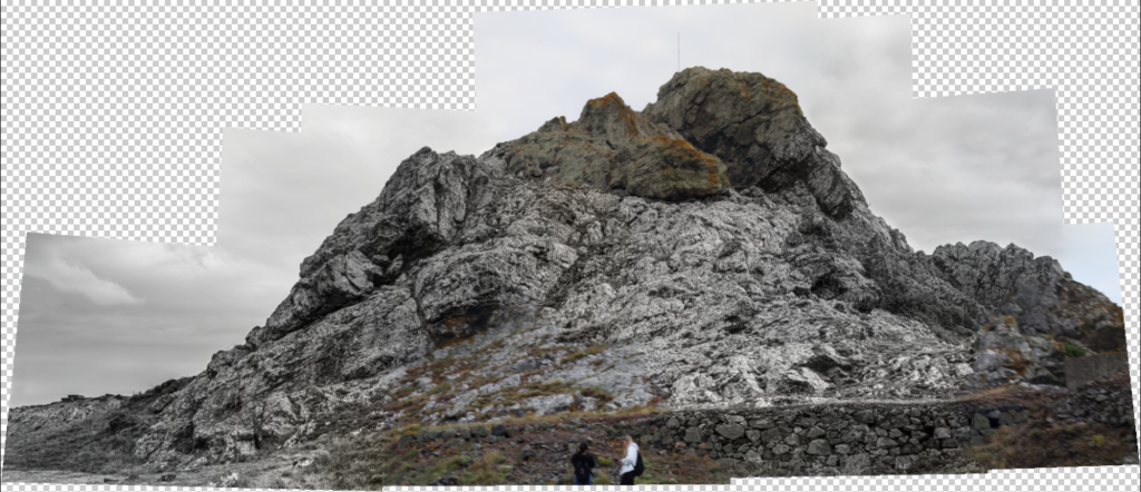
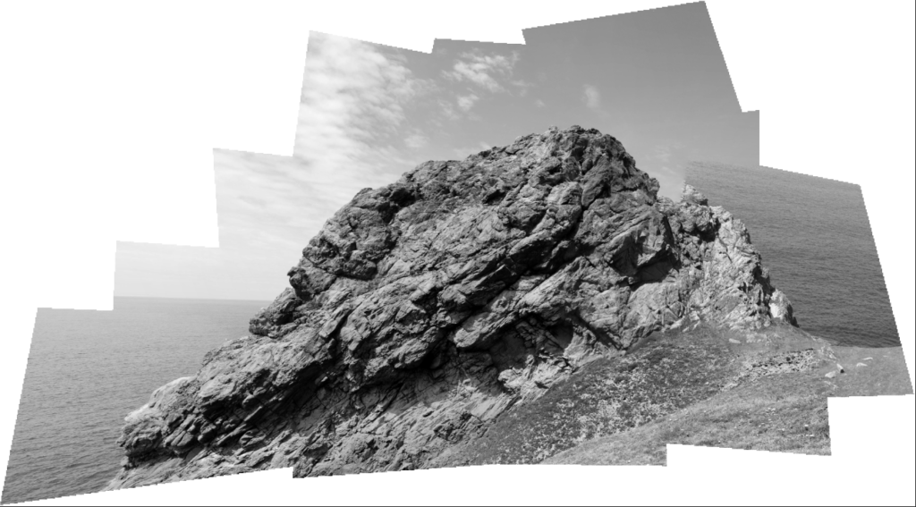
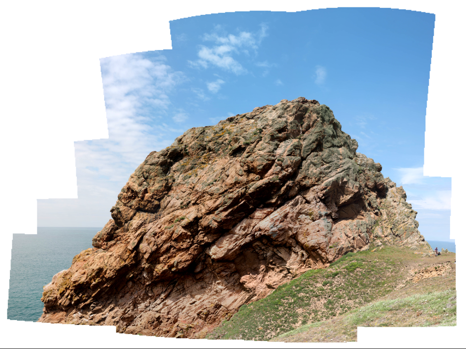
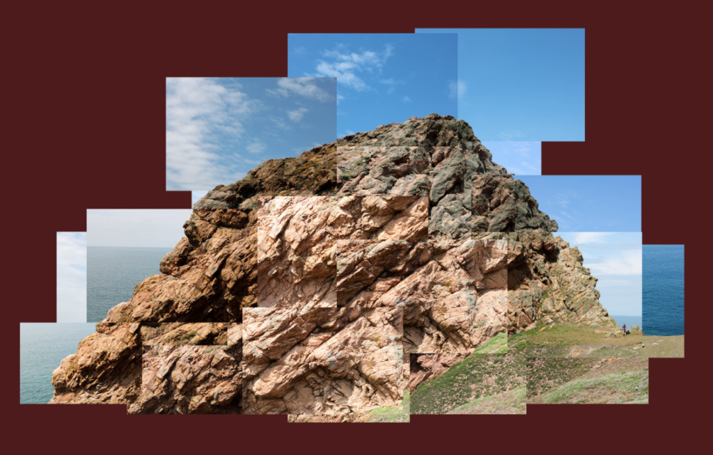
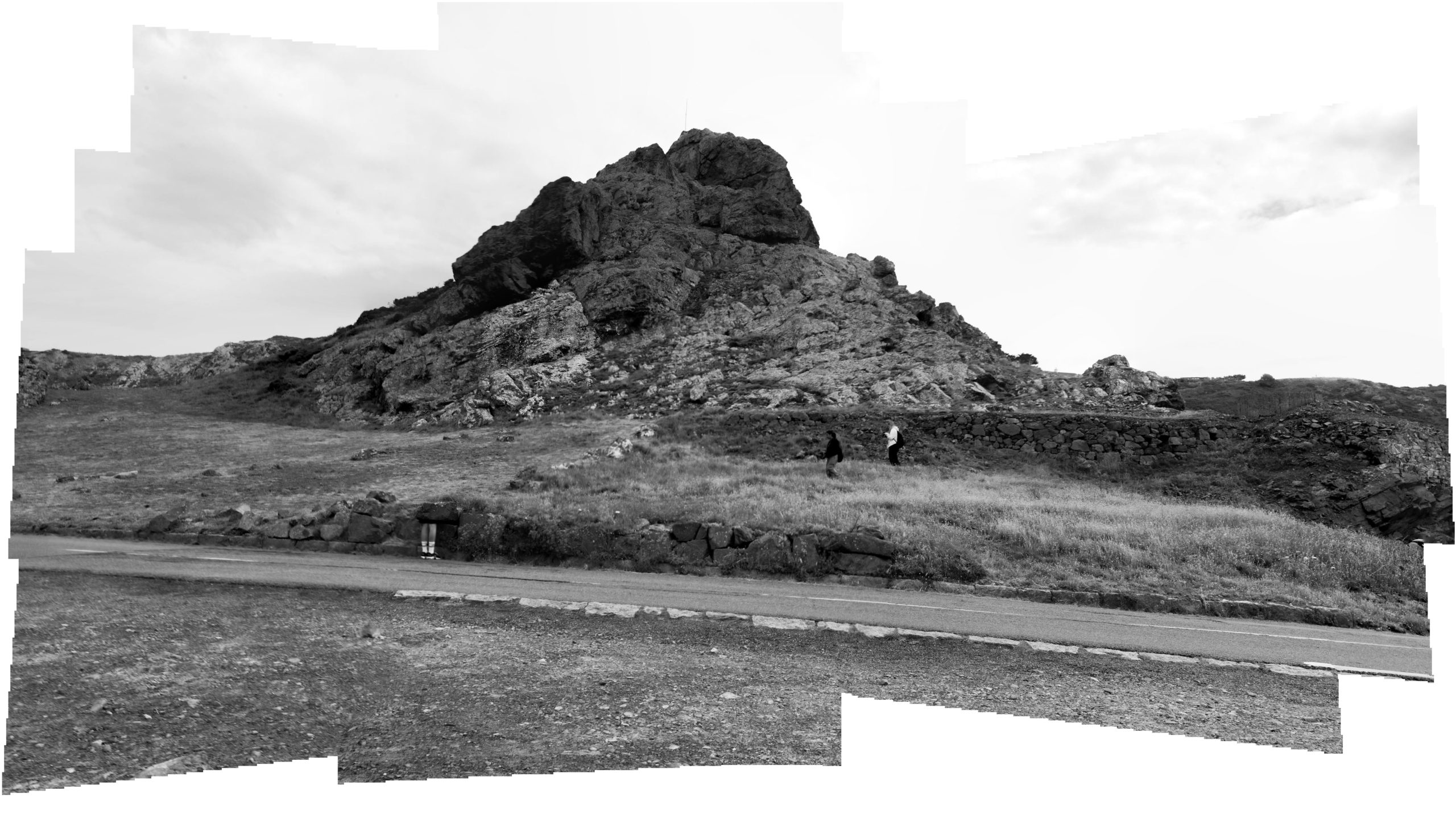
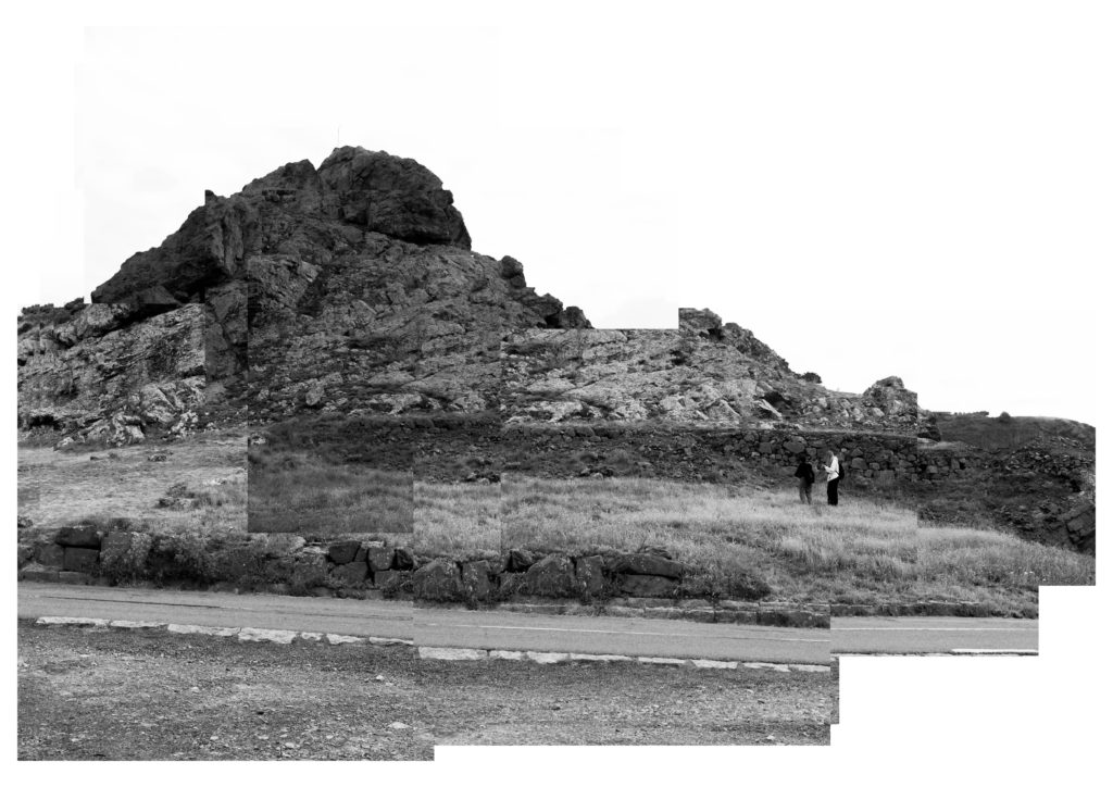
This is my first joiner image in the style of David Hockney. When selecting my images i tried mixing black and white with colour images which i think turned out really interesting. Additionally by having the people in the foreground the image is given a true size of scale.
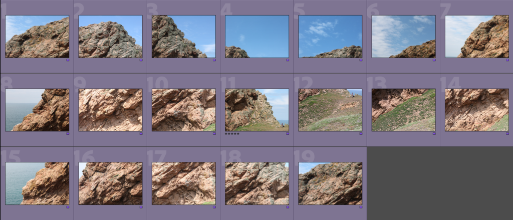
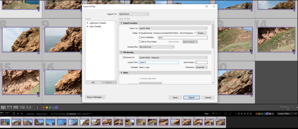
To start making the Joiner, I had to find and mark the images I would use for the joiner to make them easier to find and use.
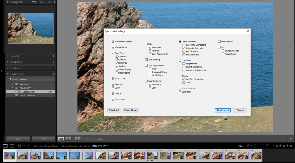
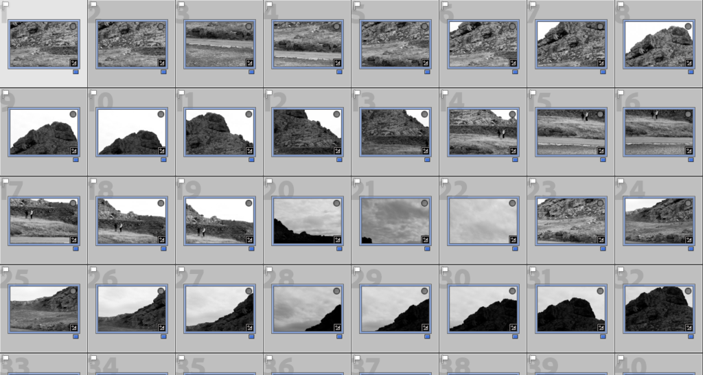
Next I edited an image to how I wanted it to look, then I used the synchronise function on Lightroom to make sure each image looks the same exposure/contrast-wise.
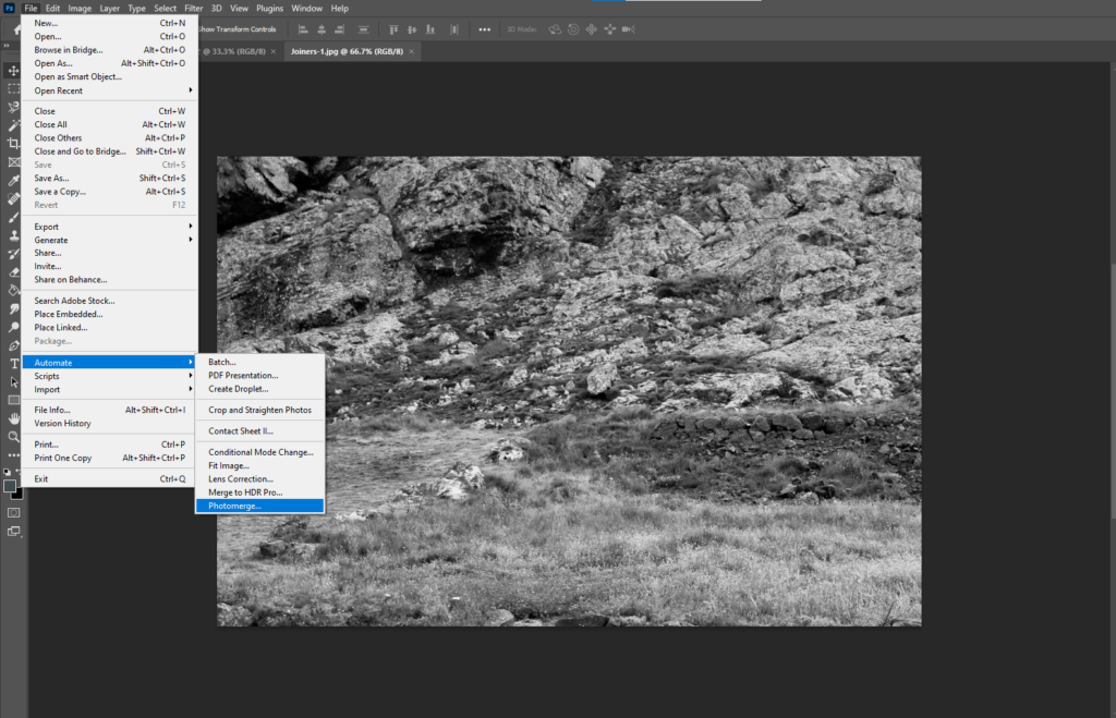
Then I exported them from Lightroom into small/medium sized files so they can be used in photoshop, in order to create the joiner
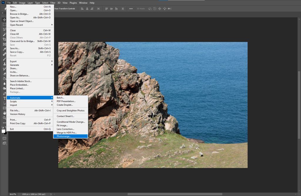
In photoshop, I used the Photomerge tool to generate the photo joiner automatically.
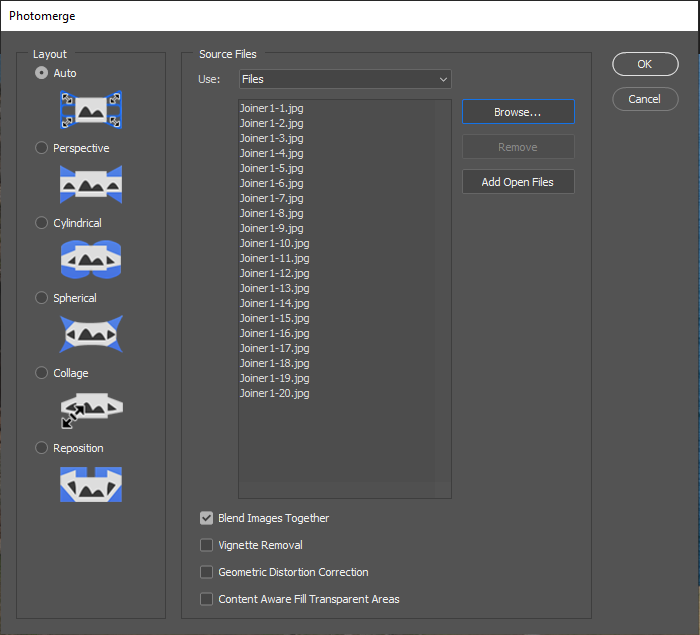
I selected the images I wanted to use and ticked the ‘Blend Images Together’ option
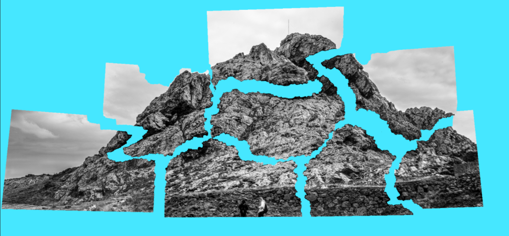
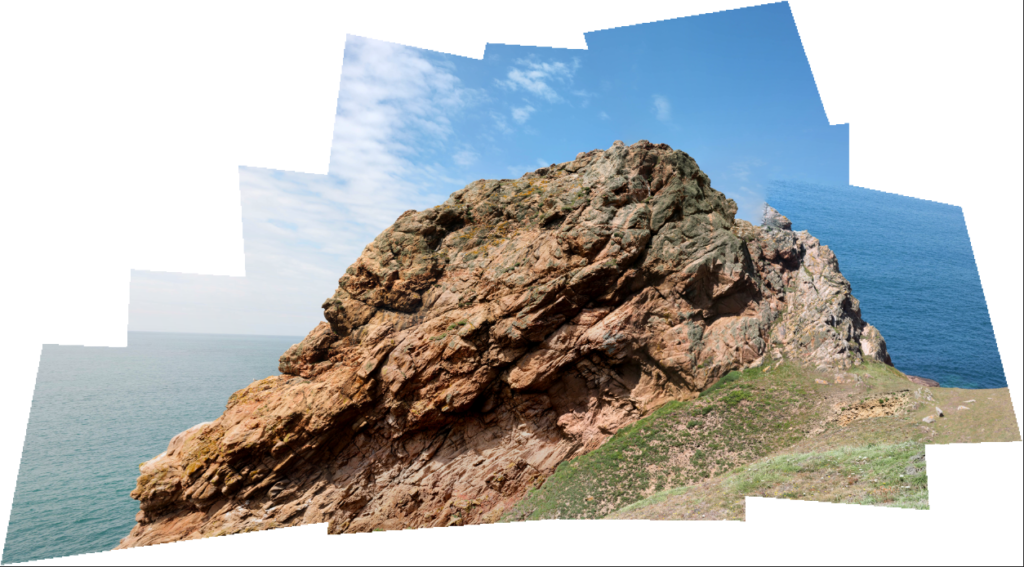
After that, this is what was generated. I like the way the joiner is somewhat imperfect on the top-right, it gives the image a more jagged look.
Experimentation
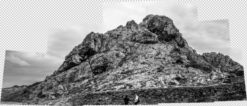
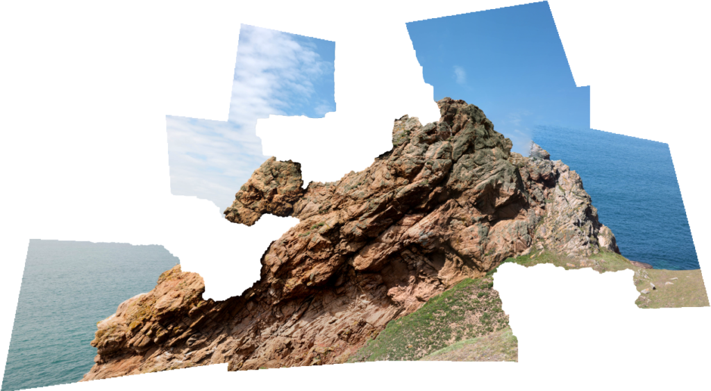
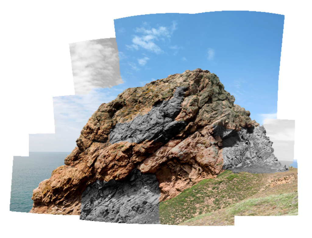
Here I made a Black and White version to see how it would look.
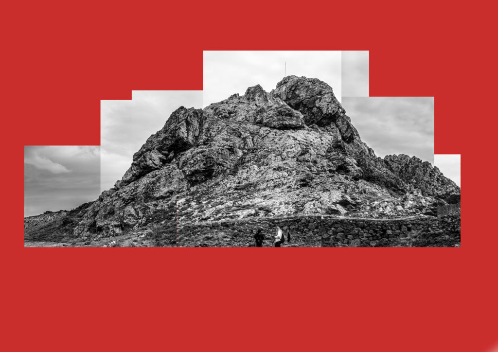
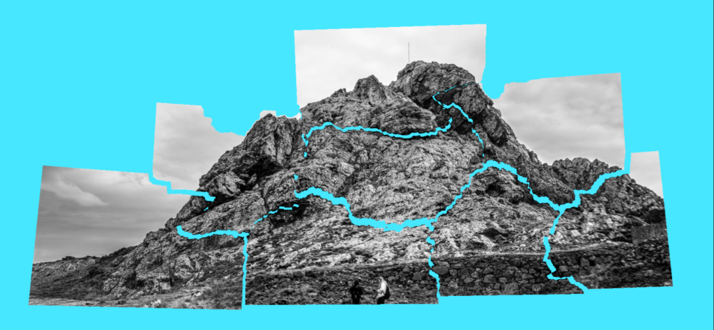
Here I experimented on the image by hiding some layers, removing chunks from the original joiner. I think this looks interesting as the makes the edge of the joiner (which is usually just straight lines) appear more irregular.
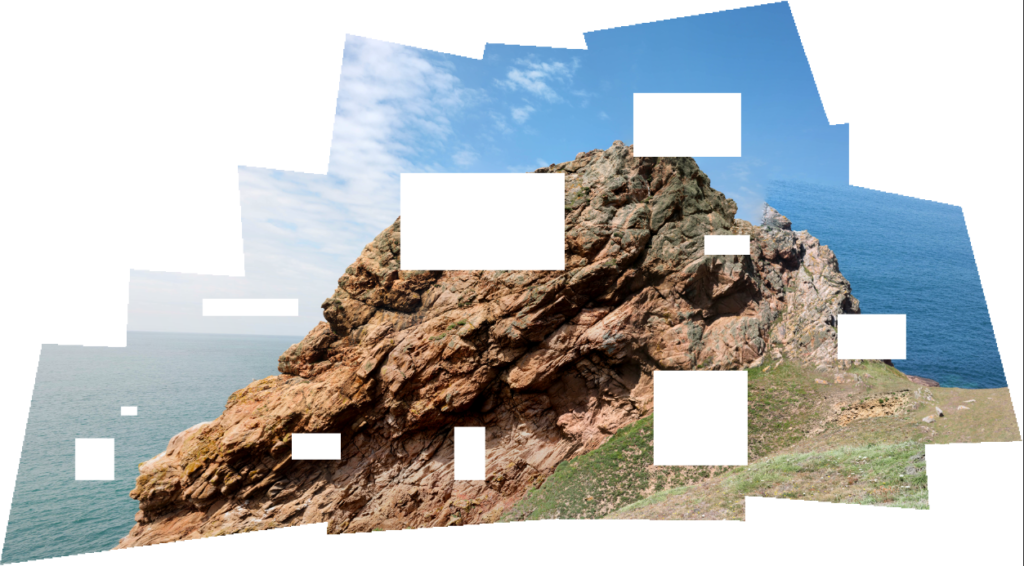
Here is another experimentation where, instead of hiding individual layers, I used the selection tool to delete squares/rectangles from the image to see what effect that would create.
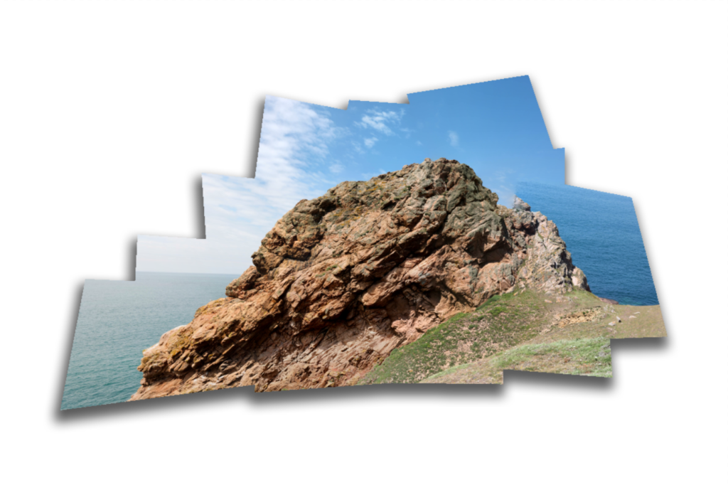
Here I flattened the photo joiner and applied a drop shadow to it to give it a more 3D look, as if it was a physical joiner.
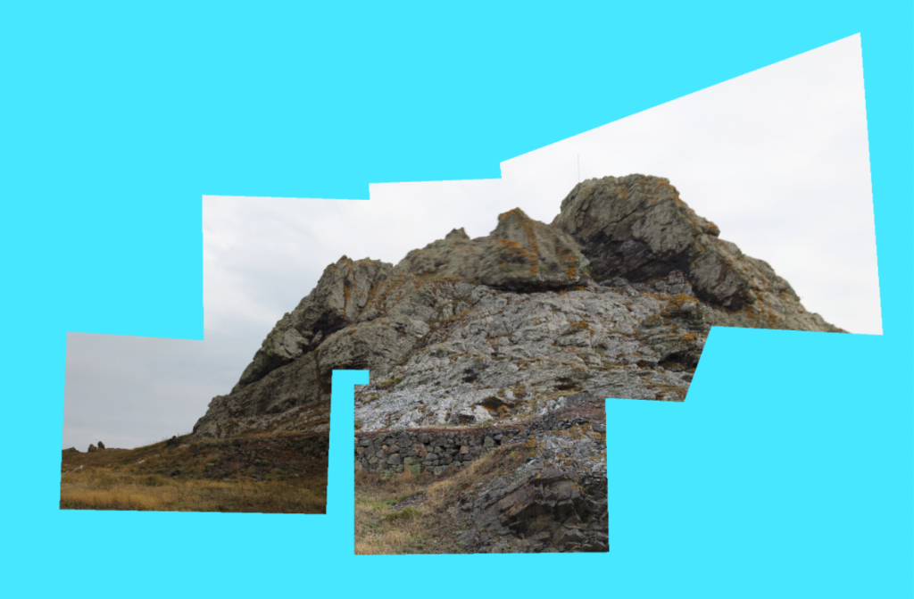
Here I have made another photo joiner using the ‘cylindrical’ setting on the photomerge tool.
Here I was inspired by artist Daniel W. Farnden to make some parts of the image black and white. I like the way the colour and the black and white segments go well together.
Second Outcome
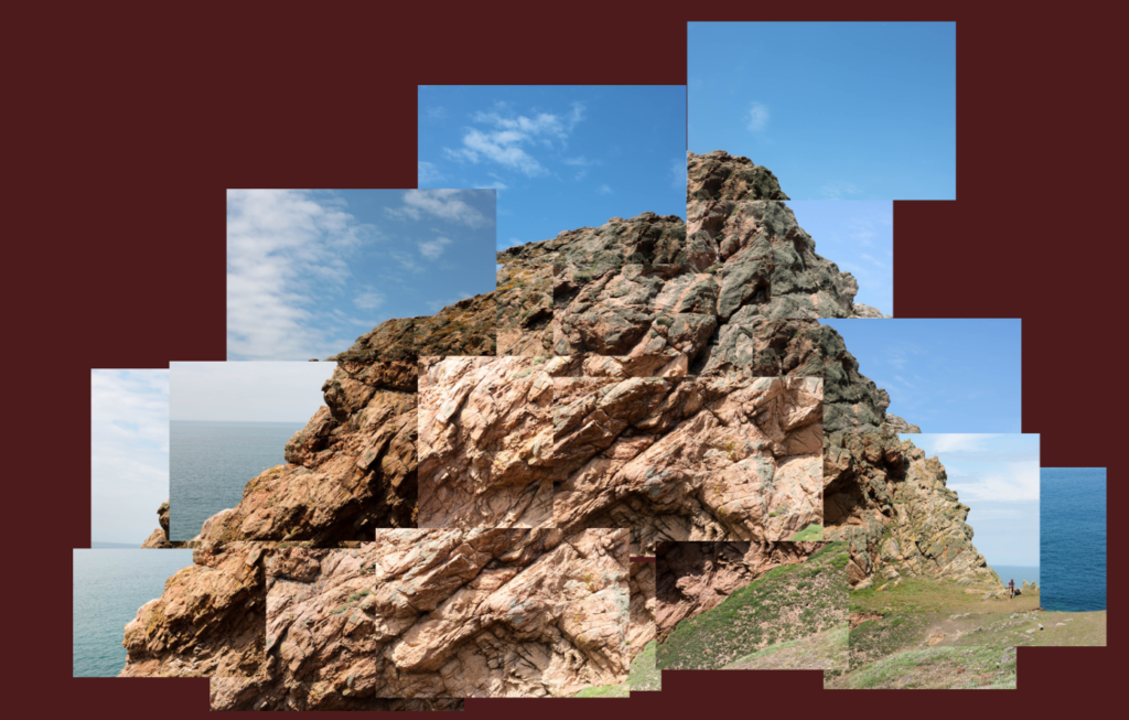
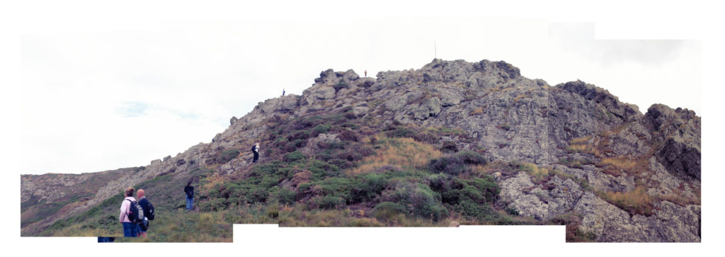
This is another photo joiner I have made, instead of using the automate photo merge tool on photoshop, I manually placed the images together. I like the effect this makes as it makes some images brighter than others, in addition, I purposefully made some of the images blend incorrectly together to give the rock a more jagged look.
I have made a second version of this photo joiner where I have been even rougher with the placement of the images, giving the rock a distorted look.
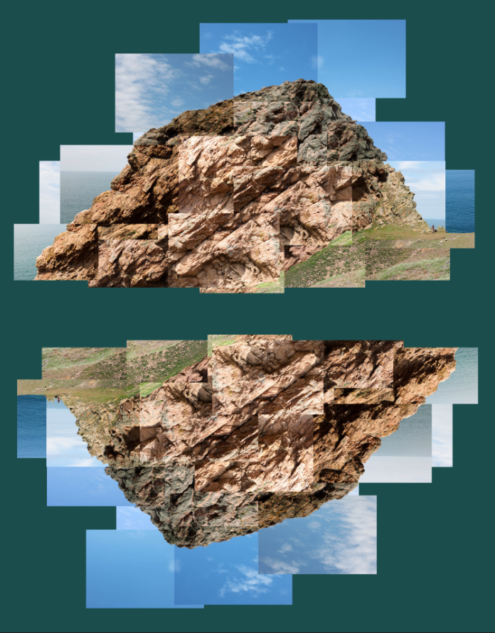
In this version I wanted to see how the image would look if I flipped it and put them together. I like the effect this creates as it makes it easier to see the image in different ways/angles, which sometimes can change where the image draws our attention.
Third Outcome
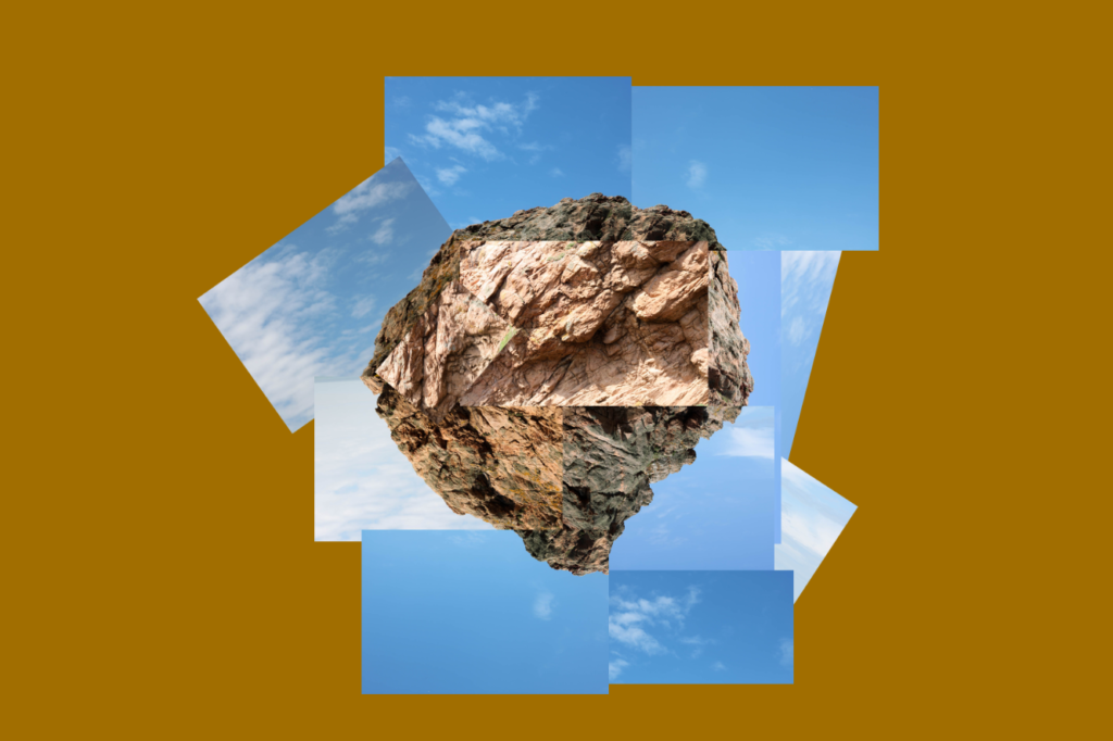
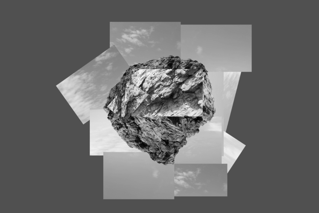
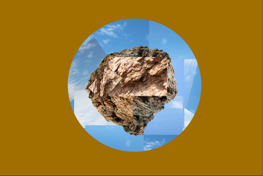
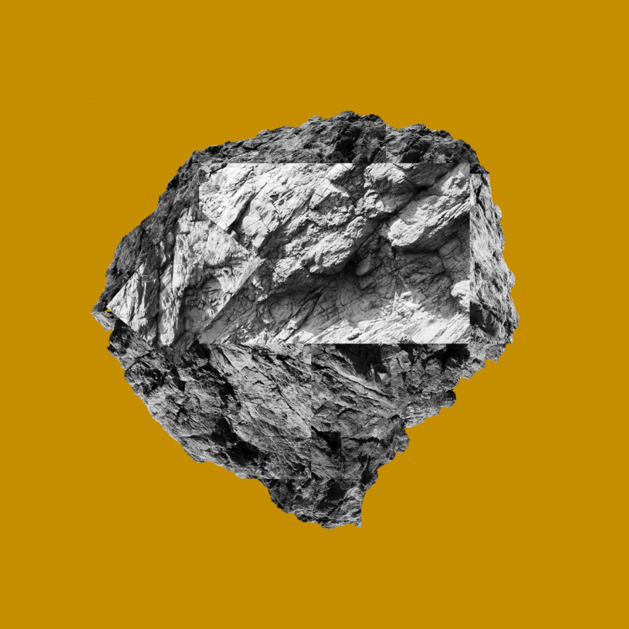
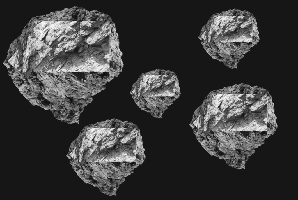
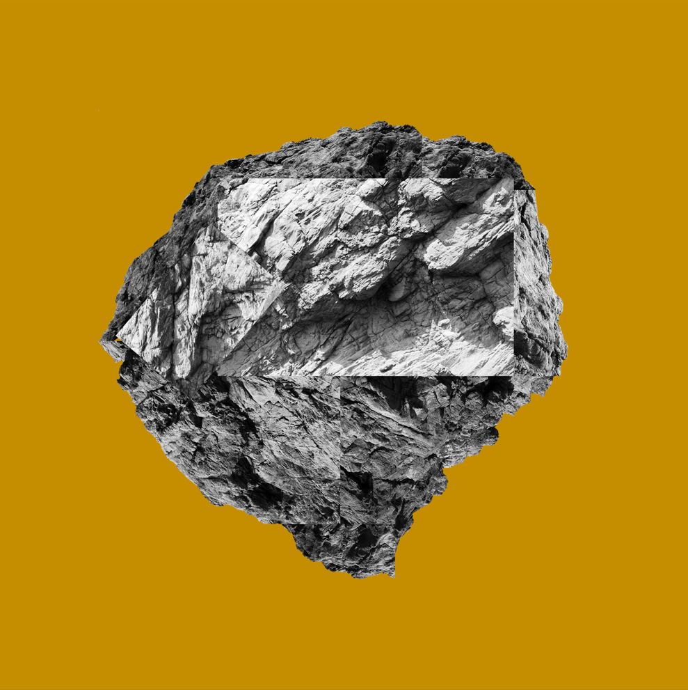
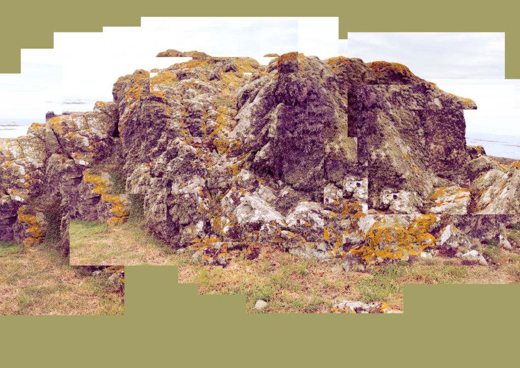
For this joiner, I wanted to attempt to create an abstract shape using the images taken of the edge of the rock, allowing me to put them in a circular arrangement, creating a circle surrounded by sky. I chose a dark, mustardy colour as it pairs well with the blue of the sky, but doesn’t interfere with the image due to it’s dullness.
I made a black and white version of this image to see how it would look, I like this version as the sky separates the rock with the dark background, as well as how it creates a greater contrast between the bright and dark parts.
In this version, I cut out the edges of the joiner and made it circular to match the rough shape of the rock formation in the centre.
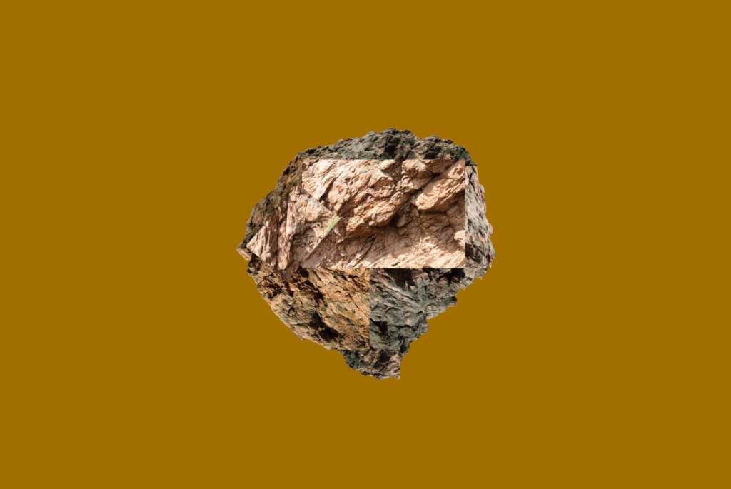
Here I have completely removed the sky to see how the rock would look by itself, I like the way this looks as an abstract image.
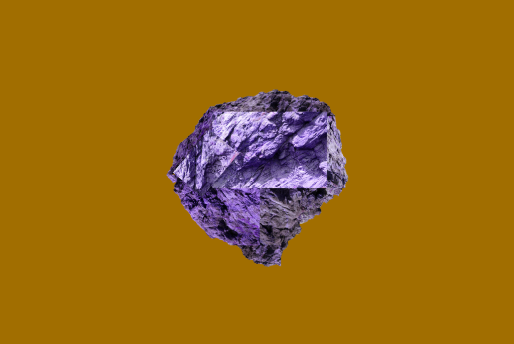
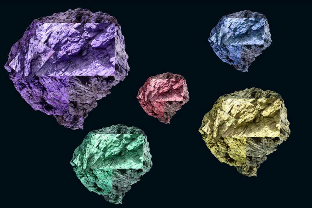
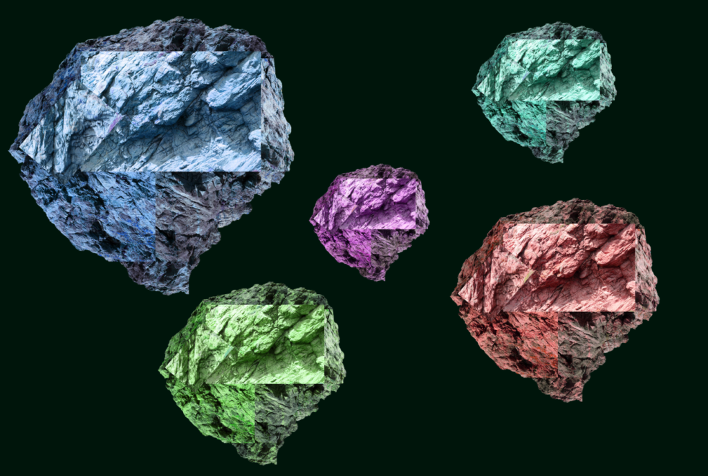
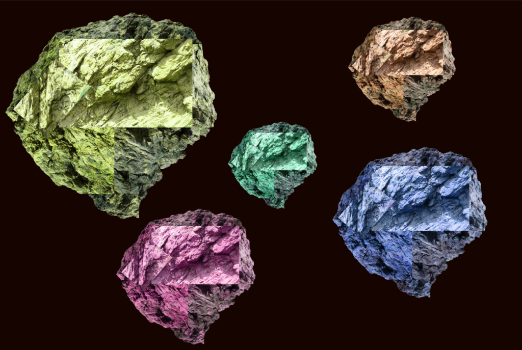
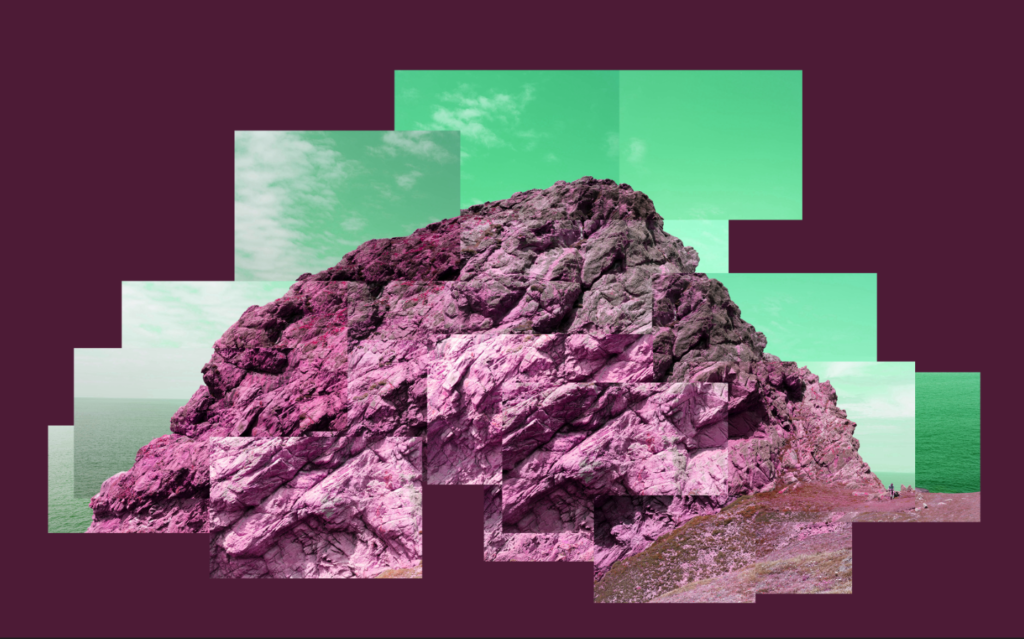
Here I experimented by changing the hue of the rock to a different colour (in this case purple) to see how it would look, I like the way this looks as it further abstracts the rock.
Here is a black and white version, I made the background slightly brighter to give the image a more vibrant look. I like the look of this image as it keeps the cold and angular properties from the stone while staying vibrant.
Here I copied each rock and changed the hue and size of each rock and made the background a very dark blue to match with the colours better, and perhaps give the image a space-like look. I like the effect this creates, as it looks like a collection of special rocks or something similar. While this has deviated slightly from the photo joiner technique, I think that this experimentation goes well with the rocks in the images.
Here are a few more examples of different colour combinations I thought went well with this image (including a black and white version).
After this set of experiments, I wondered how the image would look if I changed the hue of the whole image. I think this effect is interesting as it gives the image an abstract look.
Fourth Outcome
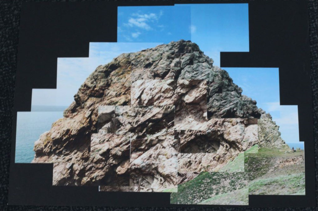
This outcome is a physical joiner I made by printing out the images in a 9 x 13 cm size, cutting them out and placing them on the black side of the window mount to create the joiner in a more traditional way. This was my first attempt at creating a joiner physically and I think it turned out quite well.
Final Images
Single Image
Joiner
Evaluation (For the Joiners)
I like the way my joiners came out – both the digital and physical ones. In particular, I thought the experimentation part of this project was the most fun and expressive, and it allowed me to explore the joiner technique further. During my experimentation, I focused on using colour and shapes towards my later experiments, which I think gave the joiners more ‘pop’. I chose the black and white rock on a mustard background as the final image because I think it has a good mix between contrast of colour and shape (being the rock), as well as the less complex background.
I have colour coded by images so that the parts of my joiner are blue.I have synchronised the settings in these images so they all have the same edits.I open my images in photoshop and use the Photomerge tool.
Joiners created using the Photoshop AI
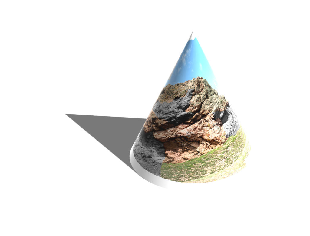
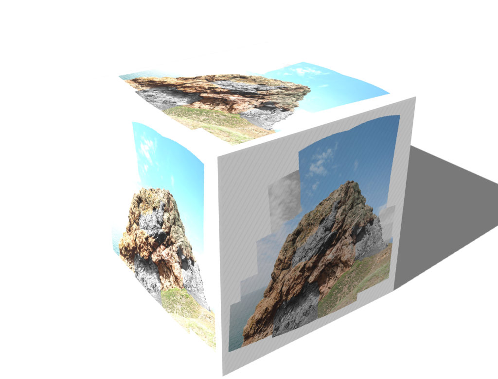
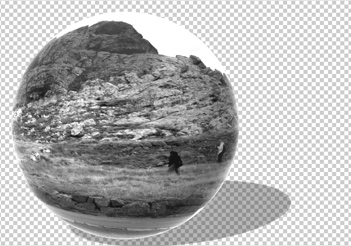
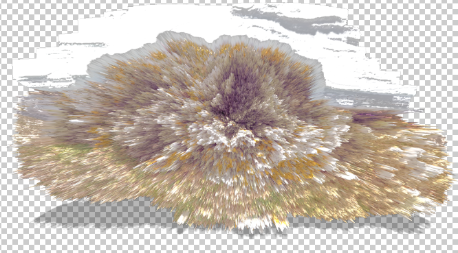
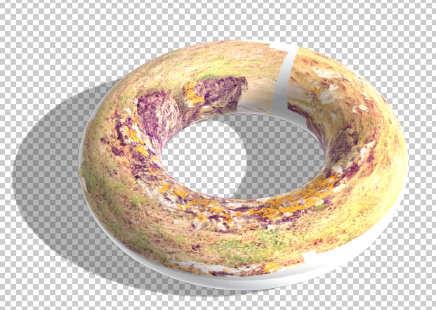
Experiments in photoshop using the 3D tool
I am not very interested in the ones overlayed onto 3D objects.
I then decided to make some joiners manually, inspired by David Hockney.
Overall I enjoyed this experiment, I just wish that I had taken more images so I had more interesting looking Joiners.
I printed out my images and cut them up so they didn’t have any white borders and were all the same size.
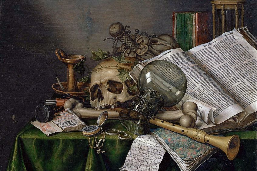
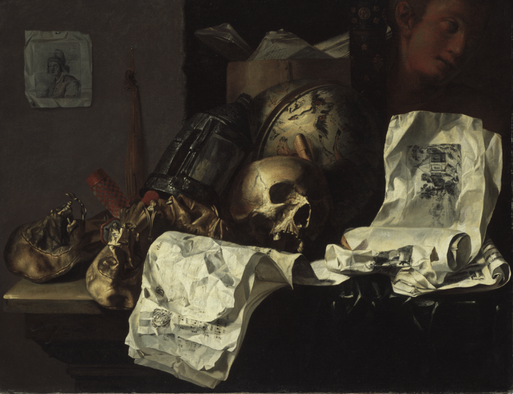
Still Life with Books and Manuscripts and a Skull (1663) – Edwaert Collier
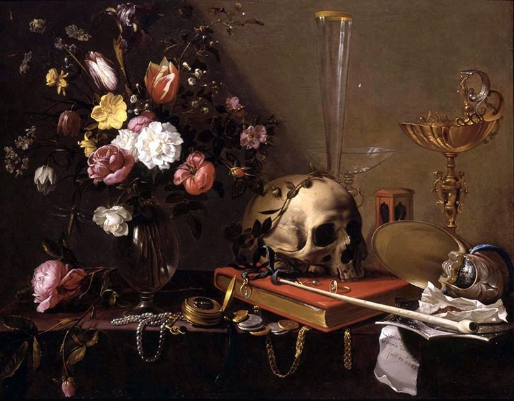
Vanitas Still-Life (1661) – N. Le Peschier
Vanitas Still Life (1650) – Hendrick Andriessen
What is a still life?
Still lifes were known to be paintings that displayed a variety of inanimate objects that were used as being the main subject of the piece. The paintings were known to communicate a moral or religious message and they particularly emphasised the shortness of life and the inevitability of decline and death. Still life paintings typically included fruit, flowers and objects contrasting with these in texture, such as bowls and glassware. Skeletons, burning candles and decaying fruit tend to be other popular choices within still life paintings
History behind still life
Still life ranges between many different time periods, aging all the way back to the 15th Century within the Egyptian culture. Still life began to become popular during ancient times and later on began to move throughout the middle ages, the renaissance period, modern period and is still popular to this day within contemporary art.
Ancient Still life
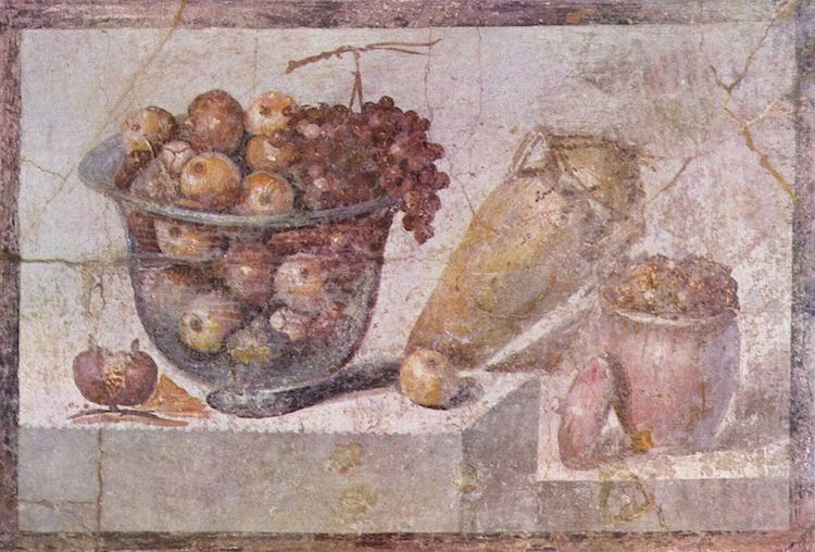
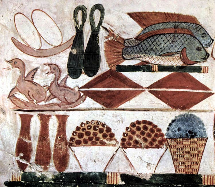
Coming from the ancient period, paintings were discovered from within burial grounds and tombs of what looked to be food – including crops, fish and meat. Later on within the ancient period, ancient greeks and romans became invested in the concept of still life and produced mosaics and frescoes.
“Still Life with Glass Bowl of Fruit and Vases,” (63 – 79 CE)
“Still-Life Found in the Tomb of Menna” (15th century BCE)
Middle ages still life
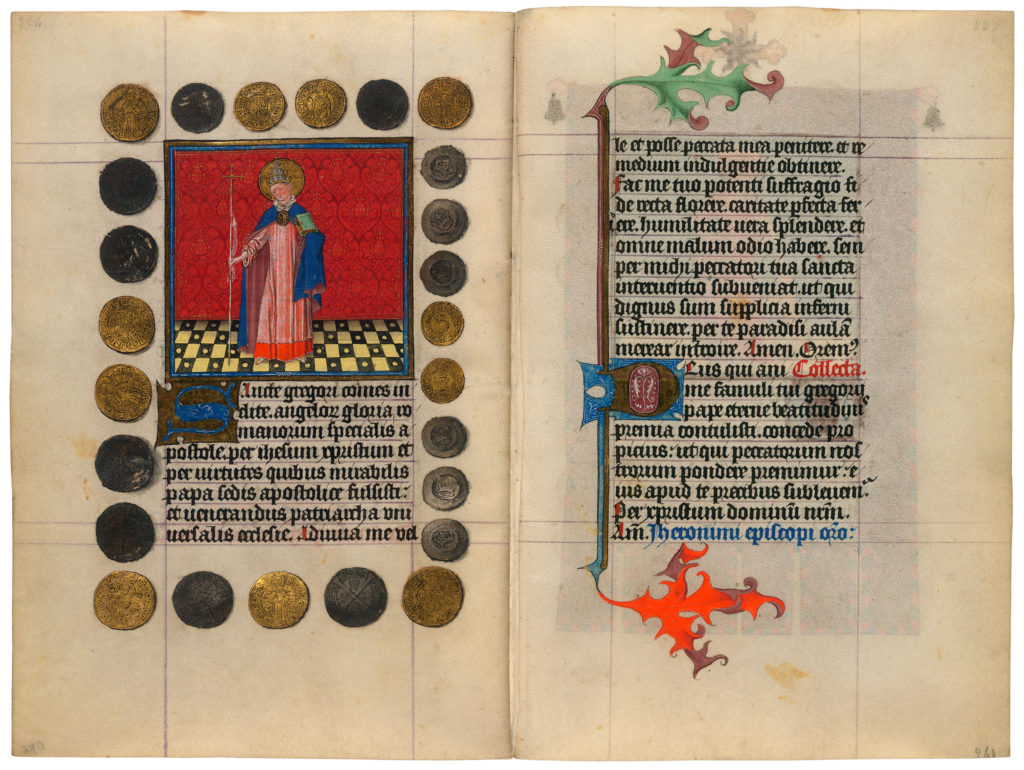
St. Gregory the Great (1440)
Within the middle ages, still life was continued on but was based more around a religious concept and objects such as coins, seashells, and bushels of fruit were included in the pieces.
Renaissance still life
Still Life with Bouquet and Skull by Adriaen van Utrecht (1642)
Still Life with Flowers and Butterflies by Maria van Oosterwyck (1686)
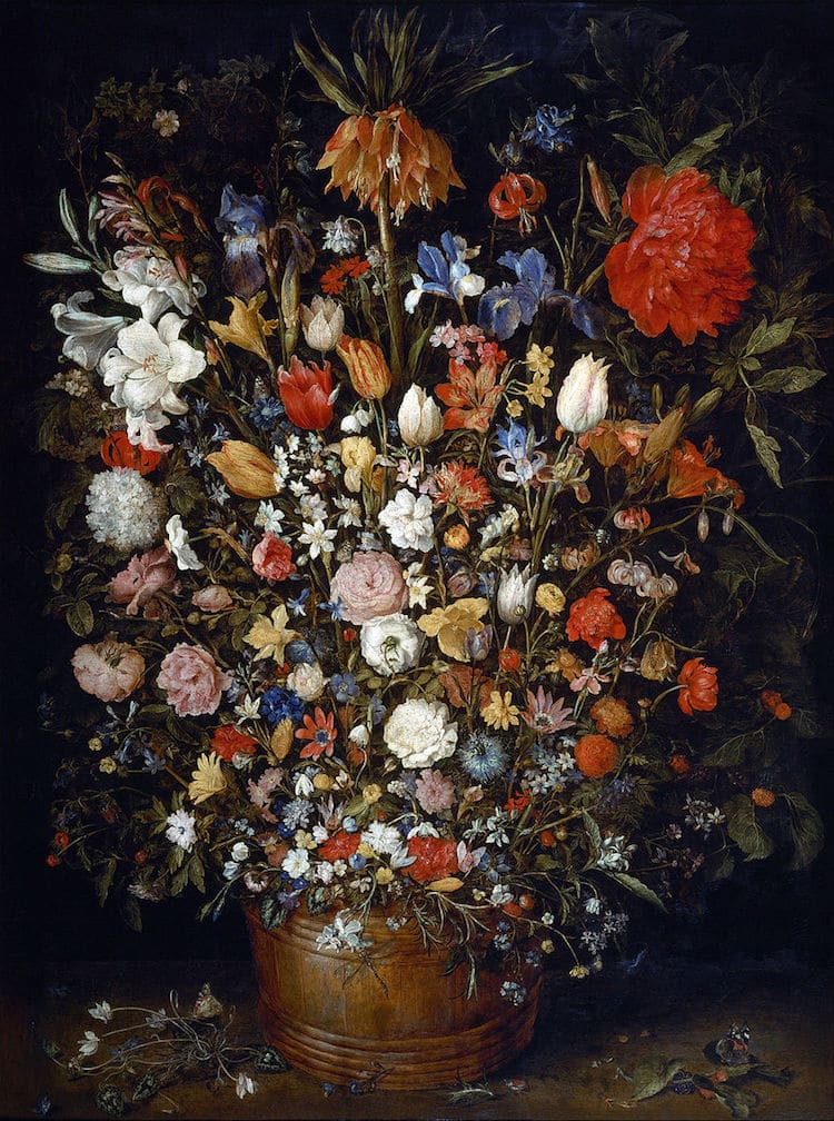
Flowers in a Wooden Vessel by Jan Brueghel the Elder (1606 – 1607)
Still Life with Flowers by Maria van Oosterwyck (1680)
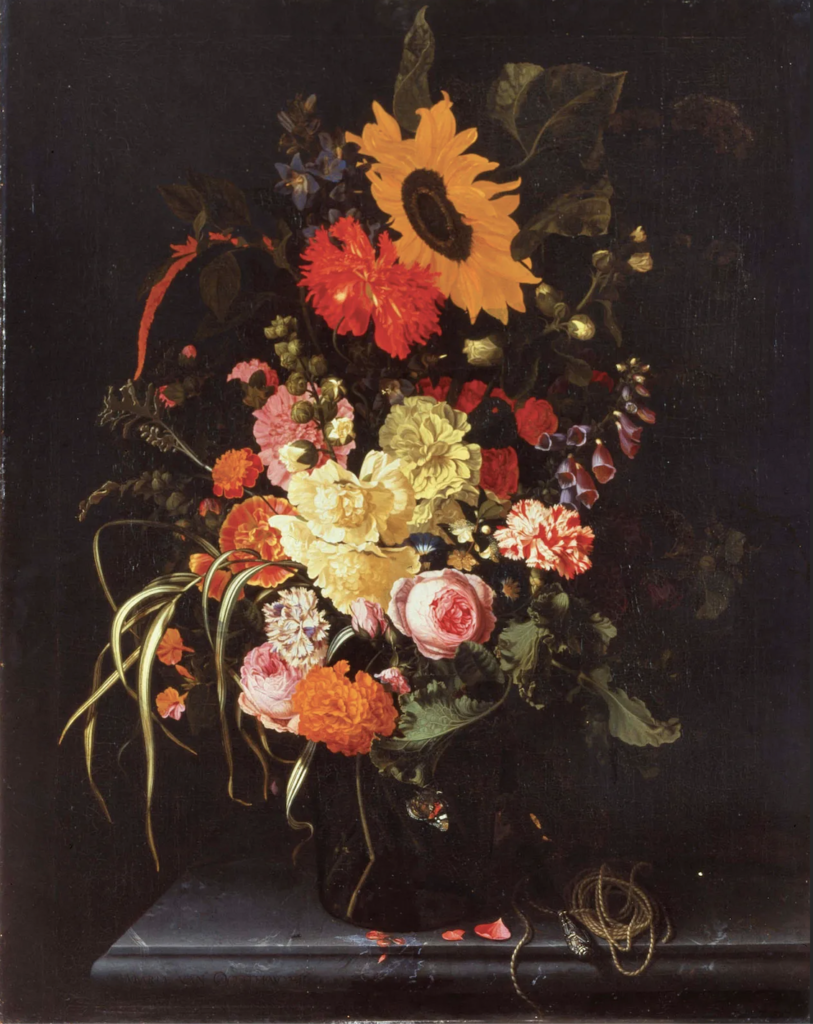
The renaissance period began solely using flowers as their focal point within paintings, but as the period progressed into the Dutch Golden Age, floral art took the turn of further stepping into becoming vanitas paintings. Vanitas paintings are inspired by memento mori, which was a genre of painting whose Latin name translates to “remember that you have to die.” Objects used would include human skulls, waning candles, and overturned hourglasses that were usually paired with a range of cut flowers.
Modern still life
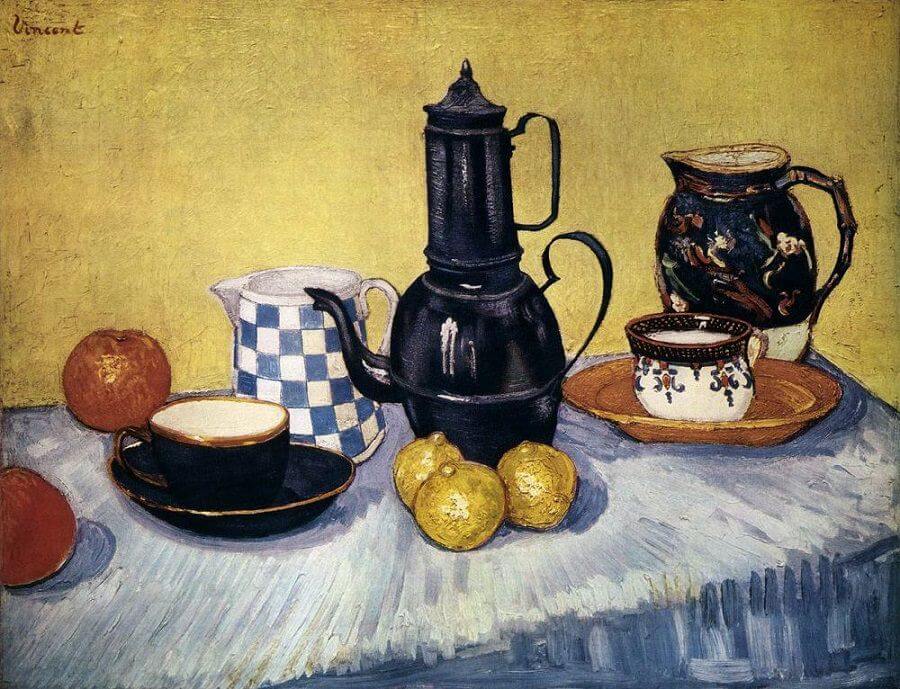
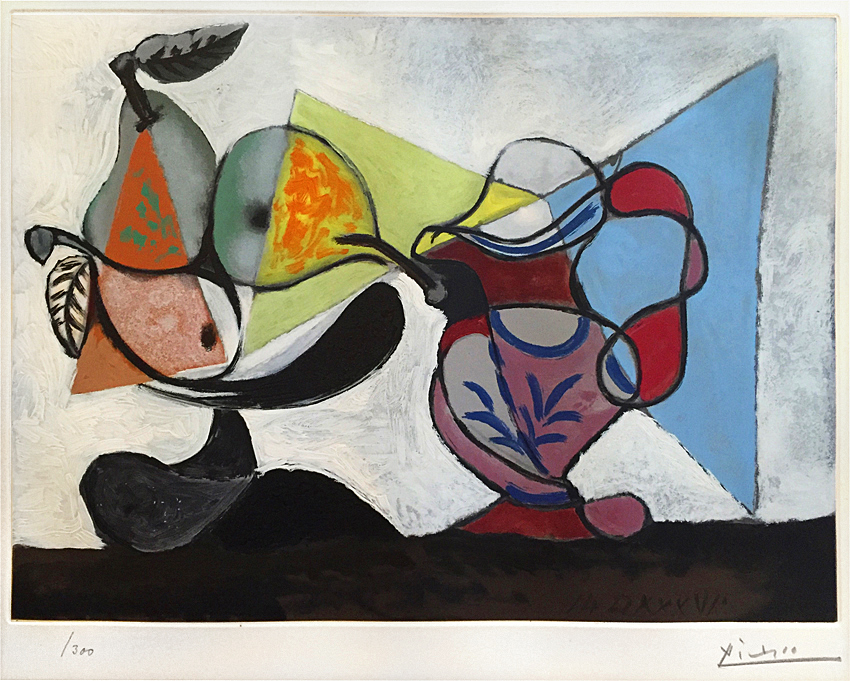
Modern art then began to make the appearance of still life aspects and artists, such as Vincent Van Gogh and Cezanne, dabbled into the genre with the inclusion of usually flower filled vases, apples, wine bottles and water jugs. Cezanne in particular, dived into exploring a similar theme to that of vanitas genre by including skulls in his paintings. Pop art then began to follow the theme of still life, coming from artists such as Pablo Picasso and Georges Braque.
Still Life with Coffee Pot by Vincent Van Gogh (1888)
Nature Morte (Still Life) by Pablo Picasso (1960)
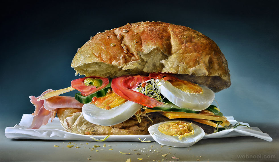
Still life nowadays still holds importance within the style of contemporary art. Paintings of still life would be produced of modern-day food and objects usually in a hyper-realistic style.
Sandwich Realistic Oil Paintings By Tjalf Sparnaay
The genre of Still life began with Netherlandish painting of the 16th and 17th centuries, and the English term ‘still life‘ derives from the Dutch word ‘stilleven‘. Early still-life paintings, particularly before 1700, often contained religious and allegorical symbolism relating to the objects depicted. Later still-life works are produced with a variety of media and technology, such as found objects, photography, computer graphics, as well as video and sound.
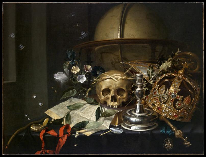
Vanitas Still Life (1662) – Edwaert Collier
Still life in photography
There was then still life photography which was introduced alongside still life paintings. Still life photography became a genre of still life which included the depiction of inanimate subject matter, typically a small group of objects. Tabletop photography, product photography, food photography and found object photography are all examples of still life photography.
This genre gives the photographer more leeway in the arrangement of design elements within a composition compared to other photographic genres, such as landscape or portrait photography. Lighting and framing are important aspects of still life photography composition.
Man-made objects such as pots, vases, consumer products, handicrafts etc. or natural objects like plants, fruits, vegetables, food, rocks, shells etc. can be taken as subjects for still life photography. A range of these items were also quite common in historical still life paintings as well. Still life photos are not close up to the subject nor far away, but at a very head-on angle. The art in still life photography is often in the choice of objects that are being arranged and the lighting rather than the skill of the photographer.
Artist analysis
Still Life with a Skull and a Writing Quill by Pieter Claesz (1628)
Pieter Claesz was a Dutch painter who achieved a striking simplicity and atmospheric quality in still-life representations. Claesz’s increasingly decorative work after 1640 includes lavish still-life displays.
Claesz was a Dutch artist who gave everyday objects great individuality. From the piece ‘Still life with a skull and a writing quill’, many suggested that a skull, a spilled glass with ephemeral reflections, an extinguished light, and a writer’s tools all imply that worldly endeavors are eventually futile. Claesz progressively refined the clarity and incisiveness acquired in this piece over a period of many years, during which he may be considered to have achieved an early maturity.
The painting displayed many of the typical vanitas aspects and was framed up in a dramatic sense with a messy layout of spilled items and other random objects.
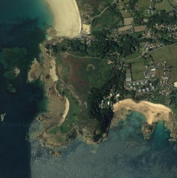
For my first photoshoot, I went to La Cotte which is located in St. Brelades. I started at Le Quaisne beach and made my way into Portelet, then ended my photoshoot at Portelet beach. I chose this area as it is an archaeological site with a lot of rocky areas that allowed me to take a mixture of photographs. Portelet is also known to be a site of special interest meaning that it is protected because it is important to the island’s history, which links to my project. I started my photoshoot in the afternoon around 4/5 pm because I wanted to avoid the harsh lighting that could’ve appeared previously in the day. I also liked the idea of the sun setting and taking my pictures in different lighting instead of just the sun.
map of the area
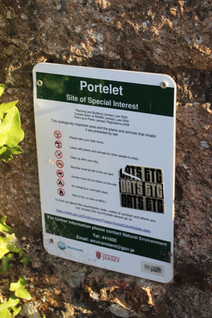
Sign showing Portelet is a Site of Special Interest
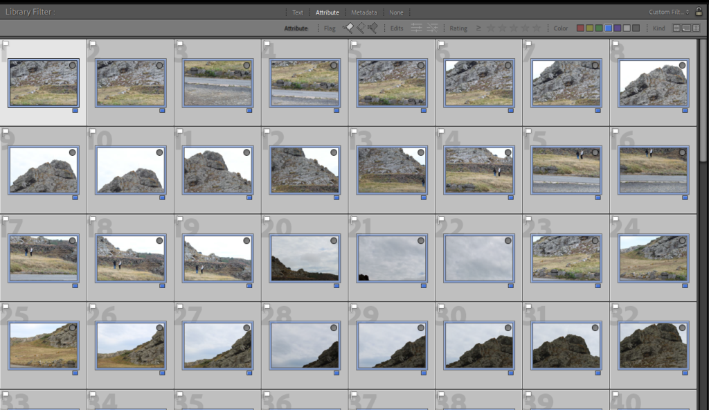
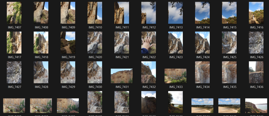
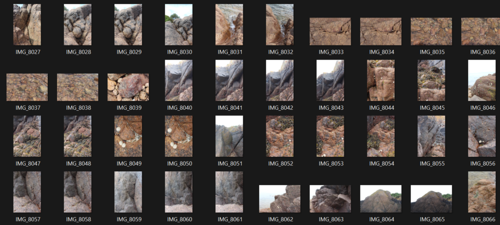
Contact Sheet
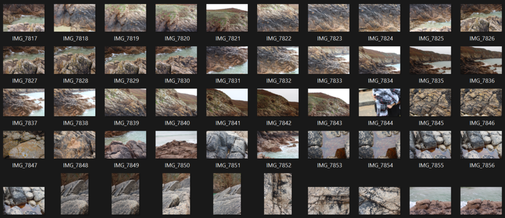
On this photoshoot, I took 300+ images and these are some of the contact sheets. I focused on taking close up of the rocks in order to capture the small details and textures of the different rocks. I also tried taking the images from different angles, heights and distances.
contact sheets
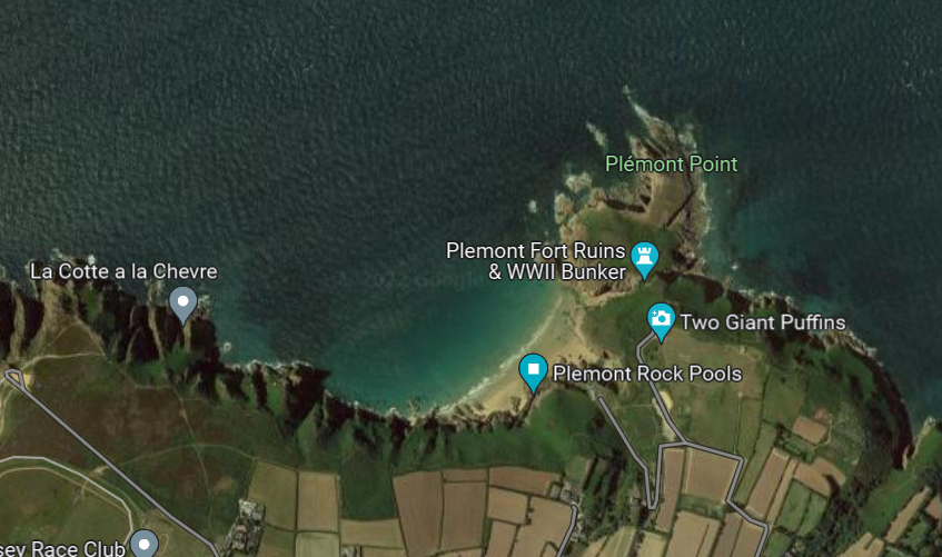
Photoshoot 2 – Plemont
For my second photoshoot, I went to Plemont Bay, also known as ‘La Greve au Lancon’, which is on the west-north coast of the island. I took my photographs in the afternoon on a foggy and rainy day, compared to my previous photoshoot which was taken in sunny weather. I feel like this will make a nice contrast between my images later when editing and putting them together. I stopped at Portinfer Junction which is slightly further down the map and walked for around 15 minutes to the coast, before going down the clifftop and reaching the bay. I started at the Plemont Rock Pools and then made my way along the coastline to La cotter a la Chevre. Before leaving completely I stopped at the Fort Ruins and took more images over there.
map of the area
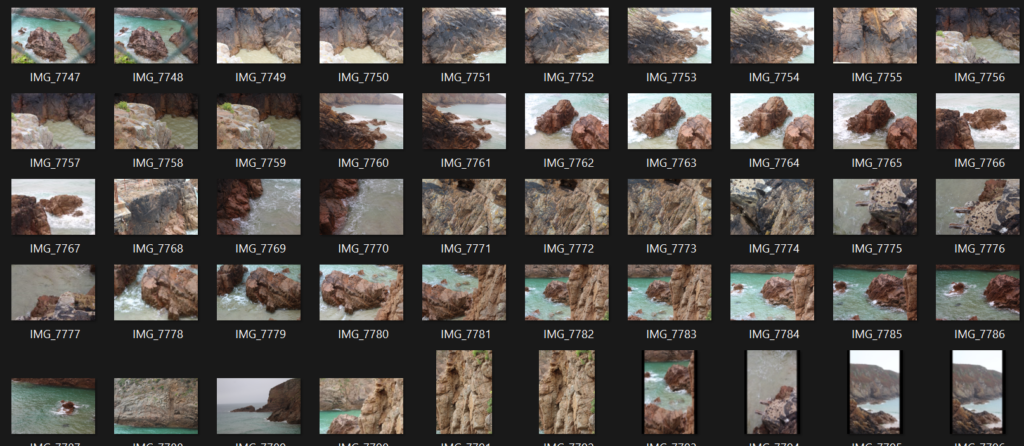
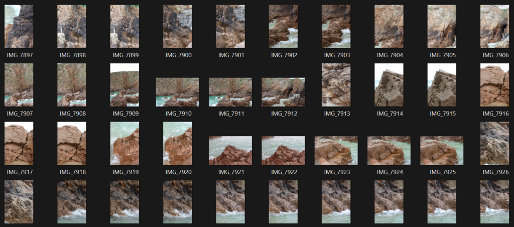
Contact Sheet
This photoshoot consists of around 250 images I took on my walk at Plemont. On this photoshoot I focused on taking my images from a distance and occasionally zooming in for some texture, this is because I was on top of a cliff and at the rock pools which meant that I couldn’t exactly go closer and capture the details that way.
Photoshoot 3 – Gorey
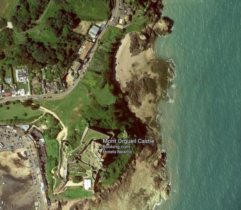
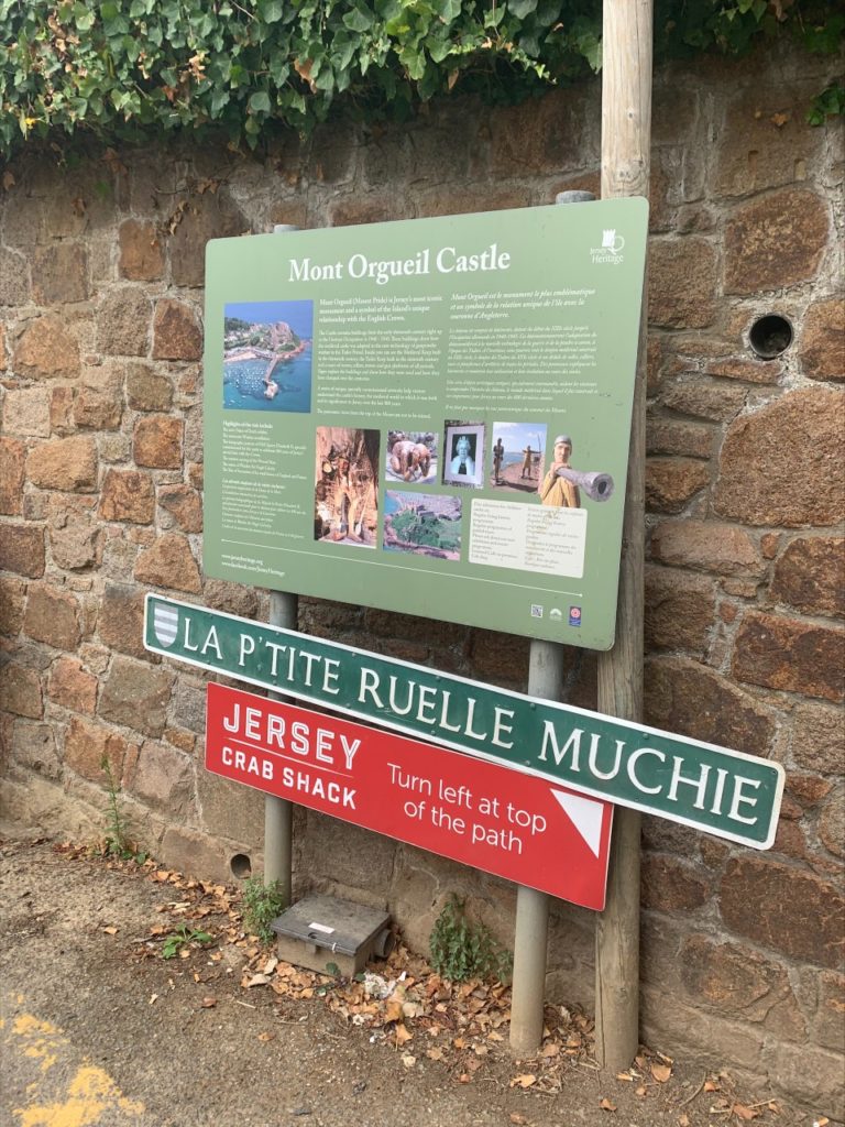
For my third photoshoot I went to Gorey which is located on the east side of the island, in the afternoon. When I got there, I went behind the Mont Orgueil castle and took my images at the beach, where most of the area was made out of rocks. It was quite cloudy outside but still bright which I think made the rocks stand out more.
map of the area
sign at Gorey by where I went to take my photographs
Contact Sheet
These are my photoshoot from Gorey in which I took only around 220 images. This time I focused more on close up images because I really liked the texture of the rocks and all the shells/algae that had eventually fused with the rocks. I also took some pictures of the ocean as I liked the way the waves hit the shore.
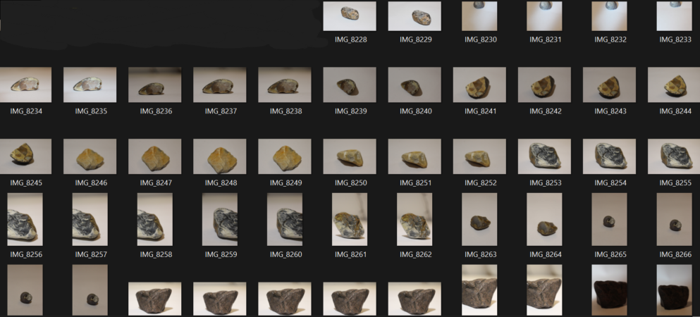
During my three trips, I collected different rocks and shells that I later photographed. I did this by simply placing my objects son to some white paper and photographing them from 1 or 2 angles. The lighting wasn’t good and I wasn’t able to make it better so I didn’t take too many images.