Process
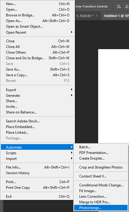
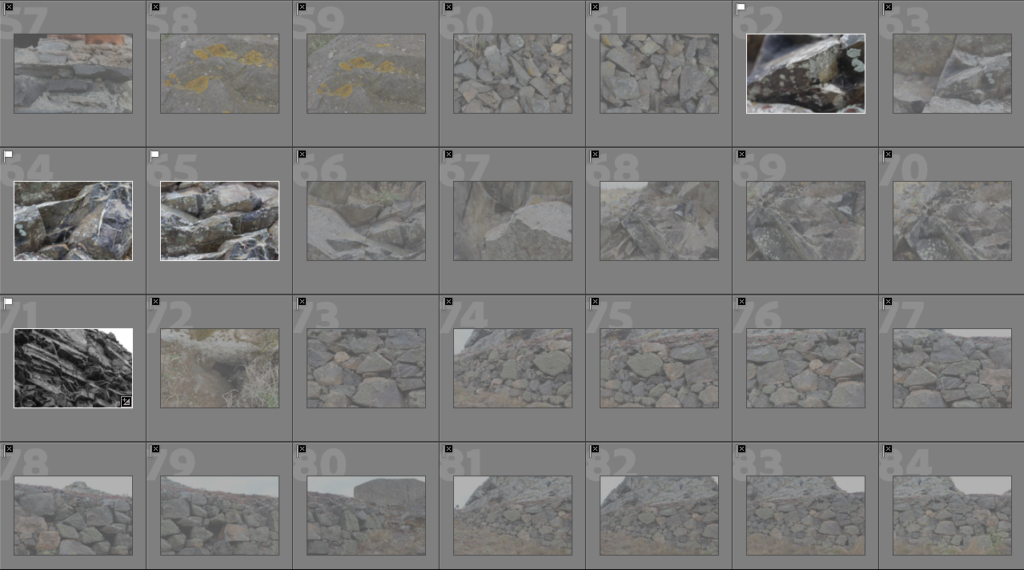
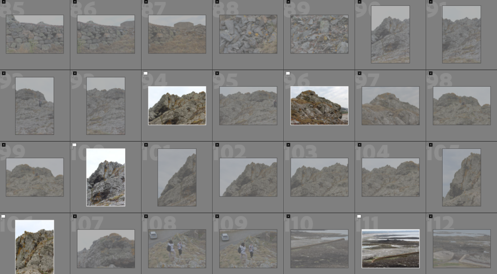
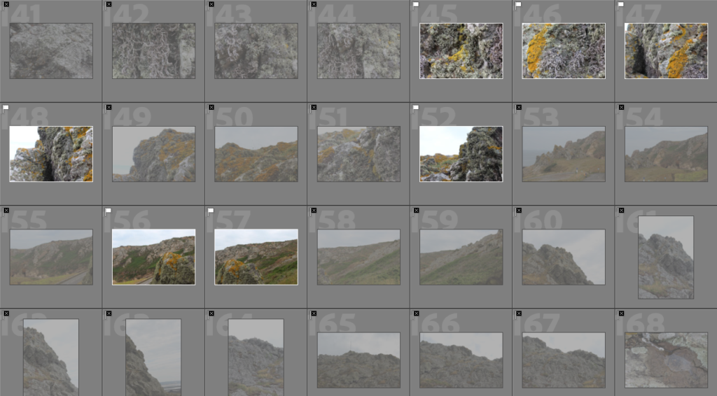
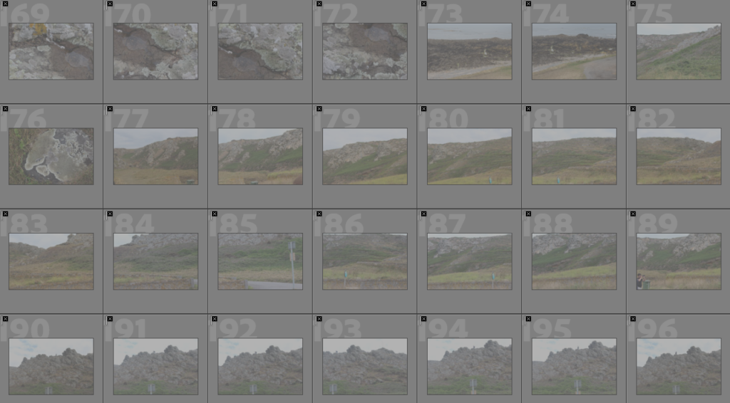
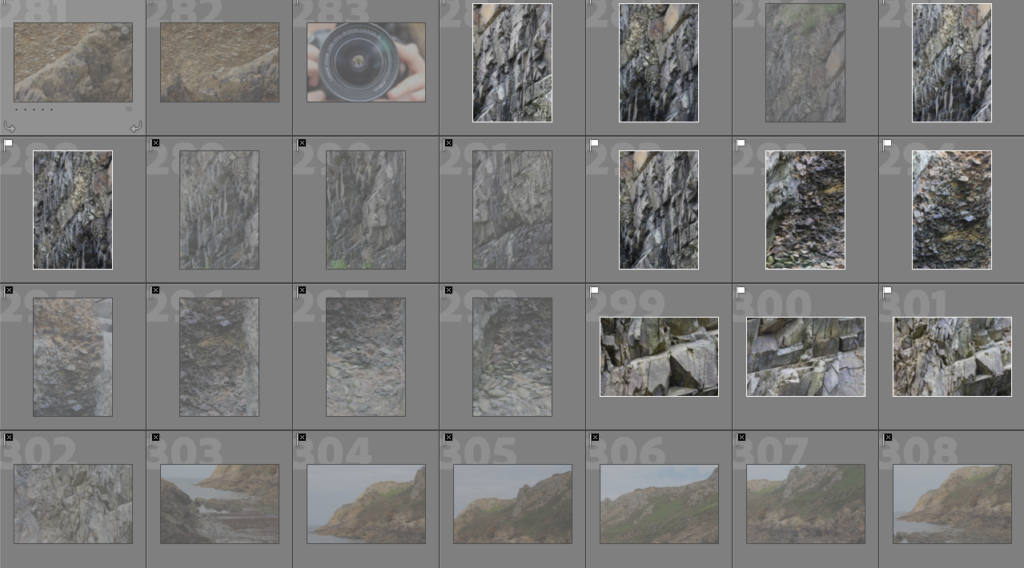
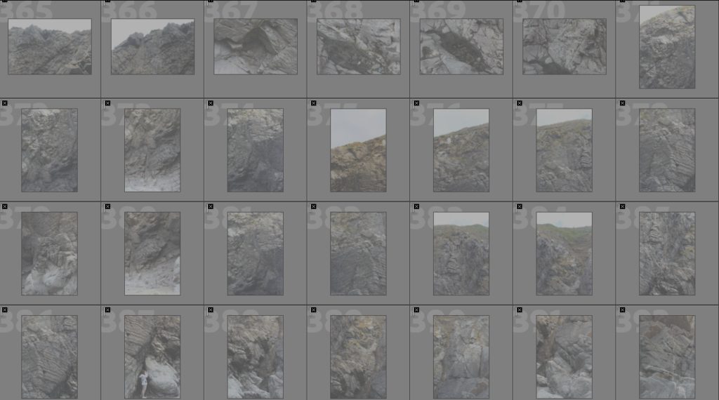
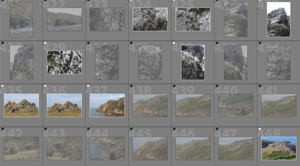
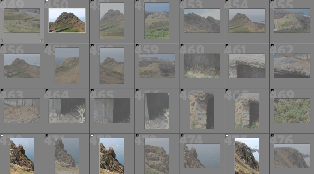
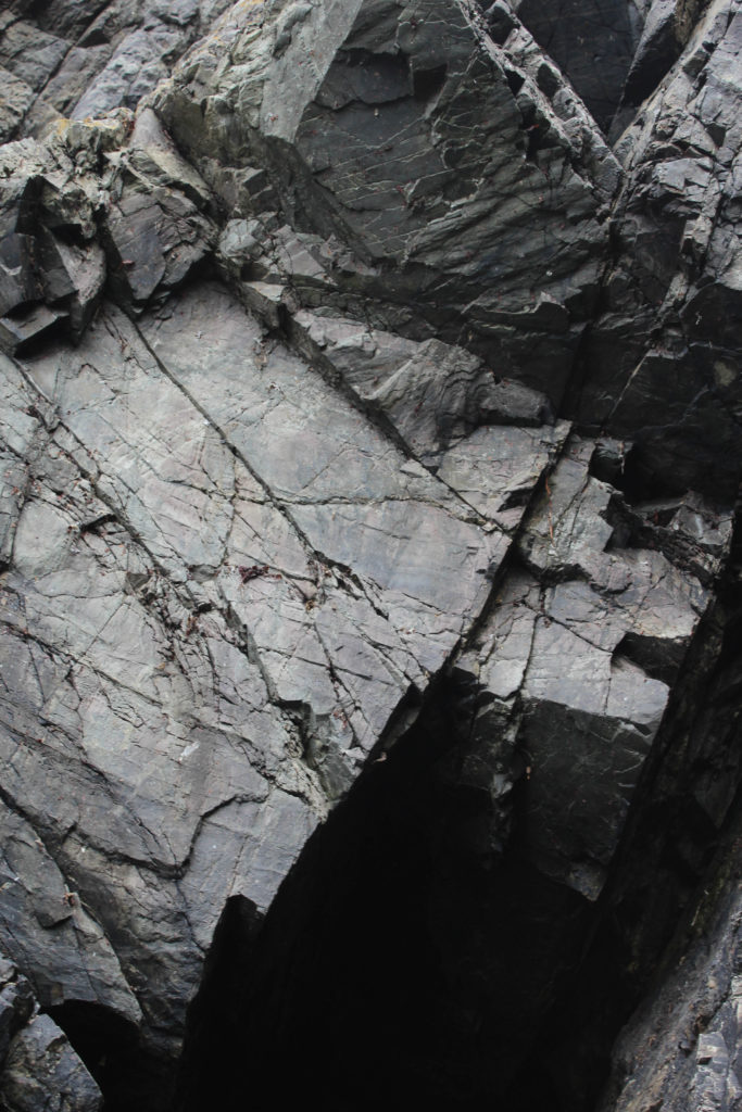
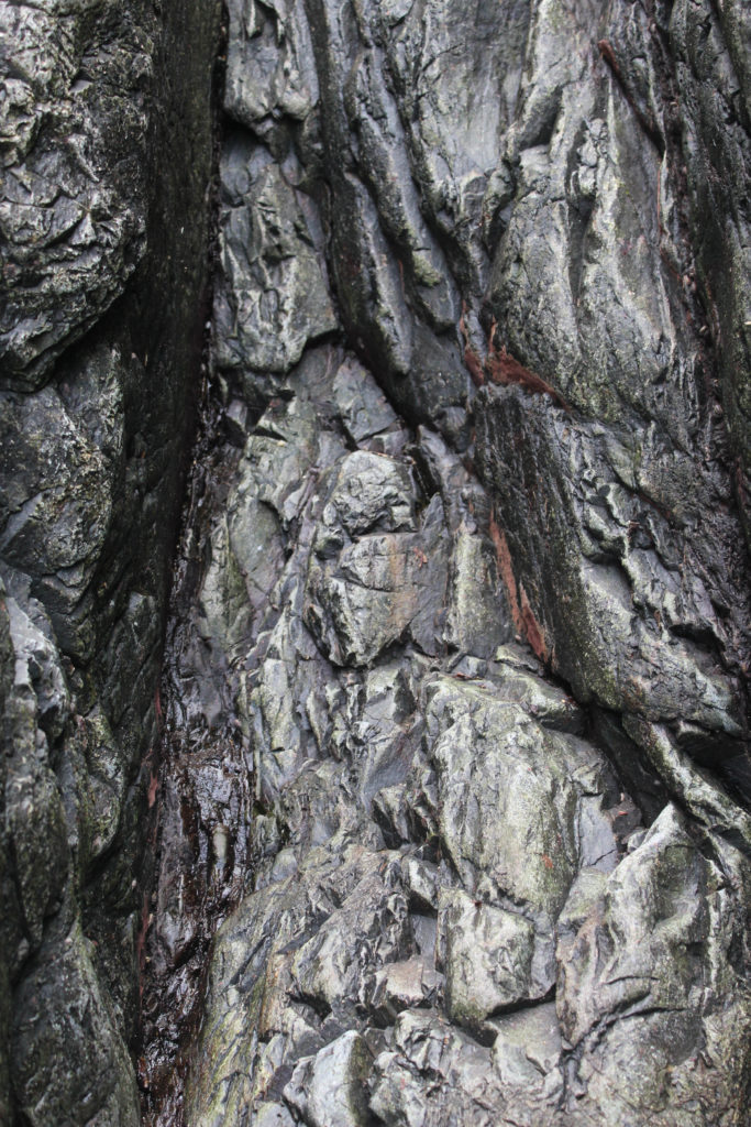
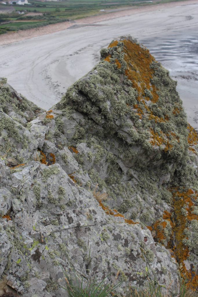
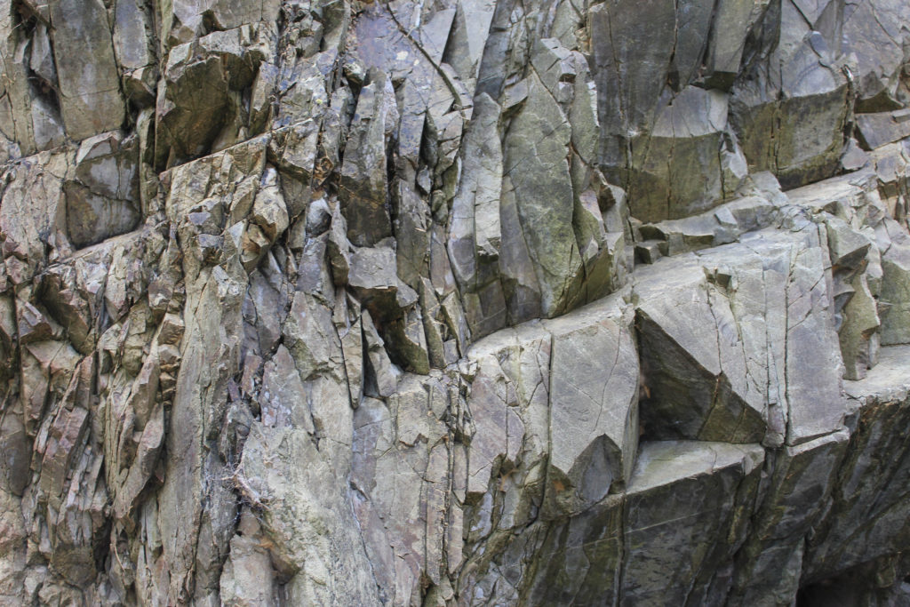
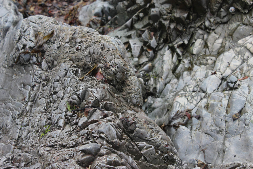
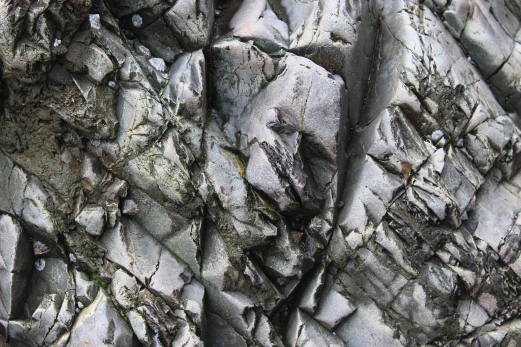
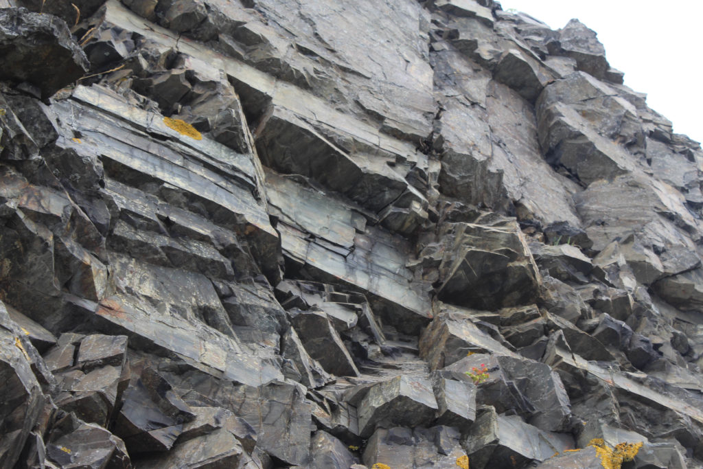
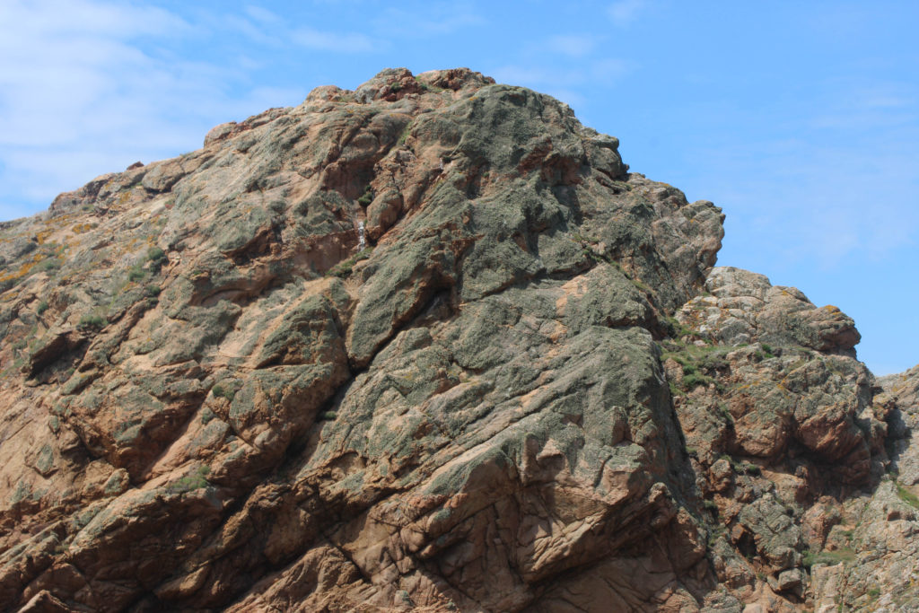
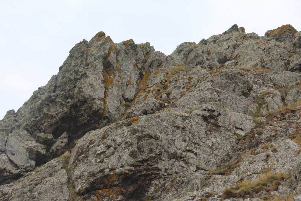
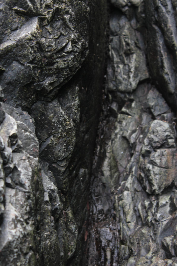
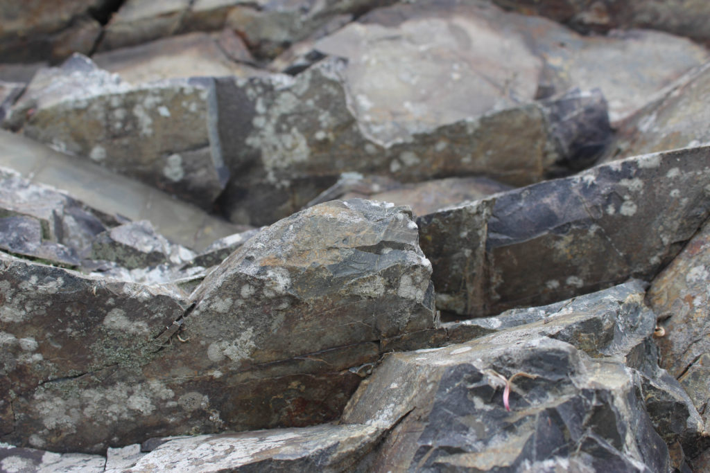
Below I have included some images to help explain the process of how to produce a joiners, inspired by David Hockney’s work. Using Photoshop and the images selected from Lightroom, we used the Photomerge tool to digitally create the joiners. The main advantage of this process is that it’s quick and creates effective joiners as long as long as you use legible photographs.
Outcomes
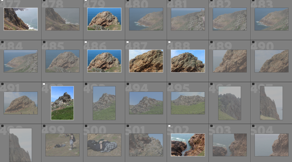
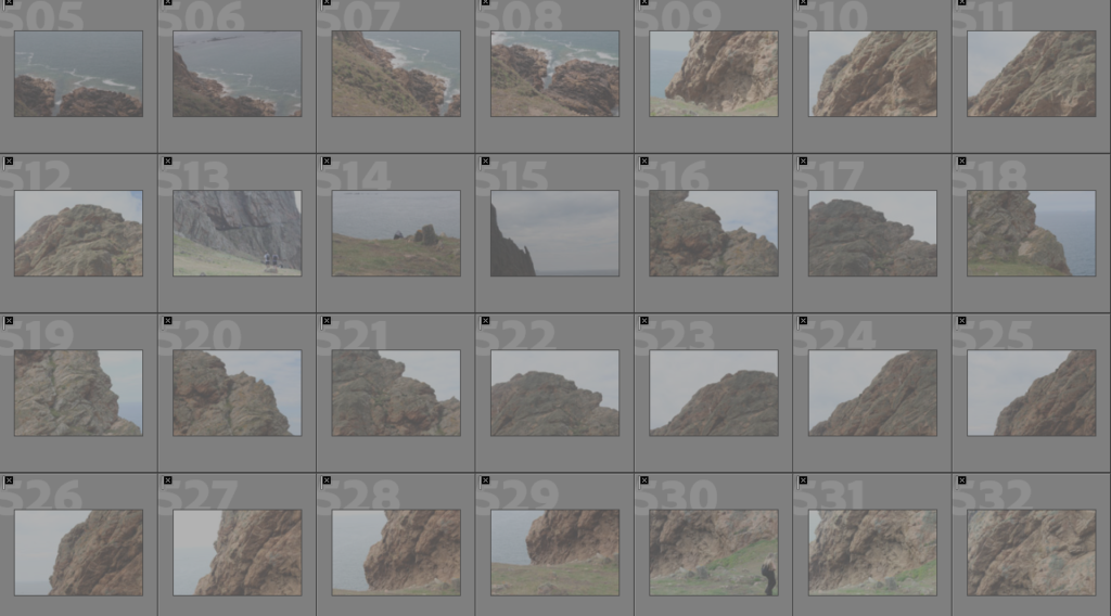
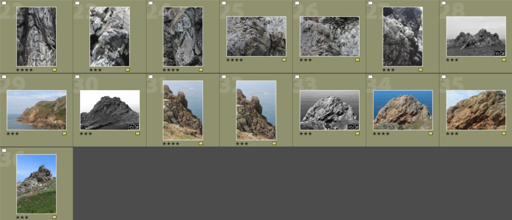
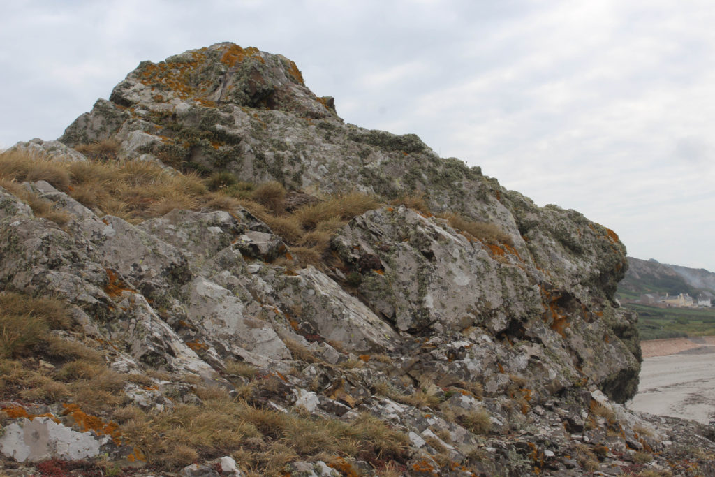
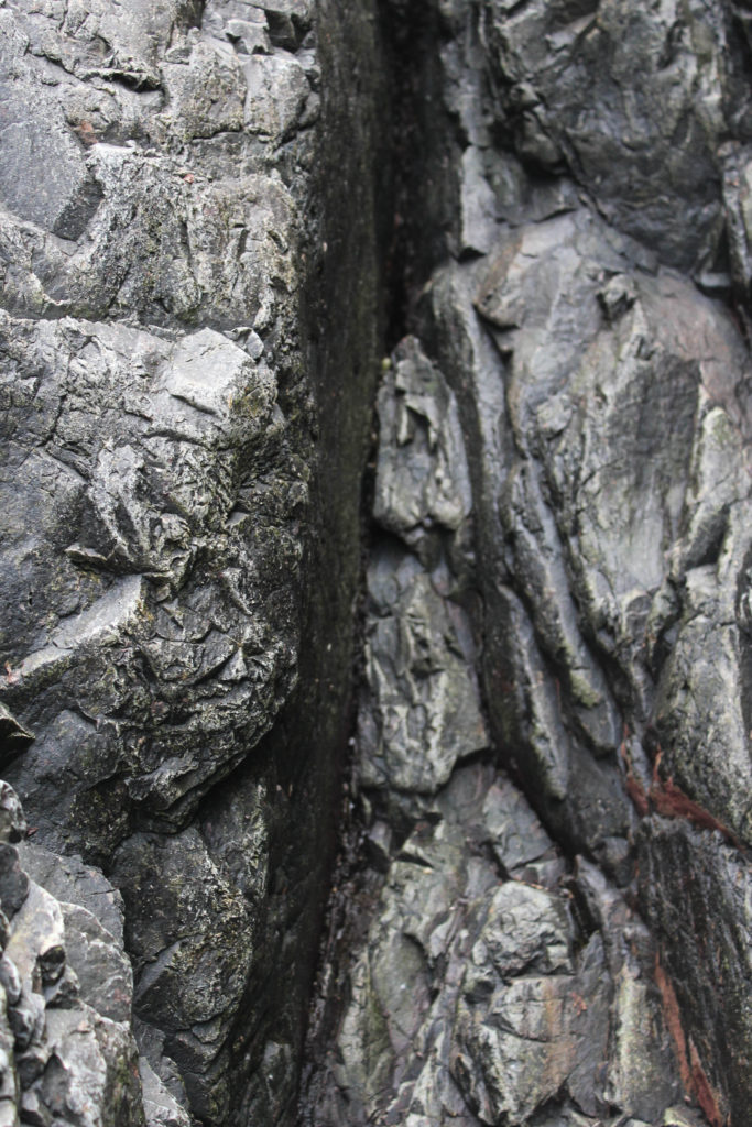
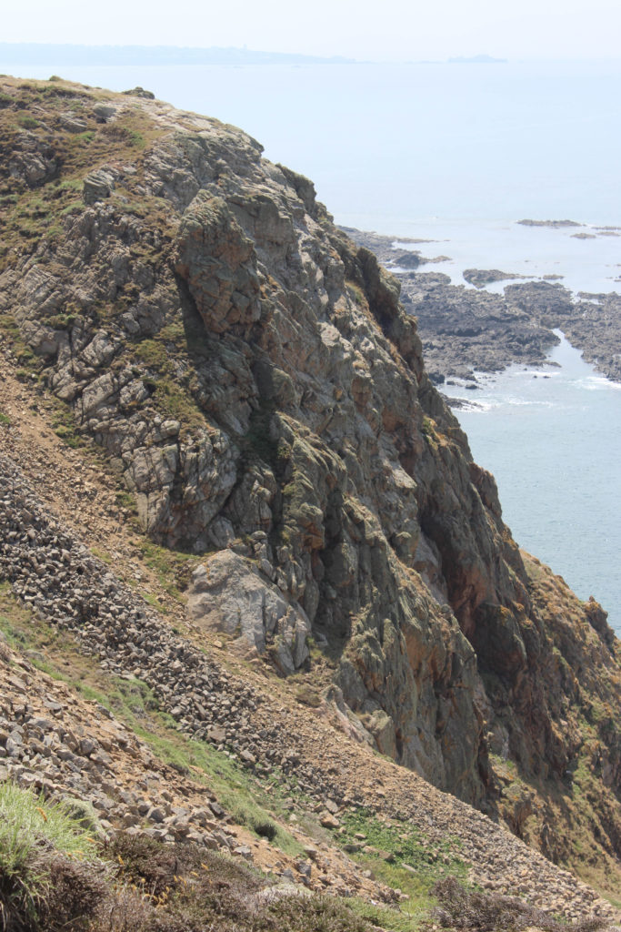
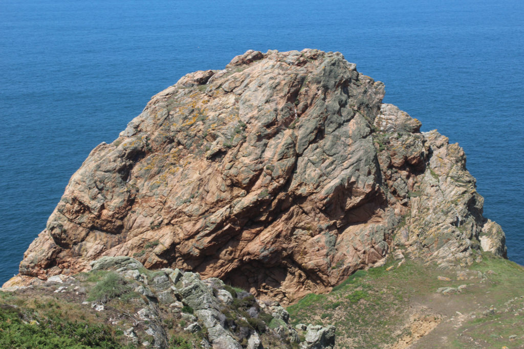
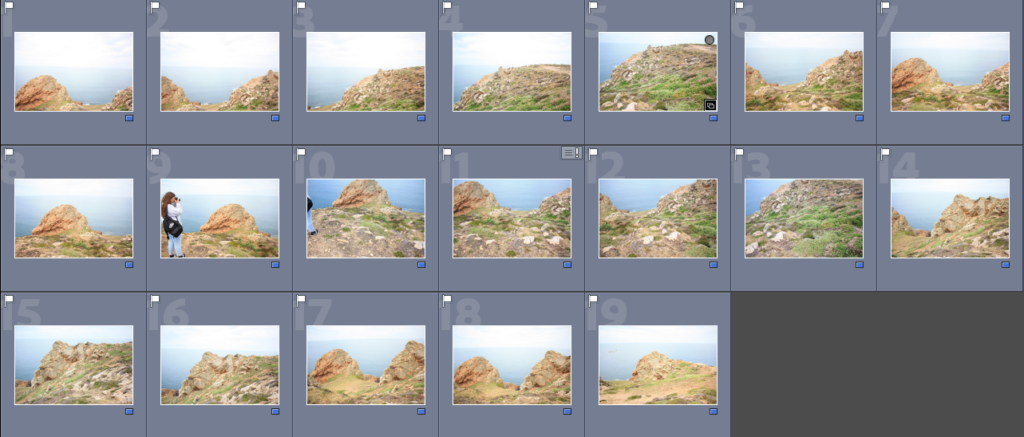
To make the joiner we had to create a quick collection in Lightroom, creating the folder make it easier to export the images into Photoshop to create the joiners. Below I have added some contact sheets so that the process is more visual.
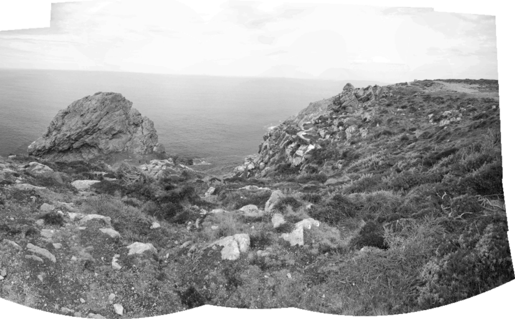
Evaluation: This outcome was created from good original images, the main disadvantage of this piece of its composition. As the angle of the image could be viewed as boring along with the fact that someone is in the joiner, meaning it distracts from the focus of the Sight of Special Interest. Despite this piece not being fully natural, the La Pinacle being in the background means that there is some variety within the piece. The photographs matching up perfectly means that the details in features such as the horizon and rocks aren’t lost.

Critique: This joiner looks very much like my other one, which could be seen as a negative as there isn’t much variation in my work. Furthermore, I think these piece is a little over exposed and the fact that the angle captures more of the ground then the sky and rocks means that all you can see is grass. Despite this, the images used to create this are very legible meaning that the final piece turns out clear and aesthetic.
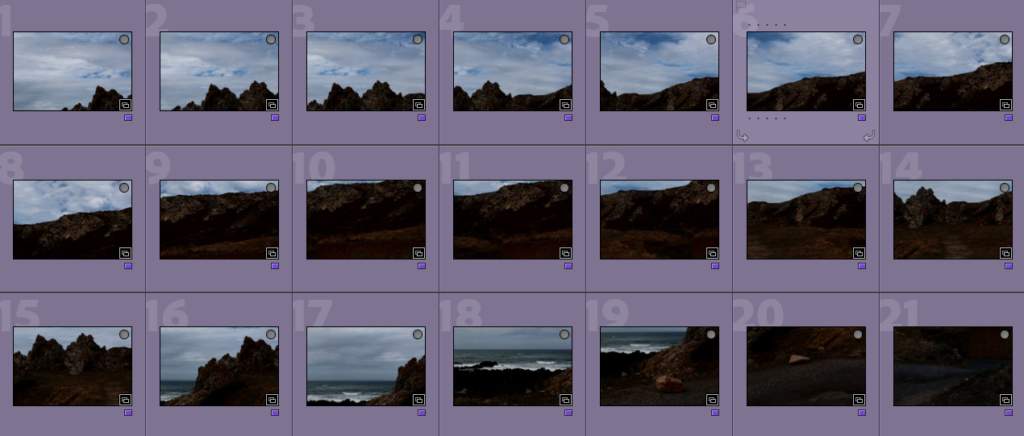
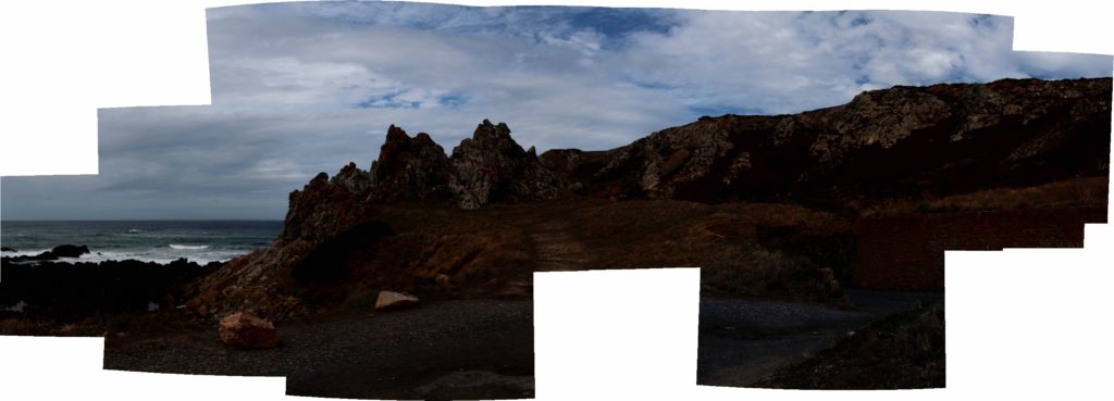
I think that this joiner is one of my best, as the warmer tones in the joiner adds to it’s effect. However, I think that the fact that there is a missing part in the bottom middle of the image creates a bad focal point for it. Despite this, I feel like with lots of editing this could become a lot more successful joiner as I like the location of Stinky Bay a lot, as I think that this is one of Jersey’s most aesthetic geoparks.
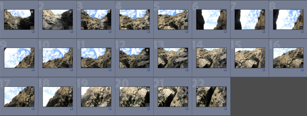
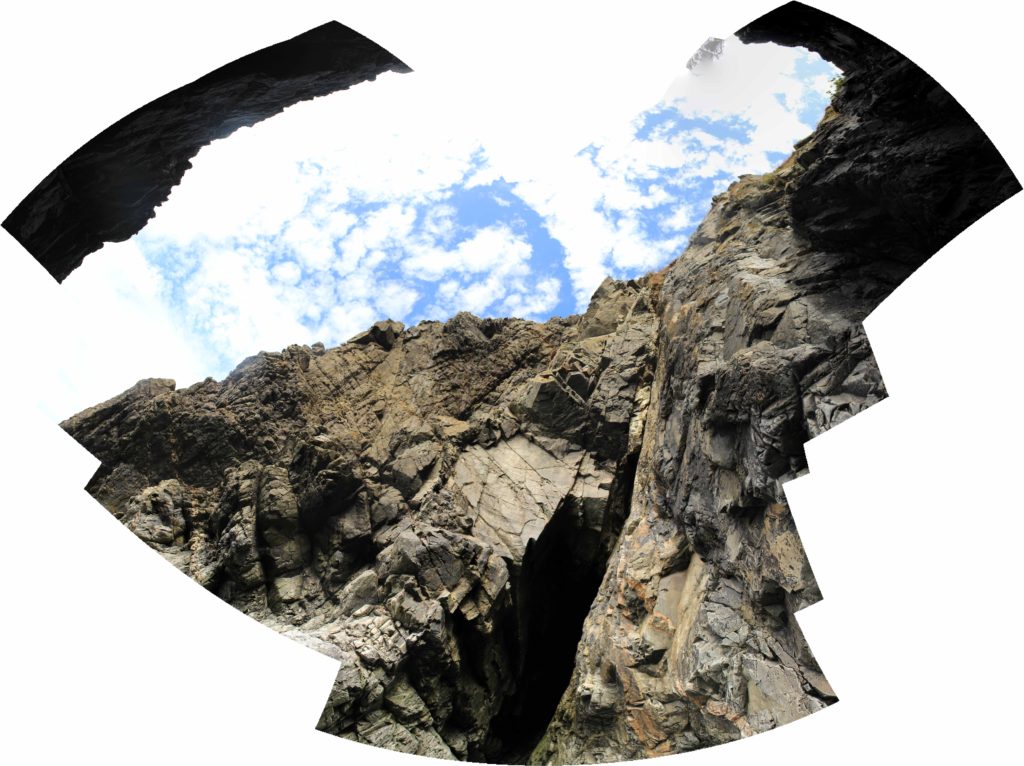
I thought that this would be my best joiner, however it didn’t turn out as successful as I anticipated, I think that the perceptive of this joiner is quite creative, however the final space of the image came out a bit strange and I think that changing the shape through editing wouldn’t fully fix the problems of this joiner.
Experimentation
Below I have taken my joiners and changed them into 3D shapes, I have altered some of their textures to add more depth and variety to my experiments. In my opinion, these make the joiners more fun but don’t really match with David Hockney’s work.
Original Joiner
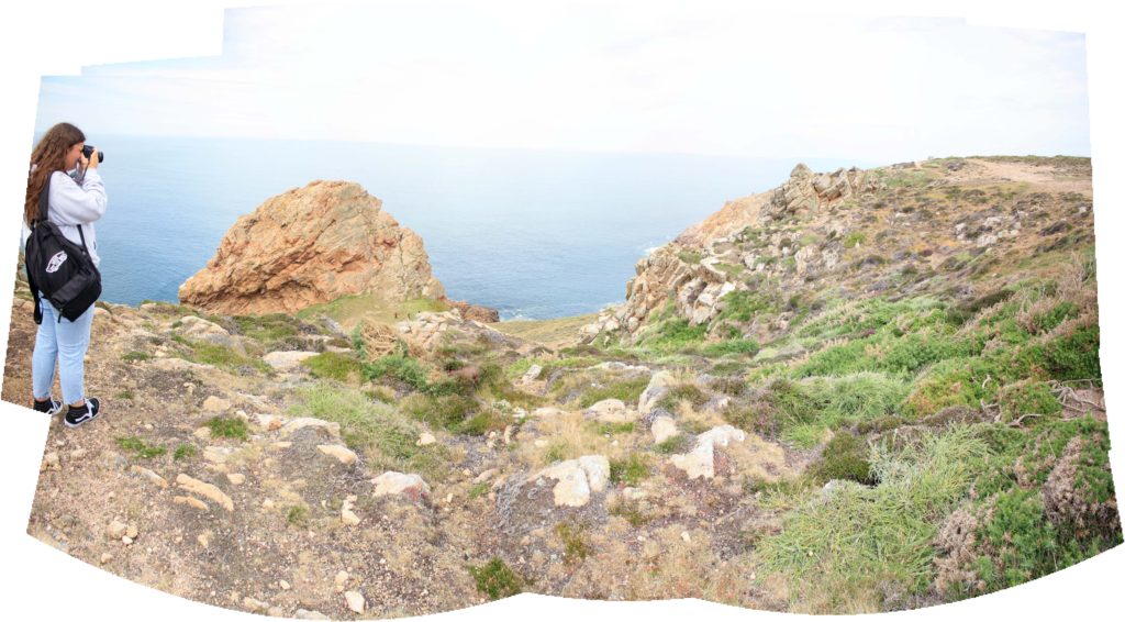
Edited
I think that this joiner is a lot more successful in black and white, this is because more contrast is created between the actual joiner and the white background. I think that more contrast within the joiner there is, the more successful in the first place.
Original Joiner
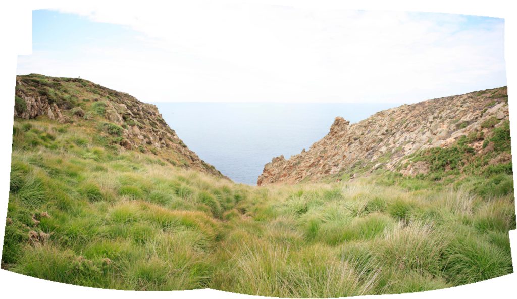
Edited
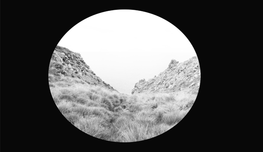
The edit on the right is my favourite of all of my joiners, again there is lots of contrast as I have washed out the joiner by purposefully having a very white sky, this along with the circular shape means that there is lots of focus on the picture itself rather than the background.
Original Joiner

