Still Life photoshoot

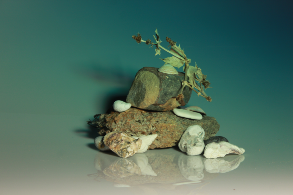
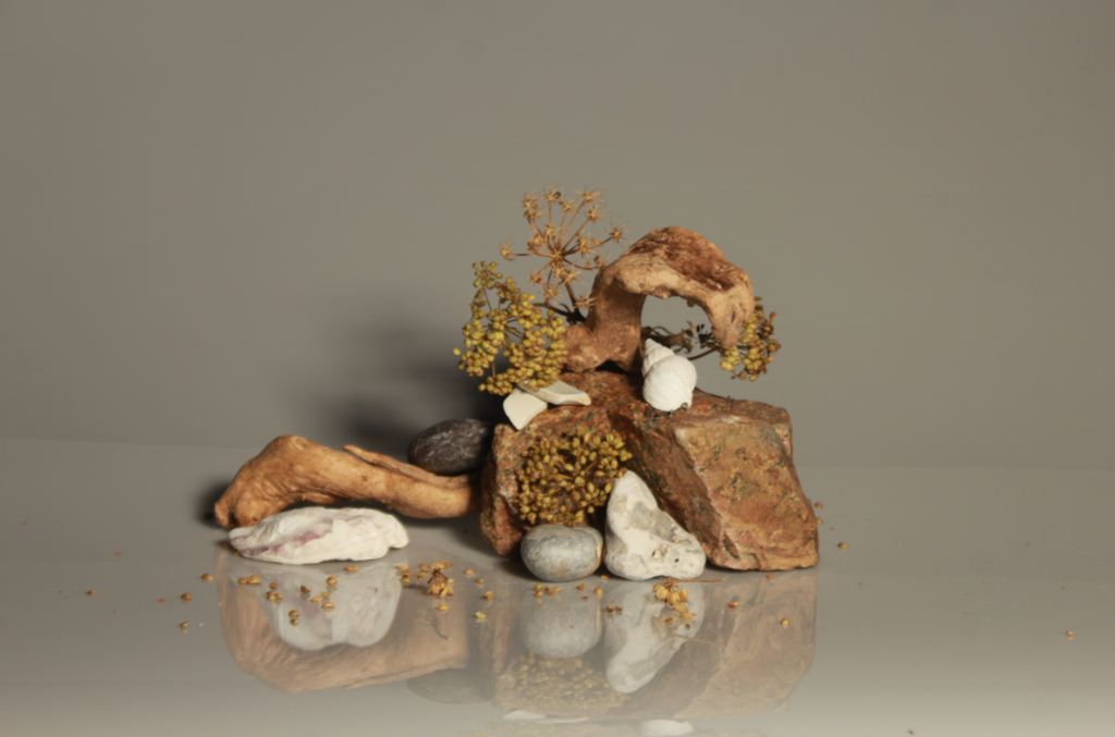
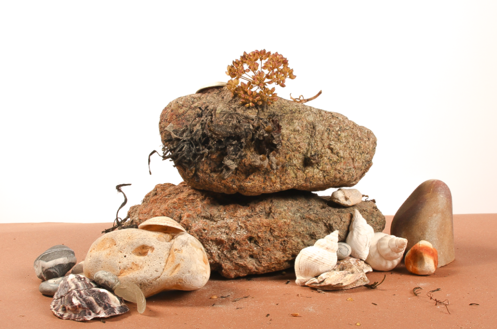
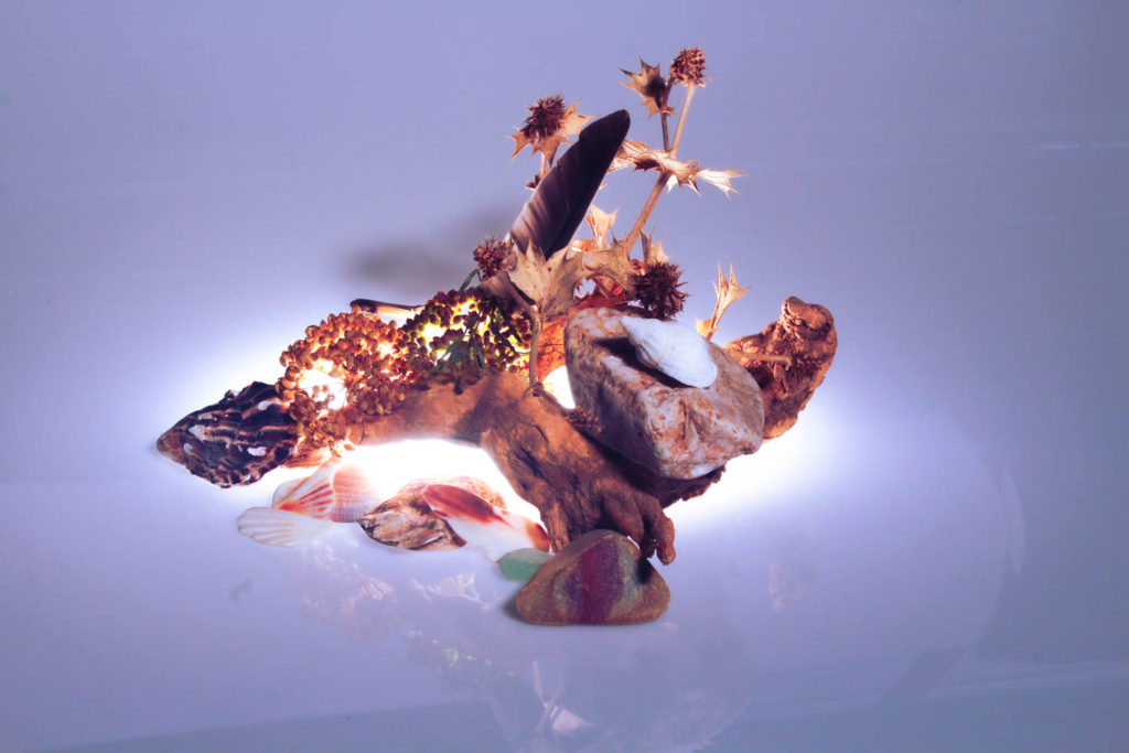
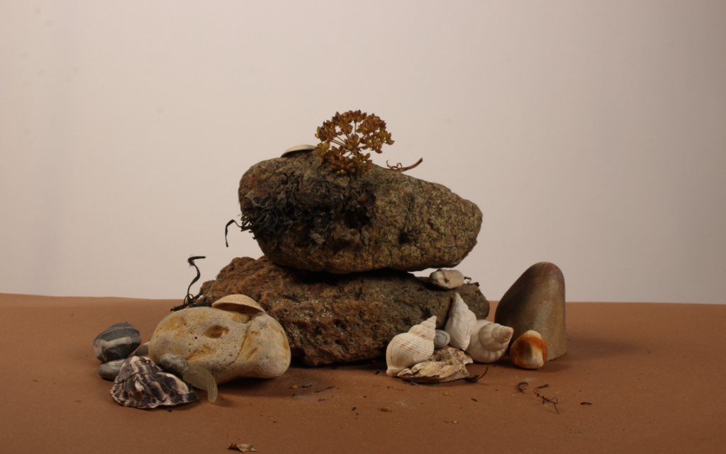
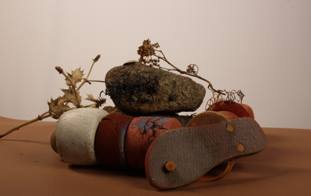
We went down to the photography studio and took a variety of still life images of objects that relate to the ‘My Rock’ project such as rocks, shells, seaweed etc that could be combined with previous photoshoots later on. We used two different types of lighting [still lighting and flashead lighting] with different backgrounds in order to experiment with the intensity of the lights and accentuate the quality of each image along with pairing each object composition with a backdrop that would allow the details the emerge within the image.

Still Lighting Set-up
Flashead Lighting Set-up

Still Lighting:

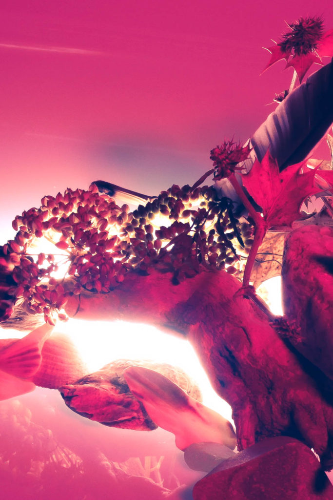
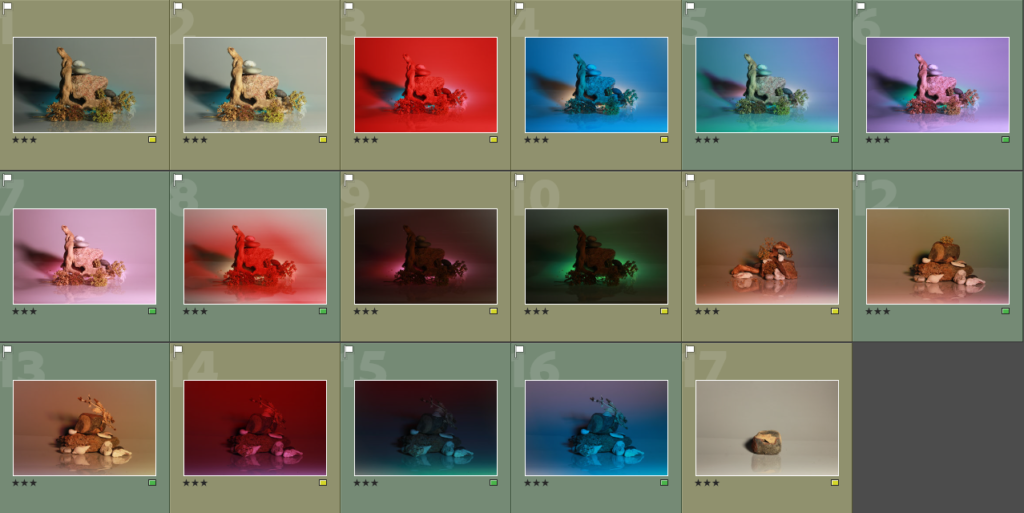
When taking images with still lighting, we decided to move around our composition between photos, adding and removing objects so we could later decide which ones we preferred and which ones would be scrapped. Along with that, we experimented with holding coloured acrylic sheets in front of the camera lens, tinting our images a variety of saturated colours, and seeing how it affected how the photo looked and felt from a more meaningful perspective. Overall, I think our photoshoot was successful as we took a bunch of well lit photographs, however, I feel as though we could go back and take more still life photos of objects on their own.
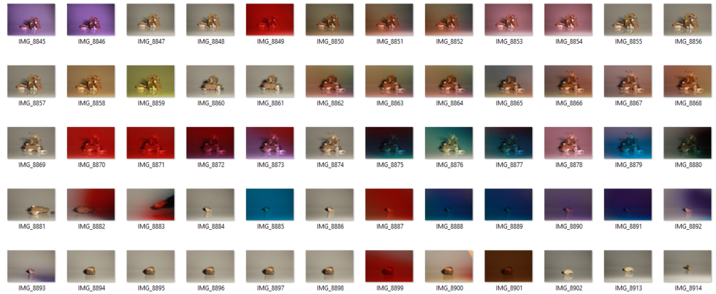
Contact Sheet

Some of my best shots:

Flashead Lights:

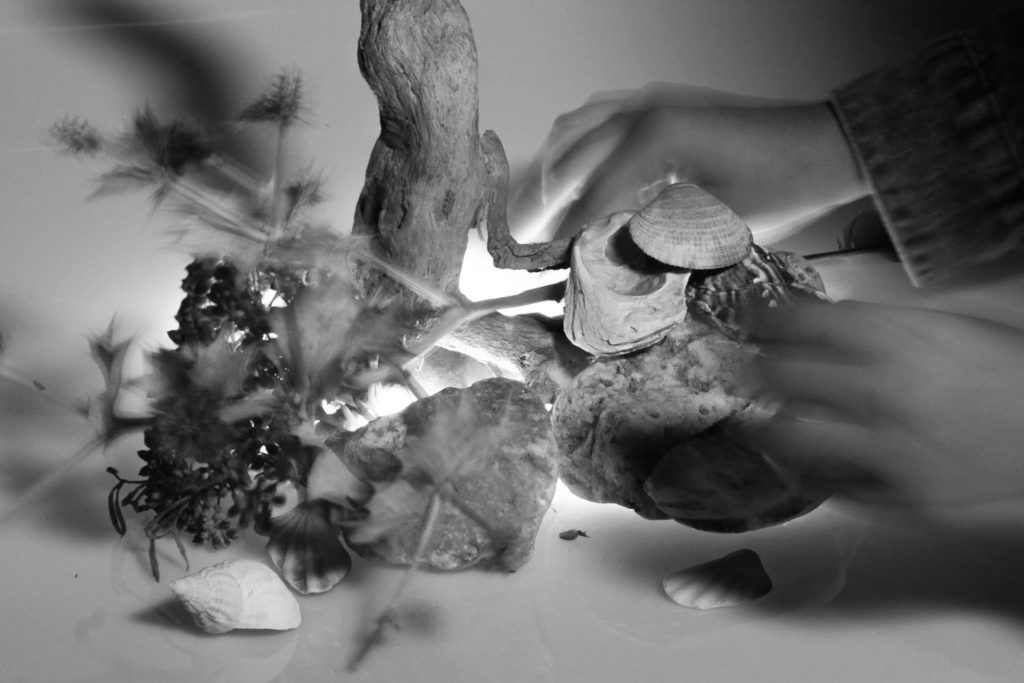
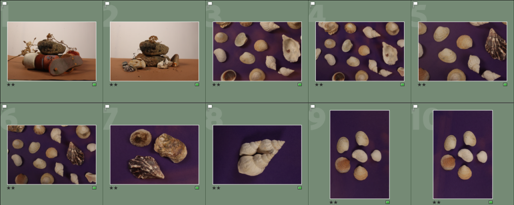
When taking images using the flashead lights, we spent a lot of time getting our framing right as the backdrop was coloured paper and we wanted to make sure we didn’t get the table itself in frame which led to less photos being taken. We tried taking photos from different viewpoints [i.e: eyelevel and bird’s-eye] whilst trying to keep the lighting consistent which was a struggle due to the amount of shadows that would appear from all the objects. Overall, I think our images came out decent, however, I do think we could improve and could have a second photoshoot with the flashead lights.

Contact Sheet

Some of my best shots:

Photo-Sculpture Artist Research

I have selected an array of images to use as inspiration for my own photo-sculpture. I like the idea of distorting my original images and focusing on shapes and layers in my sculpture.

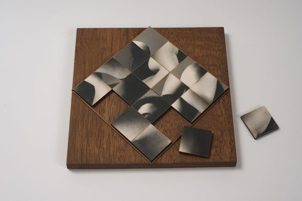
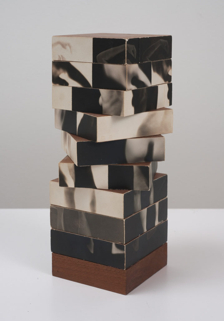
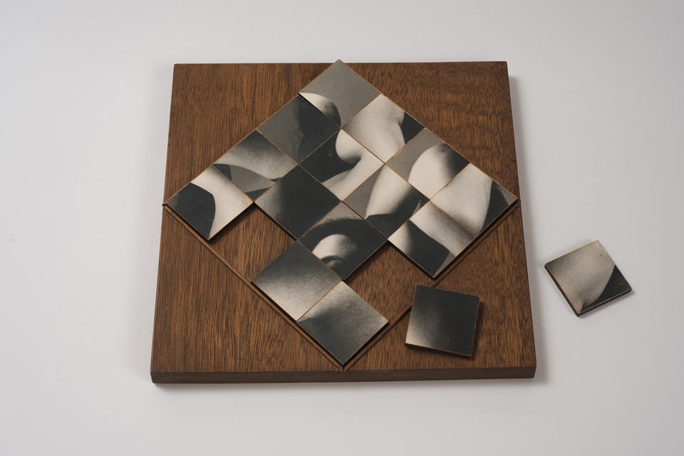
“There is a vast difference between taking a picture and making a photograph,” declared Heinecken, who rejected the idea of photography as a mere recording device. In this work, a series of segmented photographs of a nude female figure are affixed to the sides of nine rotating blocks. Borrowing practices normally used in sculpture or modernist abstraction, Heinecken expanded what we expect of photographs, here insisting on their interactivity, dimensionality, and ability to puzzle.

https://artmuseum.princeton.edu/collections/objects/18932

I chose to look at Fractured Figure Sections because it is a unique and memorable photosculpture. Heinecken’s work tends to feature Multiexposures and inverted colours and this piece is no different, it does however have the added 3D element of there being multiple faces, as well as the fact that these faces can be moved to create the desired image of the viewer. This could tie into ideas of the portrayal of women and beauty standards as the faces of the sections are all based off of one original image of a naked woman. This idea of customisation by the viewer could tie into the male gaze and women being expected to change themselves in order to be seen as appealing by other people.

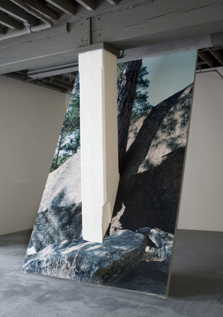
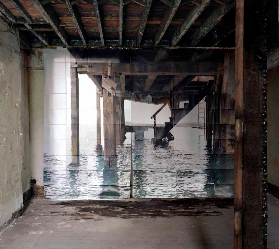
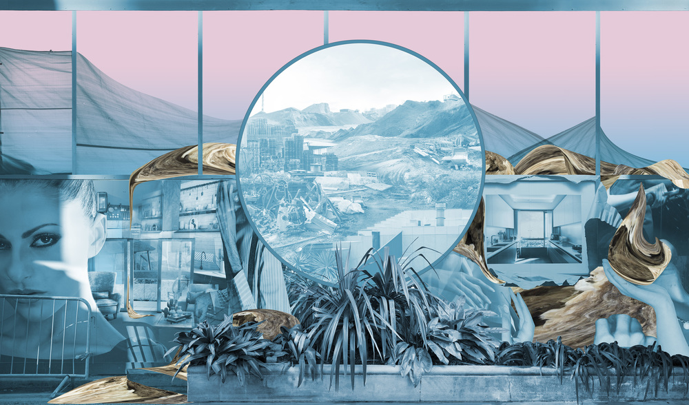
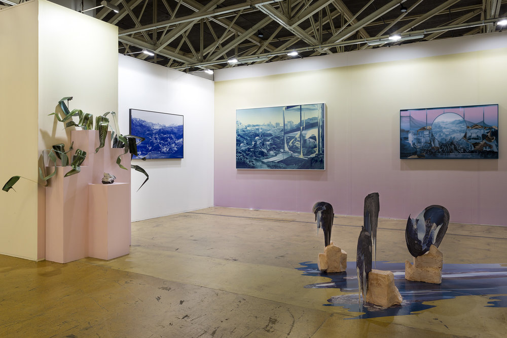
Goudal’s work often features images of one environment placed inside a different contrasting one. Jetée features a collection of images of a pier placed inside some kind of run down, industrial looking room. Both places are old and manmade and Goudal made sure to line up the perspectives of the interlope between images to make their combination more seamless, while also leaving the noticeable cracks between the images of the jetée. The water on the floor below the pier image make it look as if water has spilled through, creating another strange connection between the two images. Goudal’s pieces are often about contrast, often between manmade structures and the natural world, which is seen in this piece as well, the warms dark greys of the indoor environment contrast the lighter cooler colours of the outside world.

photo sculptures

Artist Research

For my research and inspiration, I looked at work from Felicity Hammond– an emerging artist who works across photography and installation. Fascinated by political contradictions within the urban landscape her work explores construction sites and obsolete built environments. Her sculptures are abstract in the way that they are all small parts of a larger sculpture that constructs a landscape.


First Model Idea

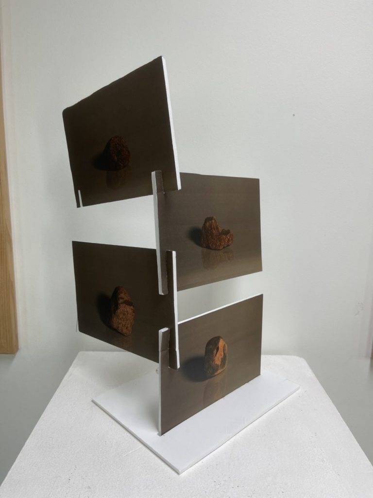
My first idea is to use these 4 photos from the My Rock project, and stack them similar to an ascending spiral staircase.


Experimenting

After printing the photos and attempting to stack them I realized it would be difficult to get them to stand straight without drooping so I experimented with another layout similar to a directions post which came out better than my first idea.

Mounting base photo into the base by cutting a slit
Type of slit used to stack them

Final Version

For my final version, I will be more precisely measuring the slits on the photos, as well as on the base to make sure the model stands sturdy and straight. I will also be using toothpicks to create a sort of spine for support.


Wind Chime Idea

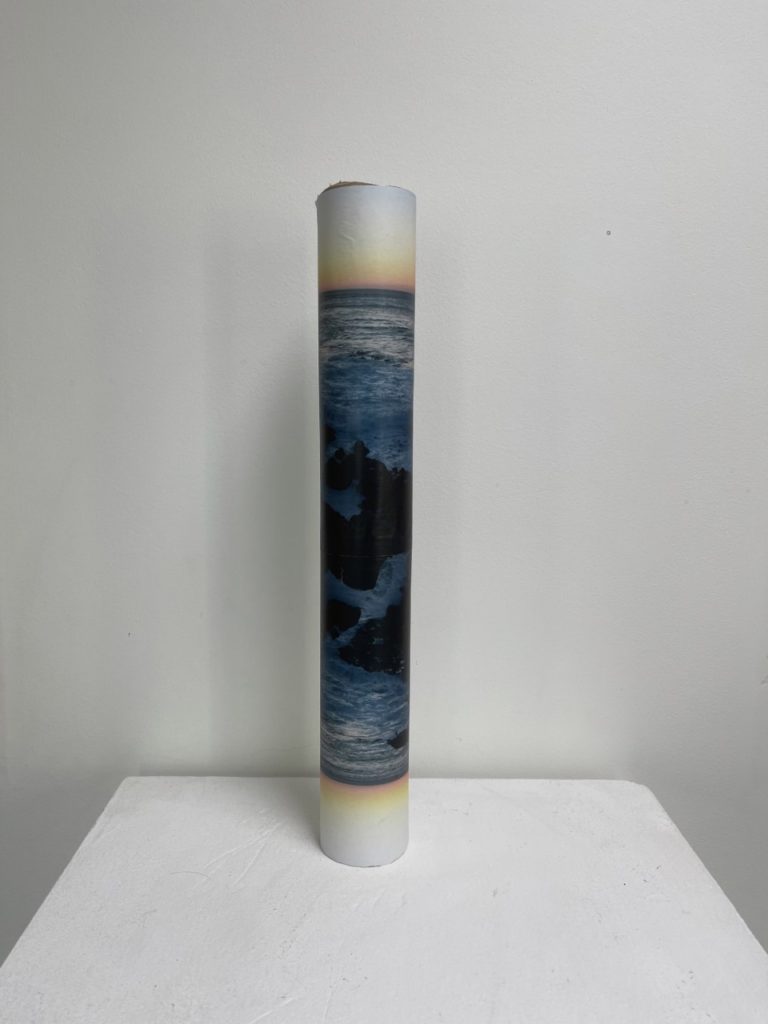
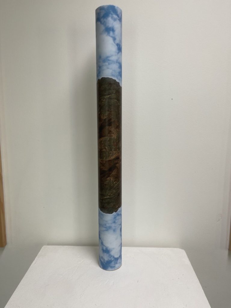
My second idea was to wrap two photos around a cylinder creating a mirrored effect, and then hand 3/4 of different sizes at different heights to create a sort of wind chime.


Roll 1
Roll 2

Still life photography (finish)

Is a genre of photography used for the depiction of inanimate subject matter, typically a small group of objects. Similar to still life painting, it is the application of photography to the still life artistic style.

History of Still Life

-Still life is usually about metaphors / symbolism (i.e death, love, fragility of life, etc)

Still, life has historically been used as a way to present symbolism for real life, for example early Netherlandish paintings of the 16th and 17th centuries often contained religious and allegorical symbolism relating to the objects depicted. This then developed to more recent history with photography- allowing more to be captured more easily. This genre gives the photographer more leeway in the arrangement of design elements within a composition compared to other photographic genres, such as landscape or portrait photography. Lighting and framing are important aspects of still life photography composition. Manmade objects like pots, vases, consumer products, handicrafts etc. or natural objects like plants, fruits, vegetables, food, rocks, shells etc. can be taken as subjects for still life photography. Typically, still life photos are not close up to the subject nor far away, but at a very head-on angle. The art in still life photography is often in the choice of objects that are being arranged and the lighting rather than the skill of the photographer. Still life derives from the Dutch word still even, coined in the 17th century when paintings of objects enjoyed immense popularity throughout Europe. The impetus for this term came as artists created compositions of greater complexity, bringing together a wider variety of objects to communicate allegorical meanings.

Analysis of Key Painting

Jan Brueghel – Bouquet in a Vase

Brueghel has used

3D PHOTO SCULPTURE Artist references

Robert Heinecken

Robert Heinecken was an American artist who referred to himself as a “paraphotographer” because he so often made photographic images without a camera. He was born on October 29th 1931 and died on May 19th 2006.

examples of his work

Heinecken extended photographic processes and materials into lithography, collage, photo-based painting and sculpture, and installation. Drawing on the countless pictures in magazines, books, pornography, television, and even consumer items such as TV dinners, Heinecken used found images to explore the manufacture of daily life by mass media and the relationship between the original and the copy, both in art and in our culture at large.

Image analysis

This image/sculpture shows a stack of rotating images which create multiple images when aligned in different ways, like a puzzle. the images created by the puzzle are pictures of the human form and can be rearranged to create different forms. This could be suggesting that the human form is just like a puzzle and can be very confusing at times.

Lauren Pascarella

Lauren Pascarella was born in Hollywood, FL in 1984.  She studied at New World School of the Arts in Miami, Florida from 2003 to 2007, majoring in Photography. She is currently working in cross-disciplinary genres, including New Media and digital photographic installations. She lives and works in Brooklyn, New York. 

examples of her work

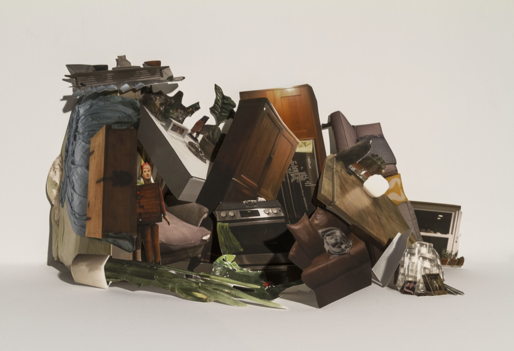
Pascarellas process utilizes photographs of printed and manipulated photographs, “I have the ability to shift perspective”. At times, the flat photographic images behave just as if they had the depth of their real world counterparts. In other instances, they are arrayed in a manner that wouldn’t be possible without shedding a dimension. “When examining my work, the viewer is confronted with an unsettling situation that demands correction. Whether the subject is a single item or a cluster of disjointed objects, the mind will attempt proper placement, but without satisfaction”.

Image analysis

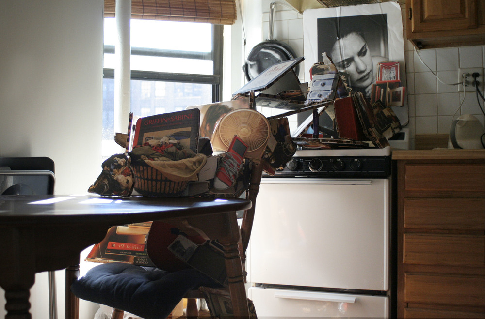
The image above shows a lot of clutter in the kitchen of the artists house which looks like it is placed very random at first. As the artists states, “When examining my work, the viewer is confronted with an unsettling situation that demands correction”, in this case the unsettling situation being a lot of clutter which the viewer wants to clean up. This idea could be backed up by the photo of the woman in the back of the photo who also looks unsettled or even frustrated. The clutter has been placed this way with a purpose, to create a unique sculpture like image where the viewer wants to correctly place the objects where they belong, but without satisfaction.

Studio Still Life

The final images from my first shoot in the studio using the objects given, I decided to use this shoot as an opportunity to experiment with lighting and colour.

I sorted through my images using P and X and chose ones I thought would have the most editing potential, during the shoot I experimented with some coloured lights to add some interest.

Here I shifted the green into a blue and the shadows into a more pinkish colour, I also upped the texture and contrast.

3d photo structure final

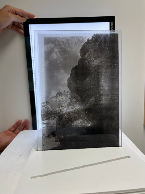
I created a structure consisting of a foamboard base, sheets of Perspex and put a light behind it, the images were printed onto transparent paper so that they could be layered in front of the light.

I think for a display I would need a stronger light so the images were clearly more visible, even better if I could make lighting fixtures which go in the base underneath the Perspex slides illuminating the image itself.

3D PHOTO SCULPTURE – JOSEPH PARRA and mary ellen bartley

Joseph Parra was born in South Florida and currently resides in Baltimore, Maryland where he received a BFA at the Maryland Institute College of Art (MICA) with a major in Painting, a minor in Art History, and a concentration in Printmaking. He has always had an interest in working with aspects of identity in relation to the human figure. His work has come to challenge the traditions of portraiture through acts of concealment and exposure; a reflection of the mind transposed onto a surface.

“Remember, today is the first day of the rest of your life. Don’t be bound by yesterday, just look forward“-Joseph Parra

Examples of his work

Exposure and concealment are Parra’s tools, carried out via printmaking, digital printing, drawing, sculpting and painting. While viewers connect with the figures, they are also silently confronted by the figures’ mindless expressions, illuminating that they aren’t aware of their voyeur.

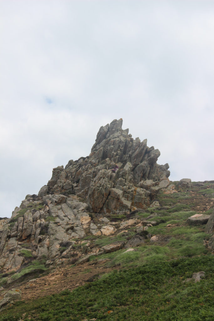
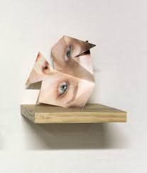
Joseph Parras work could be an inspiration towards my 3d photo sculptures because of the way he creates the 3d effect. I really like the way he uses crumpled paper to create distorted faces and present them in an effective way. I could use the idea of rolled up paper with my images of rock formations to make a 3d sculpture in a similar way to Joseph.

Mary Ellen Bartley

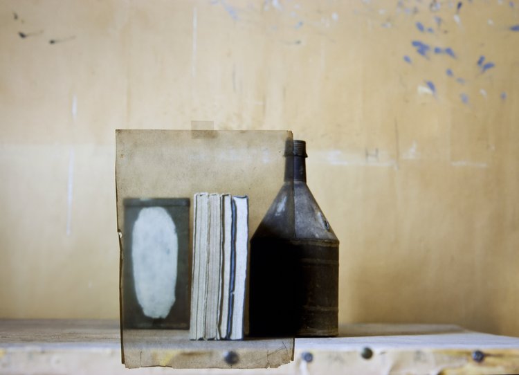
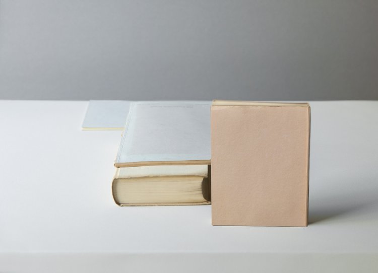
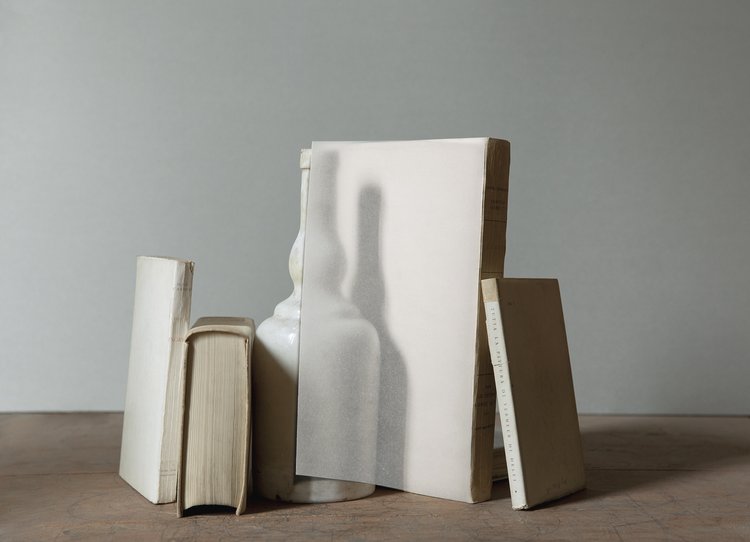
Mary Ellen Bartley is known for her photographs exploring the tactile and formal qualities of the printed book, and its potential for abstraction. By emphasizing the unique “aura” and materiality of printed matter, Bartley’s work offers a celebration of textural and tactile properties, a particularly potent act in this increasingly digital age.

Examples of her work

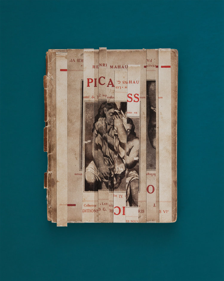
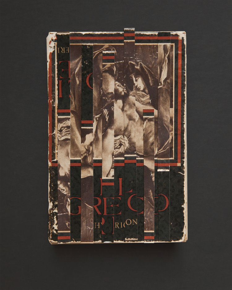
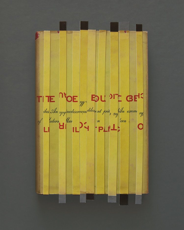
Bartley photographs stacked paperback books that take on the identity of minimal sculptures. This is emphasized by the anonymity of the books, whose spines and covers cannot be seen, just the blocks of pages with subtle variations in colour. 

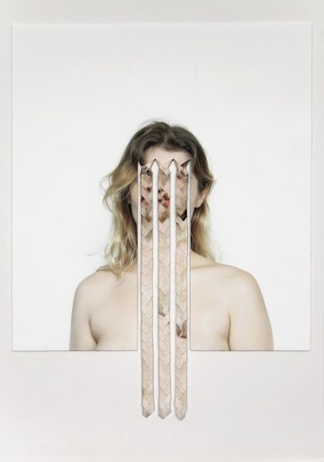
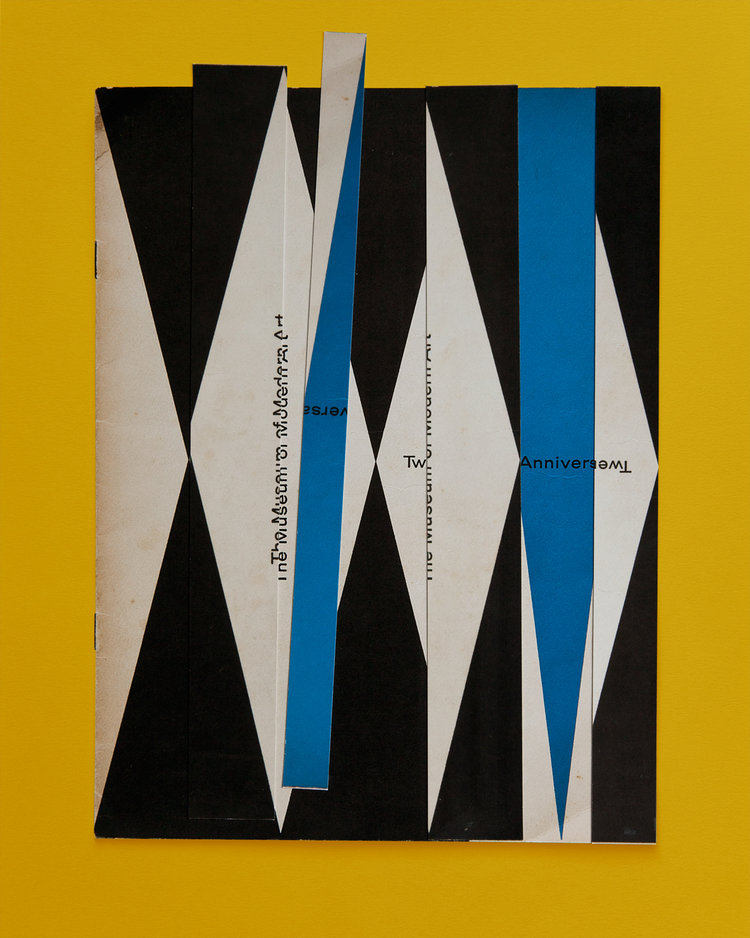
Mary Ellen Bartley has a few different styles of work with a topic based on photographing and manipulation of different kinds of books. To create these abnormal books, Mary cuts out strips of the book cover and flips them around in a sequence, then photographs them on a vibrant coloured background. Examples:
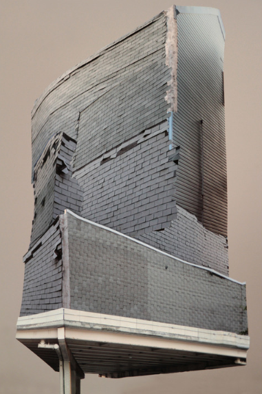
Image analysis

This image has an empty alt attribute; its file name is photography-sculpture-1-1.jpg

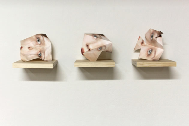
In this image, you can see three crumpled pieces of paper displaying a distorted face on wooden shelves. The faces can portray the idea of lost identity due to the same face displaying different emotions through different positions and angles. The shadows being cast from the shelves creates a nice, dark contrast towards the plain grey background. Also, the artist has created relating shapes with the faces to give the idea of different identities through the face positioning. I would like to use a similar style of work when I create my 3d photo sculpture because I like the way the faces are positioned and displayed.

3d photo sculpture inspirations

My moodboard

SON BONG CHAE

A pioneer of the 3D painting genre, Son Bong Chae was born in Hwasun County, South Korea in 1967. He received his BFA from Chosun University in Gwangju, and his MFA from the prestigious Pratt Institute in New York, USA.

My main inspiration for experimentation with 3d sculptures is this concept

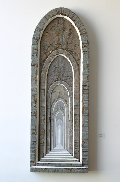
Son employs a layered painting process to create ethereal landscapes reminiscent of traditional Korean landscape painting. Each work is painted in oil paint onto multiple layers of polycarbonate, a special type of bulletproof glass 300 times stronger than acrylic glass. Illuminated by a luminescent diode, a type of lighting similar to a LED, these landscapes evoke both the memory of traditional painting and the timelessness of the scene.

HAHN JEESUN

Hahn Jeesun earned her BFA from Hongik Univerity in South Korea and her MFA from the University of Utah in the US. So far, she has 20 individual exhibitions and many group exhibitions in South Korea and other countries.

I would like to create a photo sculpture with this effect, using images with different tones to create almost an optical illusion.

Hahn Jeesun is versatile with architectural images of multiple perspectives as well as floating objects in diverse shapes and looks. These are accented in her acrylic paintings with three-dimensional surfaces on plywood, symbolizing people, society, and relationships that interact together. Some of them represent the perceptions that should be abandoned in order to reach the ideal state. Her works are about our environment that is breaking down and our efforts to recover from it.

Contact sheets – Still life in studio

Different lighting used –

For this photoshoot which was carried out in the photography studio, we experimented with using still light for this photoshoot on a infinity curve background. This was helpful when creating the pictures because it was a plain white background which made the different objects we used stand out, as well as successfully illuminating the pictures into different colours when using gel sheets which I really liked.

We also experimented with flash head photography in the studio. This type of photography consists of using a larger infinity curve background to provide a plain background but instead of using one continuous still light as seen above, you use either one or more flash heads. These flash heads sync up with your camera when taking a picture and this is good for taking close up images or groups of photos, I also enjoyed experimenting with this type of photography too.

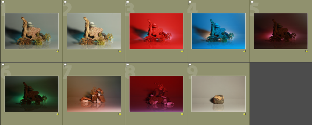
Contact sheets –

In Lightroom, I used the colours to help organise my contact sheets. I used the yellow for my photos which I thought were successful to an extent but I still wasn’t happy with. Then for the photos which I thought were successful which I could use further to edit and use in my experiments of sculptures further on.

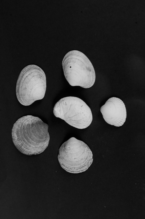
Most successful images –

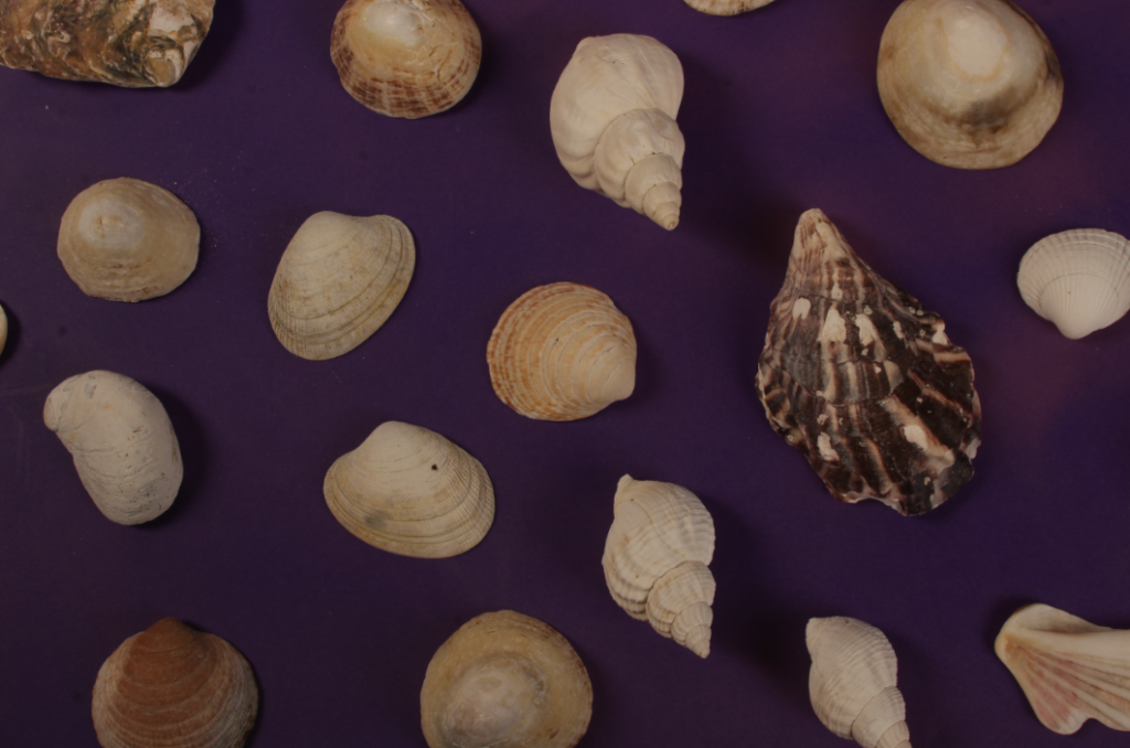
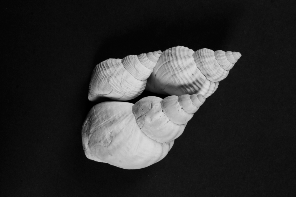
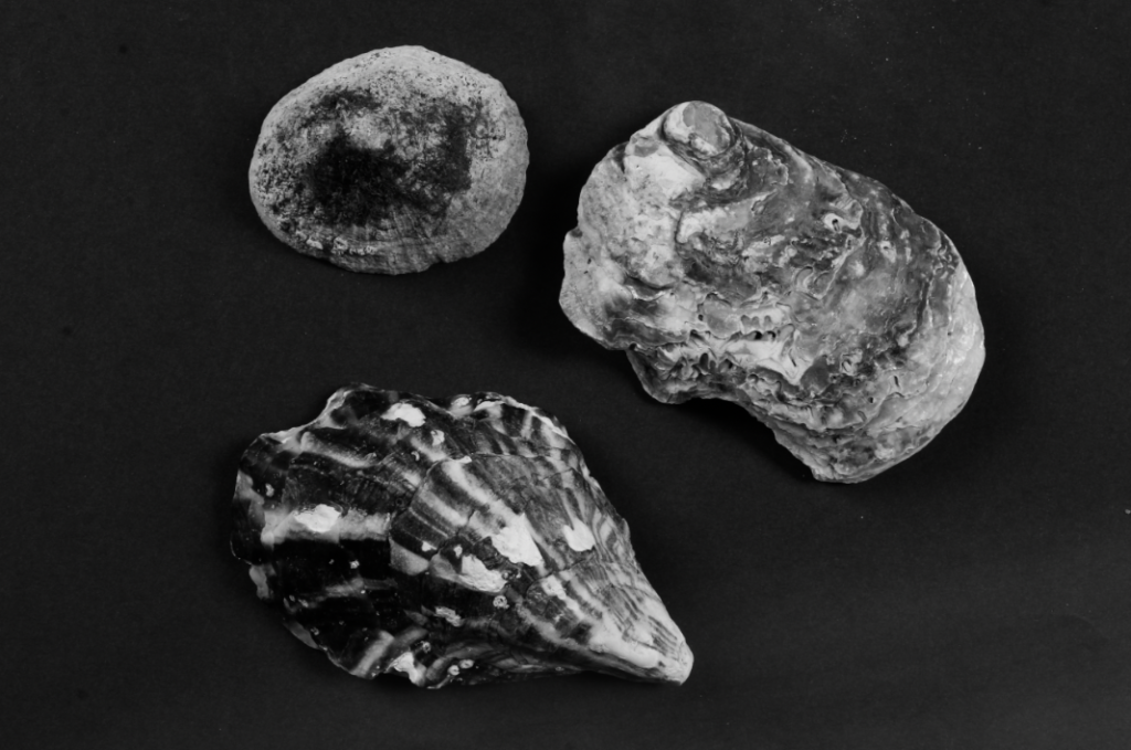
These 5 images are photos which I have decided to use and produce sculptures out of alongside the joiners which I have created. I really liked these pictures because the 3 photos of shells creates a set of pictures which I can manipulate and combine together and I turned them into black and white because they were on a dark coloured background and the white of the shells creates a distinct contrast which makes them stand out well as well as having different shades of grey and black in it. For the 2 photos on the bottom, I created a mini set of 2 which I think work quite well together as they are similar in how they look and the background is the same which I can use to make some creative outcomes further along.