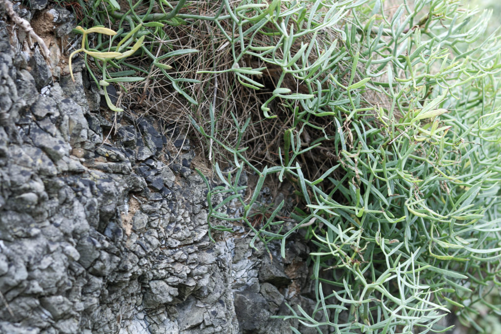
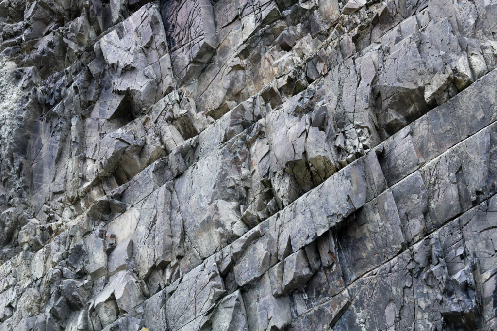
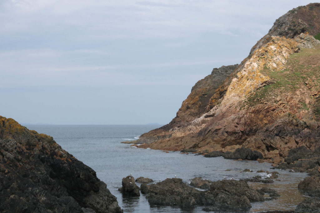
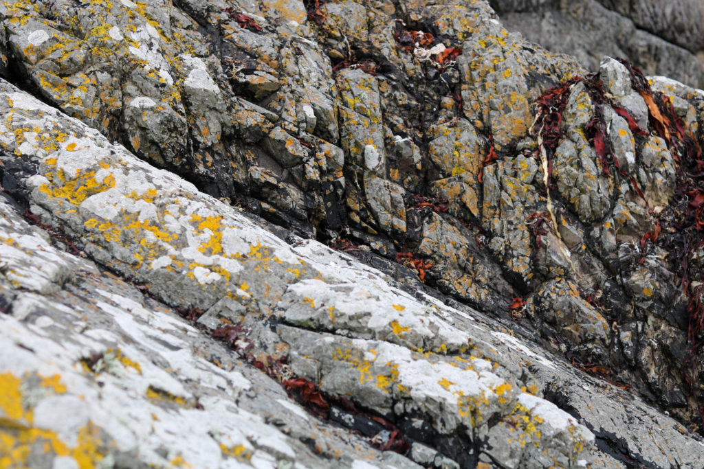
L’etacq Photoshoot

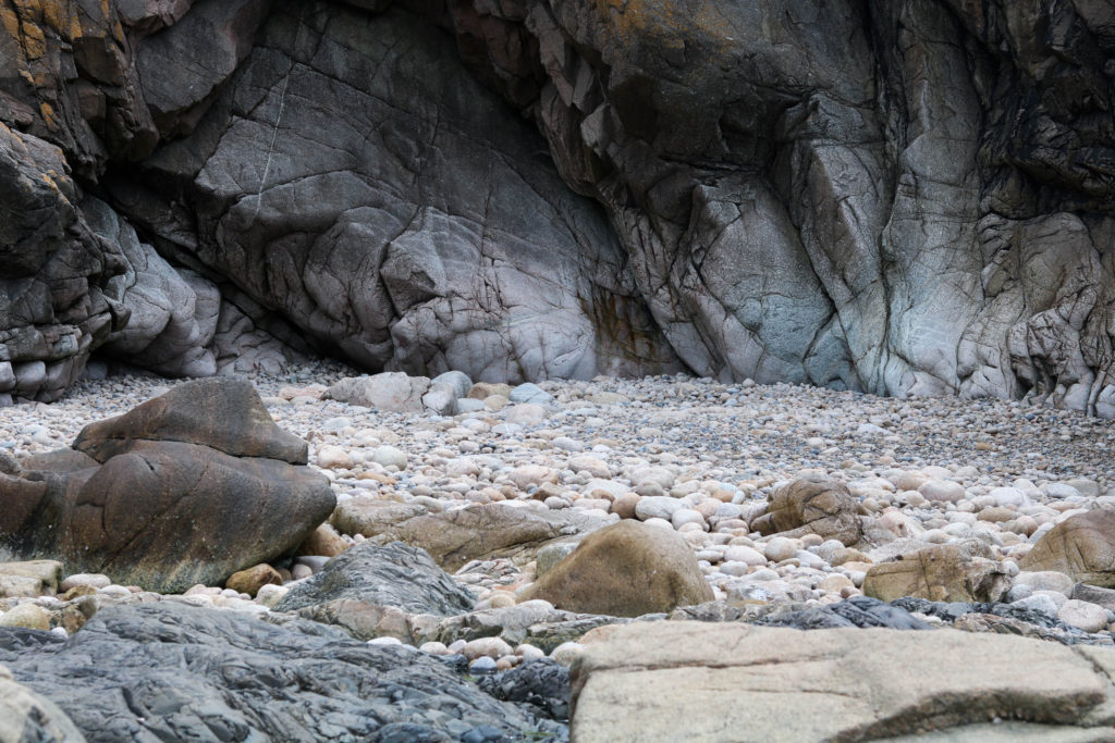
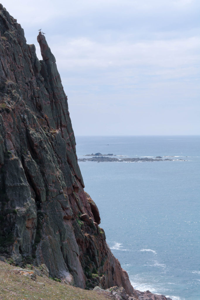
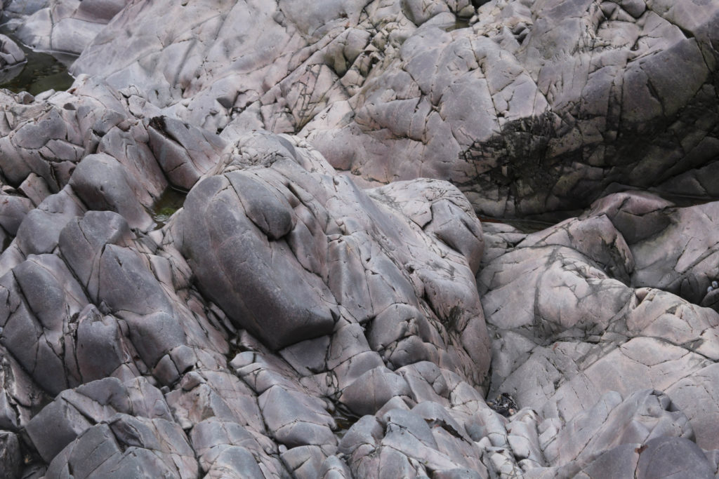
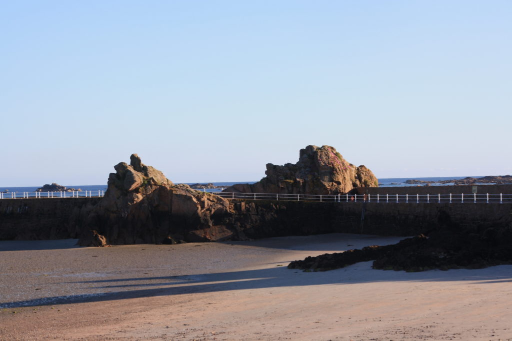
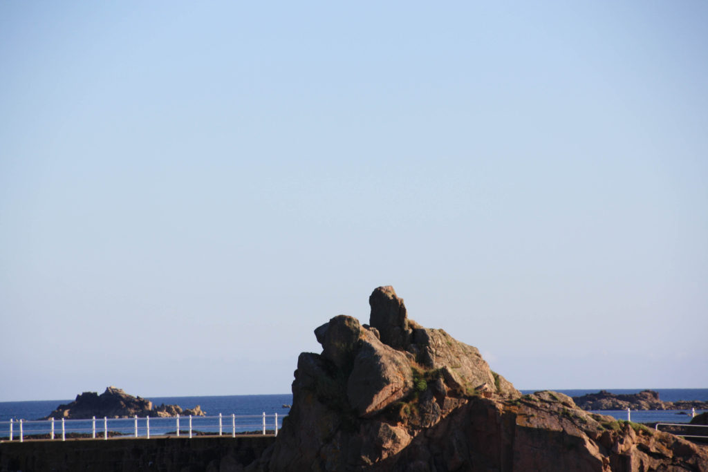
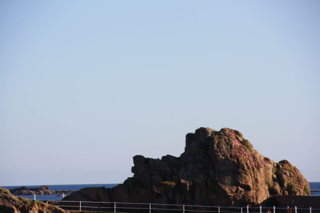
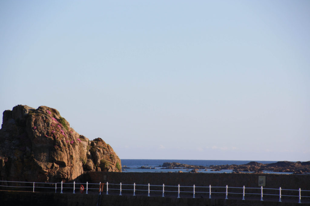
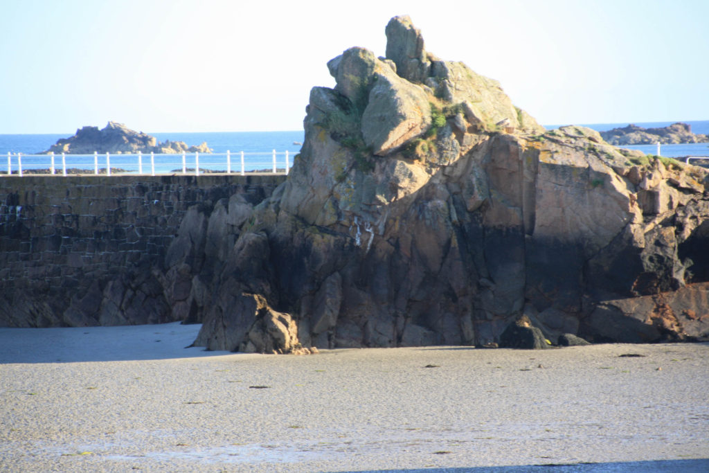
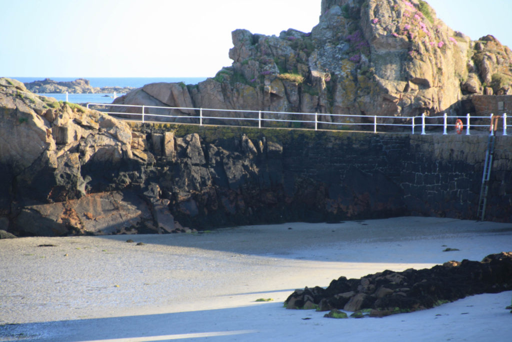
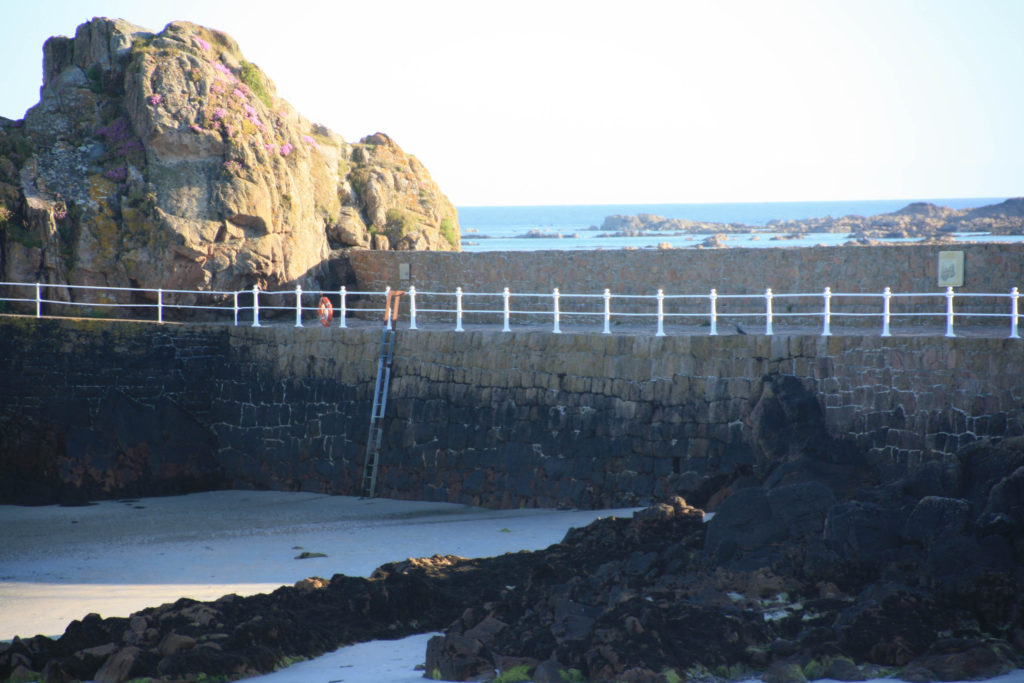
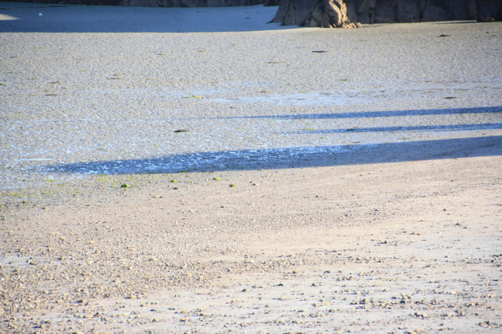
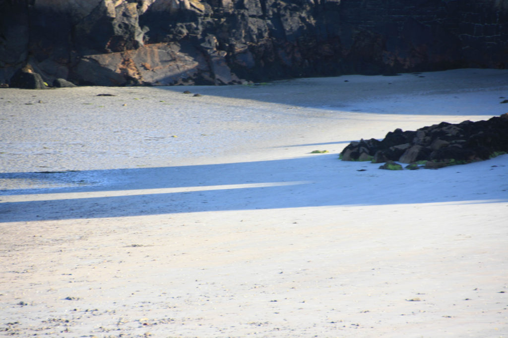
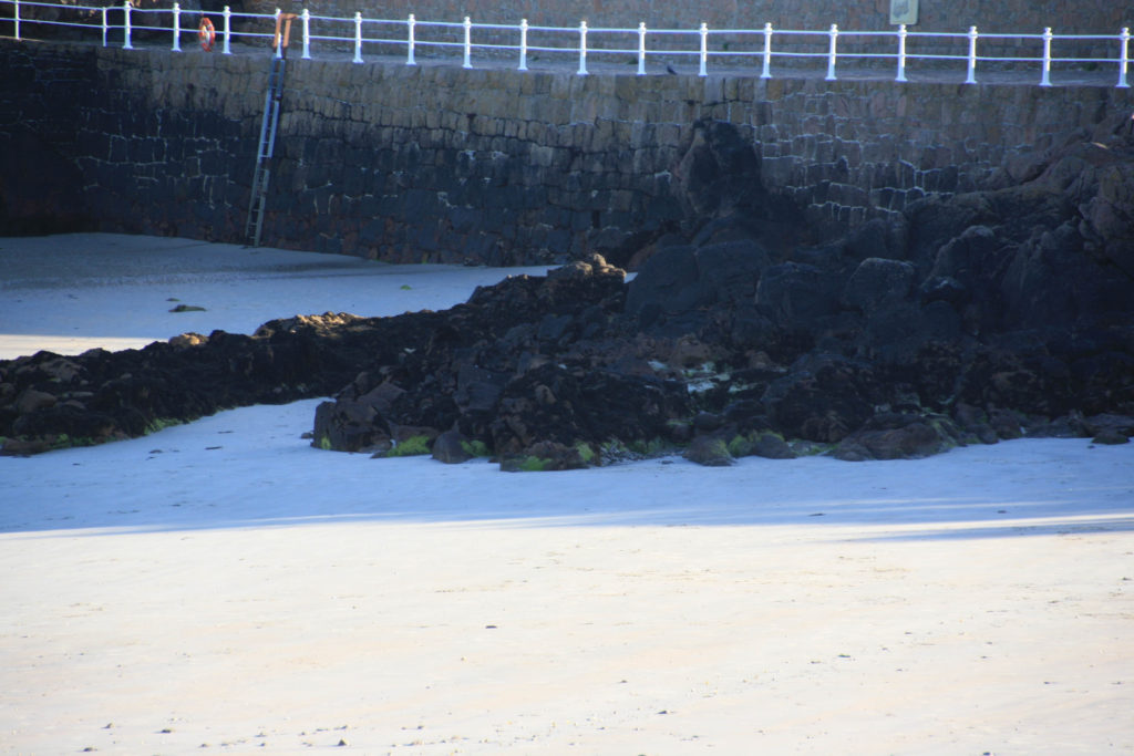
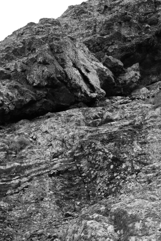
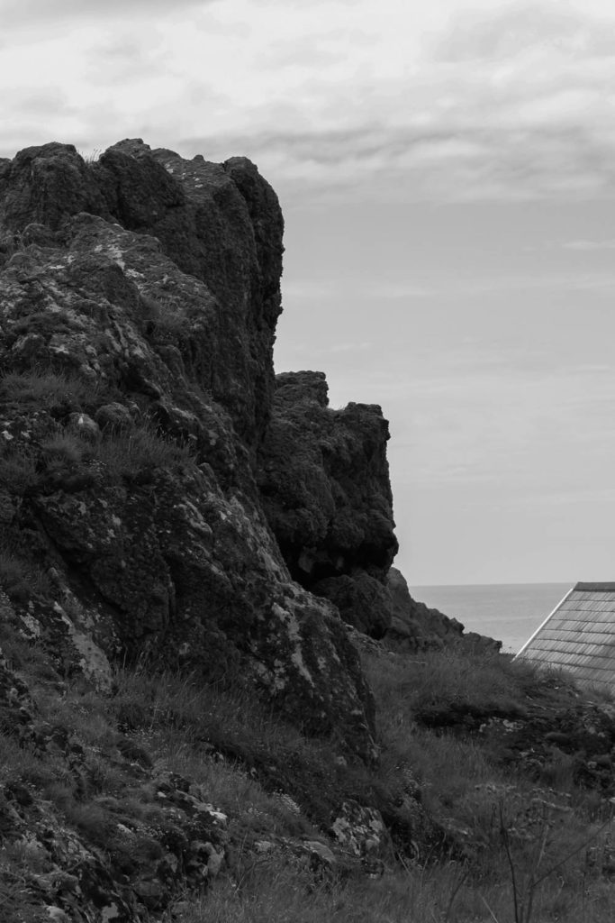
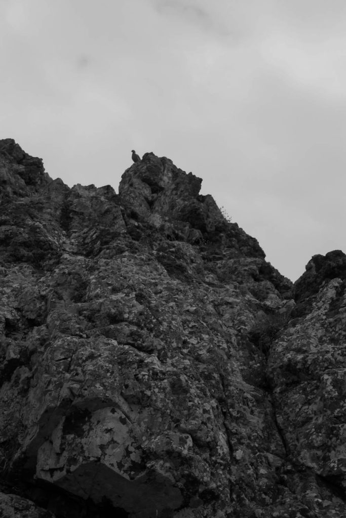
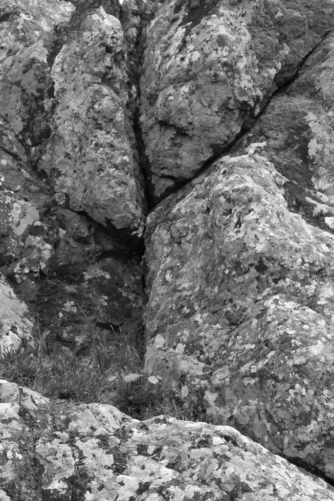
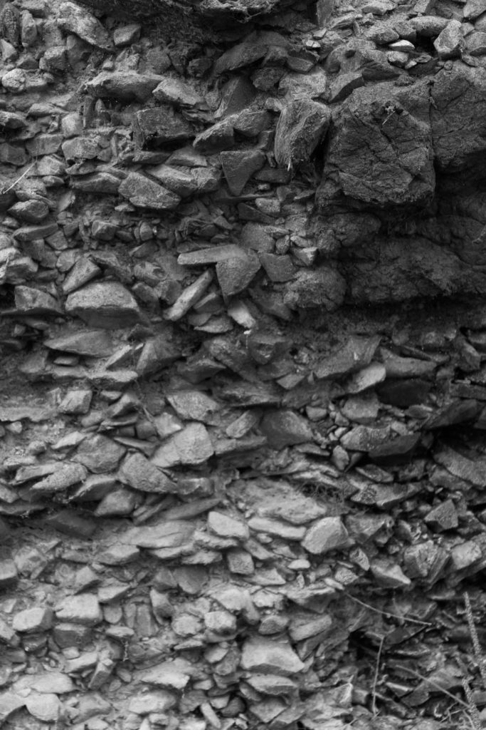
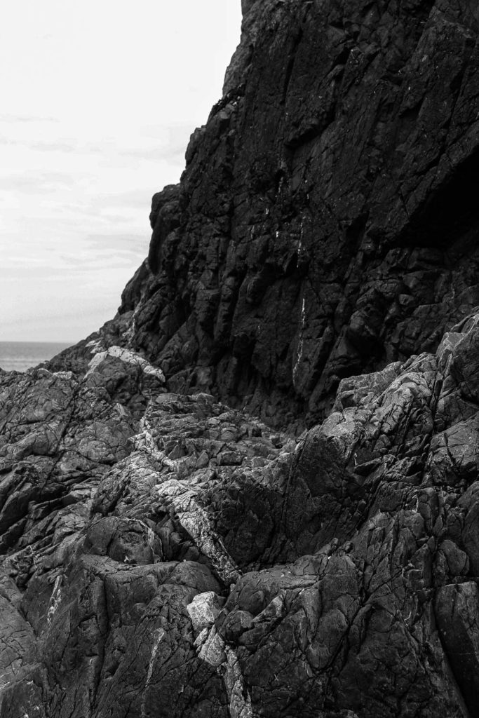
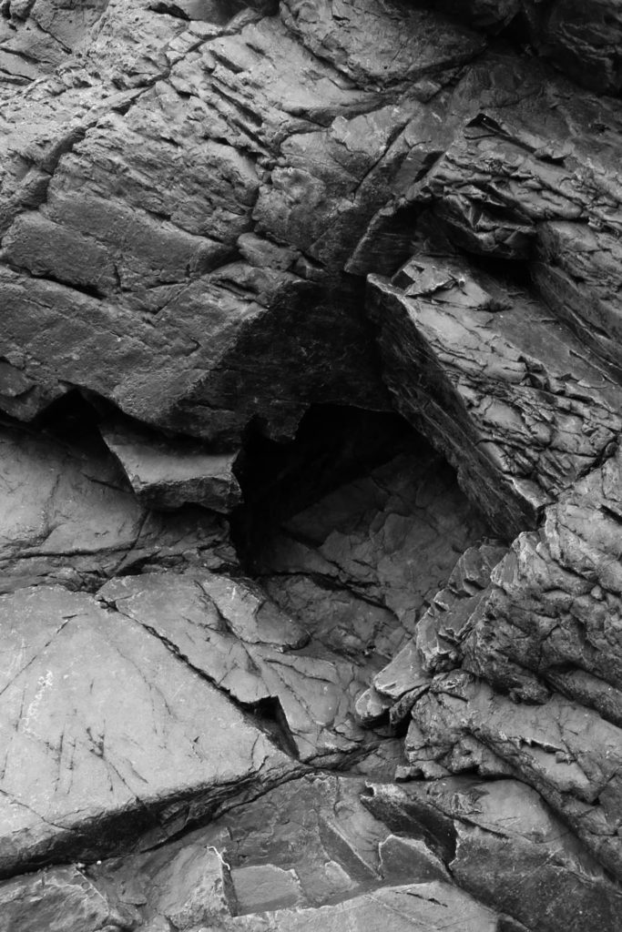
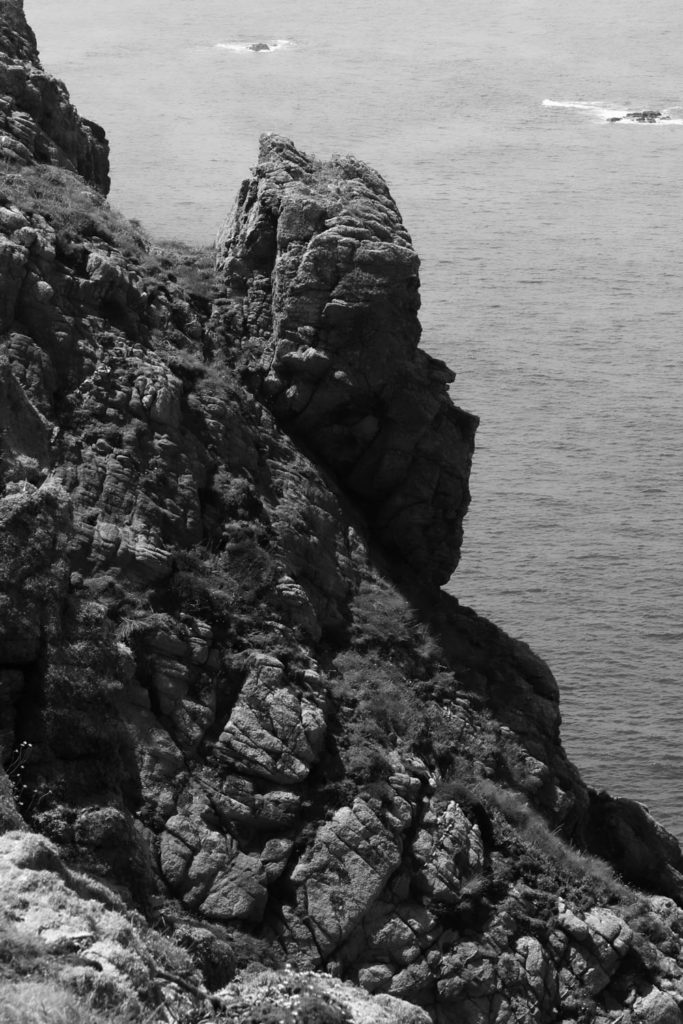
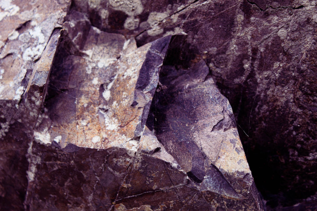
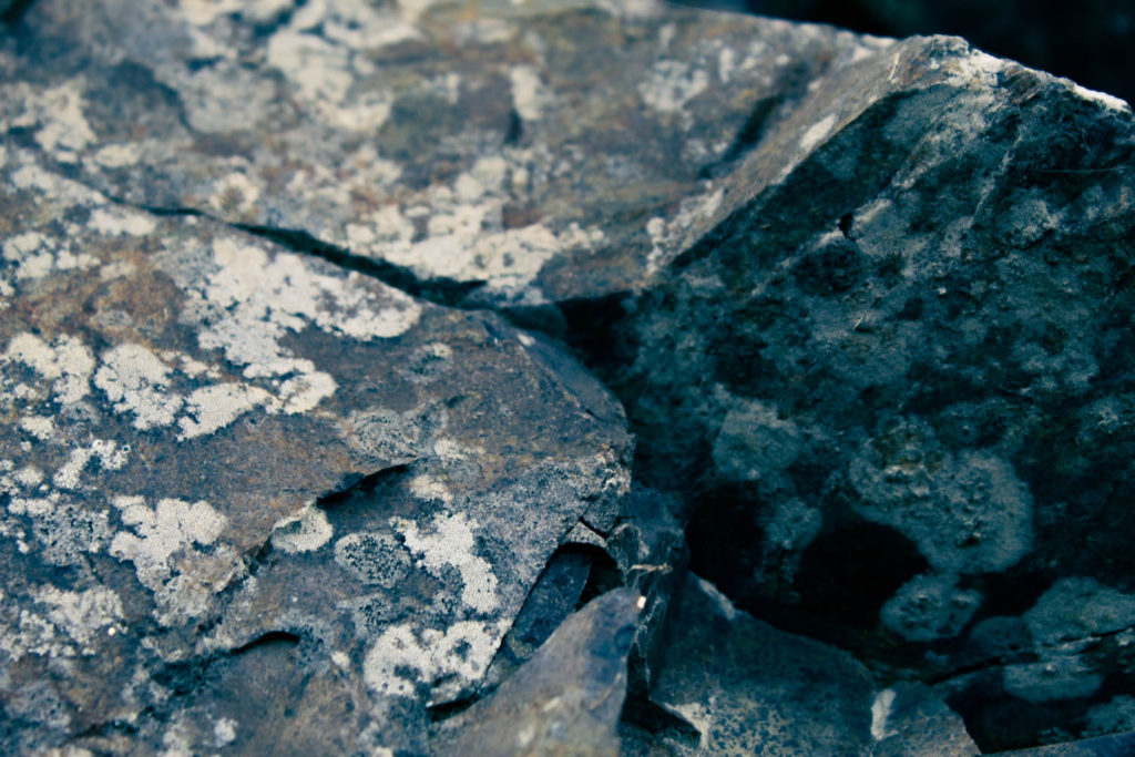
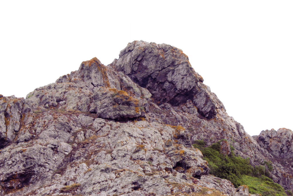
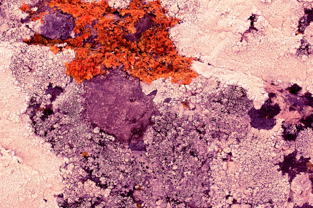
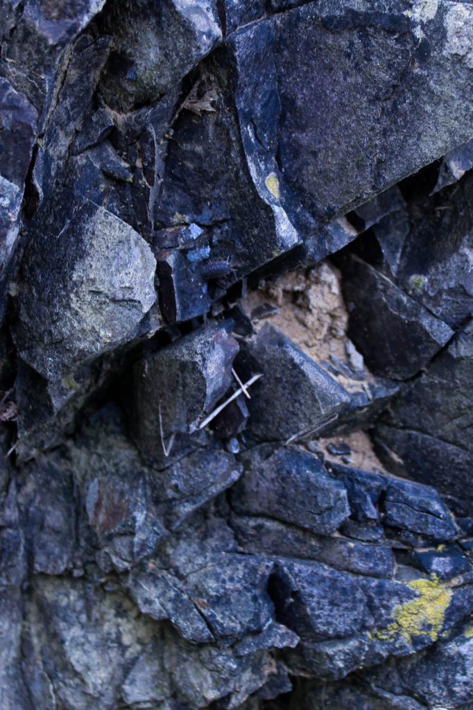
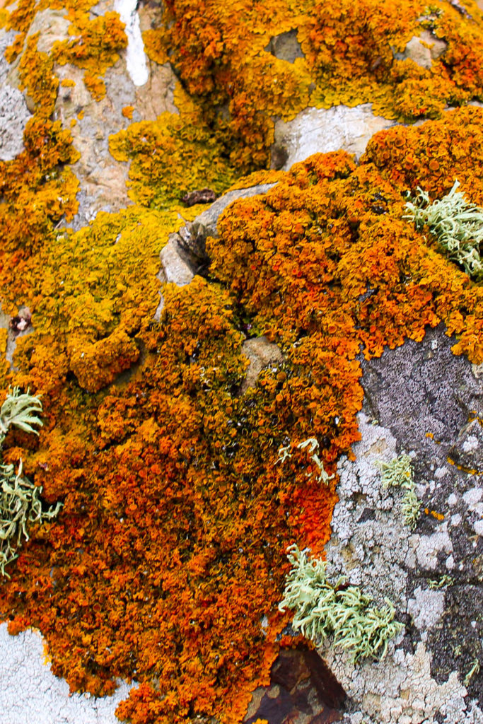
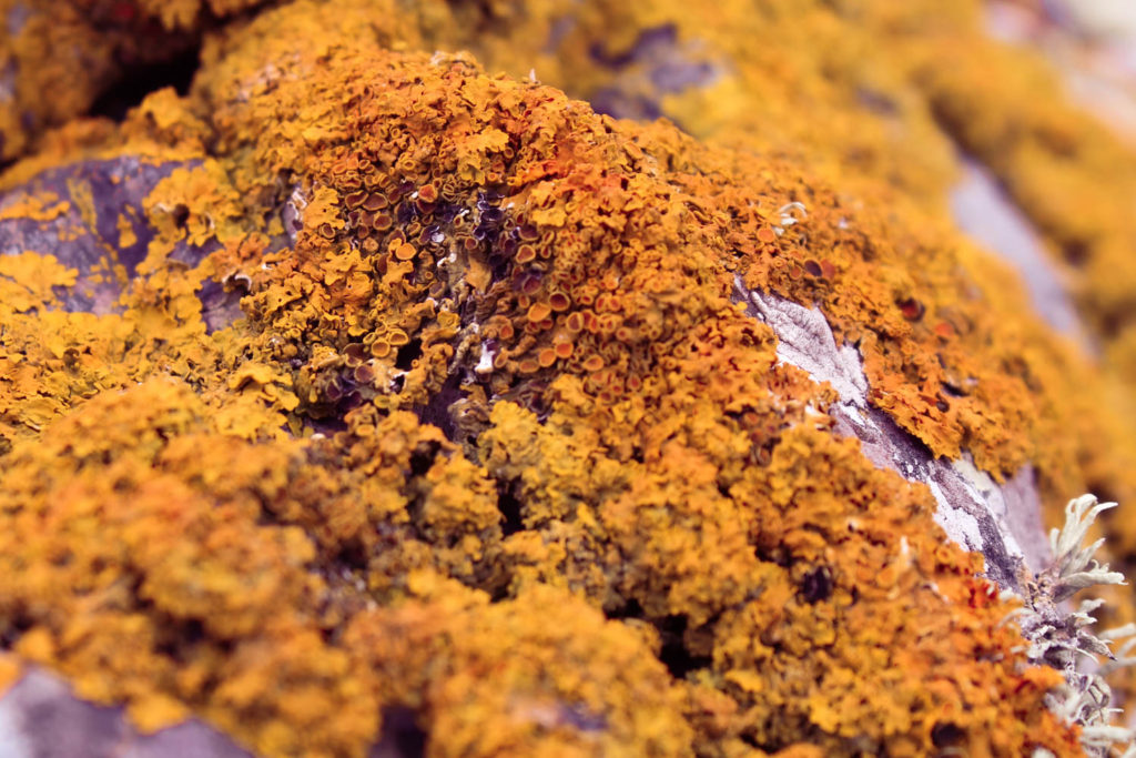
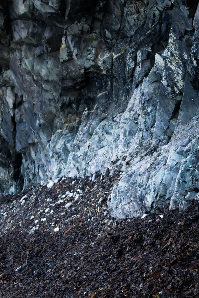
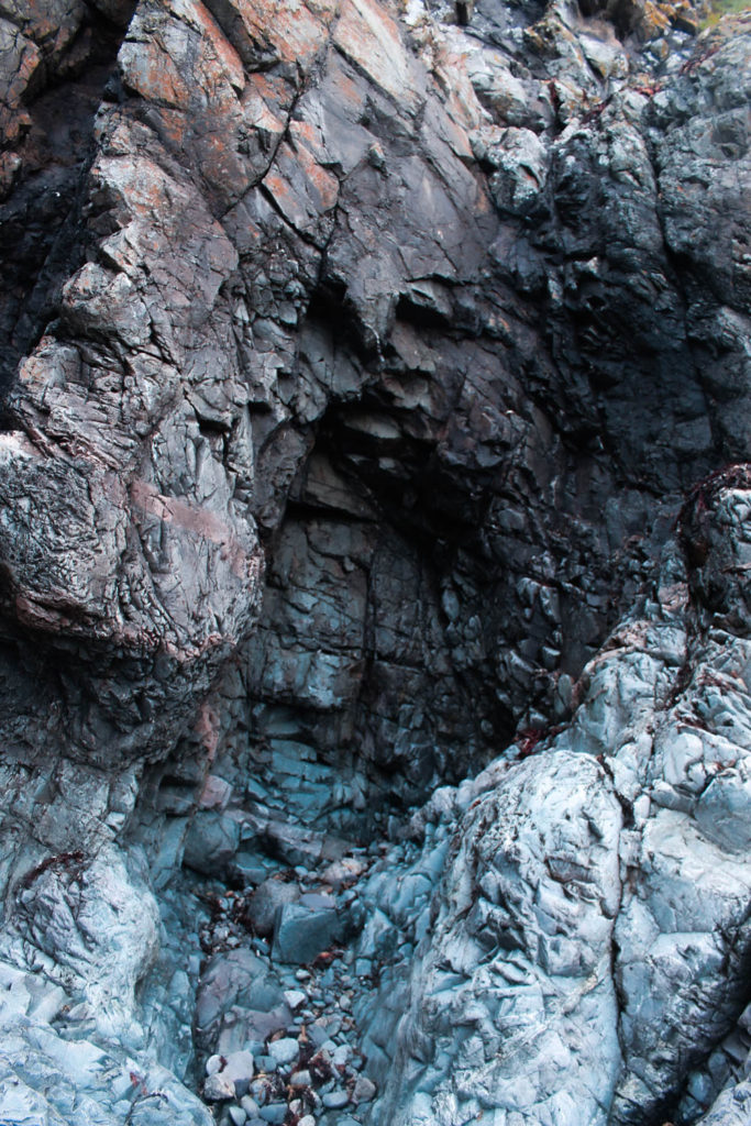
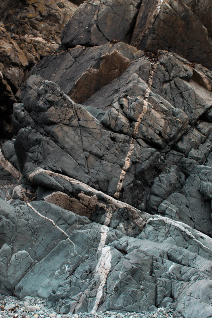
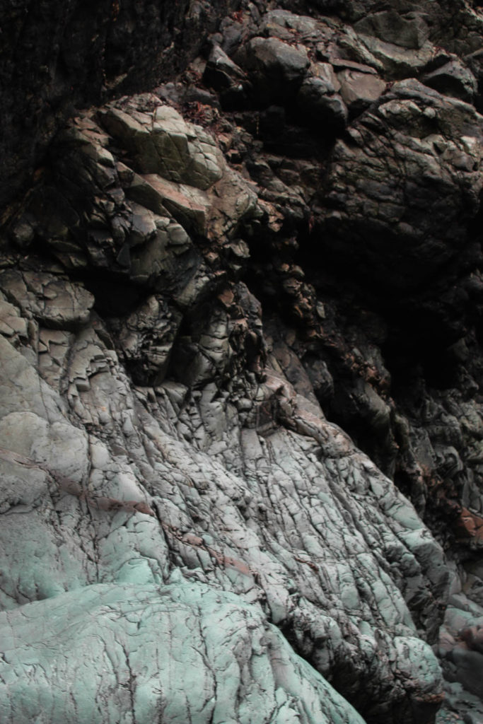
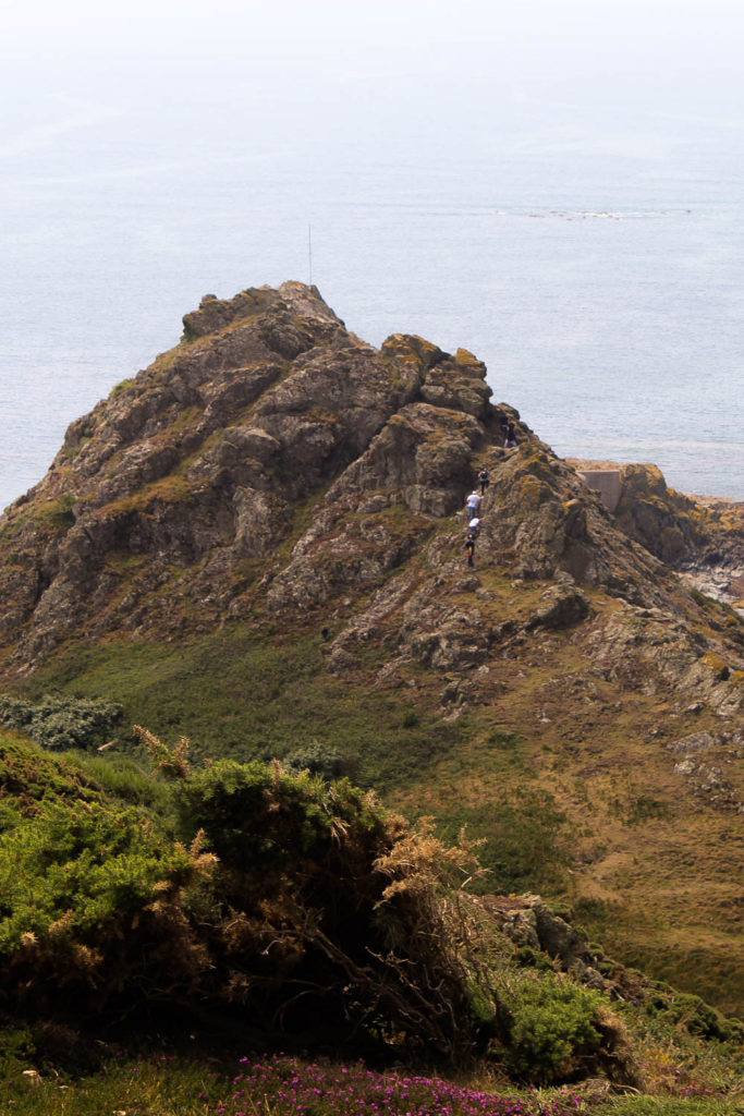
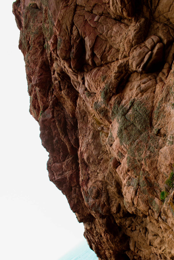
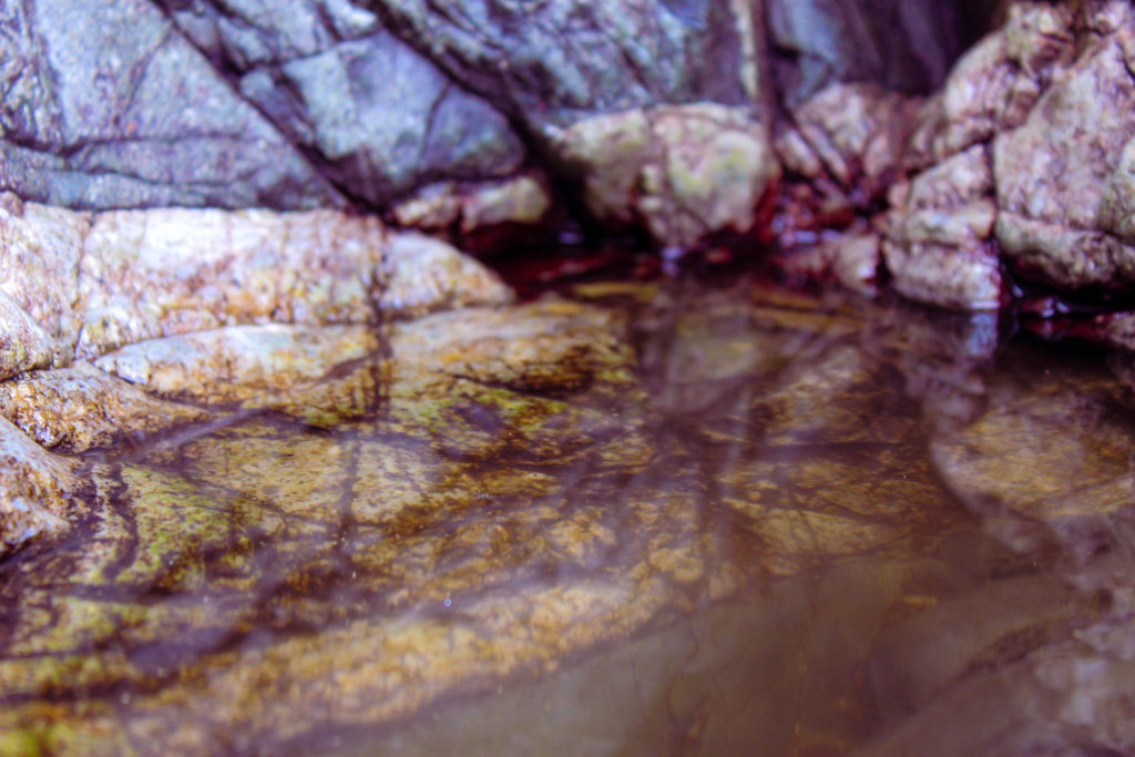
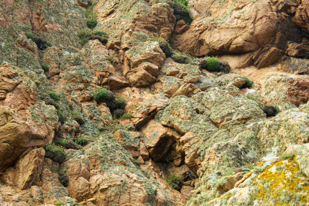
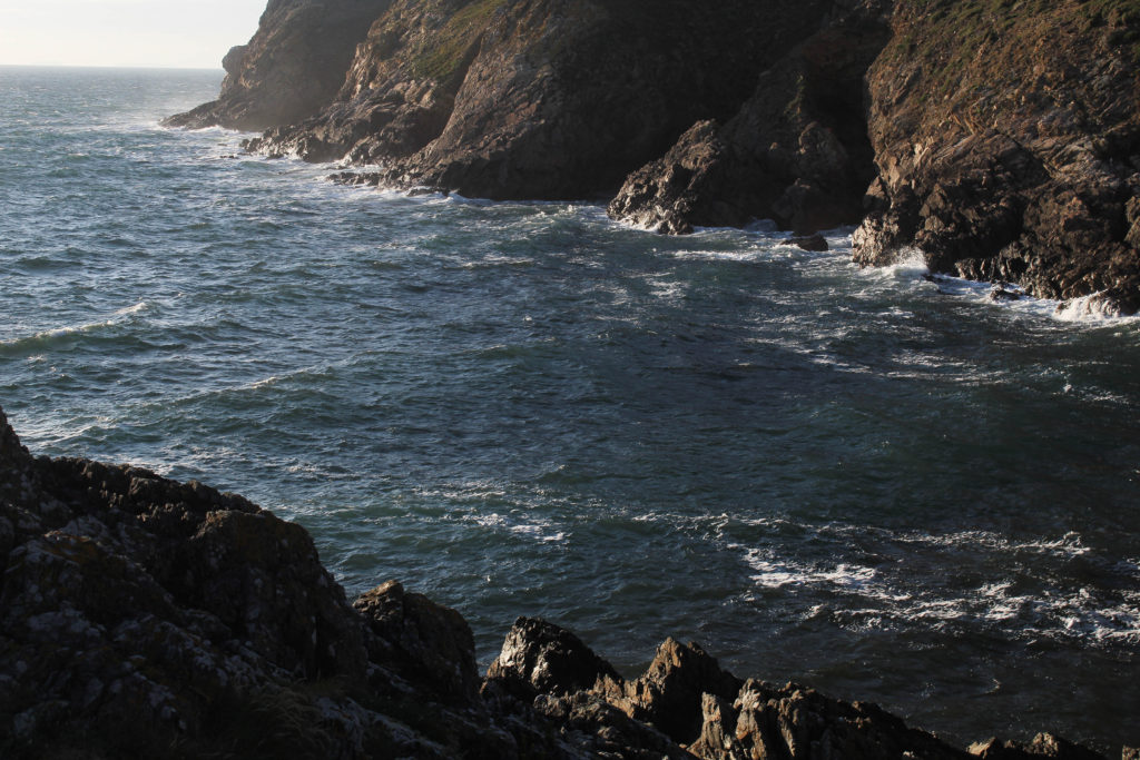
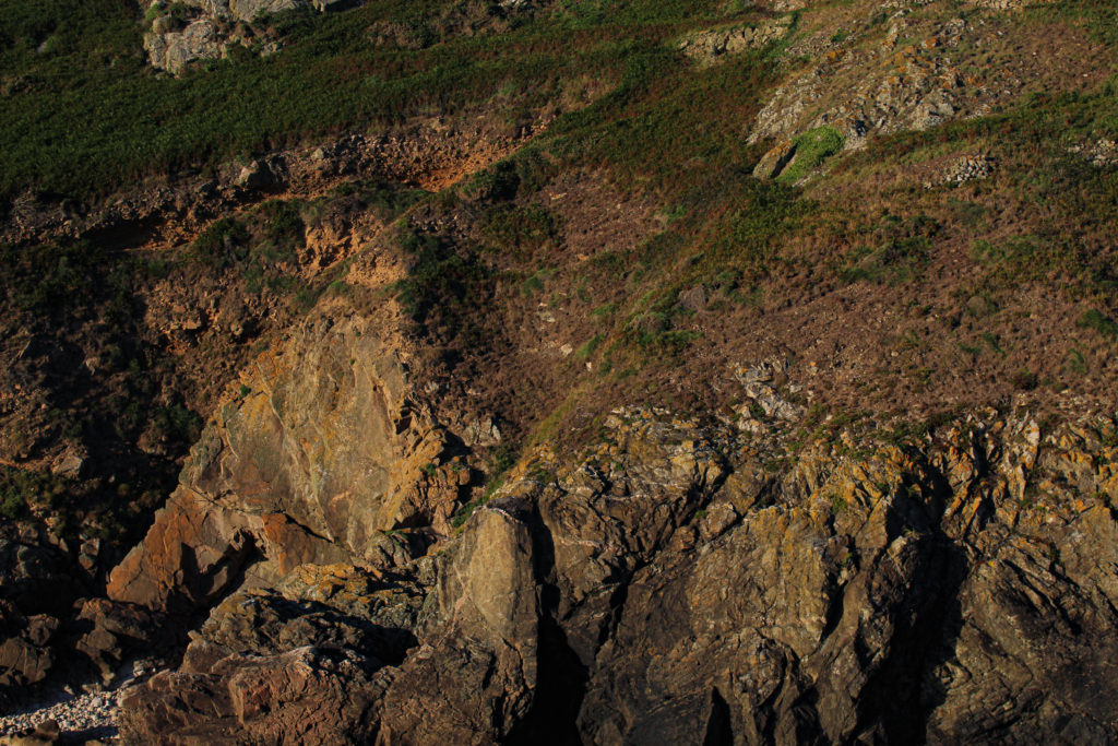
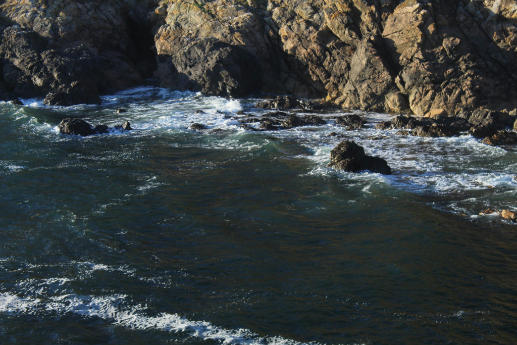
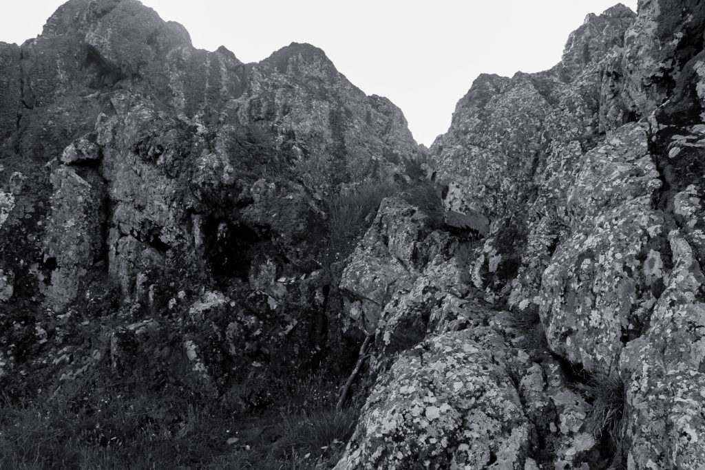
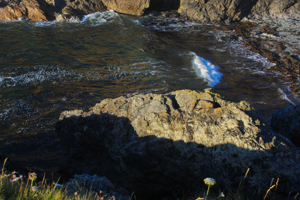
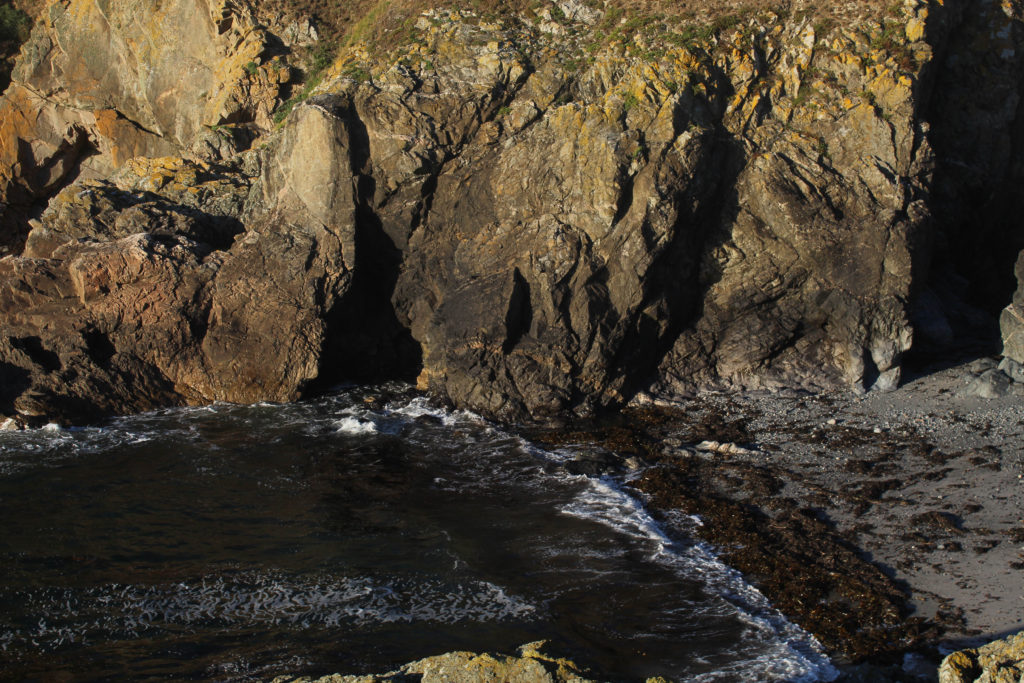
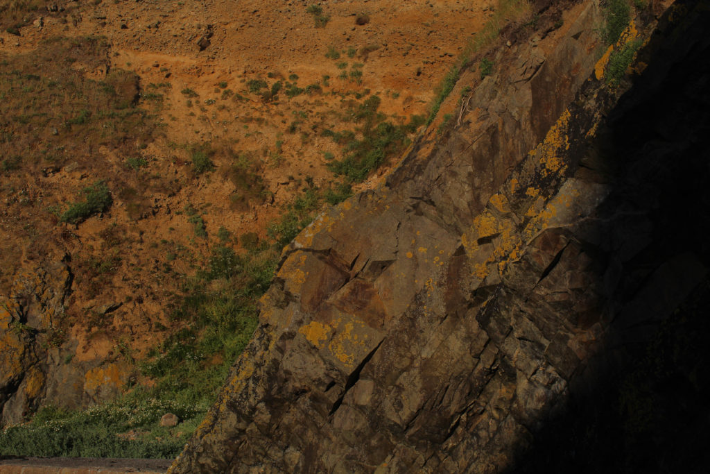
As a class, we took a trip to L’etacq to visit the four geopark sites around that area: Le Petit Etacquerel, Le Grand Etacquerel, Le Pinnacle, Le Pulec.


Editing
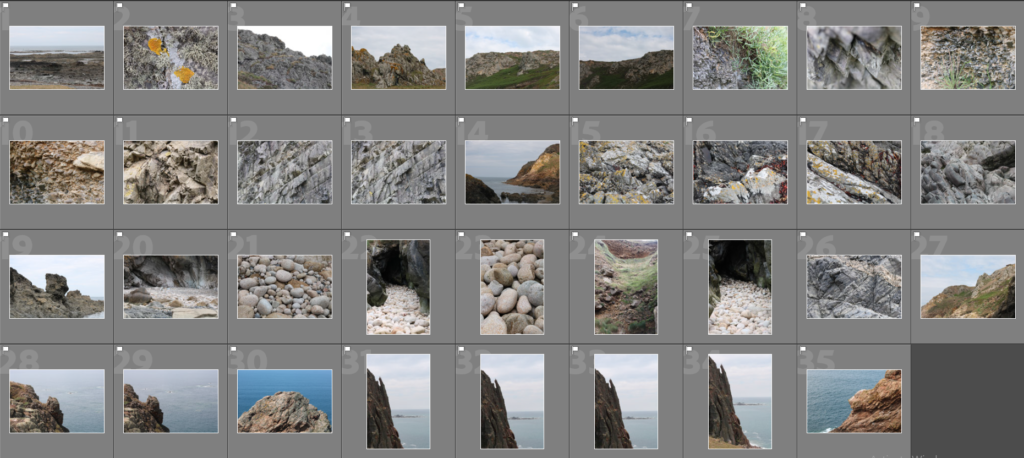
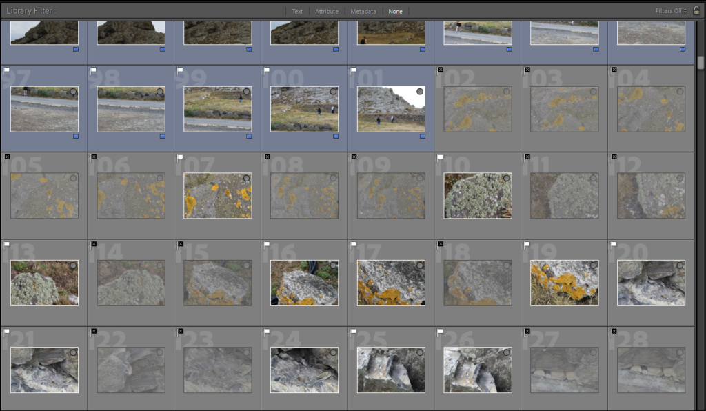
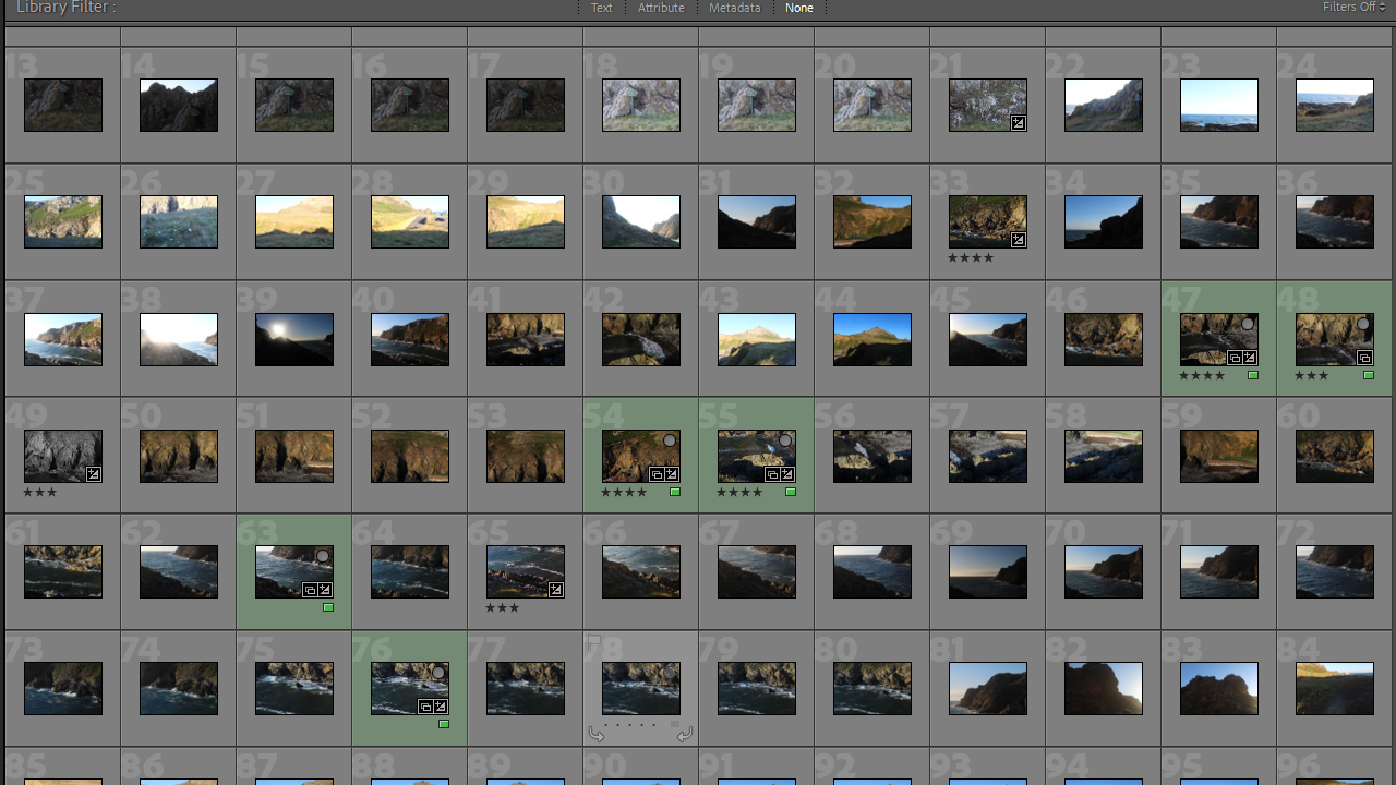
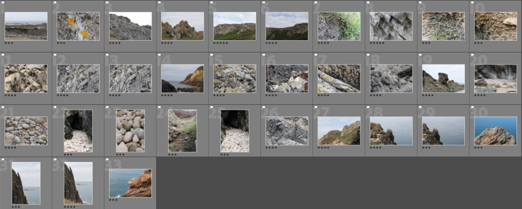
For my first round of editing, I used the ‘pick’ and ‘reject’ function on lightroom to narrow my image selection down to around 30 images.
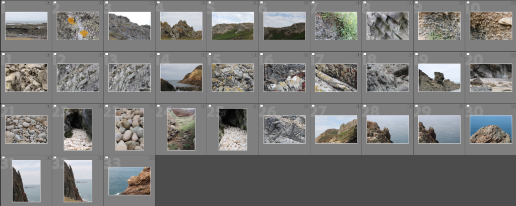
Next, I went through these images and rated them out of 5 using the star rating function in lightroom.
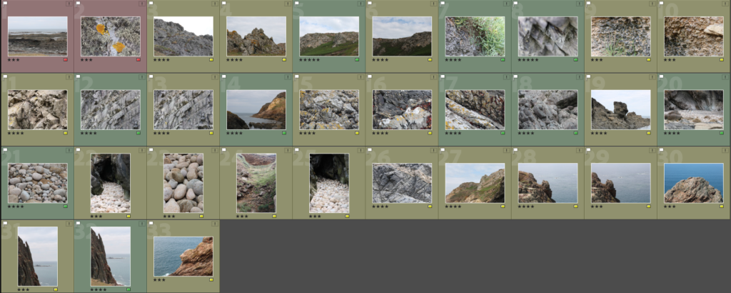
After, I assigned a colour to each image further narrow down my selection. (I used blue for the images I plan on using for the Joiners I will make).
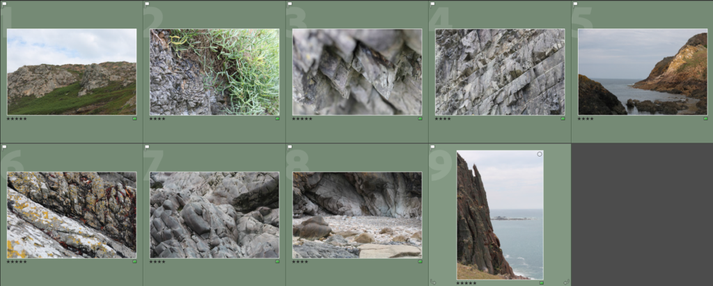
At this point, I have narrowed my image selection down to 9 images which I consider to be the best from this photoshoot. I will take these images into further editing/experimentation

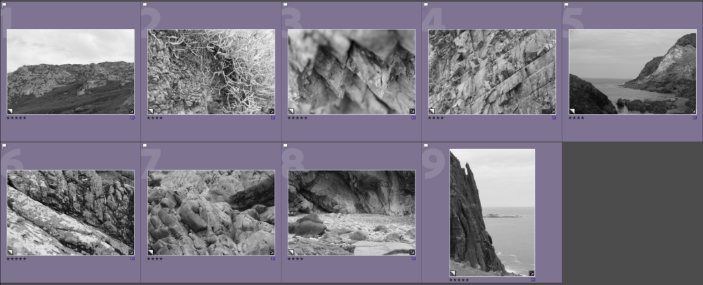
Final Edits

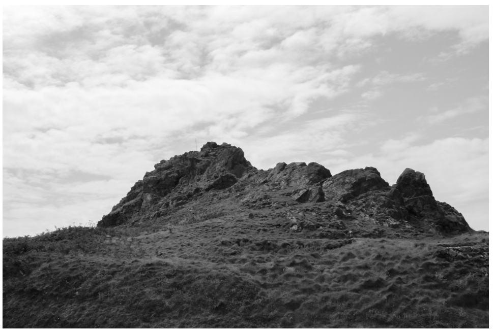
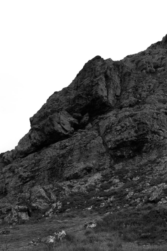
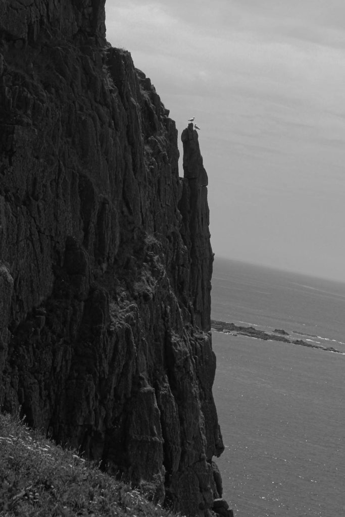
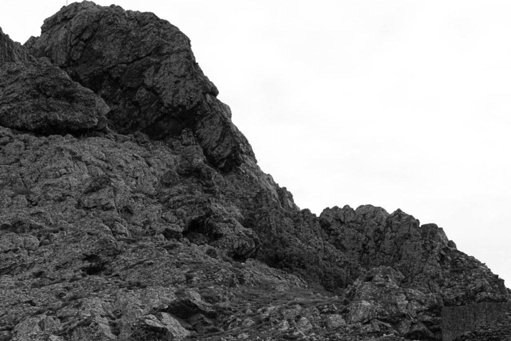
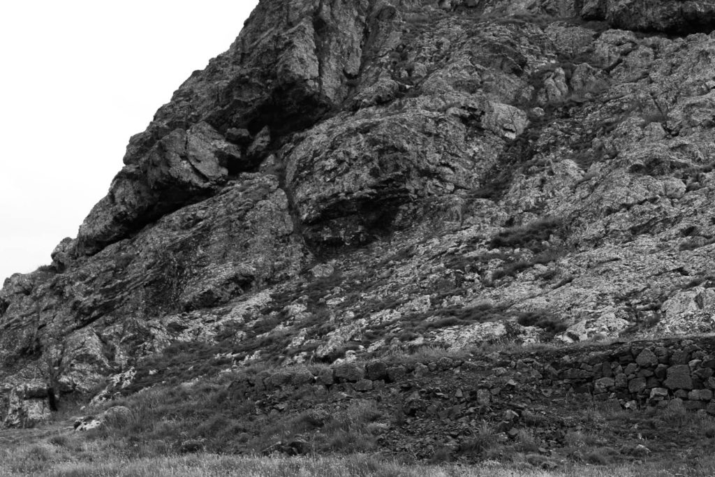
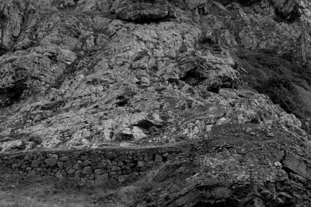
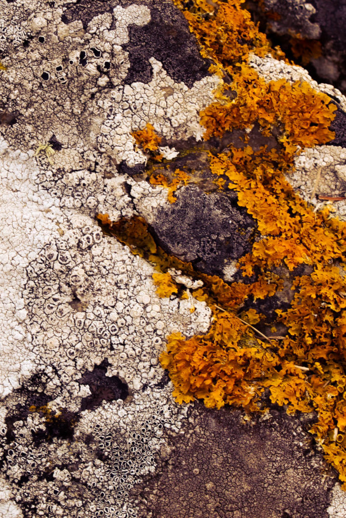
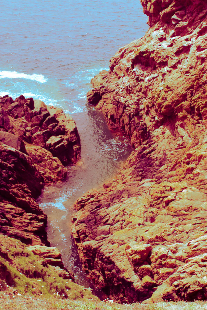
These are the edited versions of my best images from this photoshoot.

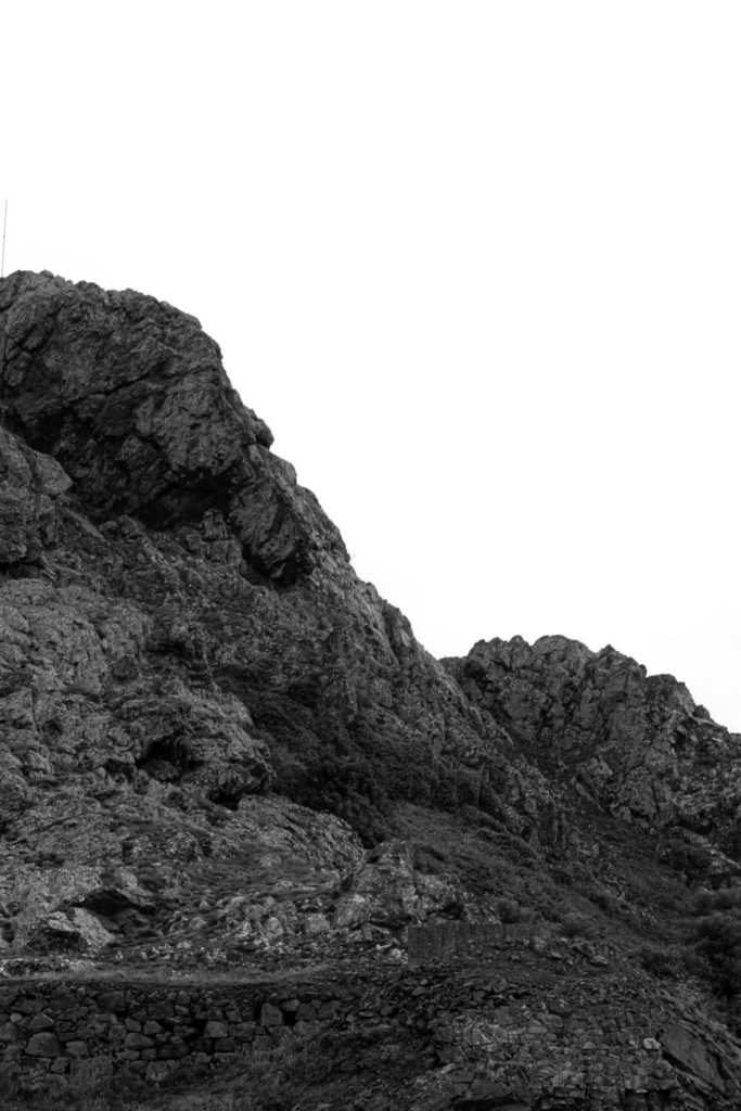
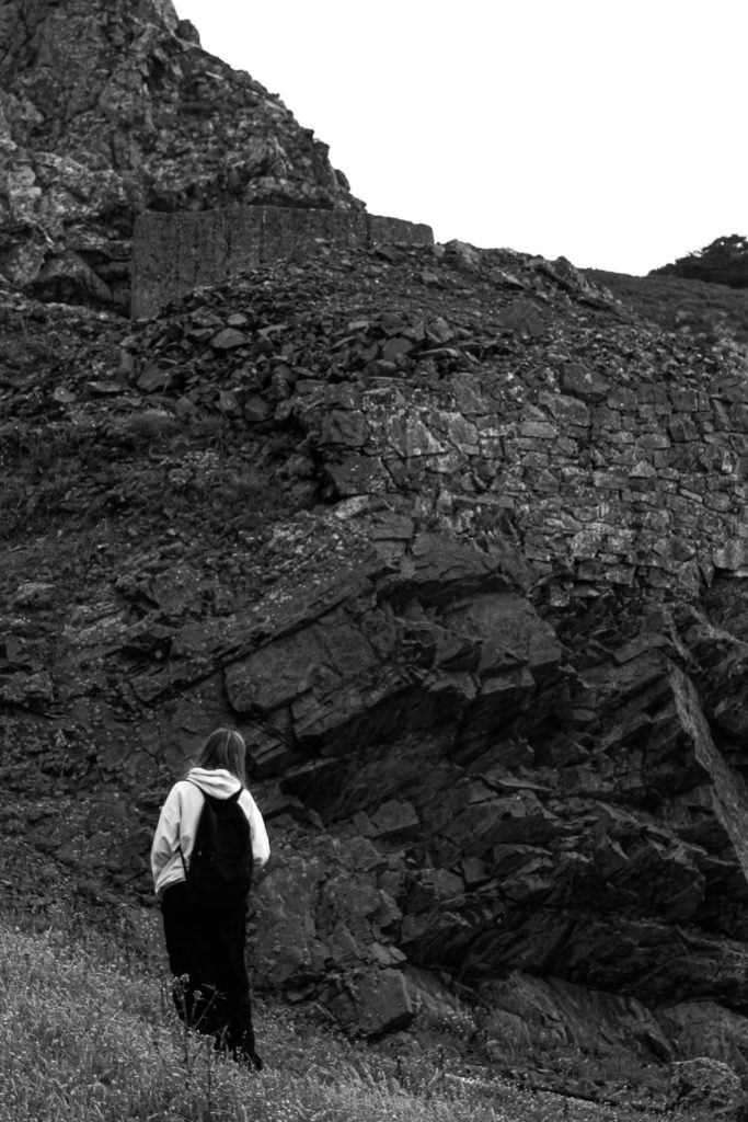
I have made Black and White versions of each image as I think it complements the overall lighting and form of each image.

Best Final Images

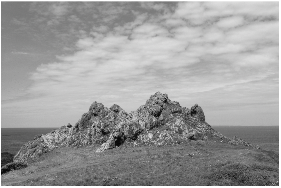
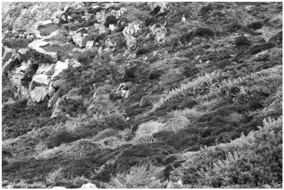
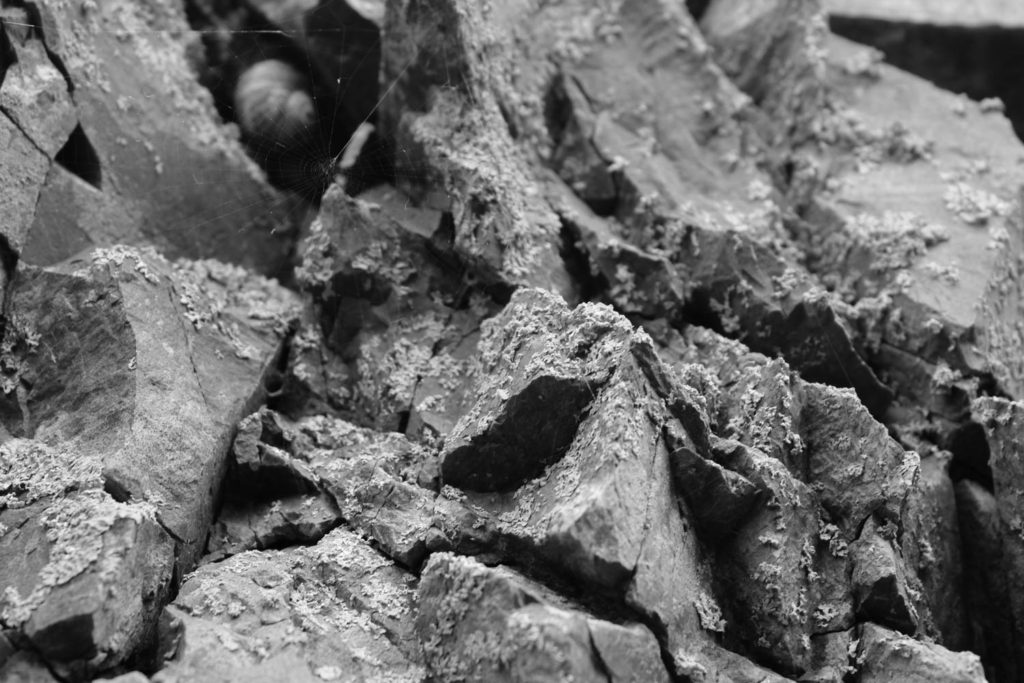
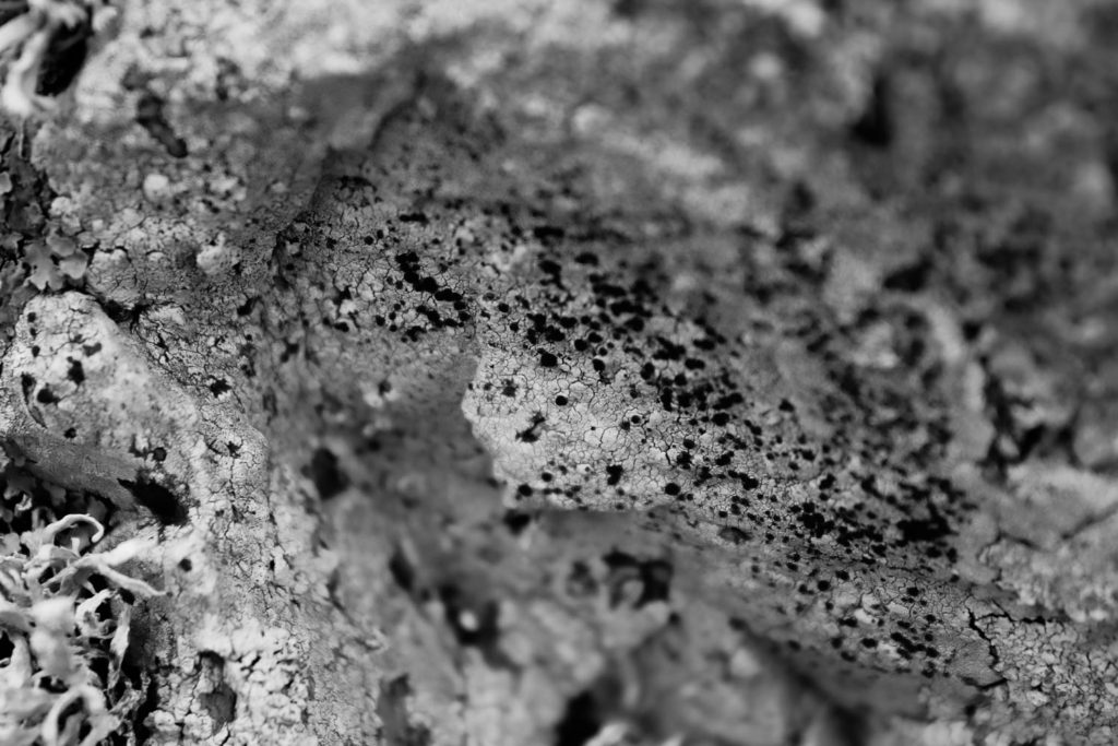
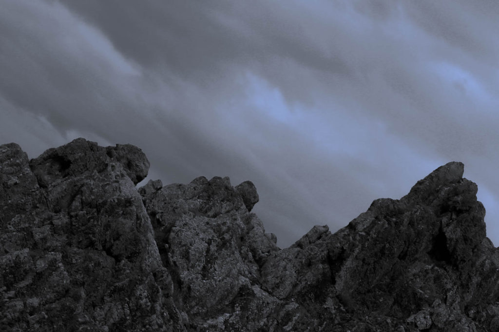
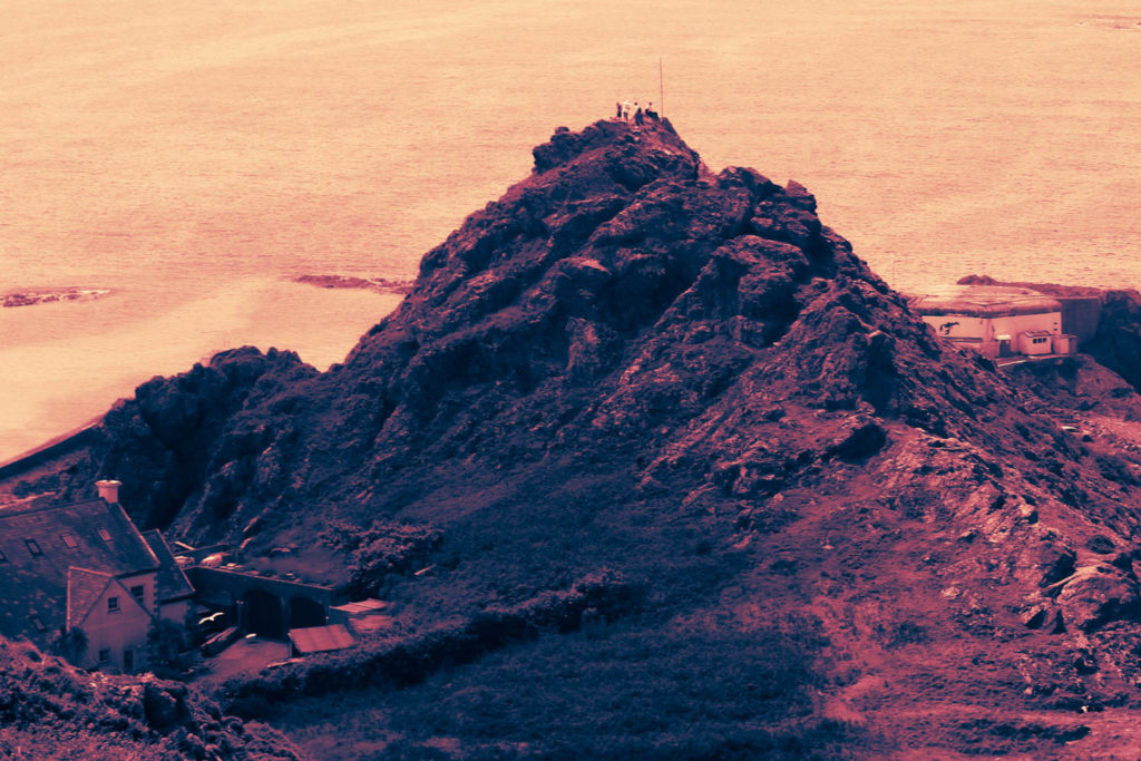
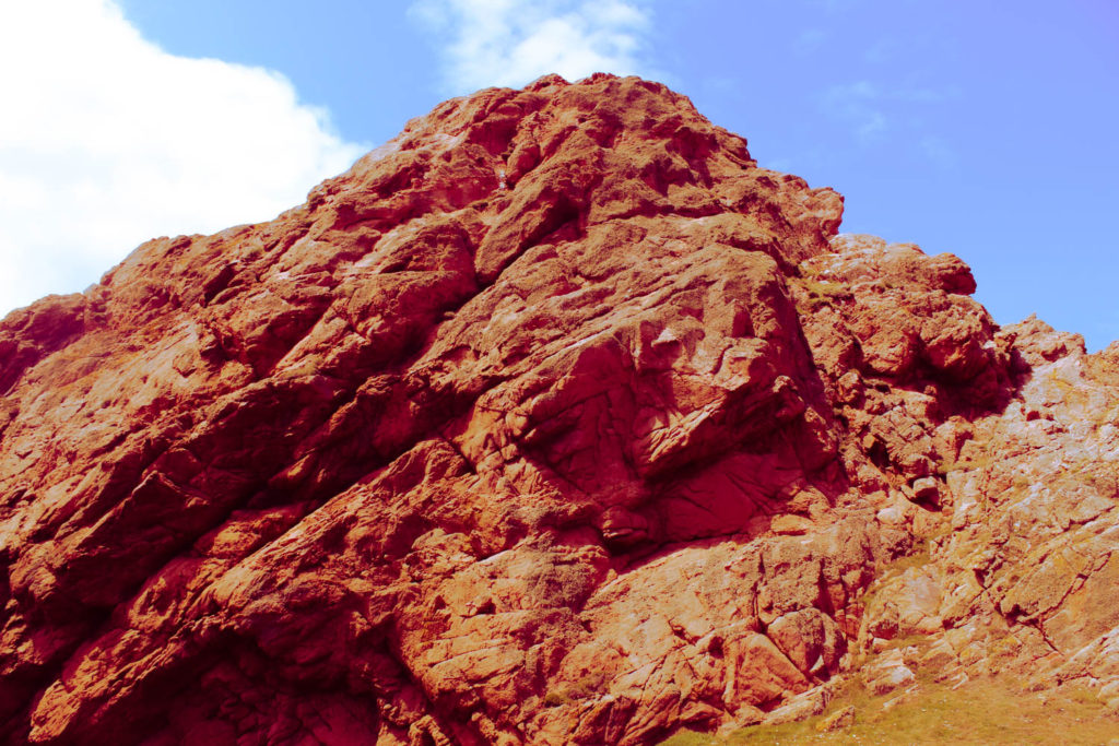
I selected these two images as my best final images from this photoshoot. I think these images are a good representation of both the more traditional landscape images and the more abstract, close up images that I took during this photoshoot.
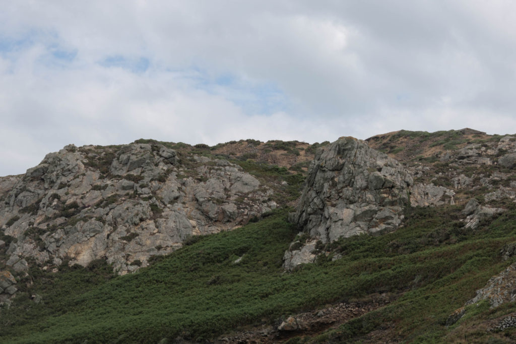
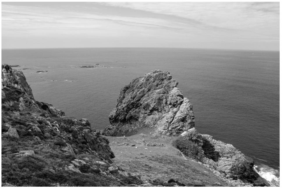
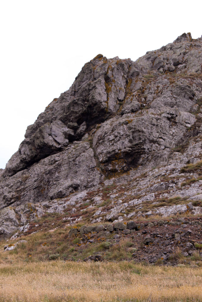
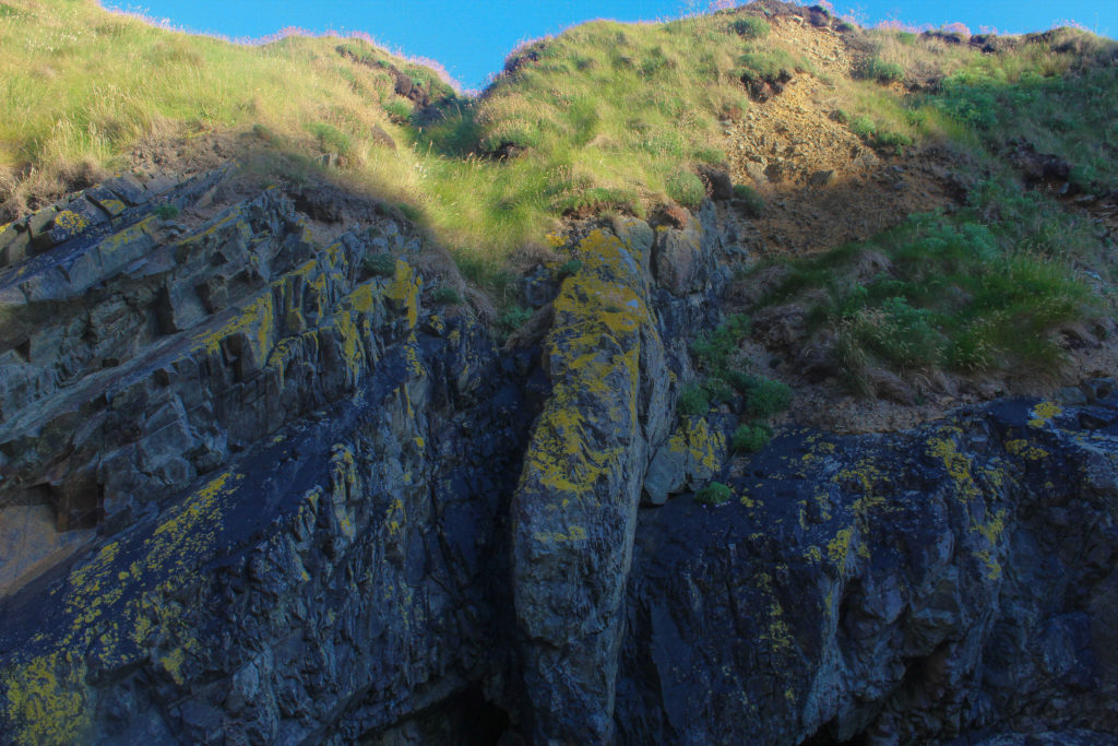
This image was taken around Le Pulec, displaying the headlands and rock formations seen around that area, being one of the reasons why this area is considered a geopark/SSI. The tone in this image is fairly dark, when editing I made the image ever so slightly darker in tone to complement the darker greens, greys and browns in the image. There are several patterns in this image, such as the soft pattern of clouds in the sky, the denser pattern of plants on the headlands, and the rigid, angular patterns seen on the rocks. These patterns help give the image an organic feel, while also separating those separate parts of the image more. The shapes created by the rocks and plants are fairly angular yet natural.
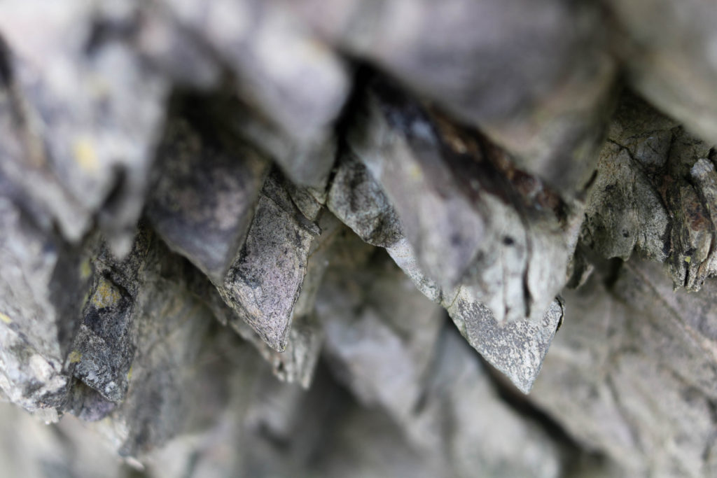
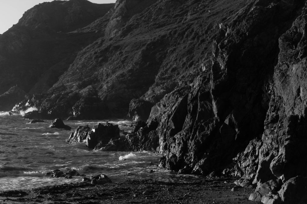
This image was also taken around Le Pulec, around the slipway down to the beach itself, the image clearly shows a unique example of geology in that area, once again showing why the landscape in this area is protected and considered a part of Jersey’s heritage. The tone in this image is slightly brighter than the first image, I made this decision while editing as I thought it would allow the edges of the rocks to be seen more clearly. I like this image as it is made up of very simple shapes, mainly triangles, that give the image a very uniform look. This contrasts with the natural subject matter of the image. This image is made almost entirely of nearly-straight lines, giving the image a strangely unnatural, yet natural look.


Photoshoot Evaluation

I think this was a successful photoshoot, in the sense that I thought my final images were strong images, and I felt I learned more on how to look deeper into the landscapes, as seen in the images where I went particularly close to a certain rock face or feature, as well as wider, more traditional landscapes. I think the rock formations in and around Le Pinnacle, Le Pulec and Le Petit/Grand Etacquerel provided a familiar landscape for me, while also providing a new opportunities to photograph things I may not have seen in the past.

What Went Well:

I feel like I was able to develop my skills in landscape photography, as this photoshoot has given me more experience in taking images to create photo joiners, as well as more traditional images.

How I can Improve:

I found some of my images came out slightly blurry, I don’t know if that was something to do with the camera/settings itself or my own camera handling, next time I will try to ensure my images come out as best they can by making sure the settings on the camera are correct, and I go a bit slower while taking my images.

joiners

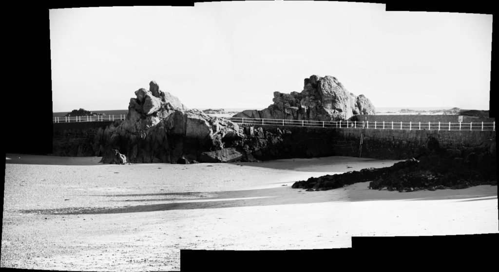
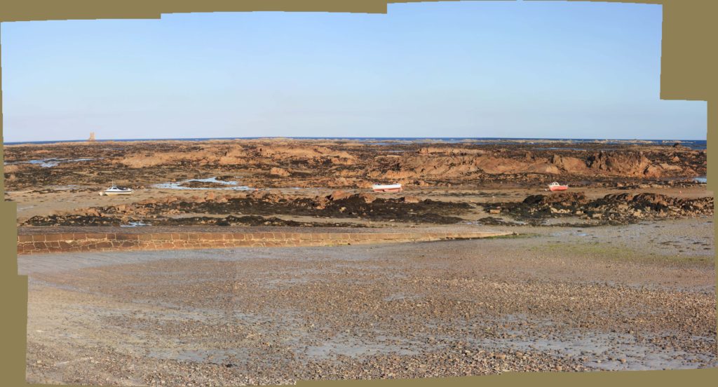
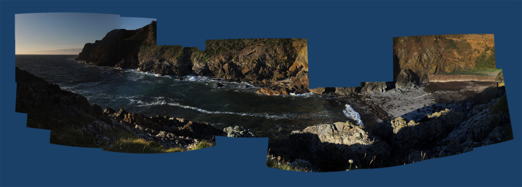
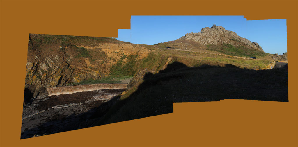
A joiner is a large image made up of smaller images.
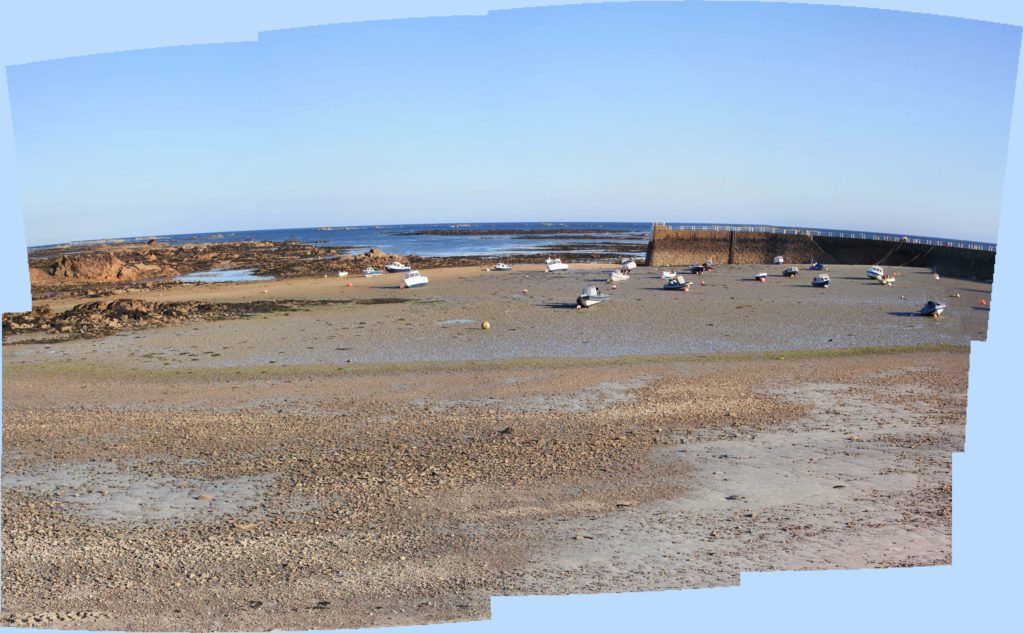
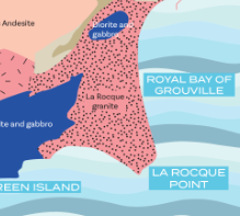
I took photos for my joiners at La Rocque because there are rocks that represent Jersey’s geopark

The first step of making a joiner is to take the photos. I chose what to photograph and took nine zoomed in images that roughly show the main image when put together.

The next step is to choose the right images from the joiners to export in Lightroom. I made folders for each joiner and exported the 9 images for each one.

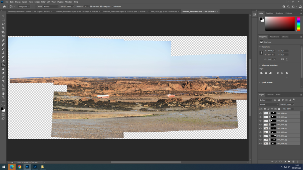
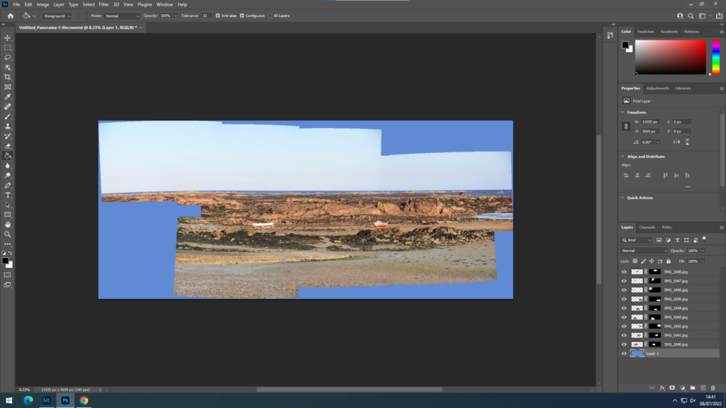
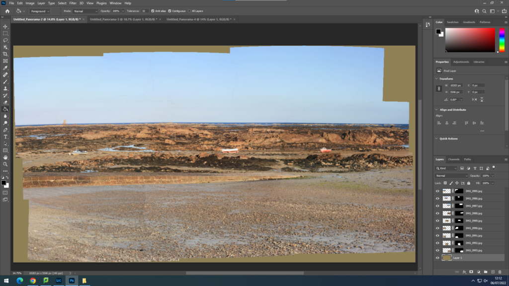
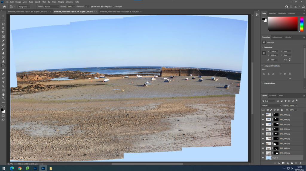
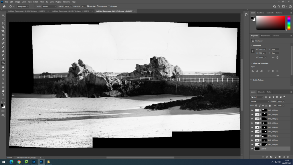
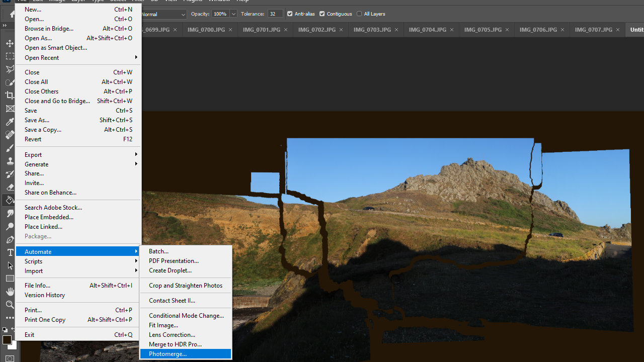
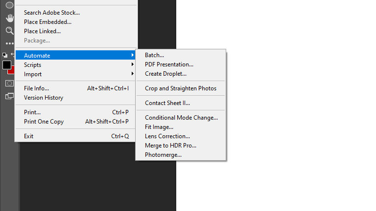
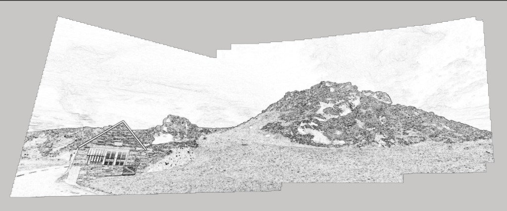
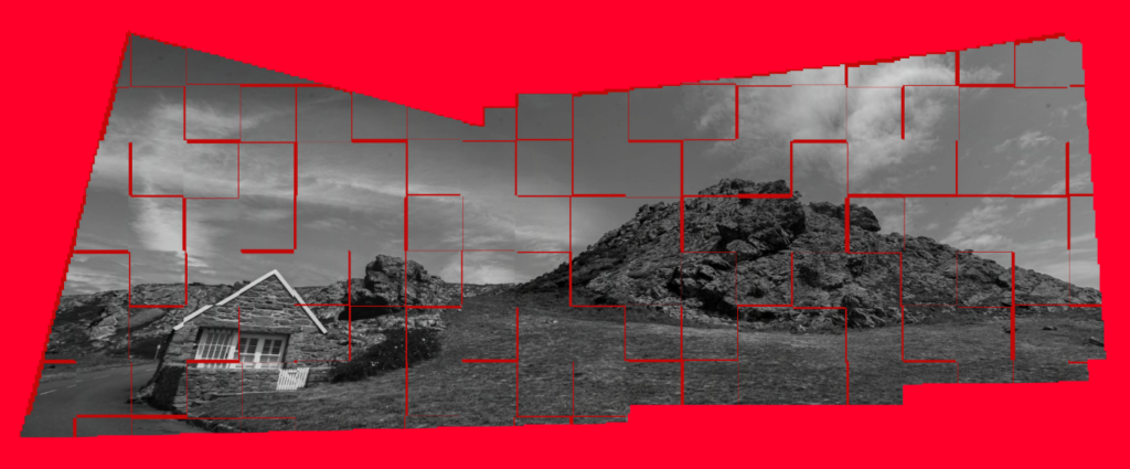
Then in photoshop I used the automate tool to create my joiners.

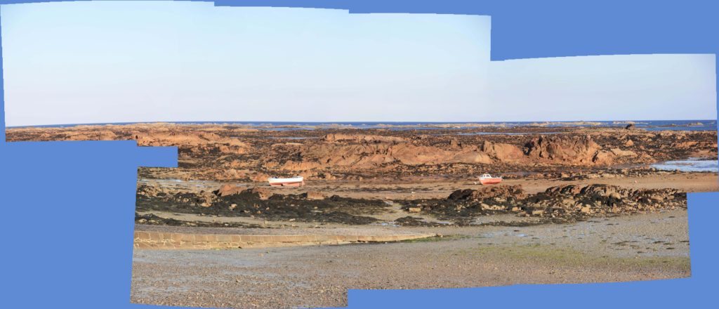
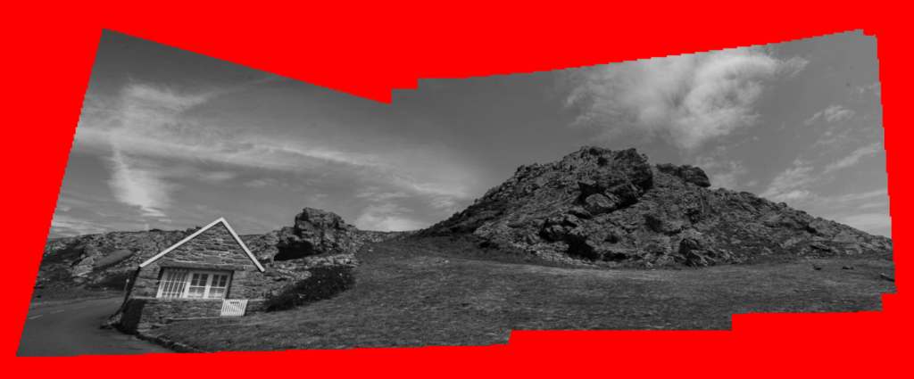
Then I used the fill tool to create a coloured background

Final product:

joiners

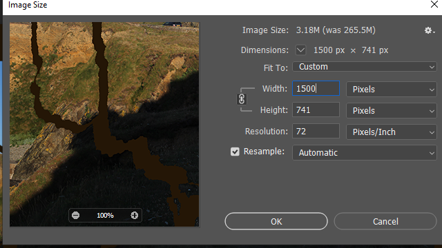
To upload to the blog i changed the pixels so that the image would be able to fit, and i edited it for there to be a clearer resolution so the image is sharper.

This is how i merged all of the separate photos together to create the joiner.

my rock- shoot #1 l’etacq

My first shoot was conducted at areas surrounding L’ Etacq, Le Pinacle and Stinky Bay, We walked around the headland but focused on taking photos of rocks- whether close up or far away.

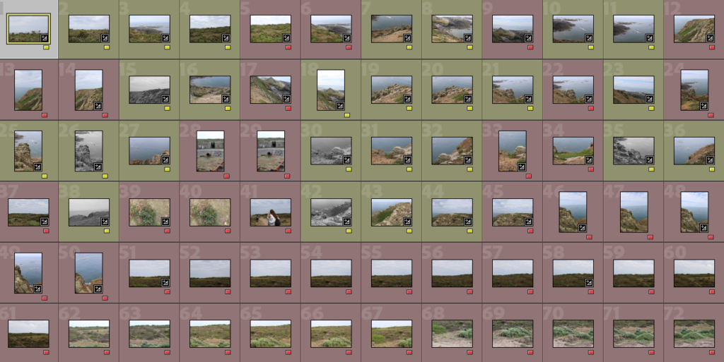
First I separated my images by colour- red meaning I am least likely to use them while yellow meaning I believe they have potential.

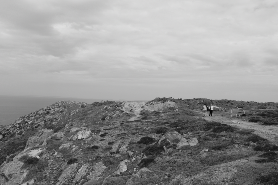
I edited all my images the same way, turning them to black and white then syncing the settings, I then went through each image individually and edited it so it suited the light etc. I also did some spot removal in some of the images as some of them had people in them (spot removal seen below)

While going through and individually editing each image, I did another sub-selection, changing images I believe are my best to green.

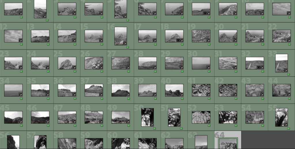
After this I then did a further sub-selection as I had ended up with 64 images I liked, this final sub selection lead me on to my best images.

BEST IMAGES FROM THE SHOOT

case study: David Hockney

David Hockney is an English photographer and artist who was born in 1939. He is well known for his many influential pop-art pieces throughout the 60’s and his original photocollages he manually created throughout the 80’s called ‘joiners’.

Hockney’s joiners use a distinctive style, making his final piece look similar to a painting due to the way he’s chosen to piece them together. He chooses to combine his photos and alter the original landscape to his liking rather than recreating the subject exactly. He likes to focus on the space in each joiner and rearranges objects as he sees fit, the most famous example of this being his joiner ‘Pearblossom Highway No. 2’.

David Hockney 'Pearblossom Highway,' | Teaching Resources

The image at the top is Hockey’s famous joiner ‘Pearblossom Highway No. 2’, a photocollage he created of the actual Pearblossom Highway [which can be seen in the image underneath it]. In order to create the joiner, Hockney took photos using a variety of perspectives over the course of multiple days with a film camera and post-development stuck each image together. He changed the positions of some of the objects to make the image his own, trying to represent the passing of time rather than just remaking the real location by hand.

Hockney’s method takes a lot of time and careful placement as he used hundreds, if not thousands, of images in this piece alone, all of which he stuck down manually over a series of days.

Some more of David Hockney’s joiners:

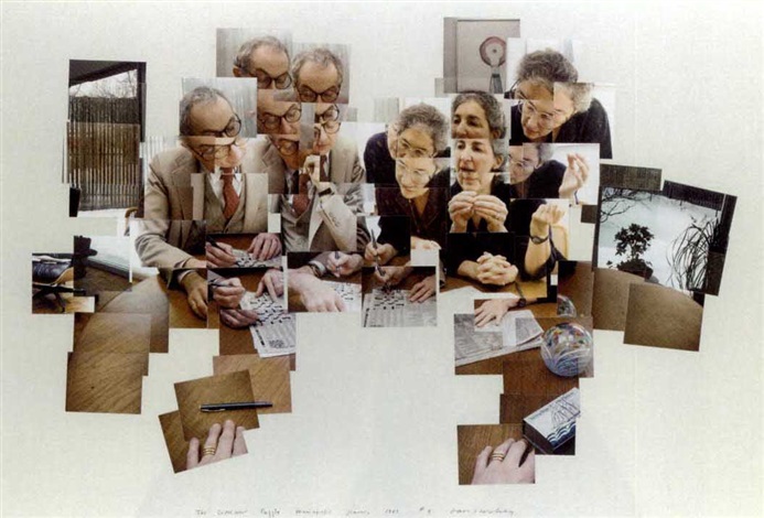
The crossword puzzle, Minneapolis, January 1983 by David Hockney on artnet
‘The Crossword Puzzle’ [1983]
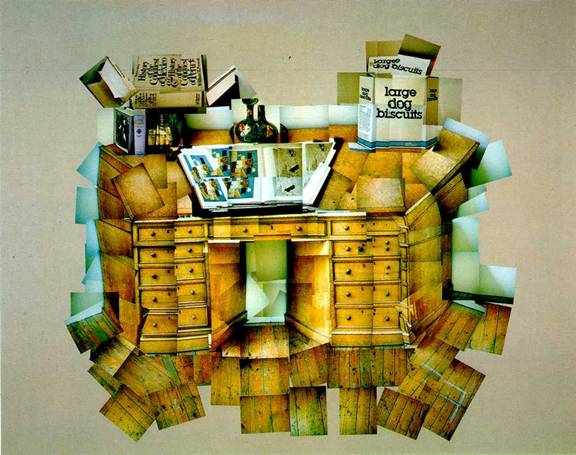
‘The Desk’ [1984]

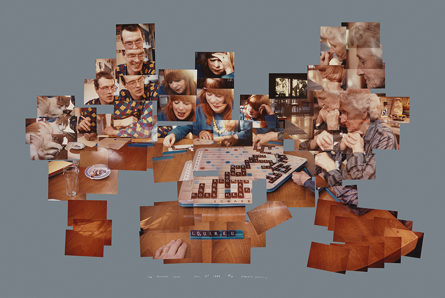
‘The Scrabble Game’ [1983]

joiners

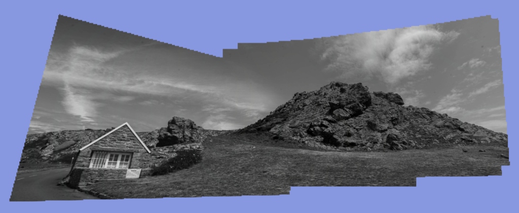
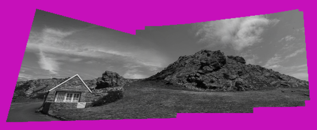
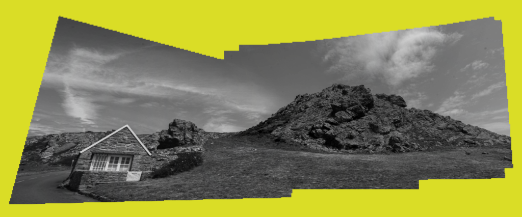
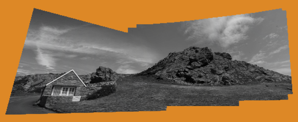
To begin making my Joiner I selected around 15 images from Lightroom and exported them into a specific joiner folder. I colour co-ordinated my joiner images into a yellow collection so I can be more organised. I made sure all selected image were applied with the same editing tools to not ruin my joiner by having coloured images involved.

I exported my joiner images into photoshop through the Photomerge tool to create my joiner. I believe this is the most effective way of creating a joiner instead of using the manual way because it neatly forms all the other images together in a very effective way.

File – automate – photomerge

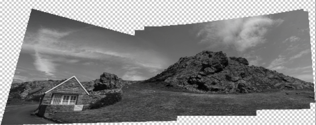
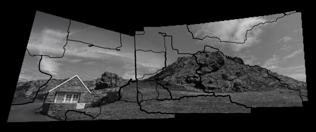
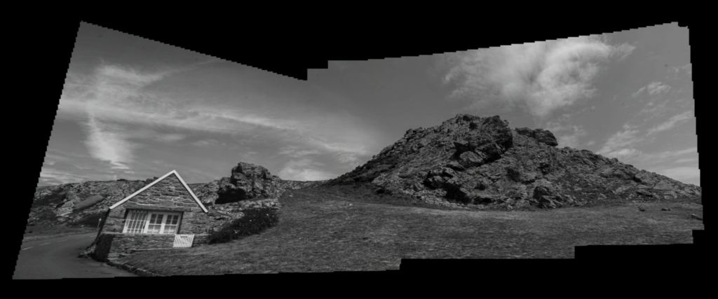
Here is how it created my joiner:

Clear background

Simple edits:

Background colour experimentation:

Evalution

I like the way most of these joiners turned out especially the ones with simple effects. During my experimentation I focused on using one main image that I chose to use throughout all my experiment. I chose this joiner because it was the best out of all the other outcomes I tried to produce due to the wide span of scenery. The use of the bright and vibrant colours made the joiners seem more ‘joyful’ and makes the monochrome joiner have great contrast towards the colours. For the next time I create a joiner I am going to experiment further with 3d objects and creating my own joiner manually instead of the automatic photoshop way.

My Rock Final Images-

I started to edit my images, first by flagging the images that I wanted to use, as well as marking any images I am planning to use in joiners blue. I went through my images again and marked my images yellow and green based on how much I wanted to use them.

I decided to have a range of highly saturated images and black and white images.

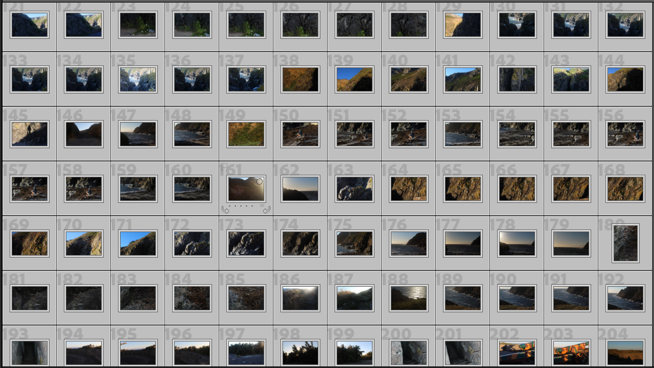
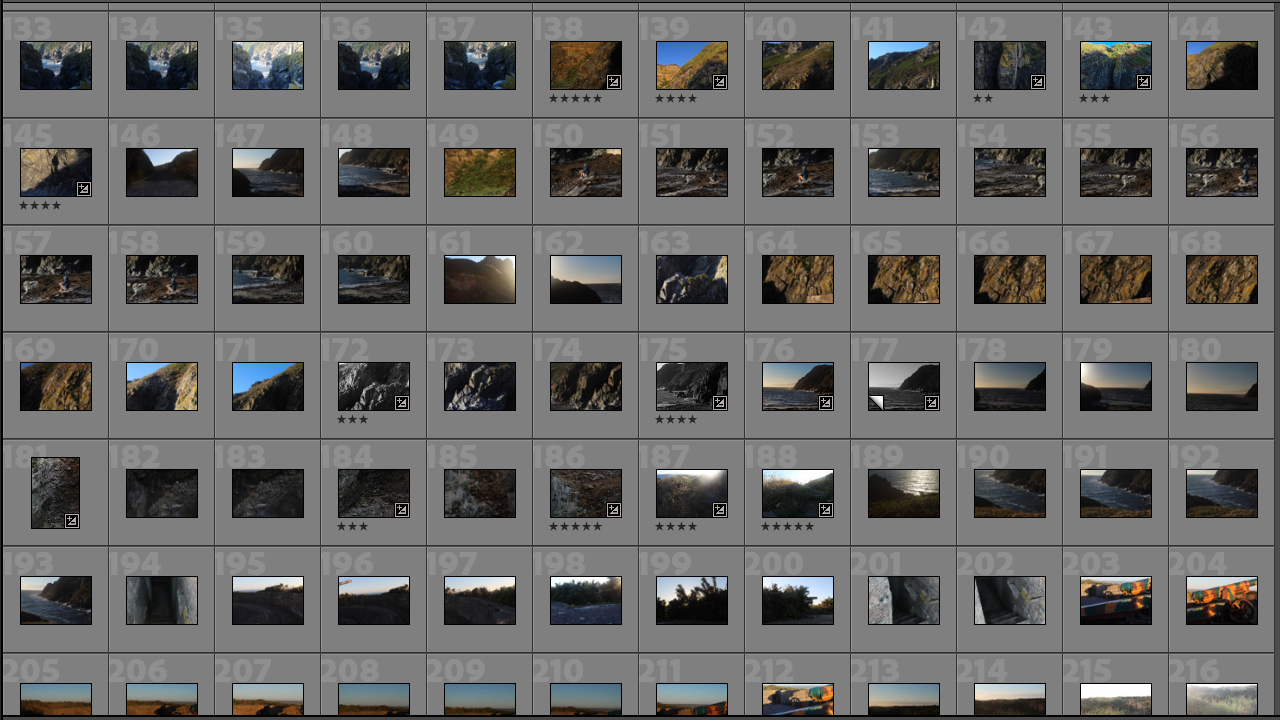
contact sheet

My selection process

I rated my images ranging from 2-5 stars based on how good the image is, after i edited my images i then changed my ratings to the photos i will use for my best images so it is easier and clearer for me to see which ones i will use.

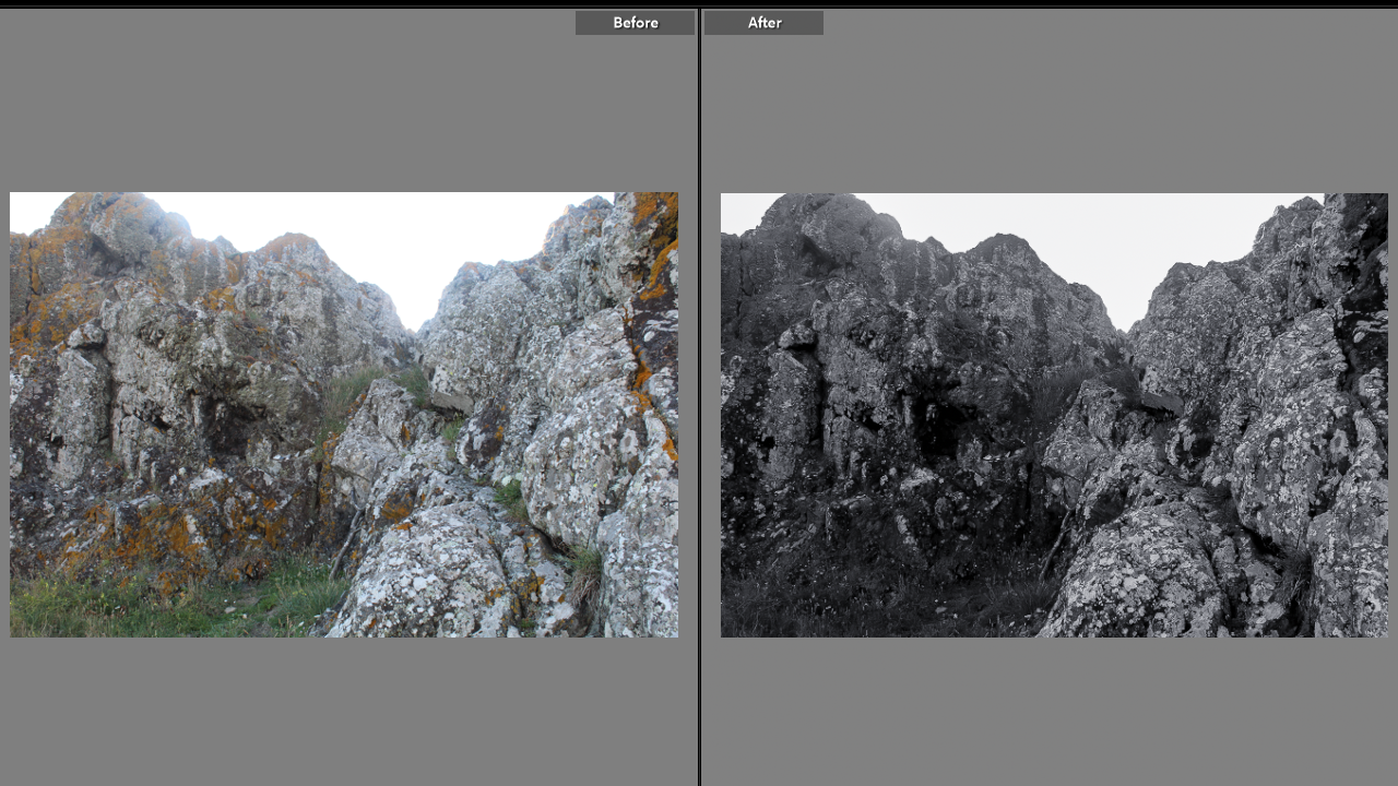
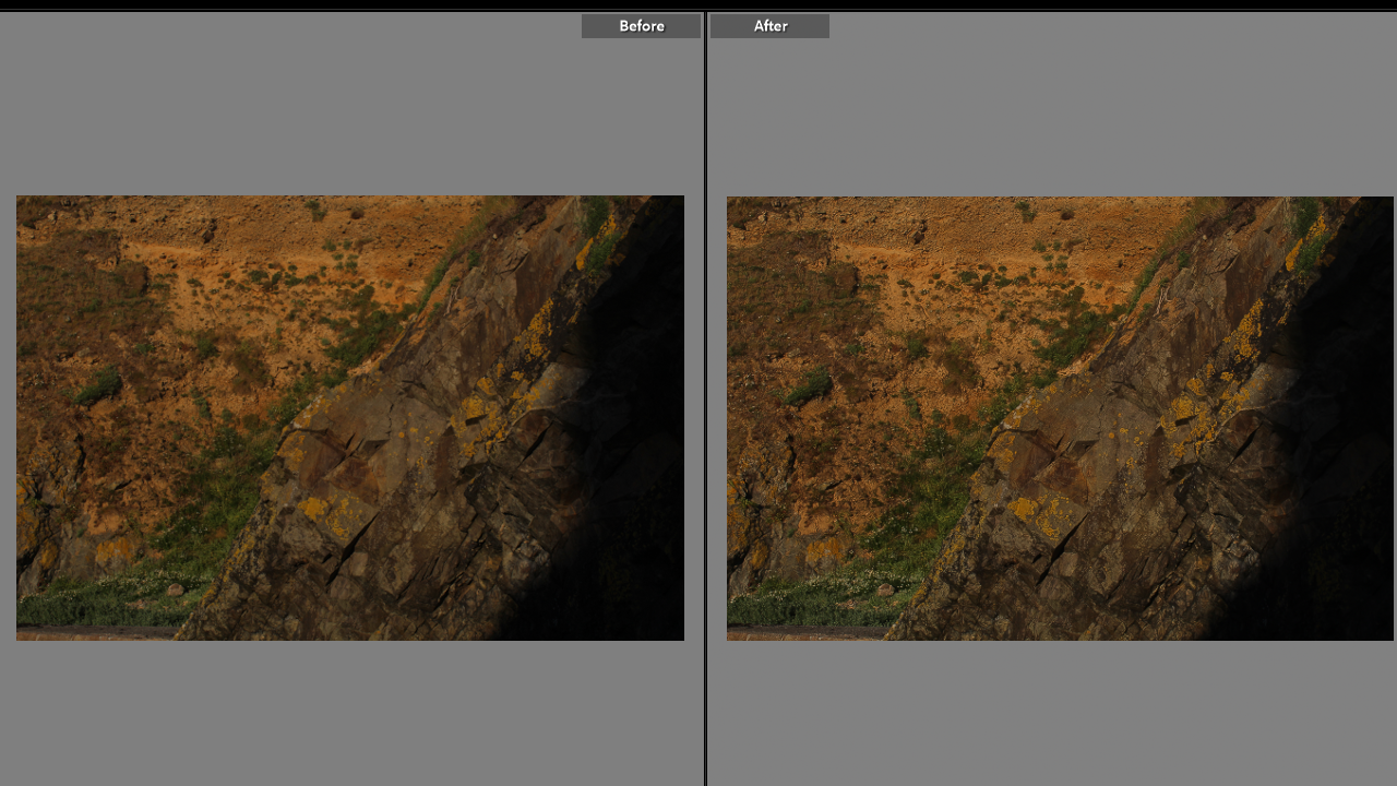
Here is just a couple of examples of adjusting the images to look more presentable and how i edited the majority of my images by adjusting the exposure, contrast and sharpening the image for a cleaner outcome. Some images i made black and white because if the image has a darker contrast i feel black and white enhances the photo better and makes it more dramatic.

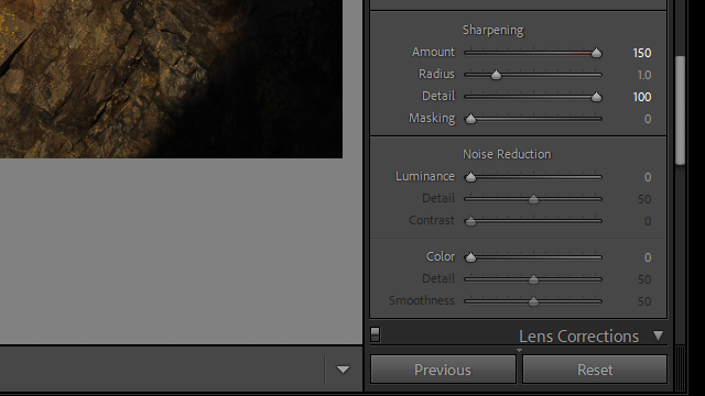
I made these images clearer by sharpening them to look more eyecatching

My best images

I selected my best images highlighting them in green making it easier for me to select them

joiner

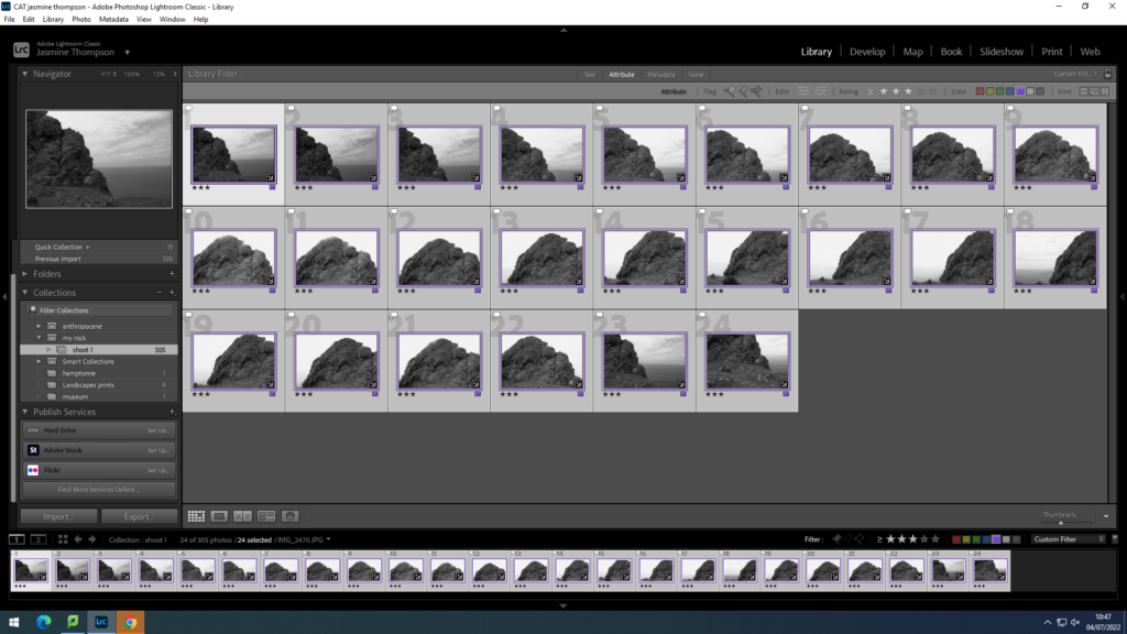
I arranged my images in a star and colour system being 3 stars and a purple filter.
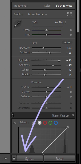
I began by choosing my tone settings and places the image in black and white. Using the sync tool I pasted these settings on the rest of the images i wanted to use.
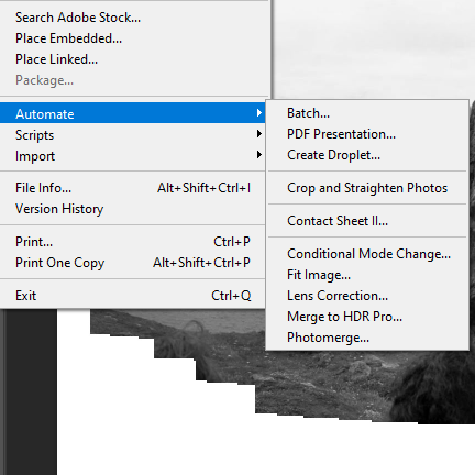
after importing my image into photoshop, I used the photo merge tool within the automate setting to create my joiner

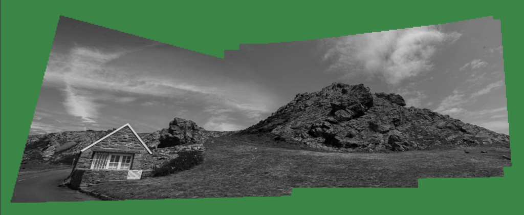
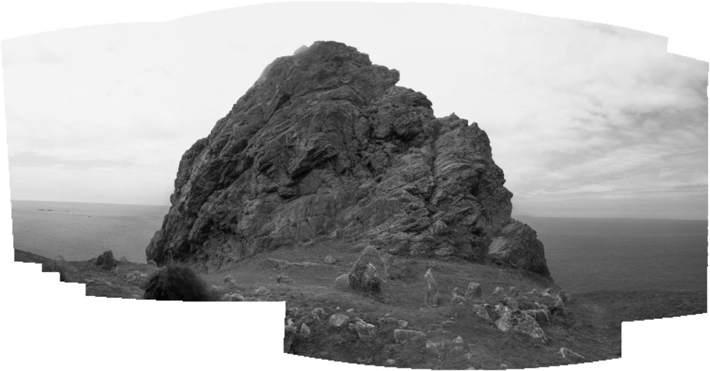
My Joiner

This is the first joiner i made, i decided to make the images black and white to capture the depth and shadows within the rock. I also feel the black and white compliments the solitary feeling of the lonely rock.

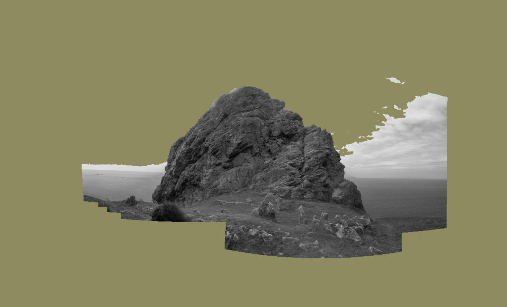
I decided to include a muted green background to emulate the style of Hockney.

Example of Hockneys muted background.

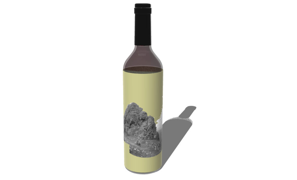
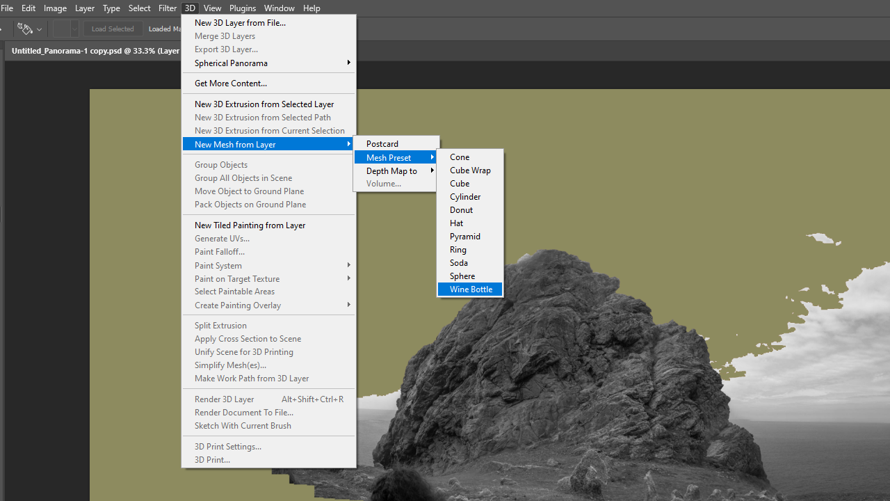
Using photoshop i created a mock up of what my image would look like on a wine bottle.

Overall, I believe my joiner turned out well, however, to improve I would take more images so i could make more joiners and test different editing styles. I would also make sure I capture more of the landscape such as the grassy and rocky surface in the foreground.