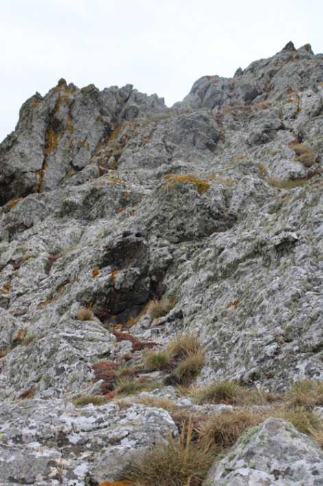
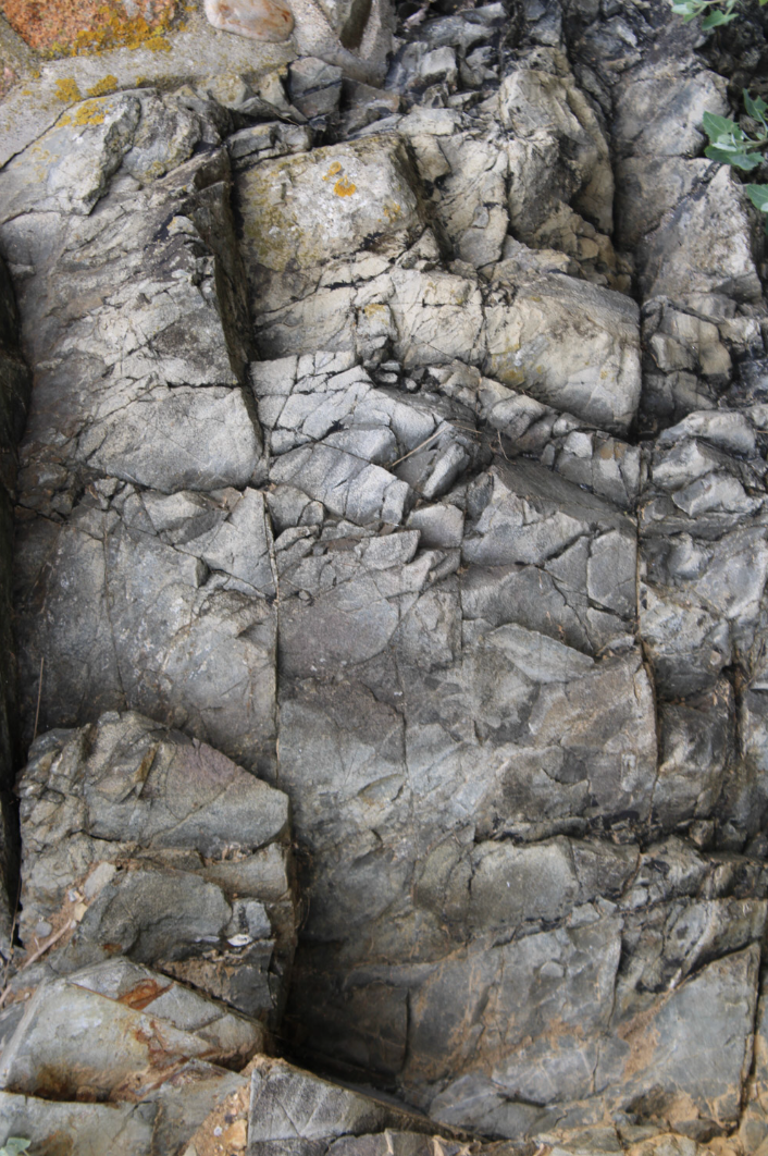
experimentation field trip

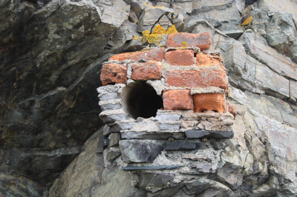
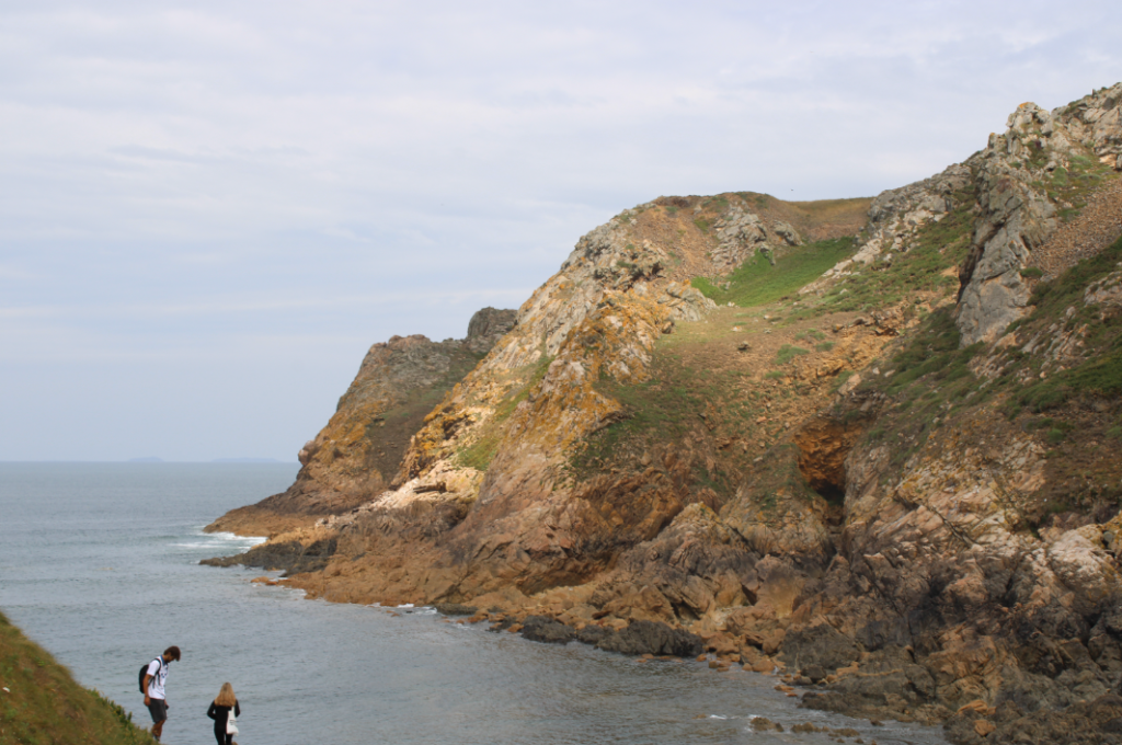
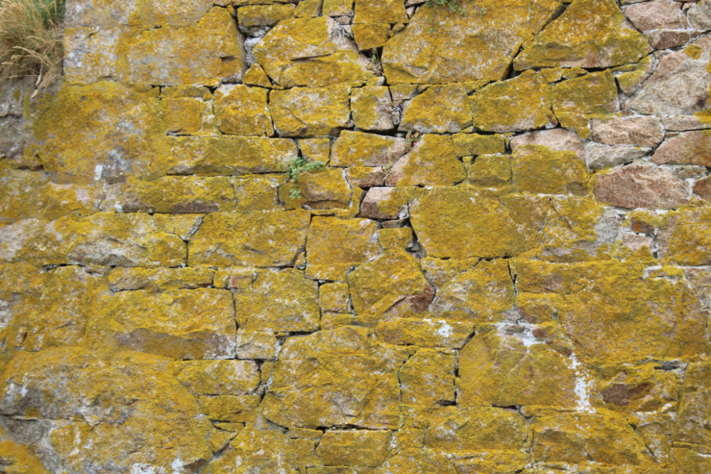
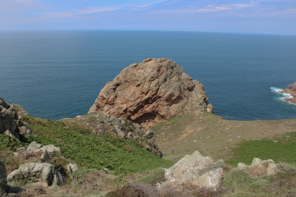
I liked the way I edited this image to proved a deeper range of colours to the image but I decided to experiment with this image in black and white, overall I decided I like the colour image better because the contrast between cold blue sea and the warm yellowy granite.

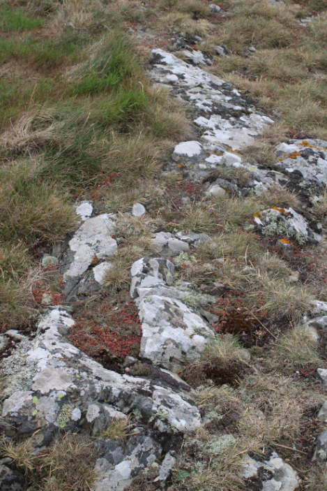
Another image I edited until I was happy with it but then i decided to experiment with the Midtones to proved a tinted colour to the image. I chose a reddish pink which brings out the rich colour in the dirt holding the conglomerate together. i liked this image a lot but i thought a more natural look was better suited to the image.

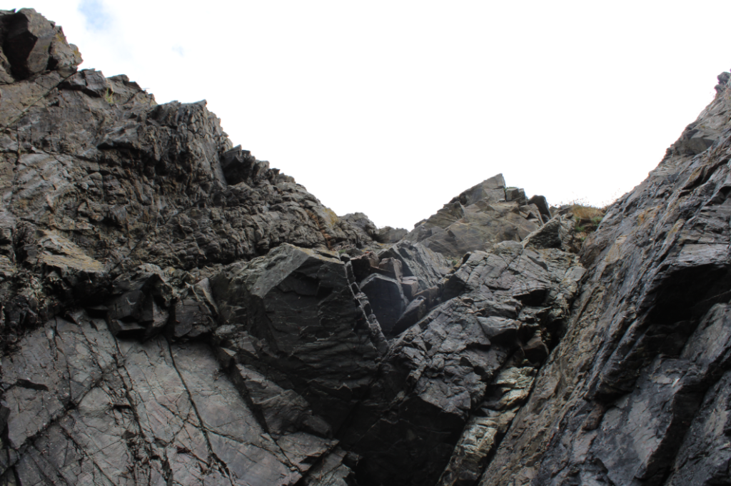
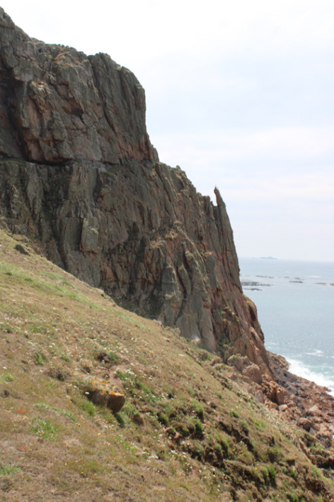
I chose image to put in black and white which gave it a dead pan aesthetic with high contrast between the lighter bolder and darker coloured background. I experimented with changing the tonal curves to change the overall colour of the image. i liked the red effect as it looks alien as if it doesn’t belong in our planets natural environment.
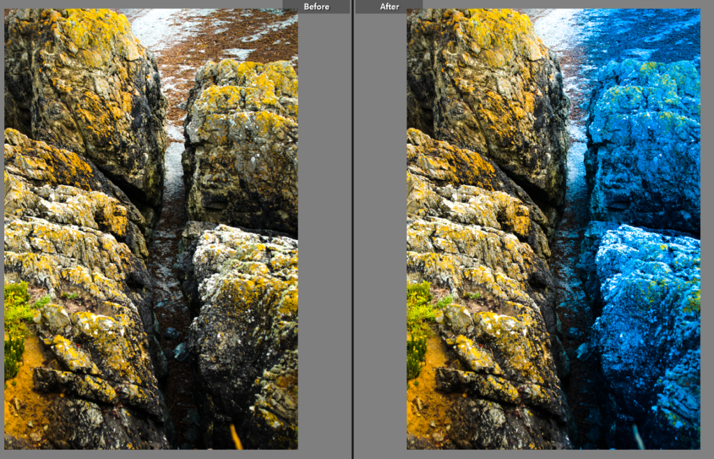
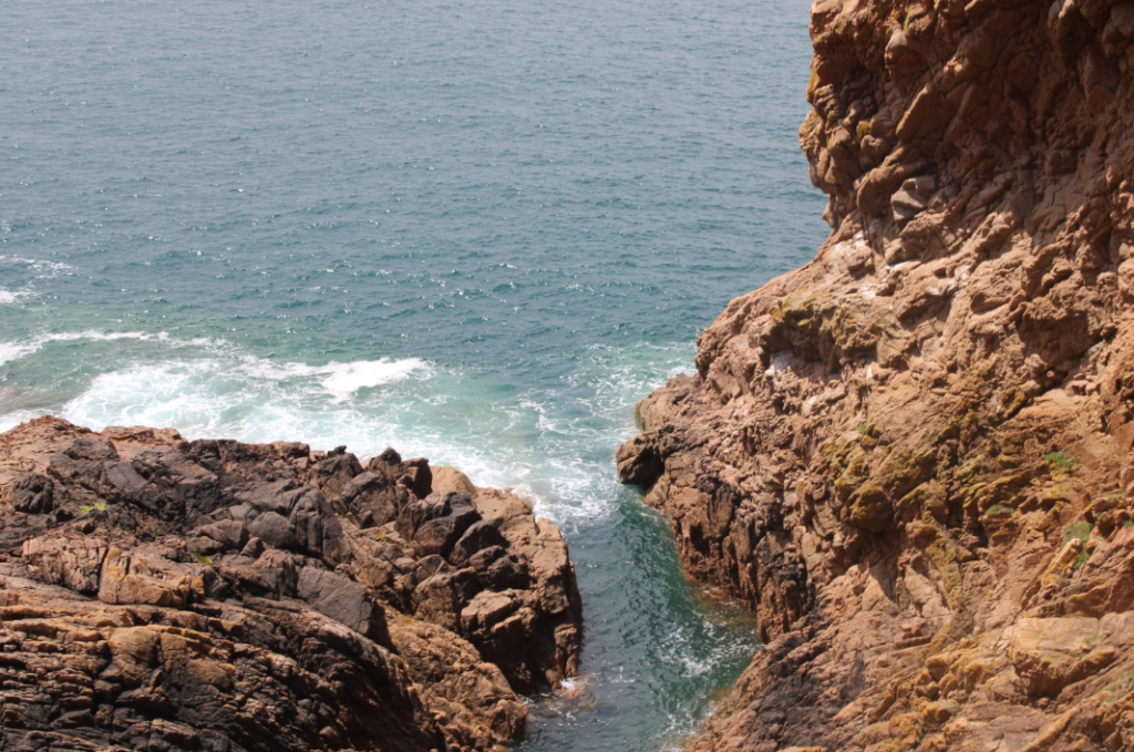
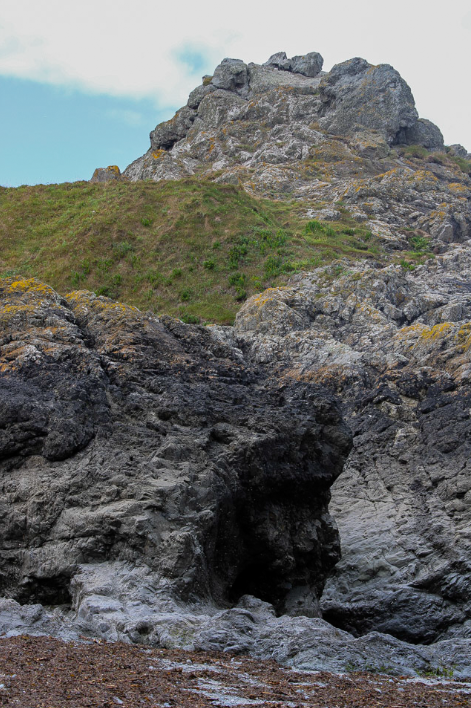
I really like this image of a crevasse which I increased the vibrance to bring out the yellow from the lichen on the rocks. I then used the graduate filter tool and decreased the temp to give a warm side and a cold side to the image with a gap in the middle represented by the divide created by coastal erosion. i liked the way this image turned out.

I liked the effect i created on the last image so I tried a similar effect on another image i placed the graduate filter tool in the centre of the life ring then decreased the temp and increase the hue this created a multi colour effect between the life ring and its surroundings which I thought was very interesting.

photoshoot 1: L’etacq

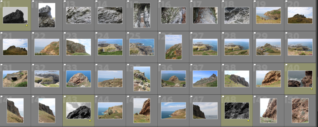
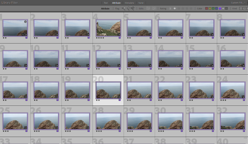
I started going through my first photoshoot on Lightroom and flagged my images, discarding the ones that weren’t in focus or had a bad composition.

Contact Sheet

Next, I began doing some brief edits, such as turning them black and white, on a few of my images that I liked and gave them a yellow colour label to help me differentiate between my edits and raw images.

Best Shots

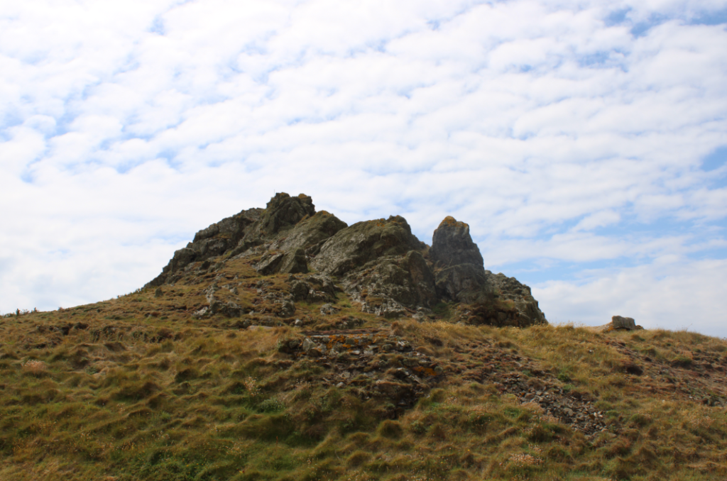
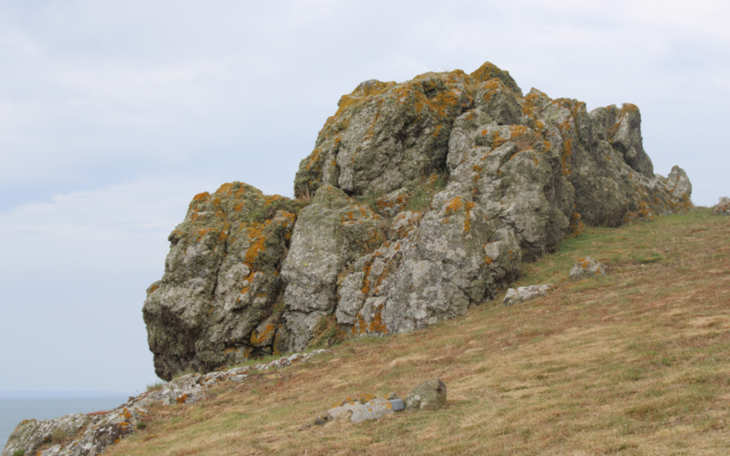
These are my best shots as I like the composition of all the images and think they’re all in focus and well lit. I like how vibrant all the colours are in these images as it helps to emphasize all the details within the rocks, making each image more visually interesting whilst also helping to add depth to all my photos due to the contrast between the highlights and shadows which also makes my images seem more dynamic.

joiner experimentation

Firstly i gathered all my possible joiner photos together and colour coded them so they wouldn’t get lost or mixed up.

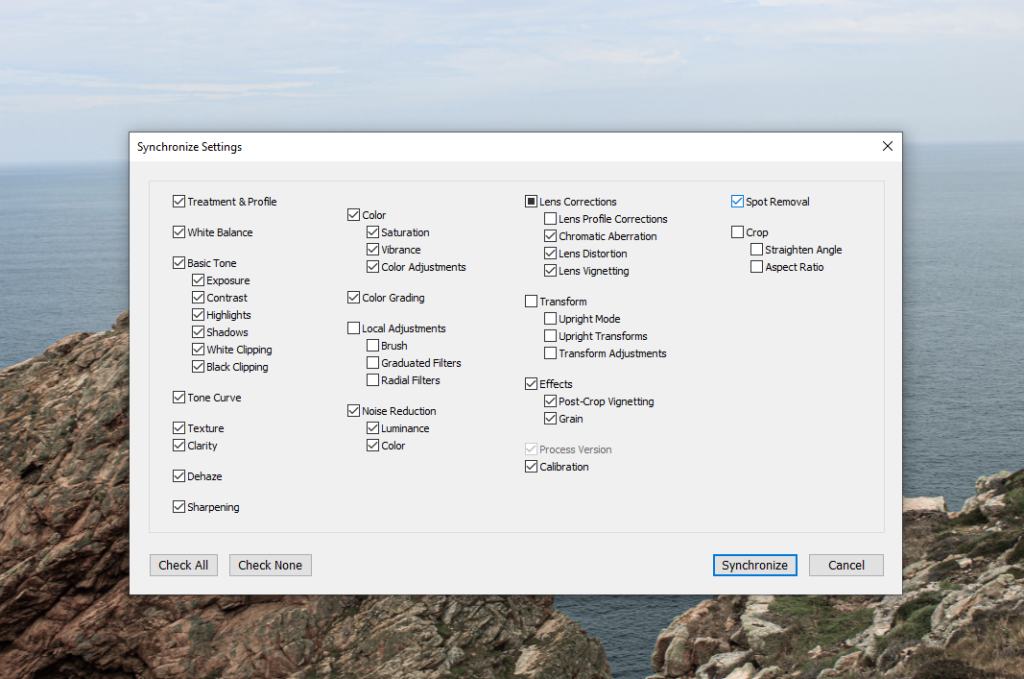
I edited some of the photos with exposure contrast etc. Then grouped them all together to apply the same settings for each photo.

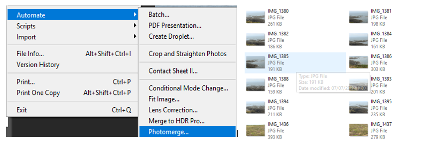
To create my joiner, i went on photoshop, clicked automate then photomerge. I selected my images and pasted them into the file.

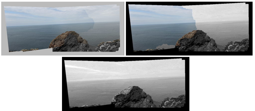
JOINER #1

I chose to experiment with saturation in this set of joiners, i think the second one came out the best because i like the contrast between the light and dark colours.

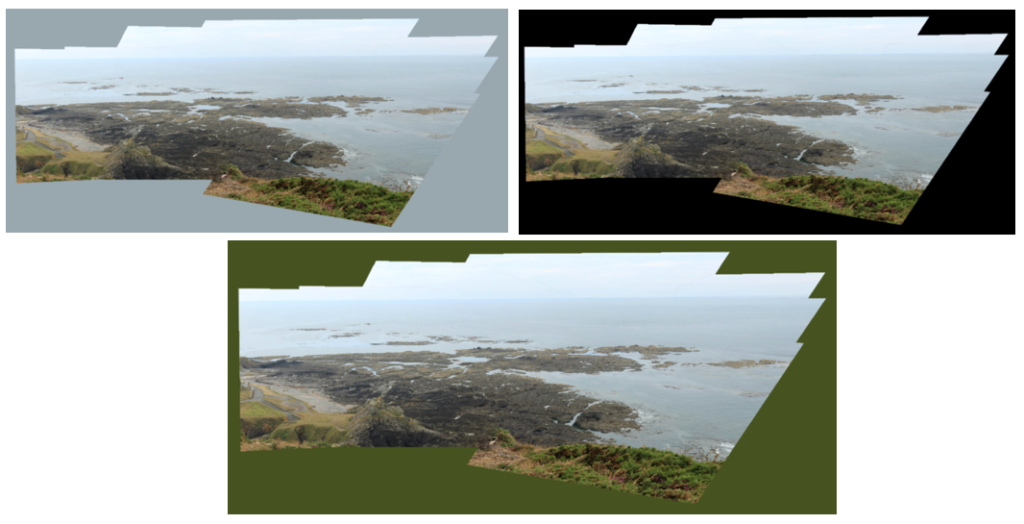
JOINER #2

With this set of joiners i wanted to combine colour in the background which i think helped bring out colours in my joiner.

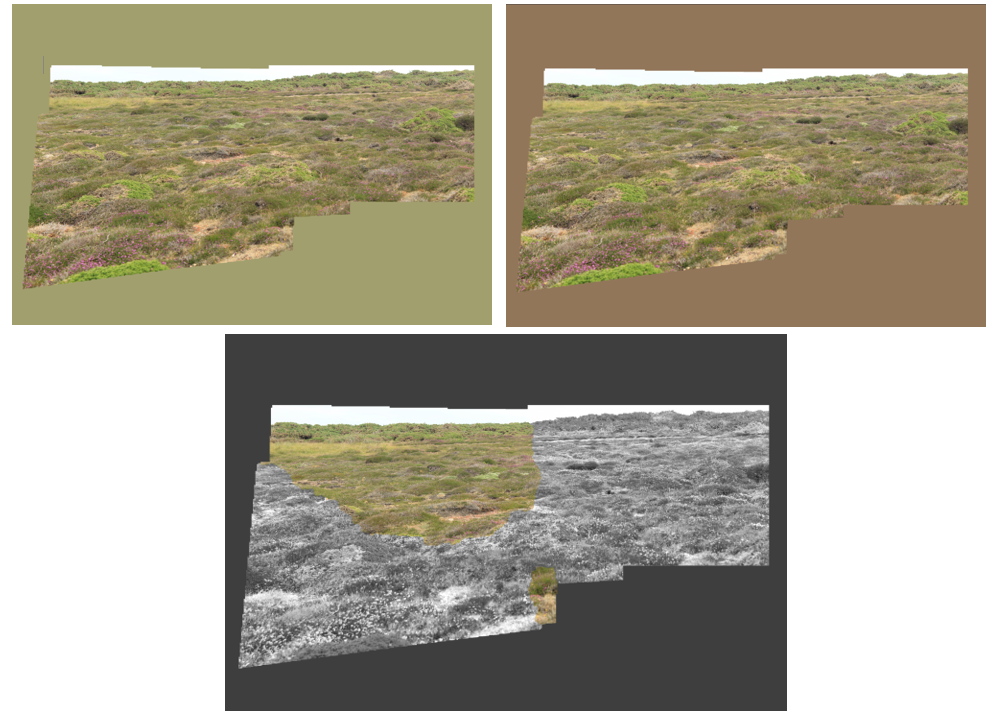
JOINER #3

My third set of joiners are my favourites, especially the bottom one because it has a nice combination of B&W and colour which coordinates with the background.

COMPARISON

I chose to compare this David Hockney joiner with my own because of how different they are. They are both landscape, taken during the day in colour, but also have many differences. Hockneys joiner was taken from above however mine was from looking straight on. In my photos there are no noticeable shadows, however in Hockneys there is a shadow from a tree cast over the pool water. Another difference is background and borders. Hockneys photo has no background, but has white squares around each image, a feature that my joiner does not have.

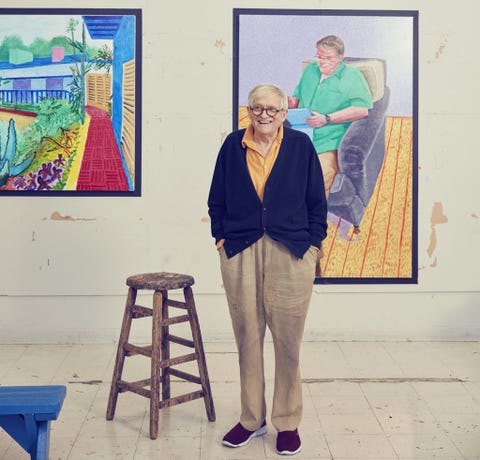
David Hockney

David Hockney (born 9 July 1937) is an English painter, draftsman, printmaker, stage designer, and photographer. As an important contributor to the pop art movement of the 1960s, he is considered one of the most influential British artists of the 20th century.

David Hockney: What I've Learned

While at the Royal College of Art, Hockney featured in the exhibition Young Contemporaries – alongside Peter Blake – that announced the arrival of British Pop art. He was associated with the movement, but his early works display expressionist elements, similar to some works by Francis Bacon.

Hockney moved to Los Angeles in 1964, where he was inspired to make a series of paintings of swimming pools in the comparatively new acrylic medium using vibrant colours. Hockney has also experimented with painting, drawing, printmaking, watercolours, photography, and many other media including a fax machine, paper pulp, computer applications and iPad drawing programs.

Hockney has always returned to painting portraits throughout his career. he painted portraits and double portraits of friends, lovers, and relatives just under life-size in a realistic style that adroitly captured the likenesses of his subjects.

-Joiners-

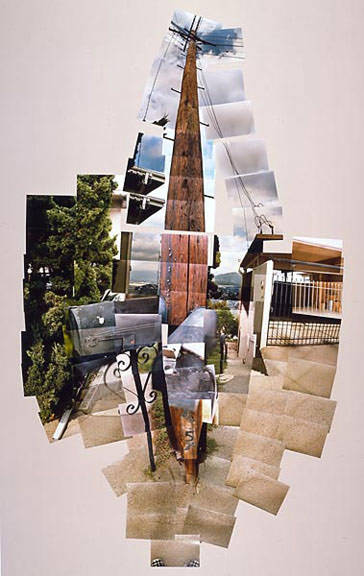
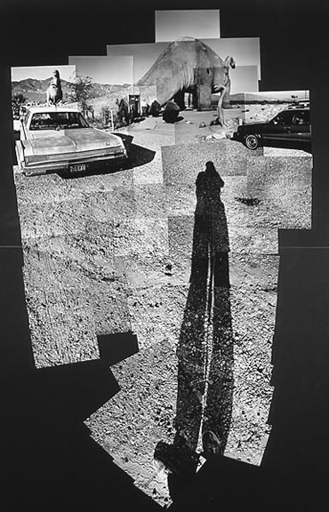
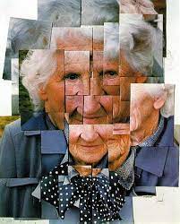
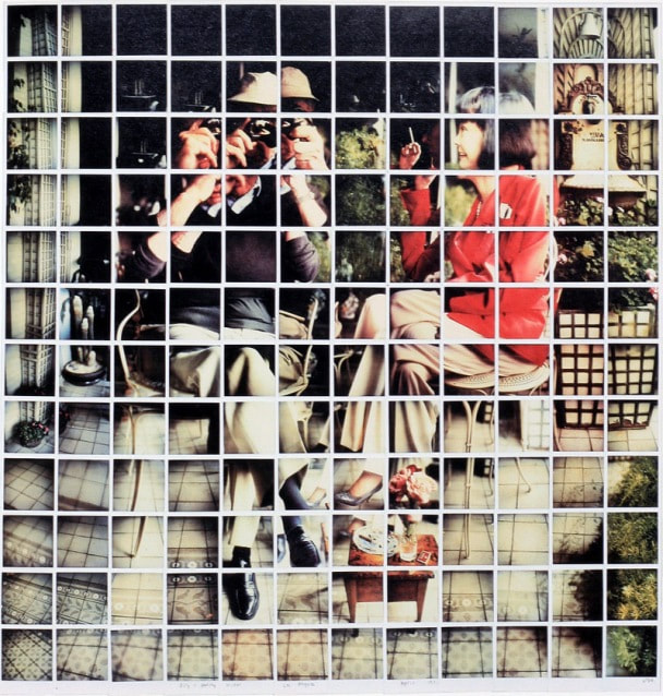
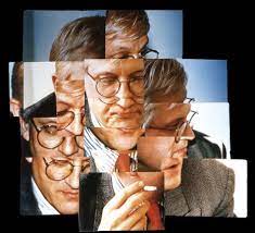
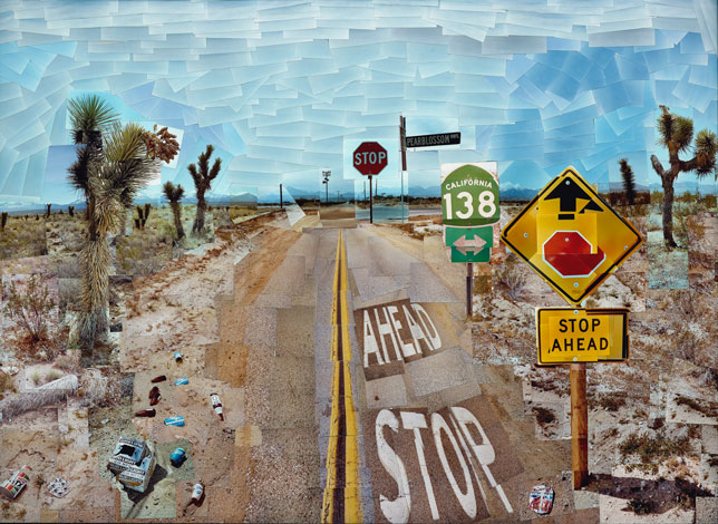
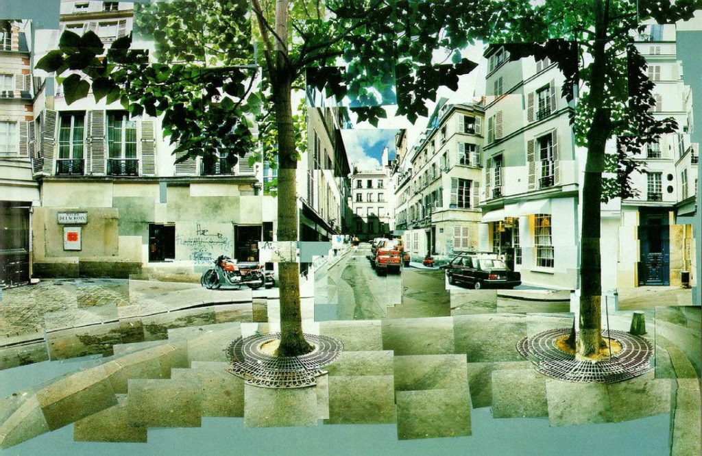
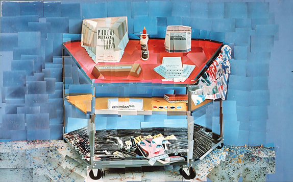
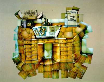
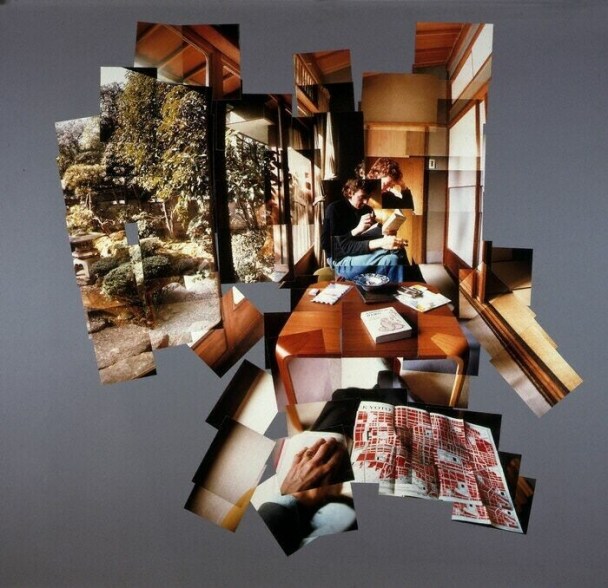
In the early 1980s, Hockney began to produce photo collages —which in his early explorations within his personal photo albums he referred to as “joiners” first using Polaroid prints and 35mm, commercially processed colour prints. Using Polaroid snaps or photolab-prints of a single subject, Hockney arranged a patchwork to make a composite image.

Creation of the “joiners” occurred accidentally. He noticed in the late sixties that photographers were using cameras with wide-angle lenses. He did not like these photographs because they looked somewhat distorted. While working on a painting of a living room and terrace in Los Angeles, he took Polaroid shots of the living room and glued them together, not intending for them to be a composition on their own. On looking at the final composition, he realised it created a narrative, as if the viewer moved through the room.