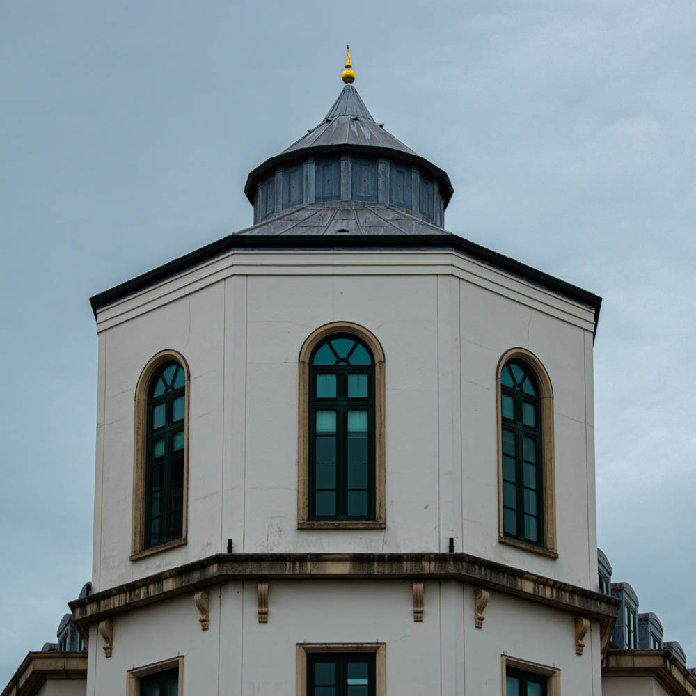
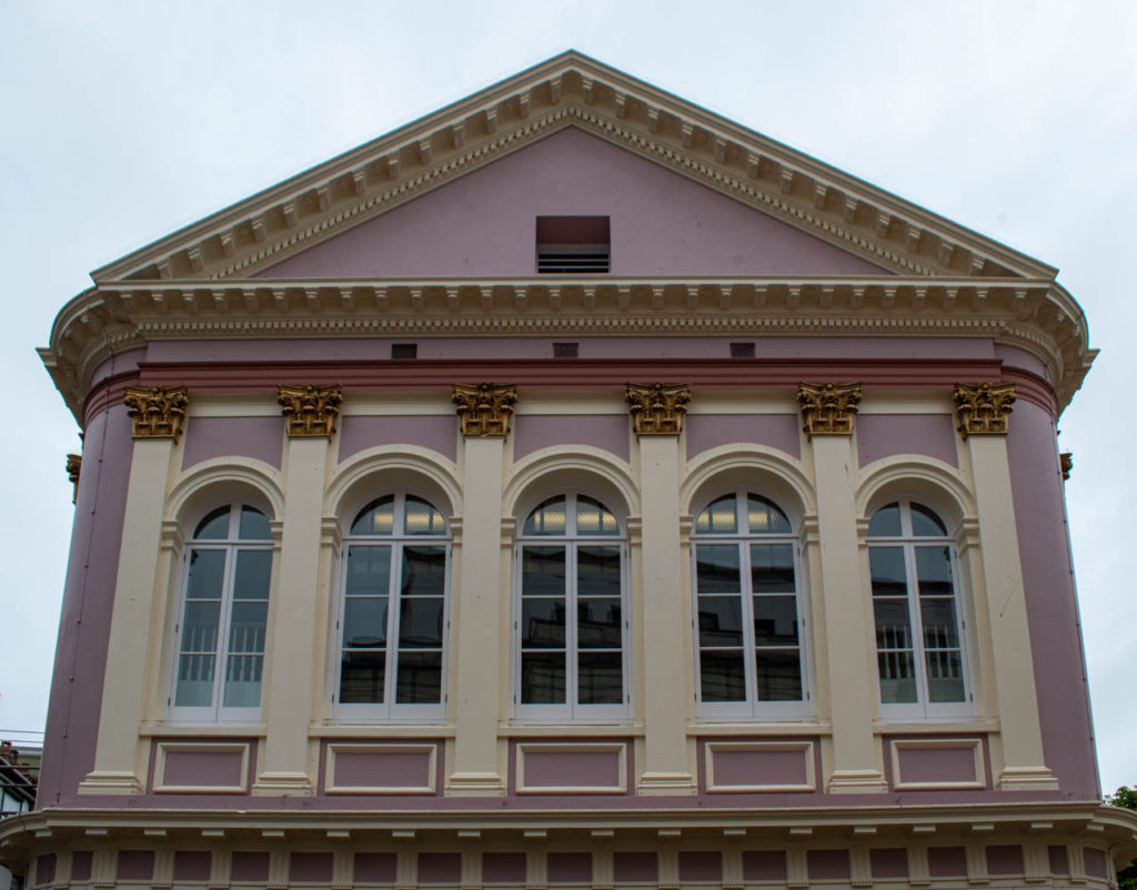
Artist reference – Nicholas Nixon and Lewis Blitz
Where – I will take photographs in town.
When – During a clear day.
What – I will take close ups of buildings and windows.
Equipment – Camera
Artist reference – Nicholas Nixon and Lewis Blitz
Where – I will take photographs in town.
When – During a clear day.
What – I will take close ups of buildings and windows.
Equipment – Camera
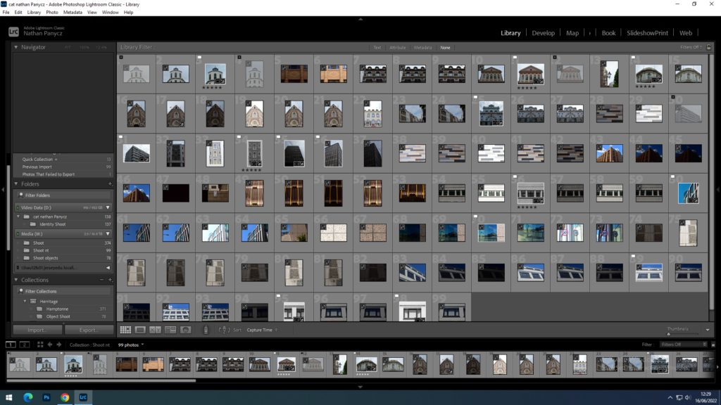
Those photographs were taken at two seperate shoots, in St Helier. I experimented with different angles and ideas.

Those are the photographs I thought came out the best after considering sharpness and exposure.

The first three photographs and the ones with 4 stars are my experimentation. Number 4 and 7 are the ones I chose as most appropriate for this project taking in count my reference artists.
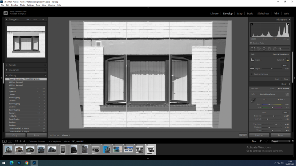
Considering there is no squares in my shot I decided to crop the picture into a square format to give it a similar sense of stability as the square window frame in Blitz’s Claremont, 1973. I used the transform tool to achieve symmetry and bring the window more to the eye level like in Blitz photograph.
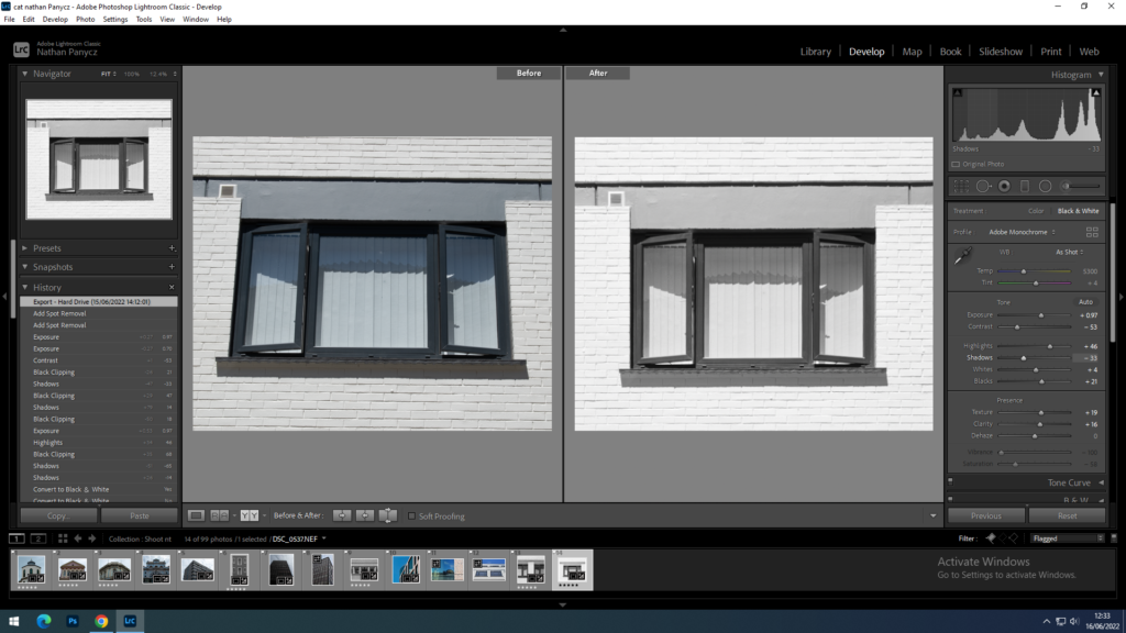
I chose the black and white format because simplicity usually carries the strongest messages. I shoot this outside during a sunny weather at around 11 am, with the sun above me slightly to the right which created nice symmetric shadows below the window cell. I had the ISO set to 100 as it was a very bright and sunny day and the camera was pointing up. In addition the white wall reflected all the light back at the camera. I wanted to get as much detail in as possible so chose a small aperture of f/26 for a higher depth of field (so that the top wouldn’t be blurry as compare to the bottom). To compensate the exposure for the small aperture I set the shutter speed at around 1/60 which is still a value at which I could shoot handheld with no blur. I used the auto development option to get the process started, I then increased the exposure to match the style of Blitz photograph. I turned decreased the contrast, increased the whites and highlights, as well as reduced the saturation to narrow down the tonal range. Since the contrast was low, the detail and texture was limited so I decided to turn up the clarity and texture as the reference photograph, although not very refined in the reflection, does have prominent textures outside of it.
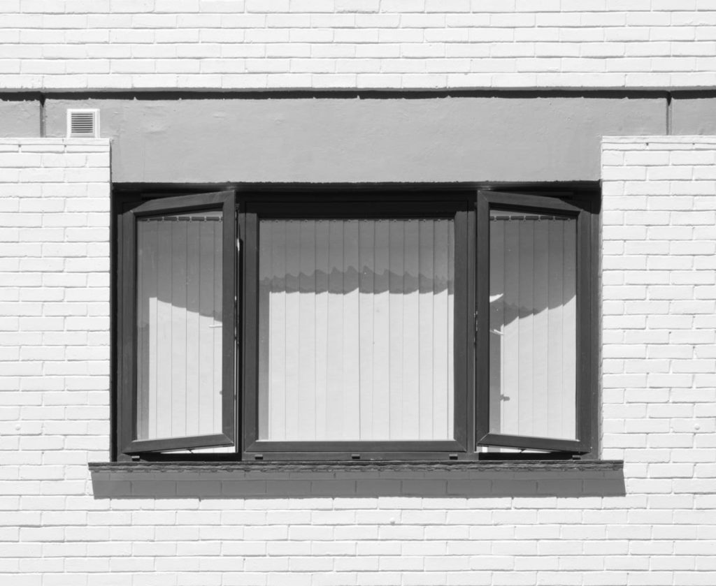
In this photograph I tried to convey the way humans are able to find a sense of peace and stability in this hectic and crowded world. Even in Jersey where housing is limited and problematic, we are still inclined to call it home.
In comparison to the Lewis Blitz’s Claremont, 1973, this photograph is much more complex due the near absence of negative space; loads of shapes including the rectangular window frames and textures such as the bricks in the wall. The gray wall above the window makes for a great line as the viewer is drawn to it because of the polarity it poses against the positive space; It offers a safe space for the eyes to rest. It leads the eye to the focal point eventually as it dips downwards. As a result of the antithesis between the tones, the window frame also makes for a great line leading the eye around the main subject. While the horizontal lines create a sense of stability and stagnation, the vertical lines convey growth and determination. Metaphorically, this represents the conflict between environmentalism and The New Topographics movement. The open window creates diagonal lines which induce tension within the photograph, this engages the viewer as they try to resolve it. In addition convergring, diagonal lines add depth to the photograph. Unlike the Lewis Blitz photograph, this one is also rich in shadows which bring out dimensions, this is due to the angle at which the photograph was taken. Blitz also gives us insight into someone’s personal life as well as a reflection of the outside world. In my photograph no reflection is present and the curtains block the scene behind the window creating a sence of uncertainty.
Overall I think I did a good job with creating a sense of space through lines and shadows. The symmetry also makes the picture look tidy and balanced although the air vent on the upper left side causes a bit of a disruption. Using the monochrome format took away any distractions caused by colour allowing the message to be conveyed lightly but firmly.
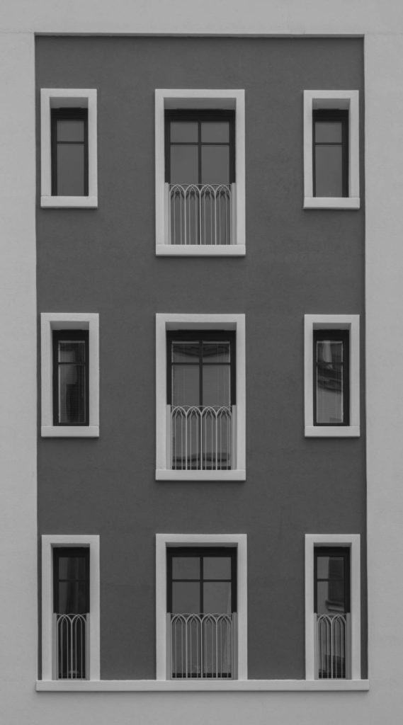
This photograph was inspired by both Lewis Blitz and Nicolas Nixon.


