
Evaluation of my process
Artist References
Even though I didn’t end up creating a collage in the style of Laura Romero or Anastasia Savinova, I am still grateful I chose them as my first artists – I found my locations to shoot from these two artists’ ideas, and wouldn’t have found my areas to photograph if it wasn’t for these two artists. I decided not to use collage with my images as I ended up realising the images I had taken would not respond to the artists’ work very effectively, and wouldn’t produce the quality of work that I wanted. After researching and realising I am more interested in documentary photography, such as Peter Mitchell and Sharon O’Neill, I began to research photographers who documented the wealth divide, social housing, economic issues, and poverty. I then found. two artists that I felt would help me to produce the best work I could, which would inspire my work.
Photoshoots
Photoshoot 1:
This photoshoot was mostly successful, however, I had trouble with the weather towards the end of my shoot so I had to reshoot the next day. The first part of the shoot was more successful, as there was no rain, and the overcast skies helped me to achieve the bold lines and intense shapes which I wanted to achieve in my images. On the other hand, I had trouble with overexposure in this shoot and found this an issue in my editing, which I will discuss below. To improve this shoot if I was to do it again, I would ensure the weather was better for my shoot further in advance, ensuring better exposure and brightness. (preferably sunny weather conditions with the low wind to ensure my images are not shaky or blurry).
Photoshoot 2:
This photoshoot, in which I took pictures of industrial buildings, was successful, but I did not end up using most of the pictures. I completed this photoshoot because initially, my idea was to produce collages of housing and business buildings, however, my idea developed into more of a photojournalism style, after researching further on the issue and related artists. Even if I didn’t end up using these pictures of industrial buildings in my final outcomes and the rest of my project, this photoshoot allowed me to further fine-tune my idea, and without this shoot, I may not have decided to alter my idea and complete a third photo shoot. Lastly, the Ann Street brewery that I photographed was next to De Quetteville Court, the main location of my third shoot – I would not have discovered my location for the third shoot, and it would not have been so successful – I would not have found a location that linked as closely to my chosen theme, and my final piece may not have been as effective.
Photoshoot 3:
I found this one to be the most successful of my three photoshoots. I think this is because I carried out this photoshoot after further research and had a more informed idea of what my project was becoming – therefore I had a clearer idea of the shots, areas and ideas I was trying to achieve when I took my images. These images, in my opinion, had more meaning behind them, with the help of my added research on the housing crisis and its’ relation to the area I was photographing. If I was to carry out this project and exam again, I would have done the same level of research before my previous photoshoot. This made the last photoshoot much more successful, and I think that if I had carried out the same level of research before ALL of my shoots, not just the last, the project would have been more successful.
Selections and Editing
Selections:
I selected my images using Lightroom classic. After importing my images, I put them into folders for each photoshoot. I then used p and x tools to select my favourite images – however, I did have to redo this process multiple times due to very similar images. Therefore, if I was to do my photoshoots again for this project, I would make sure to avoid very similar shots, as this was detrimental to my selection process and then my editing. Overall I think this selection process was effective but was too time-consuming so did mean I had less time for editing/creating my zine and final outcomes in the exam.
Editing:
I decided to edit in black and white in the end, but I had originally planned to do my collages, with some black and white and some in colour. Once I had moved away from this idea, I decided to not edit in colour, as I thought black and white images would help to bring out the strong lines and shapes in the architecture and buildings I was photographing, and highlight the strong monochromatic tones that were present in most of my images anyway.
Final Images
These images are the pictures I have selected as my best outcomes from the project – These will make up my physical outcomes, and also make up most of my zine as I showed and evaluated in my last blog post.
I chose this image as one of my final images due to the different tones within the image as well as the varying light and shadow. When I was shooting, the light was coming from the right, which can be seen in the image as the left side of the building is much brighter, contrasting with the right side which is much darker and moodier in tone. This creates a split tone effect in the image, as the split of light happens to fall just off the centre of the image. – This helps to balance the image compositionally. After reviewing all of my images, I would say this is one of my most successful images from this project, and in hindsight, I think this type of image worked better than others. If I was to redo this project I would take similar images to this of other buildings after seeing how successful this image was after my editing and final printing.

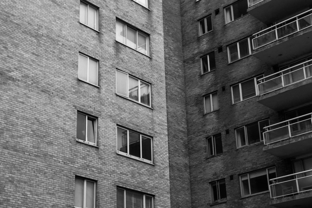
I chose this image as one of my final because of the strong lines and shape. The image is split up into three parts in a way: the lower part of the house, the flats to the right, and the upper bit of the house. There is strong repetition in the apartment building with rectangular windows. This contrasts with the lines in the house, as they are more triangular. This creates a natural partition in the image. Although I chose this image as one of my final ones, I do think that looking back I should have not edited with such high contrast levels, as I think this makes the image a little too dark.
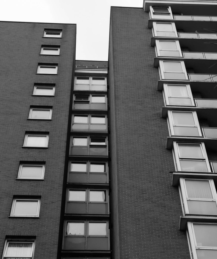
This image is one of my favourites from this project. I am super happy with the angle from which it was taken, which creates strong leading lines next to the windows, and along the bit of the building which juts inwards. I think my editing in this image was successful, as I didn’t overdo the contrast – this was a little bit of an issue with some of my other images. I think the composition of this image is an aspect that makes it one of my favourites, as I utilised the rule of thirds to make sure the composition was balanced.

I chose this image as one of my best because of the sharp lines and high contrast between the building, sky, and features of the building. The building takes up most of the image, and even if the sky only features slightly to the right, the sharp line separating the two parts of the image is a key focal point. I think editing in black and white for this image was a good decision as it highlights the sharp lines and the highly shadowed windows.

I chose this photo for a few reasons: I like how each window shows a different life in the building. This feature of this photo is unique in my project, which I wanted to include. Furthermore, there is strong repetition in this image: the windows create a rigid pattern, however, this is broken up due to the angle at which the photo was taken, slightly tilted. Also, my use of cropping plays a part in this angle. Originally, this image was not cropped enough for the effect I wanted to achieve, so to put more focus on the individual windows I cropped the image inwards quite significantly. Looking back, I think this was a good decision as I think it gives the image further depth and stops the image from looking too flat.

This image is definitely one of my favourites from the Anthropocene project, so I decided to include it in my final prints. I think this image compositionally is really strong. This is helped by the way the overgrown garden frames the door of the house, and how these plants are seen in the foreground, midground and background of the image. I did use slight cropping in this image, as I think originally there were too many other parts of the house and apartment building in the background which made the composition too busy and distracted the eye from the door and garden which are the main parts of the image. I like this image also because at first glance, the house looks lived in, just a little overgrown. As you look closer, it is visible that the house is in fact empty, which I think is helped by the soft black and white editing (creating a feeling of emptiness in the image). I think my editing was really successful in this image, and if I was to do my editing again I would not change it.

This is my last final image from the Anthropocene project. I like the deadpan nature of this image, showing the true look of the environment I was photographing. I used slight cropping to the right of this image, to ensure it was only one house in the image – this helps the image to be more balanced compositionally. In hindsight, I do think my editing was too dark for this image – there are too many blacks in the fence and windows, and if I was to re-edit this photo again, I would turn the blacks and contrast down slightly.
Final Zine
Creating my zine: I found creating the zine a little difficult at first – I had never used AdobeInDesign before, and I found it a little tricky to navigate at first. However, after getting to grips with it I found it very useful – the two kinds of lines around an image meant I could crop and move my images smoothly – this tool made my spreads much better, as I could fine-tune which parts of an image were the focus of a spread.
(Final presentation shown and evaluated in my previous blog post)