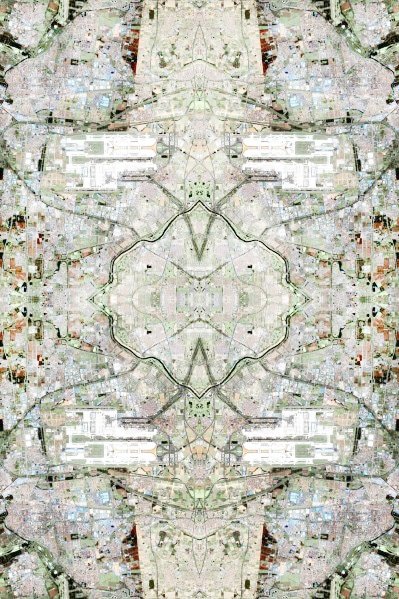
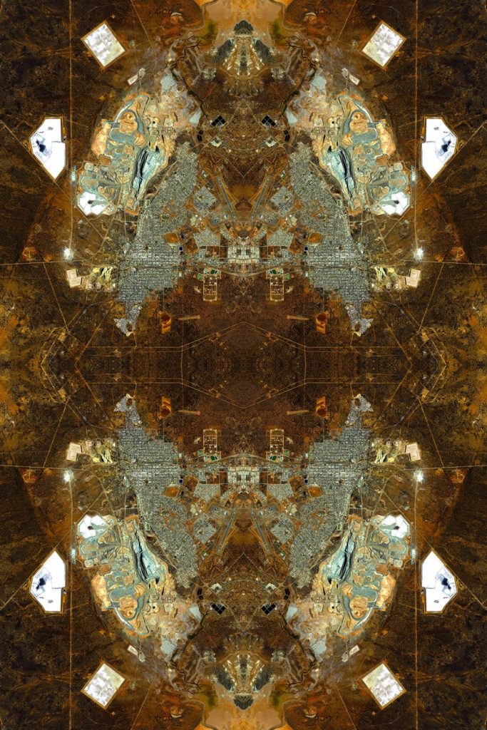
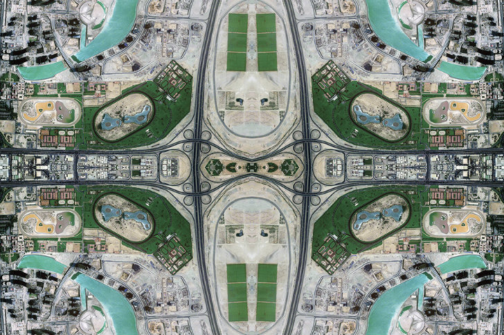
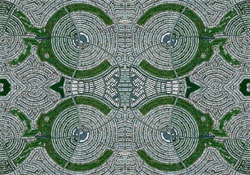
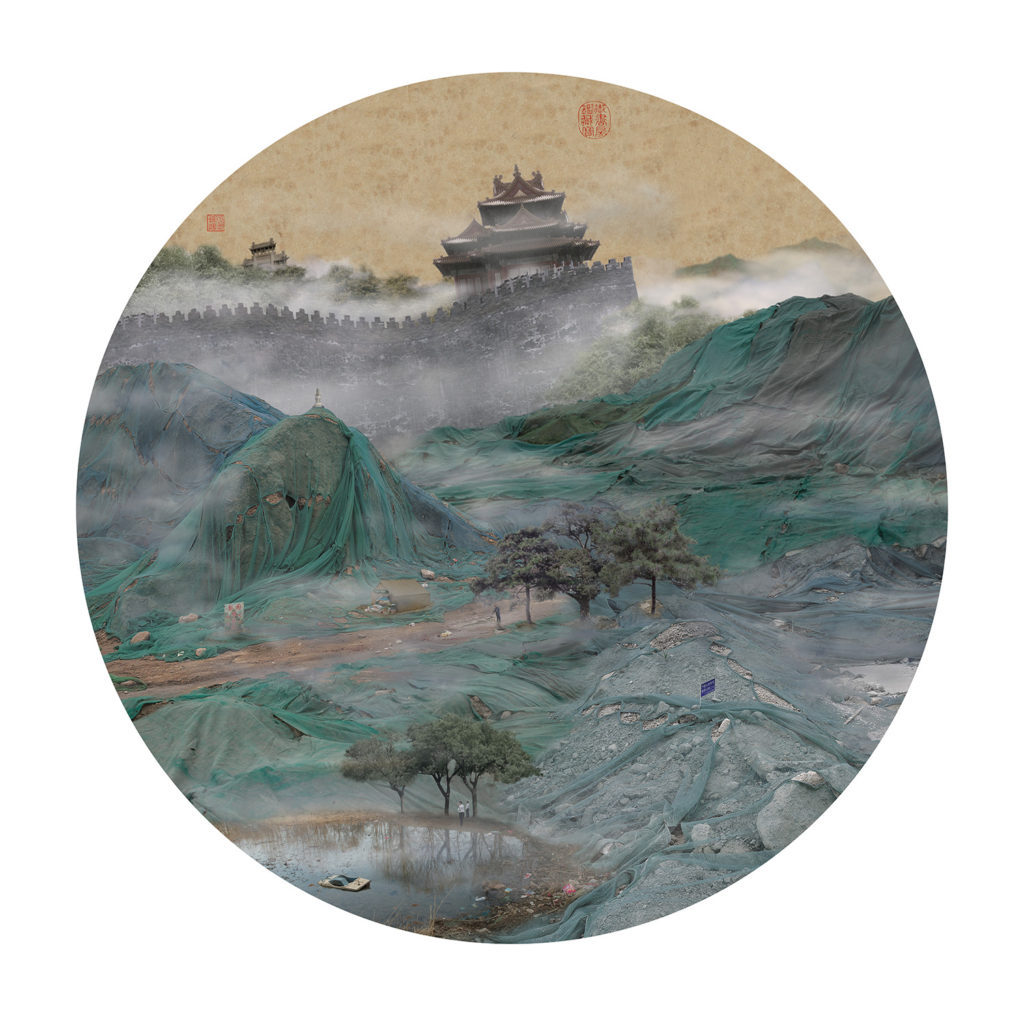
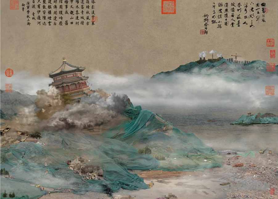
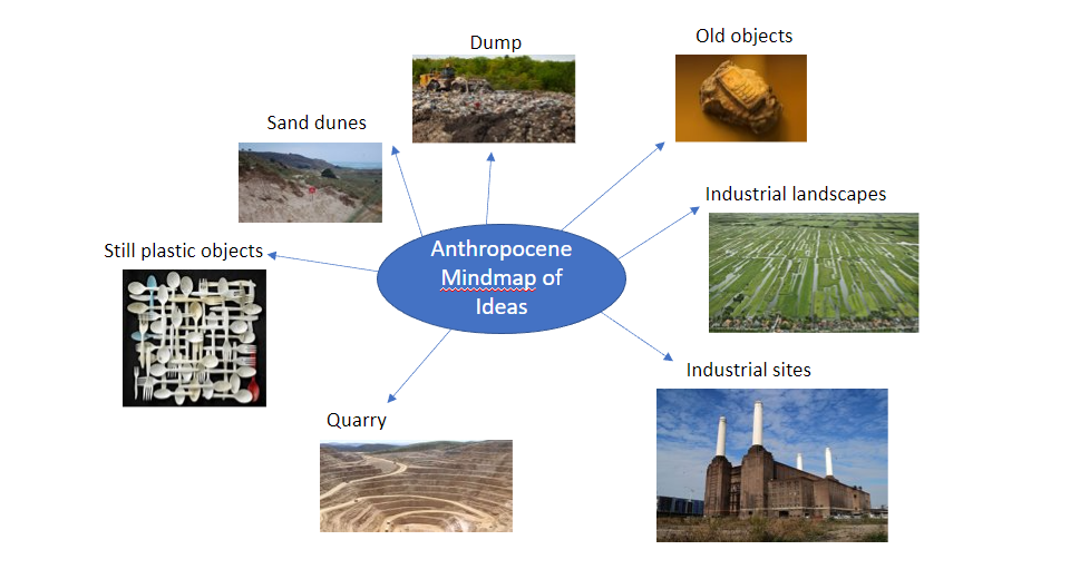
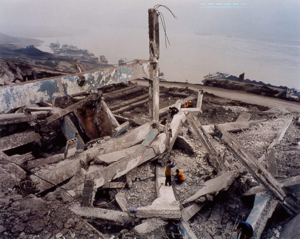
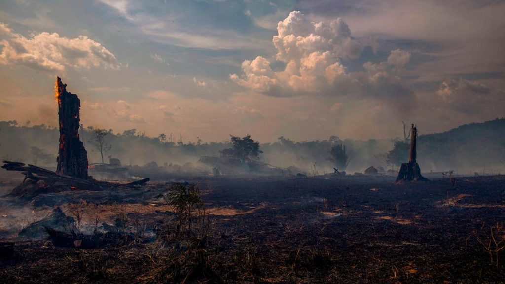
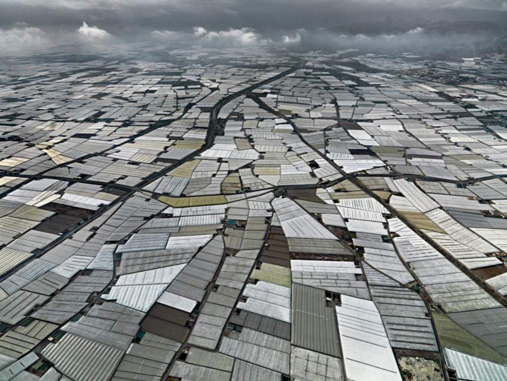
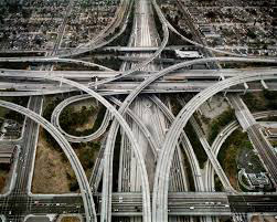
Anthropocene refers to the time in which humanity affects the earth substantially in terms of climate, natural ecosystems, resource availability, the atmosphere, the oceans and so on, as opposed to when nature itself is the most impactful force on the earth.
Anthropocene typically generates themes of pollution, destruction of habitats/landscapes and other negative connotations which displays nature as something dying due to humanity’s advancements.
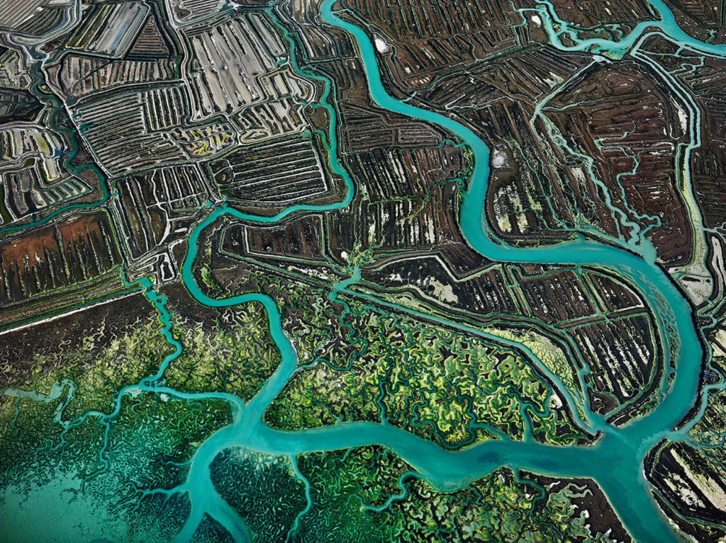
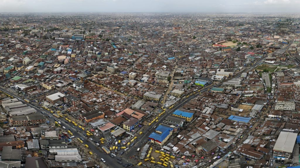
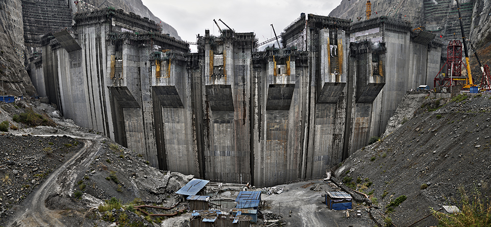
For artists/photographers, the theme of Anthropocene can create work attempting to display humanity’s affects on the environment by capturing destroyed/tainted landscapes or other sombre subjects.
Case Studies:
J. Henry Fair
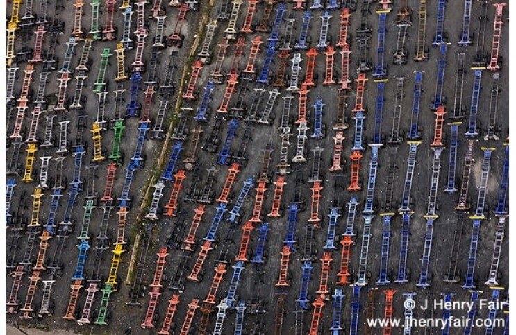
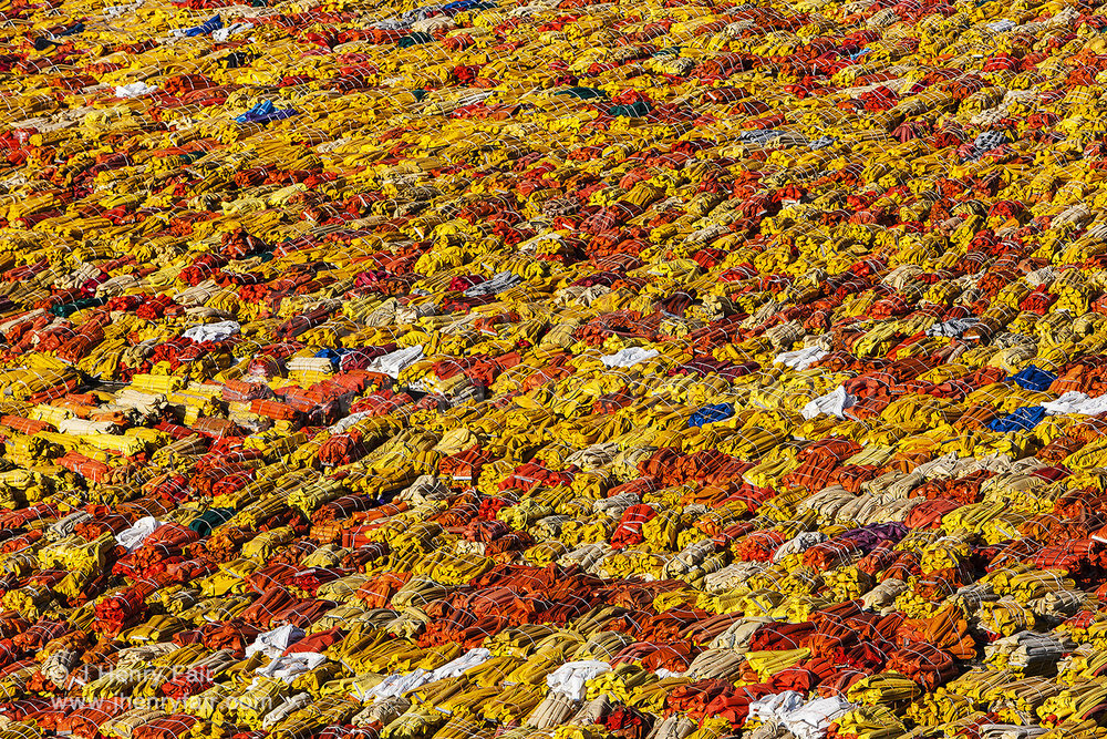
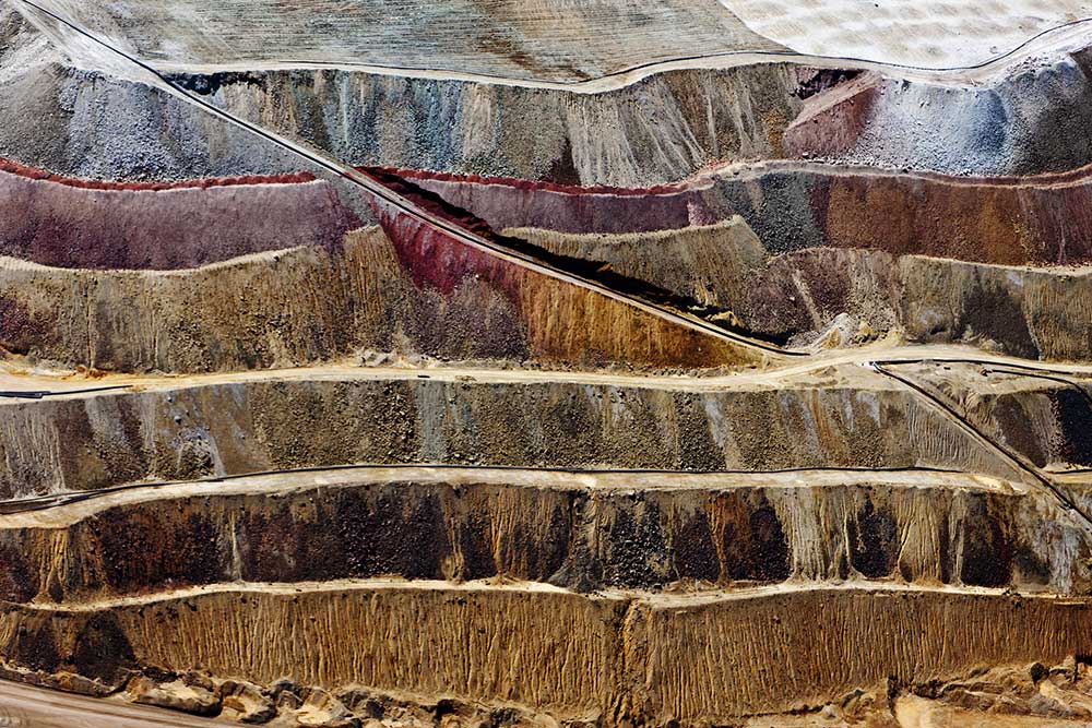
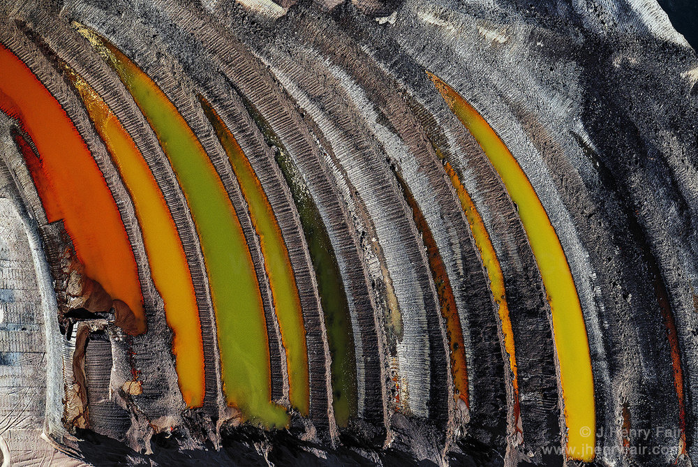
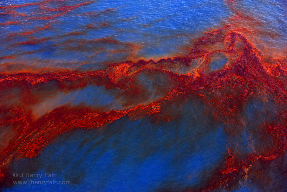
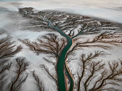
J. Henry Fair is a Berlin/New York based photographer who uses his photography to “tell stories about the things that affect people”, which typically involves photographs that show large-scale destruction or pollution of a location. Fair uses his photography to promote conservation that ranges from small scale protection of space from development to preventing damage to an environment from an international company.
I chose Henry Fair as a photographer to study because I think the way he uses his photographs to shine a light on the damage the environment is experiencing fits nicely with the theme of Anthropocene. I also find the images surrounding oil spillages in particular to be interesting, as they are both artistically nice to look at, but also concerning in the sense that it shows humanity’s impact on the planet.

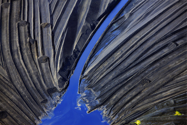
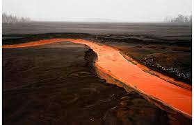
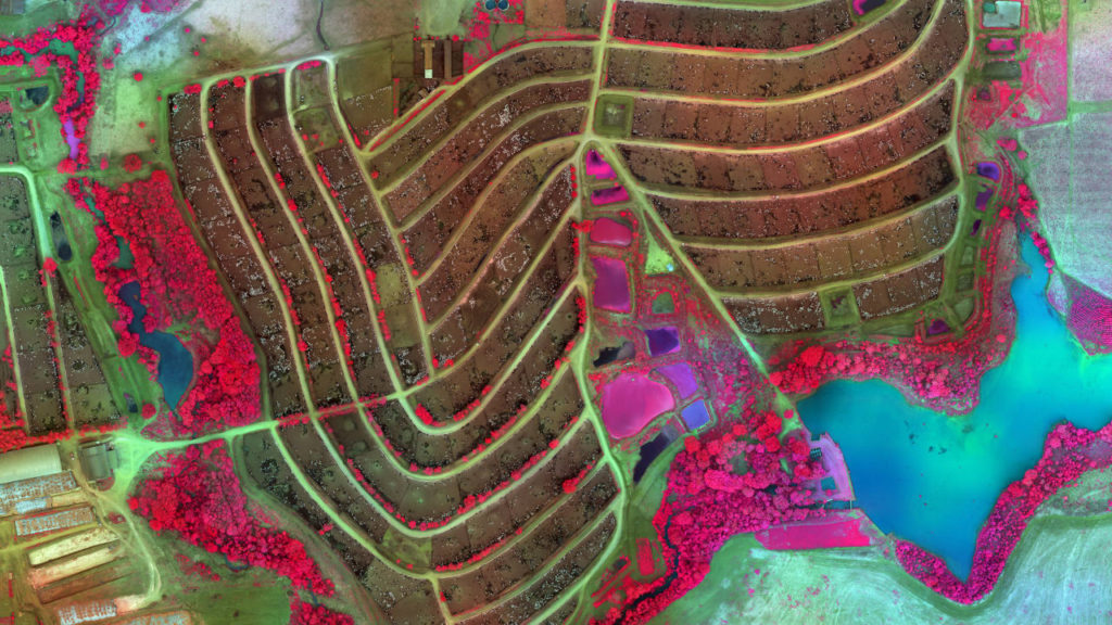
I like this image because of its bright colours and the patterns they create. I think the colours make the image look more abstract, making the viewer think first about what they are seeing, then why the photographer is showing them this – I think that works very well with the theme of Anthropocene. In addition, the use of complementary colours, the bright blue sea contrasting with the orange parts of the oil, gives the image a more artificial look, which could link to the theme of Anthropocene in the sense that humanity uses artificial substances such as plastics which eventually contaminate the natural landscapes, shown clearly in this photograph. Clearly the bright red patches on the right (bleeding into the left) side of the image act as the focal point, which could have been done by Fair to put emphasis on the oil spill and its effects on the earth. I think the lack of any shadows makes the image itself more clear, allowing the subject of it, the water and oil, to stand out more.
More Examples of his Work
Troy Paiva

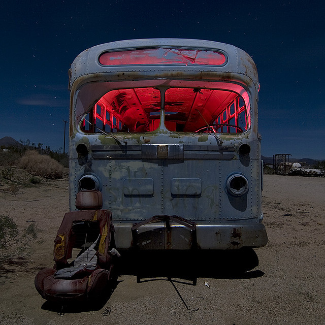
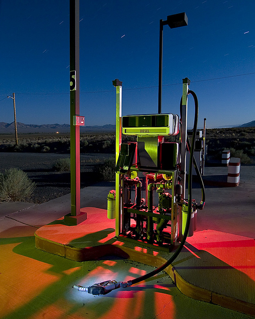
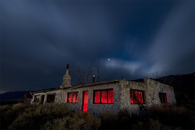
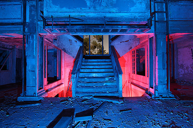
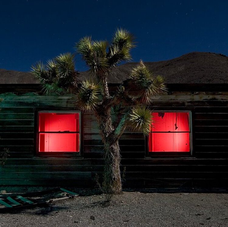
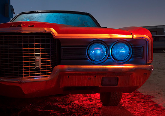
Troy Paiva is an America-based photographer who’s career started in 1989. His exploration of desolate urban settings lead to his distinct use of light painting in these settings, giving his images a unique, alien-like aesthetic. Paiva has made several books displaying his works, each showing urban ‘graveyards’ of abandoned ruins. He specialises in night photography, which allows his images to gain a sense of surrealism, as well as allowing the lights to be made clearer, giving some of his images a very abstract look.
I chose Paiva as a photographer to study because I thought his light painting photography was unique and created a clear parallel between the natural and the unnatural through his use of artificial lighting. I was inspired by his use of colour and I wish to use it in my own project.
Interviews: Light Painting Photography Interview, BL Blog Interview

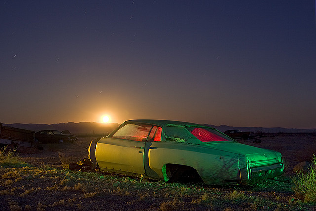
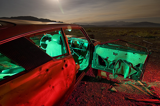
I think Paiva’s use of complementary colours in this image gives it an unnatural, abstract look, which I think links well with the theme of Anthropocene. The colours also give the car a sense of life and animation, which contrasts with the desolate landscape it inhabits seen in the background. I like how Paiva took the image just after sunrise/before sunset, allowing the sun to be seen, illuminating the sky and landscape, which gives the image more colour and shape (especially in the background). The coloured lights also give the car (especially the interior) bolder shadows, providing a contrast that helps the car stand out more. I also think it is interesting how Paiva used a red light to illuminate only the exterior of the car, while the interior of the car is only illuminated by a green light, I think it gives the image a more artificial look. The lines that shape the car are far more straight/regular, whereas the lines and shapes of the natural landscape in the background are more irregular, which creates a contrast between the car, as a man-made object, and the landscape.
More Examples of his Work
Comparison
Similarities
- Both of these images use colour as a way to give the image an abstract look
- Both images use unnatural subject matter (Fair’s using an oil spill and Paiva’s using a car)
- Both contain natural elements that contrast with the unnatural ones
Differences
- Fair’s image focuses more on the awareness of damage to nature, while Paiva’s image seems to aim for a more artistic focus
- Fair’s image uses soft, irregular lines due to the subject being strictly natural (the sea), while Paiva’s image uses both soft and hard lines to create a contrast between the urban and the natural
- Fair’s image uses natural lighting, while Paiva’s image uses a combination of natural and artificial lighting (however the artificial lighting seems to dominate the lighting of the image overall)
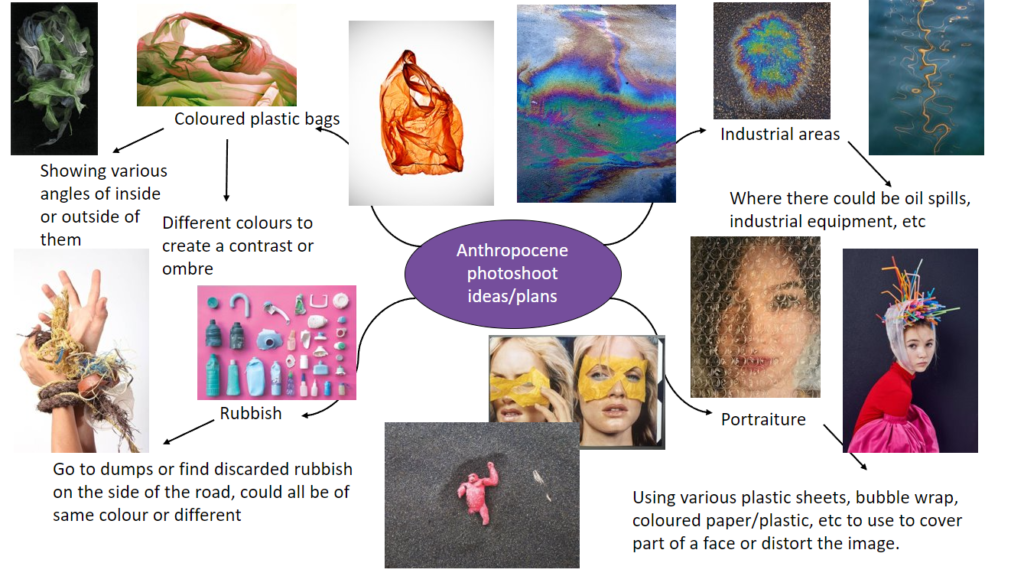
Moodboard of Photoshoot Inspirations
