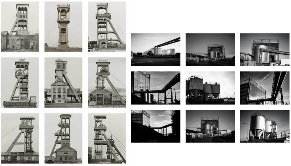
Frank Gohlke
His work 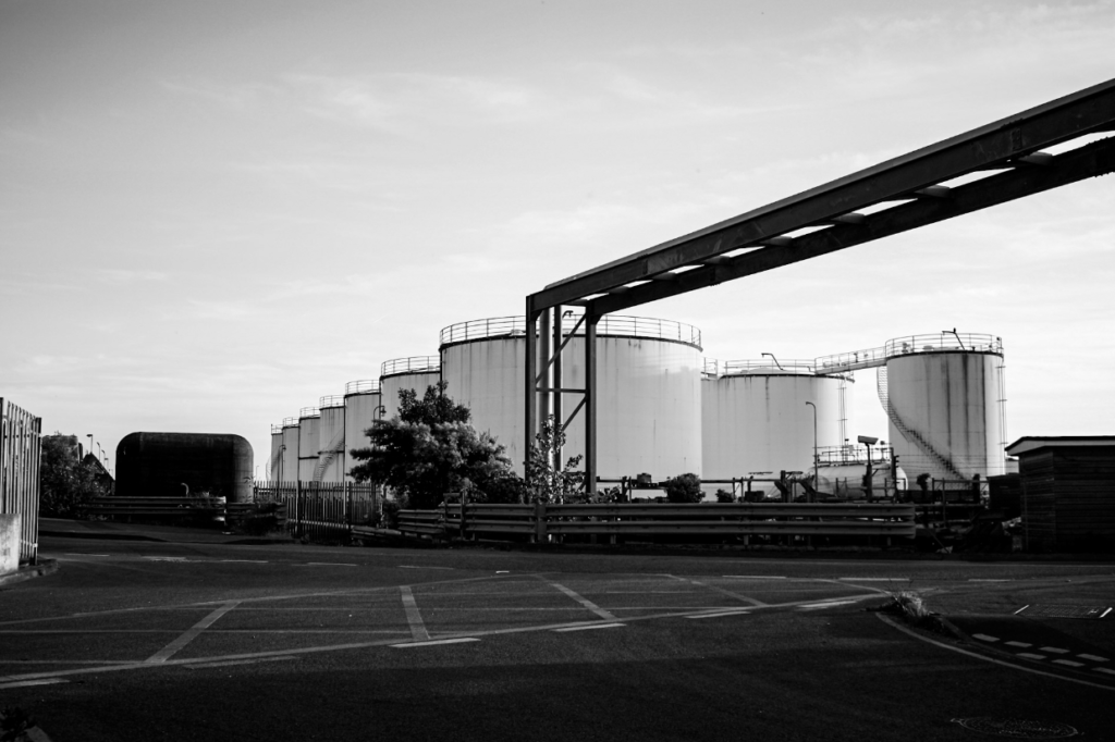
My work
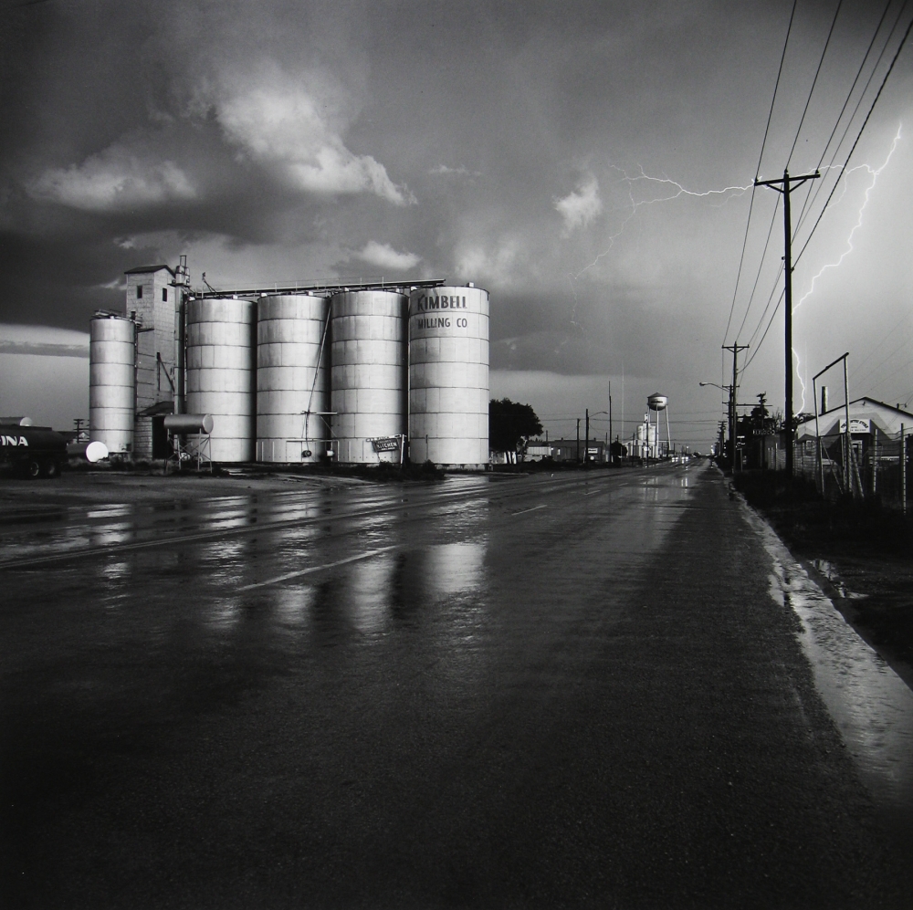
Similarities: Above I have demonstrated that I have been influenced by Frank Gohlke’s work. One of the main similarities in our work are the structures within our them, with us both having included tanks means that our work has a visual link to the topic of Anthropocene and the New Topographic, and these themes both explore how human life has impacted the natural environment. This message is reiterated when you think about the fact that the tank may contain naturally occurring substances such as water or oil, and these elements are contradicted by their surroundings, which are man altered metal and other features such as tarmac and houses (in Gohlke’s work). This means that the link between the image go beyond what is just visual. Additionally, the levels of contrast in both of the photographs, with the metal features appearing a range of tones and textures in the photographs. What’s also important to note is the perspective of both of these images, with the composition being similar yet not identical, its apparent that both were taken from afar. My work is a lot closer but the purpose that the tanks are the key focal point of the images is repeated.
Differences: The most apparent difference between my work and Frank Gohlke’s work is the sky. In Gohlke’s work this feature is full of contrast and a focal point for the photograph. I could have made the sky darker in photoshop to make the image stronger and more like Gohlke’s work. However, I still like that the sky is light in my image and it compliments the tones in the tanks, but it separates it from my artist’s work and creates differences. Additionally, the composition of our photographs are unalike as he has been taken from a distant viewpoint and mine is taken from a lot closer up, with mine following the rule of thirds more as mine is more symmetrical with a closer up focal point. Gohlke’s focuses more on a number on manmade objects and lacks a focal point with the tanks so far away.
Bernd and Hilla Becher
Their work 
My work
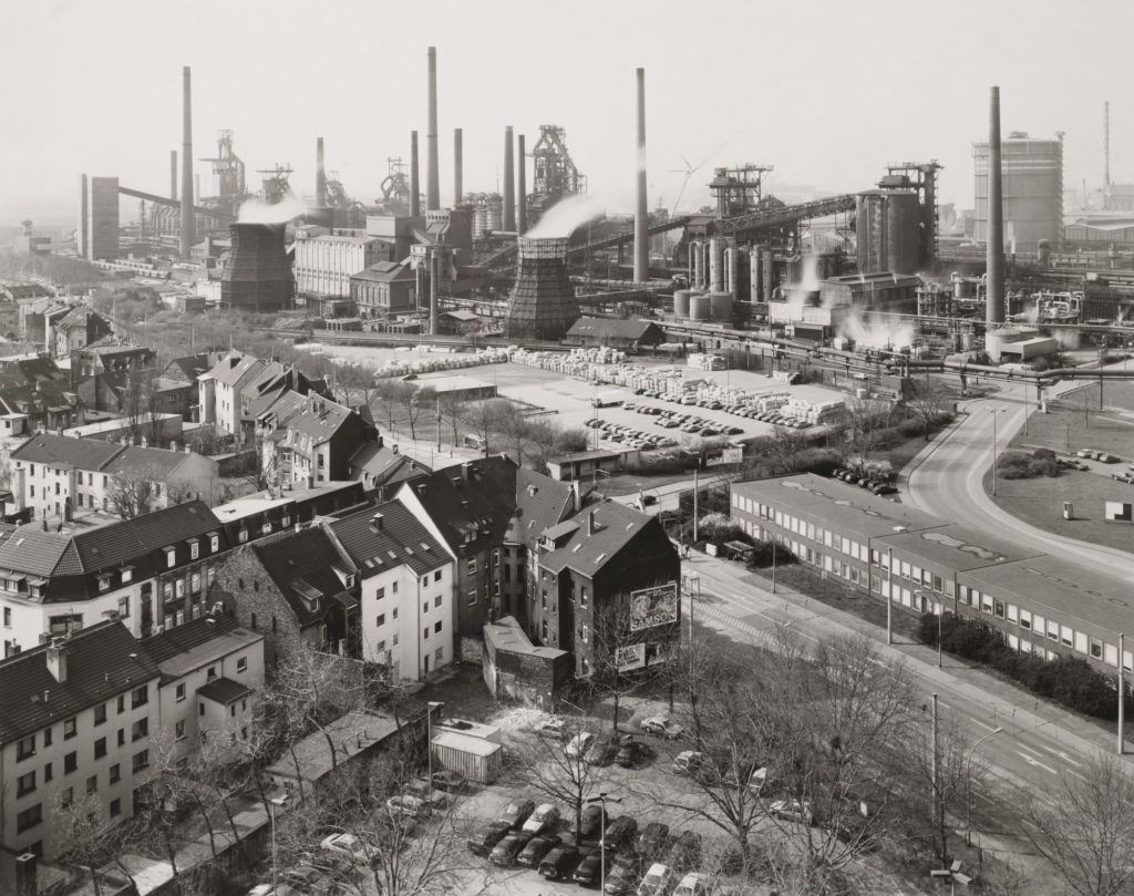
Similarities: I think comparison I have attempted to recreate one of Bernd and Hilla Becher’s pieces, with my photograph being taken at Fort Regent so I could get the best view of the reclaimed land. I like how similar these photographs are as the composition helps it feel as it they have been taken with the intention to look alike. The message behind both of out work has the same purpose, with both of the work demonstrating how much humans have changed the planet, but in this case focusing on cityscapes and how drastic the affects on industrialisation are.
Differences: The way that these images have been edited with there technology at the time is very different, obviously Bernd and Hilla Becher were more limited with what styles of editing they could do and the quality of images they could produce, but the fact that their image is dull and mine had to be greatly edited to match this is an indication of how much manmade technology has changed, and this example is just with cameras. I think this also means that their work turned out to be a more yellow toned image whereas mine has a cooler toned feel.