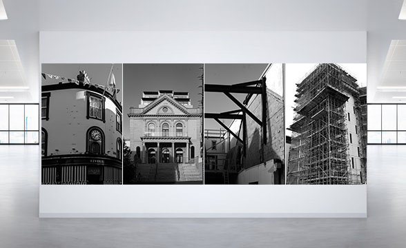
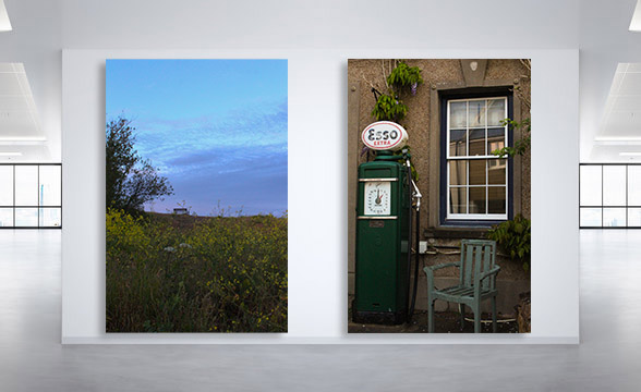
For my virtual gallery, I decided to have two sets of monochrome images and two colour images to show diversity. I also used a mixture of landscape and portrait photographs.
The first monochrome set consists of two landscape images that are opposite to each other on a white background. I paired them up as I thought they worked well together. The second set consists of four portrait images, one after the other in a straight line. I think they work together because they are all images of buildings and scaffolding.
The first colour set is another juxtaposition. In the image on the left there can be seen a bench in the distance and this links to the images on the right because the main focus of it is a chair. The second set is simply a landscape image of a roof with two chimneys. I like this image because the colours are nice and vibrant.


