evaluation & critique

WHAT WENT WELL

Overall I think my final outcomes were done well because i wasn’t rushed for time, and spent about 1-2 hours on each photoshoot which i think in the end really benefit me especially because it gave me a wider range of photos to choose from. Out of the two photoshoots i feel that the 2nd one was my strongest as it had a good range of location lighting and objects and i managed to capture the fascination i had in the hotel in my images. I think editing really helped make my photos better for both shoots as i played with colour exposure and texture to help make my piece stand out and showcase the detail put into my photos.

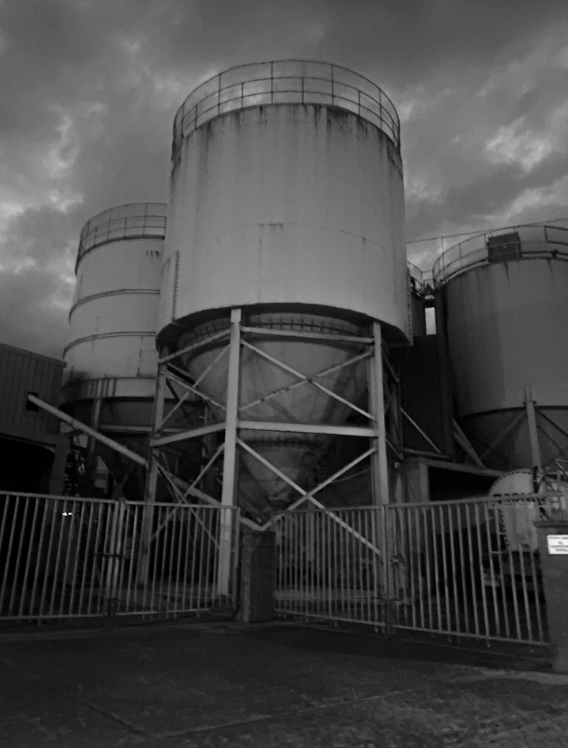
Another thing that I think went well was the standard of my final images, as none of them turned out blurry or shaky – in some instances i had to use flash as it was too dark to secure a good image but even then it turned out well and gave me the desired effect, however the ones i didn’t take with flash also turned out well especially for photoshoot 1 as the darker lighting helped me build on my theme of industrial architecture.

CRITIQUE

Although the majority of my images turned out well, one thing i felt faulted me was the fact i didn’t have a working camera for the first photoshoot so i had to use my phone, which meant some of my photos ended up out of focus or shaky and could’ve turned out better if i had used a camera. I also felt like with photoshoot 1 since using a phone i didn’t end up with much variation in the texture of my images. If i were to do it again I wouldn’t use my phone unless it was a daytime photoshoot because the quality doesn’t end up as good if the photos are taken during the night.

Evaluation and Critique- anthropocene

FINAL IMAGES

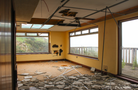
EVALUATION

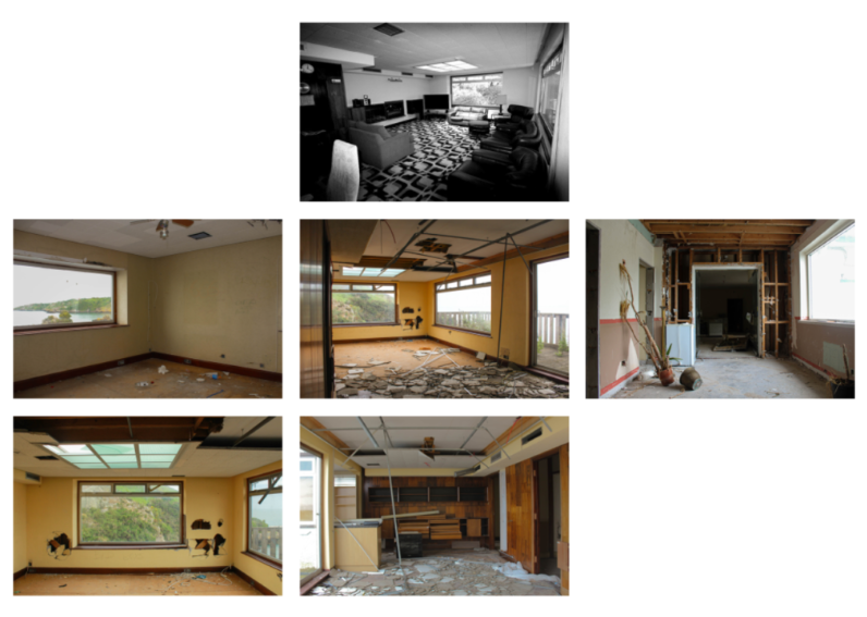
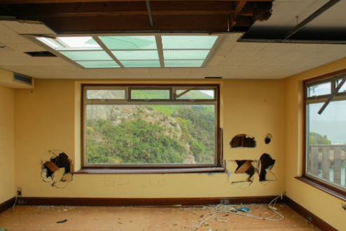
I like the yellow contrasted against the blues and greens of the nature through the window and the blue of the ceiling windows while attention being drawn to the dark tones of the holes in the walls which present a sense of depth as attention to drawn to the back of the room. The framing of nature through the window is interesting as the destruction and abandonment

CRITIQUE

The image is quite plain in its composition with not much happening. There is also a lot of darkness in the corners and top of the image as there are shadows and dark wood which looks unusual against the tone of the yellow.

EVALUATION

The image has depth as attention is drawn towards the back of the image, the theme of yellow is continued which looks interesting against the dark of the wood. The texture of the wood and floor is also very visible which is interesting to look at especially since there is such a large variety of colours.

CRITIQUE

The left side of image is overexposed and provides a large contrast between the dark tones of the wood, I could’ve cropped this out but the dimensions of the image would have been unusual.

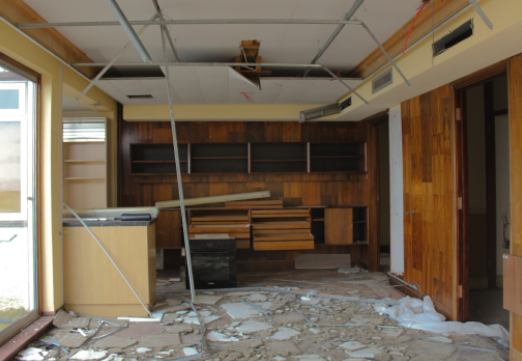
EVALUATION

I like this image as destruction is shown throughout the image, with the ceiling tiles on the floor and the holes in the ceiling and walls, along with the obvious yellow motif.

CRITIQUE

The outside is overexposed which if I changed then the image would have been too dark to notice the yellow walls and soft lighting coming from outside.

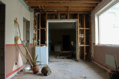
EVALUATION

Attention is drawn towards the dead plant as it is the only slanted thing in the image, I find this interesting- especially as it is in front of the doorway- as it could symbolise the death of nature making way for human activity. I think this images has the best flow to it as composition-wise it is the most classic composition.

CRITIQUE

The right side of the image is overexposed but I didn’t want to lose the soft light coming in from the window so I decided to keep it.

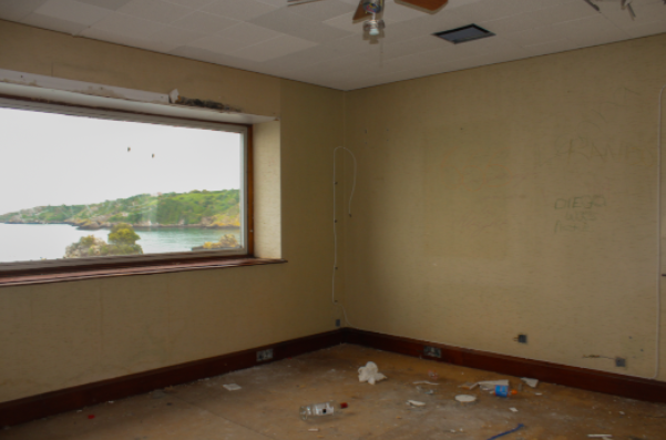
EVALUATION

I like how the stains and graffiti on the walls is visible alongside the obvious signs of human interaction with the room contrasted with the view of nature outside the window.

CRITIQUE

The image has quite a plain composition and the outside is overexposed.

FINAL ARRANGEMENT OF IMAGES

My final grid of images

EVALUATION

I like the contrast between the plain rooms scattered with destruction against the black and white original image of the room. I also believe the negative space between the images works very well as it looks like a blue print- with the slight motif of nature/the outside in every image compared with only viewing nature through a derelict room is interesting especially in the nature of a blueprint.

CRITIQUE

Overall I do not like my final set of images, I preferred my last mock exam as with the theme Anthropocene it mainly focusses on nature and how humans are changing the world- I prefer taking images of people as I find it more interesting.

case studies comparison

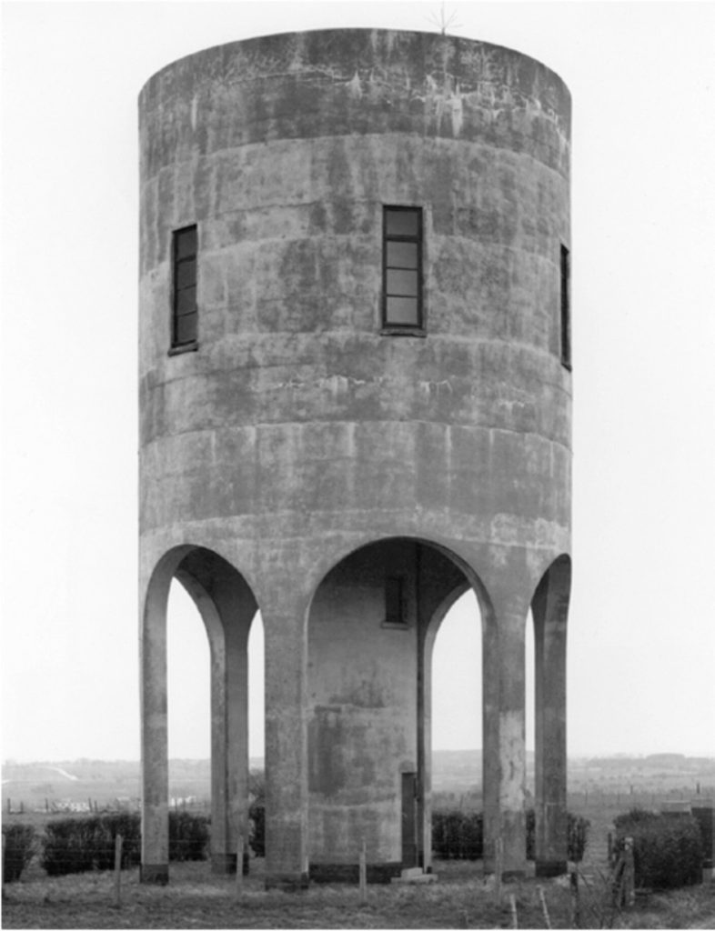
HILLA AND BERND BECHER

Similarities

  • Colour
    • Viewpoint (head-on)
    • Natural lighting
    • Focused
    • Similar subject of photo

Differences

  • Context
  • Lighting (night vs. day)
  • I have edited my photo to be slightly overexposed
  • Different focal points in my image

Similarities

  • Set of three
  • Similar theme
  • Features graffiti
  • Taken during day

Differences

  • My image is in black and white
  • Talling’s images are taken outside
  • My photos were taken with flash
  • Mine are edited – heightened exposure
  • Talling’s features elements of nature whereas my set is showcasing the vandalism caused there by people.

Anthropocene: Virtual Gallery

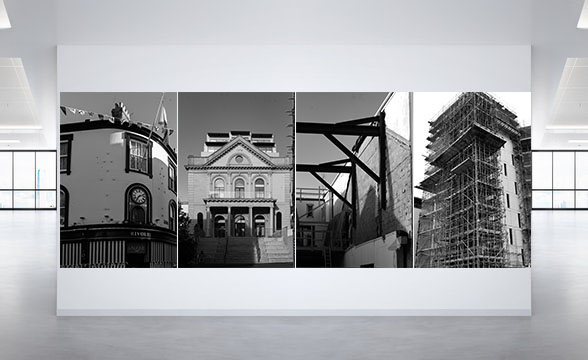
For my virtual gallery, I decided to have two sets of monochrome images and two colour images to show diversity. I also used a mixture of landscape and portrait photographs.

The first monochrome set consists of two landscape images that are opposite to each other on a white background. I paired them up as I thought they worked well together. The second set consists of four portrait images, one after the other in a straight line. I think they work together because they are all images of buildings and scaffolding.

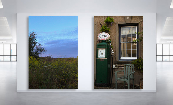
The first colour set is another juxtaposition. In the image on the left there can be seen a bench in the distance and this links to the images on the right because the main focus of it is a chair. The second set is simply a landscape image of a roof with two chimneys. I like this image because the colours are nice and vibrant.