
I have decided to develop my ideas into a Zine for my final outcome. To create my zine, I used the following format in Adobe InDesign: a new document with a width of 148mm, a height of 210, 16 pages, 2 columns and a column gutter of 5mm. This will be printed as A4 but will fold to be A5.
Experimenting with the placement of images

I have decided to place this image as a two-page spread as I think it is one of my most successful images – the two-toned nature of the light in this image also means that it is split down the middle of the page spread which I like.

Here I was unsure of which photo to use – I decided against the image to the left, as I think the textures in the photos were too different – I felt that they were not closely related enough.
Therefore, I changed the layout – I think this picture to the left works well with the one on the right due to the shared sense of line and shape, linking them cohesively together.

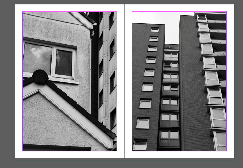
Here, I was in the process of using a larger image (the left), enlarging it to full size then cropping it – the blue lines on the image were pulled in to create the cropped effect, aligned with the inner purple left line of the page.
Final Zine
Below is my final outcome, created on Adobe InDesign.
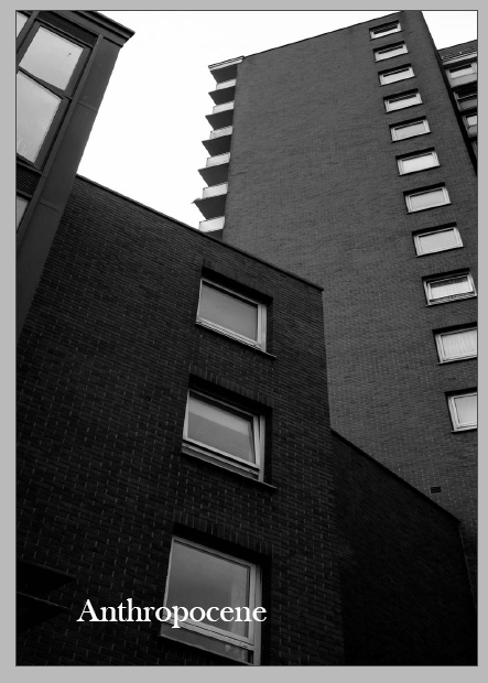
I chose this image as my front cover due to the sense of the looming towers – I think the group of three towers give an idea of the different parts of my project. I think that the graphical and measured look of the towers, through the use of line and shape in the image, helps to give a clear introduction to my project and zine.

This spread I think creates great contrast and a statement about housing on the island – I chose these two images next to each other because of their similar large amount of white tones, and slight black tones around the edges. Furthermore, I think this image shows two facets of the housing crisis: the left shows the demolition and destruction of housing, whereas the right shows the neglect and ignorance of the government about vacant properties. Both show the unfiltered reality of the impact of overpopulation and housing poverty on the island. – Overall, I think this was one of the most successful spreads in my zine.

I used this image as a double spread in my zine as I wanted to show the different details of each individual window in the building – each individual window shows a different life in the building, which contrasts with the rigid patterning and dullness of the outside of the building.
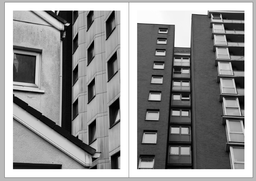
I have placed these two images next to each other due to the similar use of line and shape – however there is also great contrast between the two with the varying light and dark tones in each image. Each of these images in in 3 parts in a way, which means that they work cohesively together in one piece. I also think that the repetitive shapes of both these images shows the ‘copy and paste’ nature of a lot of social housing in the island, and how these buildings stick out because of their size and shape.

I chose this image as a double page spread as I wanted to highlight one of my best images from my project. In this image, I particularly like the contrasting tones in the image – when I was shooting, the light was coming from the right, shining only onto the left side of the building. This creates a kind of split-tone effect, and with my use of black and white editing this is much more obvious. Having this image as a double page spread means that the split between the two tones is just off-centre – I like this about the spread.
This is another one of my favourite spreads from my zine. I think these two images tell an interesting story, and in my head they show the idea of a so called “ideal home”, but one that is not conventional, as it is derelict. I think there is a sense of calm given from these two images, away from the destruction and slight sadness in my other images and spreads. It shows what looks like a normal, lived in home, but as you look closer, you see it has been left, unoccupied. I think this spread also shows the waste of vacant houses on the island, as I researched – this home looks almost lived in, almost welcoming, amongst destruction and waste that was seen in my other images.
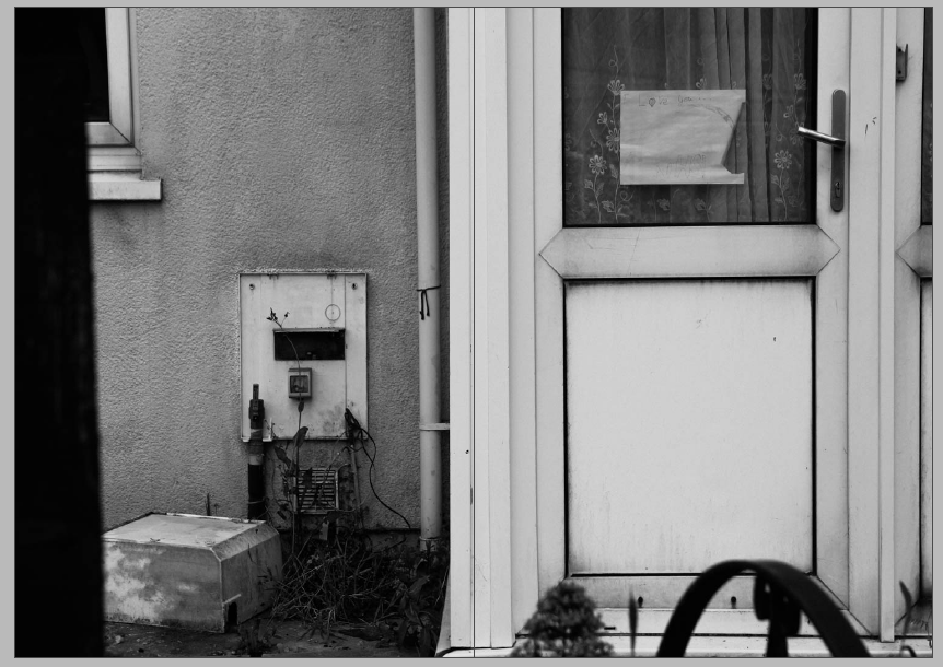
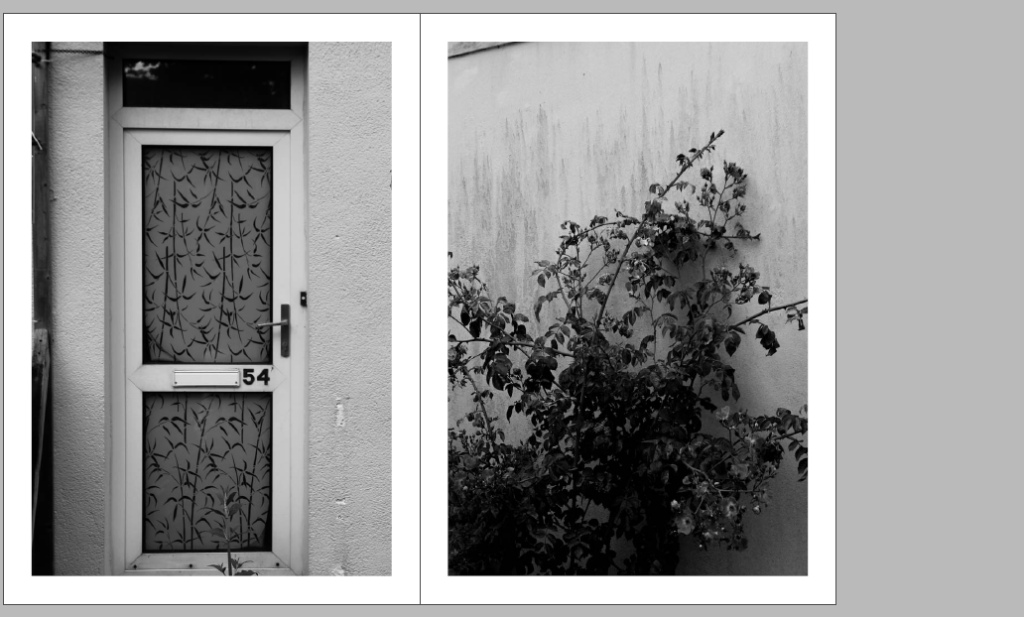
I chose this image to be a two-page spread, as I wanted to highlight the high amount of fine details in this image – the rainbow image to the right on the door is a reminder of the lockdown in 2020, showing how the lives of those who have left these flats are still left behind but only in little amounts. Furthermore, this image shows evidence of destruction in these derelict and disused buildings, which to me also symbolises the mistreatment of those struggling to access housing on this island.
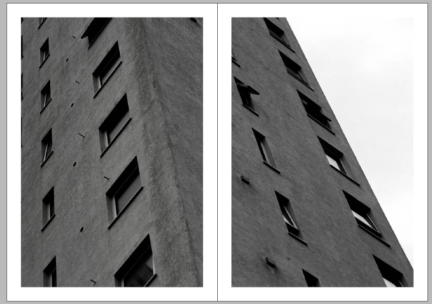
This spread is made of one image – I decided to split this image in half and did so by duplicating and splitting the images in InDesign. I did this to make sure the composition was balanced – with the image whole, the eye was drawn too much to the white part of the image to the right, and I think that the focal point of the image should be the strong sense of line and repetition in the actual building. To me, the repetition and geometric shape in this spread represent the similarity of each big block of flats on the island, almost as if they have just been duplicated – giving more reason for my duplication of the image in this spread.

I think this image is a more lighthearted end to what is quite a heavy, and dark project – this ‘no-ball games’ sign shows what would have been a fun side to living on the estate, flipping my project’s idea round, which I quite like.