
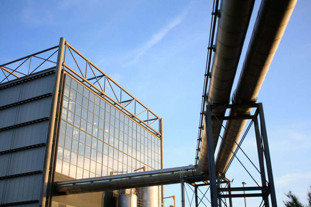
Evaluation: I have selected this as my first final image for a number of reasons; I think the composition of the image is one of its main strengths. With the incinerator being in the background towards the left and the metal pipes being very far into the foreground creates a good perceptive and sense of depth. Furthermore, the lighting of the original image was perfect considering the time of day it was taken at, meaning this image required minimal editing and to edit this image all I did was change the saturation of the image from a blue tone to more of a yellow tone, this meant that the final image came out appearing to have been taken at dusk. Additionally, the rule of thirds is demonstrated in this final piece, with the incinerator taking up the first two thirds of the image and the metal pipes taking up the rest. This links to the topic of Anthropocene as it demonstrates how human life has forced the natural landscape to adapt to our needs.
Critique: This piece could be viewed as not having enough components to link to our topic of anthropocene, the fact that this piece is so subtle could be a negative thing as theres not much contrast within this image. The sky isn’t filled with clouds so this image wasn’t as successful edited in a monochromatic way and it could be viewed as dull compared to my other piece of work. Furthermore, the photoshoot during at which this image was taken could have been planned better so that clouds could have present, which would have gave the image more depth.

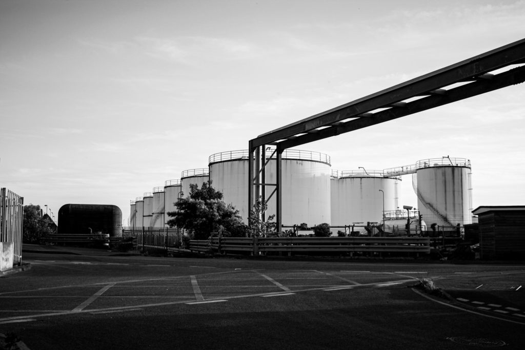
Evaluation: This final piece is a reflection on human life on not just the landscape but specifically how human life has affected Jersey, as this photograph of the reclaimed land illustrates how we have been forced to expand our environment in an unnatural way to combat our overpopulation and overconsumption crisis in the island. This image was taken at an angle with shows an overview of Jersey, the composition of the image means that this image is filled with features. Additionally, making this image black and white means that the individual structures become more evident. This piece was taken using manual camera settings and this allowed for the final piece to come out with good lighting, altering the contrast however, does make it look a little bit unexposed.
Critique: The fact that this photograph was taken from such a far point away, it means that there is no focal point within the image and it becomes a little muddy. This is created because of the lack of contrast and texture within the piece. I attempted to create more juxtaposition within the piece, but this didn’t work because of the clear sky in the original image.

Evaluation: This final piece is probably my favourite all, factors which aid this piece in being one of the best firstly includes the lighting. The original photograph was always one of my strongest and this was only enhanced by adding the colour. By overlapping a border affect is created and this helps create even more contrast between the warm toned pink and cool toned blue. Furthermore, placing the pinker image at a smaller size over the original meant that the unedited image is still visible. This was meant to be an experiment but I really like the ideas of the colours together so this was developed into a final piece. Additionally, the green within the pink photograph is cool toned so despite all of the contrast these images do link together.
Critique: The blue background image is a little lost with the vibrance of the pink in the centre, the overlapping factor mean that a new better piece cane be created but this only occurs when another image has to be compromised. Furthermore, the pink image could have been replaced with a saturated image that complimented the blue border rather than contrasted it.

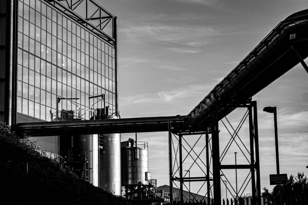
Evaluation: I have selected this as my last final photograph as it was intended to be a Frank artist reference but it turned out to be one of my most aesthetic images. This is because of the composition of the image, the angle at which it was taken means that the tanks are in the centre. The metal structures and road heavily contrast with the tanks and the sky, I like how half of the photograph is composed of lighter features and half are composed of darker, creating a more cohesive image. I think the message behind this image is more important then the piece itself, I think it has a sense of sadness would could link back to anthropocene as its all about what humans have done to the earth, which are mostly negative factors.
Critique: I think that I could have cropped this image to get rid of the tarmac in the foreground and some of the image could have also been taken away from the left side of the photograph. Despite this image being more true to my artist reference it could be more exciting and possibly (by using Photoshop) only edited the sky within the image to create more contrast and more of a dramatic look, which would also link to our topic of romanticism.


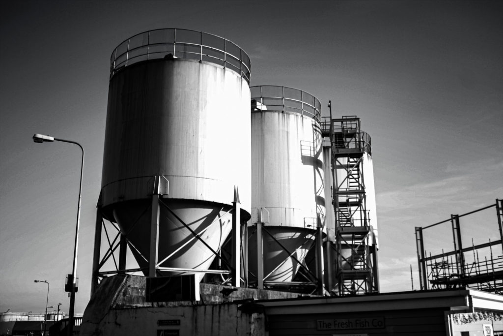
Evaluation: I have selected this as the arrangement for my final gallery as I think that the lighting of the individual images makes for a more cohesive image. There is lots of contrast within this image and this makes it more successful as its more of an eye-catching piece. The photographs have been placed so that the images with metal pole or water tanks are not next to each other, this is to create differentiation within my work. Additionally I think that the lighting of the image plays out well together as they lighter and darker images are placed next to each other,
Critique: This work could be seen as not a true typology and all the image are of of the same thing or taken in the same way. I have attempted to make the levels or contrast and lighting all the same in each of the images, however, I’m not sure if this was apparent or if all of my images turned out successfully.