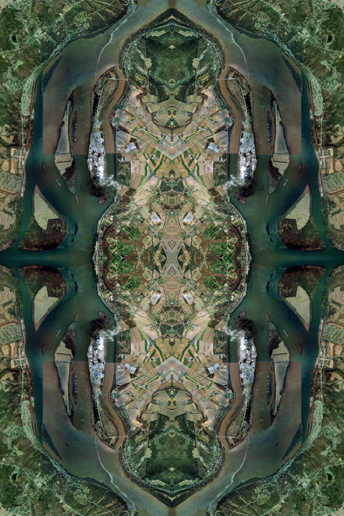
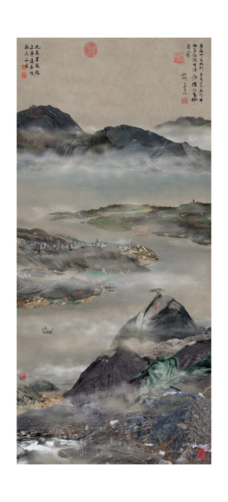
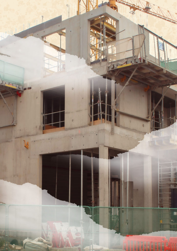
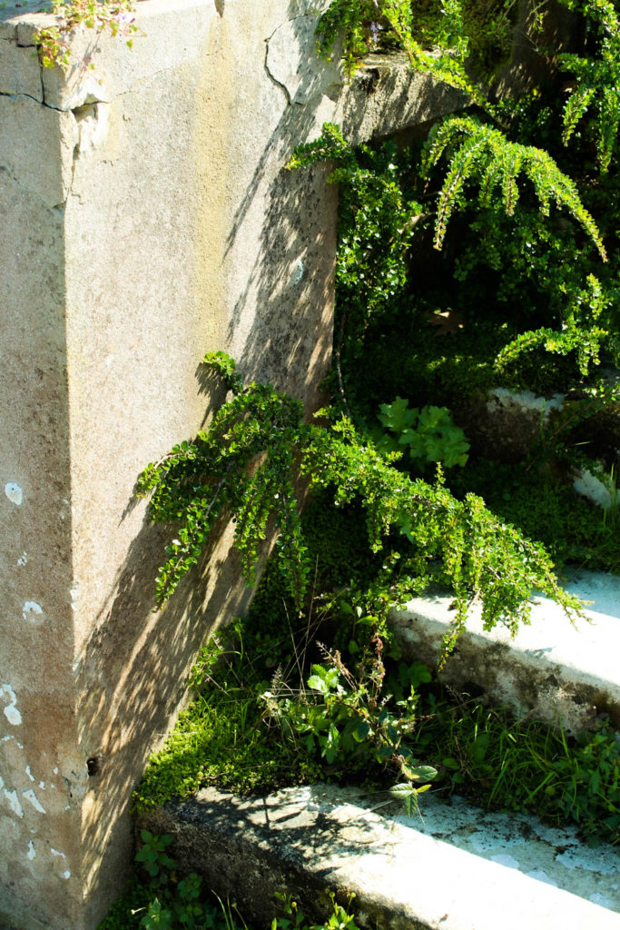
I really like how my collages from this artist reference came out, I think they look really unique while also being obviously inspired by him. My colours are a lot more saturated and they look different compositionally as Smith’s was taken from above while mine was from the side. Mine was also taken from a lot closer up so has more fine details.
I like my final result for this one less, it took a lot longer to make than I expected. Mine features a lot less clouds because I was struggling to find clouds in my shoots. I also could not find many images of green netting, as there was not very much actually being used in town, so mine lacks some of the artificially made natural forms.

I also made a zine containing a selection of my images from this project.

Front Cover 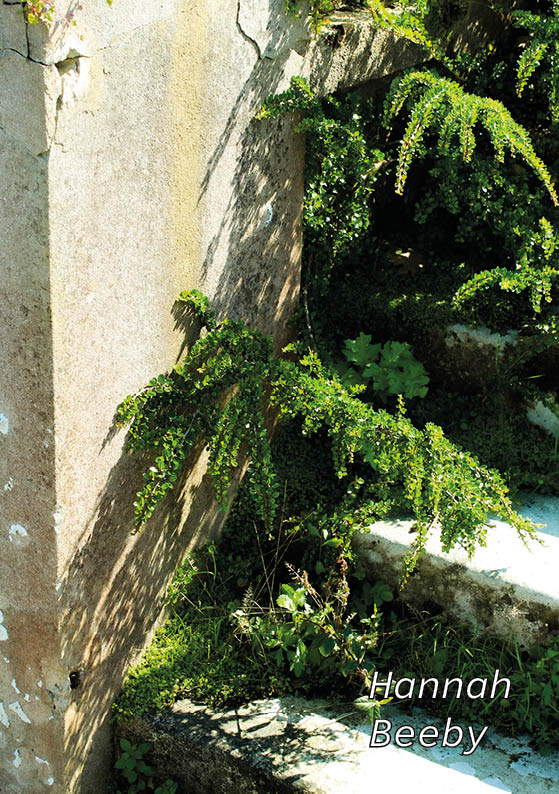
Back Cover 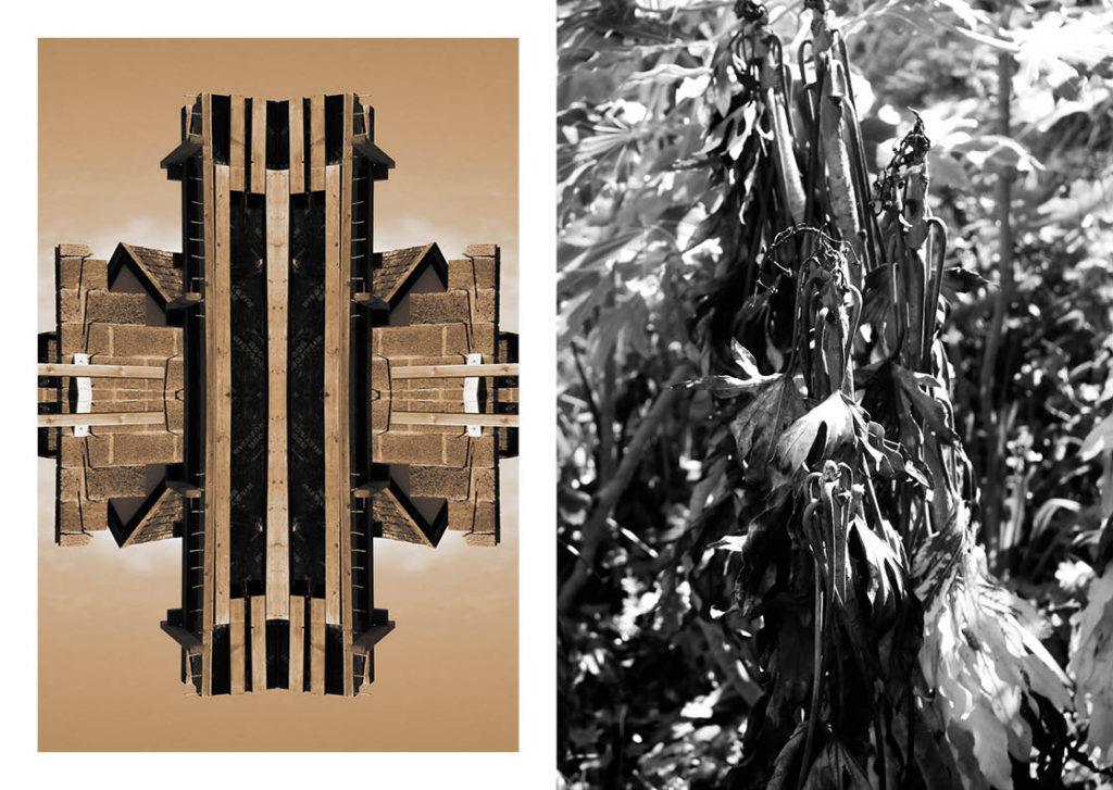

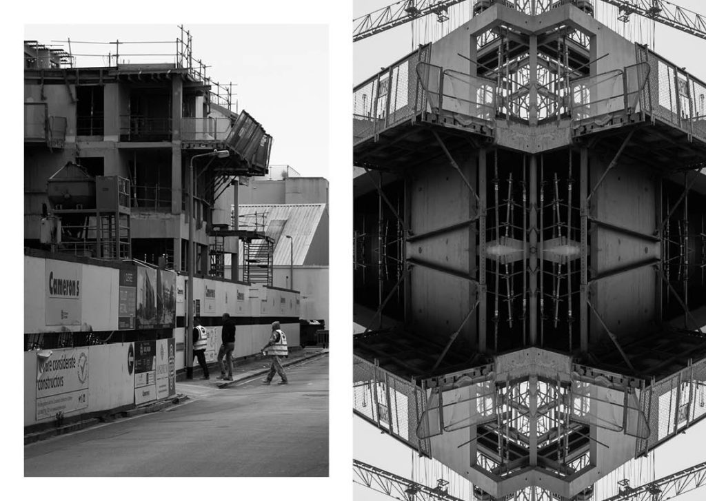
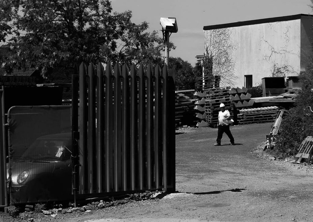
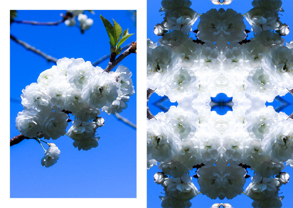

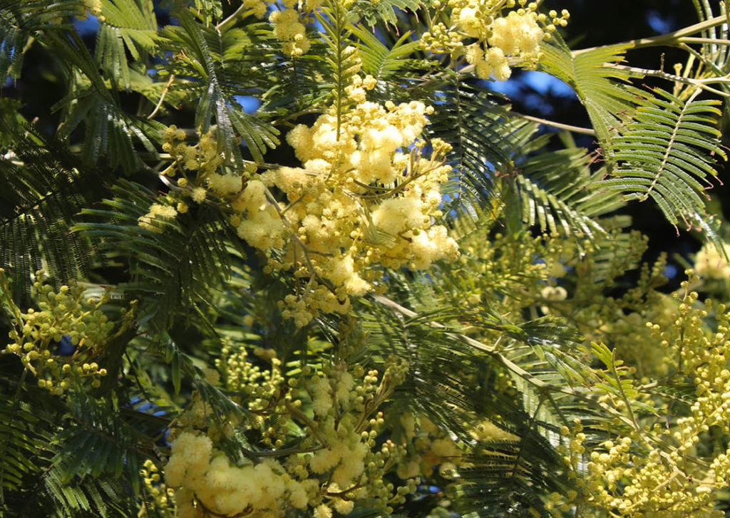
If I were do this project again, I would want to be more organised with my shoots, as well as potentially going on a third just so I have more material to work from. I would also want to take a longer look at which artists I want to pick, and how I think my pieces in response to them would look.

