Final Outcomes

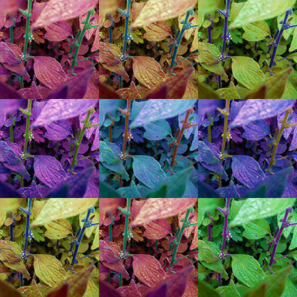
These two images are direct responses to Andy Warhol’s own artwork. I wanted to capture a style similar to his ‘Marilyn Diptych’ piece (the first image), as well as a more detailed style (the second image). For these two images, I wanted to focus on colour, both images have a lot of colour to help them appear more abstract, however the first image uses far darker colours and shades, while the second image is much more vibrant.


Similar to the last two images, I was inspired by Warhol’s work when making these images, seen by the bright and vibrant colours akin to his Marilyn Monroe portraits. I like the way these images use the straight lines from the urban building to separate colours and tones.
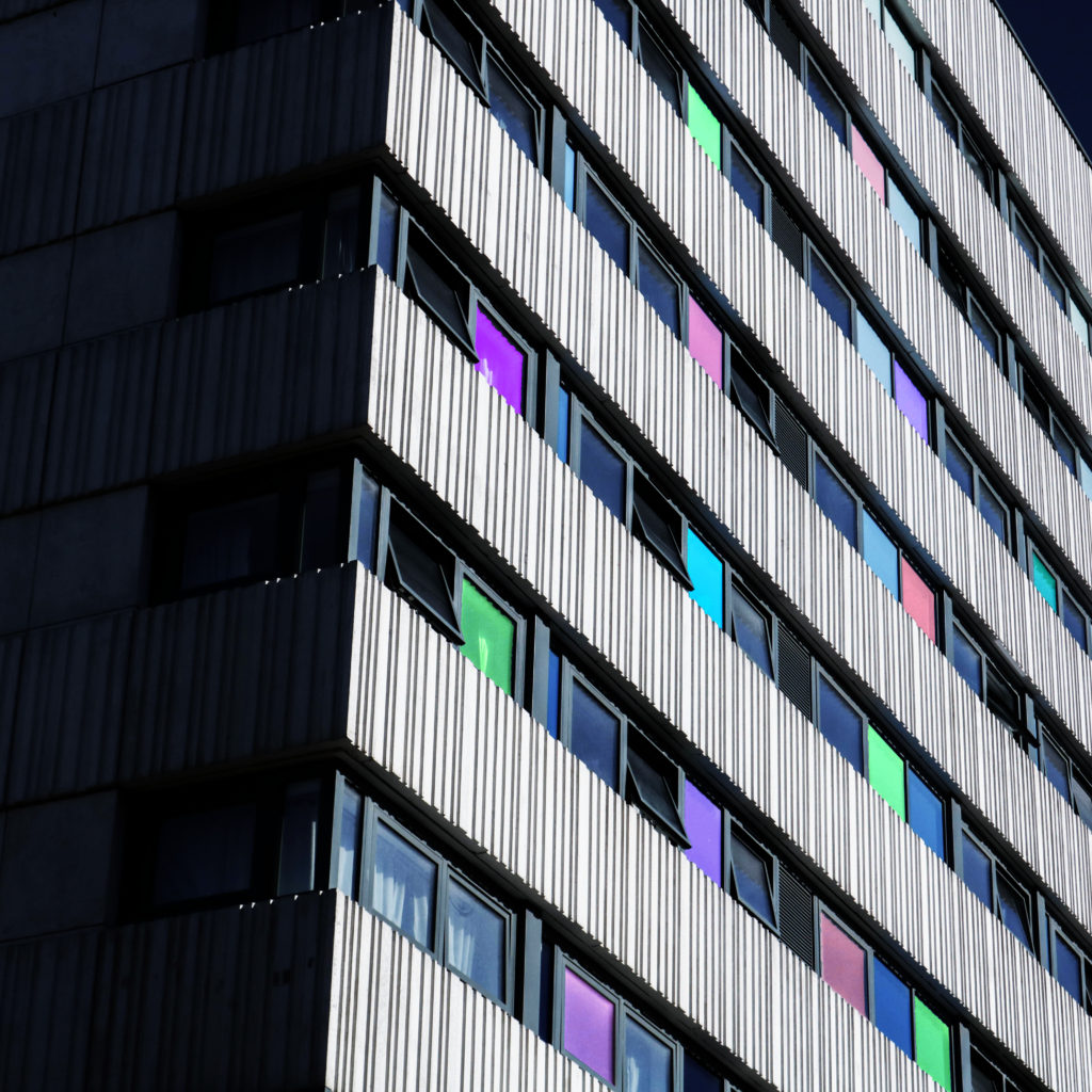
As for this outcome, I was inspired by both Warhol’s use of abstract shape and tones and Paiva’s light painting photographs, creating the different colours in some windows was an inspiration from some of Paiva’s images.
Presenting my Outcomes
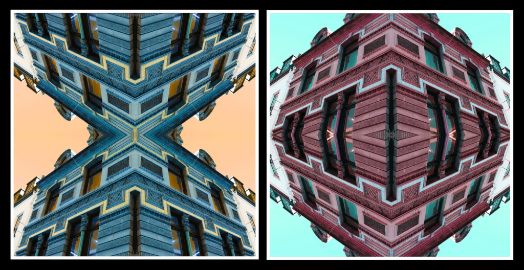
For these two images, I am going to lay them out in a window mount, I have made a mock-up version of this with a white boarder to mimic this style.

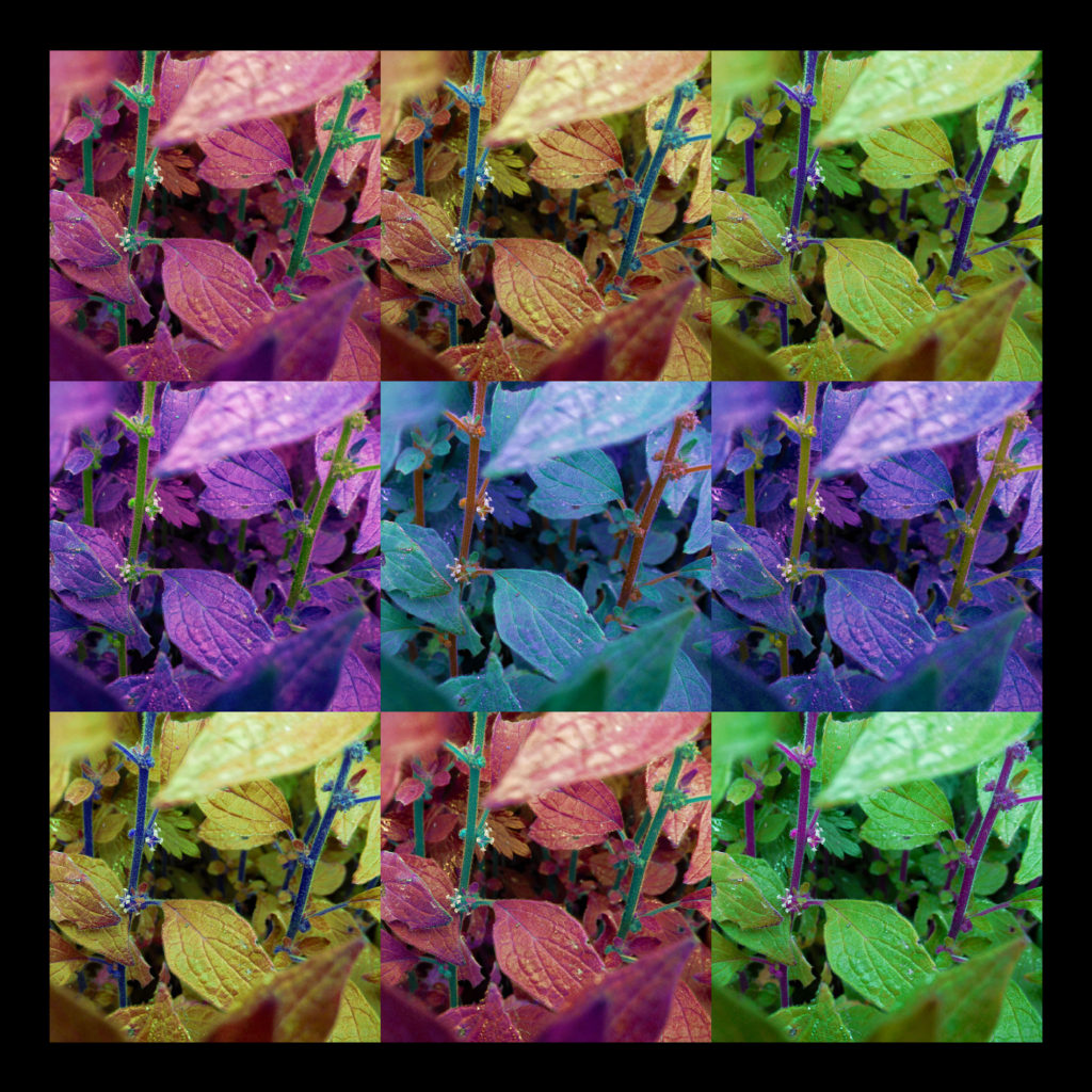

For these images, I want to mount them separately on foam/mount board.
My Images in a Gallery
I have made two images that show what my images would look like if they were to be hung in a gallery.


My Final Outcomes
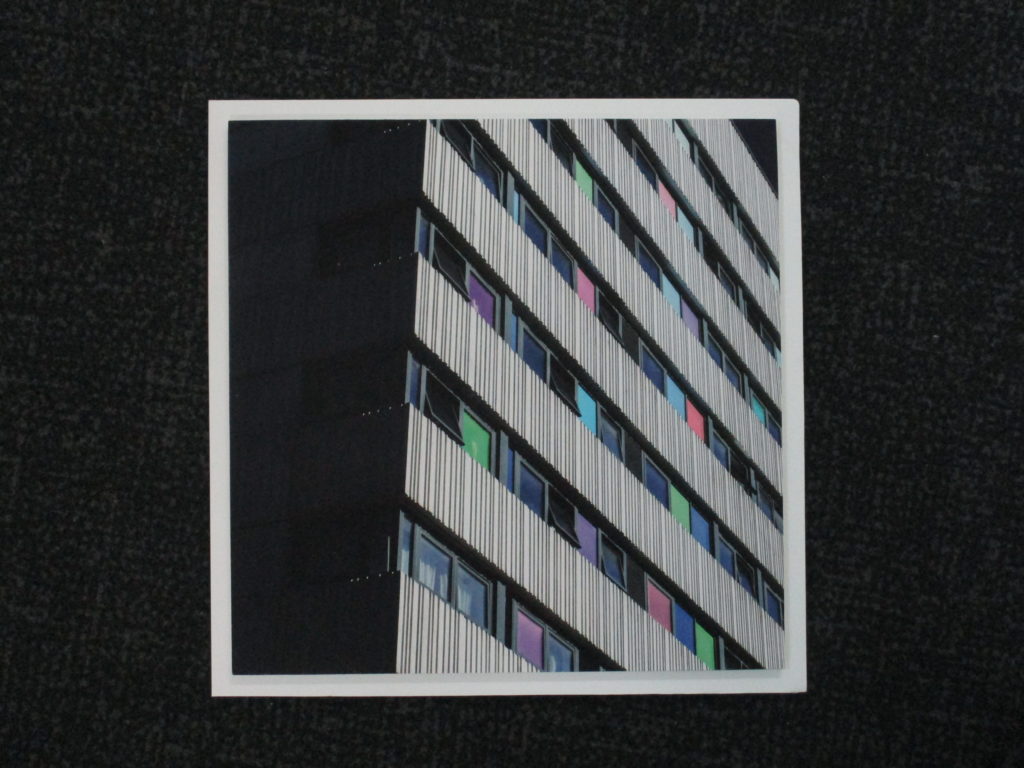


Comparing my Final Outcome to Reference Artist
Similarities
- Both images use strong colours
- Both images are abstract
- Both images use a regular grid pattern
Differences
- My image is far darker than Warhol’s
- Warhol’s image has much less contrast
- Warhol’s image is a portrait, while mine is more of an object/landscape image
Evaluation
Overall, I am very happy with the way this project turned out. I feel like this project was far more successful than the last mock exam, not only in terms of planning, but also, I felt that the quality of the images I took were far greater than the last project’s and that the final outcomes, in terms of editing and presentation was far stronger.
What Went Well:
I feel like the photoshoots for this project were very strong, I think this because I focussed more on the subject matter, why I was taking the images and what I was doing (in terms of how I took the pictures). I think my final pieces for this project are all strong and matched what I had intended from the start. I feel like my final images all match my referenced artists nicely, with each image bearing good resemblance to the work of those artists. While experimenting, I feel like I have learnt new ways on how to manipulate my images, as well as new concepts that I may be able to use in a future project.
What I can Improve on:
I feel like I could have been a bit faster in terms of producing the blog posts and final images, however I did manage to get them done during the allocated time. Because I didn’t get the project done in time for me to really go back and add even more detail to the blog posts, I also didn’t have enough time to make physical mock-up of how I would present my images in real life, I will try and aim to get to that point in the next project.


