
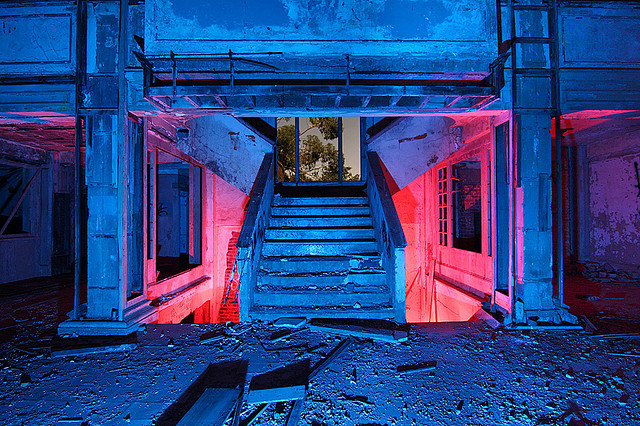
For this photoshoot, I went into St. Helier, one of the urbanized areas in Jersey, and took pictures of the various urban structures I could find in it, buildings and the shapes that can be seen on them, such as pipes and windows. Like the previous photoshoot, I aimed for an abstract approach to make my images similar to both Henry Fair and Troy Paiva to an extent.
Photoshoot Plan
| What? | I will take pictures of buildings and other urban objects |
| Where? | Around St. Helier where there is a large urban landscape |
| When? | Later in the afternoon to get a brighter, more colourful light source |
| Why? | I think taking pictures of an urban landscape as well as a more natural landscape will help link the photoshoots to the theme of Anthropocene |
| How? | I will go around the urban areas of St. Helier and take pictures of urban scenes |
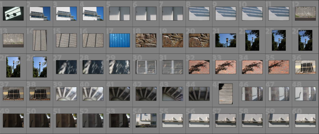
Contact Sheet


Editing Process

To start, like the previous photoshoot, I used the ‘Pick’ and ‘Reject’ tools to remove the bad images from the contact sheet, leaving the stronger images from the photoshoot.
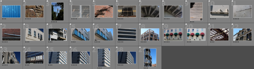
Next, I rated the images using stars to help choose which images were the strongest and weakest.
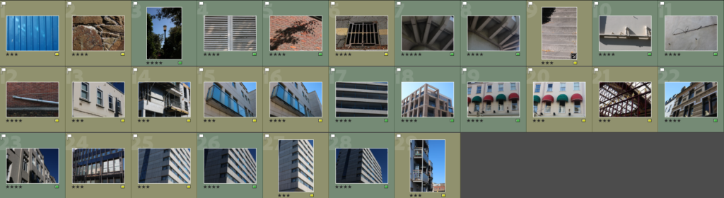
After that, I assigned a colour to each image to further condense my selection of images that could be final images.

Lastly, I went through the images left after filtering them into colour and star rating and selected these 5 images as the final images for this photoshoot.
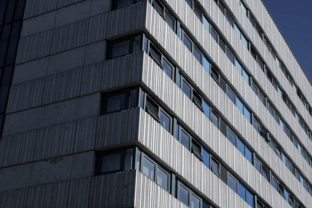
Final Images
These are my final images for this photoshoot, I have also adjusted them on Lightroom.
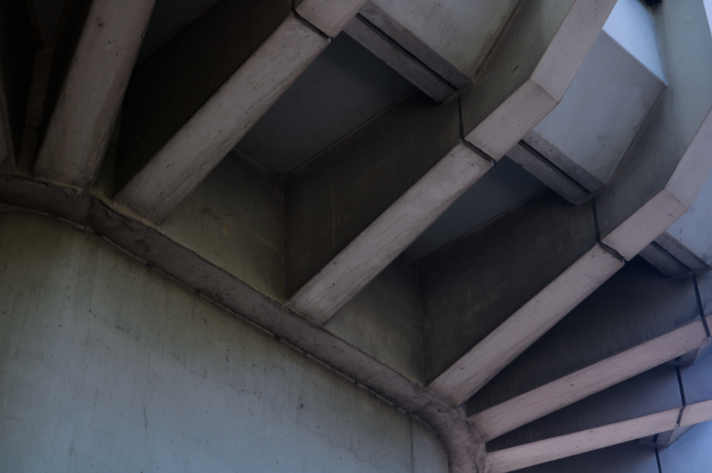


Like in the previous photoshoot, I have made black and white versions of each image. I think this goes well with these images in particular, as the black and white seems to emphasise the urban aesthetic of the images.

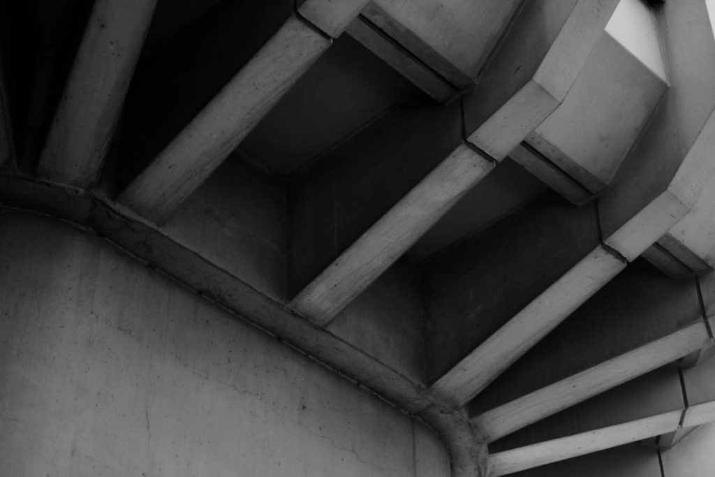
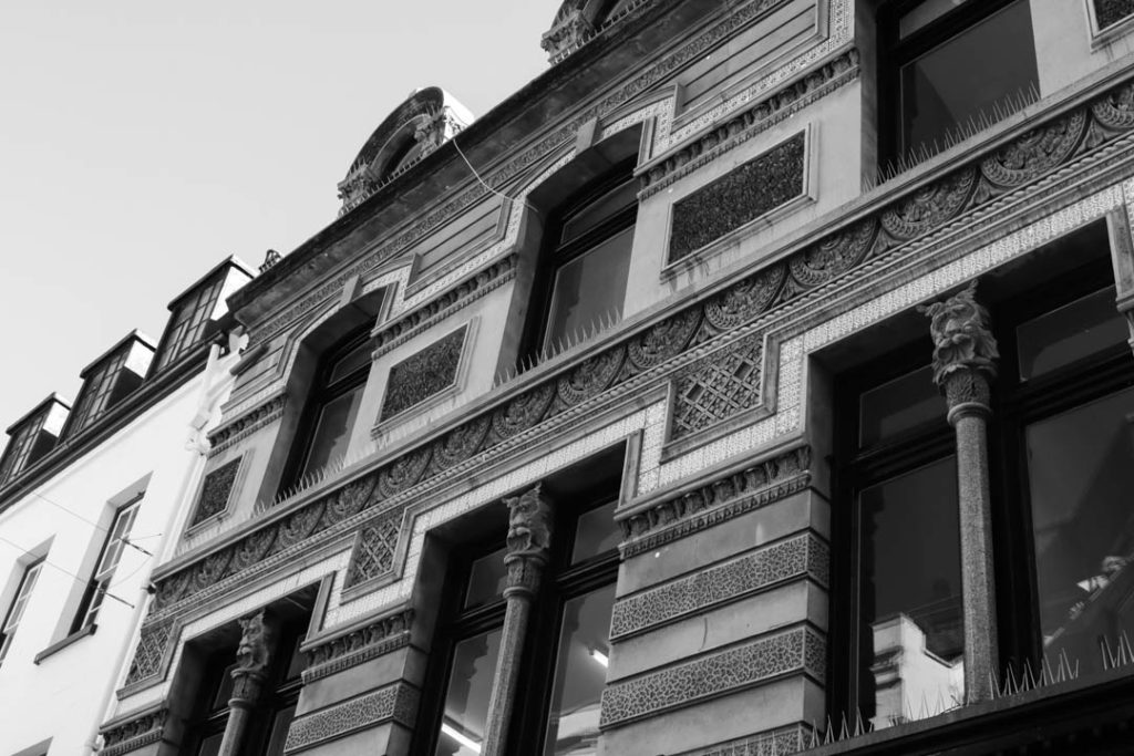


Image Analysis

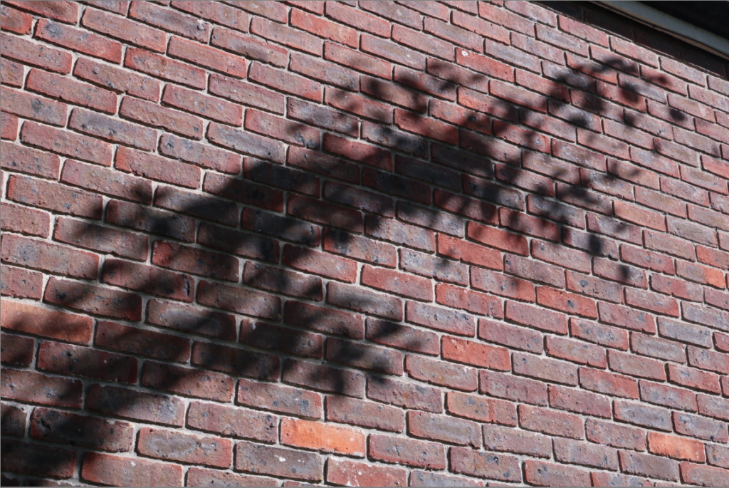
I like this image because I think the lines on the building gives it a fairly abstract form, the lines created from the wall and windows on the building gives it a complex and unique shape. The complete lack of any significant irregular lines or shapes gives the image a clear urbanised/manmade look. I also think that the pairing of greys and blues gives the image a cold, urban aesthetic that contrasts greatly with the images from the previous photoshoot. The lighting on the image creates a harsh contrast between the two faces seen in the image, as the one on the left is completely engulfed in shadow, while the one on the right is lit up nicely. I like how the wall on the left has dirt marks dotted around it, I think it gives the image an urban, unpolished look. When editing this image, I made the tone slightly more blue to make the blue parts of the image ‘pop’ more, but not to the point of making it overpowering. I also slightly increased the contrast between the lighter and darker areas of the image to make the lighter patterns on the right wall stand out more.
Comparison to Artist
This photoshoot was not a response to Paiva’s work, however I was inspired by his abstract use of subject matter and colour (for all photoshoots).
Similarities
- Both images use irregular shapes and lines
- Both images lack any natural subject matter
- Both images have a bold contrast between light and dark areas
Differences
- Paiva’s image focuses far more on using coloured lights to make his image appear abstract, while my image relies on line and shape
- Paiva’s image uses artificial lighting while mine uses natural lighting
Photoshoot Evaluation
I think this photoshoot went really well, I was able to produce some strong images that will offer a huge contrast to my other photoshoot in terms of aesthetic and imagery. I think I was able to capture abstract imagery from the urban setting I photographed, however I do feel like I can learn a little bit more on how to take abstract images of urban areas. If I was to do this photoshoot again, I would maybe go out when the weather is overcast or rainy, to give the images a slightly colder tone overall, or perhaps take the images at sunrise/sunset to make them warmer, which will create a different effect.