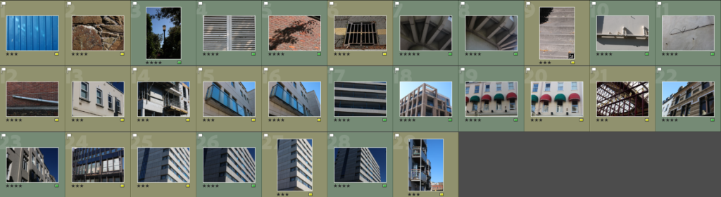
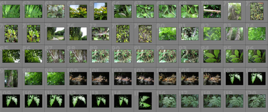
Here I have my final images displayed in a virtual gallery

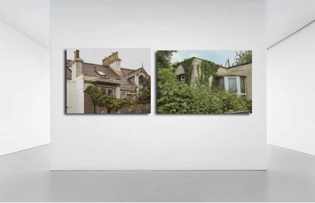

Here I have my final images displayed in a virtual gallery

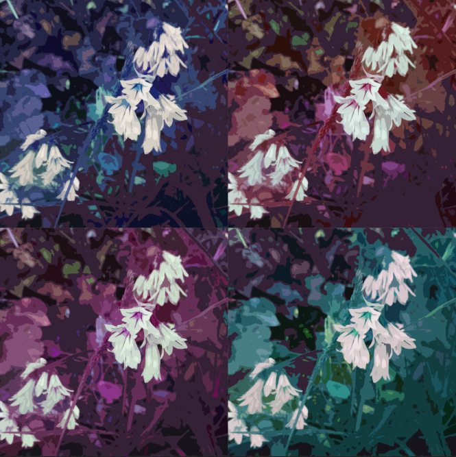
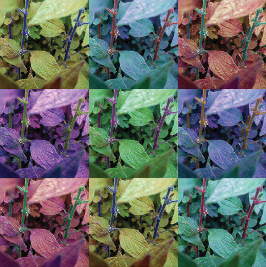
These two images are direct responses to Andy Warhol’s own artwork. I wanted to capture a style similar to his ‘Marilyn Diptych’ piece (the first image), as well as a more detailed style (the second image). For these two images, I wanted to focus on colour, both images have a lot of colour to help them appear more abstract, however the first image uses far darker colours and shades, while the second image is much more vibrant.


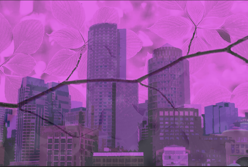
Similar to the last two images, I was inspired by Warhol’s work when making these images, seen by the bright and vibrant colours akin to his Marilyn Monroe portraits. I like the way these images use the straight lines from the urban building to separate colours and tones.
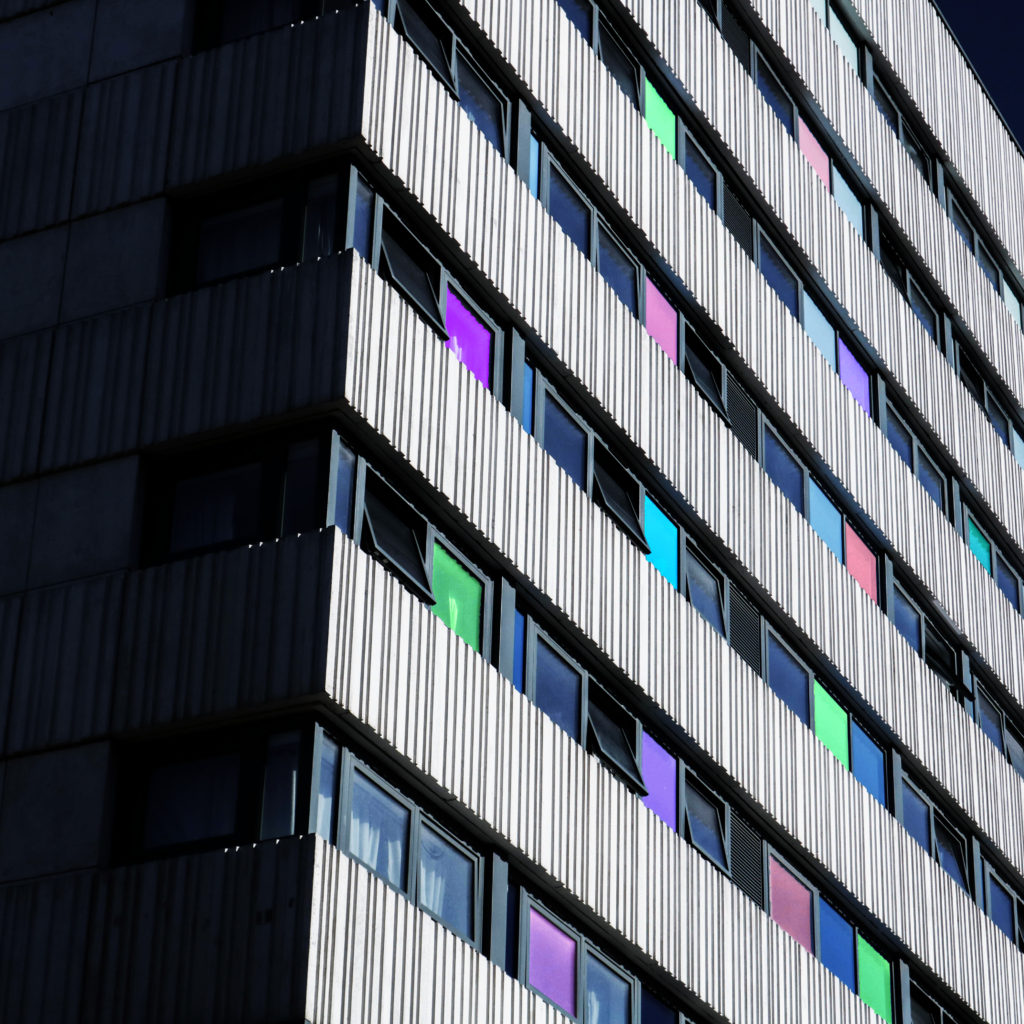
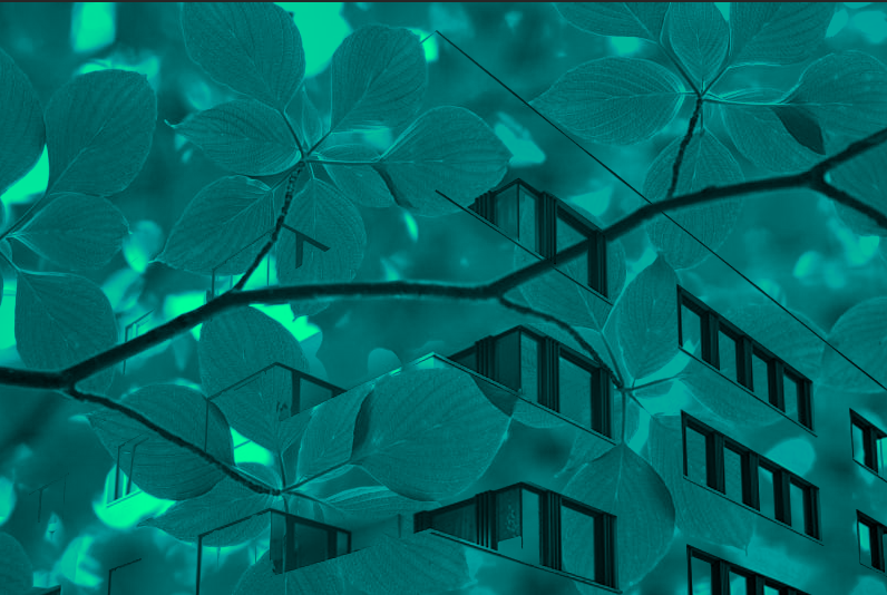
As for this outcome, I was inspired by both Warhol’s use of abstract shape and tones and Paiva’s light painting photographs, creating the different colours in some windows was an inspiration from some of Paiva’s images.
For these two images, I am going to lay them out in a window mount, I have made a mock-up version of this with a white boarder to mimic this style.


For these images, I want to mount them separately on foam/mount board.
I have made two images that show what my images would look like if they were to be hung in a gallery.


Overall, I am very happy with the way this project turned out. I feel like this project was far more successful than the last mock exam, not only in terms of planning, but also, I felt that the quality of the images I took were far greater than the last project’s and that the final outcomes, in terms of editing and presentation was far stronger.
I feel like the photoshoots for this project were very strong, I think this because I focussed more on the subject matter, why I was taking the images and what I was doing (in terms of how I took the pictures). I think my final pieces for this project are all strong and matched what I had intended from the start. I feel like my final images all match my referenced artists nicely, with each image bearing good resemblance to the work of those artists. While experimenting, I feel like I have learnt new ways on how to manipulate my images, as well as new concepts that I may be able to use in a future project.
I feel like I could have been a bit faster in terms of producing the blog posts and final images, however I did manage to get them done during the allocated time. Because I didn’t get the project done in time for me to really go back and add even more detail to the blog posts, I also didn’t have enough time to make physical mock-up of how I would present my images in real life, I will try and aim to get to that point in the next project.
These two images were very early experiments I did (before I took any pictures for the project). I knew from the start that I wanted to use colour and have an abstract aesthetic, so these images were tests to see how I could achieve that. While I think there could be an interesting idea behind these images, I don’t think I have developed it enough to be worthy of a final piece.
This image is an experimentation for when I thought about making my images appear like an Autochrome photograph. While I like the look of this image, and I honestly think I may bring back the idea for a future project, I didn’t think that it would fit with my ideas for a ‘colourful’ and ‘abstract’ final piece, perhaps for a darker, less energetic photoshoot.

Warhol was an American artist, producer and film director who is most famous for his silkscreen paintings, such as Campbell’s Soup Cans and Marilyn Diptych. Warhol was the lead artist/figure in the Pop Art movement, which mixed art with popular media, such as advertising, comic books and mass produced objects, giving them a boring aesthetic, which created irony. The movement highlighted the banal elements of culture. Warhol’s works include some of the most expensive paintings ever sold, he is considered to be the ‘bellwether of the art market’
I chose to study Warhol because I think his pop-art work, especially the Marilyn Diptych, fits with my aim for the project nicely. I was inspired by Warhol’s work because I think his use of colour is what I was aiming for when I was thinking of ways to make my images appear more abstract through my use of colour.

This image (and its variations) inspired me to create my final pieces in a similar way, with variations in colour in each image. I like these images because of their simple aesthetic (however I will not be using this for my final pieces as I want to keep some detail) and vibrant colours. To me, the lines appear soft and almost flower-like, which helps give the images an unnatural (for a portrait), manipulated look. The shapes in these images seem to be all independent from each other, the hair, lips, eyes, etc…, they blend together to create the portrait in a unique way. The simplicity of these shapes also gives the images (especially the less detailed ones) a more 2D look, which could be part of the reason why they are so distinct from other portrait images. The pattern created by copying the image and changing its colour (sometimes not changing the colour at all) is a staple for Warhol’s work.

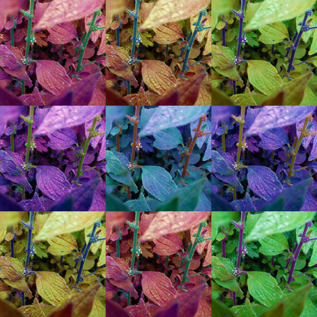
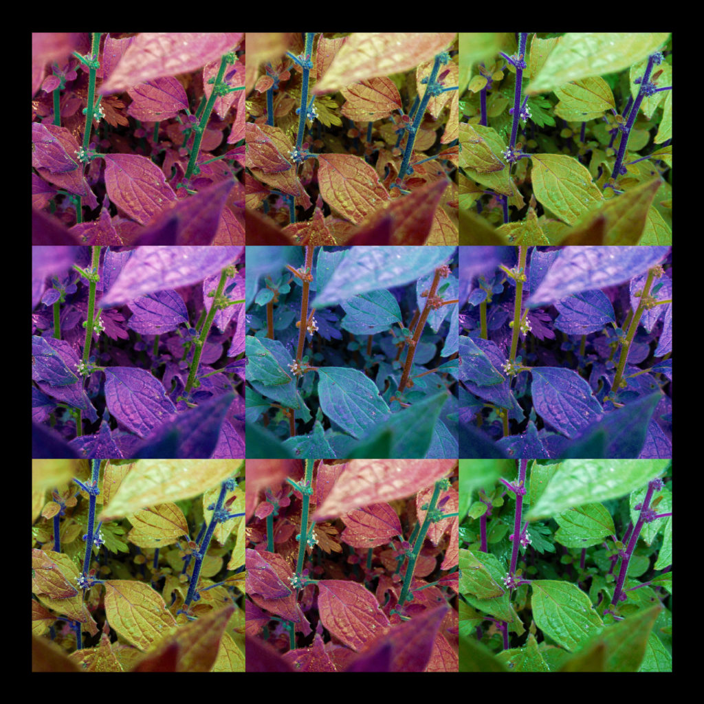
This is an experiment/test for using a similar style for an image in a similar style to Andy Warhol. I thought that changing the image’s colour and vibrancy on photoshop and then placing them in a 2×2 grid will mimic his style, but not completely. I wanted to keep as much detail in these images as I can, unlike Warhol’s images which tend to be more simplistic, in terms of shape, line, depth, etc… I like this turnout a lot and I think I will take it further into an idea for a final piece).

These two images are further experimentations for the Andy Warhol concept, this time I made my images square and used the Filter Gallery tool on photoshop to give the images a more simple look. I personally prefer the second image, as it retains some of the detail from the original image, while making the image appear more abstract.
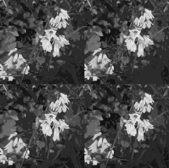
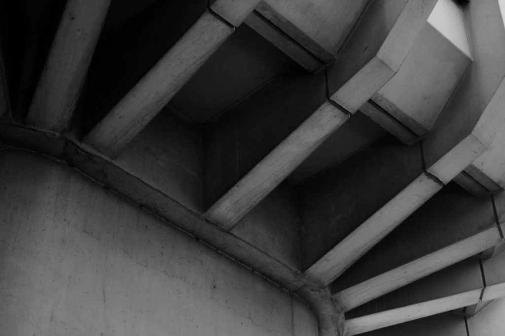
I have made a black and white version of this image to see how it would look. I thought the abstract shapes and difference in tones could make for an interesting black and white image.
This was an experimentation to see what different grids look like. This version is more akin to images such as Campbell’s Soup Cans, which include a higher number of images in the montage.

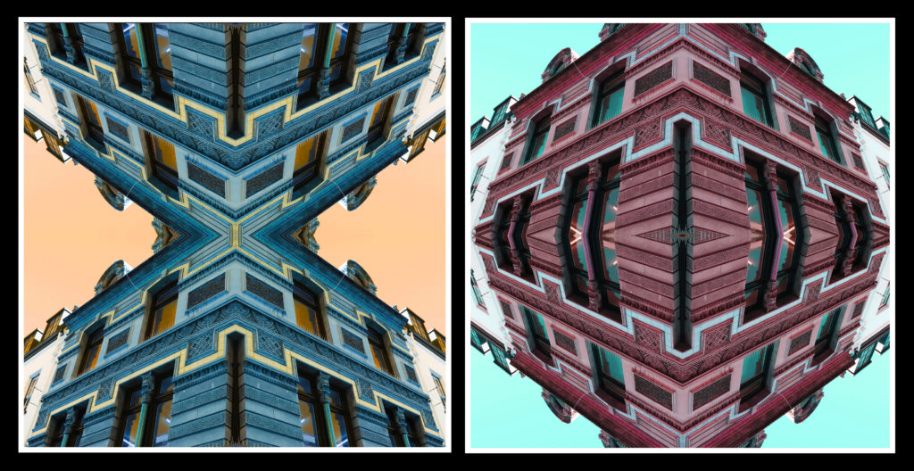
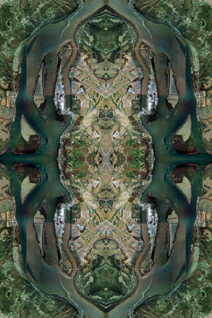
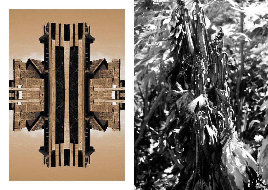
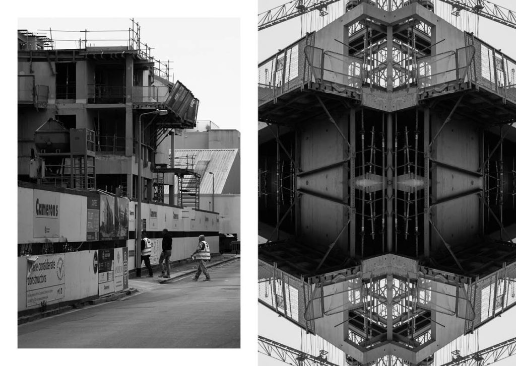
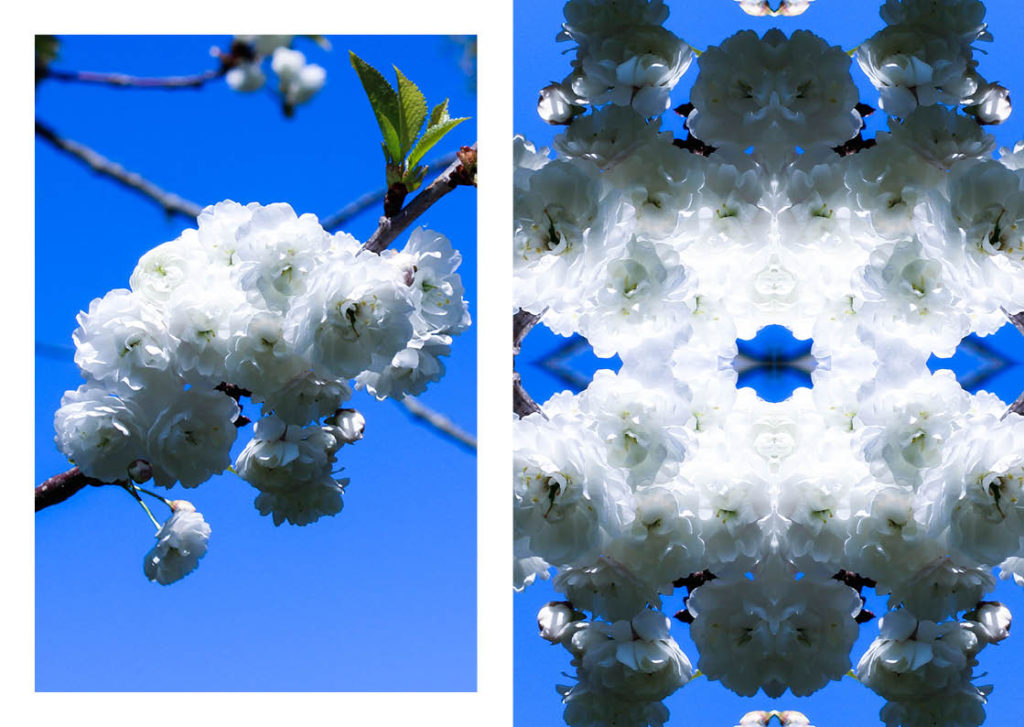
Here I wanted to look at different ways I could lay each image out, in this case I made it completely mirrored.
This is another variation of a mirrored sequence. I think these give the images an abstract look, however I think I’d rather stick to the regular style Warhol uses.
For my Final Piece for this project, I will be making multiple Andy Warhol inspired images using my photographs. I think this will work for the project as I am aiming for a colourful, abstract final piece, and I think this style most suits this prompt. I think this will fit for the theme of Anthropocene because I think that using abstract images, a style that I consider to be thought-provoking, as well as artistically interesting, will be a good way to conceptualize the theme of Anthropocene. This is because the Anthropocene is a theme that must be thought about, by everyone, so by making thought-provoking images, the Anthropocene will be thought about in the production and viewing of the final piece.
These are the images I consider to be the best out of all three photoshoots (I will use these to create the final piece):


Before making the sequences, I made a square version of each final image, as I thought it captured the style of Andy Warhol’s pop art better.

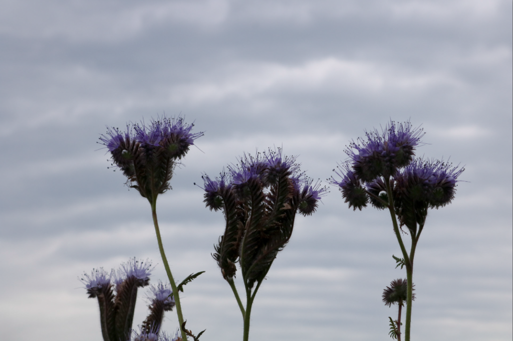
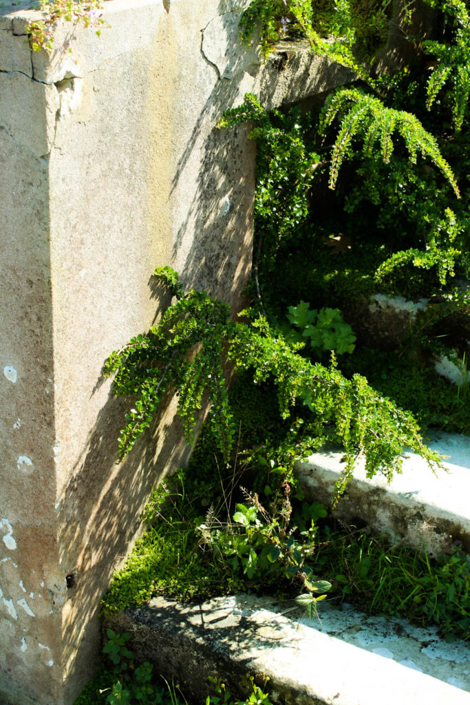
In this project, I wanted to focus more on nature, as it is the part that is most affected by the Anthropocene, this made me want to take more pictures of nature in this photoshoot. I will take pictures of landscapes or individual plants (similar to the first photoshoot), however in more overcast, cloudy weather, which will give the image a different mood.
| What? | I will take pictures of landscapes/plants when it is cloudy/rainy |
| Where? | On a track near my home |
| When? | When there is enough natural light to light my images nicely, while also being cloudy |
| Why? | I think a cloudy look could produce abstract images that look interesting due to the difference in lighting. I also think that focusing on nature will make my images akin to Henry Fair’s work |
| How? | I will take pictures of plants and landscapes from angles and viewpoints that could make them appear abstract |
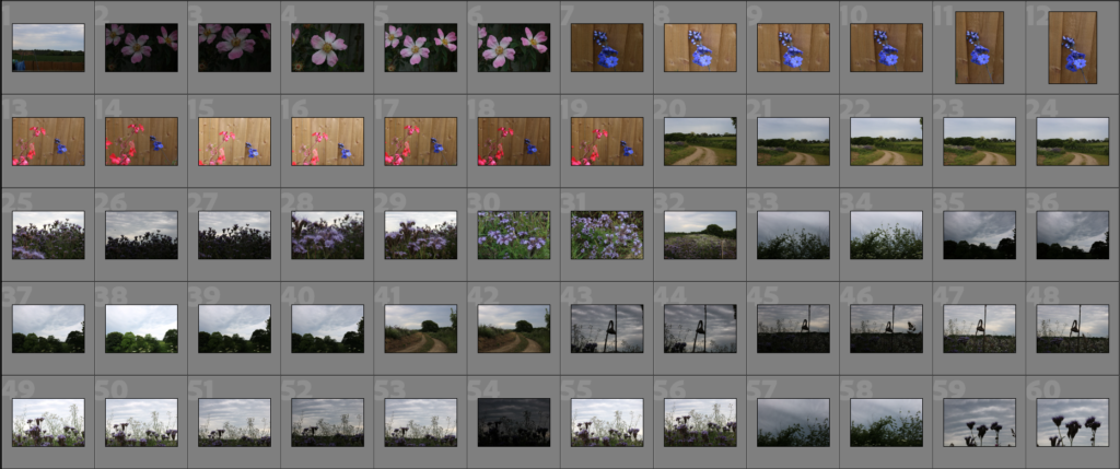


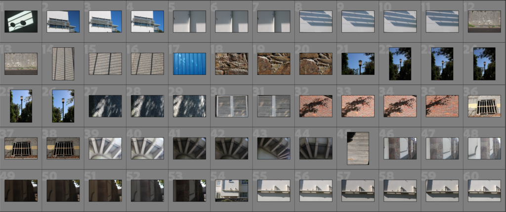
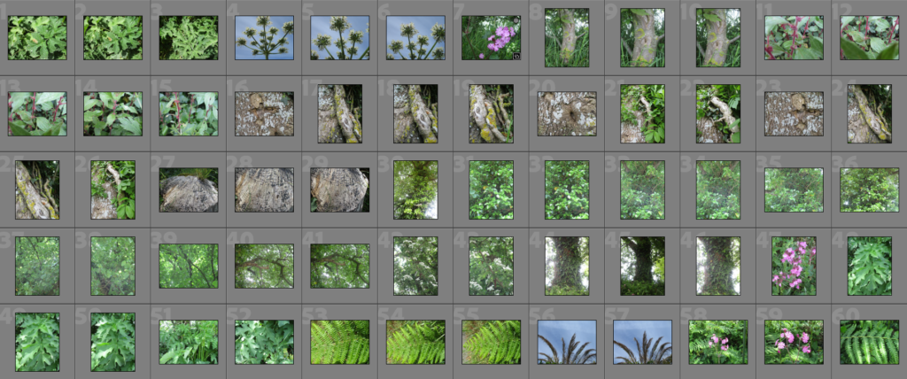
Here, I have used the ‘pick’ and ‘reject’ tools on Lightroom to comb out what I consider to be the best images from this photoshoot.

Next, I rated each image out of 5 to see which ones were the strongest and weakest out of that collection, which will help me make the decision for selecting my final images.

Then I assigned a colour to each image to help further comb the images to determine which will be the final images.

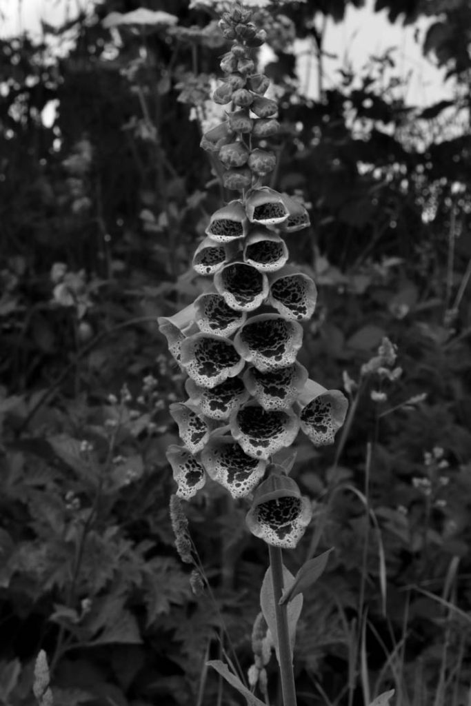
In the end, I chose these five images from the entire photoshoot to be my final images that I will be editing/manipulating further.
These are the edited/adjusted versions of each final image.


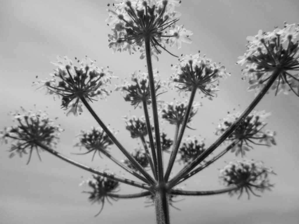
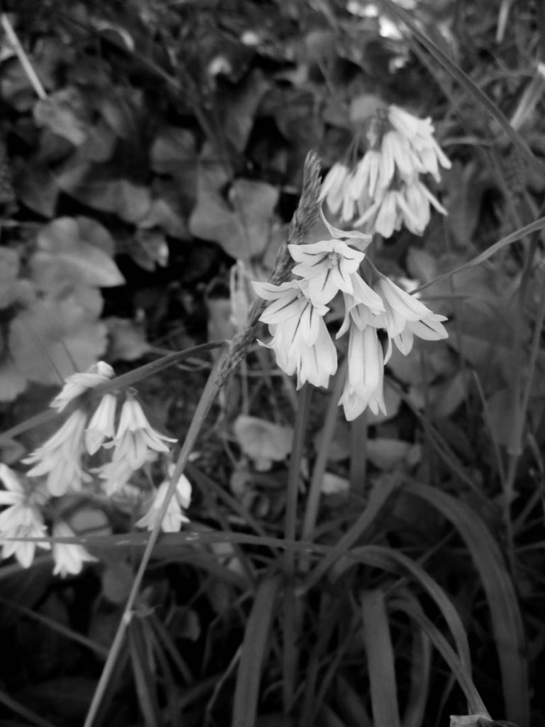
Here are the black and white versions of each final image.
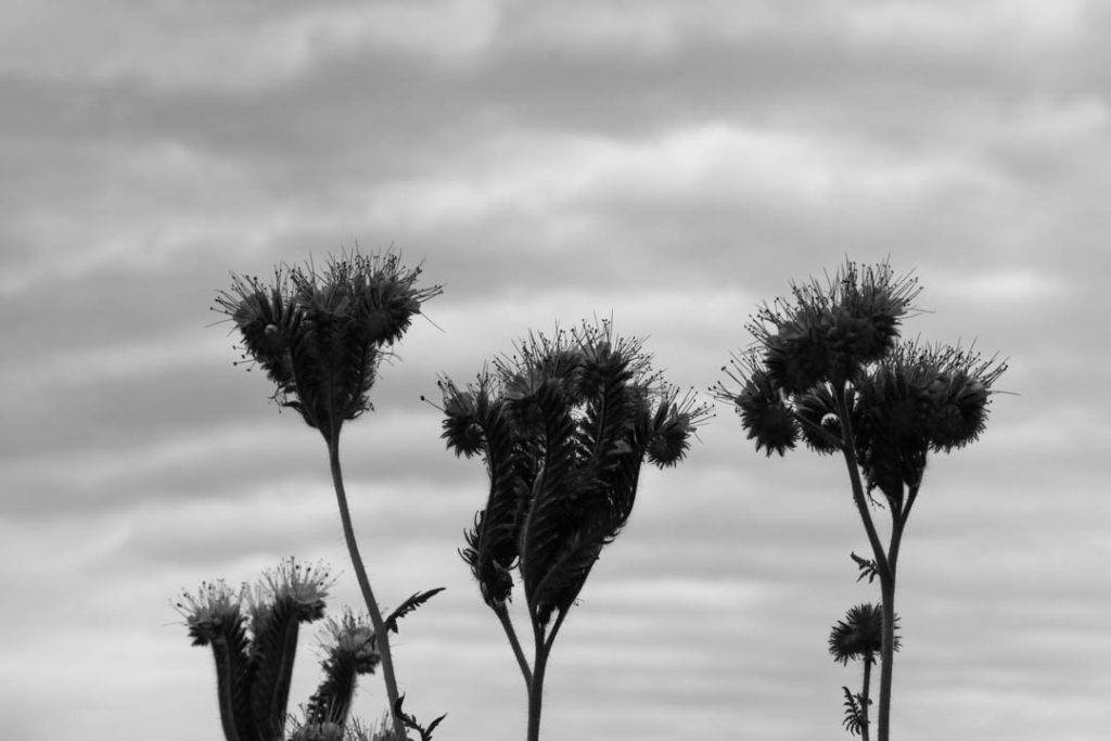
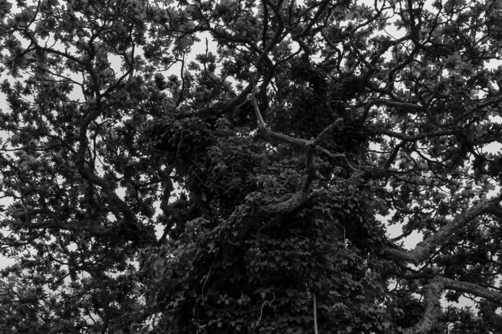


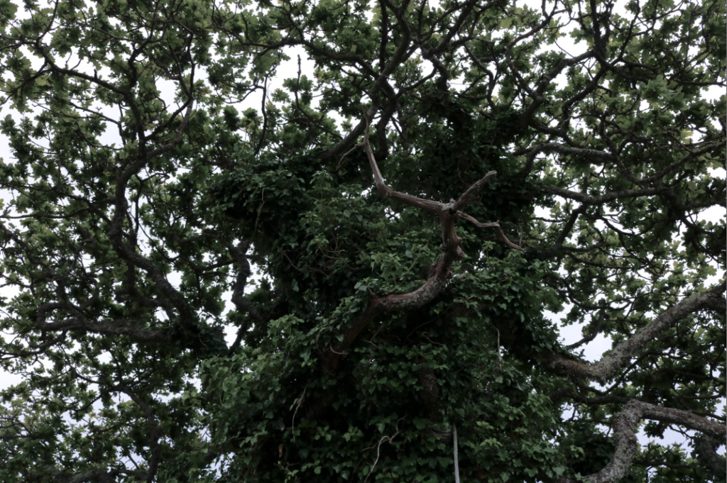
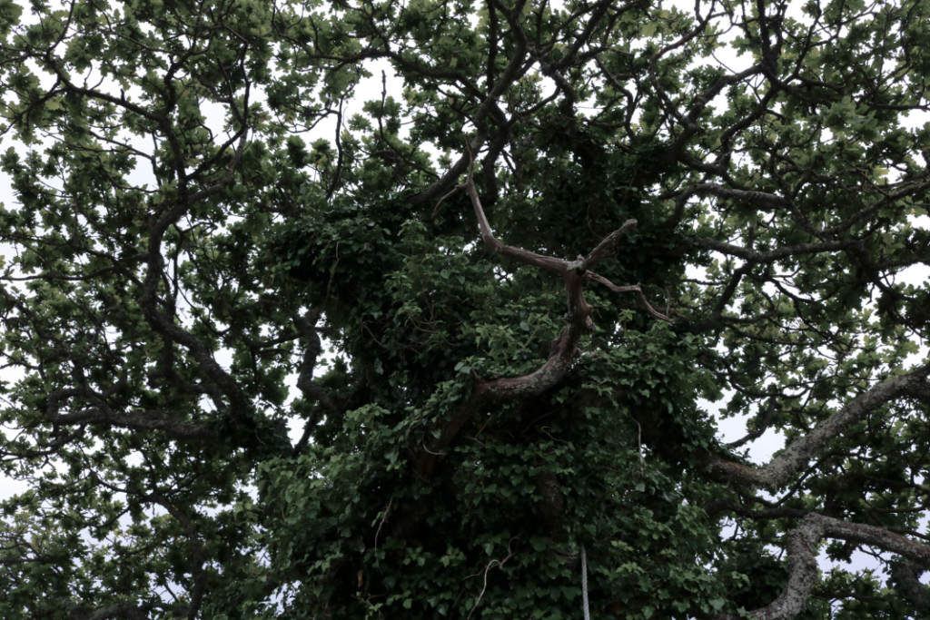
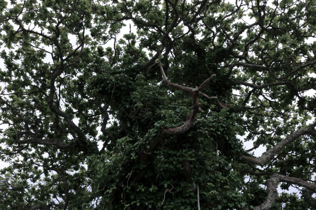
I made this a final image because I like the way the image looks almost chaotic, with the leaves and branches taking up a lot of space and creating many angular, yet irregular, shapes. When editing, I wanted the colour in this image to be slightly less vibrant, to give it a more sombre look, which I think works with the greens and browns on the tree. I also made the tone of the image slightly colder, to shift the leaves to a more dark colour that will go better with the sombre aesthetic of the image. Personally, I like the way the lighting creates an almost pure white in the background, as it helps to give the image a slightly more abstract look, helping it fit in with the images from the previous photoshoots. I like how the shadows on the tree contrasts greatly with the white in the background, not only does it give the leaves, branches and other patterns on the tree more definition, but it also aids the abstract and sombre look the image achieves.
This photoshoot was not inspired by Henry Fair’s work, however I think some elements from this photoshoot and his work are shared in some cases.
I am happy with the way that this photoshoot turned out, I think the final images are all interesting and link to the theme of Anthropocene well. I think the location I used for this photoshoot was interesting, and I may return to it in the near future to see what else I can find. As this photoshoot was taken in overcast weather, I think I would try to go out when the weather is brighter, such as at sunrise or sunset, which will give the images a completely different feel. In the area, there was also piles of timber and leftover rubble, which I think will be interesting to take pictures of in more depth at a later date.
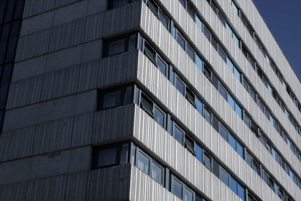
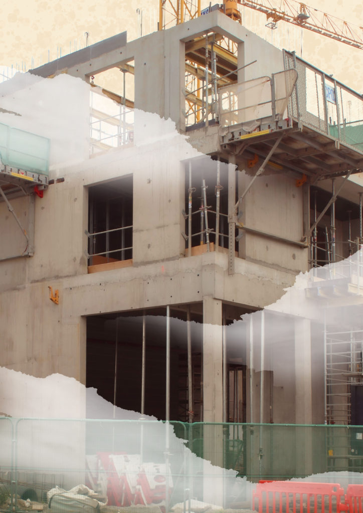
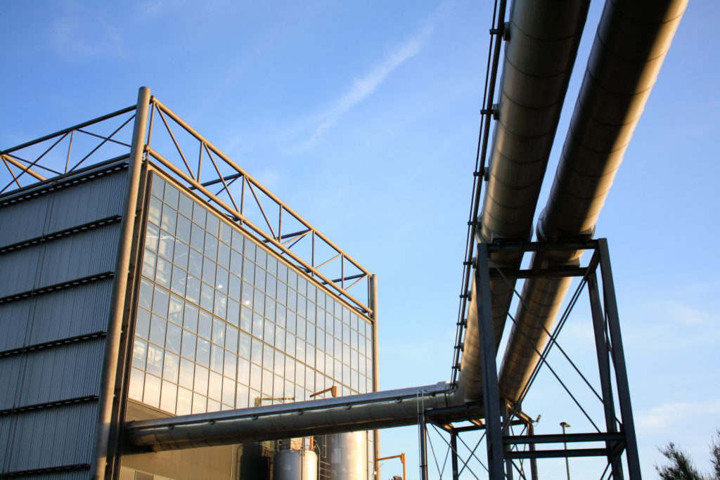
For this photoshoot, I went into St. Helier, one of the urbanized areas in Jersey, and took pictures of the various urban structures I could find in it, buildings and the shapes that can be seen on them, such as pipes and windows. Like the previous photoshoot, I aimed for an abstract approach to make my images similar to both Henry Fair and Troy Paiva to an extent.
| What? | I will take pictures of buildings and other urban objects |
| Where? | Around St. Helier where there is a large urban landscape |
| When? | Later in the afternoon to get a brighter, more colourful light source |
| Why? | I think taking pictures of an urban landscape as well as a more natural landscape will help link the photoshoots to the theme of Anthropocene |
| How? | I will go around the urban areas of St. Helier and take pictures of urban scenes |


To start, like the previous photoshoot, I used the ‘Pick’ and ‘Reject’ tools to remove the bad images from the contact sheet, leaving the stronger images from the photoshoot.
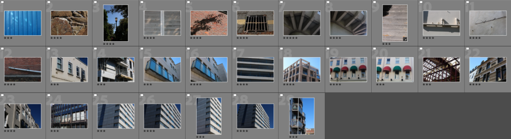
Next, I rated the images using stars to help choose which images were the strongest and weakest.
After that, I assigned a colour to each image to further condense my selection of images that could be final images.

Lastly, I went through the images left after filtering them into colour and star rating and selected these 5 images as the final images for this photoshoot.
These are my final images for this photoshoot, I have also adjusted them on Lightroom.


Like in the previous photoshoot, I have made black and white versions of each image. I think this goes well with these images in particular, as the black and white seems to emphasise the urban aesthetic of the images.

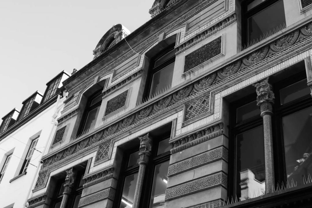


I like this image because I think the lines on the building gives it a fairly abstract form, the lines created from the wall and windows on the building gives it a complex and unique shape. The complete lack of any significant irregular lines or shapes gives the image a clear urbanised/manmade look. I also think that the pairing of greys and blues gives the image a cold, urban aesthetic that contrasts greatly with the images from the previous photoshoot. The lighting on the image creates a harsh contrast between the two faces seen in the image, as the one on the left is completely engulfed in shadow, while the one on the right is lit up nicely. I like how the wall on the left has dirt marks dotted around it, I think it gives the image an urban, unpolished look. When editing this image, I made the tone slightly more blue to make the blue parts of the image ‘pop’ more, but not to the point of making it overpowering. I also slightly increased the contrast between the lighter and darker areas of the image to make the lighter patterns on the right wall stand out more.
This photoshoot was not a response to Paiva’s work, however I was inspired by his abstract use of subject matter and colour (for all photoshoots).
I think this photoshoot went really well, I was able to produce some strong images that will offer a huge contrast to my other photoshoot in terms of aesthetic and imagery. I think I was able to capture abstract imagery from the urban setting I photographed, however I do feel like I can learn a little bit more on how to take abstract images of urban areas. If I was to do this photoshoot again, I would maybe go out when the weather is overcast or rainy, to give the images a slightly colder tone overall, or perhaps take the images at sunrise/sunset to make them warmer, which will create a different effect.
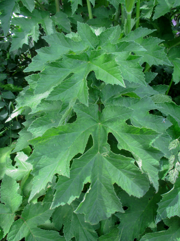
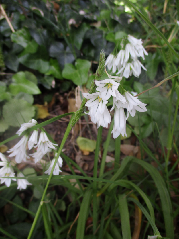
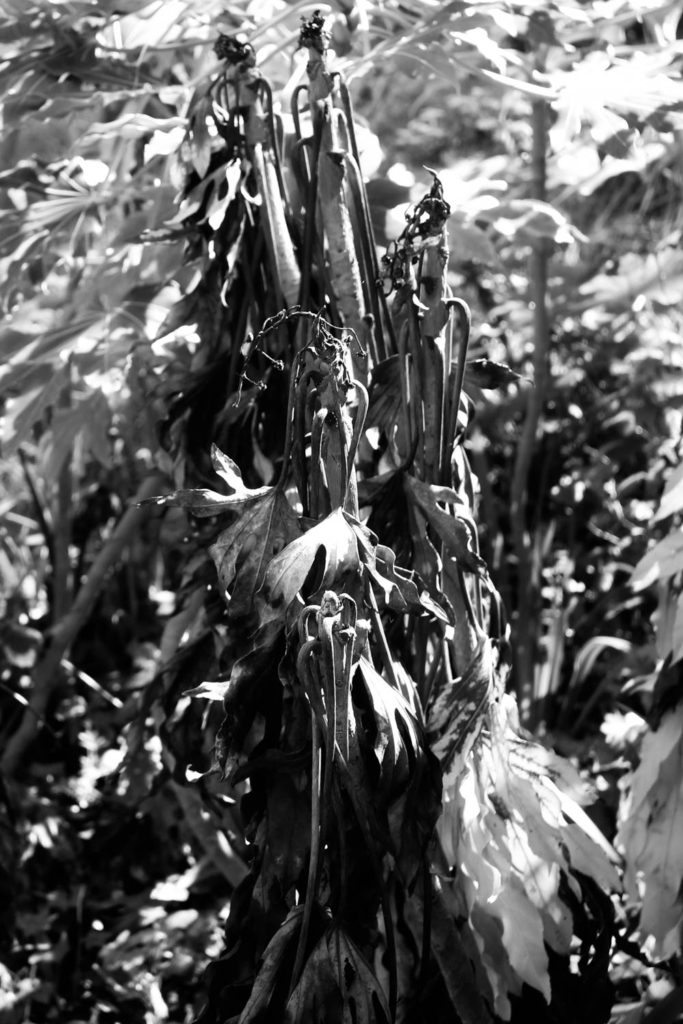
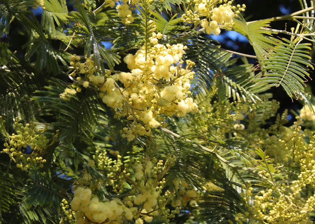
For this photoshoot I walked through the lanes near my home which have a large amount of unique plants and landscapes, which I thought would be a great way to start photographing for this project. I aimed to take pictures with an abstract approach similar to Henry Fair’s own work. During the photoshoot I managed to take many pictures of different plant life such as flowers, trees and leaves.
| What? | I will take pictures of the plants and aim for an abstract approach |
| Where? | Near/In St. Peter’s Valley |
| When? | Mid-late day as the trees in the valley obscure light, so I will need as much light as possible |
| Why? | I think the large variety/amount of plant life in this area will give me a good set of different images |
| How? | I will walk around the valley and look for interesting scenes |


For my first round of editing, I went through my images and selected the good images from the photoshoot using the ‘Pick’ and ‘Reject’ tools on Lightroom. This leaves only the images that I think I could use for a final piece.

Next, I used the star rating tool to distinguish which images I think are strong and which are weak by rating them out of 5.

I also used the colour rating tool to assign a colour to each image, which will help to further narrow my image selection, while also making it easier for me to see which images I am/ am not using (With red being the weaker images and green being the stronger ones).

Eventually, I condensed this photoshoot into what I think are the strongest 5 images, which I will be manipulating and likely using for my Final Piece for this project.
Here are my final images for this photoshoot, I have adjusted them slightly on Lightroom.


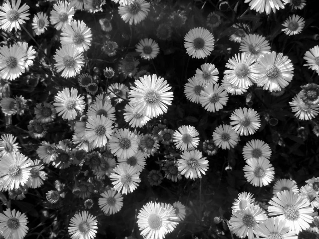
I have also made black and white versions of each final image to see what they would look like without colour.


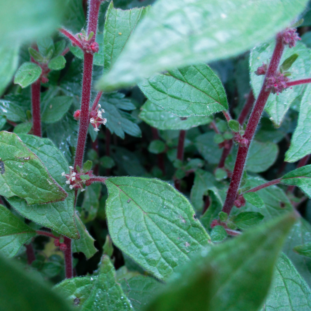
I chose this as a Final Image because I think the way the camera seems to look beyond the leaves (seen in the foreground) into a group of other leaves and stalks gives it an abstract feel. I think the viewpoint (slightly downwards facing) also helps give the image an abstract look, as it looks downwards into the shaded ground, while also showing more of the stalks and leaves in the background. I like the way the stalks and leaves in the image are separated: the obvious colour difference, which uses complimentary colours giving the image an unnatural, yet natural look, but also the difference in shape and line, with the stalks naturally having a more rigid, straight-edged form. The patterns seen on the leaves gives the image even more lines to make it more abstract. When editing this image, I made it ever-so-slightly more cold, which gives the leaves a more vibrant greenish-blue tone, which creates a greater contrast between the red stalks and the green leaves.
While my images are not a completely direct response to Henry Fair’s images, I took inspiration from his use of shapes and colour specifically for this photoshoot.


Overall, I am very happy with how this photoshoot turned out, I think each final image is interesting and unique from each other, and fits with the project nicely. I enjoyed taking the images and I feel like I have learnt more ways on how to photograph the environment in an interesting way, as well as how to take abstract images in particular more effectively and uniquely. If I was to do this same photoshoot again later, I would maybe change the weather I go out in, to maybe change the subject matter slightly (with the inclusion of raindrops for example), or perhaps go out at a later/earlier time of the day to give the images a more interesting natural light source

I really like how my collages from this artist reference came out, I think they look really unique while also being obviously inspired by him. My colours are a lot more saturated and they look different compositionally as Smith’s was taken from above while mine was from the side. Mine was also taken from a lot closer up so has more fine details.
I like my final result for this one less, it took a lot longer to make than I expected. Mine features a lot less clouds because I was struggling to find clouds in my shoots. I also could not find many images of green netting, as there was not very much actually being used in town, so mine lacks some of the artificially made natural forms.


I also made a zine containing a selection of my images from this project.


If I were do this project again, I would want to be more organised with my shoots, as well as potentially going on a third just so I have more material to work from. I would also want to take a longer look at which artists I want to pick, and how I think my pieces in response to them would look.


Similarities: In the photo above I have been influences by Troy Paiva’s ‘Night Vision; The Art of Urban Exploration’ project. One of the main similarities in these two images is the neon colours that highlight the objects or structures. One of the more saturated colours that moth the photographs share is the neon green/yellow the covers the top of the petrol pumps in Troy Paiva’s work and the side/underneath of the medicine packaging in my work. I wanted to use two colours that were similar to Paiva’s as I liked how they complimented each other but were still very different. Another similarity in these photos is the dark background and the darker aspects of the image which help the main piece standout and seem brighter, in Paiva’s work he was working during dusk, so different factors in the background are mainly silhouette’s .
Differences: One of the main differences in the two photos is the setting that the two images where taken in. In Troy Paiva’s work he was outside where you can see the sky where the sun has just set and the big piece of land that is covered in dried plants, where as I used black card as my background so that there was nothing else in the final piece. I prefer Paiva’s background as it add more context to the image and tells more of a story compared to my plain background. Another difference between the images is the type of objects that have been photographed, I decided to photograph different types of plastic, mainly the ones that are the most common, where as Troy Paiva photographed different structures that were in the middle of a desert, for example the petrol pump, cars and buildings.
For the presentation of each of my final outcomes, I displayed them in a way that would show reference to both of my case studies and their way of presenting their work through grids and sets, especially for my first photoshoot – the use of both a black and white filter and set of three shows close attention to Hilla and Bernd Becher.
For my second photoshoot, I put my photos in sets of four or three, sorting them by colour or texture whilst experimenting with other photos to see how they would fit together.
FINAL PIECE #1 – CHAOS

This is my final outcome for photoshoot one named CHAOS. I based my first shoot on industrial architecture inspired by my case studies. These set of photos are presented in black and white to show the damage power stations are causing to the environment, the lack of colours representing the pollutions in the sky. These photos were taken around La Collette and the harbour, two hotspots for harmful gases and lack of nature. I presented my photos from two different viewpoints; one taken head on and two looking upwards to symbollize how society looks down on nature to take over and build what they please, essentially destroying ecosystems. I put my photos in black and white to showcase an ominous atmosphere, but to make sure the viewer knows exactly what they are looking at, the dark colours used to exaggerate the message i want to spread about anthropocene through photography.
FINAL PIECE #2 – DOORS

I named this set of photo DOORS because each photo showcases a different type of door, for this set I wanted to take a different apporach and showcase my photos in a more abstract way, so I decided to display them according to shape. My goal for this set of photos was to make the viewer feel curious as to what’s behind the door, which relates back to my interest in abandoned buildings and wanting to know what’s inside. This set of photos I feel are the closest to my case study on Paul Talling because he has similar ones on his website; sets of conceptual photos that don’t have a correlation unless you read between the lines, which was my idea behind these images. Before grouping these photos together, I had to make sure the lighting matched, and was all natural light without any flash.
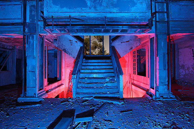
FINAL PIECE #3 – DECAY

This set is one of my favourites of the four that i’ve produced because to me it evokes the most emotion. When editing on Lightroom i set the temperature to blue to show a sad, lonely atmosphere which is what most people think of when they see abandoned places. I lowered the saturation to make the photos appear faded as i wanted to show the disrepair and state the hotel had fallen into since being derelict and taken over by nature. These images were taken at all different locations around the hotel which i think helps show a wider representation of what the atmosphere in there is like.
FINAL PIECE #4 – DESTRUCTION

As i mentioned in a previous blog post, i took these photos to replicate some of Talling’s work as many of his photoshoots are of graffiti and street art, but i also wanted to capture the vandalism caused not just by nature but also by trespassers and perhaps show another aspect of anthropocene where humans are their own worse enemy, representing destructive behaviours through the smashed objects and graffiti i found whilst exploring the hotel. I was originally reluctant to switch these photos to black and white as i felt it would clash with my other sets but I am satisfied with the outcome as i feel it really highlights the graffiti and makes it stand out whilst still having multiple other focal points.
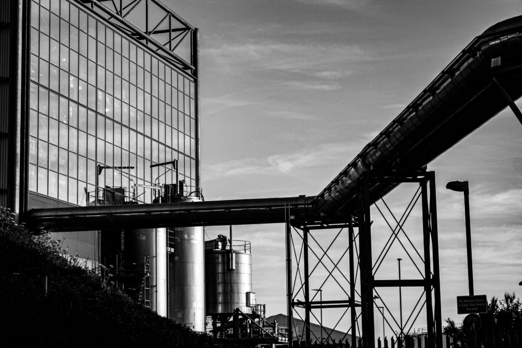
Evaluation: I have selected this as my first final image for a number of reasons; I think the composition of the image is one of its main strengths. With the incinerator being in the background towards the left and the metal pipes being very far into the foreground creates a good perceptive and sense of depth. Furthermore, the lighting of the original image was perfect considering the time of day it was taken at, meaning this image required minimal editing and to edit this image all I did was change the saturation of the image from a blue tone to more of a yellow tone, this meant that the final image came out appearing to have been taken at dusk. Additionally, the rule of thirds is demonstrated in this final piece, with the incinerator taking up the first two thirds of the image and the metal pipes taking up the rest. This links to the topic of Anthropocene as it demonstrates how human life has forced the natural landscape to adapt to our needs.
Critique: This piece could be viewed as not having enough components to link to our topic of anthropocene, the fact that this piece is so subtle could be a negative thing as theres not much contrast within this image. The sky isn’t filled with clouds so this image wasn’t as successful edited in a monochromatic way and it could be viewed as dull compared to my other piece of work. Furthermore, the photoshoot during at which this image was taken could have been planned better so that clouds could have present, which would have gave the image more depth.

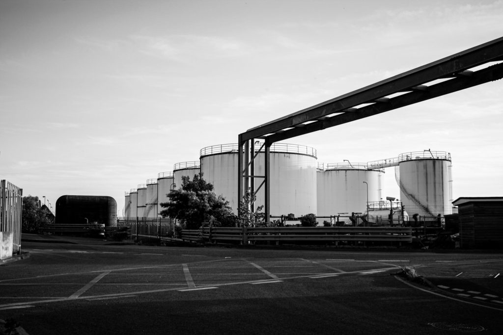
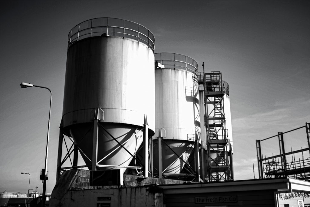
Evaluation: This final piece is a reflection on human life on not just the landscape but specifically how human life has affected Jersey, as this photograph of the reclaimed land illustrates how we have been forced to expand our environment in an unnatural way to combat our overpopulation and overconsumption crisis in the island. This image was taken at an angle with shows an overview of Jersey, the composition of the image means that this image is filled with features. Additionally, making this image black and white means that the individual structures become more evident. This piece was taken using manual camera settings and this allowed for the final piece to come out with good lighting, altering the contrast however, does make it look a little bit unexposed.
Critique: The fact that this photograph was taken from such a far point away, it means that there is no focal point within the image and it becomes a little muddy. This is created because of the lack of contrast and texture within the piece. I attempted to create more juxtaposition within the piece, but this didn’t work because of the clear sky in the original image.

Evaluation: This final piece is probably my favourite all, factors which aid this piece in being one of the best firstly includes the lighting. The original photograph was always one of my strongest and this was only enhanced by adding the colour. By overlapping a border affect is created and this helps create even more contrast between the warm toned pink and cool toned blue. Furthermore, placing the pinker image at a smaller size over the original meant that the unedited image is still visible. This was meant to be an experiment but I really like the ideas of the colours together so this was developed into a final piece. Additionally, the green within the pink photograph is cool toned so despite all of the contrast these images do link together.
Critique: The blue background image is a little lost with the vibrance of the pink in the centre, the overlapping factor mean that a new better piece cane be created but this only occurs when another image has to be compromised. Furthermore, the pink image could have been replaced with a saturated image that complimented the blue border rather than contrasted it.

Evaluation: I have selected this as my last final photograph as it was intended to be a Frank artist reference but it turned out to be one of my most aesthetic images. This is because of the composition of the image, the angle at which it was taken means that the tanks are in the centre. The metal structures and road heavily contrast with the tanks and the sky, I like how half of the photograph is composed of lighter features and half are composed of darker, creating a more cohesive image. I think the message behind this image is more important then the piece itself, I think it has a sense of sadness would could link back to anthropocene as its all about what humans have done to the earth, which are mostly negative factors.
Critique: I think that I could have cropped this image to get rid of the tarmac in the foreground and some of the image could have also been taken away from the left side of the photograph. Despite this image being more true to my artist reference it could be more exciting and possibly (by using Photoshop) only edited the sky within the image to create more contrast and more of a dramatic look, which would also link to our topic of romanticism.


Evaluation: I have selected this as the arrangement for my final gallery as I think that the lighting of the individual images makes for a more cohesive image. There is lots of contrast within this image and this makes it more successful as its more of an eye-catching piece. The photographs have been placed so that the images with metal pole or water tanks are not next to each other, this is to create differentiation within my work. Additionally I think that the lighting of the image plays out well together as they lighter and darker images are placed next to each other,
Critique: This work could be seen as not a true typology and all the image are of of the same thing or taken in the same way. I have attempted to make the levels or contrast and lighting all the same in each of the images, however, I’m not sure if this was apparent or if all of my images turned out successfully.