FINAL IMAGES
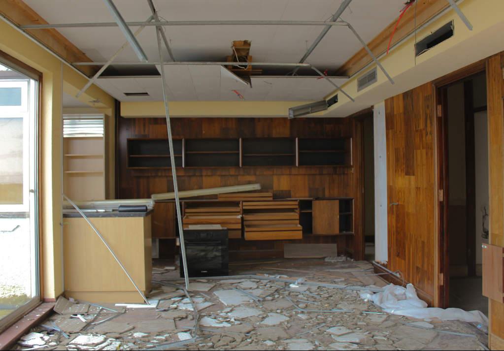
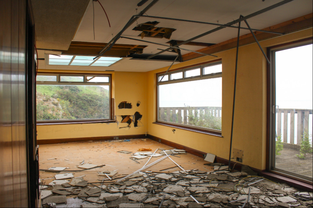
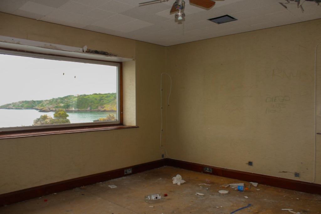
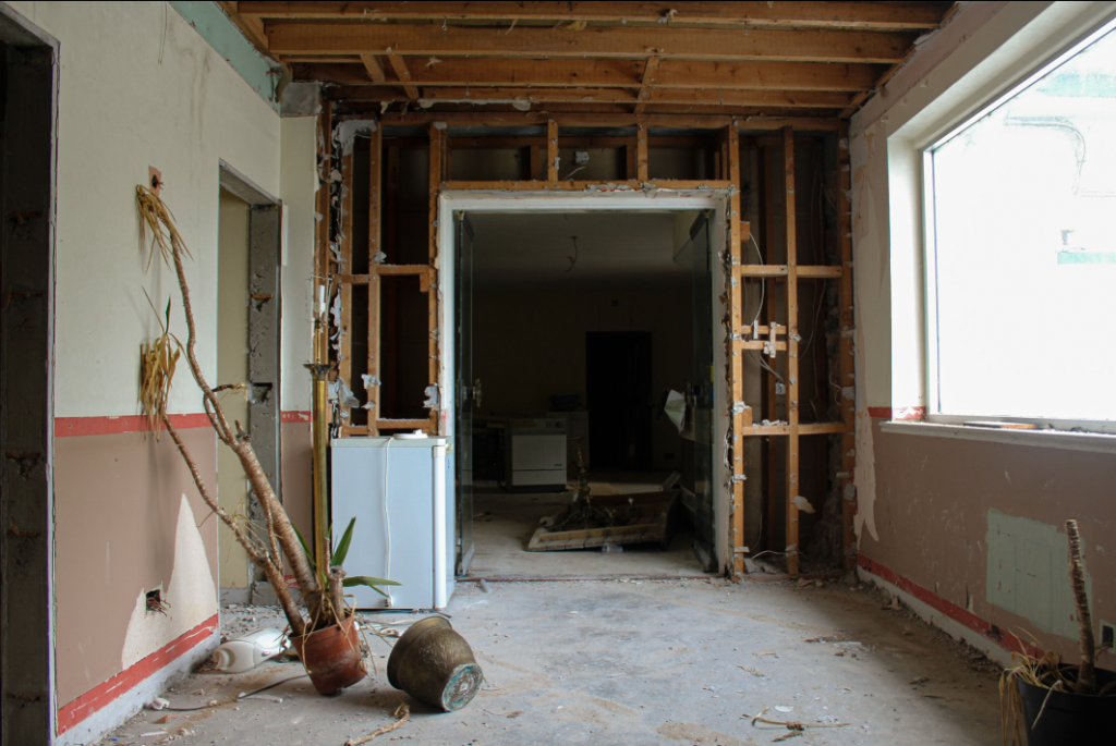
FINAL LAYOUT OF IMAGES
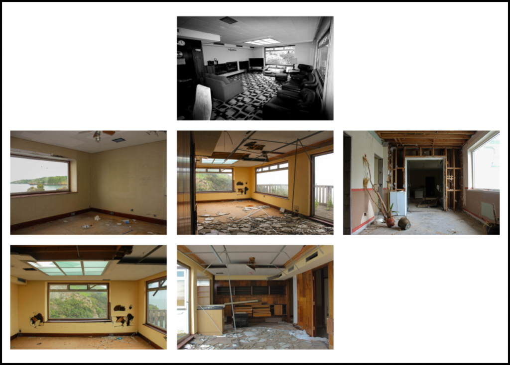
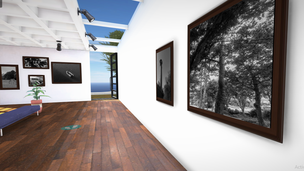
GALLERY DISPLAY OF IMAGES
FINAL IMAGES


FINAL LAYOUT OF IMAGES

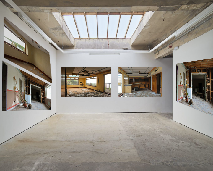
GALLERY DISPLAY OF IMAGES

Before the exam I had curated a plan to create 3 blog posts, featuring my artist of choice for that piece, all which I felt had successfully explored the idea of Anthropocene and humans effect on the planet in a way that was new and interesting to me. I had also decided on some places I was going to go to photograph that clearly show real life examples of changes in landscape caused by humans such as a quarry, a residential pond, a large scale oyster farm and a city. I wanted to replicate George Marazakis style of showing humans leaving their mark far out in nature- and then abandoning it there, Ingrid Weyland’s theme of projecting nature’s vulnerability & fragility, and Laura Roemero style where she documents how building styles change and over time develop a places (city’s) identity. At first I was just wanting to edit my photos the same as these artists did, but after some further research and looking through my catalogue I later decided to slightly change these ideas.
When I went to take these photos I often found myself struggling to be satisfied with the angles and lighting that I had originally planned for them to have to be similar to that of my chosen artists- and so I had to adapt and try out various different angles to overcome certain barriers. For example when I went to photograph Rosnez Quarry I found that I wasn’t actually allowed in and down to the quarry area, obviously because it is a large industrial operation- so I had to go to Sorrel point to take pictures from above and I found that I could actually get different angles by going further down the cliff path.
After uploading my photos to light room, I quickly found that I would only want to use about 30% of them, however I was satisfied that all of the ones I had taken do clearly show changing landscapes caused by humans- which is something all of my chosen artist’s work has in common.
While I originally planned for my first piece inspired by George Marazakis to be a showcase of plain images, I quickly found that since my photos weren’t of such large, dramatic spots, that I had to add another layer (the ‘windows’ I made in photoshop) to them to give them more depth and insight into the topic of Anthropocene. However I had only come to that final editing choice after experimenting with various other editing and display choices which can also be seen on the blog post.
For my second piece I had printed of a section of the photo to edit which came out good and looked similar to the work of Ingrid Wesely, after framing, taking a picture and uploading to photoshop to touch up I wanted to further develop this piece and so I made the distorted section of the image slightly smaller-which I actually think looked better as it took up less of the whole image and so contributed to the message about nature being fragile. Since this first image came out so good, I decided to try this process again on another image, and so I looked through an old project and found a series of photos along the coast of St Oens which I felt were relevant to the theme of Anthropocene. I repeated the process again and it came out just as good so all I had to do was take a photo of it and touch it up in photoshop, removing the harsh edges to make the distorted section blend in better with the image- as Ingrid’s photos look.
For my third piece, after looking at Laura Romero’s dystopian collages of buildings I wanted to create something similar in that I wanted to Include various different types of buildings with different architectural styles and from different times. This piece was quite simple as I just had to cut out each building and adjust them together one document. Although it was simple I do think that it portrays the theme of changing identity’s and landscapes, and Anthropocene efficiently and so I didn’t have to make any further changes to this apart from giving it a background (which is made with colour from the predominant building on the piece- The Royal Pavilion.
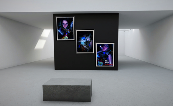
I decided to display my work in a virtual art gallery, which I have included a link to in a seperate blog post, as well as screenshots for those who may not be able to access it. I have decided to do this as I think that my work would best be displayed in a modern art gallery because it would be a great contrast to the gritty urban and rural landscapes I have depicted in my work.
Andreas Franke
Andreas Franke, based in Vienna, is a passionate diver and award winning photographer. For Luerzer‘s Archive he is among the 200 Best Photographers. He is the founder, owner and chief photographer of Staudinger+Franke He worked for great brands like Ben&Jerry’s, Coca-Cola, Ford, General Electric, Gillette, Heineken, Nike, Visa or Wrigley‘s. His still life’s and his surreal effects are famous. In his pictures every little detail is planned precisely. There is no space left for fortuity. Andreas Franke is a traveller. He travels through the world and between the worlds. His job frequently leads him to several countries on several continents. So does his passion the scuba diving. In his pictures Franke crosses the borderlines between fantasy and real life.
Frankes work focuses on having a plastic free ocean.
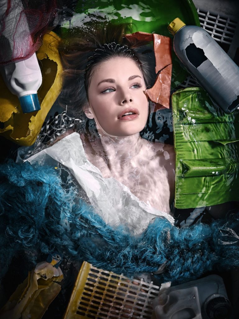

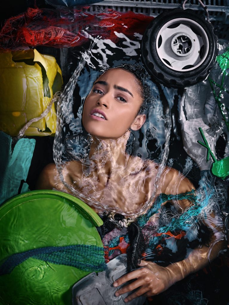
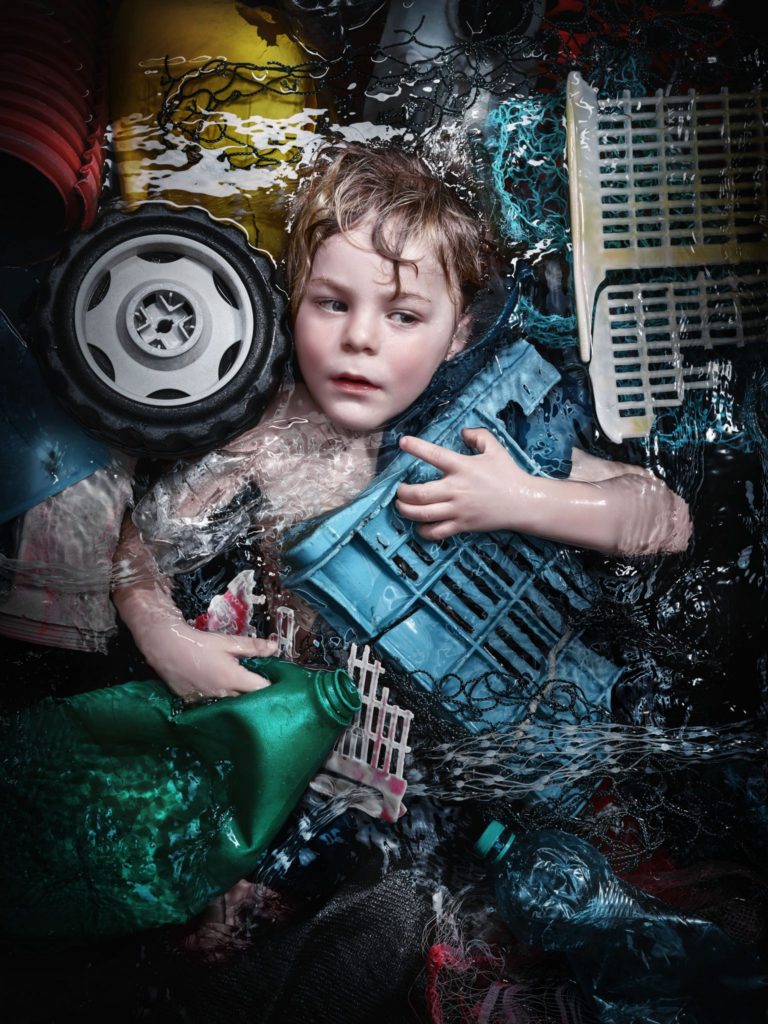
My idea
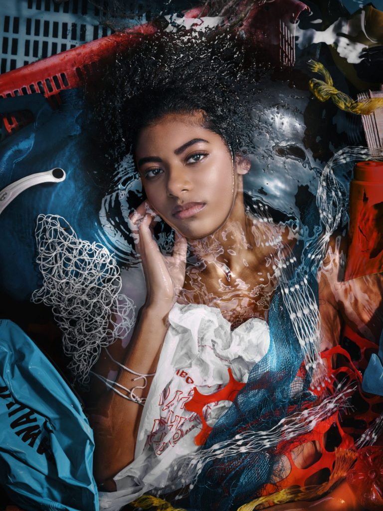
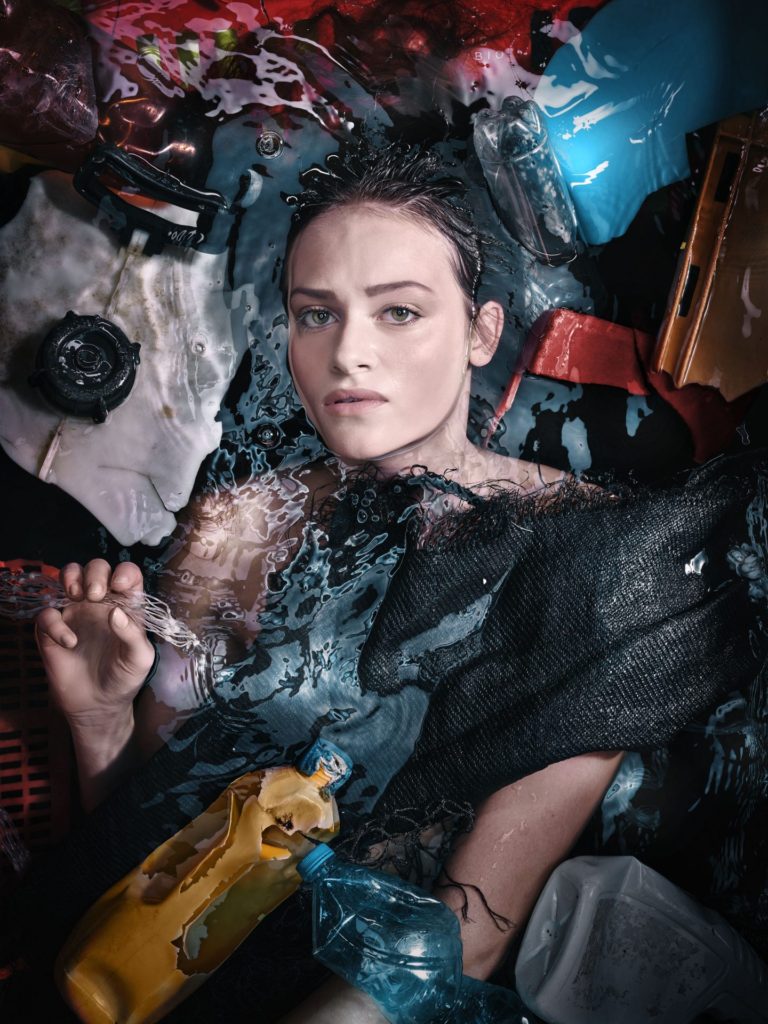
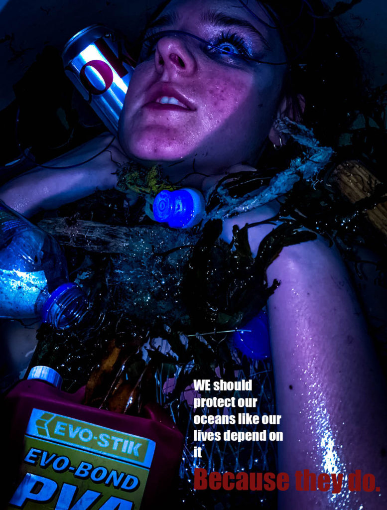
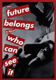
My idea was too emulate the work of Andreas Franke while also taking inspiration from Barbra Kruger and Jeremy Carroll. I wanted to highlight the human impact on the ocean, through plastic pollution. To do this I collected various pieces of plastic off the beach, some of which were harmful e.g. poisonous waxy debris off of cargo ships which could kill an animal if eaten, chemical bottles, plastic bottles, plastic nets, rope. I wanted to create a piece which was ominous to add a fear factor to the images which would emphasise the impact of humans.
My edits

Black and White
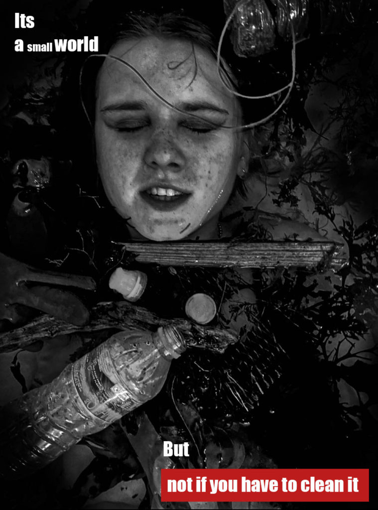
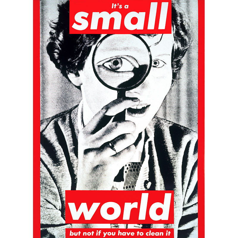
This image was heavily inspired By Kruger, while still containing the Franke style of image. I used a caption from Kruger, “its a small world, but not if you have to clean it”.
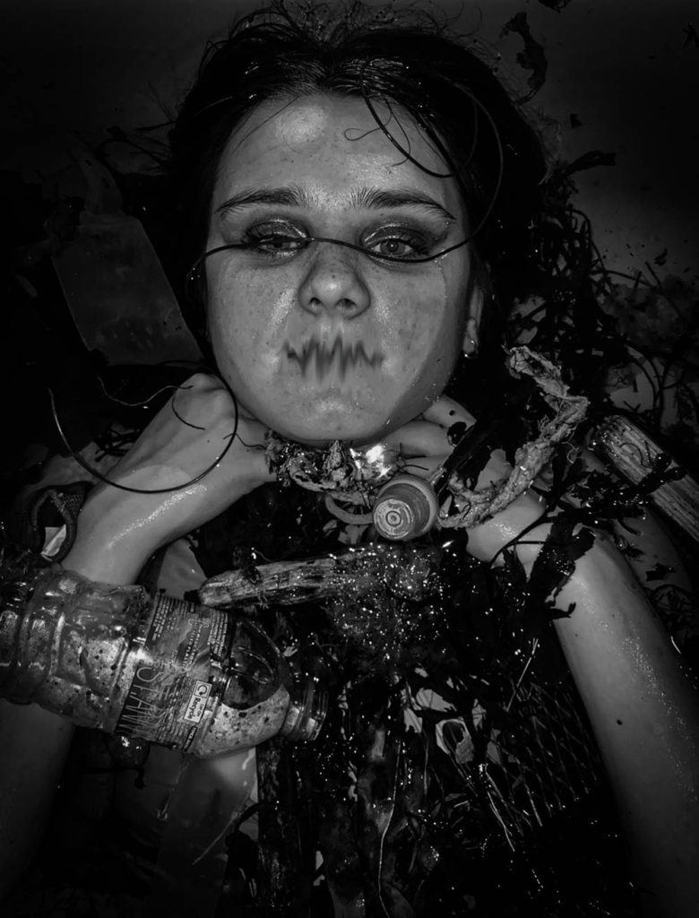
In this image, blurred the mouth to represent how we are the voice of the ocean and the ocean life, they cannot speak for themselves, so we must.
My final 3 images
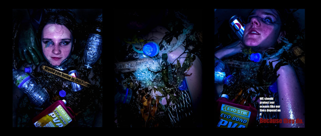
I have cut down my final images to these 3 here, i feel they work together as a trio down to their, colour scheme and messages.

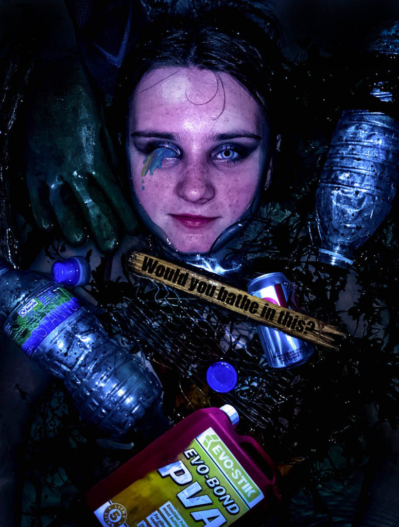
I have decided to include this image as I believe it outlines the message of plastic pollution clearly. The phrase ‘would you bathe in this’ makes the viewer realise that the sea life have to live in such conditions. I believe it emulates the work of Andreas Franke while also featuring my own twist which was the rhetorical question inspired by Barbra Kruger.
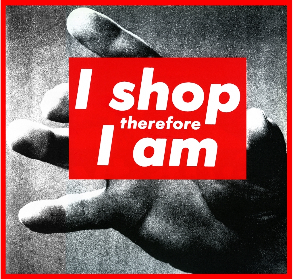
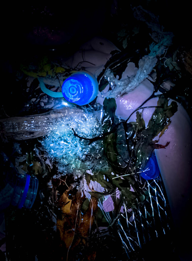
This image shows a hand trapped in the seaweed and rubbish, this is to represent that the plastic pollution is only only massively negative on the sea animals, it will as well affect humans badly -Endocrine disruptors like bisphenol A (BPA) will increase our risk of certain cancers, can cause hormonal issues, and even increase risk of infertility and birth defects. As well as the ocean life, we as humans will also be torn down by plastic pollution.

I decided to chose this image as it reverses roles, it looks as if the person is being strangled by the rope and the plastic similar to how sea life are caught in plastic waste. The rope around her kneck, is inspired by Jeremy carols work.

Image compare and contrast
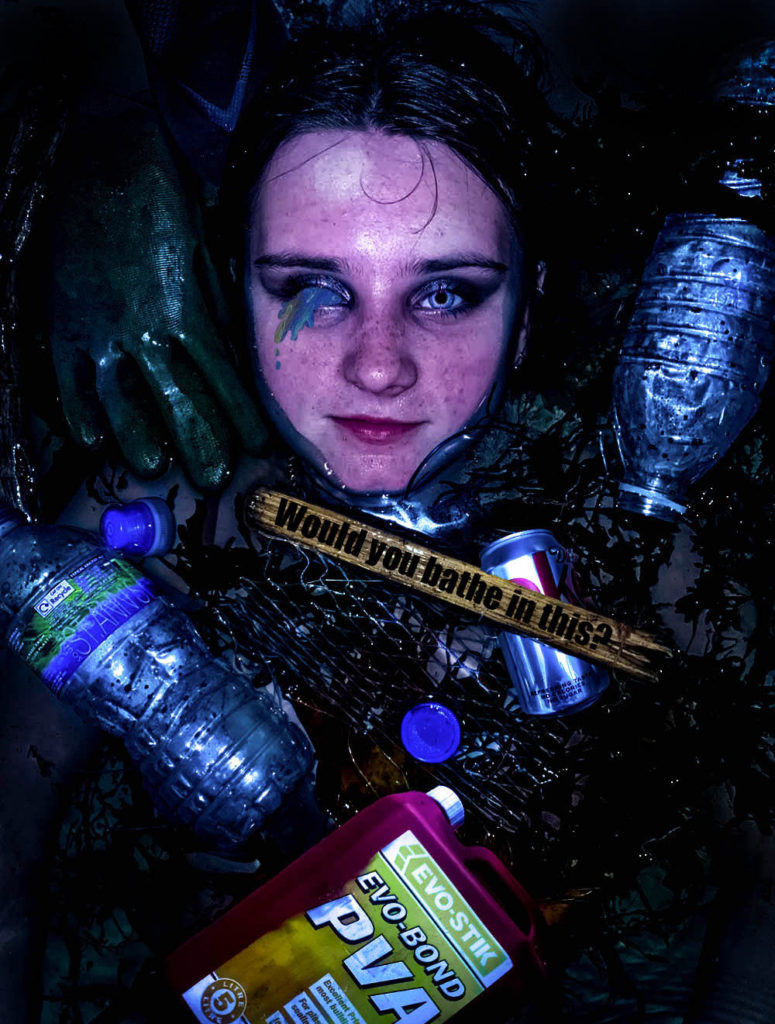
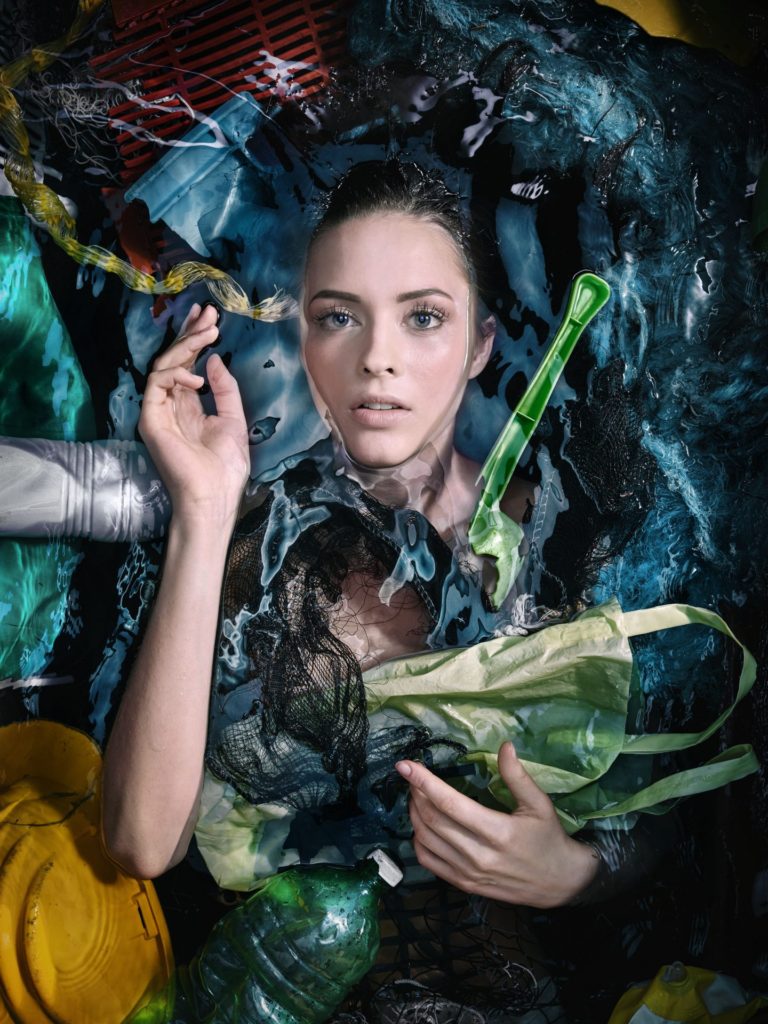
I was inspired by Andreas Franke to create this ocean plastic pollution themed photoshoot. I emulated her style of a human submerged in water filled with plastic waste. The images are both similar in the sense that they are both in water, surrounded by rubbish. Both of the images create a feeling of sinking and depth, possibly symbolising the depth of the problem. Both of the images are coloured images which follow a theme of exaggerated colour on a dark pool of water. The placement of the people are similar, most of the body submerged, the face showing. In contrast my image includes a message ‘would you bathe in this’, inspired by Barbra Kruger, adding more context.
Presenting
Evaluation
I believe my final images came out good. They fit the theme of plastic pollution. I believe I tackled the theme of ‘Anthropocene’ correctly and focused on ‘human impact’. I think my idea was thought through well and I am happy with how they look. I think to improve my work i could’ve taken my images on a camera instead of my phone camera as the images would’ve come out better quality. I also think I was quite inconsistent within my photoshoot as some of my images were flash and some without which meant the lighting was different for some photos. I think my final outcome could’ve been better if I had more images to work with, I had enough images, however some of them were very similar to each other, meaning I would’ve ended up creating things that looked the same as each other. I believe I could’ve made these images better by taking the image from a higher point to allow myself more room to add additional plastic items similar to hers.
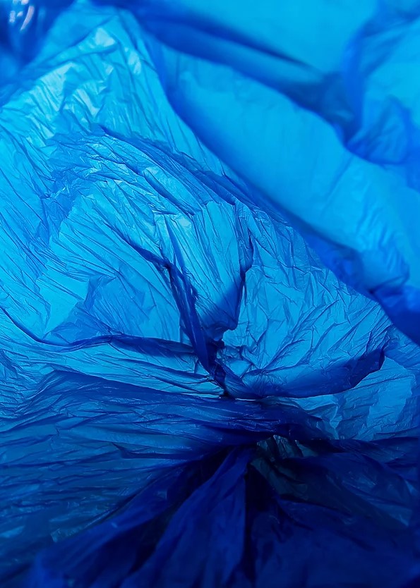
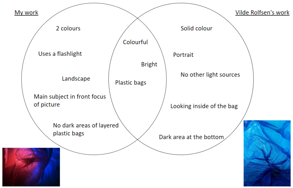
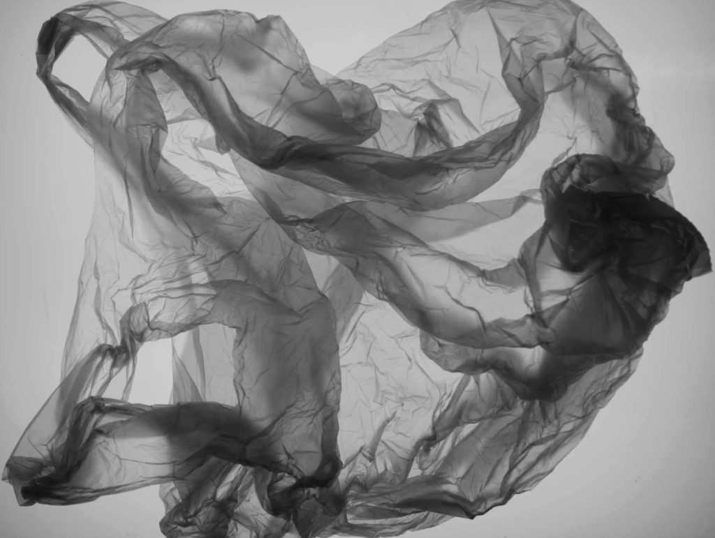
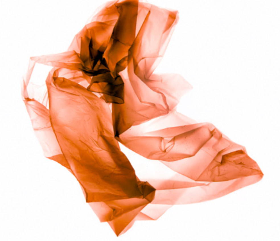
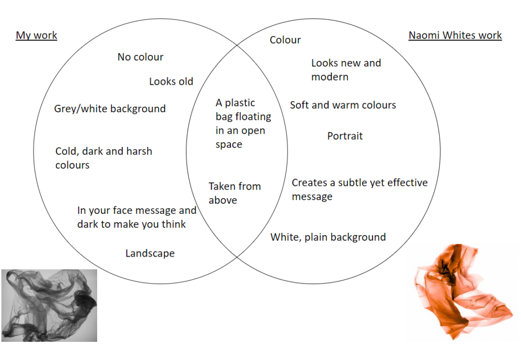
For the comparisons, I chose 2 pieces of my own work from my different photoshoots which I have edited in the style of each photographer, Vilde Rolfsen and Naomi White, and created Venn diagrams on their similarities and differences.
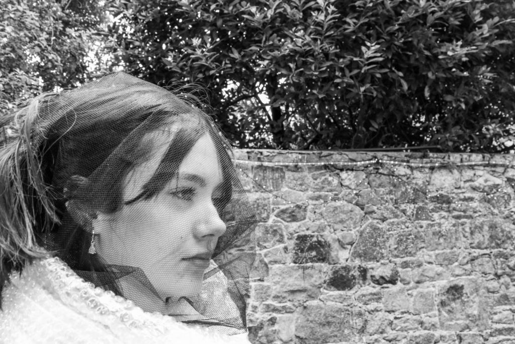

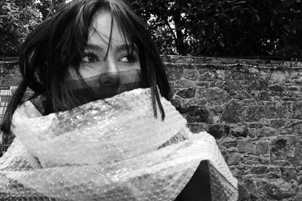
These images are a response to Craig McDeans work In my opinion this part of my project went well as it shows a good variety of emotion. The idea behind these images was to portray the damages of fashion as an industry on the ever developing world we live in, and that in the years to come we might suffer with the consequences of the chemical damage to water sources and farm land and the land that has been wasted due to landfills from clothing companies who aren’t able to sell all their stock. I decided to take these photos outside as it helps resemble the detrimental effects on the environment through the natural lighting and the trees showing above the walls in 3 of the images can show how the growing waste caused by clothes in landfills is taking up possible nature parks and farmland that could be providing habitats and food recourses for humans.
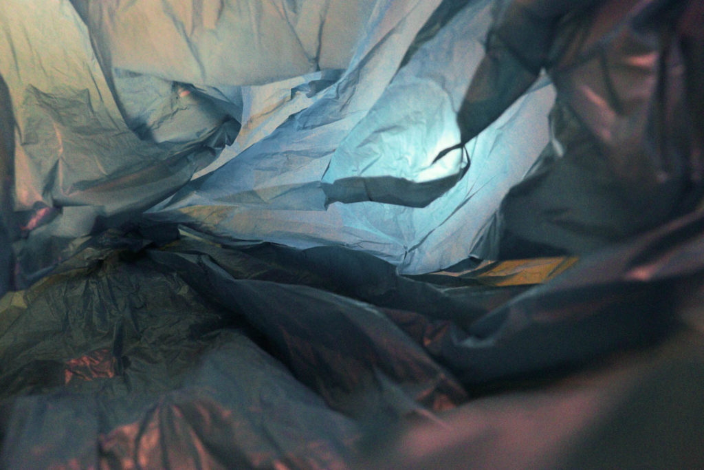
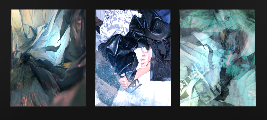
This shoot was inspired by Vilde Rolfsen in my opinion this aspect of my project turned out well as I was able to show my understanding of her work and knowledge on how to create a unique set of images that still have the same essence as her work without being direct copies. I decided to only print one image from this shoot for mounting as many of them share similar qualities therefore displaying only one allows me to use the image without it feeling over done.
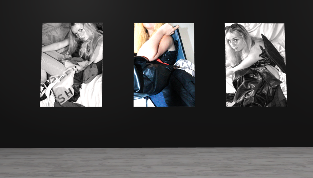
This shoot is a response to Marco Mori’s work, I think this photoshoot was successful as it shows influence from my chosen artist I managed to create these high resolution images with natural and artificial lighting I also managed to produce a series of meaningful and conceptual images that show a variety of skills such as camera handling and concept creating. I think this shoot could have been better if I took more images in a wider range of angles and posed the model in a wider variety of poses. If I could re do this shoot one thing I would change would be using more materials such as a variety of paper and plastics such as bottles to create a stronger message about pollution.
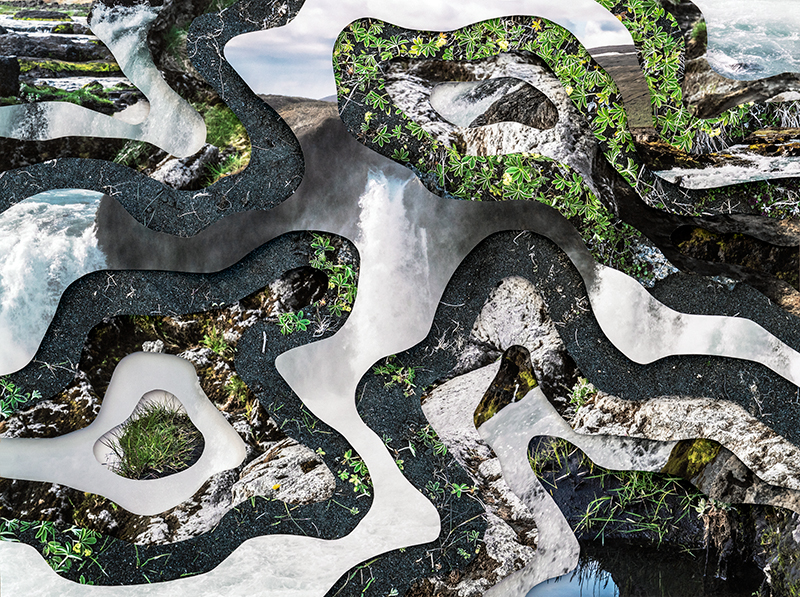
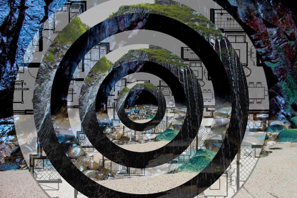
Visually, my image compared to Charlottas looks quite similar. Both images provide an optical illusion effect, In my image i decided to use rings instead of unique cutouts, to provide the image with perfection, just how i viewed the waterfall when I saw it. However, charlotta uses random shapes to show that nothing in nature is ever the same. Both images portray the idea that we are actively destroying the planet, this is literally shown by how in both of the images, the original photos are untouched natural landscapes but myself and charlotta have altered them to portray humans impact on nature. In some of charlottas other work, she uses texts about climate change and global warming , however in my piece i decided to incorporate building plans or a house. i did this to show that this landscape will chang eover the next few needs, due to the fact that jersey has an overpopulation crisis, and the need for housing is more important now than it has ever been. Charlotta took these images also in her home town in iceland , to show that her home is changing drastically due to climate change. The lighting in charlottas images has a warm tone, which is similar to mine, this insinuates the idea that these places are warm and considered home to us, and we want to protect them. In both of our images, the textures vary and stand out a lot, charlotta uses the different sharp textures of rock in comparison to the soft textures of the water, which is very similar to my image.
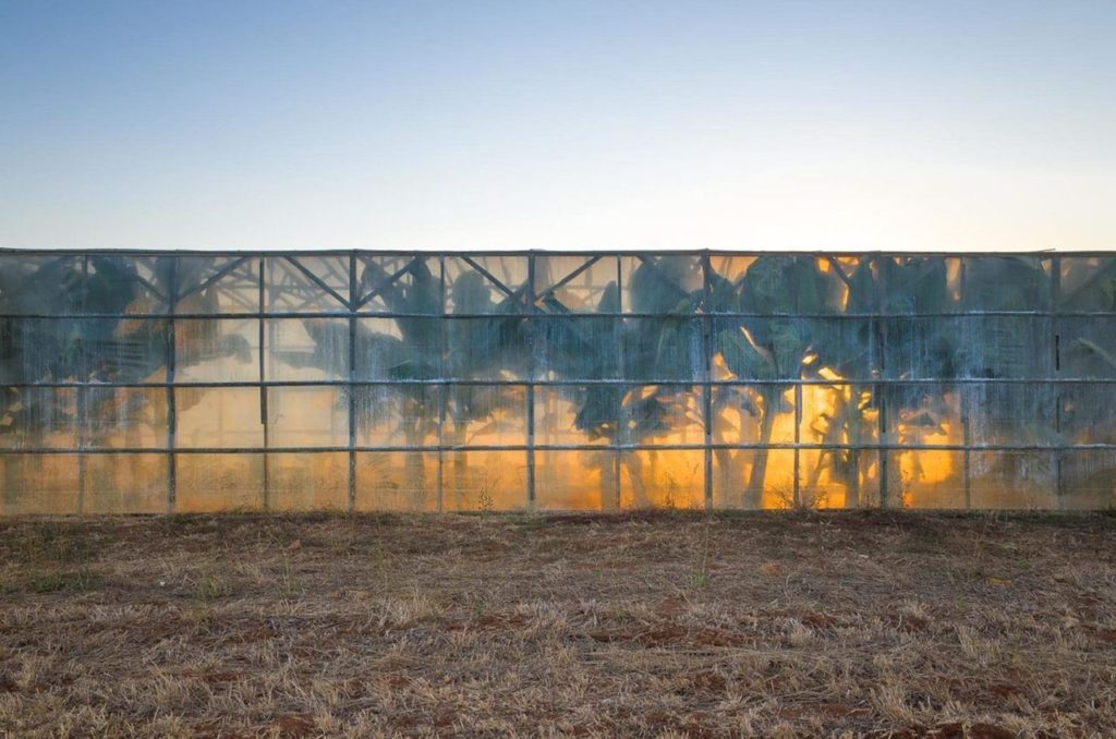
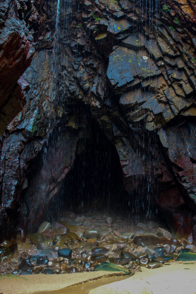
Both images here are Landscape images. there are many differences between these images but the concept behind them is actually particularly similar. both images relate to the idea of Anthropocene by providing the audience with a sense of awe and terror. In these images we have both portrayed the idea of natural beauty. however in my image, the manmade destruction does not yet exist, i wanted to shows what the environment looks like before it is altered. In Georges image he show what happens after man has come in contact with nature and the sad reality behind it. In both images we have saturated the colours to allow them to be seen better then they actually look in real life, this is to highlight how much we should protect nature. A difference between the 2 images is that Georges image uses high exposure and low contrast whereas my image uses high contrast and low exposure so that the colours pop from the rocks, and that the image appears sharper.
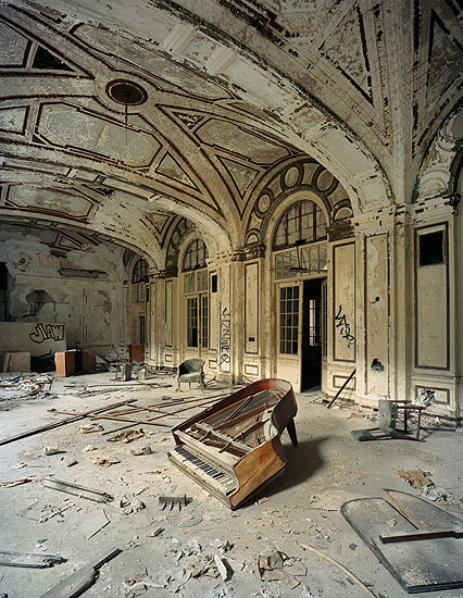
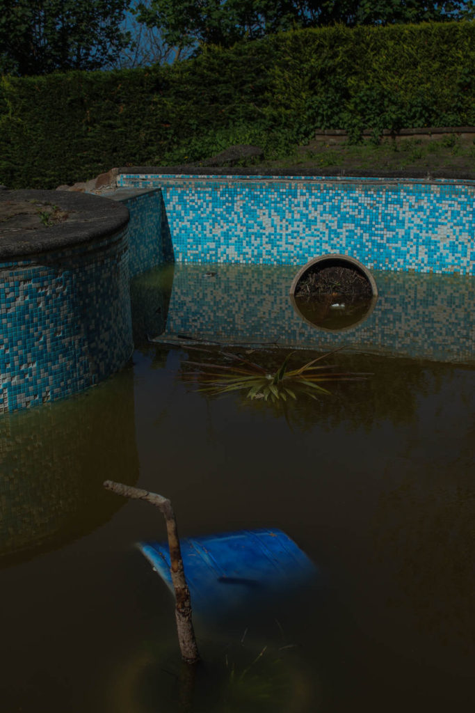
both of these image highlight destruction as the key theme behind the photos. In Andrews image, the key focal point is the piano in the centre, in my image, the key focus is on the objects left in the dirty pool. Both images are warm toned to show that these places were preloved and a safe space in the past. In andrews image, the exposure is quite high to show the natural light coming through the windows, however in my image the exposure is low, making the image look more saturated and almost how a regular swimming pool is viewed through a child’s eyes in a nightmare. i decided to make my image darker to highlight the sad reality of abandoned places, whereas george uses a light image to show that this place was once a place of happiness. Both images show natures effect on manmade objects, in my image on the left, the water in the pool is from rain and is that colour due to dirt and mould growing overtime. You can also see that nature is taking over by growing weeds around the once immaculately maintained patio around the pool. In andrews image, this place has been destroyed by nature, shown by the dulling of colours in the room from the sun, however has also been destroyed by man. This is shown by the broken piano and rubble on the floor. i am very happy with how this image turned out as I wanted to highlight the sadness of an abandoned place, but also anted to make it colourful as if it was seen by a child.
Evaluation–
i think this project worked out well i feel that the work i have done is satisfactory and think that my choices of locations and types of final images worked well linking to Anthropocene showing the the fragility of nature in my first idea and the urbanisation of our world for my second idea
i first planned out my photo shoots picking the best locations to bring my ideas to life i also described what Anthropocene was which i feel was important to do so the viewer of my work realy understand what it is about
I then started to think about my artist refrences and what it was about there work that attracted me to do a similar project using YVES MARCHAND & ROMAIN MEFFRE and Ingrid Weyland
i then created my action plan using screen shots from google maps to show the location’s i am using and when and how i will be taking my photos
the next step was filtering out the images i was going to use to have a final selection of images the next step was editing in light room where for project 1 i enhanced the vibrancy of the colours and how they work together and for project 2 i edited them black and white as well as other small enhancements
after completing all the editing and being left with my final images which i then posted on the blog and created a virtual gallery to showcase my images
Critique-
I feel i did good with this project how ever i feel that there is room for improvements a key one being planning in advance this is because i felt i didn’t have enough images to create the vision i had i also should of fully figured out what i was going to make for my final image before taking the photos so i could of aimed to take more connected photos to each of the projects ultimately giving me a better chance at a better final image
Felicity Hammond is both an artist and a photographer who often uses a range of mediums when presenting her work in exhibitions, often aiming to immerse the viewer in her work via use of instillations, vibrant colours, lights and textures, ensuring the presentation of her work is just as engaging as the work itself. Her work tends to focus on “political contradictions within the urban landscape” as it’s something that she finds “fascinating”, often expressing her thoughts and feelings through her series’, displaying her work in a half-framed way with materials she’s gathered from old construction sites.
“In her work, Hammond focuses not only on the physical appearance of buildings, but also on their social impact: for whom are they intended and whom do they force out? Whether it concerns new residential homes or commercial properties, so-called “regeneration” is usually a euphemism for strictly entrepreneurial investment rather than any actual improvement for the local area and its inhabitants.” – ArtViewer.com
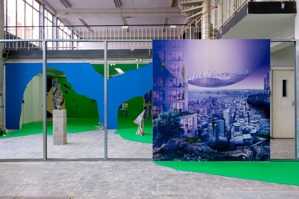
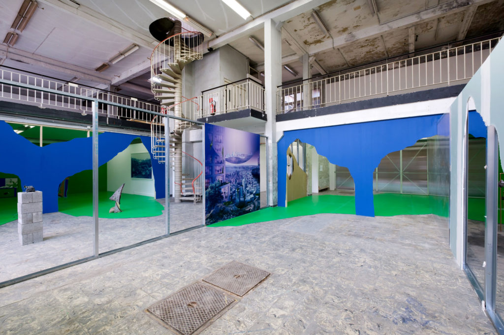
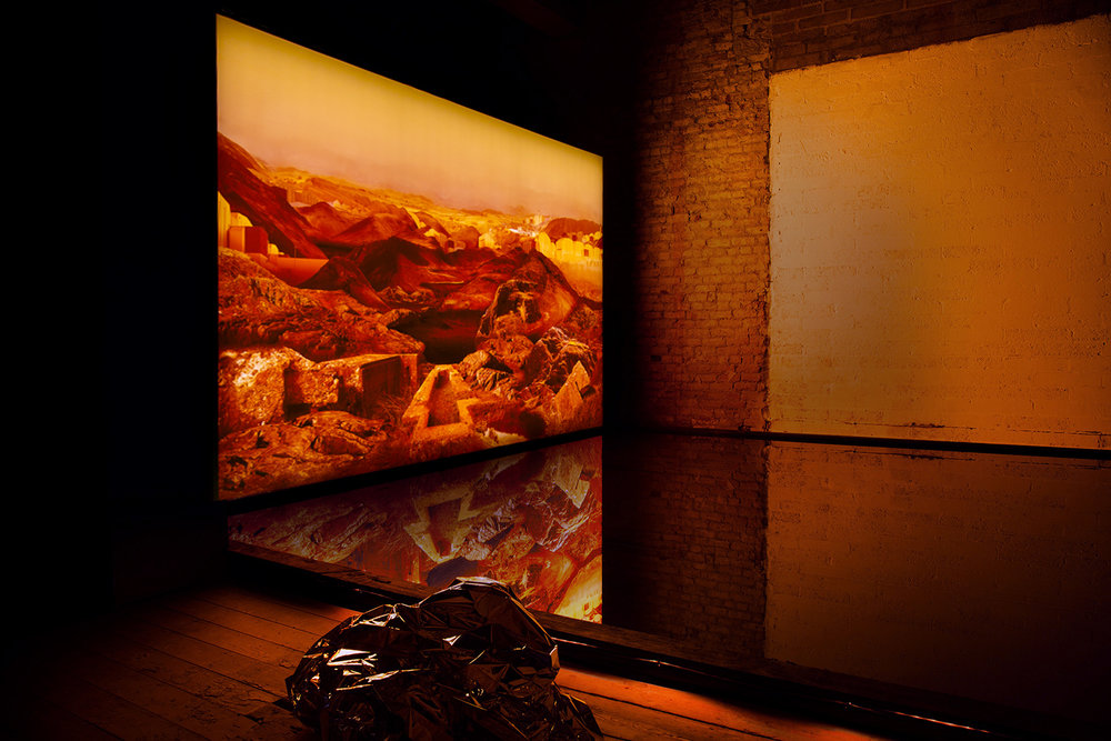
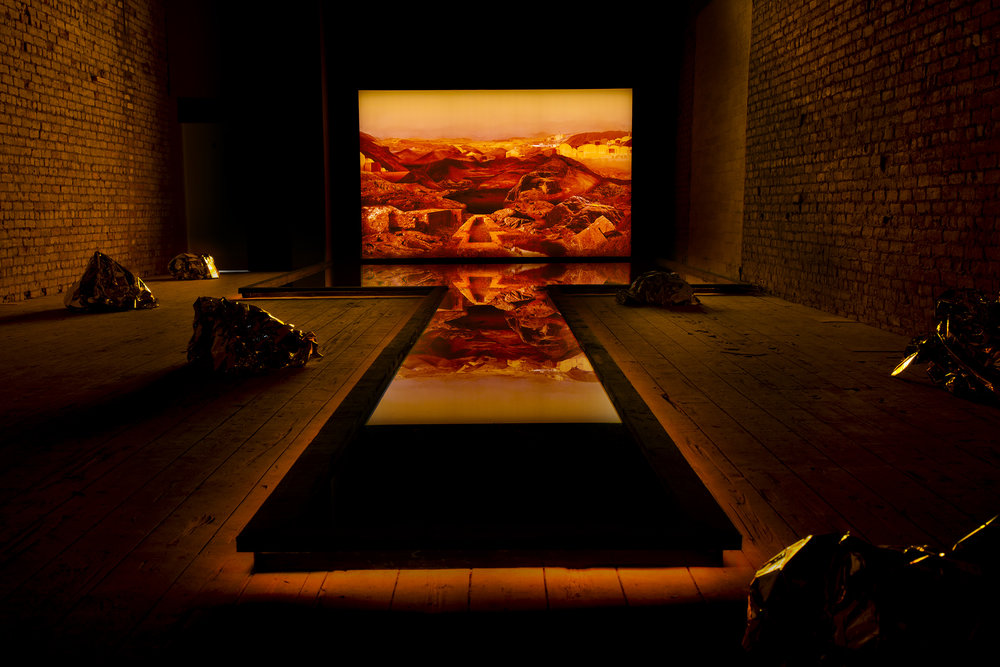
Image Analysis:
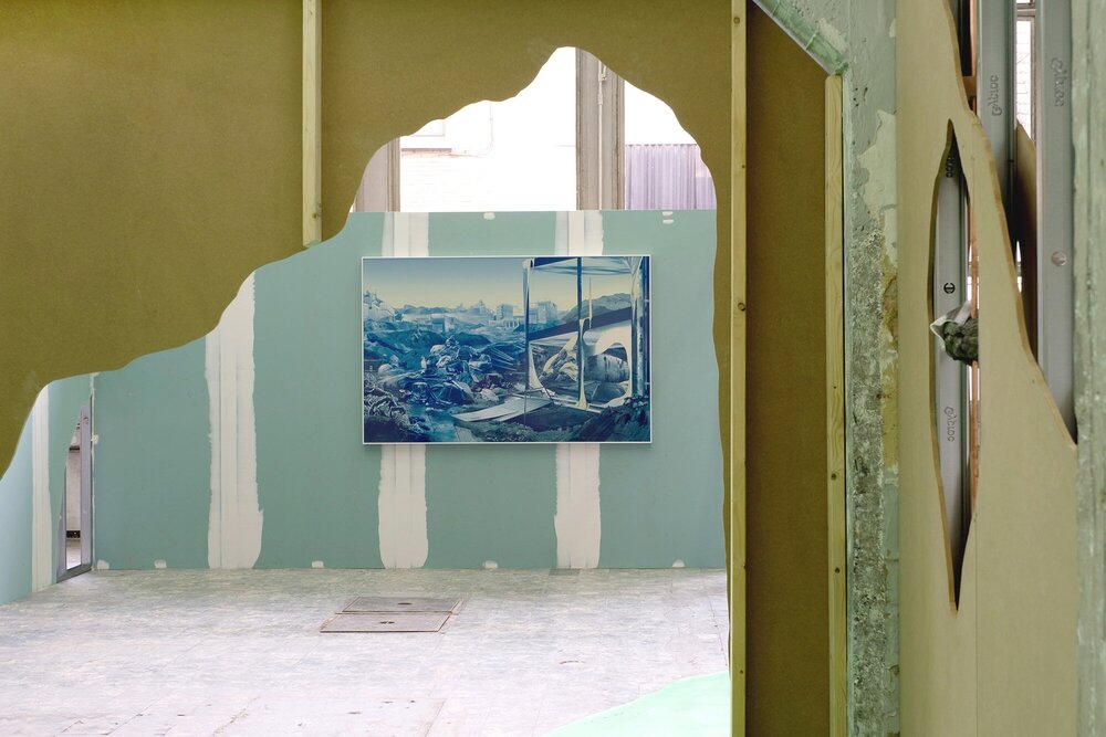
This photo from Hammond’s series “Remains in development” has been edited so that the shadows are tinted a deep blue whereas the highlights are a yellow tint. This creates a sense of melancholy in the image as blue is often associated with dismalness which is then contrasted by the yellow, which I think is used here to add a sense of sickness as it seems to represent pollution in the air, changing the image altogether as it helps to exaggerate how Hammond feels about the environment.
The photo being presented on a wall that looks incomplete and through what looks like a piece of ripped cardboard adds to the photo as it represents how humanity has ripped the Earth of its materials in order to create thousands of buildings, most of which have ended up being abandoned. This makes the piece even more visually interesting to the viewer as they get to see the photo from different angles and perspectives, changing how the image is perceived.
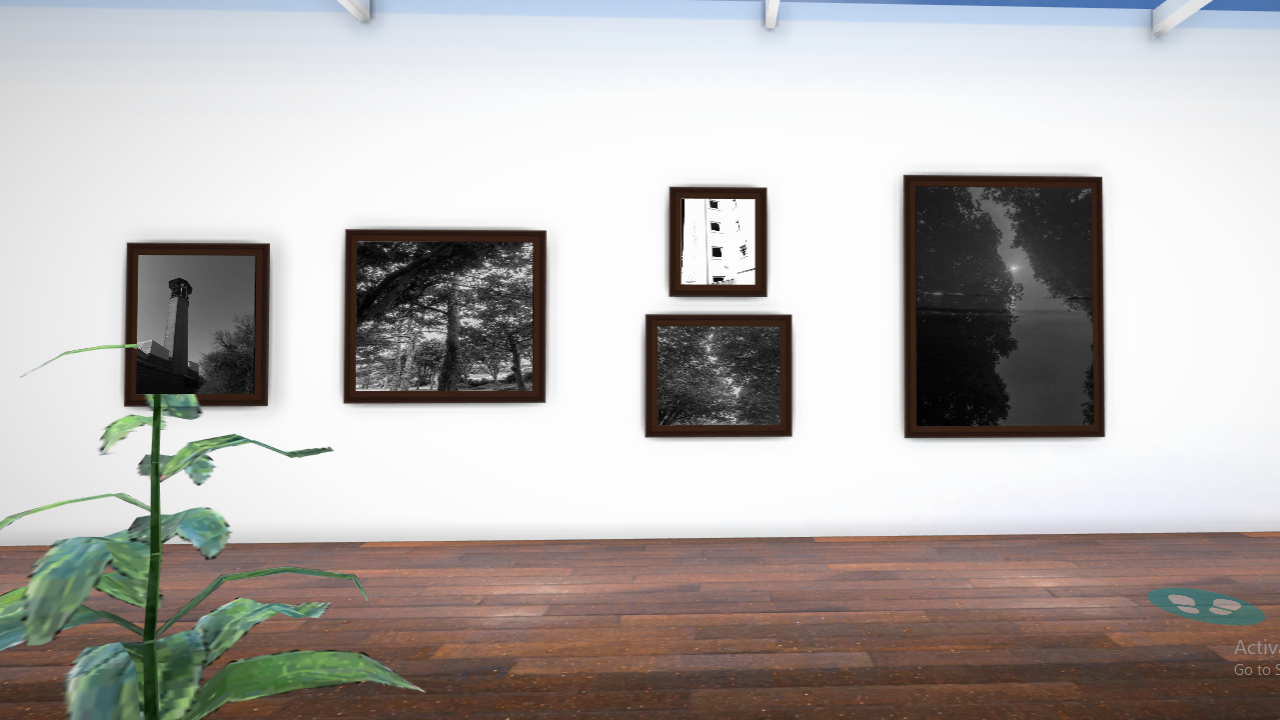
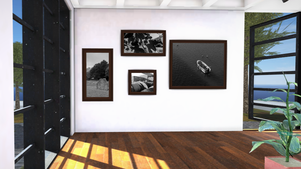
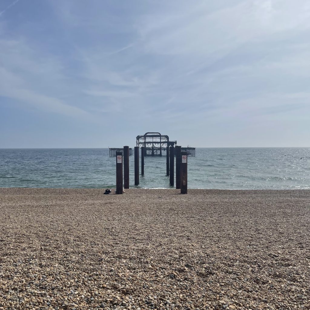
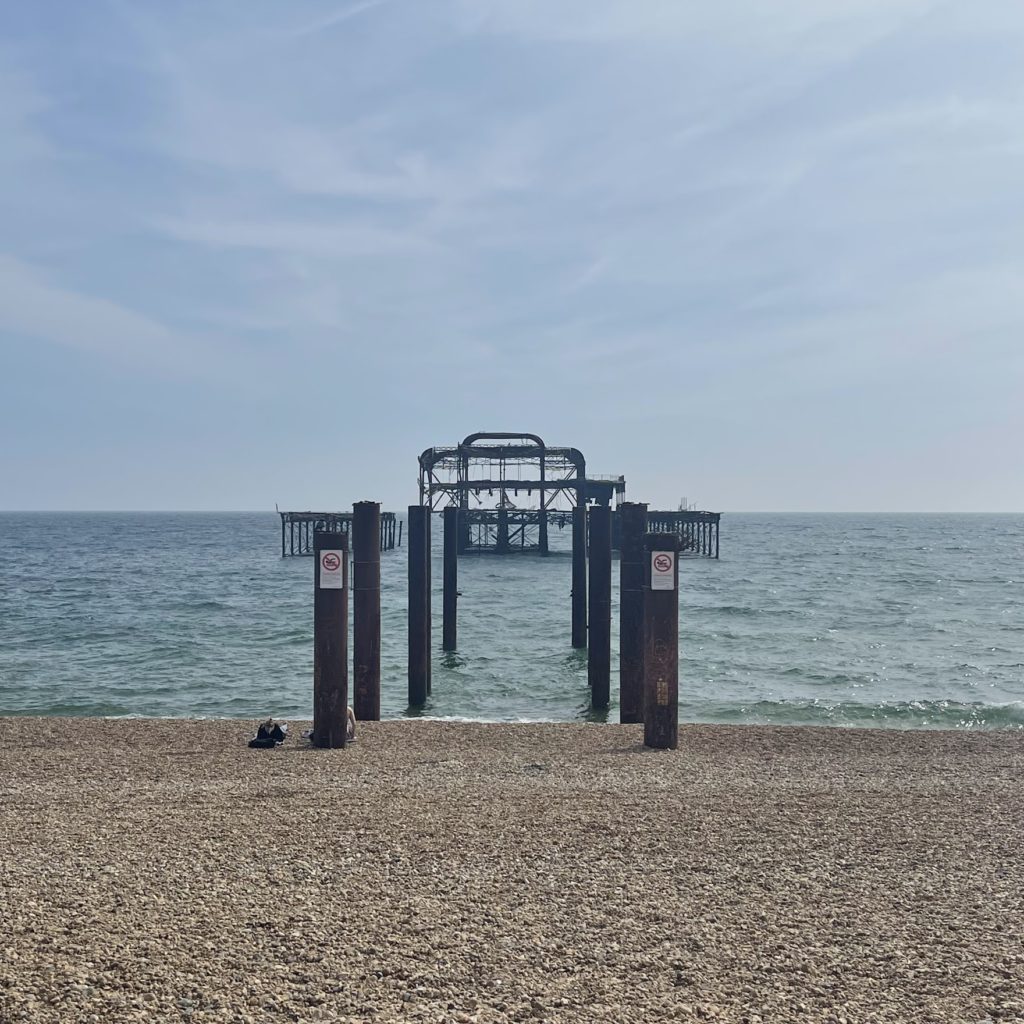
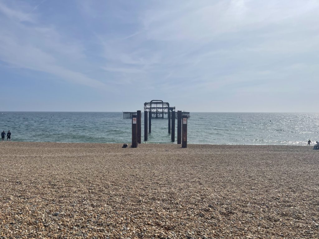
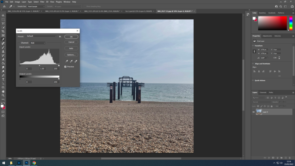
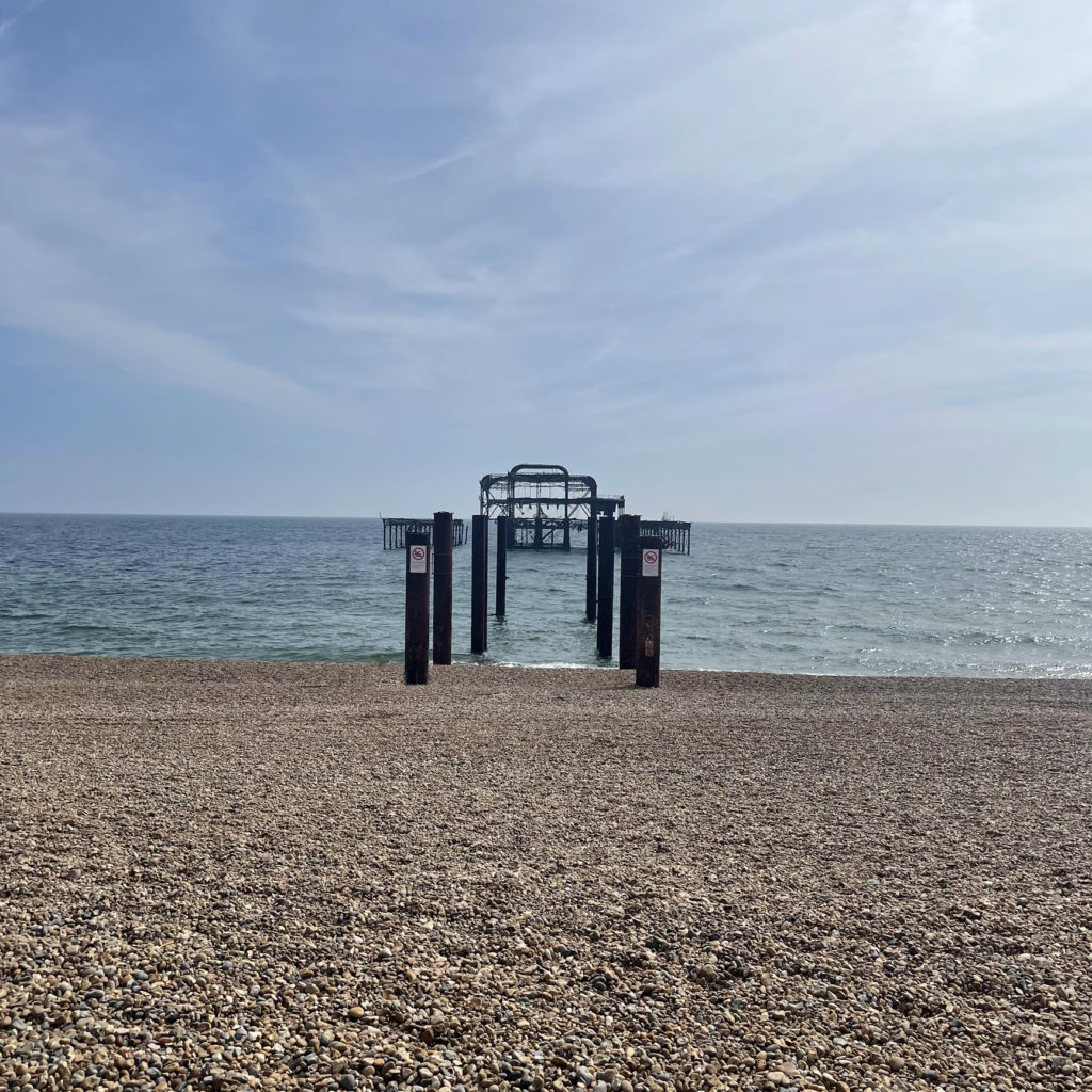
To fit in with the theme of Anthropocene and the impact humans have on the earth/ environment I wanted to include a piece on the old ruins of Brighton’s west pier. he West Pier is a ruined pier in Brighton, England. It was designed by Eugenius Birch and opened in 1866. It was the first pier to be Grade I listed in England and Wales but has become increasingly derelict since its closure to the public in 1975 as a result of a fire. As of present day only a partial metal framework remains.
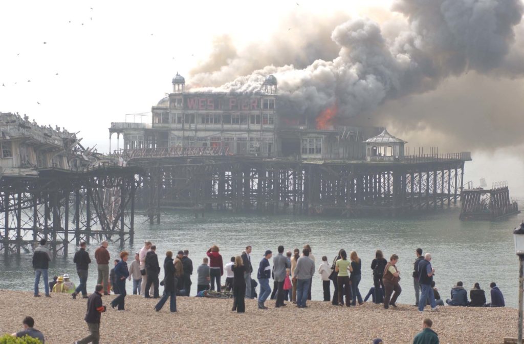
My aim was to keep it simple by taking a photo from straight on to capture the wreckage in contrast to the large open sea around it, and showing how it has just been left abandoned there.
