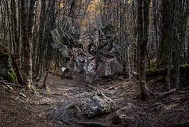
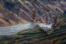
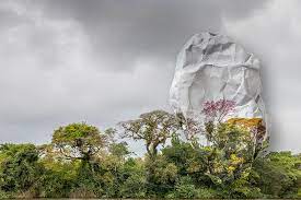
For this idea i wanted to take inspiration from Ingrid Weyland and her topographic of fragility project as i feel it strongly links with the theme Anthropocene and like her work
IMAGE ANALYSIS

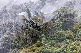
For this image analysis I looked at this photo from Ingrid, showing ice caps, however Ingrid has added scrunched up print of the photo. This was most likely done to show humans effect on the land. The picture was taken on a gloomy day, and has the ice cap centred most likely to emphasise the effect humans had on the ice caps as the scrunched up paper also shows the fragility of the ice caps due to the humans . The rough texture of the paper ball gives a good contrast to the softness of the background image.
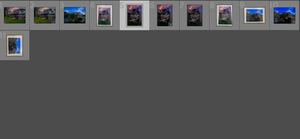
contact sheets
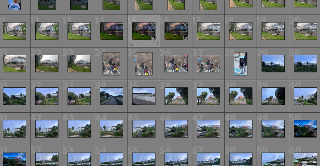
i then flagged it down to my final images to use
then left with my final image after some editing
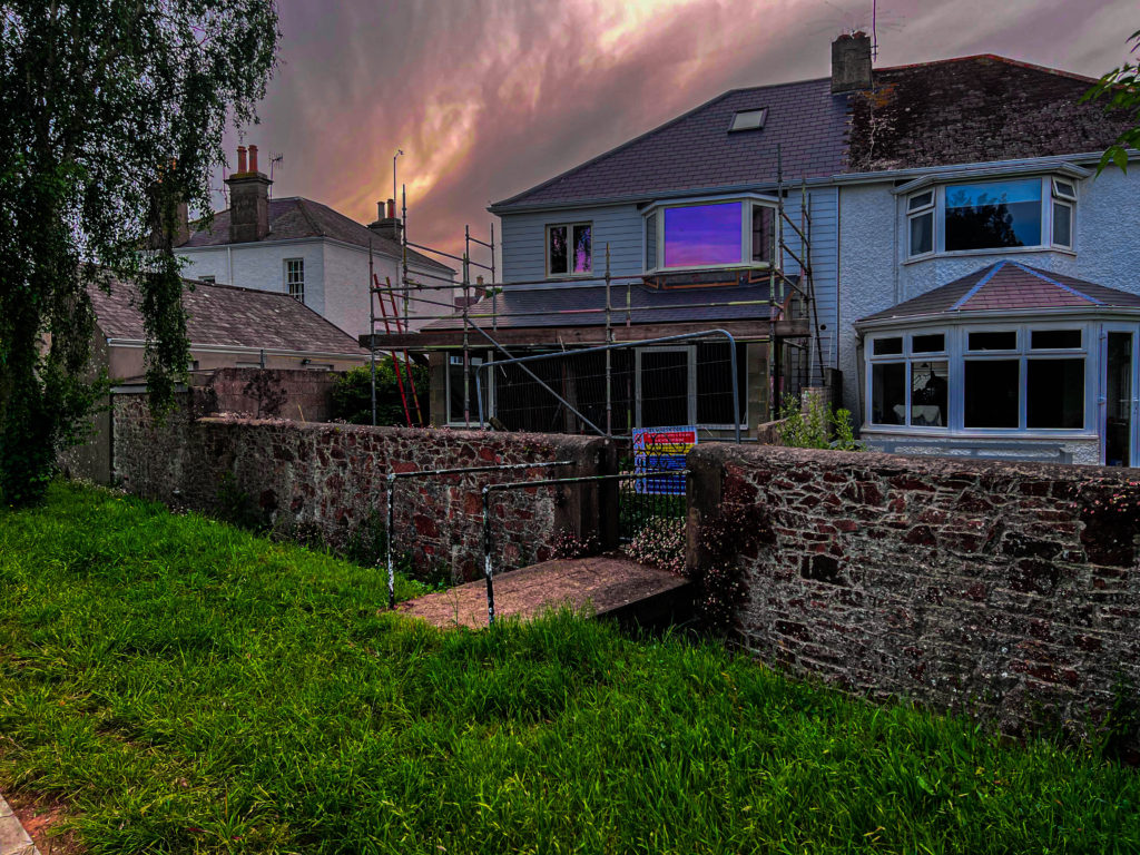
Final Piece & Process
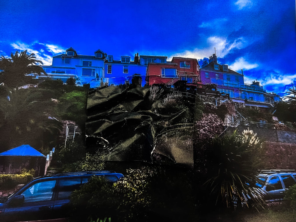
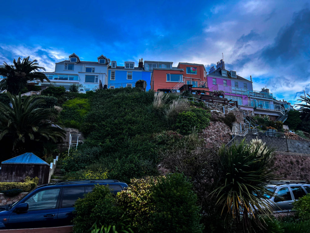
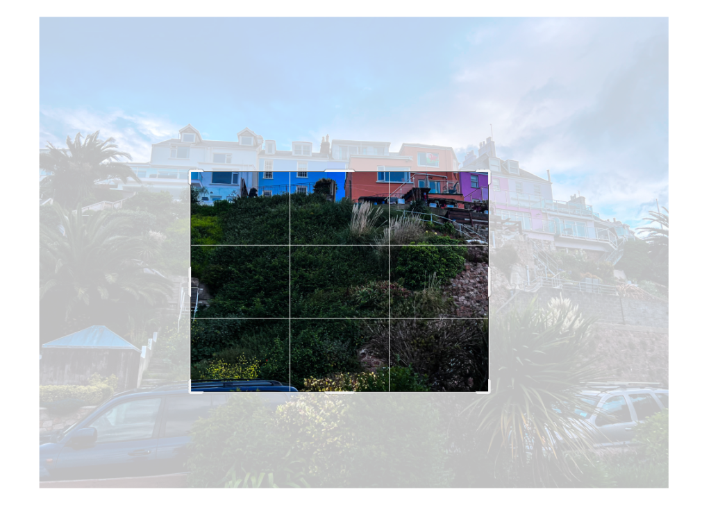
To make this piece I started by printing out the original image, and then a section of the original image to then crease and layer over it.
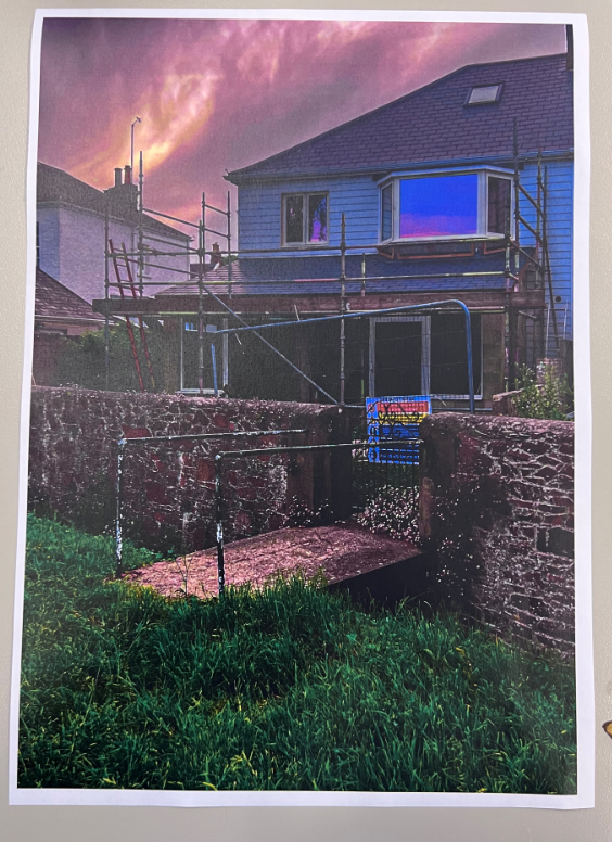
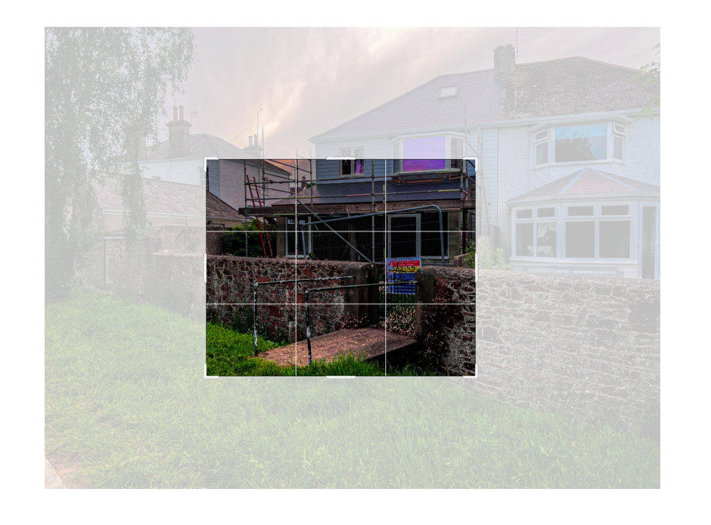
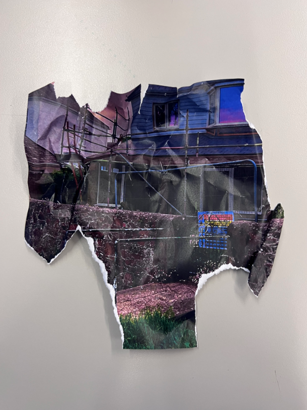
once i had all the components i played around with it a bit to get my final image
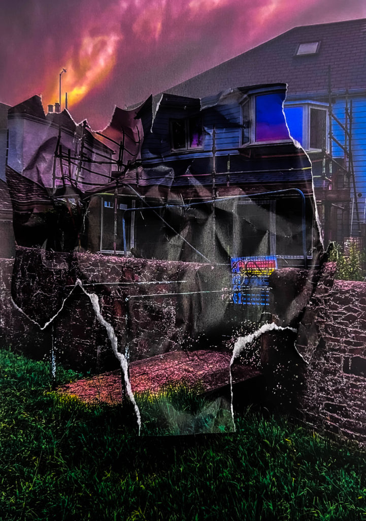
overall i think this went well so i decided to try again using a different photo

Evaluation & Comparison
Overall I think that these pieces came out very good and mostly how I planned, they are similar to the work of Ingrid Weyland, not only in the process used to create but also in the way that they represent “the fragility of the natural environment” with the distorted paper patches representing the impact humans have on the earth.

