Andreas Franke
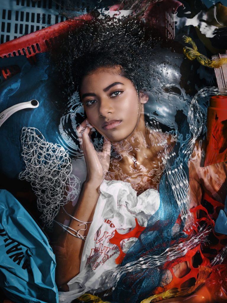
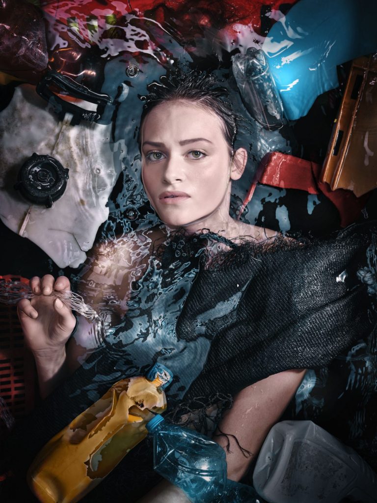
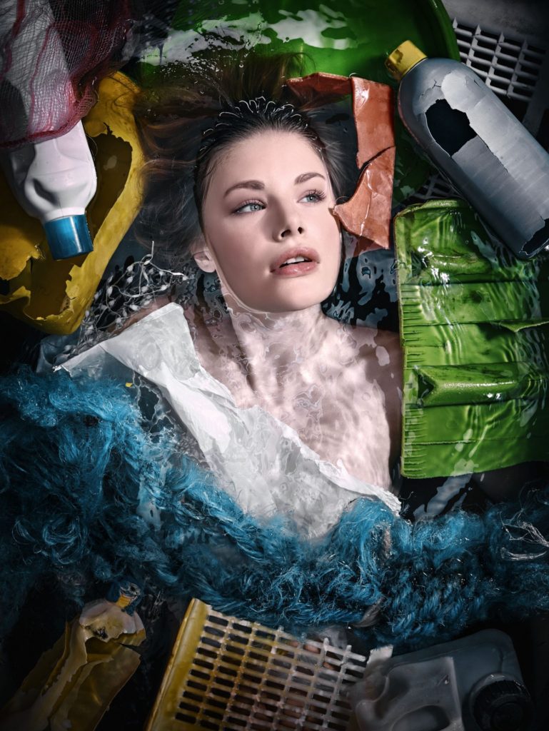
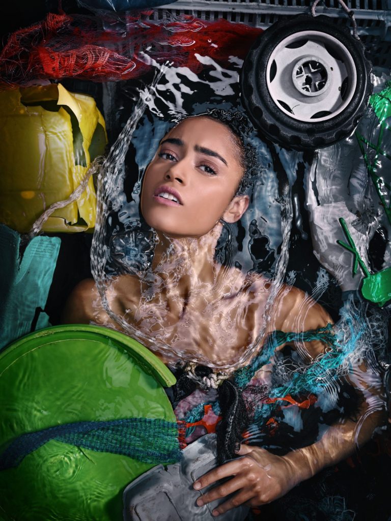
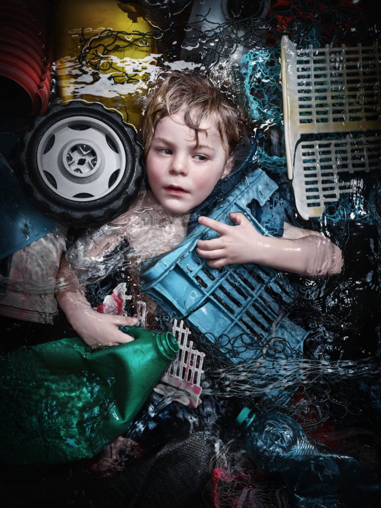
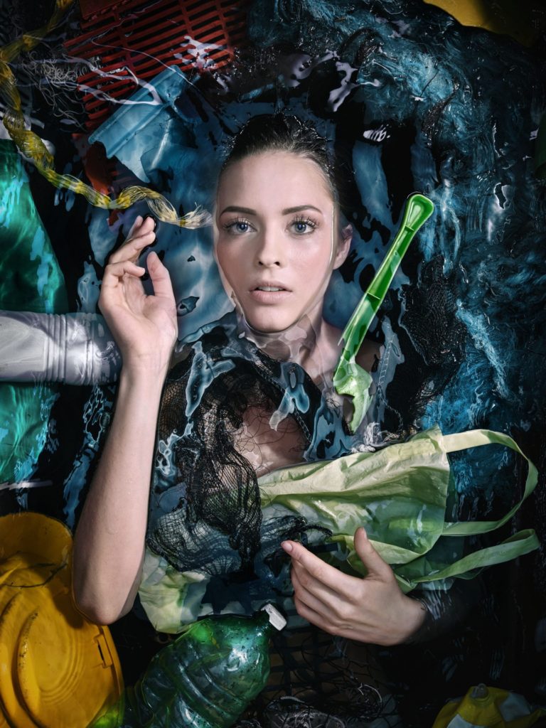
Andreas Franke, based in Vienna, is a passionate diver and award winning photographer. For Luerzer‘s Archive he is among the 200 Best Photographers. He is the founder, owner and chief photographer of Staudinger+Franke He worked for great brands like Ben&Jerry’s, Coca-Cola, Ford, General Electric, Gillette, Heineken, Nike, Visa or Wrigley‘s. His still life’s and his surreal effects are famous. In his pictures every little detail is planned precisely. There is no space left for fortuity. Andreas Franke is a traveller. He travels through the world and between the worlds. His job frequently leads him to several countries on several continents. So does his passion the scuba diving. In his pictures Franke crosses the borderlines between fantasy and real life.
Frankes work focuses on having a plastic free ocean.
My idea
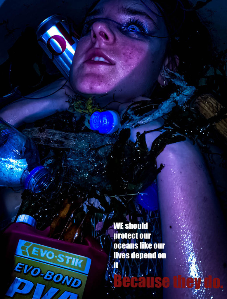
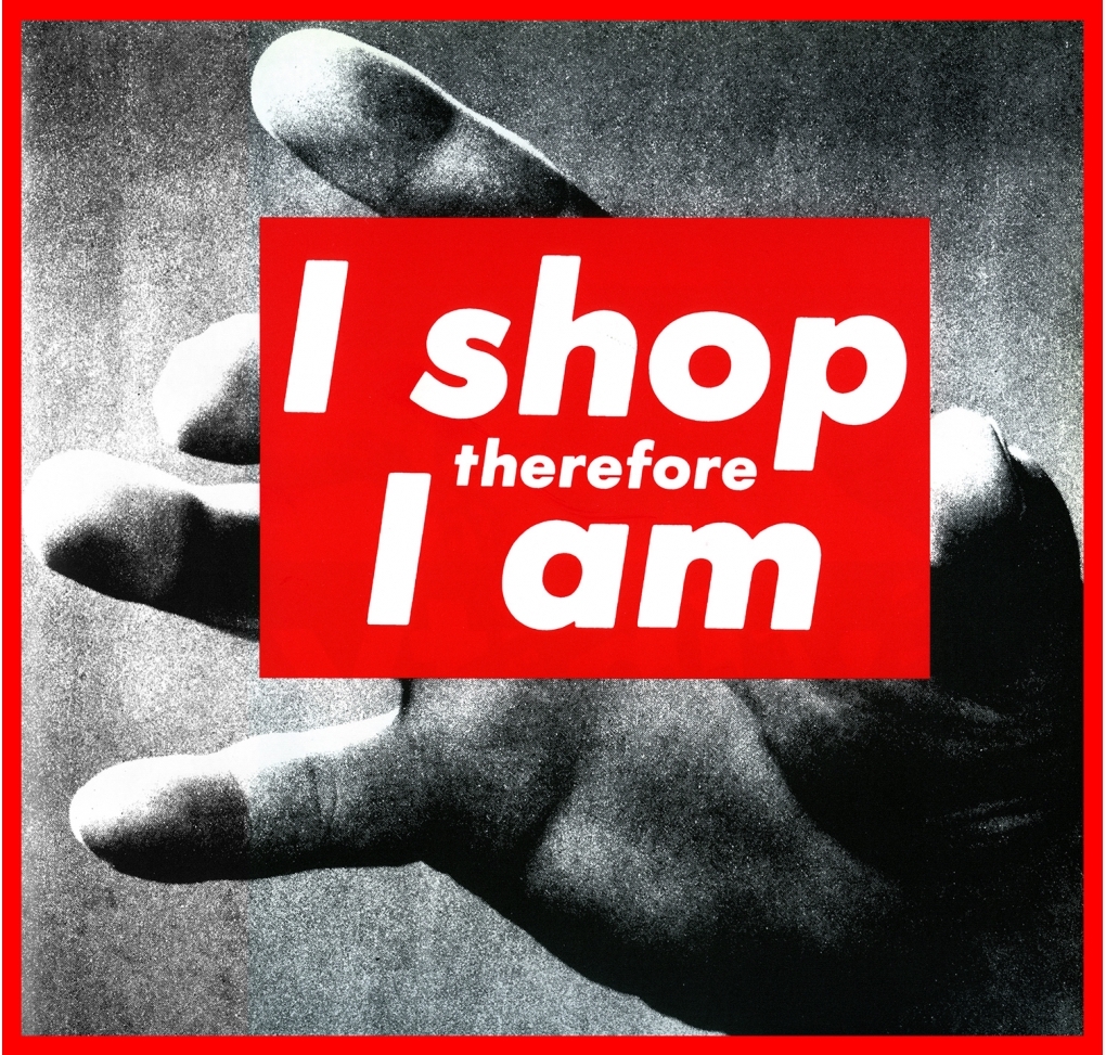
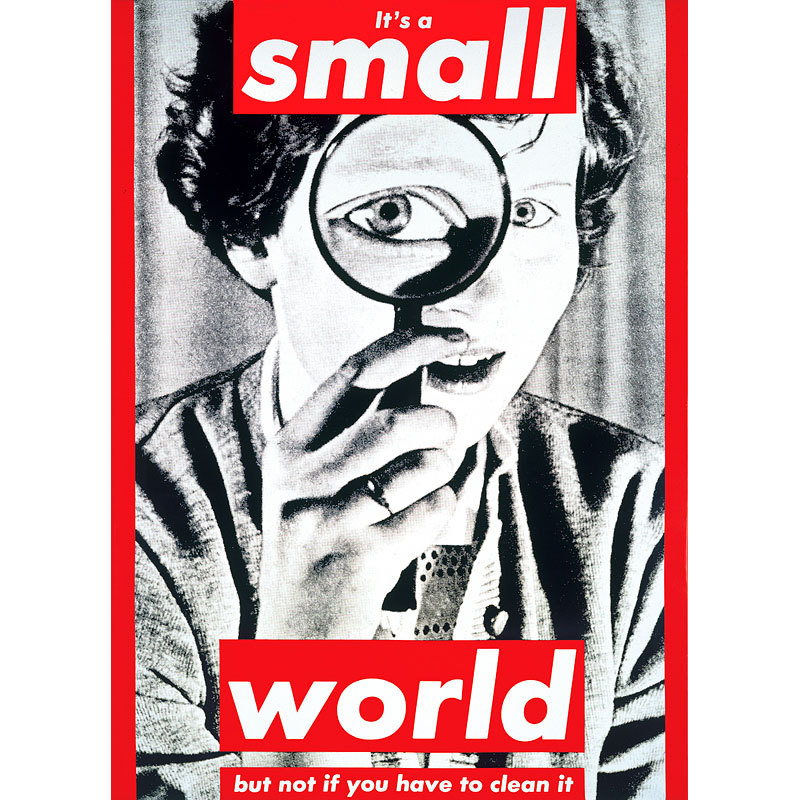
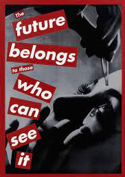
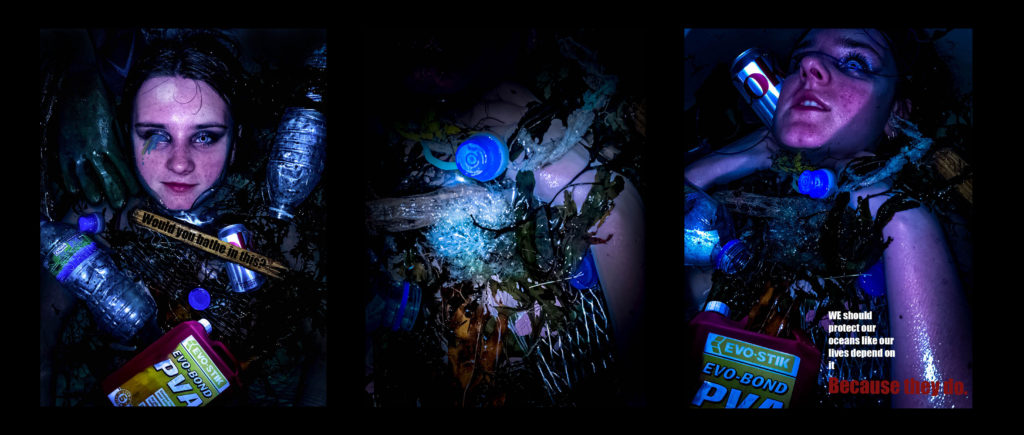
My idea was too emulate the work of Andreas Franke while also taking inspiration from Barbra Kruger and Jeremy Carroll. I wanted to highlight the human impact on the ocean, through plastic pollution. To do this I collected various pieces of plastic off the beach, some of which were harmful e.g. poisonous waxy debris off of cargo ships which could kill an animal if eaten, chemical bottles, plastic bottles, plastic nets, rope. I wanted to create a piece which was ominous to add a fear factor to the images which would emphasise the impact of humans.
My edits
Black and White
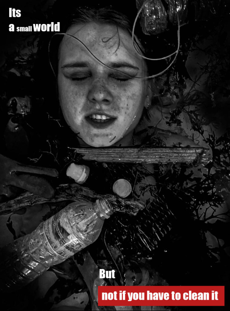
This image was heavily inspired By Kruger, while still containing the Franke style of image. I used a caption from Kruger, “its a small world, but not if you have to clean it”.
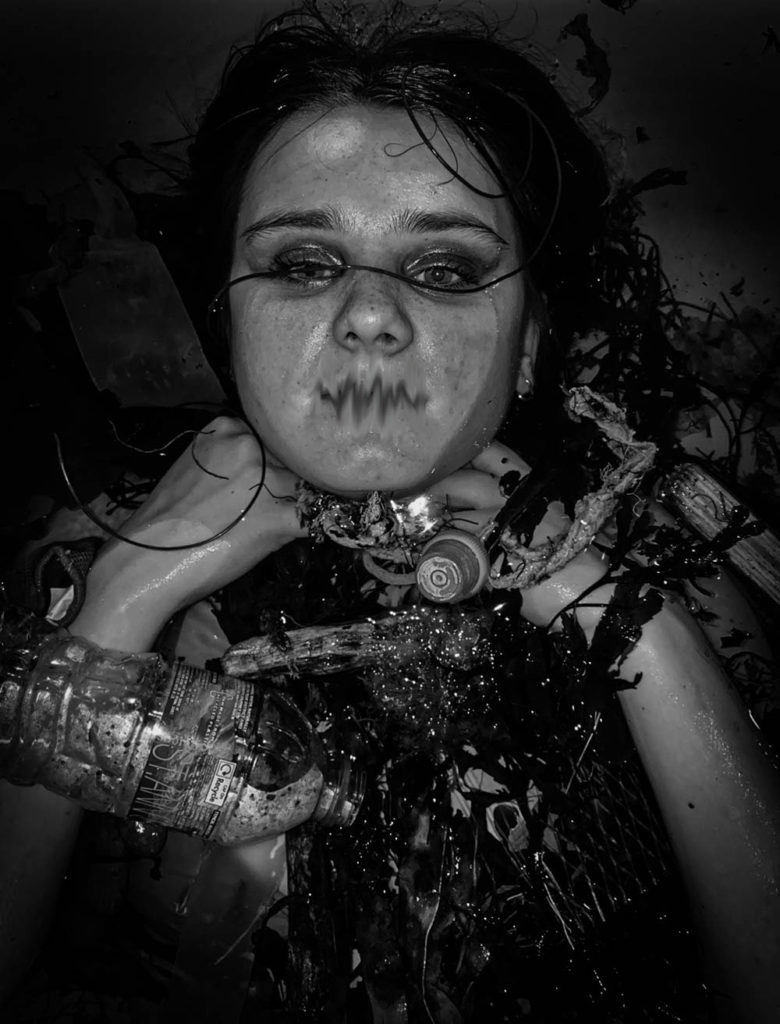
In this image, blurred the mouth to represent how we are the voice of the ocean and the ocean life, they cannot speak for themselves, so we must.
My final 3 images
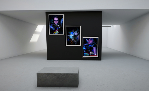
I have cut down my final images to these 3 here, i feel they work together as a trio down to their, colour scheme and messages.
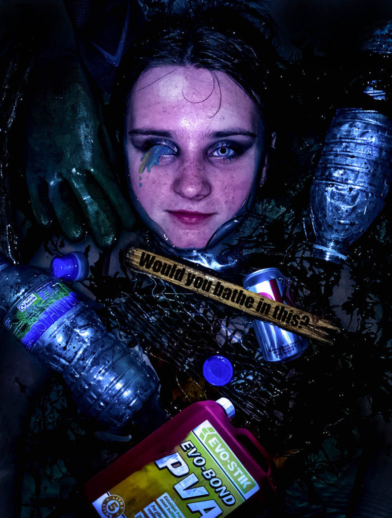
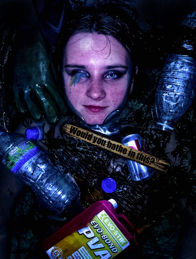
I have decided to include this image as I believe it outlines the message of plastic pollution clearly. The phrase ‘would you bathe in this’ makes the viewer realise that the sea life have to live in such conditions. I believe it emulates the work of Andreas Franke while also featuring my own twist which was the rhetorical question inspired by Barbra Kruger.
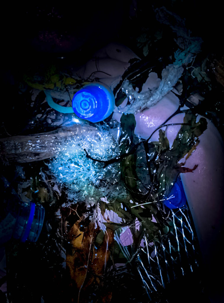
This image shows a hand trapped in the seaweed and rubbish, this is to represent that the plastic pollution is only only massively negative on the sea animals, it will as well affect humans badly -Endocrine disruptors like bisphenol A (BPA) will increase our risk of certain cancers, can cause hormonal issues, and even increase risk of infertility and birth defects. As well as the ocean life, we as humans will also be torn down by plastic pollution.

I decided to chose this image as it reverses roles, it looks as if the person is being strangled by the rope and the plastic similar to how sea life are caught in plastic waste. The rope around her kneck, is inspired by Jeremy carols work.
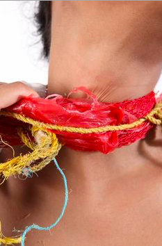
Image compare and contrast
I was inspired by Andreas Franke to create this ocean plastic pollution themed photoshoot. I emulated her style of a human submerged in water filled with plastic waste. The images are both similar in the sense that they are both in water, surrounded by rubbish. Both of the images create a feeling of sinking and depth, possibly symbolising the depth of the problem. Both of the images are coloured images which follow a theme of exaggerated colour on a dark pool of water. The placement of the people are similar, most of the body submerged, the face showing. In contrast my image includes a message ‘would you bathe in this’, inspired by Barbra Kruger, adding more context.
Presenting
Evaluation
I believe my final images came out good. They fit the theme of plastic pollution. I believe I tackled the theme of ‘Anthropocene’ correctly and focused on ‘human impact’. I think my idea was thought through well and I am happy with how they look. I think to improve my work i could’ve taken my images on a camera instead of my phone camera as the images would’ve come out better quality. I also think I was quite inconsistent within my photoshoot as some of my images were flash and some without which meant the lighting was different for some photos. I think my final outcome could’ve been better if I had more images to work with, I had enough images, however some of them were very similar to each other, meaning I would’ve ended up creating things that looked the same as each other. I believe I could’ve made these images better by taking the image from a higher point to allow myself more room to add additional plastic items similar to hers.

